Abstract / Conceptual
7
7
7
7
Vague, poetic, or artistic — focused on tone and impression over clarity.
Filters
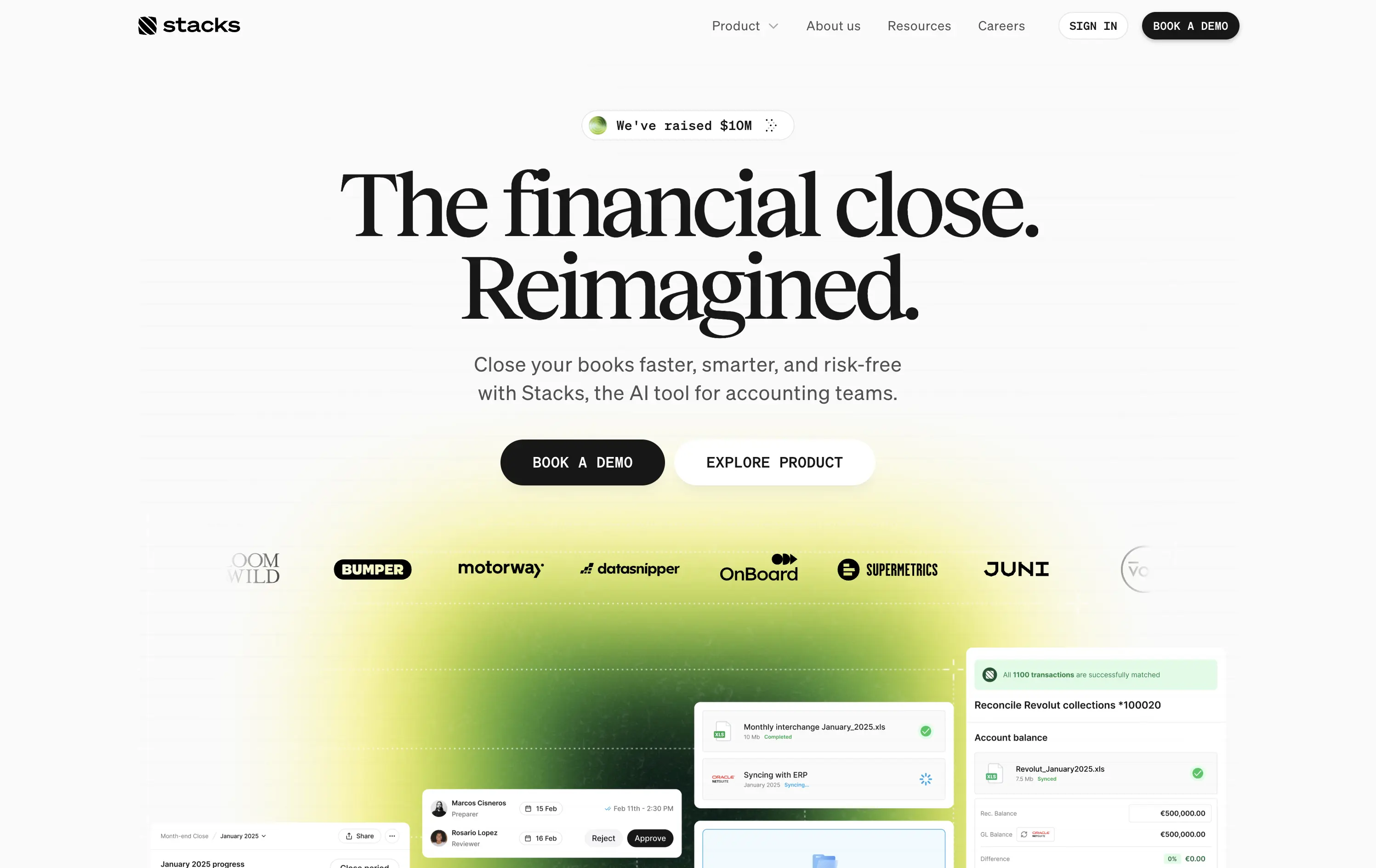
Stacks
↗
SaaS
AI Tools
Fintech
Centered
Aspirational
Abstract / Conceptual
Multi-CTA Block
Logo Wall
Product UI
Announcement
Gradient
Light Mode
Green
Yellow
Serif
B2B
Home Page
Framer
gradient hero, oversized serif headline, AI accounting SaaS, dual CTA, funding badge, logo wall, centered layout, finance automation, green yellow gradient, trusted by logos, product UI peek, crisp white background, modern B2B, high trust, accounting teams
AI‑powered platform that helps accounting teams close books faster and with less risk by automating month‑end workflows.
Oversized serif headline reframes month‑end close as an ambitious reinvention, while the lime gradient draws focus and adds energy. Subheadline grounds the concept with clear benefits, and dual CTAs serve both demo‑ready and exploratory visitors. Funding badge plus client logos build instant trust. UI snippets tease depth without clutter, aided by spacious layout and sticky nav. Cohesive and convincing.
Conceptual headline elevates mundane finance work, appealing to transformation‑minded leaders. Gradient signals progress, while proof elements ease risk concerns. Demo‑centric funnel matches enterprise sales reality.
This layout balances technical utility with human impact, aligning well with Algolia’s positioning as an API-first but UX-aware company. The mobile UI reinforces product value visually, while the logo wall signals scale and trust for enterprise buyers. The tone is clear, benefit-led, and appropriate for high-intent decision-makers evaluating AI tools for customer experience. This is a solid enterprise-facing hero built to perform.
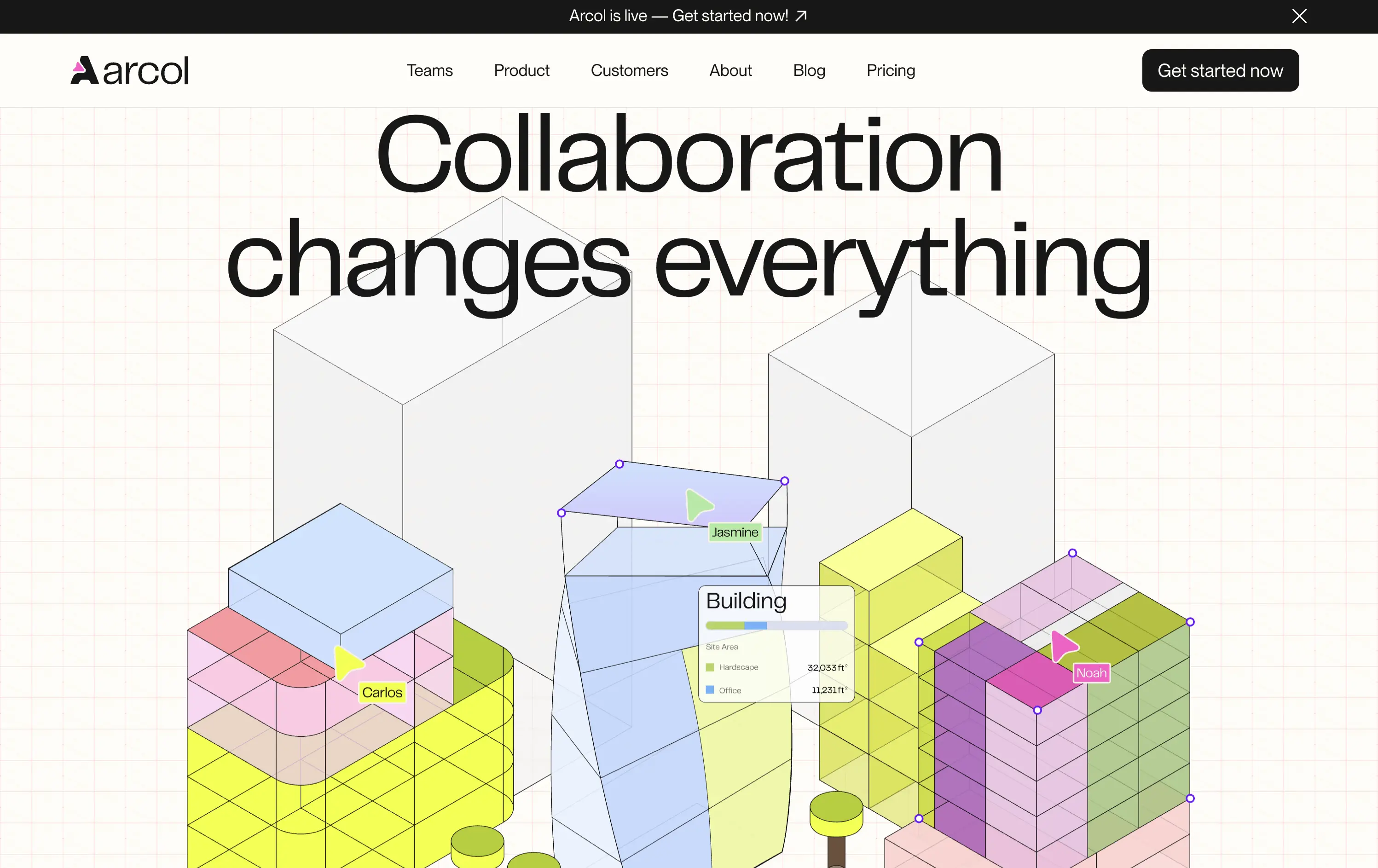
Arcol
↗
SaaS
Collaboration
Centered
Aspirational
Abstract / Conceptual
No CTA
Illustration
Custom Animation
Light Mode
Blue
Yellow
Sans serif
B2B
Home Page
Webflow
BIM software, real-time collaboration, isometric grid, multiplayer cursor, spatial planning UI, construction tech, 3D data layers, architectural tool, modern CAD, animated interface, light grid background
Arcol is a generative design and collaboration platform for architecture and BIM workflows, built for real-time teamwork.
The animated visual does the heavy lifting, illustrating use cases like live edits and data overlays. But without a supporting subline, new users may miss the BIM context. Still, strong visual storytelling creates intrigue.
Visually strong and clearly differentiated, but the messaging lacks grounding. The animation sells collaboration well, but without a sub-headline or product descriptor, it leans too much on visual inference. Clarity is sacrificed for aesthetic.
This layout balances technical utility with human impact, aligning well with Algolia’s positioning as an API-first but UX-aware company. The mobile UI reinforces product value visually, while the logo wall signals scale and trust for enterprise buyers. The tone is clear, benefit-led, and appropriate for high-intent decision-makers evaluating AI tools for customer experience. This is a solid enterprise-facing hero built to perform.
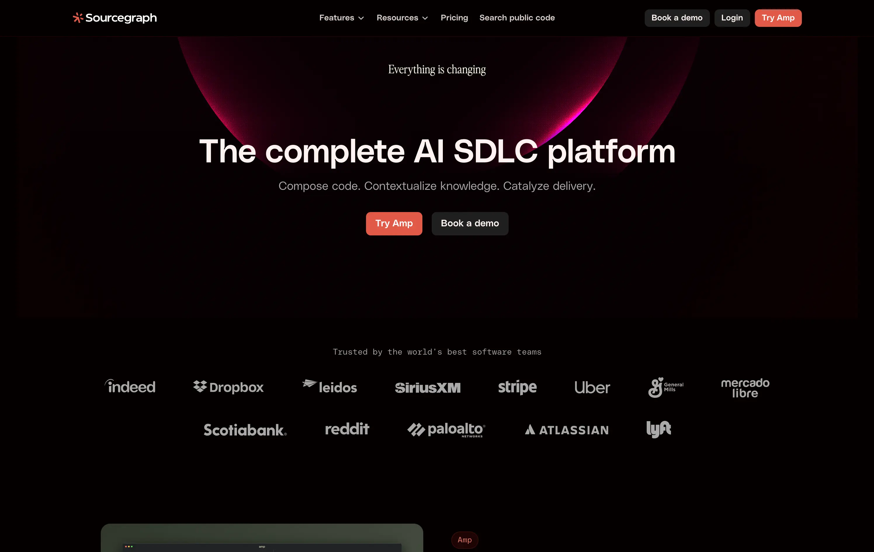
Sourcegraph
↗
DevTools
AI Tools
Collaboration
Centered
Abstract / Conceptual
Professional
Multi-CTA Block
Logo Wall
Custom Animation
Dark Mode
White
Red
Sans serif
B2B
Home Page
Webflow
AI developer tools, software delivery, blinking headline, AI SDLC platform, cognitive CTA friction, high-trust logos, developer enterprise, dual CTA layout, evolving dev workflows, dark futuristic aesthetic, intelligent search, platform abstraction
Sourcegraph offers AI-powered tools to help dev teams search, understand, and deliver code faster across their entire software development lifecycle.
The hero signals scale, change, and technical leadership. Trust logos and layout build authority fast. But “Try Amp” as CTA is vague—first-time users won’t know what it means.
Aims to own a high-level category: “AI SDLC.” The priming animation reinforces urgency, but abstract product naming creates an entry barrier for unfamiliar users.
This layout balances technical utility with human impact, aligning well with Algolia’s positioning as an API-first but UX-aware company. The mobile UI reinforces product value visually, while the logo wall signals scale and trust for enterprise buyers. The tone is clear, benefit-led, and appropriate for high-intent decision-makers evaluating AI tools for customer experience. This is a solid enterprise-facing hero built to perform.
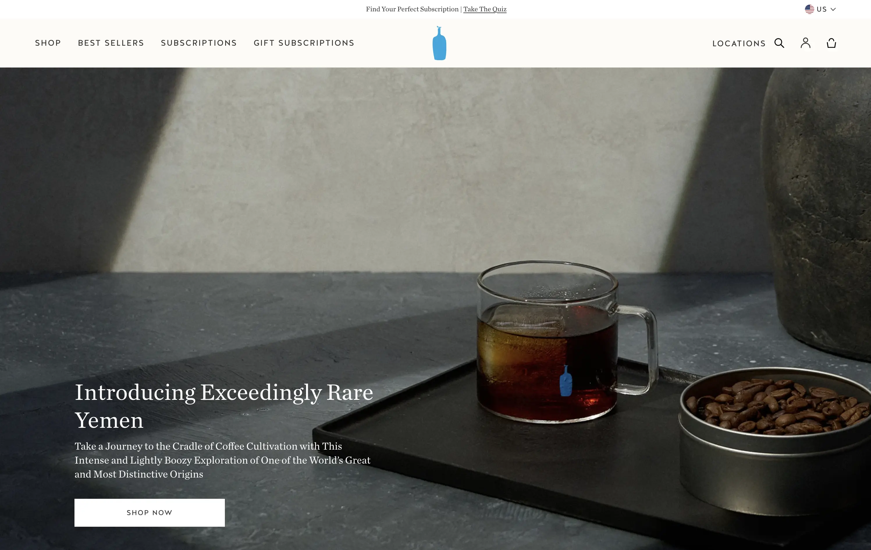
Blue Bottle Coffee
↗
CPG
Food & Beverage
Left-aligned
Editorial
Aspirational
Abstract / Conceptual
Single Button
Photography
Announcement
Imagery-Based
White
Serif
DTC
Home Page
Launch/Promo
Custom Code
premium coffee, quiet luxury, single origin, Yemen release, cultural storytelling, flavor-forward, design restraint, editorial style, homepage feature, slow ritual, product launch, lifestyle minimalism
Blue Bottle Coffee is a premium coffee roaster and retailer known for its meticulously sourced beans, minimalist aesthetic, and elevated brewing experience.
Everything here signals premium: restrained layout, subdued tone, and subtle animation. The hero is purposefully quiet — elevating the coffee without overselling it.
Perfectly aligned with a luxury buyer's mindset. It invites exploration through trust, taste, and tempo — not urgency. Signals quality through understatement.
This layout balances technical utility with human impact, aligning well with Algolia’s positioning as an API-first but UX-aware company. The mobile UI reinforces product value visually, while the logo wall signals scale and trust for enterprise buyers. The tone is clear, benefit-led, and appropriate for high-intent decision-makers evaluating AI tools for customer experience. This is a solid enterprise-facing hero built to perform.
MindPalace AI
↗
SaaS
AI Tools
Productivity
Inset
Full Width
Editorial
Founder-Led Voice
Abstract / Conceptual
Email Capture
Photography
Product UI
Imagery-Based
Light Mode
Red
Black
Display
B2C
Home Page
Webflow
cinematic design, founder-led brand, AI memory tool, data integration, futuristic UI, monochrome orange palette, provocative headline, low-context messaging, brand-first hero, retro-futurist aesthetic, predictive tech, narrative design, mood-driven UX
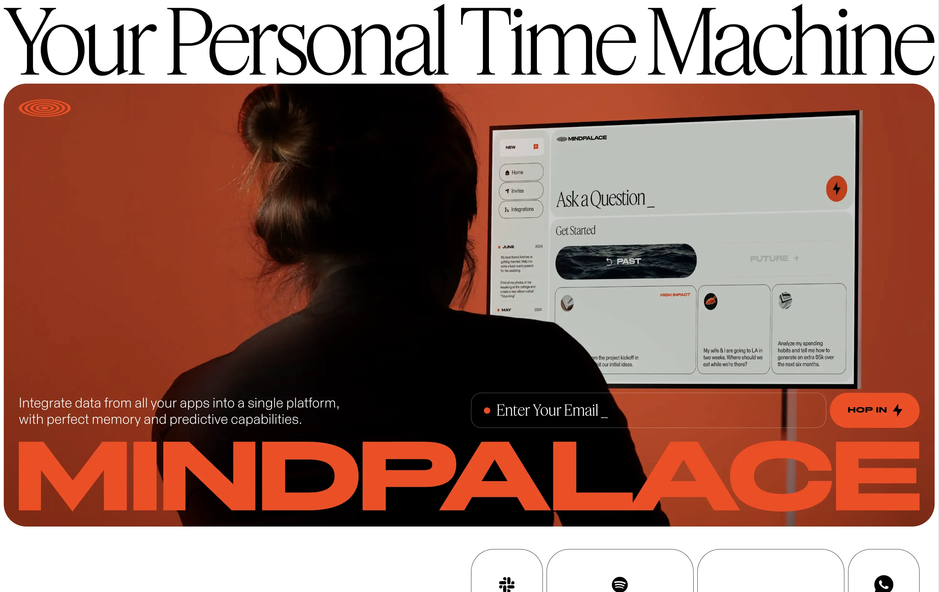
Mindpalace connects and organizes your digital life into a single interface with memory recall and predictive AI tools—part archive, part assistant.
This hero is brand-first, product-second. The editorial headline draws intrigue but offers zero utility without scrolling. Subheadline hints at integration and predictive capabilities but avoids details. The strength lies in the striking art direction: backlit subject, glowing screen, and color-blocked monochrome palette immediately set a cinematic tone. Product UI is visible but not interactive. The email capture field is subtle and stylish, fitting the brand’s creative edge. It’s a bold anti-SaaS approach—prioritizing identity over clarity.
Mindpalace positions itself as a visionary, not a tool. Strategy leans into intrigue, betting on design-savvy early adopters who value storytelling and aesthetics over immediate clarity. Strong brand magnetism, low onboarding intent.
This layout balances technical utility with human impact, aligning well with Algolia’s positioning as an API-first but UX-aware company. The mobile UI reinforces product value visually, while the logo wall signals scale and trust for enterprise buyers. The tone is clear, benefit-led, and appropriate for high-intent decision-makers evaluating AI tools for customer experience. This is a solid enterprise-facing hero built to perform.
MindPalace AI
↗
SaaS
AI Tools
Productivity
Inset
Full Width
Editorial
Founder-Led Voice
Abstract / Conceptual
Email Capture
Photography
Product UI
Imagery-Based
Light Mode
Red
Black
Display
B2C
Home Page
Webflow
cinematic design, founder-led brand, AI memory tool, data integration, futuristic UI, monochrome orange palette, provocative headline, low-context messaging, brand-first hero, retro-futurist aesthetic, predictive tech, narrative design, mood-driven UX
Mindpalace connects and organizes your digital life into a single interface with memory recall and predictive AI tools—part archive, part assistant.
This hero is brand-first, product-second. The editorial headline draws intrigue but offers zero utility without scrolling. Subheadline hints at integration and predictive capabilities but avoids details. The strength lies in the striking art direction: backlit subject, glowing screen, and color-blocked monochrome palette immediately set a cinematic tone. Product UI is visible but not interactive. The email capture field is subtle and stylish, fitting the brand’s creative edge. It’s a bold anti-SaaS approach—prioritizing identity over clarity.
Mindpalace positions itself as a visionary, not a tool. Strategy leans into intrigue, betting on design-savvy early adopters who value storytelling and aesthetics over immediate clarity. Strong brand magnetism, low onboarding intent.
This layout balances technical utility with human impact, aligning well with Algolia’s positioning as an API-first but UX-aware company. The mobile UI reinforces product value visually, while the logo wall signals scale and trust for enterprise buyers. The tone is clear, benefit-led, and appropriate for high-intent decision-makers evaluating AI tools for customer experience. This is a solid enterprise-facing hero built to perform.
WeStock
↗
SaaS
Split Grid
Left-aligned
Abstract / Conceptual
Single Button
Illustration
Interactive
Product UI
Light Mode
Red
Orange
Yellow
Sans serif
B2B
Home Page
Webflow
retail analytics, B2B SaaS, colorful path motif, feature reveal, scroll effect, clean layout, product-led hero, multicolored interface, CPG enablement, UI preview, startup brand tone, sales-velocity focus, modern B2B
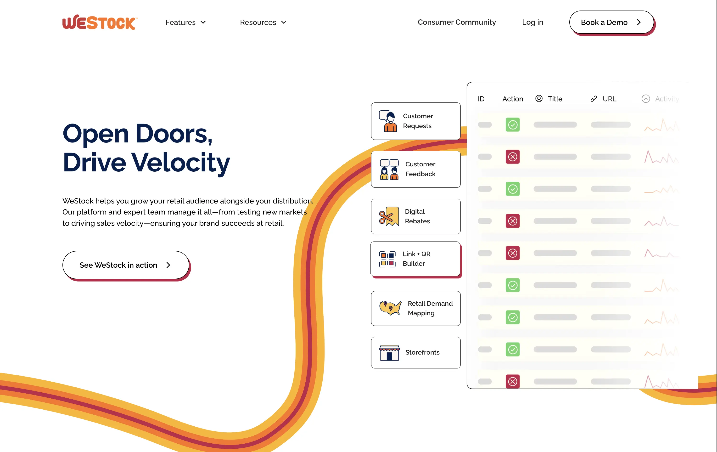
WeStock helps brands grow at retail by using data and consumer demand to drive velocity and streamline distribution.
This hero gets to the point quickly. The headline is bold, the subcopy is informative, and the UI sample makes the product feel real. The color path is a clever directional device. Visual hierarchy works, though the CTA could use stronger visual emphasis to better guide next-step intent.
A clear, professional intro for early-stage and growth CPG brands. Balances explanation with intrigue. Strong brand coherence, great visual metaphor, and effective low-friction education. CTA clarity is good; visibility needs boost.
This layout balances technical utility with human impact, aligning well with Algolia’s positioning as an API-first but UX-aware company. The mobile UI reinforces product value visually, while the logo wall signals scale and trust for enterprise buyers. The tone is clear, benefit-led, and appropriate for high-intent decision-makers evaluating AI tools for customer experience. This is a solid enterprise-facing hero built to perform.
WeStock
↗
SaaS
Split Grid
Left-aligned
Abstract / Conceptual
Single Button
Illustration
Interactive
Product UI
Light Mode
Red
Orange
Yellow
Sans serif
B2B
Home Page
Webflow
retail analytics, B2B SaaS, colorful path motif, feature reveal, scroll effect, clean layout, product-led hero, multicolored interface, CPG enablement, UI preview, startup brand tone, sales-velocity focus, modern B2B
WeStock helps brands grow at retail by using data and consumer demand to drive velocity and streamline distribution.
This hero gets to the point quickly. The headline is bold, the subcopy is informative, and the UI sample makes the product feel real. The color path is a clever directional device. Visual hierarchy works, though the CTA could use stronger visual emphasis to better guide next-step intent.
A clear, professional intro for early-stage and growth CPG brands. Balances explanation with intrigue. Strong brand coherence, great visual metaphor, and effective low-friction education. CTA clarity is good; visibility needs boost.
This layout balances technical utility with human impact, aligning well with Algolia’s positioning as an API-first but UX-aware company. The mobile UI reinforces product value visually, while the logo wall signals scale and trust for enterprise buyers. The tone is clear, benefit-led, and appropriate for high-intent decision-makers evaluating AI tools for customer experience. This is a solid enterprise-facing hero built to perform.
Miro
↗
SaaS
Collaboration
Creative Tools
Centered
Aspirational
Abstract / Conceptual
Email Capture
Product UI
Custom Animation
Light Mode
Blue
Sans serif
B2B
Home Page
Framer
collaboration tool, whiteboard software, innovation workspace, product teams, live UI elements, Miro AI, interactive SaaS, idea management, enterprise-ready, low-friction signup, dotted grid design, playful tone, design thinking, real-time tools
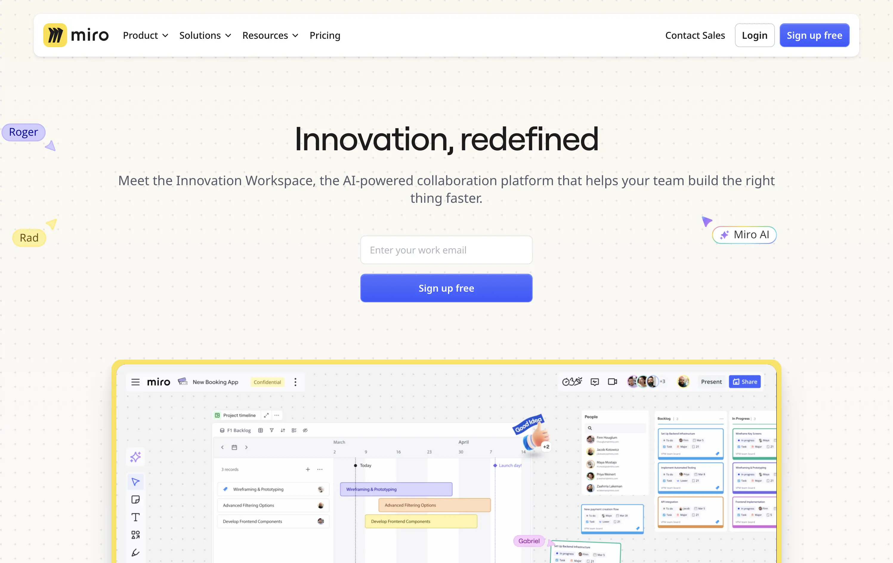
Miro is a collaborative online workspace for teams to brainstorm, plan, and build faster with intuitive tools and real-time visuals.
Hero is clean, modern, and visually grounded. Headline is short and inviting. Product UI is framed to feel expansive but still focused. The email-first CTA supports frictionless onboarding for teams exploring async tools.
Balances approachability with enterprise readiness. Message appeals to team leads, PMs, and designers. AI tag and product visuals align with innovation narrative. The hero positions Miro as both flexible and scalable.
This layout balances technical utility with human impact, aligning well with Algolia’s positioning as an API-first but UX-aware company. The mobile UI reinforces product value visually, while the logo wall signals scale and trust for enterprise buyers. The tone is clear, benefit-led, and appropriate for high-intent decision-makers evaluating AI tools for customer experience. This is a solid enterprise-facing hero built to perform.
Miro
↗
SaaS
Collaboration
Creative Tools
Centered
Aspirational
Abstract / Conceptual
Email Capture
Product UI
Custom Animation
Light Mode
Blue
Sans serif
B2B
Home Page
Framer
collaboration tool, whiteboard software, innovation workspace, product teams, live UI elements, Miro AI, interactive SaaS, idea management, enterprise-ready, low-friction signup, dotted grid design, playful tone, design thinking, real-time tools
Miro is a collaborative online workspace for teams to brainstorm, plan, and build faster with intuitive tools and real-time visuals.
Hero is clean, modern, and visually grounded. Headline is short and inviting. Product UI is framed to feel expansive but still focused. The email-first CTA supports frictionless onboarding for teams exploring async tools.
Balances approachability with enterprise readiness. Message appeals to team leads, PMs, and designers. AI tag and product visuals align with innovation narrative. The hero positions Miro as both flexible and scalable.
This layout balances technical utility with human impact, aligning well with Algolia’s positioning as an API-first but UX-aware company. The mobile UI reinforces product value visually, while the logo wall signals scale and trust for enterprise buyers. The tone is clear, benefit-led, and appropriate for high-intent decision-makers evaluating AI tools for customer experience. This is a solid enterprise-facing hero built to perform.
The most effective hero sections in your inbox.
Monthly round up of top hero sections.
Don't worry. We hate spam too.
Don't worry. We hate spam too.
Don't worry. We hate spam too.