Webflow
22
22
22
22
Highly customized sites — popular among tech startups & web studios.
Filters
Shareio
↗
Creator Tools
Web3
Editorial
Aspirational
Confident
Single Button
Custom Animation
Loading Animation
3D visuals
Dark Mode
Green
Pink
Serif
B2C
Home Page
Webflow
paywall tech, content monetization, no-upload platform, editorial layout, kinetic typography, web3 creator stack, glowing animation, creator-first, income tools, luxury digital aesthetic
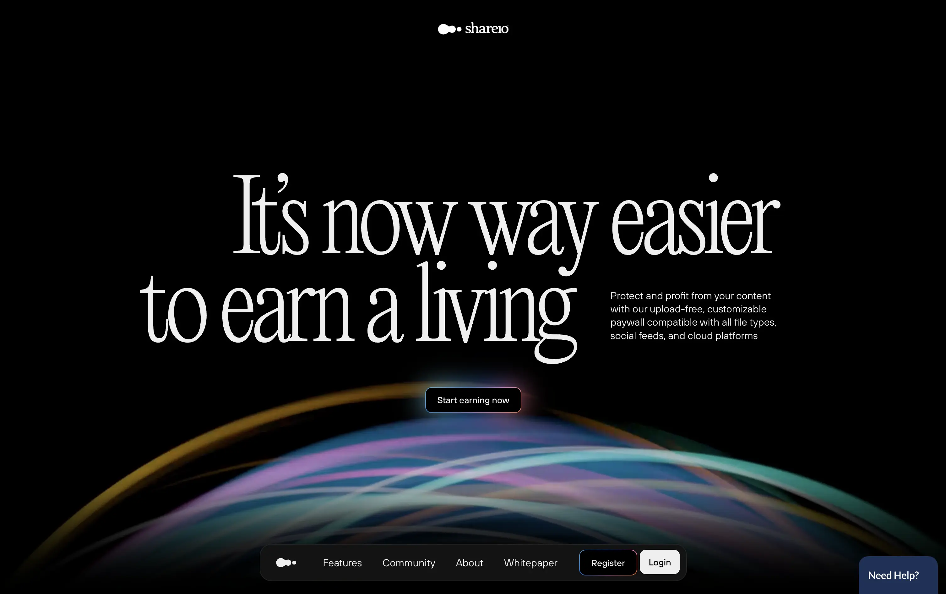
Shareio is a tool for creators to monetize any content via customizable paywalls—no uploads, just link and earn.
The hero is visually magnetic. Oversized serif type and fluid animation deliver a high-end, editorial feel. The core message is emotional, not functional—but the subline recovers clarity.
A bold play for modern creators who value style, independence, and control. The hero builds intrigue through aesthetic gravity but still manages to explain the product’s purpose with restraint.
This layout balances technical utility with human impact, aligning well with Algolia’s positioning as an API-first but UX-aware company. The mobile UI reinforces product value visually, while the logo wall signals scale and trust for enterprise buyers. The tone is clear, benefit-led, and appropriate for high-intent decision-makers evaluating AI tools for customer experience. This is a solid enterprise-facing hero built to perform.
Shareio
↗
Creator Tools
Web3
Editorial
Aspirational
Confident
Single Button
Custom Animation
Loading Animation
3D visuals
Dark Mode
Green
Pink
Serif
B2C
Home Page
Webflow
paywall tech, content monetization, no-upload platform, editorial layout, kinetic typography, web3 creator stack, glowing animation, creator-first, income tools, luxury digital aesthetic
Shareio is a tool for creators to monetize any content via customizable paywalls—no uploads, just link and earn.
The hero is visually magnetic. Oversized serif type and fluid animation deliver a high-end, editorial feel. The core message is emotional, not functional—but the subline recovers clarity.
A bold play for modern creators who value style, independence, and control. The hero builds intrigue through aesthetic gravity but still manages to explain the product’s purpose with restraint.
This layout balances technical utility with human impact, aligning well with Algolia’s positioning as an API-first but UX-aware company. The mobile UI reinforces product value visually, while the logo wall signals scale and trust for enterprise buyers. The tone is clear, benefit-led, and appropriate for high-intent decision-makers evaluating AI tools for customer experience. This is a solid enterprise-facing hero built to perform.
Infinite Machine
↗
Hardware
Editorial
No headline
Single Button
Photography
3D visuals
Imagery-Based
Green
Display
DTC
Home Page
Webflow
electric mobility, hyper-modern design, minimalist layout, luxury product, DTC vehicle brand, monochrome aesthetic, bold branding, soft industrial lighting, lifestyle hardware, premium feel
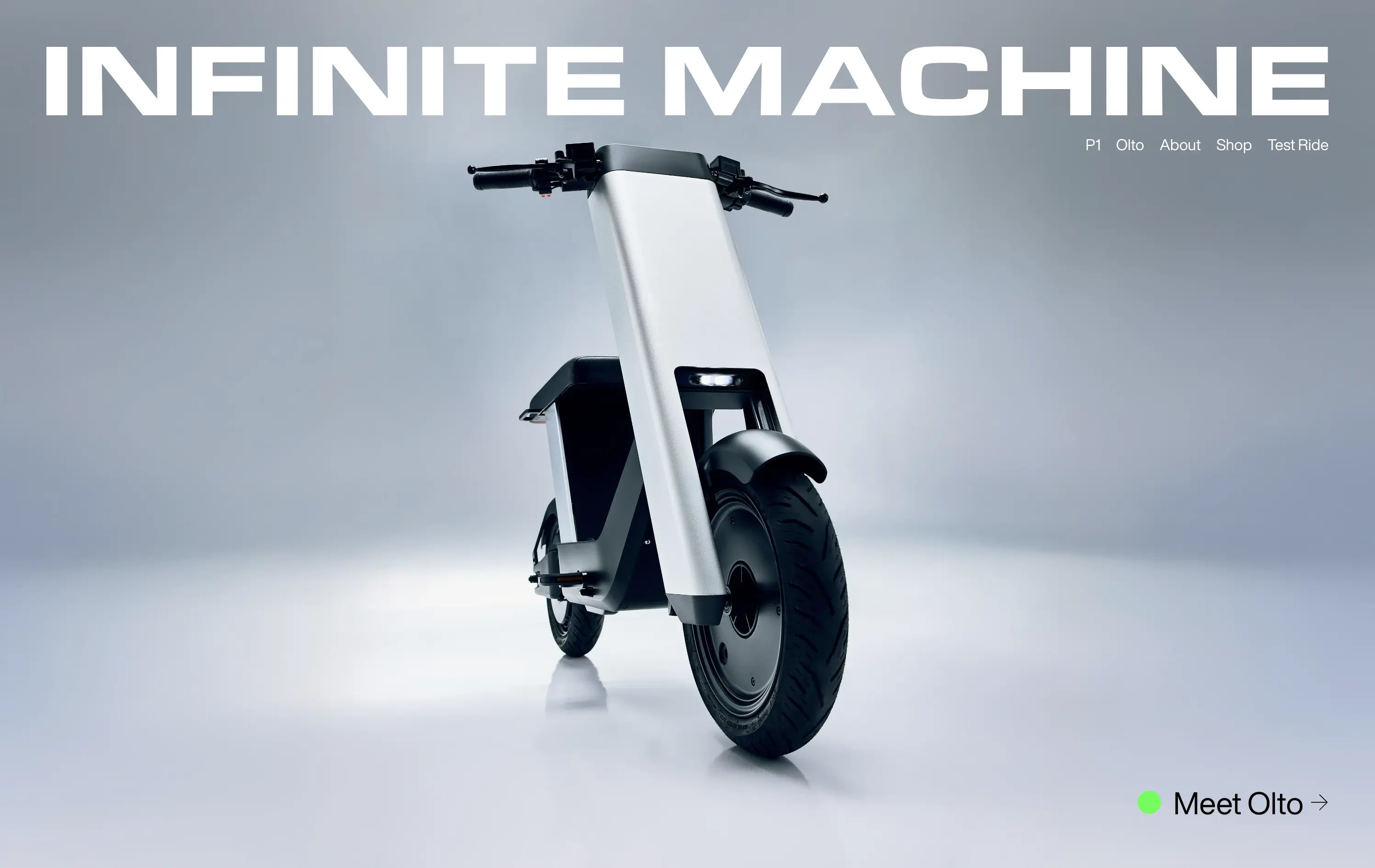
Infinite Machine builds futuristic electric motorcycles with a minimalist aesthetic and modern tech integrations.
The layout mimics a high-end magazine cover: stark, centered, and brand-dominant. It creates intrigue and immediate visual impact, but offers little onboarding or product context until users click deeper.
Infinite Machine is selling vision, not just a product. The choice to remove all explanatory copy and lead with form aligns with a luxury hardware playbook
This layout balances technical utility with human impact, aligning well with Algolia’s positioning as an API-first but UX-aware company. The mobile UI reinforces product value visually, while the logo wall signals scale and trust for enterprise buyers. The tone is clear, benefit-led, and appropriate for high-intent decision-makers evaluating AI tools for customer experience. This is a solid enterprise-facing hero built to perform.
Infinite Machine
↗
Hardware
Editorial
No headline
Single Button
Photography
3D visuals
Imagery-Based
Green
Display
DTC
Home Page
Webflow
electric mobility, hyper-modern design, minimalist layout, luxury product, DTC vehicle brand, monochrome aesthetic, bold branding, soft industrial lighting, lifestyle hardware, premium feel
Infinite Machine builds futuristic electric motorcycles with a minimalist aesthetic and modern tech integrations.
The layout mimics a high-end magazine cover: stark, centered, and brand-dominant. It creates intrigue and immediate visual impact, but offers little onboarding or product context until users click deeper.
Infinite Machine is selling vision, not just a product. The choice to remove all explanatory copy and lead with form aligns with a luxury hardware playbook
This layout balances technical utility with human impact, aligning well with Algolia’s positioning as an API-first but UX-aware company. The mobile UI reinforces product value visually, while the logo wall signals scale and trust for enterprise buyers. The tone is clear, benefit-led, and appropriate for high-intent decision-makers evaluating AI tools for customer experience. This is a solid enterprise-facing hero built to perform.
Wand
↗
AI Tools
Creative Tools
Centered
Aspirational
Empowering
Download App
Single Button
Video
Product UI
Imagery-Based
Blue
Sans serif
B2C
Home Page
Webflow
sketch-to-render, iOS-first, AI for artists, Apple Pencil UX, generative design, creative tooling, mobile-first AI, aspirational motion, immersive product demo, minimal CTA, emotional tech
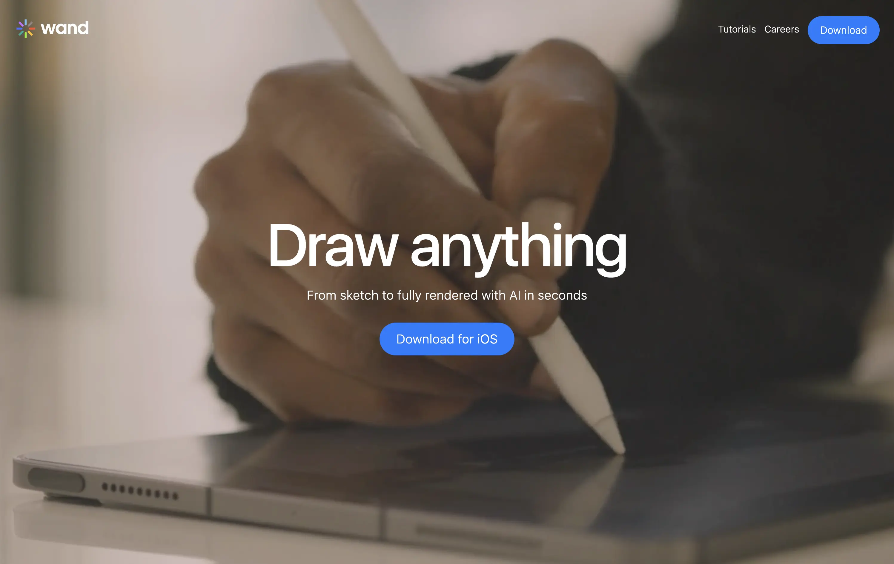
Wand is an iOS app that transforms hand-drawn sketches into fully rendered images using AI—fast, simple, and intuitive.
The full-screen video speaks louder than the copy. You see the product’s value in real time. It’s immersive, emotionally resonant, and gives instant context—but assumes the viewer will wait and watch.
Wand leans into aspiration and emotion to sell its power. The video-first hero positions the tool as magical and tactile. It’s a strong brand move but could benefit from a secondary line for clarity or onboarding.
This layout balances technical utility with human impact, aligning well with Algolia’s positioning as an API-first but UX-aware company. The mobile UI reinforces product value visually, while the logo wall signals scale and trust for enterprise buyers. The tone is clear, benefit-led, and appropriate for high-intent decision-makers evaluating AI tools for customer experience. This is a solid enterprise-facing hero built to perform.
Wand
↗
AI Tools
Creative Tools
Centered
Aspirational
Empowering
Download App
Single Button
Video
Product UI
Imagery-Based
Blue
Sans serif
B2C
Home Page
Webflow
sketch-to-render, iOS-first, AI for artists, Apple Pencil UX, generative design, creative tooling, mobile-first AI, aspirational motion, immersive product demo, minimal CTA, emotional tech
Wand is an iOS app that transforms hand-drawn sketches into fully rendered images using AI—fast, simple, and intuitive.
The full-screen video speaks louder than the copy. You see the product’s value in real time. It’s immersive, emotionally resonant, and gives instant context—but assumes the viewer will wait and watch.
Wand leans into aspiration and emotion to sell its power. The video-first hero positions the tool as magical and tactile. It’s a strong brand move but could benefit from a secondary line for clarity or onboarding.
This layout balances technical utility with human impact, aligning well with Algolia’s positioning as an API-first but UX-aware company. The mobile UI reinforces product value visually, while the logo wall signals scale and trust for enterprise buyers. The tone is clear, benefit-led, and appropriate for high-intent decision-makers evaluating AI tools for customer experience. This is a solid enterprise-facing hero built to perform.
Parabola
↗
AI Tools
Productivity
Data & Analytics
Centered
Conversational
Multi-CTA Block
Interactive
Search Field
Logo Wall
Dark Mode
Green
Serif
B2B
Home Page
Webflow
AI automation, input-based interaction, structured workflows, smart defaults, productivity tool, GPT-enhanced UX, dark mode UI, enterprise lean, trusted by brands, high-conversion layout
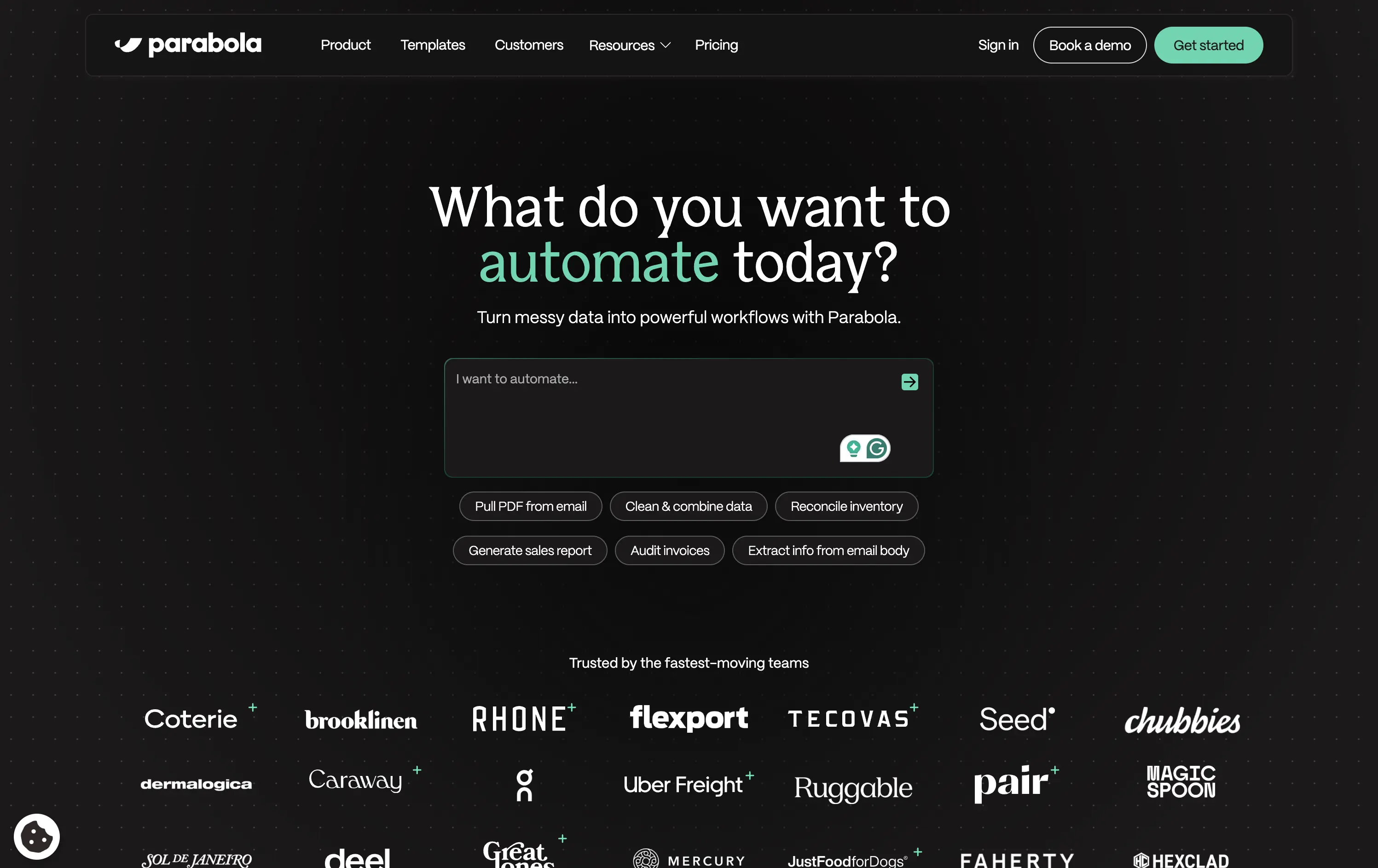
Parabola helps teams automate data-heavy workflows with AI-powered tools that clean, transform, and move business data faster.
Strong interactive moment with the input field immediately puts the user in control. The headline is benefit-led, and supporting actions give examples for inspiration. Clean, conversion-optimized layout that feels modern.
Directly aligned with operational and data-driven teams. The hero positions Parabola as both powerful and easy to start with—supported by an enterprise-trust logo wall and guided input UX.
This layout balances technical utility with human impact, aligning well with Algolia’s positioning as an API-first but UX-aware company. The mobile UI reinforces product value visually, while the logo wall signals scale and trust for enterprise buyers. The tone is clear, benefit-led, and appropriate for high-intent decision-makers evaluating AI tools for customer experience. This is a solid enterprise-facing hero built to perform.
Parabola
↗
AI Tools
Productivity
Data & Analytics
Centered
Conversational
Multi-CTA Block
Interactive
Search Field
Logo Wall
Dark Mode
Green
Serif
B2B
Home Page
Webflow
AI automation, input-based interaction, structured workflows, smart defaults, productivity tool, GPT-enhanced UX, dark mode UI, enterprise lean, trusted by brands, high-conversion layout
Parabola helps teams automate data-heavy workflows with AI-powered tools that clean, transform, and move business data faster.
Strong interactive moment with the input field immediately puts the user in control. The headline is benefit-led, and supporting actions give examples for inspiration. Clean, conversion-optimized layout that feels modern.
Directly aligned with operational and data-driven teams. The hero positions Parabola as both powerful and easy to start with—supported by an enterprise-trust logo wall and guided input UX.
This layout balances technical utility with human impact, aligning well with Algolia’s positioning as an API-first but UX-aware company. The mobile UI reinforces product value visually, while the logo wall signals scale and trust for enterprise buyers. The tone is clear, benefit-led, and appropriate for high-intent decision-makers evaluating AI tools for customer experience. This is a solid enterprise-facing hero built to perform.
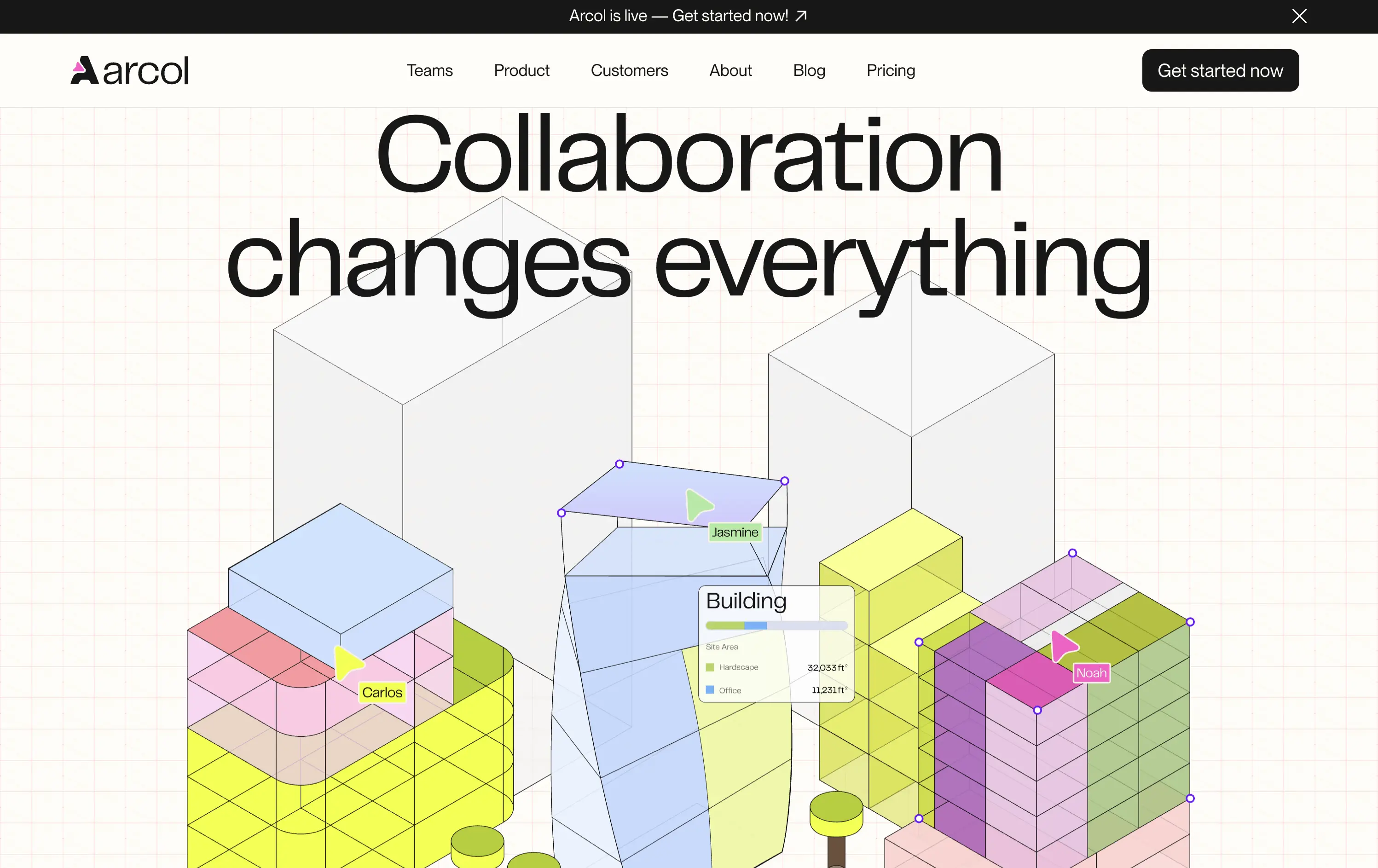
Arcol
↗
SaaS
Collaboration
Centered
Aspirational
Abstract / Conceptual
No CTA
Illustration
Custom Animation
Light Mode
Blue
Yellow
Sans serif
B2B
Home Page
Webflow
BIM software, real-time collaboration, isometric grid, multiplayer cursor, spatial planning UI, construction tech, 3D data layers, architectural tool, modern CAD, animated interface, light grid background
Arcol is a generative design and collaboration platform for architecture and BIM workflows, built for real-time teamwork.
The animated visual does the heavy lifting, illustrating use cases like live edits and data overlays. But without a supporting subline, new users may miss the BIM context. Still, strong visual storytelling creates intrigue.
Visually strong and clearly differentiated, but the messaging lacks grounding. The animation sells collaboration well, but without a sub-headline or product descriptor, it leans too much on visual inference. Clarity is sacrificed for aesthetic.
This layout balances technical utility with human impact, aligning well with Algolia’s positioning as an API-first but UX-aware company. The mobile UI reinforces product value visually, while the logo wall signals scale and trust for enterprise buyers. The tone is clear, benefit-led, and appropriate for high-intent decision-makers evaluating AI tools for customer experience. This is a solid enterprise-facing hero built to perform.
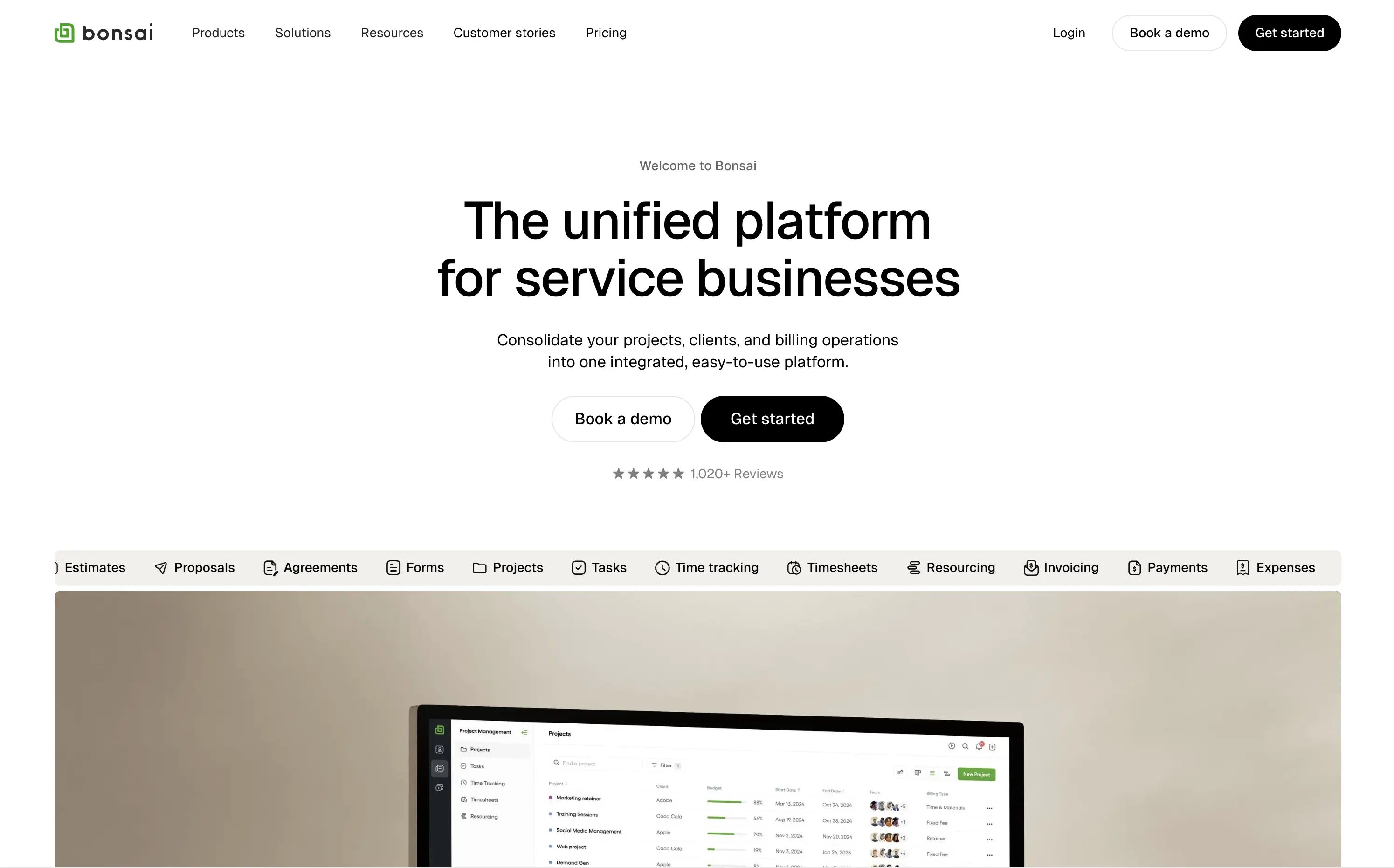
Bonsai
↗
SaaS
Productivity
Centered
Descriptive
Professional
Multi-CTA Block
Product UI
Social Proof
Badges
Light Mode
Black
Sans serif
B2B
Home Page
Webflow
clean UI, use-case ticker, modular product suite, high-trust SaaS, minimal layout, neutral branding, small business ops, service platform, feature-led structure, multi-tool clarity, clear positioning
Bonsai offers an all-in-one platform to manage projects, clients, billing, and admin work for service-based businesses.
Minimal, structured, and very clear. The hero spells out the value in one line and supports it with a rolling feature list. Visuals, CTAs, and copy all pull in the same direction—no friction, no fluff.
Positioned for busy professionals who need clarity fast. Layout and tone reflect a mature product with high utility and little need for persuasion theatrics.
This layout balances technical utility with human impact, aligning well with Algolia’s positioning as an API-first but UX-aware company. The mobile UI reinforces product value visually, while the logo wall signals scale and trust for enterprise buyers. The tone is clear, benefit-led, and appropriate for high-intent decision-makers evaluating AI tools for customer experience. This is a solid enterprise-facing hero built to perform.
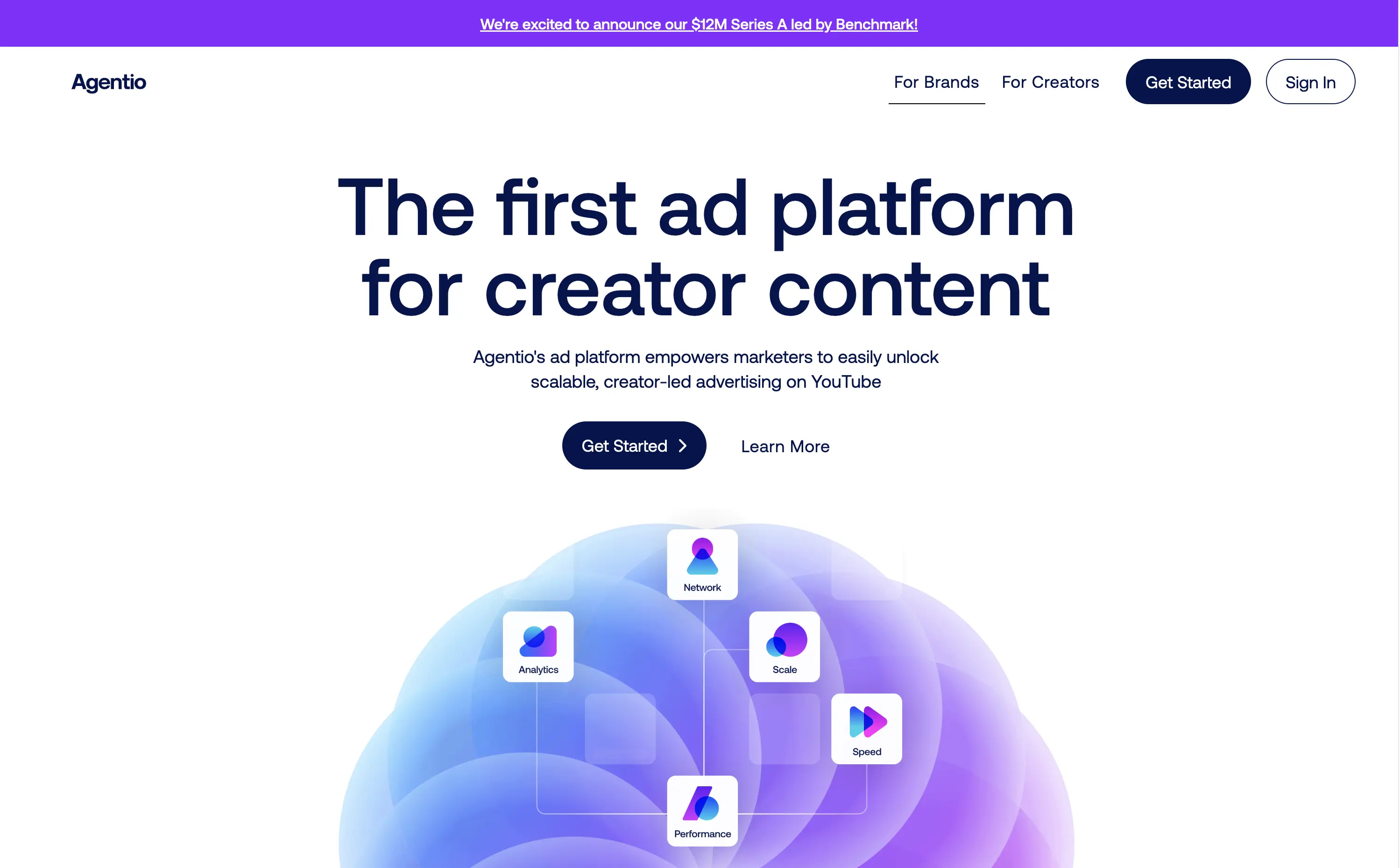
Agentio
↗
SaaS
AI Tools
Creator Tools
Centered
Bold & Direct
Confident
Multi-CTA Block
Illustration
Announcement
Gradient
Light Mode
Blue
Purple
Sans serif
Hybrid
Home Page
Webflow
orb graphic, YouTube ads, creator economy, motion gradient, AI ad platform, minimal layout, startup vibe, polished MVP, Series A, dual audience nav, split funnel intent
Agentio is an adtech platform helping marketers launch scalable, creator-led YouTube campaigns with performance tracking, analytics, and a managed network of creators.
Agentio’s hero is tight and intentional. The headline is clear and confident in its category claim. Subtext adds usability context without overloading. The floating orb graphic with ecosystem icons effectively visualizes the product promise. Dual CTAs cover both high and low-intent traffic. The announcement bar adds momentum without distraction. Layout feels modern and founder-backed — clean, but not generic.
Strong product-market fit vibes. Balances clarity and momentum for both creators and marketers. Visuals align with startup scaleup phase. Messaging is sharply angled to claim an early stake in the creator-led ad space.
This layout balances technical utility with human impact, aligning well with Algolia’s positioning as an API-first but UX-aware company. The mobile UI reinforces product value visually, while the logo wall signals scale and trust for enterprise buyers. The tone is clear, benefit-led, and appropriate for high-intent decision-makers evaluating AI tools for customer experience. This is a solid enterprise-facing hero built to perform.
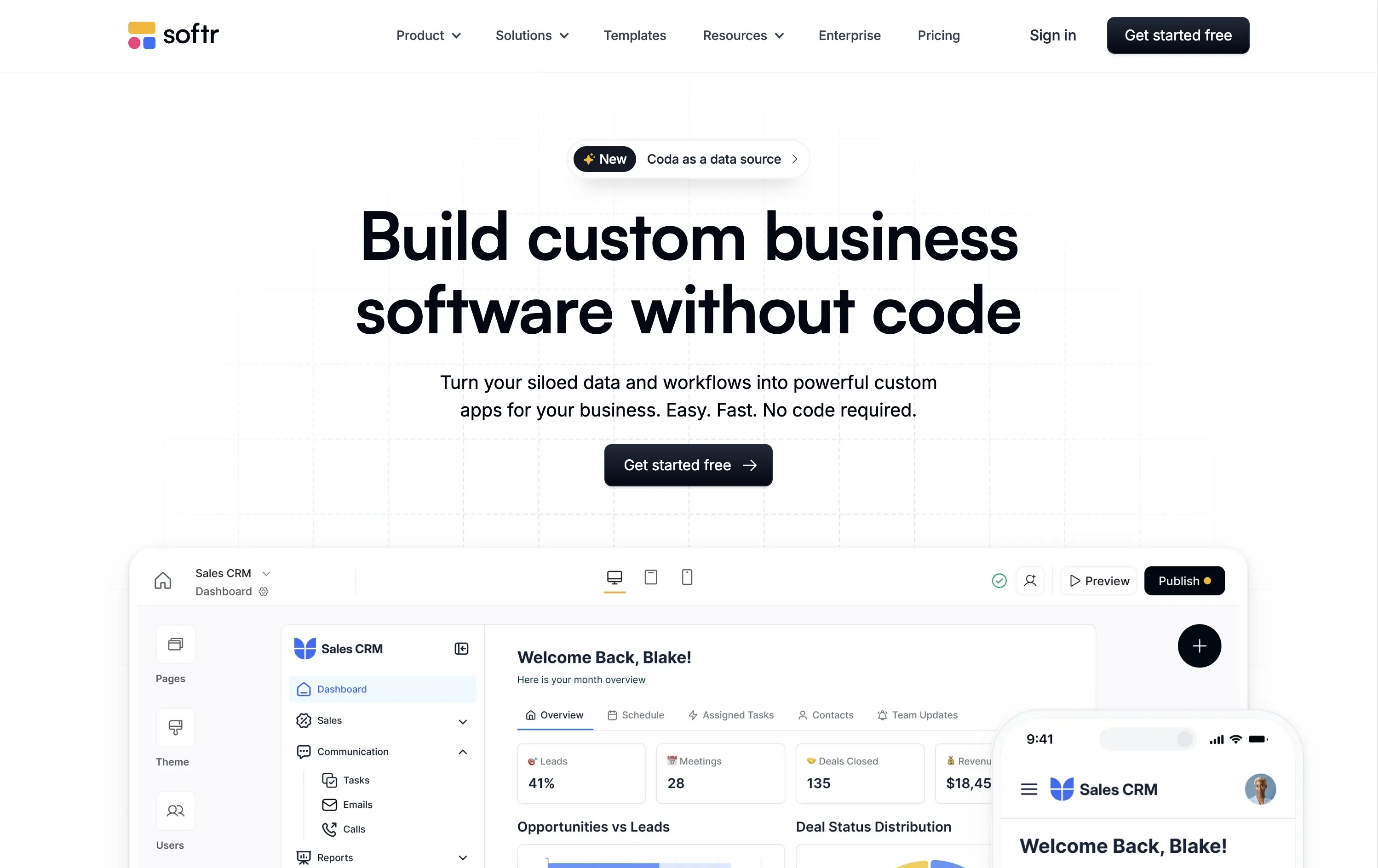
Softr
↗
SaaS
No-Code
Centered
Descriptive
Empowering
Single Button
Product UI
Announcement
Light Mode
Black
Sans serif
B2B
Home Page
Webflow
no-code builder, grid background, empowering language, SaaS homepage, CRM dashboard UI, announcement pill, onboarding-friendly, clean layout, business automation, early-stage SaaS, Coda integration, custom apps, tool for operations, low-friction CTA
Softr lets you build custom internal tools, portals, and apps from your business data without writing any code.
Clear, product-led hero that instantly communicates value. The main headline is bold and simple, and the visual shows real product UI. New feature callout adds relevance. Overall, conversion-friendly.
Strong fit for practical decision-makers who value clarity and speed. Clean layout and tone match the product’s accessible, productivity-first positioning. Shows rather than tells.
This layout balances technical utility with human impact, aligning well with Algolia’s positioning as an API-first but UX-aware company. The mobile UI reinforces product value visually, while the logo wall signals scale and trust for enterprise buyers. The tone is clear, benefit-led, and appropriate for high-intent decision-makers evaluating AI tools for customer experience. This is a solid enterprise-facing hero built to perform.
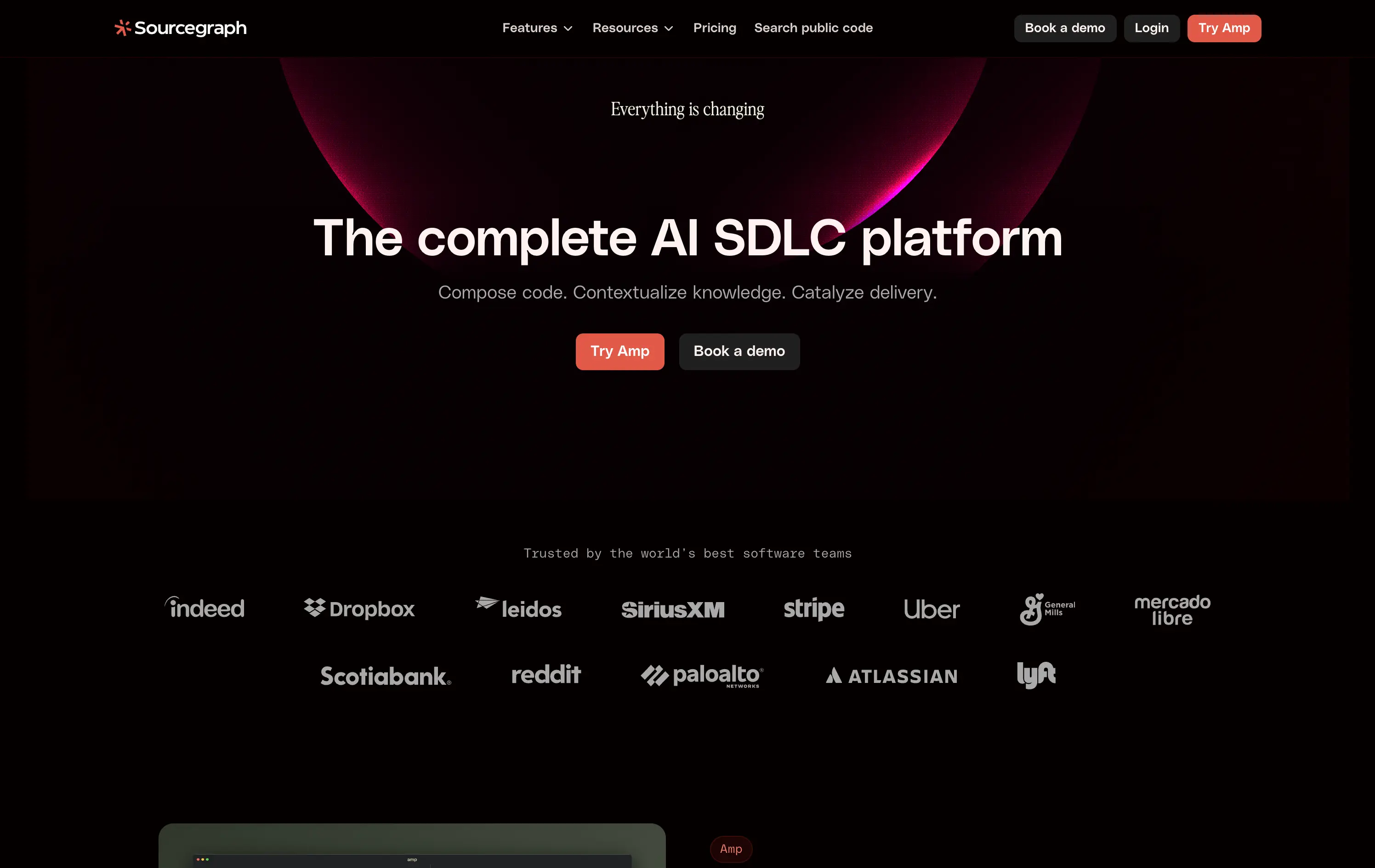
Sourcegraph
↗
DevTools
AI Tools
Collaboration
Centered
Abstract / Conceptual
Professional
Multi-CTA Block
Logo Wall
Custom Animation
Dark Mode
White
Red
Sans serif
B2B
Home Page
Webflow
AI developer tools, software delivery, blinking headline, AI SDLC platform, cognitive CTA friction, high-trust logos, developer enterprise, dual CTA layout, evolving dev workflows, dark futuristic aesthetic, intelligent search, platform abstraction
Sourcegraph offers AI-powered tools to help dev teams search, understand, and deliver code faster across their entire software development lifecycle.
The hero signals scale, change, and technical leadership. Trust logos and layout build authority fast. But “Try Amp” as CTA is vague—first-time users won’t know what it means.
Aims to own a high-level category: “AI SDLC.” The priming animation reinforces urgency, but abstract product naming creates an entry barrier for unfamiliar users.
This layout balances technical utility with human impact, aligning well with Algolia’s positioning as an API-first but UX-aware company. The mobile UI reinforces product value visually, while the logo wall signals scale and trust for enterprise buyers. The tone is clear, benefit-led, and appropriate for high-intent decision-makers evaluating AI tools for customer experience. This is a solid enterprise-facing hero built to perform.
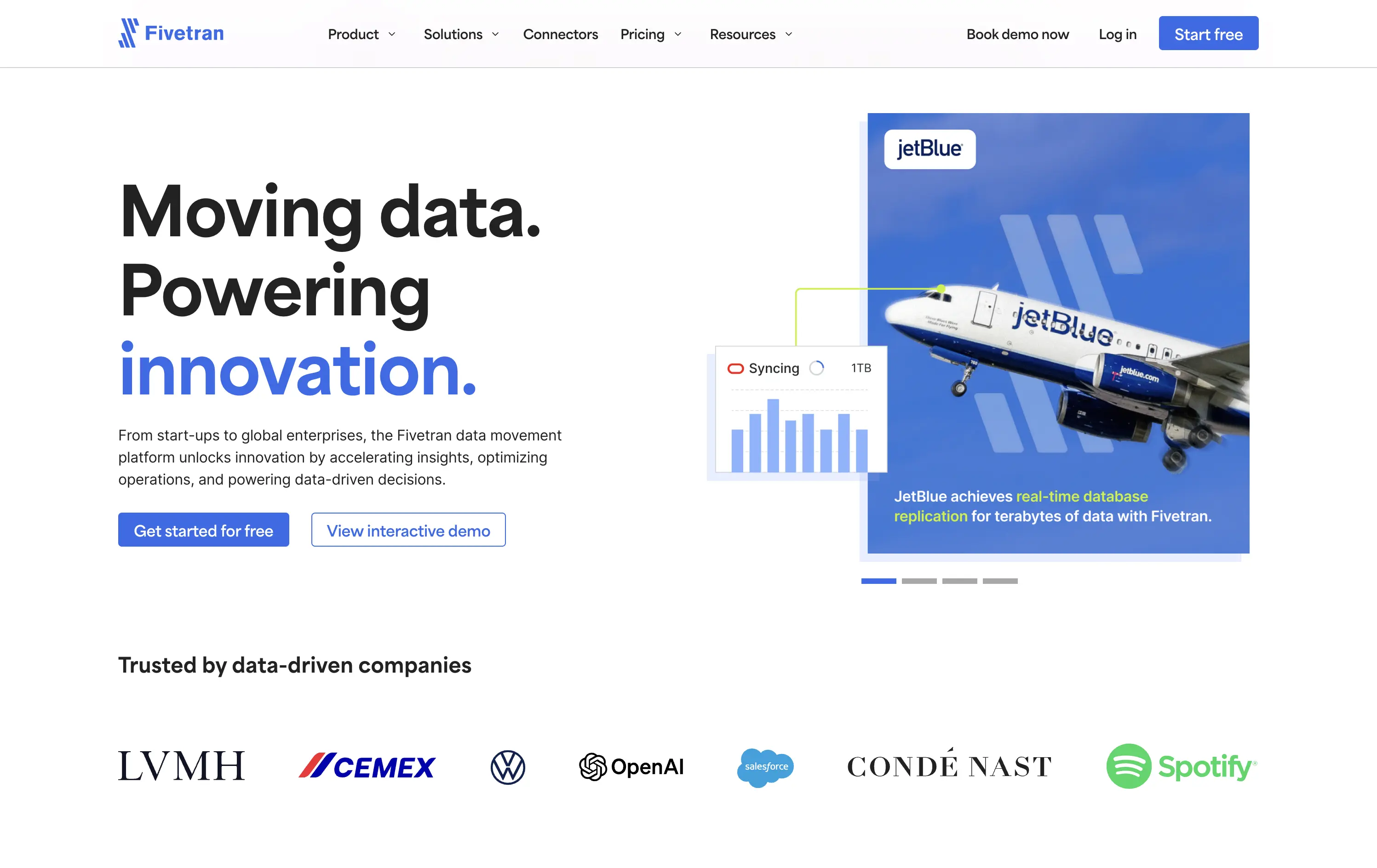
Fivetran
↗
SaaS
Data & Analytics
Split Grid
Left-aligned
Confident
Professional
Multi-CTA Block
Photography
Product UI
Social Proof
Custom Animation
Light Mode
Blue
Sans serif
B2B
Home Page
Webflow
enterprise-grade, real-time sync, testimonial integration, data pipeline, scalable architecture, visual storytelling, motion-light, trust-first, case-driven, product-led, split layout, mature B2B, dual CTA
Fivetran is a data integration platform that helps businesses automate, sync, and centralize their data across systems for analysis and reporting.
Fivetran’s hero delivers immediate clarity through its strong headline and proof-focused subtext. The combination of a recognizable brand (JetBlue) and a visual data-sync overlay reinforces product value without requiring technical deep dives. Dual CTAs are clear and well-placed for different levels of intent. Social proof below adds enterprise credibility. The overall layout is well-balanced and efficient.
Tailored for enterprise buyers, the hero blends technical reassurance with case-based credibility. It communicates trust and scalability, aligning with a mid-to-late funnel B2B audience without overwhelming on first touch.
This layout balances technical utility with human impact, aligning well with Algolia’s positioning as an API-first but UX-aware company. The mobile UI reinforces product value visually, while the logo wall signals scale and trust for enterprise buyers. The tone is clear, benefit-led, and appropriate for high-intent decision-makers evaluating AI tools for customer experience. This is a solid enterprise-facing hero built to perform.
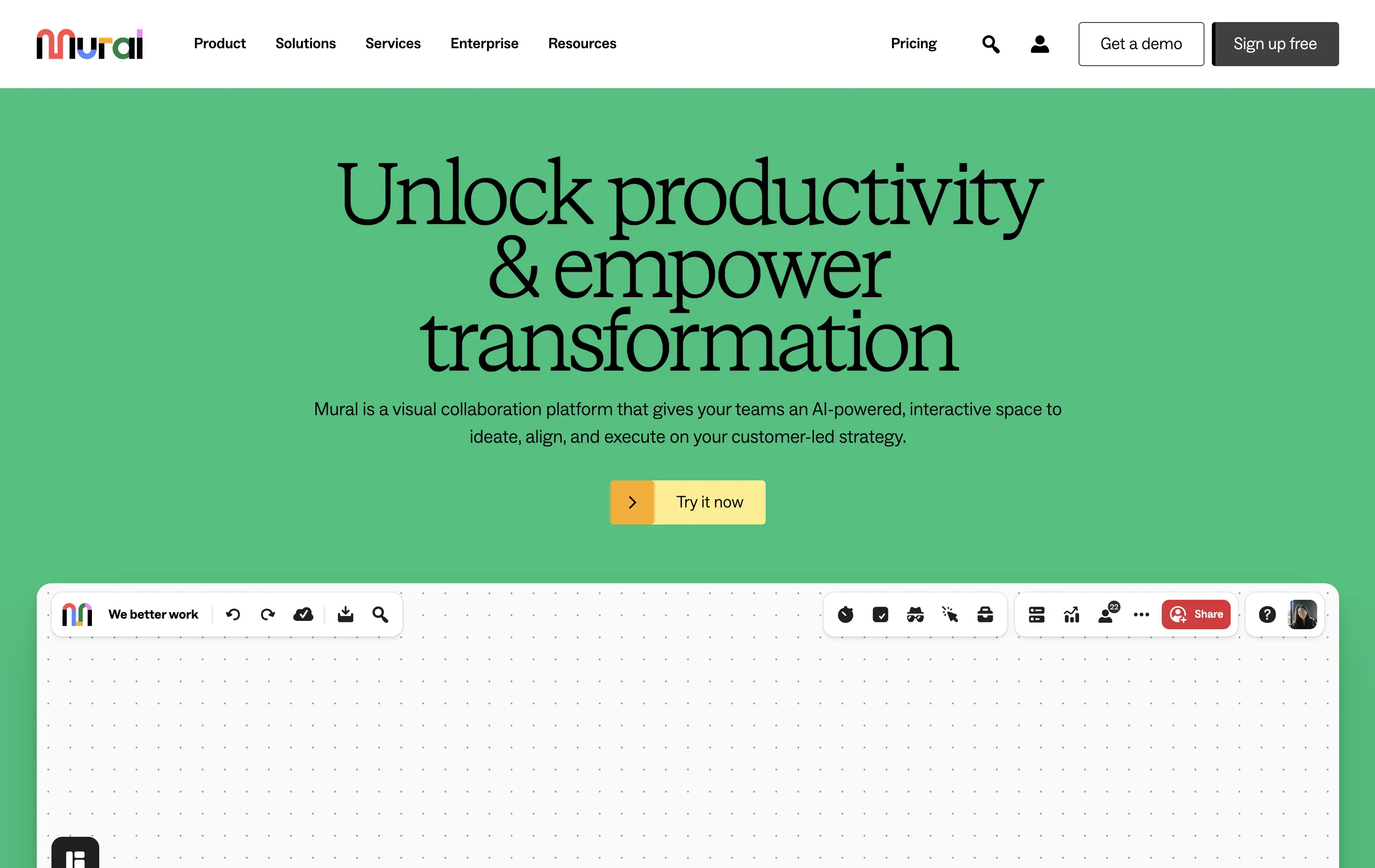
Mural
↗
SaaS
Collaboration
Productivity
Centered
Benefit-Driven
Aspirational
Single Button
Product UI
Multi-color
Green
Yellow
Serif
B2B
Home Page
Webflow
team productivity tool, familiar UI, friendly tone, AI-supported collaboration, light mode, optimistic copy, future-focused, dotted grid, visual-first, professional teams, clean hierarchy, flat color background
Mural is a visual collaboration platform that helps teams ideate, align, and execute strategy in real time with AI support.
The hero opens with a strong aspirational headline and bright color blocking that draws attention quickly. The serif typeface adds gravitas, while the clean UI below hints at practical use. However, the product preview could be more immediate—only the top edge of the canvas is visible, which may delay user comprehension. CTA is simple and visible. Overall, the section signals clarity and ease but misses some depth in product proof above the fold.
Strategically aimed at enterprise teams navigating transformation. The tone leans inspirational, while the visual style keeps it accessible. Immediate clarity, but lacks an element to tease the scroll action to anchor the pitch.
This layout balances technical utility with human impact, aligning well with Algolia’s positioning as an API-first but UX-aware company. The mobile UI reinforces product value visually, while the logo wall signals scale and trust for enterprise buyers. The tone is clear, benefit-led, and appropriate for high-intent decision-makers evaluating AI tools for customer experience. This is a solid enterprise-facing hero built to perform.
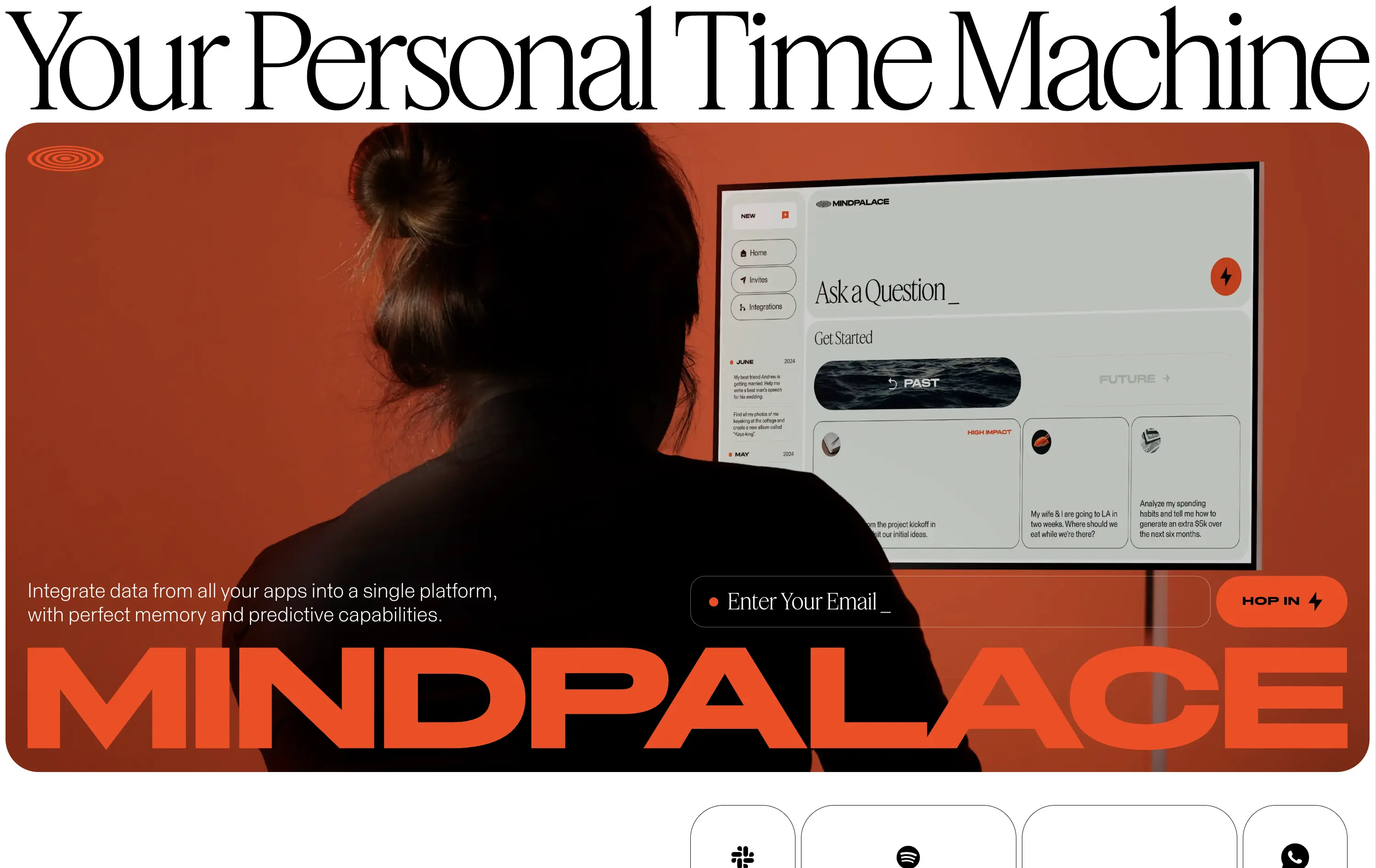
MindPalace AI
↗
SaaS
AI Tools
Productivity
Inset
Full Width
Editorial
Founder-Led Voice
Abstract / Conceptual
Email Capture
Photography
Product UI
Imagery-Based
Light Mode
Red
Black
Display
B2C
Home Page
Webflow
cinematic design, founder-led brand, AI memory tool, data integration, futuristic UI, monochrome orange palette, provocative headline, low-context messaging, brand-first hero, retro-futurist aesthetic, predictive tech, narrative design, mood-driven UX
Mindpalace connects and organizes your digital life into a single interface with memory recall and predictive AI tools—part archive, part assistant.
This hero is brand-first, product-second. The editorial headline draws intrigue but offers zero utility without scrolling. Subheadline hints at integration and predictive capabilities but avoids details. The strength lies in the striking art direction: backlit subject, glowing screen, and color-blocked monochrome palette immediately set a cinematic tone. Product UI is visible but not interactive. The email capture field is subtle and stylish, fitting the brand’s creative edge. It’s a bold anti-SaaS approach—prioritizing identity over clarity.
Mindpalace positions itself as a visionary, not a tool. Strategy leans into intrigue, betting on design-savvy early adopters who value storytelling and aesthetics over immediate clarity. Strong brand magnetism, low onboarding intent.
This layout balances technical utility with human impact, aligning well with Algolia’s positioning as an API-first but UX-aware company. The mobile UI reinforces product value visually, while the logo wall signals scale and trust for enterprise buyers. The tone is clear, benefit-led, and appropriate for high-intent decision-makers evaluating AI tools for customer experience. This is a solid enterprise-facing hero built to perform.
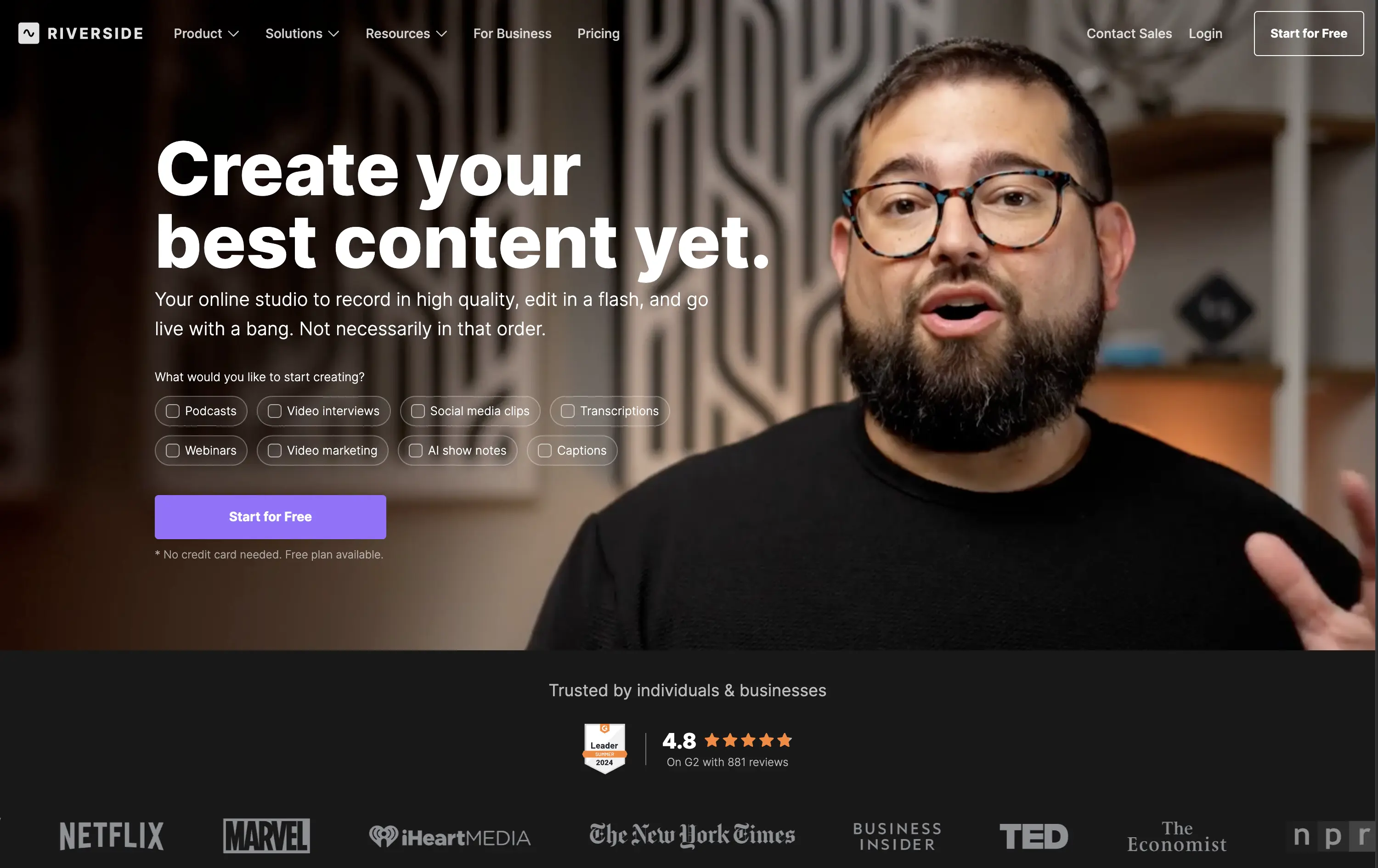
Riverside
↗
SaaS
Creator Tools
Creative Tools
Left-aligned
Aspirational
Single Button
Video
Interactive
Social Proof
Dark Mode
Imagery-Based
Purple
Sans serif
B2C
Home Page
Webflow
creator-first, face-driven, casual tone, real people, live recording, video-first layout, chip selector UI, dark mode, G2 badge, media industry, podcasting tool, modern SaaS, high-trust, content creation
Riverside is a browser-based studio for creators to record, edit, and publish high-quality video and audio content with ease.
Hero combines human warmth with clear purpose. Headline is aspirational, while subcopy clarifies. Visual chips guide self-segmentation. The single CTA is clean, bold, and frictionless. Social proof below adds immediate brand trust.
Tailored to non-technical creators who need a one-stop content tool. Design choices build ease and inspiration. Social logos position Riverside as mainstream-ready while keeping the tone personal and welcoming.
This layout balances technical utility with human impact, aligning well with Algolia’s positioning as an API-first but UX-aware company. The mobile UI reinforces product value visually, while the logo wall signals scale and trust for enterprise buyers. The tone is clear, benefit-led, and appropriate for high-intent decision-makers evaluating AI tools for customer experience. This is a solid enterprise-facing hero built to perform.
WeStock
↗
SaaS
Split Grid
Left-aligned
Abstract / Conceptual
Single Button
Illustration
Interactive
Product UI
Light Mode
Red
Orange
Yellow
Sans serif
B2B
Home Page
Webflow
retail analytics, B2B SaaS, colorful path motif, feature reveal, scroll effect, clean layout, product-led hero, multicolored interface, CPG enablement, UI preview, startup brand tone, sales-velocity focus, modern B2B
WeStock helps brands grow at retail by using data and consumer demand to drive velocity and streamline distribution.
This hero gets to the point quickly. The headline is bold, the subcopy is informative, and the UI sample makes the product feel real. The color path is a clever directional device. Visual hierarchy works, though the CTA could use stronger visual emphasis to better guide next-step intent.
A clear, professional intro for early-stage and growth CPG brands. Balances explanation with intrigue. Strong brand coherence, great visual metaphor, and effective low-friction education. CTA clarity is good; visibility needs boost.
This layout balances technical utility with human impact, aligning well with Algolia’s positioning as an API-first but UX-aware company. The mobile UI reinforces product value visually, while the logo wall signals scale and trust for enterprise buyers. The tone is clear, benefit-led, and appropriate for high-intent decision-makers evaluating AI tools for customer experience. This is a solid enterprise-facing hero built to perform.
Lattice
↗
SaaS
HR/People Tech
Bento
Left-aligned
Benefit-Driven
Bold & Direct
Multi-CTA Block
Media Gallery
Product UI
Light Mode
Green
Sans serif
B2B
Home Page
Webflow
HR software, performance management, workplace culture, AI-assisted HR, clean layout, emotion-forward, team tools, modern UX, soft color palette, trust-led, subtle AI integration, employee experience, people-first platform
Lattice is an all-in-one people platform helping companies manage performance, engagement, growth, and compensation in one streamlined space.
Headline is short and sticky. The visual weight leans toward clarity and warmth. Product UI is legible and softly styled. Strong CTA placement plus secondary path shows understanding of buyer stages.
Effectively balances performance-driven HR with emotional resonance. Smart for leadership stakeholders seeking culture and efficiency. Visuals support modernity without overwhelming.
This layout balances technical utility with human impact, aligning well with Algolia’s positioning as an API-first but UX-aware company. The mobile UI reinforces product value visually, while the logo wall signals scale and trust for enterprise buyers. The tone is clear, benefit-led, and appropriate for high-intent decision-makers evaluating AI tools for customer experience. This is a solid enterprise-facing hero built to perform.
Givebutter
↗
SaaS
Fintech
Centered
Aspirational
Empowering
Single Button
Illustration
Product UI
Custom Animation
Light Mode
Yellow
Sans serif
B2B
Home Page
Webflow
fundraising SaaS, nonprofit tech, donor platform, feel-good UX, animated mascot, bento interface, purpose-driven, pastel palette, onboarding clarity, interactive benefits, Gen Z friendly, platform utility, warm branding, visual segmentation
Givebutter is a modern fundraising platform for nonprofits to manage donations, donors, events, and campaigns — all in one place.
This hero hits all the right notes for a purpose-led platform. The headline is clear and values-forward, while the playful highlight under “changing the world” draws attention without shouting. The mascot brings joy and motion, and the interactive bentocards smartly preview key benefits. It’s emotionally inviting, but structurally strong.
The hero balances clarity and optimism. Copy is simple and anchored in purpose. Visual hierarchy is clean, with modular tiles surfacing key actions. Mascot animation adds warmth without clutter.
This layout balances technical utility with human impact, aligning well with Algolia’s positioning as an API-first but UX-aware company. The mobile UI reinforces product value visually, while the logo wall signals scale and trust for enterprise buyers. The tone is clear, benefit-led, and appropriate for high-intent decision-makers evaluating AI tools for customer experience. This is a solid enterprise-facing hero built to perform.
Kajabi
↗
SaaS
Creator Tools
Bento
Left-aligned
Aspirational
Empowering
Email Capture
Media Gallery
Live Metrics
Social Proof
Custom Animation
Light Mode
Red
Sans serif
B2C
Home Page
Webflow
creator economy, digital products, personal branding, monetization tools, testimonial-focused, bold headline, gradient cards, visual proof, email capture, energetic layout, high social proof, creator-first SaaS, aspirational branding
Kajabi is an all-in-one platform for creators to build, market, and monetize their digital products
Hero hits hard with credibility and momentum. Bold headline sets tone, though lacks clarity. Visual grid of creators and stats instantly builds trust. High-density layout may feel overwhelming on first load.
Designed to speak directly to ambitious creators. Social proof, earnings stats, and familiar faces reinforce Kajabi’s category leadership. Loud but tuned to audience mindset — performance-first, legitimacy-led, and conversion-aware.
This layout balances technical utility with human impact, aligning well with Algolia’s positioning as an API-first but UX-aware company. The mobile UI reinforces product value visually, while the logo wall signals scale and trust for enterprise buyers. The tone is clear, benefit-led, and appropriate for high-intent decision-makers evaluating AI tools for customer experience. This is a solid enterprise-facing hero built to perform.
OpenPhone
↗
SaaS
Productivity
Centered
Bold & Direct
Confident
Single Button
Product UI
Social Proof
Light Mode
Purple
Black
Sans serif
B2B
Home Page
Webflow
business phone system, team communication, AI-enhanced calling, VoIP SaaS, minimalist hero, bold headline, trust rating, startup tools, shared inbox, clear CTA, conversion-focused, functional UI preview, modern enterprise utility
OpenPhone is a modern business phone system that unifies calls, texts, and contact management for growing teams.
Hero is bold and crystal clear. Headline makes a confident claim, immediately backed by product visuals and strong review stats. The black CTA button pops against the clean layout, driving clear intent.
Focused and direct for SMB and startup buyers. Hero supports bottom-of-funnel conversion. Minimalist visuals and rating badge project trust. Smart use of space for clarity and speed.
This layout balances technical utility with human impact, aligning well with Algolia’s positioning as an API-first but UX-aware company. The mobile UI reinforces product value visually, while the logo wall signals scale and trust for enterprise buyers. The tone is clear, benefit-led, and appropriate for high-intent decision-makers evaluating AI tools for customer experience. This is a solid enterprise-facing hero built to perform.
Adalo
↗
SaaS
No-Code
Creative Tools
Split Grid
Left-aligned
Benefit-Driven
Descriptive
Email Capture
Product UI
Duotone
Green
Sans serif
Hybrid
Home Page
Webflow
no-code builder, early-stage vibe, product-led growth, friendly UI, starter-friendly, clear CTA, drag-and-drop visual, email-first CTA, low-barrier signup, mobile-first, DIY tech, warm palette, creator tools, approachable tone, utility-first
Adalo lets anyone build mobile and web apps without coding using an easy drag-and-drop editor and built-in components.
The layout is clean, welcoming, and communicates ease of use. Visual UI gives confidence, and the input field softens conversion friction. It appeals to non-technical founders well but doesn’t carve out much distinctiveness from competitors in the same space.
This hero aligns well with beginner creators. It plays to comfort and simplicity, though it misses an edge in differentiating speed, success stories, or creative freedom.
This layout balances technical utility with human impact, aligning well with Algolia’s positioning as an API-first but UX-aware company. The mobile UI reinforces product value visually, while the logo wall signals scale and trust for enterprise buyers. The tone is clear, benefit-led, and appropriate for high-intent decision-makers evaluating AI tools for customer experience. This is a solid enterprise-facing hero built to perform.
Airbyte
↗
SaaS
DevTools
Data & Analytics
Split Grid
Left-aligned
Confident
Professional
Single Button
Logo Wall
Social Proof
Custom Animation
Announcement
Light Mode
Blue
Purple
Sans serif
B2B
Home Page
Webflow
open source, developer-focused, visual connectors, high-trust, no fluff, fast-start trial, product-led, modern minimalist, enterprise-friendly, soft palette, bold type, efficient UI, scalable tech, clean grid, dual CTA
Airbyte helps companies move data between tools through customizable, open-source pipelines built in minutes.
The hero layout is direct and minimal — a great match for its technical buyer. The headline stakes leadership, and the visual of cross-platform connections lands the core value. CTA options address both bottom-up adoption and top-down sales. It feels mature without overcomplicating.
Positioning is strong: leading with “open standard” signals authority and trust. Visual language and tone reinforce the credibility needed to win enterprise and developer mindshare.
This layout balances technical utility with human impact, aligning well with Algolia’s positioning as an API-first but UX-aware company. The mobile UI reinforces product value visually, while the logo wall signals scale and trust for enterprise buyers. The tone is clear, benefit-led, and appropriate for high-intent decision-makers evaluating AI tools for customer experience. This is a solid enterprise-facing hero built to perform.
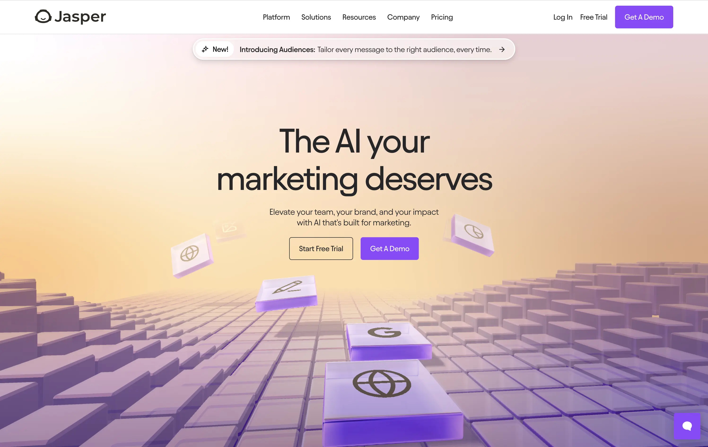
Jasper
↗
SaaS
AI Tools
Centered
Aspirational
Professional
Multi-CTA Block
Interactive
Custom Animation
3D visuals
Gradient
Light Mode
Purple
Yellow
Sans serif
Hybrid
Home Page
Webflow
AI copywriting, AI for marketers, premium SaaS, floating 3D blocks, gradient UI, dual CTA, conversion-focused, brand messaging, purple aesthetic, marketing automation, future-facing, demo-first UX, mid-market SaaS
Jasper is an AI copilot that helps marketing teams craft on-brand content faster across every channel.
Clear message, sharp contrast, and a visually engaging 3D tile animation support both narrative and interaction. Dual CTAs guide intent. Subhead could use slightly more emphasis for hierarchy.
Hero aligns with mid-to-late-stage buyers seeking polished, scalable AI solutions. Visual tone supports category leadership. Good balance of aspiration and product clarity.
This layout balances technical utility with human impact, aligning well with Algolia’s positioning as an API-first but UX-aware company. The mobile UI reinforces product value visually, while the logo wall signals scale and trust for enterprise buyers. The tone is clear, benefit-led, and appropriate for high-intent decision-makers evaluating AI tools for customer experience. This is a solid enterprise-facing hero built to perform.
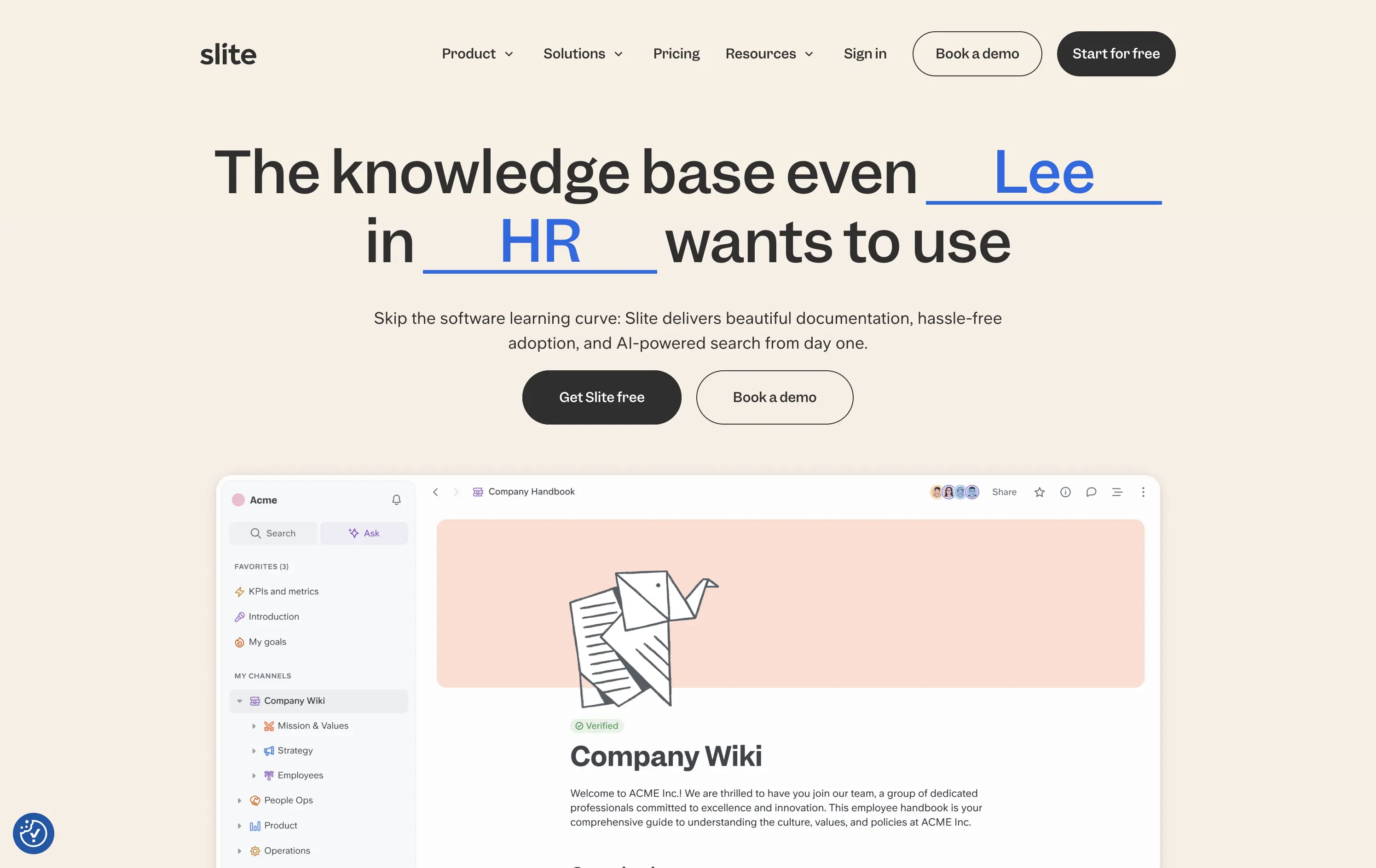
Slite
↗
SaaS
Collaboration
Centered
Benefit-Driven
Conversational
Multi-CTA Block
Product UI
Custom Animation
Light Mode
Blue
Black
Sans serif
B2B
Home Page
Webflow
team-friendly, rotating headline, UI demo, warm neutrals, playful logic, AI-assisted search, startup SaaS, low-friction entry, inclusive language, collaborative tools, documentation-first, dual CTA, trust-building UX
Slite gives teams a simple, AI-powered workspace to capture and find knowledge without the usual learning curve.
Hero is clever and inclusive. Animated blanks highlight versatility without overexplaining. UI preview builds product confidence. Dual CTAs clearly support trial vs. demo. Warm visuals balance modern minimalism with approachability.
Speaks to multiple roles without bloating the message. Tone and visual style position Slite as a low-friction, high-utility tool. Well-suited for horizontal B2B SaaS adoption.
This layout balances technical utility with human impact, aligning well with Algolia’s positioning as an API-first but UX-aware company. The mobile UI reinforces product value visually, while the logo wall signals scale and trust for enterprise buyers. The tone is clear, benefit-led, and appropriate for high-intent decision-makers evaluating AI tools for customer experience. This is a solid enterprise-facing hero built to perform.
The most effective hero sections in your inbox.
Monthly round up of top hero sections.
Don't worry. We hate spam too.
Don't worry. We hate spam too.
Don't worry. We hate spam too.