Productivity
35
35
35
35
Tools designed to help people plan, prioritize, and get work done with less friction — calendars, notes, tasks.
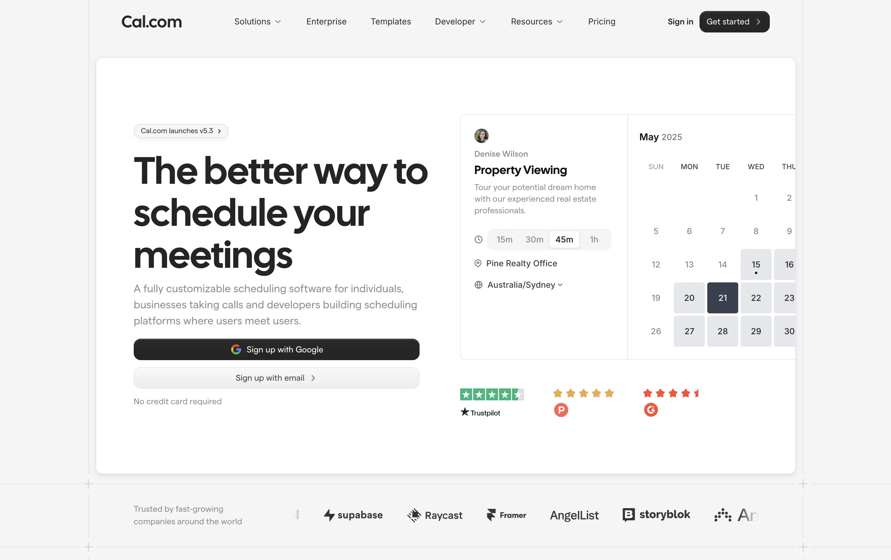
Obsidian
↗
SaaS
Productivity
Left-aligned
Benefit-Driven
Aspirational
Single Button
Product UI
Dark Mode
Purple
Sans serif
B2C
Home Page
Custom Code
note-taking, markdown editor, PKM, knowledge graph, offline-first, cross-platform, dark-mode hero, split layout, purple CTA, personal knowledge base, privacy-first, product-led growth, free core app, desktop & mobile, sync add-on
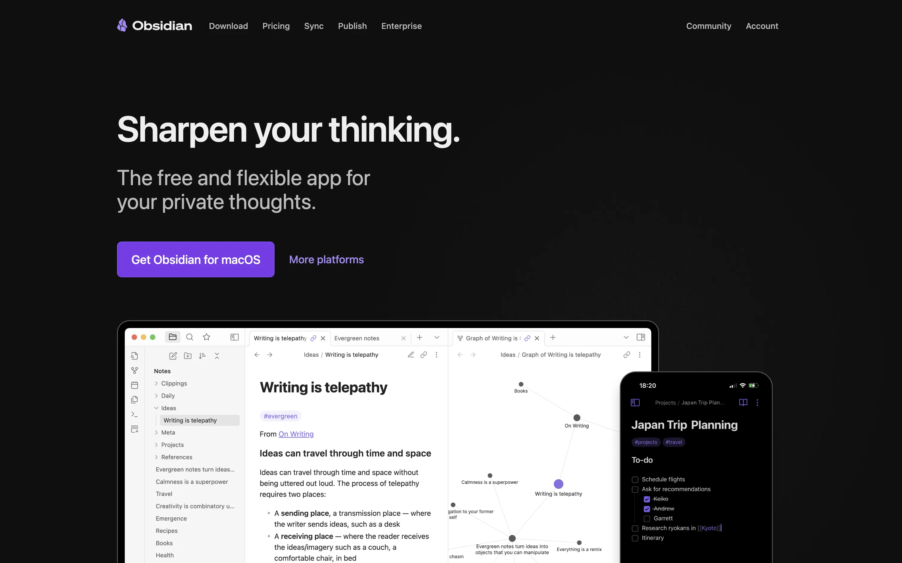
Obsidian is a markdown note app that links your ideas into a private, cross-platform knowledge graph you fully own.
Hero wastes no time: promise, positioning, and platform CTA appear above the fold with generous whitespace. “Sharpen your thinking” is emotive yet concrete, and subcopy nails the free-plus-private hook. Large purple download button drives action; “More platforms” captures non-Mac traffic without clutter. Device mock-ups validate desktop graph view and mobile parity. Dark palette amplifies focus but can feel heavy on first load for light-mode users. Overall, message, proof, and path to value align smoothly.
Clear benefit and privacy stance resonate with knowledge-worker early adopters. Product UI proof boosts trust, while free entry plus paid extras reinforces community-driven, product-led growth flywheel.
This layout balances technical utility with human impact, aligning well with Algolia’s positioning as an API-first but UX-aware company. The mobile UI reinforces product value visually, while the logo wall signals scale and trust for enterprise buyers. The tone is clear, benefit-led, and appropriate for high-intent decision-makers evaluating AI tools for customer experience. This is a solid enterprise-facing hero built to perform.
Obsidian
↗
SaaS
Productivity
Left-aligned
Benefit-Driven
Aspirational
Single Button
Product UI
Dark Mode
Purple
Sans serif
B2C
Home Page
Custom Code
note-taking, markdown editor, PKM, knowledge graph, offline-first, cross-platform, dark-mode hero, split layout, purple CTA, personal knowledge base, privacy-first, product-led growth, free core app, desktop & mobile, sync add-on
Obsidian is a markdown note app that links your ideas into a private, cross-platform knowledge graph you fully own.
Hero wastes no time: promise, positioning, and platform CTA appear above the fold with generous whitespace. “Sharpen your thinking” is emotive yet concrete, and subcopy nails the free-plus-private hook. Large purple download button drives action; “More platforms” captures non-Mac traffic without clutter. Device mock-ups validate desktop graph view and mobile parity. Dark palette amplifies focus but can feel heavy on first load for light-mode users. Overall, message, proof, and path to value align smoothly.
Clear benefit and privacy stance resonate with knowledge-worker early adopters. Product UI proof boosts trust, while free entry plus paid extras reinforces community-driven, product-led growth flywheel.
This layout balances technical utility with human impact, aligning well with Algolia’s positioning as an API-first but UX-aware company. The mobile UI reinforces product value visually, while the logo wall signals scale and trust for enterprise buyers. The tone is clear, benefit-led, and appropriate for high-intent decision-makers evaluating AI tools for customer experience. This is a solid enterprise-facing hero built to perform.
Later
↗
SaaS
Creator Tools
Productivity
Centered
Descriptive
Empowering
Email Capture
Photography
Media Gallery
Logo Wall
Gradient
Blue
Sans serif
B2B
Home Page
Custom Code
influencer CRM, creator marketing platform, lead gen UI, campaign planning tool, social media SaaS, conversion-first layout, creator showcase, email-first CTA, SaaS for brands, bright
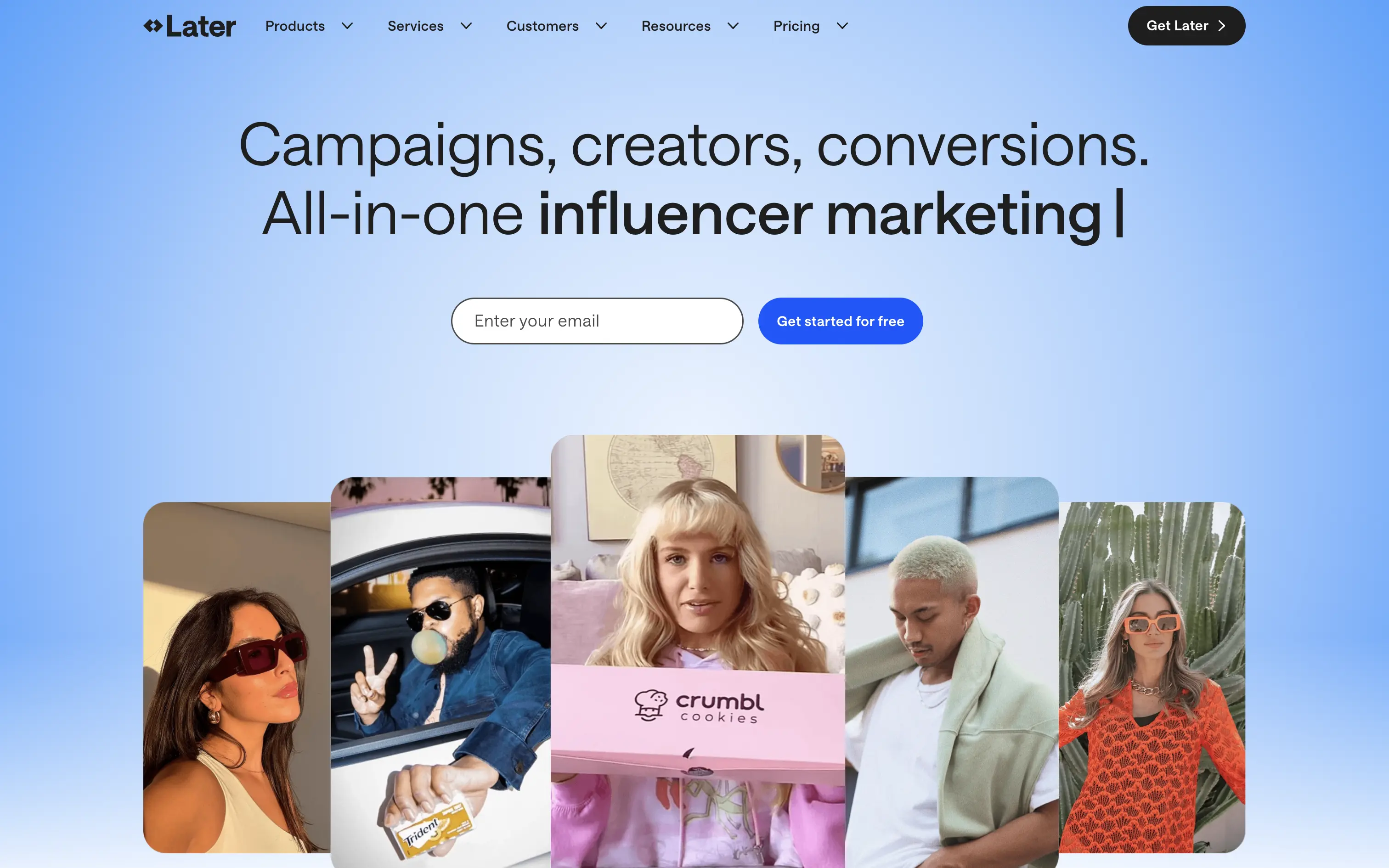
Later is a creator marketing platform helping brands manage influencer campaigns from outreach to ROI.
A functional, no-nonsense SaaS hero. Focused on conversion with a soft blue gradient and creator image bar to build immediate visual relevance. Email-first CTA lowers friction.
Safe and effective for B2B marketing leads. The layout is built for clarity over creativity. Great for scale, but it doesn’t carve out a unique visual or tonal niche.
This layout balances technical utility with human impact, aligning well with Algolia’s positioning as an API-first but UX-aware company. The mobile UI reinforces product value visually, while the logo wall signals scale and trust for enterprise buyers. The tone is clear, benefit-led, and appropriate for high-intent decision-makers evaluating AI tools for customer experience. This is a solid enterprise-facing hero built to perform.
Later
↗
SaaS
Creator Tools
Productivity
Centered
Descriptive
Empowering
Email Capture
Photography
Media Gallery
Logo Wall
Gradient
Blue
Sans serif
B2B
Home Page
Custom Code
influencer CRM, creator marketing platform, lead gen UI, campaign planning tool, social media SaaS, conversion-first layout, creator showcase, email-first CTA, SaaS for brands, bright
Later is a creator marketing platform helping brands manage influencer campaigns from outreach to ROI.
A functional, no-nonsense SaaS hero. Focused on conversion with a soft blue gradient and creator image bar to build immediate visual relevance. Email-first CTA lowers friction.
Safe and effective for B2B marketing leads. The layout is built for clarity over creativity. Great for scale, but it doesn’t carve out a unique visual or tonal niche.
This layout balances technical utility with human impact, aligning well with Algolia’s positioning as an API-first but UX-aware company. The mobile UI reinforces product value visually, while the logo wall signals scale and trust for enterprise buyers. The tone is clear, benefit-led, and appropriate for high-intent decision-makers evaluating AI tools for customer experience. This is a solid enterprise-facing hero built to perform.
Reflect
↗
AI Tools
Creative Tools
Productivity
Centered
Aspirational
No CTA
Video
Product UI
Custom Animation
Gradient
Dark Mode
Purple
Sans serif
B2C
Home Page
Custom Code
second brain tool, backlinking notes, dark ambient UI, AI note-taking, glowing animation, calm productivity, memory-focused tools, Roam alternative, neural metaphor, minimal interface
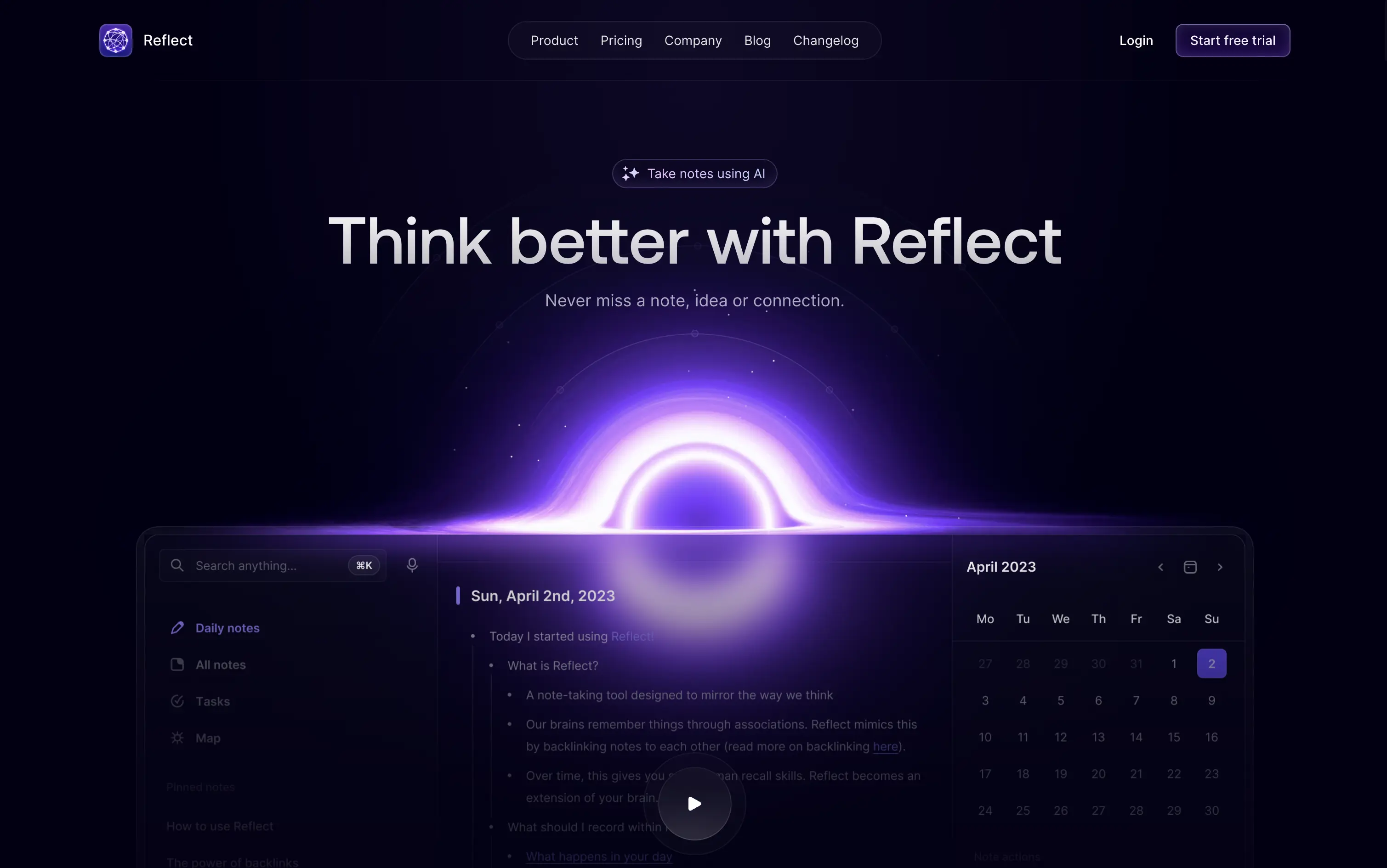
Reflect is an AI-powered note-taking app designed to help users think better, organize ideas, and link concepts seamlessly.
A visually memorable hero that communicates mood more than function. The glowing black-hole motif hints at depth and interconnectedness, but product clarity relies on secondary copy and scroll.
Reflect sells a mindset, not a feature. It uses visual metaphor and ambient energy to frame note-taking as a thinking upgrade. It’s bold, but clarity is delayed—relying on patience and resonance with a knowledge-worker mindset.
This layout balances technical utility with human impact, aligning well with Algolia’s positioning as an API-first but UX-aware company. The mobile UI reinforces product value visually, while the logo wall signals scale and trust for enterprise buyers. The tone is clear, benefit-led, and appropriate for high-intent decision-makers evaluating AI tools for customer experience. This is a solid enterprise-facing hero built to perform.
Reflect
↗
AI Tools
Creative Tools
Productivity
Centered
Aspirational
No CTA
Video
Product UI
Custom Animation
Gradient
Dark Mode
Purple
Sans serif
B2C
Home Page
Custom Code
second brain tool, backlinking notes, dark ambient UI, AI note-taking, glowing animation, calm productivity, memory-focused tools, Roam alternative, neural metaphor, minimal interface
Reflect is an AI-powered note-taking app designed to help users think better, organize ideas, and link concepts seamlessly.
A visually memorable hero that communicates mood more than function. The glowing black-hole motif hints at depth and interconnectedness, but product clarity relies on secondary copy and scroll.
Reflect sells a mindset, not a feature. It uses visual metaphor and ambient energy to frame note-taking as a thinking upgrade. It’s bold, but clarity is delayed—relying on patience and resonance with a knowledge-worker mindset.
This layout balances technical utility with human impact, aligning well with Algolia’s positioning as an API-first but UX-aware company. The mobile UI reinforces product value visually, while the logo wall signals scale and trust for enterprise buyers. The tone is clear, benefit-led, and appropriate for high-intent decision-makers evaluating AI tools for customer experience. This is a solid enterprise-facing hero built to perform.
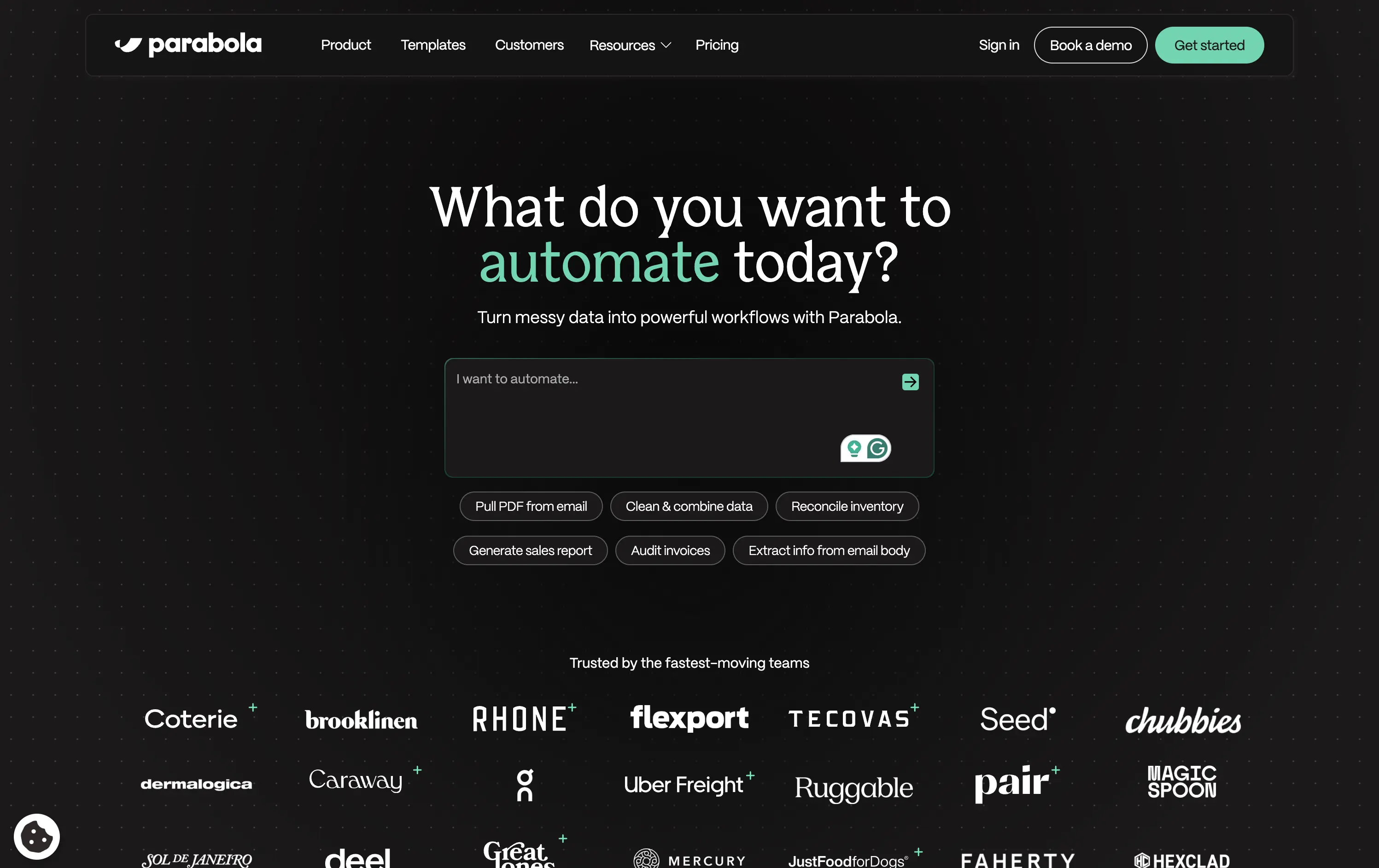
Parabola
↗
AI Tools
Productivity
Data & Analytics
Centered
Conversational
Multi-CTA Block
Interactive
Search Field
Logo Wall
Dark Mode
Green
Serif
B2B
Home Page
Webflow
AI automation, input-based interaction, structured workflows, smart defaults, productivity tool, GPT-enhanced UX, dark mode UI, enterprise lean, trusted by brands, high-conversion layout
Parabola helps teams automate data-heavy workflows with AI-powered tools that clean, transform, and move business data faster.
Strong interactive moment with the input field immediately puts the user in control. The headline is benefit-led, and supporting actions give examples for inspiration. Clean, conversion-optimized layout that feels modern.
Directly aligned with operational and data-driven teams. The hero positions Parabola as both powerful and easy to start with—supported by an enterprise-trust logo wall and guided input UX.
This layout balances technical utility with human impact, aligning well with Algolia’s positioning as an API-first but UX-aware company. The mobile UI reinforces product value visually, while the logo wall signals scale and trust for enterprise buyers. The tone is clear, benefit-led, and appropriate for high-intent decision-makers evaluating AI tools for customer experience. This is a solid enterprise-facing hero built to perform.
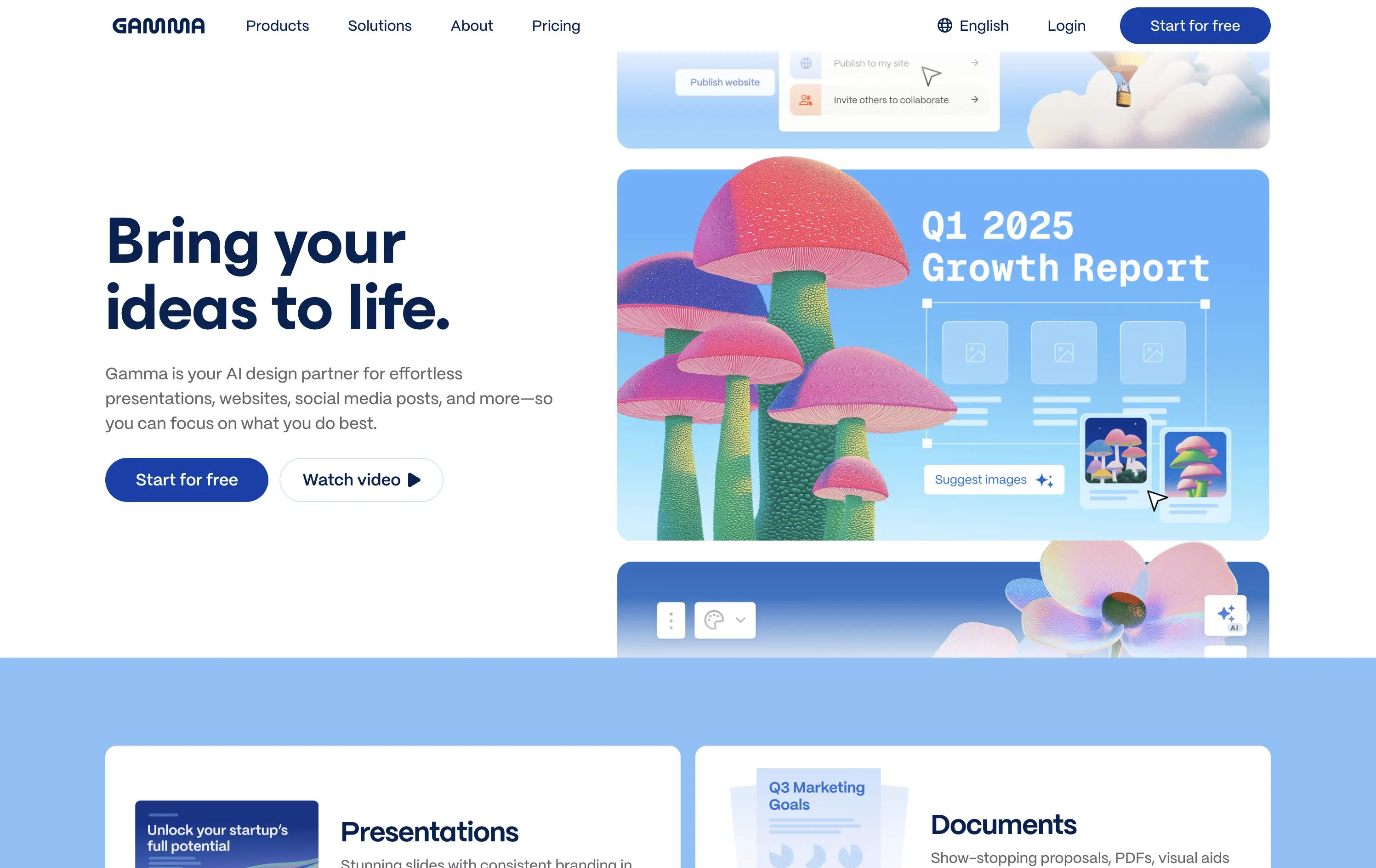
Gamma
↗
AI Tools
Creative Tools
Productivity
Split Grid
Left-aligned
Descriptive
Empowering
Multi-CTA Block
Watch Demo
Illustration
Media Gallery
Interactive
Light Mode
Blue
Sans serif
Hybrid
Home Page
Custom Code
AI presentation tool, whimsical 3D art, surreal imagery, smooth onboarding, soft brand tone, vertical carousel, intuitive UX, layout-focused demo, pastel aesthetic, creative AI tool, friendly product language
Gamma is an AI-powered design platform that helps users create beautiful presentations, websites, and docs effortlessly.
The carousel introduces Gamma’s features visually without overwhelming the user. The surreal illustration style immediately grabs attention, and the copy reinforces ease-of-use and creativity.
Gamma positions itself as a non-intimidating AI tool for creative productivity. Visuals, layout, and tone all serve to lower the barrier for entry and increase relatability.
This layout balances technical utility with human impact, aligning well with Algolia’s positioning as an API-first but UX-aware company. The mobile UI reinforces product value visually, while the logo wall signals scale and trust for enterprise buyers. The tone is clear, benefit-led, and appropriate for high-intent decision-makers evaluating AI tools for customer experience. This is a solid enterprise-facing hero built to perform.
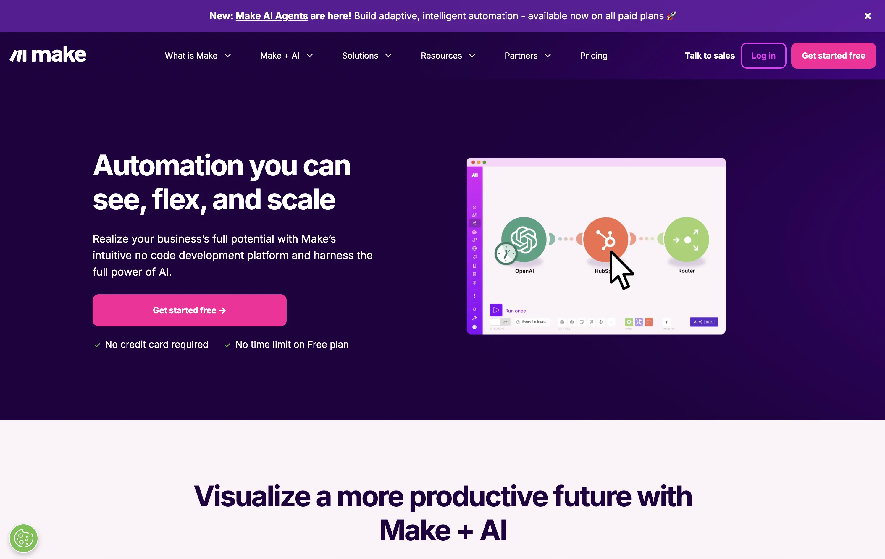
Make
↗
No-Code
Productivity
Split Grid
Descriptive
Empowering
Multi-CTA Block
Video
Announcement
Duotone
Pink
Sans serif
Hybrid
Home Page
Custom Code
no-code automation, workflow builder, AI integration, drag-and-drop editor, Zapier alternative, clear onboarding, SaaS demo UX, trust-focused layout, commercial SaaS, AI-enhanced logic
Make is a no-code automation platform that lets businesses visually build and scale workflows powered by AI.
It’s clean, clear, and direct. The animated product video does the heavy lifting. The layout and copy are textbook SaaS—efficient but forgettable. It communicates function well without taking any design risks.
Optimized for clarity and ease of adoption. Great for users shopping for workflow tools, but lacks brand distinctiveness. Plays it safe with a universal SaaS format and gradient palette.
This layout balances technical utility with human impact, aligning well with Algolia’s positioning as an API-first but UX-aware company. The mobile UI reinforces product value visually, while the logo wall signals scale and trust for enterprise buyers. The tone is clear, benefit-led, and appropriate for high-intent decision-makers evaluating AI tools for customer experience. This is a solid enterprise-facing hero built to perform.
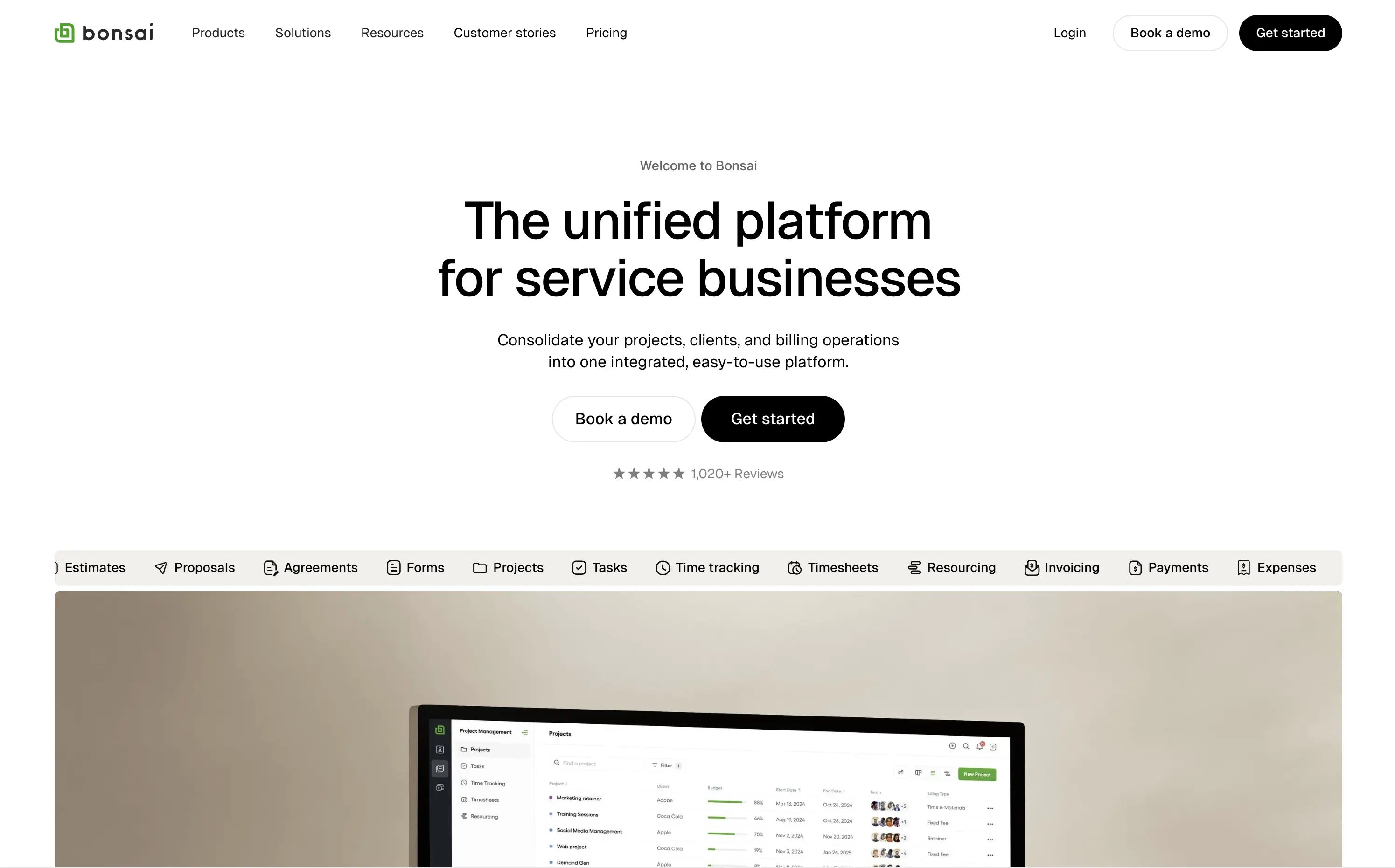
Bonsai
↗
SaaS
Productivity
Centered
Descriptive
Professional
Multi-CTA Block
Product UI
Social Proof
Badges
Light Mode
Black
Sans serif
B2B
Home Page
Webflow
clean UI, use-case ticker, modular product suite, high-trust SaaS, minimal layout, neutral branding, small business ops, service platform, feature-led structure, multi-tool clarity, clear positioning
Bonsai offers an all-in-one platform to manage projects, clients, billing, and admin work for service-based businesses.
Minimal, structured, and very clear. The hero spells out the value in one line and supports it with a rolling feature list. Visuals, CTAs, and copy all pull in the same direction—no friction, no fluff.
Positioned for busy professionals who need clarity fast. Layout and tone reflect a mature product with high utility and little need for persuasion theatrics.
This layout balances technical utility with human impact, aligning well with Algolia’s positioning as an API-first but UX-aware company. The mobile UI reinforces product value visually, while the logo wall signals scale and trust for enterprise buyers. The tone is clear, benefit-led, and appropriate for high-intent decision-makers evaluating AI tools for customer experience. This is a solid enterprise-facing hero built to perform.
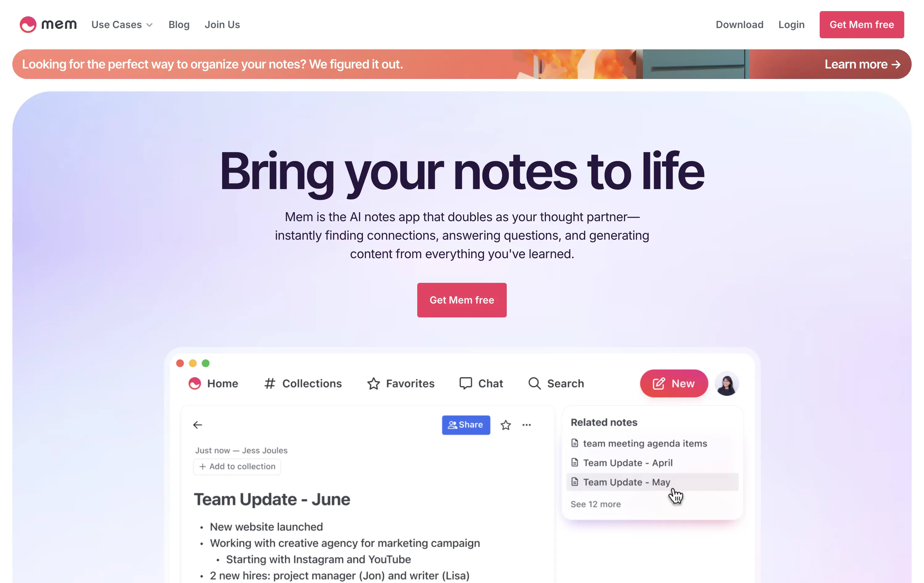
Mem
↗
AI Tools
Productivity
Inset
Centered
Benefit-Driven
Empowering
Single Button
Product UI
Announcement
Gradient
Light Mode
Pink
Purple
Sans serif
B2C
Home Page
Framer
ai note app, ambient UI, productivity tool, second brain, writing partner, connected thoughts, knowledge management, pastel color gradient, Gen Z tone, soft product UI, memory system, fast capture, personal knowledge base
Mem is an AI-powered note-taking app that helps users organize thoughts, generate content, and uncover connections automatically.
Clear and emotional headline matched with a simple product UI. CTA stands out visually. Gradient background and calm visual rhythm support a productivity mindset. Overall, well-structured but slightly generic in messaging.
Positioning as a thought partner sets it apart from basic note apps. Hero leans into AI assistance without overwhelming technicality. Good emotional framing for a consumer productivity tool.
This layout balances technical utility with human impact, aligning well with Algolia’s positioning as an API-first but UX-aware company. The mobile UI reinforces product value visually, while the logo wall signals scale and trust for enterprise buyers. The tone is clear, benefit-led, and appropriate for high-intent decision-makers evaluating AI tools for customer experience. This is a solid enterprise-facing hero built to perform.
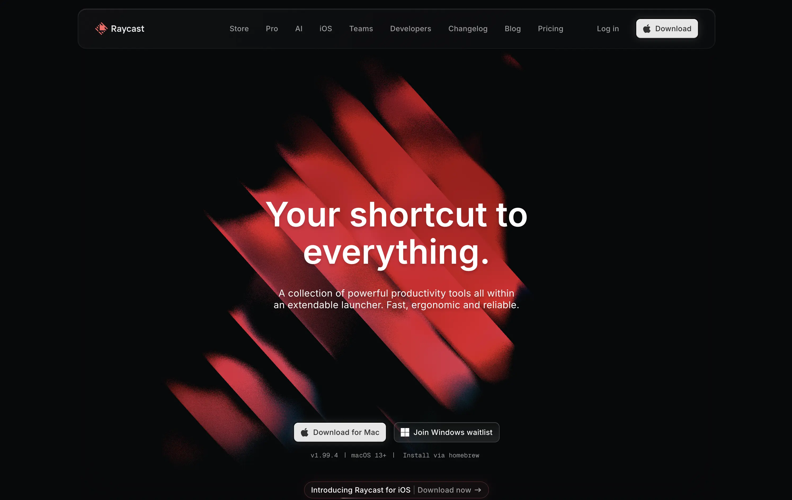
Raycast
↗
SaaS
Productivity
Centered
Bold & Direct
Descriptive
Download App
Multi-CTA Block
Interactive
Custom Animation
Loading Animation
Dark Mode
White
Red
Sans serif
B2C
Home Page
Custom Code
launcher app, power user tool, developer productivity, dark aesthetic, interactive background, custom animation, glowing motion, fast utility, keyboard-first UX, macOS-native, iOS launch, feature-rich
Raycast is a fast, extendable launcher that streamlines tasks and apps into one productivity command center.
Hero opens with striking motion and subtle interactivity, creating immediate emotional pull. Headline is short and memorable. Strong clarity on what it is and what it solves. Layout is focused, high-conversion and visually polished.
Positioning as a utility layer for power users is clear. Dark mode and minimalist tone align with dev-savvy audiences. Strong balance of brand and product without overexplaining.
This layout balances technical utility with human impact, aligning well with Algolia’s positioning as an API-first but UX-aware company. The mobile UI reinforces product value visually, while the logo wall signals scale and trust for enterprise buyers. The tone is clear, benefit-led, and appropriate for high-intent decision-makers evaluating AI tools for customer experience. This is a solid enterprise-facing hero built to perform.
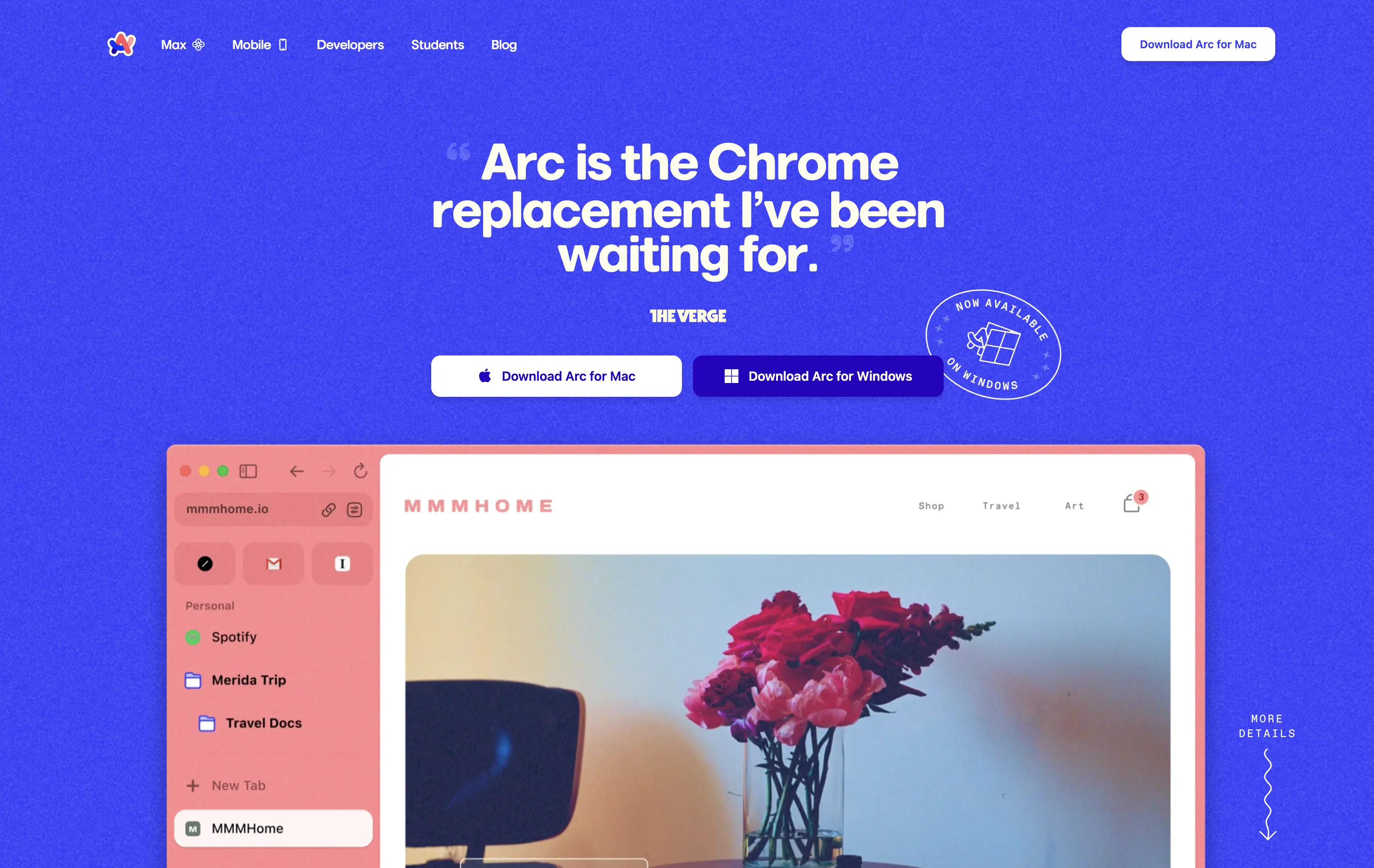
Arc
↗
SaaS
Productivity
Centered
Proof-Heavy
Multi-CTA Block
Product UI
Social Proof
Duotone
White
Blue
Display
Sans serif
B2C
Home Page
Custom Code
consumer browser, verge quote, UI-focused, product-led design, browser replacement, macOS-first, desktop software, soft but bold, macOS-style visual language, motion-laced layout, quirky detail, testimonial-driven, vibrant blue, feature-forward
Arc is a modern browser designed to replace legacy browser with a reimagined UI and productivity-first experience.
This hero grabs attention immediately with a high-credibility quote as the headline, bold visual language, and a visible product UI that instantly signals differentiation. The CTA is clear and platform-specific. The color treatment and layout feel energetic and modern, aligning well with consumer expectations for a desktop app.
Strong positioning via social proof rather than abstract messaging. The hero makes the shift-from-Chrome angle explicit, appealing to an informed, tech-forward audience. High trust and strong product framing.
This layout balances technical utility with human impact, aligning well with Algolia’s positioning as an API-first but UX-aware company. The mobile UI reinforces product value visually, while the logo wall signals scale and trust for enterprise buyers. The tone is clear, benefit-led, and appropriate for high-intent decision-makers evaluating AI tools for customer experience. This is a solid enterprise-facing hero built to perform.
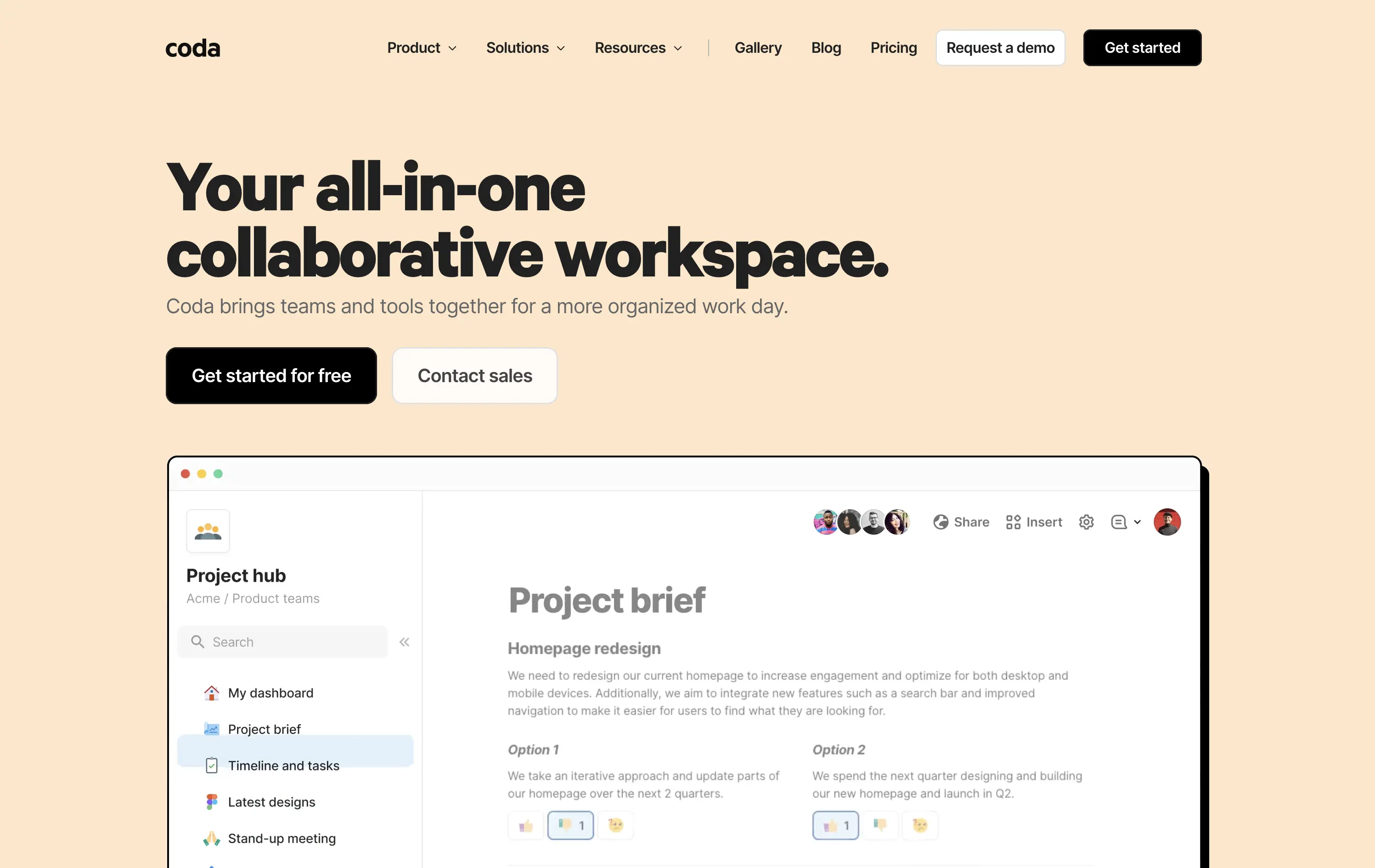
Coda
↗
SaaS
Collaboration
Productivity
Left-aligned
Descriptive
Empowering
Multi-CTA Block
Product UI
Duotone
White
Yellow
Display
Sans serif
Hybrid
Home Page
Custom Code
doc-as-app, team workflow, internal tools, collaborative workspace, UI product demo, hybrid teams, sales enablement, project brief, minimal design, low-code logic, enterprise-friendly, live multiplayer,
Coda is a collaborative doc platform that combines documents, spreadsheets, and apps into one unified workspace for teams.
The hero communicates clearly with a straightforward headline and strong product shot. Layout is easy to follow, and the dual CTA gives distinct paths for self-serve or sales-led funnels. The visual hierarchy is solid, though not emotionally charged.
Coda leads with clarity over flash. The message and layout prioritize breadth of use and enterprise readiness. Great fit for decision-makers looking to unify scattered tools into a single workspace.
This layout balances technical utility with human impact, aligning well with Algolia’s positioning as an API-first but UX-aware company. The mobile UI reinforces product value visually, while the logo wall signals scale and trust for enterprise buyers. The tone is clear, benefit-led, and appropriate for high-intent decision-makers evaluating AI tools for customer experience. This is a solid enterprise-facing hero built to perform.
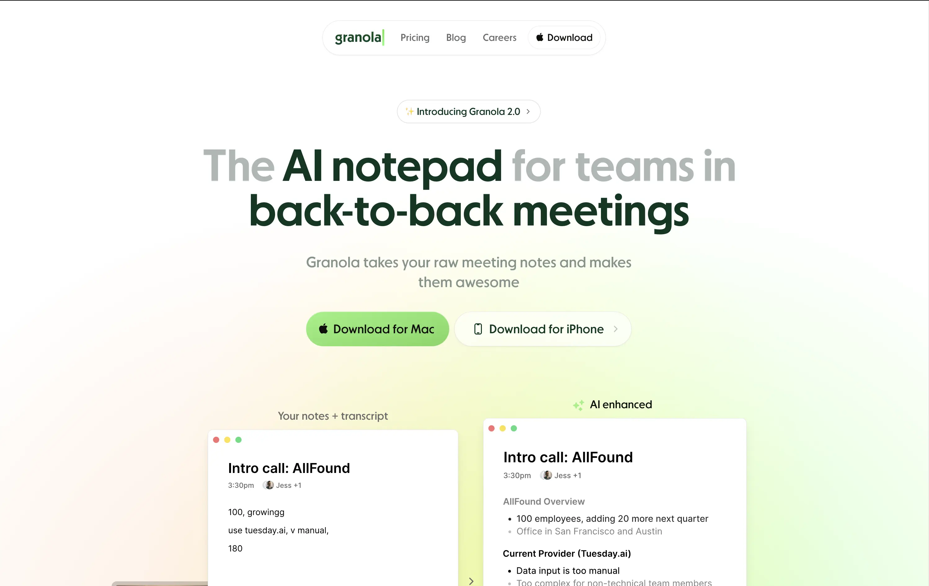
Granola
↗
SaaS
AI Tools
Productivity
Centered
Descriptive
Pain-driven
Download App
Multi-CTA Block
Product UI
Announcement
Gradient
Light Mode
Green
Sans serif
Hybrid
Home Page
Custom Code
AI notepad, transcript comparison, Mac/iOS focus, pastel gradient, clean UX, AI productivity, note app, task-lite SaaS, small team positioning, time-saving tool, App Store-ready, side-by-side visual
Granola is an AI notepad that turns messy meeting notes into clean, structured transcripts — built for teams with nonstop meetings.
The hero is practical and conversion-focused. It quickly communicates what the tool does and for whom. The side-by-side note demo is immediately legible and shows before/after clarity. Headline focuses on team context rather than just AI, which grounds it. Download CTAs feel native and frictionless. The soft green gradient is calming without feeling sterile. Could benefit from stronger brand differentiation, but it nails clarity and accessibility for a high-frequency use case.
Laser-targeted to productivity-challenged teams. Hero clearly communicates utility and streamlines onboarding. UI preview builds instant understanding, and the download CTAs suggest a tool that fits right into daily workflows.
This layout balances technical utility with human impact, aligning well with Algolia’s positioning as an API-first but UX-aware company. The mobile UI reinforces product value visually, while the logo wall signals scale and trust for enterprise buyers. The tone is clear, benefit-led, and appropriate for high-intent decision-makers evaluating AI tools for customer experience. This is a solid enterprise-facing hero built to perform.
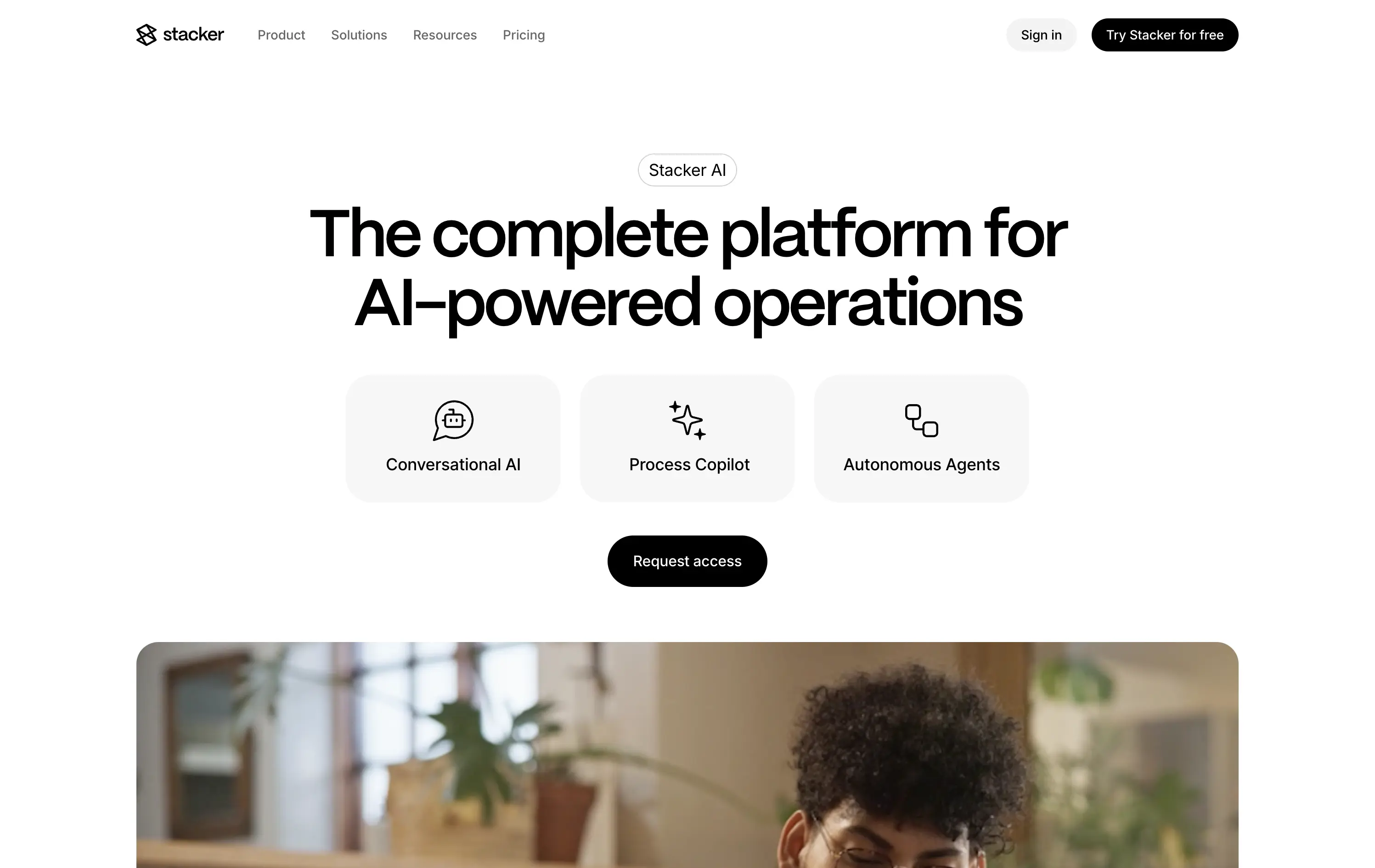
Stacker
↗
SaaS
AI Tools
Productivity
Minimal
Centered
Descriptive
Professional
Single Button
Photography
Video
Light Mode
Black
Sans serif
B2B
Home Page
Framer
AI operations platform, light minimal hero, conversational UI, agent automation, process copilots, clean layout, icon-based features, white space emphasis, AI-native workflow, modern SaaS tone, B2B AI, high-trust layout, early-stage beta feel
Stacker AI helps companies automate internal operations with conversational interfaces, process copilots, and autonomous agents built into their workflows.
Clarity-forward hero with minimal visual noise. Headline is direct. Icons give quick scannability of offering. “Request access” indicates early-stage invite model, aligning with AI-native positioning.
Strong entry for teams exploring AI-first automation. The restrained layout and soft interaction style suggest maturity and stability—a counterbalance to the experimental nature of AI agents.
This layout balances technical utility with human impact, aligning well with Algolia’s positioning as an API-first but UX-aware company. The mobile UI reinforces product value visually, while the logo wall signals scale and trust for enterprise buyers. The tone is clear, benefit-led, and appropriate for high-intent decision-makers evaluating AI tools for customer experience. This is a solid enterprise-facing hero built to perform.
Outreach
↗
SaaS
AI Tools
Productivity
Full Width
Centered
Benefit-Driven
Confident
Multi-CTA Block
Video
Product UI
Imagery-Based
Blue
Sans serif
B2B
Home Page
Custom Code
sales automation, B2B SaaS, AI forecasting, sales rep enablement, RevOps tools, productivity workflows, confident tone, enterprise platform, full-width layout, animated product demo, AI sales co-pilot, multi-CTA, modern interface, precision messaging, dark UI
Outreach helps B2B teams improve pipeline precision and sales productivity through AI-powered automation and forecasting tools.
The hero is product-led with a high-trust, enterprise feel. The headline is assertive, speaking directly to the sales persona. Subheadline adds clarity and lists functional benefits. Background motion shows product value without distraction. CTAs are split by intent: demo vs. explore. The full-width layout conveys confidence and scale.
Clearly positioned for decision-makers in SalesOps and RevOps. Copy and layout support mid-funnel engagement with strong product-centric framing and trusting tone.
This layout balances technical utility with human impact, aligning well with Algolia’s positioning as an API-first but UX-aware company. The mobile UI reinforces product value visually, while the logo wall signals scale and trust for enterprise buyers. The tone is clear, benefit-led, and appropriate for high-intent decision-makers evaluating AI tools for customer experience. This is a solid enterprise-facing hero built to perform.
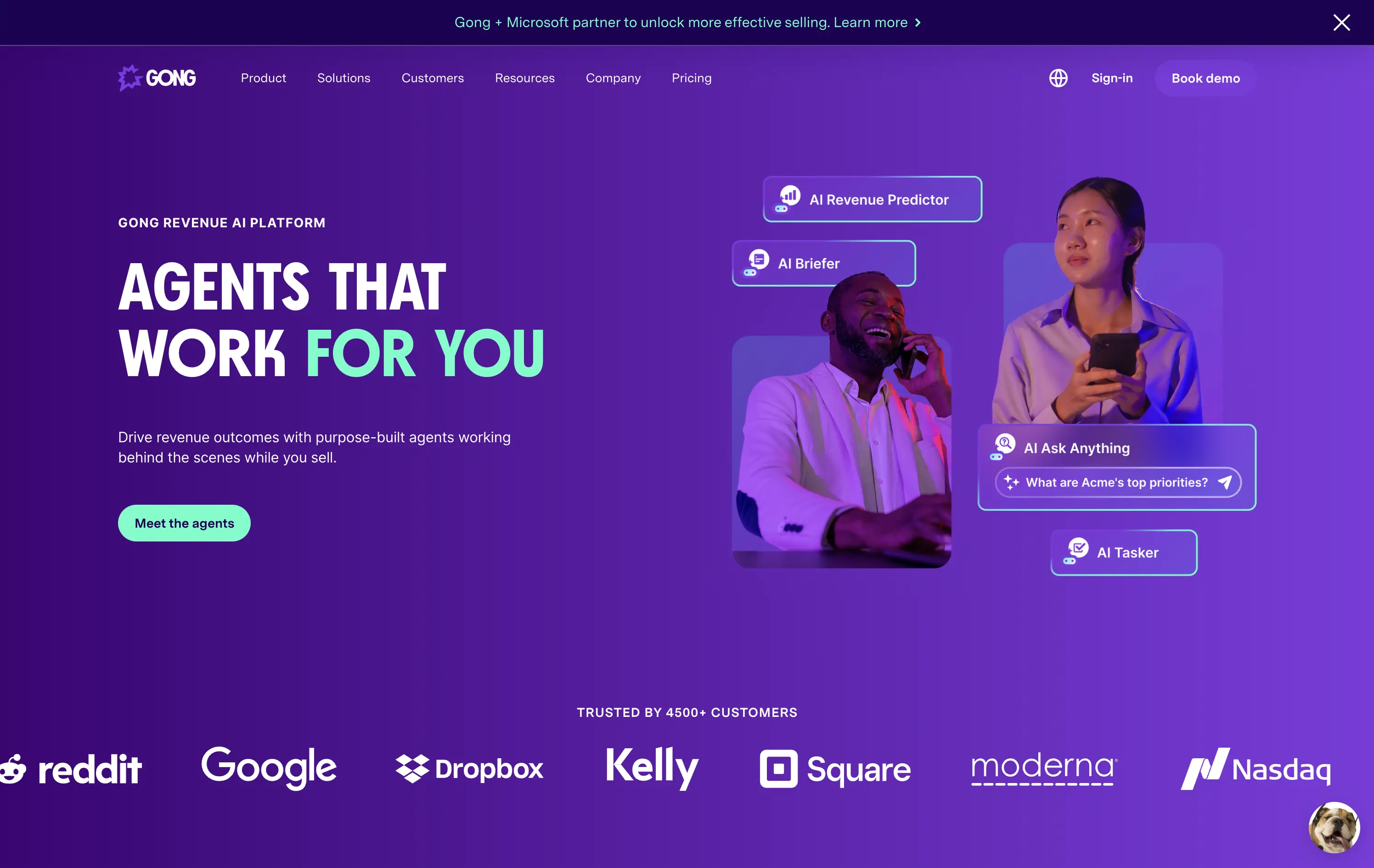
Gong
↗
SaaS
AI Tools
Productivity
Split Grid
Left-aligned
Benefit-Driven
Confident
Single Button
Photography
Illustration
Logo Wall
Announcement
Duotone
Blue
Purple
Sans serif
B2B
Home Page
Wordpress
sales AI, B2B revenue platform, utility CTA, animated overlays, client logos, enterprise trust signals, AI productivity agents, dark gradient palette, conversational UI, split hero grid, vibrant lighting, modern SaaS, sales enablement, motion interface cues, product-forward layout
Gong helps sales teams boost revenue by deploying AI-powered agents that automate insights, prep, and task handling across the sales cycle.
The hero is clear and conversion-aware. Headline delivers a confident value prop, supported by animated tooltips that make the product’s AI capabilities tangible. The “Meet the agents” CTA invites deeper engagement. Strong use of customer logos boosts enterprise credibility. Overall, it's tight, modern, and visually active without overwhelming.
Tailored for mid-to-late funnel enterprise leads. High-trust layout and confident tone reflect maturity and market leadership in B2B sales tech.
This layout balances technical utility with human impact, aligning well with Algolia’s positioning as an API-first but UX-aware company. The mobile UI reinforces product value visually, while the logo wall signals scale and trust for enterprise buyers. The tone is clear, benefit-led, and appropriate for high-intent decision-makers evaluating AI tools for customer experience. This is a solid enterprise-facing hero built to perform.
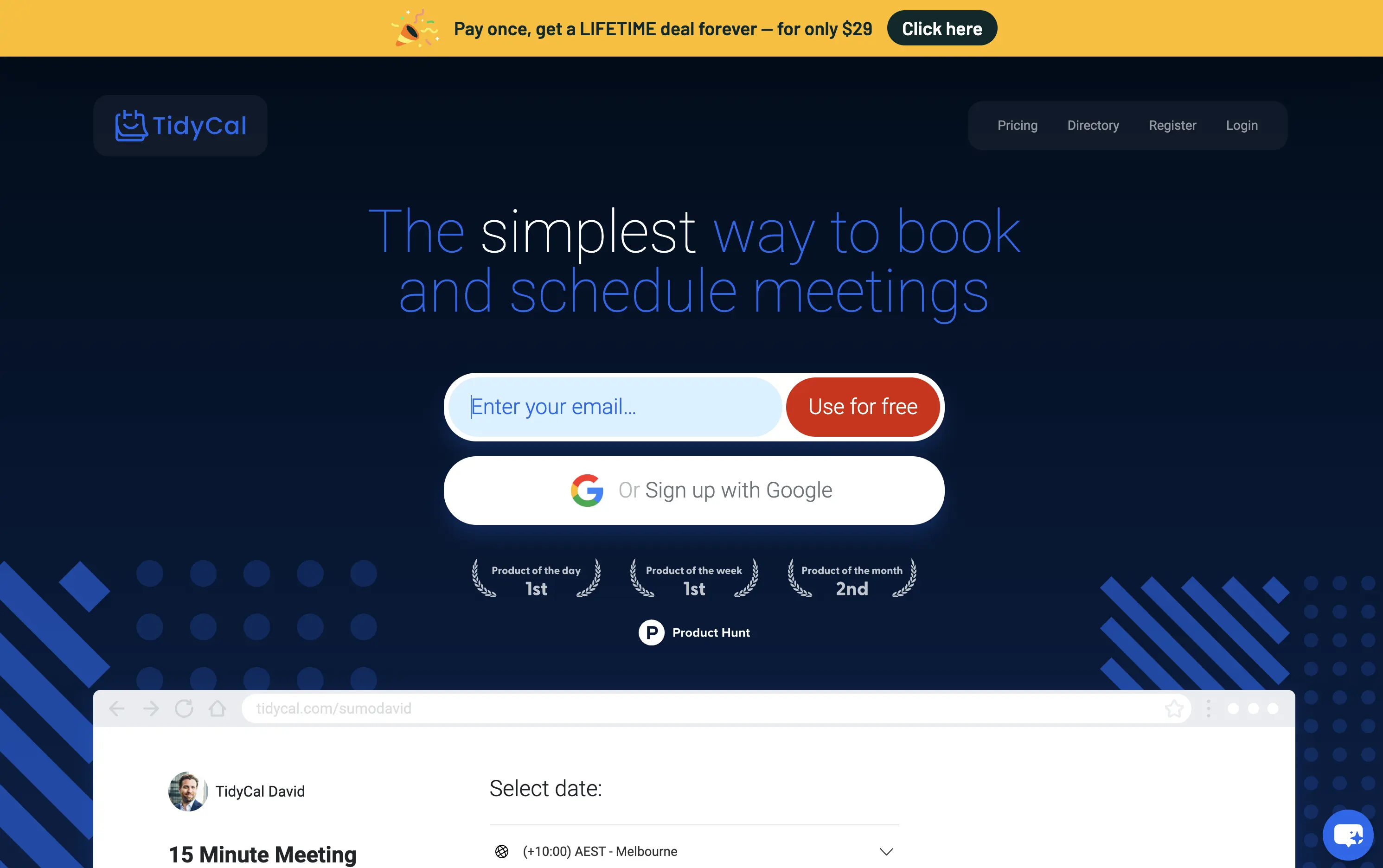
TidyCal
↗
SaaS
Productivity
Centered
Benefit-Driven
Descriptive
Email Capture
Social Proof
Announcement
Badges
Dark Mode
Blue
Sans serif
B2B
Home Page
Custom Code
low-cost alternative, one-time payment SaaS, scheduling tool, Product Hunt-backed, no-frills UI, budget-friendly SaaS, email-first CTA, dark mode hero, indie stack, small team SaaS, lifetime deal, value-first messaging, stripped-down UX, pricing transparency
TidyCal is a simple, affordable calendar booking tool offering lifetime access for a one-time fee — ideal for solo professionals and budget-conscious teams.
TidyCal’s hero is clear on purpose but light on finesse. The lifetime deal banner is highly conversion-optimized and immediately grabs attention. However, the headline lacks typographic hierarchy and fails to land with impact — “simplest” stands out visually, but the phrasing overall feels flat. The input-first layout is user-friendly, but inconsistent sizing and visual imbalance reduce perceived trust. This hero converts, but it doesn’t inspire.
The pricing-first message works for a cost-sensitive audience. But the unrefined layout and typographic decisions may limit credibility with enterprise or design-aware users. Prioritizes affordability over perception of quality.
This layout balances technical utility with human impact, aligning well with Algolia’s positioning as an API-first but UX-aware company. The mobile UI reinforces product value visually, while the logo wall signals scale and trust for enterprise buyers. The tone is clear, benefit-led, and appropriate for high-intent decision-makers evaluating AI tools for customer experience. This is a solid enterprise-facing hero built to perform.
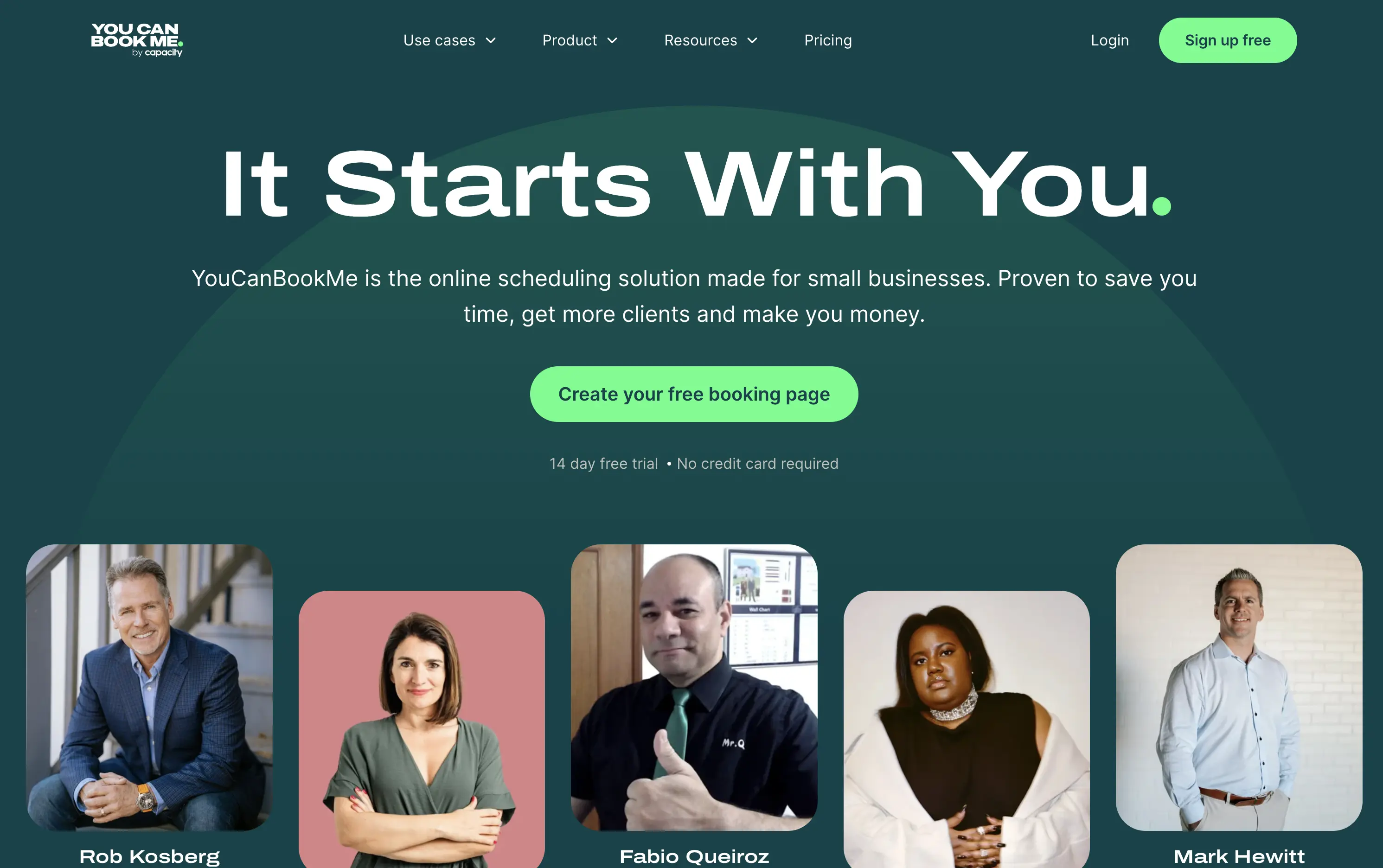
You Can Book Me
↗
SaaS
Productivity
Centered
Descriptive
Empowering
Single Button
Photography
Media Gallery
Duotone
Green
Display
B2B
Home Page
solo-friendly SaaS, scheduling tool, real user proof, small business productivity, personal headline, free trial, soft design system, emotional copy, utility-first, community-led, freemium conversion, authenticity-first visuals, indie SaaS
YouCanBook.Me is a scheduling platform designed to help small businesses streamline bookings, save time, and convert more leads through simple, flexible scheduling pages.
The hero centers emotional relatability. “It Starts With You” feels direct and empowering, while the subhead offers a clear, benefit-first pitch. The design isn’t flashy — it leans on authenticity, with non-art-directed portraits adding a raw, real-user touch. The green CTA is visible, though visually softer than competitors. While the layout lacks design sophistication, it feels personal and conversion-minded.
Targeting small business owners and service providers with a tone of support and relatability. It emphasizes utility over polish, aiming to win trust through clarity, familiarity, and proof of real-world use.
This layout balances technical utility with human impact, aligning well with Algolia’s positioning as an API-first but UX-aware company. The mobile UI reinforces product value visually, while the logo wall signals scale and trust for enterprise buyers. The tone is clear, benefit-led, and appropriate for high-intent decision-makers evaluating AI tools for customer experience. This is a solid enterprise-facing hero built to perform.
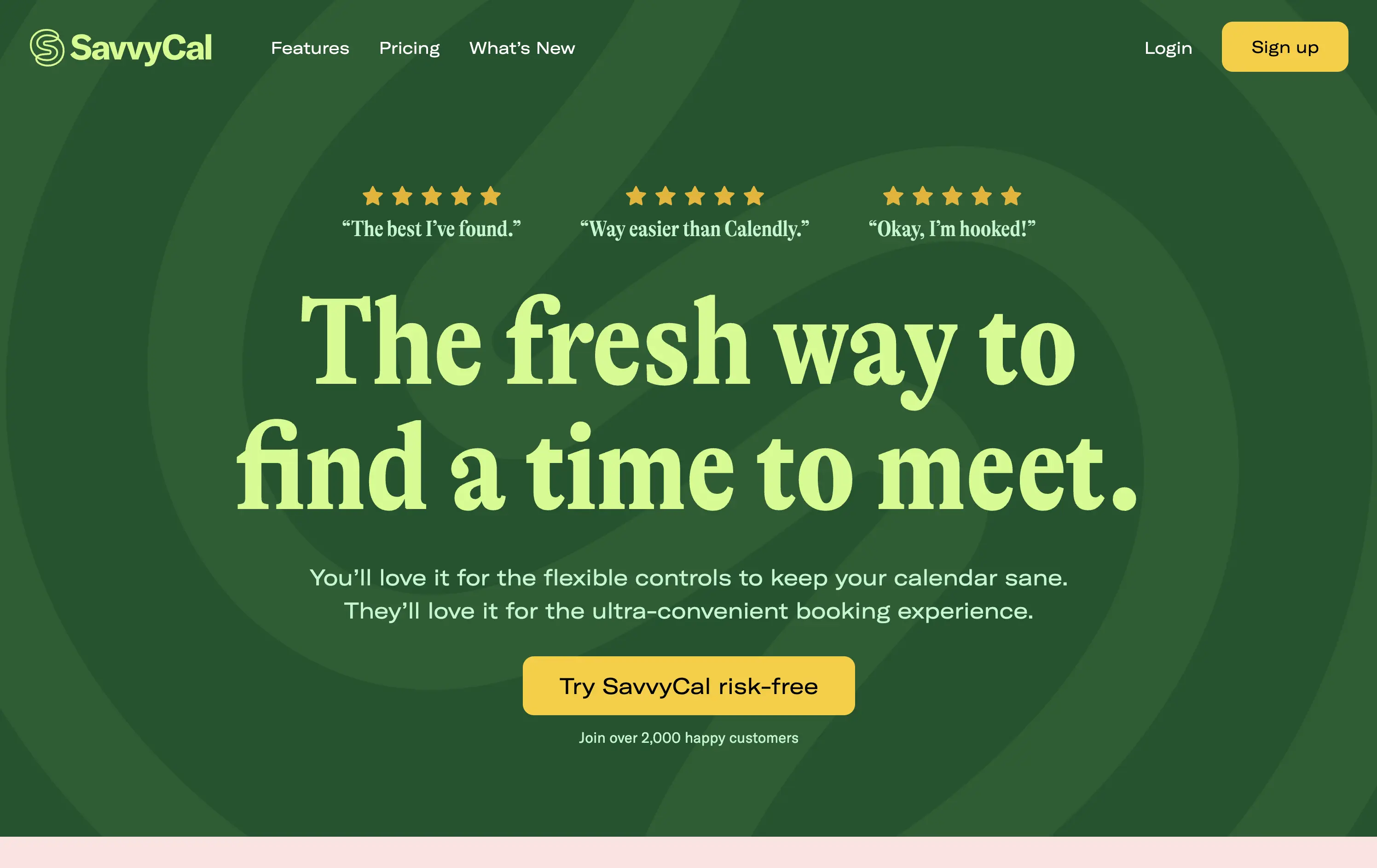
Savvy Cal
↗
SaaS
Productivity
Centered
Playful
Aspirational
Single Button
Illustration
Social Proof
Duotone
Green
Yellow
Display
Serif
B2B
Home Page
Custom Code
calendly alternative, scheduling SaaS, friendly UI, bold typography, customer-first tone, startup productivity tools, anti-friction branding, green-on-green palette, centered layout, calendar control, review-driven, solo founder energy, fresh design, clean booking UX
SavvyCal is a scheduling tool designed to simplify meeting coordination with flexible, user-first controls and a clean, friendly interface.
The hero leans hard into charm and confidence. The bold, serif headline feels conversational and clever. The contrast between green tones is controlled, and the centered layout places the CTA in a visually dominant spot. Social proof is integrated at the top with testimonial snippets to validate performance. It’s conversion-ready, especially for users looking for a more human alternative to Calendly.
Tailored to solo operators, indie founders, and small teams seeking simplicity without the enterprise bloat. Balances approachability and professionalism through tone and visual treatment. Micro-proof adds trust without noise.
This layout balances technical utility with human impact, aligning well with Algolia’s positioning as an API-first but UX-aware company. The mobile UI reinforces product value visually, while the logo wall signals scale and trust for enterprise buyers. The tone is clear, benefit-led, and appropriate for high-intent decision-makers evaluating AI tools for customer experience. This is a solid enterprise-facing hero built to perform.
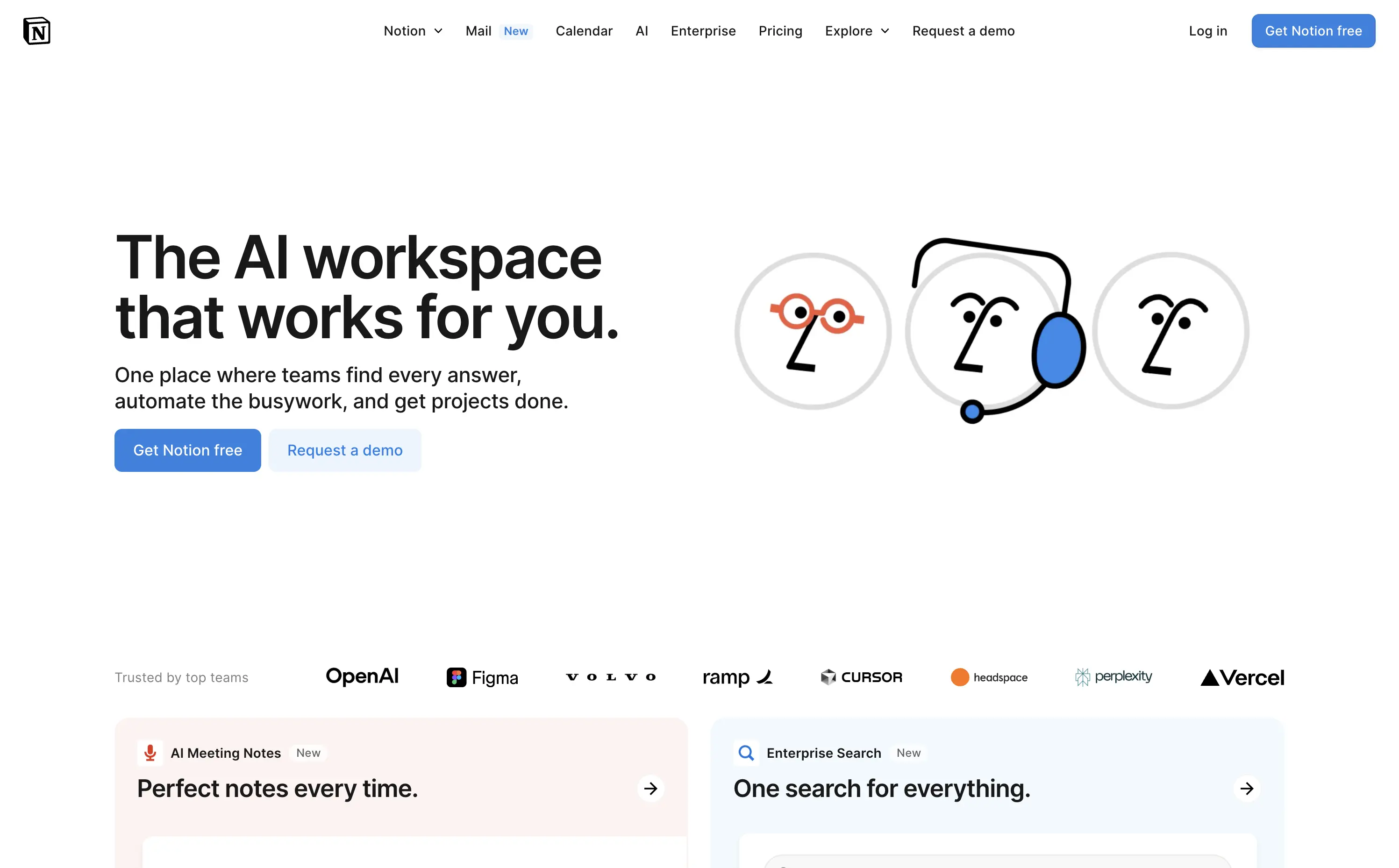
Notion
↗
SaaS
AI Tools
Productivity
Split Grid
Left-aligned
Aspirational
Empowering
Multi-CTA Block
Illustration
Logo Wall
Custom Animation
Light Mode
Blue
Sans serif
Hybrid
Home Page
Custom Code
AI workspace, animated avatars, productivity OS, enterprise-ready, personal + team use, modular interface, brand-first UI, continuation scroll, flexible use cases, playful sophistication, high-trust visual, calm interface, utility meets emotion, scalable collaboration
Notion is an all-in-one AI workspace that helps teams and individuals write, organize, automate, and collaborate — from startups to enterprise scale.
This hero strikes a balance between visual charm and clarity. The animation of AI personas dramatizes the core value prop — “they work for you” — and makes the abstract feel accessible. The headline is direct and benefit-led, while the subhead outlines practical use cases. Dual CTAs target both entry-level and enterprise buyers. Scrolling reveals feature blocks, encouraging deeper exploration. Trusted-by logos create instant credibility.
A masterclass in multi-audience positioning — speaks to freelancers and Fortune 500s simultaneously. Smart blend of human tone and scalable utility, reinforced visually through motion, brand trust cues, and modular follow-up content.
This layout balances technical utility with human impact, aligning well with Algolia’s positioning as an API-first but UX-aware company. The mobile UI reinforces product value visually, while the logo wall signals scale and trust for enterprise buyers. The tone is clear, benefit-led, and appropriate for high-intent decision-makers evaluating AI tools for customer experience. This is a solid enterprise-facing hero built to perform.
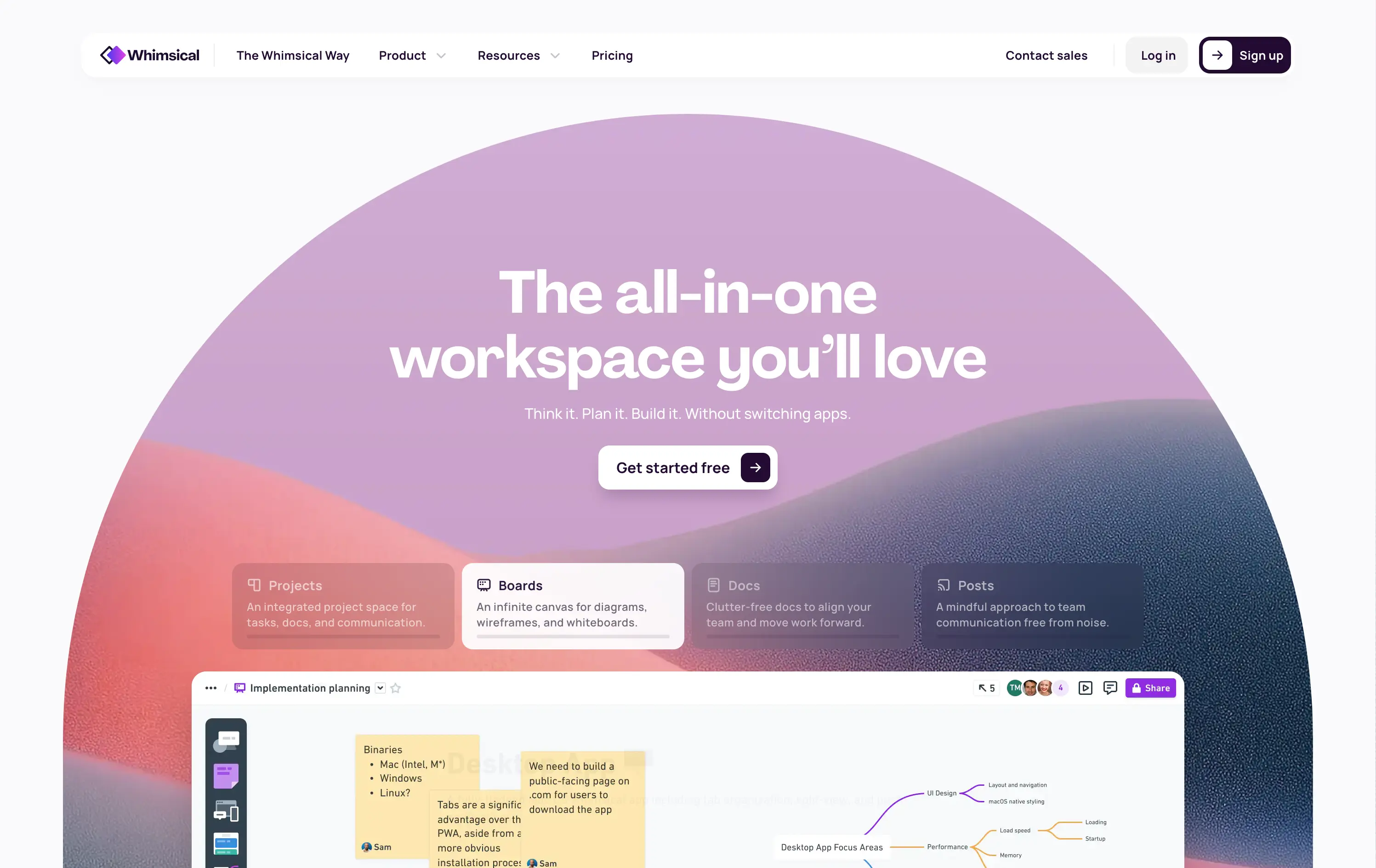
Whimsical
↗
SaaS
Collaboration
Productivity
Inset
Centered
Benefit-Driven
Empowering
Single Button
Illustration
Interactive
Product UI
Gradient
Light Mode
Pink
Purple
Orange
Sans serif
B2B
Home Page
Custom Code
collaborative workspace, pastel gradient, feature carousel, lightweight SaaS, sticky headline, soft UI, premium-yet-friendly, high-trust design, zero-friction onboarding, visual task planning, alternative to Miro, team productivity
Whimsical is an all-in-one visual workspace for teams to plan, wireframe, write, and collaborate—without switching between tools.
The hero immediately differentiates with its warm, gradient-driven palette and curved editorial layout. Headline is sticky and emotional, while the subheadline cues action and ease. Below, animated modules skim through key features—smartly designed to reduce cognitive load while expanding curiosity. The product UI is fully visible and feels friendly. CTA is low friction and well-placed. Compared to competitors, this layout feels more human-centered and less corporate, while still conveying product intelligence.
Strong product-led growth positioning with emotional stickiness. Visuals balance friendliness with focus. Motion helps drive upfront clarity, and layout choice favors quick scanning—well-suited for both individual users and team leads.
This layout balances technical utility with human impact, aligning well with Algolia’s positioning as an API-first but UX-aware company. The mobile UI reinforces product value visually, while the logo wall signals scale and trust for enterprise buyers. The tone is clear, benefit-led, and appropriate for high-intent decision-makers evaluating AI tools for customer experience. This is a solid enterprise-facing hero built to perform.
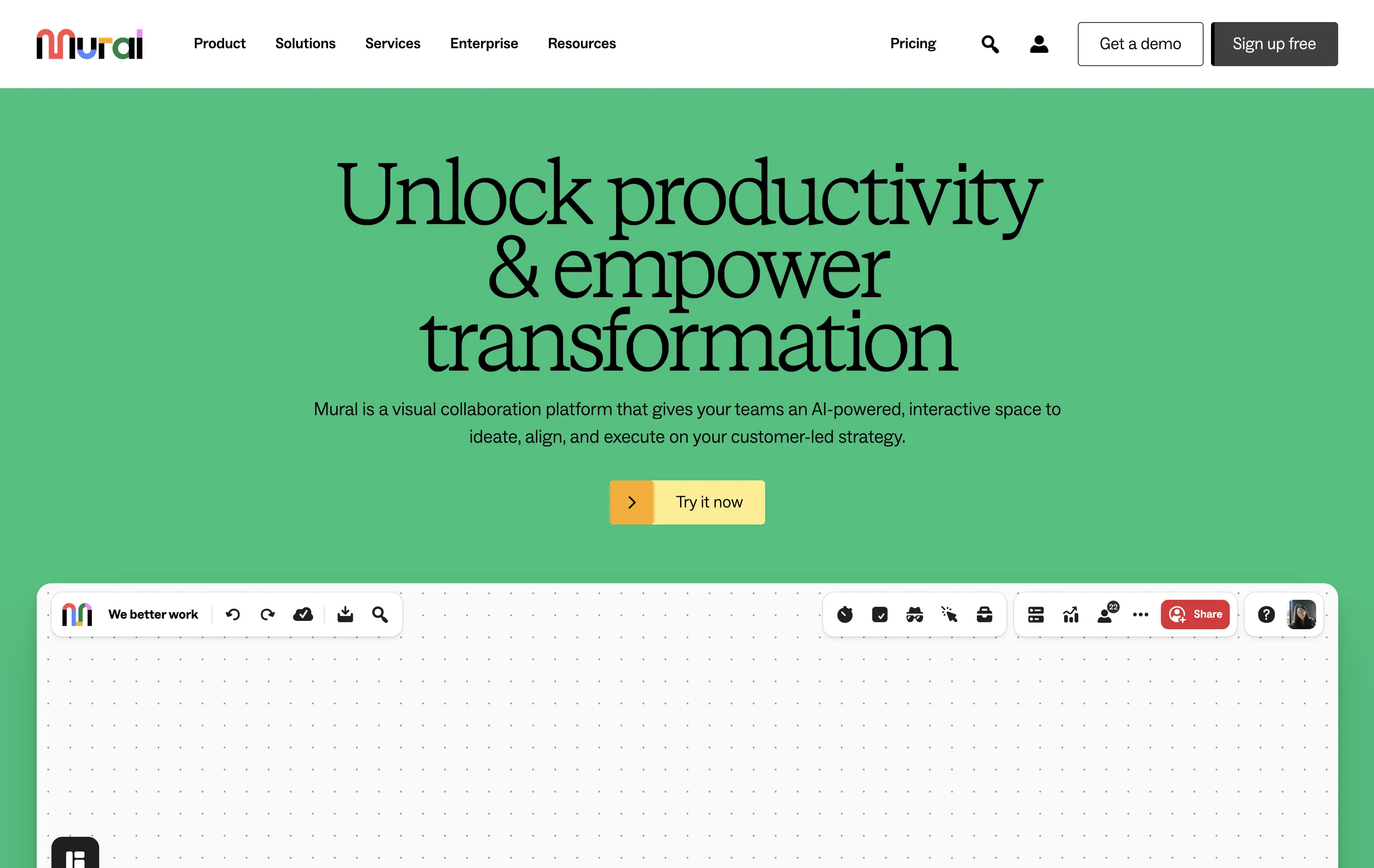
Mural
↗
SaaS
Collaboration
Productivity
Centered
Benefit-Driven
Aspirational
Single Button
Product UI
Multi-color
Green
Yellow
Serif
B2B
Home Page
Webflow
team productivity tool, familiar UI, friendly tone, AI-supported collaboration, light mode, optimistic copy, future-focused, dotted grid, visual-first, professional teams, clean hierarchy, flat color background
Mural is a visual collaboration platform that helps teams ideate, align, and execute strategy in real time with AI support.
The hero opens with a strong aspirational headline and bright color blocking that draws attention quickly. The serif typeface adds gravitas, while the clean UI below hints at practical use. However, the product preview could be more immediate—only the top edge of the canvas is visible, which may delay user comprehension. CTA is simple and visible. Overall, the section signals clarity and ease but misses some depth in product proof above the fold.
Strategically aimed at enterprise teams navigating transformation. The tone leans inspirational, while the visual style keeps it accessible. Immediate clarity, but lacks an element to tease the scroll action to anchor the pitch.
This layout balances technical utility with human impact, aligning well with Algolia’s positioning as an API-first but UX-aware company. The mobile UI reinforces product value visually, while the logo wall signals scale and trust for enterprise buyers. The tone is clear, benefit-led, and appropriate for high-intent decision-makers evaluating AI tools for customer experience. This is a solid enterprise-facing hero built to perform.
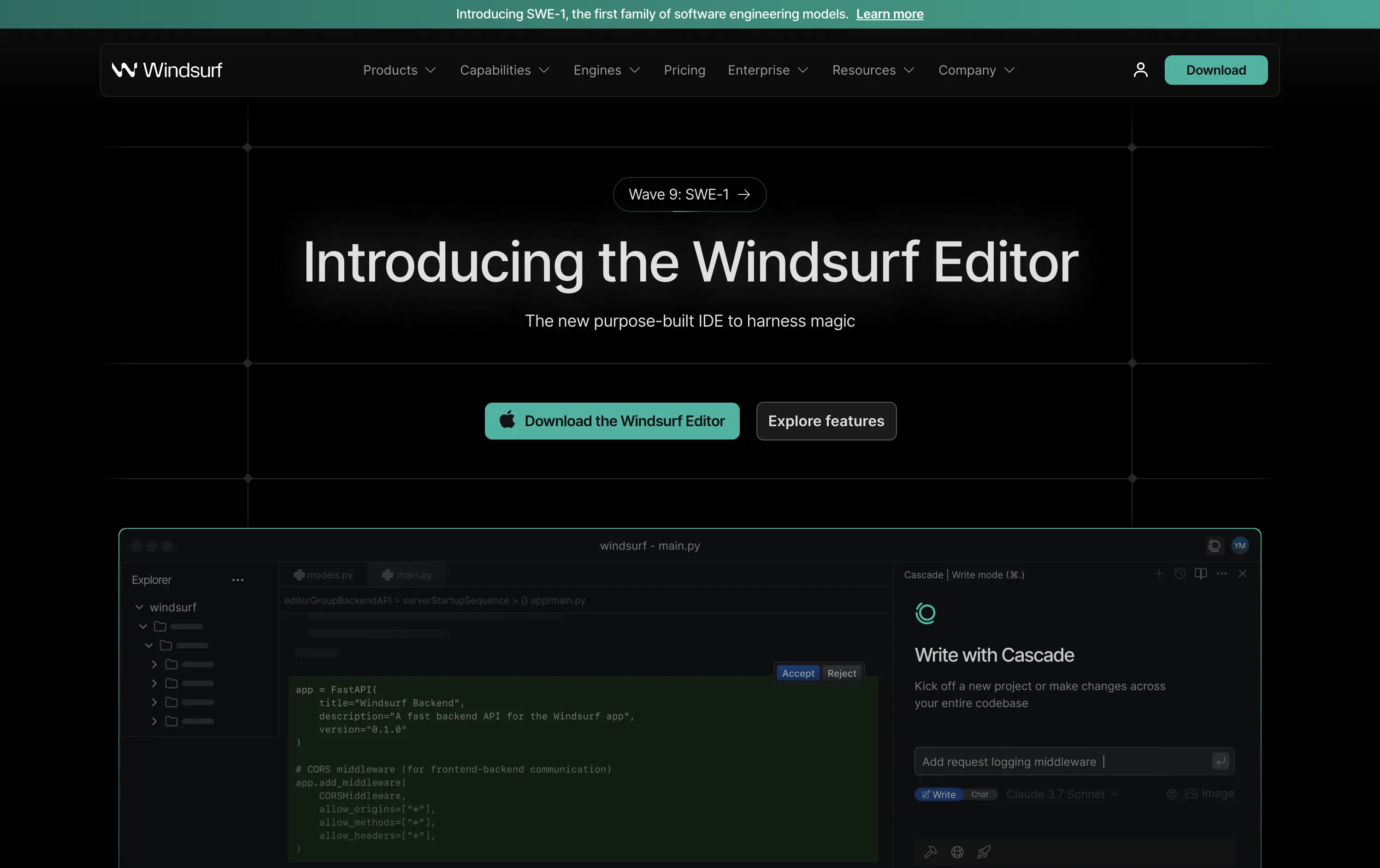
Windsurf
↗
DevTools
AI Tools
Productivity
Centered
Descriptive
Multi-CTA Block
Product UI
Custom Animation
Announcement
Dark Mode
Green
Sans serif
B2B
Home Page
Custom Code
IDE launch, developer-centric UI, dark mode, AI-enhanced coding, precision layout, launch-focused, performance signaling, Claude integration, copy-to-download conversion, dev community tone, structured layout, hero with proof
Windsurf is a new AI-powered IDE purpose-built for modern software engineers—integrating tools, models, and workflows into one seamless editing experience.
This is a pure product launch hero—focused, fast, and confident. The headline introduces the new editor directly, with “harness magic” adding flair. A download CTA and “Explore features” link address both high and medium intent users. Visual hierarchy is crisp: product UI preview beneath gives immediate credibility. The dark grid background and neon teal accents push a high-performance, developer-native aesthetic. Motion on the UI keeps it alive without distracting. Overall: efficient, well-structured, and optimized for launch-phase conversion.
A highly product-led approach targeted at technical users. The CTA hierarchy and layout structure prioritize credibility and momentum. Strong framing for launch, with a clear focus on dev audience mindset and intent.
This layout balances technical utility with human impact, aligning well with Algolia’s positioning as an API-first but UX-aware company. The mobile UI reinforces product value visually, while the logo wall signals scale and trust for enterprise buyers. The tone is clear, benefit-led, and appropriate for high-intent decision-makers evaluating AI tools for customer experience. This is a solid enterprise-facing hero built to perform.
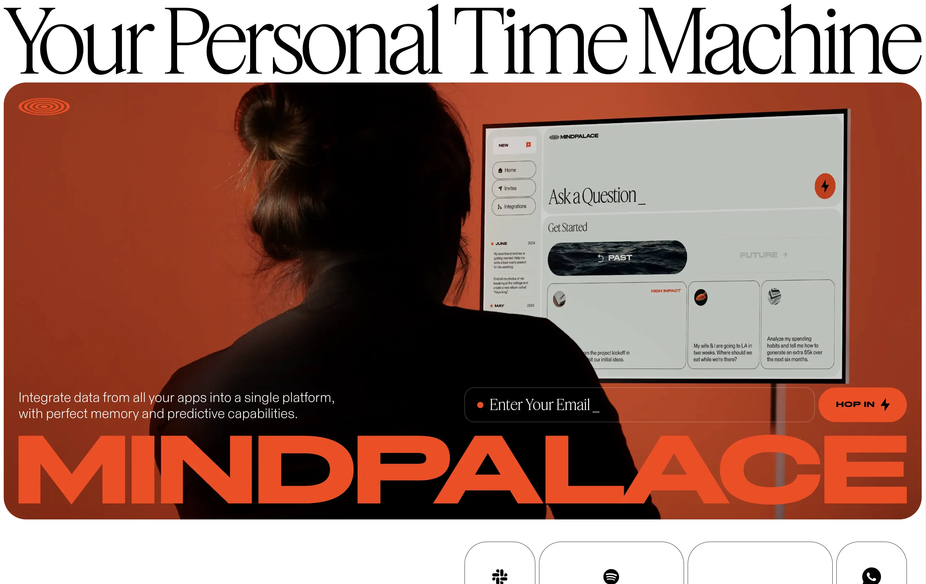
MindPalace AI
↗
SaaS
AI Tools
Productivity
Inset
Full Width
Editorial
Founder-Led Voice
Abstract / Conceptual
Email Capture
Photography
Product UI
Imagery-Based
Light Mode
Red
Black
Display
B2C
Home Page
Webflow
cinematic design, founder-led brand, AI memory tool, data integration, futuristic UI, monochrome orange palette, provocative headline, low-context messaging, brand-first hero, retro-futurist aesthetic, predictive tech, narrative design, mood-driven UX
Mindpalace connects and organizes your digital life into a single interface with memory recall and predictive AI tools—part archive, part assistant.
This hero is brand-first, product-second. The editorial headline draws intrigue but offers zero utility without scrolling. Subheadline hints at integration and predictive capabilities but avoids details. The strength lies in the striking art direction: backlit subject, glowing screen, and color-blocked monochrome palette immediately set a cinematic tone. Product UI is visible but not interactive. The email capture field is subtle and stylish, fitting the brand’s creative edge. It’s a bold anti-SaaS approach—prioritizing identity over clarity.
Mindpalace positions itself as a visionary, not a tool. Strategy leans into intrigue, betting on design-savvy early adopters who value storytelling and aesthetics over immediate clarity. Strong brand magnetism, low onboarding intent.
This layout balances technical utility with human impact, aligning well with Algolia’s positioning as an API-first but UX-aware company. The mobile UI reinforces product value visually, while the logo wall signals scale and trust for enterprise buyers. The tone is clear, benefit-led, and appropriate for high-intent decision-makers evaluating AI tools for customer experience. This is a solid enterprise-facing hero built to perform.
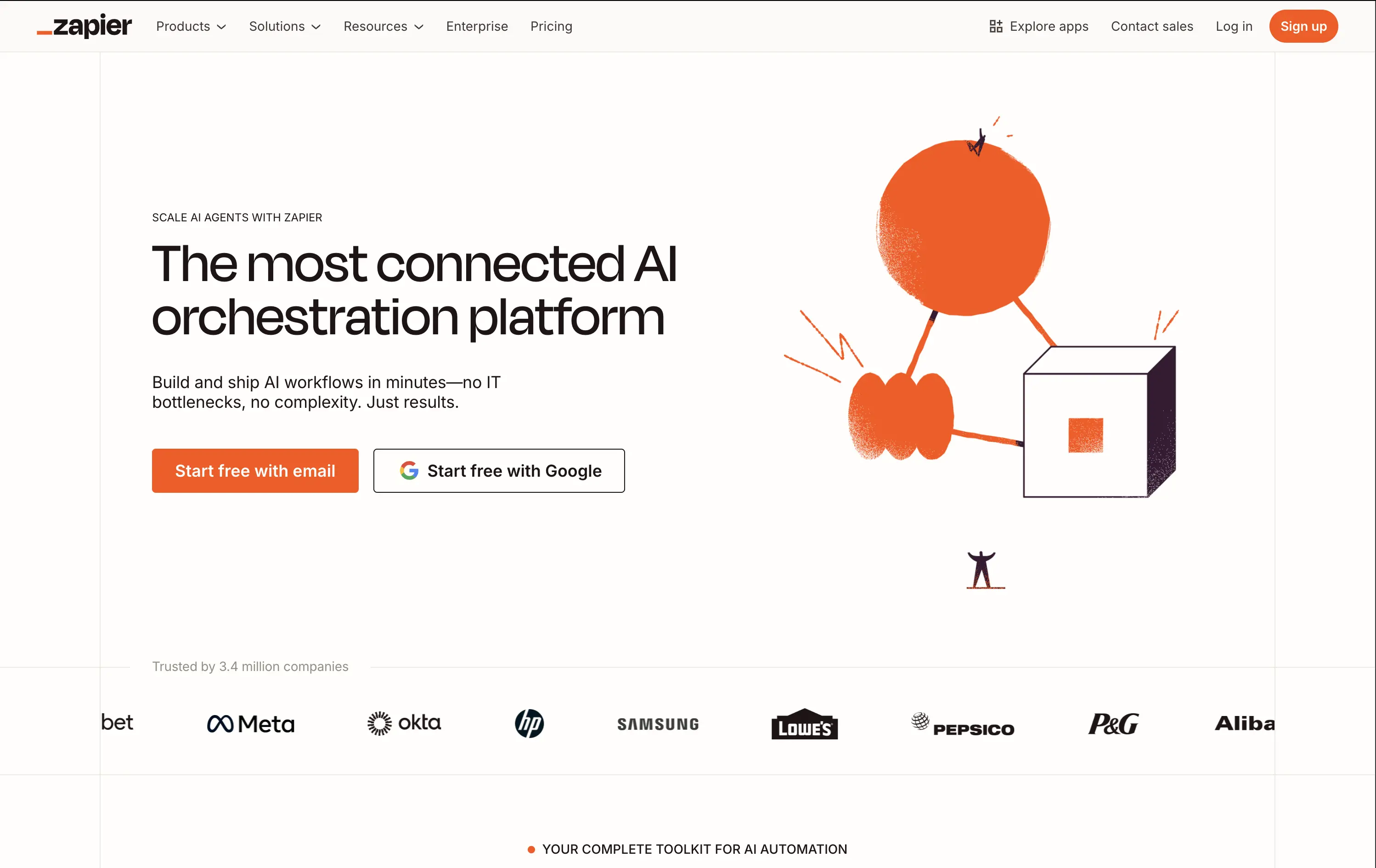
Zapier
↗
SaaS
AI Tools
No-Code
Split Grid
Left-aligned
Confident
Multi-CTA Block
Illustration
Logo Wall
Light Mode
Orange
Sans serif
Hybrid
Home Page
Builder.io
automation platform, brand-led, Zapier orange, illustration-based hero, high-trust layout, whitespace-heavy, freemium SaaS, mature product, enterprise credibility, visual shorthand, no-code workflow, minimal UI, no-code
Zapier is a no-code automation platform that connects 8,000+ apps so anyone can build time-saving workflows without engineering help.
The hero does a clean job of reinforcing brand authority. Copy is tight and direct. The whimsical graphic adds energy while the dual CTAs eliminate friction. It assumes pre-awareness and leans on Zapier’s brand strength.
Ideal for a mature product with wide adoption. Skips granular education to emphasize leadership and ease of use. Visuals and messaging feel like a confident category owner.
This layout balances technical utility with human impact, aligning well with Algolia’s positioning as an API-first but UX-aware company. The mobile UI reinforces product value visually, while the logo wall signals scale and trust for enterprise buyers. The tone is clear, benefit-led, and appropriate for high-intent decision-makers evaluating AI tools for customer experience. This is a solid enterprise-facing hero built to perform.
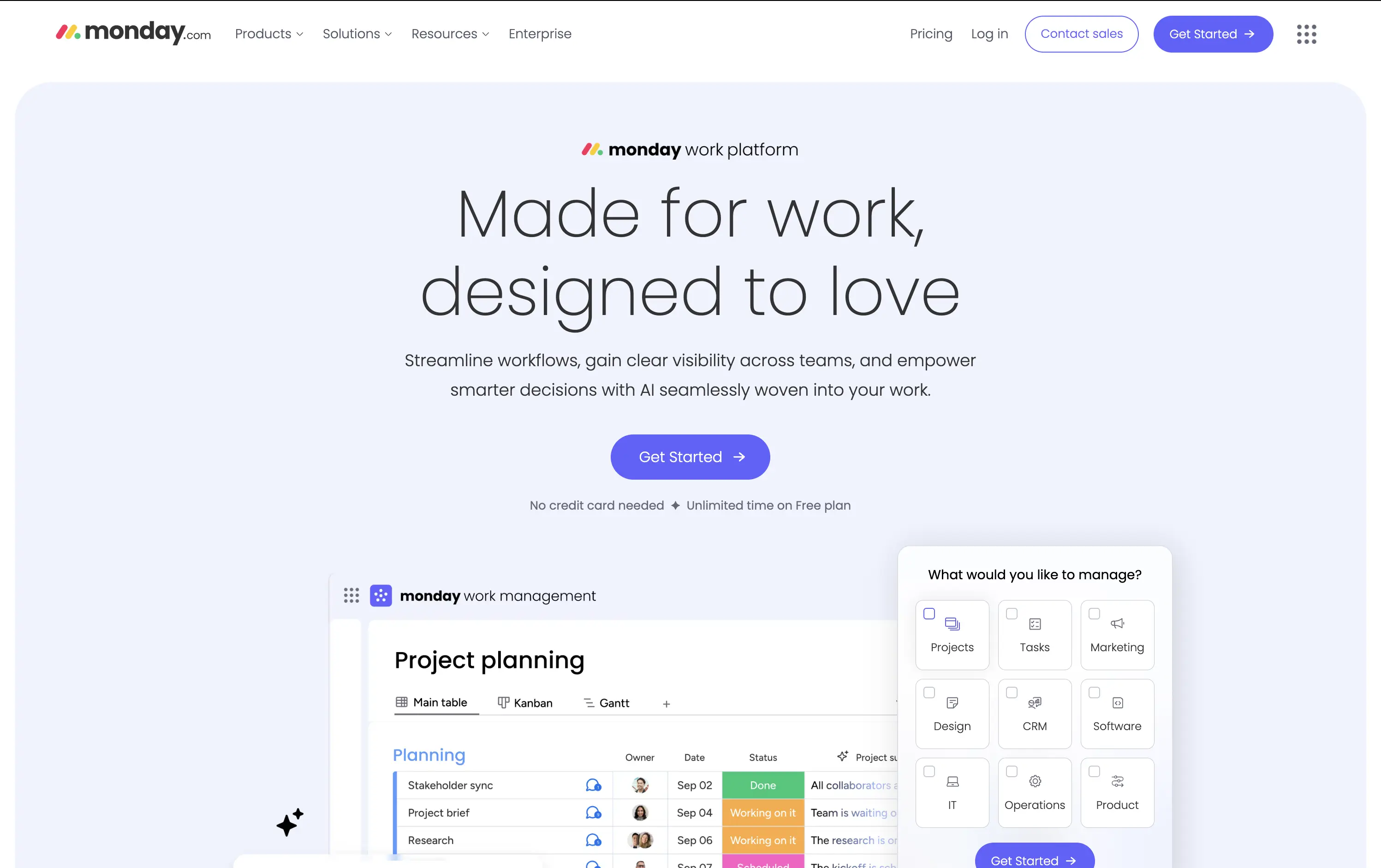
Monday
↗
SaaS
Productivity
Inset
Centered
Empowering
Single Button
Interactive
Product UI
Light Mode
Purple
Sans serif
B2B
Home Page
Custom Code
workflow software, team collaboration, project management, calm UI, interactive tiles, soft gradients, onboarding clarity, task visibility, intuitive UX, AI-enhanced, enterprise-friendly, all-in-one platform, modular SaaS
Monday.com is a flexible work platform that helps teams manage projects, track progress, and automate workflows with AI-powered tools.
The headline is both emotional and functional — “Made for work, designed to love” — signaling a user-first experience. The layout is soft and centered, with an interactive module that invites users to pre-define their use case before even signing up. The single CTA streamlines conversions, and supporting UI previews show off flexibility in a non-intrusive way.
Hero bridges the gap between SMBs and enterprise with an inclusive tone and tailored entry point. Use-case selector adds personalization. Messaging supports wide adoption without diluting brand voice.
This layout balances technical utility with human impact, aligning well with Algolia’s positioning as an API-first but UX-aware company. The mobile UI reinforces product value visually, while the logo wall signals scale and trust for enterprise buyers. The tone is clear, benefit-led, and appropriate for high-intent decision-makers evaluating AI tools for customer experience. This is a solid enterprise-facing hero built to perform.
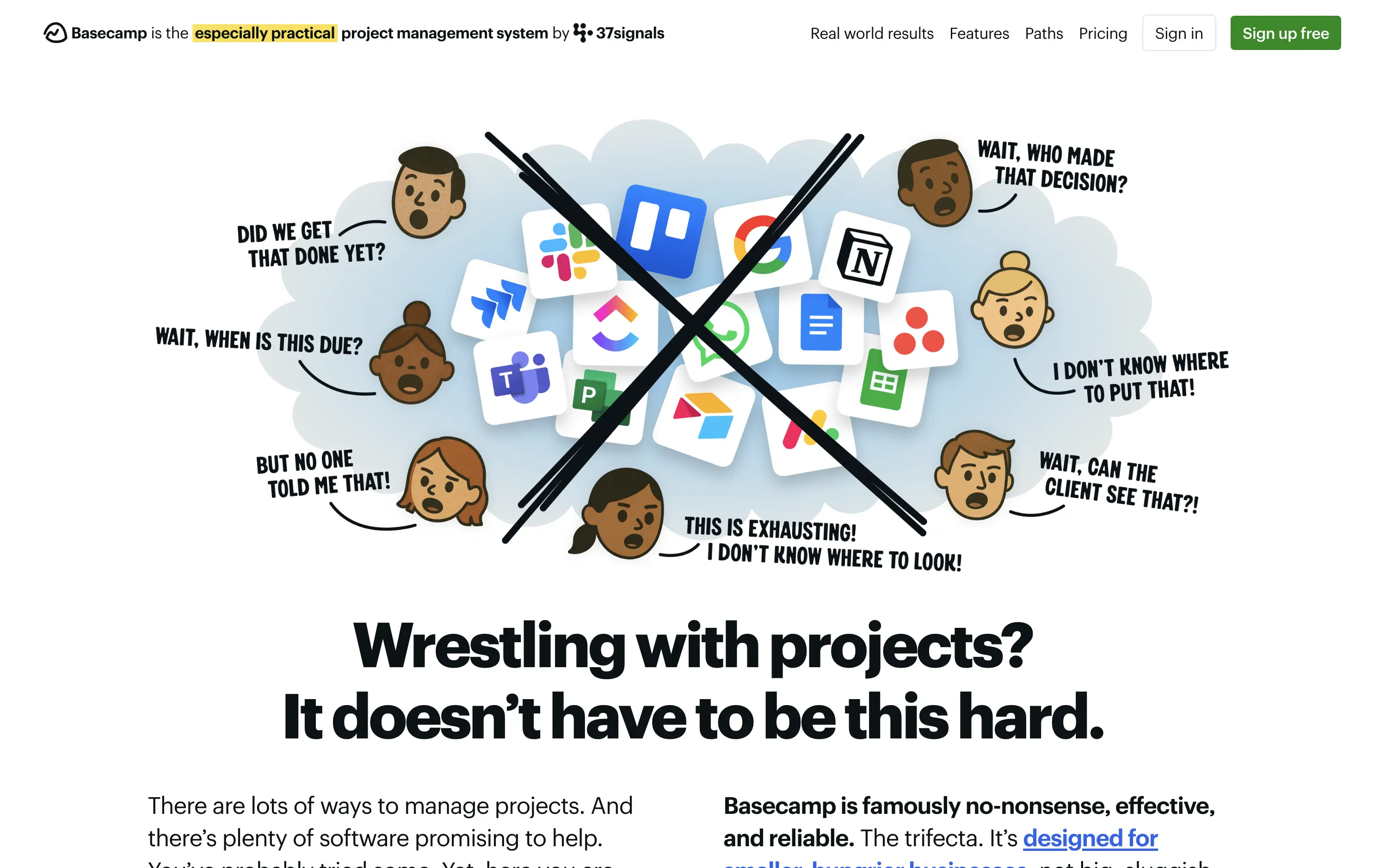
Basecamp
↗
SaaS
Collaboration
Productivity
Centered
Unconventional
Conversational
Pain-driven
No CTA
Illustration
Light Mode
Green
Yellow
Sans serif
B2B
Home Page
Custom Code
project management, SaaS, lo-fi aesthetic, opinionated design, founder-led voice, visual storytelling, problem-first, productivity, cluttered tool fatigue, anti-modern, expressive illustration, early-stage appeal, emotional resonance, no UI demo, brand storytelling, narrative-led
Basecamp cuts through tool overload with one practical workspace, ending project chaos.
The hero skips UI glamour for emotional clarity. It dramatizes the frustration of using too many disjointed tools through expressive cartoon faces and crossed-out logos. The copy is plain, bold, and highly relatable — “Wrestling with projects?” grounds it in a universal pain. No button, no fluff. The simplicity grabs attention and makes the message instantly clear.
Leans hard into anti-trend positioning—practicality over polish. Speaks directly to the frustration of tool overload, appealing to leaders who want sanity, not features. It’s memorable and unmistakably aligned with Basecamp’s legacy of contrarian clarity.
This layout balances technical utility with human impact, aligning well with Algolia’s positioning as an API-first but UX-aware company. The mobile UI reinforces product value visually, while the logo wall signals scale and trust for enterprise buyers. The tone is clear, benefit-led, and appropriate for high-intent decision-makers evaluating AI tools for customer experience. This is a solid enterprise-facing hero built to perform.
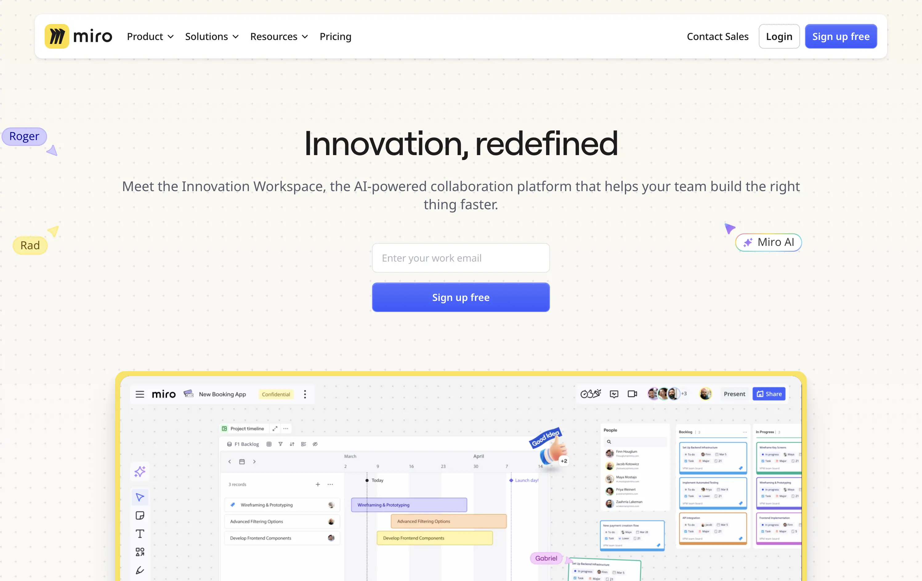
Miro
↗
SaaS
Collaboration
Creative Tools
Centered
Aspirational
Abstract / Conceptual
Email Capture
Product UI
Custom Animation
Light Mode
Blue
Sans serif
B2B
Home Page
Framer
collaboration tool, whiteboard software, innovation workspace, product teams, live UI elements, Miro AI, interactive SaaS, idea management, enterprise-ready, low-friction signup, dotted grid design, playful tone, design thinking, real-time tools
Miro is a collaborative online workspace for teams to brainstorm, plan, and build faster with intuitive tools and real-time visuals.
Hero is clean, modern, and visually grounded. Headline is short and inviting. Product UI is framed to feel expansive but still focused. The email-first CTA supports frictionless onboarding for teams exploring async tools.
Balances approachability with enterprise readiness. Message appeals to team leads, PMs, and designers. AI tag and product visuals align with innovation narrative. The hero positions Miro as both flexible and scalable.
This layout balances technical utility with human impact, aligning well with Algolia’s positioning as an API-first but UX-aware company. The mobile UI reinforces product value visually, while the logo wall signals scale and trust for enterprise buyers. The tone is clear, benefit-led, and appropriate for high-intent decision-makers evaluating AI tools for customer experience. This is a solid enterprise-facing hero built to perform.
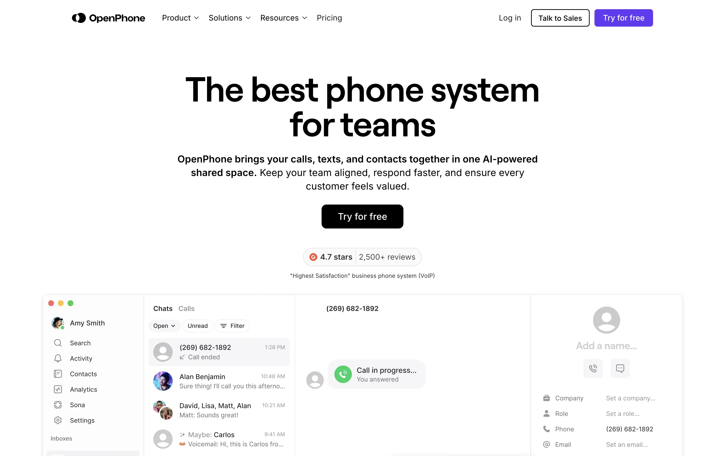
OpenPhone
↗
SaaS
Productivity
Centered
Bold & Direct
Confident
Single Button
Product UI
Social Proof
Light Mode
Purple
Black
Sans serif
B2B
Home Page
Webflow
business phone system, team communication, AI-enhanced calling, VoIP SaaS, minimalist hero, bold headline, trust rating, startup tools, shared inbox, clear CTA, conversion-focused, functional UI preview, modern enterprise utility
OpenPhone is a modern business phone system that unifies calls, texts, and contact management for growing teams.
Hero is bold and crystal clear. Headline makes a confident claim, immediately backed by product visuals and strong review stats. The black CTA button pops against the clean layout, driving clear intent.
Focused and direct for SMB and startup buyers. Hero supports bottom-of-funnel conversion. Minimalist visuals and rating badge project trust. Smart use of space for clarity and speed.
This layout balances technical utility with human impact, aligning well with Algolia’s positioning as an API-first but UX-aware company. The mobile UI reinforces product value visually, while the logo wall signals scale and trust for enterprise buyers. The tone is clear, benefit-led, and appropriate for high-intent decision-makers evaluating AI tools for customer experience. This is a solid enterprise-facing hero built to perform.
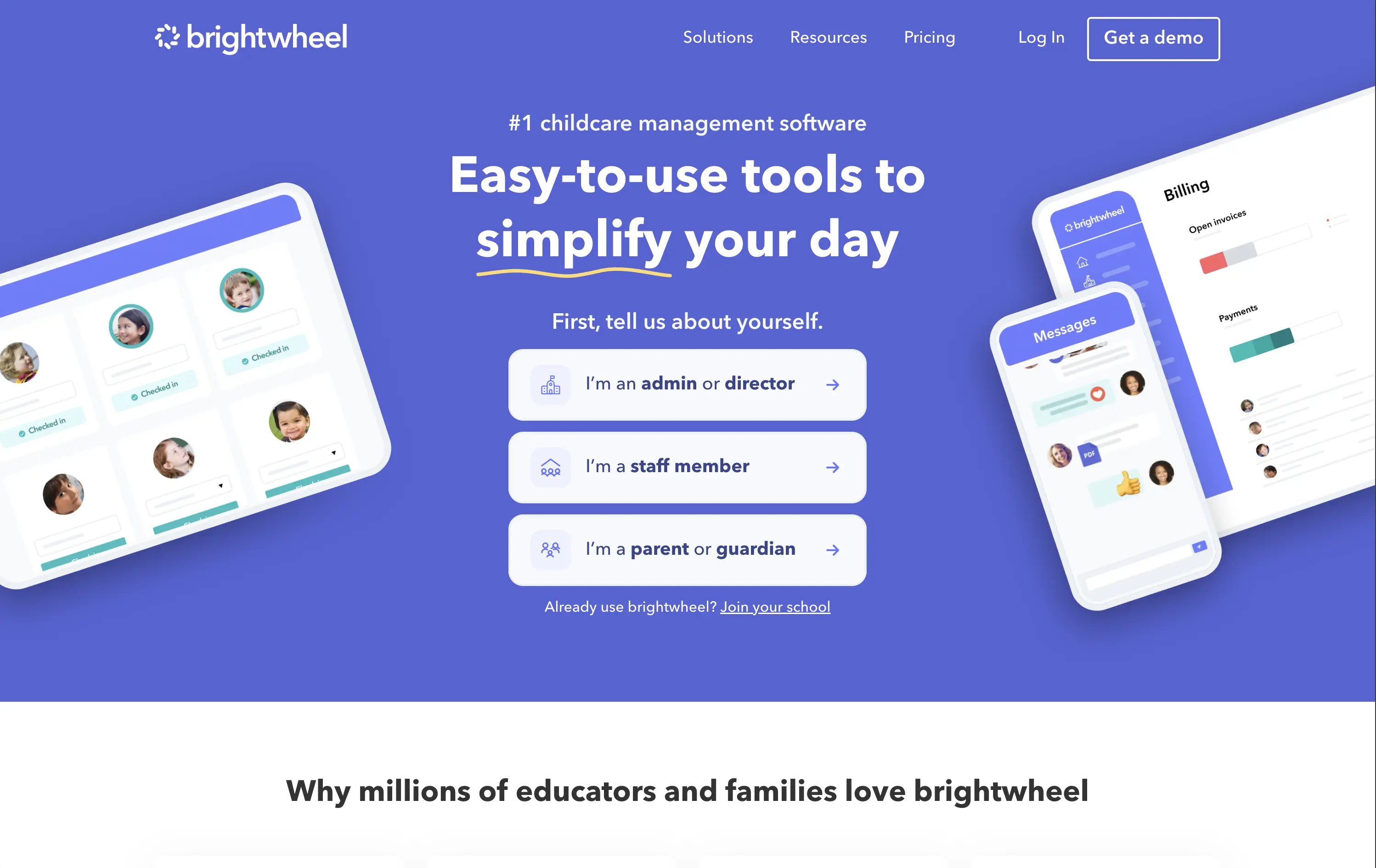
Brightwheel
↗
SaaS
Productivity
Education
Centered
Benefit-Driven
Empowering
Multi-CTA Block
Product UI
Duotone
Blue
Sans serif
B2B
Home Page
Wordpress
childcare SaaS, early education, UI-forward, persona filter, soft onboarding, trust-building, calm palette, family-friendly, product-led storytelling, scroll guidance, interactive selector, teacher tech, value-first headline
Brightwheel offers all-in-one software for childcare centers, helping staff and parents streamline daily operations, billing, and communication.
The hero blends product visuals with conversion utility. UI mockups feel grounded in real use cases—billing, check-ins, messaging—while the big, benefit-led headline hits directly. Interactive persona buttons sort traffic based on user role, creating clarity and reducing friction. Clean layout, focused copy, and trust cues (like “#1 childcare software”) all work toward fast comprehension.
Targets a trust-dependent category with confident simplicity. The user-type selector streamlines onboarding while signaling the platform’s adaptability. It balances emotional safety with practical function, reflecting Brightwheel’s value as a tool that makes lives easier.
This layout balances technical utility with human impact, aligning well with Algolia’s positioning as an API-first but UX-aware company. The mobile UI reinforces product value visually, while the logo wall signals scale and trust for enterprise buyers. The tone is clear, benefit-led, and appropriate for high-intent decision-makers evaluating AI tools for customer experience. This is a solid enterprise-facing hero built to perform.
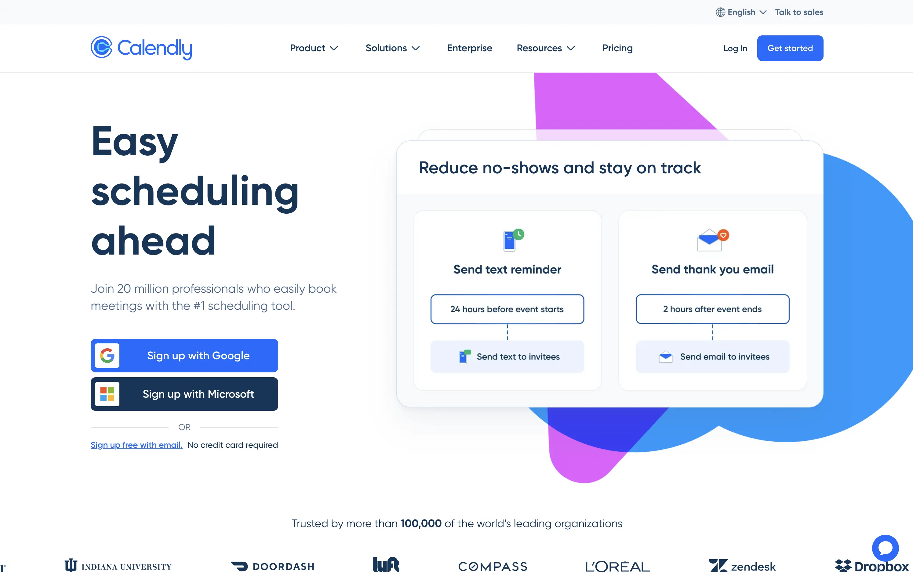
Calendly
↗
SaaS
Productivity
Split Grid
Left-aligned
Benefit-Driven
Aspirational
Multi-CTA Block
Product UI
Social Proof
Custom Animation
Light Mode
Blue
Purple
Sans serif
Hybrid
Home Page
Custom Code
booking automation, enterprise SaaS, high-trust layout, Google sign-in, product-led UX, animated demo cards, client communication, reminder workflows, credibility-focused, mass adoption, enterprise trust, conversion-focused, no-credit-card, dual CTA
Calendly is a scheduling automation platform used by over 20 million professionals to simplify meeting coordination and reduce no-shows.
Large headline clearly communicates the core benefit. Animated UI cards demo concrete features like text reminders and post-meeting emails—useful and direct. Google and Microsoft sign-up flows lower friction and suggest enterprise readiness. Copy leans on credibility (user count, logo wall). Layout is clean and functional, though edges toward safe and generic compared to challenger brands.
Calendly’s hero positions it as the trusted standard for scheduling. Focused on reducing friction for new users while demonstrating value for scale—perfect for self-serve and enterprise alike.
This layout balances technical utility with human impact, aligning well with Algolia’s positioning as an API-first but UX-aware company. The mobile UI reinforces product value visually, while the logo wall signals scale and trust for enterprise buyers. The tone is clear, benefit-led, and appropriate for high-intent decision-makers evaluating AI tools for customer experience. This is a solid enterprise-facing hero built to perform.
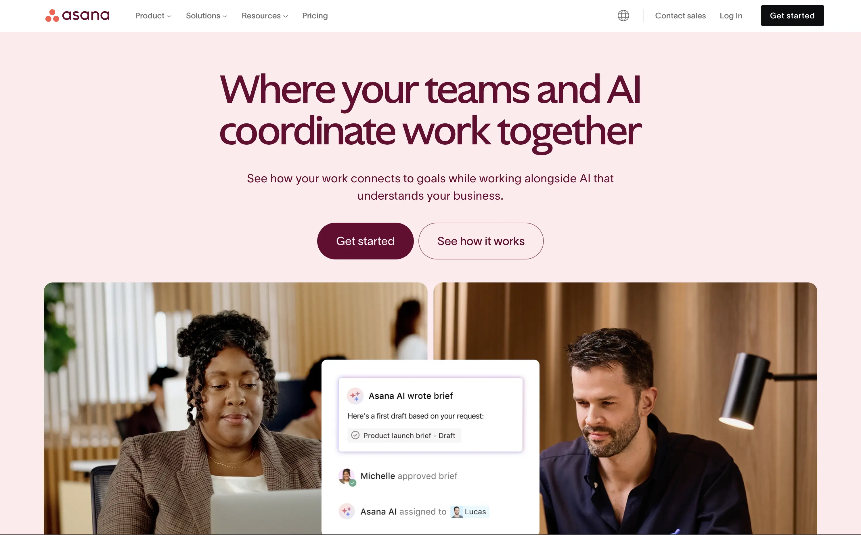
Asana
↗
SaaS
Collaboration
Productivity
Split Grid
Centered
Aspirational
Multi-CTA Block
Custom Animation
Duotone
Pink
Sans serif
B2B
Home Page
Custom Code
work management, project collaboration, AI assistant, team productivity, multi-cta hero
Asana helps organisations plan, track, and automate work—now boosted by an AI assistant that ties tasks to goals.
The hero is serene and strategic. Headline clearly defines the product’s evolution with AI, while visuals combine real people with subtle UI overlays to convey practical usage. Dual CTA is thoughtful and helps segment traffic. Typography and spacing support clarity.
Positions Asana as a next-gen operational tool built for modern teams. The hero shows how AI integrates with workflow, not replaces it. The balance of confidence and calm makes it accessible for mid-market to enterprise users exploring AI productivity.
This layout balances technical utility with human impact, aligning well with Algolia’s positioning as an API-first but UX-aware company. The mobile UI reinforces product value visually, while the logo wall signals scale and trust for enterprise buyers. The tone is clear, benefit-led, and appropriate for high-intent decision-makers evaluating AI tools for customer experience. This is a solid enterprise-facing hero built to perform.
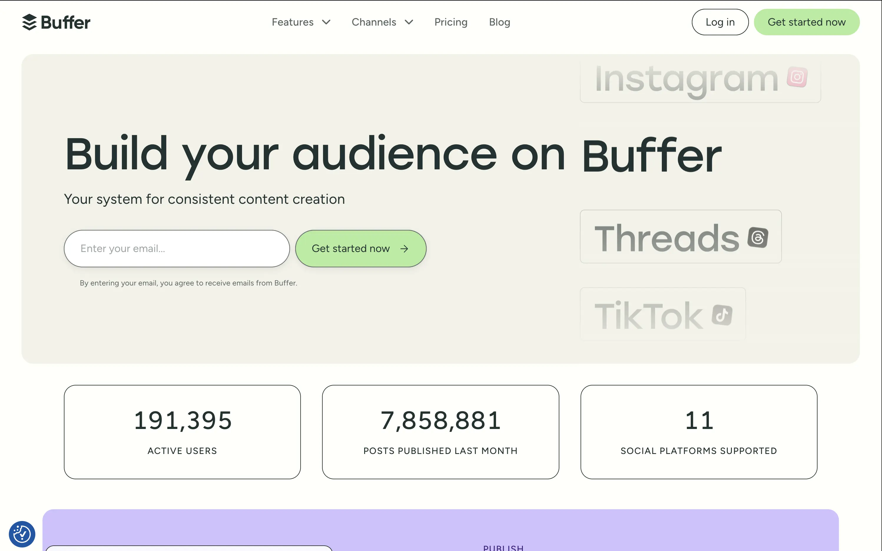
Buffer
↗
SaaS
Creator Tools
Productivity
Inset
Left-aligned
Aspirational
Email Capture
Live Metrics
Social Proof
Custom Animation
Light Mode
Green
Sans serif
Hybrid
Home Page
Custom Code
social media scheduler, content calendar tool, creator marketing SaaS, post automation, analytics, small-business growth
Buffer helps creators and teams grow their audience with simple tools to plan, publish, and track social content across multiple platforms.
The hero is calm and conversion-optimized. The oversized headline commands attention, while the clever marquee animation showcases integrations without visual overload. The inline email field reduces signup resistance and is paired with a soft green CTA for visual hierarchy. The hero balances aspirational tone with grounded proof (usage stats), but slightly muted contrast may reduce clarity on some screens.
Buffer leads with clarity and low effort — a smart choice for time-starved creators and marketers. Stats support credibility while tone avoids hype. The layout matches their no-fluff, practical brand positioning.
This layout balances technical utility with human impact, aligning well with Algolia’s positioning as an API-first but UX-aware company. The mobile UI reinforces product value visually, while the logo wall signals scale and trust for enterprise buyers. The tone is clear, benefit-led, and appropriate for high-intent decision-makers evaluating AI tools for customer experience. This is a solid enterprise-facing hero built to perform.
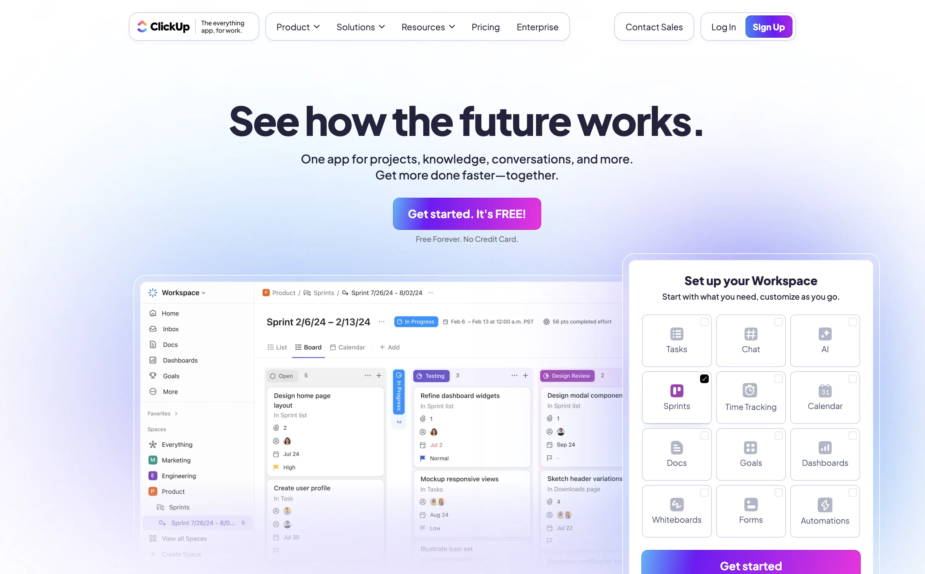
ClickUp
↗
SaaS
Collaboration
Productivity
Centered
Aspirational
Single Button
Interactive
Product UI
Gradient
Light Mode
Blue
Purple
Sans serif
Hybrid
Home Page
Custom Code
project management, all-in-one tool, interactive demo, modular onboarding, live preview, customizable workspace, productivity SaaS, gradient UI, click-to-explore, modern UX, team workflow, no-code vibes, multi-tool stack
ClickUp is a customizable productivity platform where teams manage tasks, docs, goals, and everything else in one place.
The “See how the future works” headline strikes an ambitious yet welcoming tone. The standout element is the interactive module — showing real UI changes based on selected features, creating instant visual proof. Bright gradients and a bold purple CTA drive attention while softening the tech-forward message. It’s engaging, credible, and built for signup momentum.
ClickUp is positioning itself as a full-stack replacement for scattered SaaS tools. This hero backs that claim with both visual clarity and message ambition, supporting its “everything app” value prop.
This layout balances technical utility with human impact, aligning well with Algolia’s positioning as an API-first but UX-aware company. The mobile UI reinforces product value visually, while the logo wall signals scale and trust for enterprise buyers. The tone is clear, benefit-led, and appropriate for high-intent decision-makers evaluating AI tools for customer experience. This is a solid enterprise-facing hero built to perform.
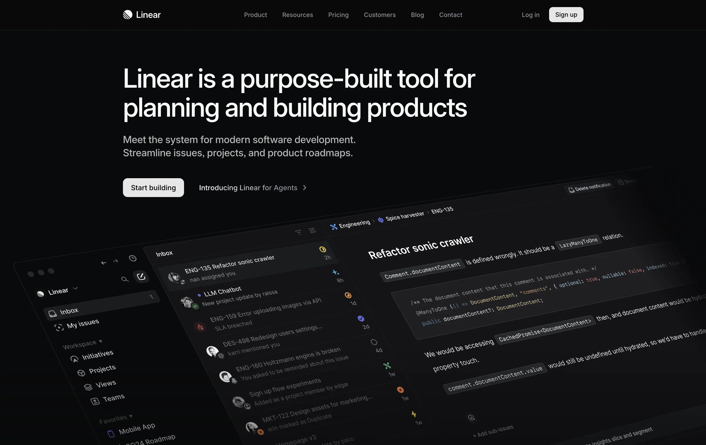
Linear
↗
SaaS
DevTools
Productivity
Left-aligned
Descriptive
Confident
Single Button
Product UI
Loading Animation
Dark Mode
White
Sans serif
B2B
Home Page
Custom Code
dark UI, engineering tools, product planning, no-fluff SaaS, modern developer stack, minimal aesthetic, deep focus, crisp layout, issue tracking, roadmap software, command-style CTA, zero distraction, productivity-first, startup tools
Linear is a streamlined tool for software teams to manage issues, sprints, and product roadmaps in a beautifully fast interface.
The hero is sleek, direct, and visually immersive. It highlights product strength without bloating the screen. Messaging is tight and outcome-focused. “Start building” reinforces dev-oriented immediacy. A strong signal of seriousness.
Perfectly aligned with experienced product and engineering teams. The minimal design supports focus. Hero says: “we’re here to work,” not pitch. Shows deep awareness of audience expectations.
This layout balances technical utility with human impact, aligning well with Algolia’s positioning as an API-first but UX-aware company. The mobile UI reinforces product value visually, while the logo wall signals scale and trust for enterprise buyers. The tone is clear, benefit-led, and appropriate for high-intent decision-makers evaluating AI tools for customer experience. This is a solid enterprise-facing hero built to perform.
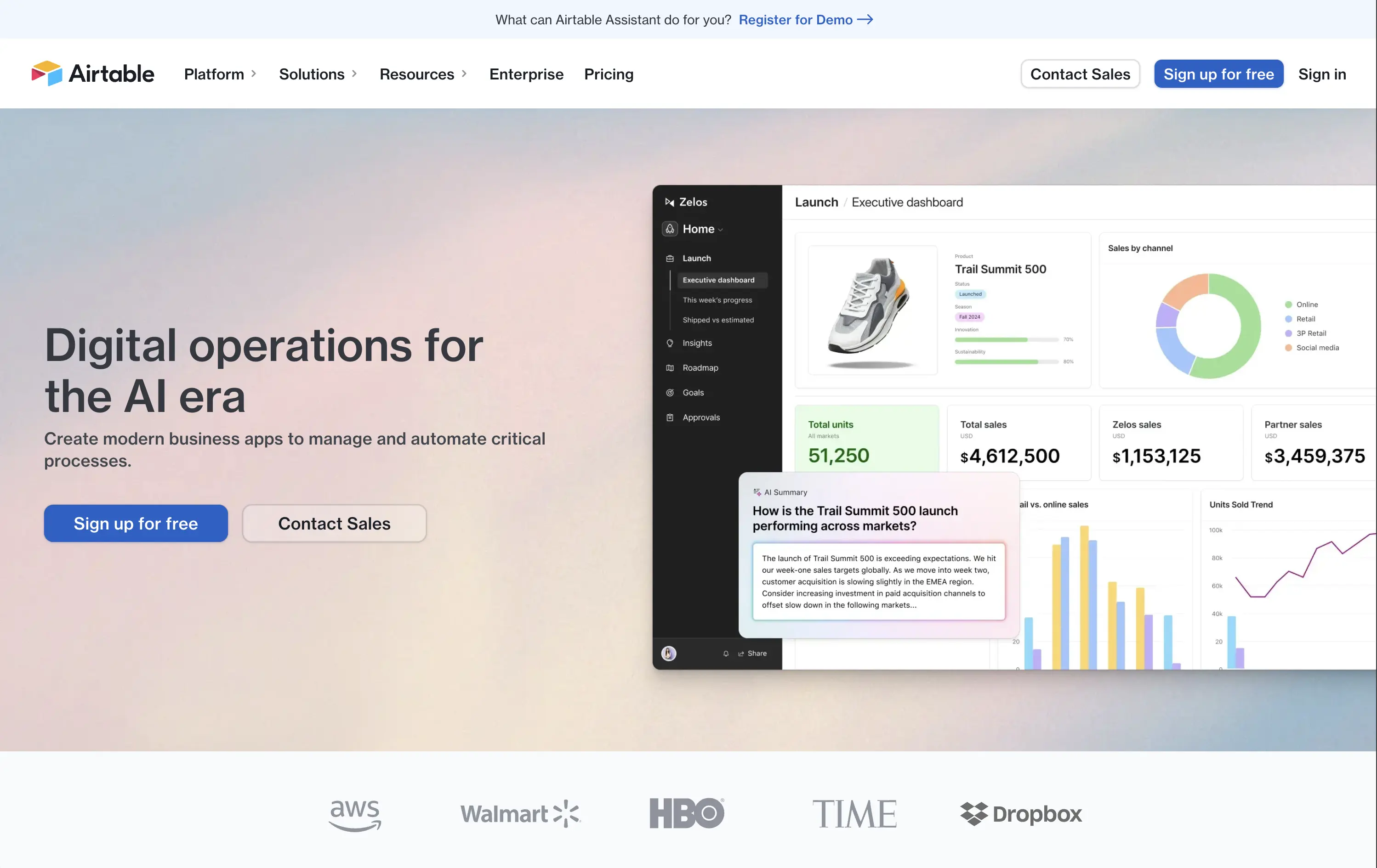
Airtable
↗
SaaS
Productivity
Data & Analytics
Split Grid
Left-aligned
Professional
Multi-CTA Block
Logo Wall
Product UI
Announcement
Light Mode
Blue
Sans serif
Hybrid
Home Page
Custom Code
online database, no-code database, low-code SaaS, workflow automation, AI summaries, enterprise ops
Airtable is a cloud database that lets teams build custom apps, views, and automations with no deep coding needed.
The visual hierarchy is spot-on — calm gradient background, clean product UI, and easy-to-scan copy. “Digital operations for the AI era” is broad but timely, and the supporting line grounds it in practical outcomes. The dashboard example does the heavy lifting to show use case without overloading. Two clear CTAs (free sign-up and contact sales) accommodate both ends of the buyer journey. Quietly confident, but not flashy — very Airtable.
Positions Airtable as an evolving and flexible business OS for enterprise workflows, not just a spreadsheet tool. Speaks to maturing users with operational needs. Copy is safe but solid — it could use a sharper hook, but tone matches market shift toward AI.
This layout balances technical utility with human impact, aligning well with Algolia’s positioning as an API-first but UX-aware company. The mobile UI reinforces product value visually, while the logo wall signals scale and trust for enterprise buyers. The tone is clear, benefit-led, and appropriate for high-intent decision-makers evaluating AI tools for customer experience. This is a solid enterprise-facing hero built to perform.
Superhuman
↗
SaaS
AI Tools
Productivity
Centered
Benefit-Driven
Confident
Single Button
Media Gallery
Product UI
Gradient
Dark Mode
Purple
Sans serif
Hybrid
Home Page
Framer
AI-native, email tool, bold value prop, gradient background, high-impact copy, startup focus, B2B SaaS, focused layout, attention economy, minimalist CTA, time-saving, numeric hook
Superhuman’s AI-native email client helps individuals and teams blitz through mail, saving about four hours per person every week.
Hero leads with a measurable benefit, instantly appealing to time-conscious professionals. Layout is minimal, directing all focus to the message. The purple CTA stands out clearly. Product UI hints below add legitimacy without clutter.
Perfectly crafted for productivity-focused SaaS buyers. The headline appeals to outcome-first thinkers. Design is focused, polished, and self-assured — built to convert high-intent users looking for speed and output.
This layout balances technical utility with human impact, aligning well with Algolia’s positioning as an API-first but UX-aware company. The mobile UI reinforces product value visually, while the logo wall signals scale and trust for enterprise buyers. The tone is clear, benefit-led, and appropriate for high-intent decision-makers evaluating AI tools for customer experience. This is a solid enterprise-facing hero built to perform.
The most effective hero sections in your inbox.
Monthly round up of top hero sections.
Don't worry. We hate spam too.
Don't worry. We hate spam too.
Don't worry. We hate spam too.