Fintech
13
13
13
13
Products rethinking how money moves, from personal banking to B2B payments.
Collective
↗
SaaS
Fintech
Split Grid
Benefit-Driven
Single Button
Logo Wall
Product UI
Announcement
Light Mode
Purple
Serif
B2B
Home Page
Custom Code
solo-preneur finance, tax savings, accounting dashboard, countdown promo bar, split hero, logo wall proof, LLC services, purple CTA, self-employed tools, clean UI, high-trust layout, all-in-one platform, product screenshot, modern fintech, onboarding waiver
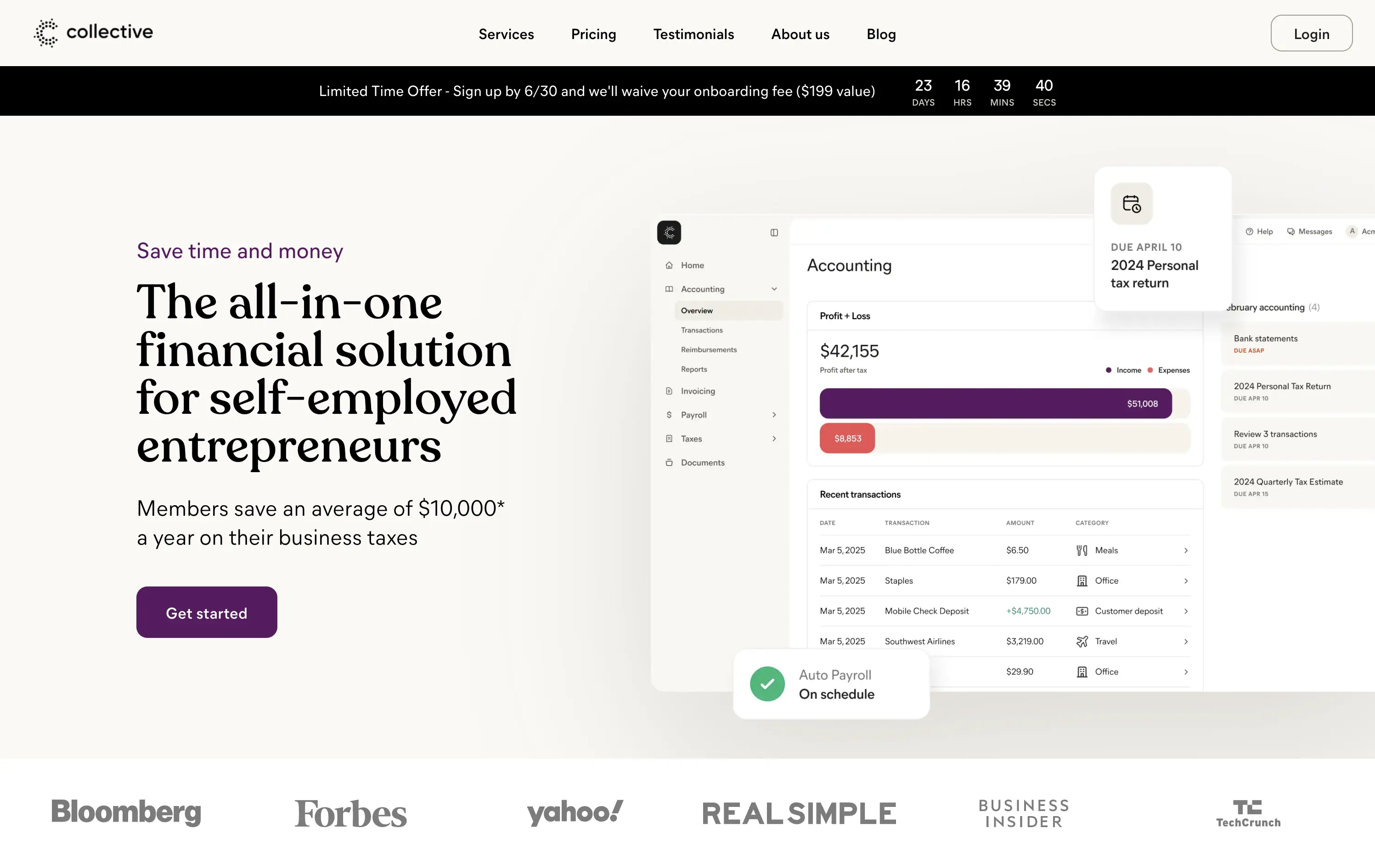
Collective handles formation, accounting, payroll, and taxes for self-employed entrepreneurs so they keep more income and skip back-office busywork.
Clear headline frames a big benefit; sub-copy quantifies $10k average savings, anchoring value. Purple “Get started” button pops on a calm canvas, and a limited-time bar with countdown injects urgency. Right-side UI mock-up shows real product context, while publication logos reinforce trust. Visual hierarchy guides left-to-right scan cleanly.
Messaging speaks directly to cost-sensitive solo founders, pairing quantified proof with urgency and social validation. Split grid balances authority and approachability, aligning with a service-plus-software proposition.
This layout balances technical utility with human impact, aligning well with Algolia’s positioning as an API-first but UX-aware company. The mobile UI reinforces product value visually, while the logo wall signals scale and trust for enterprise buyers. The tone is clear, benefit-led, and appropriate for high-intent decision-makers evaluating AI tools for customer experience. This is a solid enterprise-facing hero built to perform.
Collective
↗
SaaS
Fintech
Split Grid
Benefit-Driven
Single Button
Logo Wall
Product UI
Announcement
Light Mode
Purple
Serif
B2B
Home Page
Custom Code
solo-preneur finance, tax savings, accounting dashboard, countdown promo bar, split hero, logo wall proof, LLC services, purple CTA, self-employed tools, clean UI, high-trust layout, all-in-one platform, product screenshot, modern fintech, onboarding waiver
Collective handles formation, accounting, payroll, and taxes for self-employed entrepreneurs so they keep more income and skip back-office busywork.
Clear headline frames a big benefit; sub-copy quantifies $10k average savings, anchoring value. Purple “Get started” button pops on a calm canvas, and a limited-time bar with countdown injects urgency. Right-side UI mock-up shows real product context, while publication logos reinforce trust. Visual hierarchy guides left-to-right scan cleanly.
Messaging speaks directly to cost-sensitive solo founders, pairing quantified proof with urgency and social validation. Split grid balances authority and approachability, aligning with a service-plus-software proposition.
This layout balances technical utility with human impact, aligning well with Algolia’s positioning as an API-first but UX-aware company. The mobile UI reinforces product value visually, while the logo wall signals scale and trust for enterprise buyers. The tone is clear, benefit-led, and appropriate for high-intent decision-makers evaluating AI tools for customer experience. This is a solid enterprise-facing hero built to perform.
Stacks
↗
SaaS
AI Tools
Fintech
Centered
Aspirational
Abstract / Conceptual
Multi-CTA Block
Logo Wall
Product UI
Announcement
Gradient
Light Mode
Green
Yellow
Serif
B2B
Home Page
Framer
gradient hero, oversized serif headline, AI accounting SaaS, dual CTA, funding badge, logo wall, centered layout, finance automation, green yellow gradient, trusted by logos, product UI peek, crisp white background, modern B2B, high trust, accounting teams
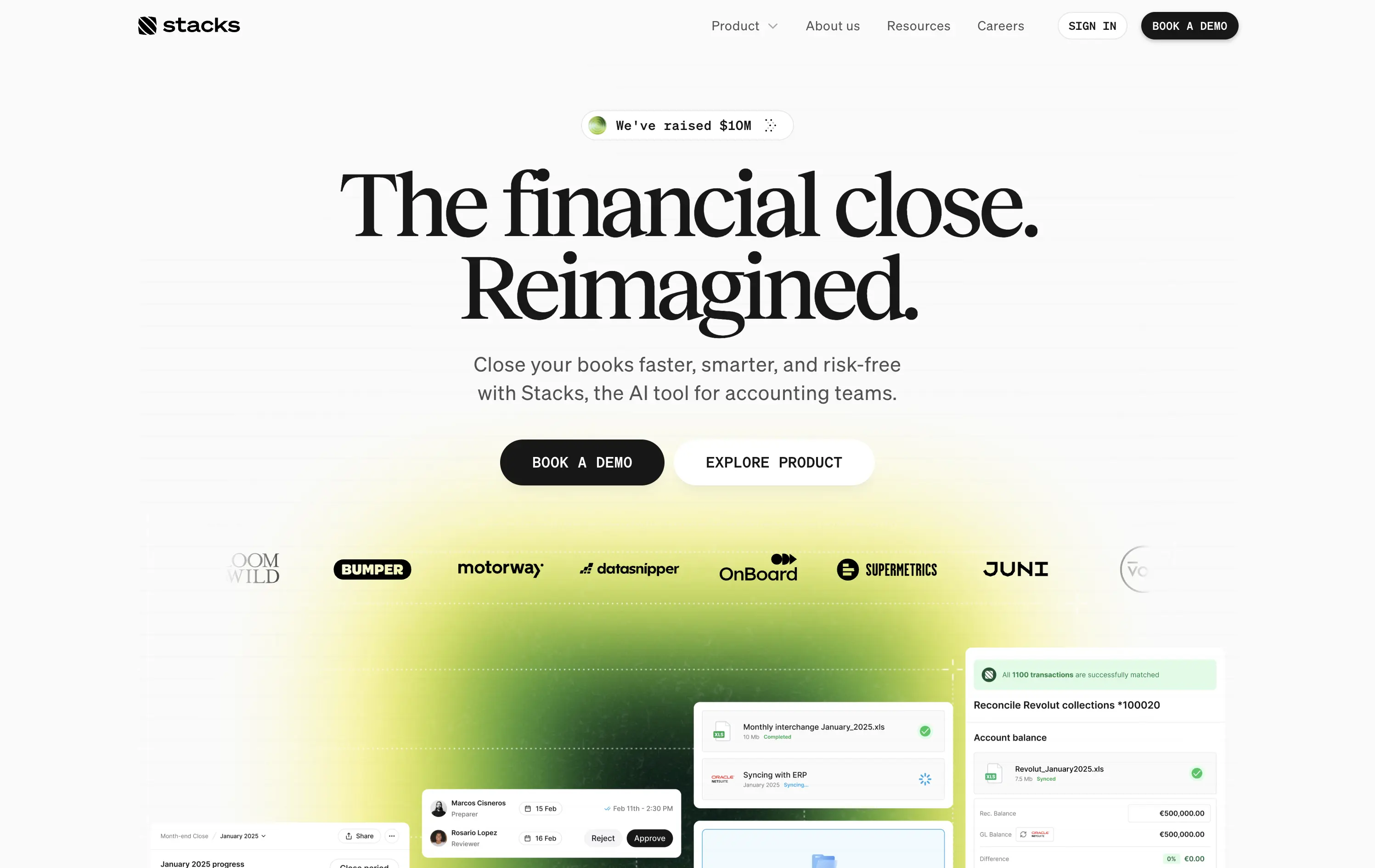
AI‑powered platform that helps accounting teams close books faster and with less risk by automating month‑end workflows.
Oversized serif headline reframes month‑end close as an ambitious reinvention, while the lime gradient draws focus and adds energy. Subheadline grounds the concept with clear benefits, and dual CTAs serve both demo‑ready and exploratory visitors. Funding badge plus client logos build instant trust. UI snippets tease depth without clutter, aided by spacious layout and sticky nav. Cohesive and convincing.
Conceptual headline elevates mundane finance work, appealing to transformation‑minded leaders. Gradient signals progress, while proof elements ease risk concerns. Demo‑centric funnel matches enterprise sales reality.
This layout balances technical utility with human impact, aligning well with Algolia’s positioning as an API-first but UX-aware company. The mobile UI reinforces product value visually, while the logo wall signals scale and trust for enterprise buyers. The tone is clear, benefit-led, and appropriate for high-intent decision-makers evaluating AI tools for customer experience. This is a solid enterprise-facing hero built to perform.
Stacks
↗
SaaS
AI Tools
Fintech
Centered
Aspirational
Abstract / Conceptual
Multi-CTA Block
Logo Wall
Product UI
Announcement
Gradient
Light Mode
Green
Yellow
Serif
B2B
Home Page
Framer
gradient hero, oversized serif headline, AI accounting SaaS, dual CTA, funding badge, logo wall, centered layout, finance automation, green yellow gradient, trusted by logos, product UI peek, crisp white background, modern B2B, high trust, accounting teams
AI‑powered platform that helps accounting teams close books faster and with less risk by automating month‑end workflows.
Oversized serif headline reframes month‑end close as an ambitious reinvention, while the lime gradient draws focus and adds energy. Subheadline grounds the concept with clear benefits, and dual CTAs serve both demo‑ready and exploratory visitors. Funding badge plus client logos build instant trust. UI snippets tease depth without clutter, aided by spacious layout and sticky nav. Cohesive and convincing.
Conceptual headline elevates mundane finance work, appealing to transformation‑minded leaders. Gradient signals progress, while proof elements ease risk concerns. Demo‑centric funnel matches enterprise sales reality.
This layout balances technical utility with human impact, aligning well with Algolia’s positioning as an API-first but UX-aware company. The mobile UI reinforces product value visually, while the logo wall signals scale and trust for enterprise buyers. The tone is clear, benefit-led, and appropriate for high-intent decision-makers evaluating AI tools for customer experience. This is a solid enterprise-facing hero built to perform.
Family
↗
Fintech
Web3
Centered
Playful
Confident
Download App
Multi-CTA Block
Illustration
Custom Animation
Loading Animation
Light Mode
Blue
Yellow
Black
Sans serif
B2C
Home Page
Custom Code
crypto wallet for iOS, ENS support, playful Web3, mobile-first design, Gen Z crypto, kawaii aesthetic, approachable fintech, token collectibles, web3 onboarding, friendly UX
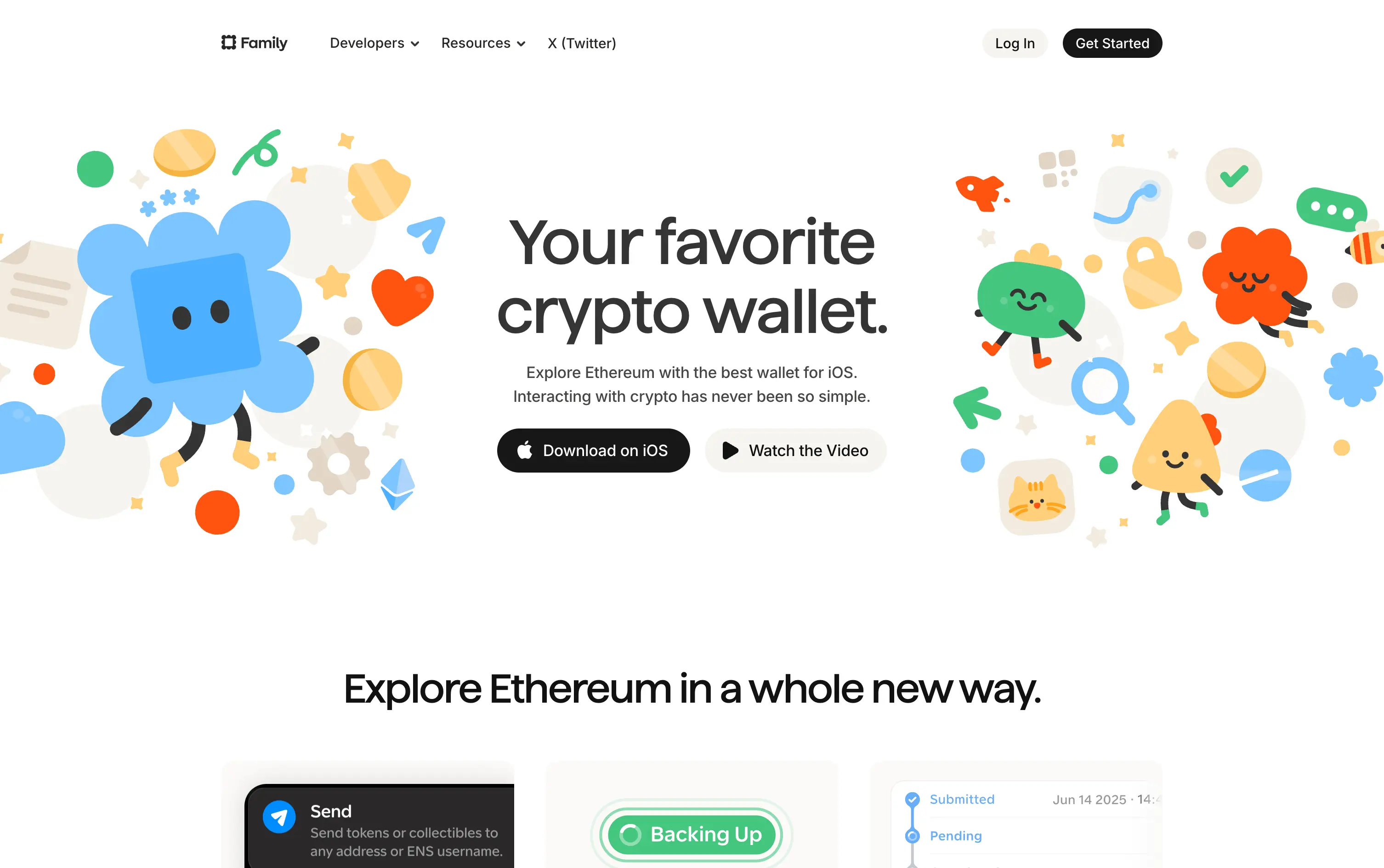
Family is a playful Ethereum wallet designed for iOS, making crypto feel friendly, visual, and simple to use.
Extremely approachable for a space often seen as cold or intimidating. The illustrations soften the category. Clear copy and strong CTA pair well with the product’s target audience and mobile-first approach.
A masterclass in brand positioning. While most Web3 brands chase dark, technical aesthetics, Family goes the opposite direction—bright, warm, and welcoming. It’s intentionally crafted to disarm, invite, and onboard a broader audience.
This layout balances technical utility with human impact, aligning well with Algolia’s positioning as an API-first but UX-aware company. The mobile UI reinforces product value visually, while the logo wall signals scale and trust for enterprise buyers. The tone is clear, benefit-led, and appropriate for high-intent decision-makers evaluating AI tools for customer experience. This is a solid enterprise-facing hero built to perform.
Family
↗
Fintech
Web3
Centered
Playful
Confident
Download App
Multi-CTA Block
Illustration
Custom Animation
Loading Animation
Light Mode
Blue
Yellow
Black
Sans serif
B2C
Home Page
Custom Code
crypto wallet for iOS, ENS support, playful Web3, mobile-first design, Gen Z crypto, kawaii aesthetic, approachable fintech, token collectibles, web3 onboarding, friendly UX
Family is a playful Ethereum wallet designed for iOS, making crypto feel friendly, visual, and simple to use.
Extremely approachable for a space often seen as cold or intimidating. The illustrations soften the category. Clear copy and strong CTA pair well with the product’s target audience and mobile-first approach.
A masterclass in brand positioning. While most Web3 brands chase dark, technical aesthetics, Family goes the opposite direction—bright, warm, and welcoming. It’s intentionally crafted to disarm, invite, and onboard a broader audience.
This layout balances technical utility with human impact, aligning well with Algolia’s positioning as an API-first but UX-aware company. The mobile UI reinforces product value visually, while the logo wall signals scale and trust for enterprise buyers. The tone is clear, benefit-led, and appropriate for high-intent decision-makers evaluating AI tools for customer experience. This is a solid enterprise-facing hero built to perform.
Brex
↗
SaaS
Fintech
Split Grid
Left-aligned
Benefit-Driven
Confident
Email Capture
Product UI
Social Proof
3D visuals
Light Mode
Orange
Sans serif
B2B
Home Page
Custom Code
global finance platform, expense automation, control and speed messaging, embedded email field, startup to enterprise, international SaaS, B2B fintech, conversion-led layout, modern finance stack, clean UI, sharp tone, input-first UX, mobile + card visual, minimalist grid
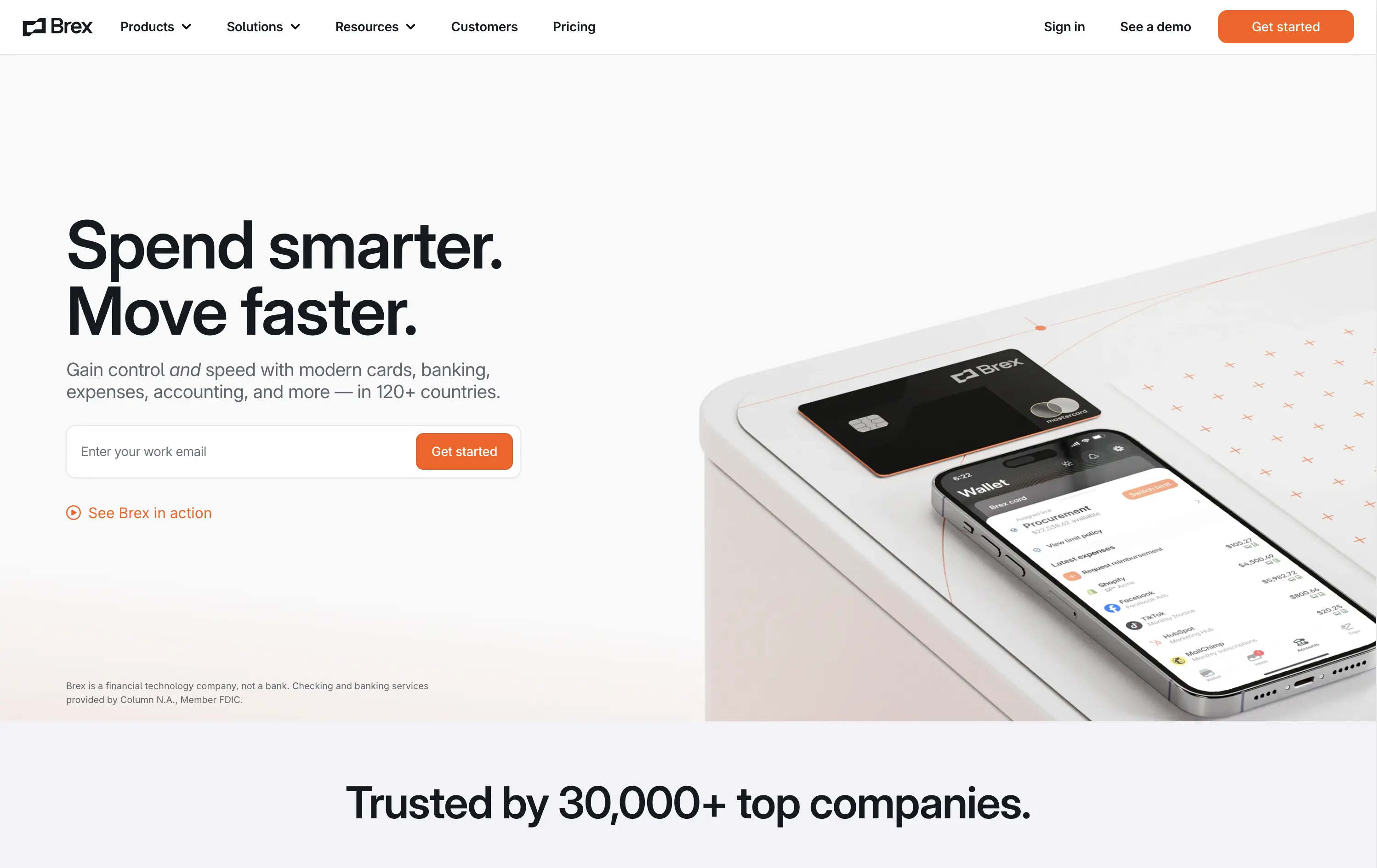
Brex is a global financial platform offering cards, banking, and expense tools for fast-scaling companies in 120+ countries.
This hero nails first-contact clarity. The headline hits fast with rhythmic, benefit-led language, while the subhead contextualizes product depth across spend, banking, and scale. The layout leads with a form-first interaction, pushing immediate action, while the micro-CTA (“See Brex in action”) gives skeptics a softer entry point. The 3D product mockup adds credibility and sharpens the tech-forward appeal. Nothing feels redundant — every element either informs or converts. The result is frictionless, enterprise-friendly, and confident without oversell.
Speaks directly to startup and scale-up operators. Prioritizes control and speed — key brand levers for high-growth companies. Balanced tone and visual logic establish Brex as both trusted and technically future-ready.
This layout balances technical utility with human impact, aligning well with Algolia’s positioning as an API-first but UX-aware company. The mobile UI reinforces product value visually, while the logo wall signals scale and trust for enterprise buyers. The tone is clear, benefit-led, and appropriate for high-intent decision-makers evaluating AI tools for customer experience. This is a solid enterprise-facing hero built to perform.
Brex
↗
SaaS
Fintech
Split Grid
Left-aligned
Benefit-Driven
Confident
Email Capture
Product UI
Social Proof
3D visuals
Light Mode
Orange
Sans serif
B2B
Home Page
Custom Code
global finance platform, expense automation, control and speed messaging, embedded email field, startup to enterprise, international SaaS, B2B fintech, conversion-led layout, modern finance stack, clean UI, sharp tone, input-first UX, mobile + card visual, minimalist grid
Brex is a global financial platform offering cards, banking, and expense tools for fast-scaling companies in 120+ countries.
This hero nails first-contact clarity. The headline hits fast with rhythmic, benefit-led language, while the subhead contextualizes product depth across spend, banking, and scale. The layout leads with a form-first interaction, pushing immediate action, while the micro-CTA (“See Brex in action”) gives skeptics a softer entry point. The 3D product mockup adds credibility and sharpens the tech-forward appeal. Nothing feels redundant — every element either informs or converts. The result is frictionless, enterprise-friendly, and confident without oversell.
Speaks directly to startup and scale-up operators. Prioritizes control and speed — key brand levers for high-growth companies. Balanced tone and visual logic establish Brex as both trusted and technically future-ready.
This layout balances technical utility with human impact, aligning well with Algolia’s positioning as an API-first but UX-aware company. The mobile UI reinforces product value visually, while the logo wall signals scale and trust for enterprise buyers. The tone is clear, benefit-led, and appropriate for high-intent decision-makers evaluating AI tools for customer experience. This is a solid enterprise-facing hero built to perform.
Lettuce
↗
SaaS
Fintech
Split Grid
Left-aligned
Benefit-Driven
Bold & Direct
Single Button
Photography
Logo Wall
Product UI
Duotone
Green
Display
B2C
Home Page
Custom Code
solo business finance, tax automation, self-employed SaaS, conversion-focused layout, AI accounting, ROI-driven copy, playful branding, savings calculator CTA, solo founder tools, dark green palette, clear value prop, direct tone, press trust bar, mobile-first product
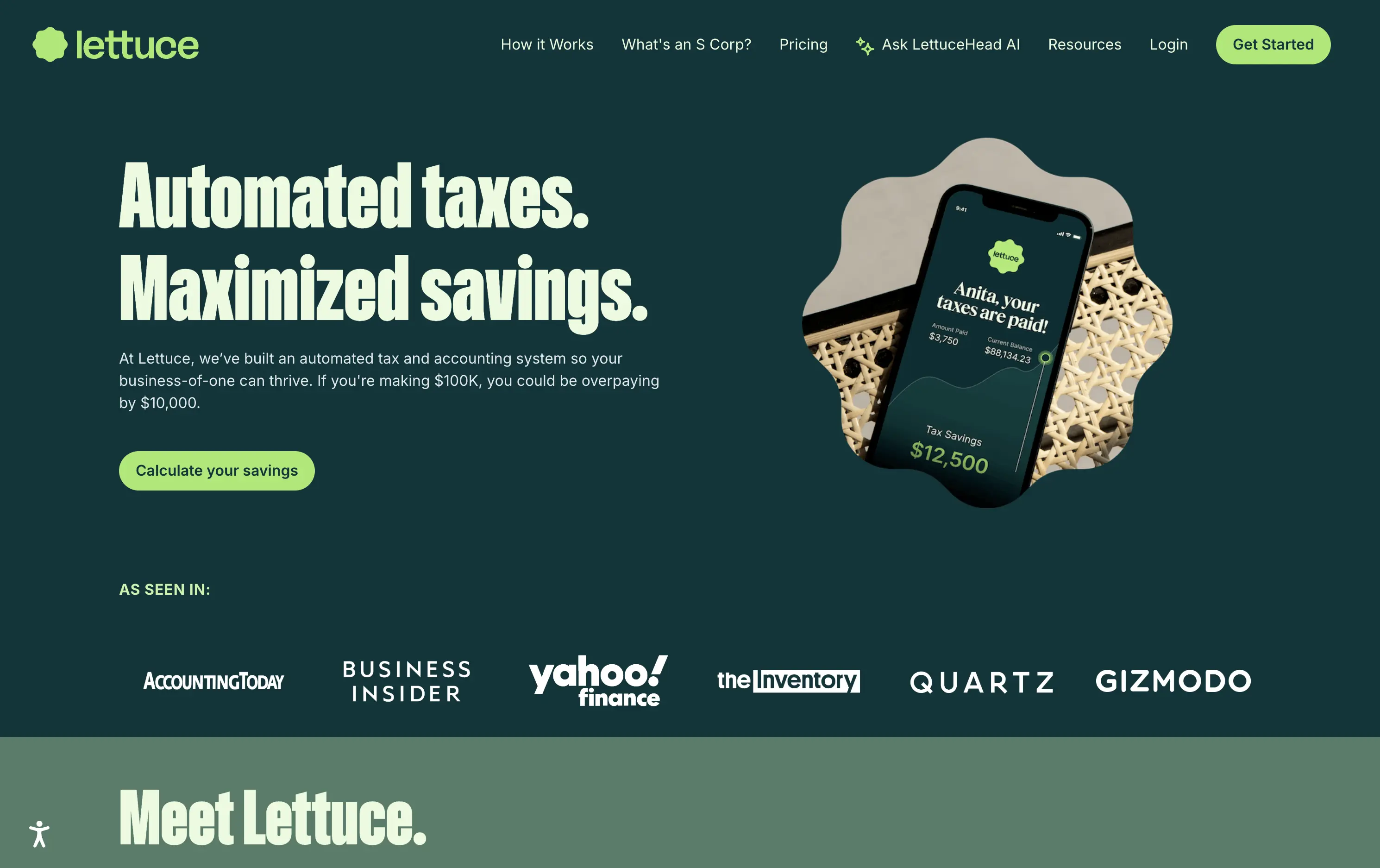
Lettuce is an automated tax and accounting platform built for solo business owners, helping them save thousands by optimizing how they pay taxes.
The hero is assertive, clear, and benefit-led. “Automated taxes. Maximized savings.” lands immediately, and the subhead explains who it's for and what they’re losing without it. The savings figure on the phone mockup reinforces the pitch visually. The “Calculate your savings” CTA is strong and personalized. Overall, the layout moves fast and speaks directly to freelancers and solo operators.
Perfectly tuned for time-poor, outcome-driven solopreneurs. Uses clear math ($10k in savings) and visual cues (mobile UI, dollar figures) to make the benefit feel tangible. Smart alignment of tone, layout, and buyer urgency.
This layout balances technical utility with human impact, aligning well with Algolia’s positioning as an API-first but UX-aware company. The mobile UI reinforces product value visually, while the logo wall signals scale and trust for enterprise buyers. The tone is clear, benefit-led, and appropriate for high-intent decision-makers evaluating AI tools for customer experience. This is a solid enterprise-facing hero built to perform.
Lettuce
↗
SaaS
Fintech
Split Grid
Left-aligned
Benefit-Driven
Bold & Direct
Single Button
Photography
Logo Wall
Product UI
Duotone
Green
Display
B2C
Home Page
Custom Code
solo business finance, tax automation, self-employed SaaS, conversion-focused layout, AI accounting, ROI-driven copy, playful branding, savings calculator CTA, solo founder tools, dark green palette, clear value prop, direct tone, press trust bar, mobile-first product
Lettuce is an automated tax and accounting platform built for solo business owners, helping them save thousands by optimizing how they pay taxes.
The hero is assertive, clear, and benefit-led. “Automated taxes. Maximized savings.” lands immediately, and the subhead explains who it's for and what they’re losing without it. The savings figure on the phone mockup reinforces the pitch visually. The “Calculate your savings” CTA is strong and personalized. Overall, the layout moves fast and speaks directly to freelancers and solo operators.
Perfectly tuned for time-poor, outcome-driven solopreneurs. Uses clear math ($10k in savings) and visual cues (mobile UI, dollar figures) to make the benefit feel tangible. Smart alignment of tone, layout, and buyer urgency.
This layout balances technical utility with human impact, aligning well with Algolia’s positioning as an API-first but UX-aware company. The mobile UI reinforces product value visually, while the logo wall signals scale and trust for enterprise buyers. The tone is clear, benefit-led, and appropriate for high-intent decision-makers evaluating AI tools for customer experience. This is a solid enterprise-facing hero built to perform.
Payoneer
↗
SaaS
Fintech
Centered
Descriptive
Confident
Single Button
Photography
Illustration
Custom Animation
Light Mode
Purple
Sans serif
B2B
Home Page
Wordpress
global payments, borderless finance, transaction animation, multi-currency account, visual storytelling, freelancer payments, cross-border SaaS, simplified UX, modern money movement, motion-led layout, banking alternative, vibrant palette, international scale
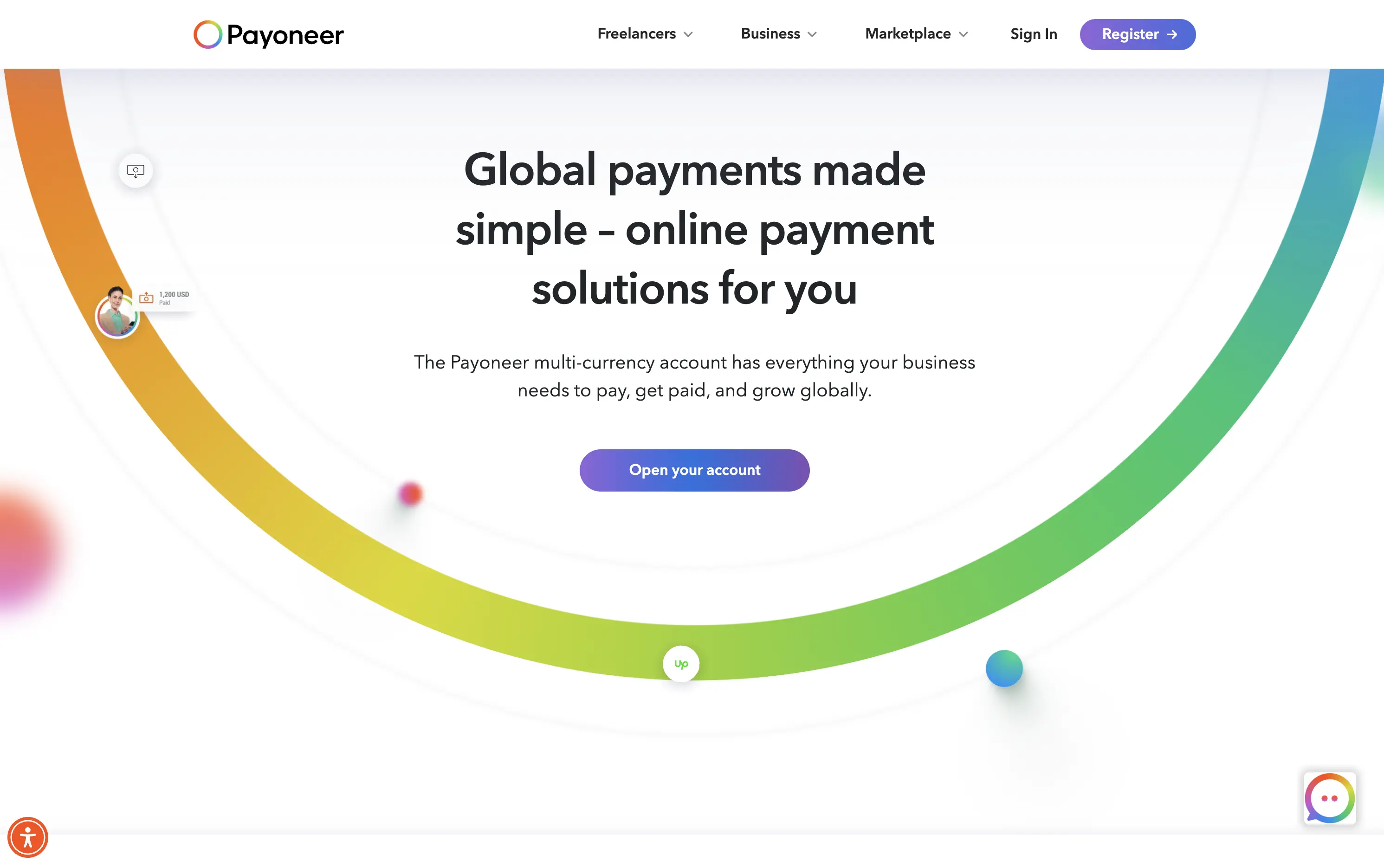
Payoneer is a global online payment platform offering multi-currency accounts and seamless cross-border transactions for businesses and freelancers.
The hero blends utility and motion well. The animated arc mimics financial flow, visually conveying the platform’s core promise: fast, borderless payments. Headline is clear and functional, supported by a strong subhead. The animation, showing USD amounts sent and received, makes the experience feel human and practical. The CTA is visible but understated. Overall, it reinforces trust and makes the product feel simple and scalable.
Smart visual metaphor for financial ease and flow — helps Payoneer stand out in a space often dominated by cold, institutional design. This layout is conversion-safe while visually expressive.
This layout balances technical utility with human impact, aligning well with Algolia’s positioning as an API-first but UX-aware company. The mobile UI reinforces product value visually, while the logo wall signals scale and trust for enterprise buyers. The tone is clear, benefit-led, and appropriate for high-intent decision-makers evaluating AI tools for customer experience. This is a solid enterprise-facing hero built to perform.
Payoneer
↗
SaaS
Fintech
Centered
Descriptive
Confident
Single Button
Photography
Illustration
Custom Animation
Light Mode
Purple
Sans serif
B2B
Home Page
Wordpress
global payments, borderless finance, transaction animation, multi-currency account, visual storytelling, freelancer payments, cross-border SaaS, simplified UX, modern money movement, motion-led layout, banking alternative, vibrant palette, international scale
Payoneer is a global online payment platform offering multi-currency accounts and seamless cross-border transactions for businesses and freelancers.
The hero blends utility and motion well. The animated arc mimics financial flow, visually conveying the platform’s core promise: fast, borderless payments. Headline is clear and functional, supported by a strong subhead. The animation, showing USD amounts sent and received, makes the experience feel human and practical. The CTA is visible but understated. Overall, it reinforces trust and makes the product feel simple and scalable.
Smart visual metaphor for financial ease and flow — helps Payoneer stand out in a space often dominated by cold, institutional design. This layout is conversion-safe while visually expressive.
This layout balances technical utility with human impact, aligning well with Algolia’s positioning as an API-first but UX-aware company. The mobile UI reinforces product value visually, while the logo wall signals scale and trust for enterprise buyers. The tone is clear, benefit-led, and appropriate for high-intent decision-makers evaluating AI tools for customer experience. This is a solid enterprise-facing hero built to perform.
Wise
↗
SaaS
Fintech
Split Grid
Left-aligned
Benefit-Driven
Search/Utility Block
Interactive
Product UI
Social Proof
Light Mode
Green
Sans serif
Hybrid
Home Page
Custom Code
fintech, currency exchange, cost calculator, social proof upfront, real-time UI, B2C utility, transparent pricing, global payments, lean UX, bold typography, conversion-focused, clean layout, product-first design
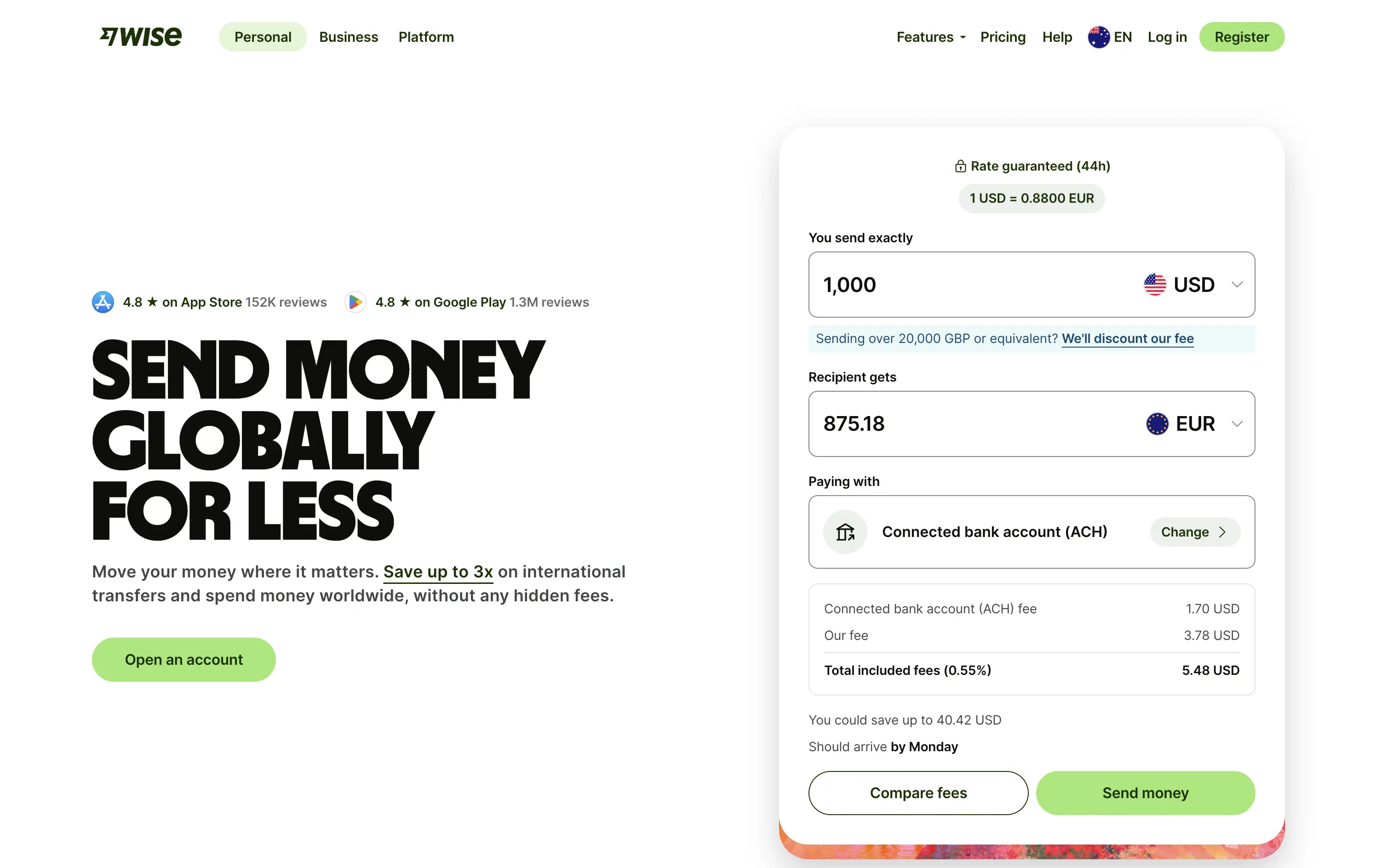
Wise lets you send money internationally with real exchange rates and ultra-low fees — no hidden costs, just fast, fair transfers.
The bold headline immediately communicates value — “SEND MONEY GLOBALLY FOR LESS” — while the live calculator UI does the heavy lifting. Trust indicators like app store ratings sit prominently up top. CTAs are practical and clearly tied to user action. It’s all signal; functional and focused.
Perfect for high-intent users seeking fast comparison and action. The calculator UI de-risks the process while keeping attention on price.
This layout balances technical utility with human impact, aligning well with Algolia’s positioning as an API-first but UX-aware company. The mobile UI reinforces product value visually, while the logo wall signals scale and trust for enterprise buyers. The tone is clear, benefit-led, and appropriate for high-intent decision-makers evaluating AI tools for customer experience. This is a solid enterprise-facing hero built to perform.
Wise
↗
SaaS
Fintech
Split Grid
Left-aligned
Benefit-Driven
Search/Utility Block
Interactive
Product UI
Social Proof
Light Mode
Green
Sans serif
Hybrid
Home Page
Custom Code
fintech, currency exchange, cost calculator, social proof upfront, real-time UI, B2C utility, transparent pricing, global payments, lean UX, bold typography, conversion-focused, clean layout, product-first design
Wise lets you send money internationally with real exchange rates and ultra-low fees — no hidden costs, just fast, fair transfers.
The bold headline immediately communicates value — “SEND MONEY GLOBALLY FOR LESS” — while the live calculator UI does the heavy lifting. Trust indicators like app store ratings sit prominently up top. CTAs are practical and clearly tied to user action. It’s all signal; functional and focused.
Perfect for high-intent users seeking fast comparison and action. The calculator UI de-risks the process while keeping attention on price.
This layout balances technical utility with human impact, aligning well with Algolia’s positioning as an API-first but UX-aware company. The mobile UI reinforces product value visually, while the logo wall signals scale and trust for enterprise buyers. The tone is clear, benefit-led, and appropriate for high-intent decision-makers evaluating AI tools for customer experience. This is a solid enterprise-facing hero built to perform.
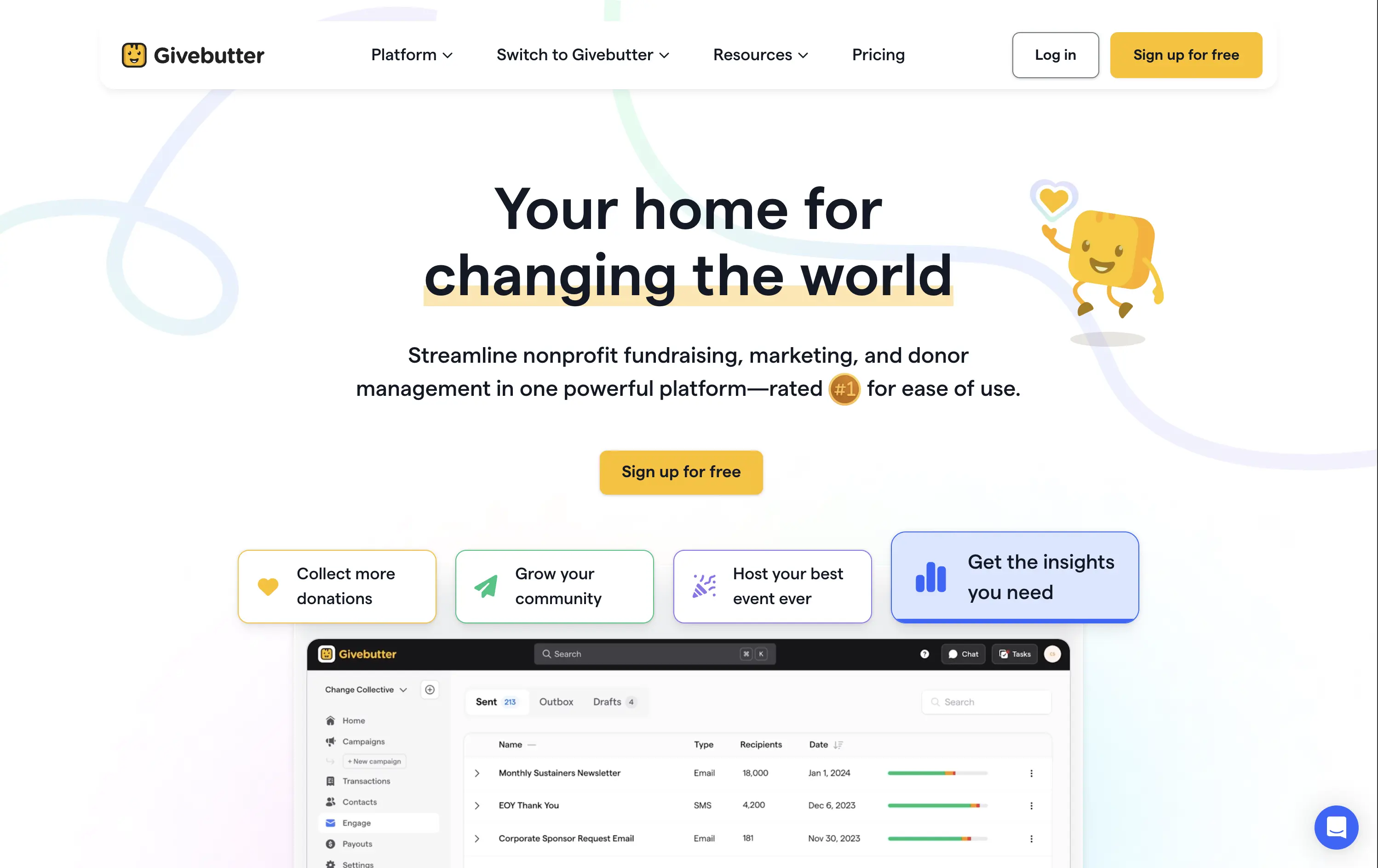
Givebutter
↗
SaaS
Fintech
Centered
Aspirational
Empowering
Single Button
Illustration
Product UI
Custom Animation
Light Mode
Yellow
Sans serif
B2B
Home Page
Webflow
fundraising SaaS, nonprofit tech, donor platform, feel-good UX, animated mascot, bento interface, purpose-driven, pastel palette, onboarding clarity, interactive benefits, Gen Z friendly, platform utility, warm branding, visual segmentation
Givebutter is a modern fundraising platform for nonprofits to manage donations, donors, events, and campaigns — all in one place.
This hero hits all the right notes for a purpose-led platform. The headline is clear and values-forward, while the playful highlight under “changing the world” draws attention without shouting. The mascot brings joy and motion, and the interactive bentocards smartly preview key benefits. It’s emotionally inviting, but structurally strong.
The hero balances clarity and optimism. Copy is simple and anchored in purpose. Visual hierarchy is clean, with modular tiles surfacing key actions. Mascot animation adds warmth without clutter.
This layout balances technical utility with human impact, aligning well with Algolia’s positioning as an API-first but UX-aware company. The mobile UI reinforces product value visually, while the logo wall signals scale and trust for enterprise buyers. The tone is clear, benefit-led, and appropriate for high-intent decision-makers evaluating AI tools for customer experience. This is a solid enterprise-facing hero built to perform.
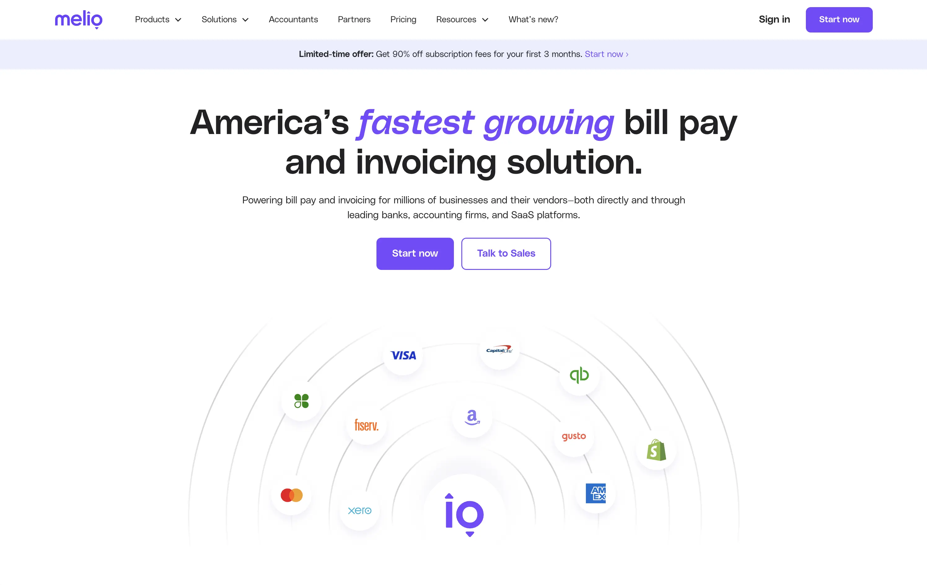
Melio
↗
SaaS
Fintech
Centered
Bold & Direct
Proof-Heavy
Multi-CTA Block
Logo Wall
Announcement
Light Mode
Purple
Sans serif
B2B
Home Page
Wordpress
bill pay, invoicing platform, small business payments, financial automation, AP/AR SaaS, vendor payments, accounting tools, QuickBooks integrations
Melio is a digital payment platform that simplifies bill pay and invoicing for small businesses and accounting teams.
Bold headline, partner logos, and focused CTAs create a strong first impression. The layout supports quick scanning and immediate action. Design choices signal reliability and scale without visual clutter.
Leverages third-party credibility to reduce friction for trust-based workflows. Dual CTA acknowledges buyer types. Layout and tone match the high-urgency, low-risk mindset of SMB finance leads.
This layout balances technical utility with human impact, aligning well with Algolia’s positioning as an API-first but UX-aware company. The mobile UI reinforces product value visually, while the logo wall signals scale and trust for enterprise buyers. The tone is clear, benefit-led, and appropriate for high-intent decision-makers evaluating AI tools for customer experience. This is a solid enterprise-facing hero built to perform.
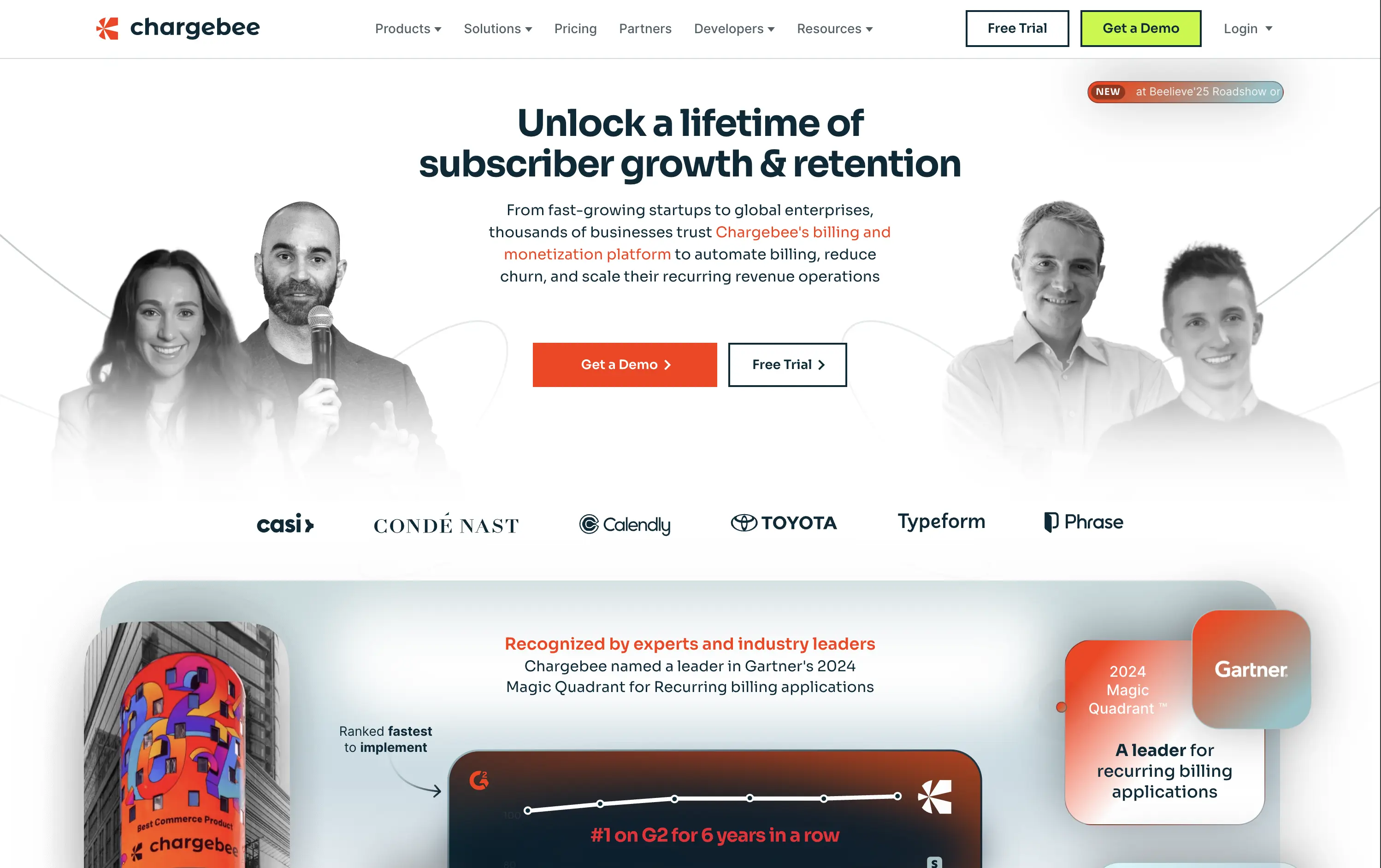
Chargebee
↗
SaaS
Fintech
Centered
Benefit-Driven
Bold & Direct
Multi-CTA Block
Photography
Logo Wall
Social Proof
Light Mode
Green
Orange
Sans serif
B2B
Home Page
Wordpress
B2B SaaS, billing automation, subscription platform, enterprise-ready, credibility-first, leadership positioning, founder imagery, logo wall, dual CTA, Gartner badge, G2 recognition, growth-focused messaging, recurring revenue
Chargebee helps businesses automate recurring billing, reduce churn, and scale subscription revenue through a trusted enterprise-ready platform.
The hero leads with a sharp, benefit-packed headline and backs it up with high-trust signals: real customer faces, name-brand logos, and third-party awards. The “Get a Demo” and “Free Trial” CTAs give users both enterprise and self-serve paths, but visual hierarchy between the two could be better balanced. Copy is outcome-focused and credible.
Smartly targeted at growth-stage and enterprise buyers, but the visual language undersells its category leadership. Strong content mix, but design lacks the presence or edge to reinforce premium positioning.
This layout balances technical utility with human impact, aligning well with Algolia’s positioning as an API-first but UX-aware company. The mobile UI reinforces product value visually, while the logo wall signals scale and trust for enterprise buyers. The tone is clear, benefit-led, and appropriate for high-intent decision-makers evaluating AI tools for customer experience. This is a solid enterprise-facing hero built to perform.
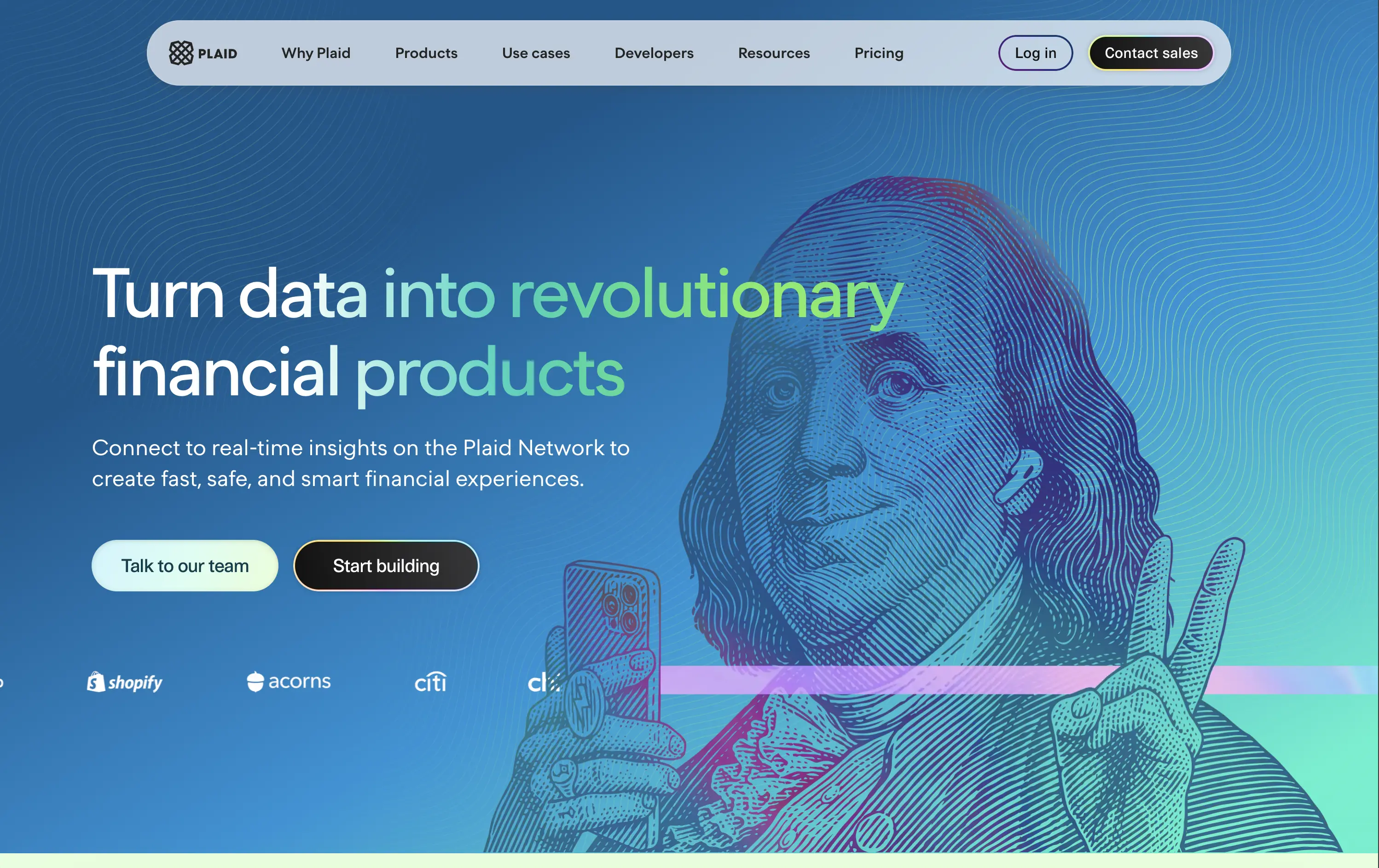
Plaid
↗
DevTools
Fintech
Data & Analytics
Left-aligned
Bold & Direct
Confident
Multi-CTA Block
Illustration
Interactive
Logo Wall
Gradient
Blue
Green
Sans serif
B2B
Home Page
Custom Code
developer fintech, API platform, financial data access, quirky fintech aesthetic, bold hero art, Benjamin Franklin illustration, smart finance tools, B2B API, trust logos, dev-first call to action, animated CTA, playful visual metaphor
Plaid is a data network that connects financial apps to users’ bank accounts securely and efficiently to power modern money experiences.
Plaid’s hero grabs attention with personality — Benjamin Franklin posing with an iPhone and some airpods, wrapped in a swirling gradient background. But it’s not just noise. The headline instantly communicates product value and the CTA contrast (“Talk to our team” vs. “Start building”) serves both enterprise and self-serve tracks. Logo wall underlines legitimacy. It’s high-impact and instantly memorable.
Plaid positions itself as the modern infrastructure backbone of fintech. The visual and messaging mix signals credibility, tech depth, and cultural fluency — ideal for both new gen founders.
This layout balances technical utility with human impact, aligning well with Algolia’s positioning as an API-first but UX-aware company. The mobile UI reinforces product value visually, while the logo wall signals scale and trust for enterprise buyers. The tone is clear, benefit-led, and appropriate for high-intent decision-makers evaluating AI tools for customer experience. This is a solid enterprise-facing hero built to perform.
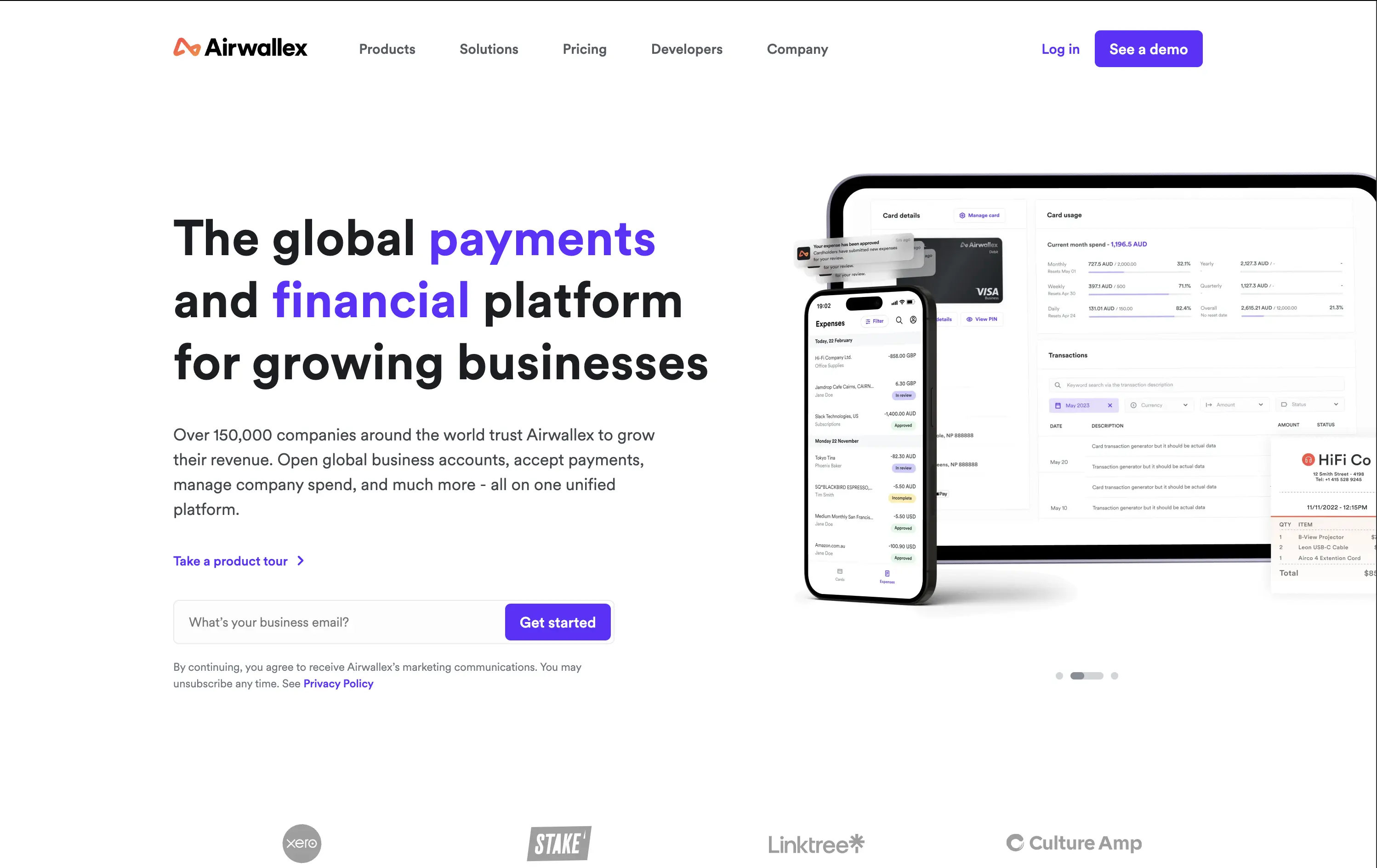
Airwallex
↗
SaaS
Fintech
Split Grid
Left-aligned
Bold & Direct
Email Capture
Logo Wall
Product UI
Social Proof
Light Mode
Purple
Sans serif
B2B
Home Page
Custom Code
global payments, business finance platform, modern fintech, trust-first messaging, clear value prop, multi-CTA, enterprise growth focus, mobile-first UI, clean grid, bold headline, subtle social proof, form-first hero, platform consolidation
Airwallex helps businesses grow globally by simplifying payments, expenses, and financial operations in one platform.
The hero is clean, confident, and product-led. It showcases both mobile and desktop views, reinforcing versatility. The email CTA is low-friction and conversion-ready. Copy hits major trust levers—global scale, growth, and simplicity—without bloating.
Well-calibrated for a mid-to-enterprise audience seeking global financial control. It’s benefit-led without hyperbole and supports multiple buyer types with a calm, scalable tone. The product visuals back up the value promise.
This layout balances technical utility with human impact, aligning well with Algolia’s positioning as an API-first but UX-aware company. The mobile UI reinforces product value visually, while the logo wall signals scale and trust for enterprise buyers. The tone is clear, benefit-led, and appropriate for high-intent decision-makers evaluating AI tools for customer experience. This is a solid enterprise-facing hero built to perform.
The most effective hero sections in your inbox.
Monthly round up of top hero sections.
Don't worry. We hate spam too.
Don't worry. We hate spam too.
Don't worry. We hate spam too.