Announcement
26
26
26
26
Banners or top bars calling attention to something new or timely.
Filters
Hume
↗
SaaS
AI Tools
Centered
Bold & Direct
Confident
Search/Utility Block
Interactive
Announcement
Gradient
Light Mode
Pink
Orange
Sans serif
Hybrid
Home Page
Custom Code
voice ai, text-to-speech, llm, real-time api, developer friendly, pastel gradient, centered hero, interactive demo, single cta, assertive headline, white card, product proof, gradient background, low-friction signup, modern saas
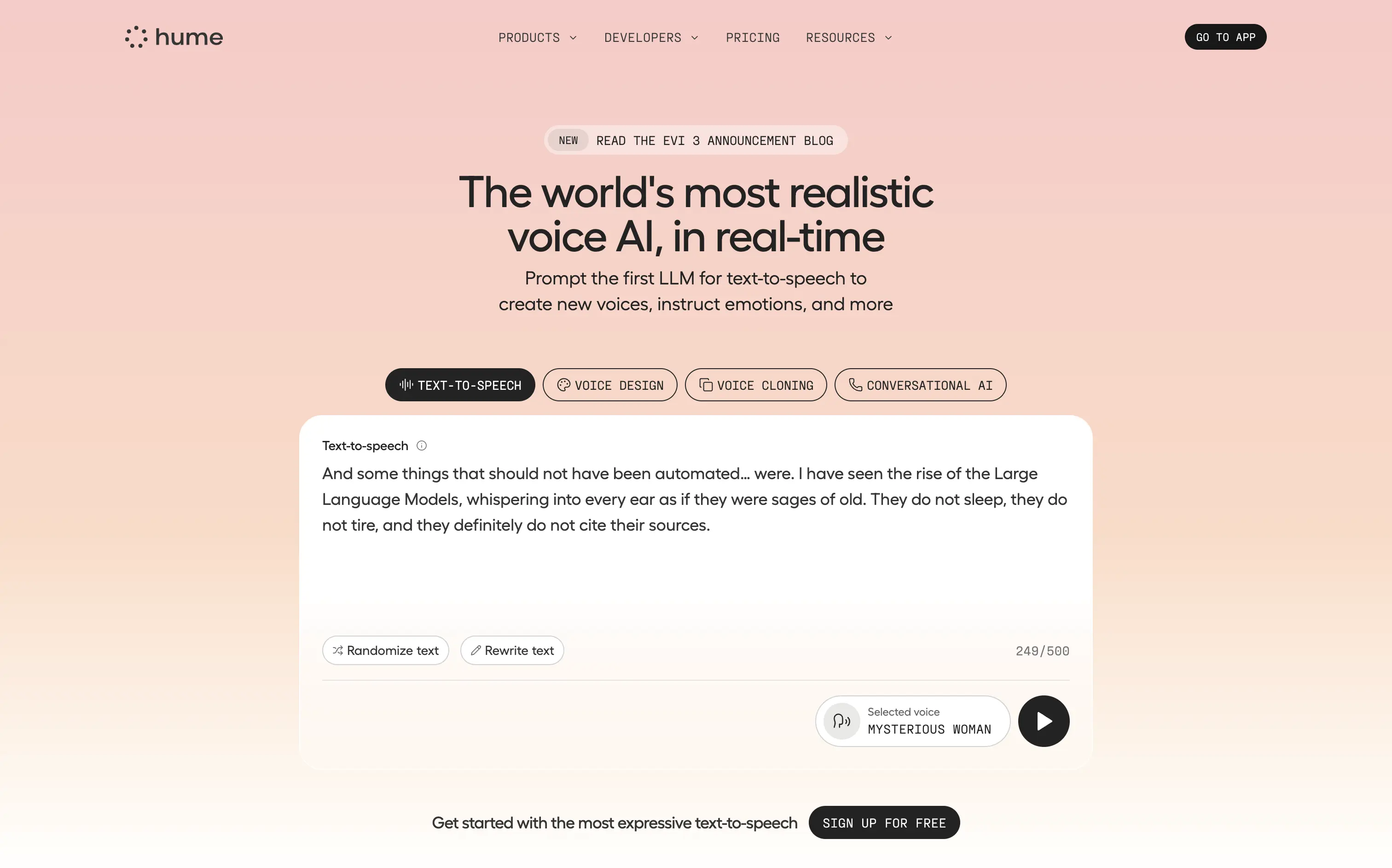
Hume offers a real-time text-to-speech API that lets developers generate lifelike, emotionally nuanced voices or clone existing ones on demand.
Bold claim, proof in one scroll. The live sandbox lets visitors try four core features instantly—a strong trust move. Clear headline, crisp subhead, and “Sign Up For Free” keep focus. Gradient softens tech intensity but may under-signal enterprise heft.
Superlative headline plus instant demo match developer expectations for proof. Single signup path reduces cognitive load, positioning Hume as fast, expressive infrastructure rather than a heavy enterprise suite.
This layout balances technical utility with human impact, aligning well with Algolia’s positioning as an API-first but UX-aware company. The mobile UI reinforces product value visually, while the logo wall signals scale and trust for enterprise buyers. The tone is clear, benefit-led, and appropriate for high-intent decision-makers evaluating AI tools for customer experience. This is a solid enterprise-facing hero built to perform.
Hume
↗
SaaS
AI Tools
Centered
Bold & Direct
Confident
Search/Utility Block
Interactive
Announcement
Gradient
Light Mode
Pink
Orange
Sans serif
Hybrid
Home Page
Custom Code
voice ai, text-to-speech, llm, real-time api, developer friendly, pastel gradient, centered hero, interactive demo, single cta, assertive headline, white card, product proof, gradient background, low-friction signup, modern saas
Hume offers a real-time text-to-speech API that lets developers generate lifelike, emotionally nuanced voices or clone existing ones on demand.
Bold claim, proof in one scroll. The live sandbox lets visitors try four core features instantly—a strong trust move. Clear headline, crisp subhead, and “Sign Up For Free” keep focus. Gradient softens tech intensity but may under-signal enterprise heft.
Superlative headline plus instant demo match developer expectations for proof. Single signup path reduces cognitive load, positioning Hume as fast, expressive infrastructure rather than a heavy enterprise suite.
This layout balances technical utility with human impact, aligning well with Algolia’s positioning as an API-first but UX-aware company. The mobile UI reinforces product value visually, while the logo wall signals scale and trust for enterprise buyers. The tone is clear, benefit-led, and appropriate for high-intent decision-makers evaluating AI tools for customer experience. This is a solid enterprise-facing hero built to perform.
Collective
↗
SaaS
Fintech
Split Grid
Benefit-Driven
Single Button
Logo Wall
Product UI
Announcement
Light Mode
Purple
Serif
B2B
Home Page
Custom Code
solo-preneur finance, tax savings, accounting dashboard, countdown promo bar, split hero, logo wall proof, LLC services, purple CTA, self-employed tools, clean UI, high-trust layout, all-in-one platform, product screenshot, modern fintech, onboarding waiver
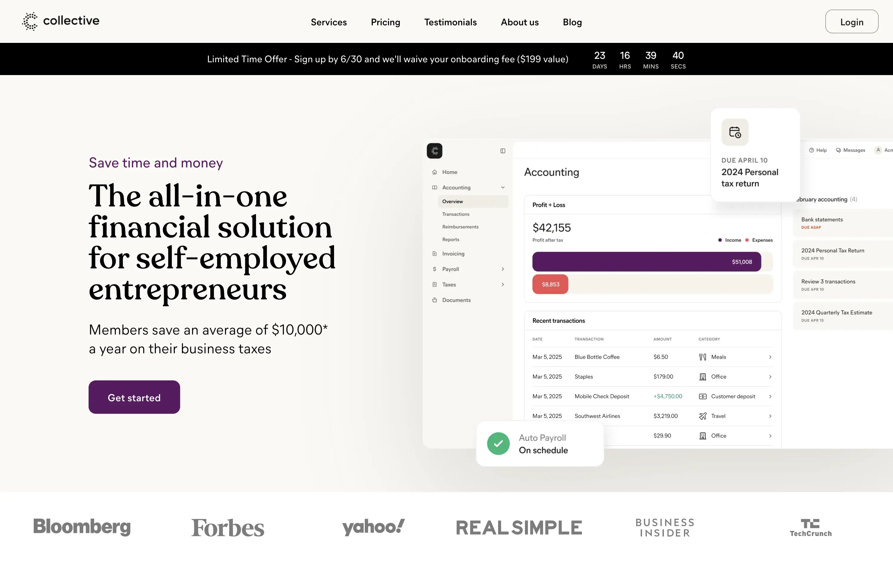
Collective handles formation, accounting, payroll, and taxes for self-employed entrepreneurs so they keep more income and skip back-office busywork.
Clear headline frames a big benefit; sub-copy quantifies $10k average savings, anchoring value. Purple “Get started” button pops on a calm canvas, and a limited-time bar with countdown injects urgency. Right-side UI mock-up shows real product context, while publication logos reinforce trust. Visual hierarchy guides left-to-right scan cleanly.
Messaging speaks directly to cost-sensitive solo founders, pairing quantified proof with urgency and social validation. Split grid balances authority and approachability, aligning with a service-plus-software proposition.
This layout balances technical utility with human impact, aligning well with Algolia’s positioning as an API-first but UX-aware company. The mobile UI reinforces product value visually, while the logo wall signals scale and trust for enterprise buyers. The tone is clear, benefit-led, and appropriate for high-intent decision-makers evaluating AI tools for customer experience. This is a solid enterprise-facing hero built to perform.
Collective
↗
SaaS
Fintech
Split Grid
Benefit-Driven
Single Button
Logo Wall
Product UI
Announcement
Light Mode
Purple
Serif
B2B
Home Page
Custom Code
solo-preneur finance, tax savings, accounting dashboard, countdown promo bar, split hero, logo wall proof, LLC services, purple CTA, self-employed tools, clean UI, high-trust layout, all-in-one platform, product screenshot, modern fintech, onboarding waiver
Collective handles formation, accounting, payroll, and taxes for self-employed entrepreneurs so they keep more income and skip back-office busywork.
Clear headline frames a big benefit; sub-copy quantifies $10k average savings, anchoring value. Purple “Get started” button pops on a calm canvas, and a limited-time bar with countdown injects urgency. Right-side UI mock-up shows real product context, while publication logos reinforce trust. Visual hierarchy guides left-to-right scan cleanly.
Messaging speaks directly to cost-sensitive solo founders, pairing quantified proof with urgency and social validation. Split grid balances authority and approachability, aligning with a service-plus-software proposition.
This layout balances technical utility with human impact, aligning well with Algolia’s positioning as an API-first but UX-aware company. The mobile UI reinforces product value visually, while the logo wall signals scale and trust for enterprise buyers. The tone is clear, benefit-led, and appropriate for high-intent decision-makers evaluating AI tools for customer experience. This is a solid enterprise-facing hero built to perform.
Stacks
↗
SaaS
AI Tools
Fintech
Centered
Aspirational
Abstract / Conceptual
Multi-CTA Block
Logo Wall
Product UI
Announcement
Gradient
Light Mode
Green
Yellow
Serif
B2B
Home Page
Framer
gradient hero, oversized serif headline, AI accounting SaaS, dual CTA, funding badge, logo wall, centered layout, finance automation, green yellow gradient, trusted by logos, product UI peek, crisp white background, modern B2B, high trust, accounting teams
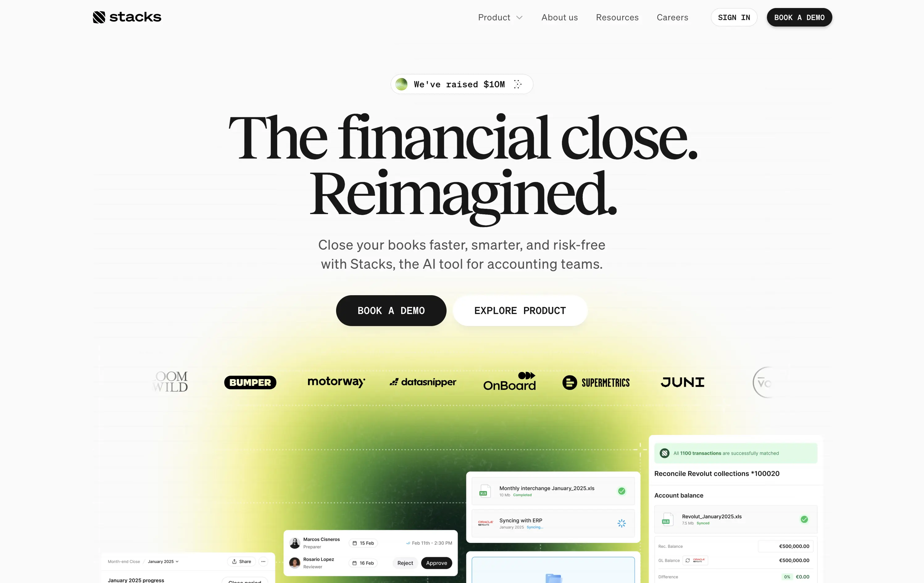
AI‑powered platform that helps accounting teams close books faster and with less risk by automating month‑end workflows.
Oversized serif headline reframes month‑end close as an ambitious reinvention, while the lime gradient draws focus and adds energy. Subheadline grounds the concept with clear benefits, and dual CTAs serve both demo‑ready and exploratory visitors. Funding badge plus client logos build instant trust. UI snippets tease depth without clutter, aided by spacious layout and sticky nav. Cohesive and convincing.
Conceptual headline elevates mundane finance work, appealing to transformation‑minded leaders. Gradient signals progress, while proof elements ease risk concerns. Demo‑centric funnel matches enterprise sales reality.
This layout balances technical utility with human impact, aligning well with Algolia’s positioning as an API-first but UX-aware company. The mobile UI reinforces product value visually, while the logo wall signals scale and trust for enterprise buyers. The tone is clear, benefit-led, and appropriate for high-intent decision-makers evaluating AI tools for customer experience. This is a solid enterprise-facing hero built to perform.
Stacks
↗
SaaS
AI Tools
Fintech
Centered
Aspirational
Abstract / Conceptual
Multi-CTA Block
Logo Wall
Product UI
Announcement
Gradient
Light Mode
Green
Yellow
Serif
B2B
Home Page
Framer
gradient hero, oversized serif headline, AI accounting SaaS, dual CTA, funding badge, logo wall, centered layout, finance automation, green yellow gradient, trusted by logos, product UI peek, crisp white background, modern B2B, high trust, accounting teams
AI‑powered platform that helps accounting teams close books faster and with less risk by automating month‑end workflows.
Oversized serif headline reframes month‑end close as an ambitious reinvention, while the lime gradient draws focus and adds energy. Subheadline grounds the concept with clear benefits, and dual CTAs serve both demo‑ready and exploratory visitors. Funding badge plus client logos build instant trust. UI snippets tease depth without clutter, aided by spacious layout and sticky nav. Cohesive and convincing.
Conceptual headline elevates mundane finance work, appealing to transformation‑minded leaders. Gradient signals progress, while proof elements ease risk concerns. Demo‑centric funnel matches enterprise sales reality.
This layout balances technical utility with human impact, aligning well with Algolia’s positioning as an API-first but UX-aware company. The mobile UI reinforces product value visually, while the logo wall signals scale and trust for enterprise buyers. The tone is clear, benefit-led, and appropriate for high-intent decision-makers evaluating AI tools for customer experience. This is a solid enterprise-facing hero built to perform.
Make
↗
No-Code
Productivity
Split Grid
Descriptive
Empowering
Multi-CTA Block
Video
Announcement
Duotone
Pink
Sans serif
Hybrid
Home Page
Custom Code
no-code automation, workflow builder, AI integration, drag-and-drop editor, Zapier alternative, clear onboarding, SaaS demo UX, trust-focused layout, commercial SaaS, AI-enhanced logic
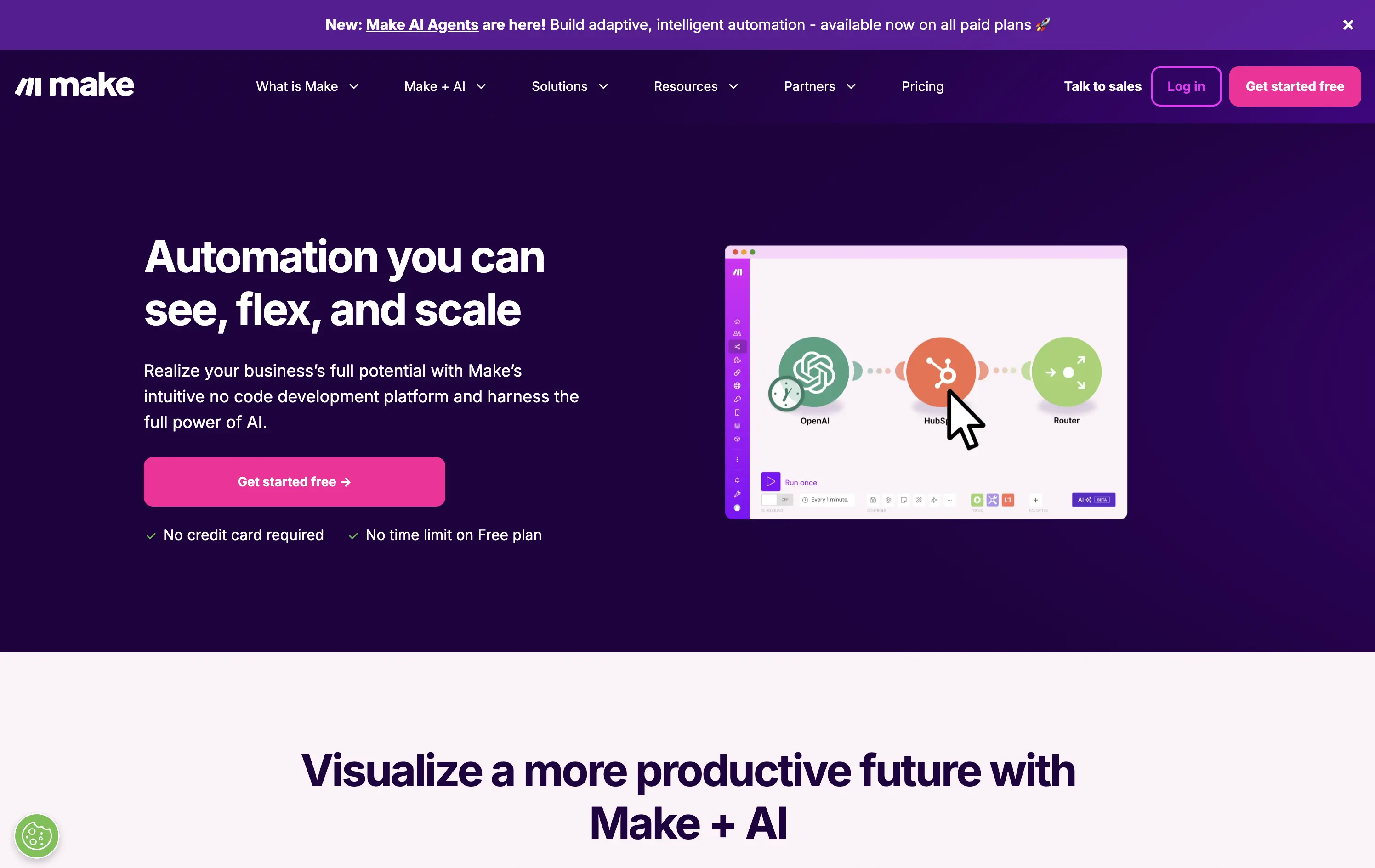
Make is a no-code automation platform that lets businesses visually build and scale workflows powered by AI.
It’s clean, clear, and direct. The animated product video does the heavy lifting. The layout and copy are textbook SaaS—efficient but forgettable. It communicates function well without taking any design risks.
Optimized for clarity and ease of adoption. Great for users shopping for workflow tools, but lacks brand distinctiveness. Plays it safe with a universal SaaS format and gradient palette.
This layout balances technical utility with human impact, aligning well with Algolia’s positioning as an API-first but UX-aware company. The mobile UI reinforces product value visually, while the logo wall signals scale and trust for enterprise buyers. The tone is clear, benefit-led, and appropriate for high-intent decision-makers evaluating AI tools for customer experience. This is a solid enterprise-facing hero built to perform.
Make
↗
No-Code
Productivity
Split Grid
Descriptive
Empowering
Multi-CTA Block
Video
Announcement
Duotone
Pink
Sans serif
Hybrid
Home Page
Custom Code
no-code automation, workflow builder, AI integration, drag-and-drop editor, Zapier alternative, clear onboarding, SaaS demo UX, trust-focused layout, commercial SaaS, AI-enhanced logic
Make is a no-code automation platform that lets businesses visually build and scale workflows powered by AI.
It’s clean, clear, and direct. The animated product video does the heavy lifting. The layout and copy are textbook SaaS—efficient but forgettable. It communicates function well without taking any design risks.
Optimized for clarity and ease of adoption. Great for users shopping for workflow tools, but lacks brand distinctiveness. Plays it safe with a universal SaaS format and gradient palette.
This layout balances technical utility with human impact, aligning well with Algolia’s positioning as an API-first but UX-aware company. The mobile UI reinforces product value visually, while the logo wall signals scale and trust for enterprise buyers. The tone is clear, benefit-led, and appropriate for high-intent decision-makers evaluating AI tools for customer experience. This is a solid enterprise-facing hero built to perform.
Buildship
↗
SaaS
AI Tools
No-Code
Left-aligned
Descriptive
Single Button
Product UI
Custom Animation
Announcement
Dark Mode
White
Blue
Sans serif
Hybrid
Home Page
Framer
AI workflow builder, visual builder, flowchart UI, dev-friendly, dark UI, launch-ready, free tier, motion subtlety, AI agent platform, startup audience, real-time editing, builder UX, automation
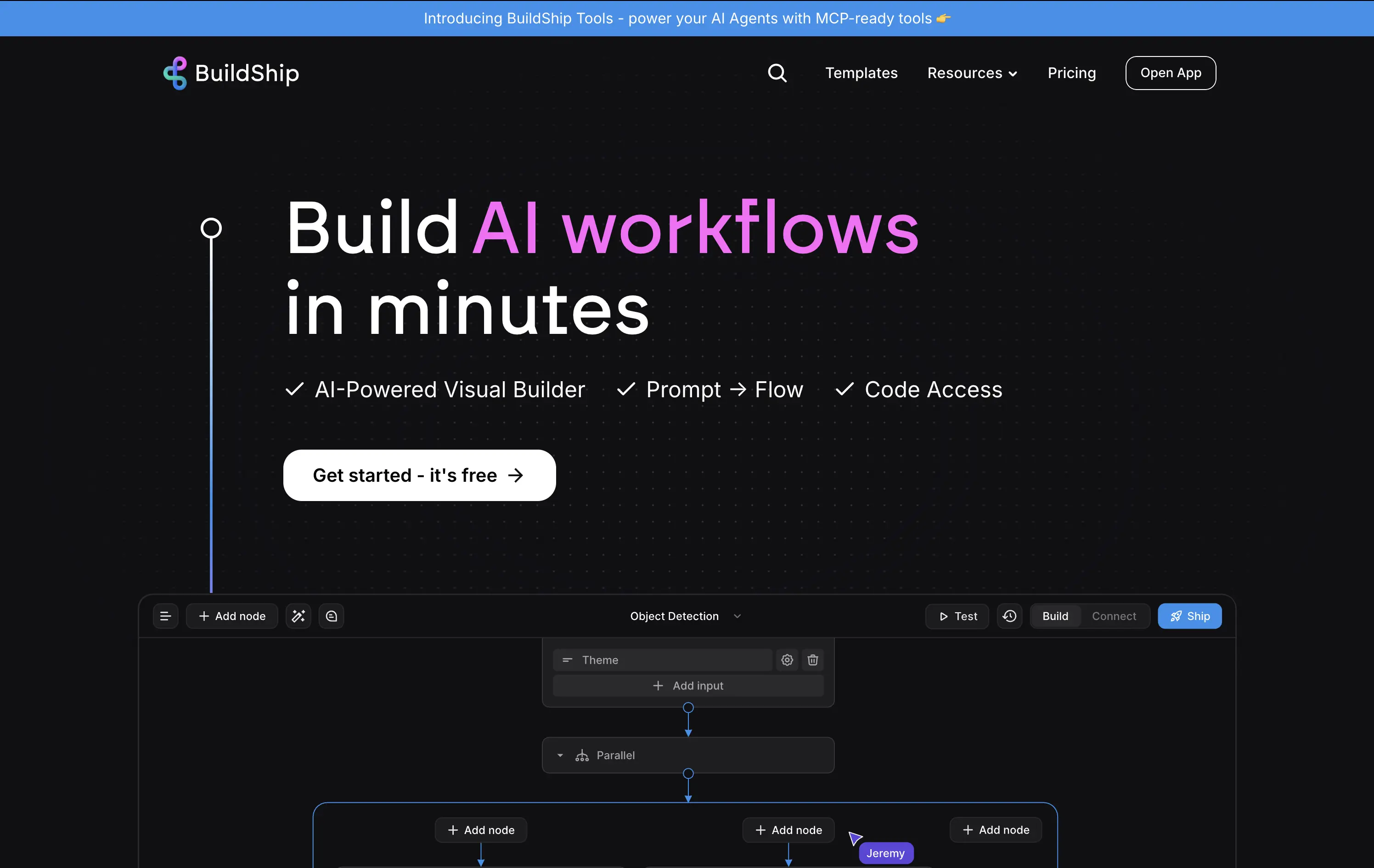
A visual builder to create and deploy AI workflows, combining prompts, logic flows, and optional code access.
Clear headline with a tight value prop and fast comprehension. Subtext breaks down the core features simply. The product UI preview grounds the promise in functionality. Strong visual hierarchy, CTA stands out.
Great fit for a semi-technical but time-sensitive audience. The message appeals to both speed and control. Design signals ease of use without over-explaining.
This layout balances technical utility with human impact, aligning well with Algolia’s positioning as an API-first but UX-aware company. The mobile UI reinforces product value visually, while the logo wall signals scale and trust for enterprise buyers. The tone is clear, benefit-led, and appropriate for high-intent decision-makers evaluating AI tools for customer experience. This is a solid enterprise-facing hero built to perform.
Buildship
↗
SaaS
AI Tools
No-Code
Left-aligned
Descriptive
Single Button
Product UI
Custom Animation
Announcement
Dark Mode
White
Blue
Sans serif
Hybrid
Home Page
Framer
AI workflow builder, visual builder, flowchart UI, dev-friendly, dark UI, launch-ready, free tier, motion subtlety, AI agent platform, startup audience, real-time editing, builder UX, automation
A visual builder to create and deploy AI workflows, combining prompts, logic flows, and optional code access.
Clear headline with a tight value prop and fast comprehension. Subtext breaks down the core features simply. The product UI preview grounds the promise in functionality. Strong visual hierarchy, CTA stands out.
Great fit for a semi-technical but time-sensitive audience. The message appeals to both speed and control. Design signals ease of use without over-explaining.
This layout balances technical utility with human impact, aligning well with Algolia’s positioning as an API-first but UX-aware company. The mobile UI reinforces product value visually, while the logo wall signals scale and trust for enterprise buyers. The tone is clear, benefit-led, and appropriate for high-intent decision-makers evaluating AI tools for customer experience. This is a solid enterprise-facing hero built to perform.
Mem
↗
AI Tools
Productivity
Inset
Centered
Benefit-Driven
Empowering
Single Button
Product UI
Announcement
Gradient
Light Mode
Pink
Purple
Sans serif
B2C
Home Page
Framer
ai note app, ambient UI, productivity tool, second brain, writing partner, connected thoughts, knowledge management, pastel color gradient, Gen Z tone, soft product UI, memory system, fast capture, personal knowledge base
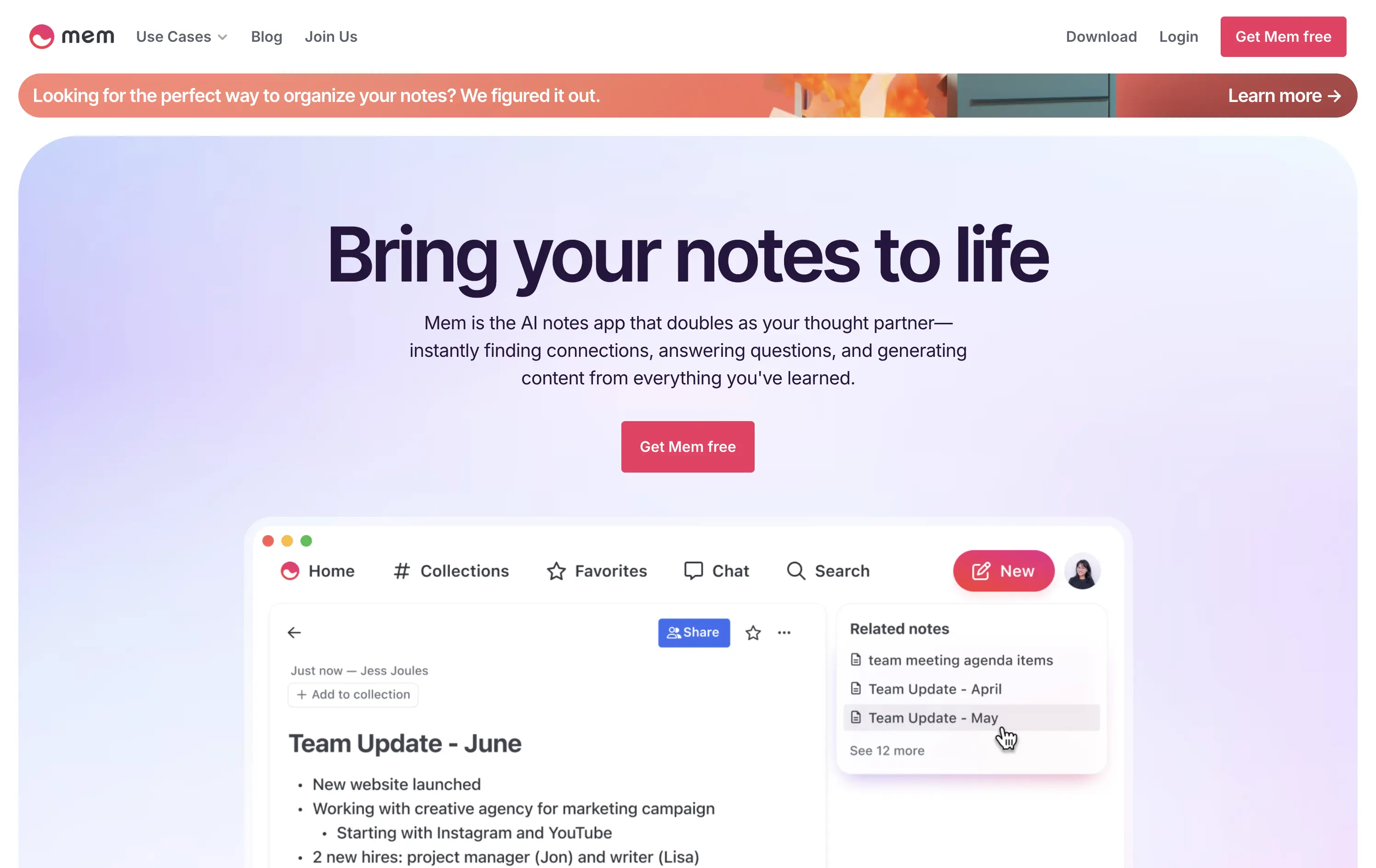
Mem is an AI-powered note-taking app that helps users organize thoughts, generate content, and uncover connections automatically.
Clear and emotional headline matched with a simple product UI. CTA stands out visually. Gradient background and calm visual rhythm support a productivity mindset. Overall, well-structured but slightly generic in messaging.
Positioning as a thought partner sets it apart from basic note apps. Hero leans into AI assistance without overwhelming technicality. Good emotional framing for a consumer productivity tool.
This layout balances technical utility with human impact, aligning well with Algolia’s positioning as an API-first but UX-aware company. The mobile UI reinforces product value visually, while the logo wall signals scale and trust for enterprise buyers. The tone is clear, benefit-led, and appropriate for high-intent decision-makers evaluating AI tools for customer experience. This is a solid enterprise-facing hero built to perform.
Mem
↗
AI Tools
Productivity
Inset
Centered
Benefit-Driven
Empowering
Single Button
Product UI
Announcement
Gradient
Light Mode
Pink
Purple
Sans serif
B2C
Home Page
Framer
ai note app, ambient UI, productivity tool, second brain, writing partner, connected thoughts, knowledge management, pastel color gradient, Gen Z tone, soft product UI, memory system, fast capture, personal knowledge base
Mem is an AI-powered note-taking app that helps users organize thoughts, generate content, and uncover connections automatically.
Clear and emotional headline matched with a simple product UI. CTA stands out visually. Gradient background and calm visual rhythm support a productivity mindset. Overall, well-structured but slightly generic in messaging.
Positioning as a thought partner sets it apart from basic note apps. Hero leans into AI assistance without overwhelming technicality. Good emotional framing for a consumer productivity tool.
This layout balances technical utility with human impact, aligning well with Algolia’s positioning as an API-first but UX-aware company. The mobile UI reinforces product value visually, while the logo wall signals scale and trust for enterprise buyers. The tone is clear, benefit-led, and appropriate for high-intent decision-makers evaluating AI tools for customer experience. This is a solid enterprise-facing hero built to perform.
Plasmic
↗
SaaS
No-Code
Collaboration
Creative Tools
Centered
Benefit-Driven
Descriptive
Single Button
Product UI
Announcement
Gradient
Light Mode
Pink
Purple
Yellow
Sans serif
Hybrid
Home Page
Custom Code
visual builder, code integration, React support, Figma import, developer-friendly, no-code platform, CMS integration, responsive design, real-time collaboration, open-source, component-based, scalable, enterprise-ready, UI/UX design
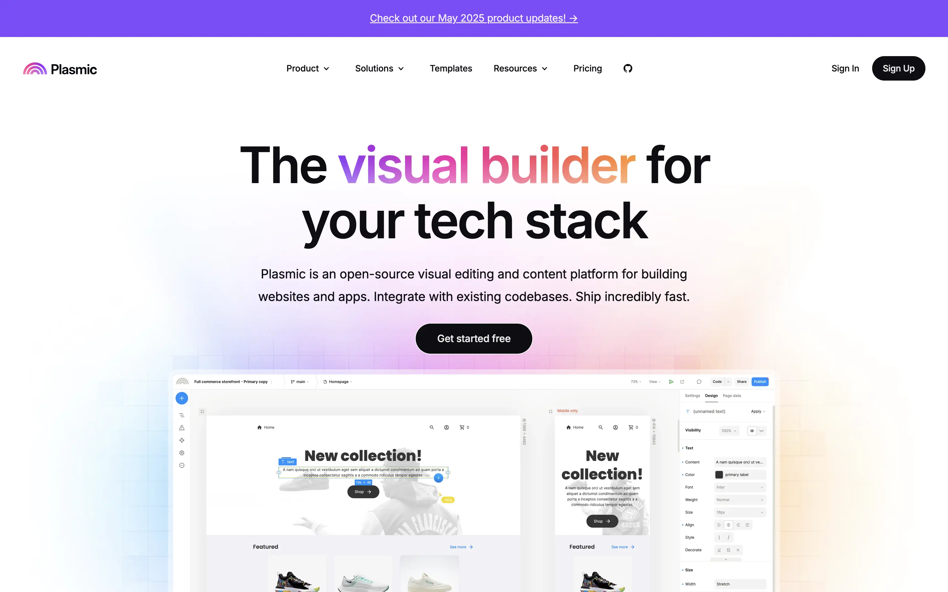
Plasmic is an open-source visual builder that enables teams to design and build web apps and websites rapidly, integrating seamlessly with existing codebases.
The hero section clearly communicates Plasmic's core value proposition as a visual builder for tech stacks. The combination of concise copy and product visuals effectively showcases its capabilities. The inclusion of a logo wall adds credibility, and the CTA is prominently displayed, guiding users toward engagement.
Plasmic positions itself effectively for both developers and non-developers by highlighting seamless code integration and visual editing capabilities. This dual appeal broadens its market reach and addresses common pain points in web development workflows.
This layout balances technical utility with human impact, aligning well with Algolia’s positioning as an API-first but UX-aware company. The mobile UI reinforces product value visually, while the logo wall signals scale and trust for enterprise buyers. The tone is clear, benefit-led, and appropriate for high-intent decision-makers evaluating AI tools for customer experience. This is a solid enterprise-facing hero built to perform.
Plasmic
↗
SaaS
No-Code
Collaboration
Creative Tools
Centered
Benefit-Driven
Descriptive
Single Button
Product UI
Announcement
Gradient
Light Mode
Pink
Purple
Yellow
Sans serif
Hybrid
Home Page
Custom Code
visual builder, code integration, React support, Figma import, developer-friendly, no-code platform, CMS integration, responsive design, real-time collaboration, open-source, component-based, scalable, enterprise-ready, UI/UX design
Plasmic is an open-source visual builder that enables teams to design and build web apps and websites rapidly, integrating seamlessly with existing codebases.
The hero section clearly communicates Plasmic's core value proposition as a visual builder for tech stacks. The combination of concise copy and product visuals effectively showcases its capabilities. The inclusion of a logo wall adds credibility, and the CTA is prominently displayed, guiding users toward engagement.
Plasmic positions itself effectively for both developers and non-developers by highlighting seamless code integration and visual editing capabilities. This dual appeal broadens its market reach and addresses common pain points in web development workflows.
This layout balances technical utility with human impact, aligning well with Algolia’s positioning as an API-first but UX-aware company. The mobile UI reinforces product value visually, while the logo wall signals scale and trust for enterprise buyers. The tone is clear, benefit-led, and appropriate for high-intent decision-makers evaluating AI tools for customer experience. This is a solid enterprise-facing hero built to perform.
Console
↗
SaaS
IT & Security
AI Tools
Inset
Centered
Descriptive
Single Button
Watch Demo
Illustration
Logo Wall
Announcement
Light Mode
White
Serif
B2B
Home Page
Framer
cinematic backdrop, ai coworker, startup-funded, IT automation, visual metaphor, remote workspace, ambient hero, dystopian warm tone, product-less hero, modern SaaS, minimal chrome, high-trust logos
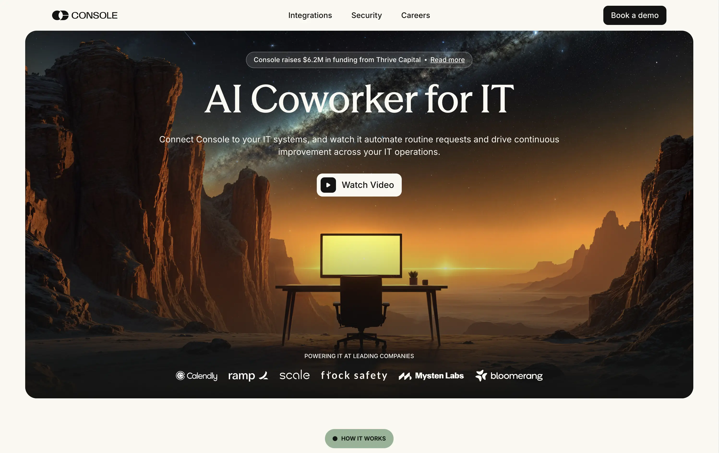
Console is an AI platform that automates routine IT tasks, acting as an autonomous coworker for technical operations teams in scaling companies.
Console’s hero leans heavily on mood. The cinematic desert landscape and glowing screen offer a metaphor for isolation, automation, and 24/7 capability. The “AI Coworker for IT” headline is simple, memorable, and category-redefining. Subtext expands the use case efficiently. The “Watch Video” CTA feels aligned with the storytelling angle. Enterprise logos below provide validation. The absence of product UI is a calculated choice — betting on intrigue over clarity.
This is a bet on brand over clarity; and it works and stands out. Conceptual visual framing elevates the value prop from tool to paradigm. Great fit for early-stage brand building in technical buyer circles.
This layout balances technical utility with human impact, aligning well with Algolia’s positioning as an API-first but UX-aware company. The mobile UI reinforces product value visually, while the logo wall signals scale and trust for enterprise buyers. The tone is clear, benefit-led, and appropriate for high-intent decision-makers evaluating AI tools for customer experience. This is a solid enterprise-facing hero built to perform.
Console
↗
SaaS
IT & Security
AI Tools
Inset
Centered
Descriptive
Single Button
Watch Demo
Illustration
Logo Wall
Announcement
Light Mode
White
Serif
B2B
Home Page
Framer
cinematic backdrop, ai coworker, startup-funded, IT automation, visual metaphor, remote workspace, ambient hero, dystopian warm tone, product-less hero, modern SaaS, minimal chrome, high-trust logos
Console is an AI platform that automates routine IT tasks, acting as an autonomous coworker for technical operations teams in scaling companies.
Console’s hero leans heavily on mood. The cinematic desert landscape and glowing screen offer a metaphor for isolation, automation, and 24/7 capability. The “AI Coworker for IT” headline is simple, memorable, and category-redefining. Subtext expands the use case efficiently. The “Watch Video” CTA feels aligned with the storytelling angle. Enterprise logos below provide validation. The absence of product UI is a calculated choice — betting on intrigue over clarity.
This is a bet on brand over clarity; and it works and stands out. Conceptual visual framing elevates the value prop from tool to paradigm. Great fit for early-stage brand building in technical buyer circles.
This layout balances technical utility with human impact, aligning well with Algolia’s positioning as an API-first but UX-aware company. The mobile UI reinforces product value visually, while the logo wall signals scale and trust for enterprise buyers. The tone is clear, benefit-led, and appropriate for high-intent decision-makers evaluating AI tools for customer experience. This is a solid enterprise-facing hero built to perform.
Granola
↗
SaaS
AI Tools
Productivity
Centered
Descriptive
Pain-driven
Download App
Multi-CTA Block
Product UI
Announcement
Gradient
Light Mode
Green
Sans serif
Hybrid
Home Page
Custom Code
AI notepad, transcript comparison, Mac/iOS focus, pastel gradient, clean UX, AI productivity, note app, task-lite SaaS, small team positioning, time-saving tool, App Store-ready, side-by-side visual
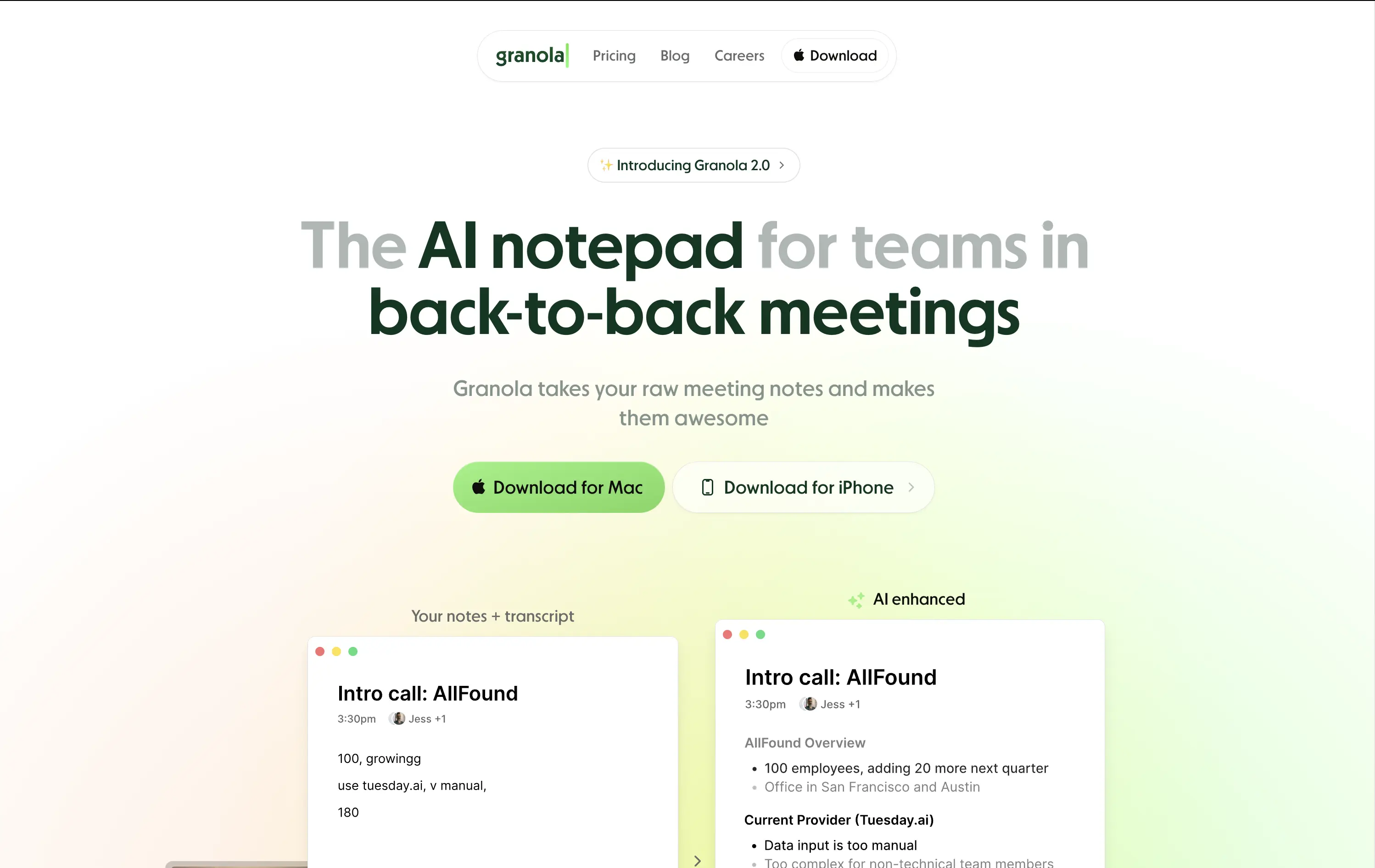
Granola is an AI notepad that turns messy meeting notes into clean, structured transcripts — built for teams with nonstop meetings.
The hero is practical and conversion-focused. It quickly communicates what the tool does and for whom. The side-by-side note demo is immediately legible and shows before/after clarity. Headline focuses on team context rather than just AI, which grounds it. Download CTAs feel native and frictionless. The soft green gradient is calming without feeling sterile. Could benefit from stronger brand differentiation, but it nails clarity and accessibility for a high-frequency use case.
Laser-targeted to productivity-challenged teams. Hero clearly communicates utility and streamlines onboarding. UI preview builds instant understanding, and the download CTAs suggest a tool that fits right into daily workflows.
This layout balances technical utility with human impact, aligning well with Algolia’s positioning as an API-first but UX-aware company. The mobile UI reinforces product value visually, while the logo wall signals scale and trust for enterprise buyers. The tone is clear, benefit-led, and appropriate for high-intent decision-makers evaluating AI tools for customer experience. This is a solid enterprise-facing hero built to perform.
Granola
↗
SaaS
AI Tools
Productivity
Centered
Descriptive
Pain-driven
Download App
Multi-CTA Block
Product UI
Announcement
Gradient
Light Mode
Green
Sans serif
Hybrid
Home Page
Custom Code
AI notepad, transcript comparison, Mac/iOS focus, pastel gradient, clean UX, AI productivity, note app, task-lite SaaS, small team positioning, time-saving tool, App Store-ready, side-by-side visual
Granola is an AI notepad that turns messy meeting notes into clean, structured transcripts — built for teams with nonstop meetings.
The hero is practical and conversion-focused. It quickly communicates what the tool does and for whom. The side-by-side note demo is immediately legible and shows before/after clarity. Headline focuses on team context rather than just AI, which grounds it. Download CTAs feel native and frictionless. The soft green gradient is calming without feeling sterile. Could benefit from stronger brand differentiation, but it nails clarity and accessibility for a high-frequency use case.
Laser-targeted to productivity-challenged teams. Hero clearly communicates utility and streamlines onboarding. UI preview builds instant understanding, and the download CTAs suggest a tool that fits right into daily workflows.
This layout balances technical utility with human impact, aligning well with Algolia’s positioning as an API-first but UX-aware company. The mobile UI reinforces product value visually, while the logo wall signals scale and trust for enterprise buyers. The tone is clear, benefit-led, and appropriate for high-intent decision-makers evaluating AI tools for customer experience. This is a solid enterprise-facing hero built to perform.
Agentio
↗
SaaS
AI Tools
Creator Tools
Centered
Bold & Direct
Confident
Multi-CTA Block
Illustration
Announcement
Gradient
Light Mode
Blue
Purple
Sans serif
Hybrid
Home Page
Webflow
orb graphic, YouTube ads, creator economy, motion gradient, AI ad platform, minimal layout, startup vibe, polished MVP, Series A, dual audience nav, split funnel intent
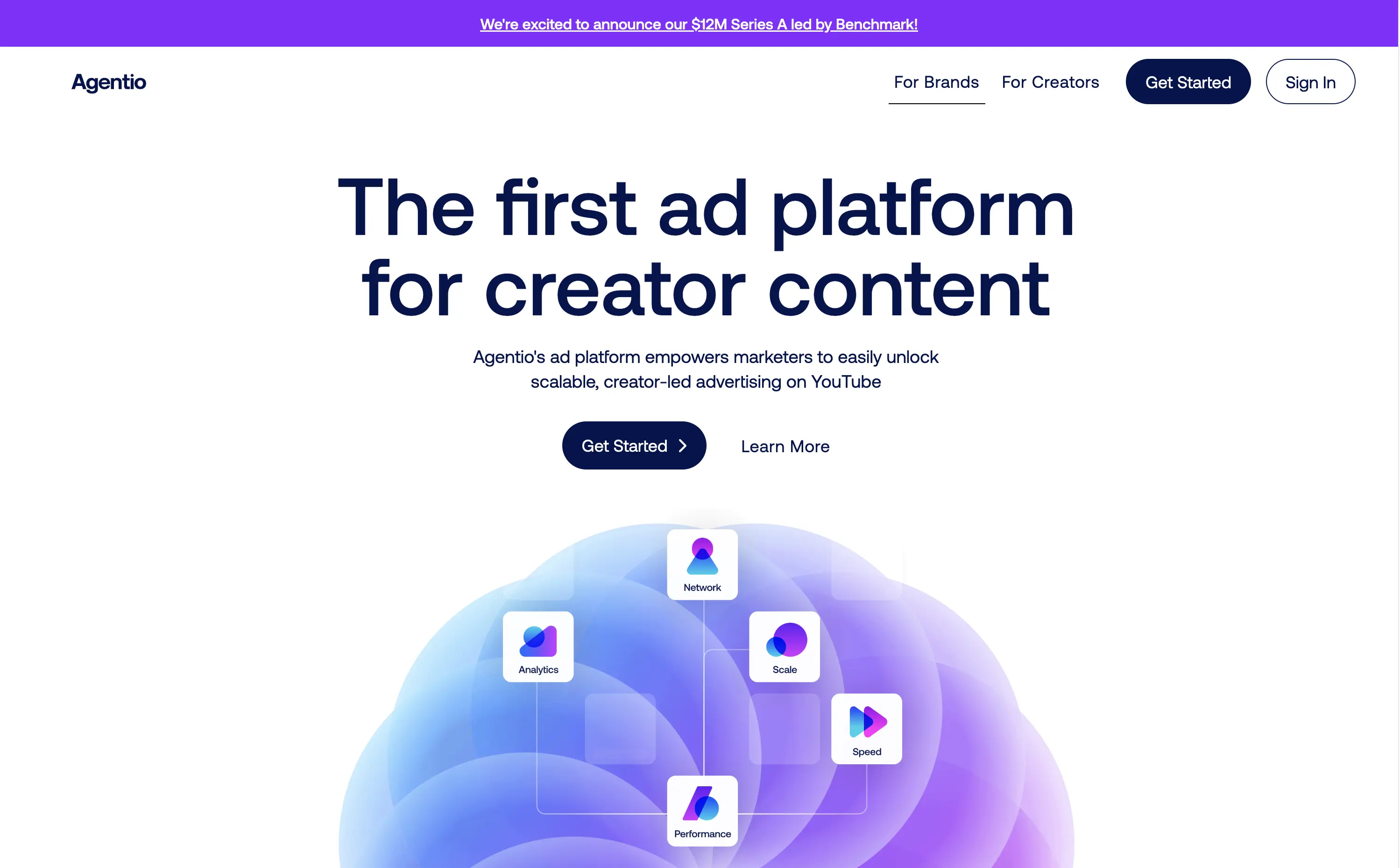
Agentio is an adtech platform helping marketers launch scalable, creator-led YouTube campaigns with performance tracking, analytics, and a managed network of creators.
Agentio’s hero is tight and intentional. The headline is clear and confident in its category claim. Subtext adds usability context without overloading. The floating orb graphic with ecosystem icons effectively visualizes the product promise. Dual CTAs cover both high and low-intent traffic. The announcement bar adds momentum without distraction. Layout feels modern and founder-backed — clean, but not generic.
Strong product-market fit vibes. Balances clarity and momentum for both creators and marketers. Visuals align with startup scaleup phase. Messaging is sharply angled to claim an early stake in the creator-led ad space.
This layout balances technical utility with human impact, aligning well with Algolia’s positioning as an API-first but UX-aware company. The mobile UI reinforces product value visually, while the logo wall signals scale and trust for enterprise buyers. The tone is clear, benefit-led, and appropriate for high-intent decision-makers evaluating AI tools for customer experience. This is a solid enterprise-facing hero built to perform.
Agentio
↗
SaaS
AI Tools
Creator Tools
Centered
Bold & Direct
Confident
Multi-CTA Block
Illustration
Announcement
Gradient
Light Mode
Blue
Purple
Sans serif
Hybrid
Home Page
Webflow
orb graphic, YouTube ads, creator economy, motion gradient, AI ad platform, minimal layout, startup vibe, polished MVP, Series A, dual audience nav, split funnel intent
Agentio is an adtech platform helping marketers launch scalable, creator-led YouTube campaigns with performance tracking, analytics, and a managed network of creators.
Agentio’s hero is tight and intentional. The headline is clear and confident in its category claim. Subtext adds usability context without overloading. The floating orb graphic with ecosystem icons effectively visualizes the product promise. Dual CTAs cover both high and low-intent traffic. The announcement bar adds momentum without distraction. Layout feels modern and founder-backed — clean, but not generic.
Strong product-market fit vibes. Balances clarity and momentum for both creators and marketers. Visuals align with startup scaleup phase. Messaging is sharply angled to claim an early stake in the creator-led ad space.
This layout balances technical utility with human impact, aligning well with Algolia’s positioning as an API-first but UX-aware company. The mobile UI reinforces product value visually, while the logo wall signals scale and trust for enterprise buyers. The tone is clear, benefit-led, and appropriate for high-intent decision-makers evaluating AI tools for customer experience. This is a solid enterprise-facing hero built to perform.
Softr
↗
SaaS
No-Code
Centered
Descriptive
Empowering
Single Button
Product UI
Announcement
Light Mode
Black
Sans serif
B2B
Home Page
Webflow
no-code builder, grid background, empowering language, SaaS homepage, CRM dashboard UI, announcement pill, onboarding-friendly, clean layout, business automation, early-stage SaaS, Coda integration, custom apps, tool for operations, low-friction CTA
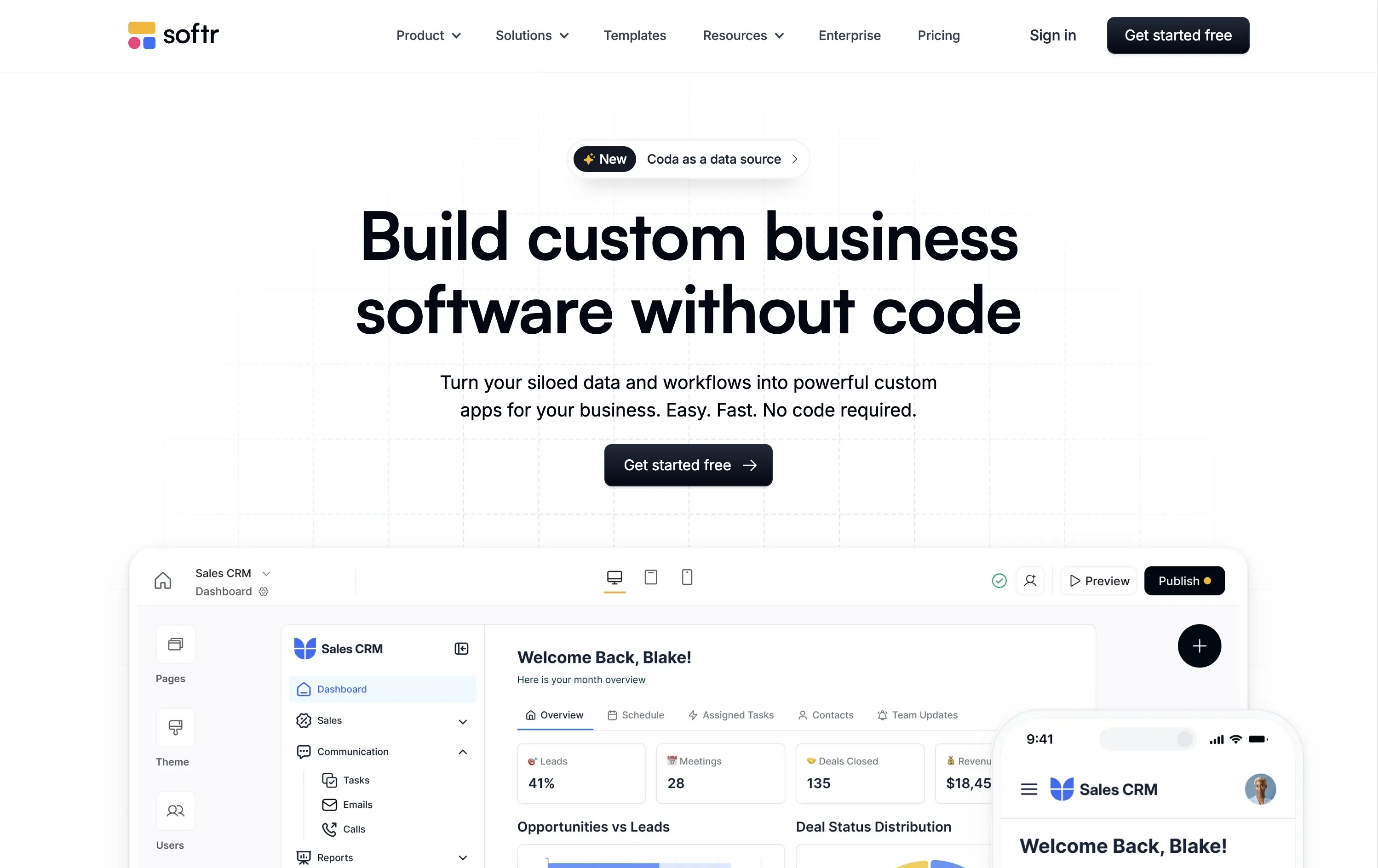
Softr lets you build custom internal tools, portals, and apps from your business data without writing any code.
Clear, product-led hero that instantly communicates value. The main headline is bold and simple, and the visual shows real product UI. New feature callout adds relevance. Overall, conversion-friendly.
Strong fit for practical decision-makers who value clarity and speed. Clean layout and tone match the product’s accessible, productivity-first positioning. Shows rather than tells.
This layout balances technical utility with human impact, aligning well with Algolia’s positioning as an API-first but UX-aware company. The mobile UI reinforces product value visually, while the logo wall signals scale and trust for enterprise buyers. The tone is clear, benefit-led, and appropriate for high-intent decision-makers evaluating AI tools for customer experience. This is a solid enterprise-facing hero built to perform.
Softr
↗
SaaS
No-Code
Centered
Descriptive
Empowering
Single Button
Product UI
Announcement
Light Mode
Black
Sans serif
B2B
Home Page
Webflow
no-code builder, grid background, empowering language, SaaS homepage, CRM dashboard UI, announcement pill, onboarding-friendly, clean layout, business automation, early-stage SaaS, Coda integration, custom apps, tool for operations, low-friction CTA
Softr lets you build custom internal tools, portals, and apps from your business data without writing any code.
Clear, product-led hero that instantly communicates value. The main headline is bold and simple, and the visual shows real product UI. New feature callout adds relevance. Overall, conversion-friendly.
Strong fit for practical decision-makers who value clarity and speed. Clean layout and tone match the product’s accessible, productivity-first positioning. Shows rather than tells.
This layout balances technical utility with human impact, aligning well with Algolia’s positioning as an API-first but UX-aware company. The mobile UI reinforces product value visually, while the logo wall signals scale and trust for enterprise buyers. The tone is clear, benefit-led, and appropriate for high-intent decision-makers evaluating AI tools for customer experience. This is a solid enterprise-facing hero built to perform.
Sanity
↗
SaaS
DevTools
Full Width
Descriptive
Multi-CTA Block
Video
Logo Wall
Announcement
Imagery-Based
White
Orange
Sans serif
B2B
Home Page
Custom Code
programmable content, developer-first CMS, content infrastructure, CLI install, terminal-ready, layered layout, utility CTA, heavy visual load, startup-to-enterprise scale, code-native UX, tech-forward brand, headless CMS, dark visual tone
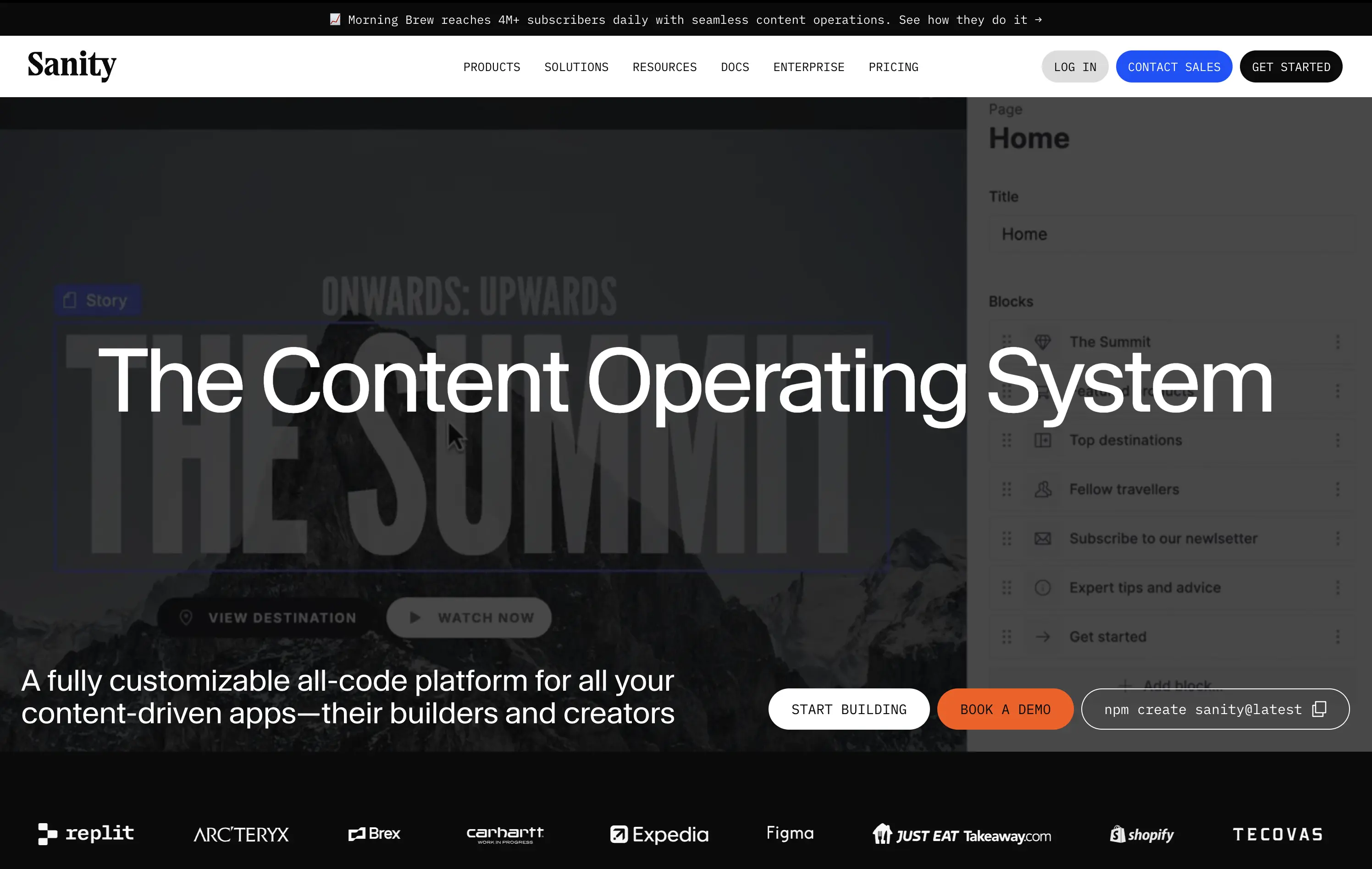
Sanity is a customizable, developer-first CMS platform that gives full programmatic control to build scalable content-driven apps.
Copy-to-clipboard npm CTA is highly functional and aligned with dev habits. But overall hierarchy is cluttered—UI overlay, imagery, and CTAs fight for attention, making the first impression a bit noisy.
Great strategic anchor for a technical audience, but risks cognitive overload on entry. Needs tighter content framing to sharpen focus for first-time visitors.
This layout balances technical utility with human impact, aligning well with Algolia’s positioning as an API-first but UX-aware company. The mobile UI reinforces product value visually, while the logo wall signals scale and trust for enterprise buyers. The tone is clear, benefit-led, and appropriate for high-intent decision-makers evaluating AI tools for customer experience. This is a solid enterprise-facing hero built to perform.
Sanity
↗
SaaS
DevTools
Full Width
Descriptive
Multi-CTA Block
Video
Logo Wall
Announcement
Imagery-Based
White
Orange
Sans serif
B2B
Home Page
Custom Code
programmable content, developer-first CMS, content infrastructure, CLI install, terminal-ready, layered layout, utility CTA, heavy visual load, startup-to-enterprise scale, code-native UX, tech-forward brand, headless CMS, dark visual tone
Sanity is a customizable, developer-first CMS platform that gives full programmatic control to build scalable content-driven apps.
Copy-to-clipboard npm CTA is highly functional and aligned with dev habits. But overall hierarchy is cluttered—UI overlay, imagery, and CTAs fight for attention, making the first impression a bit noisy.
Great strategic anchor for a technical audience, but risks cognitive overload on entry. Needs tighter content framing to sharpen focus for first-time visitors.
This layout balances technical utility with human impact, aligning well with Algolia’s positioning as an API-first but UX-aware company. The mobile UI reinforces product value visually, while the logo wall signals scale and trust for enterprise buyers. The tone is clear, benefit-led, and appropriate for high-intent decision-makers evaluating AI tools for customer experience. This is a solid enterprise-facing hero built to perform.
Jot
↗
CPG
Food & Beverage
Editorial
Benefit-Driven
Conversational
Multi-CTA Block
Photography
Custom Animation
Announcement
Imagery-Based
Yellow
Black
Display
DTC
Home Page
Shopify
Replo
coffee brand, lifestyle product, home ritual, premium instant coffee, CPG beverage, warm palette, morning routine, modern food DTC, product-centered hero, rotating headline, lifestyle-led photography
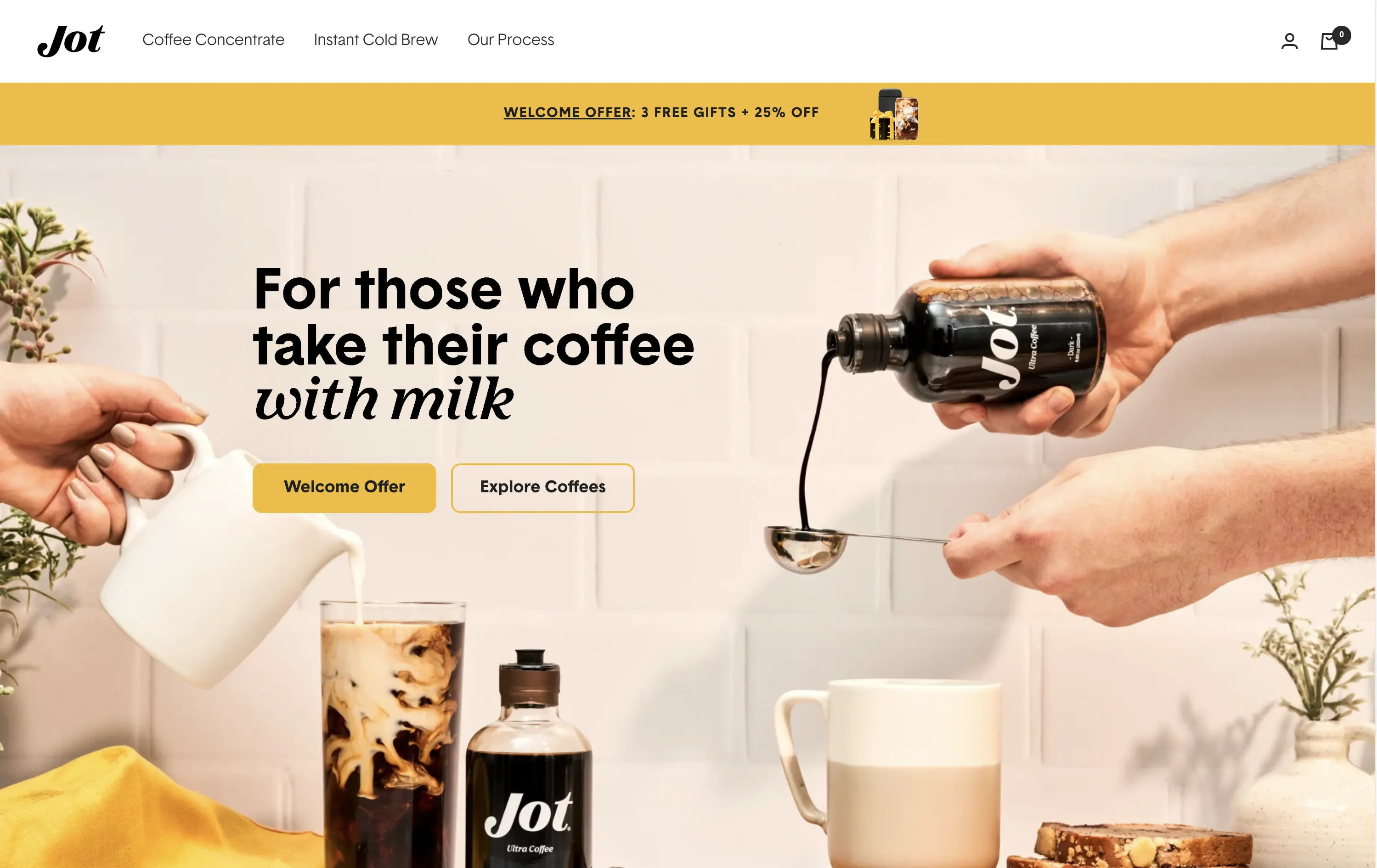
Jot sells ultra-concentrated coffee that simplifies your morning brew without compromising on quality or taste.
Visuals immediately convey simplicity and satisfaction. The rotating headline adapts to multiple buyer intents while keeping focus tight. The product-in-action shot clarifies usage without needing extra explanation.
The brand leans hard into lifestyle cues—targeting modern, taste-conscious buyers with clarity and credibility. The light palette and cozy setup reinforce everyday luxury.
This layout balances technical utility with human impact, aligning well with Algolia’s positioning as an API-first but UX-aware company. The mobile UI reinforces product value visually, while the logo wall signals scale and trust for enterprise buyers. The tone is clear, benefit-led, and appropriate for high-intent decision-makers evaluating AI tools for customer experience. This is a solid enterprise-facing hero built to perform.
Jot
↗
CPG
Food & Beverage
Editorial
Benefit-Driven
Conversational
Multi-CTA Block
Photography
Custom Animation
Announcement
Imagery-Based
Yellow
Black
Display
DTC
Home Page
Shopify
Replo
coffee brand, lifestyle product, home ritual, premium instant coffee, CPG beverage, warm palette, morning routine, modern food DTC, product-centered hero, rotating headline, lifestyle-led photography
Jot sells ultra-concentrated coffee that simplifies your morning brew without compromising on quality or taste.
Visuals immediately convey simplicity and satisfaction. The rotating headline adapts to multiple buyer intents while keeping focus tight. The product-in-action shot clarifies usage without needing extra explanation.
The brand leans hard into lifestyle cues—targeting modern, taste-conscious buyers with clarity and credibility. The light palette and cozy setup reinforce everyday luxury.
This layout balances technical utility with human impact, aligning well with Algolia’s positioning as an API-first but UX-aware company. The mobile UI reinforces product value visually, while the logo wall signals scale and trust for enterprise buyers. The tone is clear, benefit-led, and appropriate for high-intent decision-makers evaluating AI tools for customer experience. This is a solid enterprise-facing hero built to perform.
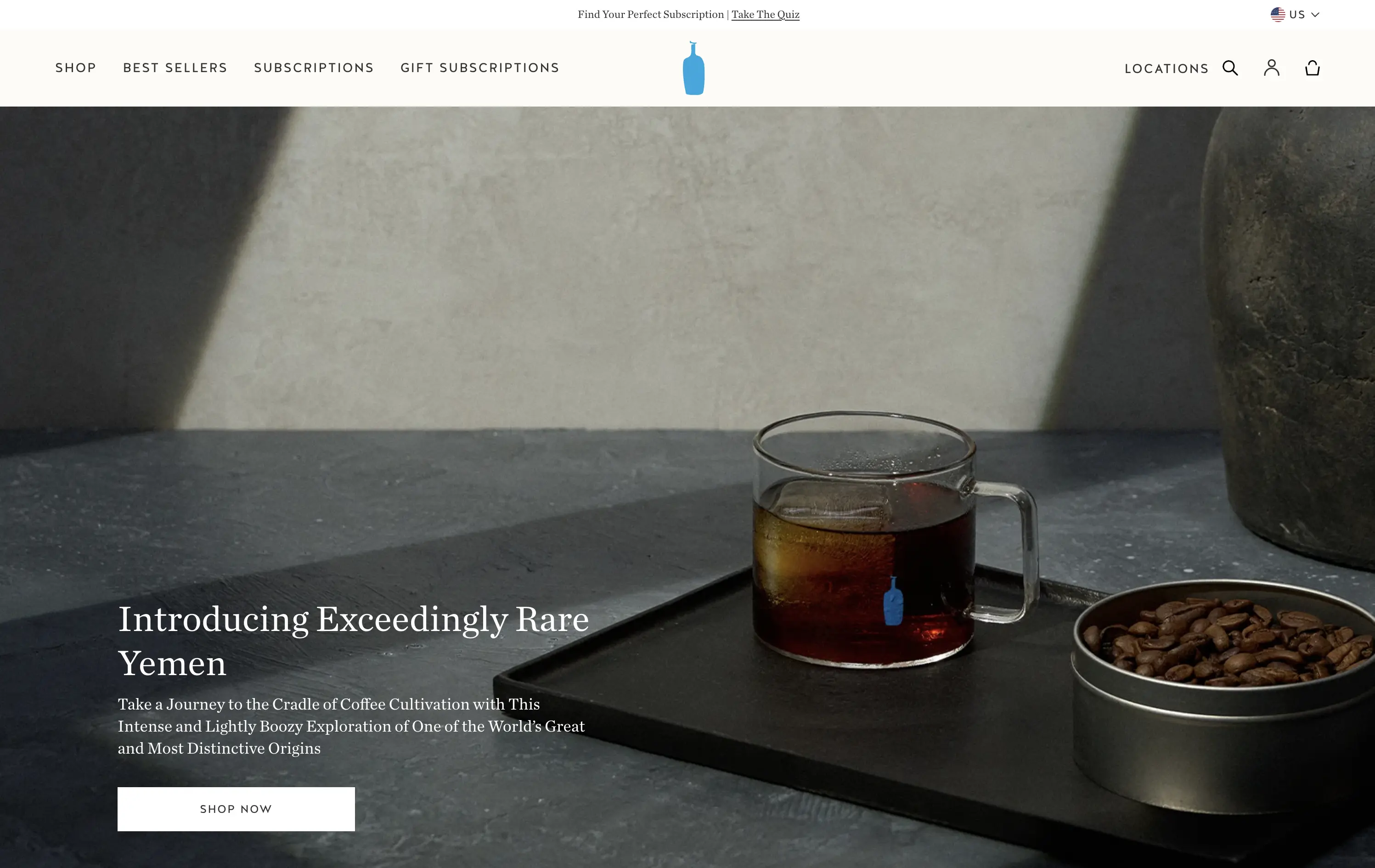
Blue Bottle Coffee
↗
CPG
Food & Beverage
Left-aligned
Editorial
Aspirational
Abstract / Conceptual
Single Button
Photography
Announcement
Imagery-Based
White
Serif
DTC
Home Page
Launch/Promo
Custom Code
premium coffee, quiet luxury, single origin, Yemen release, cultural storytelling, flavor-forward, design restraint, editorial style, homepage feature, slow ritual, product launch, lifestyle minimalism
Blue Bottle Coffee is a premium coffee roaster and retailer known for its meticulously sourced beans, minimalist aesthetic, and elevated brewing experience.
Everything here signals premium: restrained layout, subdued tone, and subtle animation. The hero is purposefully quiet — elevating the coffee without overselling it.
Perfectly aligned with a luxury buyer's mindset. It invites exploration through trust, taste, and tempo — not urgency. Signals quality through understatement.
This layout balances technical utility with human impact, aligning well with Algolia’s positioning as an API-first but UX-aware company. The mobile UI reinforces product value visually, while the logo wall signals scale and trust for enterprise buyers. The tone is clear, benefit-led, and appropriate for high-intent decision-makers evaluating AI tools for customer experience. This is a solid enterprise-facing hero built to perform.
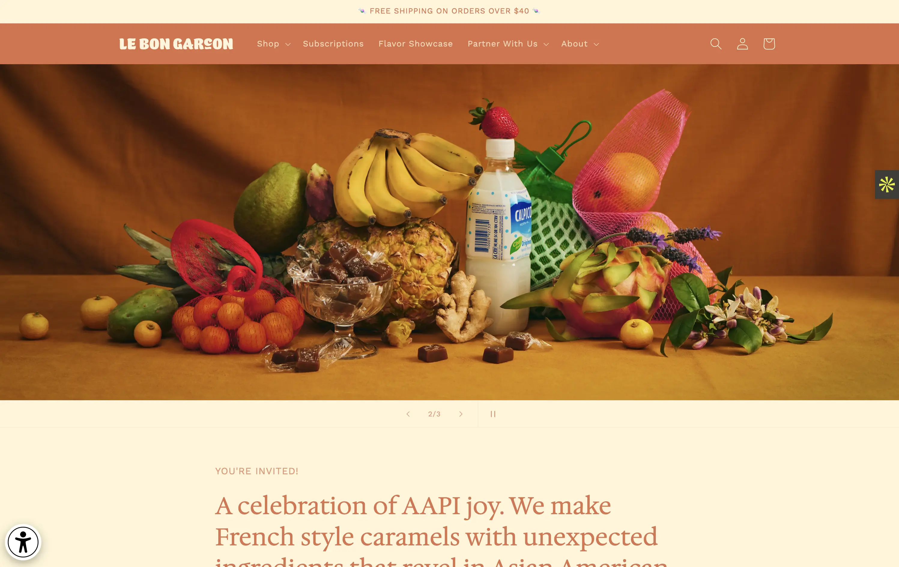
Le Bon Garçon
↗
CPG
Food & Beverage
Editorial
Descriptive
Founder-Led Voice
No CTA
Photography
Media Gallery
Announcement
Duotone
Imagery-Based
Orange
Yellow
Serif
DTC
Home Page
Shopify
nostalgic packaging, elevated DTC candy, premium gifting, Asian-American ingredients, still-life styling, art direction-led, cultural storytelling, warm palette, caramel focus, identity-led CPG, curated feel, editorial aesthetic, flavor storytelling, high design, AAPI founder
A premium confectionery brand reimagining French-style caramels through the lens of Asian-American flavors and storytelling.
This hero leans fully into art direction, with a cinematic still-life that evokes tradition, indulgence, and multicultural vibrancy. There's no obvious CTA, but the experience feels intentional and immersive. The visual composition draws curiosity and reflects a product crafted with care. The copy introduces cultural relevance and flavor positioning effectively, though some may miss a direct product hook.
Perfect for brand-aware shoppers and gifting segments. A visual-first approach supports premium positioning and cultural storytelling over hard conversion.
This layout balances technical utility with human impact, aligning well with Algolia’s positioning as an API-first but UX-aware company. The mobile UI reinforces product value visually, while the logo wall signals scale and trust for enterprise buyers. The tone is clear, benefit-led, and appropriate for high-intent decision-makers evaluating AI tools for customer experience. This is a solid enterprise-facing hero built to perform.
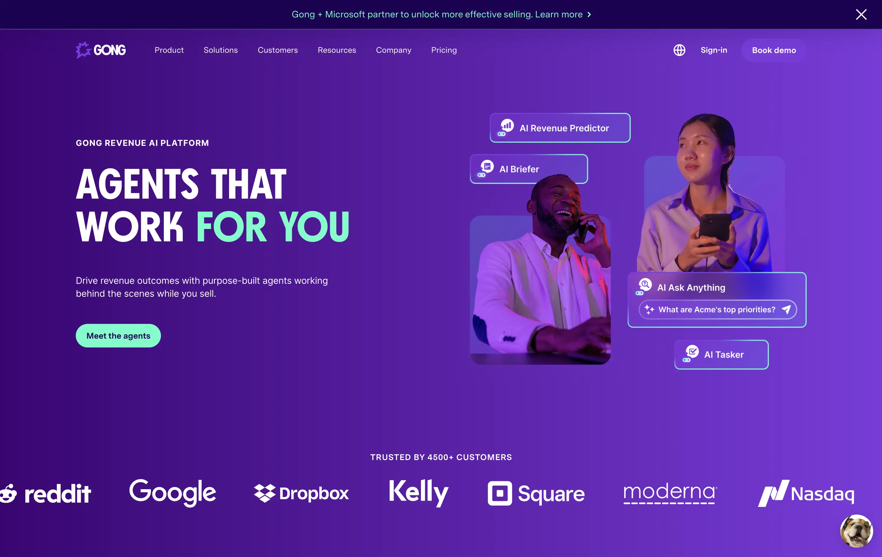
Gong
↗
SaaS
AI Tools
Productivity
Split Grid
Left-aligned
Benefit-Driven
Confident
Single Button
Photography
Illustration
Logo Wall
Announcement
Duotone
Blue
Purple
Sans serif
B2B
Home Page
Wordpress
sales AI, B2B revenue platform, utility CTA, animated overlays, client logos, enterprise trust signals, AI productivity agents, dark gradient palette, conversational UI, split hero grid, vibrant lighting, modern SaaS, sales enablement, motion interface cues, product-forward layout
Gong helps sales teams boost revenue by deploying AI-powered agents that automate insights, prep, and task handling across the sales cycle.
The hero is clear and conversion-aware. Headline delivers a confident value prop, supported by animated tooltips that make the product’s AI capabilities tangible. The “Meet the agents” CTA invites deeper engagement. Strong use of customer logos boosts enterprise credibility. Overall, it's tight, modern, and visually active without overwhelming.
Tailored for mid-to-late funnel enterprise leads. High-trust layout and confident tone reflect maturity and market leadership in B2B sales tech.
This layout balances technical utility with human impact, aligning well with Algolia’s positioning as an API-first but UX-aware company. The mobile UI reinforces product value visually, while the logo wall signals scale and trust for enterprise buyers. The tone is clear, benefit-led, and appropriate for high-intent decision-makers evaluating AI tools for customer experience. This is a solid enterprise-facing hero built to perform.
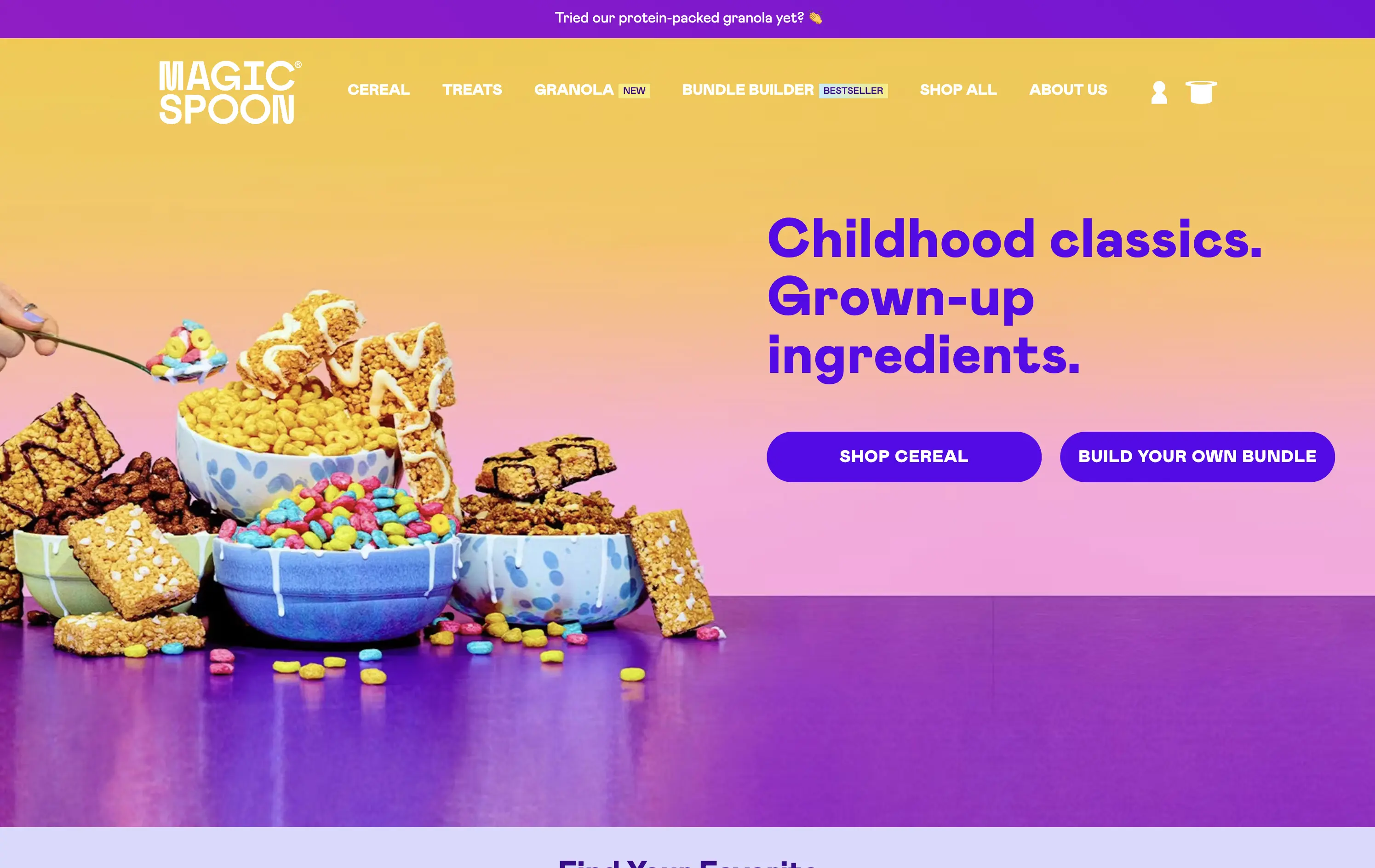
Magic Spoon
↗
Food & Beverage
Split Grid
Playful
Multi-CTA Block
Photography
Announcement
Gradient
Multi-color
Pink
Purple
Yellow
Sans serif
DTC
Home Page
Shopify
high-protein cereal, nostalgic breakfast, millennial branding, retro palette, build-your-own-bundle, vibrant color gradient, candy-colored visuals, kid-to-adult rebrand, DTC snack, bold typography, healthified junk food, colorful product styling, split grid layout, energetic tone, premium grocery
Magic Spoon sells high-protein cereal and snack bars that recreate childhood favorites with adult nutrition standards.
The hero nails the balance between fun and function. Product visuals feel exaggerated in the best way — styled like sugary cereal ads from the ‘90s but paired with benefit-led messaging. The copy is tight and instantly clarifies the value prop. Gradient background and punchy layout draw attention. CTAs are clear, and “build your own bundle” is an engaging utility-led hook.
Smartly crafted for health-conscious millennials who want nostalgia without the sugar crash. The visual-candy look softens the functional message about protein and better ingredients.
This layout balances technical utility with human impact, aligning well with Algolia’s positioning as an API-first but UX-aware company. The mobile UI reinforces product value visually, while the logo wall signals scale and trust for enterprise buyers. The tone is clear, benefit-led, and appropriate for high-intent decision-makers evaluating AI tools for customer experience. This is a solid enterprise-facing hero built to perform.
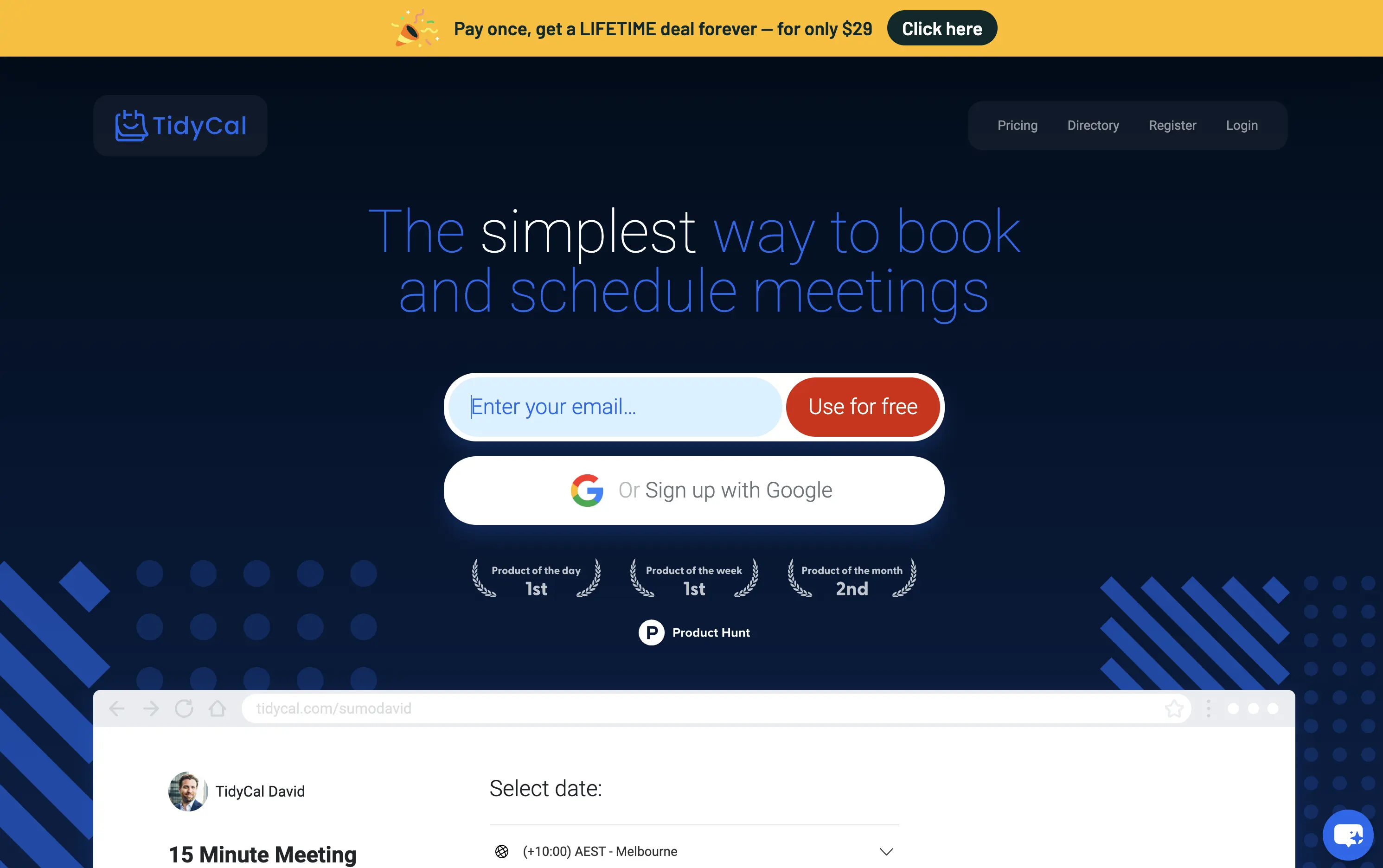
TidyCal
↗
SaaS
Productivity
Centered
Benefit-Driven
Descriptive
Email Capture
Social Proof
Announcement
Badges
Dark Mode
Blue
Sans serif
B2B
Home Page
Custom Code
low-cost alternative, one-time payment SaaS, scheduling tool, Product Hunt-backed, no-frills UI, budget-friendly SaaS, email-first CTA, dark mode hero, indie stack, small team SaaS, lifetime deal, value-first messaging, stripped-down UX, pricing transparency
TidyCal is a simple, affordable calendar booking tool offering lifetime access for a one-time fee — ideal for solo professionals and budget-conscious teams.
TidyCal’s hero is clear on purpose but light on finesse. The lifetime deal banner is highly conversion-optimized and immediately grabs attention. However, the headline lacks typographic hierarchy and fails to land with impact — “simplest” stands out visually, but the phrasing overall feels flat. The input-first layout is user-friendly, but inconsistent sizing and visual imbalance reduce perceived trust. This hero converts, but it doesn’t inspire.
The pricing-first message works for a cost-sensitive audience. But the unrefined layout and typographic decisions may limit credibility with enterprise or design-aware users. Prioritizes affordability over perception of quality.
This layout balances technical utility with human impact, aligning well with Algolia’s positioning as an API-first but UX-aware company. The mobile UI reinforces product value visually, while the logo wall signals scale and trust for enterprise buyers. The tone is clear, benefit-led, and appropriate for high-intent decision-makers evaluating AI tools for customer experience. This is a solid enterprise-facing hero built to perform.
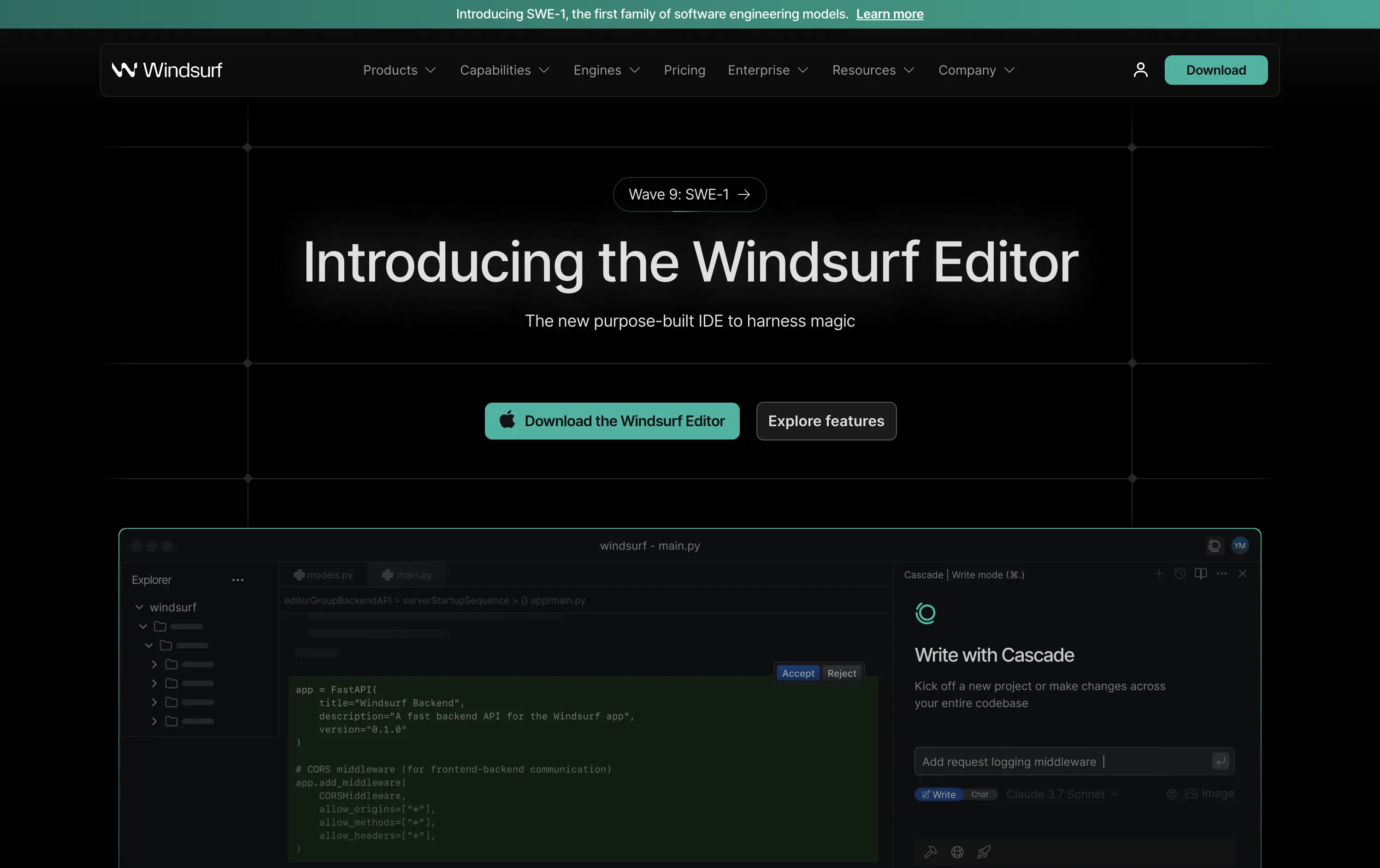
Windsurf
↗
DevTools
AI Tools
Productivity
Centered
Descriptive
Multi-CTA Block
Product UI
Custom Animation
Announcement
Dark Mode
Green
Sans serif
B2B
Home Page
Custom Code
IDE launch, developer-centric UI, dark mode, AI-enhanced coding, precision layout, launch-focused, performance signaling, Claude integration, copy-to-download conversion, dev community tone, structured layout, hero with proof
Windsurf is a new AI-powered IDE purpose-built for modern software engineers—integrating tools, models, and workflows into one seamless editing experience.
This is a pure product launch hero—focused, fast, and confident. The headline introduces the new editor directly, with “harness magic” adding flair. A download CTA and “Explore features” link address both high and medium intent users. Visual hierarchy is crisp: product UI preview beneath gives immediate credibility. The dark grid background and neon teal accents push a high-performance, developer-native aesthetic. Motion on the UI keeps it alive without distracting. Overall: efficient, well-structured, and optimized for launch-phase conversion.
A highly product-led approach targeted at technical users. The CTA hierarchy and layout structure prioritize credibility and momentum. Strong framing for launch, with a clear focus on dev audience mindset and intent.
This layout balances technical utility with human impact, aligning well with Algolia’s positioning as an API-first but UX-aware company. The mobile UI reinforces product value visually, while the logo wall signals scale and trust for enterprise buyers. The tone is clear, benefit-led, and appropriate for high-intent decision-makers evaluating AI tools for customer experience. This is a solid enterprise-facing hero built to perform.
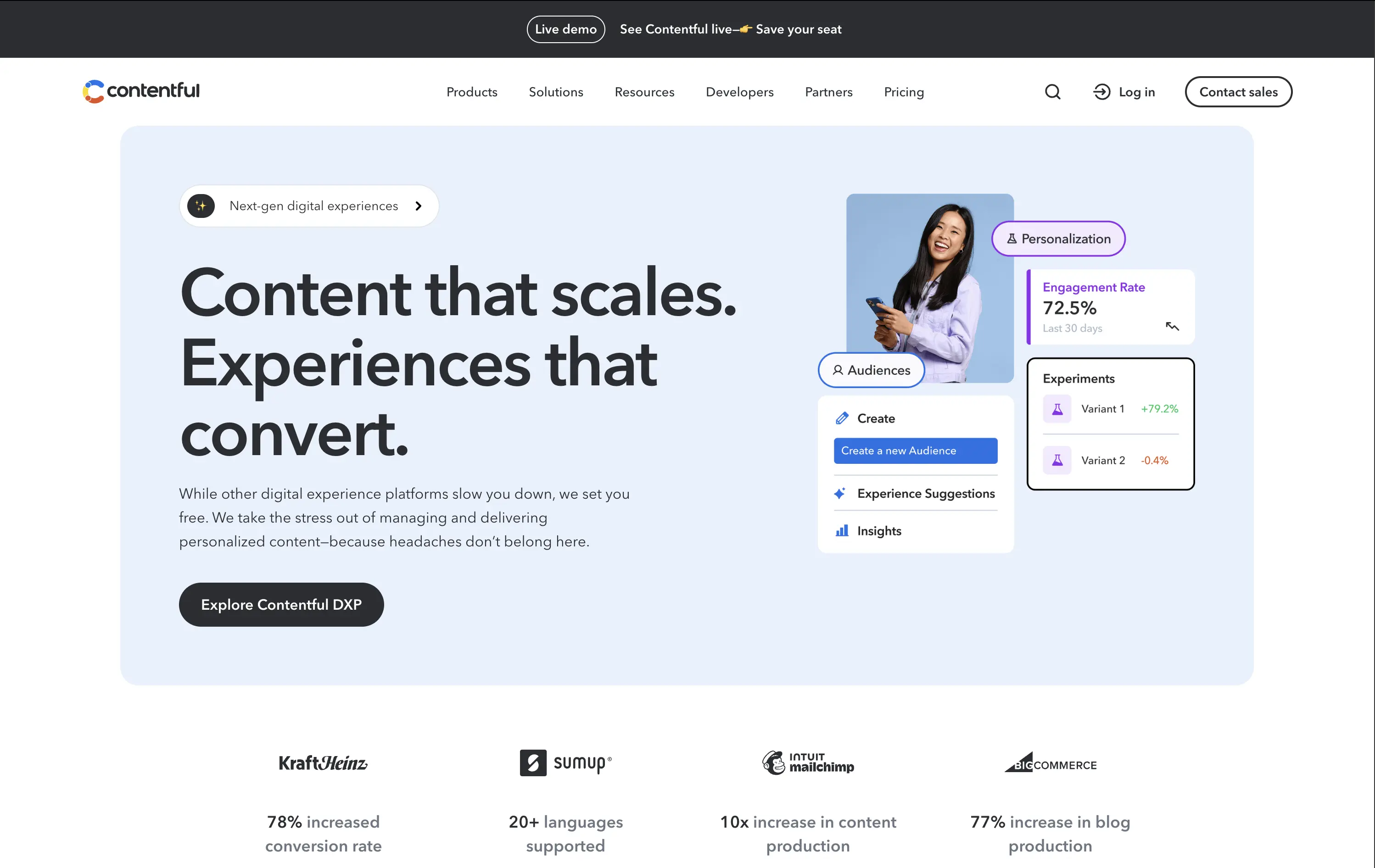
Contentful
↗
SaaS
DevTools
Inset
Left-aligned
Benefit-Driven
Single Button
Photography
Logo Wall
Product UI
Announcement
Light Mode
Blue
Black
Sans serif
B2B
Home Page
Custom Code
headless CMS, digital experience platform, DXP, content ops, personalization tools, conversion-optimized hero, enterprise SaaS
Contentful is a composable content platform for digital teams to build, manage, and scale personalized content experiences.
This hero delivers clarity and control. The headline is simple but strong, while the UI cards bring in real metrics — 72.5% engagement, +79.2% test lift — that immediately signal impact. The modular, bento-inspired visual design frames product capabilities without overwhelming the user. A single, confident CTA caps it off. It’s subtle, strategic, and conversion-aware.
Balances conversion focus with credibility. Perfectly aligned with performance-driven teams who want visual polish without noise. Content strategy and product capability are both clearly expressed without overpromising.
This layout balances technical utility with human impact, aligning well with Algolia’s positioning as an API-first but UX-aware company. The mobile UI reinforces product value visually, while the logo wall signals scale and trust for enterprise buyers. The tone is clear, benefit-led, and appropriate for high-intent decision-makers evaluating AI tools for customer experience. This is a solid enterprise-facing hero built to perform.
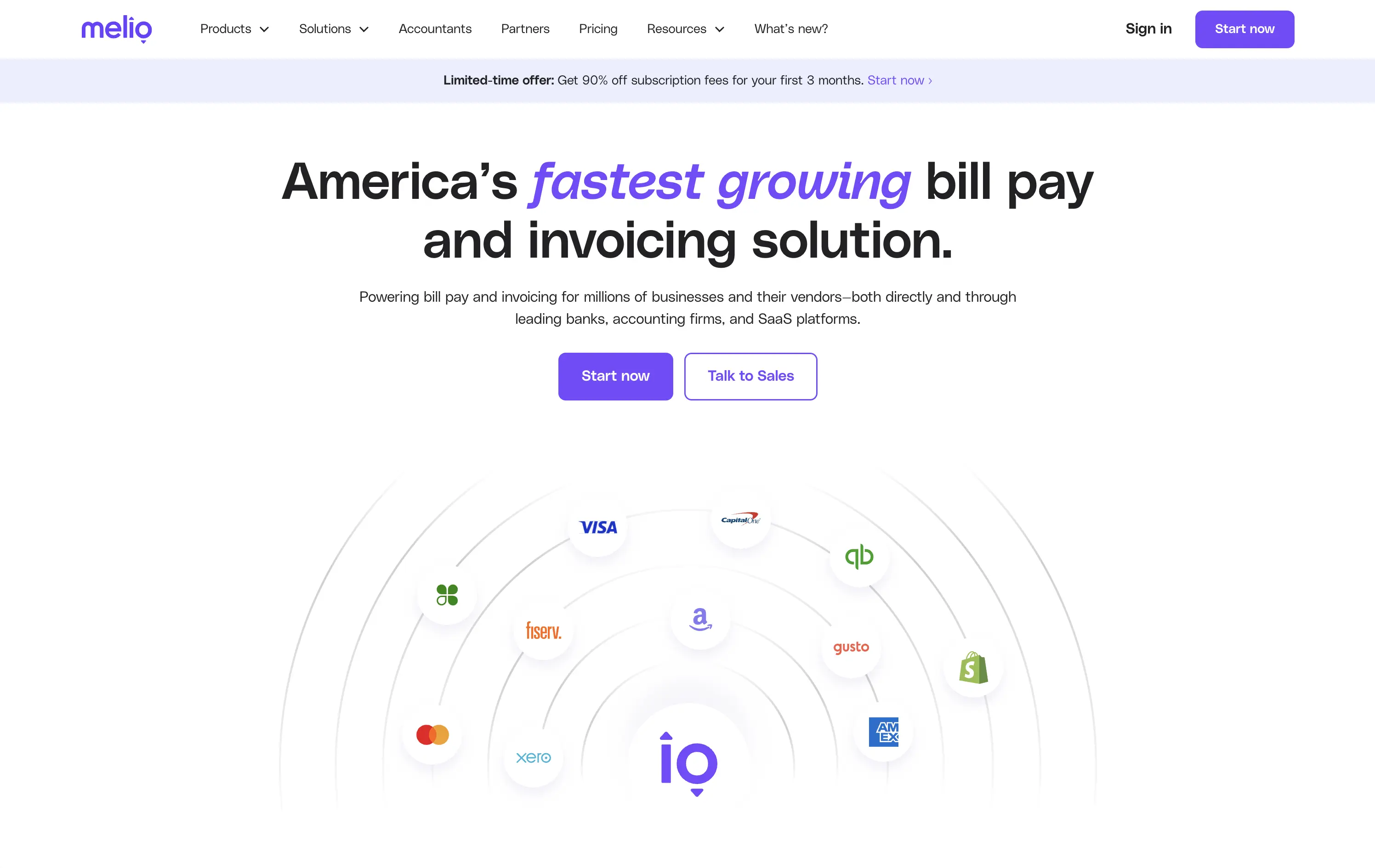
Melio
↗
SaaS
Fintech
Centered
Bold & Direct
Proof-Heavy
Multi-CTA Block
Logo Wall
Announcement
Light Mode
Purple
Sans serif
B2B
Home Page
Wordpress
bill pay, invoicing platform, small business payments, financial automation, AP/AR SaaS, vendor payments, accounting tools, QuickBooks integrations
Melio is a digital payment platform that simplifies bill pay and invoicing for small businesses and accounting teams.
Bold headline, partner logos, and focused CTAs create a strong first impression. The layout supports quick scanning and immediate action. Design choices signal reliability and scale without visual clutter.
Leverages third-party credibility to reduce friction for trust-based workflows. Dual CTA acknowledges buyer types. Layout and tone match the high-urgency, low-risk mindset of SMB finance leads.
This layout balances technical utility with human impact, aligning well with Algolia’s positioning as an API-first but UX-aware company. The mobile UI reinforces product value visually, while the logo wall signals scale and trust for enterprise buyers. The tone is clear, benefit-led, and appropriate for high-intent decision-makers evaluating AI tools for customer experience. This is a solid enterprise-facing hero built to perform.
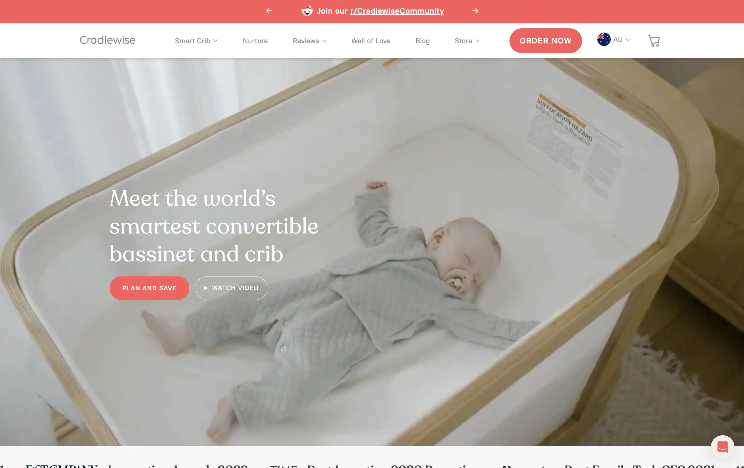
Cradlewise
↗
CPG
Hardware
Editorial
Benefit-Driven
Aspirational
Multi-CTA Block
Video
Announcement
Imagery-Based
Light Mode
Red
Serif
DTC
Home Page
Shopify
baby tech, smart crib, premium parenting, soft lifestyle visual, emotional trust, product-as-solution, sleep tech, high-ticket DTC, calming footage, gentle UX, non-intrusive CTA, safety-forward, babycare innovation, maternal audience
Cradlewise is a smart bassinet and crib that uses AI to soothe babies and help parents sleep better, all in one beautifully designed product.
The hero leans into emotion with soft lifestyle footage of the product in use — instantly communicating trust, peace of mind, and functional value. The headline clearly positions the product as a smart solution, while serif typography adds a premium touch. CTAs are well-placed, letting users choose between action or exploration. It’s elegant and persuasive.
Cradlewise effectively sells peace of mind to new parents. The blend of smart-tech value and lifestyle aesthetics strikes a perfect balance for premium buyers. It reinforces both utility and warmth without overexplaining.
This layout balances technical utility with human impact, aligning well with Algolia’s positioning as an API-first but UX-aware company. The mobile UI reinforces product value visually, while the logo wall signals scale and trust for enterprise buyers. The tone is clear, benefit-led, and appropriate for high-intent decision-makers evaluating AI tools for customer experience. This is a solid enterprise-facing hero built to perform.
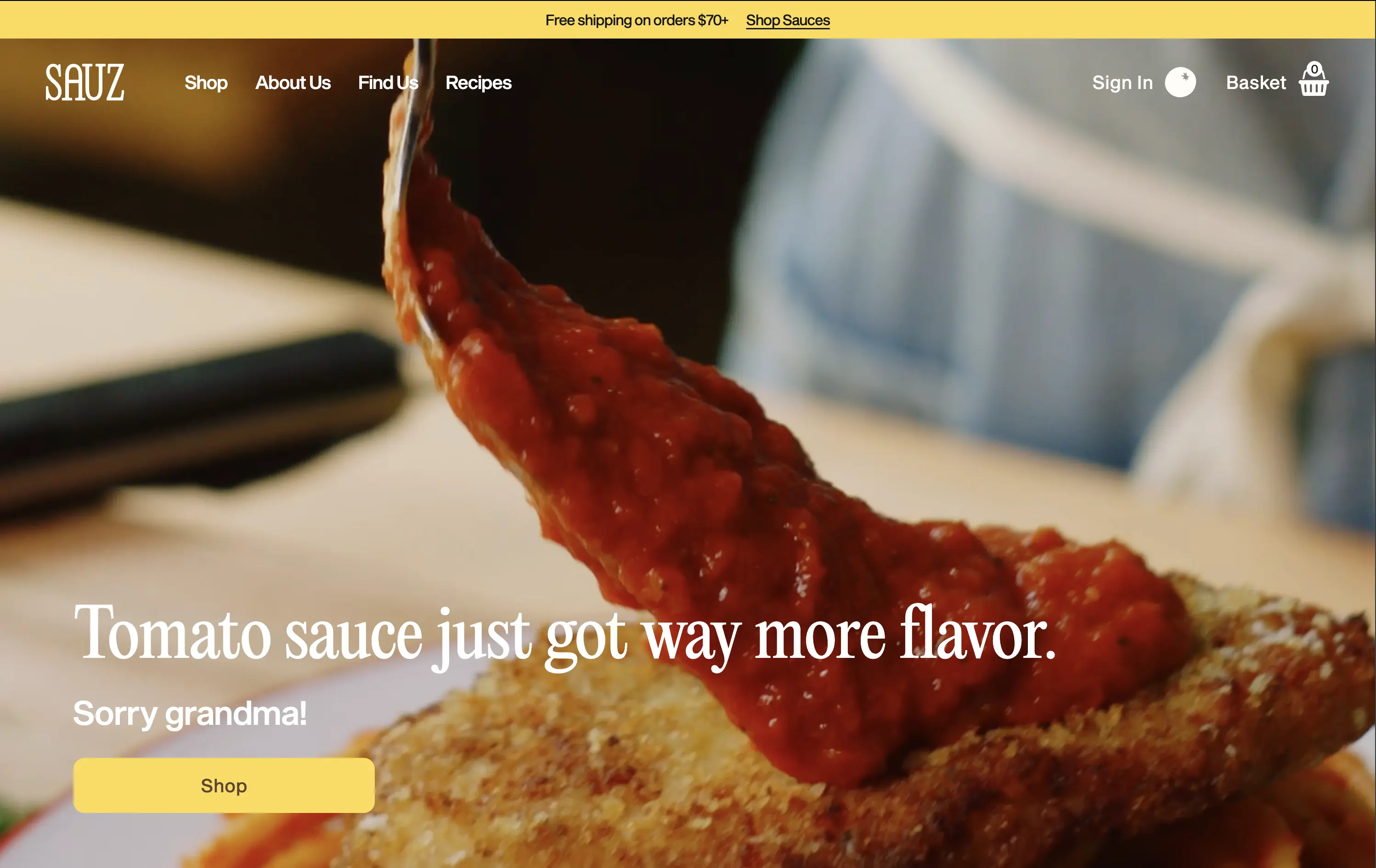
Sauz
↗
CPG
Food & Beverage
Left-aligned
Editorial
Playful
Confident
Single Button
Video
Announcement
Imagery-Based
Yellow
Sans serif
DTC
Home Page
Shopify
food-focused, video hero, flavor-first, cheeky copy, bold serif, zoom-in shot, emotional appeal, clean layout, direct CTA, DTC food, high-conversion, gourmet casual, attention-grabbing, warm tones
Sauz is a modern food brand delivering bold, chef-crafted sauces that reimagine classic flavors with attitude and heat.
The video draws instant attention and evokes craving. Typography and tone hit hard but feel fun. CTA is well-placed and visually distinct. It’s visual-first and high-impact with zero distractions — built for impulse.
A textbook DTC move: punchy, irreverent, visual. The design guides users toward quick conversion. It’s fun without losing clarity — perfect for modern food shoppers who crave personality with purchase.
This layout balances technical utility with human impact, aligning well with Algolia’s positioning as an API-first but UX-aware company. The mobile UI reinforces product value visually, while the logo wall signals scale and trust for enterprise buyers. The tone is clear, benefit-led, and appropriate for high-intent decision-makers evaluating AI tools for customer experience. This is a solid enterprise-facing hero built to perform.
The most effective hero sections in your inbox.
Monthly round up of top hero sections.
Don't worry. We hate spam too.
Don't worry. We hate spam too.
Don't worry. We hate spam too.