B2C
15
15
15
15
Business-to-consumer — targeting individual users, shoppers, or general audiences.
Filters
Orchids
↗
AI Tools
No-Code
Creative Tools
Centered
Benefit-Driven
Aspirational
Search/Utility Block
Interactive
Product UI
Imagery-Based
Pink
Black
Serif
B2C
Home Page
Custom Code
ai site builder, no-code websites, prompt box hero, interactive sandbox, scenic background, gallery proof, centered layout, serif headline, product-led growth, signup gate, creative makers, pastel sky, inspirational copy, landing page builder, web app generator
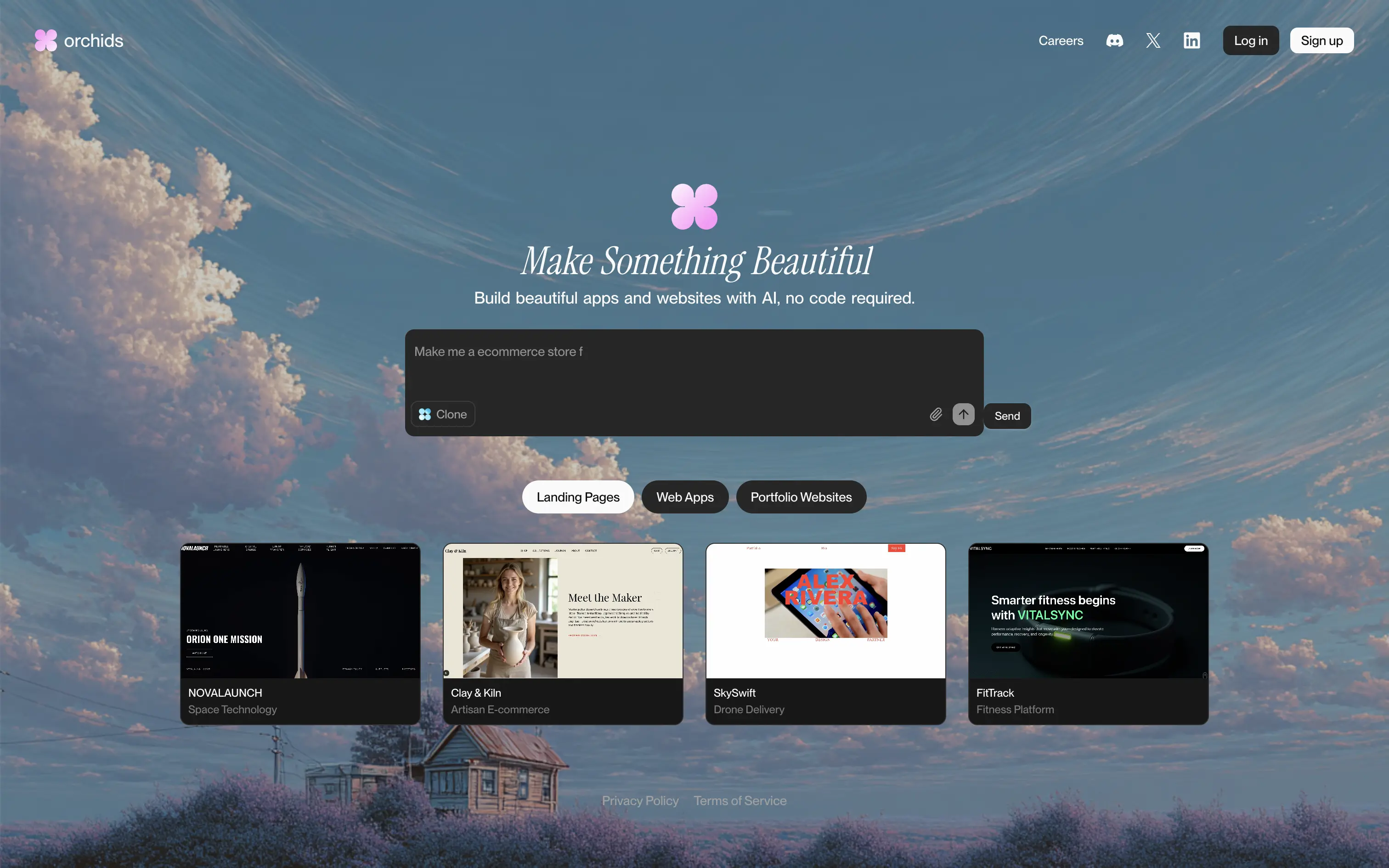
Orchids lets anyone generate full websites or apps from a single text prompt, delivering production-ready code and design without writing a line themselves.
Dreamy sky backdrop and italic serif headline promise beauty, while the live prompt box invites instant play. Thumbnail gallery backs the claim with varied examples. Redirecting to sign-up right after a prompt captures intent but may jar casual visitors. Overall hierarchy is clear and engaging.
Vision-heavy headline hooks design-focused founders; interactive builder demo signals AI uniqueness. Product-led funnel drives conversions, though absence of pricing or social proof leaves credibility to aesthetic appeal alone.
This layout balances technical utility with human impact, aligning well with Algolia’s positioning as an API-first but UX-aware company. The mobile UI reinforces product value visually, while the logo wall signals scale and trust for enterprise buyers. The tone is clear, benefit-led, and appropriate for high-intent decision-makers evaluating AI tools for customer experience. This is a solid enterprise-facing hero built to perform.
Orchids
↗
AI Tools
No-Code
Creative Tools
Centered
Benefit-Driven
Aspirational
Search/Utility Block
Interactive
Product UI
Imagery-Based
Pink
Black
Serif
B2C
Home Page
Custom Code
ai site builder, no-code websites, prompt box hero, interactive sandbox, scenic background, gallery proof, centered layout, serif headline, product-led growth, signup gate, creative makers, pastel sky, inspirational copy, landing page builder, web app generator
Orchids lets anyone generate full websites or apps from a single text prompt, delivering production-ready code and design without writing a line themselves.
Dreamy sky backdrop and italic serif headline promise beauty, while the live prompt box invites instant play. Thumbnail gallery backs the claim with varied examples. Redirecting to sign-up right after a prompt captures intent but may jar casual visitors. Overall hierarchy is clear and engaging.
Vision-heavy headline hooks design-focused founders; interactive builder demo signals AI uniqueness. Product-led funnel drives conversions, though absence of pricing or social proof leaves credibility to aesthetic appeal alone.
This layout balances technical utility with human impact, aligning well with Algolia’s positioning as an API-first but UX-aware company. The mobile UI reinforces product value visually, while the logo wall signals scale and trust for enterprise buyers. The tone is clear, benefit-led, and appropriate for high-intent decision-makers evaluating AI tools for customer experience. This is a solid enterprise-facing hero built to perform.
Obsidian
↗
SaaS
Productivity
Left-aligned
Benefit-Driven
Aspirational
Single Button
Product UI
Dark Mode
Purple
Sans serif
B2C
Home Page
Custom Code
note-taking, markdown editor, PKM, knowledge graph, offline-first, cross-platform, dark-mode hero, split layout, purple CTA, personal knowledge base, privacy-first, product-led growth, free core app, desktop & mobile, sync add-on
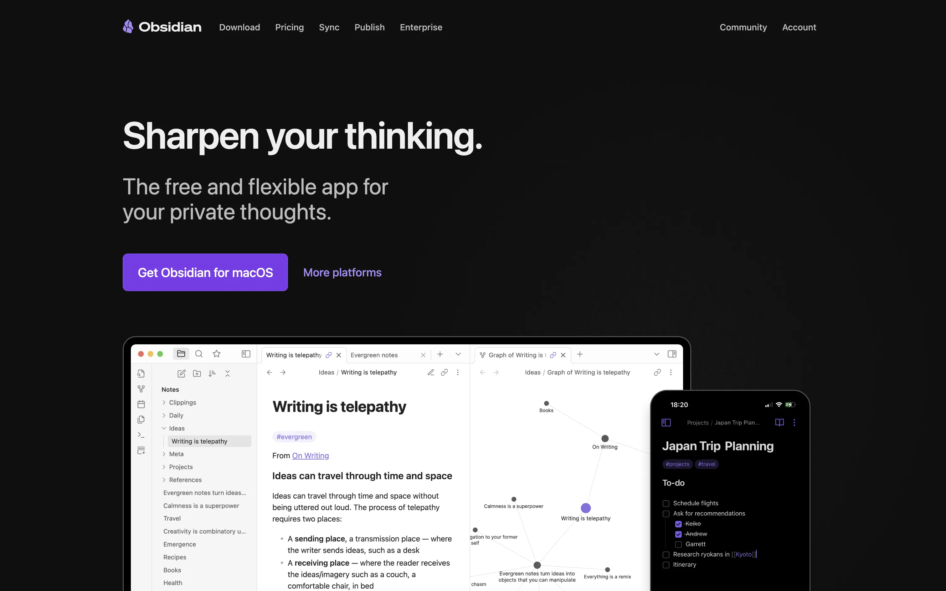
Obsidian is a markdown note app that links your ideas into a private, cross-platform knowledge graph you fully own.
Hero wastes no time: promise, positioning, and platform CTA appear above the fold with generous whitespace. “Sharpen your thinking” is emotive yet concrete, and subcopy nails the free-plus-private hook. Large purple download button drives action; “More platforms” captures non-Mac traffic without clutter. Device mock-ups validate desktop graph view and mobile parity. Dark palette amplifies focus but can feel heavy on first load for light-mode users. Overall, message, proof, and path to value align smoothly.
Clear benefit and privacy stance resonate with knowledge-worker early adopters. Product UI proof boosts trust, while free entry plus paid extras reinforces community-driven, product-led growth flywheel.
This layout balances technical utility with human impact, aligning well with Algolia’s positioning as an API-first but UX-aware company. The mobile UI reinforces product value visually, while the logo wall signals scale and trust for enterprise buyers. The tone is clear, benefit-led, and appropriate for high-intent decision-makers evaluating AI tools for customer experience. This is a solid enterprise-facing hero built to perform.
Obsidian
↗
SaaS
Productivity
Left-aligned
Benefit-Driven
Aspirational
Single Button
Product UI
Dark Mode
Purple
Sans serif
B2C
Home Page
Custom Code
note-taking, markdown editor, PKM, knowledge graph, offline-first, cross-platform, dark-mode hero, split layout, purple CTA, personal knowledge base, privacy-first, product-led growth, free core app, desktop & mobile, sync add-on
Obsidian is a markdown note app that links your ideas into a private, cross-platform knowledge graph you fully own.
Hero wastes no time: promise, positioning, and platform CTA appear above the fold with generous whitespace. “Sharpen your thinking” is emotive yet concrete, and subcopy nails the free-plus-private hook. Large purple download button drives action; “More platforms” captures non-Mac traffic without clutter. Device mock-ups validate desktop graph view and mobile parity. Dark palette amplifies focus but can feel heavy on first load for light-mode users. Overall, message, proof, and path to value align smoothly.
Clear benefit and privacy stance resonate with knowledge-worker early adopters. Product UI proof boosts trust, while free entry plus paid extras reinforces community-driven, product-led growth flywheel.
This layout balances technical utility with human impact, aligning well with Algolia’s positioning as an API-first but UX-aware company. The mobile UI reinforces product value visually, while the logo wall signals scale and trust for enterprise buyers. The tone is clear, benefit-led, and appropriate for high-intent decision-makers evaluating AI tools for customer experience. This is a solid enterprise-facing hero built to perform.
Shareio
↗
Creator Tools
Web3
Editorial
Aspirational
Confident
Single Button
Custom Animation
Loading Animation
3D visuals
Dark Mode
Green
Pink
Serif
B2C
Home Page
Webflow
paywall tech, content monetization, no-upload platform, editorial layout, kinetic typography, web3 creator stack, glowing animation, creator-first, income tools, luxury digital aesthetic
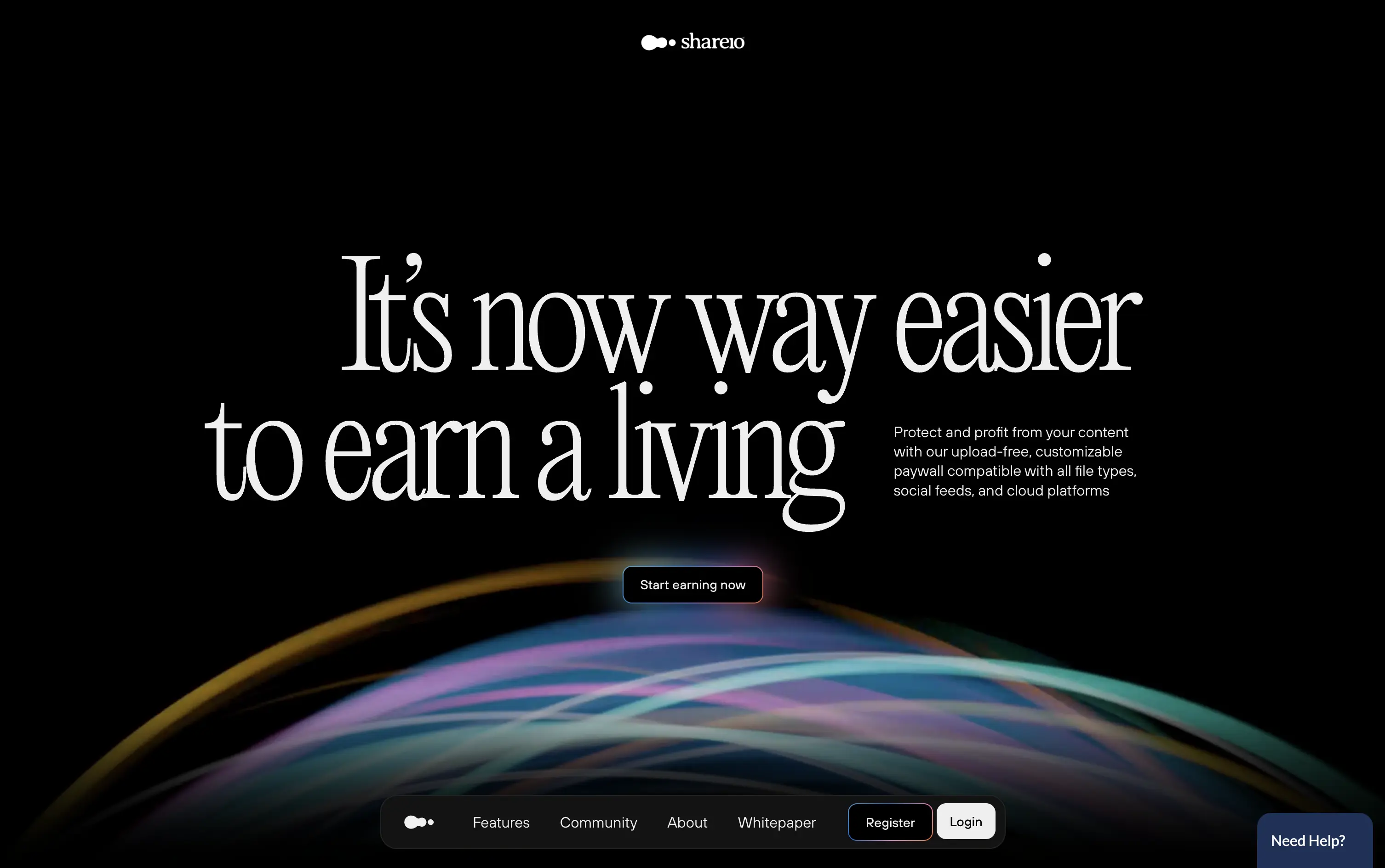
Shareio is a tool for creators to monetize any content via customizable paywalls—no uploads, just link and earn.
The hero is visually magnetic. Oversized serif type and fluid animation deliver a high-end, editorial feel. The core message is emotional, not functional—but the subline recovers clarity.
A bold play for modern creators who value style, independence, and control. The hero builds intrigue through aesthetic gravity but still manages to explain the product’s purpose with restraint.
This layout balances technical utility with human impact, aligning well with Algolia’s positioning as an API-first but UX-aware company. The mobile UI reinforces product value visually, while the logo wall signals scale and trust for enterprise buyers. The tone is clear, benefit-led, and appropriate for high-intent decision-makers evaluating AI tools for customer experience. This is a solid enterprise-facing hero built to perform.
Shareio
↗
Creator Tools
Web3
Editorial
Aspirational
Confident
Single Button
Custom Animation
Loading Animation
3D visuals
Dark Mode
Green
Pink
Serif
B2C
Home Page
Webflow
paywall tech, content monetization, no-upload platform, editorial layout, kinetic typography, web3 creator stack, glowing animation, creator-first, income tools, luxury digital aesthetic
Shareio is a tool for creators to monetize any content via customizable paywalls—no uploads, just link and earn.
The hero is visually magnetic. Oversized serif type and fluid animation deliver a high-end, editorial feel. The core message is emotional, not functional—but the subline recovers clarity.
A bold play for modern creators who value style, independence, and control. The hero builds intrigue through aesthetic gravity but still manages to explain the product’s purpose with restraint.
This layout balances technical utility with human impact, aligning well with Algolia’s positioning as an API-first but UX-aware company. The mobile UI reinforces product value visually, while the logo wall signals scale and trust for enterprise buyers. The tone is clear, benefit-led, and appropriate for high-intent decision-makers evaluating AI tools for customer experience. This is a solid enterprise-facing hero built to perform.
Wand
↗
AI Tools
Creative Tools
Centered
Aspirational
Empowering
Download App
Single Button
Video
Product UI
Imagery-Based
Blue
Sans serif
B2C
Home Page
Webflow
sketch-to-render, iOS-first, AI for artists, Apple Pencil UX, generative design, creative tooling, mobile-first AI, aspirational motion, immersive product demo, minimal CTA, emotional tech
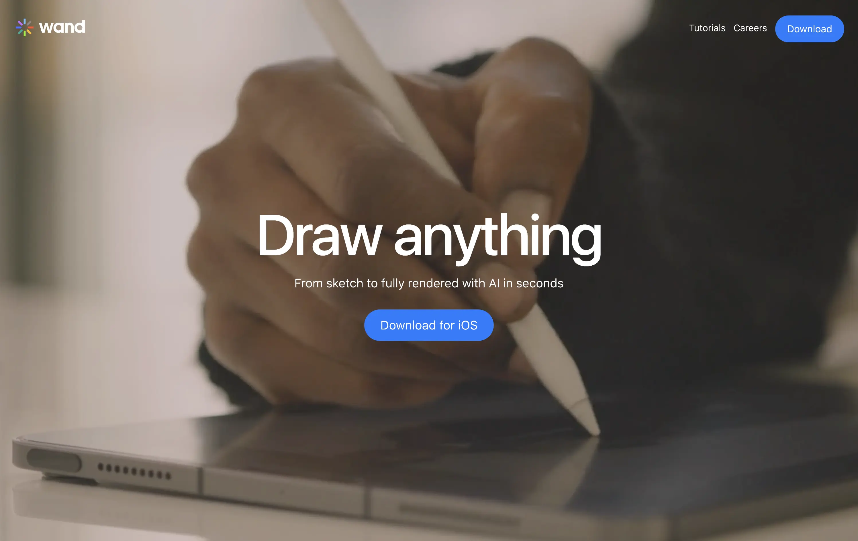
Wand is an iOS app that transforms hand-drawn sketches into fully rendered images using AI—fast, simple, and intuitive.
The full-screen video speaks louder than the copy. You see the product’s value in real time. It’s immersive, emotionally resonant, and gives instant context—but assumes the viewer will wait and watch.
Wand leans into aspiration and emotion to sell its power. The video-first hero positions the tool as magical and tactile. It’s a strong brand move but could benefit from a secondary line for clarity or onboarding.
This layout balances technical utility with human impact, aligning well with Algolia’s positioning as an API-first but UX-aware company. The mobile UI reinforces product value visually, while the logo wall signals scale and trust for enterprise buyers. The tone is clear, benefit-led, and appropriate for high-intent decision-makers evaluating AI tools for customer experience. This is a solid enterprise-facing hero built to perform.
Wand
↗
AI Tools
Creative Tools
Centered
Aspirational
Empowering
Download App
Single Button
Video
Product UI
Imagery-Based
Blue
Sans serif
B2C
Home Page
Webflow
sketch-to-render, iOS-first, AI for artists, Apple Pencil UX, generative design, creative tooling, mobile-first AI, aspirational motion, immersive product demo, minimal CTA, emotional tech
Wand is an iOS app that transforms hand-drawn sketches into fully rendered images using AI—fast, simple, and intuitive.
The full-screen video speaks louder than the copy. You see the product’s value in real time. It’s immersive, emotionally resonant, and gives instant context—but assumes the viewer will wait and watch.
Wand leans into aspiration and emotion to sell its power. The video-first hero positions the tool as magical and tactile. It’s a strong brand move but could benefit from a secondary line for clarity or onboarding.
This layout balances technical utility with human impact, aligning well with Algolia’s positioning as an API-first but UX-aware company. The mobile UI reinforces product value visually, while the logo wall signals scale and trust for enterprise buyers. The tone is clear, benefit-led, and appropriate for high-intent decision-makers evaluating AI tools for customer experience. This is a solid enterprise-facing hero built to perform.
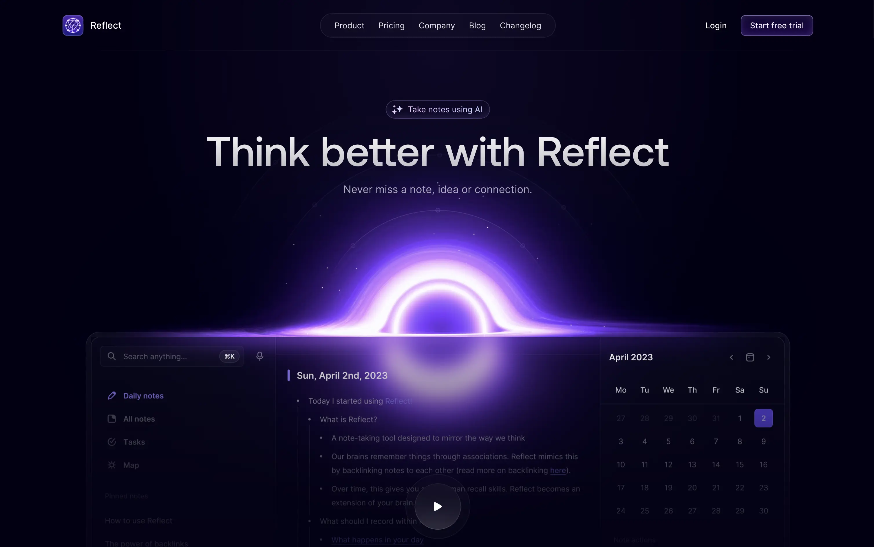
Reflect
↗
AI Tools
Creative Tools
Productivity
Centered
Aspirational
No CTA
Video
Product UI
Custom Animation
Gradient
Dark Mode
Purple
Sans serif
B2C
Home Page
Custom Code
second brain tool, backlinking notes, dark ambient UI, AI note-taking, glowing animation, calm productivity, memory-focused tools, Roam alternative, neural metaphor, minimal interface
Reflect is an AI-powered note-taking app designed to help users think better, organize ideas, and link concepts seamlessly.
A visually memorable hero that communicates mood more than function. The glowing black-hole motif hints at depth and interconnectedness, but product clarity relies on secondary copy and scroll.
Reflect sells a mindset, not a feature. It uses visual metaphor and ambient energy to frame note-taking as a thinking upgrade. It’s bold, but clarity is delayed—relying on patience and resonance with a knowledge-worker mindset.
This layout balances technical utility with human impact, aligning well with Algolia’s positioning as an API-first but UX-aware company. The mobile UI reinforces product value visually, while the logo wall signals scale and trust for enterprise buyers. The tone is clear, benefit-led, and appropriate for high-intent decision-makers evaluating AI tools for customer experience. This is a solid enterprise-facing hero built to perform.
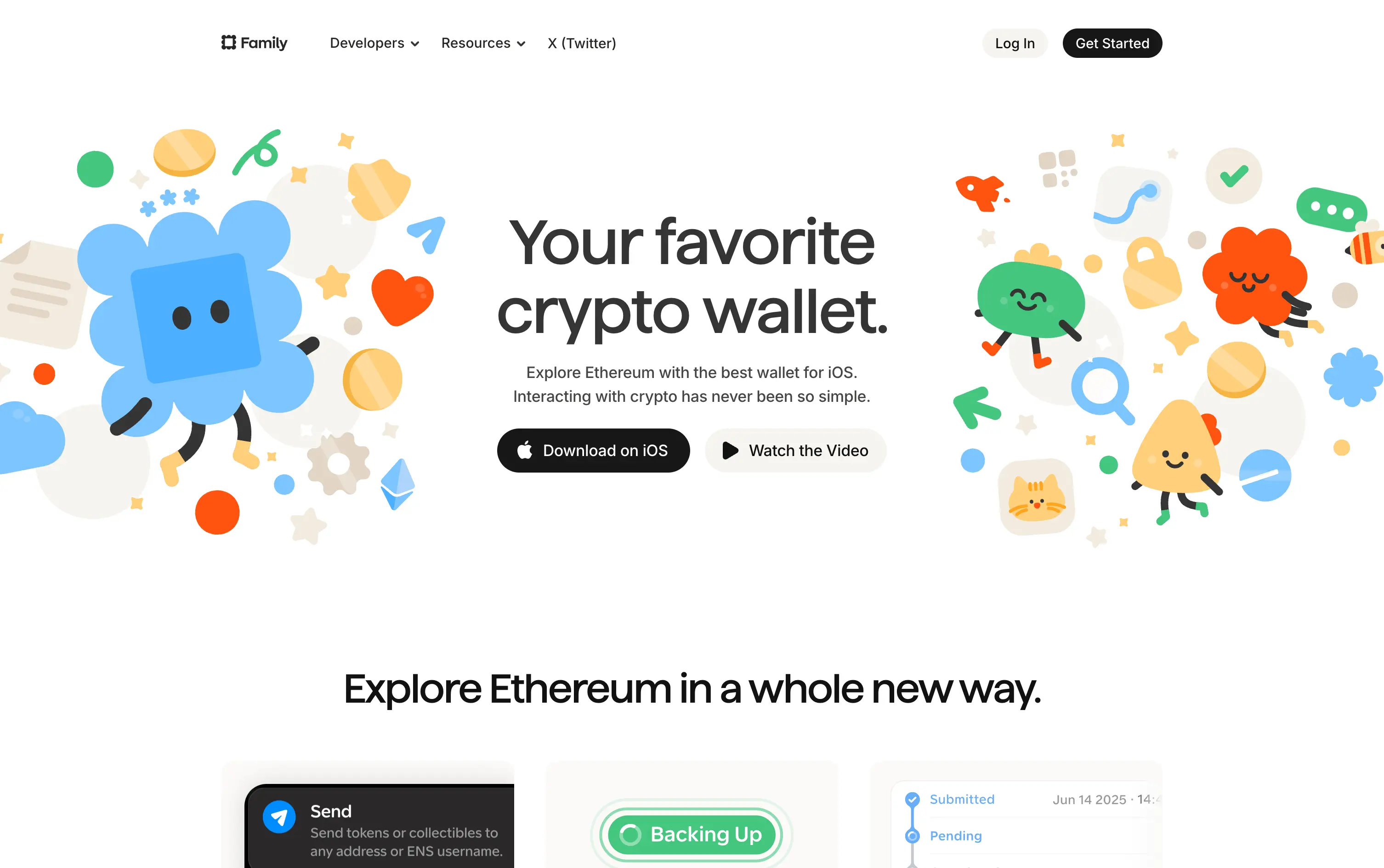
Family
↗
Fintech
Web3
Centered
Playful
Confident
Download App
Multi-CTA Block
Illustration
Custom Animation
Loading Animation
Light Mode
Blue
Yellow
Black
Sans serif
B2C
Home Page
Custom Code
crypto wallet for iOS, ENS support, playful Web3, mobile-first design, Gen Z crypto, kawaii aesthetic, approachable fintech, token collectibles, web3 onboarding, friendly UX
Family is a playful Ethereum wallet designed for iOS, making crypto feel friendly, visual, and simple to use.
Extremely approachable for a space often seen as cold or intimidating. The illustrations soften the category. Clear copy and strong CTA pair well with the product’s target audience and mobile-first approach.
A masterclass in brand positioning. While most Web3 brands chase dark, technical aesthetics, Family goes the opposite direction—bright, warm, and welcoming. It’s intentionally crafted to disarm, invite, and onboard a broader audience.
This layout balances technical utility with human impact, aligning well with Algolia’s positioning as an API-first but UX-aware company. The mobile UI reinforces product value visually, while the logo wall signals scale and trust for enterprise buyers. The tone is clear, benefit-led, and appropriate for high-intent decision-makers evaluating AI tools for customer experience. This is a solid enterprise-facing hero built to perform.
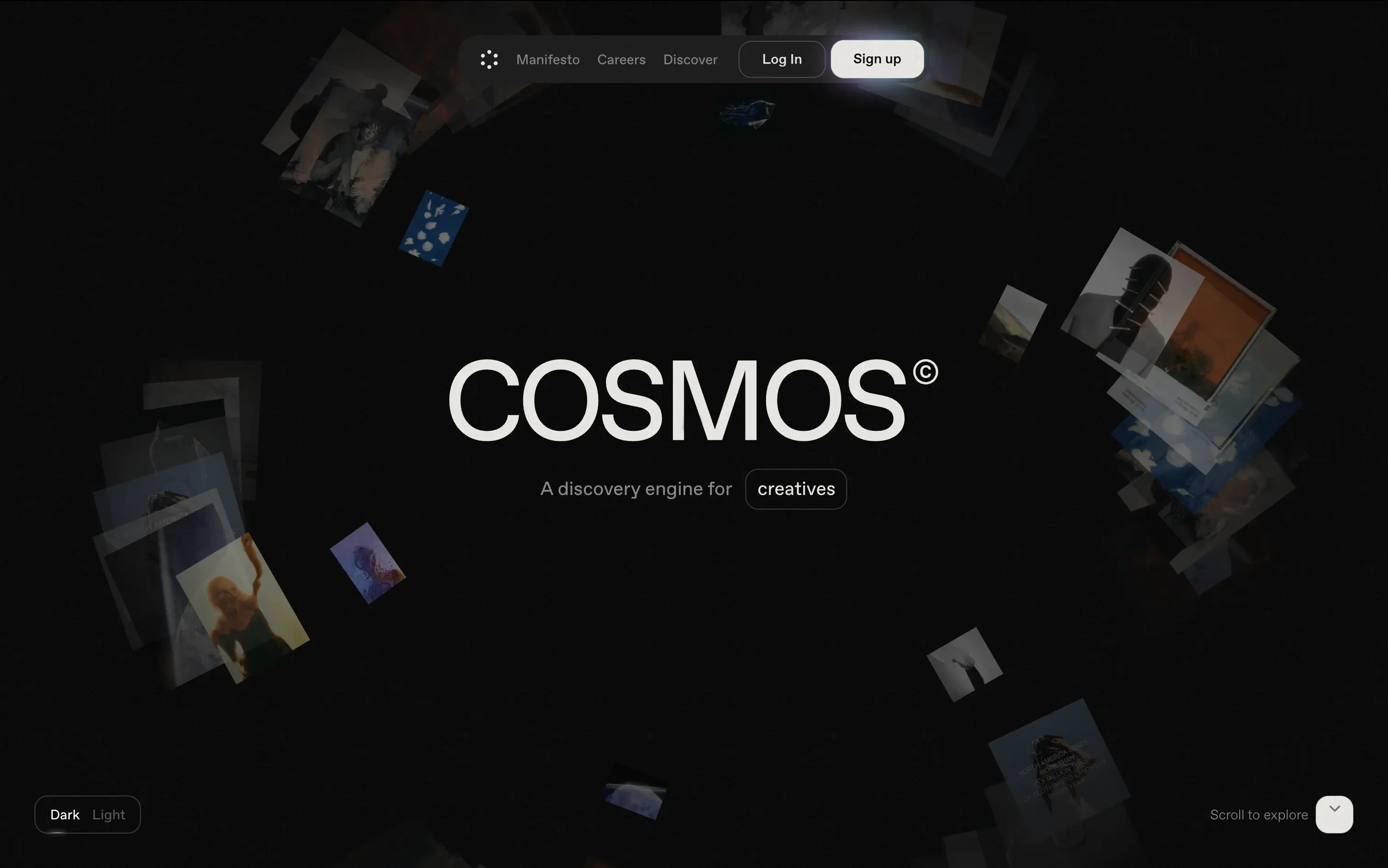
Cosmos
↗
SaaS
Creative Tools
Centered
Descriptive
Scroll Prompt
Interactive
Custom Animation
3D visuals
Dark Mode
White
Sans serif
B2C
Home Page
Wordpress
3D animation, immersive experience, visual discovery engine, artist-first, gallery feel, dark mode default, cinematic hero, soft motion, ambient design, identity-led, scroll-to-enter, creative tech
Cosmos is a discovery engine for creatives, helping them explore curated visuals and inspiration in an immersive format.
The hero trades clarity for vibe—but does it with intention. The slow, 3D-style animation invites exploration. There's no CTA push, just immersion. Ideal for creatives looking to feel, not be sold to.
A brand-first, emotion-forward approach that’s clearly designed for visual creatives. The tone and treatment filter out non-ideal users early—this isn’t for the productivity crowd.
This layout balances technical utility with human impact, aligning well with Algolia’s positioning as an API-first but UX-aware company. The mobile UI reinforces product value visually, while the logo wall signals scale and trust for enterprise buyers. The tone is clear, benefit-led, and appropriate for high-intent decision-makers evaluating AI tools for customer experience. This is a solid enterprise-facing hero built to perform.
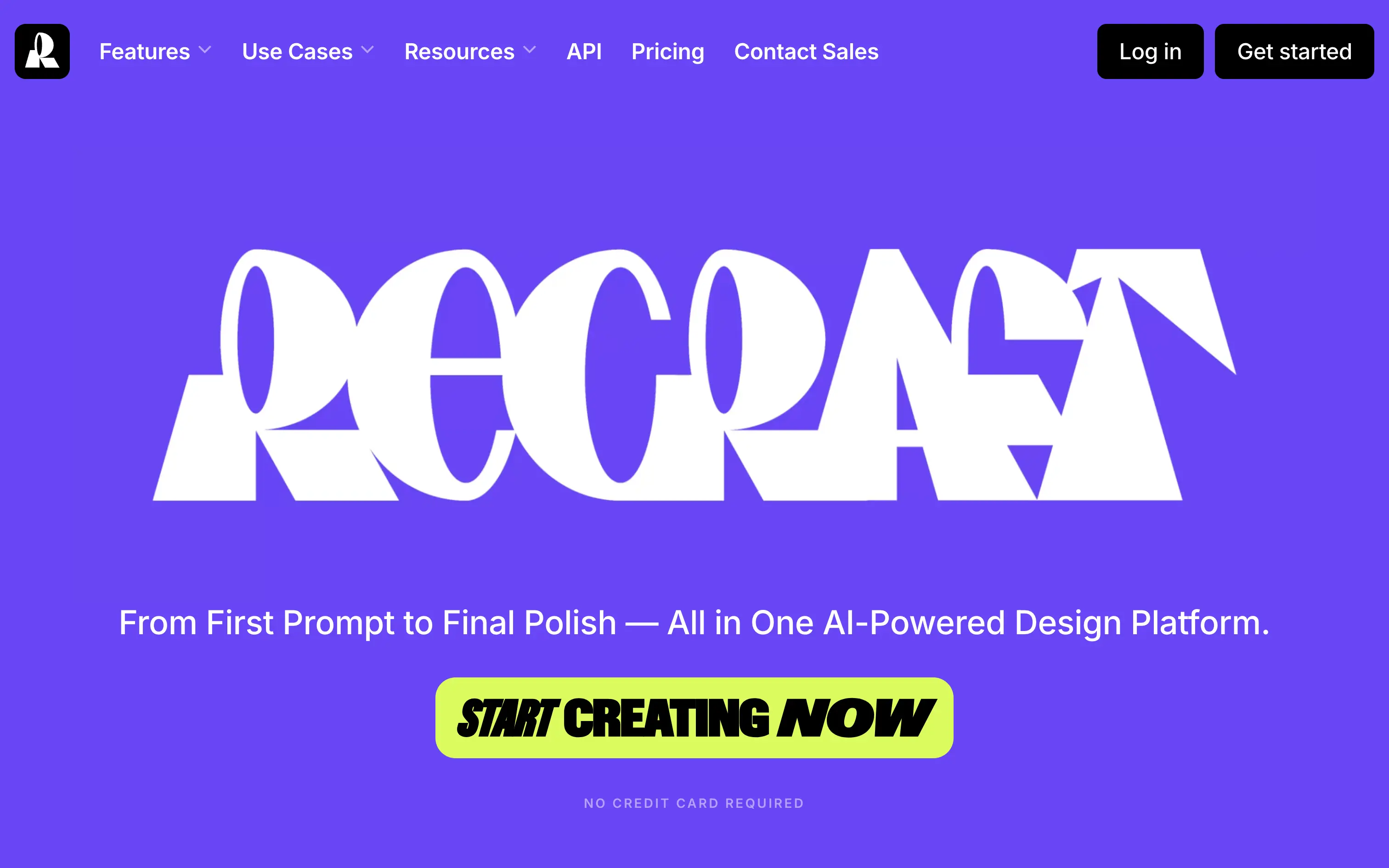
Recraft
↗
SaaS
AI Tools
Creative Tools
Centered
Bold & Direct
Single Button
Interactive
Loading Animation
Multi-color
Green
Purple
Display
Sans serif
B2C
Home Page
Custom Code
experimental typography, AI design suite, generative graphics, all-in-one creative tool, bold visual identity, Gen Z design energy, maximalist type, disruptive layout, prompt-to-polish UX, vector-first platform
Recraft is an AI-powered design platform for generating and editing vector and image assets from text prompts.
A bold, identity-first approach that skips traditional SaaS tropes. The loading animation morphs into the oversized logo, building intrigue and brand memory. Lacks UI context but makes a strong creative impression.
Recraft speaks to non-technical creatives who want AI tools that feel like theirs. This is brand-first positioning at its most intentional—confident, expressive, and highly audience-aligned.
This layout balances technical utility with human impact, aligning well with Algolia’s positioning as an API-first but UX-aware company. The mobile UI reinforces product value visually, while the logo wall signals scale and trust for enterprise buyers. The tone is clear, benefit-led, and appropriate for high-intent decision-makers evaluating AI tools for customer experience. This is a solid enterprise-facing hero built to perform.
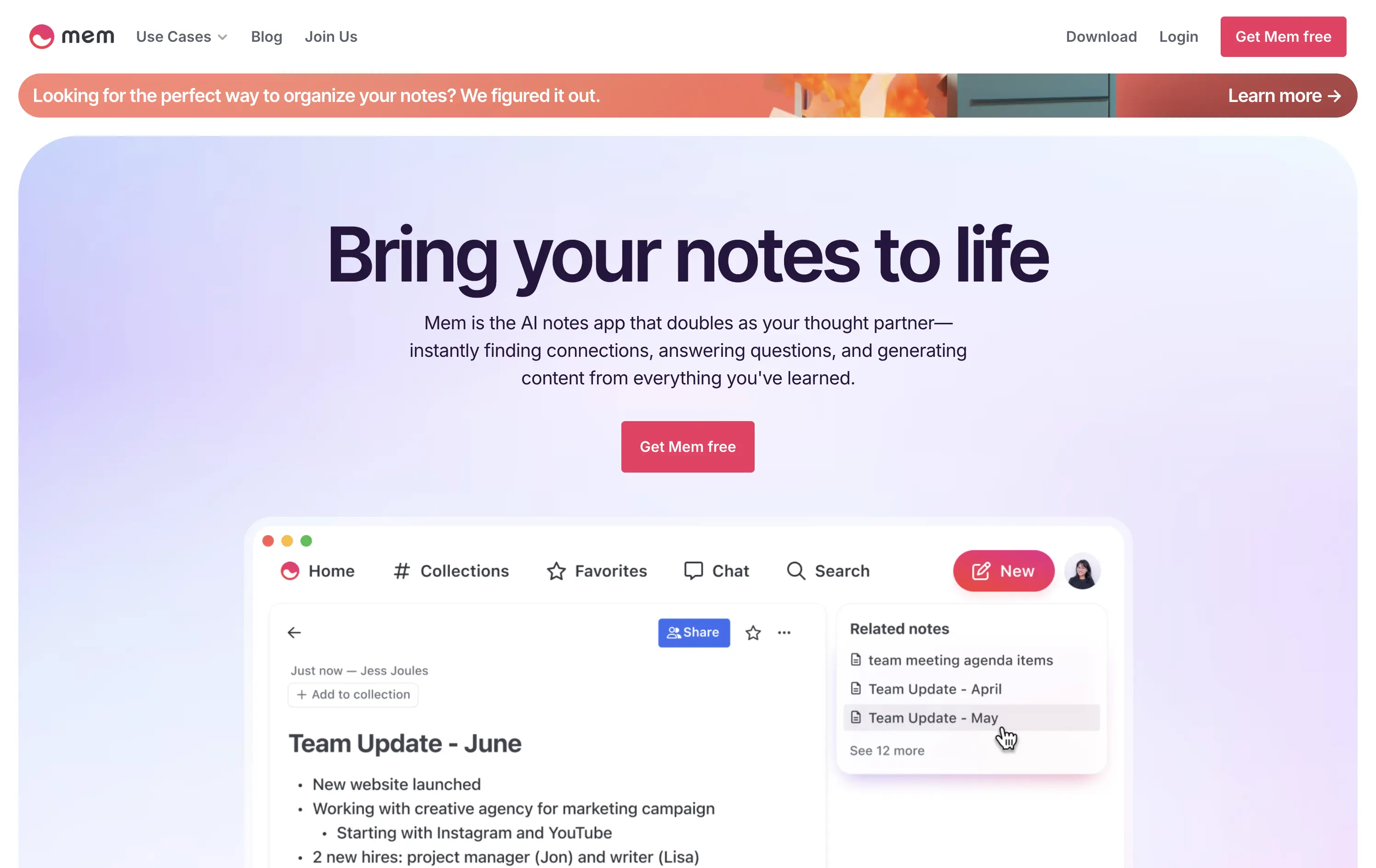
Mem
↗
AI Tools
Productivity
Inset
Centered
Benefit-Driven
Empowering
Single Button
Product UI
Announcement
Gradient
Light Mode
Pink
Purple
Sans serif
B2C
Home Page
Framer
ai note app, ambient UI, productivity tool, second brain, writing partner, connected thoughts, knowledge management, pastel color gradient, Gen Z tone, soft product UI, memory system, fast capture, personal knowledge base
Mem is an AI-powered note-taking app that helps users organize thoughts, generate content, and uncover connections automatically.
Clear and emotional headline matched with a simple product UI. CTA stands out visually. Gradient background and calm visual rhythm support a productivity mindset. Overall, well-structured but slightly generic in messaging.
Positioning as a thought partner sets it apart from basic note apps. Hero leans into AI assistance without overwhelming technicality. Good emotional framing for a consumer productivity tool.
This layout balances technical utility with human impact, aligning well with Algolia’s positioning as an API-first but UX-aware company. The mobile UI reinforces product value visually, while the logo wall signals scale and trust for enterprise buyers. The tone is clear, benefit-led, and appropriate for high-intent decision-makers evaluating AI tools for customer experience. This is a solid enterprise-facing hero built to perform.
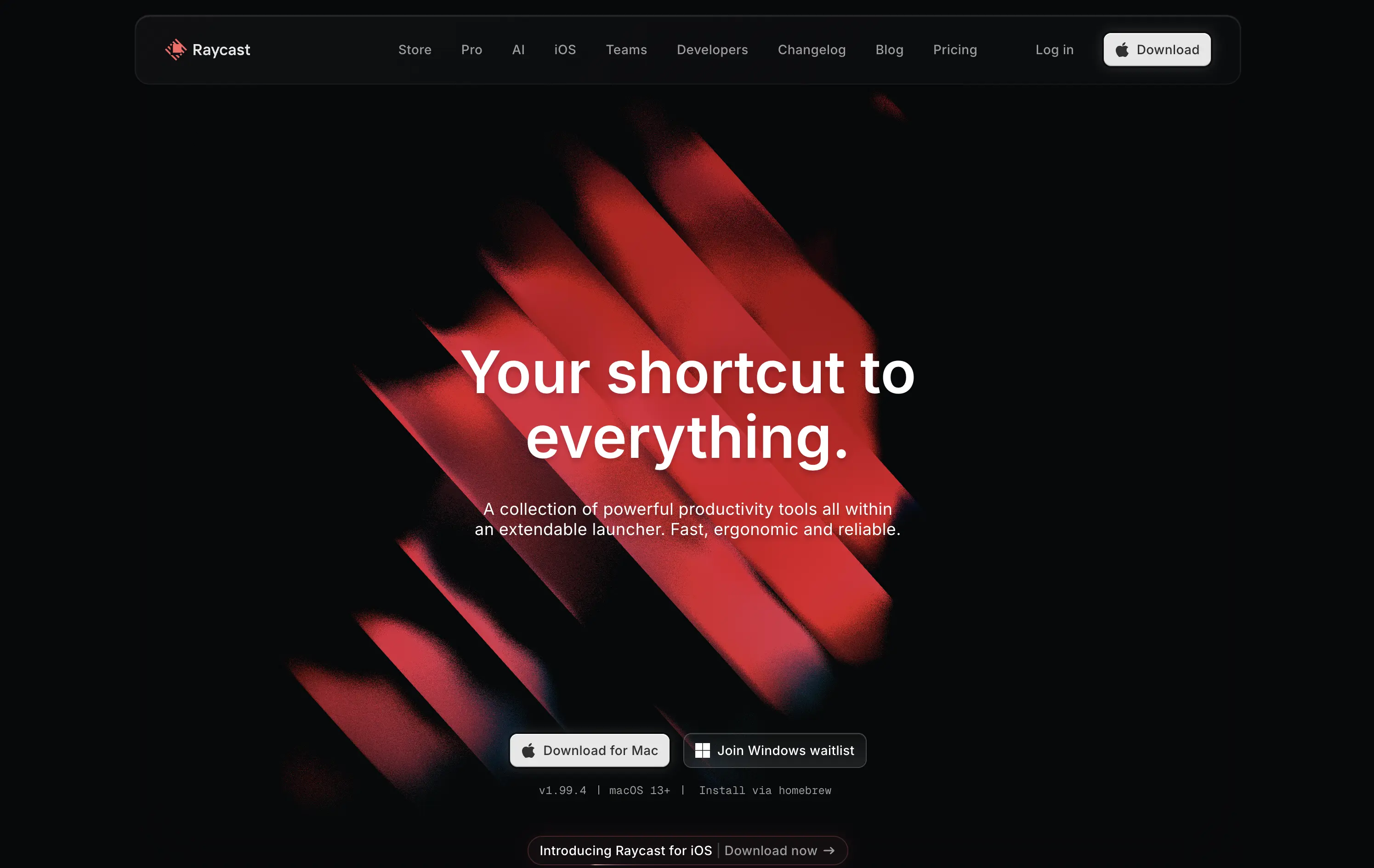
Raycast
↗
SaaS
Productivity
Centered
Bold & Direct
Descriptive
Download App
Multi-CTA Block
Interactive
Custom Animation
Loading Animation
Dark Mode
White
Red
Sans serif
B2C
Home Page
Custom Code
launcher app, power user tool, developer productivity, dark aesthetic, interactive background, custom animation, glowing motion, fast utility, keyboard-first UX, macOS-native, iOS launch, feature-rich
Raycast is a fast, extendable launcher that streamlines tasks and apps into one productivity command center.
Hero opens with striking motion and subtle interactivity, creating immediate emotional pull. Headline is short and memorable. Strong clarity on what it is and what it solves. Layout is focused, high-conversion and visually polished.
Positioning as a utility layer for power users is clear. Dark mode and minimalist tone align with dev-savvy audiences. Strong balance of brand and product without overexplaining.
This layout balances technical utility with human impact, aligning well with Algolia’s positioning as an API-first but UX-aware company. The mobile UI reinforces product value visually, while the logo wall signals scale and trust for enterprise buyers. The tone is clear, benefit-led, and appropriate for high-intent decision-makers evaluating AI tools for customer experience. This is a solid enterprise-facing hero built to perform.
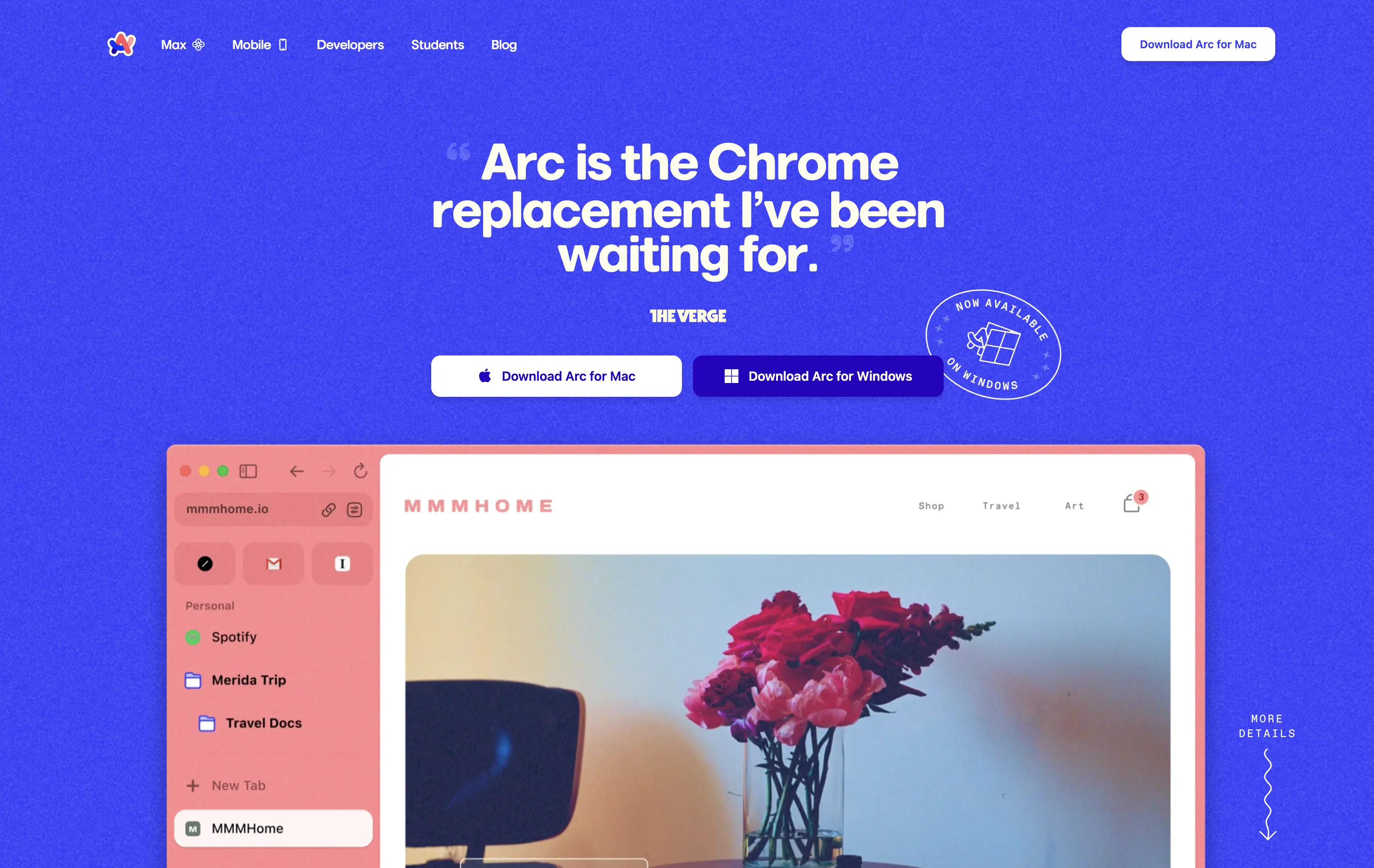
Arc
↗
SaaS
Productivity
Centered
Proof-Heavy
Multi-CTA Block
Product UI
Social Proof
Duotone
White
Blue
Display
Sans serif
B2C
Home Page
Custom Code
consumer browser, verge quote, UI-focused, product-led design, browser replacement, macOS-first, desktop software, soft but bold, macOS-style visual language, motion-laced layout, quirky detail, testimonial-driven, vibrant blue, feature-forward
Arc is a modern browser designed to replace legacy browser with a reimagined UI and productivity-first experience.
This hero grabs attention immediately with a high-credibility quote as the headline, bold visual language, and a visible product UI that instantly signals differentiation. The CTA is clear and platform-specific. The color treatment and layout feel energetic and modern, aligning well with consumer expectations for a desktop app.
Strong positioning via social proof rather than abstract messaging. The hero makes the shift-from-Chrome angle explicit, appealing to an informed, tech-forward audience. High trust and strong product framing.
This layout balances technical utility with human impact, aligning well with Algolia’s positioning as an API-first but UX-aware company. The mobile UI reinforces product value visually, while the logo wall signals scale and trust for enterprise buyers. The tone is clear, benefit-led, and appropriate for high-intent decision-makers evaluating AI tools for customer experience. This is a solid enterprise-facing hero built to perform.
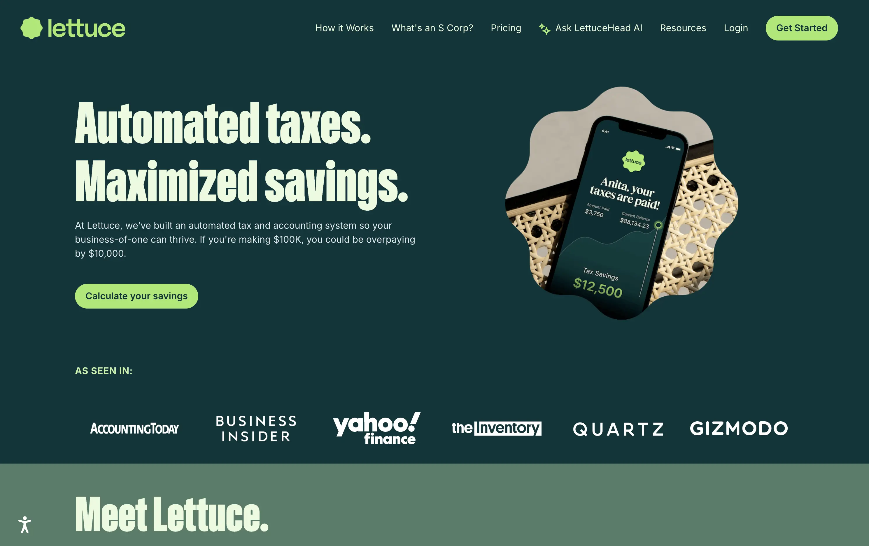
Lettuce
↗
SaaS
Fintech
Split Grid
Left-aligned
Benefit-Driven
Bold & Direct
Single Button
Photography
Logo Wall
Product UI
Duotone
Green
Display
B2C
Home Page
Custom Code
solo business finance, tax automation, self-employed SaaS, conversion-focused layout, AI accounting, ROI-driven copy, playful branding, savings calculator CTA, solo founder tools, dark green palette, clear value prop, direct tone, press trust bar, mobile-first product
Lettuce is an automated tax and accounting platform built for solo business owners, helping them save thousands by optimizing how they pay taxes.
The hero is assertive, clear, and benefit-led. “Automated taxes. Maximized savings.” lands immediately, and the subhead explains who it's for and what they’re losing without it. The savings figure on the phone mockup reinforces the pitch visually. The “Calculate your savings” CTA is strong and personalized. Overall, the layout moves fast and speaks directly to freelancers and solo operators.
Perfectly tuned for time-poor, outcome-driven solopreneurs. Uses clear math ($10k in savings) and visual cues (mobile UI, dollar figures) to make the benefit feel tangible. Smart alignment of tone, layout, and buyer urgency.
This layout balances technical utility with human impact, aligning well with Algolia’s positioning as an API-first but UX-aware company. The mobile UI reinforces product value visually, while the logo wall signals scale and trust for enterprise buyers. The tone is clear, benefit-led, and appropriate for high-intent decision-makers evaluating AI tools for customer experience. This is a solid enterprise-facing hero built to perform.
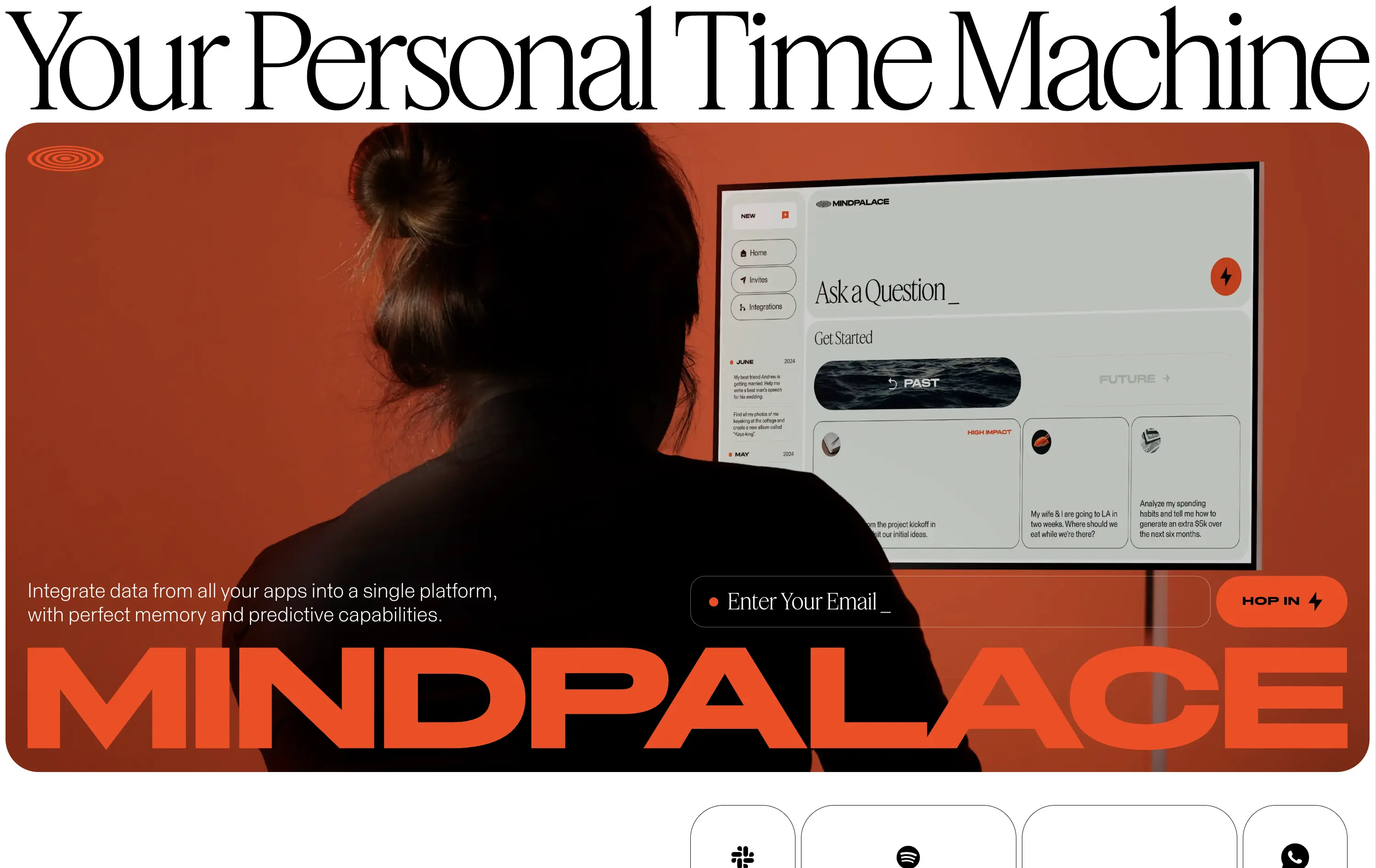
MindPalace AI
↗
SaaS
AI Tools
Productivity
Inset
Full Width
Editorial
Founder-Led Voice
Abstract / Conceptual
Email Capture
Photography
Product UI
Imagery-Based
Light Mode
Red
Black
Display
B2C
Home Page
Webflow
cinematic design, founder-led brand, AI memory tool, data integration, futuristic UI, monochrome orange palette, provocative headline, low-context messaging, brand-first hero, retro-futurist aesthetic, predictive tech, narrative design, mood-driven UX
Mindpalace connects and organizes your digital life into a single interface with memory recall and predictive AI tools—part archive, part assistant.
This hero is brand-first, product-second. The editorial headline draws intrigue but offers zero utility without scrolling. Subheadline hints at integration and predictive capabilities but avoids details. The strength lies in the striking art direction: backlit subject, glowing screen, and color-blocked monochrome palette immediately set a cinematic tone. Product UI is visible but not interactive. The email capture field is subtle and stylish, fitting the brand’s creative edge. It’s a bold anti-SaaS approach—prioritizing identity over clarity.
Mindpalace positions itself as a visionary, not a tool. Strategy leans into intrigue, betting on design-savvy early adopters who value storytelling and aesthetics over immediate clarity. Strong brand magnetism, low onboarding intent.
This layout balances technical utility with human impact, aligning well with Algolia’s positioning as an API-first but UX-aware company. The mobile UI reinforces product value visually, while the logo wall signals scale and trust for enterprise buyers. The tone is clear, benefit-led, and appropriate for high-intent decision-makers evaluating AI tools for customer experience. This is a solid enterprise-facing hero built to perform.
Riverside
↗
SaaS
Creator Tools
Creative Tools
Left-aligned
Aspirational
Single Button
Video
Interactive
Social Proof
Dark Mode
Imagery-Based
Purple
Sans serif
B2C
Home Page
Webflow
creator-first, face-driven, casual tone, real people, live recording, video-first layout, chip selector UI, dark mode, G2 badge, media industry, podcasting tool, modern SaaS, high-trust, content creation
Riverside is a browser-based studio for creators to record, edit, and publish high-quality video and audio content with ease.
Hero combines human warmth with clear purpose. Headline is aspirational, while subcopy clarifies. Visual chips guide self-segmentation. The single CTA is clean, bold, and frictionless. Social proof below adds immediate brand trust.
Tailored to non-technical creators who need a one-stop content tool. Design choices build ease and inspiration. Social logos position Riverside as mainstream-ready while keeping the tone personal and welcoming.
This layout balances technical utility with human impact, aligning well with Algolia’s positioning as an API-first but UX-aware company. The mobile UI reinforces product value visually, while the logo wall signals scale and trust for enterprise buyers. The tone is clear, benefit-led, and appropriate for high-intent decision-makers evaluating AI tools for customer experience. This is a solid enterprise-facing hero built to perform.
Kajabi
↗
SaaS
Creator Tools
Bento
Left-aligned
Aspirational
Empowering
Email Capture
Media Gallery
Live Metrics
Social Proof
Custom Animation
Light Mode
Red
Sans serif
B2C
Home Page
Webflow
creator economy, digital products, personal branding, monetization tools, testimonial-focused, bold headline, gradient cards, visual proof, email capture, energetic layout, high social proof, creator-first SaaS, aspirational branding
Kajabi is an all-in-one platform for creators to build, market, and monetize their digital products
Hero hits hard with credibility and momentum. Bold headline sets tone, though lacks clarity. Visual grid of creators and stats instantly builds trust. High-density layout may feel overwhelming on first load.
Designed to speak directly to ambitious creators. Social proof, earnings stats, and familiar faces reinforce Kajabi’s category leadership. Loud but tuned to audience mindset — performance-first, legitimacy-led, and conversion-aware.
This layout balances technical utility with human impact, aligning well with Algolia’s positioning as an API-first but UX-aware company. The mobile UI reinforces product value visually, while the logo wall signals scale and trust for enterprise buyers. The tone is clear, benefit-led, and appropriate for high-intent decision-makers evaluating AI tools for customer experience. This is a solid enterprise-facing hero built to perform.
The most effective hero sections in your inbox.
Monthly round up of top hero sections.
Don't worry. We hate spam too.
Don't worry. We hate spam too.
Don't worry. We hate spam too.