Badges
4
4
4
4
Visual cues like “#1 on G2/Product Hun” or “Used by 1M+” that reinforce proof or position.
Filters
Bonsai
↗
SaaS
Productivity
Centered
Descriptive
Professional
Multi-CTA Block
Product UI
Social Proof
Badges
Light Mode
Black
Sans serif
B2B
Home Page
Webflow
clean UI, use-case ticker, modular product suite, high-trust SaaS, minimal layout, neutral branding, small business ops, service platform, feature-led structure, multi-tool clarity, clear positioning
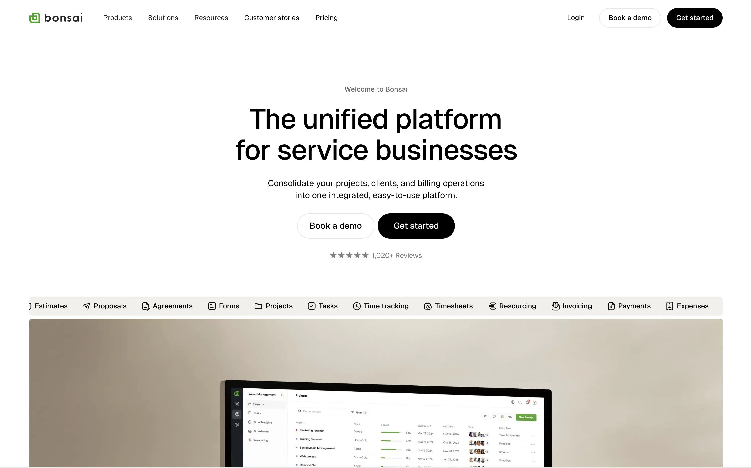
Bonsai offers an all-in-one platform to manage projects, clients, billing, and admin work for service-based businesses.
Minimal, structured, and very clear. The hero spells out the value in one line and supports it with a rolling feature list. Visuals, CTAs, and copy all pull in the same direction—no friction, no fluff.
Positioned for busy professionals who need clarity fast. Layout and tone reflect a mature product with high utility and little need for persuasion theatrics.
This layout balances technical utility with human impact, aligning well with Algolia’s positioning as an API-first but UX-aware company. The mobile UI reinforces product value visually, while the logo wall signals scale and trust for enterprise buyers. The tone is clear, benefit-led, and appropriate for high-intent decision-makers evaluating AI tools for customer experience. This is a solid enterprise-facing hero built to perform.
Bonsai
↗
SaaS
Productivity
Centered
Descriptive
Professional
Multi-CTA Block
Product UI
Social Proof
Badges
Light Mode
Black
Sans serif
B2B
Home Page
Webflow
clean UI, use-case ticker, modular product suite, high-trust SaaS, minimal layout, neutral branding, small business ops, service platform, feature-led structure, multi-tool clarity, clear positioning
Bonsai offers an all-in-one platform to manage projects, clients, billing, and admin work for service-based businesses.
Minimal, structured, and very clear. The hero spells out the value in one line and supports it with a rolling feature list. Visuals, CTAs, and copy all pull in the same direction—no friction, no fluff.
Positioned for busy professionals who need clarity fast. Layout and tone reflect a mature product with high utility and little need for persuasion theatrics.
This layout balances technical utility with human impact, aligning well with Algolia’s positioning as an API-first but UX-aware company. The mobile UI reinforces product value visually, while the logo wall signals scale and trust for enterprise buyers. The tone is clear, benefit-led, and appropriate for high-intent decision-makers evaluating AI tools for customer experience. This is a solid enterprise-facing hero built to perform.
Storyblok
↗
SaaS
DevTools
Inset
Centered
Playful
Pain-driven
Multi-CTA Block
Illustration
Product UI
Social Proof
Badges
Light Mode
Blue
Black
Sans serif
B2B
Home Page
Custom Code
headless CMS, anti-legacy positioning, visual editing, developer tools, AI assist, SaaS marketing, animated UI mockup, software demo, CMS for teams, testimonial badge, conversion-first layout
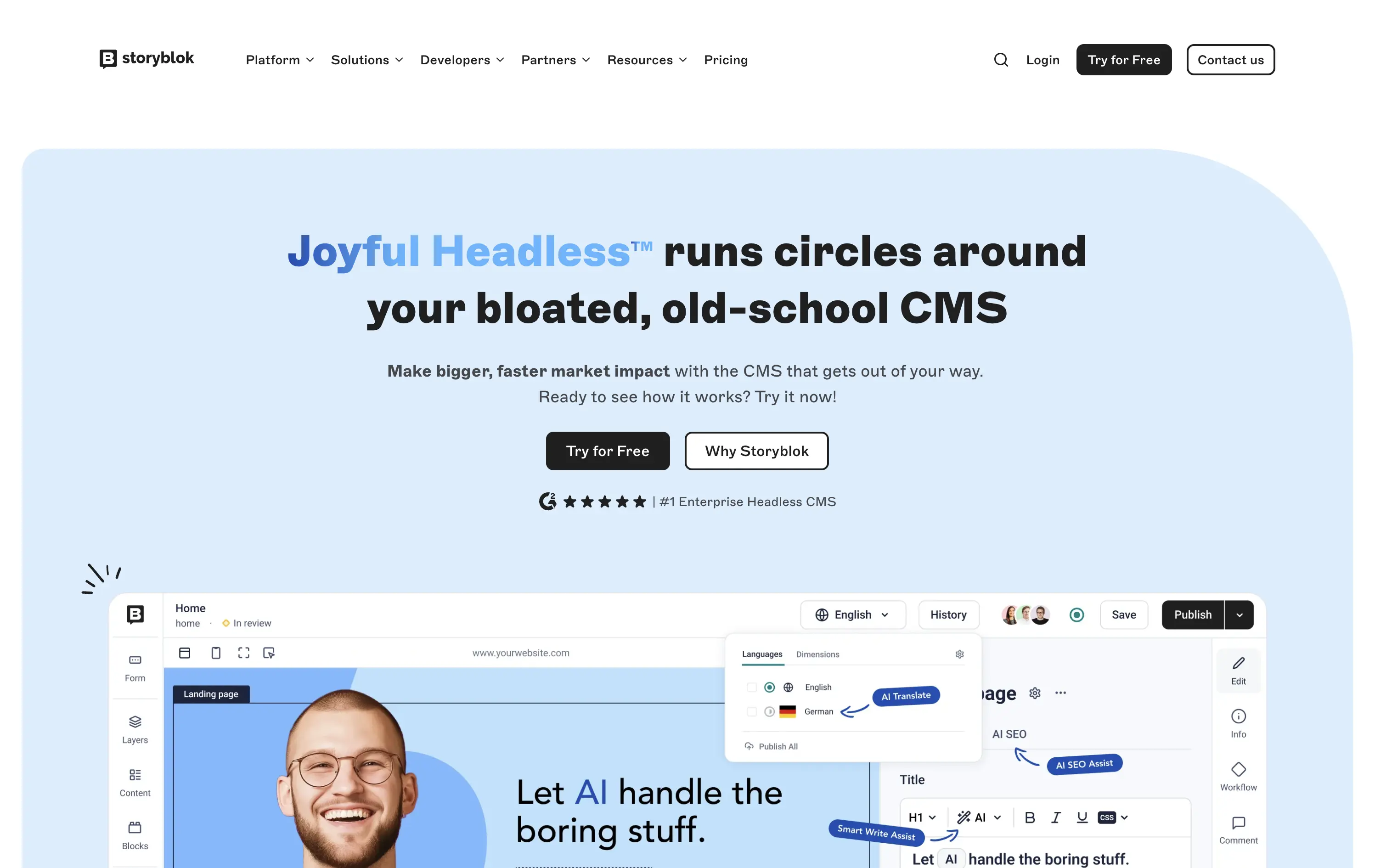
Storyblok is a headless CMS built for developers and marketers to collaboratively build fast, flexible websites and digital experiences.
The hero is unapologetically punchy. It leads with a clear enemy (bloated CMSs), while pairing credibility badges with live UI proof. Product visuals reinforce benefits instead of distracting from them.
This is high-conversion, pain-aware SaaS positioning. The voice is aggressive but measured, fitting for teams actively seeking a modern CMS alternative.
This layout balances technical utility with human impact, aligning well with Algolia’s positioning as an API-first but UX-aware company. The mobile UI reinforces product value visually, while the logo wall signals scale and trust for enterprise buyers. The tone is clear, benefit-led, and appropriate for high-intent decision-makers evaluating AI tools for customer experience. This is a solid enterprise-facing hero built to perform.
Storyblok
↗
SaaS
DevTools
Inset
Centered
Playful
Pain-driven
Multi-CTA Block
Illustration
Product UI
Social Proof
Badges
Light Mode
Blue
Black
Sans serif
B2B
Home Page
Custom Code
headless CMS, anti-legacy positioning, visual editing, developer tools, AI assist, SaaS marketing, animated UI mockup, software demo, CMS for teams, testimonial badge, conversion-first layout
Storyblok is a headless CMS built for developers and marketers to collaboratively build fast, flexible websites and digital experiences.
The hero is unapologetically punchy. It leads with a clear enemy (bloated CMSs), while pairing credibility badges with live UI proof. Product visuals reinforce benefits instead of distracting from them.
This is high-conversion, pain-aware SaaS positioning. The voice is aggressive but measured, fitting for teams actively seeking a modern CMS alternative.
This layout balances technical utility with human impact, aligning well with Algolia’s positioning as an API-first but UX-aware company. The mobile UI reinforces product value visually, while the logo wall signals scale and trust for enterprise buyers. The tone is clear, benefit-led, and appropriate for high-intent decision-makers evaluating AI tools for customer experience. This is a solid enterprise-facing hero built to perform.
TidyCal
↗
SaaS
Productivity
Centered
Benefit-Driven
Descriptive
Email Capture
Social Proof
Announcement
Badges
Dark Mode
Blue
Sans serif
B2B
Home Page
Custom Code
low-cost alternative, one-time payment SaaS, scheduling tool, Product Hunt-backed, no-frills UI, budget-friendly SaaS, email-first CTA, dark mode hero, indie stack, small team SaaS, lifetime deal, value-first messaging, stripped-down UX, pricing transparency
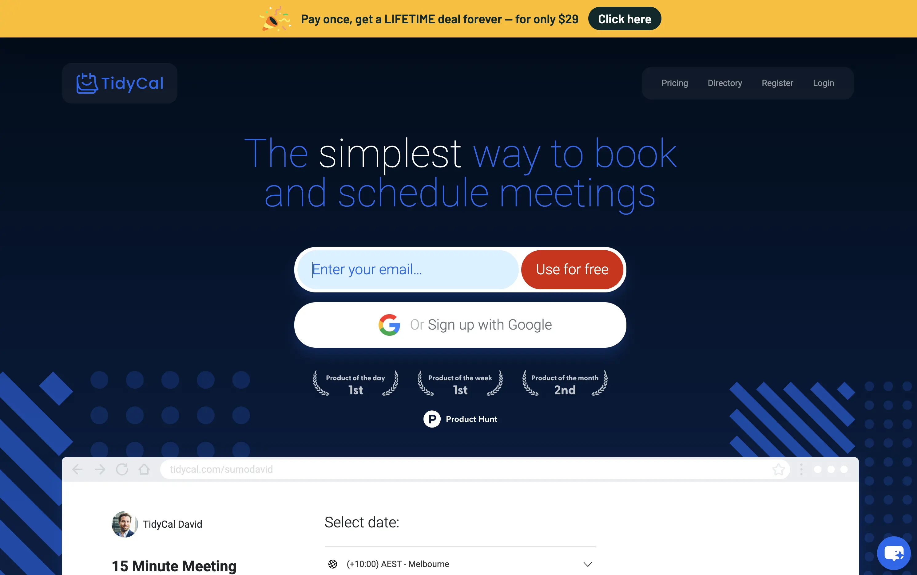
TidyCal is a simple, affordable calendar booking tool offering lifetime access for a one-time fee — ideal for solo professionals and budget-conscious teams.
TidyCal’s hero is clear on purpose but light on finesse. The lifetime deal banner is highly conversion-optimized and immediately grabs attention. However, the headline lacks typographic hierarchy and fails to land with impact — “simplest” stands out visually, but the phrasing overall feels flat. The input-first layout is user-friendly, but inconsistent sizing and visual imbalance reduce perceived trust. This hero converts, but it doesn’t inspire.
The pricing-first message works for a cost-sensitive audience. But the unrefined layout and typographic decisions may limit credibility with enterprise or design-aware users. Prioritizes affordability over perception of quality.
This layout balances technical utility with human impact, aligning well with Algolia’s positioning as an API-first but UX-aware company. The mobile UI reinforces product value visually, while the logo wall signals scale and trust for enterprise buyers. The tone is clear, benefit-led, and appropriate for high-intent decision-makers evaluating AI tools for customer experience. This is a solid enterprise-facing hero built to perform.
TidyCal
↗
SaaS
Productivity
Centered
Benefit-Driven
Descriptive
Email Capture
Social Proof
Announcement
Badges
Dark Mode
Blue
Sans serif
B2B
Home Page
Custom Code
low-cost alternative, one-time payment SaaS, scheduling tool, Product Hunt-backed, no-frills UI, budget-friendly SaaS, email-first CTA, dark mode hero, indie stack, small team SaaS, lifetime deal, value-first messaging, stripped-down UX, pricing transparency
TidyCal is a simple, affordable calendar booking tool offering lifetime access for a one-time fee — ideal for solo professionals and budget-conscious teams.
TidyCal’s hero is clear on purpose but light on finesse. The lifetime deal banner is highly conversion-optimized and immediately grabs attention. However, the headline lacks typographic hierarchy and fails to land with impact — “simplest” stands out visually, but the phrasing overall feels flat. The input-first layout is user-friendly, but inconsistent sizing and visual imbalance reduce perceived trust. This hero converts, but it doesn’t inspire.
The pricing-first message works for a cost-sensitive audience. But the unrefined layout and typographic decisions may limit credibility with enterprise or design-aware users. Prioritizes affordability over perception of quality.
This layout balances technical utility with human impact, aligning well with Algolia’s positioning as an API-first but UX-aware company. The mobile UI reinforces product value visually, while the logo wall signals scale and trust for enterprise buyers. The tone is clear, benefit-led, and appropriate for high-intent decision-makers evaluating AI tools for customer experience. This is a solid enterprise-facing hero built to perform.
Cal.com
↗
SaaS
Productivity
Split Grid
Left-aligned
Bold & Direct
Multi-CTA Block
Product UI
Social Proof
Custom Animation
Badges
Light Mode
Black
Sans serif
Hybrid
Home Page
Framer
calendar booking, open source scheduler, clean aesthetic, lightweight onboarding, animated UI, trust-led design, Google sign-in, frictionless flow, developer-friendly, minimal layout, self-serve SaaS, cross-industry use cases, credibility-first, proof-based design
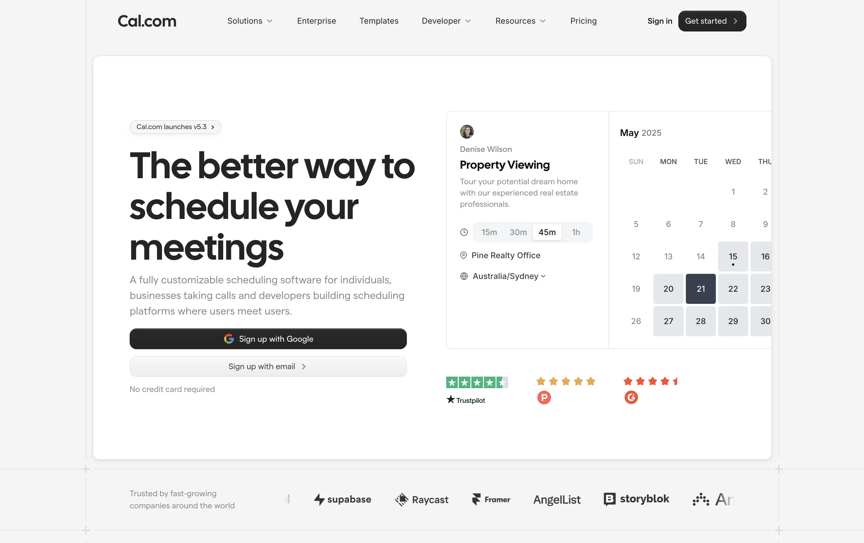
Cal.com is a fully customizable scheduling platform for individuals, teams, and developers—built for everything from calls to client bookings.
Clear headline paired with a minimalist aesthetic creates instant comprehension. The animated UI module smartly showcases varied use cases—from legal consults to photoshoots—broadening audience appeal. Trust badges build legitimacy, while “Sign up with Google” signals low-friction entry. Copy is functional and tight, and the centered layout maintains visual clarity without distraction.
The hero is focused and efficient. Clear headline, modular product UI, and direct signup flows drive intent. Trust logos and social proof add validation. UI previews reflect real-world use across industries. Nothing extraneous.
This layout balances technical utility with human impact, aligning well with Algolia’s positioning as an API-first but UX-aware company. The mobile UI reinforces product value visually, while the logo wall signals scale and trust for enterprise buyers. The tone is clear, benefit-led, and appropriate for high-intent decision-makers evaluating AI tools for customer experience. This is a solid enterprise-facing hero built to perform.
Cal.com
↗
SaaS
Productivity
Split Grid
Left-aligned
Bold & Direct
Multi-CTA Block
Product UI
Social Proof
Custom Animation
Badges
Light Mode
Black
Sans serif
Hybrid
Home Page
Framer
calendar booking, open source scheduler, clean aesthetic, lightweight onboarding, animated UI, trust-led design, Google sign-in, frictionless flow, developer-friendly, minimal layout, self-serve SaaS, cross-industry use cases, credibility-first, proof-based design
Cal.com is a fully customizable scheduling platform for individuals, teams, and developers—built for everything from calls to client bookings.
Clear headline paired with a minimalist aesthetic creates instant comprehension. The animated UI module smartly showcases varied use cases—from legal consults to photoshoots—broadening audience appeal. Trust badges build legitimacy, while “Sign up with Google” signals low-friction entry. Copy is functional and tight, and the centered layout maintains visual clarity without distraction.
The hero is focused and efficient. Clear headline, modular product UI, and direct signup flows drive intent. Trust logos and social proof add validation. UI previews reflect real-world use across industries. Nothing extraneous.
This layout balances technical utility with human impact, aligning well with Algolia’s positioning as an API-first but UX-aware company. The mobile UI reinforces product value visually, while the logo wall signals scale and trust for enterprise buyers. The tone is clear, benefit-led, and appropriate for high-intent decision-makers evaluating AI tools for customer experience. This is a solid enterprise-facing hero built to perform.
The most effective hero sections in your inbox.
Monthly round up of top hero sections.
Don't worry. We hate spam too.
Don't worry. We hate spam too.
Don't worry. We hate spam too.