Benefit-Driven
35
35
35
35
Leads with user value — focused on outcomes, not features.
Filters
Orchids
↗
AI Tools
No-Code
Creative Tools
Centered
Benefit-Driven
Aspirational
Search/Utility Block
Interactive
Product UI
Imagery-Based
Pink
Black
Serif
B2C
Home Page
Custom Code
ai site builder, no-code websites, prompt box hero, interactive sandbox, scenic background, gallery proof, centered layout, serif headline, product-led growth, signup gate, creative makers, pastel sky, inspirational copy, landing page builder, web app generator
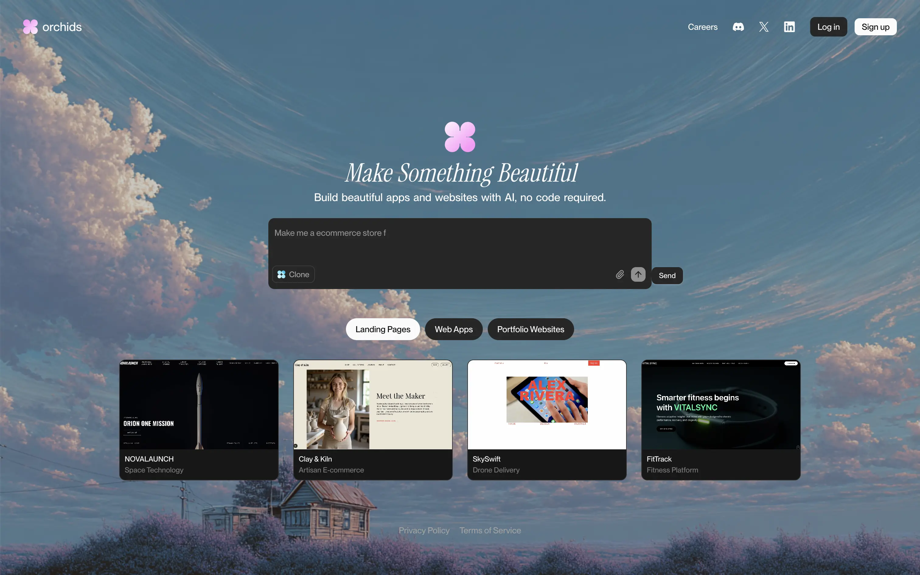
Orchids lets anyone generate full websites or apps from a single text prompt, delivering production-ready code and design without writing a line themselves.
Dreamy sky backdrop and italic serif headline promise beauty, while the live prompt box invites instant play. Thumbnail gallery backs the claim with varied examples. Redirecting to sign-up right after a prompt captures intent but may jar casual visitors. Overall hierarchy is clear and engaging.
Vision-heavy headline hooks design-focused founders; interactive builder demo signals AI uniqueness. Product-led funnel drives conversions, though absence of pricing or social proof leaves credibility to aesthetic appeal alone.
This layout balances technical utility with human impact, aligning well with Algolia’s positioning as an API-first but UX-aware company. The mobile UI reinforces product value visually, while the logo wall signals scale and trust for enterprise buyers. The tone is clear, benefit-led, and appropriate for high-intent decision-makers evaluating AI tools for customer experience. This is a solid enterprise-facing hero built to perform.
Orchids
↗
AI Tools
No-Code
Creative Tools
Centered
Benefit-Driven
Aspirational
Search/Utility Block
Interactive
Product UI
Imagery-Based
Pink
Black
Serif
B2C
Home Page
Custom Code
ai site builder, no-code websites, prompt box hero, interactive sandbox, scenic background, gallery proof, centered layout, serif headline, product-led growth, signup gate, creative makers, pastel sky, inspirational copy, landing page builder, web app generator
Orchids lets anyone generate full websites or apps from a single text prompt, delivering production-ready code and design without writing a line themselves.
Dreamy sky backdrop and italic serif headline promise beauty, while the live prompt box invites instant play. Thumbnail gallery backs the claim with varied examples. Redirecting to sign-up right after a prompt captures intent but may jar casual visitors. Overall hierarchy is clear and engaging.
Vision-heavy headline hooks design-focused founders; interactive builder demo signals AI uniqueness. Product-led funnel drives conversions, though absence of pricing or social proof leaves credibility to aesthetic appeal alone.
This layout balances technical utility with human impact, aligning well with Algolia’s positioning as an API-first but UX-aware company. The mobile UI reinforces product value visually, while the logo wall signals scale and trust for enterprise buyers. The tone is clear, benefit-led, and appropriate for high-intent decision-makers evaluating AI tools for customer experience. This is a solid enterprise-facing hero built to perform.
Yellow
↗
AI Tools
Creative Tools
Split Grid
Left-aligned
Benefit-Driven
Single Button
Video
3D visuals
Dark Mode
Yellow
Sans serif
B2B
Home Page
Custom Code
lifelike 3d characters, vision ai, rigged mesh, animation ready, game dev tools, vfx pipeline, split hero, black-yellow palette, bold typography, single cta, video demo, fast generation, pro-grade, product-led, studio workflow
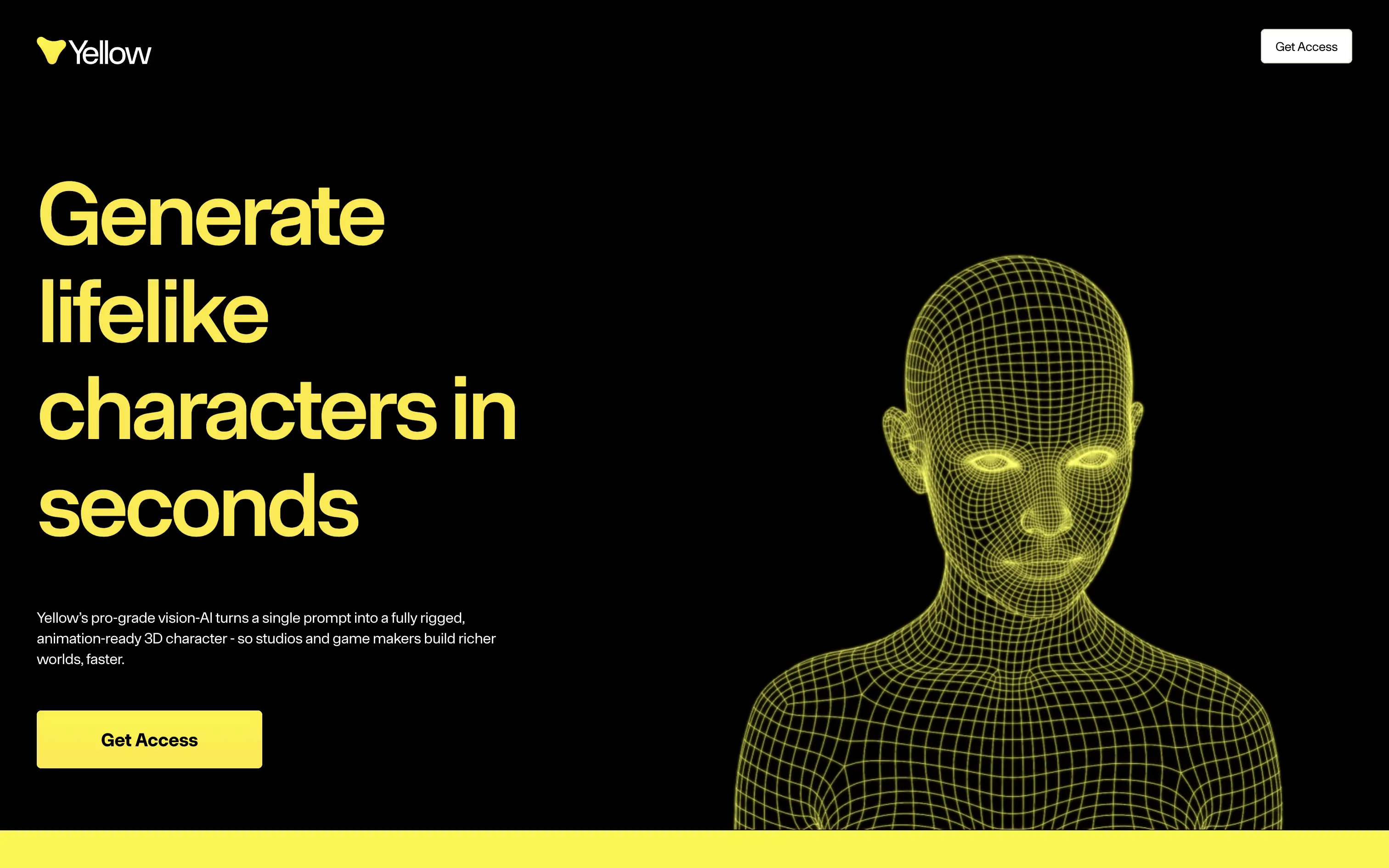
Yellow turns a single prompt into a fully rigged, animation-ready 3D character so game and film studios build richer worlds in minutes.
Oversized yellow headline on black instantly communicates value and speed. Wireframe head animates, proving tech while matching brand color. Short support copy clarifies prompt-to-mesh promise. One bright button repeats “Get Access,” giving a clear next step. Motion pace feels slow, but hierarchy and contrast keep focus locked.
Hero nails pain of slow character workflows, aligning with pro creators who measure in seconds. Stark aesthetic signals premium tooling while early-access gate supports scarcity and user vetting.
This layout balances technical utility with human impact, aligning well with Algolia’s positioning as an API-first but UX-aware company. The mobile UI reinforces product value visually, while the logo wall signals scale and trust for enterprise buyers. The tone is clear, benefit-led, and appropriate for high-intent decision-makers evaluating AI tools for customer experience. This is a solid enterprise-facing hero built to perform.
Yellow
↗
AI Tools
Creative Tools
Split Grid
Left-aligned
Benefit-Driven
Single Button
Video
3D visuals
Dark Mode
Yellow
Sans serif
B2B
Home Page
Custom Code
lifelike 3d characters, vision ai, rigged mesh, animation ready, game dev tools, vfx pipeline, split hero, black-yellow palette, bold typography, single cta, video demo, fast generation, pro-grade, product-led, studio workflow
Yellow turns a single prompt into a fully rigged, animation-ready 3D character so game and film studios build richer worlds in minutes.
Oversized yellow headline on black instantly communicates value and speed. Wireframe head animates, proving tech while matching brand color. Short support copy clarifies prompt-to-mesh promise. One bright button repeats “Get Access,” giving a clear next step. Motion pace feels slow, but hierarchy and contrast keep focus locked.
Hero nails pain of slow character workflows, aligning with pro creators who measure in seconds. Stark aesthetic signals premium tooling while early-access gate supports scarcity and user vetting.
This layout balances technical utility with human impact, aligning well with Algolia’s positioning as an API-first but UX-aware company. The mobile UI reinforces product value visually, while the logo wall signals scale and trust for enterprise buyers. The tone is clear, benefit-led, and appropriate for high-intent decision-makers evaluating AI tools for customer experience. This is a solid enterprise-facing hero built to perform.
Collective
↗
SaaS
Fintech
Split Grid
Benefit-Driven
Single Button
Logo Wall
Product UI
Announcement
Light Mode
Purple
Serif
B2B
Home Page
Custom Code
solo-preneur finance, tax savings, accounting dashboard, countdown promo bar, split hero, logo wall proof, LLC services, purple CTA, self-employed tools, clean UI, high-trust layout, all-in-one platform, product screenshot, modern fintech, onboarding waiver
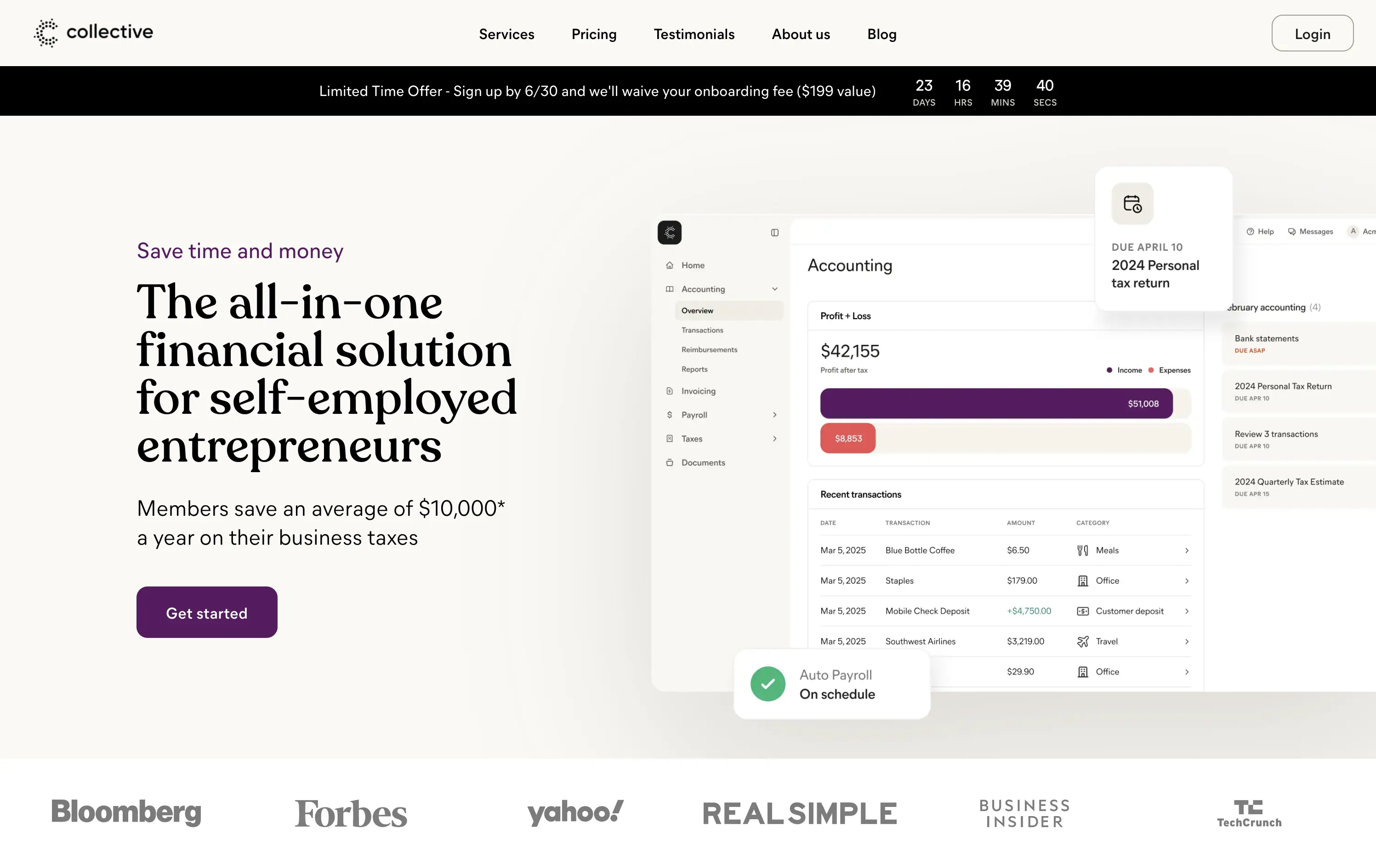
Collective handles formation, accounting, payroll, and taxes for self-employed entrepreneurs so they keep more income and skip back-office busywork.
Clear headline frames a big benefit; sub-copy quantifies $10k average savings, anchoring value. Purple “Get started” button pops on a calm canvas, and a limited-time bar with countdown injects urgency. Right-side UI mock-up shows real product context, while publication logos reinforce trust. Visual hierarchy guides left-to-right scan cleanly.
Messaging speaks directly to cost-sensitive solo founders, pairing quantified proof with urgency and social validation. Split grid balances authority and approachability, aligning with a service-plus-software proposition.
This layout balances technical utility with human impact, aligning well with Algolia’s positioning as an API-first but UX-aware company. The mobile UI reinforces product value visually, while the logo wall signals scale and trust for enterprise buyers. The tone is clear, benefit-led, and appropriate for high-intent decision-makers evaluating AI tools for customer experience. This is a solid enterprise-facing hero built to perform.
Collective
↗
SaaS
Fintech
Split Grid
Benefit-Driven
Single Button
Logo Wall
Product UI
Announcement
Light Mode
Purple
Serif
B2B
Home Page
Custom Code
solo-preneur finance, tax savings, accounting dashboard, countdown promo bar, split hero, logo wall proof, LLC services, purple CTA, self-employed tools, clean UI, high-trust layout, all-in-one platform, product screenshot, modern fintech, onboarding waiver
Collective handles formation, accounting, payroll, and taxes for self-employed entrepreneurs so they keep more income and skip back-office busywork.
Clear headline frames a big benefit; sub-copy quantifies $10k average savings, anchoring value. Purple “Get started” button pops on a calm canvas, and a limited-time bar with countdown injects urgency. Right-side UI mock-up shows real product context, while publication logos reinforce trust. Visual hierarchy guides left-to-right scan cleanly.
Messaging speaks directly to cost-sensitive solo founders, pairing quantified proof with urgency and social validation. Split grid balances authority and approachability, aligning with a service-plus-software proposition.
This layout balances technical utility with human impact, aligning well with Algolia’s positioning as an API-first but UX-aware company. The mobile UI reinforces product value visually, while the logo wall signals scale and trust for enterprise buyers. The tone is clear, benefit-led, and appropriate for high-intent decision-makers evaluating AI tools for customer experience. This is a solid enterprise-facing hero built to perform.
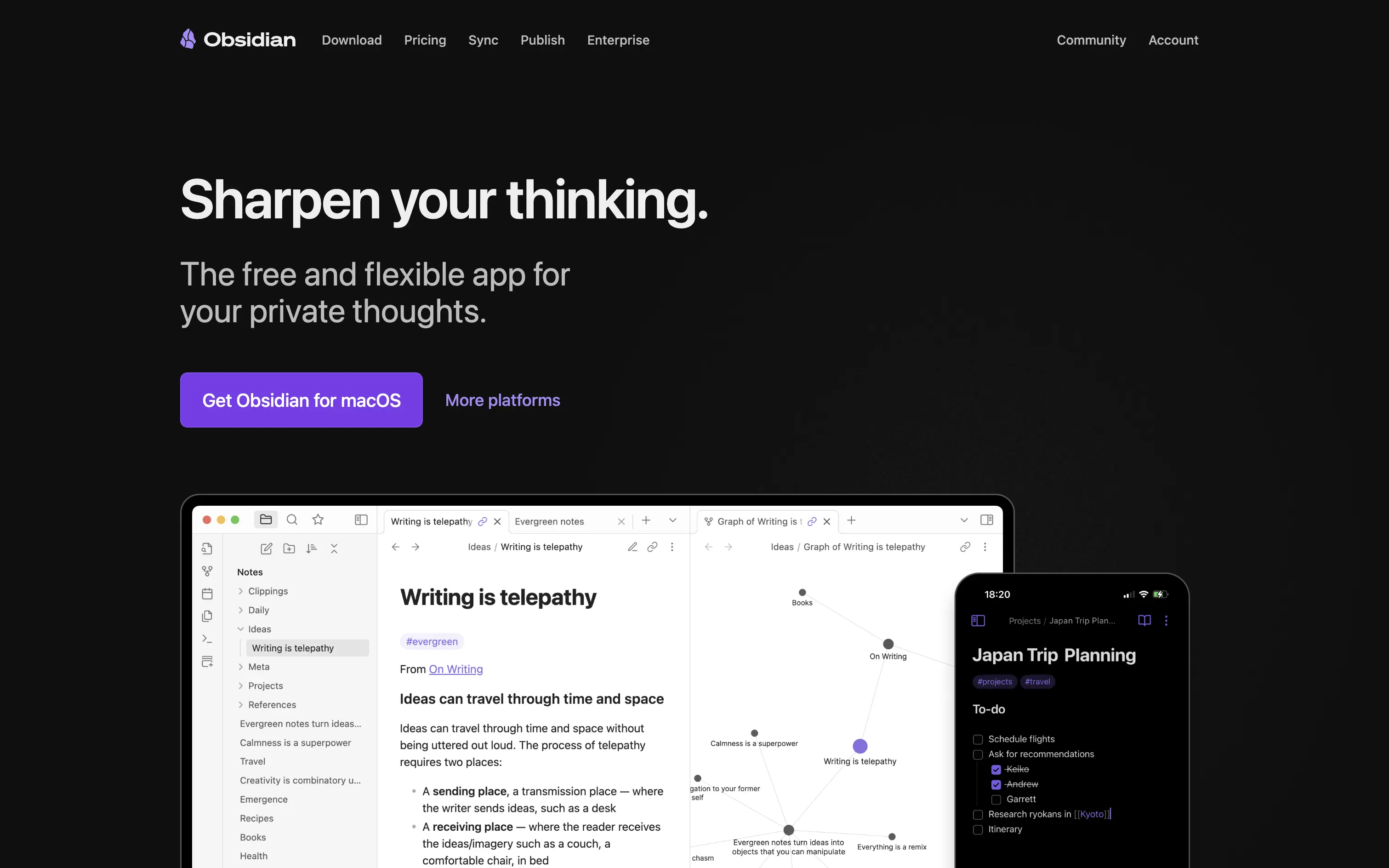
Obsidian
↗
SaaS
Productivity
Left-aligned
Benefit-Driven
Aspirational
Single Button
Product UI
Dark Mode
Purple
Sans serif
B2C
Home Page
Custom Code
note-taking, markdown editor, PKM, knowledge graph, offline-first, cross-platform, dark-mode hero, split layout, purple CTA, personal knowledge base, privacy-first, product-led growth, free core app, desktop & mobile, sync add-on
Obsidian is a markdown note app that links your ideas into a private, cross-platform knowledge graph you fully own.
Hero wastes no time: promise, positioning, and platform CTA appear above the fold with generous whitespace. “Sharpen your thinking” is emotive yet concrete, and subcopy nails the free-plus-private hook. Large purple download button drives action; “More platforms” captures non-Mac traffic without clutter. Device mock-ups validate desktop graph view and mobile parity. Dark palette amplifies focus but can feel heavy on first load for light-mode users. Overall, message, proof, and path to value align smoothly.
Clear benefit and privacy stance resonate with knowledge-worker early adopters. Product UI proof boosts trust, while free entry plus paid extras reinforces community-driven, product-led growth flywheel.
This layout balances technical utility with human impact, aligning well with Algolia’s positioning as an API-first but UX-aware company. The mobile UI reinforces product value visually, while the logo wall signals scale and trust for enterprise buyers. The tone is clear, benefit-led, and appropriate for high-intent decision-makers evaluating AI tools for customer experience. This is a solid enterprise-facing hero built to perform.
Intrepid
↗
Hardware
Centered
Benefit-Driven
Confident
Single Button
Photography
Loading Animation
3D visuals
Dark Mode
Orange
Sans serif
B2B
Home Page
Custom Code
dark hero, industrial hardware, 3D printing, automation tech, demo‑first CTA, mint headline, orange glow accents, centered layout, B2B manufacturing, sleek machines, full‑width image, high contrast, precise messaging
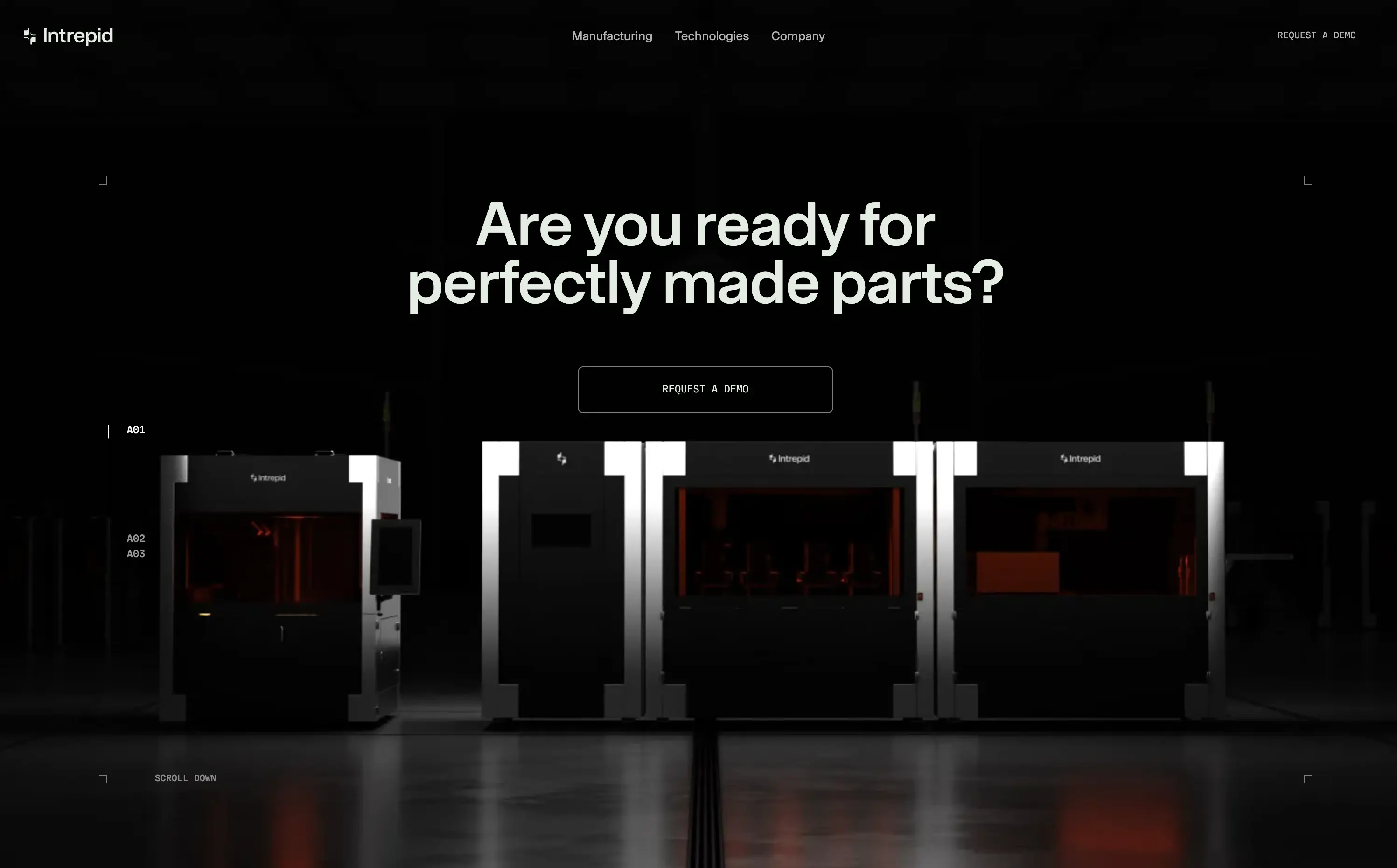
Industrial 3D‑printing company making automated hardware systems that produce precise parts at production scale for manufacturers.
Industrial 3D‑printing company making automated hardware systems that produce precise parts at production scale for manufacturers.
Visual gravitas matches enterprise buyers seeking reliability. Centered demo CTA suits high‑touch sales funnel. Message aligns with pain of imperfect parts, reinforcing positioning as quality‑first hardware partner.
This layout balances technical utility with human impact, aligning well with Algolia’s positioning as an API-first but UX-aware company. The mobile UI reinforces product value visually, while the logo wall signals scale and trust for enterprise buyers. The tone is clear, benefit-led, and appropriate for high-intent decision-makers evaluating AI tools for customer experience. This is a solid enterprise-facing hero built to perform.
Intrepid
↗
Hardware
Centered
Benefit-Driven
Confident
Single Button
Photography
Loading Animation
3D visuals
Dark Mode
Orange
Sans serif
B2B
Home Page
Custom Code
dark hero, industrial hardware, 3D printing, automation tech, demo‑first CTA, mint headline, orange glow accents, centered layout, B2B manufacturing, sleek machines, full‑width image, high contrast, precise messaging
Industrial 3D‑printing company making automated hardware systems that produce precise parts at production scale for manufacturers.
Industrial 3D‑printing company making automated hardware systems that produce precise parts at production scale for manufacturers.
Visual gravitas matches enterprise buyers seeking reliability. Centered demo CTA suits high‑touch sales funnel. Message aligns with pain of imperfect parts, reinforcing positioning as quality‑first hardware partner.
This layout balances technical utility with human impact, aligning well with Algolia’s positioning as an API-first but UX-aware company. The mobile UI reinforces product value visually, while the logo wall signals scale and trust for enterprise buyers. The tone is clear, benefit-led, and appropriate for high-intent decision-makers evaluating AI tools for customer experience. This is a solid enterprise-facing hero built to perform.
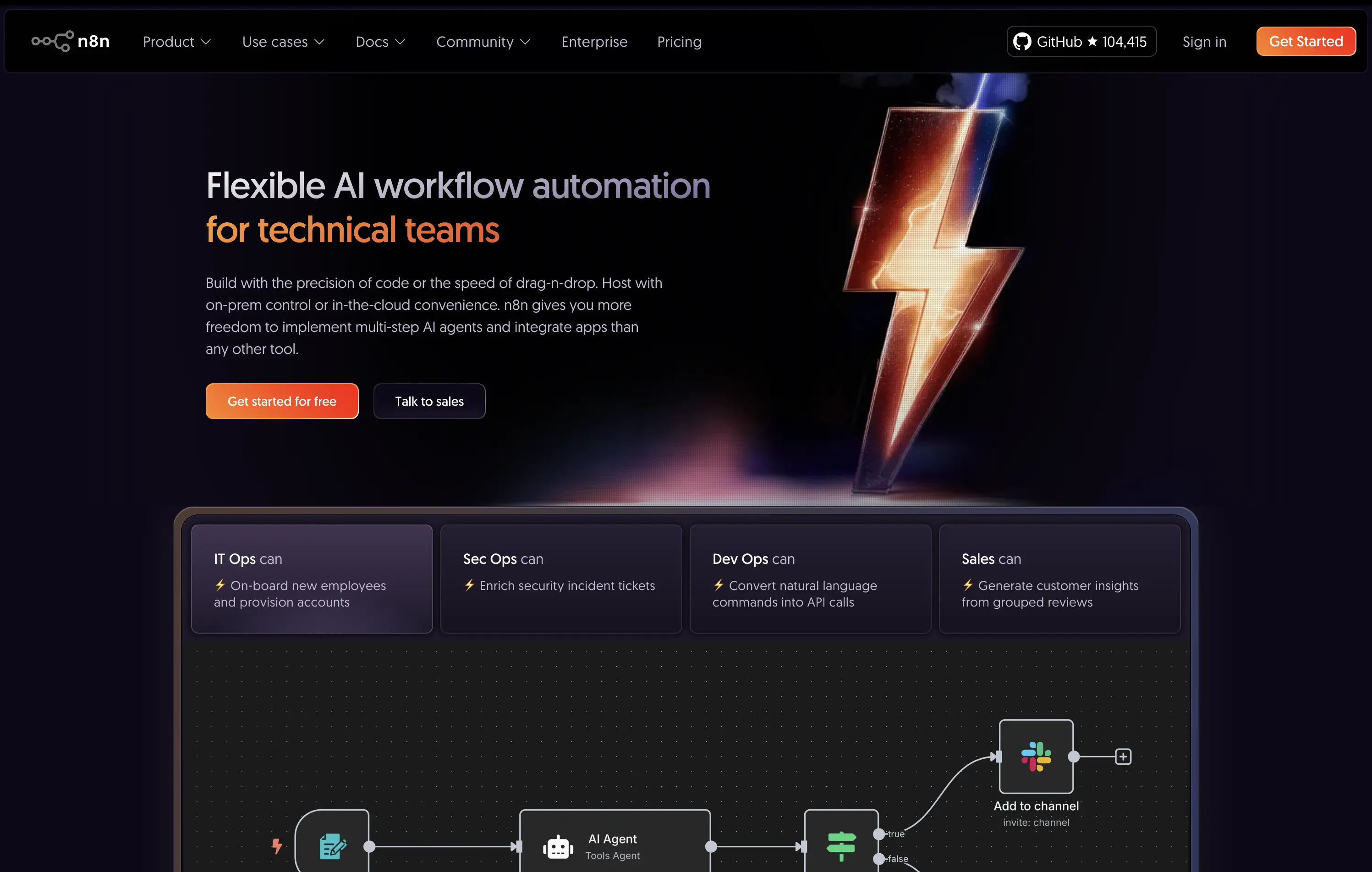
n8n
↗
SaaS
AI Tools
No-Code
Left-aligned
Benefit-Driven
Professional
Multi-CTA Block
Interactive
Product UI
Custom Animation
Dark Mode
Purple
Orange
Sans serif
B2B
Home Page
Custom Code
workflow automation, open source, dev-first, agent-based logic, enterprise-ready, dark UI, custom hosting, role-based use cases, badge grid, high-contrast visual, infra-integrated
An open-source AI workflow automation tool for developers and teams to build, host, and manage agents with full control.
The hero clearly communicates audience and value: “technical teams” is front-loaded, supported by use-case-specific tiles. The lightning bolt graphic adds memorability, while the product UI below supports credibility.
Strongly positioned for a technical, enterprise-leaning audience. The copy and structure match maturity and decision-maker needs. Hosting flexibility is a key differentiator.
This layout balances technical utility with human impact, aligning well with Algolia’s positioning as an API-first but UX-aware company. The mobile UI reinforces product value visually, while the logo wall signals scale and trust for enterprise buyers. The tone is clear, benefit-led, and appropriate for high-intent decision-makers evaluating AI tools for customer experience. This is a solid enterprise-facing hero built to perform.
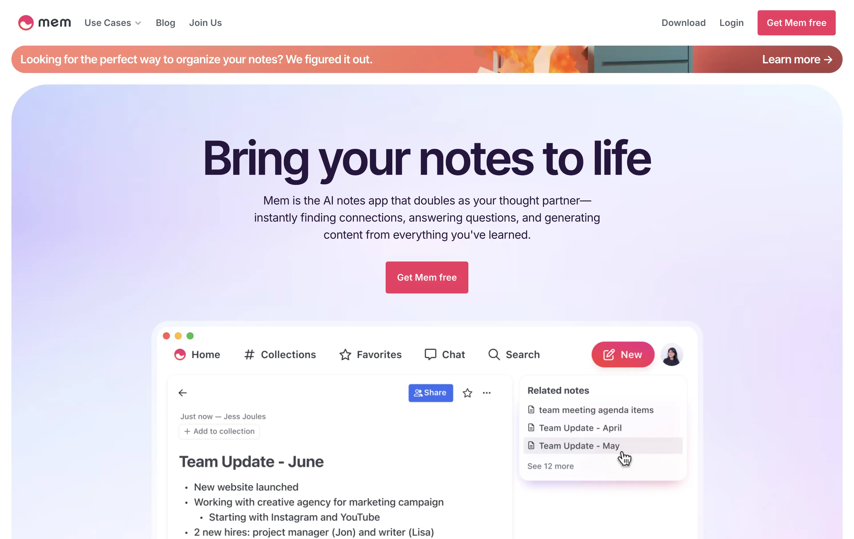
Mem
↗
AI Tools
Productivity
Inset
Centered
Benefit-Driven
Empowering
Single Button
Product UI
Announcement
Gradient
Light Mode
Pink
Purple
Sans serif
B2C
Home Page
Framer
ai note app, ambient UI, productivity tool, second brain, writing partner, connected thoughts, knowledge management, pastel color gradient, Gen Z tone, soft product UI, memory system, fast capture, personal knowledge base
Mem is an AI-powered note-taking app that helps users organize thoughts, generate content, and uncover connections automatically.
Clear and emotional headline matched with a simple product UI. CTA stands out visually. Gradient background and calm visual rhythm support a productivity mindset. Overall, well-structured but slightly generic in messaging.
Positioning as a thought partner sets it apart from basic note apps. Hero leans into AI assistance without overwhelming technicality. Good emotional framing for a consumer productivity tool.
This layout balances technical utility with human impact, aligning well with Algolia’s positioning as an API-first but UX-aware company. The mobile UI reinforces product value visually, while the logo wall signals scale and trust for enterprise buyers. The tone is clear, benefit-led, and appropriate for high-intent decision-makers evaluating AI tools for customer experience. This is a solid enterprise-facing hero built to perform.
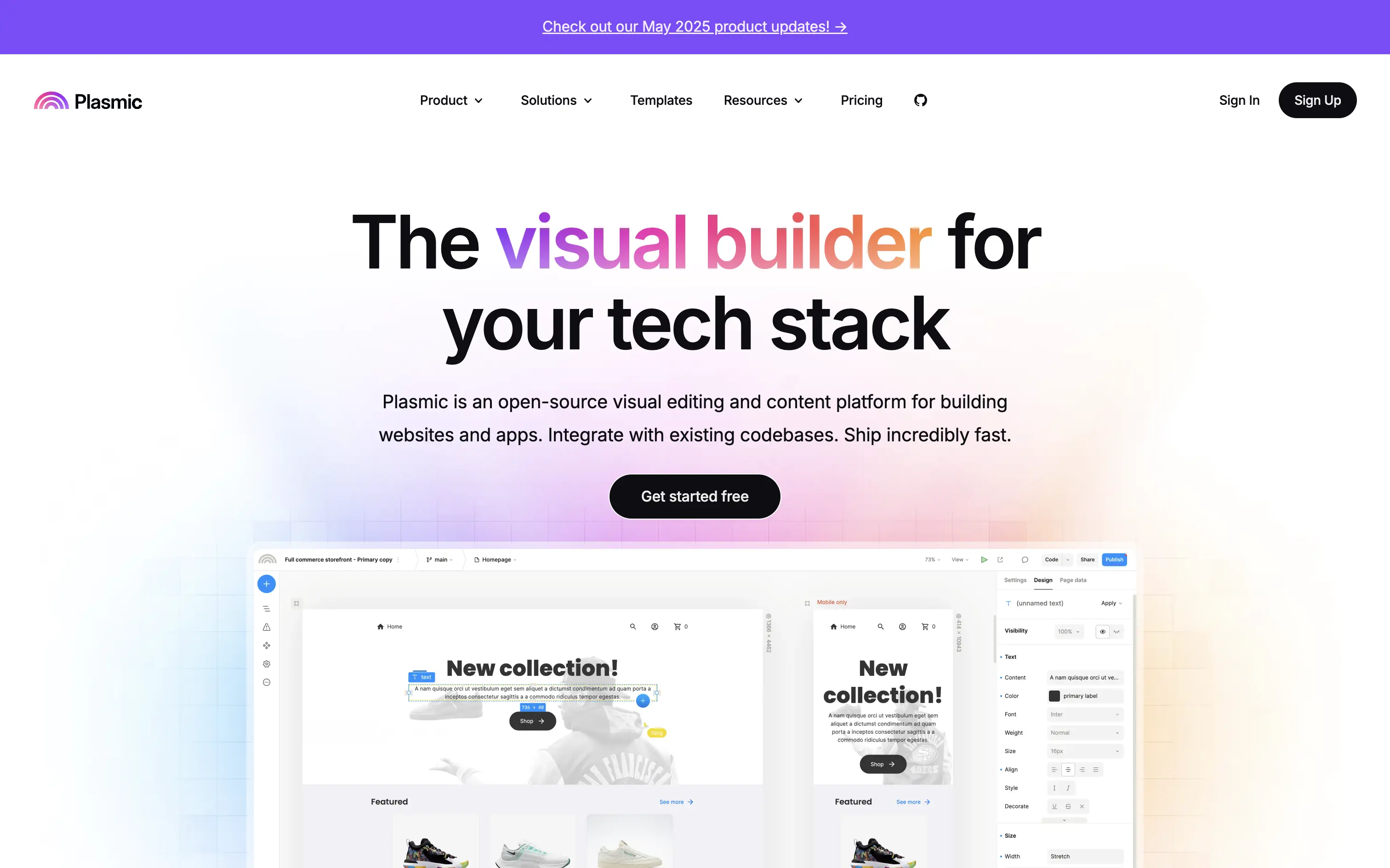
Plasmic
↗
SaaS
No-Code
Collaboration
Creative Tools
Centered
Benefit-Driven
Descriptive
Single Button
Product UI
Announcement
Gradient
Light Mode
Pink
Purple
Yellow
Sans serif
Hybrid
Home Page
Custom Code
visual builder, code integration, React support, Figma import, developer-friendly, no-code platform, CMS integration, responsive design, real-time collaboration, open-source, component-based, scalable, enterprise-ready, UI/UX design
Plasmic is an open-source visual builder that enables teams to design and build web apps and websites rapidly, integrating seamlessly with existing codebases.
The hero section clearly communicates Plasmic's core value proposition as a visual builder for tech stacks. The combination of concise copy and product visuals effectively showcases its capabilities. The inclusion of a logo wall adds credibility, and the CTA is prominently displayed, guiding users toward engagement.
Plasmic positions itself effectively for both developers and non-developers by highlighting seamless code integration and visual editing capabilities. This dual appeal broadens its market reach and addresses common pain points in web development workflows.
This layout balances technical utility with human impact, aligning well with Algolia’s positioning as an API-first but UX-aware company. The mobile UI reinforces product value visually, while the logo wall signals scale and trust for enterprise buyers. The tone is clear, benefit-led, and appropriate for high-intent decision-makers evaluating AI tools for customer experience. This is a solid enterprise-facing hero built to perform.
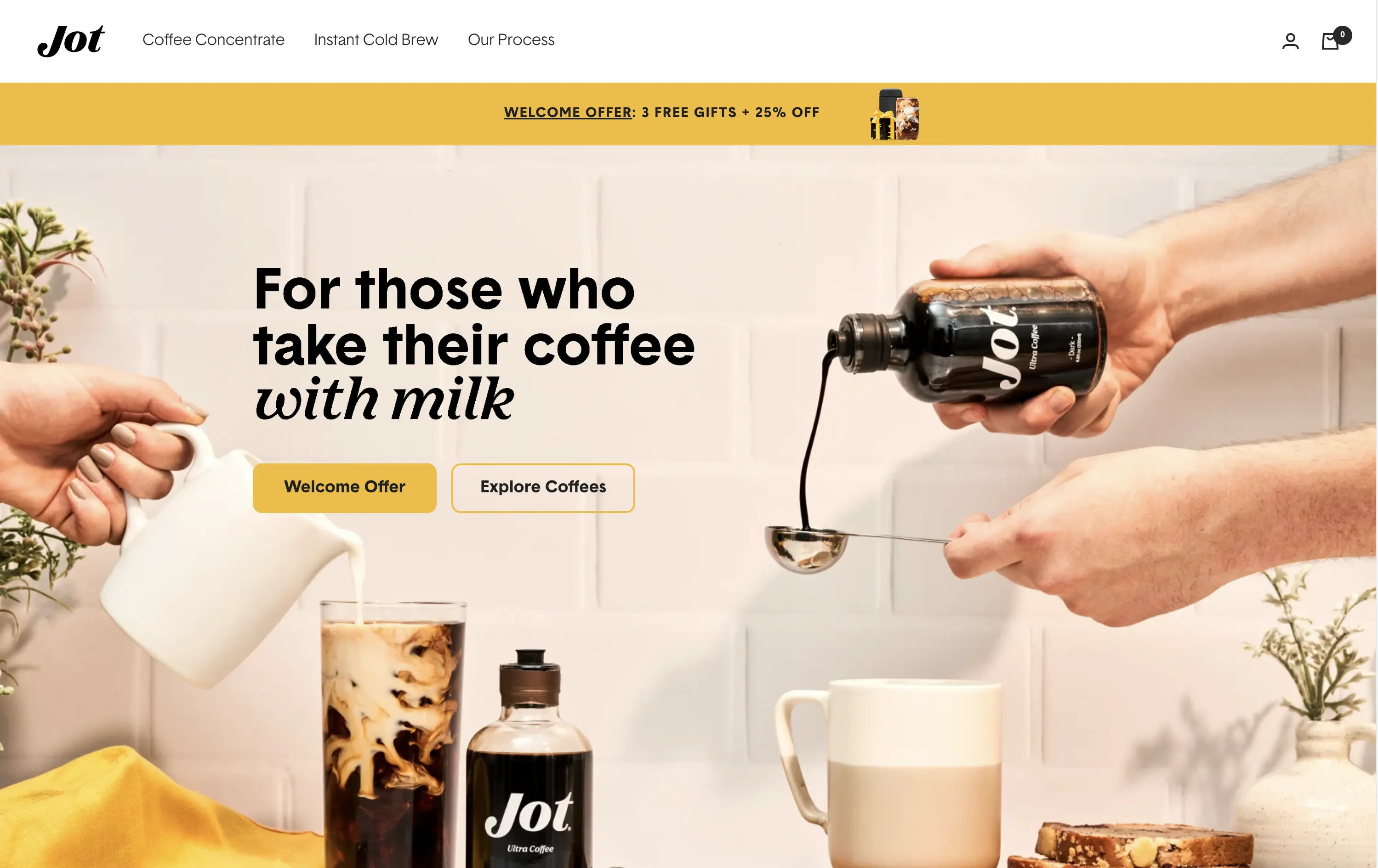
Jot
↗
CPG
Food & Beverage
Editorial
Benefit-Driven
Conversational
Multi-CTA Block
Photography
Custom Animation
Announcement
Imagery-Based
Yellow
Black
Display
DTC
Home Page
Shopify
Replo
coffee brand, lifestyle product, home ritual, premium instant coffee, CPG beverage, warm palette, morning routine, modern food DTC, product-centered hero, rotating headline, lifestyle-led photography
Jot sells ultra-concentrated coffee that simplifies your morning brew without compromising on quality or taste.
Visuals immediately convey simplicity and satisfaction. The rotating headline adapts to multiple buyer intents while keeping focus tight. The product-in-action shot clarifies usage without needing extra explanation.
The brand leans hard into lifestyle cues—targeting modern, taste-conscious buyers with clarity and credibility. The light palette and cozy setup reinforce everyday luxury.
This layout balances technical utility with human impact, aligning well with Algolia’s positioning as an API-first but UX-aware company. The mobile UI reinforces product value visually, while the logo wall signals scale and trust for enterprise buyers. The tone is clear, benefit-led, and appropriate for high-intent decision-makers evaluating AI tools for customer experience. This is a solid enterprise-facing hero built to perform.
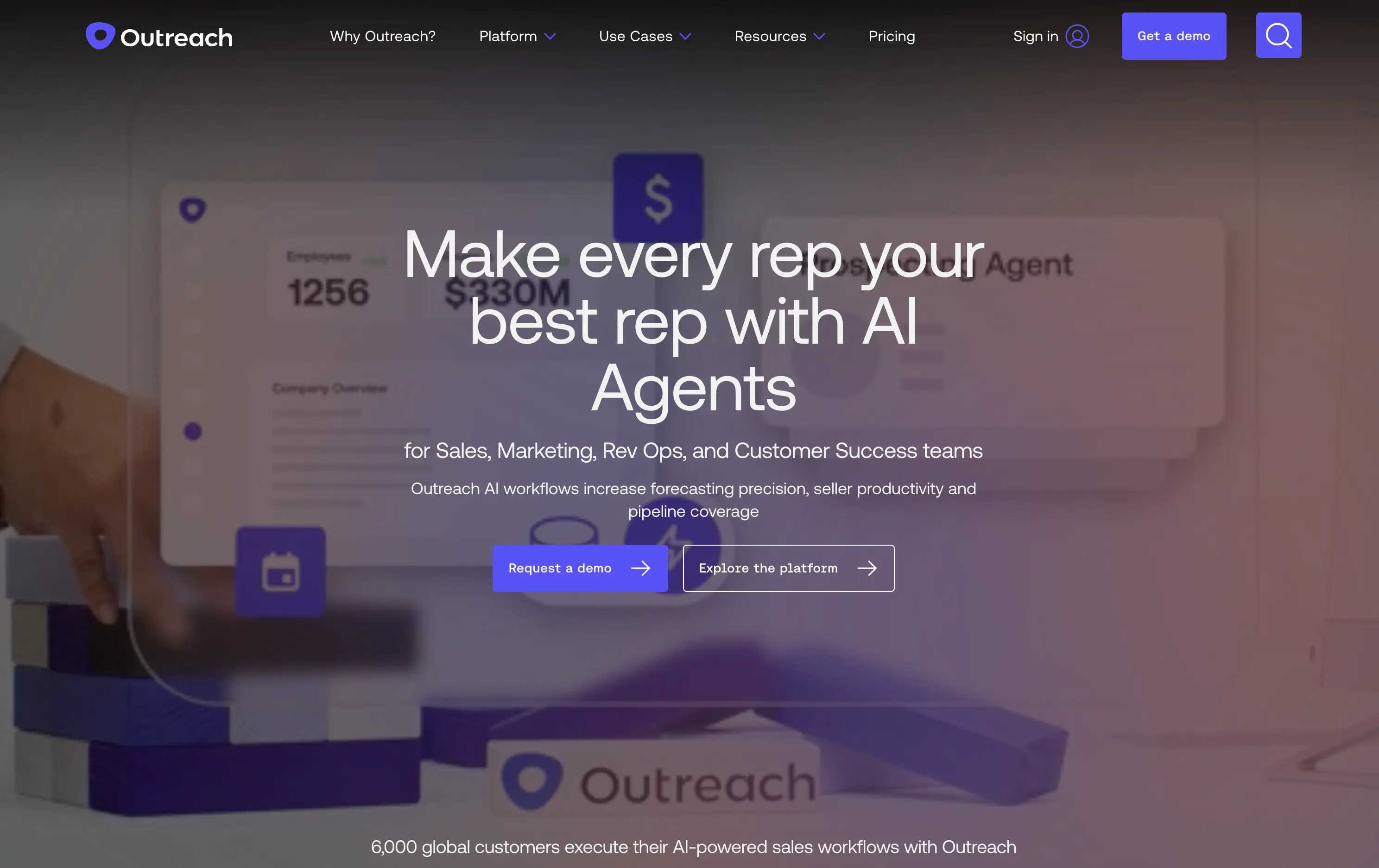
Outreach
↗
SaaS
AI Tools
Productivity
Full Width
Centered
Benefit-Driven
Confident
Multi-CTA Block
Video
Product UI
Imagery-Based
Blue
Sans serif
B2B
Home Page
Custom Code
sales automation, B2B SaaS, AI forecasting, sales rep enablement, RevOps tools, productivity workflows, confident tone, enterprise platform, full-width layout, animated product demo, AI sales co-pilot, multi-CTA, modern interface, precision messaging, dark UI
Outreach helps B2B teams improve pipeline precision and sales productivity through AI-powered automation and forecasting tools.
The hero is product-led with a high-trust, enterprise feel. The headline is assertive, speaking directly to the sales persona. Subheadline adds clarity and lists functional benefits. Background motion shows product value without distraction. CTAs are split by intent: demo vs. explore. The full-width layout conveys confidence and scale.
Clearly positioned for decision-makers in SalesOps and RevOps. Copy and layout support mid-funnel engagement with strong product-centric framing and trusting tone.
This layout balances technical utility with human impact, aligning well with Algolia’s positioning as an API-first but UX-aware company. The mobile UI reinforces product value visually, while the logo wall signals scale and trust for enterprise buyers. The tone is clear, benefit-led, and appropriate for high-intent decision-makers evaluating AI tools for customer experience. This is a solid enterprise-facing hero built to perform.
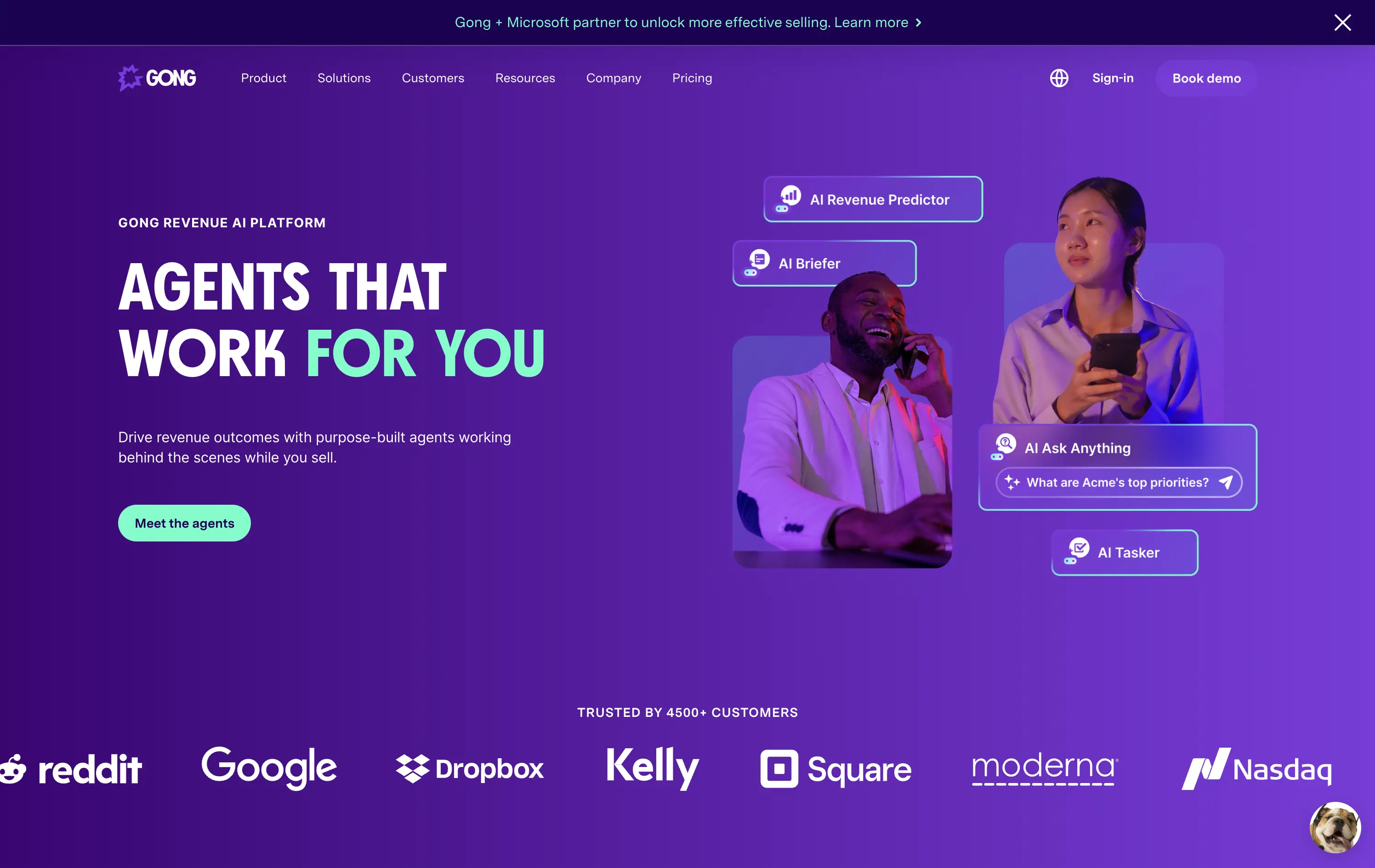
Gong
↗
SaaS
AI Tools
Productivity
Split Grid
Left-aligned
Benefit-Driven
Confident
Single Button
Photography
Illustration
Logo Wall
Announcement
Duotone
Blue
Purple
Sans serif
B2B
Home Page
Wordpress
sales AI, B2B revenue platform, utility CTA, animated overlays, client logos, enterprise trust signals, AI productivity agents, dark gradient palette, conversational UI, split hero grid, vibrant lighting, modern SaaS, sales enablement, motion interface cues, product-forward layout
Gong helps sales teams boost revenue by deploying AI-powered agents that automate insights, prep, and task handling across the sales cycle.
The hero is clear and conversion-aware. Headline delivers a confident value prop, supported by animated tooltips that make the product’s AI capabilities tangible. The “Meet the agents” CTA invites deeper engagement. Strong use of customer logos boosts enterprise credibility. Overall, it's tight, modern, and visually active without overwhelming.
Tailored for mid-to-late funnel enterprise leads. High-trust layout and confident tone reflect maturity and market leadership in B2B sales tech.
This layout balances technical utility with human impact, aligning well with Algolia’s positioning as an API-first but UX-aware company. The mobile UI reinforces product value visually, while the logo wall signals scale and trust for enterprise buyers. The tone is clear, benefit-led, and appropriate for high-intent decision-makers evaluating AI tools for customer experience. This is a solid enterprise-facing hero built to perform.
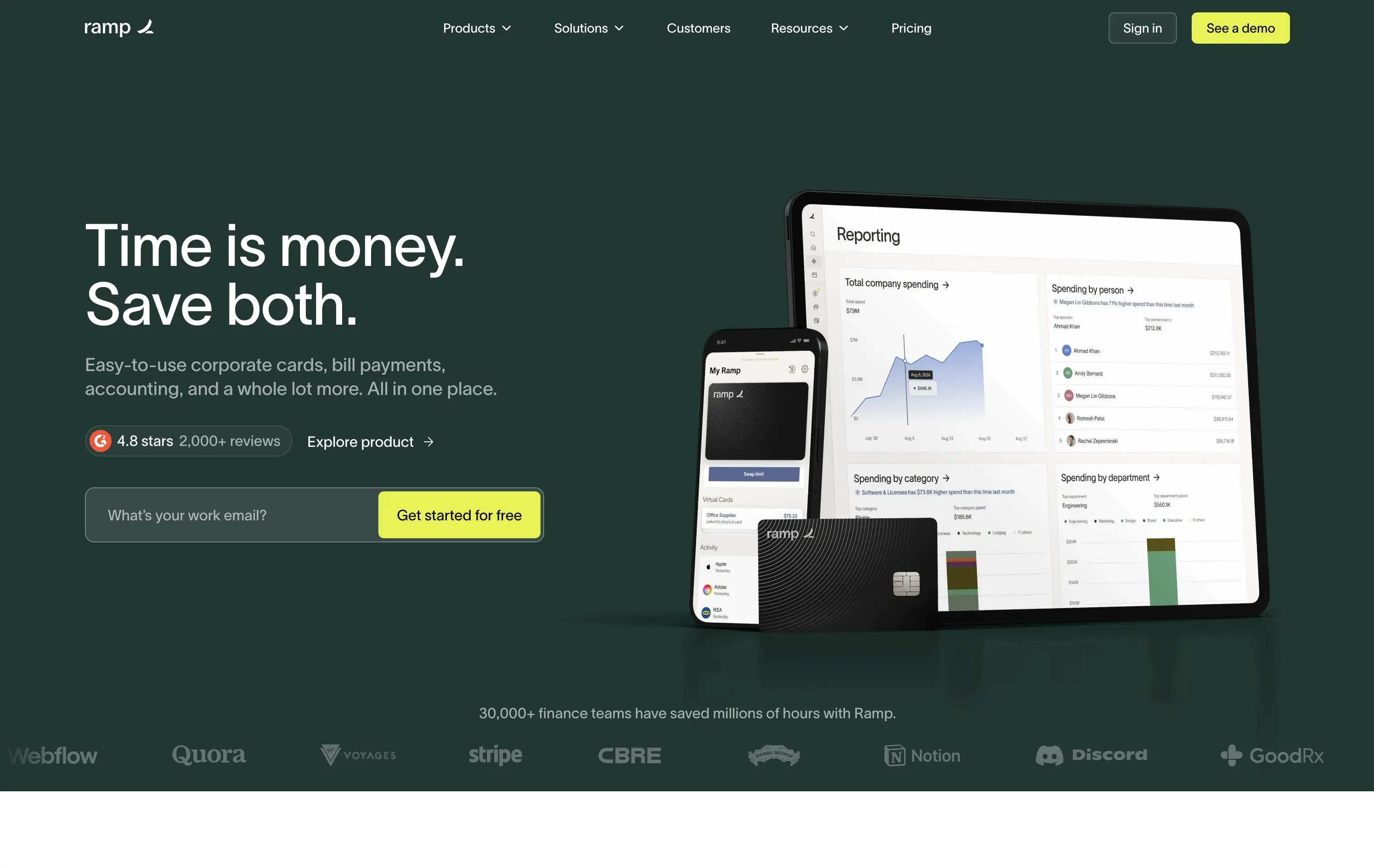
Ramp
↗
SaaS
Fintech
Split Grid
Left-aligned
Benefit-Driven
Email Capture
Product UI
Social Proof
Duotone
Green
Yellow
Sans serif
B2B
Home Page
Custom Code
expense automation, corporate cards, real-time finance tools, modern B2B fintech, ROI-led copy, dark UI, embedded reviews, verified trust cues, enterprise-ready design, slick dashboard, clear CTA, conversion optimized, mid-funnel targeting, save money pitch, split layout
Ramp is a corporate finance platform offering cards, bill pay, and reporting tools designed to save companies time and money.
The hero is clean, trust-building, and conversion-ready. Headline is bold and economic — short enough to stick, direct enough to convert. Subheadline explains the product scope, while the UI visual makes it tangible. Reviews and logos anchor trust. The input field + utility CTA streamlines lead gen.
Perfectly calibrated for CFOs and finance leads. Messaging leads with ROI, not tech — smart for a market that cares about efficiency and outcomes. Strong signal-to-noise ratio.
This layout balances technical utility with human impact, aligning well with Algolia’s positioning as an API-first but UX-aware company. The mobile UI reinforces product value visually, while the logo wall signals scale and trust for enterprise buyers. The tone is clear, benefit-led, and appropriate for high-intent decision-makers evaluating AI tools for customer experience. This is a solid enterprise-facing hero built to perform.
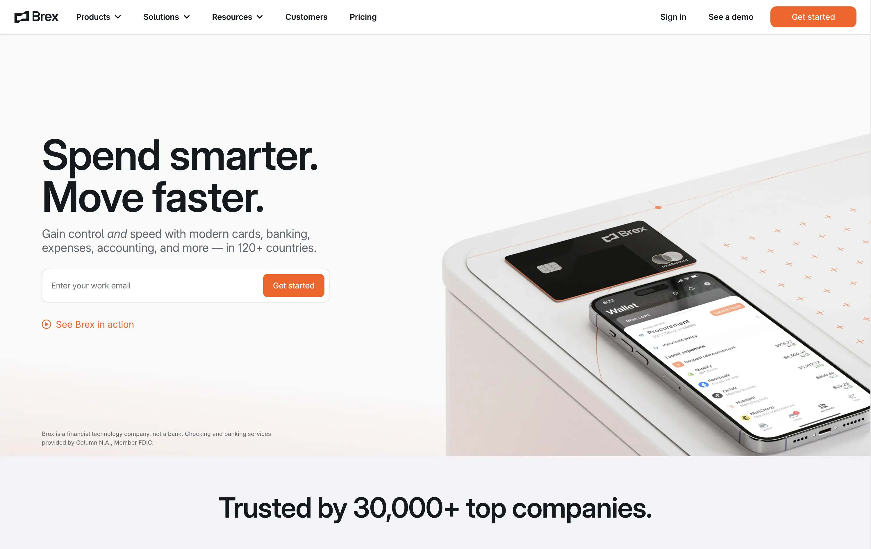
Brex
↗
SaaS
Fintech
Split Grid
Left-aligned
Benefit-Driven
Confident
Email Capture
Product UI
Social Proof
3D visuals
Light Mode
Orange
Sans serif
B2B
Home Page
Custom Code
global finance platform, expense automation, control and speed messaging, embedded email field, startup to enterprise, international SaaS, B2B fintech, conversion-led layout, modern finance stack, clean UI, sharp tone, input-first UX, mobile + card visual, minimalist grid
Brex is a global financial platform offering cards, banking, and expense tools for fast-scaling companies in 120+ countries.
This hero nails first-contact clarity. The headline hits fast with rhythmic, benefit-led language, while the subhead contextualizes product depth across spend, banking, and scale. The layout leads with a form-first interaction, pushing immediate action, while the micro-CTA (“See Brex in action”) gives skeptics a softer entry point. The 3D product mockup adds credibility and sharpens the tech-forward appeal. Nothing feels redundant — every element either informs or converts. The result is frictionless, enterprise-friendly, and confident without oversell.
Speaks directly to startup and scale-up operators. Prioritizes control and speed — key brand levers for high-growth companies. Balanced tone and visual logic establish Brex as both trusted and technically future-ready.
This layout balances technical utility with human impact, aligning well with Algolia’s positioning as an API-first but UX-aware company. The mobile UI reinforces product value visually, while the logo wall signals scale and trust for enterprise buyers. The tone is clear, benefit-led, and appropriate for high-intent decision-makers evaluating AI tools for customer experience. This is a solid enterprise-facing hero built to perform.
TidyCal
↗
SaaS
Productivity
Centered
Benefit-Driven
Descriptive
Email Capture
Social Proof
Announcement
Badges
Dark Mode
Blue
Sans serif
B2B
Home Page
Custom Code
low-cost alternative, one-time payment SaaS, scheduling tool, Product Hunt-backed, no-frills UI, budget-friendly SaaS, email-first CTA, dark mode hero, indie stack, small team SaaS, lifetime deal, value-first messaging, stripped-down UX, pricing transparency
TidyCal is a simple, affordable calendar booking tool offering lifetime access for a one-time fee — ideal for solo professionals and budget-conscious teams.
TidyCal’s hero is clear on purpose but light on finesse. The lifetime deal banner is highly conversion-optimized and immediately grabs attention. However, the headline lacks typographic hierarchy and fails to land with impact — “simplest” stands out visually, but the phrasing overall feels flat. The input-first layout is user-friendly, but inconsistent sizing and visual imbalance reduce perceived trust. This hero converts, but it doesn’t inspire.
The pricing-first message works for a cost-sensitive audience. But the unrefined layout and typographic decisions may limit credibility with enterprise or design-aware users. Prioritizes affordability over perception of quality.
This layout balances technical utility with human impact, aligning well with Algolia’s positioning as an API-first but UX-aware company. The mobile UI reinforces product value visually, while the logo wall signals scale and trust for enterprise buyers. The tone is clear, benefit-led, and appropriate for high-intent decision-makers evaluating AI tools for customer experience. This is a solid enterprise-facing hero built to perform.
Lettuce
↗
SaaS
Fintech
Split Grid
Left-aligned
Benefit-Driven
Bold & Direct
Single Button
Photography
Logo Wall
Product UI
Duotone
Green
Display
B2C
Home Page
Custom Code
solo business finance, tax automation, self-employed SaaS, conversion-focused layout, AI accounting, ROI-driven copy, playful branding, savings calculator CTA, solo founder tools, dark green palette, clear value prop, direct tone, press trust bar, mobile-first product
Lettuce is an automated tax and accounting platform built for solo business owners, helping them save thousands by optimizing how they pay taxes.
The hero is assertive, clear, and benefit-led. “Automated taxes. Maximized savings.” lands immediately, and the subhead explains who it's for and what they’re losing without it. The savings figure on the phone mockup reinforces the pitch visually. The “Calculate your savings” CTA is strong and personalized. Overall, the layout moves fast and speaks directly to freelancers and solo operators.
Perfectly tuned for time-poor, outcome-driven solopreneurs. Uses clear math ($10k in savings) and visual cues (mobile UI, dollar figures) to make the benefit feel tangible. Smart alignment of tone, layout, and buyer urgency.
This layout balances technical utility with human impact, aligning well with Algolia’s positioning as an API-first but UX-aware company. The mobile UI reinforces product value visually, while the logo wall signals scale and trust for enterprise buyers. The tone is clear, benefit-led, and appropriate for high-intent decision-makers evaluating AI tools for customer experience. This is a solid enterprise-facing hero built to perform.
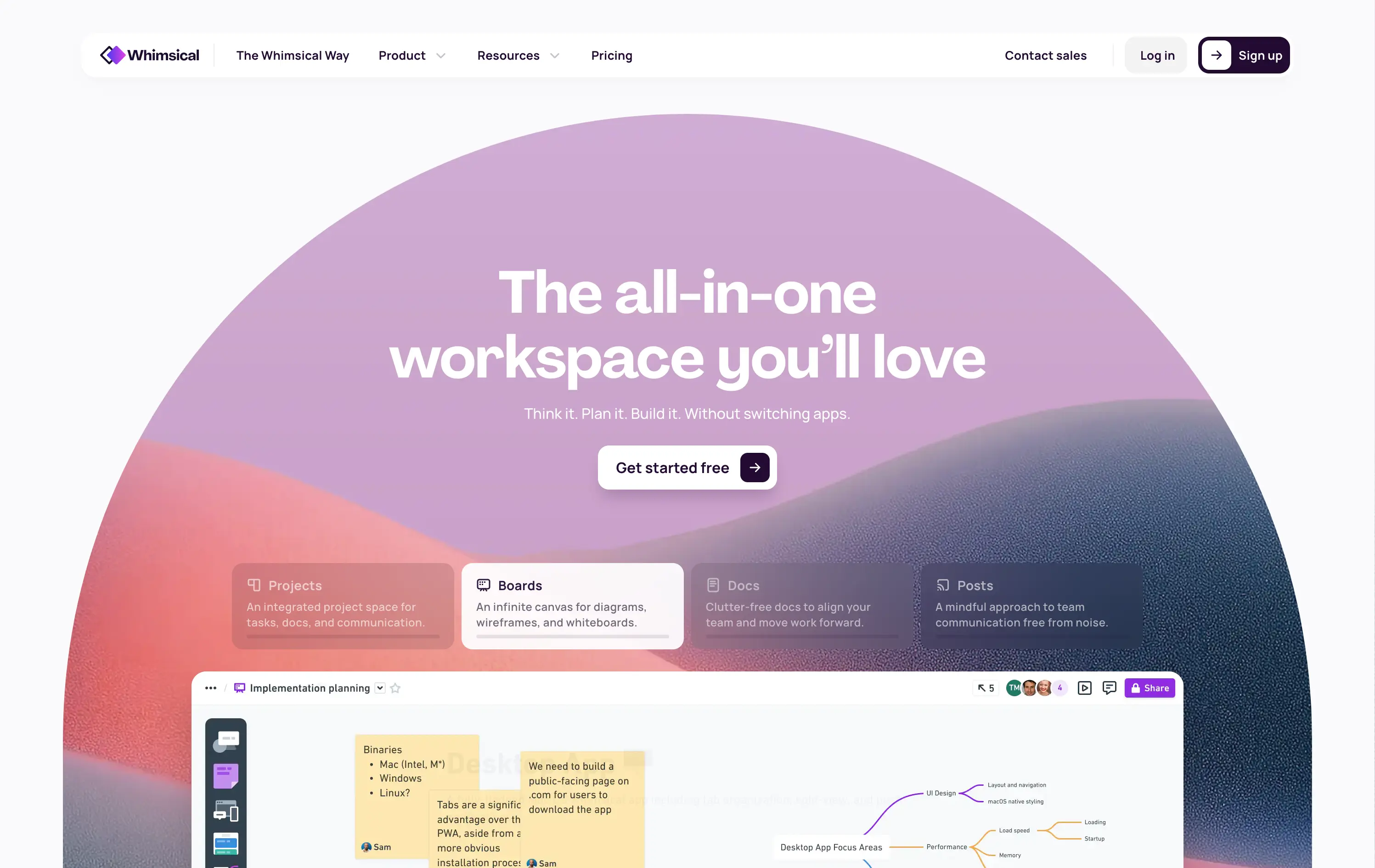
Whimsical
↗
SaaS
Collaboration
Productivity
Inset
Centered
Benefit-Driven
Empowering
Single Button
Illustration
Interactive
Product UI
Gradient
Light Mode
Pink
Purple
Orange
Sans serif
B2B
Home Page
Custom Code
collaborative workspace, pastel gradient, feature carousel, lightweight SaaS, sticky headline, soft UI, premium-yet-friendly, high-trust design, zero-friction onboarding, visual task planning, alternative to Miro, team productivity
Whimsical is an all-in-one visual workspace for teams to plan, wireframe, write, and collaborate—without switching between tools.
The hero immediately differentiates with its warm, gradient-driven palette and curved editorial layout. Headline is sticky and emotional, while the subheadline cues action and ease. Below, animated modules skim through key features—smartly designed to reduce cognitive load while expanding curiosity. The product UI is fully visible and feels friendly. CTA is low friction and well-placed. Compared to competitors, this layout feels more human-centered and less corporate, while still conveying product intelligence.
Strong product-led growth positioning with emotional stickiness. Visuals balance friendliness with focus. Motion helps drive upfront clarity, and layout choice favors quick scanning—well-suited for both individual users and team leads.
This layout balances technical utility with human impact, aligning well with Algolia’s positioning as an API-first but UX-aware company. The mobile UI reinforces product value visually, while the logo wall signals scale and trust for enterprise buyers. The tone is clear, benefit-led, and appropriate for high-intent decision-makers evaluating AI tools for customer experience. This is a solid enterprise-facing hero built to perform.
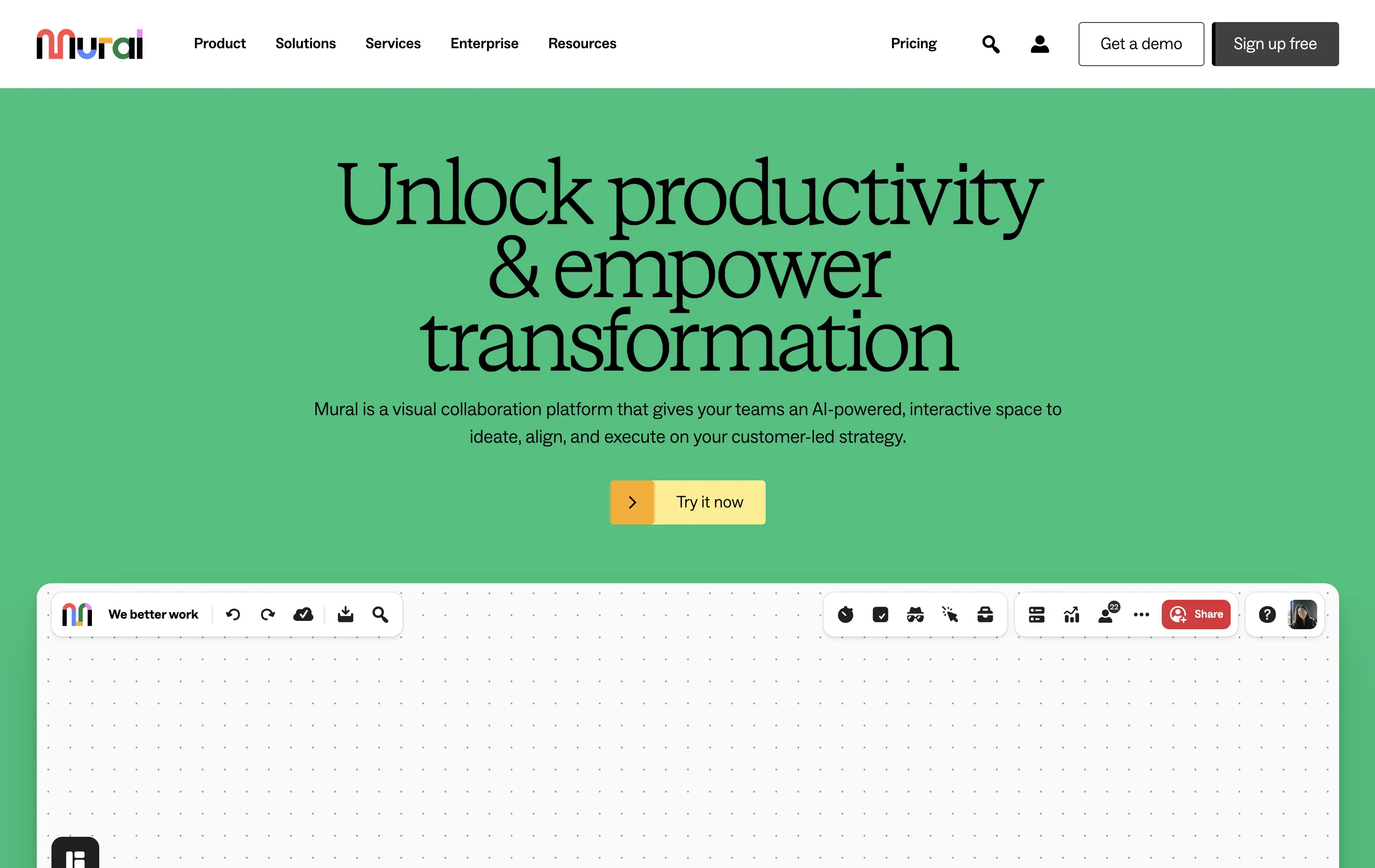
Mural
↗
SaaS
Collaboration
Productivity
Centered
Benefit-Driven
Aspirational
Single Button
Product UI
Multi-color
Green
Yellow
Serif
B2B
Home Page
Webflow
team productivity tool, familiar UI, friendly tone, AI-supported collaboration, light mode, optimistic copy, future-focused, dotted grid, visual-first, professional teams, clean hierarchy, flat color background
Mural is a visual collaboration platform that helps teams ideate, align, and execute strategy in real time with AI support.
The hero opens with a strong aspirational headline and bright color blocking that draws attention quickly. The serif typeface adds gravitas, while the clean UI below hints at practical use. However, the product preview could be more immediate—only the top edge of the canvas is visible, which may delay user comprehension. CTA is simple and visible. Overall, the section signals clarity and ease but misses some depth in product proof above the fold.
Strategically aimed at enterprise teams navigating transformation. The tone leans inspirational, while the visual style keeps it accessible. Immediate clarity, but lacks an element to tease the scroll action to anchor the pitch.
This layout balances technical utility with human impact, aligning well with Algolia’s positioning as an API-first but UX-aware company. The mobile UI reinforces product value visually, while the logo wall signals scale and trust for enterprise buyers. The tone is clear, benefit-led, and appropriate for high-intent decision-makers evaluating AI tools for customer experience. This is a solid enterprise-facing hero built to perform.
Cometeer
↗
CPG
Food & Beverage
Full Width
Editorial
Benefit-Driven
Aspirational
Multi-CTA Block
Video
Imagery-Based
Yellow
Sans serif
DTC
Home Page
Shopify
DTC coffee, video-led hero, brand storytelling, clear CTA hierarchy, warm tones, minimal text, fast onboarding, gradient background, sensory cue, product-focused, premium feel, lifestyle positioning, high visual polish, science-inspired design
Cometeer delivers barista-grade coffee flash-frozen into capsules for ultra-fast, ultra-consistent brewing at home.
The hero balances brand storytelling and performance design—sharp visual contrast, cinematic motion, and precise art direction anchor the product as premium and scientific. The headline is bold and memorable, while the subheadline clarifies the value prop in under 10 words. Dual CTAs reduce friction. The use of macro imagery paired with a scientific tool elevates the perception of quality and process control.
Clear DTC positioning with a premium, precision-led angle. The visual metaphor of lab-grade quality supports brand trust while the tone stays human. Layout signals high product confidence and fast conversion intent.
This layout balances technical utility with human impact, aligning well with Algolia’s positioning as an API-first but UX-aware company. The mobile UI reinforces product value visually, while the logo wall signals scale and trust for enterprise buyers. The tone is clear, benefit-led, and appropriate for high-intent decision-makers evaluating AI tools for customer experience. This is a solid enterprise-facing hero built to perform.
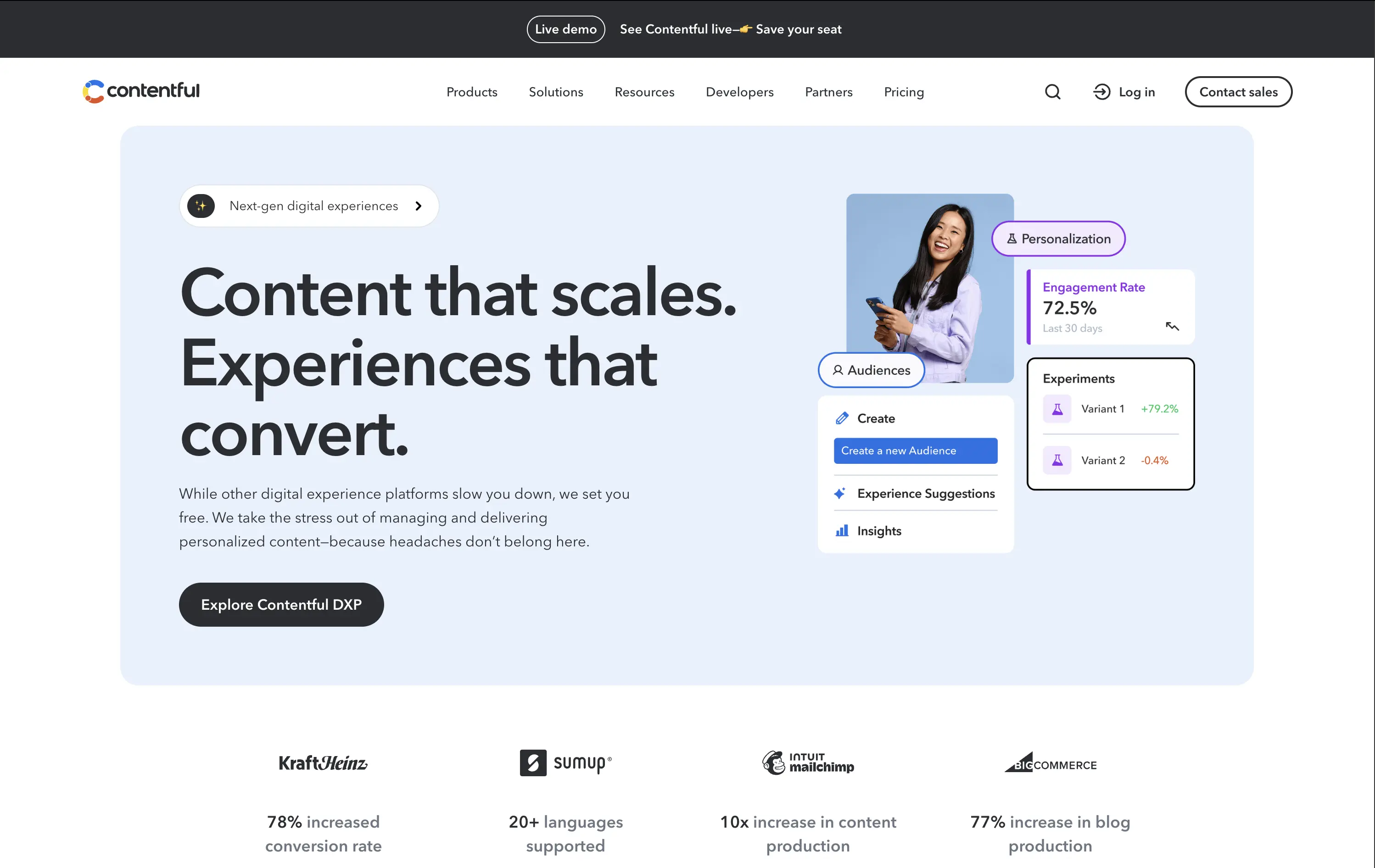
Contentful
↗
SaaS
DevTools
Inset
Left-aligned
Benefit-Driven
Single Button
Photography
Logo Wall
Product UI
Announcement
Light Mode
Blue
Black
Sans serif
B2B
Home Page
Custom Code
headless CMS, digital experience platform, DXP, content ops, personalization tools, conversion-optimized hero, enterprise SaaS
Contentful is a composable content platform for digital teams to build, manage, and scale personalized content experiences.
This hero delivers clarity and control. The headline is simple but strong, while the UI cards bring in real metrics — 72.5% engagement, +79.2% test lift — that immediately signal impact. The modular, bento-inspired visual design frames product capabilities without overwhelming the user. A single, confident CTA caps it off. It’s subtle, strategic, and conversion-aware.
Balances conversion focus with credibility. Perfectly aligned with performance-driven teams who want visual polish without noise. Content strategy and product capability are both clearly expressed without overpromising.
This layout balances technical utility with human impact, aligning well with Algolia’s positioning as an API-first but UX-aware company. The mobile UI reinforces product value visually, while the logo wall signals scale and trust for enterprise buyers. The tone is clear, benefit-led, and appropriate for high-intent decision-makers evaluating AI tools for customer experience. This is a solid enterprise-facing hero built to perform.
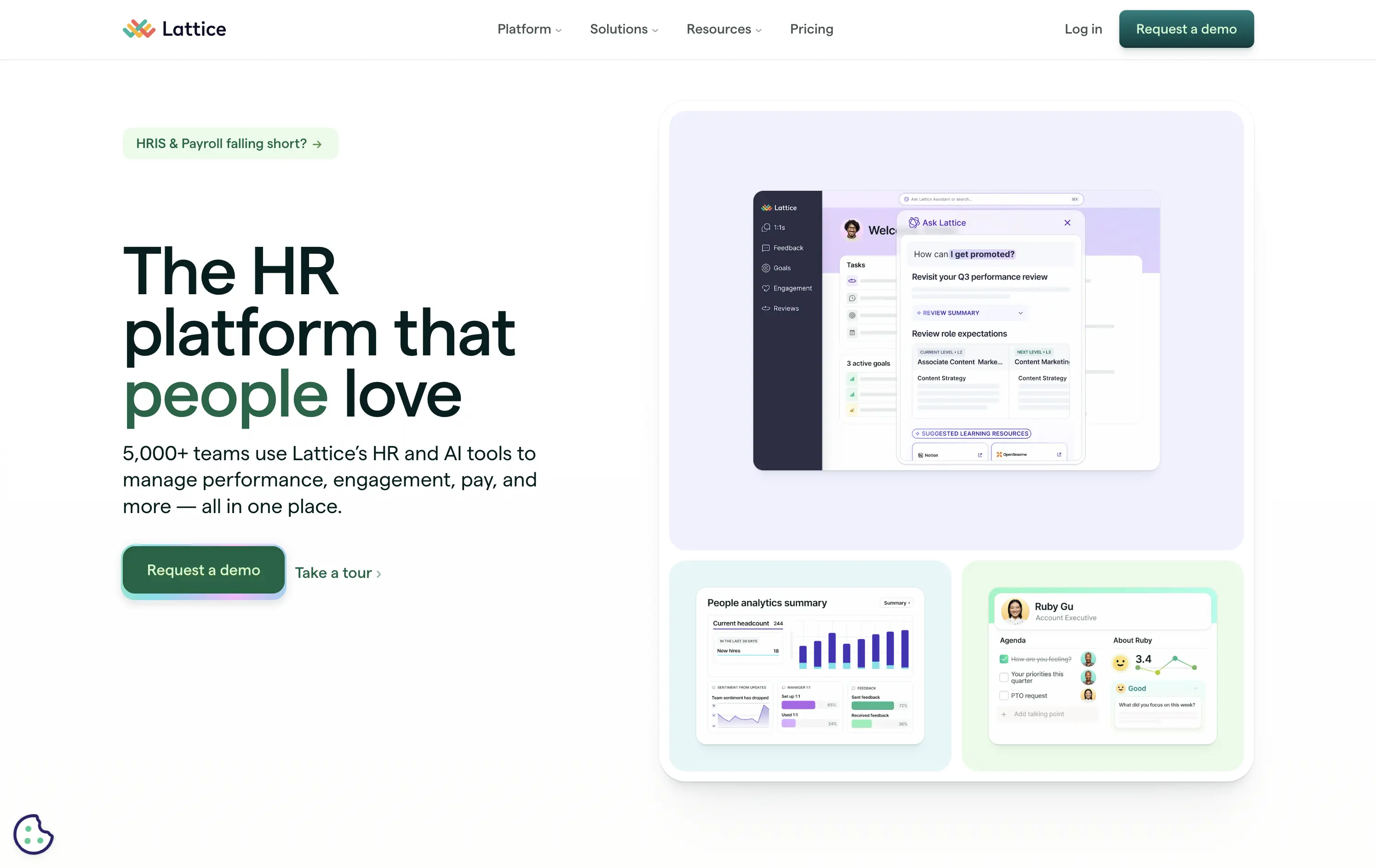
Lattice
↗
SaaS
HR/People Tech
Bento
Left-aligned
Benefit-Driven
Bold & Direct
Multi-CTA Block
Media Gallery
Product UI
Light Mode
Green
Sans serif
B2B
Home Page
Webflow
HR software, performance management, workplace culture, AI-assisted HR, clean layout, emotion-forward, team tools, modern UX, soft color palette, trust-led, subtle AI integration, employee experience, people-first platform
Lattice is an all-in-one people platform helping companies manage performance, engagement, growth, and compensation in one streamlined space.
Headline is short and sticky. The visual weight leans toward clarity and warmth. Product UI is legible and softly styled. Strong CTA placement plus secondary path shows understanding of buyer stages.
Effectively balances performance-driven HR with emotional resonance. Smart for leadership stakeholders seeking culture and efficiency. Visuals support modernity without overwhelming.
This layout balances technical utility with human impact, aligning well with Algolia’s positioning as an API-first but UX-aware company. The mobile UI reinforces product value visually, while the logo wall signals scale and trust for enterprise buyers. The tone is clear, benefit-led, and appropriate for high-intent decision-makers evaluating AI tools for customer experience. This is a solid enterprise-facing hero built to perform.
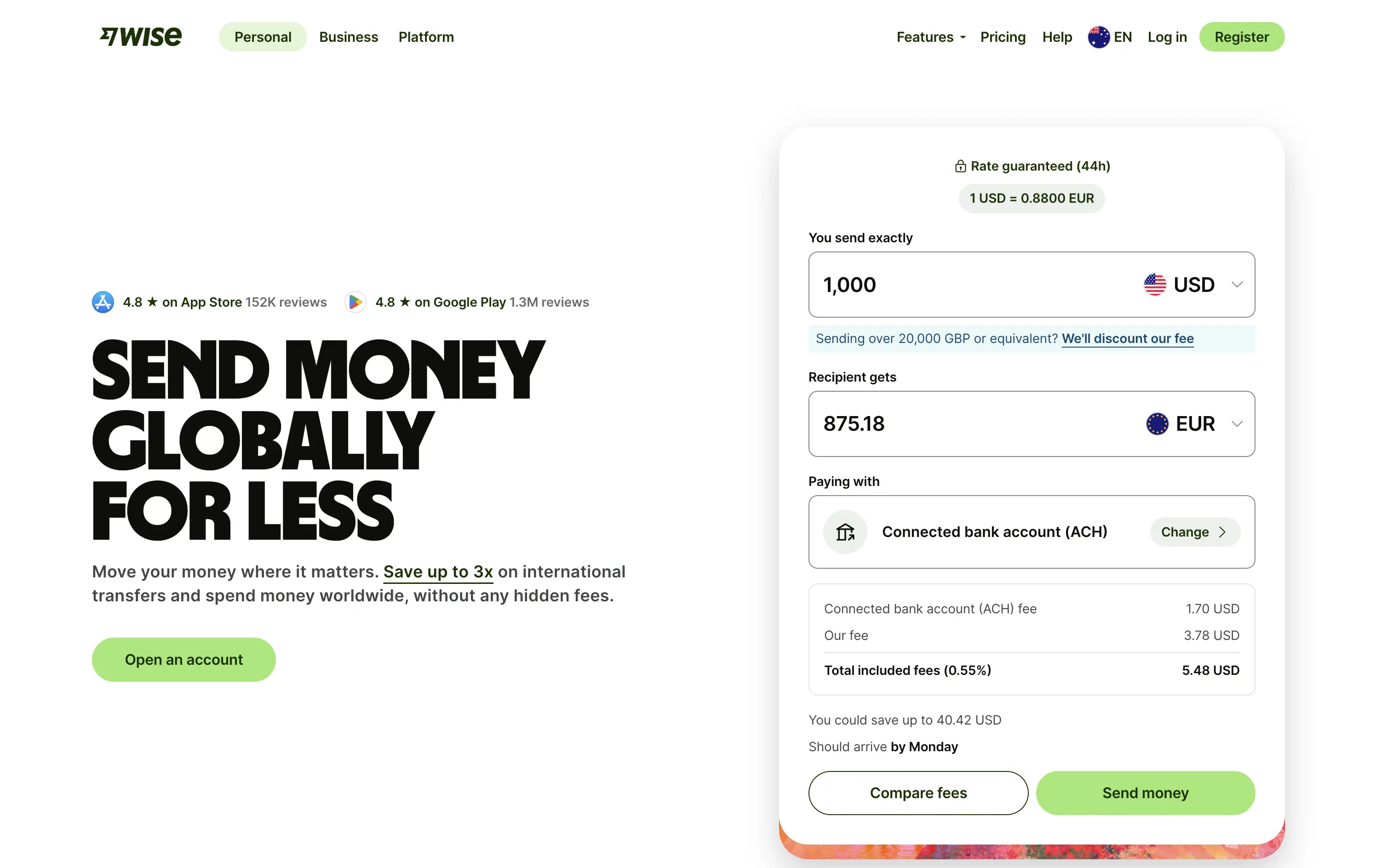
Wise
↗
SaaS
Fintech
Split Grid
Left-aligned
Benefit-Driven
Search/Utility Block
Interactive
Product UI
Social Proof
Light Mode
Green
Sans serif
Hybrid
Home Page
Custom Code
fintech, currency exchange, cost calculator, social proof upfront, real-time UI, B2C utility, transparent pricing, global payments, lean UX, bold typography, conversion-focused, clean layout, product-first design
Wise lets you send money internationally with real exchange rates and ultra-low fees — no hidden costs, just fast, fair transfers.
The bold headline immediately communicates value — “SEND MONEY GLOBALLY FOR LESS” — while the live calculator UI does the heavy lifting. Trust indicators like app store ratings sit prominently up top. CTAs are practical and clearly tied to user action. It’s all signal; functional and focused.
Perfect for high-intent users seeking fast comparison and action. The calculator UI de-risks the process while keeping attention on price.
This layout balances technical utility with human impact, aligning well with Algolia’s positioning as an API-first but UX-aware company. The mobile UI reinforces product value visually, while the logo wall signals scale and trust for enterprise buyers. The tone is clear, benefit-led, and appropriate for high-intent decision-makers evaluating AI tools for customer experience. This is a solid enterprise-facing hero built to perform.
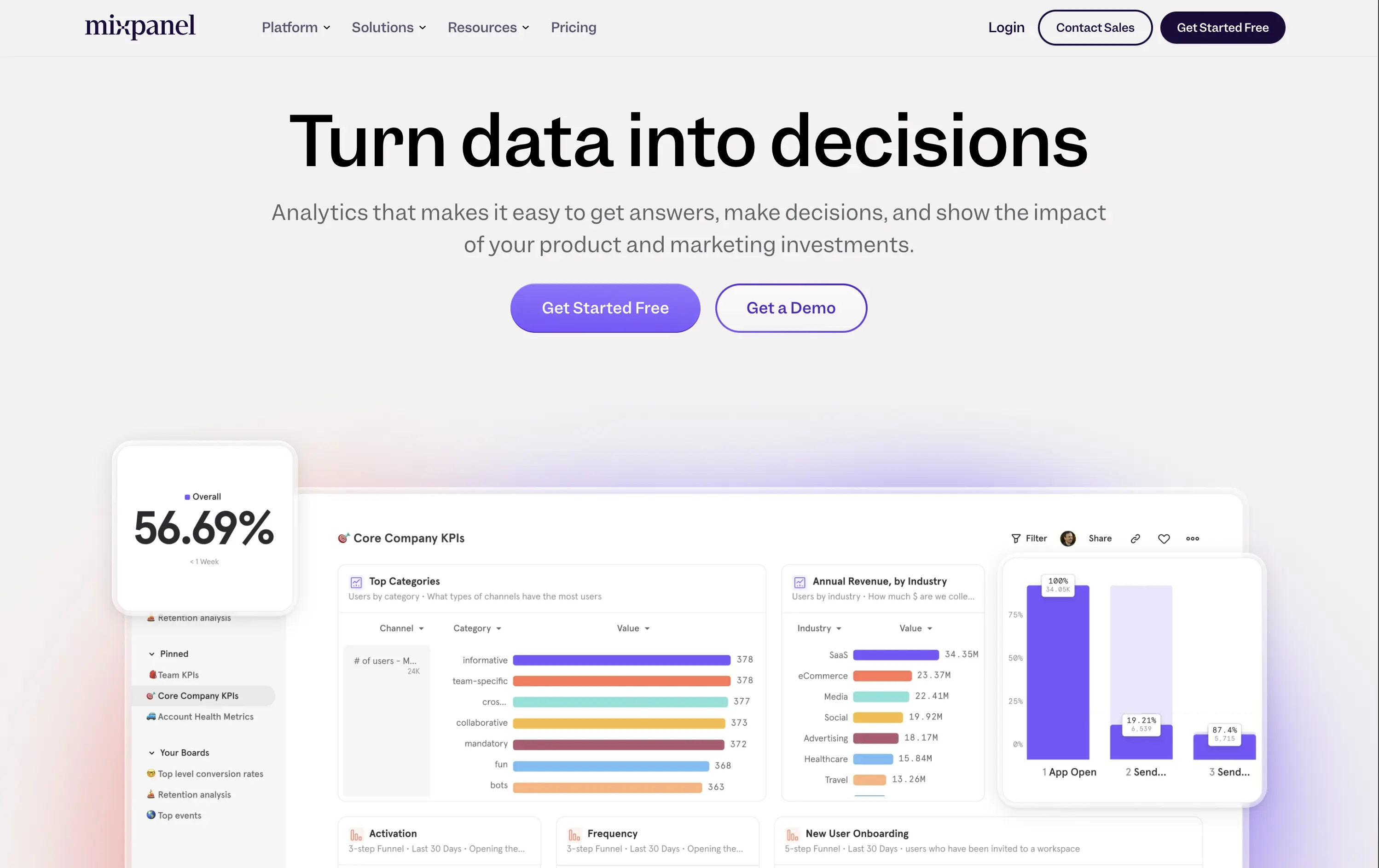
Mixpanel
↗
SaaS
Data & Analytics
Centered
Benefit-Driven
Confident
Multi-CTA Block
Live Metrics
Product UI
Gradient
Purple
Sans serif
B2B
Home Page
Custom Code
product analytics, KPI dashboards, funnel analysis, data insights, gradient background, B2B SaaS, dual CTA, modern enterprise, UI-first layout, decision-making tools, conversion tracking, product-led growth, minimal and bold
Mixpanel is a product analytics platform that helps teams understand user behavior, optimize funnels, and drive business growth.
“Turn data into decisions” is a strong, action-focused hook that immediately communicates value. The subhead explains the core utility without overexplaining. The side-by-side CTAs give both low-friction and high-touch entry points. The supporting UI visuals are clear, colorful, and show the product in action — no fluff, just function
Hero builds trust through clarity. Language and visuals appeal to decision-makers in growth, product, and marketing. Gradient adds polish, while the product UI does most of the selling.
This layout balances technical utility with human impact, aligning well with Algolia’s positioning as an API-first but UX-aware company. The mobile UI reinforces product value visually, while the logo wall signals scale and trust for enterprise buyers. The tone is clear, benefit-led, and appropriate for high-intent decision-makers evaluating AI tools for customer experience. This is a solid enterprise-facing hero built to perform.
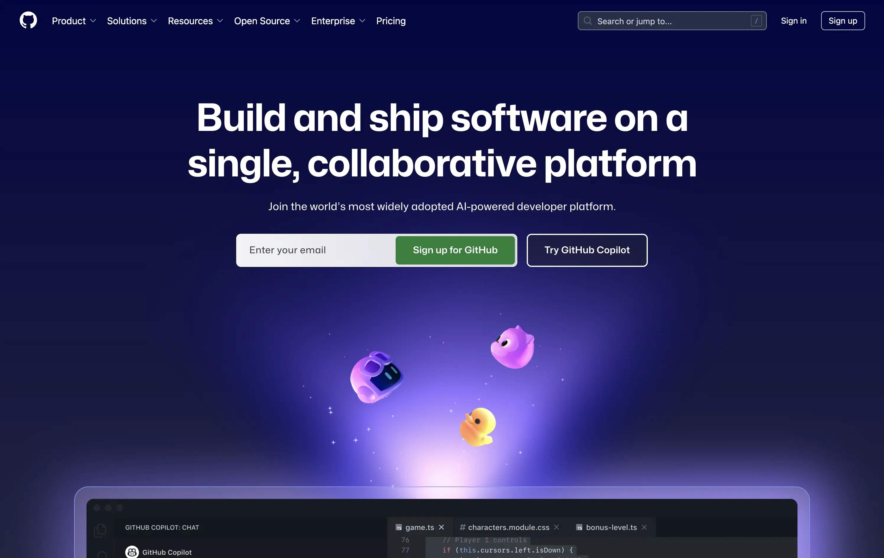
Github
↗
DevTools
Collaboration
Centered
Benefit-Driven
Confident
Multi-CTA Block
Product UI
Custom Animation
3D visuals
Gradient
Dark Mode
Green
Purple
Sans serif
Hybrid
Home Page
Custom Code
developer platform, AI coding assistant, GitHub Copilot, dark theme UI, modern dev culture, collaborative tools, open source hub, onboarding input, 3D mascots, dual CTA, cloud-based dev tools, tech-forward, productivity SaaS
GitHub is the world’s leading platform for developers to build, collaborate, and ship code together.
The hero delivers immediate clarity: build and ship software together. The animated floating mascots add visual intrigue without distracting from the copy, and the dual CTAs — email capture and Copilot trial — serve both new users and AI-curious devs. The dark spacey palette and glowing elements feel modern and focused. Solid hierarchy, clean execution.
Blends GitHub’s core dev value with its AI evolution. Highlights collaboration and product trust while gently introducing Copilot. Balanced tone makes it accessible to both enterprise teams and individual devs.
This layout balances technical utility with human impact, aligning well with Algolia’s positioning as an API-first but UX-aware company. The mobile UI reinforces product value visually, while the logo wall signals scale and trust for enterprise buyers. The tone is clear, benefit-led, and appropriate for high-intent decision-makers evaluating AI tools for customer experience. This is a solid enterprise-facing hero built to perform.
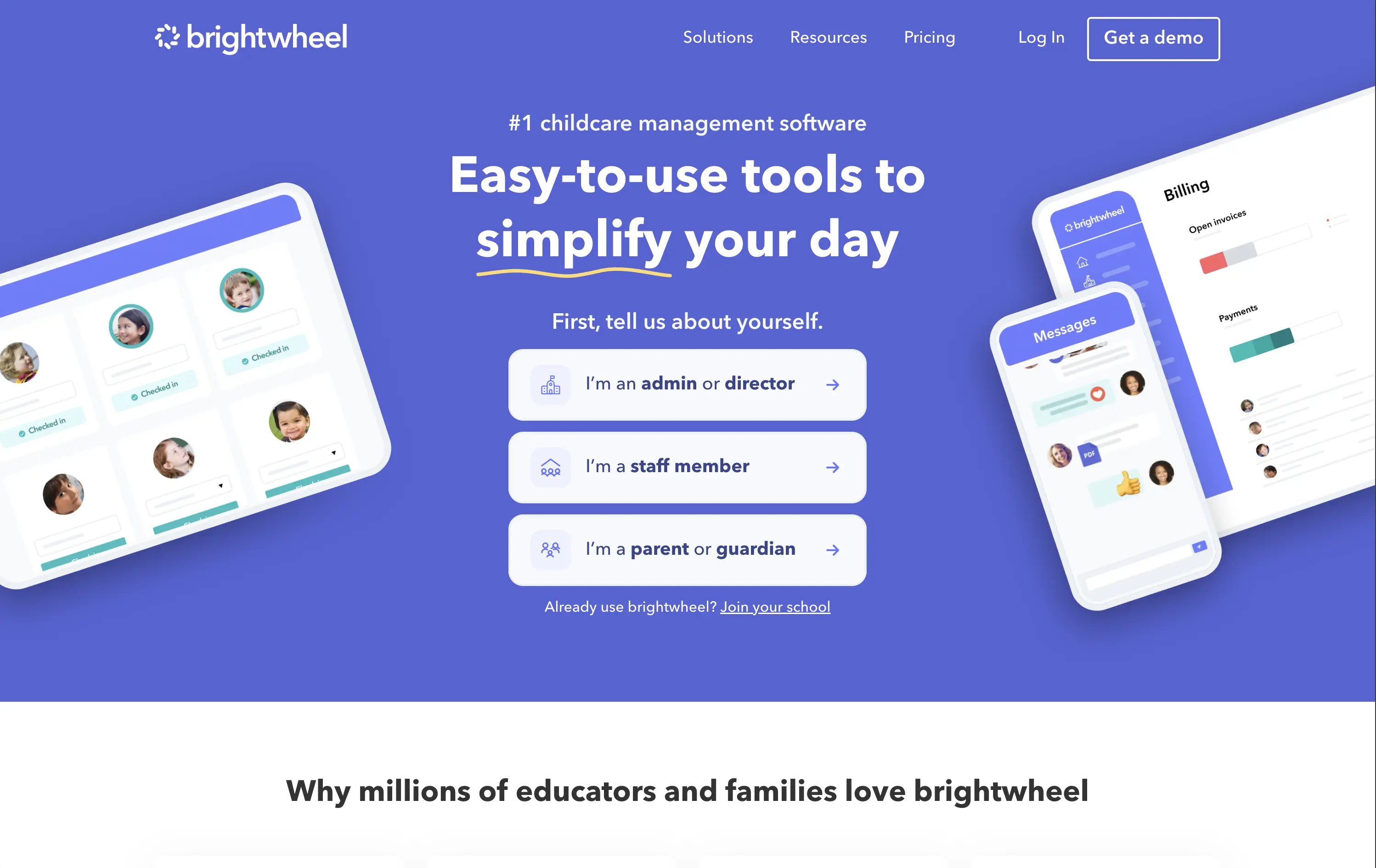
Brightwheel
↗
SaaS
Productivity
Education
Centered
Benefit-Driven
Empowering
Multi-CTA Block
Product UI
Duotone
Blue
Sans serif
B2B
Home Page
Wordpress
childcare SaaS, early education, UI-forward, persona filter, soft onboarding, trust-building, calm palette, family-friendly, product-led storytelling, scroll guidance, interactive selector, teacher tech, value-first headline
Brightwheel offers all-in-one software for childcare centers, helping staff and parents streamline daily operations, billing, and communication.
The hero blends product visuals with conversion utility. UI mockups feel grounded in real use cases—billing, check-ins, messaging—while the big, benefit-led headline hits directly. Interactive persona buttons sort traffic based on user role, creating clarity and reducing friction. Clean layout, focused copy, and trust cues (like “#1 childcare software”) all work toward fast comprehension.
Targets a trust-dependent category with confident simplicity. The user-type selector streamlines onboarding while signaling the platform’s adaptability. It balances emotional safety with practical function, reflecting Brightwheel’s value as a tool that makes lives easier.
This layout balances technical utility with human impact, aligning well with Algolia’s positioning as an API-first but UX-aware company. The mobile UI reinforces product value visually, while the logo wall signals scale and trust for enterprise buyers. The tone is clear, benefit-led, and appropriate for high-intent decision-makers evaluating AI tools for customer experience. This is a solid enterprise-facing hero built to perform.
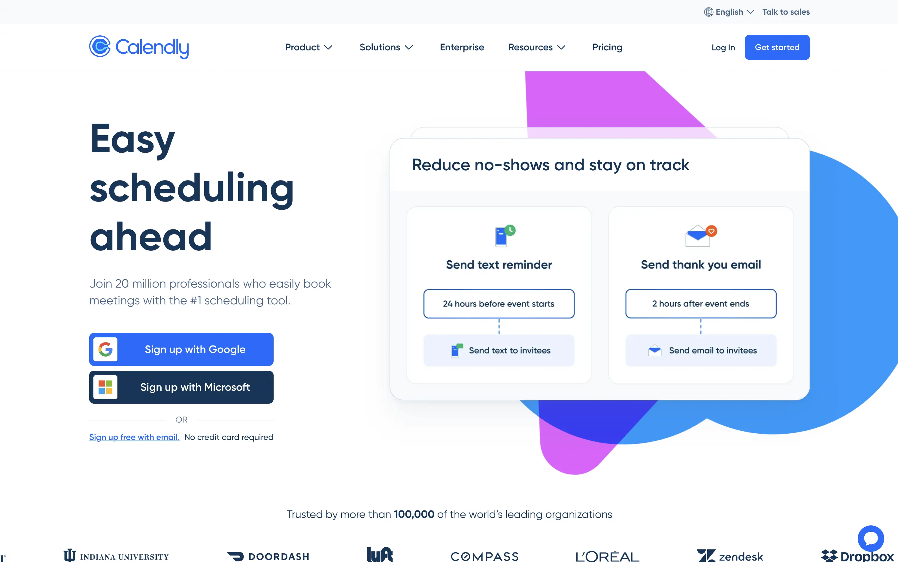
Calendly
↗
SaaS
Productivity
Split Grid
Left-aligned
Benefit-Driven
Aspirational
Multi-CTA Block
Product UI
Social Proof
Custom Animation
Light Mode
Blue
Purple
Sans serif
Hybrid
Home Page
Custom Code
booking automation, enterprise SaaS, high-trust layout, Google sign-in, product-led UX, animated demo cards, client communication, reminder workflows, credibility-focused, mass adoption, enterprise trust, conversion-focused, no-credit-card, dual CTA
Calendly is a scheduling automation platform used by over 20 million professionals to simplify meeting coordination and reduce no-shows.
Large headline clearly communicates the core benefit. Animated UI cards demo concrete features like text reminders and post-meeting emails—useful and direct. Google and Microsoft sign-up flows lower friction and suggest enterprise readiness. Copy leans on credibility (user count, logo wall). Layout is clean and functional, though edges toward safe and generic compared to challenger brands.
Calendly’s hero positions it as the trusted standard for scheduling. Focused on reducing friction for new users while demonstrating value for scale—perfect for self-serve and enterprise alike.
This layout balances technical utility with human impact, aligning well with Algolia’s positioning as an API-first but UX-aware company. The mobile UI reinforces product value visually, while the logo wall signals scale and trust for enterprise buyers. The tone is clear, benefit-led, and appropriate for high-intent decision-makers evaluating AI tools for customer experience. This is a solid enterprise-facing hero built to perform.
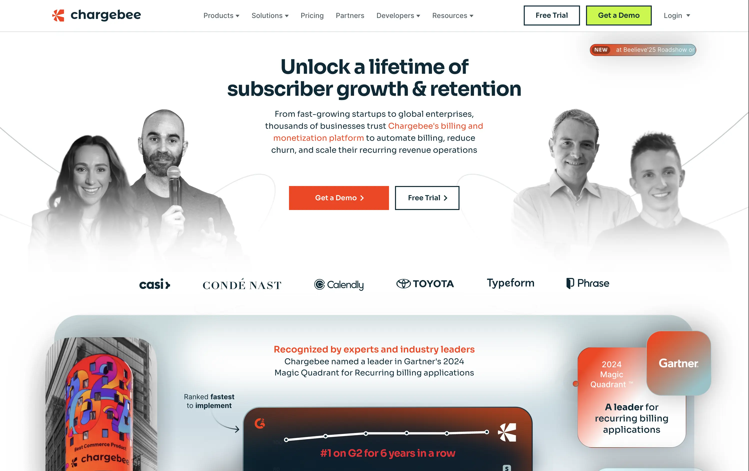
Chargebee
↗
SaaS
Fintech
Centered
Benefit-Driven
Bold & Direct
Multi-CTA Block
Photography
Logo Wall
Social Proof
Light Mode
Green
Orange
Sans serif
B2B
Home Page
Wordpress
B2B SaaS, billing automation, subscription platform, enterprise-ready, credibility-first, leadership positioning, founder imagery, logo wall, dual CTA, Gartner badge, G2 recognition, growth-focused messaging, recurring revenue
Chargebee helps businesses automate recurring billing, reduce churn, and scale subscription revenue through a trusted enterprise-ready platform.
The hero leads with a sharp, benefit-packed headline and backs it up with high-trust signals: real customer faces, name-brand logos, and third-party awards. The “Get a Demo” and “Free Trial” CTAs give users both enterprise and self-serve paths, but visual hierarchy between the two could be better balanced. Copy is outcome-focused and credible.
Smartly targeted at growth-stage and enterprise buyers, but the visual language undersells its category leadership. Strong content mix, but design lacks the presence or edge to reinforce premium positioning.
This layout balances technical utility with human impact, aligning well with Algolia’s positioning as an API-first but UX-aware company. The mobile UI reinforces product value visually, while the logo wall signals scale and trust for enterprise buyers. The tone is clear, benefit-led, and appropriate for high-intent decision-makers evaluating AI tools for customer experience. This is a solid enterprise-facing hero built to perform.
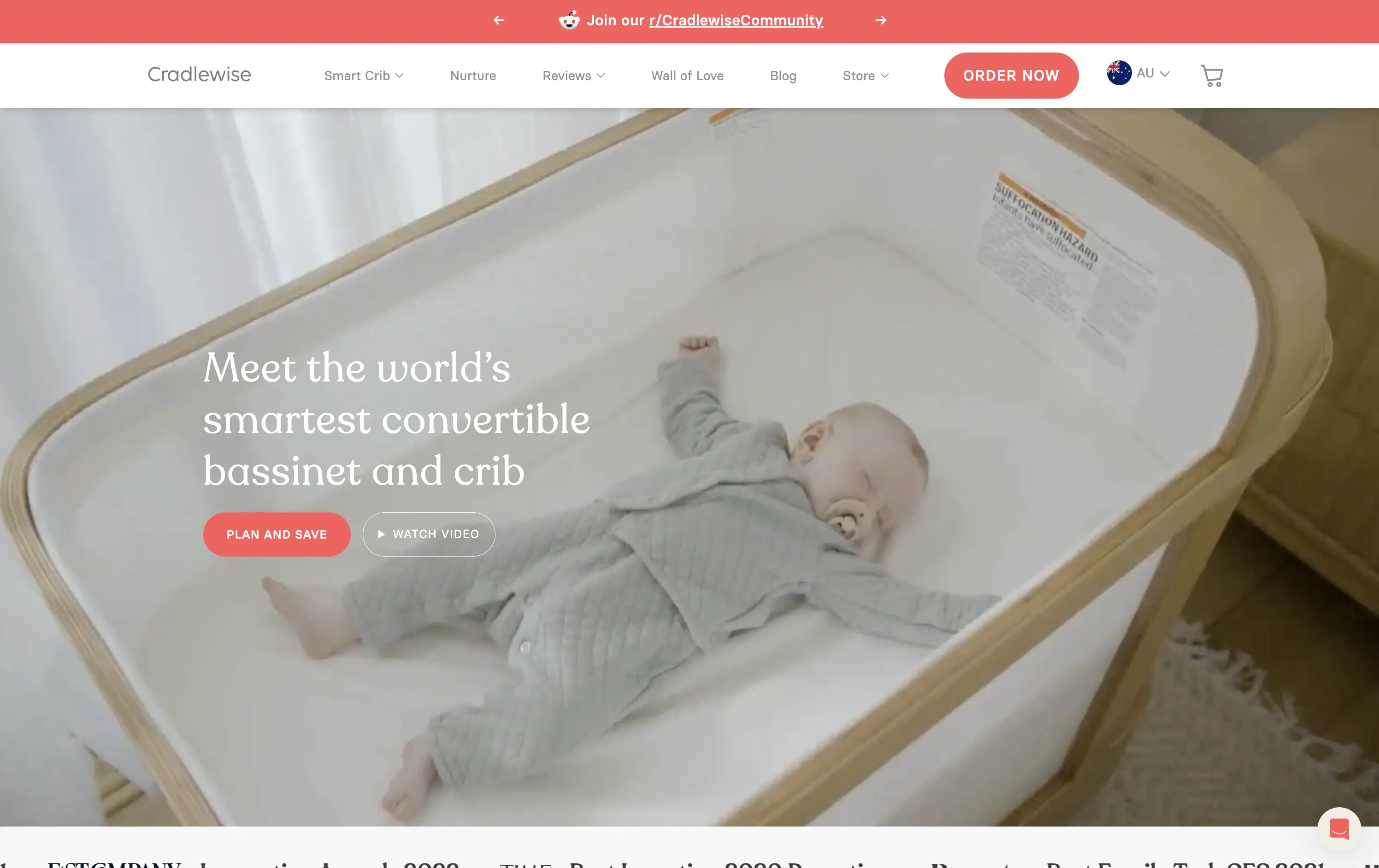
Cradlewise
↗
CPG
Hardware
Editorial
Benefit-Driven
Aspirational
Multi-CTA Block
Video
Announcement
Imagery-Based
Light Mode
Red
Serif
DTC
Home Page
Shopify
baby tech, smart crib, premium parenting, soft lifestyle visual, emotional trust, product-as-solution, sleep tech, high-ticket DTC, calming footage, gentle UX, non-intrusive CTA, safety-forward, babycare innovation, maternal audience
Cradlewise is a smart bassinet and crib that uses AI to soothe babies and help parents sleep better, all in one beautifully designed product.
The hero leans into emotion with soft lifestyle footage of the product in use — instantly communicating trust, peace of mind, and functional value. The headline clearly positions the product as a smart solution, while serif typography adds a premium touch. CTAs are well-placed, letting users choose between action or exploration. It’s elegant and persuasive.
Cradlewise effectively sells peace of mind to new parents. The blend of smart-tech value and lifestyle aesthetics strikes a perfect balance for premium buyers. It reinforces both utility and warmth without overexplaining.
This layout balances technical utility with human impact, aligning well with Algolia’s positioning as an API-first but UX-aware company. The mobile UI reinforces product value visually, while the logo wall signals scale and trust for enterprise buyers. The tone is clear, benefit-led, and appropriate for high-intent decision-makers evaluating AI tools for customer experience. This is a solid enterprise-facing hero built to perform.
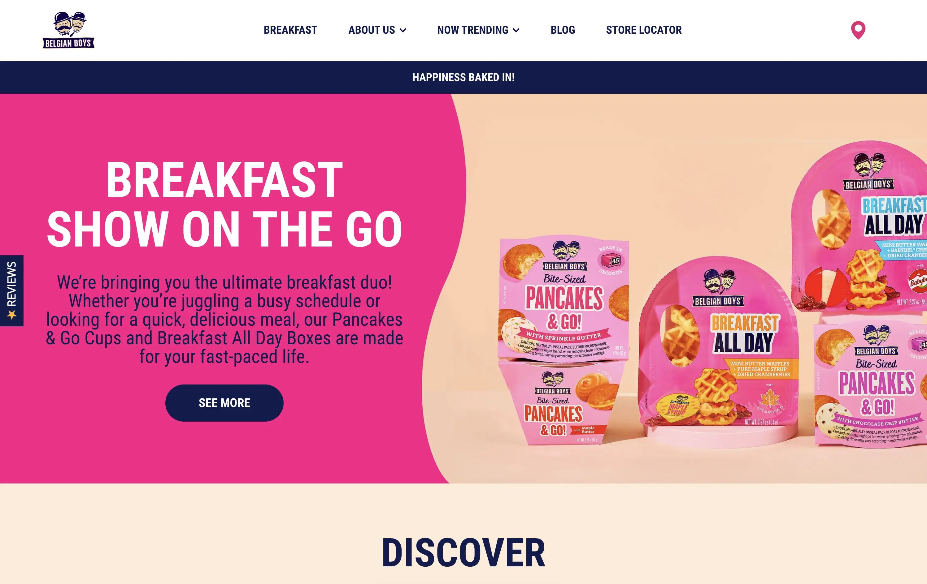
Belgian Boys
↗
CPG
Food & Beverage
Split Grid
Benefit-Driven
Playful
Single Button
Photography
Multi-color
Blue
Pink
Sans serif
DTC
Home Page
Shopify
CPG packaging, breakfast brand, direct-to-consumer, bright pink, snackable meals, product-focused, visual-first, fun tone, food on the go, time-saving meals, supermarket crossover, family-friendly, bold design, colorful grid, accessible copy
Belgian Boys sells fun, ready-to-eat breakfast snacks designed for busy people who want delicious, hassle-free meals.
The hero is loud and unapologetically pink, clearly built for quick scanning. Product packaging is the visual centerpiece, immediately showing what’s on offer. The bold type, simple language, and upbeat color palette make it easy to understand in seconds. The left-right layout balances message and product, while the single CTA is clear and inviting.
Speaks directly to the target buyer: busy, hungry, probably on mobile. The pink and navy color palette feels retail-shelf ready, and the whole layout matches the convenience and joy of the product. A great example of brand alignment through design.
This layout balances technical utility with human impact, aligning well with Algolia’s positioning as an API-first but UX-aware company. The mobile UI reinforces product value visually, while the logo wall signals scale and trust for enterprise buyers. The tone is clear, benefit-led, and appropriate for high-intent decision-makers evaluating AI tools for customer experience. This is a solid enterprise-facing hero built to perform.
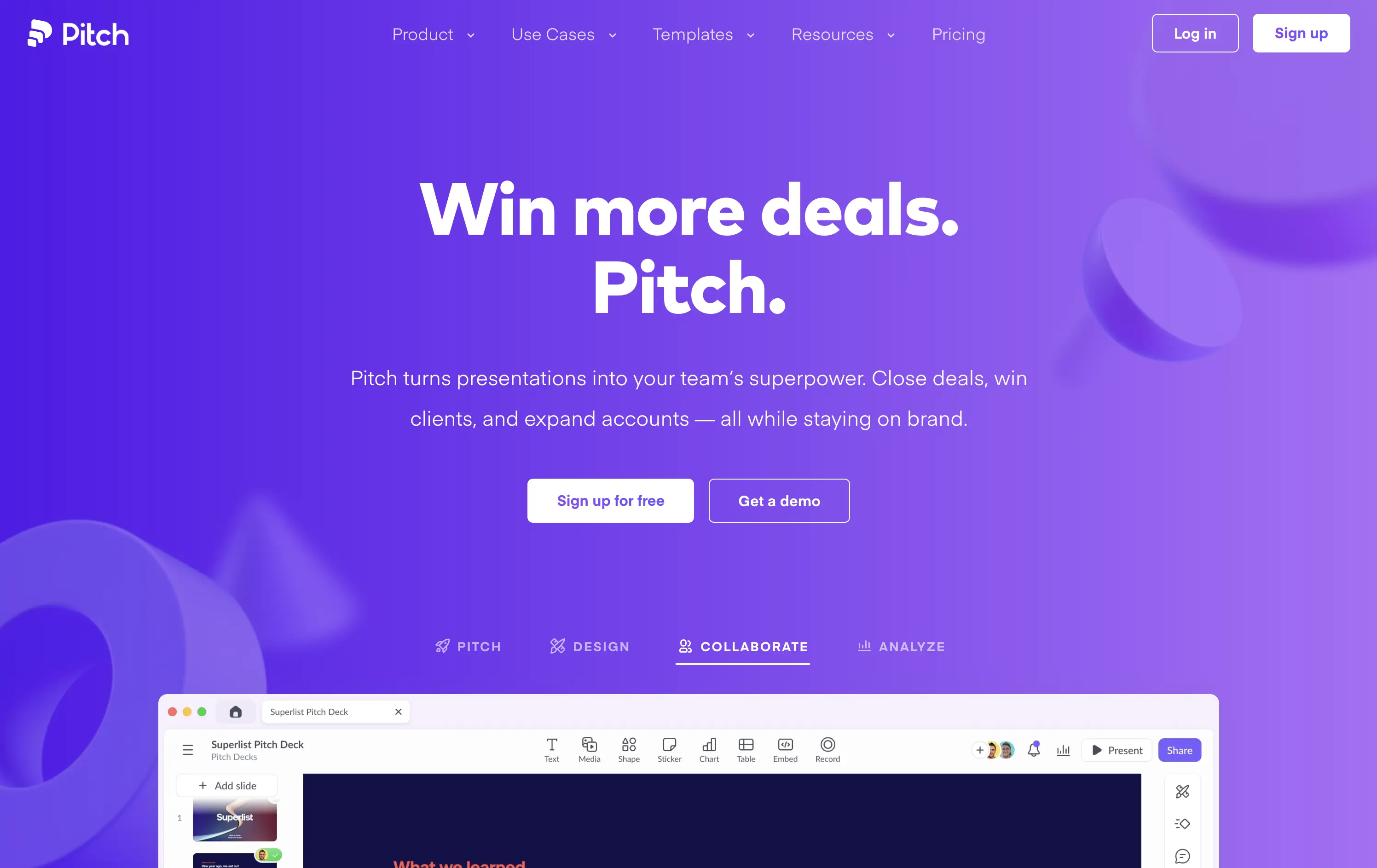
Pitch
↗
SaaS
Creative Tools
Centered
Benefit-Driven
Multi-CTA Block
Interactive
Product UI
Custom Animation
Gradient
White
Blue
Purple
Sans serif
B2B
Home Page
Custom Code
pitch decks, team presentations, sales enablement, bold SaaS design, gradient hero, product-led growth, team collaboration, sales tools, creative presentation, interactive UI, twin CTA, SaaS landing, vibrant visual language
Pitch is a collaborative presentation platform that helps teams design, deliver, and scale winning pitch decks with ease.
The headline “Win more deals. Pitch.” is snappy, benefit-first, and ties directly to the product’s core function. The gradient purple background adds energy and memorability. CTAs are visible, and the bottom UI preview shows real product capability. The modular UI toggles below the hero add perceived versatility without overwhelming. Clean hierarchy, confident voice, and immediate use-case relevance.
Tailored to fast-moving teams and founders. Messaging is tight, layout is focused, and visuals reflect quality and polish. It positions Pitch as both premium and efficient — ideal for growth teams.
This layout balances technical utility with human impact, aligning well with Algolia’s positioning as an API-first but UX-aware company. The mobile UI reinforces product value visually, while the logo wall signals scale and trust for enterprise buyers. The tone is clear, benefit-led, and appropriate for high-intent decision-makers evaluating AI tools for customer experience. This is a solid enterprise-facing hero built to perform.
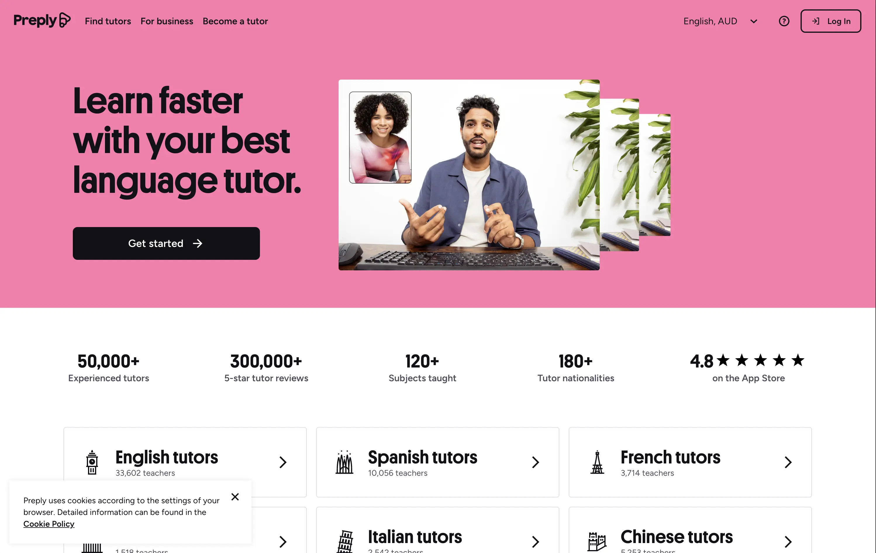
Preply
↗
Education
Left-aligned
Benefit-Driven
Single Button
Photography
Live Metrics
Social Proof
Light Mode
Pink
Black
Home Page
Custom Code
language tutor, online learning, marketplace hero, bold color hero, pink web design, conversational UI, Gen Z UX, bold CTA, tutoring platform, live teaching, zoom call visual, metrics trust banner, marketplace product
Preply is an online learning platform that connects learners with expert language tutors for personalized one-on-one lessons.
This hero punches through with its candy-pink backdrop — a rare choice for marketplaces but totally intentional. The layout is simple, but the stacked imagery still adds dynamism. Stats like “300,000+ 5-star reviews” and “180+ tutor nationalities” instantly establish credibility. The CTA is minimal and clearly actionable. Overall, the tone is upbeat, modern, and universally accessible — ideal for a cross-border education platform aiming to feel both trustworthy and welcoming.
Hero balances global scale with simplicity. Design and tone cater to international learners of all ages. Trust is built through numbers, while layout minimizes friction for new users.
This layout balances technical utility with human impact, aligning well with Algolia’s positioning as an API-first but UX-aware company. The mobile UI reinforces product value visually, while the logo wall signals scale and trust for enterprise buyers. The tone is clear, benefit-led, and appropriate for high-intent decision-makers evaluating AI tools for customer experience. This is a solid enterprise-facing hero built to perform.
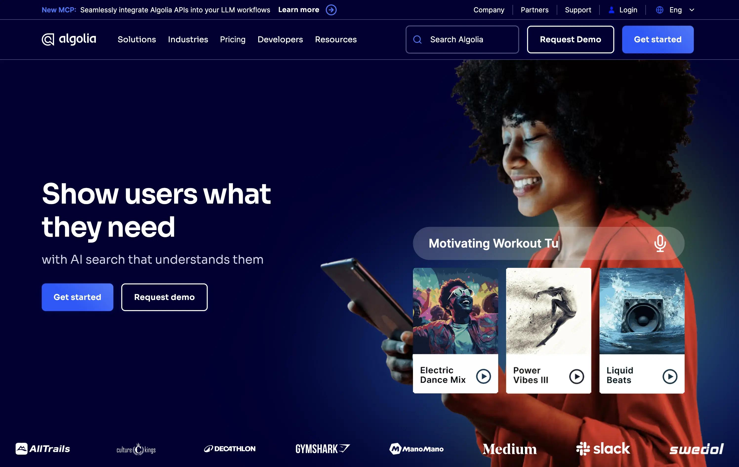
Algolia
↗
DevTools
AI Tools
Split Grid
Left-aligned
Benefit-Driven
Professional
Multi-CTA Block
Logo Wall
Custom Animation
Gradient
Dark Mode
Blue
Sans serif
B2B
Home Page
Custom Code
AI-powered search, developer tools, enterprise-grade SaaS, split layout, multi-CTA, gradient background, product showcase, mobile UI, high-trust layout, logo wall, blue tone, enterprise focus, dual CTA, visual proof, B2B product
Algolia delivers lightning-fast, AI-powered search and discovery APIs so any team can surface the right content or products instantly.
The hero combines a clear value prop with dual CTAs and a lifestyle visual showing product context. The UI animation builds relevance for end-user impact, and the strong contrast between text and background ensures readability. It’s clean, high-trust, and conversion-focused, and the smiling model embodies the end-user promise effectively.
Perfectly straddles developer and business personas. The smiling end-user signals emotional upside while UI animation reinforces performance and specificity. The brand feels modern, AI-aware, and deeply UX-committed.
This layout balances technical utility with human impact, aligning well with Algolia’s positioning as an API-first but UX-aware company. The mobile UI reinforces product value visually, while the logo wall signals scale and trust for enterprise buyers. The tone is clear, benefit-led, and appropriate for high-intent decision-makers evaluating AI tools for customer experience. This is a solid enterprise-facing hero built to perform.
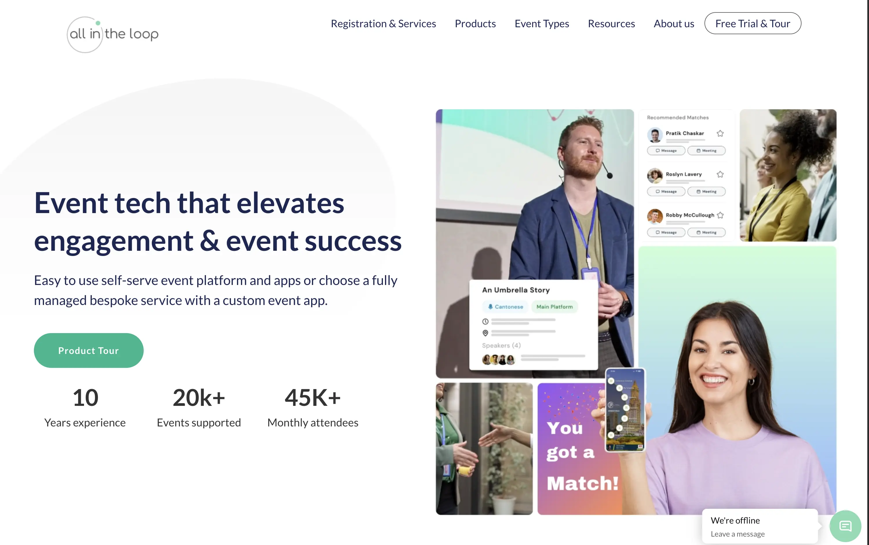
All in the loop
↗
SaaS
Events
Split Grid
Left-aligned
Benefit-Driven
Professional
Single Button
Media Gallery
Live Metrics
Social Proof
Light Mode
Blue
Green
Sans serif
B2B
Home Page
Wordpress
event tech, product tour CTA, pastel gradient, multi-image collage, visual UI overlays, metrics proof, event engagement, B2B SaaS, white background, friendly tone, hybrid event solutions, mobile app showcase, professional layout, soft aesthetic, platform demo
All in the Loop offers a self-serve or fully managed platform to run engaging, app-powered events and conferences.
The hero is clean and covers the basics — a clear headline, brief subtext, supporting visuals, and a CTA. But it plays it too safe. The collage of images feels generic and lacks a focal point. Visual proof of the product exists, but it’s scattered. There’s no standout hook or emotion — it functions, but it doesn’t persuade.
Positioning is sound—highlighting both self-serve and bespoke delivery models shows adaptability. The visuals convey live interaction and networking. Could benefit from a sharper, bolder headline, but trust and clarity are both strong.
This layout balances technical utility with human impact, aligning well with Algolia’s positioning as an API-first but UX-aware company. The mobile UI reinforces product value visually, while the logo wall signals scale and trust for enterprise buyers. The tone is clear, benefit-led, and appropriate for high-intent decision-makers evaluating AI tools for customer experience. This is a solid enterprise-facing hero built to perform.
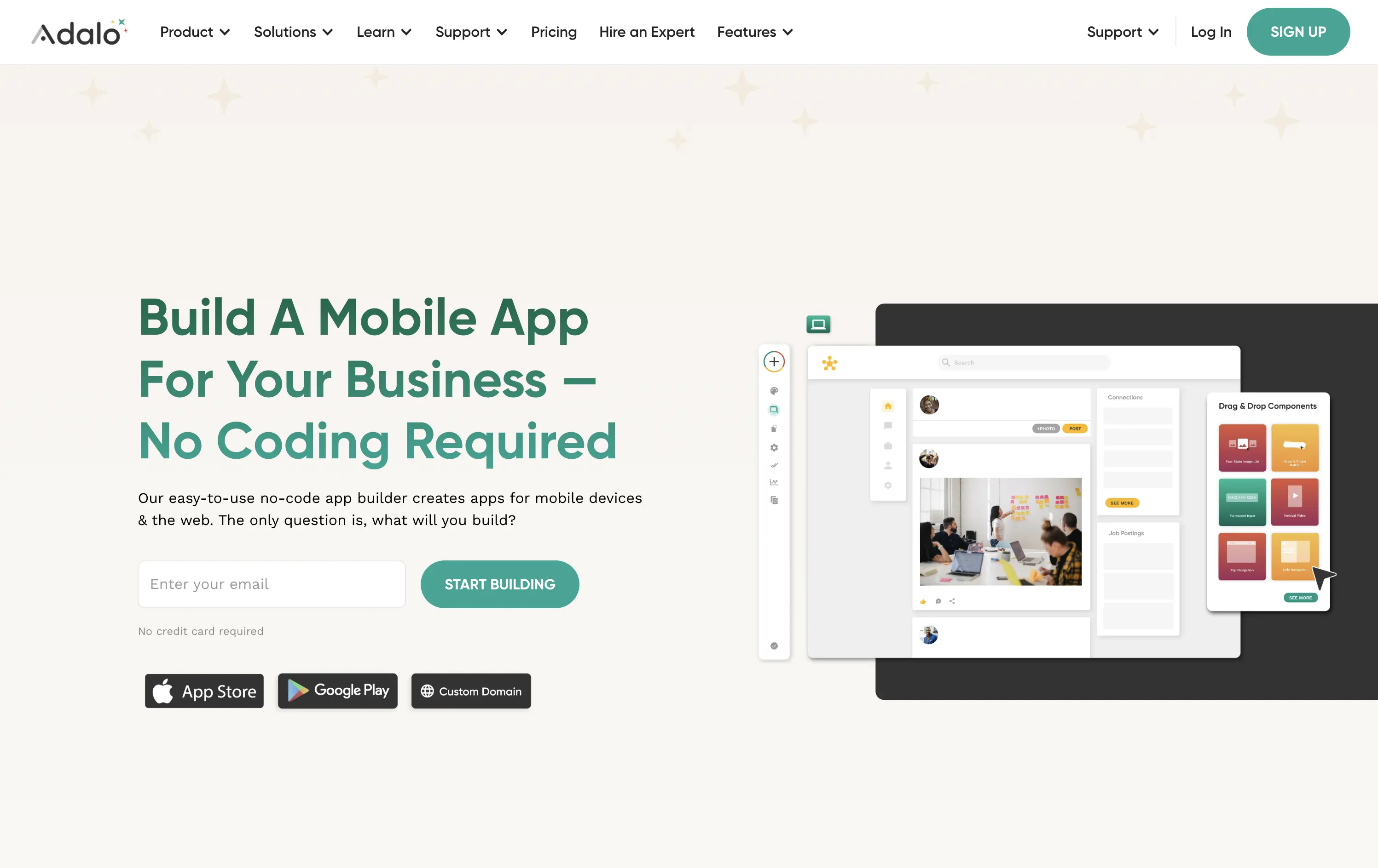
Adalo
↗
SaaS
No-Code
Creative Tools
Split Grid
Left-aligned
Benefit-Driven
Descriptive
Email Capture
Product UI
Duotone
Green
Sans serif
Hybrid
Home Page
Webflow
no-code builder, early-stage vibe, product-led growth, friendly UI, starter-friendly, clear CTA, drag-and-drop visual, email-first CTA, low-barrier signup, mobile-first, DIY tech, warm palette, creator tools, approachable tone, utility-first
Adalo lets anyone build mobile and web apps without coding using an easy drag-and-drop editor and built-in components.
The layout is clean, welcoming, and communicates ease of use. Visual UI gives confidence, and the input field softens conversion friction. It appeals to non-technical founders well but doesn’t carve out much distinctiveness from competitors in the same space.
This hero aligns well with beginner creators. It plays to comfort and simplicity, though it misses an edge in differentiating speed, success stories, or creative freedom.
This layout balances technical utility with human impact, aligning well with Algolia’s positioning as an API-first but UX-aware company. The mobile UI reinforces product value visually, while the logo wall signals scale and trust for enterprise buyers. The tone is clear, benefit-led, and appropriate for high-intent decision-makers evaluating AI tools for customer experience. This is a solid enterprise-facing hero built to perform.
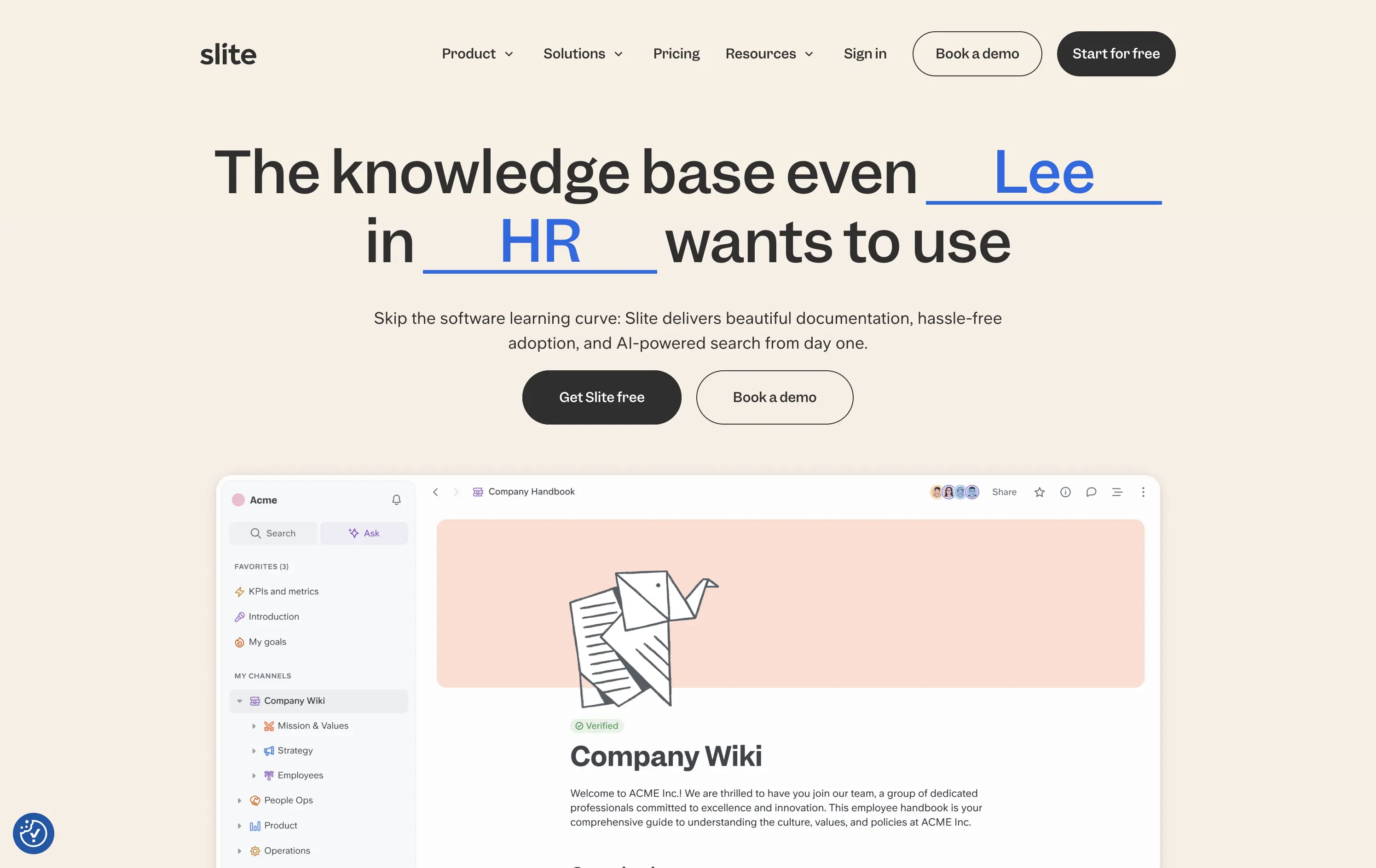
Slite
↗
SaaS
Collaboration
Centered
Benefit-Driven
Conversational
Multi-CTA Block
Product UI
Custom Animation
Light Mode
Blue
Black
Sans serif
B2B
Home Page
Webflow
team-friendly, rotating headline, UI demo, warm neutrals, playful logic, AI-assisted search, startup SaaS, low-friction entry, inclusive language, collaborative tools, documentation-first, dual CTA, trust-building UX
Slite gives teams a simple, AI-powered workspace to capture and find knowledge without the usual learning curve.
Hero is clever and inclusive. Animated blanks highlight versatility without overexplaining. UI preview builds product confidence. Dual CTAs clearly support trial vs. demo. Warm visuals balance modern minimalism with approachability.
Speaks to multiple roles without bloating the message. Tone and visual style position Slite as a low-friction, high-utility tool. Well-suited for horizontal B2B SaaS adoption.
This layout balances technical utility with human impact, aligning well with Algolia’s positioning as an API-first but UX-aware company. The mobile UI reinforces product value visually, while the logo wall signals scale and trust for enterprise buyers. The tone is clear, benefit-led, and appropriate for high-intent decision-makers evaluating AI tools for customer experience. This is a solid enterprise-facing hero built to perform.
The most effective hero sections in your inbox.
Monthly round up of top hero sections.
Don't worry. We hate spam too.
Don't worry. We hate spam too.
Don't worry. We hate spam too.