Black
15
15
15
15
Filters
Orchids
↗
AI Tools
No-Code
Creative Tools
Centered
Benefit-Driven
Aspirational
Search/Utility Block
Interactive
Product UI
Imagery-Based
Pink
Black
Serif
B2C
Home Page
Custom Code
ai site builder, no-code websites, prompt box hero, interactive sandbox, scenic background, gallery proof, centered layout, serif headline, product-led growth, signup gate, creative makers, pastel sky, inspirational copy, landing page builder, web app generator
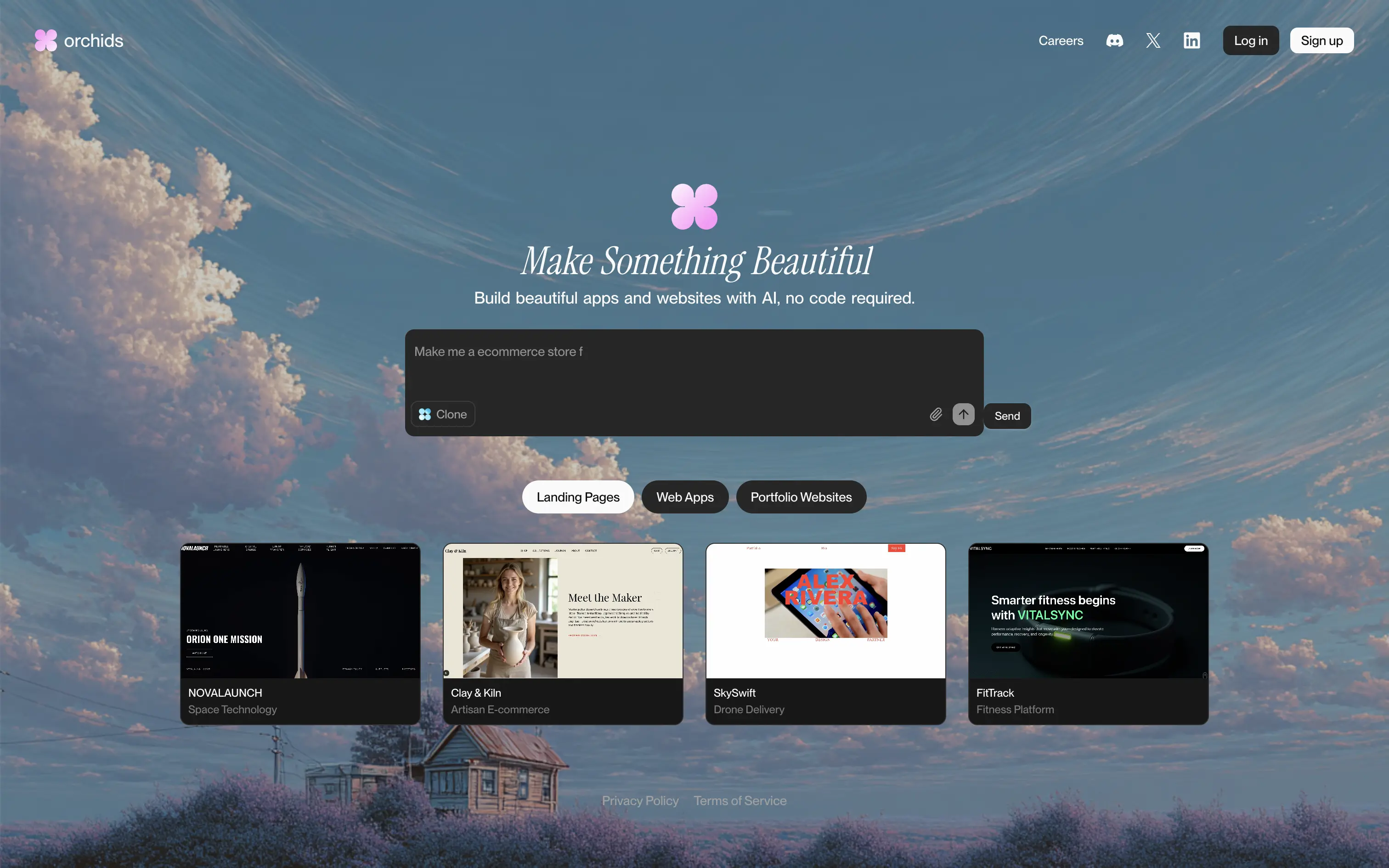
Orchids lets anyone generate full websites or apps from a single text prompt, delivering production-ready code and design without writing a line themselves.
Dreamy sky backdrop and italic serif headline promise beauty, while the live prompt box invites instant play. Thumbnail gallery backs the claim with varied examples. Redirecting to sign-up right after a prompt captures intent but may jar casual visitors. Overall hierarchy is clear and engaging.
Vision-heavy headline hooks design-focused founders; interactive builder demo signals AI uniqueness. Product-led funnel drives conversions, though absence of pricing or social proof leaves credibility to aesthetic appeal alone.
This layout balances technical utility with human impact, aligning well with Algolia’s positioning as an API-first but UX-aware company. The mobile UI reinforces product value visually, while the logo wall signals scale and trust for enterprise buyers. The tone is clear, benefit-led, and appropriate for high-intent decision-makers evaluating AI tools for customer experience. This is a solid enterprise-facing hero built to perform.
Orchids
↗
AI Tools
No-Code
Creative Tools
Centered
Benefit-Driven
Aspirational
Search/Utility Block
Interactive
Product UI
Imagery-Based
Pink
Black
Serif
B2C
Home Page
Custom Code
ai site builder, no-code websites, prompt box hero, interactive sandbox, scenic background, gallery proof, centered layout, serif headline, product-led growth, signup gate, creative makers, pastel sky, inspirational copy, landing page builder, web app generator
Orchids lets anyone generate full websites or apps from a single text prompt, delivering production-ready code and design without writing a line themselves.
Dreamy sky backdrop and italic serif headline promise beauty, while the live prompt box invites instant play. Thumbnail gallery backs the claim with varied examples. Redirecting to sign-up right after a prompt captures intent but may jar casual visitors. Overall hierarchy is clear and engaging.
Vision-heavy headline hooks design-focused founders; interactive builder demo signals AI uniqueness. Product-led funnel drives conversions, though absence of pricing or social proof leaves credibility to aesthetic appeal alone.
This layout balances technical utility with human impact, aligning well with Algolia’s positioning as an API-first but UX-aware company. The mobile UI reinforces product value visually, while the logo wall signals scale and trust for enterprise buyers. The tone is clear, benefit-led, and appropriate for high-intent decision-makers evaluating AI tools for customer experience. This is a solid enterprise-facing hero built to perform.
Family
↗
Fintech
Web3
Centered
Playful
Confident
Download App
Multi-CTA Block
Illustration
Custom Animation
Loading Animation
Light Mode
Blue
Yellow
Black
Sans serif
B2C
Home Page
Custom Code
crypto wallet for iOS, ENS support, playful Web3, mobile-first design, Gen Z crypto, kawaii aesthetic, approachable fintech, token collectibles, web3 onboarding, friendly UX
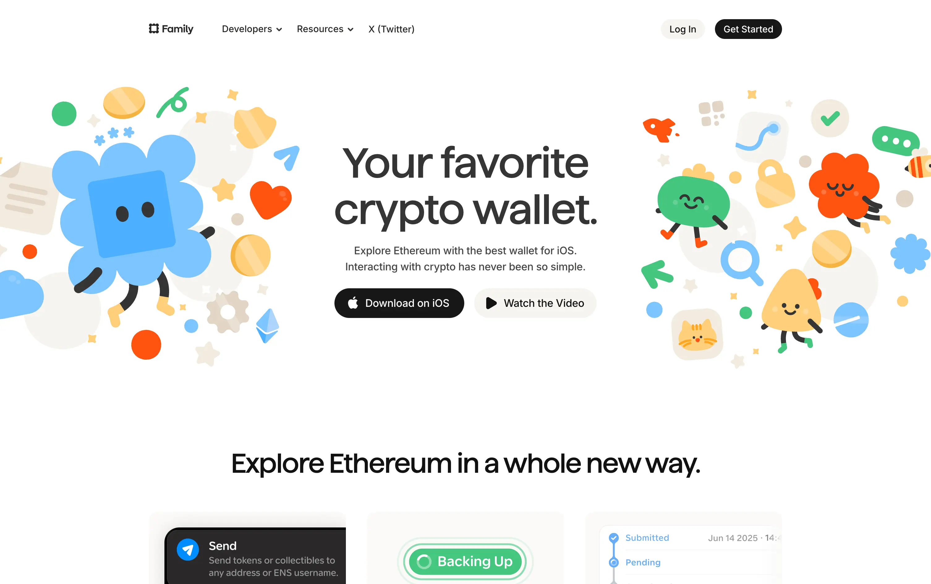
Family is a playful Ethereum wallet designed for iOS, making crypto feel friendly, visual, and simple to use.
Extremely approachable for a space often seen as cold or intimidating. The illustrations soften the category. Clear copy and strong CTA pair well with the product’s target audience and mobile-first approach.
A masterclass in brand positioning. While most Web3 brands chase dark, technical aesthetics, Family goes the opposite direction—bright, warm, and welcoming. It’s intentionally crafted to disarm, invite, and onboard a broader audience.
This layout balances technical utility with human impact, aligning well with Algolia’s positioning as an API-first but UX-aware company. The mobile UI reinforces product value visually, while the logo wall signals scale and trust for enterprise buyers. The tone is clear, benefit-led, and appropriate for high-intent decision-makers evaluating AI tools for customer experience. This is a solid enterprise-facing hero built to perform.
Family
↗
Fintech
Web3
Centered
Playful
Confident
Download App
Multi-CTA Block
Illustration
Custom Animation
Loading Animation
Light Mode
Blue
Yellow
Black
Sans serif
B2C
Home Page
Custom Code
crypto wallet for iOS, ENS support, playful Web3, mobile-first design, Gen Z crypto, kawaii aesthetic, approachable fintech, token collectibles, web3 onboarding, friendly UX
Family is a playful Ethereum wallet designed for iOS, making crypto feel friendly, visual, and simple to use.
Extremely approachable for a space often seen as cold or intimidating. The illustrations soften the category. Clear copy and strong CTA pair well with the product’s target audience and mobile-first approach.
A masterclass in brand positioning. While most Web3 brands chase dark, technical aesthetics, Family goes the opposite direction—bright, warm, and welcoming. It’s intentionally crafted to disarm, invite, and onboard a broader audience.
This layout balances technical utility with human impact, aligning well with Algolia’s positioning as an API-first but UX-aware company. The mobile UI reinforces product value visually, while the logo wall signals scale and trust for enterprise buyers. The tone is clear, benefit-led, and appropriate for high-intent decision-makers evaluating AI tools for customer experience. This is a solid enterprise-facing hero built to perform.
Bonsai
↗
SaaS
Productivity
Centered
Descriptive
Professional
Multi-CTA Block
Product UI
Social Proof
Badges
Light Mode
Black
Sans serif
B2B
Home Page
Webflow
clean UI, use-case ticker, modular product suite, high-trust SaaS, minimal layout, neutral branding, small business ops, service platform, feature-led structure, multi-tool clarity, clear positioning
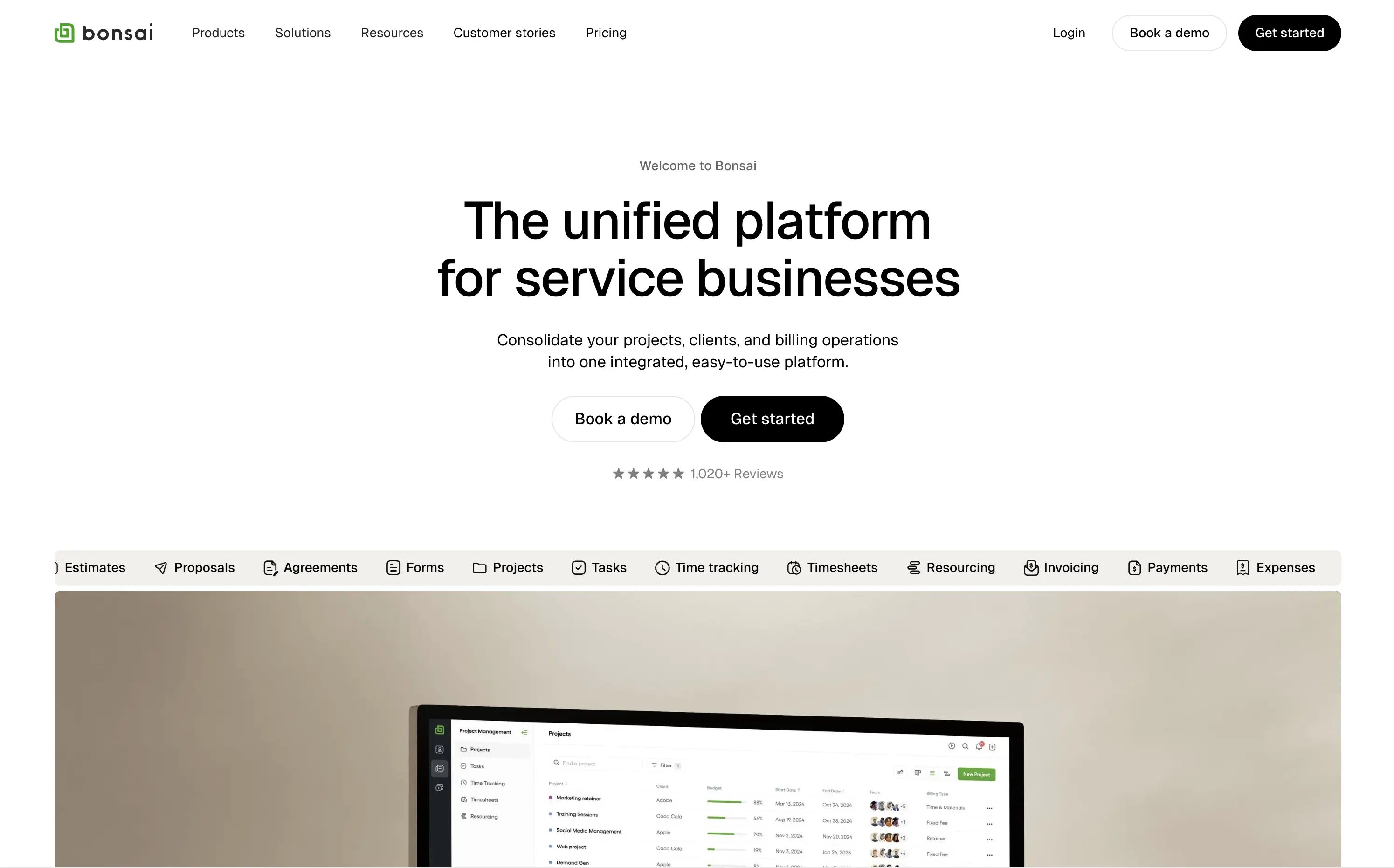
Bonsai offers an all-in-one platform to manage projects, clients, billing, and admin work for service-based businesses.
Minimal, structured, and very clear. The hero spells out the value in one line and supports it with a rolling feature list. Visuals, CTAs, and copy all pull in the same direction—no friction, no fluff.
Positioned for busy professionals who need clarity fast. Layout and tone reflect a mature product with high utility and little need for persuasion theatrics.
This layout balances technical utility with human impact, aligning well with Algolia’s positioning as an API-first but UX-aware company. The mobile UI reinforces product value visually, while the logo wall signals scale and trust for enterprise buyers. The tone is clear, benefit-led, and appropriate for high-intent decision-makers evaluating AI tools for customer experience. This is a solid enterprise-facing hero built to perform.
Bonsai
↗
SaaS
Productivity
Centered
Descriptive
Professional
Multi-CTA Block
Product UI
Social Proof
Badges
Light Mode
Black
Sans serif
B2B
Home Page
Webflow
clean UI, use-case ticker, modular product suite, high-trust SaaS, minimal layout, neutral branding, small business ops, service platform, feature-led structure, multi-tool clarity, clear positioning
Bonsai offers an all-in-one platform to manage projects, clients, billing, and admin work for service-based businesses.
Minimal, structured, and very clear. The hero spells out the value in one line and supports it with a rolling feature list. Visuals, CTAs, and copy all pull in the same direction—no friction, no fluff.
Positioned for busy professionals who need clarity fast. Layout and tone reflect a mature product with high utility and little need for persuasion theatrics.
This layout balances technical utility with human impact, aligning well with Algolia’s positioning as an API-first but UX-aware company. The mobile UI reinforces product value visually, while the logo wall signals scale and trust for enterprise buyers. The tone is clear, benefit-led, and appropriate for high-intent decision-makers evaluating AI tools for customer experience. This is a solid enterprise-facing hero built to perform.
Softr
↗
SaaS
No-Code
Centered
Descriptive
Empowering
Single Button
Product UI
Announcement
Light Mode
Black
Sans serif
B2B
Home Page
Webflow
no-code builder, grid background, empowering language, SaaS homepage, CRM dashboard UI, announcement pill, onboarding-friendly, clean layout, business automation, early-stage SaaS, Coda integration, custom apps, tool for operations, low-friction CTA
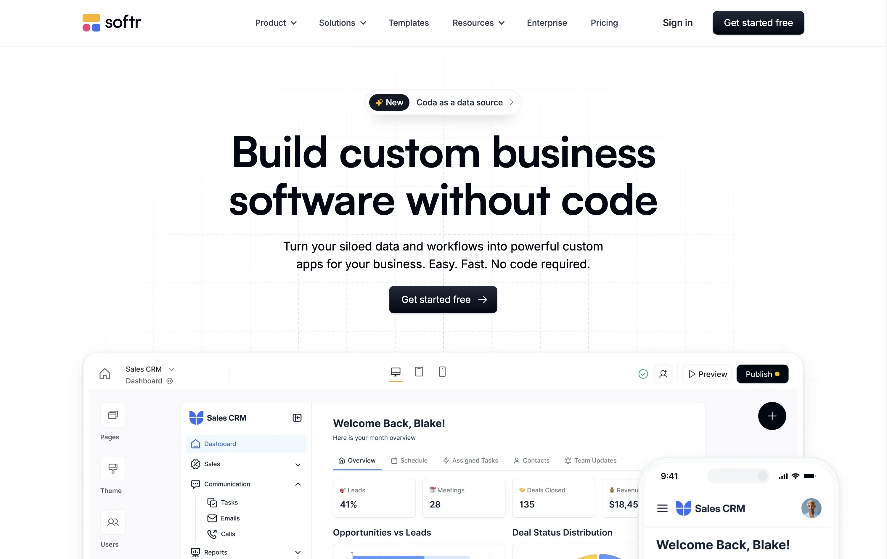
Softr lets you build custom internal tools, portals, and apps from your business data without writing any code.
Clear, product-led hero that instantly communicates value. The main headline is bold and simple, and the visual shows real product UI. New feature callout adds relevance. Overall, conversion-friendly.
Strong fit for practical decision-makers who value clarity and speed. Clean layout and tone match the product’s accessible, productivity-first positioning. Shows rather than tells.
This layout balances technical utility with human impact, aligning well with Algolia’s positioning as an API-first but UX-aware company. The mobile UI reinforces product value visually, while the logo wall signals scale and trust for enterprise buyers. The tone is clear, benefit-led, and appropriate for high-intent decision-makers evaluating AI tools for customer experience. This is a solid enterprise-facing hero built to perform.
Softr
↗
SaaS
No-Code
Centered
Descriptive
Empowering
Single Button
Product UI
Announcement
Light Mode
Black
Sans serif
B2B
Home Page
Webflow
no-code builder, grid background, empowering language, SaaS homepage, CRM dashboard UI, announcement pill, onboarding-friendly, clean layout, business automation, early-stage SaaS, Coda integration, custom apps, tool for operations, low-friction CTA
Softr lets you build custom internal tools, portals, and apps from your business data without writing any code.
Clear, product-led hero that instantly communicates value. The main headline is bold and simple, and the visual shows real product UI. New feature callout adds relevance. Overall, conversion-friendly.
Strong fit for practical decision-makers who value clarity and speed. Clean layout and tone match the product’s accessible, productivity-first positioning. Shows rather than tells.
This layout balances technical utility with human impact, aligning well with Algolia’s positioning as an API-first but UX-aware company. The mobile UI reinforces product value visually, while the logo wall signals scale and trust for enterprise buyers. The tone is clear, benefit-led, and appropriate for high-intent decision-makers evaluating AI tools for customer experience. This is a solid enterprise-facing hero built to perform.
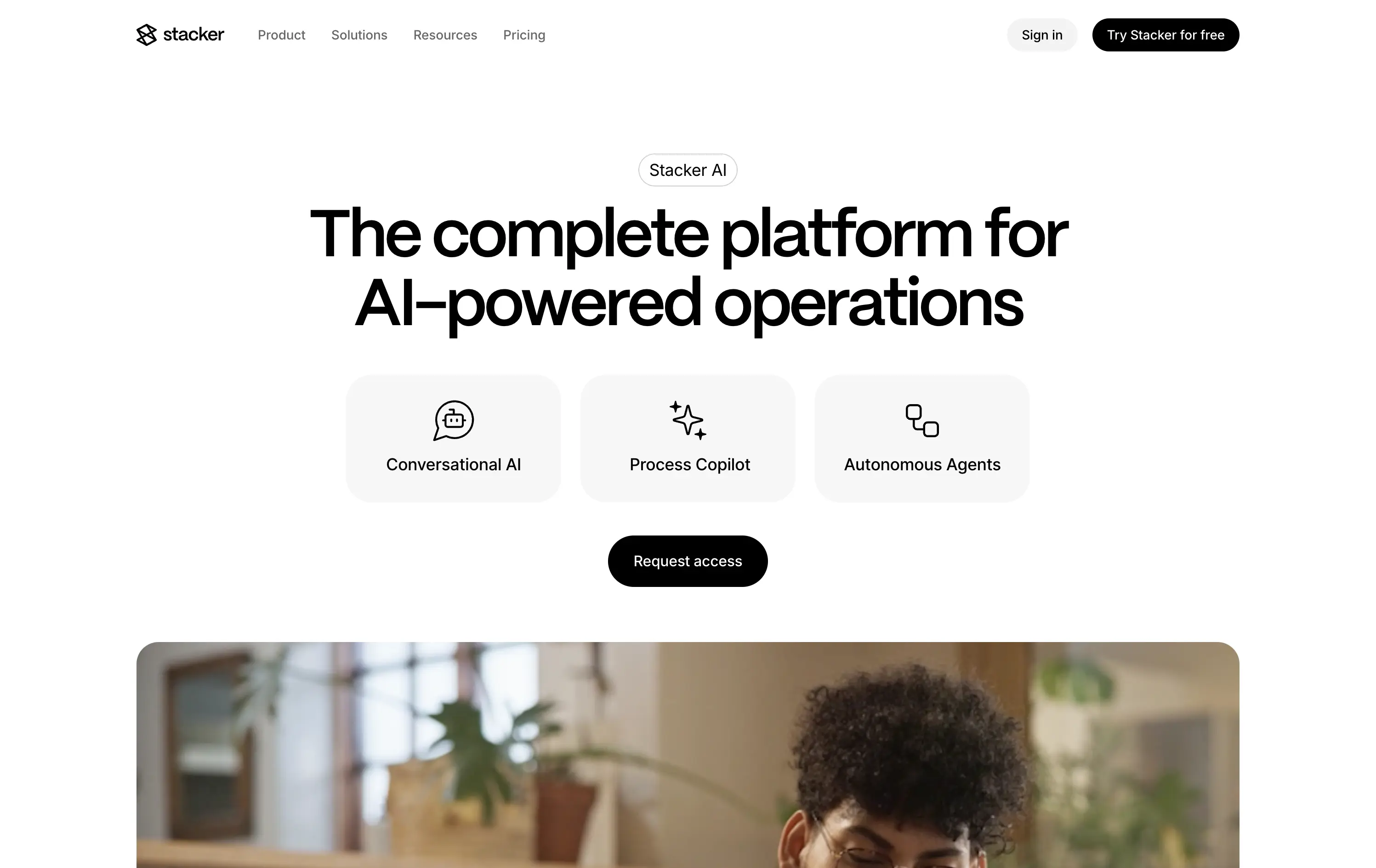
Stacker
↗
SaaS
AI Tools
Productivity
Minimal
Centered
Descriptive
Professional
Single Button
Photography
Video
Light Mode
Black
Sans serif
B2B
Home Page
Framer
AI operations platform, light minimal hero, conversational UI, agent automation, process copilots, clean layout, icon-based features, white space emphasis, AI-native workflow, modern SaaS tone, B2B AI, high-trust layout, early-stage beta feel
Stacker AI helps companies automate internal operations with conversational interfaces, process copilots, and autonomous agents built into their workflows.
Clarity-forward hero with minimal visual noise. Headline is direct. Icons give quick scannability of offering. “Request access” indicates early-stage invite model, aligning with AI-native positioning.
Strong entry for teams exploring AI-first automation. The restrained layout and soft interaction style suggest maturity and stability—a counterbalance to the experimental nature of AI agents.
This layout balances technical utility with human impact, aligning well with Algolia’s positioning as an API-first but UX-aware company. The mobile UI reinforces product value visually, while the logo wall signals scale and trust for enterprise buyers. The tone is clear, benefit-led, and appropriate for high-intent decision-makers evaluating AI tools for customer experience. This is a solid enterprise-facing hero built to perform.
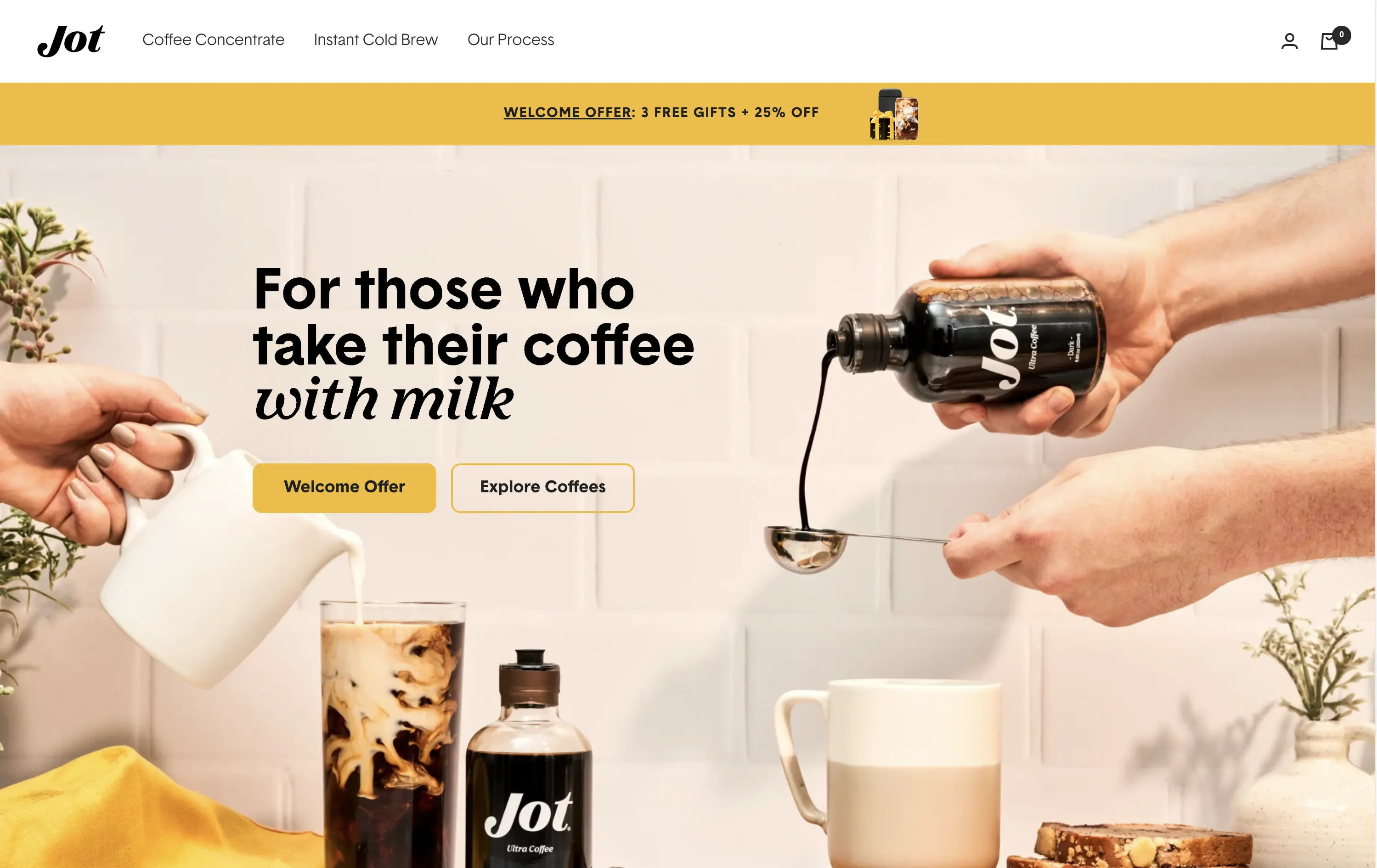
Jot
↗
CPG
Food & Beverage
Editorial
Benefit-Driven
Conversational
Multi-CTA Block
Photography
Custom Animation
Announcement
Imagery-Based
Yellow
Black
Display
DTC
Home Page
Shopify
Replo
coffee brand, lifestyle product, home ritual, premium instant coffee, CPG beverage, warm palette, morning routine, modern food DTC, product-centered hero, rotating headline, lifestyle-led photography
Jot sells ultra-concentrated coffee that simplifies your morning brew without compromising on quality or taste.
Visuals immediately convey simplicity and satisfaction. The rotating headline adapts to multiple buyer intents while keeping focus tight. The product-in-action shot clarifies usage without needing extra explanation.
The brand leans hard into lifestyle cues—targeting modern, taste-conscious buyers with clarity and credibility. The light palette and cozy setup reinforce everyday luxury.
This layout balances technical utility with human impact, aligning well with Algolia’s positioning as an API-first but UX-aware company. The mobile UI reinforces product value visually, while the logo wall signals scale and trust for enterprise buyers. The tone is clear, benefit-led, and appropriate for high-intent decision-makers evaluating AI tools for customer experience. This is a solid enterprise-facing hero built to perform.
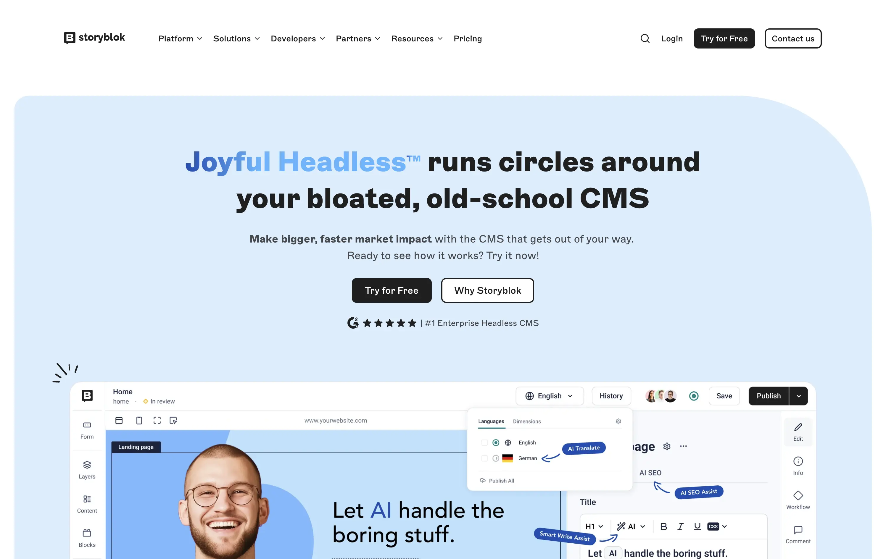
Storyblok
↗
SaaS
DevTools
Inset
Centered
Playful
Pain-driven
Multi-CTA Block
Illustration
Product UI
Social Proof
Badges
Light Mode
Blue
Black
Sans serif
B2B
Home Page
Custom Code
headless CMS, anti-legacy positioning, visual editing, developer tools, AI assist, SaaS marketing, animated UI mockup, software demo, CMS for teams, testimonial badge, conversion-first layout
Storyblok is a headless CMS built for developers and marketers to collaboratively build fast, flexible websites and digital experiences.
The hero is unapologetically punchy. It leads with a clear enemy (bloated CMSs), while pairing credibility badges with live UI proof. Product visuals reinforce benefits instead of distracting from them.
This is high-conversion, pain-aware SaaS positioning. The voice is aggressive but measured, fitting for teams actively seeking a modern CMS alternative.
This layout balances technical utility with human impact, aligning well with Algolia’s positioning as an API-first but UX-aware company. The mobile UI reinforces product value visually, while the logo wall signals scale and trust for enterprise buyers. The tone is clear, benefit-led, and appropriate for high-intent decision-makers evaluating AI tools for customer experience. This is a solid enterprise-facing hero built to perform.
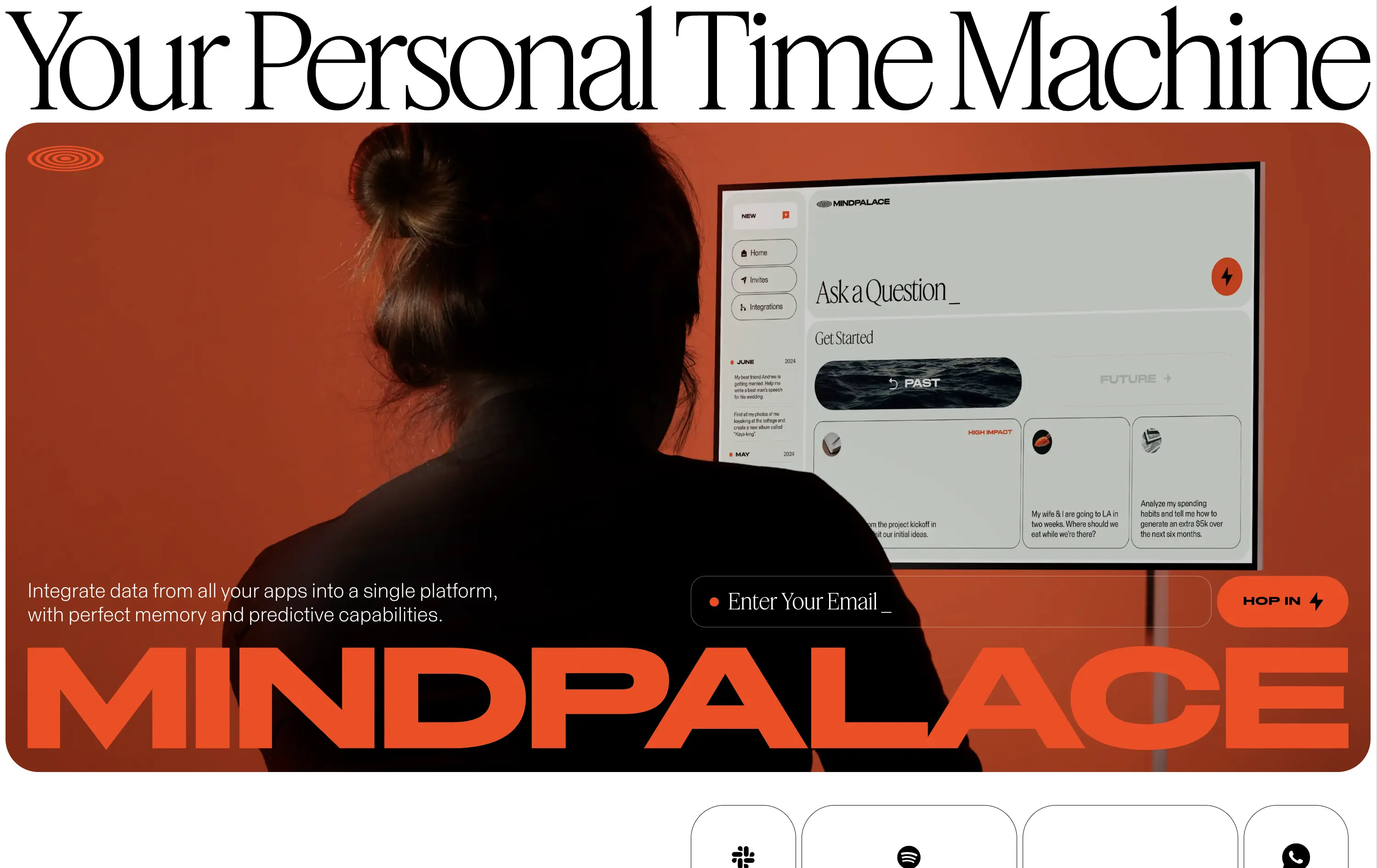
MindPalace AI
↗
SaaS
AI Tools
Productivity
Inset
Full Width
Editorial
Founder-Led Voice
Abstract / Conceptual
Email Capture
Photography
Product UI
Imagery-Based
Light Mode
Red
Black
Display
B2C
Home Page
Webflow
cinematic design, founder-led brand, AI memory tool, data integration, futuristic UI, monochrome orange palette, provocative headline, low-context messaging, brand-first hero, retro-futurist aesthetic, predictive tech, narrative design, mood-driven UX
Mindpalace connects and organizes your digital life into a single interface with memory recall and predictive AI tools—part archive, part assistant.
This hero is brand-first, product-second. The editorial headline draws intrigue but offers zero utility without scrolling. Subheadline hints at integration and predictive capabilities but avoids details. The strength lies in the striking art direction: backlit subject, glowing screen, and color-blocked monochrome palette immediately set a cinematic tone. Product UI is visible but not interactive. The email capture field is subtle and stylish, fitting the brand’s creative edge. It’s a bold anti-SaaS approach—prioritizing identity over clarity.
Mindpalace positions itself as a visionary, not a tool. Strategy leans into intrigue, betting on design-savvy early adopters who value storytelling and aesthetics over immediate clarity. Strong brand magnetism, low onboarding intent.
This layout balances technical utility with human impact, aligning well with Algolia’s positioning as an API-first but UX-aware company. The mobile UI reinforces product value visually, while the logo wall signals scale and trust for enterprise buyers. The tone is clear, benefit-led, and appropriate for high-intent decision-makers evaluating AI tools for customer experience. This is a solid enterprise-facing hero built to perform.
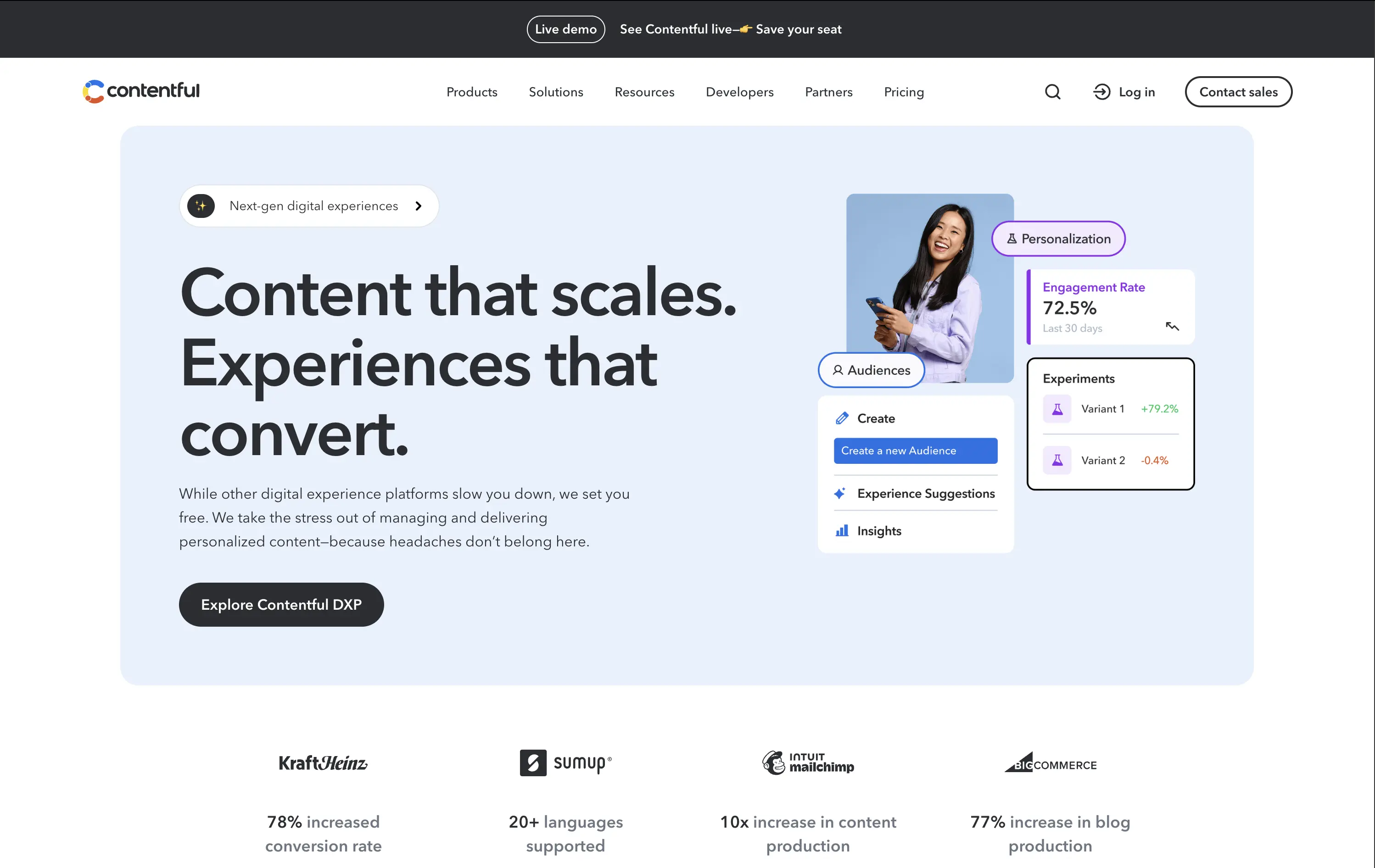
Contentful
↗
SaaS
DevTools
Inset
Left-aligned
Benefit-Driven
Single Button
Photography
Logo Wall
Product UI
Announcement
Light Mode
Blue
Black
Sans serif
B2B
Home Page
Custom Code
headless CMS, digital experience platform, DXP, content ops, personalization tools, conversion-optimized hero, enterprise SaaS
Contentful is a composable content platform for digital teams to build, manage, and scale personalized content experiences.
This hero delivers clarity and control. The headline is simple but strong, while the UI cards bring in real metrics — 72.5% engagement, +79.2% test lift — that immediately signal impact. The modular, bento-inspired visual design frames product capabilities without overwhelming the user. A single, confident CTA caps it off. It’s subtle, strategic, and conversion-aware.
Balances conversion focus with credibility. Perfectly aligned with performance-driven teams who want visual polish without noise. Content strategy and product capability are both clearly expressed without overpromising.
This layout balances technical utility with human impact, aligning well with Algolia’s positioning as an API-first but UX-aware company. The mobile UI reinforces product value visually, while the logo wall signals scale and trust for enterprise buyers. The tone is clear, benefit-led, and appropriate for high-intent decision-makers evaluating AI tools for customer experience. This is a solid enterprise-facing hero built to perform.
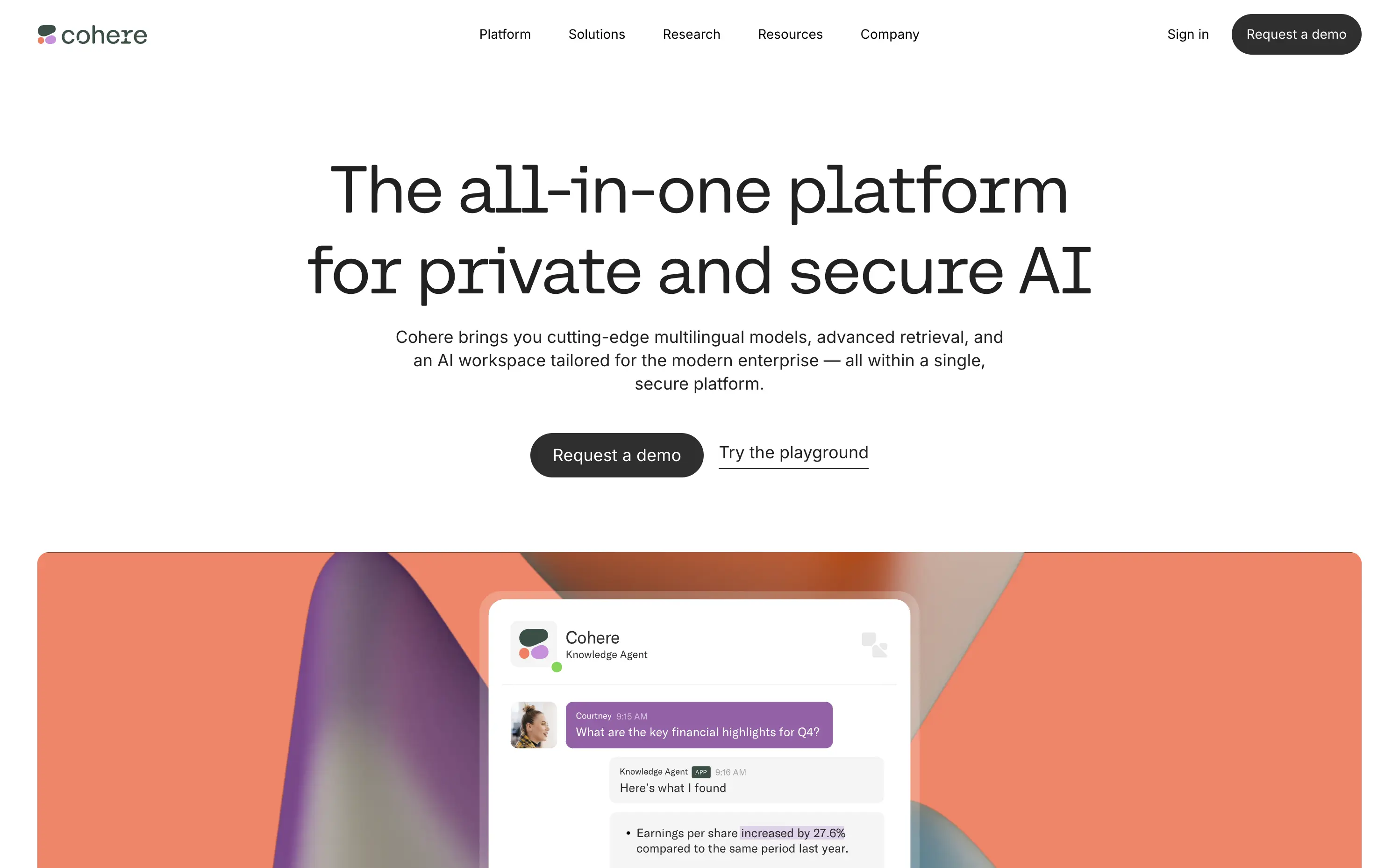
Cohere
↗
AI Tools
Centered
Descriptive
Professional
Multi-CTA Block
Video
Product UI
Light Mode
Black
Monospace
B2B
Home Page
Custom Code
enterprise AI, minimal aesthetic, abstract background, poetic design, security-forward, multilingual AI, understated UI, premium feel, morphing blobs, modern enterprise, monospace typography, visual restraint, AI productivity, custom interface
Cohere delivers private, multilingual AI models for enterprises with a focus on data security, customization, and seamless integration.
The hero is minimalist but intentional. Large, serif-style monospace typography exudes clarity and confidence. The morphing gradient blobs break up the austerity with visual warmth, and the two CTAs — “Request a demo” and “Try the playground” — balance high-commitment and exploratory paths. No gimmicks, no noise — just calm authority.
Cohere leans hard into its point of differentiation: privacy and control. The understated design reinforces brand maturity and trustworthiness — ideal for technical and security-conscious buyers avoiding hype cycles.
This layout balances technical utility with human impact, aligning well with Algolia’s positioning as an API-first but UX-aware company. The mobile UI reinforces product value visually, while the logo wall signals scale and trust for enterprise buyers. The tone is clear, benefit-led, and appropriate for high-intent decision-makers evaluating AI tools for customer experience. This is a solid enterprise-facing hero built to perform.
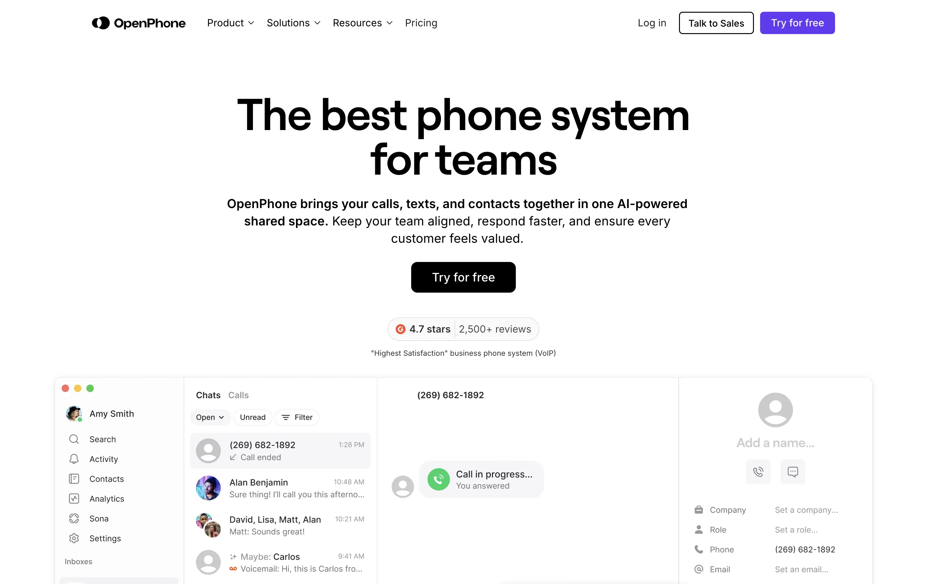
OpenPhone
↗
SaaS
Productivity
Centered
Bold & Direct
Confident
Single Button
Product UI
Social Proof
Light Mode
Purple
Black
Sans serif
B2B
Home Page
Webflow
business phone system, team communication, AI-enhanced calling, VoIP SaaS, minimalist hero, bold headline, trust rating, startup tools, shared inbox, clear CTA, conversion-focused, functional UI preview, modern enterprise utility
OpenPhone is a modern business phone system that unifies calls, texts, and contact management for growing teams.
Hero is bold and crystal clear. Headline makes a confident claim, immediately backed by product visuals and strong review stats. The black CTA button pops against the clean layout, driving clear intent.
Focused and direct for SMB and startup buyers. Hero supports bottom-of-funnel conversion. Minimalist visuals and rating badge project trust. Smart use of space for clarity and speed.
This layout balances technical utility with human impact, aligning well with Algolia’s positioning as an API-first but UX-aware company. The mobile UI reinforces product value visually, while the logo wall signals scale and trust for enterprise buyers. The tone is clear, benefit-led, and appropriate for high-intent decision-makers evaluating AI tools for customer experience. This is a solid enterprise-facing hero built to perform.
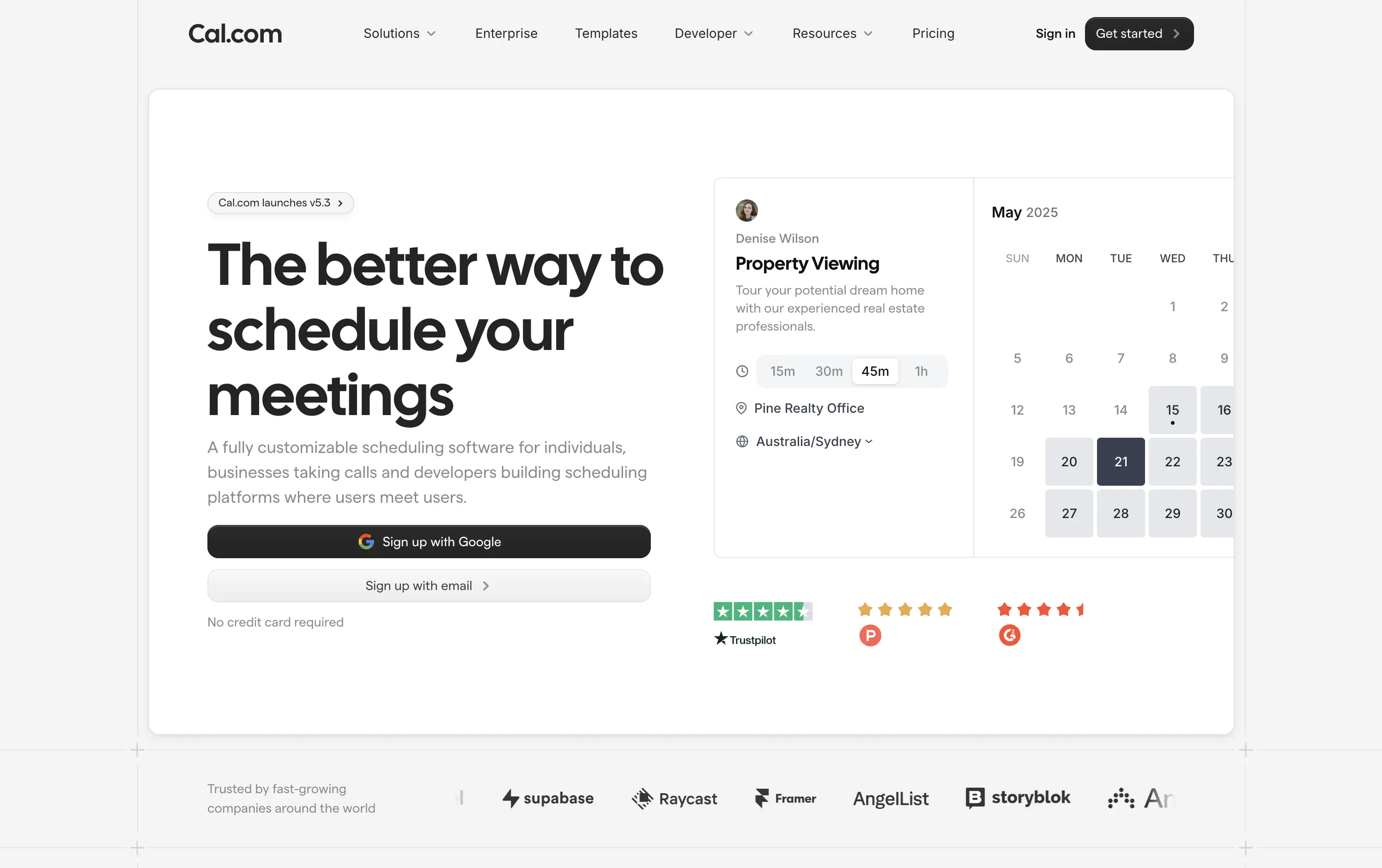
Cal.com
↗
SaaS
Productivity
Split Grid
Left-aligned
Bold & Direct
Multi-CTA Block
Product UI
Social Proof
Custom Animation
Badges
Light Mode
Black
Sans serif
Hybrid
Home Page
Framer
calendar booking, open source scheduler, clean aesthetic, lightweight onboarding, animated UI, trust-led design, Google sign-in, frictionless flow, developer-friendly, minimal layout, self-serve SaaS, cross-industry use cases, credibility-first, proof-based design
Cal.com is a fully customizable scheduling platform for individuals, teams, and developers—built for everything from calls to client bookings.
Clear headline paired with a minimalist aesthetic creates instant comprehension. The animated UI module smartly showcases varied use cases—from legal consults to photoshoots—broadening audience appeal. Trust badges build legitimacy, while “Sign up with Google” signals low-friction entry. Copy is functional and tight, and the centered layout maintains visual clarity without distraction.
The hero is focused and efficient. Clear headline, modular product UI, and direct signup flows drive intent. Trust logos and social proof add validation. UI previews reflect real-world use across industries. Nothing extraneous.
This layout balances technical utility with human impact, aligning well with Algolia’s positioning as an API-first but UX-aware company. The mobile UI reinforces product value visually, while the logo wall signals scale and trust for enterprise buyers. The tone is clear, benefit-led, and appropriate for high-intent decision-makers evaluating AI tools for customer experience. This is a solid enterprise-facing hero built to perform.
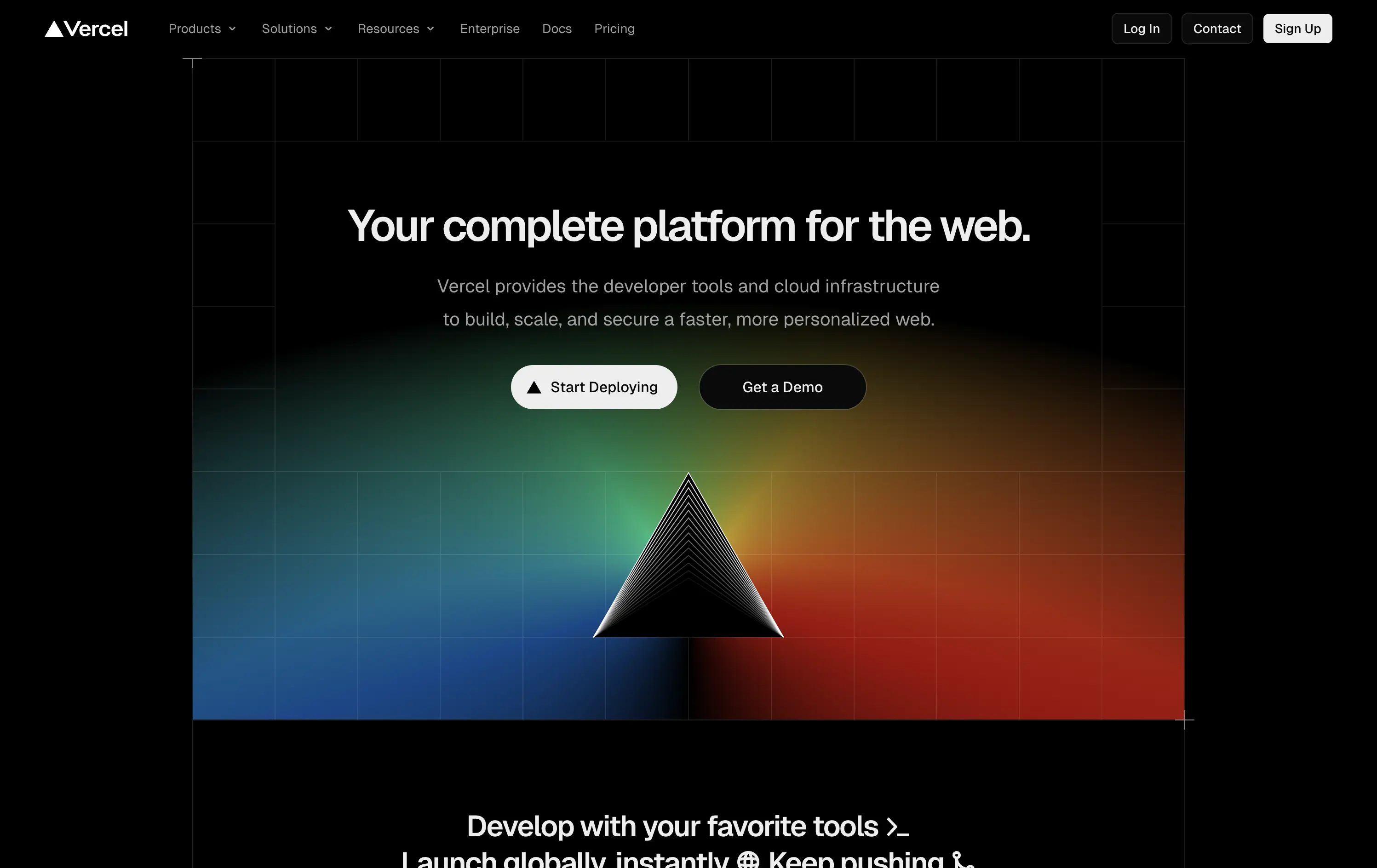
Vercel
↗
SaaS
DevTools
Centered
Bold & Direct
Multi-CTA Block
Illustration
Gradient
Dark Mode
White
Black
Sans serif
B2B
Home Page
Custom Code
developer-first, dark UI, iconic branding, gradient background, clean copy, deploy-focused, modern SaaS, performance tooling, enterprise appeal, visual impact, prism hero, action-oriented
Vercel gives developers the tools to build, deploy, and scale high-performance web apps with ease and speed.
The hero delivers immediate clarity: who it’s for, what it does, and how to get started. The dark UI, glowing visuals, and sharp copy create instant trust. Dual CTAs smartly capture both trial users and enterprise prospects.
A focused, no-fluff entry point optimized for developer decision speed. Brand expression is strong, conversion is easy, and the layout avoids distraction. Built for high-intent audiences evaluating deployment solutions.
This layout balances technical utility with human impact, aligning well with Algolia’s positioning as an API-first but UX-aware company. The mobile UI reinforces product value visually, while the logo wall signals scale and trust for enterprise buyers. The tone is clear, benefit-led, and appropriate for high-intent decision-makers evaluating AI tools for customer experience. This is a solid enterprise-facing hero built to perform.
Preply
↗
Education
Left-aligned
Benefit-Driven
Single Button
Photography
Live Metrics
Social Proof
Light Mode
Pink
Black
Home Page
Custom Code
language tutor, online learning, marketplace hero, bold color hero, pink web design, conversational UI, Gen Z UX, bold CTA, tutoring platform, live teaching, zoom call visual, metrics trust banner, marketplace product
Preply is an online learning platform that connects learners with expert language tutors for personalized one-on-one lessons.
This hero punches through with its candy-pink backdrop — a rare choice for marketplaces but totally intentional. The layout is simple, but the stacked imagery still adds dynamism. Stats like “300,000+ 5-star reviews” and “180+ tutor nationalities” instantly establish credibility. The CTA is minimal and clearly actionable. Overall, the tone is upbeat, modern, and universally accessible — ideal for a cross-border education platform aiming to feel both trustworthy and welcoming.
Hero balances global scale with simplicity. Design and tone cater to international learners of all ages. Trust is built through numbers, while layout minimizes friction for new users.
This layout balances technical utility with human impact, aligning well with Algolia’s positioning as an API-first but UX-aware company. The mobile UI reinforces product value visually, while the logo wall signals scale and trust for enterprise buyers. The tone is clear, benefit-led, and appropriate for high-intent decision-makers evaluating AI tools for customer experience. This is a solid enterprise-facing hero built to perform.
Slite
↗
SaaS
Collaboration
Centered
Benefit-Driven
Conversational
Multi-CTA Block
Product UI
Custom Animation
Light Mode
Blue
Black
Sans serif
B2B
Home Page
Webflow
team-friendly, rotating headline, UI demo, warm neutrals, playful logic, AI-assisted search, startup SaaS, low-friction entry, inclusive language, collaborative tools, documentation-first, dual CTA, trust-building UX
Slite gives teams a simple, AI-powered workspace to capture and find knowledge without the usual learning curve.
Hero is clever and inclusive. Animated blanks highlight versatility without overexplaining. UI preview builds product confidence. Dual CTAs clearly support trial vs. demo. Warm visuals balance modern minimalism with approachability.
Speaks to multiple roles without bloating the message. Tone and visual style position Slite as a low-friction, high-utility tool. Well-suited for horizontal B2B SaaS adoption.
This layout balances technical utility with human impact, aligning well with Algolia’s positioning as an API-first but UX-aware company. The mobile UI reinforces product value visually, while the logo wall signals scale and trust for enterprise buyers. The tone is clear, benefit-led, and appropriate for high-intent decision-makers evaluating AI tools for customer experience. This is a solid enterprise-facing hero built to perform.
The most effective hero sections in your inbox.
Monthly round up of top hero sections.
Don't worry. We hate spam too.
Don't worry. We hate spam too.
Don't worry. We hate spam too.