Bold & Direct
19
19
19
19
Sharp, punchy, and unapologetic. High-impact language, no hesitation.
Filters
Hume
↗
SaaS
AI Tools
Centered
Bold & Direct
Confident
Search/Utility Block
Interactive
Announcement
Gradient
Light Mode
Pink
Orange
Sans serif
Hybrid
Home Page
Custom Code
voice ai, text-to-speech, llm, real-time api, developer friendly, pastel gradient, centered hero, interactive demo, single cta, assertive headline, white card, product proof, gradient background, low-friction signup, modern saas
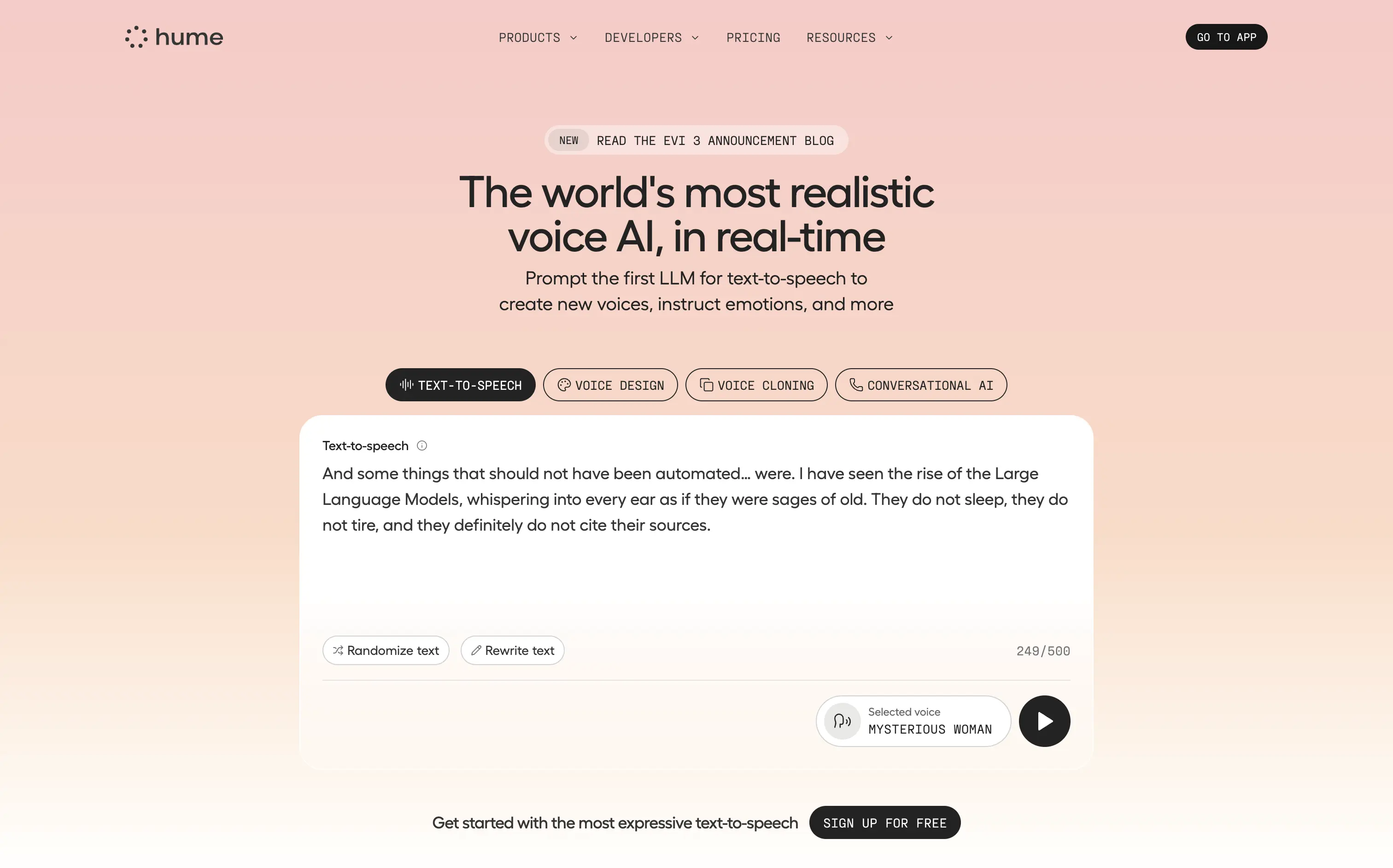
Hume offers a real-time text-to-speech API that lets developers generate lifelike, emotionally nuanced voices or clone existing ones on demand.
Bold claim, proof in one scroll. The live sandbox lets visitors try four core features instantly—a strong trust move. Clear headline, crisp subhead, and “Sign Up For Free” keep focus. Gradient softens tech intensity but may under-signal enterprise heft.
Superlative headline plus instant demo match developer expectations for proof. Single signup path reduces cognitive load, positioning Hume as fast, expressive infrastructure rather than a heavy enterprise suite.
This layout balances technical utility with human impact, aligning well with Algolia’s positioning as an API-first but UX-aware company. The mobile UI reinforces product value visually, while the logo wall signals scale and trust for enterprise buyers. The tone is clear, benefit-led, and appropriate for high-intent decision-makers evaluating AI tools for customer experience. This is a solid enterprise-facing hero built to perform.
Hume
↗
SaaS
AI Tools
Centered
Bold & Direct
Confident
Search/Utility Block
Interactive
Announcement
Gradient
Light Mode
Pink
Orange
Sans serif
Hybrid
Home Page
Custom Code
voice ai, text-to-speech, llm, real-time api, developer friendly, pastel gradient, centered hero, interactive demo, single cta, assertive headline, white card, product proof, gradient background, low-friction signup, modern saas
Hume offers a real-time text-to-speech API that lets developers generate lifelike, emotionally nuanced voices or clone existing ones on demand.
Bold claim, proof in one scroll. The live sandbox lets visitors try four core features instantly—a strong trust move. Clear headline, crisp subhead, and “Sign Up For Free” keep focus. Gradient softens tech intensity but may under-signal enterprise heft.
Superlative headline plus instant demo match developer expectations for proof. Single signup path reduces cognitive load, positioning Hume as fast, expressive infrastructure rather than a heavy enterprise suite.
This layout balances technical utility with human impact, aligning well with Algolia’s positioning as an API-first but UX-aware company. The mobile UI reinforces product value visually, while the logo wall signals scale and trust for enterprise buyers. The tone is clear, benefit-led, and appropriate for high-intent decision-makers evaluating AI tools for customer experience. This is a solid enterprise-facing hero built to perform.
Recraft
↗
SaaS
AI Tools
Creative Tools
Centered
Bold & Direct
Single Button
Interactive
Loading Animation
Multi-color
Green
Purple
Display
Sans serif
B2C
Home Page
Custom Code
experimental typography, AI design suite, generative graphics, all-in-one creative tool, bold visual identity, Gen Z design energy, maximalist type, disruptive layout, prompt-to-polish UX, vector-first platform
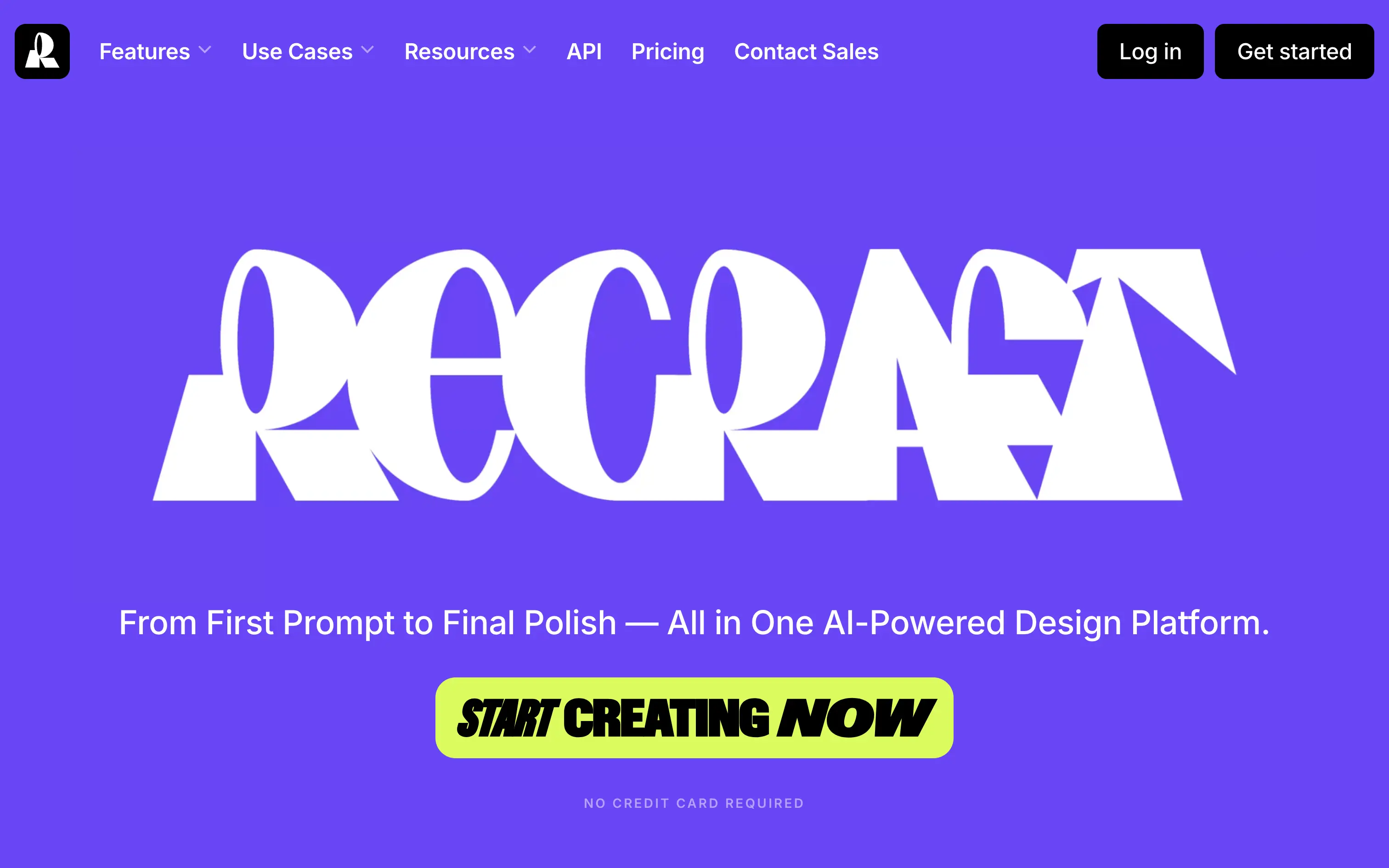
Recraft is an AI-powered design platform for generating and editing vector and image assets from text prompts.
A bold, identity-first approach that skips traditional SaaS tropes. The loading animation morphs into the oversized logo, building intrigue and brand memory. Lacks UI context but makes a strong creative impression.
Recraft speaks to non-technical creatives who want AI tools that feel like theirs. This is brand-first positioning at its most intentional—confident, expressive, and highly audience-aligned.
This layout balances technical utility with human impact, aligning well with Algolia’s positioning as an API-first but UX-aware company. The mobile UI reinforces product value visually, while the logo wall signals scale and trust for enterprise buyers. The tone is clear, benefit-led, and appropriate for high-intent decision-makers evaluating AI tools for customer experience. This is a solid enterprise-facing hero built to perform.
Recraft
↗
SaaS
AI Tools
Creative Tools
Centered
Bold & Direct
Single Button
Interactive
Loading Animation
Multi-color
Green
Purple
Display
Sans serif
B2C
Home Page
Custom Code
experimental typography, AI design suite, generative graphics, all-in-one creative tool, bold visual identity, Gen Z design energy, maximalist type, disruptive layout, prompt-to-polish UX, vector-first platform
Recraft is an AI-powered design platform for generating and editing vector and image assets from text prompts.
A bold, identity-first approach that skips traditional SaaS tropes. The loading animation morphs into the oversized logo, building intrigue and brand memory. Lacks UI context but makes a strong creative impression.
Recraft speaks to non-technical creatives who want AI tools that feel like theirs. This is brand-first positioning at its most intentional—confident, expressive, and highly audience-aligned.
This layout balances technical utility with human impact, aligning well with Algolia’s positioning as an API-first but UX-aware company. The mobile UI reinforces product value visually, while the logo wall signals scale and trust for enterprise buyers. The tone is clear, benefit-led, and appropriate for high-intent decision-makers evaluating AI tools for customer experience. This is a solid enterprise-facing hero built to perform.
Omsom
↗
CPG
Food & Beverage
Centered
Playful
Bold & Direct
No CTA
Photography
Imagery-Based
Red
Yellow
Display
DTC
Home Page
Shopify
bold packaging, nostalgic film grain, Asian American brand, food culture, Gen Z energy, CPG storytelling, saucy noodles, maximalist vibe, loud typography, high color saturation, visual attitude
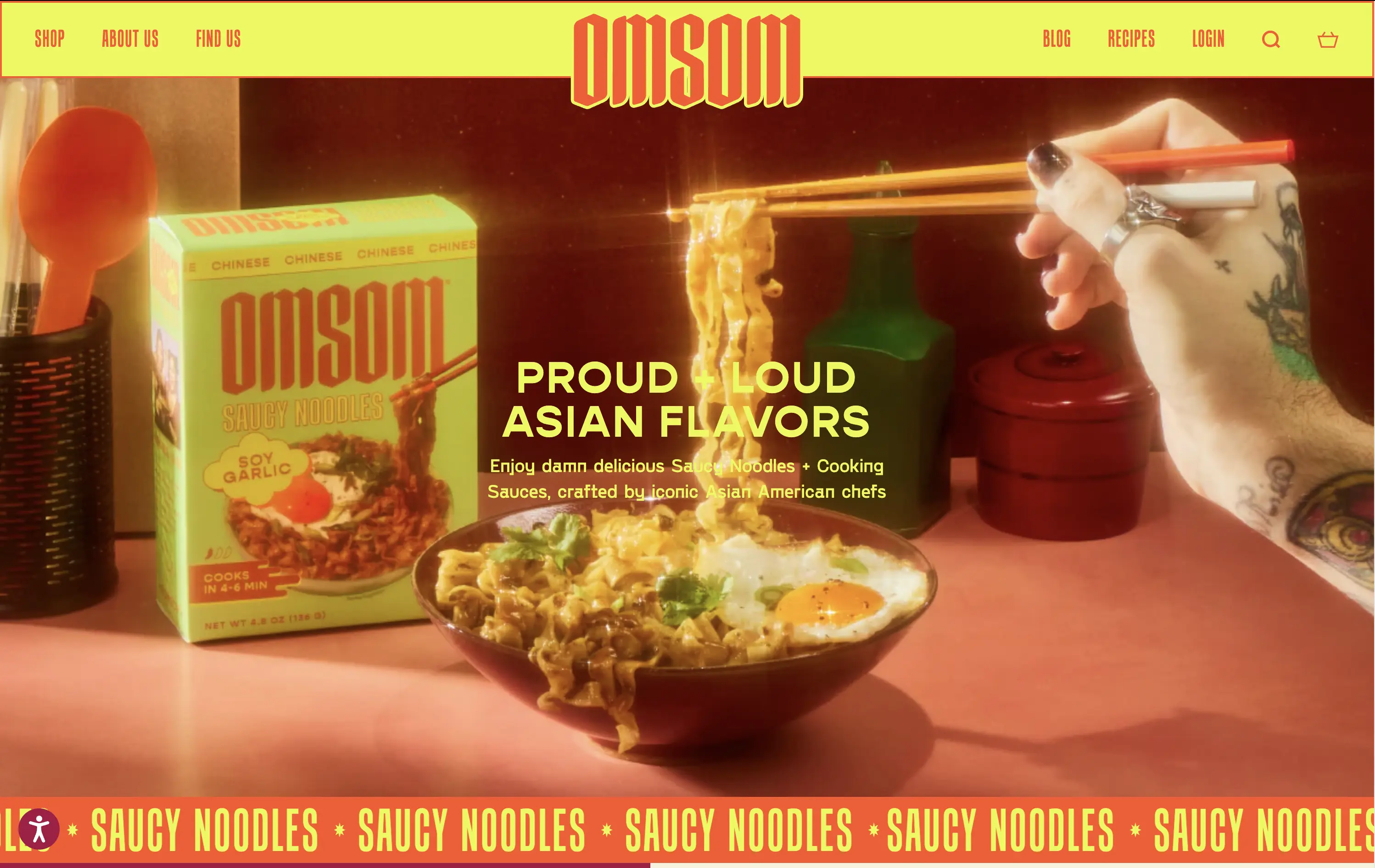
Omsom sells proud and loud Asian sauce kits and noodles without cultural compromise.
The hero hits hard with flavor and personality. High-impact visuals and voice set a strong tone and hints towards the ephereal. It’s clear who it’s for and what they’re selling.
Leans fully into identity and brand world building. Speaks directly to a culturally-aware, proudly niche audience. Messaging and art direction are fully aligned.
This layout balances technical utility with human impact, aligning well with Algolia’s positioning as an API-first but UX-aware company. The mobile UI reinforces product value visually, while the logo wall signals scale and trust for enterprise buyers. The tone is clear, benefit-led, and appropriate for high-intent decision-makers evaluating AI tools for customer experience. This is a solid enterprise-facing hero built to perform.
Omsom
↗
CPG
Food & Beverage
Centered
Playful
Bold & Direct
No CTA
Photography
Imagery-Based
Red
Yellow
Display
DTC
Home Page
Shopify
bold packaging, nostalgic film grain, Asian American brand, food culture, Gen Z energy, CPG storytelling, saucy noodles, maximalist vibe, loud typography, high color saturation, visual attitude
Omsom sells proud and loud Asian sauce kits and noodles without cultural compromise.
The hero hits hard with flavor and personality. High-impact visuals and voice set a strong tone and hints towards the ephereal. It’s clear who it’s for and what they’re selling.
Leans fully into identity and brand world building. Speaks directly to a culturally-aware, proudly niche audience. Messaging and art direction are fully aligned.
This layout balances technical utility with human impact, aligning well with Algolia’s positioning as an API-first but UX-aware company. The mobile UI reinforces product value visually, while the logo wall signals scale and trust for enterprise buyers. The tone is clear, benefit-led, and appropriate for high-intent decision-makers evaluating AI tools for customer experience. This is a solid enterprise-facing hero built to perform.
Raycast
↗
SaaS
Productivity
Centered
Bold & Direct
Descriptive
Download App
Multi-CTA Block
Interactive
Custom Animation
Loading Animation
Dark Mode
White
Red
Sans serif
B2C
Home Page
Custom Code
launcher app, power user tool, developer productivity, dark aesthetic, interactive background, custom animation, glowing motion, fast utility, keyboard-first UX, macOS-native, iOS launch, feature-rich
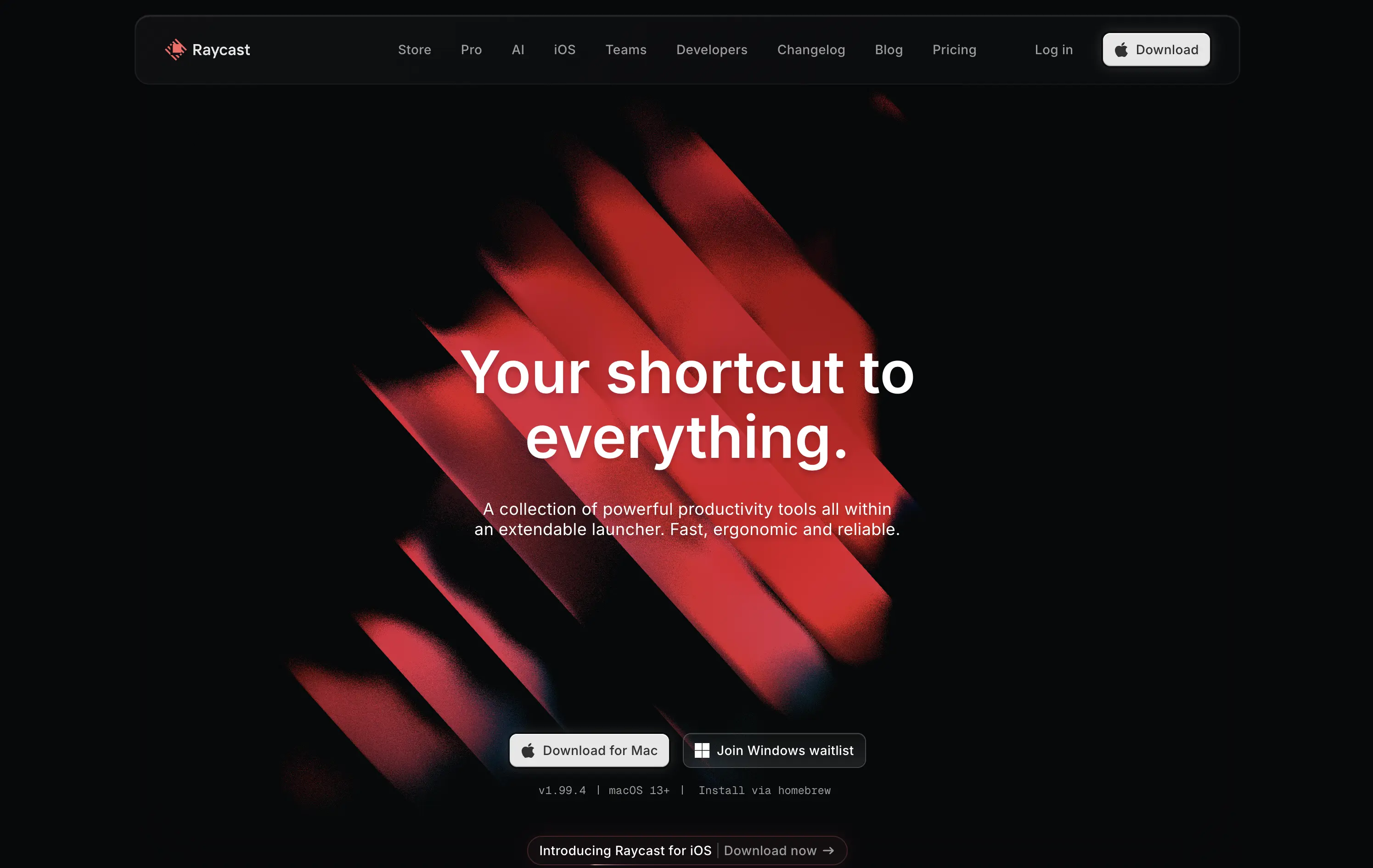
Raycast is a fast, extendable launcher that streamlines tasks and apps into one productivity command center.
Hero opens with striking motion and subtle interactivity, creating immediate emotional pull. Headline is short and memorable. Strong clarity on what it is and what it solves. Layout is focused, high-conversion and visually polished.
Positioning as a utility layer for power users is clear. Dark mode and minimalist tone align with dev-savvy audiences. Strong balance of brand and product without overexplaining.
This layout balances technical utility with human impact, aligning well with Algolia’s positioning as an API-first but UX-aware company. The mobile UI reinforces product value visually, while the logo wall signals scale and trust for enterprise buyers. The tone is clear, benefit-led, and appropriate for high-intent decision-makers evaluating AI tools for customer experience. This is a solid enterprise-facing hero built to perform.
Raycast
↗
SaaS
Productivity
Centered
Bold & Direct
Descriptive
Download App
Multi-CTA Block
Interactive
Custom Animation
Loading Animation
Dark Mode
White
Red
Sans serif
B2C
Home Page
Custom Code
launcher app, power user tool, developer productivity, dark aesthetic, interactive background, custom animation, glowing motion, fast utility, keyboard-first UX, macOS-native, iOS launch, feature-rich
Raycast is a fast, extendable launcher that streamlines tasks and apps into one productivity command center.
Hero opens with striking motion and subtle interactivity, creating immediate emotional pull. Headline is short and memorable. Strong clarity on what it is and what it solves. Layout is focused, high-conversion and visually polished.
Positioning as a utility layer for power users is clear. Dark mode and minimalist tone align with dev-savvy audiences. Strong balance of brand and product without overexplaining.
This layout balances technical utility with human impact, aligning well with Algolia’s positioning as an API-first but UX-aware company. The mobile UI reinforces product value visually, while the logo wall signals scale and trust for enterprise buyers. The tone is clear, benefit-led, and appropriate for high-intent decision-makers evaluating AI tools for customer experience. This is a solid enterprise-facing hero built to perform.
Agentio
↗
SaaS
AI Tools
Creator Tools
Centered
Bold & Direct
Confident
Multi-CTA Block
Illustration
Announcement
Gradient
Light Mode
Blue
Purple
Sans serif
Hybrid
Home Page
Webflow
orb graphic, YouTube ads, creator economy, motion gradient, AI ad platform, minimal layout, startup vibe, polished MVP, Series A, dual audience nav, split funnel intent
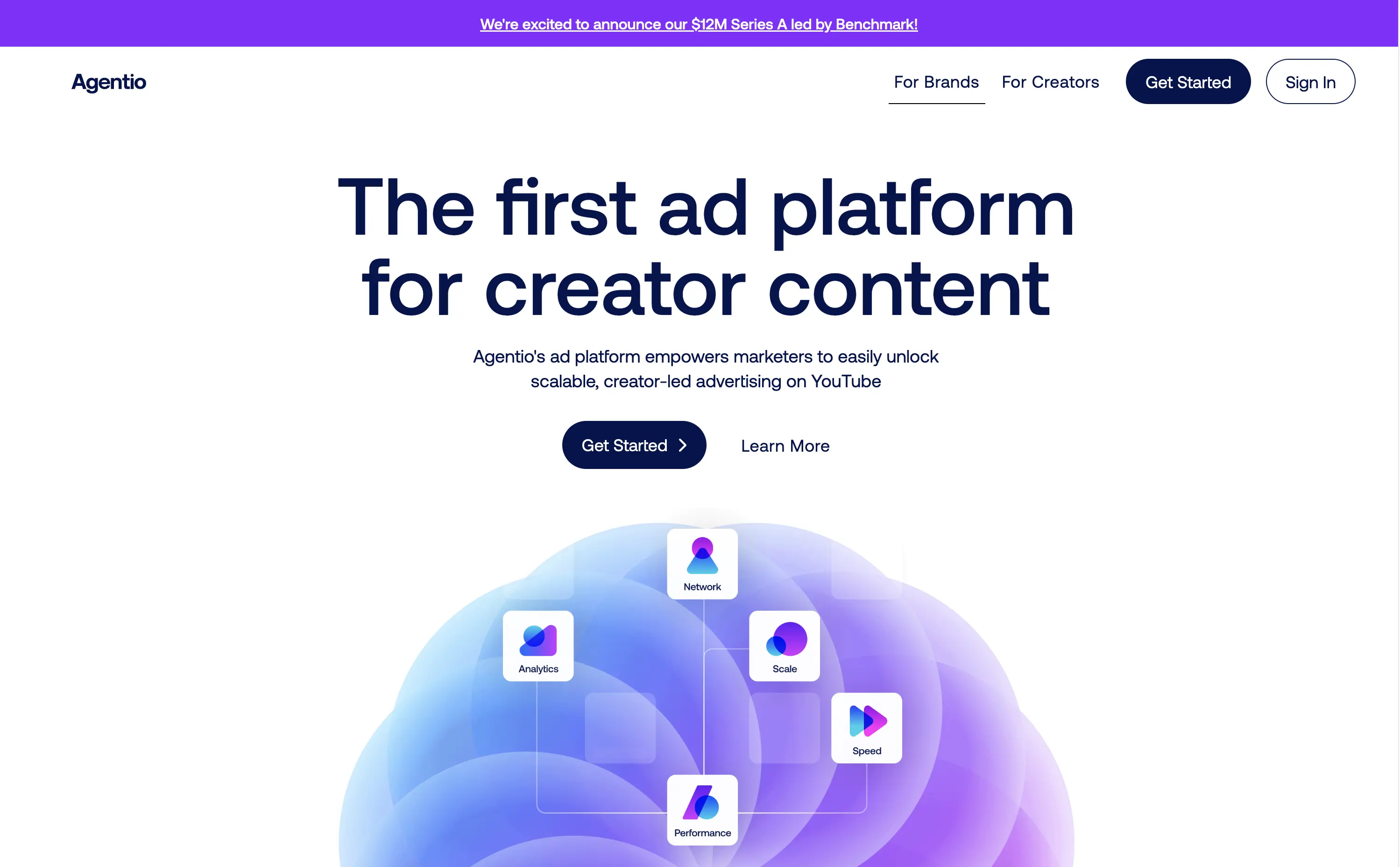
Agentio is an adtech platform helping marketers launch scalable, creator-led YouTube campaigns with performance tracking, analytics, and a managed network of creators.
Agentio’s hero is tight and intentional. The headline is clear and confident in its category claim. Subtext adds usability context without overloading. The floating orb graphic with ecosystem icons effectively visualizes the product promise. Dual CTAs cover both high and low-intent traffic. The announcement bar adds momentum without distraction. Layout feels modern and founder-backed — clean, but not generic.
Strong product-market fit vibes. Balances clarity and momentum for both creators and marketers. Visuals align with startup scaleup phase. Messaging is sharply angled to claim an early stake in the creator-led ad space.
This layout balances technical utility with human impact, aligning well with Algolia’s positioning as an API-first but UX-aware company. The mobile UI reinforces product value visually, while the logo wall signals scale and trust for enterprise buyers. The tone is clear, benefit-led, and appropriate for high-intent decision-makers evaluating AI tools for customer experience. This is a solid enterprise-facing hero built to perform.
Agentio
↗
SaaS
AI Tools
Creator Tools
Centered
Bold & Direct
Confident
Multi-CTA Block
Illustration
Announcement
Gradient
Light Mode
Blue
Purple
Sans serif
Hybrid
Home Page
Webflow
orb graphic, YouTube ads, creator economy, motion gradient, AI ad platform, minimal layout, startup vibe, polished MVP, Series A, dual audience nav, split funnel intent
Agentio is an adtech platform helping marketers launch scalable, creator-led YouTube campaigns with performance tracking, analytics, and a managed network of creators.
Agentio’s hero is tight and intentional. The headline is clear and confident in its category claim. Subtext adds usability context without overloading. The floating orb graphic with ecosystem icons effectively visualizes the product promise. Dual CTAs cover both high and low-intent traffic. The announcement bar adds momentum without distraction. Layout feels modern and founder-backed — clean, but not generic.
Strong product-market fit vibes. Balances clarity and momentum for both creators and marketers. Visuals align with startup scaleup phase. Messaging is sharply angled to claim an early stake in the creator-led ad space.
This layout balances technical utility with human impact, aligning well with Algolia’s positioning as an API-first but UX-aware company. The mobile UI reinforces product value visually, while the logo wall signals scale and trust for enterprise buyers. The tone is clear, benefit-led, and appropriate for high-intent decision-makers evaluating AI tools for customer experience. This is a solid enterprise-facing hero built to perform.
Bubble
↗
DevTools
AI Tools
No-Code
Centered
Bold & Direct
Empowering
Single Button
Product UI
Custom Animation
Gradient
Light Mode
Blue
Purple
Sans serif
B2B
Home Page
Bubble
AI builder, no-code SaaS, non-technical founders, drag-and-drop, scalable apps, visual editor, early-stage startups, animated hero, prompt-to-app, AI UI assistant, builder tools, onboarding ease, trusted platform, app generation, UX demo
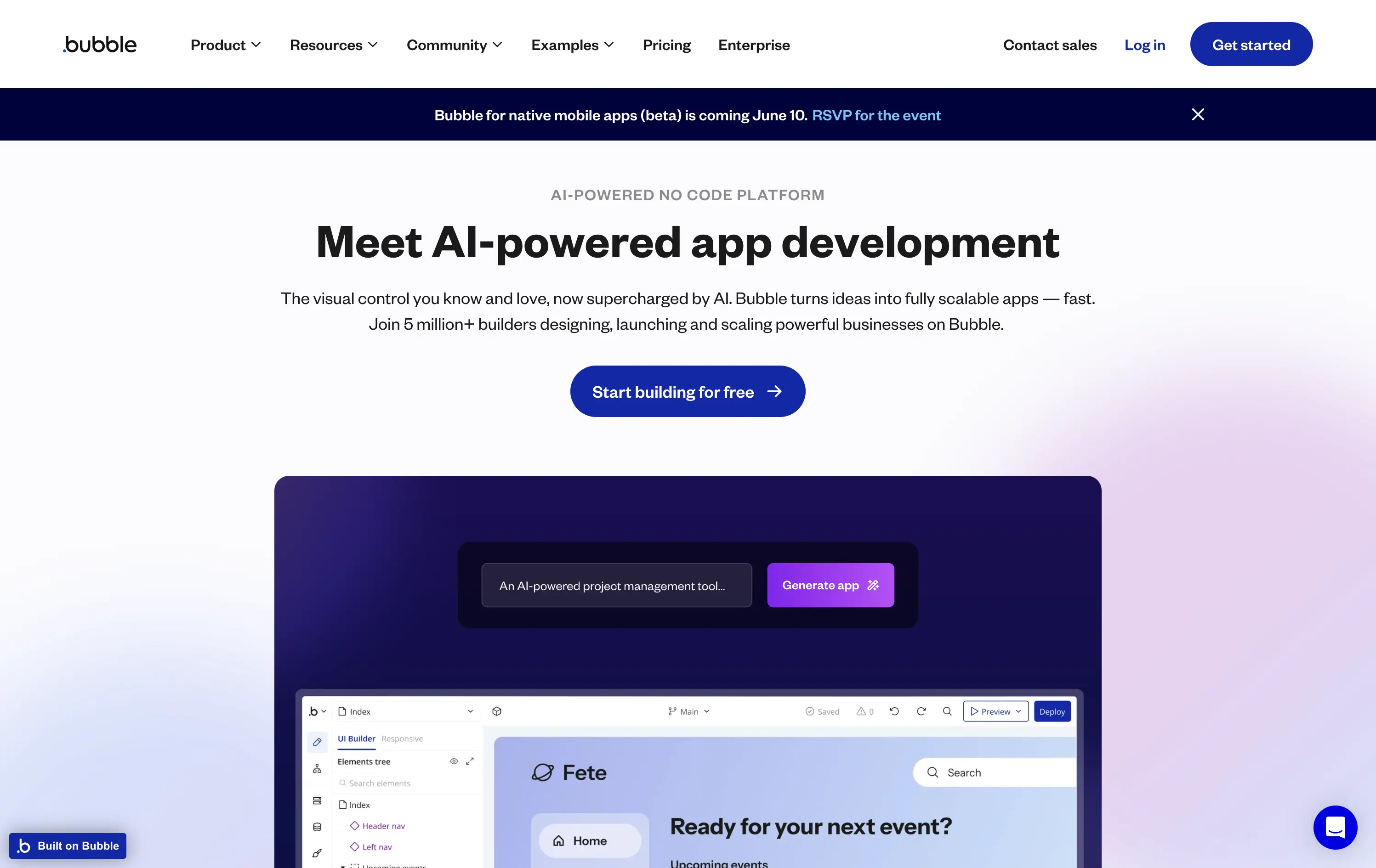
Bubble lets anyone build scalable web apps using visual tools, now enhanced with AI that turns plain text into functional components.
The hero is clear and functional, emphasizing AI-enhanced app creation for non-technical users. The animation showcases familiar product patterns with a magic twist — turning text prompts into real UI. The visual reinforces the platform’s promise. The CTA is focused, and social proof is implied through scale messaging (“5 million+ builders”).
Smart repositioning move for a no-code pioneer. The AI angle broadens appeal to early-stage founders, while preserving Bubble’s long-standing brand equity in drag-and-drop development.
This layout balances technical utility with human impact, aligning well with Algolia’s positioning as an API-first but UX-aware company. The mobile UI reinforces product value visually, while the logo wall signals scale and trust for enterprise buyers. The tone is clear, benefit-led, and appropriate for high-intent decision-makers evaluating AI tools for customer experience. This is a solid enterprise-facing hero built to perform.
Bubble
↗
DevTools
AI Tools
No-Code
Centered
Bold & Direct
Empowering
Single Button
Product UI
Custom Animation
Gradient
Light Mode
Blue
Purple
Sans serif
B2B
Home Page
Bubble
AI builder, no-code SaaS, non-technical founders, drag-and-drop, scalable apps, visual editor, early-stage startups, animated hero, prompt-to-app, AI UI assistant, builder tools, onboarding ease, trusted platform, app generation, UX demo
Bubble lets anyone build scalable web apps using visual tools, now enhanced with AI that turns plain text into functional components.
The hero is clear and functional, emphasizing AI-enhanced app creation for non-technical users. The animation showcases familiar product patterns with a magic twist — turning text prompts into real UI. The visual reinforces the platform’s promise. The CTA is focused, and social proof is implied through scale messaging (“5 million+ builders”).
Smart repositioning move for a no-code pioneer. The AI angle broadens appeal to early-stage founders, while preserving Bubble’s long-standing brand equity in drag-and-drop development.
This layout balances technical utility with human impact, aligning well with Algolia’s positioning as an API-first but UX-aware company. The mobile UI reinforces product value visually, while the logo wall signals scale and trust for enterprise buyers. The tone is clear, benefit-led, and appropriate for high-intent decision-makers evaluating AI tools for customer experience. This is a solid enterprise-facing hero built to perform.
Lettuce
↗
SaaS
Fintech
Split Grid
Left-aligned
Benefit-Driven
Bold & Direct
Single Button
Photography
Logo Wall
Product UI
Duotone
Green
Display
B2C
Home Page
Custom Code
solo business finance, tax automation, self-employed SaaS, conversion-focused layout, AI accounting, ROI-driven copy, playful branding, savings calculator CTA, solo founder tools, dark green palette, clear value prop, direct tone, press trust bar, mobile-first product
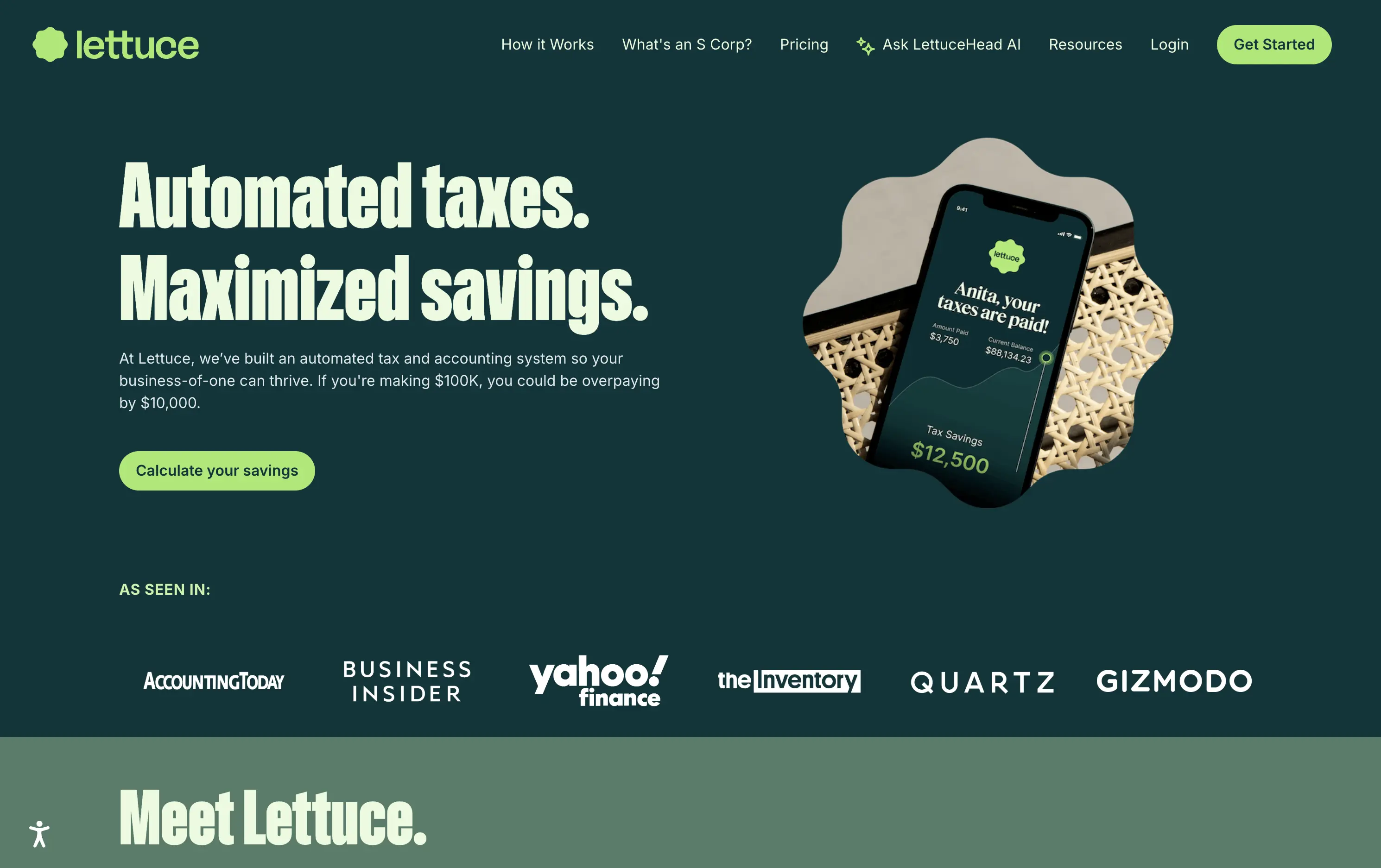
Lettuce is an automated tax and accounting platform built for solo business owners, helping them save thousands by optimizing how they pay taxes.
The hero is assertive, clear, and benefit-led. “Automated taxes. Maximized savings.” lands immediately, and the subhead explains who it's for and what they’re losing without it. The savings figure on the phone mockup reinforces the pitch visually. The “Calculate your savings” CTA is strong and personalized. Overall, the layout moves fast and speaks directly to freelancers and solo operators.
Perfectly tuned for time-poor, outcome-driven solopreneurs. Uses clear math ($10k in savings) and visual cues (mobile UI, dollar figures) to make the benefit feel tangible. Smart alignment of tone, layout, and buyer urgency.
This layout balances technical utility with human impact, aligning well with Algolia’s positioning as an API-first but UX-aware company. The mobile UI reinforces product value visually, while the logo wall signals scale and trust for enterprise buyers. The tone is clear, benefit-led, and appropriate for high-intent decision-makers evaluating AI tools for customer experience. This is a solid enterprise-facing hero built to perform.
Lettuce
↗
SaaS
Fintech
Split Grid
Left-aligned
Benefit-Driven
Bold & Direct
Single Button
Photography
Logo Wall
Product UI
Duotone
Green
Display
B2C
Home Page
Custom Code
solo business finance, tax automation, self-employed SaaS, conversion-focused layout, AI accounting, ROI-driven copy, playful branding, savings calculator CTA, solo founder tools, dark green palette, clear value prop, direct tone, press trust bar, mobile-first product
Lettuce is an automated tax and accounting platform built for solo business owners, helping them save thousands by optimizing how they pay taxes.
The hero is assertive, clear, and benefit-led. “Automated taxes. Maximized savings.” lands immediately, and the subhead explains who it's for and what they’re losing without it. The savings figure on the phone mockup reinforces the pitch visually. The “Calculate your savings” CTA is strong and personalized. Overall, the layout moves fast and speaks directly to freelancers and solo operators.
Perfectly tuned for time-poor, outcome-driven solopreneurs. Uses clear math ($10k in savings) and visual cues (mobile UI, dollar figures) to make the benefit feel tangible. Smart alignment of tone, layout, and buyer urgency.
This layout balances technical utility with human impact, aligning well with Algolia’s positioning as an API-first but UX-aware company. The mobile UI reinforces product value visually, while the logo wall signals scale and trust for enterprise buyers. The tone is clear, benefit-led, and appropriate for high-intent decision-makers evaluating AI tools for customer experience. This is a solid enterprise-facing hero built to perform.
Flora AI
↗
AI Tools
Collaboration
Creative Tools
Centered
Bold & Direct
Aspirational
Multi-CTA Block
Logo Wall
Product UI
Custom Animation
Dark Mode
White
Sans serif
Hybrid
Home Page
Custom Code
AI creative suite, dark mode, studio audience, high-contrast UI, high-trust logos, Figma-adjacent design, minimal copy, serious tone, tool for creators, productivity signal, elegant layout, launch announcement
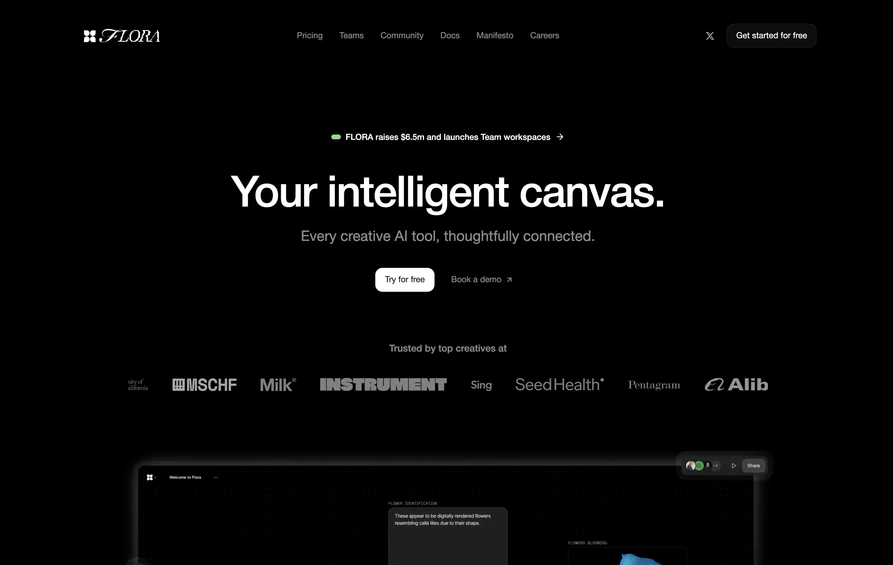
Flora is an AI-powered workspace designed for creatives to ideate, visualize, and connect ideas on a shared intelligent canvas.
The hero pairs abstract positioning with subtle product proof. The headline is conceptual yet grounded by a clear subheadline and conversion-friendly CTA layout. Surreal AI-generated flower animations subtly showcase new-gen UX thinking—meant to spark imagination, not just drive efficiency. Real-time collaboration visuals offer credibility. Trust logos lend early validation. Layout is calm and deliberate, giving room for the idea of a “thoughtfully connected” tool to breathe.
The layout signals a premium, vision-led AI product for creative teams. Abstract yet functional, it balances aspirational positioning with clear proof. Ideal for early adopters in design-forward or innovation-heavy spaces.
This layout balances technical utility with human impact, aligning well with Algolia’s positioning as an API-first but UX-aware company. The mobile UI reinforces product value visually, while the logo wall signals scale and trust for enterprise buyers. The tone is clear, benefit-led, and appropriate for high-intent decision-makers evaluating AI tools for customer experience. This is a solid enterprise-facing hero built to perform.
Flora AI
↗
AI Tools
Collaboration
Creative Tools
Centered
Bold & Direct
Aspirational
Multi-CTA Block
Logo Wall
Product UI
Custom Animation
Dark Mode
White
Sans serif
Hybrid
Home Page
Custom Code
AI creative suite, dark mode, studio audience, high-contrast UI, high-trust logos, Figma-adjacent design, minimal copy, serious tone, tool for creators, productivity signal, elegant layout, launch announcement
Flora is an AI-powered workspace designed for creatives to ideate, visualize, and connect ideas on a shared intelligent canvas.
The hero pairs abstract positioning with subtle product proof. The headline is conceptual yet grounded by a clear subheadline and conversion-friendly CTA layout. Surreal AI-generated flower animations subtly showcase new-gen UX thinking—meant to spark imagination, not just drive efficiency. Real-time collaboration visuals offer credibility. Trust logos lend early validation. Layout is calm and deliberate, giving room for the idea of a “thoughtfully connected” tool to breathe.
The layout signals a premium, vision-led AI product for creative teams. Abstract yet functional, it balances aspirational positioning with clear proof. Ideal for early adopters in design-forward or innovation-heavy spaces.
This layout balances technical utility with human impact, aligning well with Algolia’s positioning as an API-first but UX-aware company. The mobile UI reinforces product value visually, while the logo wall signals scale and trust for enterprise buyers. The tone is clear, benefit-led, and appropriate for high-intent decision-makers evaluating AI tools for customer experience. This is a solid enterprise-facing hero built to perform.
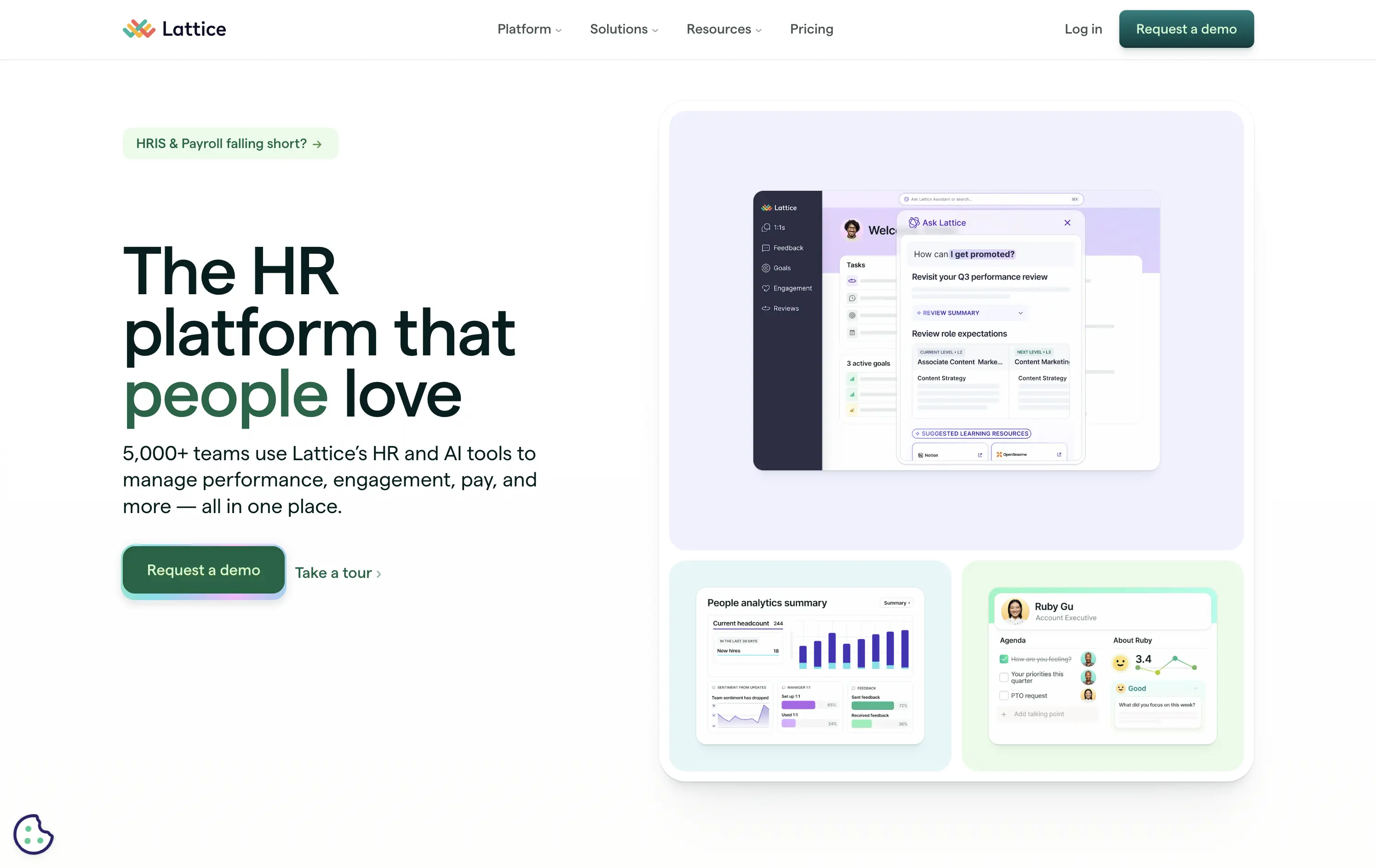
Lattice
↗
SaaS
HR/People Tech
Bento
Left-aligned
Benefit-Driven
Bold & Direct
Multi-CTA Block
Media Gallery
Product UI
Light Mode
Green
Sans serif
B2B
Home Page
Webflow
HR software, performance management, workplace culture, AI-assisted HR, clean layout, emotion-forward, team tools, modern UX, soft color palette, trust-led, subtle AI integration, employee experience, people-first platform
Lattice is an all-in-one people platform helping companies manage performance, engagement, growth, and compensation in one streamlined space.
Headline is short and sticky. The visual weight leans toward clarity and warmth. Product UI is legible and softly styled. Strong CTA placement plus secondary path shows understanding of buyer stages.
Effectively balances performance-driven HR with emotional resonance. Smart for leadership stakeholders seeking culture and efficiency. Visuals support modernity without overwhelming.
This layout balances technical utility with human impact, aligning well with Algolia’s positioning as an API-first but UX-aware company. The mobile UI reinforces product value visually, while the logo wall signals scale and trust for enterprise buyers. The tone is clear, benefit-led, and appropriate for high-intent decision-makers evaluating AI tools for customer experience. This is a solid enterprise-facing hero built to perform.
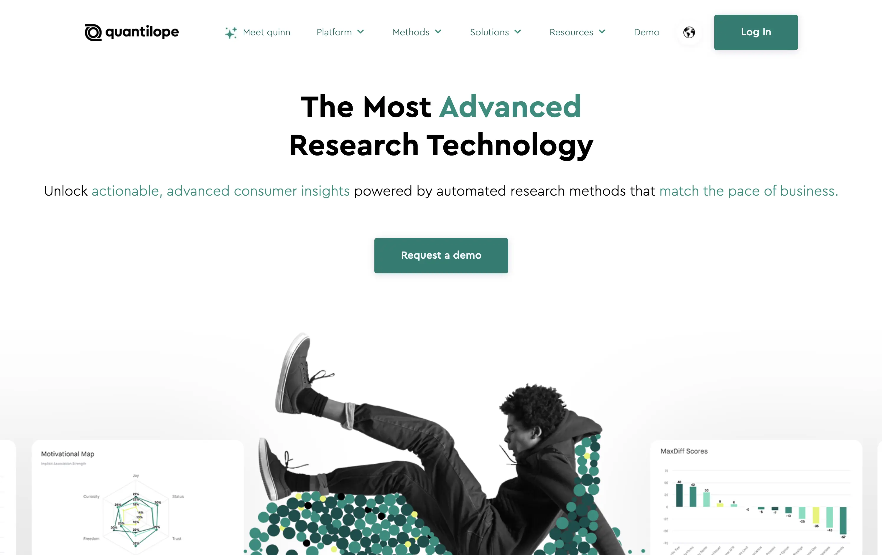
Quantilope
↗
SaaS
AI Tools
Data & Analytics
Centered
Bold & Direct
Confident
Single Button
Photography
Illustration
Product UI
Light Mode
Green
Sans serif
B2B
Home Page
Custom Code
research SaaS, data platform hero, quant marketing, teal hero, minimal SaaS layout, B2B insights platform, insight automation, animated data graphic, data-driven marketing, stat visual hero
Quantilope is an advanced research platform that automates consumer insights at scale.
The headline stakes a bold claim, and the teal accent draws focus to “advanced” and action keywords. Hero visual is a clever juxtaposition of human + data, adding some life to an otherwise data-heavy space. One clear CTA keeps the flow focused.
Aimed at marketing execs and insights leaders, the hero’s tone and layout signal speed, clarity, and data fluency. It balances modernity with professionalism, avoiding overdesign while staying sharp.
This layout balances technical utility with human impact, aligning well with Algolia’s positioning as an API-first but UX-aware company. The mobile UI reinforces product value visually, while the logo wall signals scale and trust for enterprise buyers. The tone is clear, benefit-led, and appropriate for high-intent decision-makers evaluating AI tools for customer experience. This is a solid enterprise-facing hero built to perform.
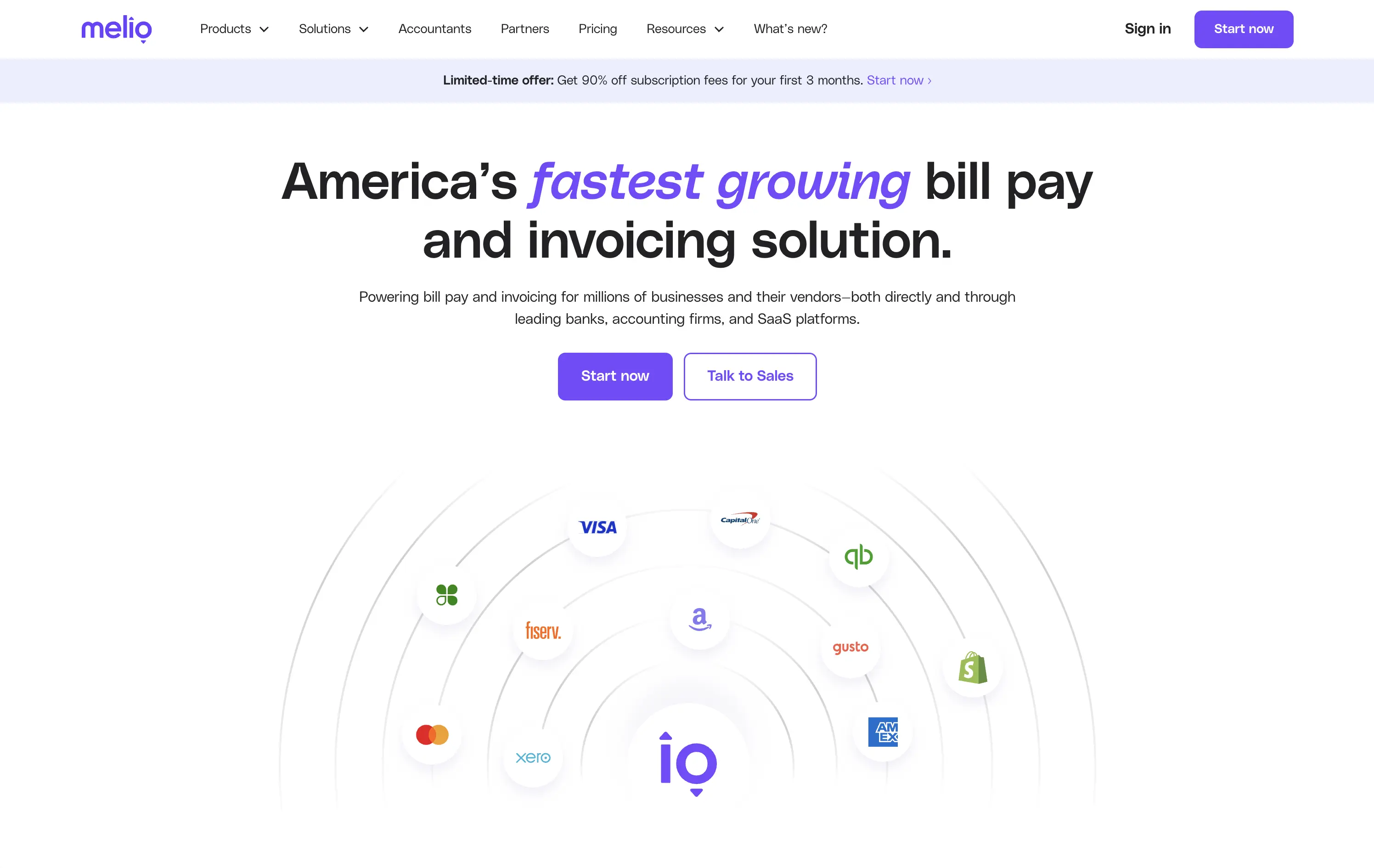
Melio
↗
SaaS
Fintech
Centered
Bold & Direct
Proof-Heavy
Multi-CTA Block
Logo Wall
Announcement
Light Mode
Purple
Sans serif
B2B
Home Page
Wordpress
bill pay, invoicing platform, small business payments, financial automation, AP/AR SaaS, vendor payments, accounting tools, QuickBooks integrations
Melio is a digital payment platform that simplifies bill pay and invoicing for small businesses and accounting teams.
Bold headline, partner logos, and focused CTAs create a strong first impression. The layout supports quick scanning and immediate action. Design choices signal reliability and scale without visual clutter.
Leverages third-party credibility to reduce friction for trust-based workflows. Dual CTA acknowledges buyer types. Layout and tone match the high-urgency, low-risk mindset of SMB finance leads.
This layout balances technical utility with human impact, aligning well with Algolia’s positioning as an API-first but UX-aware company. The mobile UI reinforces product value visually, while the logo wall signals scale and trust for enterprise buyers. The tone is clear, benefit-led, and appropriate for high-intent decision-makers evaluating AI tools for customer experience. This is a solid enterprise-facing hero built to perform.
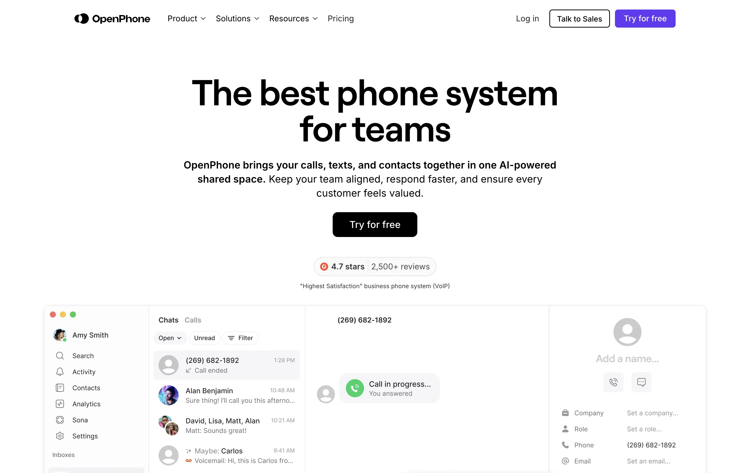
OpenPhone
↗
SaaS
Productivity
Centered
Bold & Direct
Confident
Single Button
Product UI
Social Proof
Light Mode
Purple
Black
Sans serif
B2B
Home Page
Webflow
business phone system, team communication, AI-enhanced calling, VoIP SaaS, minimalist hero, bold headline, trust rating, startup tools, shared inbox, clear CTA, conversion-focused, functional UI preview, modern enterprise utility
OpenPhone is a modern business phone system that unifies calls, texts, and contact management for growing teams.
Hero is bold and crystal clear. Headline makes a confident claim, immediately backed by product visuals and strong review stats. The black CTA button pops against the clean layout, driving clear intent.
Focused and direct for SMB and startup buyers. Hero supports bottom-of-funnel conversion. Minimalist visuals and rating badge project trust. Smart use of space for clarity and speed.
This layout balances technical utility with human impact, aligning well with Algolia’s positioning as an API-first but UX-aware company. The mobile UI reinforces product value visually, while the logo wall signals scale and trust for enterprise buyers. The tone is clear, benefit-led, and appropriate for high-intent decision-makers evaluating AI tools for customer experience. This is a solid enterprise-facing hero built to perform.
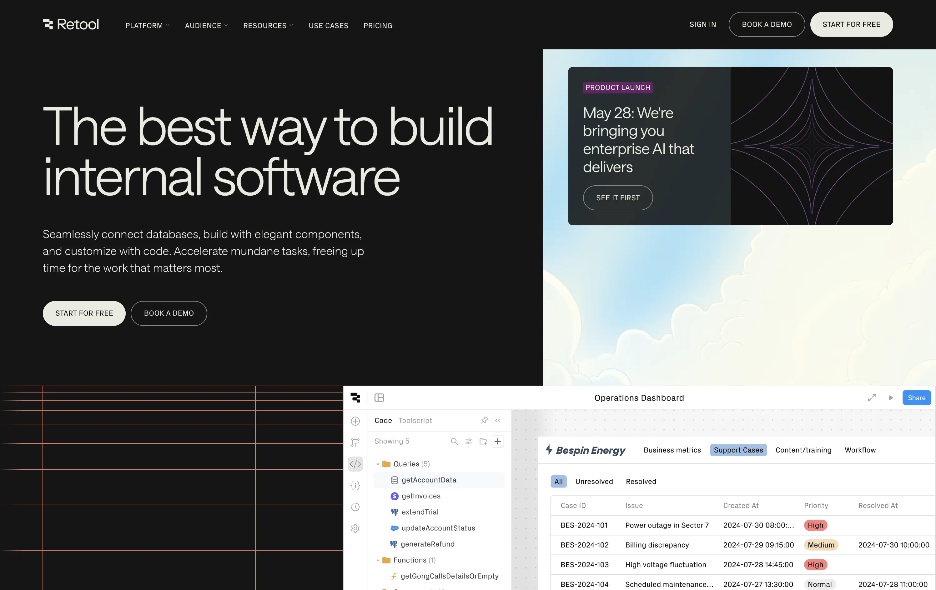
Retool
↗
SaaS
DevTools
Split Grid
Left-aligned
Bold & Direct
Multi-CTA Block
Product UI
Custom Animation
Dark Mode
White
Sans serif
B2B
Home Page
Custom Code
developer-first, dark UI, code-focused, internal tools, dashboard builder, multi-CTA, enterprise-ready, clear positioning, mature SaaS, custom UI, B2B, functional design, high-trust, productivity-focused, database-driven
Retool is a developer-first platform to quickly build and deploy internal tools using prebuilt components and direct database integration.
Headline is straightforward and credible. Hero splits brand positioning with active launch messaging, creating depth. Product UI preview is dense but legible. CTA structure clearly supports both self-serve and sales-led paths.
Hero speaks directly to high-intent technical users. Design, copy, and structure signal enterprise maturity. It's geared for developers, engineering leads, and CTOs looking for reliability and rapid deployment.
This layout balances technical utility with human impact, aligning well with Algolia’s positioning as an API-first but UX-aware company. The mobile UI reinforces product value visually, while the logo wall signals scale and trust for enterprise buyers. The tone is clear, benefit-led, and appropriate for high-intent decision-makers evaluating AI tools for customer experience. This is a solid enterprise-facing hero built to perform.
Chargebee
↗
SaaS
Fintech
Centered
Benefit-Driven
Bold & Direct
Multi-CTA Block
Photography
Logo Wall
Social Proof
Light Mode
Green
Orange
Sans serif
B2B
Home Page
Wordpress
B2B SaaS, billing automation, subscription platform, enterprise-ready, credibility-first, leadership positioning, founder imagery, logo wall, dual CTA, Gartner badge, G2 recognition, growth-focused messaging, recurring revenue
Chargebee helps businesses automate recurring billing, reduce churn, and scale subscription revenue through a trusted enterprise-ready platform.
The hero leads with a sharp, benefit-packed headline and backs it up with high-trust signals: real customer faces, name-brand logos, and third-party awards. The “Get a Demo” and “Free Trial” CTAs give users both enterprise and self-serve paths, but visual hierarchy between the two could be better balanced. Copy is outcome-focused and credible.
Smartly targeted at growth-stage and enterprise buyers, but the visual language undersells its category leadership. Strong content mix, but design lacks the presence or edge to reinforce premium positioning.
This layout balances technical utility with human impact, aligning well with Algolia’s positioning as an API-first but UX-aware company. The mobile UI reinforces product value visually, while the logo wall signals scale and trust for enterprise buyers. The tone is clear, benefit-led, and appropriate for high-intent decision-makers evaluating AI tools for customer experience. This is a solid enterprise-facing hero built to perform.
Cal.com
↗
SaaS
Productivity
Split Grid
Left-aligned
Bold & Direct
Multi-CTA Block
Product UI
Social Proof
Custom Animation
Badges
Light Mode
Black
Sans serif
Hybrid
Home Page
Framer
calendar booking, open source scheduler, clean aesthetic, lightweight onboarding, animated UI, trust-led design, Google sign-in, frictionless flow, developer-friendly, minimal layout, self-serve SaaS, cross-industry use cases, credibility-first, proof-based design
Cal.com is a fully customizable scheduling platform for individuals, teams, and developers—built for everything from calls to client bookings.
Clear headline paired with a minimalist aesthetic creates instant comprehension. The animated UI module smartly showcases varied use cases—from legal consults to photoshoots—broadening audience appeal. Trust badges build legitimacy, while “Sign up with Google” signals low-friction entry. Copy is functional and tight, and the centered layout maintains visual clarity without distraction.
The hero is focused and efficient. Clear headline, modular product UI, and direct signup flows drive intent. Trust logos and social proof add validation. UI previews reflect real-world use across industries. Nothing extraneous.
This layout balances technical utility with human impact, aligning well with Algolia’s positioning as an API-first but UX-aware company. The mobile UI reinforces product value visually, while the logo wall signals scale and trust for enterprise buyers. The tone is clear, benefit-led, and appropriate for high-intent decision-makers evaluating AI tools for customer experience. This is a solid enterprise-facing hero built to perform.
Plaid
↗
DevTools
Fintech
Data & Analytics
Left-aligned
Bold & Direct
Confident
Multi-CTA Block
Illustration
Interactive
Logo Wall
Gradient
Blue
Green
Sans serif
B2B
Home Page
Custom Code
developer fintech, API platform, financial data access, quirky fintech aesthetic, bold hero art, Benjamin Franklin illustration, smart finance tools, B2B API, trust logos, dev-first call to action, animated CTA, playful visual metaphor
Plaid is a data network that connects financial apps to users’ bank accounts securely and efficiently to power modern money experiences.
Plaid’s hero grabs attention with personality — Benjamin Franklin posing with an iPhone and some airpods, wrapped in a swirling gradient background. But it’s not just noise. The headline instantly communicates product value and the CTA contrast (“Talk to our team” vs. “Start building”) serves both enterprise and self-serve tracks. Logo wall underlines legitimacy. It’s high-impact and instantly memorable.
Plaid positions itself as the modern infrastructure backbone of fintech. The visual and messaging mix signals credibility, tech depth, and cultural fluency — ideal for both new gen founders.
This layout balances technical utility with human impact, aligning well with Algolia’s positioning as an API-first but UX-aware company. The mobile UI reinforces product value visually, while the logo wall signals scale and trust for enterprise buyers. The tone is clear, benefit-led, and appropriate for high-intent decision-makers evaluating AI tools for customer experience. This is a solid enterprise-facing hero built to perform.
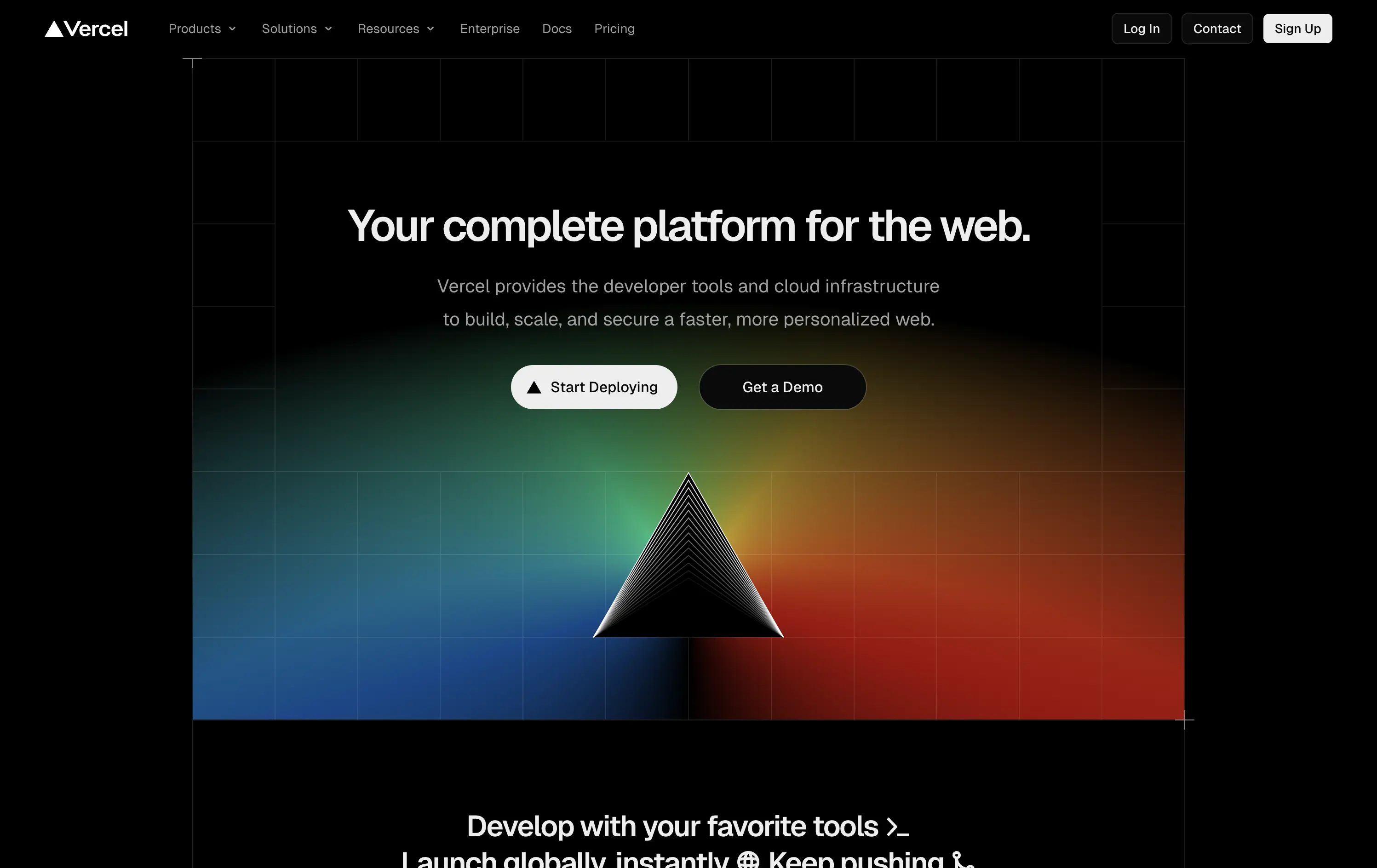
Vercel
↗
SaaS
DevTools
Centered
Bold & Direct
Multi-CTA Block
Illustration
Gradient
Dark Mode
White
Black
Sans serif
B2B
Home Page
Custom Code
developer-first, dark UI, iconic branding, gradient background, clean copy, deploy-focused, modern SaaS, performance tooling, enterprise appeal, visual impact, prism hero, action-oriented
Vercel gives developers the tools to build, deploy, and scale high-performance web apps with ease and speed.
The hero delivers immediate clarity: who it’s for, what it does, and how to get started. The dark UI, glowing visuals, and sharp copy create instant trust. Dual CTAs smartly capture both trial users and enterprise prospects.
A focused, no-fluff entry point optimized for developer decision speed. Brand expression is strong, conversion is easy, and the layout avoids distraction. Built for high-intent audiences evaluating deployment solutions.
This layout balances technical utility with human impact, aligning well with Algolia’s positioning as an API-first but UX-aware company. The mobile UI reinforces product value visually, while the logo wall signals scale and trust for enterprise buyers. The tone is clear, benefit-led, and appropriate for high-intent decision-makers evaluating AI tools for customer experience. This is a solid enterprise-facing hero built to perform.
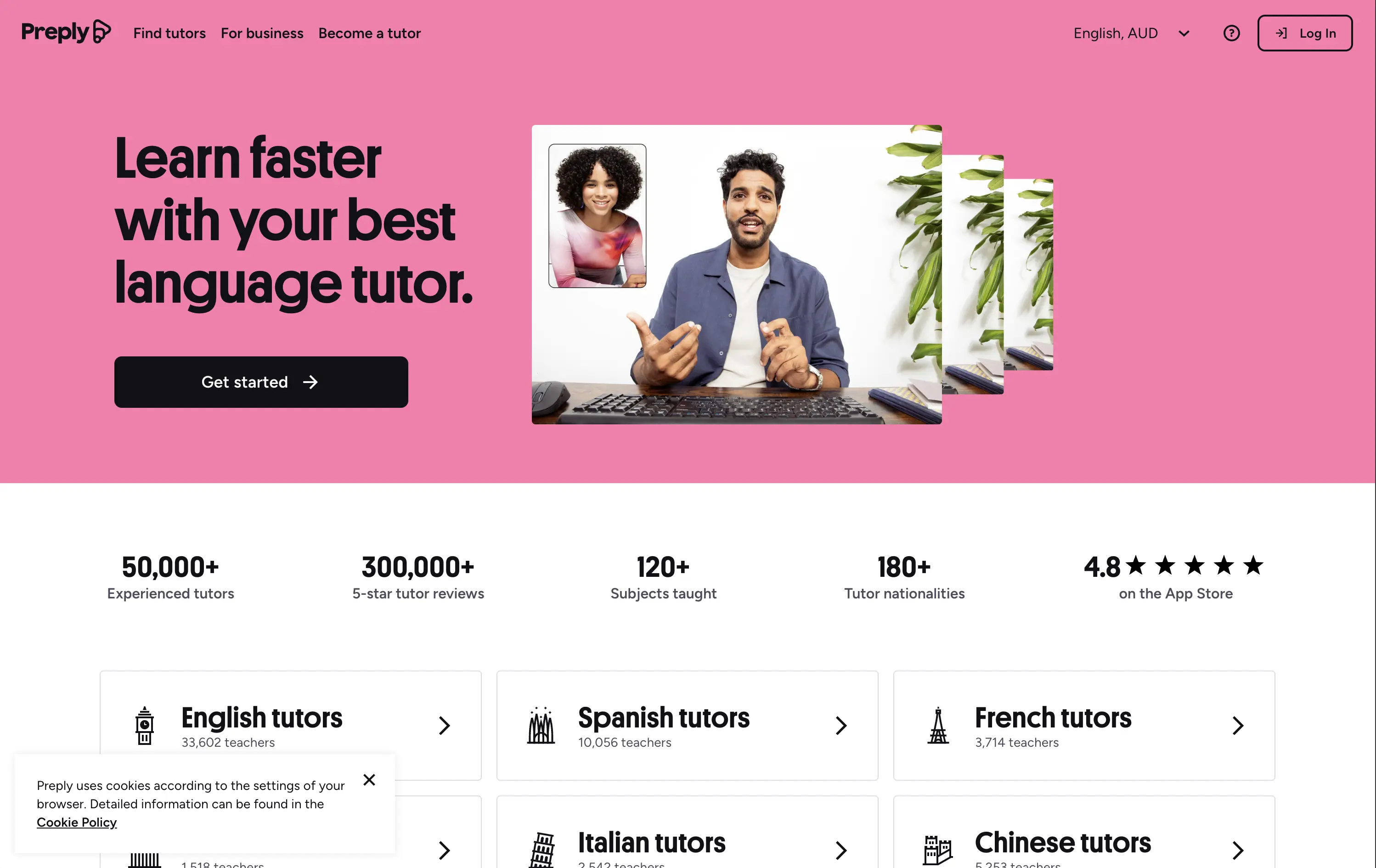
Preply
↗
Education
Left-aligned
Benefit-Driven
Single Button
Photography
Live Metrics
Social Proof
Light Mode
Pink
Black
Home Page
Custom Code
language tutor, online learning, marketplace hero, bold color hero, pink web design, conversational UI, Gen Z UX, bold CTA, tutoring platform, live teaching, zoom call visual, metrics trust banner, marketplace product
Preply is an online learning platform that connects learners with expert language tutors for personalized one-on-one lessons.
This hero punches through with its candy-pink backdrop — a rare choice for marketplaces but totally intentional. The layout is simple, but the stacked imagery still adds dynamism. Stats like “300,000+ 5-star reviews” and “180+ tutor nationalities” instantly establish credibility. The CTA is minimal and clearly actionable. Overall, the tone is upbeat, modern, and universally accessible — ideal for a cross-border education platform aiming to feel both trustworthy and welcoming.
Hero balances global scale with simplicity. Design and tone cater to international learners of all ages. Trust is built through numbers, while layout minimizes friction for new users.
This layout balances technical utility with human impact, aligning well with Algolia’s positioning as an API-first but UX-aware company. The mobile UI reinforces product value visually, while the logo wall signals scale and trust for enterprise buyers. The tone is clear, benefit-led, and appropriate for high-intent decision-makers evaluating AI tools for customer experience. This is a solid enterprise-facing hero built to perform.
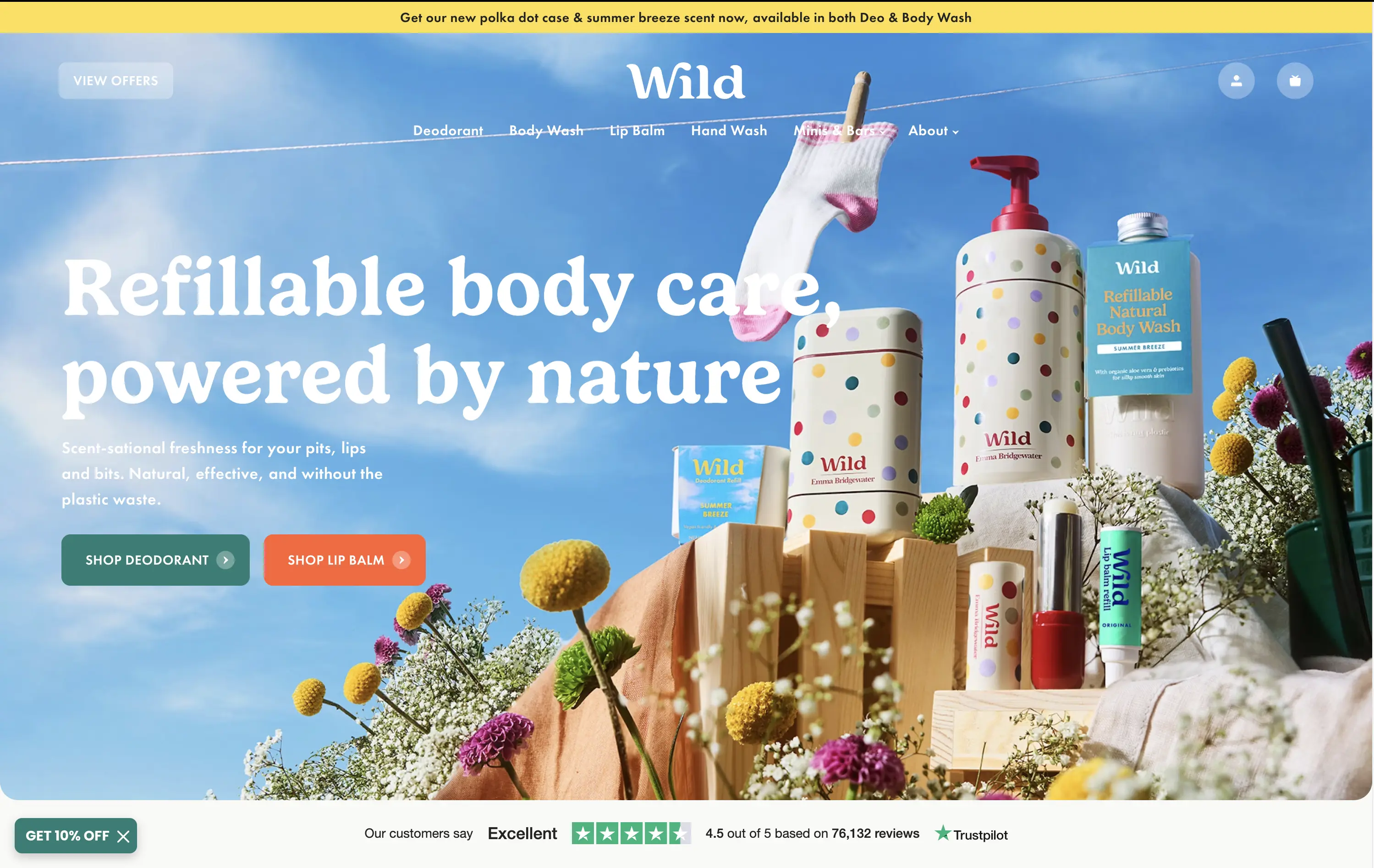
Wild
↗
CPG
Beauty & Wellness
Sustainability
Full Width
Left-aligned
Bold & Direct
Multi-CTA Block
Social Proof
Announcement
Imagery-Based
Green
Orange
Serif
DTC
Home Page
Shopify
eco-conscious, refillable packaging, summer aesthetic, photo-based hero, colorful packaging, nature-forward, trustbar visible, multi-CTA, DTC beauty, vibrant product shot, planet-positive, sunlit tone, clean bodycare
Wild offers refillable personal care products that are plastic-free, eco-friendly, and designed for everyday routines.
Bright, joyful photography captures the brand’s eco-fresh ethos while showcasing the full product range in one glance. Bold headline contrasts nicely with the sky backdrop, and CTAs are well-placed for quick shopper entry. Trustpilot widget reinforces credibility. While it’s vibrant and approachable, background details might slightly interfere with copy clarity on smaller screens.
Clear value prop and visual narrative tailored to eco-conscious DTC buyers. Emotional appeal (freshness, fun, nature) is balanced with proof (Trustpilot) and conversion intent. Could improve copy visibility slightly on mobile.
This layout balances technical utility with human impact, aligning well with Algolia’s positioning as an API-first but UX-aware company. The mobile UI reinforces product value visually, while the logo wall signals scale and trust for enterprise buyers. The tone is clear, benefit-led, and appropriate for high-intent decision-makers evaluating AI tools for customer experience. This is a solid enterprise-facing hero built to perform.
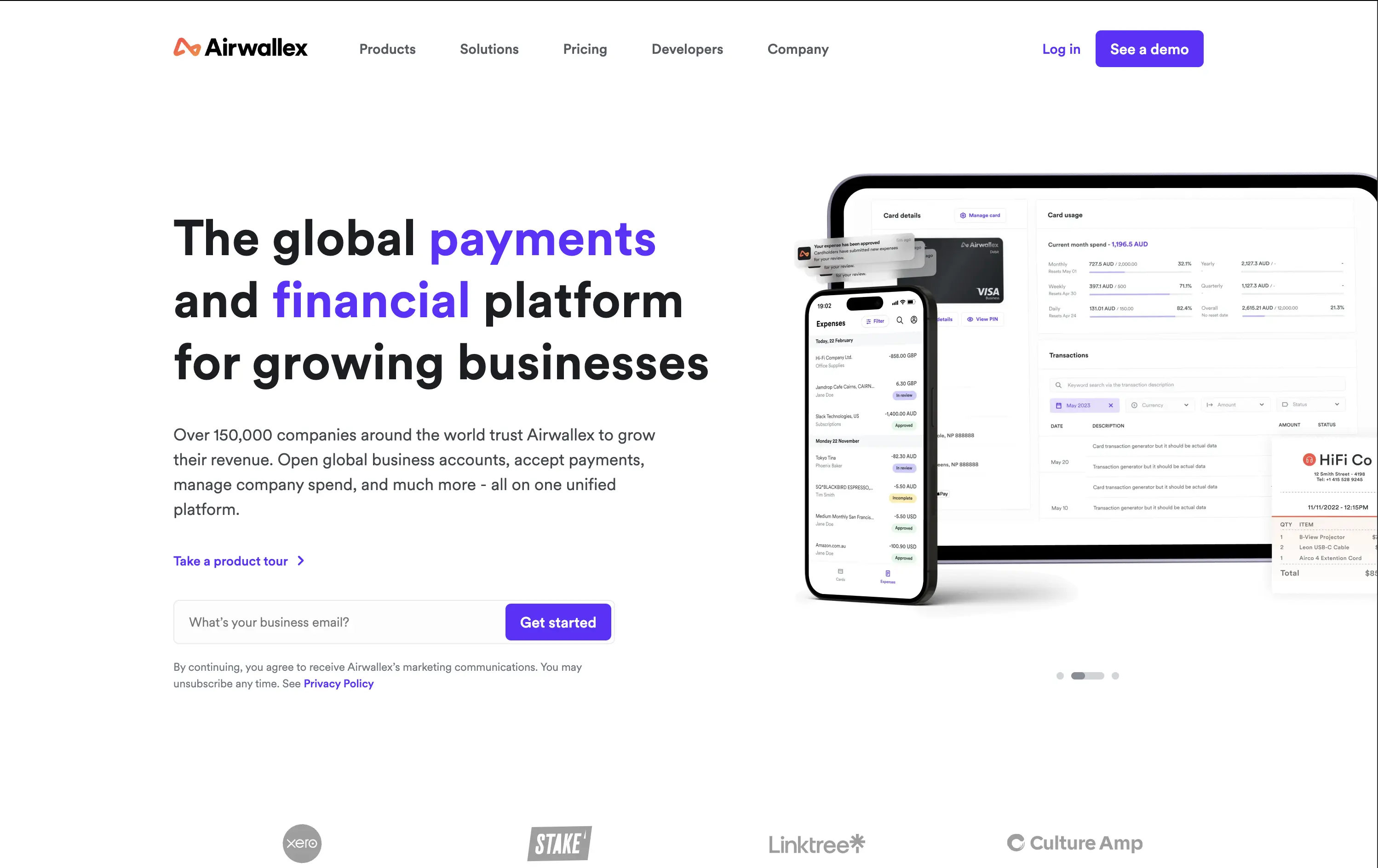
Airwallex
↗
SaaS
Fintech
Split Grid
Left-aligned
Bold & Direct
Email Capture
Logo Wall
Product UI
Social Proof
Light Mode
Purple
Sans serif
B2B
Home Page
Custom Code
global payments, business finance platform, modern fintech, trust-first messaging, clear value prop, multi-CTA, enterprise growth focus, mobile-first UI, clean grid, bold headline, subtle social proof, form-first hero, platform consolidation
Airwallex helps businesses grow globally by simplifying payments, expenses, and financial operations in one platform.
The hero is clean, confident, and product-led. It showcases both mobile and desktop views, reinforcing versatility. The email CTA is low-friction and conversion-ready. Copy hits major trust levers—global scale, growth, and simplicity—without bloating.
Well-calibrated for a mid-to-enterprise audience seeking global financial control. It’s benefit-led without hyperbole and supports multiple buyer types with a calm, scalable tone. The product visuals back up the value promise.
This layout balances technical utility with human impact, aligning well with Algolia’s positioning as an API-first but UX-aware company. The mobile UI reinforces product value visually, while the logo wall signals scale and trust for enterprise buyers. The tone is clear, benefit-led, and appropriate for high-intent decision-makers evaluating AI tools for customer experience. This is a solid enterprise-facing hero built to perform.
The most effective hero sections in your inbox.
Monthly round up of top hero sections.
Don't worry. We hate spam too.
Don't worry. We hate spam too.
Don't worry. We hate spam too.