Wordpress
8
8
8
8
Broad and flexible — from blogs to enterprise sites to content hubs.
Filters
Cosmos
↗
SaaS
Creative Tools
Centered
Descriptive
Scroll Prompt
Interactive
Custom Animation
3D visuals
Dark Mode
White
Sans serif
B2C
Home Page
Wordpress
3D animation, immersive experience, visual discovery engine, artist-first, gallery feel, dark mode default, cinematic hero, soft motion, ambient design, identity-led, scroll-to-enter, creative tech
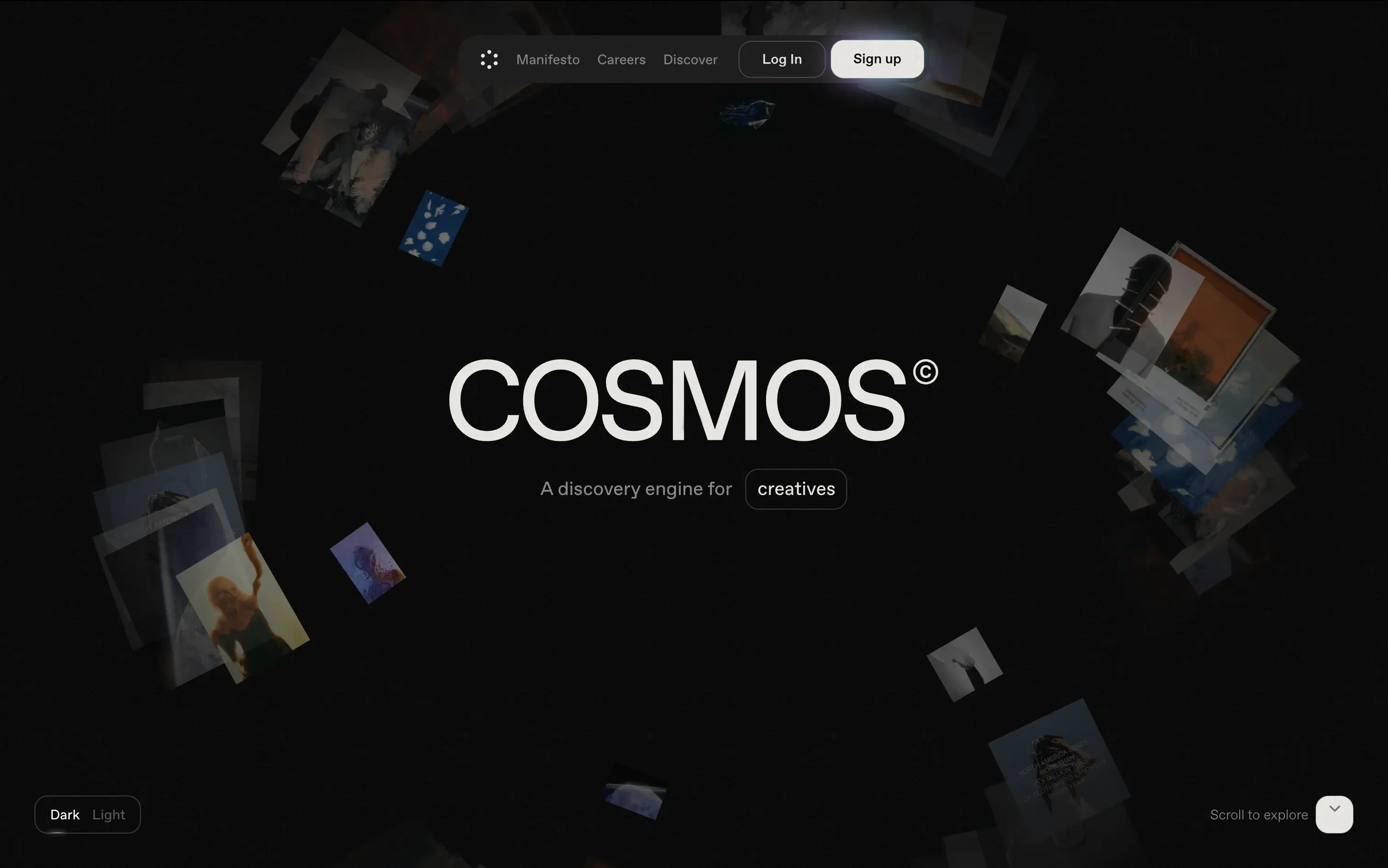
Cosmos is a discovery engine for creatives, helping them explore curated visuals and inspiration in an immersive format.
The hero trades clarity for vibe—but does it with intention. The slow, 3D-style animation invites exploration. There's no CTA push, just immersion. Ideal for creatives looking to feel, not be sold to.
A brand-first, emotion-forward approach that’s clearly designed for visual creatives. The tone and treatment filter out non-ideal users early—this isn’t for the productivity crowd.
This layout balances technical utility with human impact, aligning well with Algolia’s positioning as an API-first but UX-aware company. The mobile UI reinforces product value visually, while the logo wall signals scale and trust for enterprise buyers. The tone is clear, benefit-led, and appropriate for high-intent decision-makers evaluating AI tools for customer experience. This is a solid enterprise-facing hero built to perform.
Cosmos
↗
SaaS
Creative Tools
Centered
Descriptive
Scroll Prompt
Interactive
Custom Animation
3D visuals
Dark Mode
White
Sans serif
B2C
Home Page
Wordpress
3D animation, immersive experience, visual discovery engine, artist-first, gallery feel, dark mode default, cinematic hero, soft motion, ambient design, identity-led, scroll-to-enter, creative tech
Cosmos is a discovery engine for creatives, helping them explore curated visuals and inspiration in an immersive format.
The hero trades clarity for vibe—but does it with intention. The slow, 3D-style animation invites exploration. There's no CTA push, just immersion. Ideal for creatives looking to feel, not be sold to.
A brand-first, emotion-forward approach that’s clearly designed for visual creatives. The tone and treatment filter out non-ideal users early—this isn’t for the productivity crowd.
This layout balances technical utility with human impact, aligning well with Algolia’s positioning as an API-first but UX-aware company. The mobile UI reinforces product value visually, while the logo wall signals scale and trust for enterprise buyers. The tone is clear, benefit-led, and appropriate for high-intent decision-makers evaluating AI tools for customer experience. This is a solid enterprise-facing hero built to perform.
Gong
↗
SaaS
AI Tools
Productivity
Split Grid
Left-aligned
Benefit-Driven
Confident
Single Button
Photography
Illustration
Logo Wall
Announcement
Duotone
Blue
Purple
Sans serif
B2B
Home Page
Wordpress
sales AI, B2B revenue platform, utility CTA, animated overlays, client logos, enterprise trust signals, AI productivity agents, dark gradient palette, conversational UI, split hero grid, vibrant lighting, modern SaaS, sales enablement, motion interface cues, product-forward layout
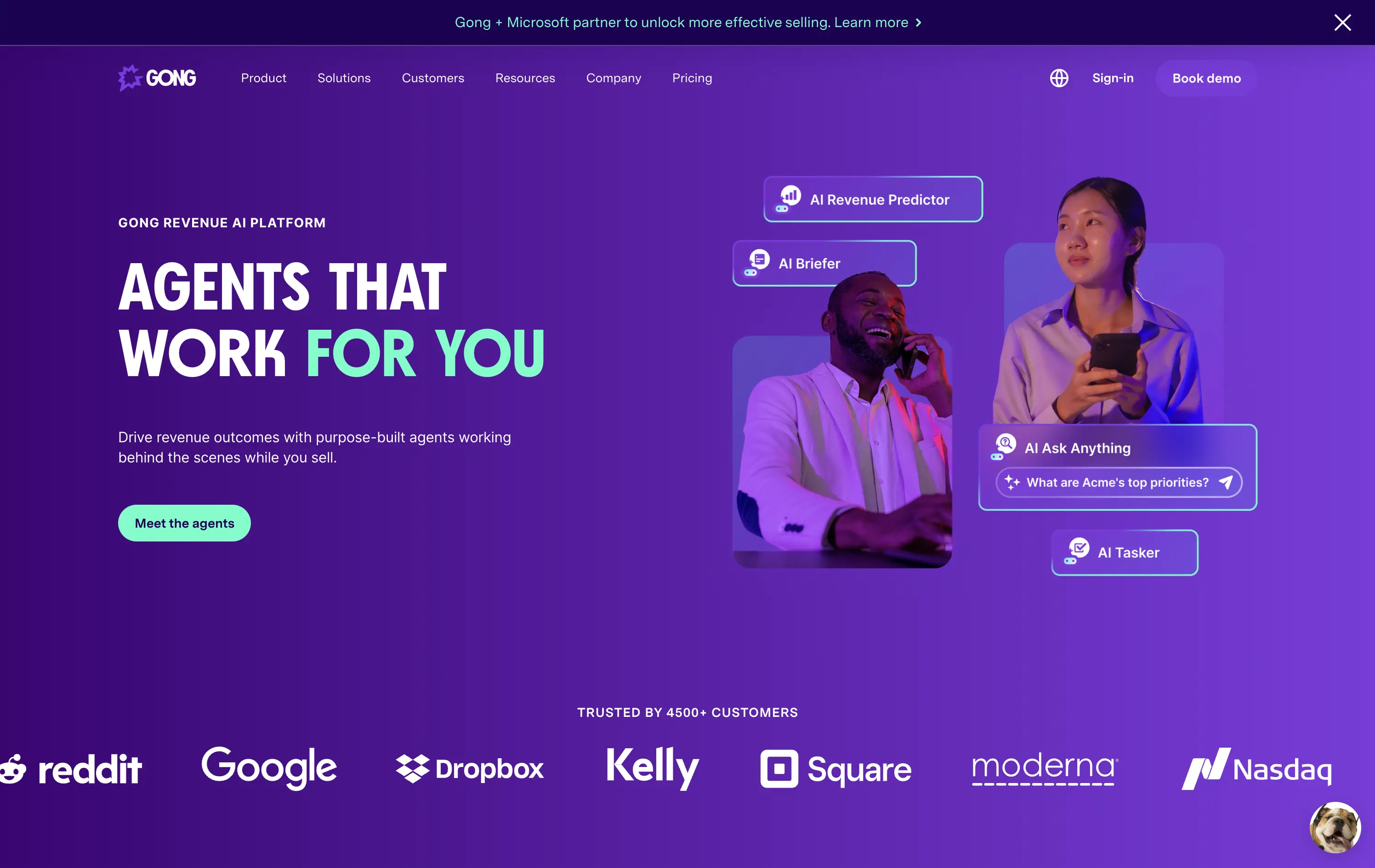
Gong helps sales teams boost revenue by deploying AI-powered agents that automate insights, prep, and task handling across the sales cycle.
The hero is clear and conversion-aware. Headline delivers a confident value prop, supported by animated tooltips that make the product’s AI capabilities tangible. The “Meet the agents” CTA invites deeper engagement. Strong use of customer logos boosts enterprise credibility. Overall, it's tight, modern, and visually active without overwhelming.
Tailored for mid-to-late funnel enterprise leads. High-trust layout and confident tone reflect maturity and market leadership in B2B sales tech.
This layout balances technical utility with human impact, aligning well with Algolia’s positioning as an API-first but UX-aware company. The mobile UI reinforces product value visually, while the logo wall signals scale and trust for enterprise buyers. The tone is clear, benefit-led, and appropriate for high-intent decision-makers evaluating AI tools for customer experience. This is a solid enterprise-facing hero built to perform.
Gong
↗
SaaS
AI Tools
Productivity
Split Grid
Left-aligned
Benefit-Driven
Confident
Single Button
Photography
Illustration
Logo Wall
Announcement
Duotone
Blue
Purple
Sans serif
B2B
Home Page
Wordpress
sales AI, B2B revenue platform, utility CTA, animated overlays, client logos, enterprise trust signals, AI productivity agents, dark gradient palette, conversational UI, split hero grid, vibrant lighting, modern SaaS, sales enablement, motion interface cues, product-forward layout
Gong helps sales teams boost revenue by deploying AI-powered agents that automate insights, prep, and task handling across the sales cycle.
The hero is clear and conversion-aware. Headline delivers a confident value prop, supported by animated tooltips that make the product’s AI capabilities tangible. The “Meet the agents” CTA invites deeper engagement. Strong use of customer logos boosts enterprise credibility. Overall, it's tight, modern, and visually active without overwhelming.
Tailored for mid-to-late funnel enterprise leads. High-trust layout and confident tone reflect maturity and market leadership in B2B sales tech.
This layout balances technical utility with human impact, aligning well with Algolia’s positioning as an API-first but UX-aware company. The mobile UI reinforces product value visually, while the logo wall signals scale and trust for enterprise buyers. The tone is clear, benefit-led, and appropriate for high-intent decision-makers evaluating AI tools for customer experience. This is a solid enterprise-facing hero built to perform.
Payoneer
↗
SaaS
Fintech
Centered
Descriptive
Confident
Single Button
Photography
Illustration
Custom Animation
Light Mode
Purple
Sans serif
B2B
Home Page
Wordpress
global payments, borderless finance, transaction animation, multi-currency account, visual storytelling, freelancer payments, cross-border SaaS, simplified UX, modern money movement, motion-led layout, banking alternative, vibrant palette, international scale
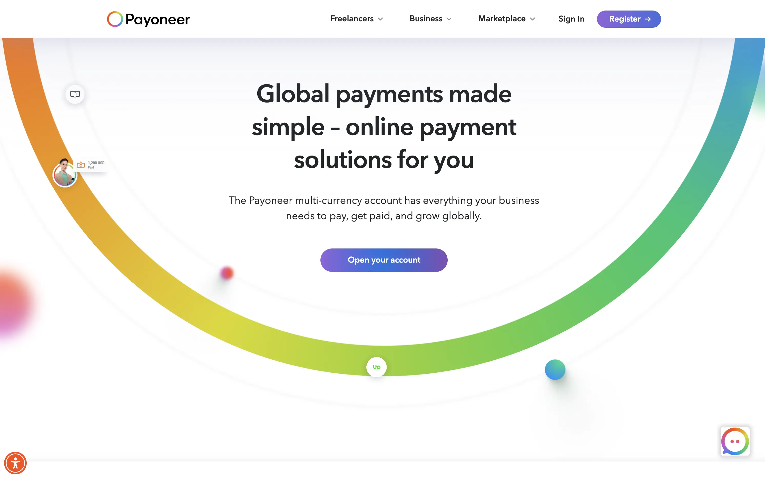
Payoneer is a global online payment platform offering multi-currency accounts and seamless cross-border transactions for businesses and freelancers.
The hero blends utility and motion well. The animated arc mimics financial flow, visually conveying the platform’s core promise: fast, borderless payments. Headline is clear and functional, supported by a strong subhead. The animation, showing USD amounts sent and received, makes the experience feel human and practical. The CTA is visible but understated. Overall, it reinforces trust and makes the product feel simple and scalable.
Smart visual metaphor for financial ease and flow — helps Payoneer stand out in a space often dominated by cold, institutional design. This layout is conversion-safe while visually expressive.
This layout balances technical utility with human impact, aligning well with Algolia’s positioning as an API-first but UX-aware company. The mobile UI reinforces product value visually, while the logo wall signals scale and trust for enterprise buyers. The tone is clear, benefit-led, and appropriate for high-intent decision-makers evaluating AI tools for customer experience. This is a solid enterprise-facing hero built to perform.
Payoneer
↗
SaaS
Fintech
Centered
Descriptive
Confident
Single Button
Photography
Illustration
Custom Animation
Light Mode
Purple
Sans serif
B2B
Home Page
Wordpress
global payments, borderless finance, transaction animation, multi-currency account, visual storytelling, freelancer payments, cross-border SaaS, simplified UX, modern money movement, motion-led layout, banking alternative, vibrant palette, international scale
Payoneer is a global online payment platform offering multi-currency accounts and seamless cross-border transactions for businesses and freelancers.
The hero blends utility and motion well. The animated arc mimics financial flow, visually conveying the platform’s core promise: fast, borderless payments. Headline is clear and functional, supported by a strong subhead. The animation, showing USD amounts sent and received, makes the experience feel human and practical. The CTA is visible but understated. Overall, it reinforces trust and makes the product feel simple and scalable.
Smart visual metaphor for financial ease and flow — helps Payoneer stand out in a space often dominated by cold, institutional design. This layout is conversion-safe while visually expressive.
This layout balances technical utility with human impact, aligning well with Algolia’s positioning as an API-first but UX-aware company. The mobile UI reinforces product value visually, while the logo wall signals scale and trust for enterprise buyers. The tone is clear, benefit-led, and appropriate for high-intent decision-makers evaluating AI tools for customer experience. This is a solid enterprise-facing hero built to perform.
Melio
↗
SaaS
Fintech
Centered
Bold & Direct
Proof-Heavy
Multi-CTA Block
Logo Wall
Announcement
Light Mode
Purple
Sans serif
B2B
Home Page
Wordpress
bill pay, invoicing platform, small business payments, financial automation, AP/AR SaaS, vendor payments, accounting tools, QuickBooks integrations
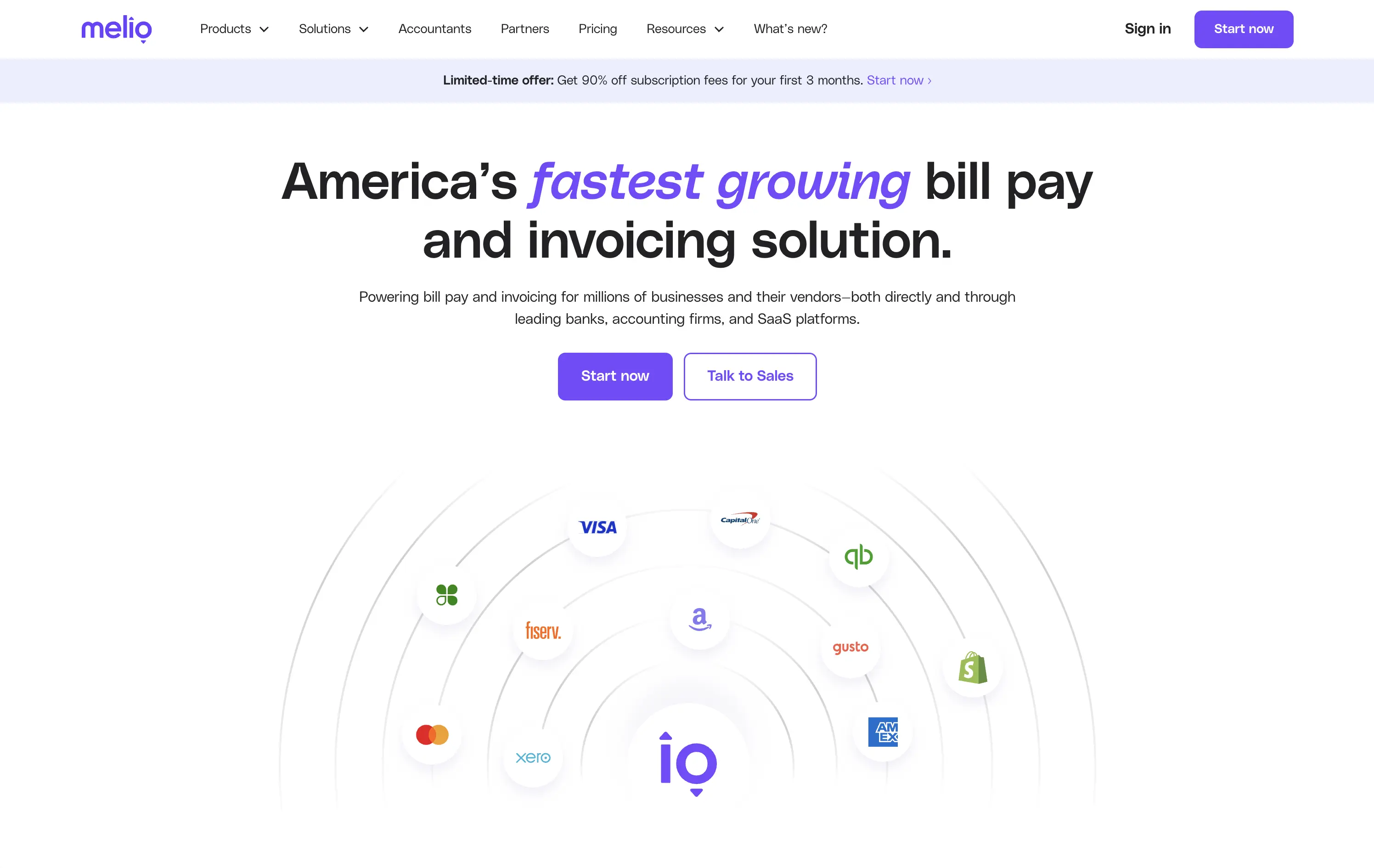
Melio is a digital payment platform that simplifies bill pay and invoicing for small businesses and accounting teams.
Bold headline, partner logos, and focused CTAs create a strong first impression. The layout supports quick scanning and immediate action. Design choices signal reliability and scale without visual clutter.
Leverages third-party credibility to reduce friction for trust-based workflows. Dual CTA acknowledges buyer types. Layout and tone match the high-urgency, low-risk mindset of SMB finance leads.
This layout balances technical utility with human impact, aligning well with Algolia’s positioning as an API-first but UX-aware company. The mobile UI reinforces product value visually, while the logo wall signals scale and trust for enterprise buyers. The tone is clear, benefit-led, and appropriate for high-intent decision-makers evaluating AI tools for customer experience. This is a solid enterprise-facing hero built to perform.
Melio
↗
SaaS
Fintech
Centered
Bold & Direct
Proof-Heavy
Multi-CTA Block
Logo Wall
Announcement
Light Mode
Purple
Sans serif
B2B
Home Page
Wordpress
bill pay, invoicing platform, small business payments, financial automation, AP/AR SaaS, vendor payments, accounting tools, QuickBooks integrations
Melio is a digital payment platform that simplifies bill pay and invoicing for small businesses and accounting teams.
Bold headline, partner logos, and focused CTAs create a strong first impression. The layout supports quick scanning and immediate action. Design choices signal reliability and scale without visual clutter.
Leverages third-party credibility to reduce friction for trust-based workflows. Dual CTA acknowledges buyer types. Layout and tone match the high-urgency, low-risk mindset of SMB finance leads.
This layout balances technical utility with human impact, aligning well with Algolia’s positioning as an API-first but UX-aware company. The mobile UI reinforces product value visually, while the logo wall signals scale and trust for enterprise buyers. The tone is clear, benefit-led, and appropriate for high-intent decision-makers evaluating AI tools for customer experience. This is a solid enterprise-facing hero built to perform.
Brightwheel
↗
SaaS
Productivity
Education
Centered
Benefit-Driven
Empowering
Multi-CTA Block
Product UI
Duotone
Blue
Sans serif
B2B
Home Page
Wordpress
childcare SaaS, early education, UI-forward, persona filter, soft onboarding, trust-building, calm palette, family-friendly, product-led storytelling, scroll guidance, interactive selector, teacher tech, value-first headline
Brightwheel offers all-in-one software for childcare centers, helping staff and parents streamline daily operations, billing, and communication.
The hero blends product visuals with conversion utility. UI mockups feel grounded in real use cases—billing, check-ins, messaging—while the big, benefit-led headline hits directly. Interactive persona buttons sort traffic based on user role, creating clarity and reducing friction. Clean layout, focused copy, and trust cues (like “#1 childcare software”) all work toward fast comprehension.
Targets a trust-dependent category with confident simplicity. The user-type selector streamlines onboarding while signaling the platform’s adaptability. It balances emotional safety with practical function, reflecting Brightwheel’s value as a tool that makes lives easier.
This layout balances technical utility with human impact, aligning well with Algolia’s positioning as an API-first but UX-aware company. The mobile UI reinforces product value visually, while the logo wall signals scale and trust for enterprise buyers. The tone is clear, benefit-led, and appropriate for high-intent decision-makers evaluating AI tools for customer experience. This is a solid enterprise-facing hero built to perform.
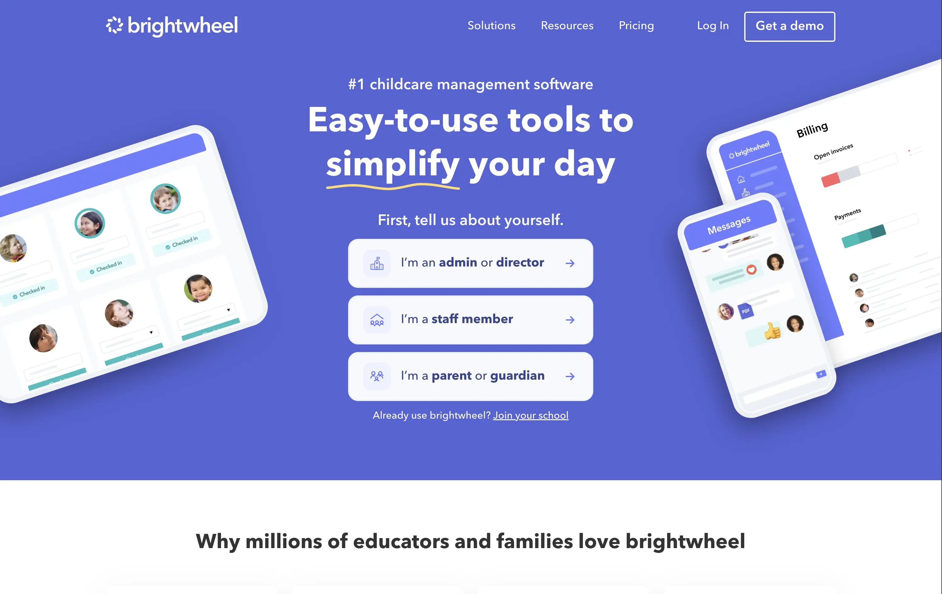
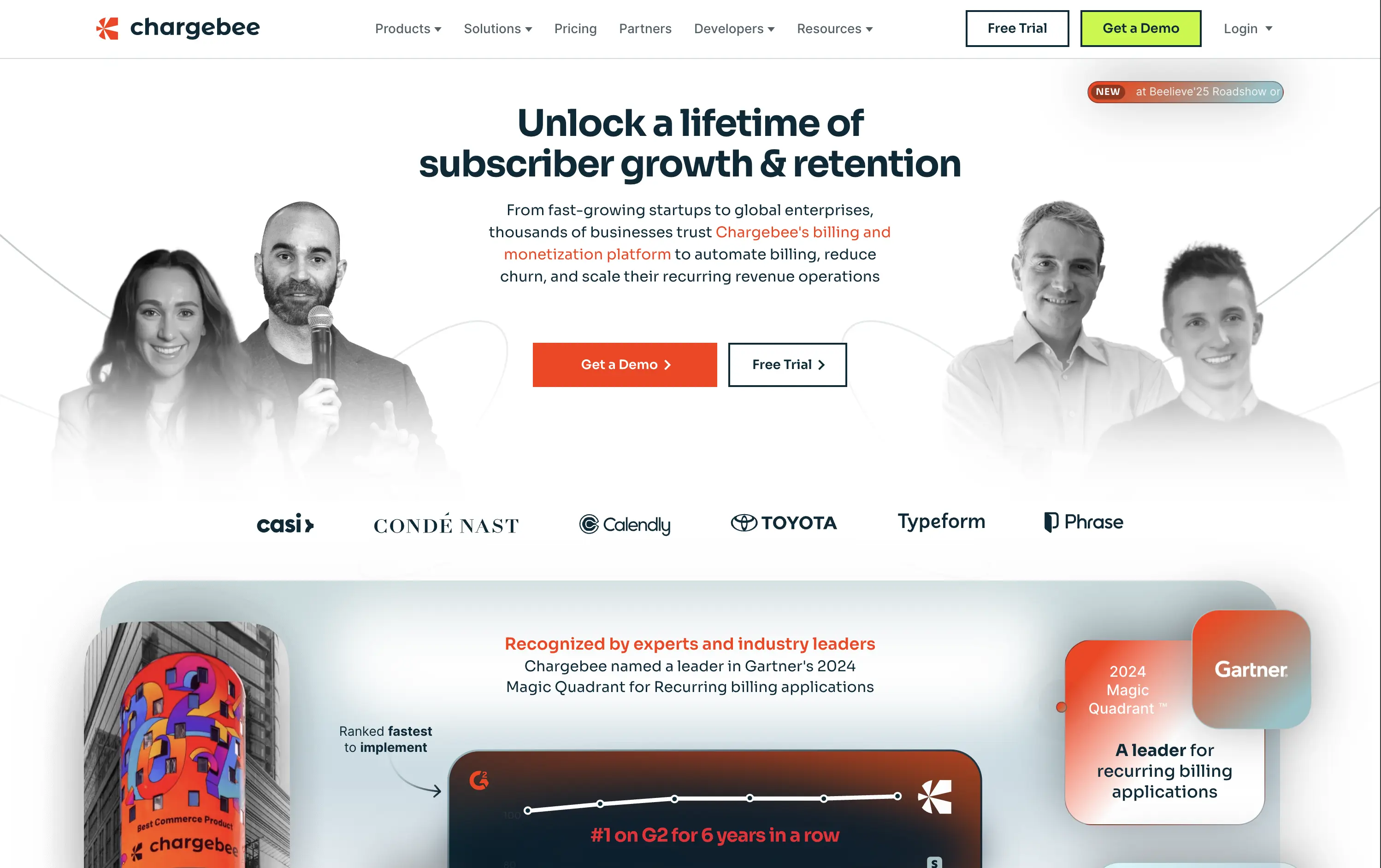
Chargebee
↗
SaaS
Fintech
Centered
Benefit-Driven
Bold & Direct
Multi-CTA Block
Photography
Logo Wall
Social Proof
Light Mode
Green
Orange
Sans serif
B2B
Home Page
Wordpress
B2B SaaS, billing automation, subscription platform, enterprise-ready, credibility-first, leadership positioning, founder imagery, logo wall, dual CTA, Gartner badge, G2 recognition, growth-focused messaging, recurring revenue
Chargebee helps businesses automate recurring billing, reduce churn, and scale subscription revenue through a trusted enterprise-ready platform.
The hero leads with a sharp, benefit-packed headline and backs it up with high-trust signals: real customer faces, name-brand logos, and third-party awards. The “Get a Demo” and “Free Trial” CTAs give users both enterprise and self-serve paths, but visual hierarchy between the two could be better balanced. Copy is outcome-focused and credible.
Smartly targeted at growth-stage and enterprise buyers, but the visual language undersells its category leadership. Strong content mix, but design lacks the presence or edge to reinforce premium positioning.
This layout balances technical utility with human impact, aligning well with Algolia’s positioning as an API-first but UX-aware company. The mobile UI reinforces product value visually, while the logo wall signals scale and trust for enterprise buyers. The tone is clear, benefit-led, and appropriate for high-intent decision-makers evaluating AI tools for customer experience. This is a solid enterprise-facing hero built to perform.
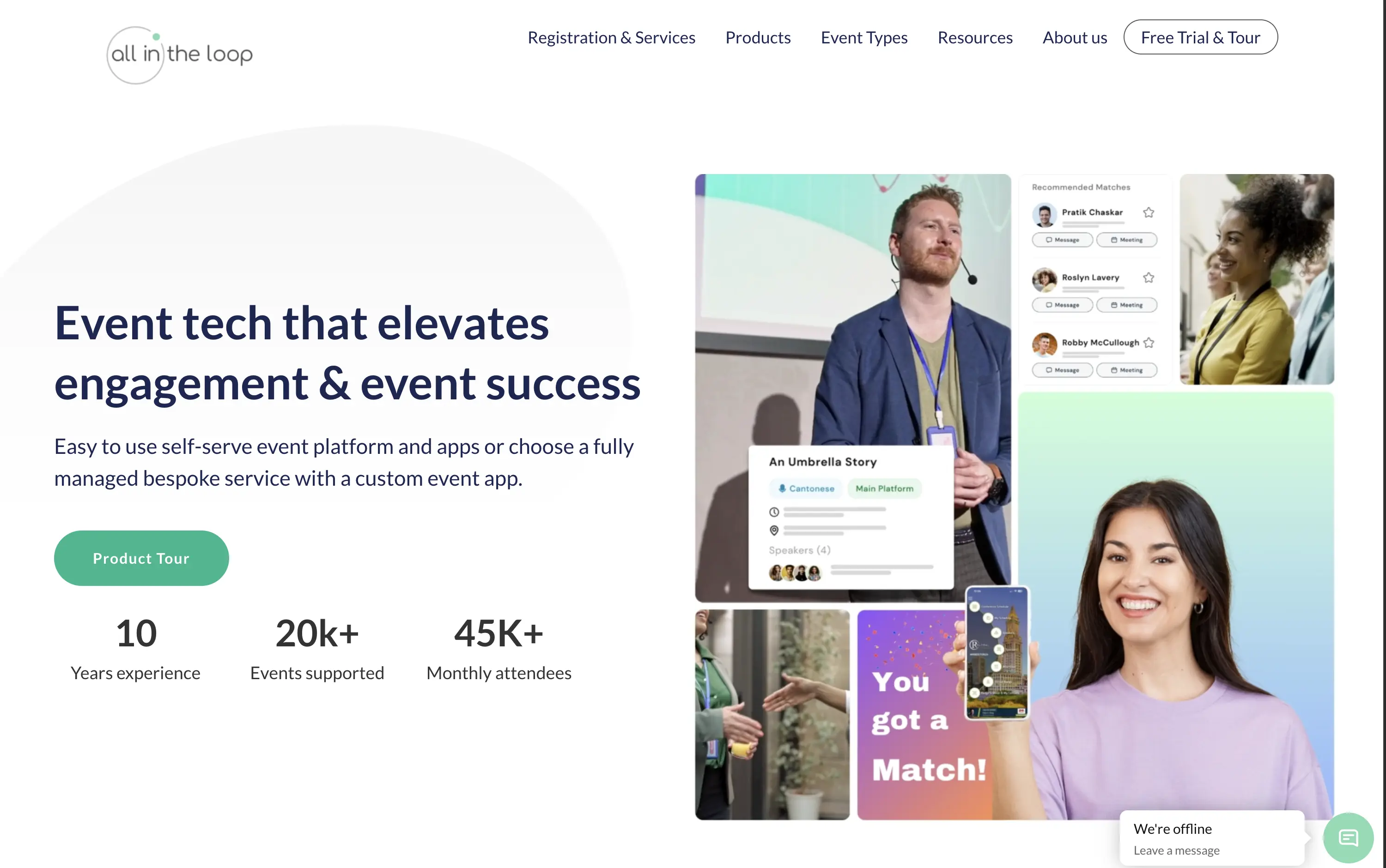
All in the loop
↗
SaaS
Events
Split Grid
Left-aligned
Benefit-Driven
Professional
Single Button
Media Gallery
Live Metrics
Social Proof
Light Mode
Blue
Green
Sans serif
B2B
Home Page
Wordpress
event tech, product tour CTA, pastel gradient, multi-image collage, visual UI overlays, metrics proof, event engagement, B2B SaaS, white background, friendly tone, hybrid event solutions, mobile app showcase, professional layout, soft aesthetic, platform demo
All in the Loop offers a self-serve or fully managed platform to run engaging, app-powered events and conferences.
The hero is clean and covers the basics — a clear headline, brief subtext, supporting visuals, and a CTA. But it plays it too safe. The collage of images feels generic and lacks a focal point. Visual proof of the product exists, but it’s scattered. There’s no standout hook or emotion — it functions, but it doesn’t persuade.
Positioning is sound—highlighting both self-serve and bespoke delivery models shows adaptability. The visuals convey live interaction and networking. Could benefit from a sharper, bolder headline, but trust and clarity are both strong.
This layout balances technical utility with human impact, aligning well with Algolia’s positioning as an API-first but UX-aware company. The mobile UI reinforces product value visually, while the logo wall signals scale and trust for enterprise buyers. The tone is clear, benefit-led, and appropriate for high-intent decision-makers evaluating AI tools for customer experience. This is a solid enterprise-facing hero built to perform.
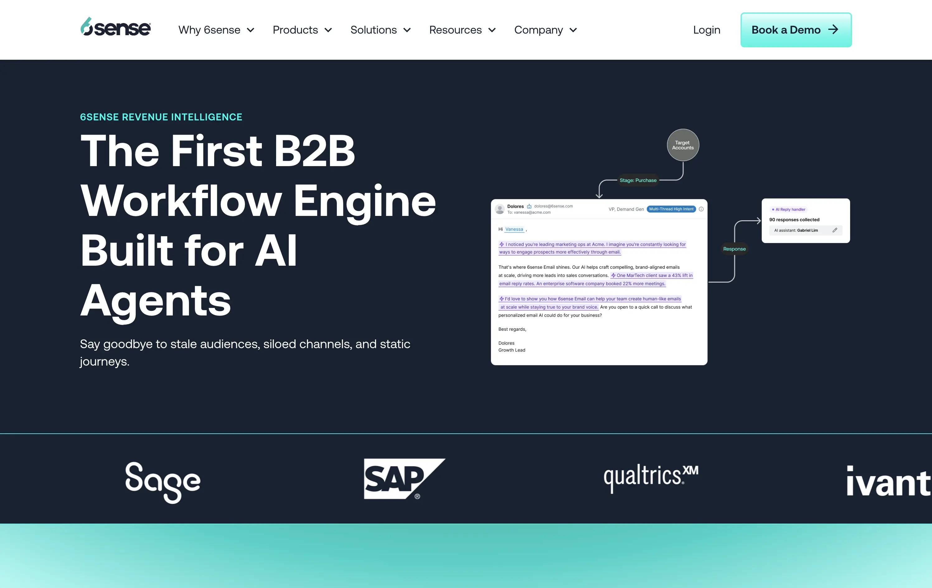
6sense
↗
SaaS
AI Tools
Split Grid
Left-aligned
Professional
No CTA
Logo Wall
Product UI
Duotone
Blue
Green
Sans serif
B2B
Home Page
Wordpress
AI-first, B2B enterprise, workflow automation, data-driven, email UI, proof of concept visual, dark theme, high-trust, demand gen, gradient bottom edge, technical audience, low-fluff, enterprise SaaS, sales enablement, client logos
6sense is a B2B platform using AI to automate workflows and personalize marketing outreach at scale.
The hero leads with authority — strong headline, clean copy, and a visual that maps out a real workflow give instant context to a technical audience. The dark theme reads serious and enterprise-ready. Copy is crystal clear, but the visual diagram could use just a little more breathing room. CTA is sharp and obvious: Book a Demo — no distractions.
Hero is tuned for high-intent buyers. The language signals innovation and productivity gains while reinforcing credibility through visual proof and case stats.
This layout balances technical utility with human impact, aligning well with Algolia’s positioning as an API-first but UX-aware company. The mobile UI reinforces product value visually, while the logo wall signals scale and trust for enterprise buyers. The tone is clear, benefit-led, and appropriate for high-intent decision-makers evaluating AI tools for customer experience. This is a solid enterprise-facing hero built to perform.
The most effective hero sections in your inbox.
Monthly round up of top hero sections.
Don't worry. We hate spam too.
Don't worry. We hate spam too.
Don't worry. We hate spam too.