Collaboration
13
13
13
13
Platforms that support shared work — async, synchronous, or somewhere in between.
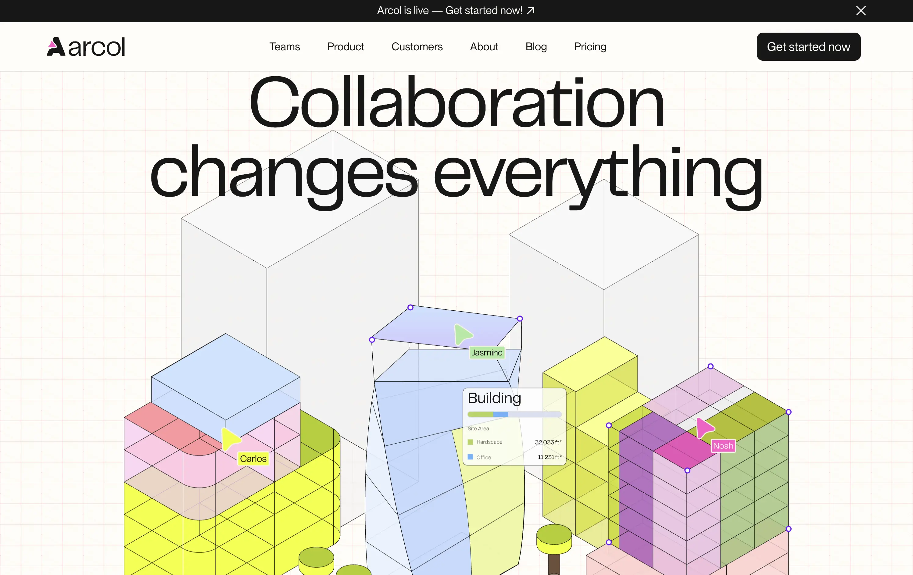
Arcol
↗
SaaS
Collaboration
Centered
Aspirational
Abstract / Conceptual
No CTA
Illustration
Custom Animation
Light Mode
Blue
Yellow
Sans serif
B2B
Home Page
Webflow
BIM software, real-time collaboration, isometric grid, multiplayer cursor, spatial planning UI, construction tech, 3D data layers, architectural tool, modern CAD, animated interface, light grid background
Arcol is a generative design and collaboration platform for architecture and BIM workflows, built for real-time teamwork.
The animated visual does the heavy lifting, illustrating use cases like live edits and data overlays. But without a supporting subline, new users may miss the BIM context. Still, strong visual storytelling creates intrigue.
Visually strong and clearly differentiated, but the messaging lacks grounding. The animation sells collaboration well, but without a sub-headline or product descriptor, it leans too much on visual inference. Clarity is sacrificed for aesthetic.
This layout balances technical utility with human impact, aligning well with Algolia’s positioning as an API-first but UX-aware company. The mobile UI reinforces product value visually, while the logo wall signals scale and trust for enterprise buyers. The tone is clear, benefit-led, and appropriate for high-intent decision-makers evaluating AI tools for customer experience. This is a solid enterprise-facing hero built to perform.
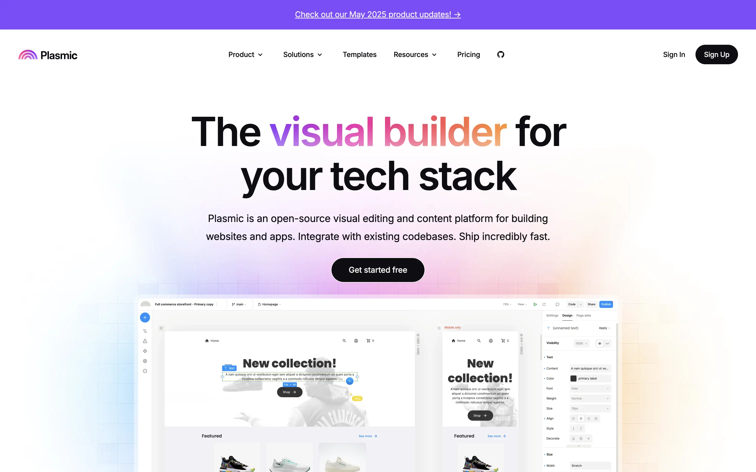
Plasmic
↗
SaaS
No-Code
Collaboration
Creative Tools
Centered
Benefit-Driven
Descriptive
Single Button
Product UI
Announcement
Gradient
Light Mode
Pink
Purple
Yellow
Sans serif
Hybrid
Home Page
Custom Code
visual builder, code integration, React support, Figma import, developer-friendly, no-code platform, CMS integration, responsive design, real-time collaboration, open-source, component-based, scalable, enterprise-ready, UI/UX design
Plasmic is an open-source visual builder that enables teams to design and build web apps and websites rapidly, integrating seamlessly with existing codebases.
The hero section clearly communicates Plasmic's core value proposition as a visual builder for tech stacks. The combination of concise copy and product visuals effectively showcases its capabilities. The inclusion of a logo wall adds credibility, and the CTA is prominently displayed, guiding users toward engagement.
Plasmic positions itself effectively for both developers and non-developers by highlighting seamless code integration and visual editing capabilities. This dual appeal broadens its market reach and addresses common pain points in web development workflows.
This layout balances technical utility with human impact, aligning well with Algolia’s positioning as an API-first but UX-aware company. The mobile UI reinforces product value visually, while the logo wall signals scale and trust for enterprise buyers. The tone is clear, benefit-led, and appropriate for high-intent decision-makers evaluating AI tools for customer experience. This is a solid enterprise-facing hero built to perform.
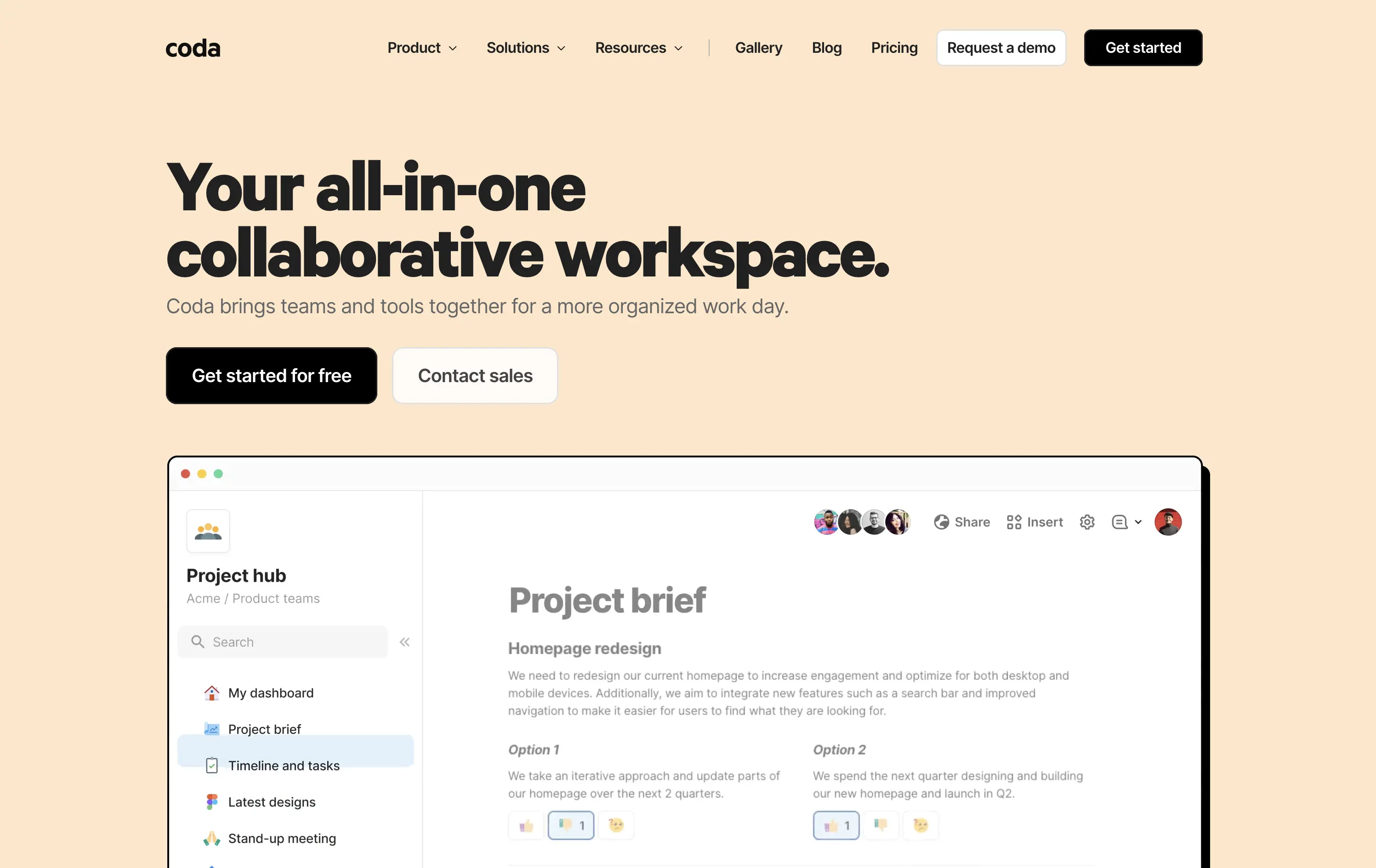
Coda
↗
SaaS
Collaboration
Productivity
Left-aligned
Descriptive
Empowering
Multi-CTA Block
Product UI
Duotone
White
Yellow
Display
Sans serif
Hybrid
Home Page
Custom Code
doc-as-app, team workflow, internal tools, collaborative workspace, UI product demo, hybrid teams, sales enablement, project brief, minimal design, low-code logic, enterprise-friendly, live multiplayer,
Coda is a collaborative doc platform that combines documents, spreadsheets, and apps into one unified workspace for teams.
The hero communicates clearly with a straightforward headline and strong product shot. Layout is easy to follow, and the dual CTA gives distinct paths for self-serve or sales-led funnels. The visual hierarchy is solid, though not emotionally charged.
Coda leads with clarity over flash. The message and layout prioritize breadth of use and enterprise readiness. Great fit for decision-makers looking to unify scattered tools into a single workspace.
This layout balances technical utility with human impact, aligning well with Algolia’s positioning as an API-first but UX-aware company. The mobile UI reinforces product value visually, while the logo wall signals scale and trust for enterprise buyers. The tone is clear, benefit-led, and appropriate for high-intent decision-makers evaluating AI tools for customer experience. This is a solid enterprise-facing hero built to perform.
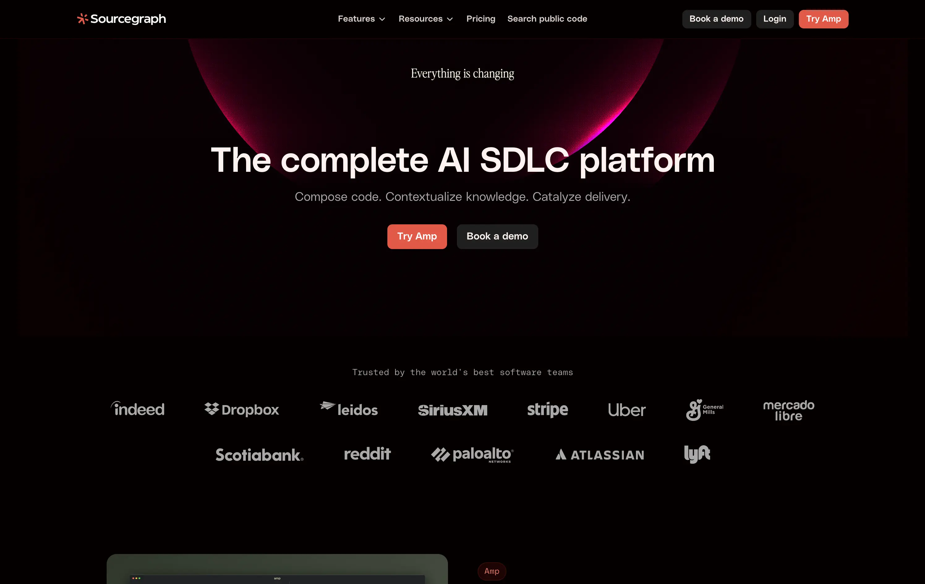
Sourcegraph
↗
DevTools
AI Tools
Collaboration
Centered
Abstract / Conceptual
Professional
Multi-CTA Block
Logo Wall
Custom Animation
Dark Mode
White
Red
Sans serif
B2B
Home Page
Webflow
AI developer tools, software delivery, blinking headline, AI SDLC platform, cognitive CTA friction, high-trust logos, developer enterprise, dual CTA layout, evolving dev workflows, dark futuristic aesthetic, intelligent search, platform abstraction
Sourcegraph offers AI-powered tools to help dev teams search, understand, and deliver code faster across their entire software development lifecycle.
The hero signals scale, change, and technical leadership. Trust logos and layout build authority fast. But “Try Amp” as CTA is vague—first-time users won’t know what it means.
Aims to own a high-level category: “AI SDLC.” The priming animation reinforces urgency, but abstract product naming creates an entry barrier for unfamiliar users.
This layout balances technical utility with human impact, aligning well with Algolia’s positioning as an API-first but UX-aware company. The mobile UI reinforces product value visually, while the logo wall signals scale and trust for enterprise buyers. The tone is clear, benefit-led, and appropriate for high-intent decision-makers evaluating AI tools for customer experience. This is a solid enterprise-facing hero built to perform.
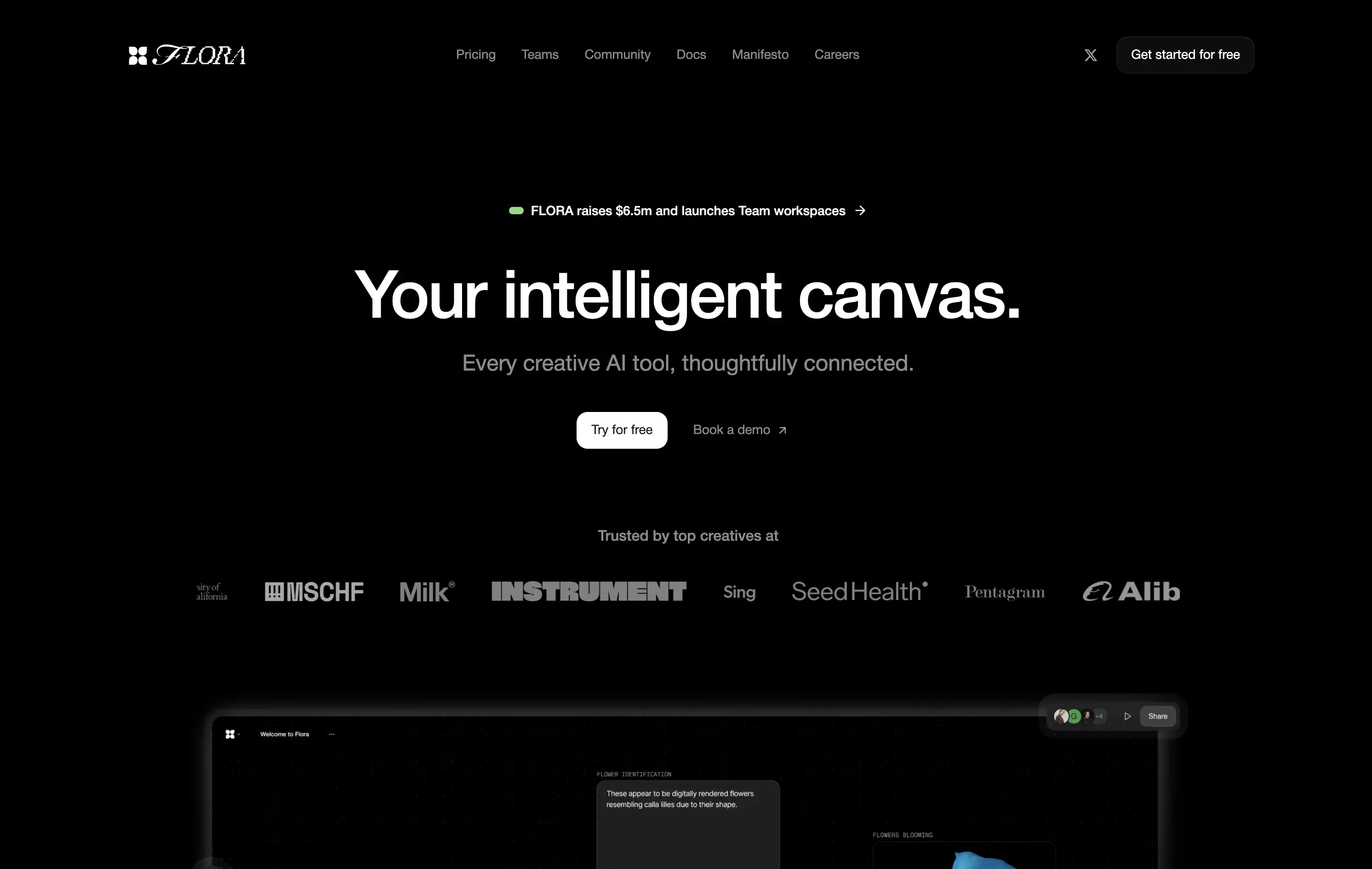
Flora AI
↗
AI Tools
Collaboration
Creative Tools
Centered
Bold & Direct
Aspirational
Multi-CTA Block
Logo Wall
Product UI
Custom Animation
Dark Mode
White
Sans serif
Hybrid
Home Page
Custom Code
AI creative suite, dark mode, studio audience, high-contrast UI, high-trust logos, Figma-adjacent design, minimal copy, serious tone, tool for creators, productivity signal, elegant layout, launch announcement
Flora is an AI-powered workspace designed for creatives to ideate, visualize, and connect ideas on a shared intelligent canvas.
The hero pairs abstract positioning with subtle product proof. The headline is conceptual yet grounded by a clear subheadline and conversion-friendly CTA layout. Surreal AI-generated flower animations subtly showcase new-gen UX thinking—meant to spark imagination, not just drive efficiency. Real-time collaboration visuals offer credibility. Trust logos lend early validation. Layout is calm and deliberate, giving room for the idea of a “thoughtfully connected” tool to breathe.
The layout signals a premium, vision-led AI product for creative teams. Abstract yet functional, it balances aspirational positioning with clear proof. Ideal for early adopters in design-forward or innovation-heavy spaces.
This layout balances technical utility with human impact, aligning well with Algolia’s positioning as an API-first but UX-aware company. The mobile UI reinforces product value visually, while the logo wall signals scale and trust for enterprise buyers. The tone is clear, benefit-led, and appropriate for high-intent decision-makers evaluating AI tools for customer experience. This is a solid enterprise-facing hero built to perform.
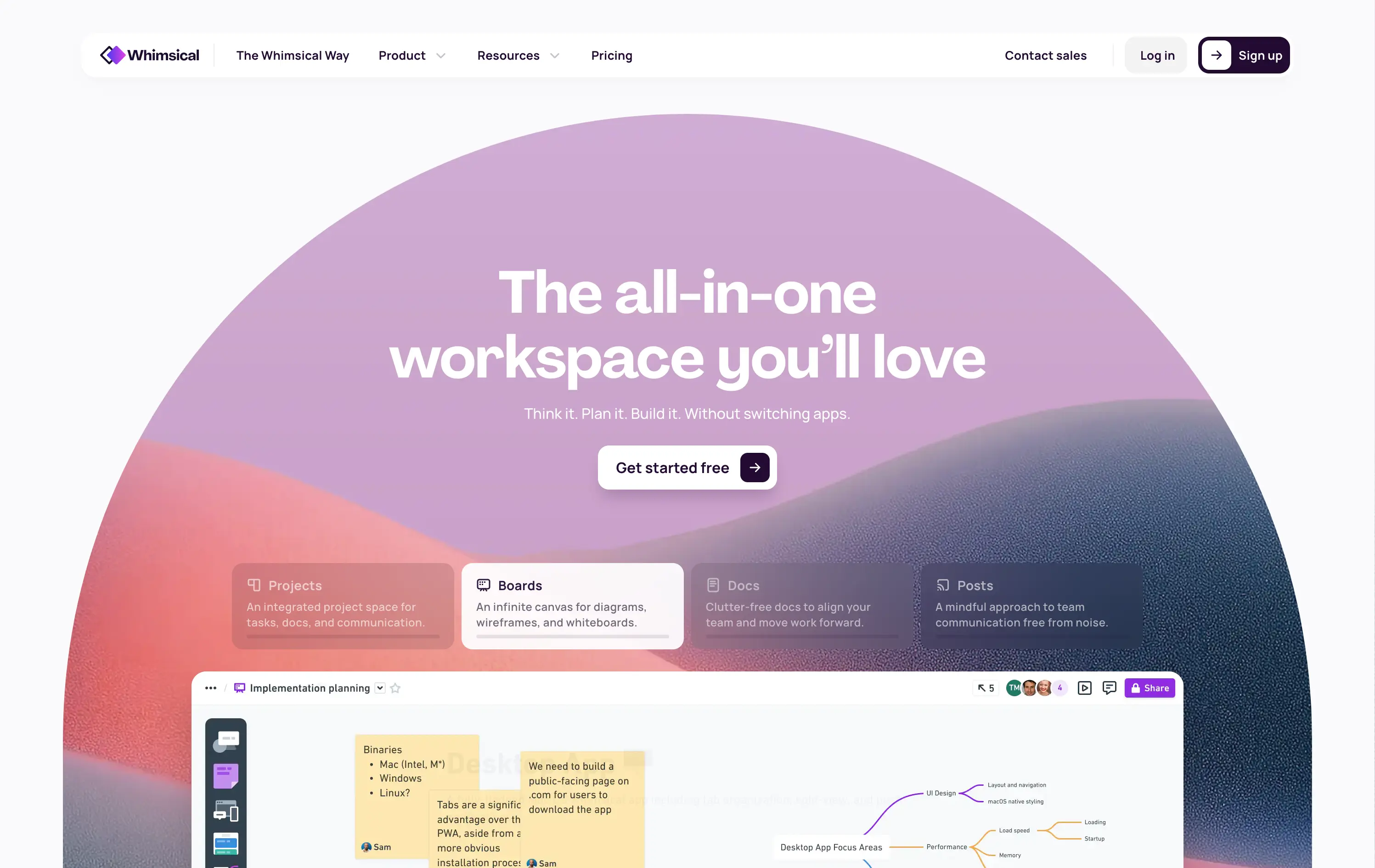
Whimsical
↗
SaaS
Collaboration
Productivity
Inset
Centered
Benefit-Driven
Empowering
Single Button
Illustration
Interactive
Product UI
Gradient
Light Mode
Pink
Purple
Orange
Sans serif
B2B
Home Page
Custom Code
collaborative workspace, pastel gradient, feature carousel, lightweight SaaS, sticky headline, soft UI, premium-yet-friendly, high-trust design, zero-friction onboarding, visual task planning, alternative to Miro, team productivity
Whimsical is an all-in-one visual workspace for teams to plan, wireframe, write, and collaborate—without switching between tools.
The hero immediately differentiates with its warm, gradient-driven palette and curved editorial layout. Headline is sticky and emotional, while the subheadline cues action and ease. Below, animated modules skim through key features—smartly designed to reduce cognitive load while expanding curiosity. The product UI is fully visible and feels friendly. CTA is low friction and well-placed. Compared to competitors, this layout feels more human-centered and less corporate, while still conveying product intelligence.
Strong product-led growth positioning with emotional stickiness. Visuals balance friendliness with focus. Motion helps drive upfront clarity, and layout choice favors quick scanning—well-suited for both individual users and team leads.
This layout balances technical utility with human impact, aligning well with Algolia’s positioning as an API-first but UX-aware company. The mobile UI reinforces product value visually, while the logo wall signals scale and trust for enterprise buyers. The tone is clear, benefit-led, and appropriate for high-intent decision-makers evaluating AI tools for customer experience. This is a solid enterprise-facing hero built to perform.
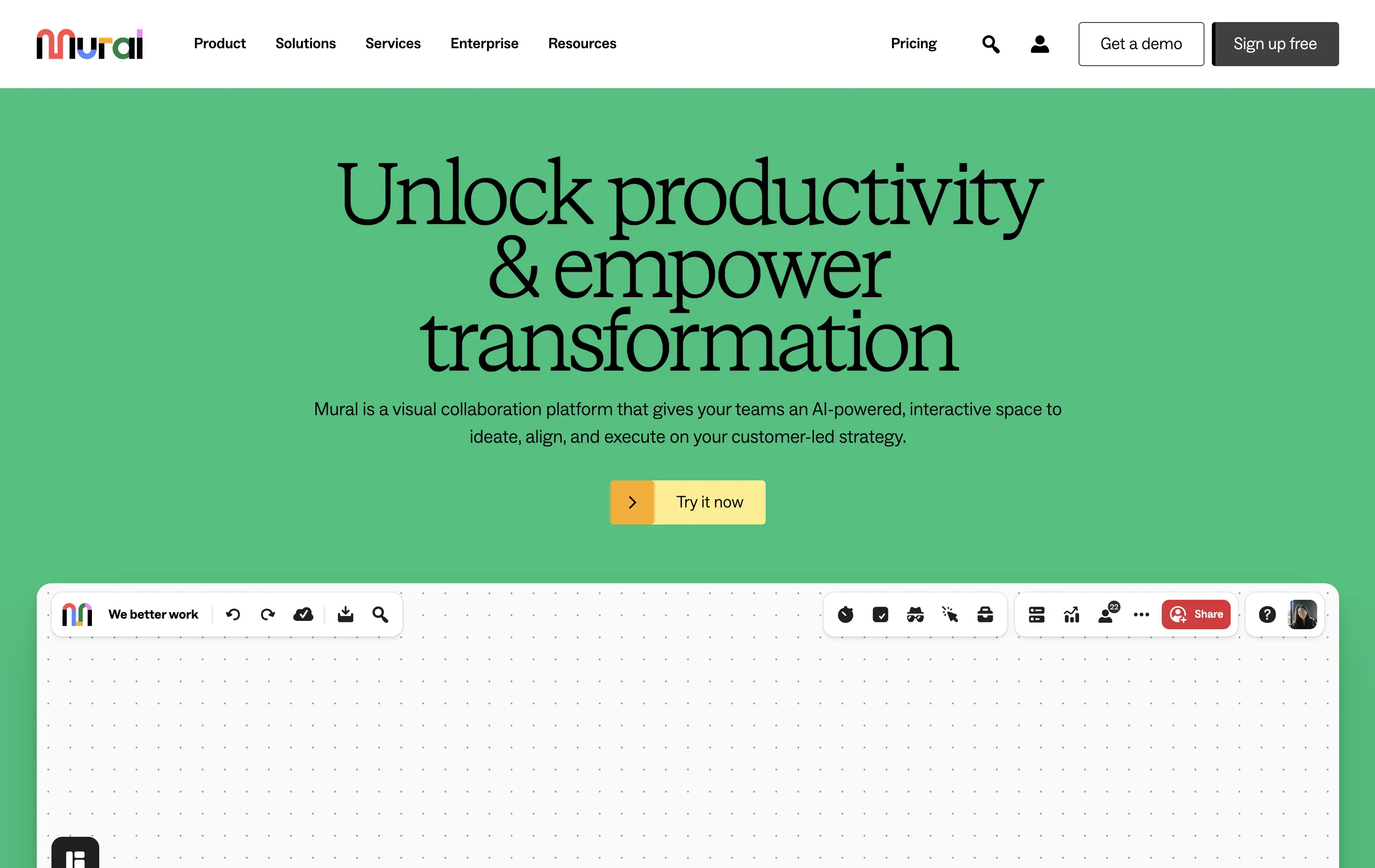
Mural
↗
SaaS
Collaboration
Productivity
Centered
Benefit-Driven
Aspirational
Single Button
Product UI
Multi-color
Green
Yellow
Serif
B2B
Home Page
Webflow
team productivity tool, familiar UI, friendly tone, AI-supported collaboration, light mode, optimistic copy, future-focused, dotted grid, visual-first, professional teams, clean hierarchy, flat color background
Mural is a visual collaboration platform that helps teams ideate, align, and execute strategy in real time with AI support.
The hero opens with a strong aspirational headline and bright color blocking that draws attention quickly. The serif typeface adds gravitas, while the clean UI below hints at practical use. However, the product preview could be more immediate—only the top edge of the canvas is visible, which may delay user comprehension. CTA is simple and visible. Overall, the section signals clarity and ease but misses some depth in product proof above the fold.
Strategically aimed at enterprise teams navigating transformation. The tone leans inspirational, while the visual style keeps it accessible. Immediate clarity, but lacks an element to tease the scroll action to anchor the pitch.
This layout balances technical utility with human impact, aligning well with Algolia’s positioning as an API-first but UX-aware company. The mobile UI reinforces product value visually, while the logo wall signals scale and trust for enterprise buyers. The tone is clear, benefit-led, and appropriate for high-intent decision-makers evaluating AI tools for customer experience. This is a solid enterprise-facing hero built to perform.
Basecamp
↗
SaaS
Collaboration
Productivity
Centered
Unconventional
Conversational
Pain-driven
No CTA
Illustration
Light Mode
Green
Yellow
Sans serif
B2B
Home Page
Custom Code
project management, SaaS, lo-fi aesthetic, opinionated design, founder-led voice, visual storytelling, problem-first, productivity, cluttered tool fatigue, anti-modern, expressive illustration, early-stage appeal, emotional resonance, no UI demo, brand storytelling, narrative-led
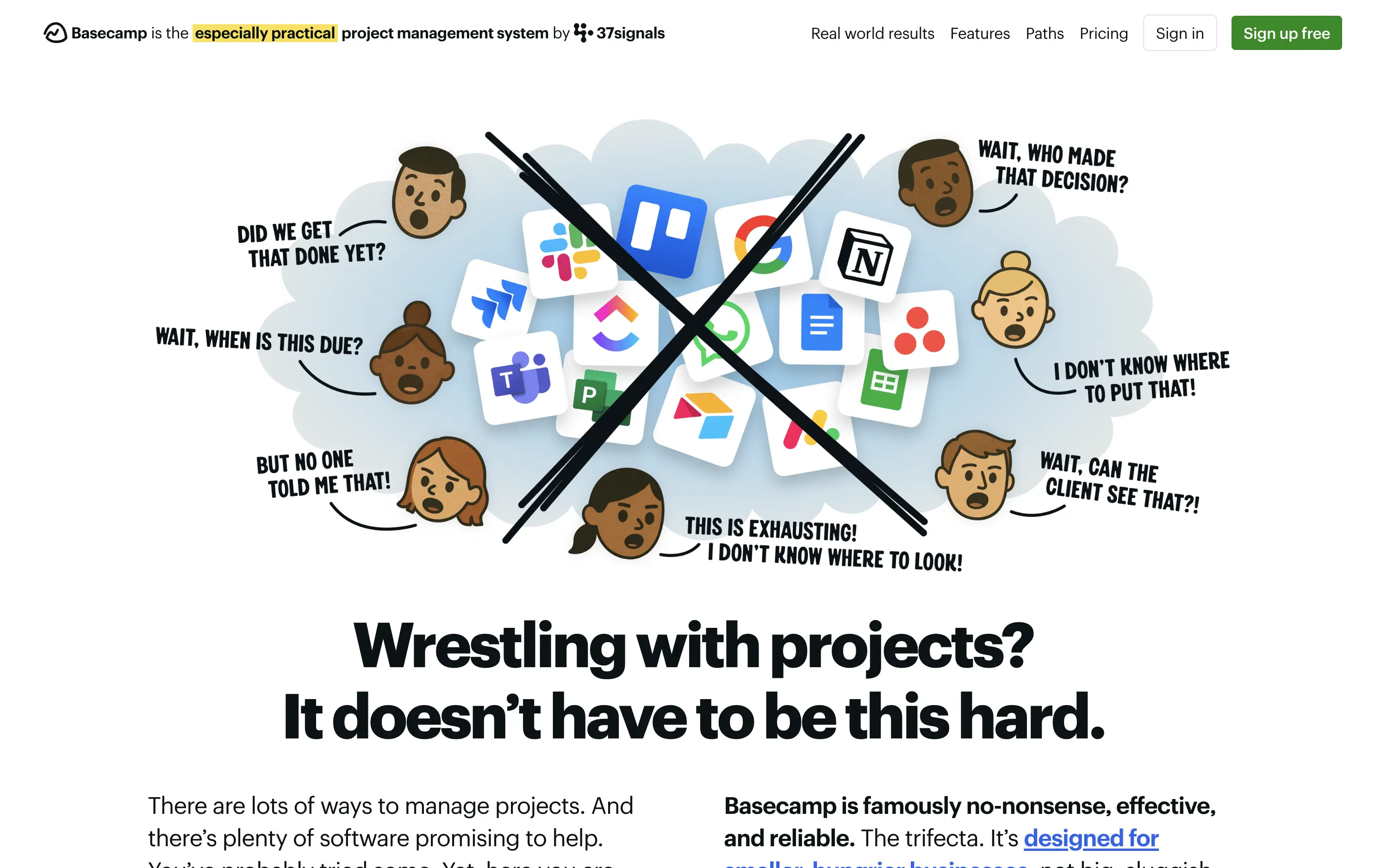
Basecamp cuts through tool overload with one practical workspace, ending project chaos.
The hero skips UI glamour for emotional clarity. It dramatizes the frustration of using too many disjointed tools through expressive cartoon faces and crossed-out logos. The copy is plain, bold, and highly relatable — “Wrestling with projects?” grounds it in a universal pain. No button, no fluff. The simplicity grabs attention and makes the message instantly clear.
Leans hard into anti-trend positioning—practicality over polish. Speaks directly to the frustration of tool overload, appealing to leaders who want sanity, not features. It’s memorable and unmistakably aligned with Basecamp’s legacy of contrarian clarity.
This layout balances technical utility with human impact, aligning well with Algolia’s positioning as an API-first but UX-aware company. The mobile UI reinforces product value visually, while the logo wall signals scale and trust for enterprise buyers. The tone is clear, benefit-led, and appropriate for high-intent decision-makers evaluating AI tools for customer experience. This is a solid enterprise-facing hero built to perform.
Basecamp
↗
SaaS
Collaboration
Productivity
Centered
Unconventional
Conversational
Pain-driven
No CTA
Illustration
Light Mode
Green
Yellow
Sans serif
B2B
Home Page
Custom Code
project management, SaaS, lo-fi aesthetic, opinionated design, founder-led voice, visual storytelling, problem-first, productivity, cluttered tool fatigue, anti-modern, expressive illustration, early-stage appeal, emotional resonance, no UI demo, brand storytelling, narrative-led
Basecamp cuts through tool overload with one practical workspace, ending project chaos.
The hero skips UI glamour for emotional clarity. It dramatizes the frustration of using too many disjointed tools through expressive cartoon faces and crossed-out logos. The copy is plain, bold, and highly relatable — “Wrestling with projects?” grounds it in a universal pain. No button, no fluff. The simplicity grabs attention and makes the message instantly clear.
Leans hard into anti-trend positioning—practicality over polish. Speaks directly to the frustration of tool overload, appealing to leaders who want sanity, not features. It’s memorable and unmistakably aligned with Basecamp’s legacy of contrarian clarity.
This layout balances technical utility with human impact, aligning well with Algolia’s positioning as an API-first but UX-aware company. The mobile UI reinforces product value visually, while the logo wall signals scale and trust for enterprise buyers. The tone is clear, benefit-led, and appropriate for high-intent decision-makers evaluating AI tools for customer experience. This is a solid enterprise-facing hero built to perform.
Github
↗
DevTools
Collaboration
Centered
Benefit-Driven
Confident
Multi-CTA Block
Product UI
Custom Animation
3D visuals
Gradient
Dark Mode
Green
Purple
Sans serif
Hybrid
Home Page
Custom Code
developer platform, AI coding assistant, GitHub Copilot, dark theme UI, modern dev culture, collaborative tools, open source hub, onboarding input, 3D mascots, dual CTA, cloud-based dev tools, tech-forward, productivity SaaS
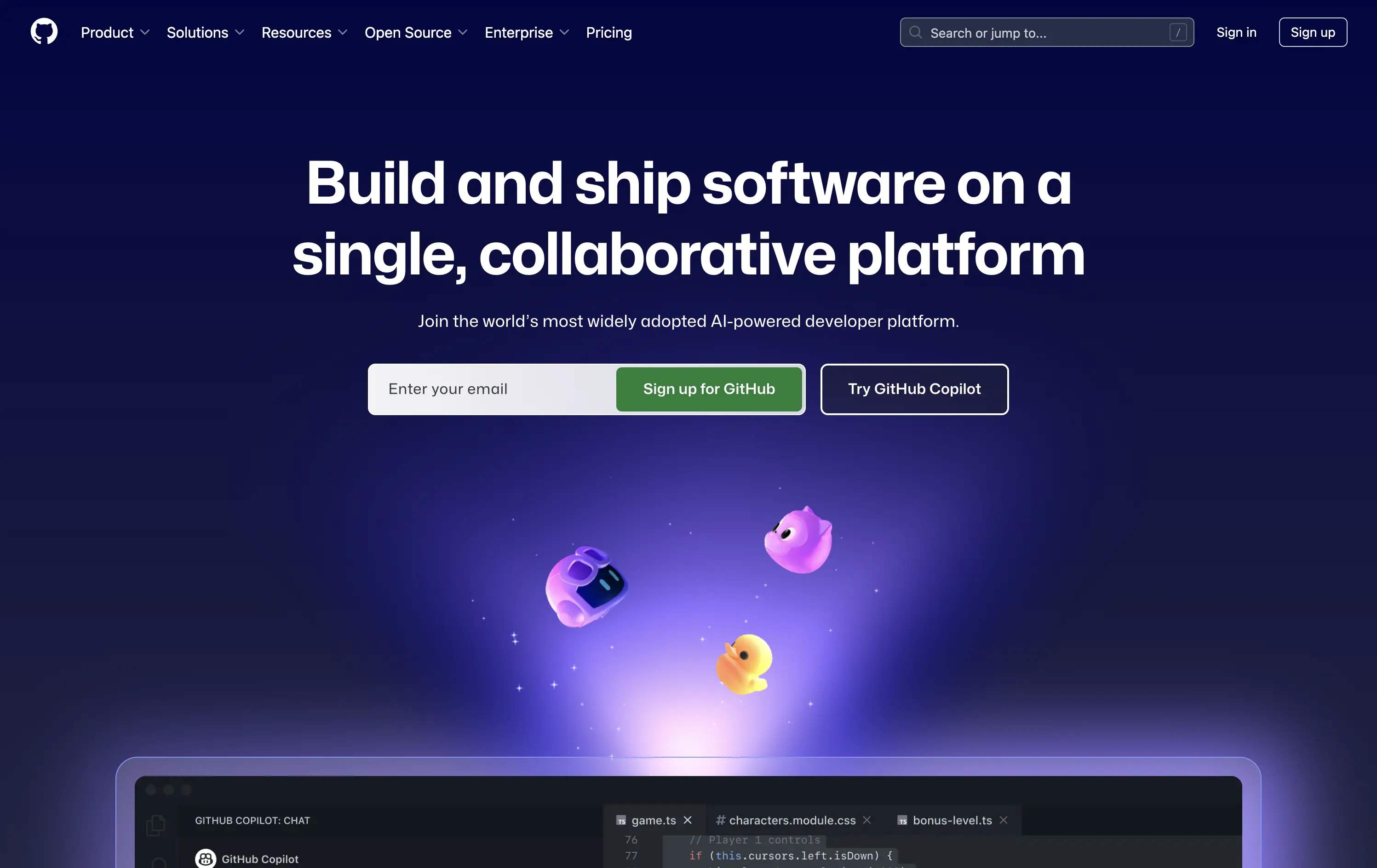
GitHub is the world’s leading platform for developers to build, collaborate, and ship code together.
The hero delivers immediate clarity: build and ship software together. The animated floating mascots add visual intrigue without distracting from the copy, and the dual CTAs — email capture and Copilot trial — serve both new users and AI-curious devs. The dark spacey palette and glowing elements feel modern and focused. Solid hierarchy, clean execution.
Blends GitHub’s core dev value with its AI evolution. Highlights collaboration and product trust while gently introducing Copilot. Balanced tone makes it accessible to both enterprise teams and individual devs.
This layout balances technical utility with human impact, aligning well with Algolia’s positioning as an API-first but UX-aware company. The mobile UI reinforces product value visually, while the logo wall signals scale and trust for enterprise buyers. The tone is clear, benefit-led, and appropriate for high-intent decision-makers evaluating AI tools for customer experience. This is a solid enterprise-facing hero built to perform.
Github
↗
DevTools
Collaboration
Centered
Benefit-Driven
Confident
Multi-CTA Block
Product UI
Custom Animation
3D visuals
Gradient
Dark Mode
Green
Purple
Sans serif
Hybrid
Home Page
Custom Code
developer platform, AI coding assistant, GitHub Copilot, dark theme UI, modern dev culture, collaborative tools, open source hub, onboarding input, 3D mascots, dual CTA, cloud-based dev tools, tech-forward, productivity SaaS
GitHub is the world’s leading platform for developers to build, collaborate, and ship code together.
The hero delivers immediate clarity: build and ship software together. The animated floating mascots add visual intrigue without distracting from the copy, and the dual CTAs — email capture and Copilot trial — serve both new users and AI-curious devs. The dark spacey palette and glowing elements feel modern and focused. Solid hierarchy, clean execution.
Blends GitHub’s core dev value with its AI evolution. Highlights collaboration and product trust while gently introducing Copilot. Balanced tone makes it accessible to both enterprise teams and individual devs.
This layout balances technical utility with human impact, aligning well with Algolia’s positioning as an API-first but UX-aware company. The mobile UI reinforces product value visually, while the logo wall signals scale and trust for enterprise buyers. The tone is clear, benefit-led, and appropriate for high-intent decision-makers evaluating AI tools for customer experience. This is a solid enterprise-facing hero built to perform.
Asana
↗
SaaS
Collaboration
Productivity
Split Grid
Centered
Aspirational
Multi-CTA Block
Custom Animation
Duotone
Pink
Sans serif
B2B
Home Page
Custom Code
work management, project collaboration, AI assistant, team productivity, multi-cta hero
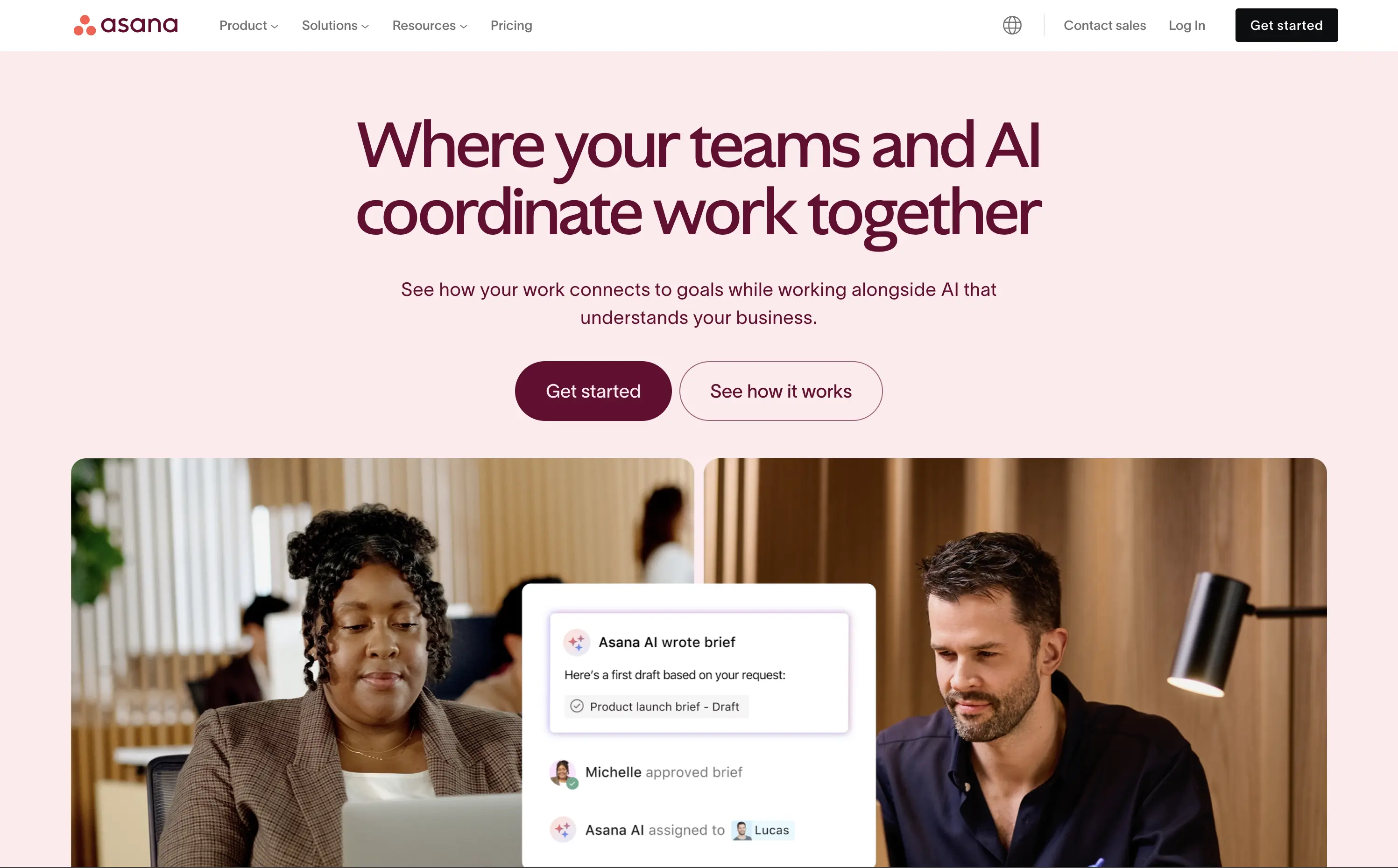
Asana helps organisations plan, track, and automate work—now boosted by an AI assistant that ties tasks to goals.
The hero is serene and strategic. Headline clearly defines the product’s evolution with AI, while visuals combine real people with subtle UI overlays to convey practical usage. Dual CTA is thoughtful and helps segment traffic. Typography and spacing support clarity.
Positions Asana as a next-gen operational tool built for modern teams. The hero shows how AI integrates with workflow, not replaces it. The balance of confidence and calm makes it accessible for mid-market to enterprise users exploring AI productivity.
This layout balances technical utility with human impact, aligning well with Algolia’s positioning as an API-first but UX-aware company. The mobile UI reinforces product value visually, while the logo wall signals scale and trust for enterprise buyers. The tone is clear, benefit-led, and appropriate for high-intent decision-makers evaluating AI tools for customer experience. This is a solid enterprise-facing hero built to perform.
Asana
↗
SaaS
Collaboration
Productivity
Split Grid
Centered
Aspirational
Multi-CTA Block
Custom Animation
Duotone
Pink
Sans serif
B2B
Home Page
Custom Code
work management, project collaboration, AI assistant, team productivity, multi-cta hero
Asana helps organisations plan, track, and automate work—now boosted by an AI assistant that ties tasks to goals.
The hero is serene and strategic. Headline clearly defines the product’s evolution with AI, while visuals combine real people with subtle UI overlays to convey practical usage. Dual CTA is thoughtful and helps segment traffic. Typography and spacing support clarity.
Positions Asana as a next-gen operational tool built for modern teams. The hero shows how AI integrates with workflow, not replaces it. The balance of confidence and calm makes it accessible for mid-market to enterprise users exploring AI productivity.
This layout balances technical utility with human impact, aligning well with Algolia’s positioning as an API-first but UX-aware company. The mobile UI reinforces product value visually, while the logo wall signals scale and trust for enterprise buyers. The tone is clear, benefit-led, and appropriate for high-intent decision-makers evaluating AI tools for customer experience. This is a solid enterprise-facing hero built to perform.
ClickUp
↗
SaaS
Collaboration
Productivity
Centered
Aspirational
Single Button
Interactive
Product UI
Gradient
Light Mode
Blue
Purple
Sans serif
Hybrid
Home Page
Custom Code
project management, all-in-one tool, interactive demo, modular onboarding, live preview, customizable workspace, productivity SaaS, gradient UI, click-to-explore, modern UX, team workflow, no-code vibes, multi-tool stack
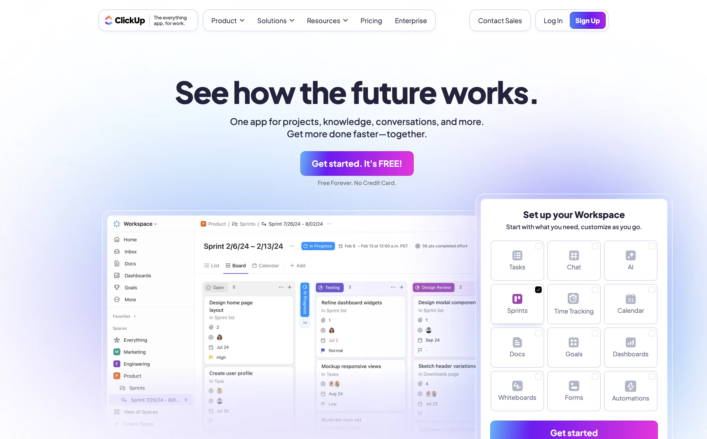
ClickUp is a customizable productivity platform where teams manage tasks, docs, goals, and everything else in one place.
The “See how the future works” headline strikes an ambitious yet welcoming tone. The standout element is the interactive module — showing real UI changes based on selected features, creating instant visual proof. Bright gradients and a bold purple CTA drive attention while softening the tech-forward message. It’s engaging, credible, and built for signup momentum.
ClickUp is positioning itself as a full-stack replacement for scattered SaaS tools. This hero backs that claim with both visual clarity and message ambition, supporting its “everything app” value prop.
This layout balances technical utility with human impact, aligning well with Algolia’s positioning as an API-first but UX-aware company. The mobile UI reinforces product value visually, while the logo wall signals scale and trust for enterprise buyers. The tone is clear, benefit-led, and appropriate for high-intent decision-makers evaluating AI tools for customer experience. This is a solid enterprise-facing hero built to perform.
ClickUp
↗
SaaS
Collaboration
Productivity
Centered
Aspirational
Single Button
Interactive
Product UI
Gradient
Light Mode
Blue
Purple
Sans serif
Hybrid
Home Page
Custom Code
project management, all-in-one tool, interactive demo, modular onboarding, live preview, customizable workspace, productivity SaaS, gradient UI, click-to-explore, modern UX, team workflow, no-code vibes, multi-tool stack
ClickUp is a customizable productivity platform where teams manage tasks, docs, goals, and everything else in one place.
The “See how the future works” headline strikes an ambitious yet welcoming tone. The standout element is the interactive module — showing real UI changes based on selected features, creating instant visual proof. Bright gradients and a bold purple CTA drive attention while softening the tech-forward message. It’s engaging, credible, and built for signup momentum.
ClickUp is positioning itself as a full-stack replacement for scattered SaaS tools. This hero backs that claim with both visual clarity and message ambition, supporting its “everything app” value prop.
This layout balances technical utility with human impact, aligning well with Algolia’s positioning as an API-first but UX-aware company. The mobile UI reinforces product value visually, while the logo wall signals scale and trust for enterprise buyers. The tone is clear, benefit-led, and appropriate for high-intent decision-makers evaluating AI tools for customer experience. This is a solid enterprise-facing hero built to perform.
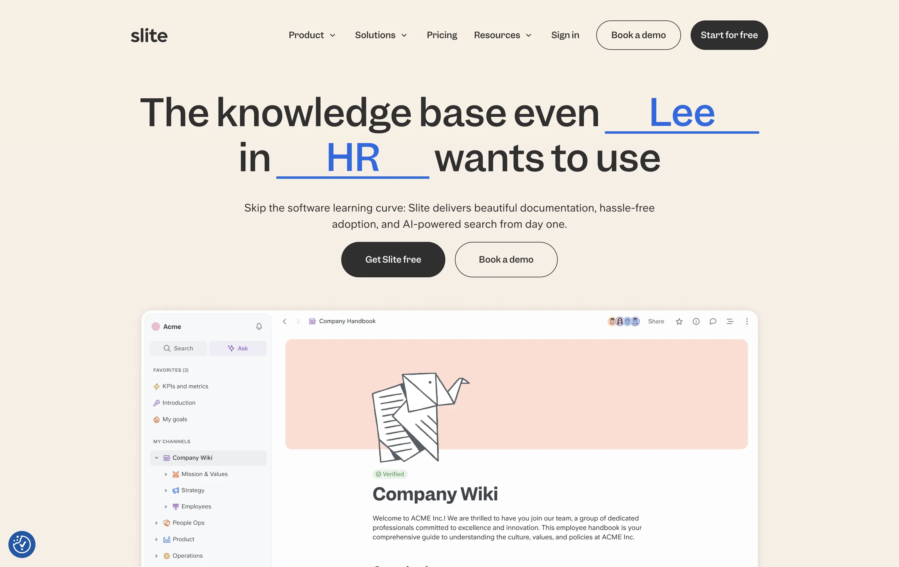
Slite
↗
SaaS
Collaboration
Centered
Benefit-Driven
Conversational
Multi-CTA Block
Product UI
Custom Animation
Light Mode
Blue
Black
Sans serif
B2B
Home Page
Webflow
team-friendly, rotating headline, UI demo, warm neutrals, playful logic, AI-assisted search, startup SaaS, low-friction entry, inclusive language, collaborative tools, documentation-first, dual CTA, trust-building UX
Slite gives teams a simple, AI-powered workspace to capture and find knowledge without the usual learning curve.
Hero is clever and inclusive. Animated blanks highlight versatility without overexplaining. UI preview builds product confidence. Dual CTAs clearly support trial vs. demo. Warm visuals balance modern minimalism with approachability.
Speaks to multiple roles without bloating the message. Tone and visual style position Slite as a low-friction, high-utility tool. Well-suited for horizontal B2B SaaS adoption.
This layout balances technical utility with human impact, aligning well with Algolia’s positioning as an API-first but UX-aware company. The mobile UI reinforces product value visually, while the logo wall signals scale and trust for enterprise buyers. The tone is clear, benefit-led, and appropriate for high-intent decision-makers evaluating AI tools for customer experience. This is a solid enterprise-facing hero built to perform.
The most effective hero sections in your inbox.
Monthly round up of top hero sections.
Don't worry. We hate spam too.
Don't worry. We hate spam too.
Don't worry. We hate spam too.