Confident
22
22
22
22
Self-assured, focused, and composed — no over-selling, just presence.
Filters
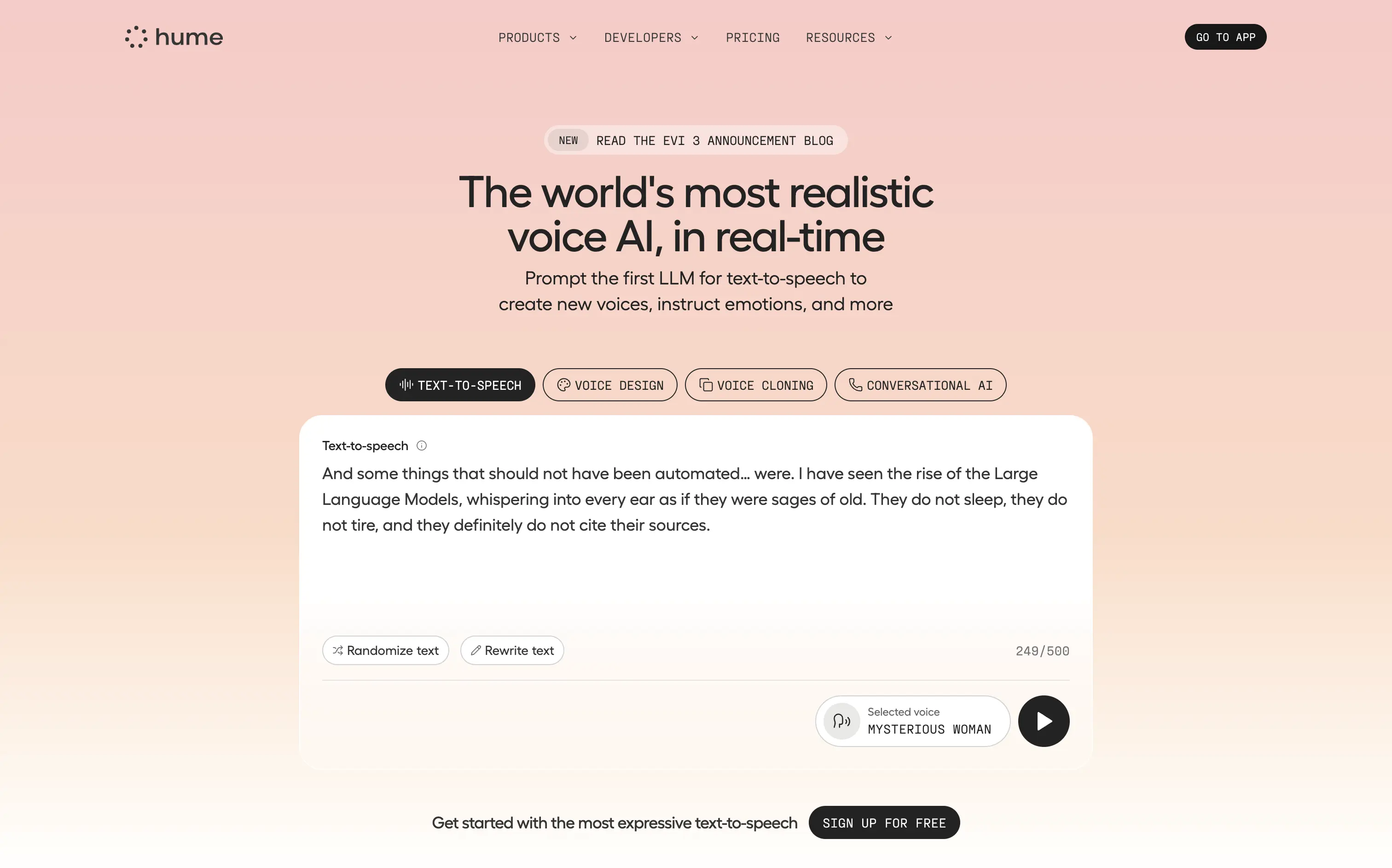
Hume
↗
SaaS
AI Tools
Centered
Bold & Direct
Confident
Search/Utility Block
Interactive
Announcement
Gradient
Light Mode
Pink
Orange
Sans serif
Hybrid
Home Page
Custom Code
voice ai, text-to-speech, llm, real-time api, developer friendly, pastel gradient, centered hero, interactive demo, single cta, assertive headline, white card, product proof, gradient background, low-friction signup, modern saas
Hume offers a real-time text-to-speech API that lets developers generate lifelike, emotionally nuanced voices or clone existing ones on demand.
Bold claim, proof in one scroll. The live sandbox lets visitors try four core features instantly—a strong trust move. Clear headline, crisp subhead, and “Sign Up For Free” keep focus. Gradient softens tech intensity but may under-signal enterprise heft.
Superlative headline plus instant demo match developer expectations for proof. Single signup path reduces cognitive load, positioning Hume as fast, expressive infrastructure rather than a heavy enterprise suite.
This layout balances technical utility with human impact, aligning well with Algolia’s positioning as an API-first but UX-aware company. The mobile UI reinforces product value visually, while the logo wall signals scale and trust for enterprise buyers. The tone is clear, benefit-led, and appropriate for high-intent decision-makers evaluating AI tools for customer experience. This is a solid enterprise-facing hero built to perform.
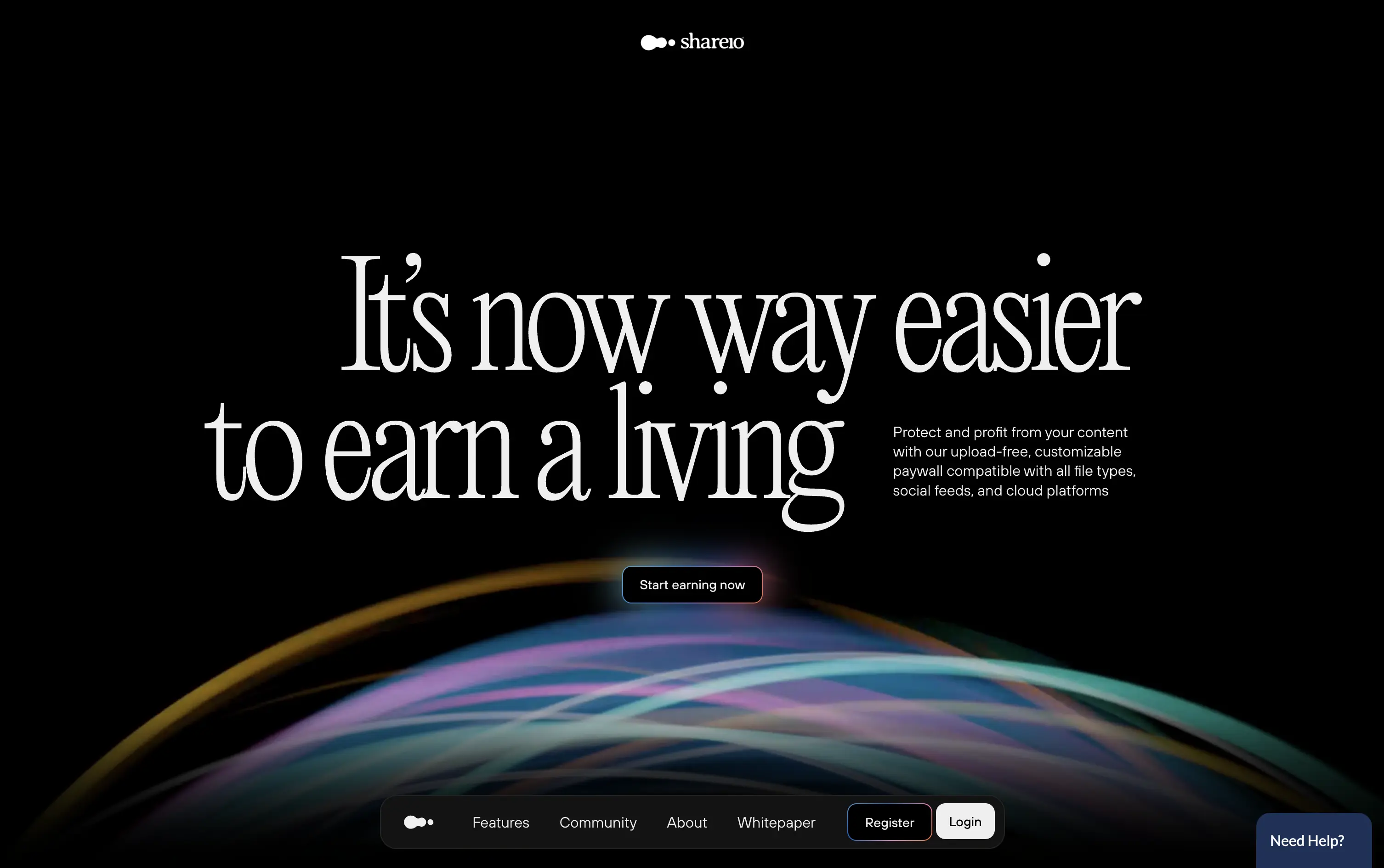
Shareio
↗
Creator Tools
Web3
Editorial
Aspirational
Confident
Single Button
Custom Animation
Loading Animation
3D visuals
Dark Mode
Green
Pink
Serif
B2C
Home Page
Webflow
paywall tech, content monetization, no-upload platform, editorial layout, kinetic typography, web3 creator stack, glowing animation, creator-first, income tools, luxury digital aesthetic
Shareio is a tool for creators to monetize any content via customizable paywalls—no uploads, just link and earn.
The hero is visually magnetic. Oversized serif type and fluid animation deliver a high-end, editorial feel. The core message is emotional, not functional—but the subline recovers clarity.
A bold play for modern creators who value style, independence, and control. The hero builds intrigue through aesthetic gravity but still manages to explain the product’s purpose with restraint.
This layout balances technical utility with human impact, aligning well with Algolia’s positioning as an API-first but UX-aware company. The mobile UI reinforces product value visually, while the logo wall signals scale and trust for enterprise buyers. The tone is clear, benefit-led, and appropriate for high-intent decision-makers evaluating AI tools for customer experience. This is a solid enterprise-facing hero built to perform.
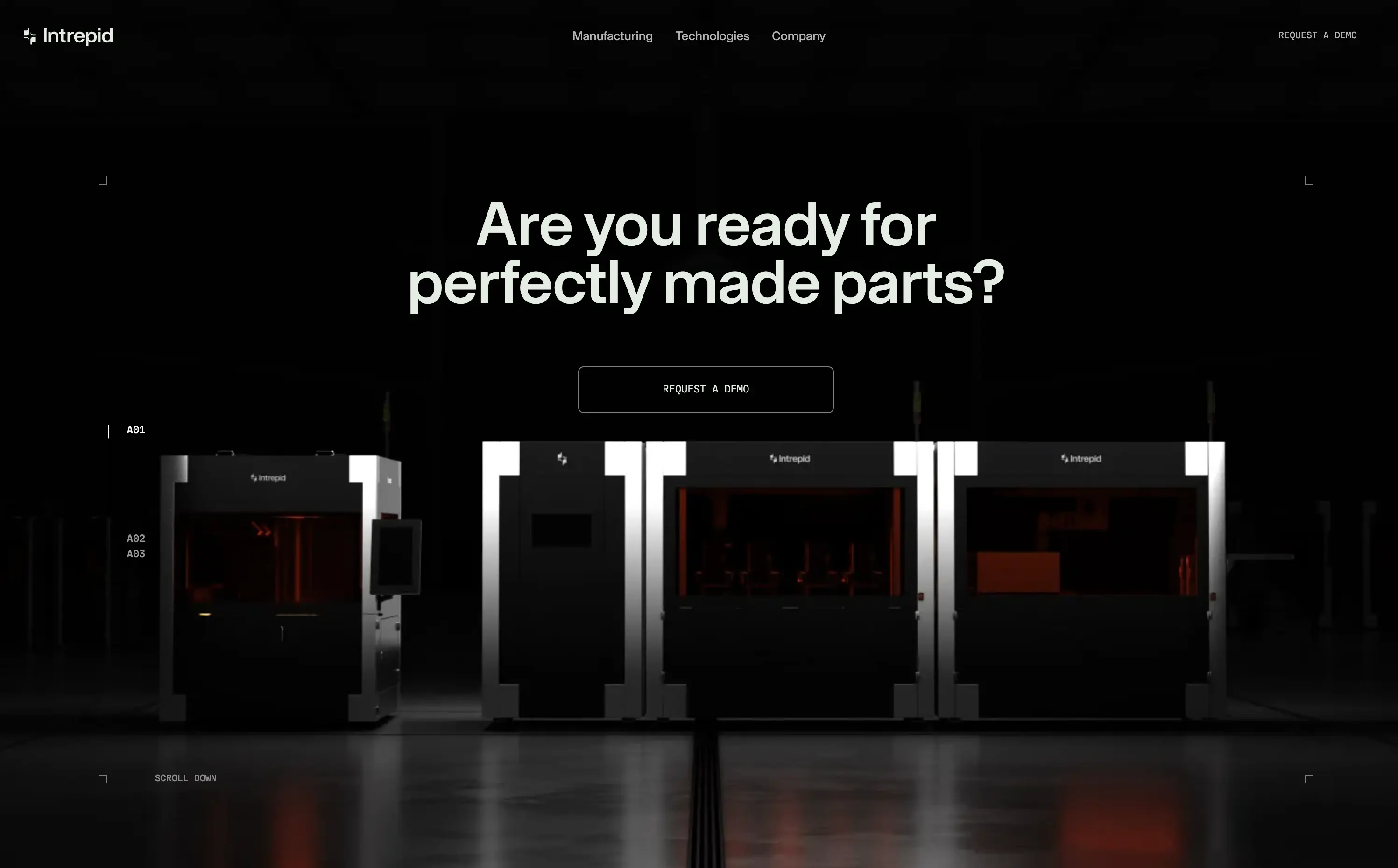
Intrepid
↗
Hardware
Centered
Benefit-Driven
Confident
Single Button
Photography
Loading Animation
3D visuals
Dark Mode
Orange
Sans serif
B2B
Home Page
Custom Code
dark hero, industrial hardware, 3D printing, automation tech, demo‑first CTA, mint headline, orange glow accents, centered layout, B2B manufacturing, sleek machines, full‑width image, high contrast, precise messaging
Industrial 3D‑printing company making automated hardware systems that produce precise parts at production scale for manufacturers.
Industrial 3D‑printing company making automated hardware systems that produce precise parts at production scale for manufacturers.
Visual gravitas matches enterprise buyers seeking reliability. Centered demo CTA suits high‑touch sales funnel. Message aligns with pain of imperfect parts, reinforcing positioning as quality‑first hardware partner.
This layout balances technical utility with human impact, aligning well with Algolia’s positioning as an API-first but UX-aware company. The mobile UI reinforces product value visually, while the logo wall signals scale and trust for enterprise buyers. The tone is clear, benefit-led, and appropriate for high-intent decision-makers evaluating AI tools for customer experience. This is a solid enterprise-facing hero built to perform.
Opal
↗
CPG
Hardware
Left-aligned
Editorial
Descriptive
Confident
Single Button
Email Capture
Photography
Imagery-Based
Yellow
Sans serif
DTC
Home Page
Custom Code
premium webcam, lifestyle focus, cozy setup, hardware-first product, DTC electronics, human-centered visual, muted palette, cinematic photography, on-brand lighting, creative tool, soft tech aesthetic
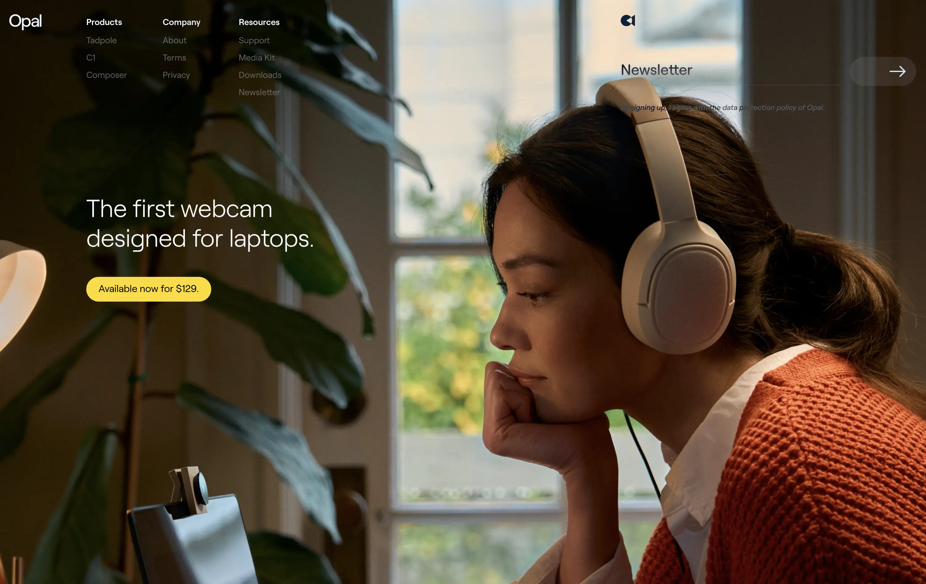
Opal makes premium webcams designed for laptops, with high-end quality and thoughtful design.
The hero is clean and confident. Photo tells the story before the copy does. It’s emotional, product-centric, and conversion-ready—but a bit light on technical proof or feature context.
Opal sells feeling first—comfort, focus, and quality. This is lifestyle-led DTC strategy that builds trust visually. But it risks underselling function unless the user scrolls.
This layout balances technical utility with human impact, aligning well with Algolia’s positioning as an API-first but UX-aware company. The mobile UI reinforces product value visually, while the logo wall signals scale and trust for enterprise buyers. The tone is clear, benefit-led, and appropriate for high-intent decision-makers evaluating AI tools for customer experience. This is a solid enterprise-facing hero built to perform.
Opal
↗
CPG
Hardware
Left-aligned
Editorial
Descriptive
Confident
Single Button
Email Capture
Photography
Imagery-Based
Yellow
Sans serif
DTC
Home Page
Custom Code
premium webcam, lifestyle focus, cozy setup, hardware-first product, DTC electronics, human-centered visual, muted palette, cinematic photography, on-brand lighting, creative tool, soft tech aesthetic
Opal makes premium webcams designed for laptops, with high-end quality and thoughtful design.
The hero is clean and confident. Photo tells the story before the copy does. It’s emotional, product-centric, and conversion-ready—but a bit light on technical proof or feature context.
Opal sells feeling first—comfort, focus, and quality. This is lifestyle-led DTC strategy that builds trust visually. But it risks underselling function unless the user scrolls.
This layout balances technical utility with human impact, aligning well with Algolia’s positioning as an API-first but UX-aware company. The mobile UI reinforces product value visually, while the logo wall signals scale and trust for enterprise buyers. The tone is clear, benefit-led, and appropriate for high-intent decision-makers evaluating AI tools for customer experience. This is a solid enterprise-facing hero built to perform.
Family
↗
Fintech
Web3
Centered
Playful
Confident
Download App
Multi-CTA Block
Illustration
Custom Animation
Loading Animation
Light Mode
Blue
Yellow
Black
Sans serif
B2C
Home Page
Custom Code
crypto wallet for iOS, ENS support, playful Web3, mobile-first design, Gen Z crypto, kawaii aesthetic, approachable fintech, token collectibles, web3 onboarding, friendly UX
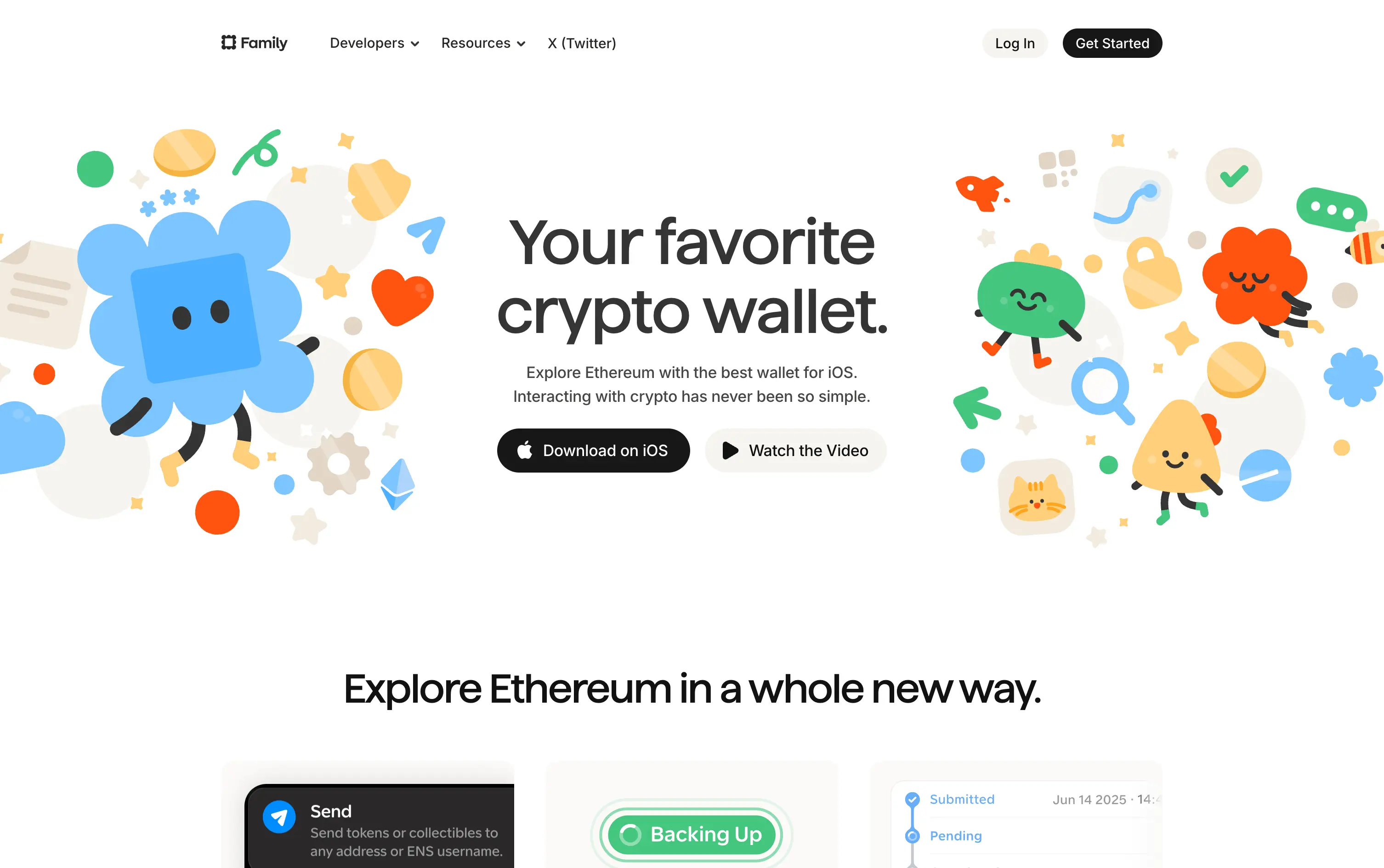
Family is a playful Ethereum wallet designed for iOS, making crypto feel friendly, visual, and simple to use.
Extremely approachable for a space often seen as cold or intimidating. The illustrations soften the category. Clear copy and strong CTA pair well with the product’s target audience and mobile-first approach.
A masterclass in brand positioning. While most Web3 brands chase dark, technical aesthetics, Family goes the opposite direction—bright, warm, and welcoming. It’s intentionally crafted to disarm, invite, and onboard a broader audience.
This layout balances technical utility with human impact, aligning well with Algolia’s positioning as an API-first but UX-aware company. The mobile UI reinforces product value visually, while the logo wall signals scale and trust for enterprise buyers. The tone is clear, benefit-led, and appropriate for high-intent decision-makers evaluating AI tools for customer experience. This is a solid enterprise-facing hero built to perform.
Family
↗
Fintech
Web3
Centered
Playful
Confident
Download App
Multi-CTA Block
Illustration
Custom Animation
Loading Animation
Light Mode
Blue
Yellow
Black
Sans serif
B2C
Home Page
Custom Code
crypto wallet for iOS, ENS support, playful Web3, mobile-first design, Gen Z crypto, kawaii aesthetic, approachable fintech, token collectibles, web3 onboarding, friendly UX
Family is a playful Ethereum wallet designed for iOS, making crypto feel friendly, visual, and simple to use.
Extremely approachable for a space often seen as cold or intimidating. The illustrations soften the category. Clear copy and strong CTA pair well with the product’s target audience and mobile-first approach.
A masterclass in brand positioning. While most Web3 brands chase dark, technical aesthetics, Family goes the opposite direction—bright, warm, and welcoming. It’s intentionally crafted to disarm, invite, and onboard a broader audience.
This layout balances technical utility with human impact, aligning well with Algolia’s positioning as an API-first but UX-aware company. The mobile UI reinforces product value visually, while the logo wall signals scale and trust for enterprise buyers. The tone is clear, benefit-led, and appropriate for high-intent decision-makers evaluating AI tools for customer experience. This is a solid enterprise-facing hero built to perform.
Outreach
↗
SaaS
AI Tools
Productivity
Full Width
Centered
Benefit-Driven
Confident
Multi-CTA Block
Video
Product UI
Imagery-Based
Blue
Sans serif
B2B
Home Page
Custom Code
sales automation, B2B SaaS, AI forecasting, sales rep enablement, RevOps tools, productivity workflows, confident tone, enterprise platform, full-width layout, animated product demo, AI sales co-pilot, multi-CTA, modern interface, precision messaging, dark UI
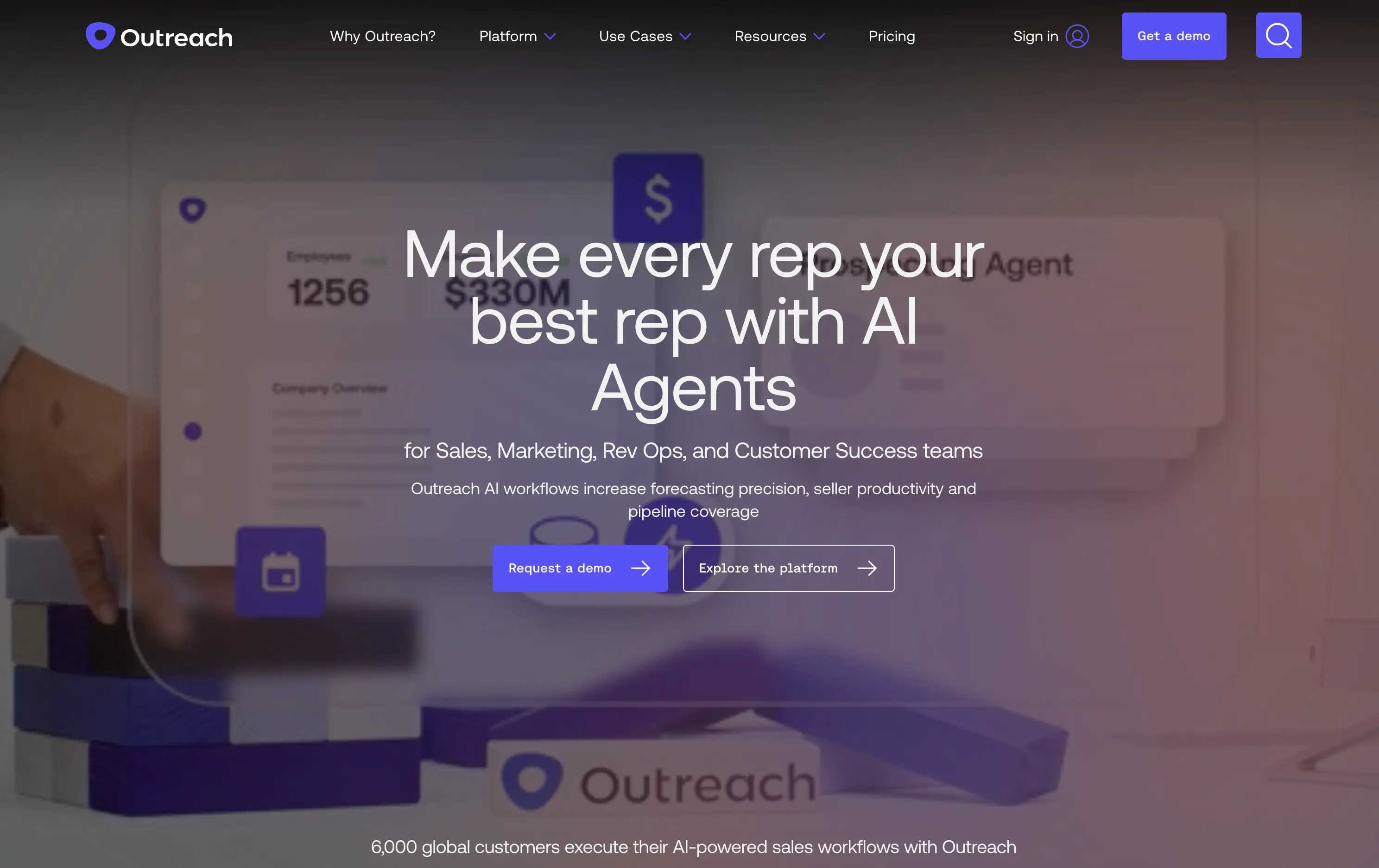
Outreach helps B2B teams improve pipeline precision and sales productivity through AI-powered automation and forecasting tools.
The hero is product-led with a high-trust, enterprise feel. The headline is assertive, speaking directly to the sales persona. Subheadline adds clarity and lists functional benefits. Background motion shows product value without distraction. CTAs are split by intent: demo vs. explore. The full-width layout conveys confidence and scale.
Clearly positioned for decision-makers in SalesOps and RevOps. Copy and layout support mid-funnel engagement with strong product-centric framing and trusting tone.
This layout balances technical utility with human impact, aligning well with Algolia’s positioning as an API-first but UX-aware company. The mobile UI reinforces product value visually, while the logo wall signals scale and trust for enterprise buyers. The tone is clear, benefit-led, and appropriate for high-intent decision-makers evaluating AI tools for customer experience. This is a solid enterprise-facing hero built to perform.
Outreach
↗
SaaS
AI Tools
Productivity
Full Width
Centered
Benefit-Driven
Confident
Multi-CTA Block
Video
Product UI
Imagery-Based
Blue
Sans serif
B2B
Home Page
Custom Code
sales automation, B2B SaaS, AI forecasting, sales rep enablement, RevOps tools, productivity workflows, confident tone, enterprise platform, full-width layout, animated product demo, AI sales co-pilot, multi-CTA, modern interface, precision messaging, dark UI
Outreach helps B2B teams improve pipeline precision and sales productivity through AI-powered automation and forecasting tools.
The hero is product-led with a high-trust, enterprise feel. The headline is assertive, speaking directly to the sales persona. Subheadline adds clarity and lists functional benefits. Background motion shows product value without distraction. CTAs are split by intent: demo vs. explore. The full-width layout conveys confidence and scale.
Clearly positioned for decision-makers in SalesOps and RevOps. Copy and layout support mid-funnel engagement with strong product-centric framing and trusting tone.
This layout balances technical utility with human impact, aligning well with Algolia’s positioning as an API-first but UX-aware company. The mobile UI reinforces product value visually, while the logo wall signals scale and trust for enterprise buyers. The tone is clear, benefit-led, and appropriate for high-intent decision-makers evaluating AI tools for customer experience. This is a solid enterprise-facing hero built to perform.
Gong
↗
SaaS
AI Tools
Productivity
Split Grid
Left-aligned
Benefit-Driven
Confident
Single Button
Photography
Illustration
Logo Wall
Announcement
Duotone
Blue
Purple
Sans serif
B2B
Home Page
Wordpress
sales AI, B2B revenue platform, utility CTA, animated overlays, client logos, enterprise trust signals, AI productivity agents, dark gradient palette, conversational UI, split hero grid, vibrant lighting, modern SaaS, sales enablement, motion interface cues, product-forward layout
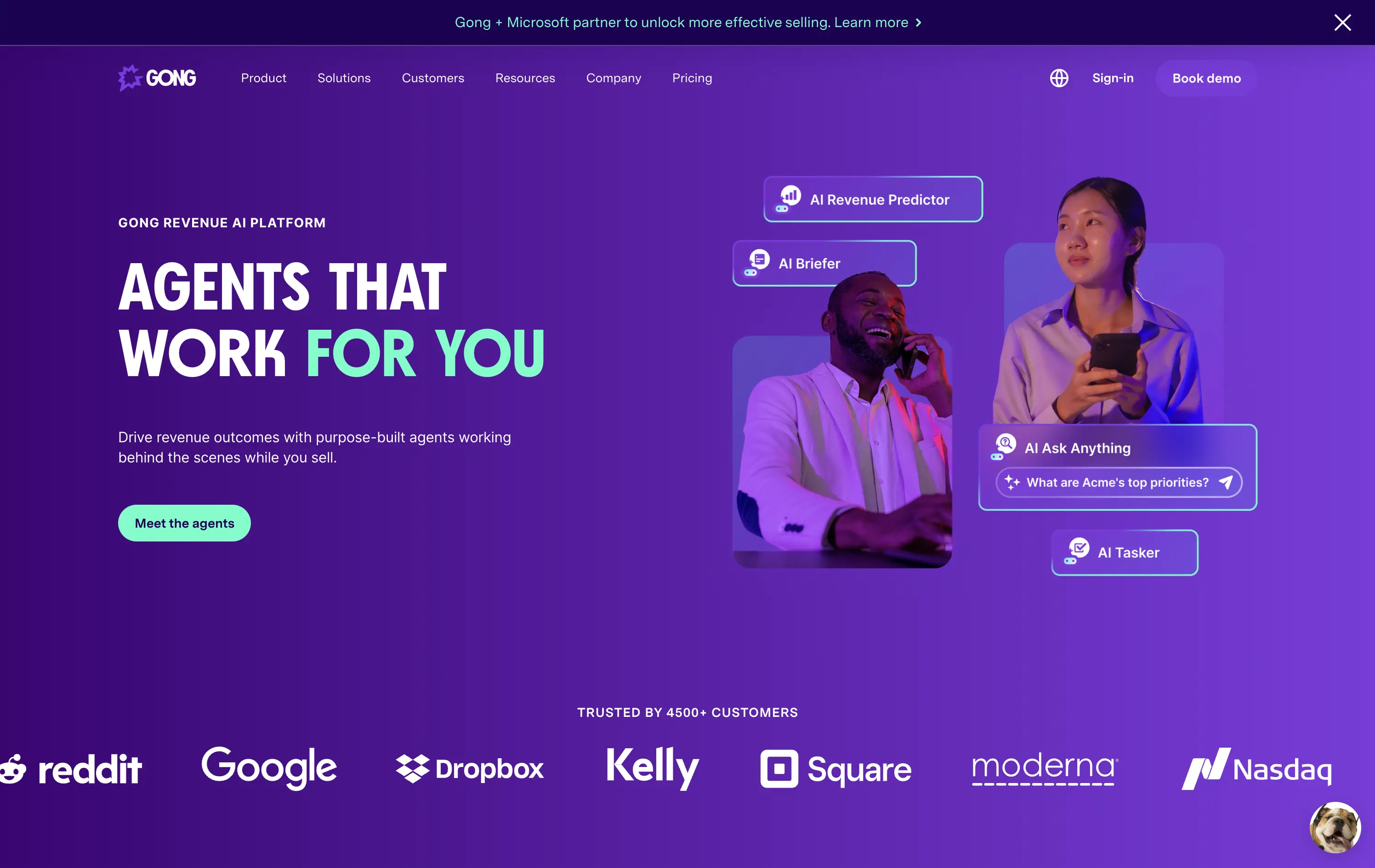
Gong helps sales teams boost revenue by deploying AI-powered agents that automate insights, prep, and task handling across the sales cycle.
The hero is clear and conversion-aware. Headline delivers a confident value prop, supported by animated tooltips that make the product’s AI capabilities tangible. The “Meet the agents” CTA invites deeper engagement. Strong use of customer logos boosts enterprise credibility. Overall, it's tight, modern, and visually active without overwhelming.
Tailored for mid-to-late funnel enterprise leads. High-trust layout and confident tone reflect maturity and market leadership in B2B sales tech.
This layout balances technical utility with human impact, aligning well with Algolia’s positioning as an API-first but UX-aware company. The mobile UI reinforces product value visually, while the logo wall signals scale and trust for enterprise buyers. The tone is clear, benefit-led, and appropriate for high-intent decision-makers evaluating AI tools for customer experience. This is a solid enterprise-facing hero built to perform.
Gong
↗
SaaS
AI Tools
Productivity
Split Grid
Left-aligned
Benefit-Driven
Confident
Single Button
Photography
Illustration
Logo Wall
Announcement
Duotone
Blue
Purple
Sans serif
B2B
Home Page
Wordpress
sales AI, B2B revenue platform, utility CTA, animated overlays, client logos, enterprise trust signals, AI productivity agents, dark gradient palette, conversational UI, split hero grid, vibrant lighting, modern SaaS, sales enablement, motion interface cues, product-forward layout
Gong helps sales teams boost revenue by deploying AI-powered agents that automate insights, prep, and task handling across the sales cycle.
The hero is clear and conversion-aware. Headline delivers a confident value prop, supported by animated tooltips that make the product’s AI capabilities tangible. The “Meet the agents” CTA invites deeper engagement. Strong use of customer logos boosts enterprise credibility. Overall, it's tight, modern, and visually active without overwhelming.
Tailored for mid-to-late funnel enterprise leads. High-trust layout and confident tone reflect maturity and market leadership in B2B sales tech.
This layout balances technical utility with human impact, aligning well with Algolia’s positioning as an API-first but UX-aware company. The mobile UI reinforces product value visually, while the logo wall signals scale and trust for enterprise buyers. The tone is clear, benefit-led, and appropriate for high-intent decision-makers evaluating AI tools for customer experience. This is a solid enterprise-facing hero built to perform.
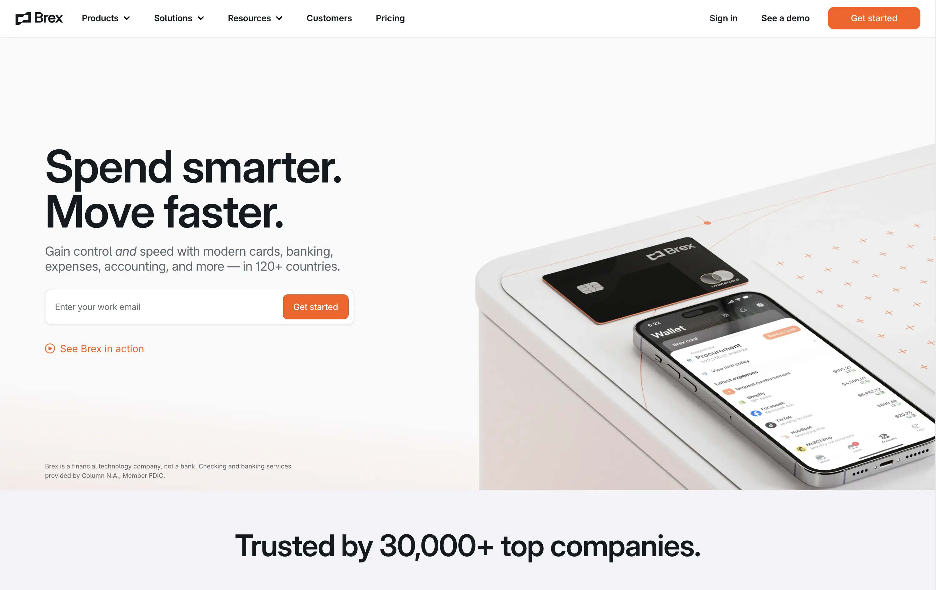
Brex
↗
SaaS
Fintech
Split Grid
Left-aligned
Benefit-Driven
Confident
Email Capture
Product UI
Social Proof
3D visuals
Light Mode
Orange
Sans serif
B2B
Home Page
Custom Code
global finance platform, expense automation, control and speed messaging, embedded email field, startup to enterprise, international SaaS, B2B fintech, conversion-led layout, modern finance stack, clean UI, sharp tone, input-first UX, mobile + card visual, minimalist grid
Brex is a global financial platform offering cards, banking, and expense tools for fast-scaling companies in 120+ countries.
This hero nails first-contact clarity. The headline hits fast with rhythmic, benefit-led language, while the subhead contextualizes product depth across spend, banking, and scale. The layout leads with a form-first interaction, pushing immediate action, while the micro-CTA (“See Brex in action”) gives skeptics a softer entry point. The 3D product mockup adds credibility and sharpens the tech-forward appeal. Nothing feels redundant — every element either informs or converts. The result is frictionless, enterprise-friendly, and confident without oversell.
Speaks directly to startup and scale-up operators. Prioritizes control and speed — key brand levers for high-growth companies. Balanced tone and visual logic establish Brex as both trusted and technically future-ready.
This layout balances technical utility with human impact, aligning well with Algolia’s positioning as an API-first but UX-aware company. The mobile UI reinforces product value visually, while the logo wall signals scale and trust for enterprise buyers. The tone is clear, benefit-led, and appropriate for high-intent decision-makers evaluating AI tools for customer experience. This is a solid enterprise-facing hero built to perform.
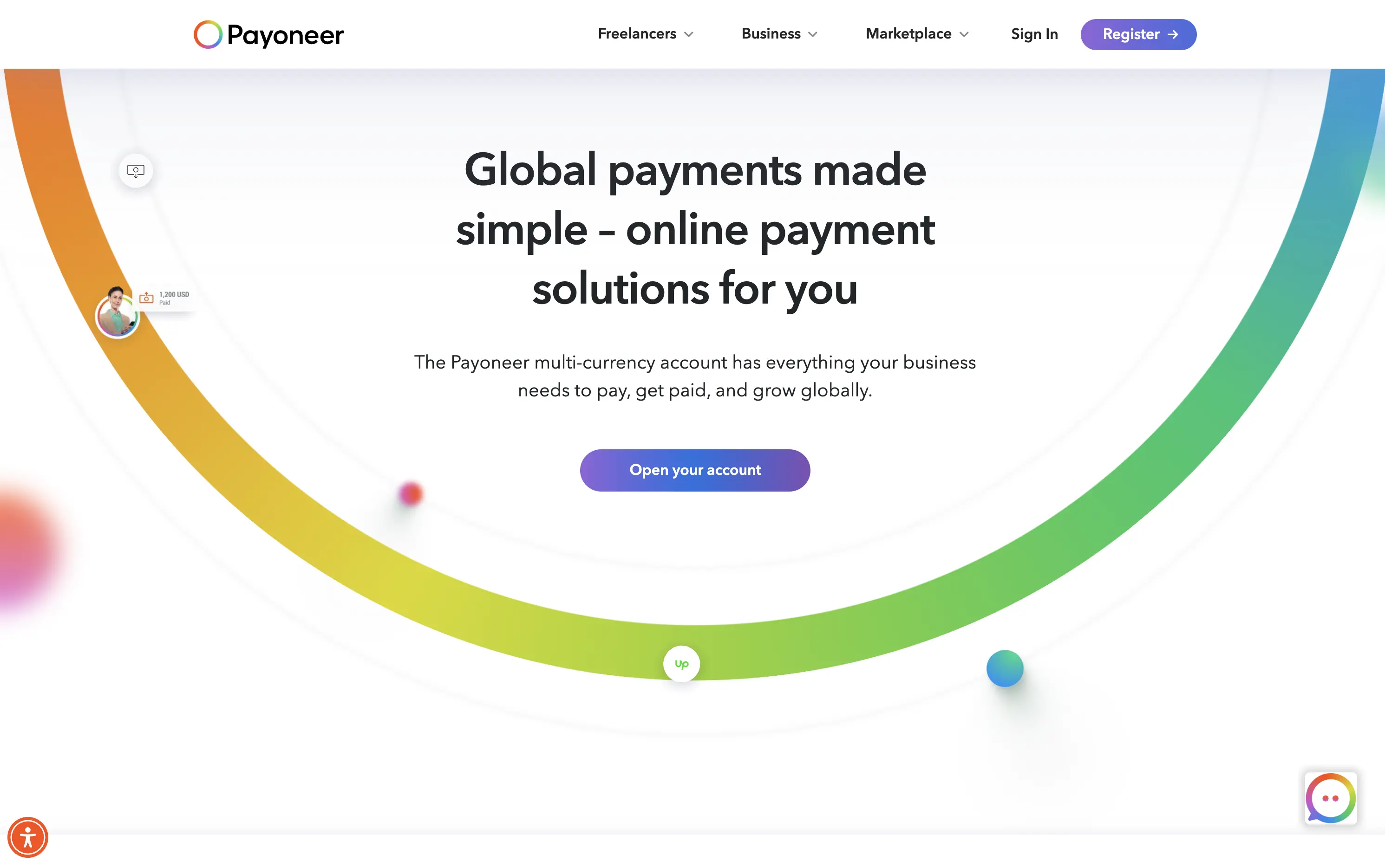
Payoneer
↗
SaaS
Fintech
Centered
Descriptive
Confident
Single Button
Photography
Illustration
Custom Animation
Light Mode
Purple
Sans serif
B2B
Home Page
Wordpress
global payments, borderless finance, transaction animation, multi-currency account, visual storytelling, freelancer payments, cross-border SaaS, simplified UX, modern money movement, motion-led layout, banking alternative, vibrant palette, international scale
Payoneer is a global online payment platform offering multi-currency accounts and seamless cross-border transactions for businesses and freelancers.
The hero blends utility and motion well. The animated arc mimics financial flow, visually conveying the platform’s core promise: fast, borderless payments. Headline is clear and functional, supported by a strong subhead. The animation, showing USD amounts sent and received, makes the experience feel human and practical. The CTA is visible but understated. Overall, it reinforces trust and makes the product feel simple and scalable.
Smart visual metaphor for financial ease and flow — helps Payoneer stand out in a space often dominated by cold, institutional design. This layout is conversion-safe while visually expressive.
This layout balances technical utility with human impact, aligning well with Algolia’s positioning as an API-first but UX-aware company. The mobile UI reinforces product value visually, while the logo wall signals scale and trust for enterprise buyers. The tone is clear, benefit-led, and appropriate for high-intent decision-makers evaluating AI tools for customer experience. This is a solid enterprise-facing hero built to perform.
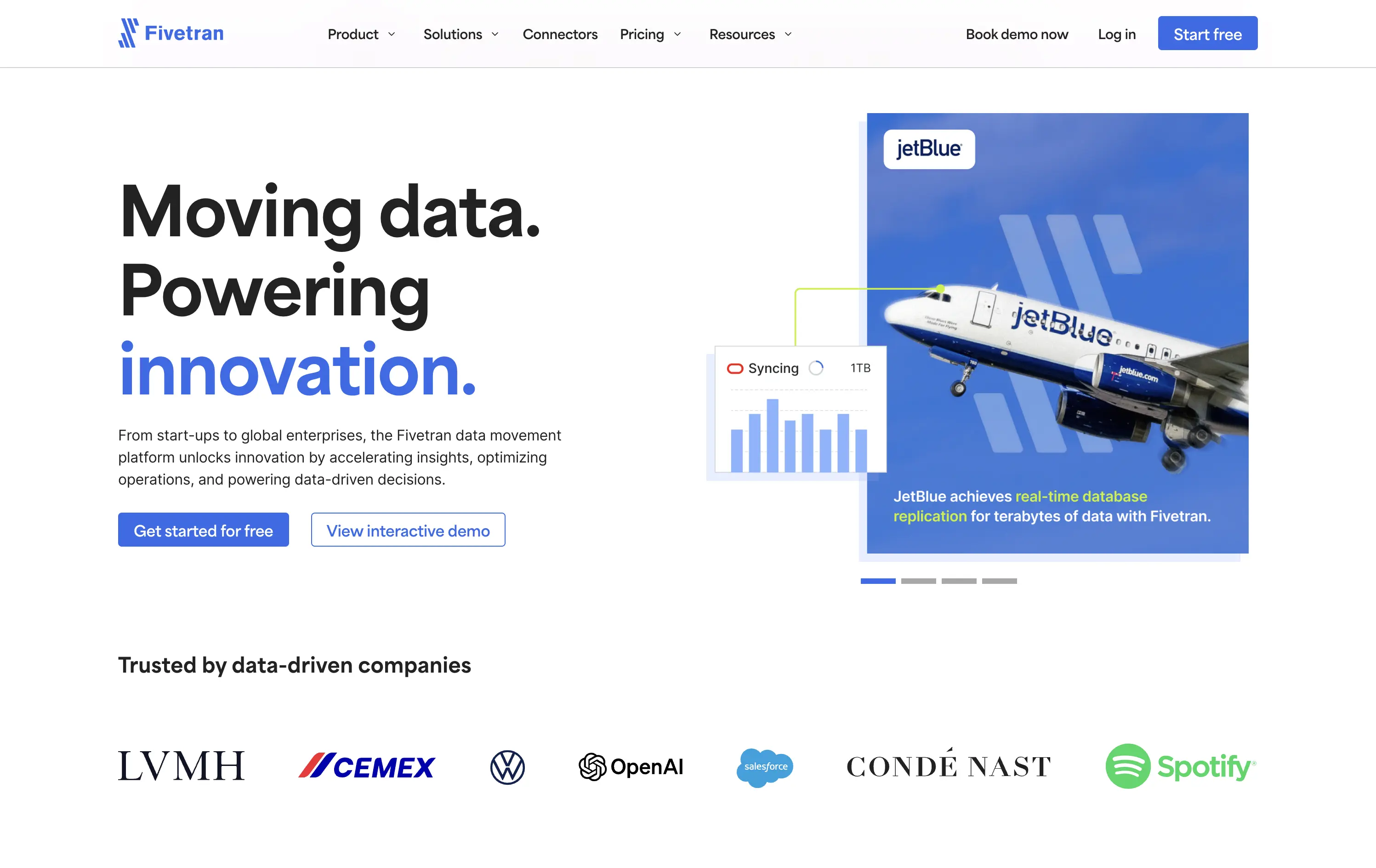
Fivetran
↗
SaaS
Data & Analytics
Split Grid
Left-aligned
Confident
Professional
Multi-CTA Block
Photography
Product UI
Social Proof
Custom Animation
Light Mode
Blue
Sans serif
B2B
Home Page
Webflow
enterprise-grade, real-time sync, testimonial integration, data pipeline, scalable architecture, visual storytelling, motion-light, trust-first, case-driven, product-led, split layout, mature B2B, dual CTA
Fivetran is a data integration platform that helps businesses automate, sync, and centralize their data across systems for analysis and reporting.
Fivetran’s hero delivers immediate clarity through its strong headline and proof-focused subtext. The combination of a recognizable brand (JetBlue) and a visual data-sync overlay reinforces product value without requiring technical deep dives. Dual CTAs are clear and well-placed for different levels of intent. Social proof below adds enterprise credibility. The overall layout is well-balanced and efficient.
Tailored for enterprise buyers, the hero blends technical reassurance with case-based credibility. It communicates trust and scalability, aligning with a mid-to-late funnel B2B audience without overwhelming on first touch.
This layout balances technical utility with human impact, aligning well with Algolia’s positioning as an API-first but UX-aware company. The mobile UI reinforces product value visually, while the logo wall signals scale and trust for enterprise buyers. The tone is clear, benefit-led, and appropriate for high-intent decision-makers evaluating AI tools for customer experience. This is a solid enterprise-facing hero built to perform.
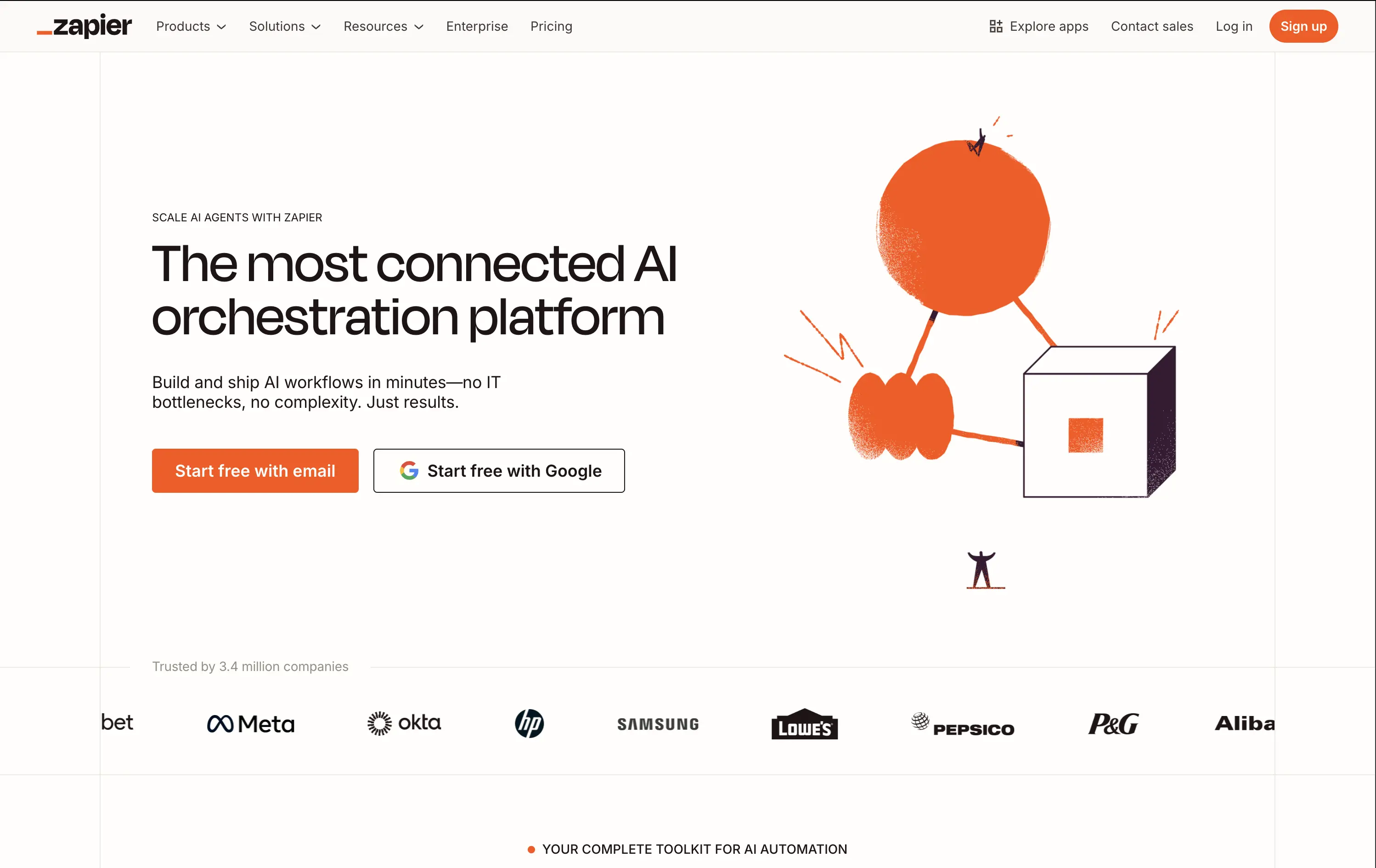
Zapier
↗
SaaS
AI Tools
No-Code
Split Grid
Left-aligned
Confident
Multi-CTA Block
Illustration
Logo Wall
Light Mode
Orange
Sans serif
Hybrid
Home Page
Builder.io
automation platform, brand-led, Zapier orange, illustration-based hero, high-trust layout, whitespace-heavy, freemium SaaS, mature product, enterprise credibility, visual shorthand, no-code workflow, minimal UI, no-code
Zapier is a no-code automation platform that connects 8,000+ apps so anyone can build time-saving workflows without engineering help.
The hero does a clean job of reinforcing brand authority. Copy is tight and direct. The whimsical graphic adds energy while the dual CTAs eliminate friction. It assumes pre-awareness and leans on Zapier’s brand strength.
Ideal for a mature product with wide adoption. Skips granular education to emphasize leadership and ease of use. Visuals and messaging feel like a confident category owner.
This layout balances technical utility with human impact, aligning well with Algolia’s positioning as an API-first but UX-aware company. The mobile UI reinforces product value visually, while the logo wall signals scale and trust for enterprise buyers. The tone is clear, benefit-led, and appropriate for high-intent decision-makers evaluating AI tools for customer experience. This is a solid enterprise-facing hero built to perform.
Quantilope
↗
SaaS
AI Tools
Data & Analytics
Centered
Bold & Direct
Confident
Single Button
Photography
Illustration
Product UI
Light Mode
Green
Sans serif
B2B
Home Page
Custom Code
research SaaS, data platform hero, quant marketing, teal hero, minimal SaaS layout, B2B insights platform, insight automation, animated data graphic, data-driven marketing, stat visual hero
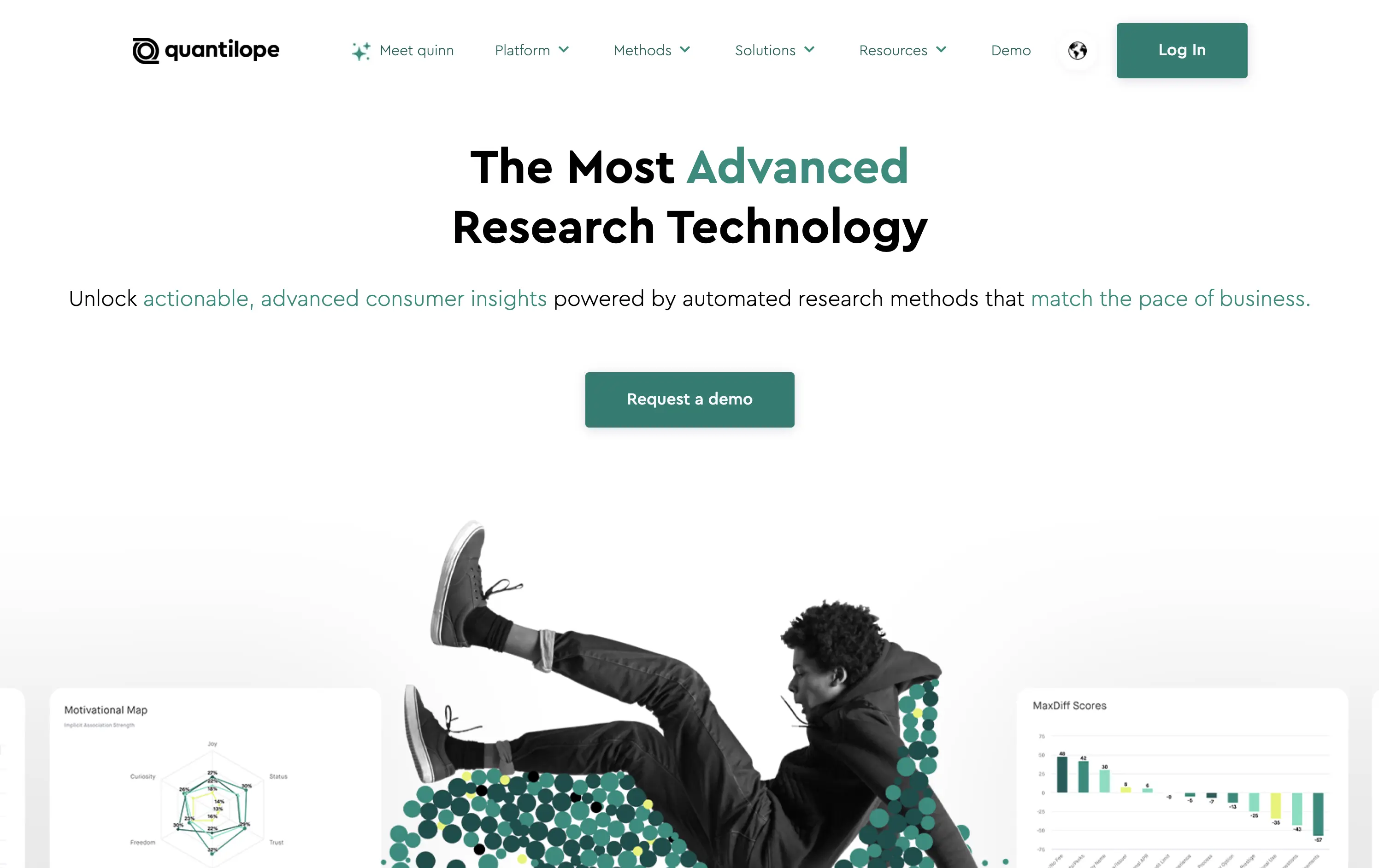
Quantilope is an advanced research platform that automates consumer insights at scale.
The headline stakes a bold claim, and the teal accent draws focus to “advanced” and action keywords. Hero visual is a clever juxtaposition of human + data, adding some life to an otherwise data-heavy space. One clear CTA keeps the flow focused.
Aimed at marketing execs and insights leaders, the hero’s tone and layout signal speed, clarity, and data fluency. It balances modernity with professionalism, avoiding overdesign while staying sharp.
This layout balances technical utility with human impact, aligning well with Algolia’s positioning as an API-first but UX-aware company. The mobile UI reinforces product value visually, while the logo wall signals scale and trust for enterprise buyers. The tone is clear, benefit-led, and appropriate for high-intent decision-makers evaluating AI tools for customer experience. This is a solid enterprise-facing hero built to perform.
Quantilope
↗
SaaS
AI Tools
Data & Analytics
Centered
Bold & Direct
Confident
Single Button
Photography
Illustration
Product UI
Light Mode
Green
Sans serif
B2B
Home Page
Custom Code
research SaaS, data platform hero, quant marketing, teal hero, minimal SaaS layout, B2B insights platform, insight automation, animated data graphic, data-driven marketing, stat visual hero
Quantilope is an advanced research platform that automates consumer insights at scale.
The headline stakes a bold claim, and the teal accent draws focus to “advanced” and action keywords. Hero visual is a clever juxtaposition of human + data, adding some life to an otherwise data-heavy space. One clear CTA keeps the flow focused.
Aimed at marketing execs and insights leaders, the hero’s tone and layout signal speed, clarity, and data fluency. It balances modernity with professionalism, avoiding overdesign while staying sharp.
This layout balances technical utility with human impact, aligning well with Algolia’s positioning as an API-first but UX-aware company. The mobile UI reinforces product value visually, while the logo wall signals scale and trust for enterprise buyers. The tone is clear, benefit-led, and appropriate for high-intent decision-makers evaluating AI tools for customer experience. This is a solid enterprise-facing hero built to perform.
Mixpanel
↗
SaaS
Data & Analytics
Centered
Benefit-Driven
Confident
Multi-CTA Block
Live Metrics
Product UI
Gradient
Purple
Sans serif
B2B
Home Page
Custom Code
product analytics, KPI dashboards, funnel analysis, data insights, gradient background, B2B SaaS, dual CTA, modern enterprise, UI-first layout, decision-making tools, conversion tracking, product-led growth, minimal and bold
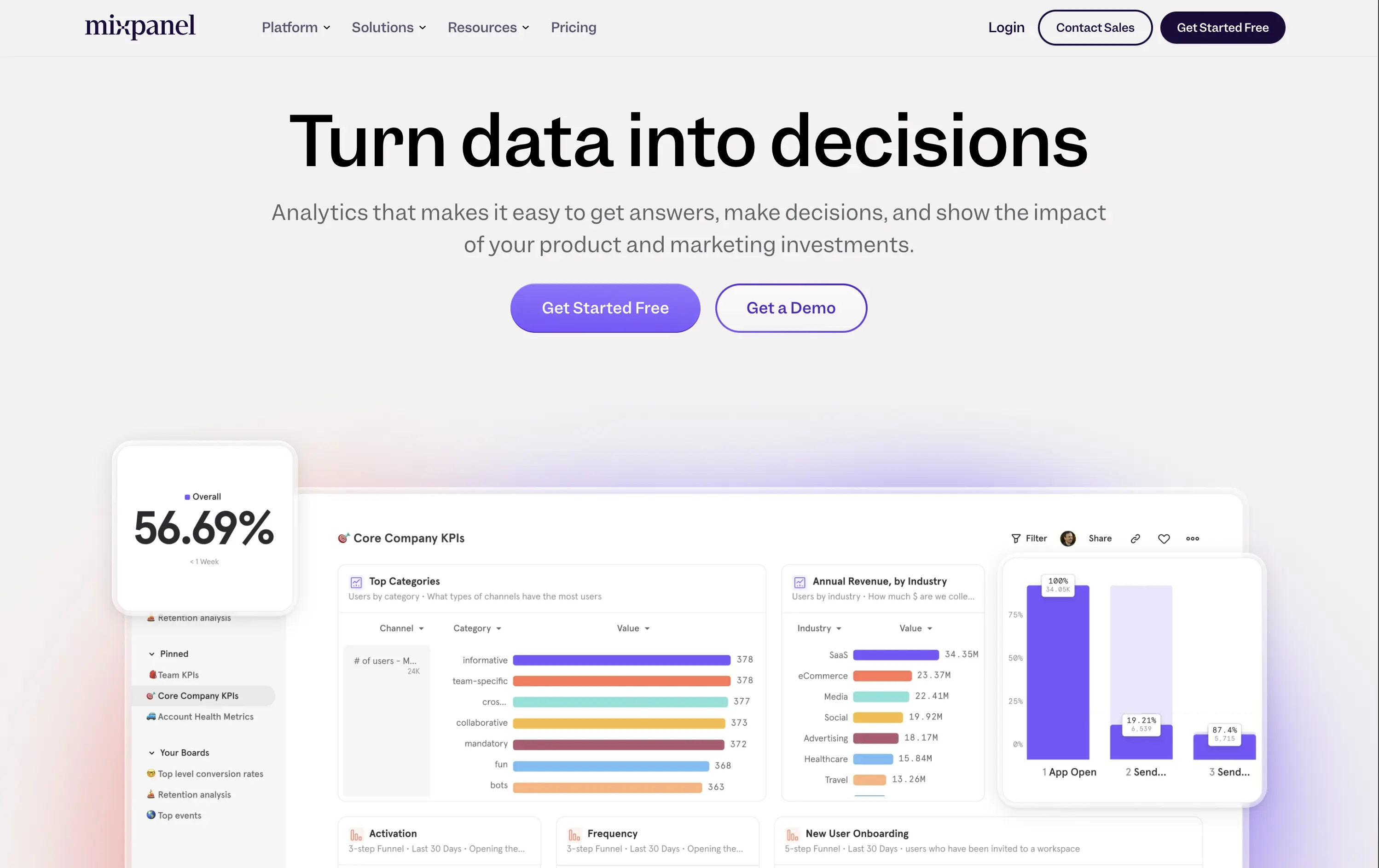
Mixpanel is a product analytics platform that helps teams understand user behavior, optimize funnels, and drive business growth.
“Turn data into decisions” is a strong, action-focused hook that immediately communicates value. The subhead explains the core utility without overexplaining. The side-by-side CTAs give both low-friction and high-touch entry points. The supporting UI visuals are clear, colorful, and show the product in action — no fluff, just function
Hero builds trust through clarity. Language and visuals appeal to decision-makers in growth, product, and marketing. Gradient adds polish, while the product UI does most of the selling.
This layout balances technical utility with human impact, aligning well with Algolia’s positioning as an API-first but UX-aware company. The mobile UI reinforces product value visually, while the logo wall signals scale and trust for enterprise buyers. The tone is clear, benefit-led, and appropriate for high-intent decision-makers evaluating AI tools for customer experience. This is a solid enterprise-facing hero built to perform.
Mixpanel
↗
SaaS
Data & Analytics
Centered
Benefit-Driven
Confident
Multi-CTA Block
Live Metrics
Product UI
Gradient
Purple
Sans serif
B2B
Home Page
Custom Code
product analytics, KPI dashboards, funnel analysis, data insights, gradient background, B2B SaaS, dual CTA, modern enterprise, UI-first layout, decision-making tools, conversion tracking, product-led growth, minimal and bold
Mixpanel is a product analytics platform that helps teams understand user behavior, optimize funnels, and drive business growth.
“Turn data into decisions” is a strong, action-focused hook that immediately communicates value. The subhead explains the core utility without overexplaining. The side-by-side CTAs give both low-friction and high-touch entry points. The supporting UI visuals are clear, colorful, and show the product in action — no fluff, just function
Hero builds trust through clarity. Language and visuals appeal to decision-makers in growth, product, and marketing. Gradient adds polish, while the product UI does most of the selling.
This layout balances technical utility with human impact, aligning well with Algolia’s positioning as an API-first but UX-aware company. The mobile UI reinforces product value visually, while the logo wall signals scale and trust for enterprise buyers. The tone is clear, benefit-led, and appropriate for high-intent decision-makers evaluating AI tools for customer experience. This is a solid enterprise-facing hero built to perform.
OpenPhone
↗
SaaS
Productivity
Centered
Bold & Direct
Confident
Single Button
Product UI
Social Proof
Light Mode
Purple
Black
Sans serif
B2B
Home Page
Webflow
business phone system, team communication, AI-enhanced calling, VoIP SaaS, minimalist hero, bold headline, trust rating, startup tools, shared inbox, clear CTA, conversion-focused, functional UI preview, modern enterprise utility
OpenPhone is a modern business phone system that unifies calls, texts, and contact management for growing teams.
Hero is bold and crystal clear. Headline makes a confident claim, immediately backed by product visuals and strong review stats. The black CTA button pops against the clean layout, driving clear intent.
Focused and direct for SMB and startup buyers. Hero supports bottom-of-funnel conversion. Minimalist visuals and rating badge project trust. Smart use of space for clarity and speed.
This layout balances technical utility with human impact, aligning well with Algolia’s positioning as an API-first but UX-aware company. The mobile UI reinforces product value visually, while the logo wall signals scale and trust for enterprise buyers. The tone is clear, benefit-led, and appropriate for high-intent decision-makers evaluating AI tools for customer experience. This is a solid enterprise-facing hero built to perform.
Github
↗
DevTools
Collaboration
Centered
Benefit-Driven
Confident
Multi-CTA Block
Product UI
Custom Animation
3D visuals
Gradient
Dark Mode
Green
Purple
Sans serif
Hybrid
Home Page
Custom Code
developer platform, AI coding assistant, GitHub Copilot, dark theme UI, modern dev culture, collaborative tools, open source hub, onboarding input, 3D mascots, dual CTA, cloud-based dev tools, tech-forward, productivity SaaS
GitHub is the world’s leading platform for developers to build, collaborate, and ship code together.
The hero delivers immediate clarity: build and ship software together. The animated floating mascots add visual intrigue without distracting from the copy, and the dual CTAs — email capture and Copilot trial — serve both new users and AI-curious devs. The dark spacey palette and glowing elements feel modern and focused. Solid hierarchy, clean execution.
Blends GitHub’s core dev value with its AI evolution. Highlights collaboration and product trust while gently introducing Copilot. Balanced tone makes it accessible to both enterprise teams and individual devs.
This layout balances technical utility with human impact, aligning well with Algolia’s positioning as an API-first but UX-aware company. The mobile UI reinforces product value visually, while the logo wall signals scale and trust for enterprise buyers. The tone is clear, benefit-led, and appropriate for high-intent decision-makers evaluating AI tools for customer experience. This is a solid enterprise-facing hero built to perform.
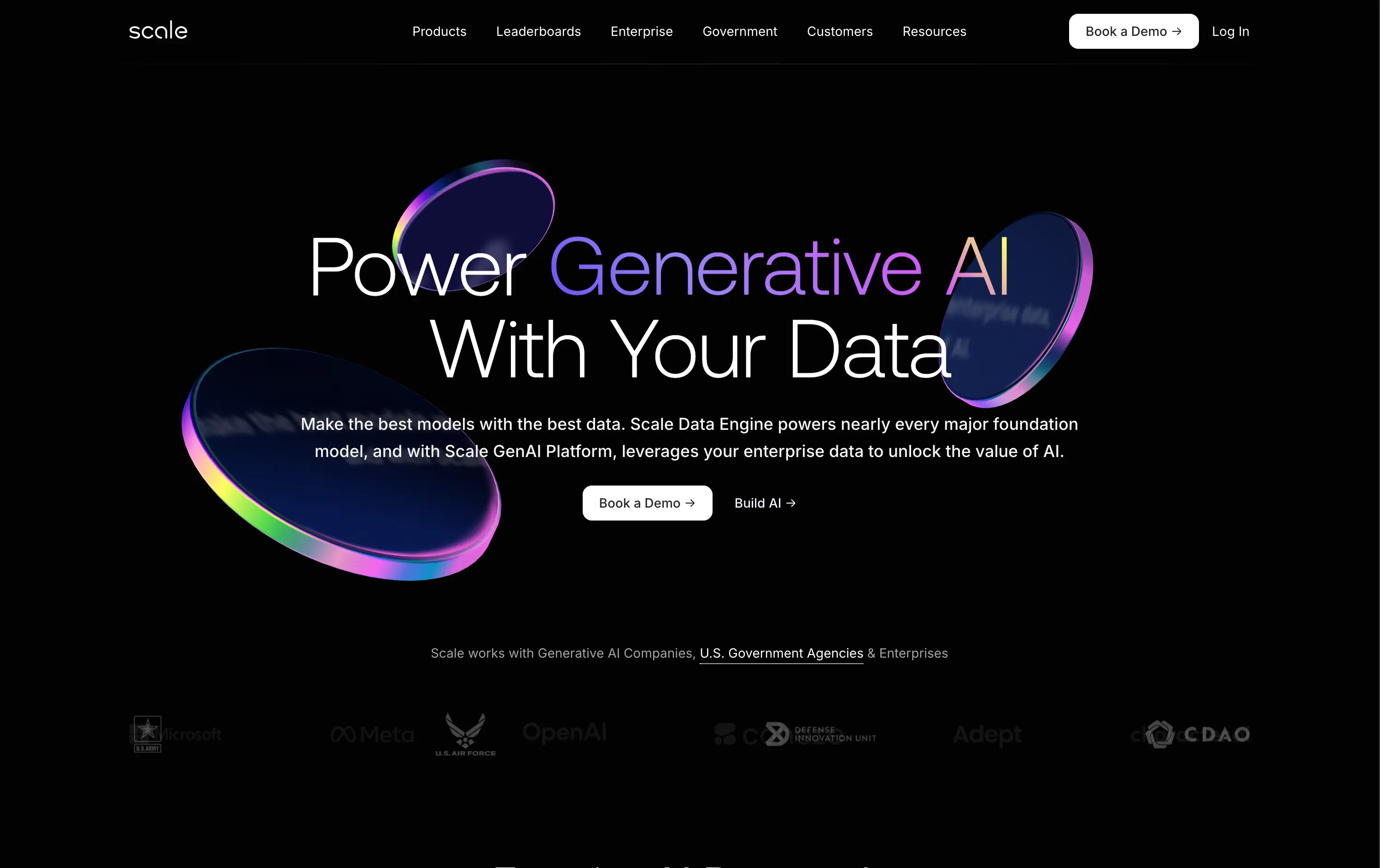
Scale
↗
AI Tools
Data & Analytics
Centered
Confident
Professional
Multi-CTA Block
Logo Wall
Custom Animation
3D visuals
Dark Mode
White
Purple
Sans serif
B2B
Home Page
Custom Code
enterprise AI, gradient glow, high-trust visual, government clients, GenAI platform, data engine, premium tech, futuristic design, centered layout, B2B AI, 3D tokens, logo wall, scale impact, C-suite focused
Scale provides AI infrastructure and data pipelines to help enterprises and governments build, train, and deploy powerful AI models.
The visuals command authority. Messaging is clean and exacting. The black backdrop and glowing UI signal cutting-edge reliability. Dual CTA path supports both buyers and builders. Logo bar validates status instantly.
A top-tier enterprise SaaS hero: built to impress stakeholders with budget and scope. Design choices reflect precision, scale, and mission-critical relevance. It speaks directly to engineering leaders and procurement.
This layout balances technical utility with human impact, aligning well with Algolia’s positioning as an API-first but UX-aware company. The mobile UI reinforces product value visually, while the logo wall signals scale and trust for enterprise buyers. The tone is clear, benefit-led, and appropriate for high-intent decision-makers evaluating AI tools for customer experience. This is a solid enterprise-facing hero built to perform.
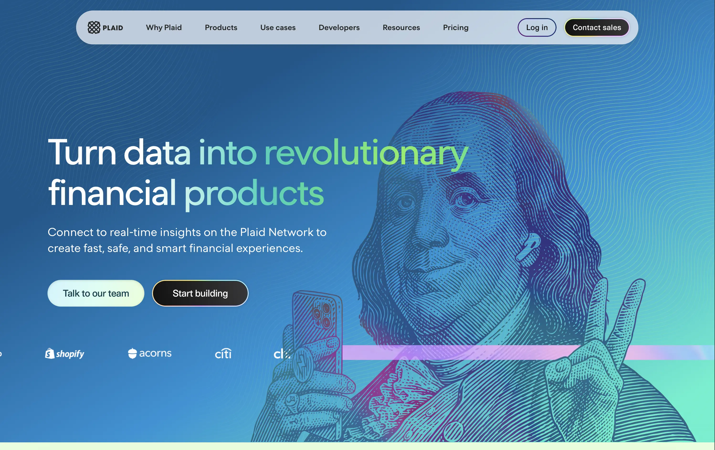
Plaid
↗
DevTools
Fintech
Data & Analytics
Left-aligned
Bold & Direct
Confident
Multi-CTA Block
Illustration
Interactive
Logo Wall
Gradient
Blue
Green
Sans serif
B2B
Home Page
Custom Code
developer fintech, API platform, financial data access, quirky fintech aesthetic, bold hero art, Benjamin Franklin illustration, smart finance tools, B2B API, trust logos, dev-first call to action, animated CTA, playful visual metaphor
Plaid is a data network that connects financial apps to users’ bank accounts securely and efficiently to power modern money experiences.
Plaid’s hero grabs attention with personality — Benjamin Franklin posing with an iPhone and some airpods, wrapped in a swirling gradient background. But it’s not just noise. The headline instantly communicates product value and the CTA contrast (“Talk to our team” vs. “Start building”) serves both enterprise and self-serve tracks. Logo wall underlines legitimacy. It’s high-impact and instantly memorable.
Plaid positions itself as the modern infrastructure backbone of fintech. The visual and messaging mix signals credibility, tech depth, and cultural fluency — ideal for both new gen founders.
This layout balances technical utility with human impact, aligning well with Algolia’s positioning as an API-first but UX-aware company. The mobile UI reinforces product value visually, while the logo wall signals scale and trust for enterprise buyers. The tone is clear, benefit-led, and appropriate for high-intent decision-makers evaluating AI tools for customer experience. This is a solid enterprise-facing hero built to perform.
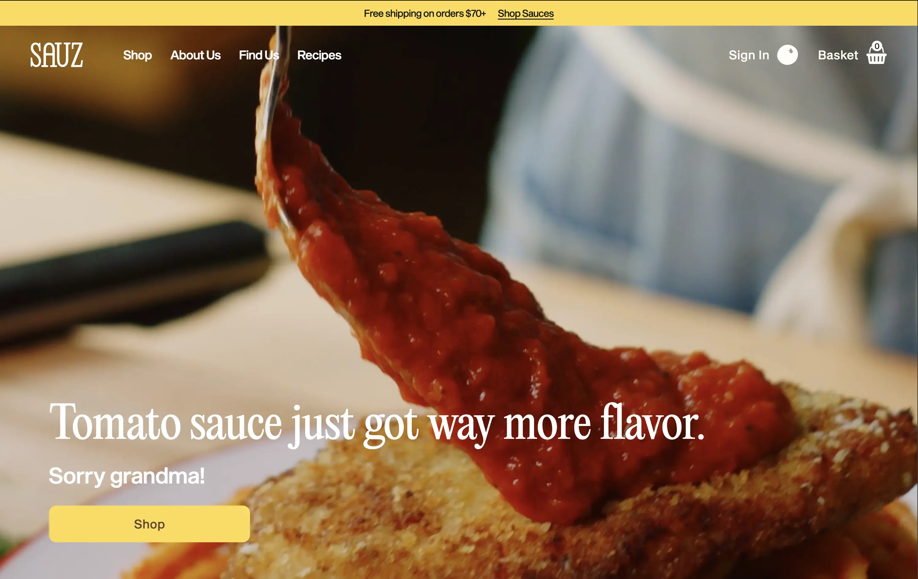
Sauz
↗
CPG
Food & Beverage
Left-aligned
Editorial
Playful
Confident
Single Button
Video
Announcement
Imagery-Based
Yellow
Sans serif
DTC
Home Page
Shopify
food-focused, video hero, flavor-first, cheeky copy, bold serif, zoom-in shot, emotional appeal, clean layout, direct CTA, DTC food, high-conversion, gourmet casual, attention-grabbing, warm tones
Sauz is a modern food brand delivering bold, chef-crafted sauces that reimagine classic flavors with attitude and heat.
The video draws instant attention and evokes craving. Typography and tone hit hard but feel fun. CTA is well-placed and visually distinct. It’s visual-first and high-impact with zero distractions — built for impulse.
A textbook DTC move: punchy, irreverent, visual. The design guides users toward quick conversion. It’s fun without losing clarity — perfect for modern food shoppers who crave personality with purchase.
This layout balances technical utility with human impact, aligning well with Algolia’s positioning as an API-first but UX-aware company. The mobile UI reinforces product value visually, while the logo wall signals scale and trust for enterprise buyers. The tone is clear, benefit-led, and appropriate for high-intent decision-makers evaluating AI tools for customer experience. This is a solid enterprise-facing hero built to perform.
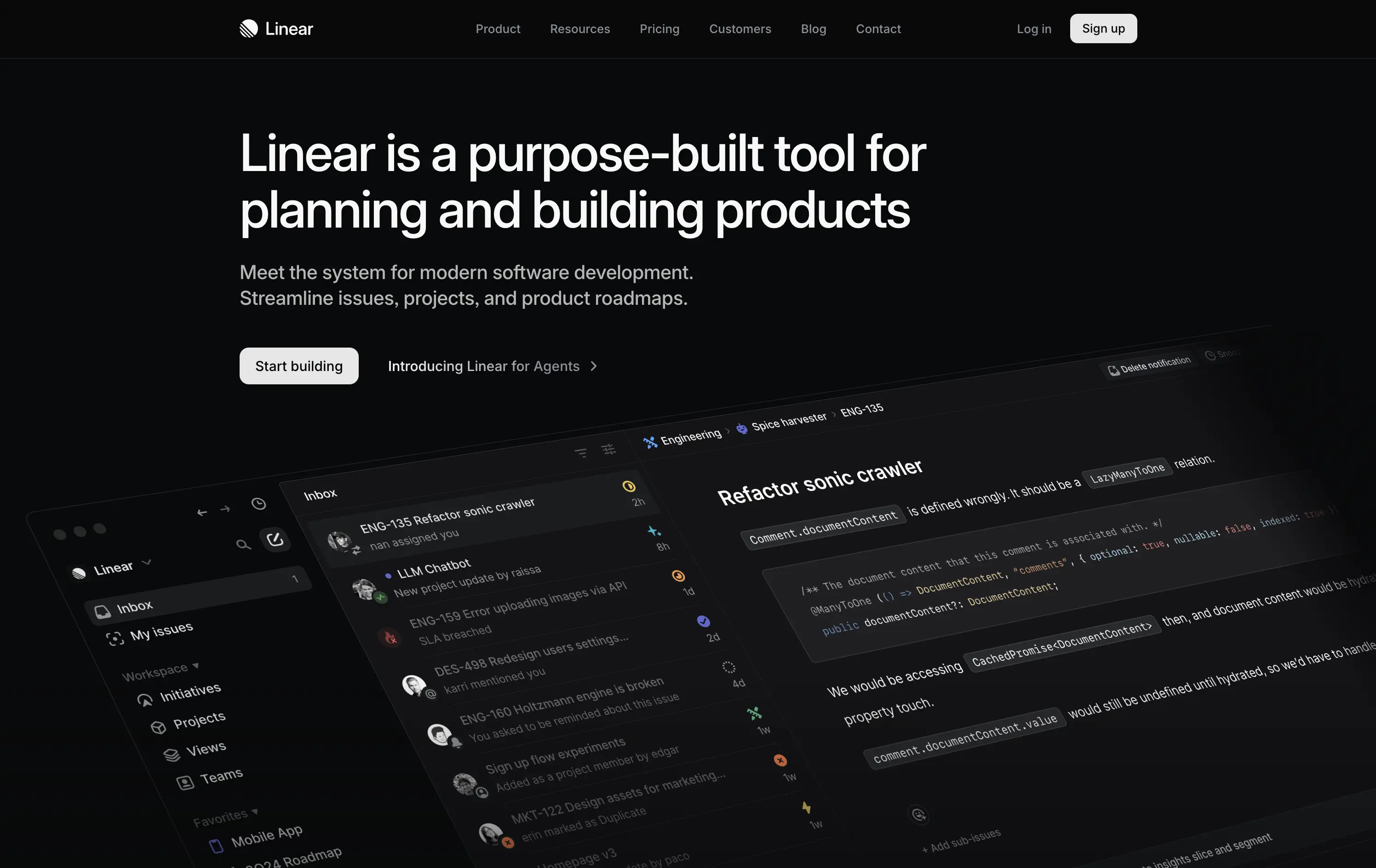
Linear
↗
SaaS
DevTools
Productivity
Left-aligned
Descriptive
Confident
Single Button
Product UI
Loading Animation
Dark Mode
White
Sans serif
B2B
Home Page
Custom Code
dark UI, engineering tools, product planning, no-fluff SaaS, modern developer stack, minimal aesthetic, deep focus, crisp layout, issue tracking, roadmap software, command-style CTA, zero distraction, productivity-first, startup tools
Linear is a streamlined tool for software teams to manage issues, sprints, and product roadmaps in a beautifully fast interface.
The hero is sleek, direct, and visually immersive. It highlights product strength without bloating the screen. Messaging is tight and outcome-focused. “Start building” reinforces dev-oriented immediacy. A strong signal of seriousness.
Perfectly aligned with experienced product and engineering teams. The minimal design supports focus. Hero says: “we’re here to work,” not pitch. Shows deep awareness of audience expectations.
This layout balances technical utility with human impact, aligning well with Algolia’s positioning as an API-first but UX-aware company. The mobile UI reinforces product value visually, while the logo wall signals scale and trust for enterprise buyers. The tone is clear, benefit-led, and appropriate for high-intent decision-makers evaluating AI tools for customer experience. This is a solid enterprise-facing hero built to perform.
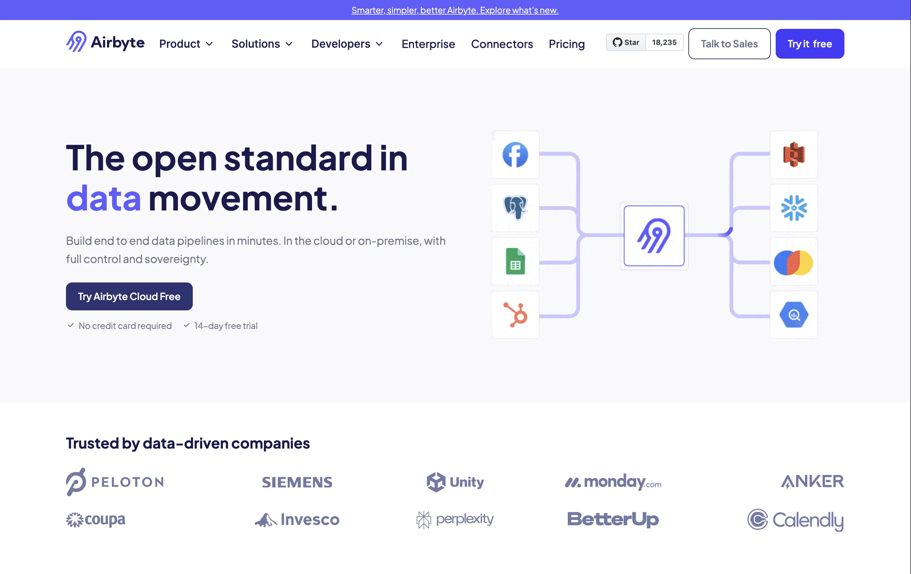
Airbyte
↗
SaaS
DevTools
Data & Analytics
Split Grid
Left-aligned
Confident
Professional
Single Button
Logo Wall
Social Proof
Custom Animation
Announcement
Light Mode
Blue
Purple
Sans serif
B2B
Home Page
Webflow
open source, developer-focused, visual connectors, high-trust, no fluff, fast-start trial, product-led, modern minimalist, enterprise-friendly, soft palette, bold type, efficient UI, scalable tech, clean grid, dual CTA
Airbyte helps companies move data between tools through customizable, open-source pipelines built in minutes.
The hero layout is direct and minimal — a great match for its technical buyer. The headline stakes leadership, and the visual of cross-platform connections lands the core value. CTA options address both bottom-up adoption and top-down sales. It feels mature without overcomplicating.
Positioning is strong: leading with “open standard” signals authority and trust. Visual language and tone reinforce the credibility needed to win enterprise and developer mindshare.
This layout balances technical utility with human impact, aligning well with Algolia’s positioning as an API-first but UX-aware company. The mobile UI reinforces product value visually, while the logo wall signals scale and trust for enterprise buyers. The tone is clear, benefit-led, and appropriate for high-intent decision-makers evaluating AI tools for customer experience. This is a solid enterprise-facing hero built to perform.
Superhuman
↗
SaaS
AI Tools
Productivity
Centered
Benefit-Driven
Confident
Single Button
Media Gallery
Product UI
Gradient
Dark Mode
Purple
Sans serif
Hybrid
Home Page
Framer
AI-native, email tool, bold value prop, gradient background, high-impact copy, startup focus, B2B SaaS, focused layout, attention economy, minimalist CTA, time-saving, numeric hook
Superhuman’s AI-native email client helps individuals and teams blitz through mail, saving about four hours per person every week.
Hero leads with a measurable benefit, instantly appealing to time-conscious professionals. Layout is minimal, directing all focus to the message. The purple CTA stands out clearly. Product UI hints below add legitimacy without clutter.
Perfectly crafted for productivity-focused SaaS buyers. The headline appeals to outcome-first thinkers. Design is focused, polished, and self-assured — built to convert high-intent users looking for speed and output.
This layout balances technical utility with human impact, aligning well with Algolia’s positioning as an API-first but UX-aware company. The mobile UI reinforces product value visually, while the logo wall signals scale and trust for enterprise buyers. The tone is clear, benefit-led, and appropriate for high-intent decision-makers evaluating AI tools for customer experience. This is a solid enterprise-facing hero built to perform.
The most effective hero sections in your inbox.
Monthly round up of top hero sections.
Don't worry. We hate spam too.
Don't worry. We hate spam too.
Don't worry. We hate spam too.