Conversational
6
6
6
6
Reads like friendly chat. Relatable, casual, and human.
Filters
Parabola
↗
AI Tools
Productivity
Data & Analytics
Centered
Conversational
Multi-CTA Block
Interactive
Search Field
Logo Wall
Dark Mode
Green
Serif
B2B
Home Page
Webflow
AI automation, input-based interaction, structured workflows, smart defaults, productivity tool, GPT-enhanced UX, dark mode UI, enterprise lean, trusted by brands, high-conversion layout
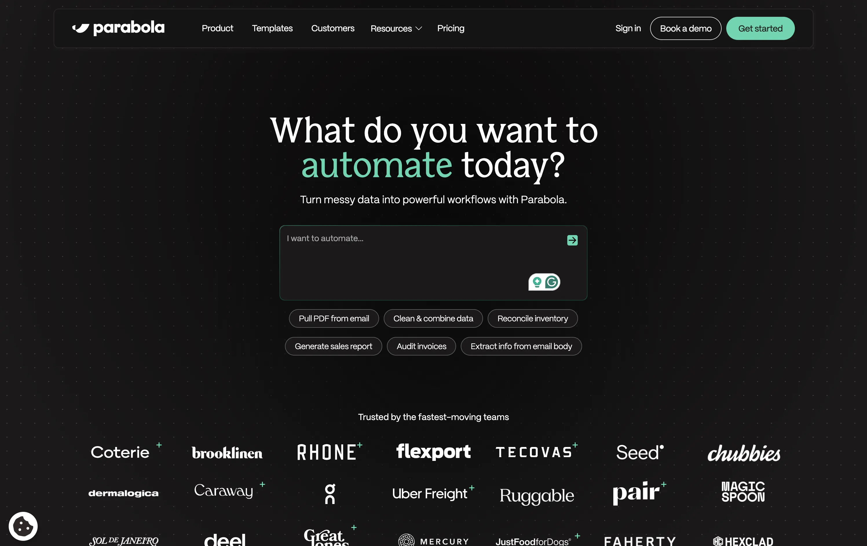
Parabola helps teams automate data-heavy workflows with AI-powered tools that clean, transform, and move business data faster.
Strong interactive moment with the input field immediately puts the user in control. The headline is benefit-led, and supporting actions give examples for inspiration. Clean, conversion-optimized layout that feels modern.
Directly aligned with operational and data-driven teams. The hero positions Parabola as both powerful and easy to start with—supported by an enterprise-trust logo wall and guided input UX.
This layout balances technical utility with human impact, aligning well with Algolia’s positioning as an API-first but UX-aware company. The mobile UI reinforces product value visually, while the logo wall signals scale and trust for enterprise buyers. The tone is clear, benefit-led, and appropriate for high-intent decision-makers evaluating AI tools for customer experience. This is a solid enterprise-facing hero built to perform.
Parabola
↗
AI Tools
Productivity
Data & Analytics
Centered
Conversational
Multi-CTA Block
Interactive
Search Field
Logo Wall
Dark Mode
Green
Serif
B2B
Home Page
Webflow
AI automation, input-based interaction, structured workflows, smart defaults, productivity tool, GPT-enhanced UX, dark mode UI, enterprise lean, trusted by brands, high-conversion layout
Parabola helps teams automate data-heavy workflows with AI-powered tools that clean, transform, and move business data faster.
Strong interactive moment with the input field immediately puts the user in control. The headline is benefit-led, and supporting actions give examples for inspiration. Clean, conversion-optimized layout that feels modern.
Directly aligned with operational and data-driven teams. The hero positions Parabola as both powerful and easy to start with—supported by an enterprise-trust logo wall and guided input UX.
This layout balances technical utility with human impact, aligning well with Algolia’s positioning as an API-first but UX-aware company. The mobile UI reinforces product value visually, while the logo wall signals scale and trust for enterprise buyers. The tone is clear, benefit-led, and appropriate for high-intent decision-makers evaluating AI tools for customer experience. This is a solid enterprise-facing hero built to perform.
Builder
↗
SaaS
AI Tools
No-Code
Centered
Conversational
Search/Utility Block
Interactive
Product UI
Custom Animation
Dark Mode
White
Purple
Sans serif
B2B
Home Page
Builder.io
prompt-driven UI, dev-focused, figma to code, repo integration, ai builder, dark interface, fast UX, early-stage AI, interactive layout, live input box, utility first, dark-to-light glow, below-the-fold tease
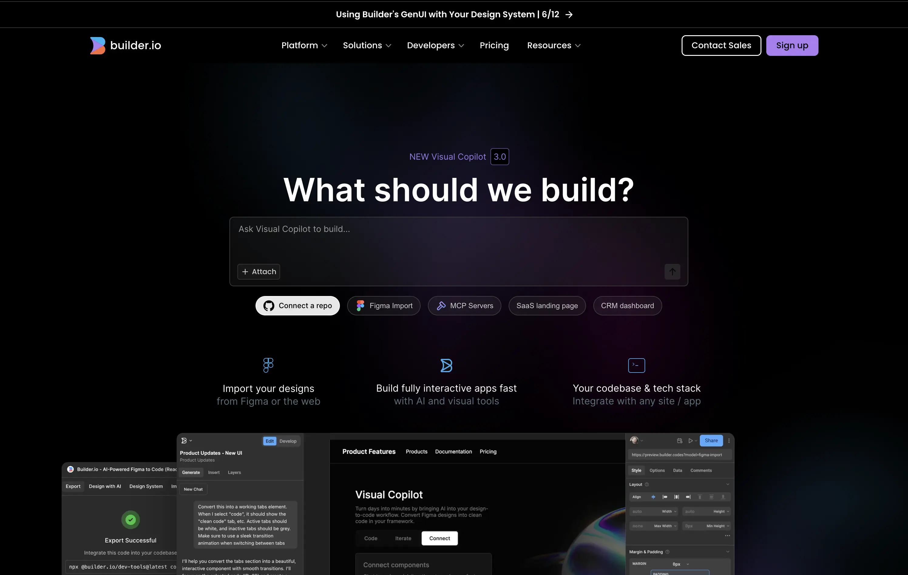
Builder.io is a no-code tool; turning designs and prompts into production-ready code through its AI-powered visual copilot.
The hero instantly orients developers with its input-first layout, suggesting immediate interaction. Integration tags like “Connect a repo” and “Figma Import” provide fast trust. Animation beneath the fold teases depth without cluttering focus.
This hero understands its technical audience. The interactive prompt paired with dev-native language signals power and flexibility without needing to explain too much.
This layout balances technical utility with human impact, aligning well with Algolia’s positioning as an API-first but UX-aware company. The mobile UI reinforces product value visually, while the logo wall signals scale and trust for enterprise buyers. The tone is clear, benefit-led, and appropriate for high-intent decision-makers evaluating AI tools for customer experience. This is a solid enterprise-facing hero built to perform.
Builder
↗
SaaS
AI Tools
No-Code
Centered
Conversational
Search/Utility Block
Interactive
Product UI
Custom Animation
Dark Mode
White
Purple
Sans serif
B2B
Home Page
Builder.io
prompt-driven UI, dev-focused, figma to code, repo integration, ai builder, dark interface, fast UX, early-stage AI, interactive layout, live input box, utility first, dark-to-light glow, below-the-fold tease
Builder.io is a no-code tool; turning designs and prompts into production-ready code through its AI-powered visual copilot.
The hero instantly orients developers with its input-first layout, suggesting immediate interaction. Integration tags like “Connect a repo” and “Figma Import” provide fast trust. Animation beneath the fold teases depth without cluttering focus.
This hero understands its technical audience. The interactive prompt paired with dev-native language signals power and flexibility without needing to explain too much.
This layout balances technical utility with human impact, aligning well with Algolia’s positioning as an API-first but UX-aware company. The mobile UI reinforces product value visually, while the logo wall signals scale and trust for enterprise buyers. The tone is clear, benefit-led, and appropriate for high-intent decision-makers evaluating AI tools for customer experience. This is a solid enterprise-facing hero built to perform.
Jot
↗
CPG
Food & Beverage
Editorial
Benefit-Driven
Conversational
Multi-CTA Block
Photography
Custom Animation
Announcement
Imagery-Based
Yellow
Black
Display
DTC
Home Page
Shopify
Replo
coffee brand, lifestyle product, home ritual, premium instant coffee, CPG beverage, warm palette, morning routine, modern food DTC, product-centered hero, rotating headline, lifestyle-led photography
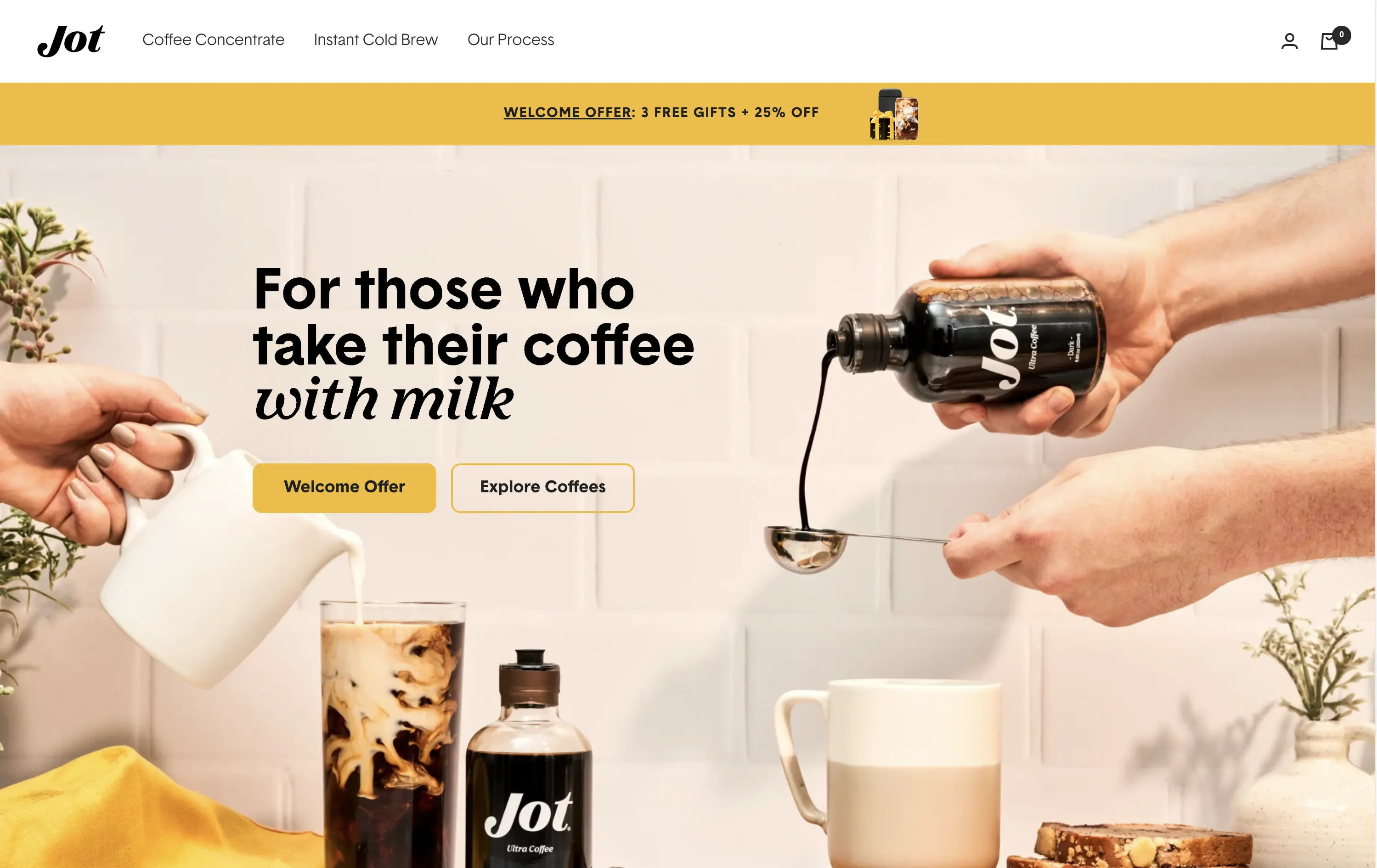
Jot sells ultra-concentrated coffee that simplifies your morning brew without compromising on quality or taste.
Visuals immediately convey simplicity and satisfaction. The rotating headline adapts to multiple buyer intents while keeping focus tight. The product-in-action shot clarifies usage without needing extra explanation.
The brand leans hard into lifestyle cues—targeting modern, taste-conscious buyers with clarity and credibility. The light palette and cozy setup reinforce everyday luxury.
This layout balances technical utility with human impact, aligning well with Algolia’s positioning as an API-first but UX-aware company. The mobile UI reinforces product value visually, while the logo wall signals scale and trust for enterprise buyers. The tone is clear, benefit-led, and appropriate for high-intent decision-makers evaluating AI tools for customer experience. This is a solid enterprise-facing hero built to perform.
Jot
↗
CPG
Food & Beverage
Editorial
Benefit-Driven
Conversational
Multi-CTA Block
Photography
Custom Animation
Announcement
Imagery-Based
Yellow
Black
Display
DTC
Home Page
Shopify
Replo
coffee brand, lifestyle product, home ritual, premium instant coffee, CPG beverage, warm palette, morning routine, modern food DTC, product-centered hero, rotating headline, lifestyle-led photography
Jot sells ultra-concentrated coffee that simplifies your morning brew without compromising on quality or taste.
Visuals immediately convey simplicity and satisfaction. The rotating headline adapts to multiple buyer intents while keeping focus tight. The product-in-action shot clarifies usage without needing extra explanation.
The brand leans hard into lifestyle cues—targeting modern, taste-conscious buyers with clarity and credibility. The light palette and cozy setup reinforce everyday luxury.
This layout balances technical utility with human impact, aligning well with Algolia’s positioning as an API-first but UX-aware company. The mobile UI reinforces product value visually, while the logo wall signals scale and trust for enterprise buyers. The tone is clear, benefit-led, and appropriate for high-intent decision-makers evaluating AI tools for customer experience. This is a solid enterprise-facing hero built to perform.
Basecamp
↗
SaaS
Collaboration
Productivity
Centered
Unconventional
Conversational
Pain-driven
No CTA
Illustration
Light Mode
Green
Yellow
Sans serif
B2B
Home Page
Custom Code
project management, SaaS, lo-fi aesthetic, opinionated design, founder-led voice, visual storytelling, problem-first, productivity, cluttered tool fatigue, anti-modern, expressive illustration, early-stage appeal, emotional resonance, no UI demo, brand storytelling, narrative-led
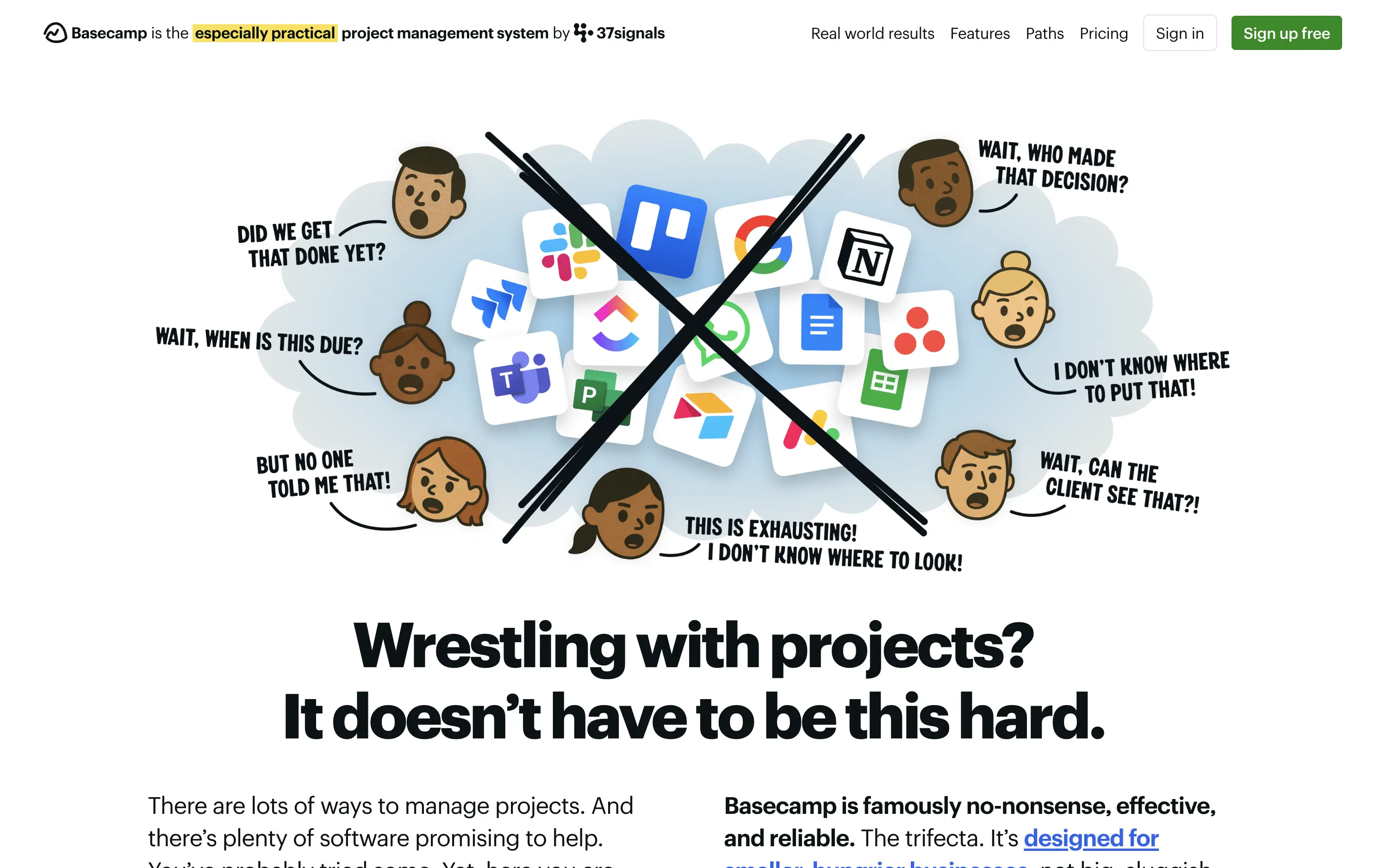
Basecamp cuts through tool overload with one practical workspace, ending project chaos.
The hero skips UI glamour for emotional clarity. It dramatizes the frustration of using too many disjointed tools through expressive cartoon faces and crossed-out logos. The copy is plain, bold, and highly relatable — “Wrestling with projects?” grounds it in a universal pain. No button, no fluff. The simplicity grabs attention and makes the message instantly clear.
Leans hard into anti-trend positioning—practicality over polish. Speaks directly to the frustration of tool overload, appealing to leaders who want sanity, not features. It’s memorable and unmistakably aligned with Basecamp’s legacy of contrarian clarity.
This layout balances technical utility with human impact, aligning well with Algolia’s positioning as an API-first but UX-aware company. The mobile UI reinforces product value visually, while the logo wall signals scale and trust for enterprise buyers. The tone is clear, benefit-led, and appropriate for high-intent decision-makers evaluating AI tools for customer experience. This is a solid enterprise-facing hero built to perform.
Basecamp
↗
SaaS
Collaboration
Productivity
Centered
Unconventional
Conversational
Pain-driven
No CTA
Illustration
Light Mode
Green
Yellow
Sans serif
B2B
Home Page
Custom Code
project management, SaaS, lo-fi aesthetic, opinionated design, founder-led voice, visual storytelling, problem-first, productivity, cluttered tool fatigue, anti-modern, expressive illustration, early-stage appeal, emotional resonance, no UI demo, brand storytelling, narrative-led
Basecamp cuts through tool overload with one practical workspace, ending project chaos.
The hero skips UI glamour for emotional clarity. It dramatizes the frustration of using too many disjointed tools through expressive cartoon faces and crossed-out logos. The copy is plain, bold, and highly relatable — “Wrestling with projects?” grounds it in a universal pain. No button, no fluff. The simplicity grabs attention and makes the message instantly clear.
Leans hard into anti-trend positioning—practicality over polish. Speaks directly to the frustration of tool overload, appealing to leaders who want sanity, not features. It’s memorable and unmistakably aligned with Basecamp’s legacy of contrarian clarity.
This layout balances technical utility with human impact, aligning well with Algolia’s positioning as an API-first but UX-aware company. The mobile UI reinforces product value visually, while the logo wall signals scale and trust for enterprise buyers. The tone is clear, benefit-led, and appropriate for high-intent decision-makers evaluating AI tools for customer experience. This is a solid enterprise-facing hero built to perform.
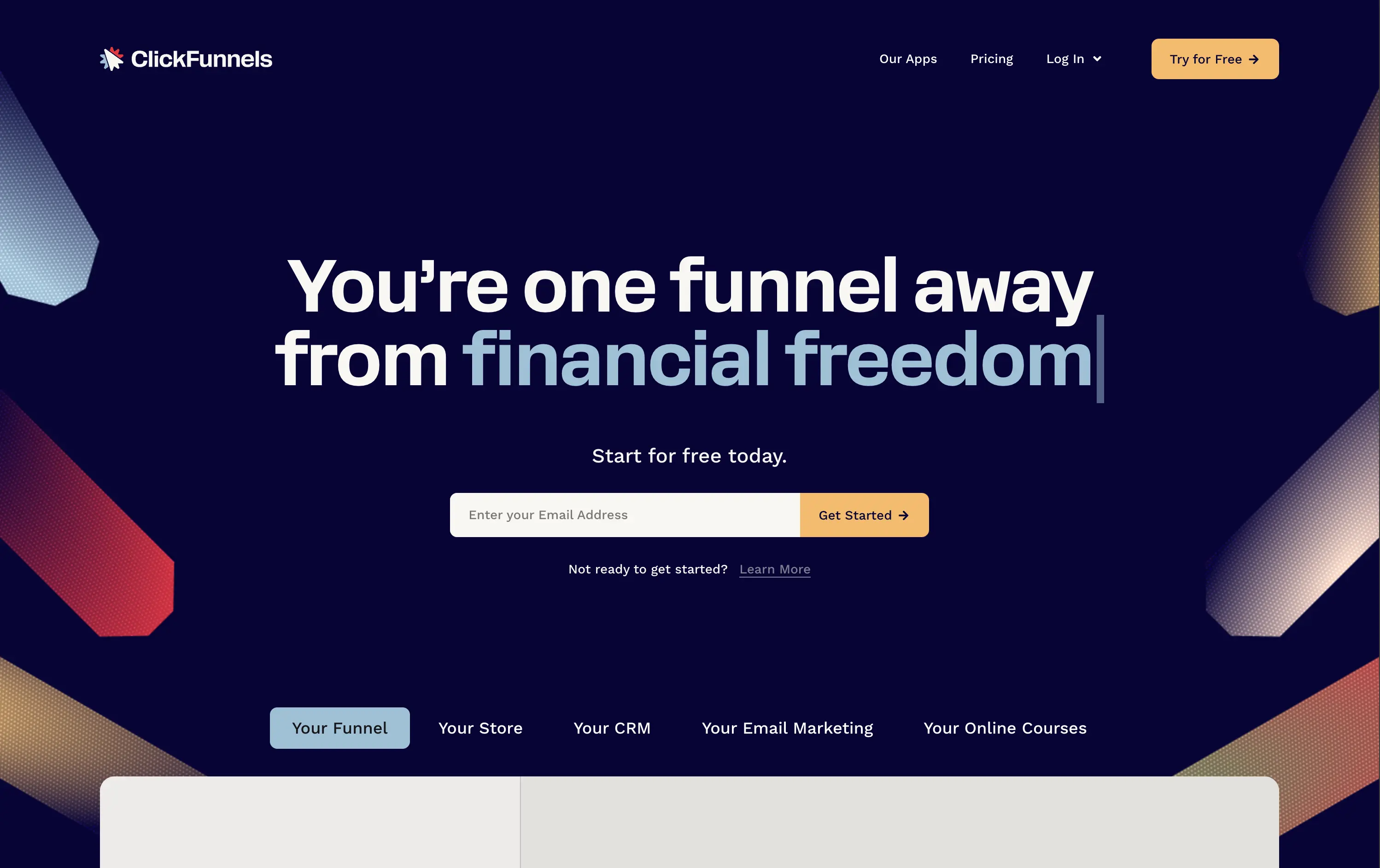
ClickFunnels
↗
SaaS
Creator Tools
Centered
Conversational
Aspirational
Email Capture
Interactive
Product UI
Custom Animation
Dark Mode
Yellow
Sans serif
Hybrid
Home Page
ClickFunnels
funnel builder, sales automation, opt-in focused, animated headline, creator economy, scroll-stopper, bold promise, conversion-first, email capture, dark mode, high energy, value-first, info-product, affiliate-heavy, landing page tools
ClickFunnels is an all-in-one platform for building sales funnels, landing pages, and automating digital marketing.
Everything in this hero screams urgency and ambition. The headline animation and phrase “financial freedom” tap directly into aspirational triggers. The surrounding angled graphics guide the eye right to the CTA, and the contrasting orange button and centered layout make signup the only logical next step. Visuals are loud, but coherent. It’s built to convert.
ClickFunnels sells identity as much as software. It targets aspirational creators with a high-conviction offer and message. Clear visual direction, value promise, and frictionless signup make it performance-built.
This layout balances technical utility with human impact, aligning well with Algolia’s positioning as an API-first but UX-aware company. The mobile UI reinforces product value visually, while the logo wall signals scale and trust for enterprise buyers. The tone is clear, benefit-led, and appropriate for high-intent decision-makers evaluating AI tools for customer experience. This is a solid enterprise-facing hero built to perform.
ClickFunnels
↗
SaaS
Creator Tools
Centered
Conversational
Aspirational
Email Capture
Interactive
Product UI
Custom Animation
Dark Mode
Yellow
Sans serif
Hybrid
Home Page
ClickFunnels
funnel builder, sales automation, opt-in focused, animated headline, creator economy, scroll-stopper, bold promise, conversion-first, email capture, dark mode, high energy, value-first, info-product, affiliate-heavy, landing page tools
ClickFunnels is an all-in-one platform for building sales funnels, landing pages, and automating digital marketing.
Everything in this hero screams urgency and ambition. The headline animation and phrase “financial freedom” tap directly into aspirational triggers. The surrounding angled graphics guide the eye right to the CTA, and the contrasting orange button and centered layout make signup the only logical next step. Visuals are loud, but coherent. It’s built to convert.
ClickFunnels sells identity as much as software. It targets aspirational creators with a high-conviction offer and message. Clear visual direction, value promise, and frictionless signup make it performance-built.
This layout balances technical utility with human impact, aligning well with Algolia’s positioning as an API-first but UX-aware company. The mobile UI reinforces product value visually, while the logo wall signals scale and trust for enterprise buyers. The tone is clear, benefit-led, and appropriate for high-intent decision-makers evaluating AI tools for customer experience. This is a solid enterprise-facing hero built to perform.
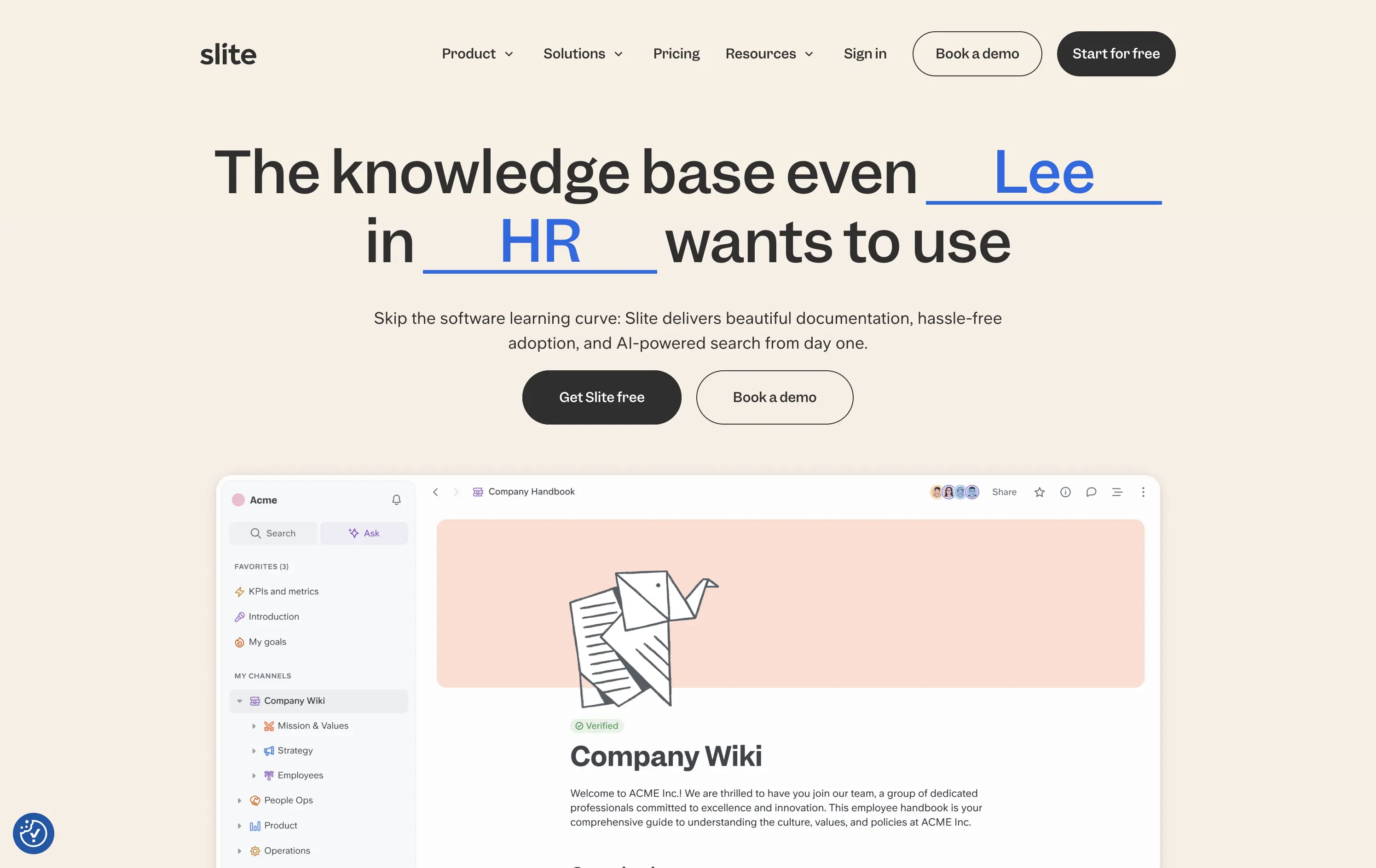
Slite
↗
SaaS
Collaboration
Centered
Benefit-Driven
Conversational
Multi-CTA Block
Product UI
Custom Animation
Light Mode
Blue
Black
Sans serif
B2B
Home Page
Webflow
team-friendly, rotating headline, UI demo, warm neutrals, playful logic, AI-assisted search, startup SaaS, low-friction entry, inclusive language, collaborative tools, documentation-first, dual CTA, trust-building UX
Slite gives teams a simple, AI-powered workspace to capture and find knowledge without the usual learning curve.
Hero is clever and inclusive. Animated blanks highlight versatility without overexplaining. UI preview builds product confidence. Dual CTAs clearly support trial vs. demo. Warm visuals balance modern minimalism with approachability.
Speaks to multiple roles without bloating the message. Tone and visual style position Slite as a low-friction, high-utility tool. Well-suited for horizontal B2B SaaS adoption.
This layout balances technical utility with human impact, aligning well with Algolia’s positioning as an API-first but UX-aware company. The mobile UI reinforces product value visually, while the logo wall signals scale and trust for enterprise buyers. The tone is clear, benefit-led, and appropriate for high-intent decision-makers evaluating AI tools for customer experience. This is a solid enterprise-facing hero built to perform.
The most effective hero sections in your inbox.
Monthly round up of top hero sections.
Don't worry. We hate spam too.
Don't worry. We hate spam too.
Don't worry. We hate spam too.