CPG
11
11
11
11
Consumer brands making physical goods like snacks, skincare, and supplements.
Opal
↗
CPG
Hardware
Left-aligned
Editorial
Descriptive
Confident
Single Button
Email Capture
Photography
Imagery-Based
Yellow
Sans serif
DTC
Home Page
Custom Code
premium webcam, lifestyle focus, cozy setup, hardware-first product, DTC electronics, human-centered visual, muted palette, cinematic photography, on-brand lighting, creative tool, soft tech aesthetic
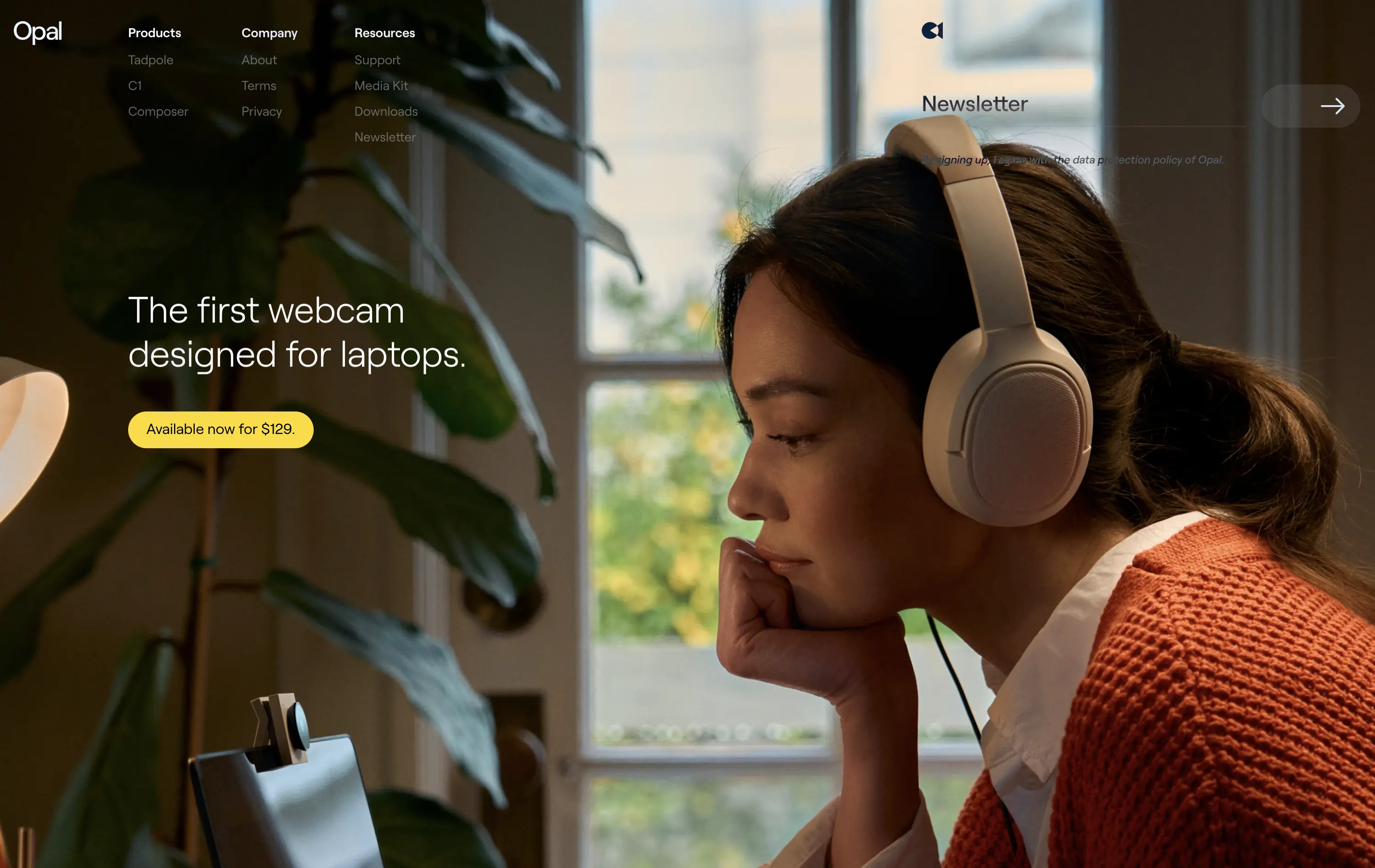
Opal makes premium webcams designed for laptops, with high-end quality and thoughtful design.
The hero is clean and confident. Photo tells the story before the copy does. It’s emotional, product-centric, and conversion-ready—but a bit light on technical proof or feature context.
Opal sells feeling first—comfort, focus, and quality. This is lifestyle-led DTC strategy that builds trust visually. But it risks underselling function unless the user scrolls.
This layout balances technical utility with human impact, aligning well with Algolia’s positioning as an API-first but UX-aware company. The mobile UI reinforces product value visually, while the logo wall signals scale and trust for enterprise buyers. The tone is clear, benefit-led, and appropriate for high-intent decision-makers evaluating AI tools for customer experience. This is a solid enterprise-facing hero built to perform.
Opal
↗
CPG
Hardware
Left-aligned
Editorial
Descriptive
Confident
Single Button
Email Capture
Photography
Imagery-Based
Yellow
Sans serif
DTC
Home Page
Custom Code
premium webcam, lifestyle focus, cozy setup, hardware-first product, DTC electronics, human-centered visual, muted palette, cinematic photography, on-brand lighting, creative tool, soft tech aesthetic
Opal makes premium webcams designed for laptops, with high-end quality and thoughtful design.
The hero is clean and confident. Photo tells the story before the copy does. It’s emotional, product-centric, and conversion-ready—but a bit light on technical proof or feature context.
Opal sells feeling first—comfort, focus, and quality. This is lifestyle-led DTC strategy that builds trust visually. But it risks underselling function unless the user scrolls.
This layout balances technical utility with human impact, aligning well with Algolia’s positioning as an API-first but UX-aware company. The mobile UI reinforces product value visually, while the logo wall signals scale and trust for enterprise buyers. The tone is clear, benefit-led, and appropriate for high-intent decision-makers evaluating AI tools for customer experience. This is a solid enterprise-facing hero built to perform.
Omsom
↗
CPG
Food & Beverage
Centered
Playful
Bold & Direct
No CTA
Photography
Imagery-Based
Red
Yellow
Display
DTC
Home Page
Shopify
bold packaging, nostalgic film grain, Asian American brand, food culture, Gen Z energy, CPG storytelling, saucy noodles, maximalist vibe, loud typography, high color saturation, visual attitude
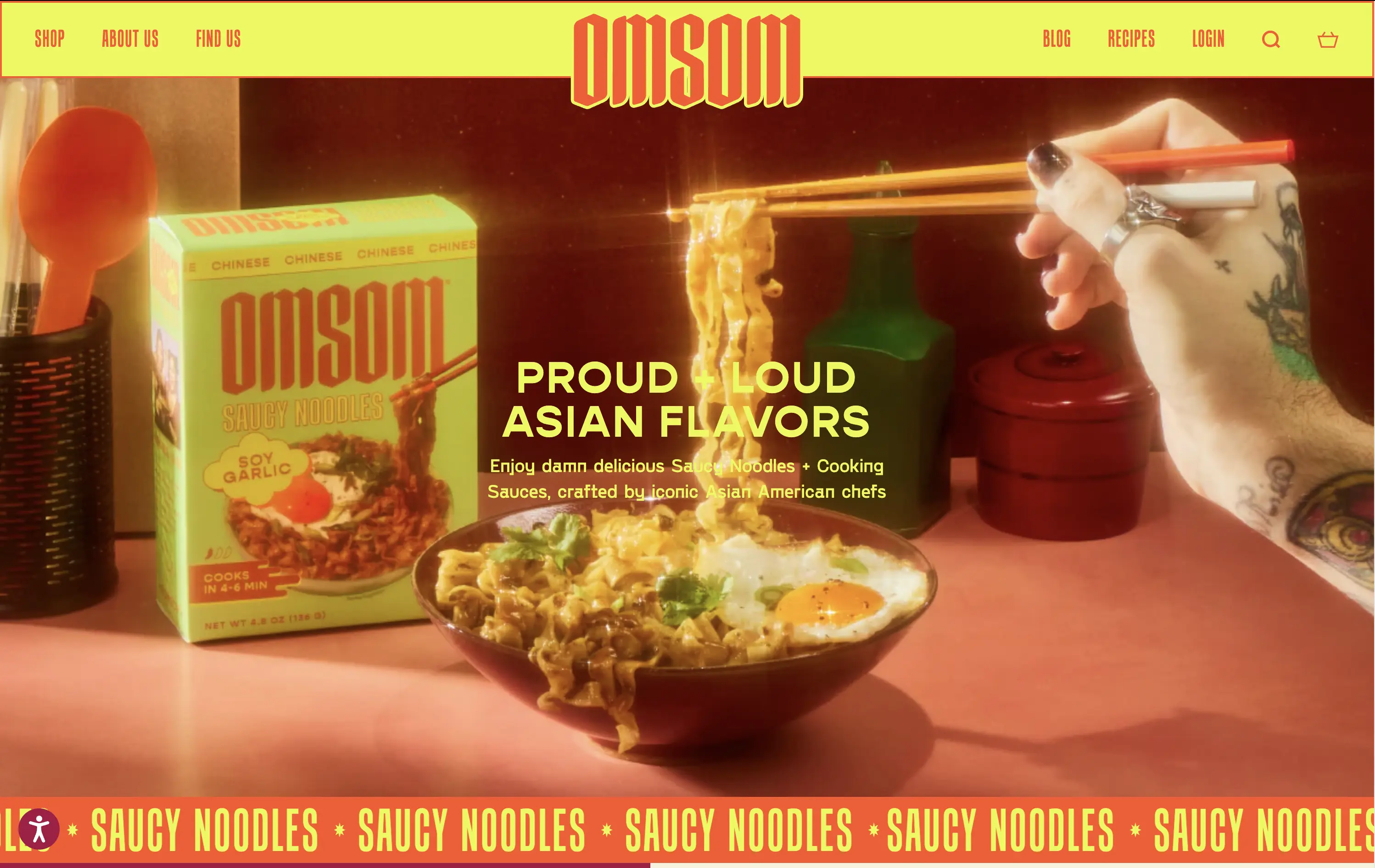
Omsom sells proud and loud Asian sauce kits and noodles without cultural compromise.
The hero hits hard with flavor and personality. High-impact visuals and voice set a strong tone and hints towards the ephereal. It’s clear who it’s for and what they’re selling.
Leans fully into identity and brand world building. Speaks directly to a culturally-aware, proudly niche audience. Messaging and art direction are fully aligned.
This layout balances technical utility with human impact, aligning well with Algolia’s positioning as an API-first but UX-aware company. The mobile UI reinforces product value visually, while the logo wall signals scale and trust for enterprise buyers. The tone is clear, benefit-led, and appropriate for high-intent decision-makers evaluating AI tools for customer experience. This is a solid enterprise-facing hero built to perform.
Omsom
↗
CPG
Food & Beverage
Centered
Playful
Bold & Direct
No CTA
Photography
Imagery-Based
Red
Yellow
Display
DTC
Home Page
Shopify
bold packaging, nostalgic film grain, Asian American brand, food culture, Gen Z energy, CPG storytelling, saucy noodles, maximalist vibe, loud typography, high color saturation, visual attitude
Omsom sells proud and loud Asian sauce kits and noodles without cultural compromise.
The hero hits hard with flavor and personality. High-impact visuals and voice set a strong tone and hints towards the ephereal. It’s clear who it’s for and what they’re selling.
Leans fully into identity and brand world building. Speaks directly to a culturally-aware, proudly niche audience. Messaging and art direction are fully aligned.
This layout balances technical utility with human impact, aligning well with Algolia’s positioning as an API-first but UX-aware company. The mobile UI reinforces product value visually, while the logo wall signals scale and trust for enterprise buyers. The tone is clear, benefit-led, and appropriate for high-intent decision-makers evaluating AI tools for customer experience. This is a solid enterprise-facing hero built to perform.
Cabi
↗
CPG
Food & Beverage
Minimal
Editorial
Playful
Descriptive
Single Button
Photography
Duotone
Red
Sans serif
DTC
Home Page
Shopify
neo-retro aesthetic, editorial layout, minimalist packaging, visual-first, high art direction, small-batch vibe, premium grocer, vertical flavor trio, lifestyle CPG, homepage hero, nostalgic modernism, shopable CTA
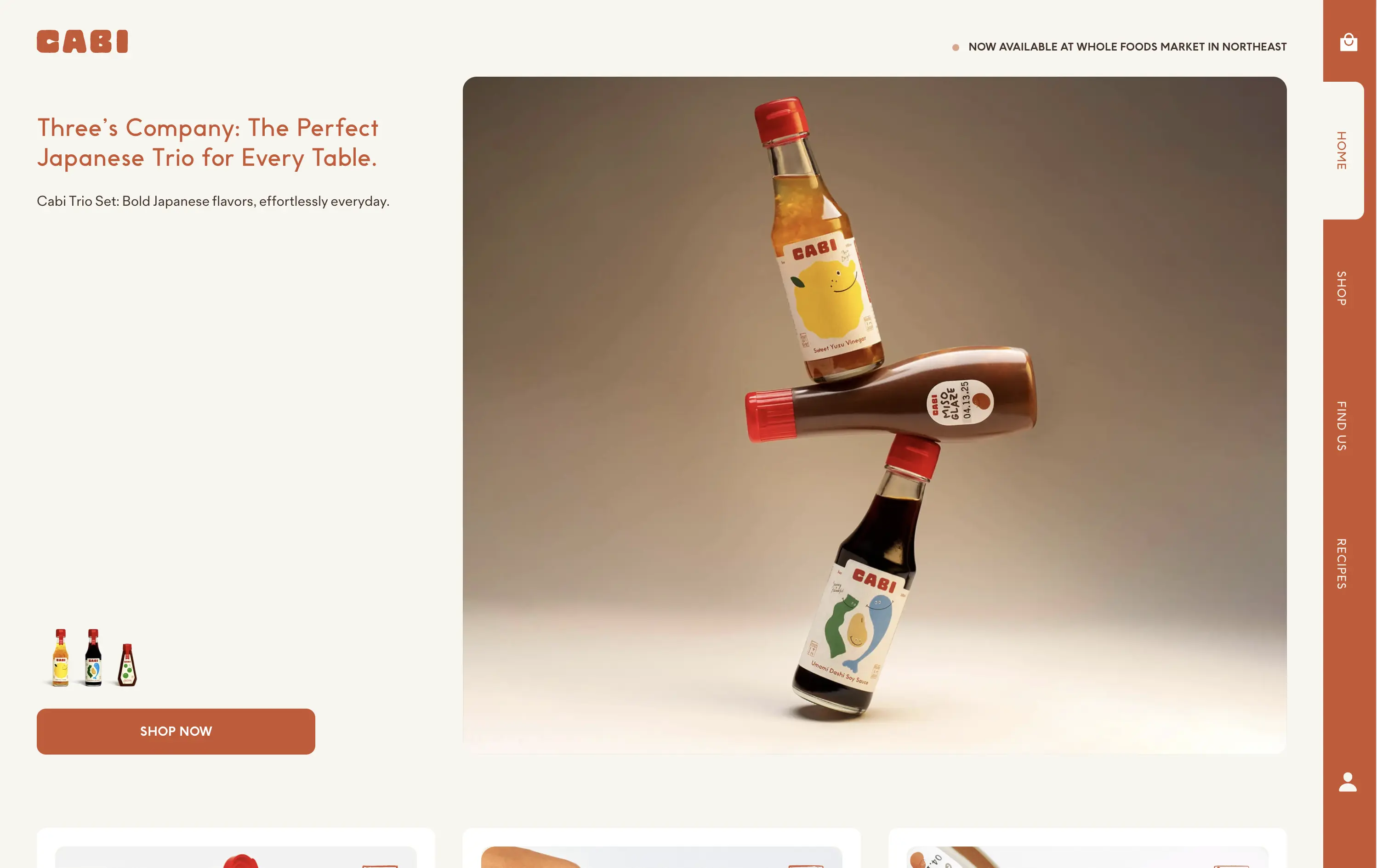
Cabi is a modern Japanese sauce brand offering a trio of bold, everyday condiments sold DTC and through select Whole Foods locations.
Cabi’s hero strikes a balance between product showcase and brand personality. The bottle stack photo is memorable and artful, with warm studio lighting that elevates the product beyond commodity. The copy is clean and narrative-led, paired with an understated “Shop Now” CTA that keeps the focus on visual storytelling. Vertical nav feels custom-built for a modern CPG brand. It holds its own without needing motion or video.
This is a homepage hero made for shelf appeal crossover. Visually premium, minimal in distractions, and confident in letting the packaging carry the emotional and culinary positioning. Feels Whole Foods-ready.
This layout balances technical utility with human impact, aligning well with Algolia’s positioning as an API-first but UX-aware company. The mobile UI reinforces product value visually, while the logo wall signals scale and trust for enterprise buyers. The tone is clear, benefit-led, and appropriate for high-intent decision-makers evaluating AI tools for customer experience. This is a solid enterprise-facing hero built to perform.
Cabi
↗
CPG
Food & Beverage
Minimal
Editorial
Playful
Descriptive
Single Button
Photography
Duotone
Red
Sans serif
DTC
Home Page
Shopify
neo-retro aesthetic, editorial layout, minimalist packaging, visual-first, high art direction, small-batch vibe, premium grocer, vertical flavor trio, lifestyle CPG, homepage hero, nostalgic modernism, shopable CTA
Cabi is a modern Japanese sauce brand offering a trio of bold, everyday condiments sold DTC and through select Whole Foods locations.
Cabi’s hero strikes a balance between product showcase and brand personality. The bottle stack photo is memorable and artful, with warm studio lighting that elevates the product beyond commodity. The copy is clean and narrative-led, paired with an understated “Shop Now” CTA that keeps the focus on visual storytelling. Vertical nav feels custom-built for a modern CPG brand. It holds its own without needing motion or video.
This is a homepage hero made for shelf appeal crossover. Visually premium, minimal in distractions, and confident in letting the packaging carry the emotional and culinary positioning. Feels Whole Foods-ready.
This layout balances technical utility with human impact, aligning well with Algolia’s positioning as an API-first but UX-aware company. The mobile UI reinforces product value visually, while the logo wall signals scale and trust for enterprise buyers. The tone is clear, benefit-led, and appropriate for high-intent decision-makers evaluating AI tools for customer experience. This is a solid enterprise-facing hero built to perform.
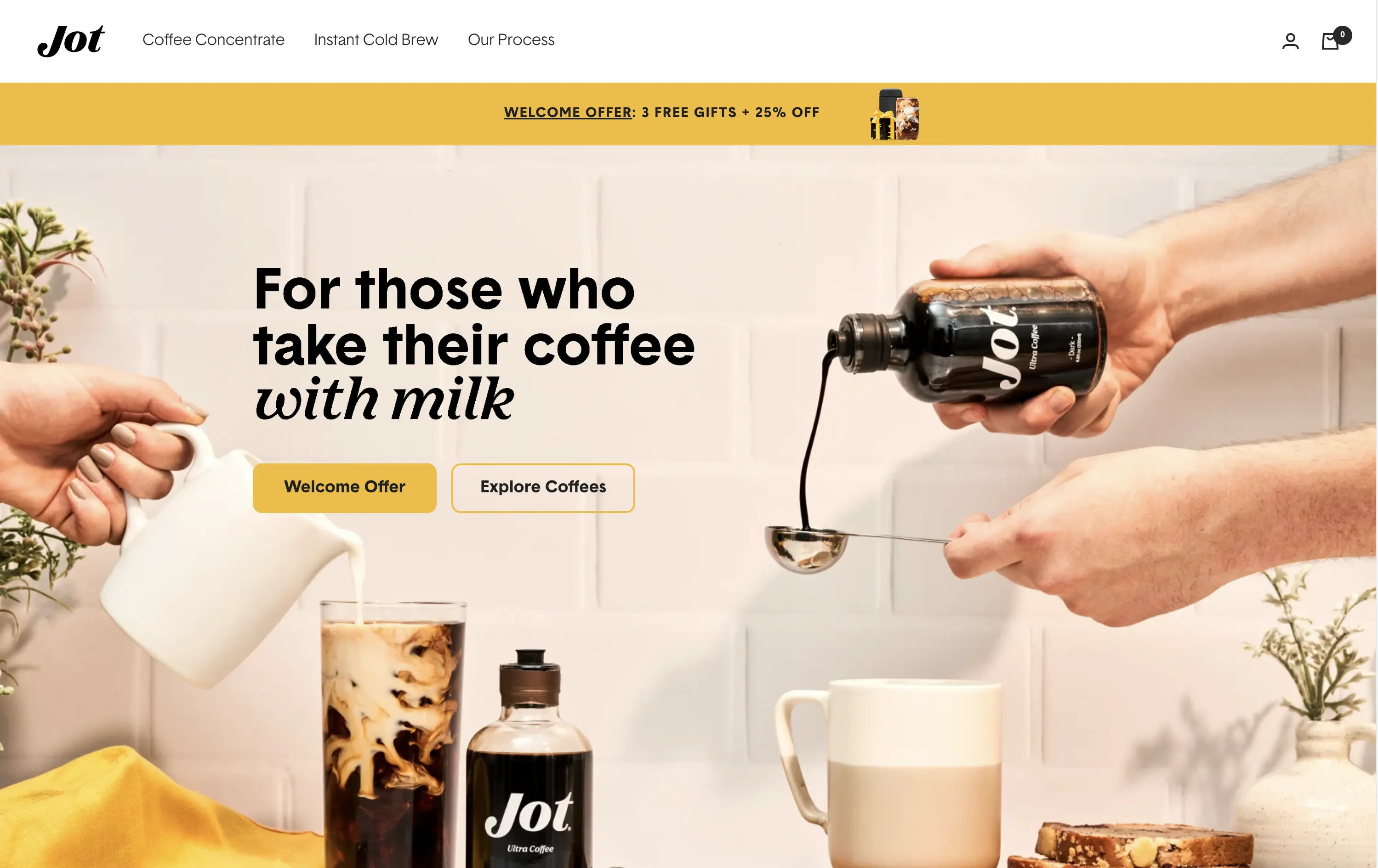
Jot
↗
CPG
Food & Beverage
Editorial
Benefit-Driven
Conversational
Multi-CTA Block
Photography
Custom Animation
Announcement
Imagery-Based
Yellow
Black
Display
DTC
Home Page
Shopify
Replo
coffee brand, lifestyle product, home ritual, premium instant coffee, CPG beverage, warm palette, morning routine, modern food DTC, product-centered hero, rotating headline, lifestyle-led photography
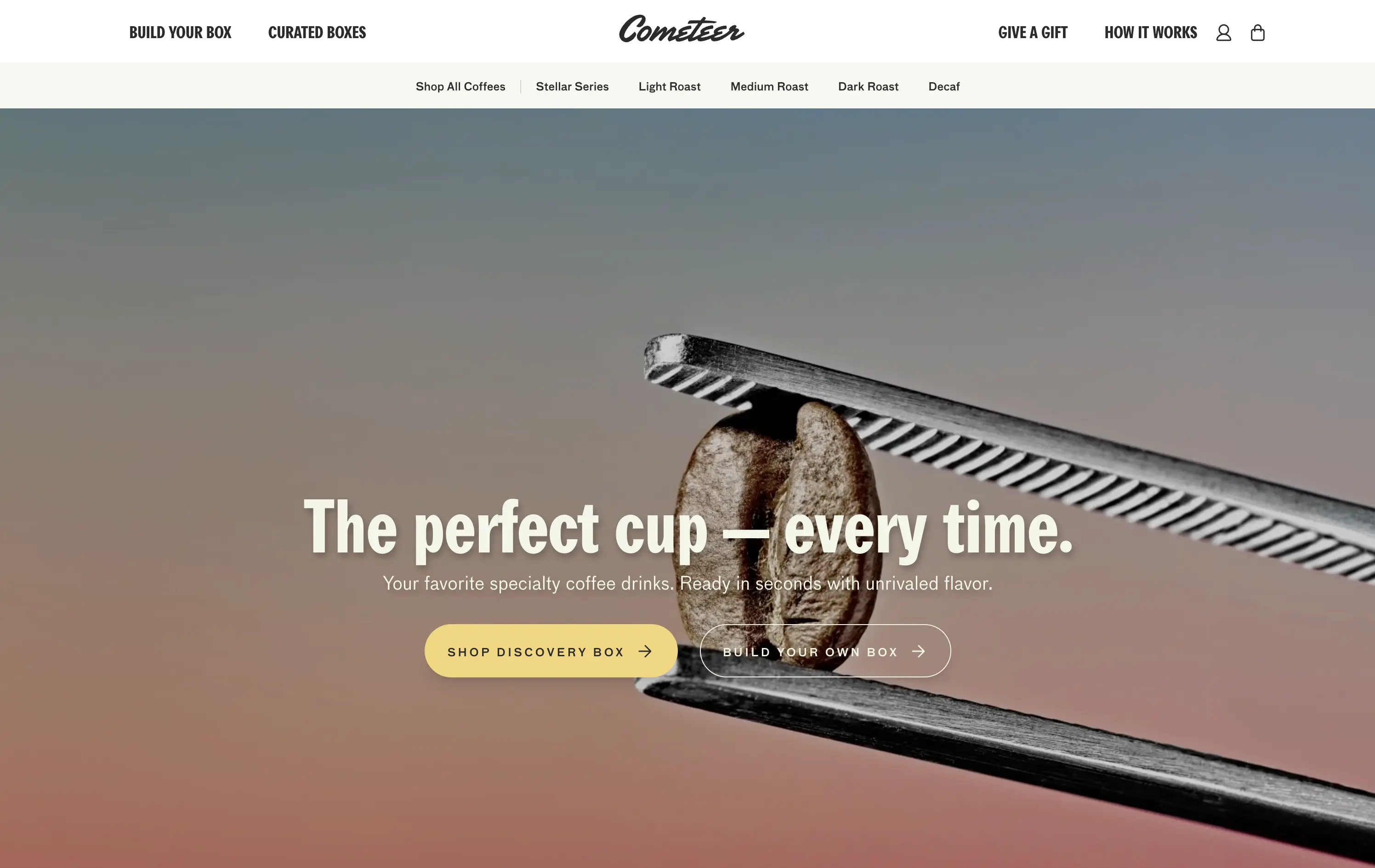
Jot sells ultra-concentrated coffee that simplifies your morning brew without compromising on quality or taste.
Visuals immediately convey simplicity and satisfaction. The rotating headline adapts to multiple buyer intents while keeping focus tight. The product-in-action shot clarifies usage without needing extra explanation.
The brand leans hard into lifestyle cues—targeting modern, taste-conscious buyers with clarity and credibility. The light palette and cozy setup reinforce everyday luxury.
This layout balances technical utility with human impact, aligning well with Algolia’s positioning as an API-first but UX-aware company. The mobile UI reinforces product value visually, while the logo wall signals scale and trust for enterprise buyers. The tone is clear, benefit-led, and appropriate for high-intent decision-makers evaluating AI tools for customer experience. This is a solid enterprise-facing hero built to perform.
Jot
↗
CPG
Food & Beverage
Editorial
Benefit-Driven
Conversational
Multi-CTA Block
Photography
Custom Animation
Announcement
Imagery-Based
Yellow
Black
Display
DTC
Home Page
Shopify
Replo
coffee brand, lifestyle product, home ritual, premium instant coffee, CPG beverage, warm palette, morning routine, modern food DTC, product-centered hero, rotating headline, lifestyle-led photography
Jot sells ultra-concentrated coffee that simplifies your morning brew without compromising on quality or taste.
Visuals immediately convey simplicity and satisfaction. The rotating headline adapts to multiple buyer intents while keeping focus tight. The product-in-action shot clarifies usage without needing extra explanation.
The brand leans hard into lifestyle cues—targeting modern, taste-conscious buyers with clarity and credibility. The light palette and cozy setup reinforce everyday luxury.
This layout balances technical utility with human impact, aligning well with Algolia’s positioning as an API-first but UX-aware company. The mobile UI reinforces product value visually, while the logo wall signals scale and trust for enterprise buyers. The tone is clear, benefit-led, and appropriate for high-intent decision-makers evaluating AI tools for customer experience. This is a solid enterprise-facing hero built to perform.
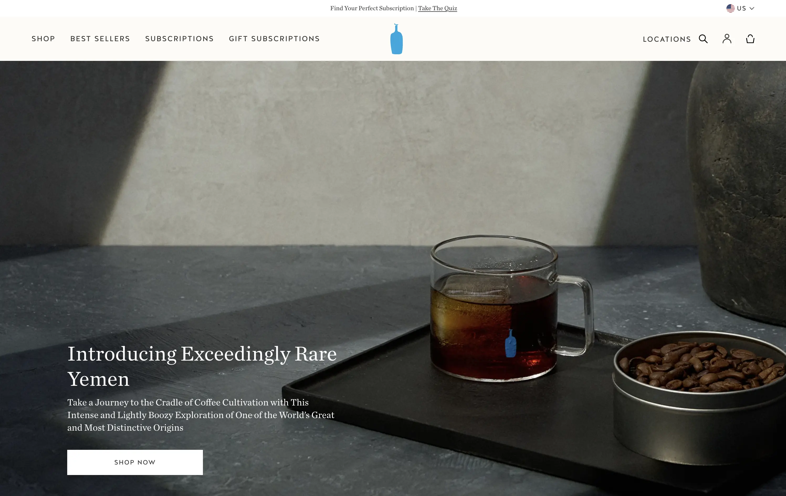
Blue Bottle Coffee
↗
CPG
Food & Beverage
Left-aligned
Editorial
Aspirational
Abstract / Conceptual
Single Button
Photography
Announcement
Imagery-Based
White
Serif
DTC
Home Page
Launch/Promo
Custom Code
premium coffee, quiet luxury, single origin, Yemen release, cultural storytelling, flavor-forward, design restraint, editorial style, homepage feature, slow ritual, product launch, lifestyle minimalism
Blue Bottle Coffee is a premium coffee roaster and retailer known for its meticulously sourced beans, minimalist aesthetic, and elevated brewing experience.
Everything here signals premium: restrained layout, subdued tone, and subtle animation. The hero is purposefully quiet — elevating the coffee without overselling it.
Perfectly aligned with a luxury buyer's mindset. It invites exploration through trust, taste, and tempo — not urgency. Signals quality through understatement.
This layout balances technical utility with human impact, aligning well with Algolia’s positioning as an API-first but UX-aware company. The mobile UI reinforces product value visually, while the logo wall signals scale and trust for enterprise buyers. The tone is clear, benefit-led, and appropriate for high-intent decision-makers evaluating AI tools for customer experience. This is a solid enterprise-facing hero built to perform.
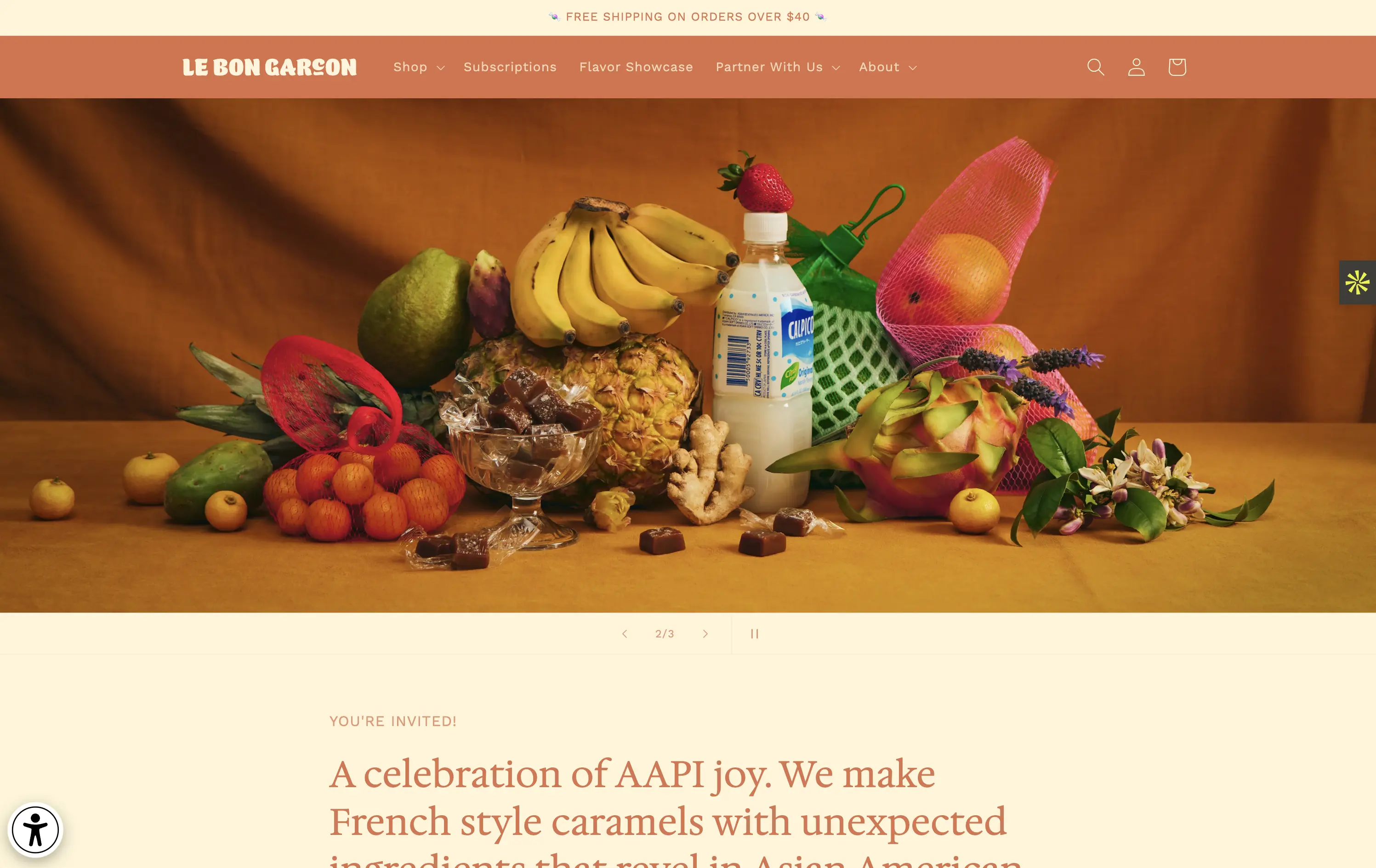
Le Bon Garçon
↗
CPG
Food & Beverage
Editorial
Descriptive
Founder-Led Voice
No CTA
Photography
Media Gallery
Announcement
Duotone
Imagery-Based
Orange
Yellow
Serif
DTC
Home Page
Shopify
nostalgic packaging, elevated DTC candy, premium gifting, Asian-American ingredients, still-life styling, art direction-led, cultural storytelling, warm palette, caramel focus, identity-led CPG, curated feel, editorial aesthetic, flavor storytelling, high design, AAPI founder
A premium confectionery brand reimagining French-style caramels through the lens of Asian-American flavors and storytelling.
This hero leans fully into art direction, with a cinematic still-life that evokes tradition, indulgence, and multicultural vibrancy. There's no obvious CTA, but the experience feels intentional and immersive. The visual composition draws curiosity and reflects a product crafted with care. The copy introduces cultural relevance and flavor positioning effectively, though some may miss a direct product hook.
Perfect for brand-aware shoppers and gifting segments. A visual-first approach supports premium positioning and cultural storytelling over hard conversion.
This layout balances technical utility with human impact, aligning well with Algolia’s positioning as an API-first but UX-aware company. The mobile UI reinforces product value visually, while the logo wall signals scale and trust for enterprise buyers. The tone is clear, benefit-led, and appropriate for high-intent decision-makers evaluating AI tools for customer experience. This is a solid enterprise-facing hero built to perform.
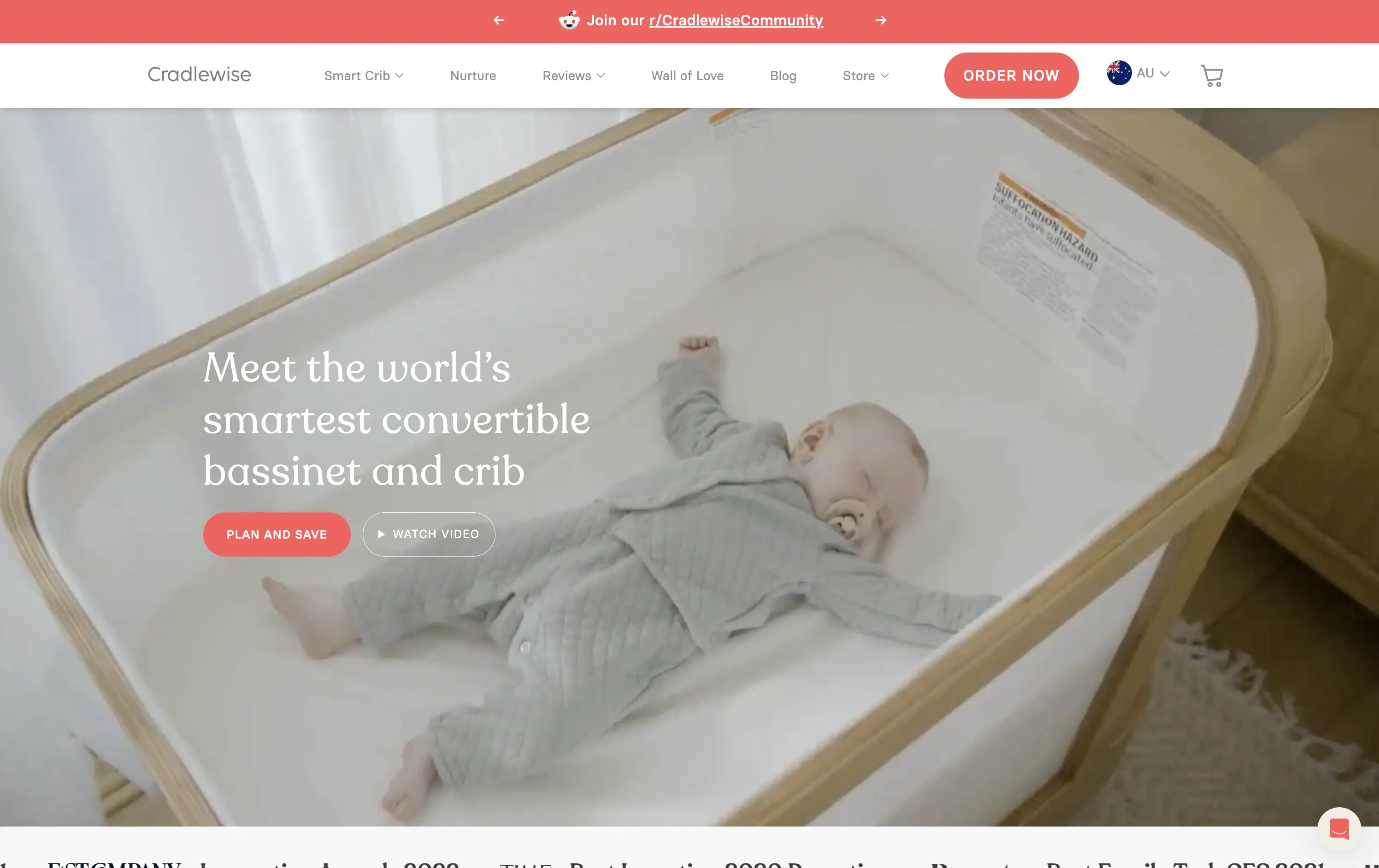
Cradlewise
↗
CPG
Hardware
Editorial
Benefit-Driven
Aspirational
Multi-CTA Block
Video
Announcement
Imagery-Based
Light Mode
Red
Serif
DTC
Home Page
Shopify
baby tech, smart crib, premium parenting, soft lifestyle visual, emotional trust, product-as-solution, sleep tech, high-ticket DTC, calming footage, gentle UX, non-intrusive CTA, safety-forward, babycare innovation, maternal audience
Cradlewise is a smart bassinet and crib that uses AI to soothe babies and help parents sleep better, all in one beautifully designed product.
The hero leans into emotion with soft lifestyle footage of the product in use — instantly communicating trust, peace of mind, and functional value. The headline clearly positions the product as a smart solution, while serif typography adds a premium touch. CTAs are well-placed, letting users choose between action or exploration. It’s elegant and persuasive.
Cradlewise effectively sells peace of mind to new parents. The blend of smart-tech value and lifestyle aesthetics strikes a perfect balance for premium buyers. It reinforces both utility and warmth without overexplaining.
This layout balances technical utility with human impact, aligning well with Algolia’s positioning as an API-first but UX-aware company. The mobile UI reinforces product value visually, while the logo wall signals scale and trust for enterprise buyers. The tone is clear, benefit-led, and appropriate for high-intent decision-makers evaluating AI tools for customer experience. This is a solid enterprise-facing hero built to perform.
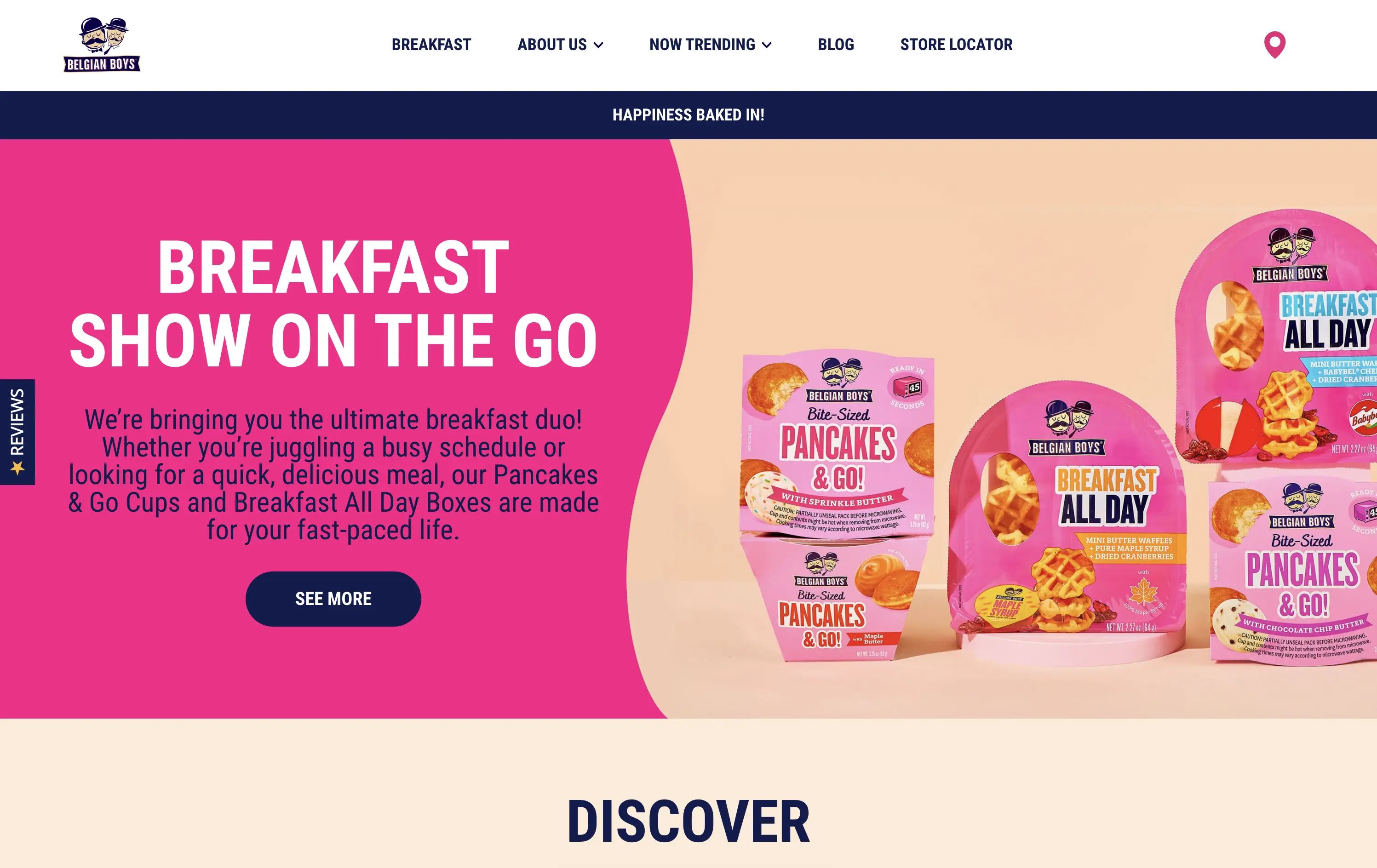
Belgian Boys
↗
CPG
Food & Beverage
Split Grid
Benefit-Driven
Playful
Single Button
Photography
Multi-color
Blue
Pink
Sans serif
DTC
Home Page
Shopify
CPG packaging, breakfast brand, direct-to-consumer, bright pink, snackable meals, product-focused, visual-first, fun tone, food on the go, time-saving meals, supermarket crossover, family-friendly, bold design, colorful grid, accessible copy
Belgian Boys sells fun, ready-to-eat breakfast snacks designed for busy people who want delicious, hassle-free meals.
The hero is loud and unapologetically pink, clearly built for quick scanning. Product packaging is the visual centerpiece, immediately showing what’s on offer. The bold type, simple language, and upbeat color palette make it easy to understand in seconds. The left-right layout balances message and product, while the single CTA is clear and inviting.
Speaks directly to the target buyer: busy, hungry, probably on mobile. The pink and navy color palette feels retail-shelf ready, and the whole layout matches the convenience and joy of the product. A great example of brand alignment through design.
This layout balances technical utility with human impact, aligning well with Algolia’s positioning as an API-first but UX-aware company. The mobile UI reinforces product value visually, while the logo wall signals scale and trust for enterprise buyers. The tone is clear, benefit-led, and appropriate for high-intent decision-makers evaluating AI tools for customer experience. This is a solid enterprise-facing hero built to perform.
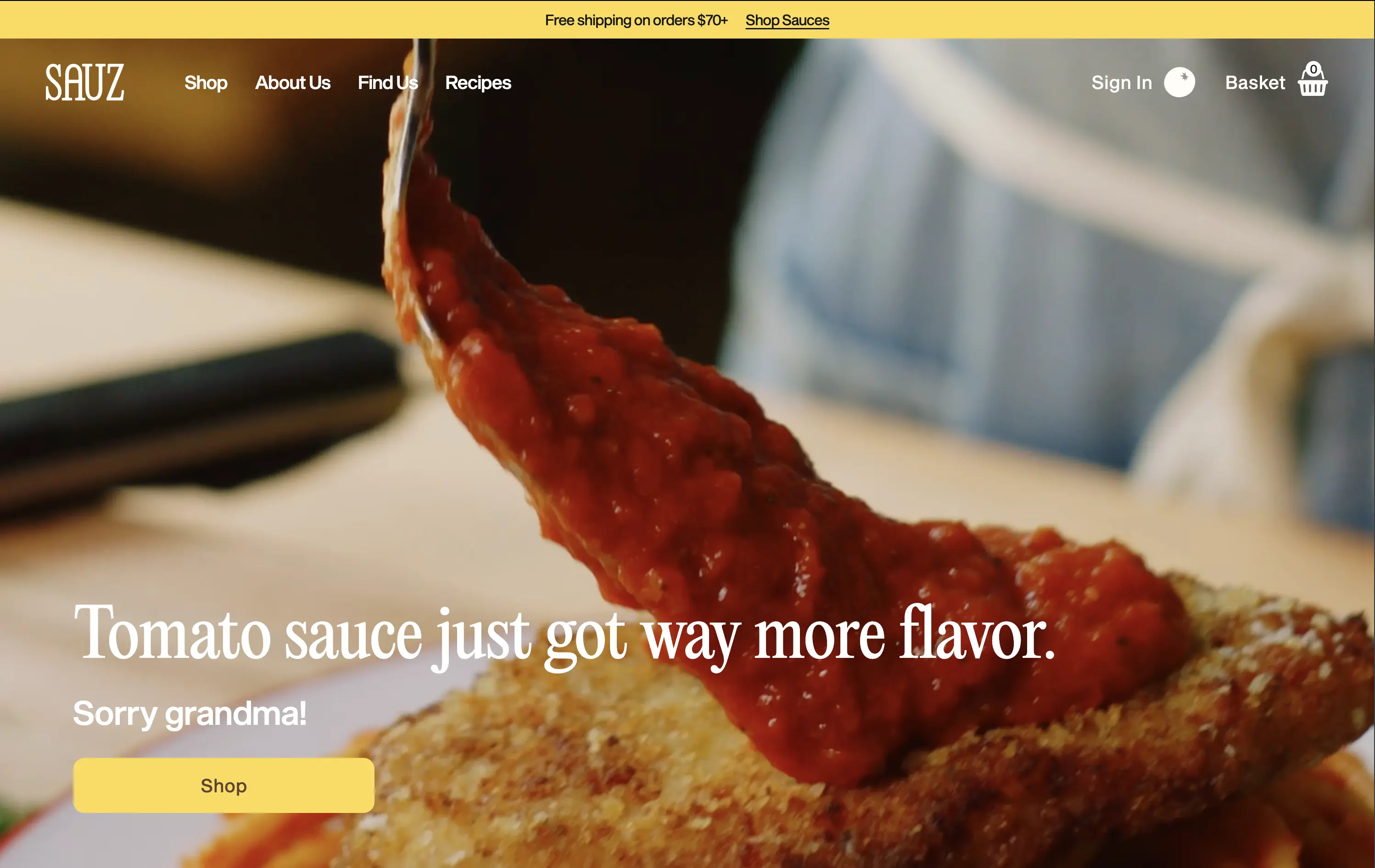
Sauz
↗
CPG
Food & Beverage
Left-aligned
Editorial
Playful
Confident
Single Button
Video
Announcement
Imagery-Based
Yellow
Sans serif
DTC
Home Page
Shopify
food-focused, video hero, flavor-first, cheeky copy, bold serif, zoom-in shot, emotional appeal, clean layout, direct CTA, DTC food, high-conversion, gourmet casual, attention-grabbing, warm tones
Sauz is a modern food brand delivering bold, chef-crafted sauces that reimagine classic flavors with attitude and heat.
The video draws instant attention and evokes craving. Typography and tone hit hard but feel fun. CTA is well-placed and visually distinct. It’s visual-first and high-impact with zero distractions — built for impulse.
A textbook DTC move: punchy, irreverent, visual. The design guides users toward quick conversion. It’s fun without losing clarity — perfect for modern food shoppers who crave personality with purchase.
This layout balances technical utility with human impact, aligning well with Algolia’s positioning as an API-first but UX-aware company. The mobile UI reinforces product value visually, while the logo wall signals scale and trust for enterprise buyers. The tone is clear, benefit-led, and appropriate for high-intent decision-makers evaluating AI tools for customer experience. This is a solid enterprise-facing hero built to perform.
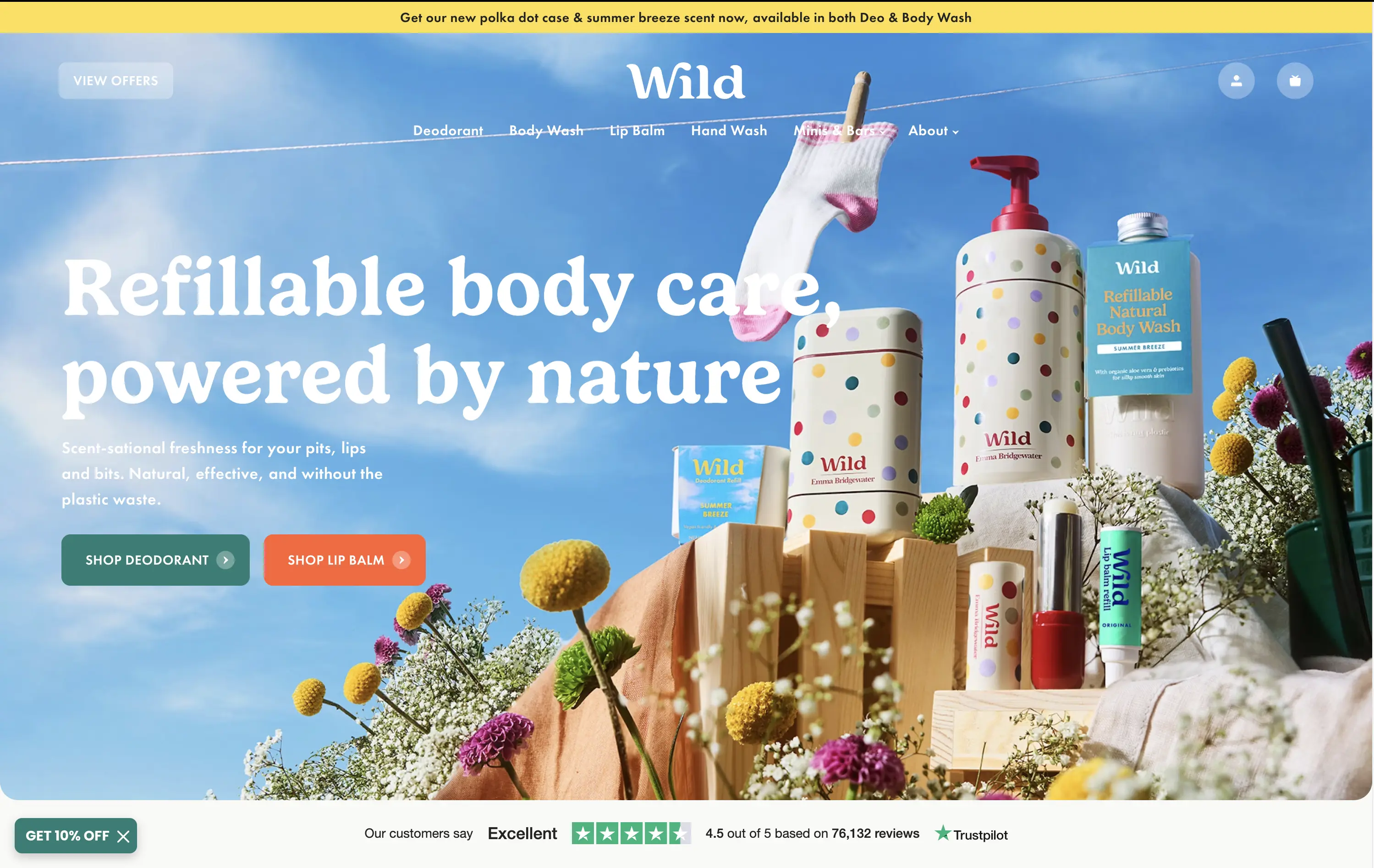
Wild
↗
CPG
Beauty & Wellness
Sustainability
Full Width
Left-aligned
Bold & Direct
Multi-CTA Block
Social Proof
Announcement
Imagery-Based
Green
Orange
Serif
DTC
Home Page
Shopify
eco-conscious, refillable packaging, summer aesthetic, photo-based hero, colorful packaging, nature-forward, trustbar visible, multi-CTA, DTC beauty, vibrant product shot, planet-positive, sunlit tone, clean bodycare
Wild offers refillable personal care products that are plastic-free, eco-friendly, and designed for everyday routines.
Bright, joyful photography captures the brand’s eco-fresh ethos while showcasing the full product range in one glance. Bold headline contrasts nicely with the sky backdrop, and CTAs are well-placed for quick shopper entry. Trustpilot widget reinforces credibility. While it’s vibrant and approachable, background details might slightly interfere with copy clarity on smaller screens.
Clear value prop and visual narrative tailored to eco-conscious DTC buyers. Emotional appeal (freshness, fun, nature) is balanced with proof (Trustpilot) and conversion intent. Could improve copy visibility slightly on mobile.
This layout balances technical utility with human impact, aligning well with Algolia’s positioning as an API-first but UX-aware company. The mobile UI reinforces product value visually, while the logo wall signals scale and trust for enterprise buyers. The tone is clear, benefit-led, and appropriate for high-intent decision-makers evaluating AI tools for customer experience. This is a solid enterprise-facing hero built to perform.
The most effective hero sections in your inbox.
Monthly round up of top hero sections.
Don't worry. We hate spam too.
Don't worry. We hate spam too.
Don't worry. We hate spam too.