Descriptive
27
27
27
27
Clear and to the point. Explains what it is and how it works with zero fluff.
Filters
Later
↗
SaaS
Creator Tools
Productivity
Centered
Descriptive
Empowering
Email Capture
Photography
Media Gallery
Logo Wall
Gradient
Blue
Sans serif
B2B
Home Page
Custom Code
influencer CRM, creator marketing platform, lead gen UI, campaign planning tool, social media SaaS, conversion-first layout, creator showcase, email-first CTA, SaaS for brands, bright
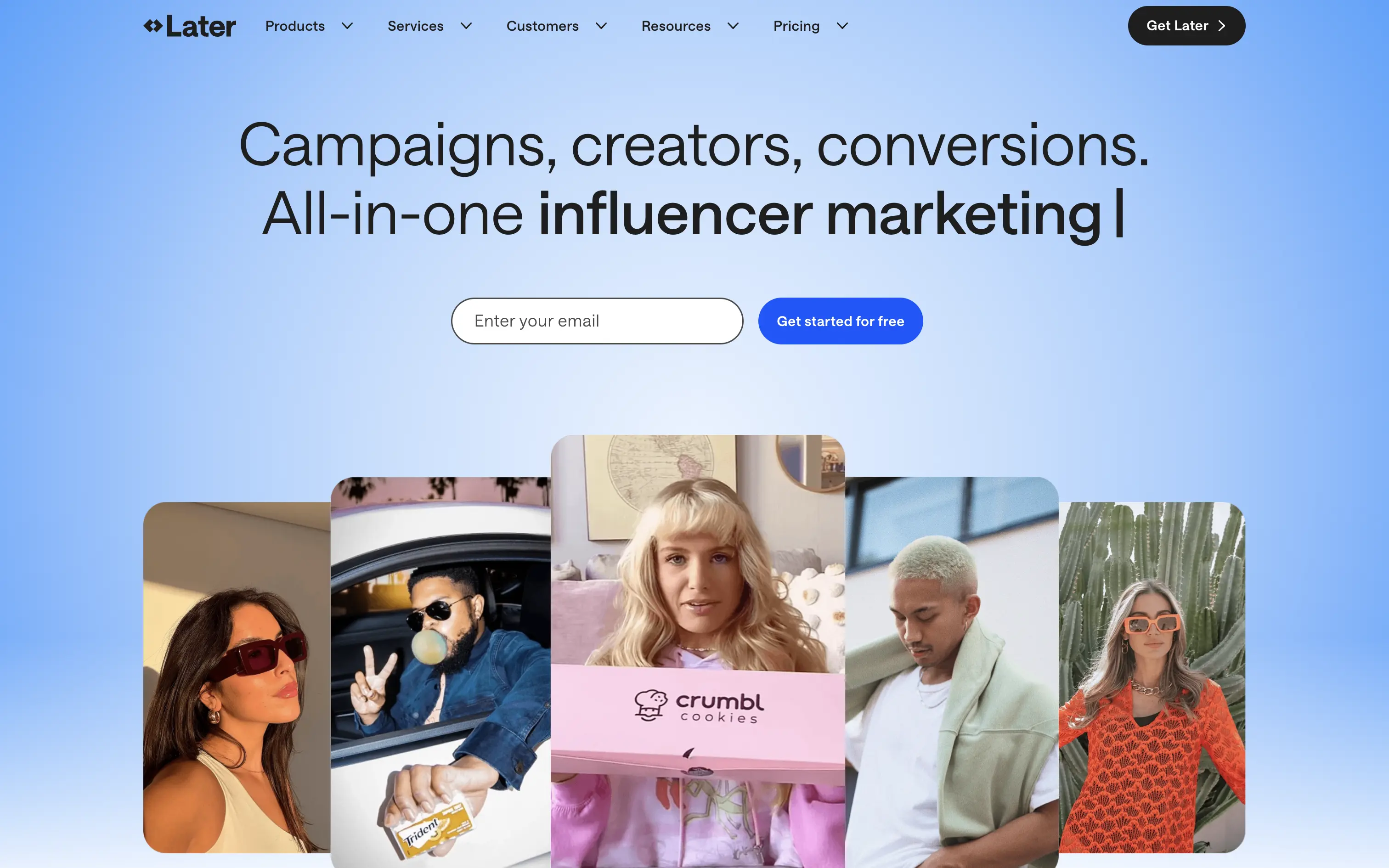
Later is a creator marketing platform helping brands manage influencer campaigns from outreach to ROI.
A functional, no-nonsense SaaS hero. Focused on conversion with a soft blue gradient and creator image bar to build immediate visual relevance. Email-first CTA lowers friction.
Safe and effective for B2B marketing leads. The layout is built for clarity over creativity. Great for scale, but it doesn’t carve out a unique visual or tonal niche.
This layout balances technical utility with human impact, aligning well with Algolia’s positioning as an API-first but UX-aware company. The mobile UI reinforces product value visually, while the logo wall signals scale and trust for enterprise buyers. The tone is clear, benefit-led, and appropriate for high-intent decision-makers evaluating AI tools for customer experience. This is a solid enterprise-facing hero built to perform.
Later
↗
SaaS
Creator Tools
Productivity
Centered
Descriptive
Empowering
Email Capture
Photography
Media Gallery
Logo Wall
Gradient
Blue
Sans serif
B2B
Home Page
Custom Code
influencer CRM, creator marketing platform, lead gen UI, campaign planning tool, social media SaaS, conversion-first layout, creator showcase, email-first CTA, SaaS for brands, bright
Later is a creator marketing platform helping brands manage influencer campaigns from outreach to ROI.
A functional, no-nonsense SaaS hero. Focused on conversion with a soft blue gradient and creator image bar to build immediate visual relevance. Email-first CTA lowers friction.
Safe and effective for B2B marketing leads. The layout is built for clarity over creativity. Great for scale, but it doesn’t carve out a unique visual or tonal niche.
This layout balances technical utility with human impact, aligning well with Algolia’s positioning as an API-first but UX-aware company. The mobile UI reinforces product value visually, while the logo wall signals scale and trust for enterprise buyers. The tone is clear, benefit-led, and appropriate for high-intent decision-makers evaluating AI tools for customer experience. This is a solid enterprise-facing hero built to perform.
Opal
↗
CPG
Hardware
Left-aligned
Editorial
Descriptive
Confident
Single Button
Email Capture
Photography
Imagery-Based
Yellow
Sans serif
DTC
Home Page
Custom Code
premium webcam, lifestyle focus, cozy setup, hardware-first product, DTC electronics, human-centered visual, muted palette, cinematic photography, on-brand lighting, creative tool, soft tech aesthetic
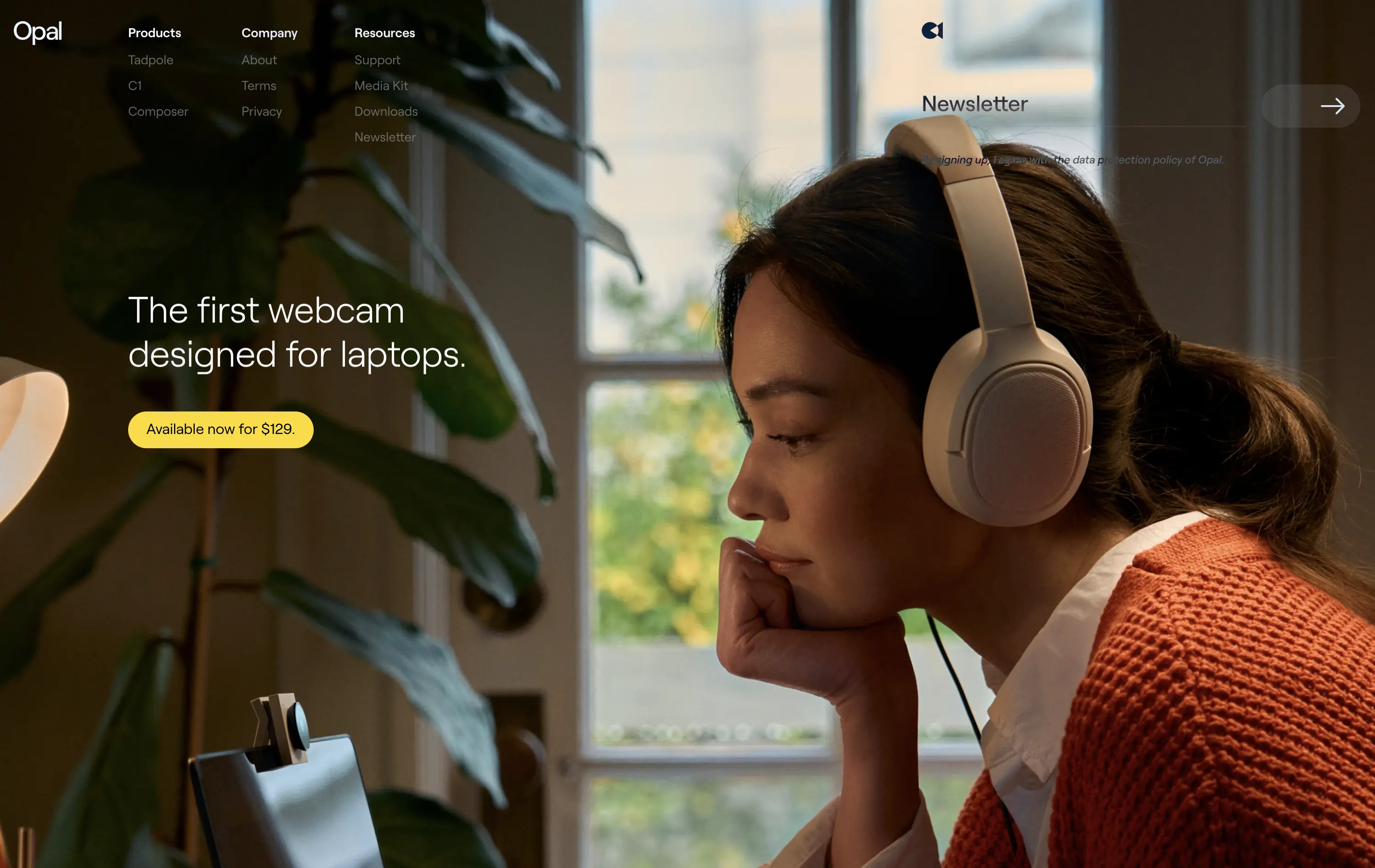
Opal makes premium webcams designed for laptops, with high-end quality and thoughtful design.
The hero is clean and confident. Photo tells the story before the copy does. It’s emotional, product-centric, and conversion-ready—but a bit light on technical proof or feature context.
Opal sells feeling first—comfort, focus, and quality. This is lifestyle-led DTC strategy that builds trust visually. But it risks underselling function unless the user scrolls.
This layout balances technical utility with human impact, aligning well with Algolia’s positioning as an API-first but UX-aware company. The mobile UI reinforces product value visually, while the logo wall signals scale and trust for enterprise buyers. The tone is clear, benefit-led, and appropriate for high-intent decision-makers evaluating AI tools for customer experience. This is a solid enterprise-facing hero built to perform.
Opal
↗
CPG
Hardware
Left-aligned
Editorial
Descriptive
Confident
Single Button
Email Capture
Photography
Imagery-Based
Yellow
Sans serif
DTC
Home Page
Custom Code
premium webcam, lifestyle focus, cozy setup, hardware-first product, DTC electronics, human-centered visual, muted palette, cinematic photography, on-brand lighting, creative tool, soft tech aesthetic
Opal makes premium webcams designed for laptops, with high-end quality and thoughtful design.
The hero is clean and confident. Photo tells the story before the copy does. It’s emotional, product-centric, and conversion-ready—but a bit light on technical proof or feature context.
Opal sells feeling first—comfort, focus, and quality. This is lifestyle-led DTC strategy that builds trust visually. But it risks underselling function unless the user scrolls.
This layout balances technical utility with human impact, aligning well with Algolia’s positioning as an API-first but UX-aware company. The mobile UI reinforces product value visually, while the logo wall signals scale and trust for enterprise buyers. The tone is clear, benefit-led, and appropriate for high-intent decision-makers evaluating AI tools for customer experience. This is a solid enterprise-facing hero built to perform.
Cosmos
↗
SaaS
Creative Tools
Centered
Descriptive
Scroll Prompt
Interactive
Custom Animation
3D visuals
Dark Mode
White
Sans serif
B2C
Home Page
Wordpress
3D animation, immersive experience, visual discovery engine, artist-first, gallery feel, dark mode default, cinematic hero, soft motion, ambient design, identity-led, scroll-to-enter, creative tech
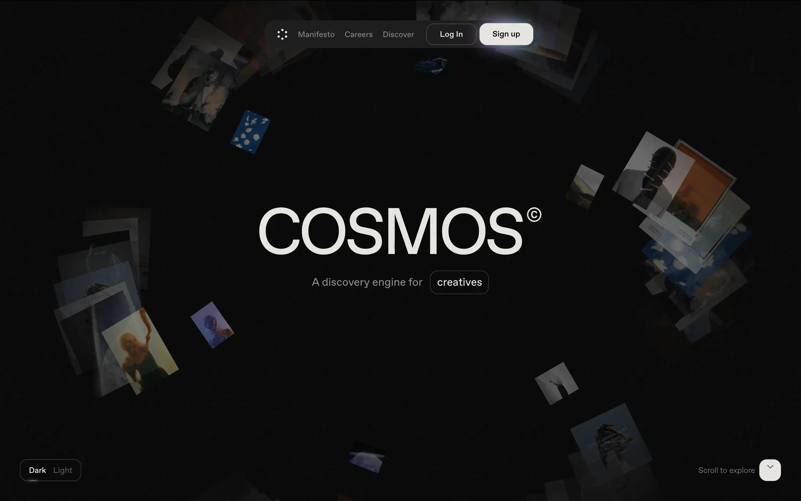
Cosmos is a discovery engine for creatives, helping them explore curated visuals and inspiration in an immersive format.
The hero trades clarity for vibe—but does it with intention. The slow, 3D-style animation invites exploration. There's no CTA push, just immersion. Ideal for creatives looking to feel, not be sold to.
A brand-first, emotion-forward approach that’s clearly designed for visual creatives. The tone and treatment filter out non-ideal users early—this isn’t for the productivity crowd.
This layout balances technical utility with human impact, aligning well with Algolia’s positioning as an API-first but UX-aware company. The mobile UI reinforces product value visually, while the logo wall signals scale and trust for enterprise buyers. The tone is clear, benefit-led, and appropriate for high-intent decision-makers evaluating AI tools for customer experience. This is a solid enterprise-facing hero built to perform.
Cosmos
↗
SaaS
Creative Tools
Centered
Descriptive
Scroll Prompt
Interactive
Custom Animation
3D visuals
Dark Mode
White
Sans serif
B2C
Home Page
Wordpress
3D animation, immersive experience, visual discovery engine, artist-first, gallery feel, dark mode default, cinematic hero, soft motion, ambient design, identity-led, scroll-to-enter, creative tech
Cosmos is a discovery engine for creatives, helping them explore curated visuals and inspiration in an immersive format.
The hero trades clarity for vibe—but does it with intention. The slow, 3D-style animation invites exploration. There's no CTA push, just immersion. Ideal for creatives looking to feel, not be sold to.
A brand-first, emotion-forward approach that’s clearly designed for visual creatives. The tone and treatment filter out non-ideal users early—this isn’t for the productivity crowd.
This layout balances technical utility with human impact, aligning well with Algolia’s positioning as an API-first but UX-aware company. The mobile UI reinforces product value visually, while the logo wall signals scale and trust for enterprise buyers. The tone is clear, benefit-led, and appropriate for high-intent decision-makers evaluating AI tools for customer experience. This is a solid enterprise-facing hero built to perform.
Gamma
↗
AI Tools
Creative Tools
Productivity
Split Grid
Left-aligned
Descriptive
Empowering
Multi-CTA Block
Watch Demo
Illustration
Media Gallery
Interactive
Light Mode
Blue
Sans serif
Hybrid
Home Page
Custom Code
AI presentation tool, whimsical 3D art, surreal imagery, smooth onboarding, soft brand tone, vertical carousel, intuitive UX, layout-focused demo, pastel aesthetic, creative AI tool, friendly product language
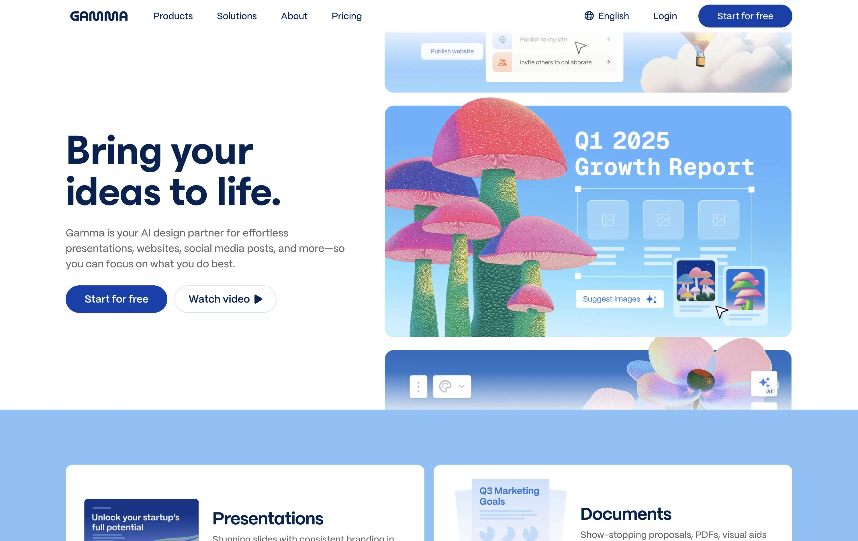
Gamma is an AI-powered design platform that helps users create beautiful presentations, websites, and docs effortlessly.
The carousel introduces Gamma’s features visually without overwhelming the user. The surreal illustration style immediately grabs attention, and the copy reinforces ease-of-use and creativity.
Gamma positions itself as a non-intimidating AI tool for creative productivity. Visuals, layout, and tone all serve to lower the barrier for entry and increase relatability.
This layout balances technical utility with human impact, aligning well with Algolia’s positioning as an API-first but UX-aware company. The mobile UI reinforces product value visually, while the logo wall signals scale and trust for enterprise buyers. The tone is clear, benefit-led, and appropriate for high-intent decision-makers evaluating AI tools for customer experience. This is a solid enterprise-facing hero built to perform.
Gamma
↗
AI Tools
Creative Tools
Productivity
Split Grid
Left-aligned
Descriptive
Empowering
Multi-CTA Block
Watch Demo
Illustration
Media Gallery
Interactive
Light Mode
Blue
Sans serif
Hybrid
Home Page
Custom Code
AI presentation tool, whimsical 3D art, surreal imagery, smooth onboarding, soft brand tone, vertical carousel, intuitive UX, layout-focused demo, pastel aesthetic, creative AI tool, friendly product language
Gamma is an AI-powered design platform that helps users create beautiful presentations, websites, and docs effortlessly.
The carousel introduces Gamma’s features visually without overwhelming the user. The surreal illustration style immediately grabs attention, and the copy reinforces ease-of-use and creativity.
Gamma positions itself as a non-intimidating AI tool for creative productivity. Visuals, layout, and tone all serve to lower the barrier for entry and increase relatability.
This layout balances technical utility with human impact, aligning well with Algolia’s positioning as an API-first but UX-aware company. The mobile UI reinforces product value visually, while the logo wall signals scale and trust for enterprise buyers. The tone is clear, benefit-led, and appropriate for high-intent decision-makers evaluating AI tools for customer experience. This is a solid enterprise-facing hero built to perform.
Make
↗
No-Code
Productivity
Split Grid
Descriptive
Empowering
Multi-CTA Block
Video
Announcement
Duotone
Pink
Sans serif
Hybrid
Home Page
Custom Code
no-code automation, workflow builder, AI integration, drag-and-drop editor, Zapier alternative, clear onboarding, SaaS demo UX, trust-focused layout, commercial SaaS, AI-enhanced logic
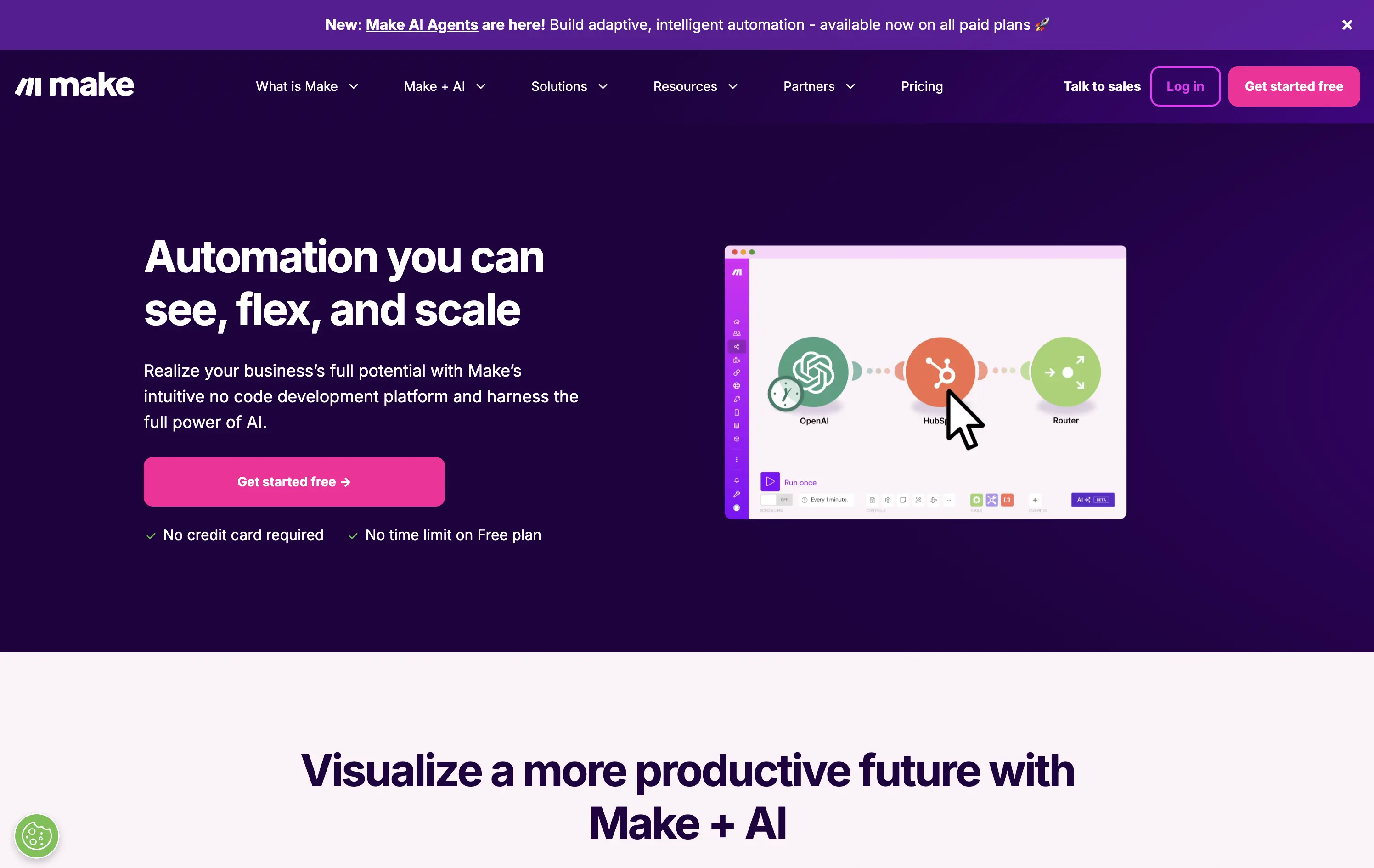
Make is a no-code automation platform that lets businesses visually build and scale workflows powered by AI.
It’s clean, clear, and direct. The animated product video does the heavy lifting. The layout and copy are textbook SaaS—efficient but forgettable. It communicates function well without taking any design risks.
Optimized for clarity and ease of adoption. Great for users shopping for workflow tools, but lacks brand distinctiveness. Plays it safe with a universal SaaS format and gradient palette.
This layout balances technical utility with human impact, aligning well with Algolia’s positioning as an API-first but UX-aware company. The mobile UI reinforces product value visually, while the logo wall signals scale and trust for enterprise buyers. The tone is clear, benefit-led, and appropriate for high-intent decision-makers evaluating AI tools for customer experience. This is a solid enterprise-facing hero built to perform.
Make
↗
No-Code
Productivity
Split Grid
Descriptive
Empowering
Multi-CTA Block
Video
Announcement
Duotone
Pink
Sans serif
Hybrid
Home Page
Custom Code
no-code automation, workflow builder, AI integration, drag-and-drop editor, Zapier alternative, clear onboarding, SaaS demo UX, trust-focused layout, commercial SaaS, AI-enhanced logic
Make is a no-code automation platform that lets businesses visually build and scale workflows powered by AI.
It’s clean, clear, and direct. The animated product video does the heavy lifting. The layout and copy are textbook SaaS—efficient but forgettable. It communicates function well without taking any design risks.
Optimized for clarity and ease of adoption. Great for users shopping for workflow tools, but lacks brand distinctiveness. Plays it safe with a universal SaaS format and gradient palette.
This layout balances technical utility with human impact, aligning well with Algolia’s positioning as an API-first but UX-aware company. The mobile UI reinforces product value visually, while the logo wall signals scale and trust for enterprise buyers. The tone is clear, benefit-led, and appropriate for high-intent decision-makers evaluating AI tools for customer experience. This is a solid enterprise-facing hero built to perform.
Bonsai
↗
SaaS
Productivity
Centered
Descriptive
Professional
Multi-CTA Block
Product UI
Social Proof
Badges
Light Mode
Black
Sans serif
B2B
Home Page
Webflow
clean UI, use-case ticker, modular product suite, high-trust SaaS, minimal layout, neutral branding, small business ops, service platform, feature-led structure, multi-tool clarity, clear positioning
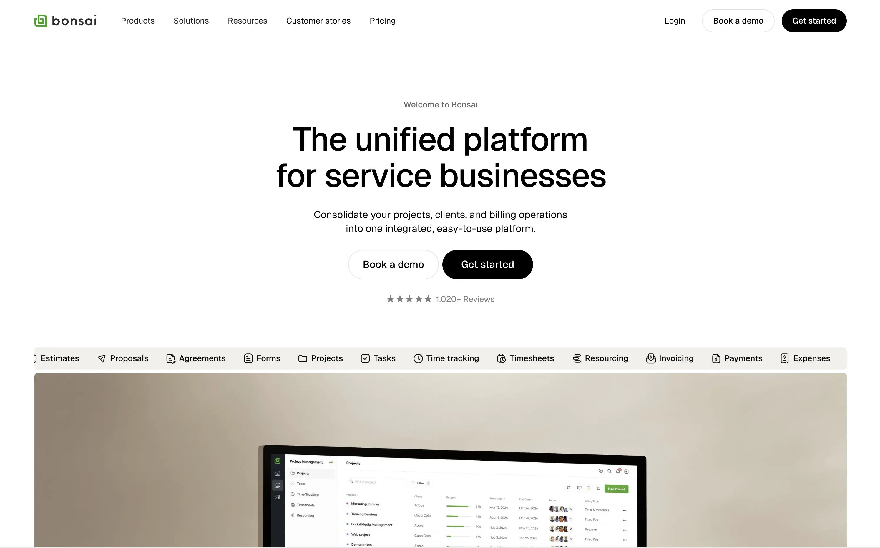
Bonsai offers an all-in-one platform to manage projects, clients, billing, and admin work for service-based businesses.
Minimal, structured, and very clear. The hero spells out the value in one line and supports it with a rolling feature list. Visuals, CTAs, and copy all pull in the same direction—no friction, no fluff.
Positioned for busy professionals who need clarity fast. Layout and tone reflect a mature product with high utility and little need for persuasion theatrics.
This layout balances technical utility with human impact, aligning well with Algolia’s positioning as an API-first but UX-aware company. The mobile UI reinforces product value visually, while the logo wall signals scale and trust for enterprise buyers. The tone is clear, benefit-led, and appropriate for high-intent decision-makers evaluating AI tools for customer experience. This is a solid enterprise-facing hero built to perform.
Bonsai
↗
SaaS
Productivity
Centered
Descriptive
Professional
Multi-CTA Block
Product UI
Social Proof
Badges
Light Mode
Black
Sans serif
B2B
Home Page
Webflow
clean UI, use-case ticker, modular product suite, high-trust SaaS, minimal layout, neutral branding, small business ops, service platform, feature-led structure, multi-tool clarity, clear positioning
Bonsai offers an all-in-one platform to manage projects, clients, billing, and admin work for service-based businesses.
Minimal, structured, and very clear. The hero spells out the value in one line and supports it with a rolling feature list. Visuals, CTAs, and copy all pull in the same direction—no friction, no fluff.
Positioned for busy professionals who need clarity fast. Layout and tone reflect a mature product with high utility and little need for persuasion theatrics.
This layout balances technical utility with human impact, aligning well with Algolia’s positioning as an API-first but UX-aware company. The mobile UI reinforces product value visually, while the logo wall signals scale and trust for enterprise buyers. The tone is clear, benefit-led, and appropriate for high-intent decision-makers evaluating AI tools for customer experience. This is a solid enterprise-facing hero built to perform.
Buildship
↗
SaaS
AI Tools
No-Code
Left-aligned
Descriptive
Single Button
Product UI
Custom Animation
Announcement
Dark Mode
White
Blue
Sans serif
Hybrid
Home Page
Framer
AI workflow builder, visual builder, flowchart UI, dev-friendly, dark UI, launch-ready, free tier, motion subtlety, AI agent platform, startup audience, real-time editing, builder UX, automation
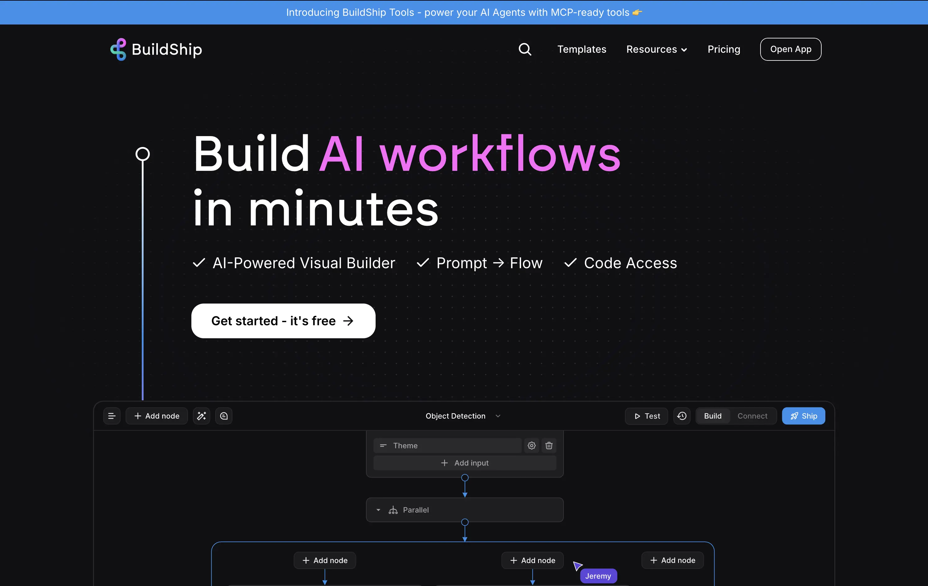
A visual builder to create and deploy AI workflows, combining prompts, logic flows, and optional code access.
Clear headline with a tight value prop and fast comprehension. Subtext breaks down the core features simply. The product UI preview grounds the promise in functionality. Strong visual hierarchy, CTA stands out.
Great fit for a semi-technical but time-sensitive audience. The message appeals to both speed and control. Design signals ease of use without over-explaining.
This layout balances technical utility with human impact, aligning well with Algolia’s positioning as an API-first but UX-aware company. The mobile UI reinforces product value visually, while the logo wall signals scale and trust for enterprise buyers. The tone is clear, benefit-led, and appropriate for high-intent decision-makers evaluating AI tools for customer experience. This is a solid enterprise-facing hero built to perform.
Buildship
↗
SaaS
AI Tools
No-Code
Left-aligned
Descriptive
Single Button
Product UI
Custom Animation
Announcement
Dark Mode
White
Blue
Sans serif
Hybrid
Home Page
Framer
AI workflow builder, visual builder, flowchart UI, dev-friendly, dark UI, launch-ready, free tier, motion subtlety, AI agent platform, startup audience, real-time editing, builder UX, automation
A visual builder to create and deploy AI workflows, combining prompts, logic flows, and optional code access.
Clear headline with a tight value prop and fast comprehension. Subtext breaks down the core features simply. The product UI preview grounds the promise in functionality. Strong visual hierarchy, CTA stands out.
Great fit for a semi-technical but time-sensitive audience. The message appeals to both speed and control. Design signals ease of use without over-explaining.
This layout balances technical utility with human impact, aligning well with Algolia’s positioning as an API-first but UX-aware company. The mobile UI reinforces product value visually, while the logo wall signals scale and trust for enterprise buyers. The tone is clear, benefit-led, and appropriate for high-intent decision-makers evaluating AI tools for customer experience. This is a solid enterprise-facing hero built to perform.
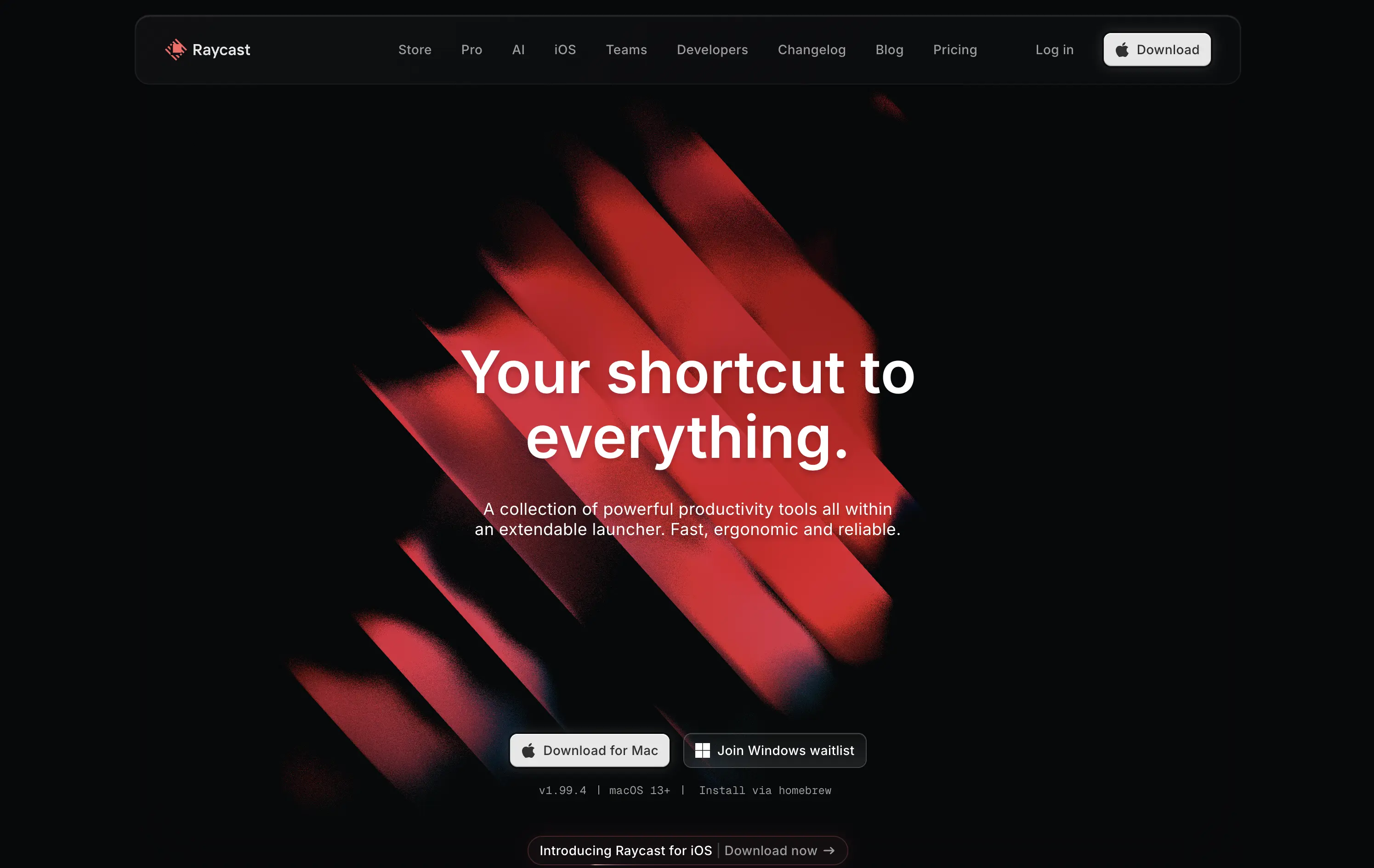
Raycast
↗
SaaS
Productivity
Centered
Bold & Direct
Descriptive
Download App
Multi-CTA Block
Interactive
Custom Animation
Loading Animation
Dark Mode
White
Red
Sans serif
B2C
Home Page
Custom Code
launcher app, power user tool, developer productivity, dark aesthetic, interactive background, custom animation, glowing motion, fast utility, keyboard-first UX, macOS-native, iOS launch, feature-rich
Raycast is a fast, extendable launcher that streamlines tasks and apps into one productivity command center.
Hero opens with striking motion and subtle interactivity, creating immediate emotional pull. Headline is short and memorable. Strong clarity on what it is and what it solves. Layout is focused, high-conversion and visually polished.
Positioning as a utility layer for power users is clear. Dark mode and minimalist tone align with dev-savvy audiences. Strong balance of brand and product without overexplaining.
This layout balances technical utility with human impact, aligning well with Algolia’s positioning as an API-first but UX-aware company. The mobile UI reinforces product value visually, while the logo wall signals scale and trust for enterprise buyers. The tone is clear, benefit-led, and appropriate for high-intent decision-makers evaluating AI tools for customer experience. This is a solid enterprise-facing hero built to perform.
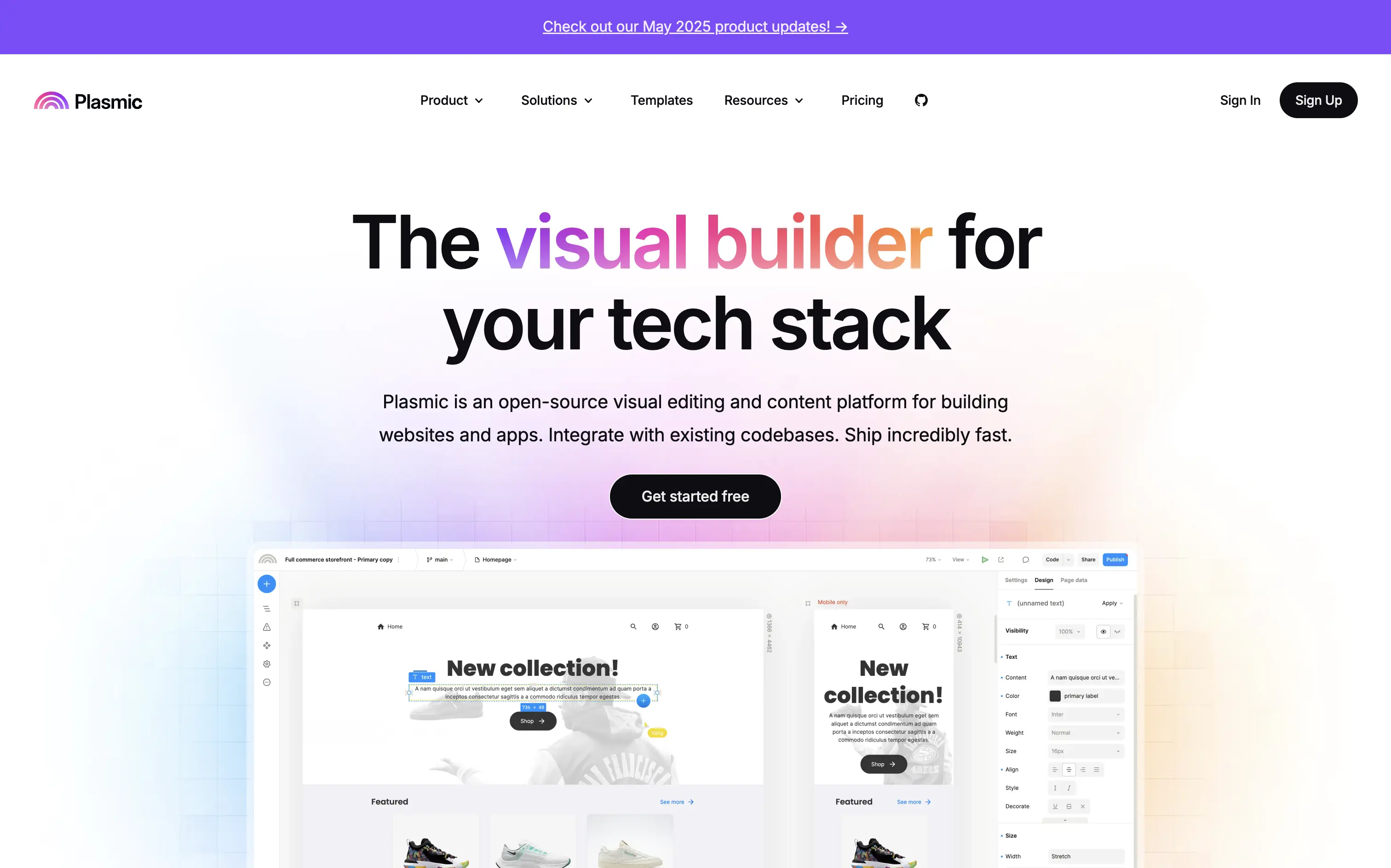
Plasmic
↗
SaaS
No-Code
Collaboration
Creative Tools
Centered
Benefit-Driven
Descriptive
Single Button
Product UI
Announcement
Gradient
Light Mode
Pink
Purple
Yellow
Sans serif
Hybrid
Home Page
Custom Code
visual builder, code integration, React support, Figma import, developer-friendly, no-code platform, CMS integration, responsive design, real-time collaboration, open-source, component-based, scalable, enterprise-ready, UI/UX design
Plasmic is an open-source visual builder that enables teams to design and build web apps and websites rapidly, integrating seamlessly with existing codebases.
The hero section clearly communicates Plasmic's core value proposition as a visual builder for tech stacks. The combination of concise copy and product visuals effectively showcases its capabilities. The inclusion of a logo wall adds credibility, and the CTA is prominently displayed, guiding users toward engagement.
Plasmic positions itself effectively for both developers and non-developers by highlighting seamless code integration and visual editing capabilities. This dual appeal broadens its market reach and addresses common pain points in web development workflows.
This layout balances technical utility with human impact, aligning well with Algolia’s positioning as an API-first but UX-aware company. The mobile UI reinforces product value visually, while the logo wall signals scale and trust for enterprise buyers. The tone is clear, benefit-led, and appropriate for high-intent decision-makers evaluating AI tools for customer experience. This is a solid enterprise-facing hero built to perform.
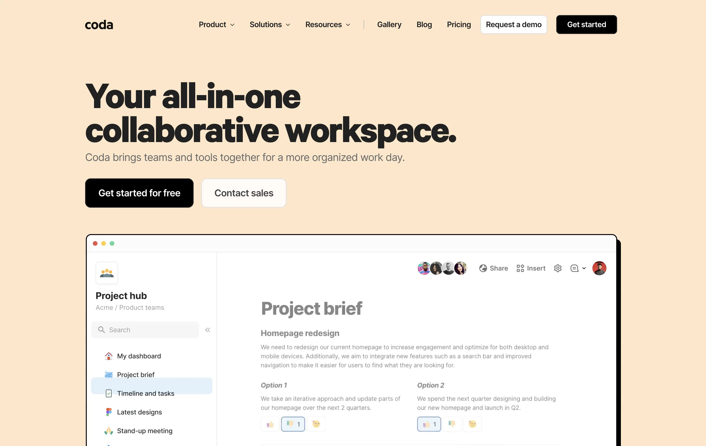
Coda
↗
SaaS
Collaboration
Productivity
Left-aligned
Descriptive
Empowering
Multi-CTA Block
Product UI
Duotone
White
Yellow
Display
Sans serif
Hybrid
Home Page
Custom Code
doc-as-app, team workflow, internal tools, collaborative workspace, UI product demo, hybrid teams, sales enablement, project brief, minimal design, low-code logic, enterprise-friendly, live multiplayer,
Coda is a collaborative doc platform that combines documents, spreadsheets, and apps into one unified workspace for teams.
The hero communicates clearly with a straightforward headline and strong product shot. Layout is easy to follow, and the dual CTA gives distinct paths for self-serve or sales-led funnels. The visual hierarchy is solid, though not emotionally charged.
Coda leads with clarity over flash. The message and layout prioritize breadth of use and enterprise readiness. Great fit for decision-makers looking to unify scattered tools into a single workspace.
This layout balances technical utility with human impact, aligning well with Algolia’s positioning as an API-first but UX-aware company. The mobile UI reinforces product value visually, while the logo wall signals scale and trust for enterprise buyers. The tone is clear, benefit-led, and appropriate for high-intent decision-makers evaluating AI tools for customer experience. This is a solid enterprise-facing hero built to perform.
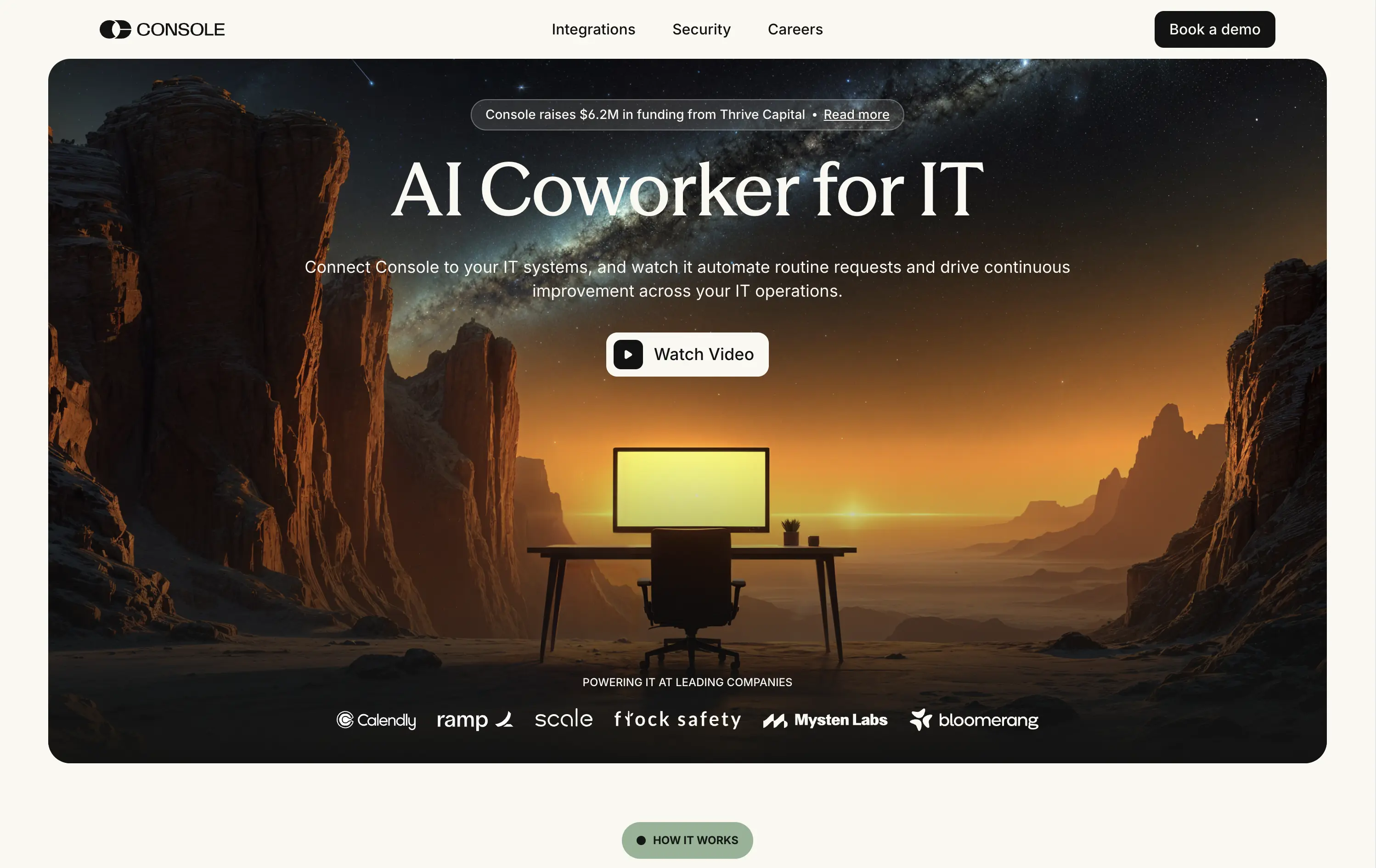
Console
↗
SaaS
IT & Security
AI Tools
Inset
Centered
Descriptive
Single Button
Watch Demo
Illustration
Logo Wall
Announcement
Light Mode
White
Serif
B2B
Home Page
Framer
cinematic backdrop, ai coworker, startup-funded, IT automation, visual metaphor, remote workspace, ambient hero, dystopian warm tone, product-less hero, modern SaaS, minimal chrome, high-trust logos
Console is an AI platform that automates routine IT tasks, acting as an autonomous coworker for technical operations teams in scaling companies.
Console’s hero leans heavily on mood. The cinematic desert landscape and glowing screen offer a metaphor for isolation, automation, and 24/7 capability. The “AI Coworker for IT” headline is simple, memorable, and category-redefining. Subtext expands the use case efficiently. The “Watch Video” CTA feels aligned with the storytelling angle. Enterprise logos below provide validation. The absence of product UI is a calculated choice — betting on intrigue over clarity.
This is a bet on brand over clarity; and it works and stands out. Conceptual visual framing elevates the value prop from tool to paradigm. Great fit for early-stage brand building in technical buyer circles.
This layout balances technical utility with human impact, aligning well with Algolia’s positioning as an API-first but UX-aware company. The mobile UI reinforces product value visually, while the logo wall signals scale and trust for enterprise buyers. The tone is clear, benefit-led, and appropriate for high-intent decision-makers evaluating AI tools for customer experience. This is a solid enterprise-facing hero built to perform.
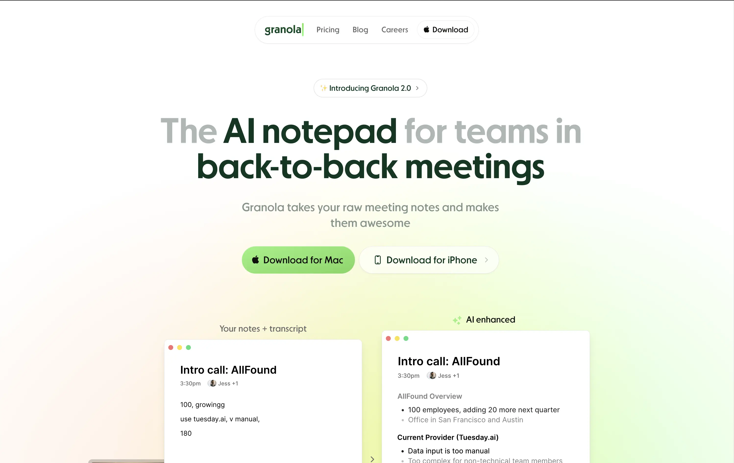
Granola
↗
SaaS
AI Tools
Productivity
Centered
Descriptive
Pain-driven
Download App
Multi-CTA Block
Product UI
Announcement
Gradient
Light Mode
Green
Sans serif
Hybrid
Home Page
Custom Code
AI notepad, transcript comparison, Mac/iOS focus, pastel gradient, clean UX, AI productivity, note app, task-lite SaaS, small team positioning, time-saving tool, App Store-ready, side-by-side visual
Granola is an AI notepad that turns messy meeting notes into clean, structured transcripts — built for teams with nonstop meetings.
The hero is practical and conversion-focused. It quickly communicates what the tool does and for whom. The side-by-side note demo is immediately legible and shows before/after clarity. Headline focuses on team context rather than just AI, which grounds it. Download CTAs feel native and frictionless. The soft green gradient is calming without feeling sterile. Could benefit from stronger brand differentiation, but it nails clarity and accessibility for a high-frequency use case.
Laser-targeted to productivity-challenged teams. Hero clearly communicates utility and streamlines onboarding. UI preview builds instant understanding, and the download CTAs suggest a tool that fits right into daily workflows.
This layout balances technical utility with human impact, aligning well with Algolia’s positioning as an API-first but UX-aware company. The mobile UI reinforces product value visually, while the logo wall signals scale and trust for enterprise buyers. The tone is clear, benefit-led, and appropriate for high-intent decision-makers evaluating AI tools for customer experience. This is a solid enterprise-facing hero built to perform.
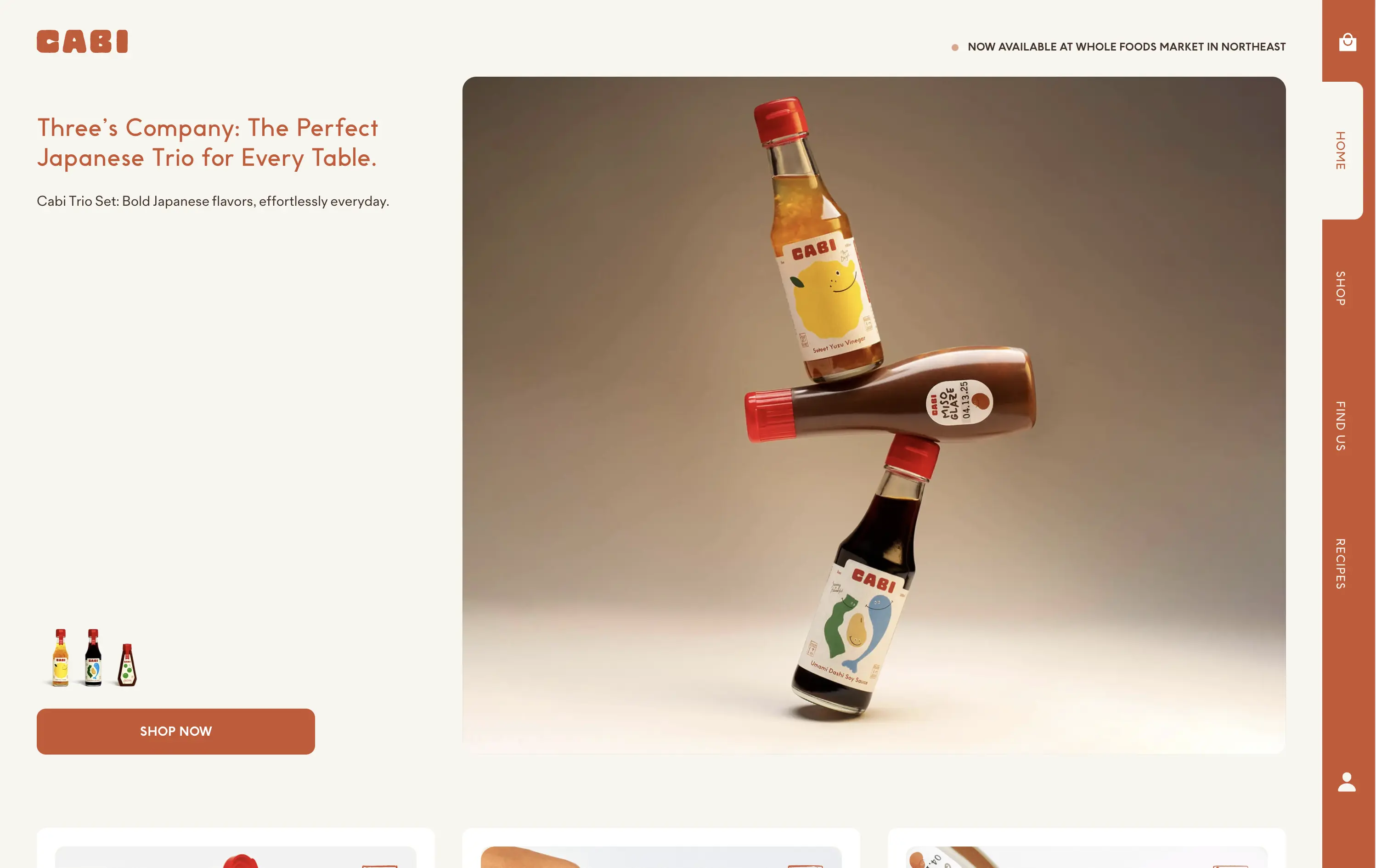
Cabi
↗
CPG
Food & Beverage
Minimal
Editorial
Playful
Descriptive
Single Button
Photography
Duotone
Red
Sans serif
DTC
Home Page
Shopify
neo-retro aesthetic, editorial layout, minimalist packaging, visual-first, high art direction, small-batch vibe, premium grocer, vertical flavor trio, lifestyle CPG, homepage hero, nostalgic modernism, shopable CTA
Cabi is a modern Japanese sauce brand offering a trio of bold, everyday condiments sold DTC and through select Whole Foods locations.
Cabi’s hero strikes a balance between product showcase and brand personality. The bottle stack photo is memorable and artful, with warm studio lighting that elevates the product beyond commodity. The copy is clean and narrative-led, paired with an understated “Shop Now” CTA that keeps the focus on visual storytelling. Vertical nav feels custom-built for a modern CPG brand. It holds its own without needing motion or video.
This is a homepage hero made for shelf appeal crossover. Visually premium, minimal in distractions, and confident in letting the packaging carry the emotional and culinary positioning. Feels Whole Foods-ready.
This layout balances technical utility with human impact, aligning well with Algolia’s positioning as an API-first but UX-aware company. The mobile UI reinforces product value visually, while the logo wall signals scale and trust for enterprise buyers. The tone is clear, benefit-led, and appropriate for high-intent decision-makers evaluating AI tools for customer experience. This is a solid enterprise-facing hero built to perform.
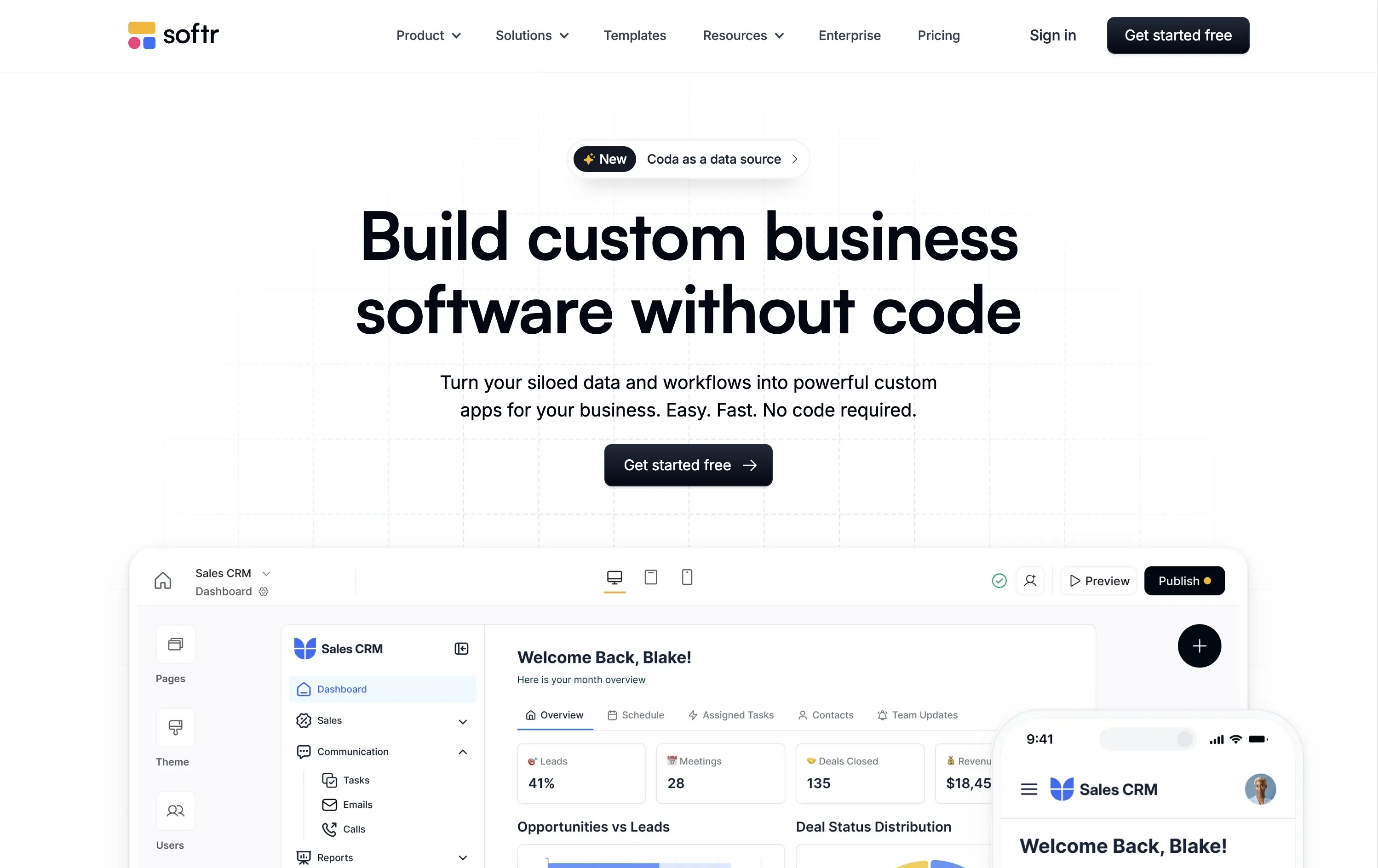
Softr
↗
SaaS
No-Code
Centered
Descriptive
Empowering
Single Button
Product UI
Announcement
Light Mode
Black
Sans serif
B2B
Home Page
Webflow
no-code builder, grid background, empowering language, SaaS homepage, CRM dashboard UI, announcement pill, onboarding-friendly, clean layout, business automation, early-stage SaaS, Coda integration, custom apps, tool for operations, low-friction CTA
Softr lets you build custom internal tools, portals, and apps from your business data without writing any code.
Clear, product-led hero that instantly communicates value. The main headline is bold and simple, and the visual shows real product UI. New feature callout adds relevance. Overall, conversion-friendly.
Strong fit for practical decision-makers who value clarity and speed. Clean layout and tone match the product’s accessible, productivity-first positioning. Shows rather than tells.
This layout balances technical utility with human impact, aligning well with Algolia’s positioning as an API-first but UX-aware company. The mobile UI reinforces product value visually, while the logo wall signals scale and trust for enterprise buyers. The tone is clear, benefit-led, and appropriate for high-intent decision-makers evaluating AI tools for customer experience. This is a solid enterprise-facing hero built to perform.
Stacker
↗
SaaS
AI Tools
Productivity
Minimal
Centered
Descriptive
Professional
Single Button
Photography
Video
Light Mode
Black
Sans serif
B2B
Home Page
Framer
AI operations platform, light minimal hero, conversational UI, agent automation, process copilots, clean layout, icon-based features, white space emphasis, AI-native workflow, modern SaaS tone, B2B AI, high-trust layout, early-stage beta feel
Stacker AI helps companies automate internal operations with conversational interfaces, process copilots, and autonomous agents built into their workflows.
Clarity-forward hero with minimal visual noise. Headline is direct. Icons give quick scannability of offering. “Request access” indicates early-stage invite model, aligning with AI-native positioning.
Strong entry for teams exploring AI-first automation. The restrained layout and soft interaction style suggest maturity and stability—a counterbalance to the experimental nature of AI agents.
This layout balances technical utility with human impact, aligning well with Algolia’s positioning as an API-first but UX-aware company. The mobile UI reinforces product value visually, while the logo wall signals scale and trust for enterprise buyers. The tone is clear, benefit-led, and appropriate for high-intent decision-makers evaluating AI tools for customer experience. This is a solid enterprise-facing hero built to perform.
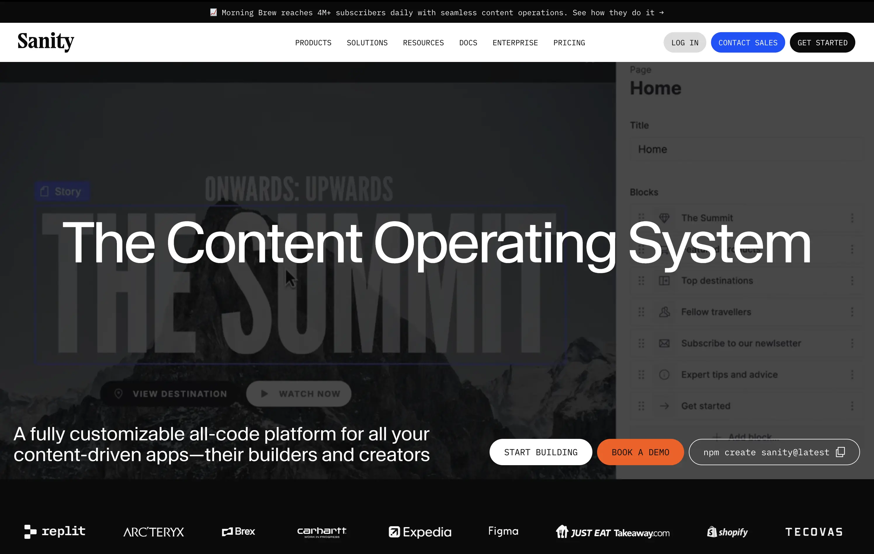
Sanity
↗
SaaS
DevTools
Full Width
Descriptive
Multi-CTA Block
Video
Logo Wall
Announcement
Imagery-Based
White
Orange
Sans serif
B2B
Home Page
Custom Code
programmable content, developer-first CMS, content infrastructure, CLI install, terminal-ready, layered layout, utility CTA, heavy visual load, startup-to-enterprise scale, code-native UX, tech-forward brand, headless CMS, dark visual tone
Sanity is a customizable, developer-first CMS platform that gives full programmatic control to build scalable content-driven apps.
Copy-to-clipboard npm CTA is highly functional and aligned with dev habits. But overall hierarchy is cluttered—UI overlay, imagery, and CTAs fight for attention, making the first impression a bit noisy.
Great strategic anchor for a technical audience, but risks cognitive overload on entry. Needs tighter content framing to sharpen focus for first-time visitors.
This layout balances technical utility with human impact, aligning well with Algolia’s positioning as an API-first but UX-aware company. The mobile UI reinforces product value visually, while the logo wall signals scale and trust for enterprise buyers. The tone is clear, benefit-led, and appropriate for high-intent decision-makers evaluating AI tools for customer experience. This is a solid enterprise-facing hero built to perform.
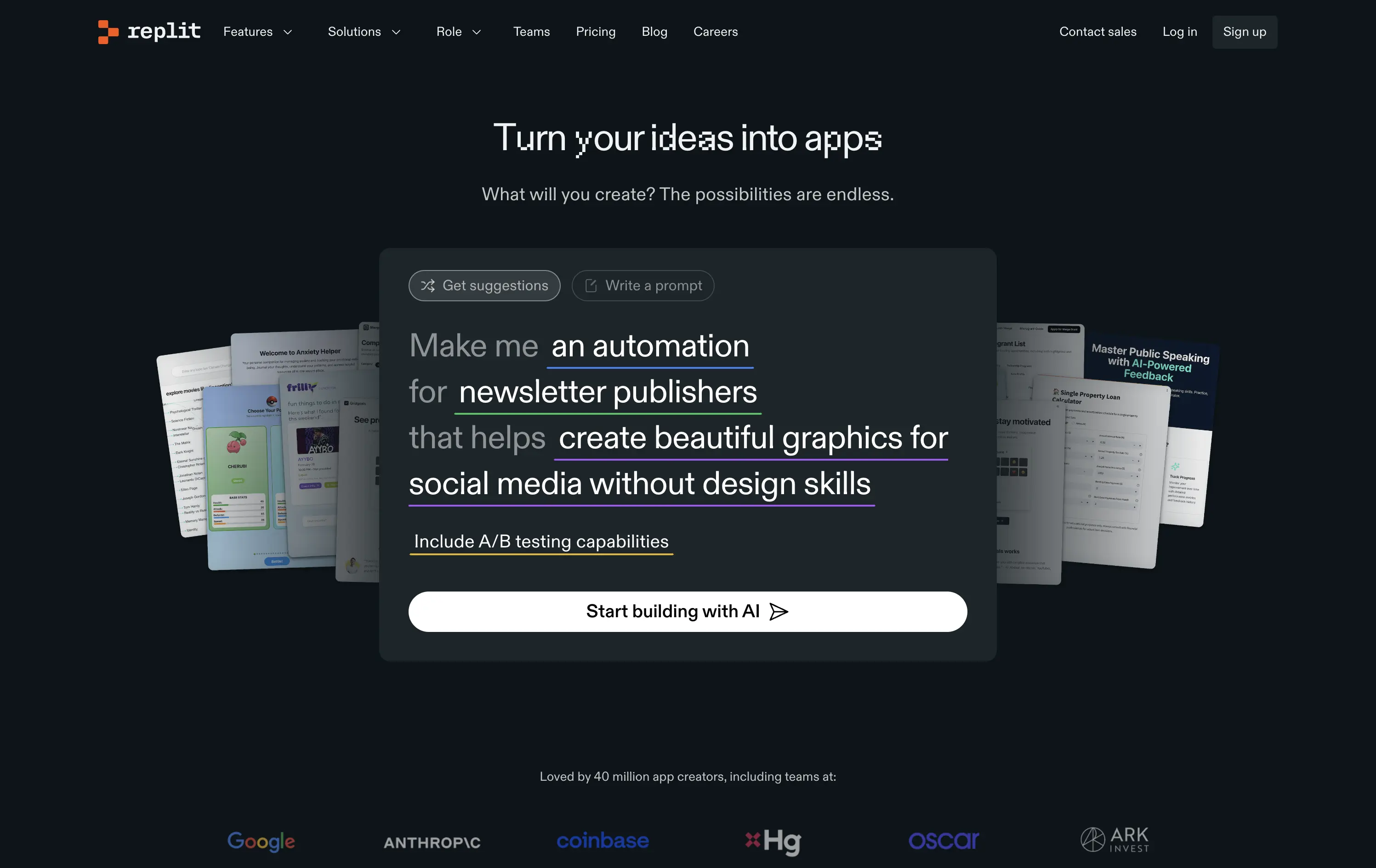
Replit
↗
SaaS
DevTools
AI Tools
Centered
Descriptive
Empowering
Search/Utility Block
Media Gallery
Interactive
Product UI
Dark Mode
White
Sans serif
Hybrid
Home Page
Custom Code
ai developer tools, type-to-build interface, interactive prompt UI, dark interface, real-time suggestion, input-led hero, startup showcase, low-code/no-code, dev productivity, trust logos, community-powered
Replit is a collaborative AI-tool platform where anyone can build, deploy, and scale software from a single workspace.
The hero is interaction-first — built around a live prompt box that speaks directly to user intent. Copy fades into function, encouraging you to engage before exploring.
Replit sells ambition to builders. The hero de-emphasizes itself in favor of showing the product experience. It’s aligned to users seeking momentum, not just documentation.
This layout balances technical utility with human impact, aligning well with Algolia’s positioning as an API-first but UX-aware company. The mobile UI reinforces product value visually, while the logo wall signals scale and trust for enterprise buyers. The tone is clear, benefit-led, and appropriate for high-intent decision-makers evaluating AI tools for customer experience. This is a solid enterprise-facing hero built to perform.
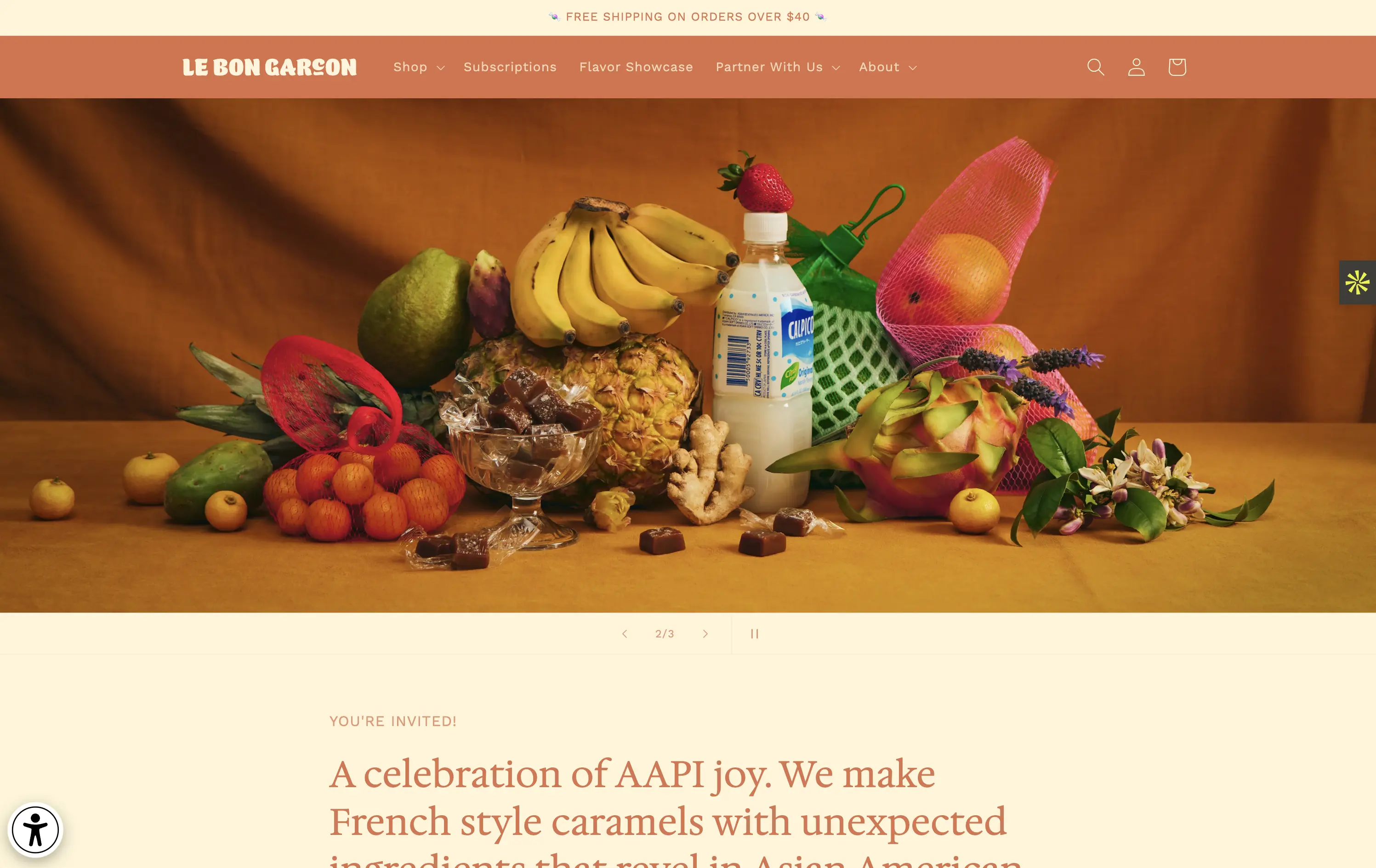
Le Bon Garçon
↗
CPG
Food & Beverage
Editorial
Descriptive
Founder-Led Voice
No CTA
Photography
Media Gallery
Announcement
Duotone
Imagery-Based
Orange
Yellow
Serif
DTC
Home Page
Shopify
nostalgic packaging, elevated DTC candy, premium gifting, Asian-American ingredients, still-life styling, art direction-led, cultural storytelling, warm palette, caramel focus, identity-led CPG, curated feel, editorial aesthetic, flavor storytelling, high design, AAPI founder
A premium confectionery brand reimagining French-style caramels through the lens of Asian-American flavors and storytelling.
This hero leans fully into art direction, with a cinematic still-life that evokes tradition, indulgence, and multicultural vibrancy. There's no obvious CTA, but the experience feels intentional and immersive. The visual composition draws curiosity and reflects a product crafted with care. The copy introduces cultural relevance and flavor positioning effectively, though some may miss a direct product hook.
Perfect for brand-aware shoppers and gifting segments. A visual-first approach supports premium positioning and cultural storytelling over hard conversion.
This layout balances technical utility with human impact, aligning well with Algolia’s positioning as an API-first but UX-aware company. The mobile UI reinforces product value visually, while the logo wall signals scale and trust for enterprise buyers. The tone is clear, benefit-led, and appropriate for high-intent decision-makers evaluating AI tools for customer experience. This is a solid enterprise-facing hero built to perform.
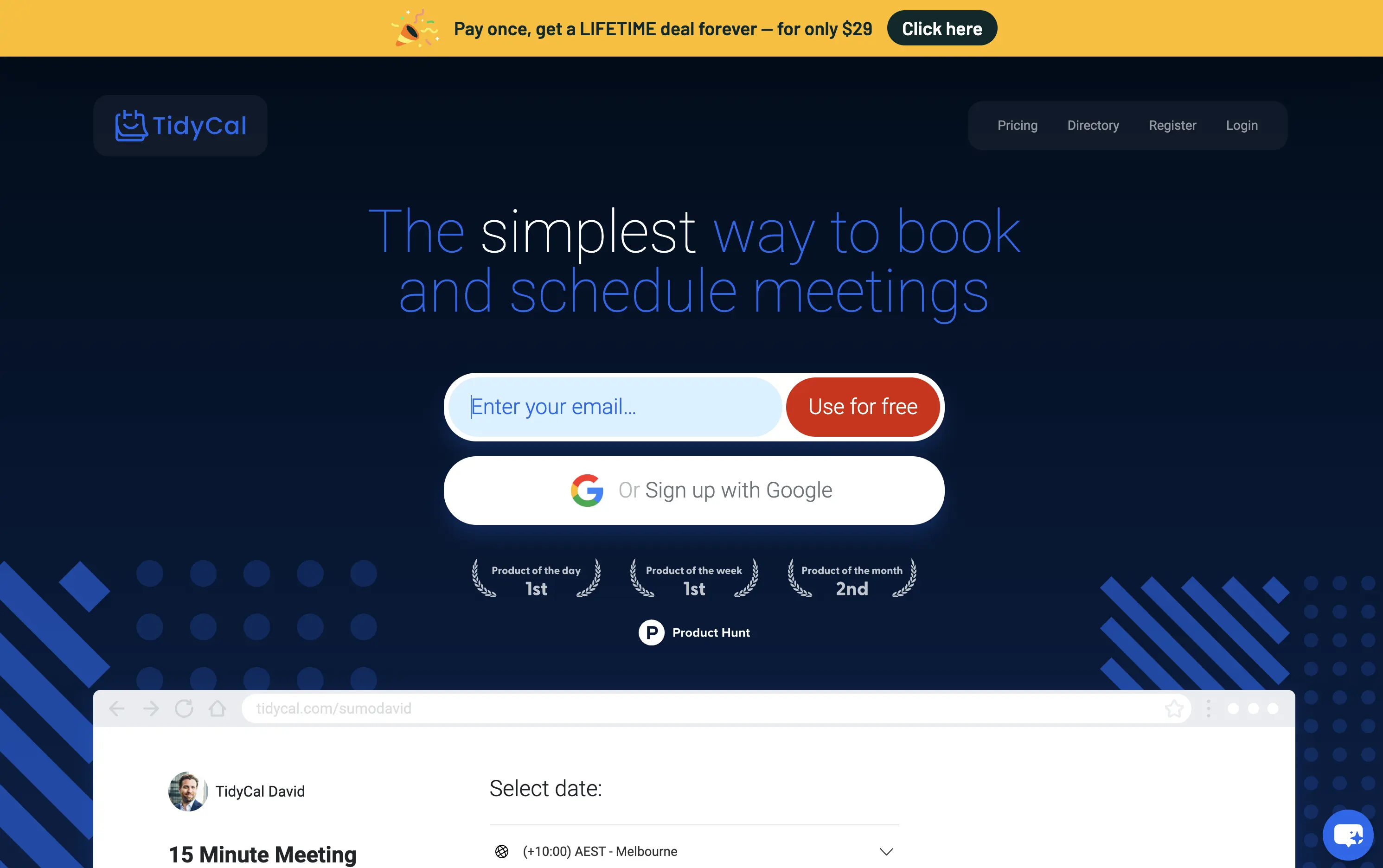
TidyCal
↗
SaaS
Productivity
Centered
Benefit-Driven
Descriptive
Email Capture
Social Proof
Announcement
Badges
Dark Mode
Blue
Sans serif
B2B
Home Page
Custom Code
low-cost alternative, one-time payment SaaS, scheduling tool, Product Hunt-backed, no-frills UI, budget-friendly SaaS, email-first CTA, dark mode hero, indie stack, small team SaaS, lifetime deal, value-first messaging, stripped-down UX, pricing transparency
TidyCal is a simple, affordable calendar booking tool offering lifetime access for a one-time fee — ideal for solo professionals and budget-conscious teams.
TidyCal’s hero is clear on purpose but light on finesse. The lifetime deal banner is highly conversion-optimized and immediately grabs attention. However, the headline lacks typographic hierarchy and fails to land with impact — “simplest” stands out visually, but the phrasing overall feels flat. The input-first layout is user-friendly, but inconsistent sizing and visual imbalance reduce perceived trust. This hero converts, but it doesn’t inspire.
The pricing-first message works for a cost-sensitive audience. But the unrefined layout and typographic decisions may limit credibility with enterprise or design-aware users. Prioritizes affordability over perception of quality.
This layout balances technical utility with human impact, aligning well with Algolia’s positioning as an API-first but UX-aware company. The mobile UI reinforces product value visually, while the logo wall signals scale and trust for enterprise buyers. The tone is clear, benefit-led, and appropriate for high-intent decision-makers evaluating AI tools for customer experience. This is a solid enterprise-facing hero built to perform.
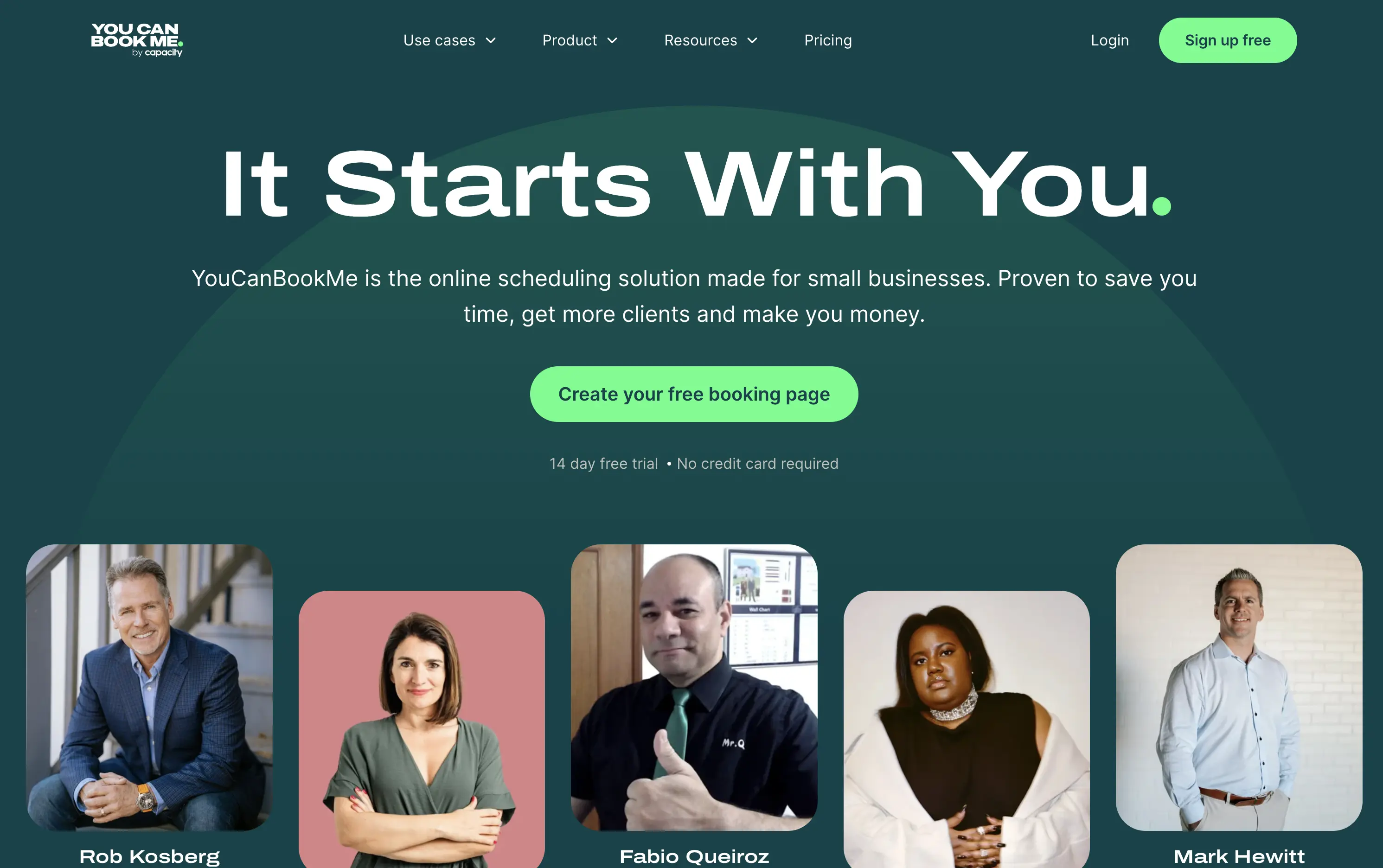
You Can Book Me
↗
SaaS
Productivity
Centered
Descriptive
Empowering
Single Button
Photography
Media Gallery
Duotone
Green
Display
B2B
Home Page
solo-friendly SaaS, scheduling tool, real user proof, small business productivity, personal headline, free trial, soft design system, emotional copy, utility-first, community-led, freemium conversion, authenticity-first visuals, indie SaaS
YouCanBook.Me is a scheduling platform designed to help small businesses streamline bookings, save time, and convert more leads through simple, flexible scheduling pages.
The hero centers emotional relatability. “It Starts With You” feels direct and empowering, while the subhead offers a clear, benefit-first pitch. The design isn’t flashy — it leans on authenticity, with non-art-directed portraits adding a raw, real-user touch. The green CTA is visible, though visually softer than competitors. While the layout lacks design sophistication, it feels personal and conversion-minded.
Targeting small business owners and service providers with a tone of support and relatability. It emphasizes utility over polish, aiming to win trust through clarity, familiarity, and proof of real-world use.
This layout balances technical utility with human impact, aligning well with Algolia’s positioning as an API-first but UX-aware company. The mobile UI reinforces product value visually, while the logo wall signals scale and trust for enterprise buyers. The tone is clear, benefit-led, and appropriate for high-intent decision-makers evaluating AI tools for customer experience. This is a solid enterprise-facing hero built to perform.
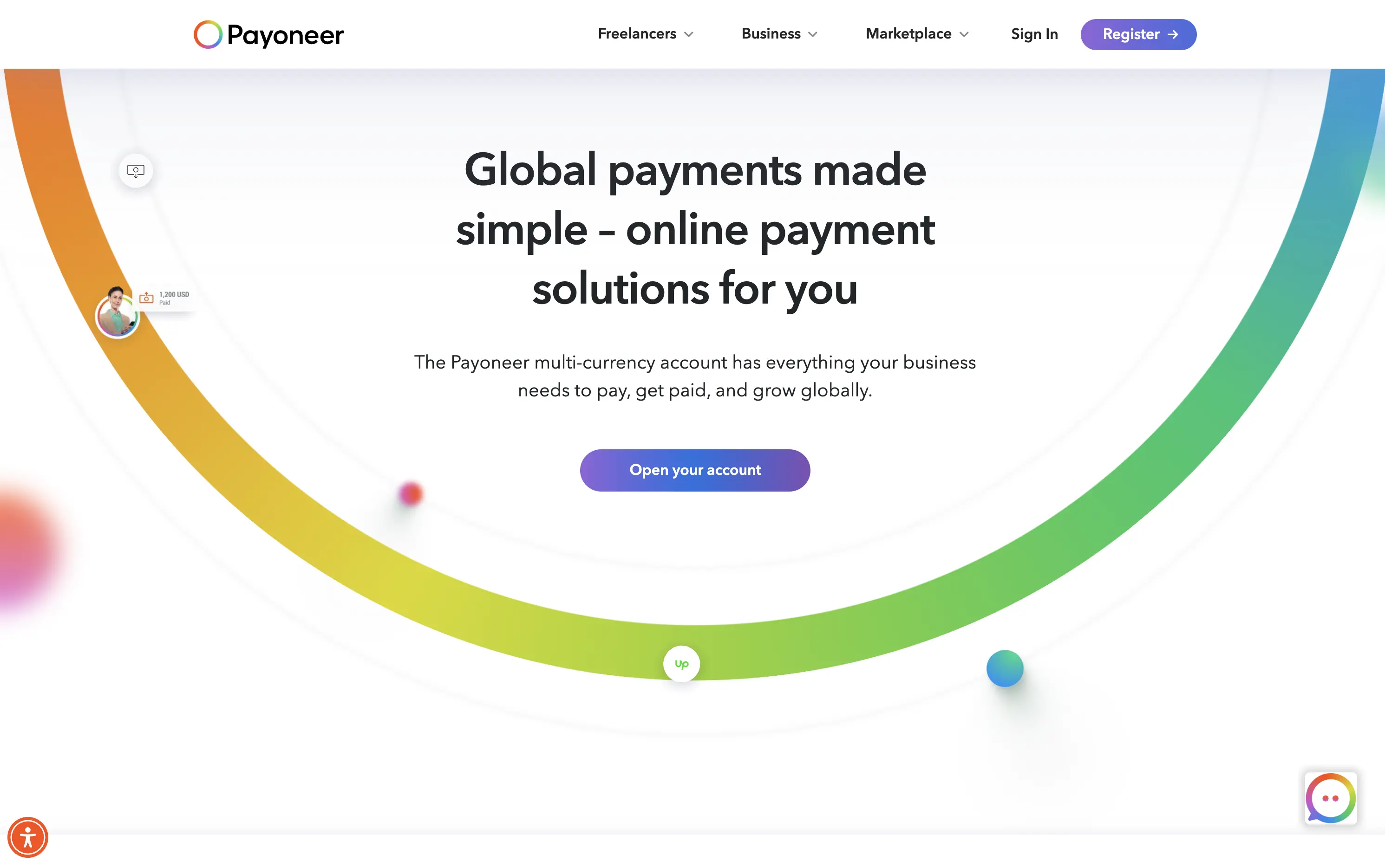
Payoneer
↗
SaaS
Fintech
Centered
Descriptive
Confident
Single Button
Photography
Illustration
Custom Animation
Light Mode
Purple
Sans serif
B2B
Home Page
Wordpress
global payments, borderless finance, transaction animation, multi-currency account, visual storytelling, freelancer payments, cross-border SaaS, simplified UX, modern money movement, motion-led layout, banking alternative, vibrant palette, international scale
Payoneer is a global online payment platform offering multi-currency accounts and seamless cross-border transactions for businesses and freelancers.
The hero blends utility and motion well. The animated arc mimics financial flow, visually conveying the platform’s core promise: fast, borderless payments. Headline is clear and functional, supported by a strong subhead. The animation, showing USD amounts sent and received, makes the experience feel human and practical. The CTA is visible but understated. Overall, it reinforces trust and makes the product feel simple and scalable.
Smart visual metaphor for financial ease and flow — helps Payoneer stand out in a space often dominated by cold, institutional design. This layout is conversion-safe while visually expressive.
This layout balances technical utility with human impact, aligning well with Algolia’s positioning as an API-first but UX-aware company. The mobile UI reinforces product value visually, while the logo wall signals scale and trust for enterprise buyers. The tone is clear, benefit-led, and appropriate for high-intent decision-makers evaluating AI tools for customer experience. This is a solid enterprise-facing hero built to perform.
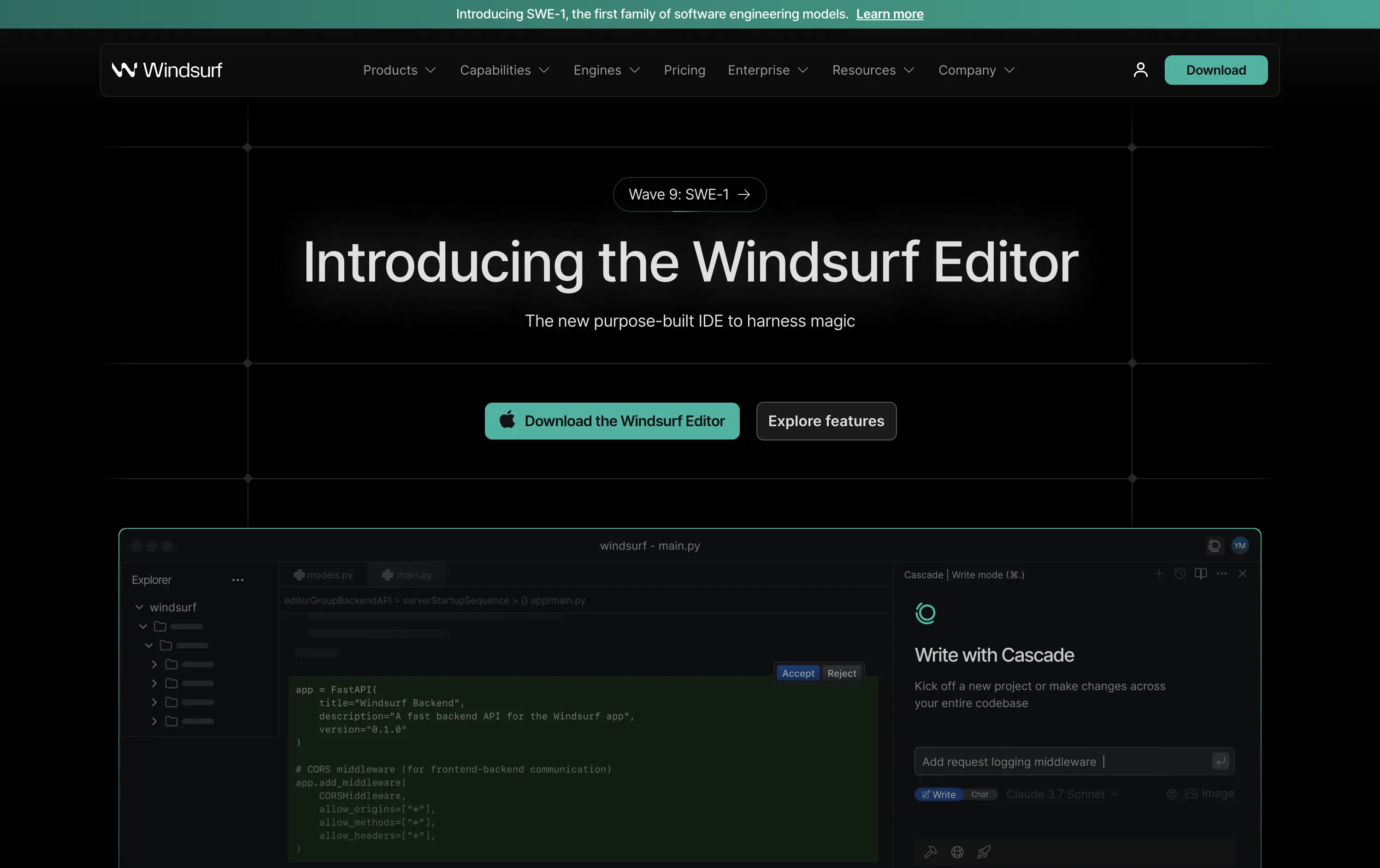
Windsurf
↗
DevTools
AI Tools
Productivity
Centered
Descriptive
Multi-CTA Block
Product UI
Custom Animation
Announcement
Dark Mode
Green
Sans serif
B2B
Home Page
Custom Code
IDE launch, developer-centric UI, dark mode, AI-enhanced coding, precision layout, launch-focused, performance signaling, Claude integration, copy-to-download conversion, dev community tone, structured layout, hero with proof
Windsurf is a new AI-powered IDE purpose-built for modern software engineers—integrating tools, models, and workflows into one seamless editing experience.
This is a pure product launch hero—focused, fast, and confident. The headline introduces the new editor directly, with “harness magic” adding flair. A download CTA and “Explore features” link address both high and medium intent users. Visual hierarchy is crisp: product UI preview beneath gives immediate credibility. The dark grid background and neon teal accents push a high-performance, developer-native aesthetic. Motion on the UI keeps it alive without distracting. Overall: efficient, well-structured, and optimized for launch-phase conversion.
A highly product-led approach targeted at technical users. The CTA hierarchy and layout structure prioritize credibility and momentum. Strong framing for launch, with a clear focus on dev audience mindset and intent.
This layout balances technical utility with human impact, aligning well with Algolia’s positioning as an API-first but UX-aware company. The mobile UI reinforces product value visually, while the logo wall signals scale and trust for enterprise buyers. The tone is clear, benefit-led, and appropriate for high-intent decision-makers evaluating AI tools for customer experience. This is a solid enterprise-facing hero built to perform.
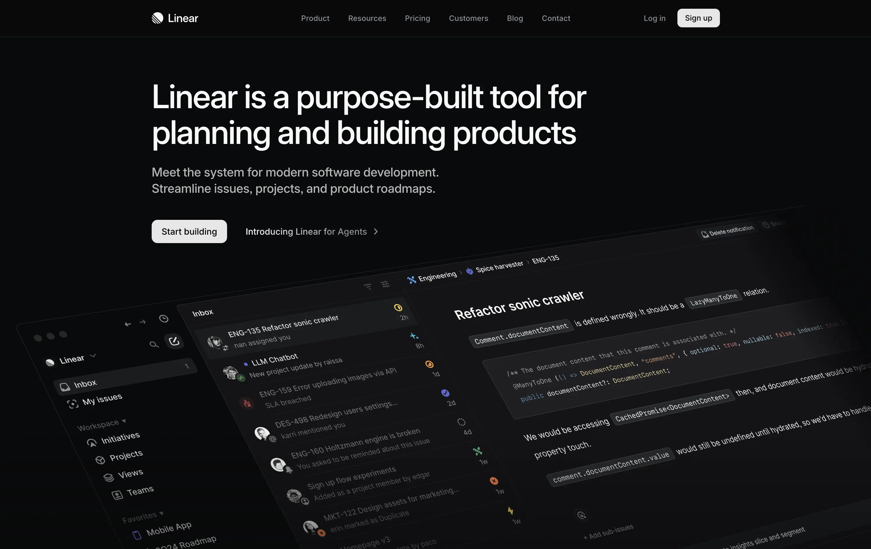
Linear
↗
SaaS
DevTools
Productivity
Left-aligned
Descriptive
Confident
Single Button
Product UI
Loading Animation
Dark Mode
White
Sans serif
B2B
Home Page
Custom Code
dark UI, engineering tools, product planning, no-fluff SaaS, modern developer stack, minimal aesthetic, deep focus, crisp layout, issue tracking, roadmap software, command-style CTA, zero distraction, productivity-first, startup tools
Linear is a streamlined tool for software teams to manage issues, sprints, and product roadmaps in a beautifully fast interface.
The hero is sleek, direct, and visually immersive. It highlights product strength without bloating the screen. Messaging is tight and outcome-focused. “Start building” reinforces dev-oriented immediacy. A strong signal of seriousness.
Perfectly aligned with experienced product and engineering teams. The minimal design supports focus. Hero says: “we’re here to work,” not pitch. Shows deep awareness of audience expectations.
This layout balances technical utility with human impact, aligning well with Algolia’s positioning as an API-first but UX-aware company. The mobile UI reinforces product value visually, while the logo wall signals scale and trust for enterprise buyers. The tone is clear, benefit-led, and appropriate for high-intent decision-makers evaluating AI tools for customer experience. This is a solid enterprise-facing hero built to perform.
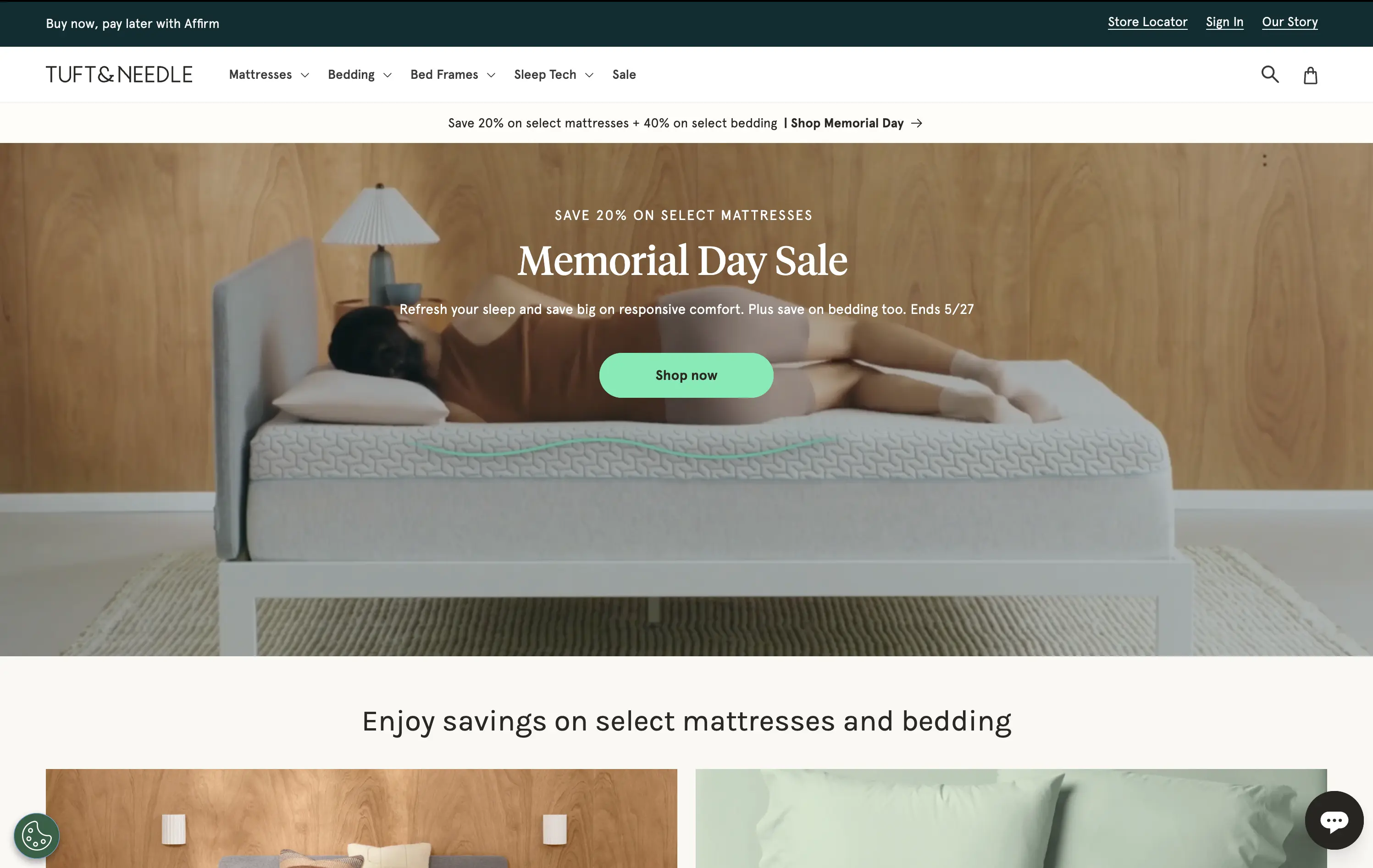
Tuft & Needle
↗
Home & Living
Full Width
Descriptive
Single Button
Video
Imagery-Based
Light Mode
Green
Serif
DTC
Home Page
Shopify
calm aesthetic, DTC home brand, promo-led hero, lifestyle video, seasonal offer, mattress DTC, soothing tones, centered CTA, sales-driven layout, comfort-first, ecommerce UX, banner urgency, restful visuals
Tuft & Needle sells mattresses and bedding online, promising comfort, value, and fast delivery.
Hero makes the seasonal sale clear and appealing without breaking the brand’s visual softness. Video adds warmth, while the green CTA stands out without feeling intrusive. Messaging is brief and conversion-oriented.
Built to convert value-driven home shoppers during peak sale season. Visual tone maintains trust and ease, while layout pushes urgency in a structured, on-brand way. No distractions, just comfort and clarity.
This layout balances technical utility with human impact, aligning well with Algolia’s positioning as an API-first but UX-aware company. The mobile UI reinforces product value visually, while the logo wall signals scale and trust for enterprise buyers. The tone is clear, benefit-led, and appropriate for high-intent decision-makers evaluating AI tools for customer experience. This is a solid enterprise-facing hero built to perform.
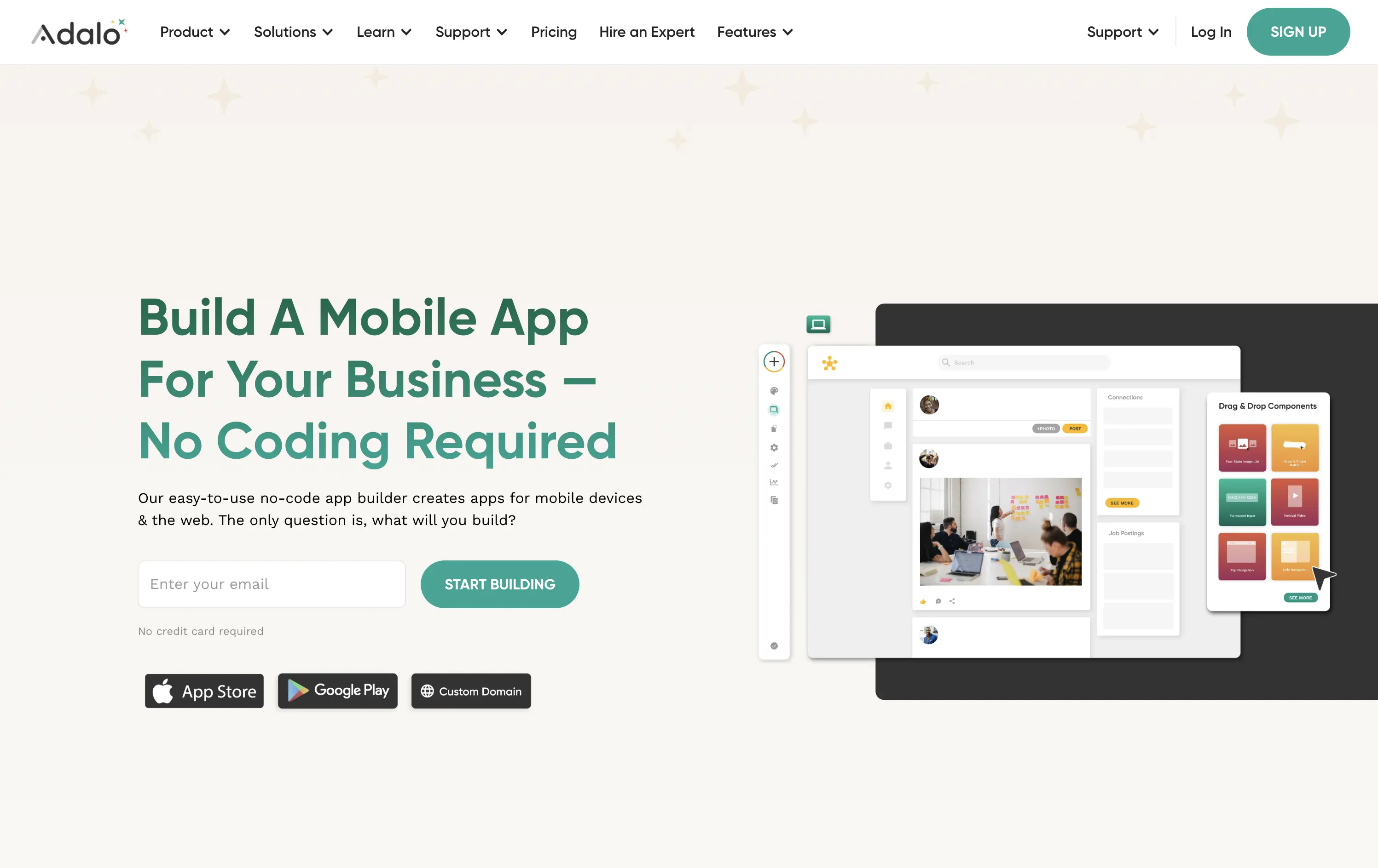
Adalo
↗
SaaS
No-Code
Creative Tools
Split Grid
Left-aligned
Benefit-Driven
Descriptive
Email Capture
Product UI
Duotone
Green
Sans serif
Hybrid
Home Page
Webflow
no-code builder, early-stage vibe, product-led growth, friendly UI, starter-friendly, clear CTA, drag-and-drop visual, email-first CTA, low-barrier signup, mobile-first, DIY tech, warm palette, creator tools, approachable tone, utility-first
Adalo lets anyone build mobile and web apps without coding using an easy drag-and-drop editor and built-in components.
The layout is clean, welcoming, and communicates ease of use. Visual UI gives confidence, and the input field softens conversion friction. It appeals to non-technical founders well but doesn’t carve out much distinctiveness from competitors in the same space.
This hero aligns well with beginner creators. It plays to comfort and simplicity, though it misses an edge in differentiating speed, success stories, or creative freedom.
This layout balances technical utility with human impact, aligning well with Algolia’s positioning as an API-first but UX-aware company. The mobile UI reinforces product value visually, while the logo wall signals scale and trust for enterprise buyers. The tone is clear, benefit-led, and appropriate for high-intent decision-makers evaluating AI tools for customer experience. This is a solid enterprise-facing hero built to perform.
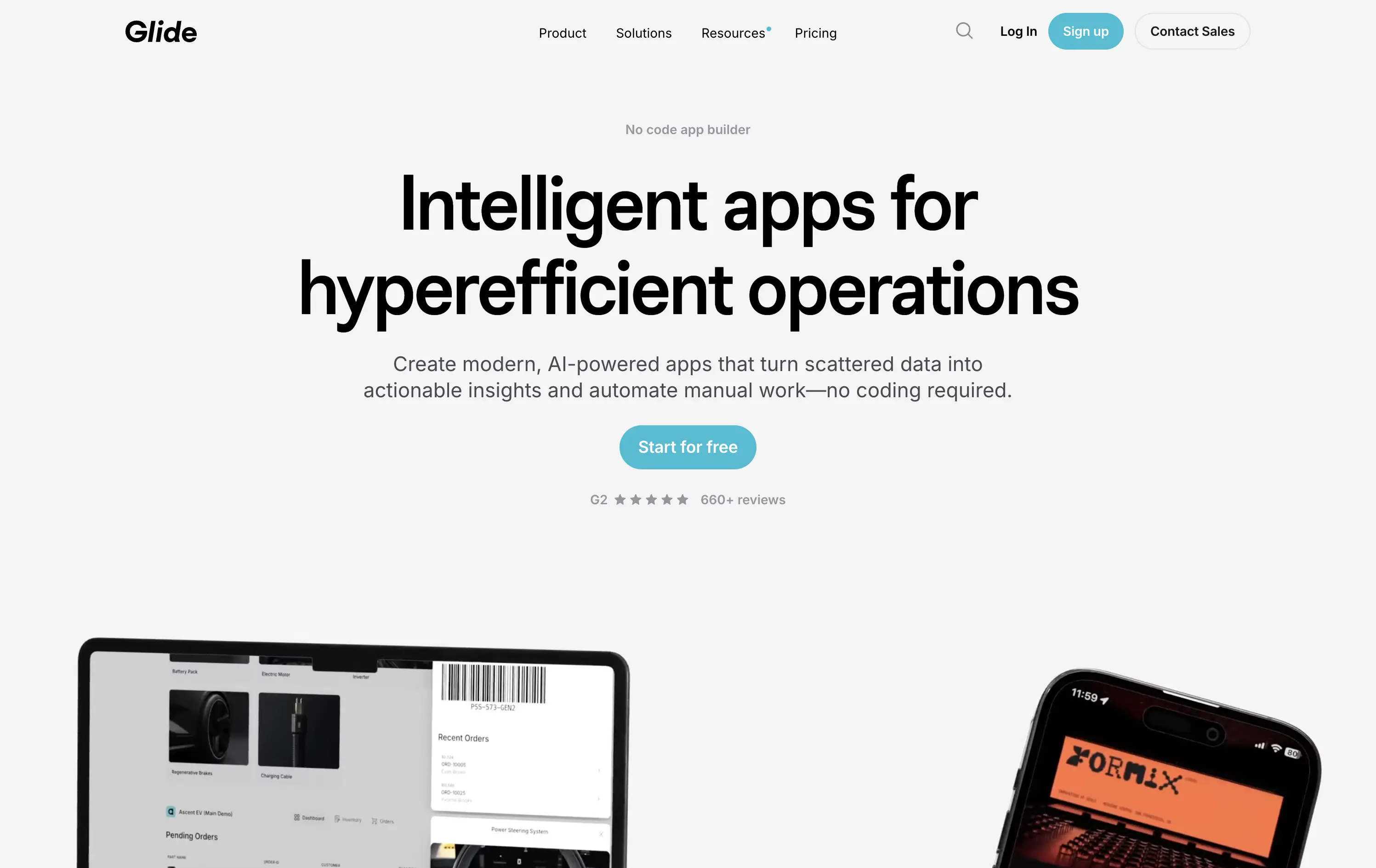
Glide
↗
SaaS
AI Tools
No-Code
Centered
Descriptive
Aspirational
Single Button
Media Gallery
Product UI
Social Proof
Light Mode
Blue
Sans serif
Hybrid
Home Page
Custom Code
no-code builder, AI app automation, enterprise productivity, lightweight onboarding, trust rating (G2), operational tooling, clean UI, visual simplicity, mobile-first, responsive design, clear headline, efficient layout, early enterprise fit
Build AI-powered apps from spreadsheets and data in minutes—no code, just drag-and-drop.
Clear headline, fast-loading visuals, and a direct CTA make this hero efficient. The structured layout supports fast scanning. The product screenshots add context, though the wide whitespace risks feeling sparse on large screens.
Hero speaks to operational efficiency with no-code benefits. Fits mid-maturity B2B buyers who want clarity and control. Trust-first approach suits SMBs and teams scaling internal workflows.
This layout balances technical utility with human impact, aligning well with Algolia’s positioning as an API-first but UX-aware company. The mobile UI reinforces product value visually, while the logo wall signals scale and trust for enterprise buyers. The tone is clear, benefit-led, and appropriate for high-intent decision-makers evaluating AI tools for customer experience. This is a solid enterprise-facing hero built to perform.
The most effective hero sections in your inbox.
Monthly round up of top hero sections.
Don't worry. We hate spam too.
Don't worry. We hate spam too.
Don't worry. We hate spam too.