Download App
0
0
0
0
App store link — commonly used for mobile-first brands.
Filters
Wand
↗
AI Tools
Creative Tools
Centered
Aspirational
Empowering
Download App
Single Button
Video
Product UI
Imagery-Based
Blue
Sans serif
B2C
Home Page
Webflow
sketch-to-render, iOS-first, AI for artists, Apple Pencil UX, generative design, creative tooling, mobile-first AI, aspirational motion, immersive product demo, minimal CTA, emotional tech
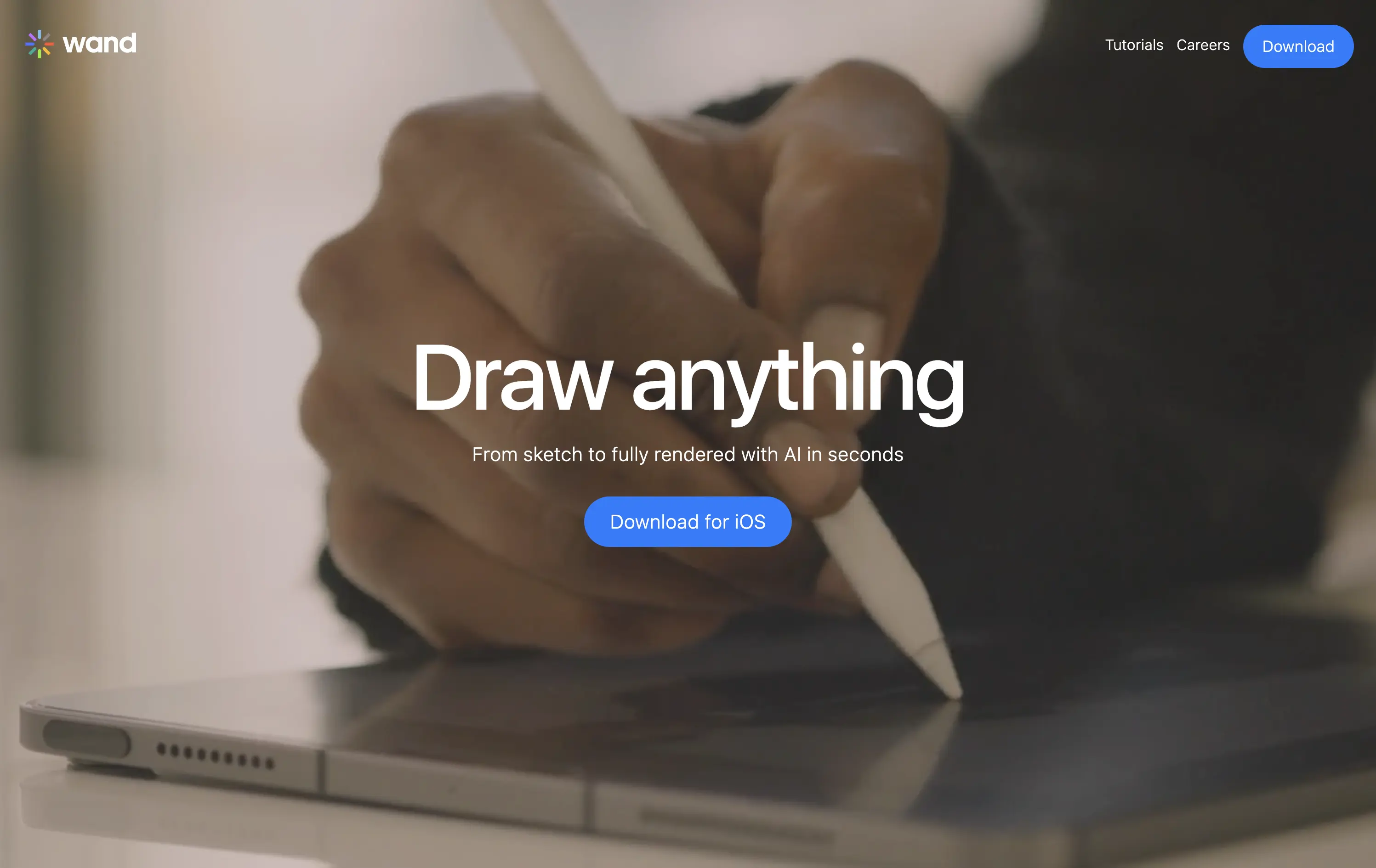
Wand is an iOS app that transforms hand-drawn sketches into fully rendered images using AI—fast, simple, and intuitive.
The full-screen video speaks louder than the copy. You see the product’s value in real time. It’s immersive, emotionally resonant, and gives instant context—but assumes the viewer will wait and watch.
Wand leans into aspiration and emotion to sell its power. The video-first hero positions the tool as magical and tactile. It’s a strong brand move but could benefit from a secondary line for clarity or onboarding.
This layout balances technical utility with human impact, aligning well with Algolia’s positioning as an API-first but UX-aware company. The mobile UI reinforces product value visually, while the logo wall signals scale and trust for enterprise buyers. The tone is clear, benefit-led, and appropriate for high-intent decision-makers evaluating AI tools for customer experience. This is a solid enterprise-facing hero built to perform.
Wand
↗
AI Tools
Creative Tools
Centered
Aspirational
Empowering
Download App
Single Button
Video
Product UI
Imagery-Based
Blue
Sans serif
B2C
Home Page
Webflow
sketch-to-render, iOS-first, AI for artists, Apple Pencil UX, generative design, creative tooling, mobile-first AI, aspirational motion, immersive product demo, minimal CTA, emotional tech
Wand is an iOS app that transforms hand-drawn sketches into fully rendered images using AI—fast, simple, and intuitive.
The full-screen video speaks louder than the copy. You see the product’s value in real time. It’s immersive, emotionally resonant, and gives instant context—but assumes the viewer will wait and watch.
Wand leans into aspiration and emotion to sell its power. The video-first hero positions the tool as magical and tactile. It’s a strong brand move but could benefit from a secondary line for clarity or onboarding.
This layout balances technical utility with human impact, aligning well with Algolia’s positioning as an API-first but UX-aware company. The mobile UI reinforces product value visually, while the logo wall signals scale and trust for enterprise buyers. The tone is clear, benefit-led, and appropriate for high-intent decision-makers evaluating AI tools for customer experience. This is a solid enterprise-facing hero built to perform.
Family
↗
Fintech
Web3
Centered
Playful
Confident
Download App
Multi-CTA Block
Illustration
Custom Animation
Loading Animation
Light Mode
Blue
Yellow
Black
Sans serif
B2C
Home Page
Custom Code
crypto wallet for iOS, ENS support, playful Web3, mobile-first design, Gen Z crypto, kawaii aesthetic, approachable fintech, token collectibles, web3 onboarding, friendly UX
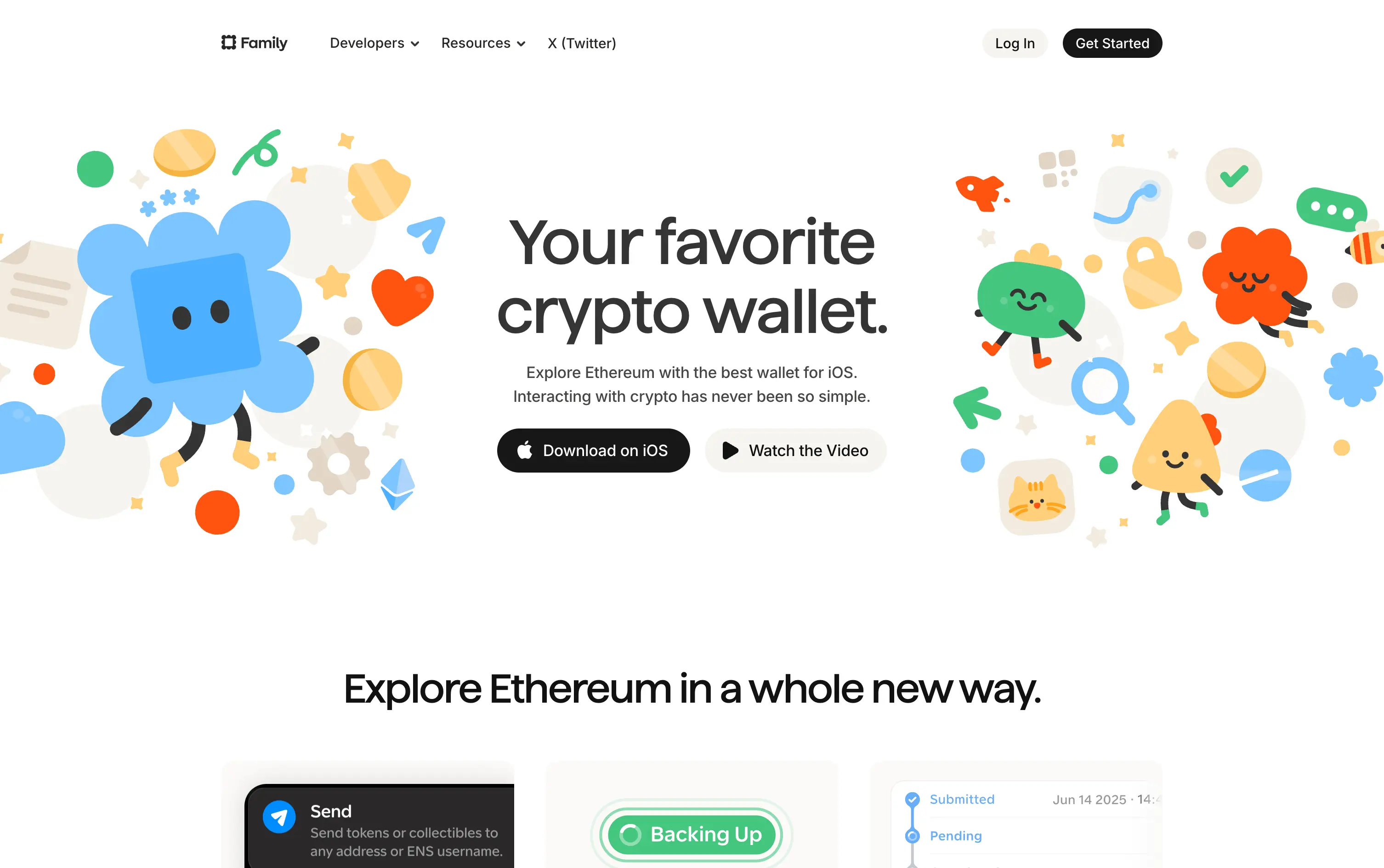
Family is a playful Ethereum wallet designed for iOS, making crypto feel friendly, visual, and simple to use.
Extremely approachable for a space often seen as cold or intimidating. The illustrations soften the category. Clear copy and strong CTA pair well with the product’s target audience and mobile-first approach.
A masterclass in brand positioning. While most Web3 brands chase dark, technical aesthetics, Family goes the opposite direction—bright, warm, and welcoming. It’s intentionally crafted to disarm, invite, and onboard a broader audience.
This layout balances technical utility with human impact, aligning well with Algolia’s positioning as an API-first but UX-aware company. The mobile UI reinforces product value visually, while the logo wall signals scale and trust for enterprise buyers. The tone is clear, benefit-led, and appropriate for high-intent decision-makers evaluating AI tools for customer experience. This is a solid enterprise-facing hero built to perform.
Family
↗
Fintech
Web3
Centered
Playful
Confident
Download App
Multi-CTA Block
Illustration
Custom Animation
Loading Animation
Light Mode
Blue
Yellow
Black
Sans serif
B2C
Home Page
Custom Code
crypto wallet for iOS, ENS support, playful Web3, mobile-first design, Gen Z crypto, kawaii aesthetic, approachable fintech, token collectibles, web3 onboarding, friendly UX
Family is a playful Ethereum wallet designed for iOS, making crypto feel friendly, visual, and simple to use.
Extremely approachable for a space often seen as cold or intimidating. The illustrations soften the category. Clear copy and strong CTA pair well with the product’s target audience and mobile-first approach.
A masterclass in brand positioning. While most Web3 brands chase dark, technical aesthetics, Family goes the opposite direction—bright, warm, and welcoming. It’s intentionally crafted to disarm, invite, and onboard a broader audience.
This layout balances technical utility with human impact, aligning well with Algolia’s positioning as an API-first but UX-aware company. The mobile UI reinforces product value visually, while the logo wall signals scale and trust for enterprise buyers. The tone is clear, benefit-led, and appropriate for high-intent decision-makers evaluating AI tools for customer experience. This is a solid enterprise-facing hero built to perform.
Raycast
↗
SaaS
Productivity
Centered
Bold & Direct
Descriptive
Download App
Multi-CTA Block
Interactive
Custom Animation
Loading Animation
Dark Mode
White
Red
Sans serif
B2C
Home Page
Custom Code
launcher app, power user tool, developer productivity, dark aesthetic, interactive background, custom animation, glowing motion, fast utility, keyboard-first UX, macOS-native, iOS launch, feature-rich
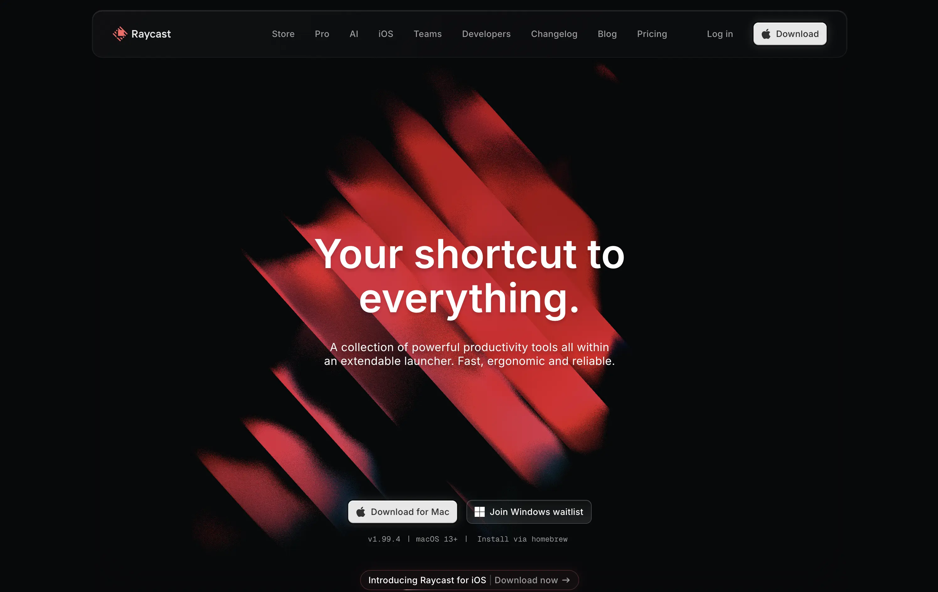
Raycast is a fast, extendable launcher that streamlines tasks and apps into one productivity command center.
Hero opens with striking motion and subtle interactivity, creating immediate emotional pull. Headline is short and memorable. Strong clarity on what it is and what it solves. Layout is focused, high-conversion and visually polished.
Positioning as a utility layer for power users is clear. Dark mode and minimalist tone align with dev-savvy audiences. Strong balance of brand and product without overexplaining.
This layout balances technical utility with human impact, aligning well with Algolia’s positioning as an API-first but UX-aware company. The mobile UI reinforces product value visually, while the logo wall signals scale and trust for enterprise buyers. The tone is clear, benefit-led, and appropriate for high-intent decision-makers evaluating AI tools for customer experience. This is a solid enterprise-facing hero built to perform.
Raycast
↗
SaaS
Productivity
Centered
Bold & Direct
Descriptive
Download App
Multi-CTA Block
Interactive
Custom Animation
Loading Animation
Dark Mode
White
Red
Sans serif
B2C
Home Page
Custom Code
launcher app, power user tool, developer productivity, dark aesthetic, interactive background, custom animation, glowing motion, fast utility, keyboard-first UX, macOS-native, iOS launch, feature-rich
Raycast is a fast, extendable launcher that streamlines tasks and apps into one productivity command center.
Hero opens with striking motion and subtle interactivity, creating immediate emotional pull. Headline is short and memorable. Strong clarity on what it is and what it solves. Layout is focused, high-conversion and visually polished.
Positioning as a utility layer for power users is clear. Dark mode and minimalist tone align with dev-savvy audiences. Strong balance of brand and product without overexplaining.
This layout balances technical utility with human impact, aligning well with Algolia’s positioning as an API-first but UX-aware company. The mobile UI reinforces product value visually, while the logo wall signals scale and trust for enterprise buyers. The tone is clear, benefit-led, and appropriate for high-intent decision-makers evaluating AI tools for customer experience. This is a solid enterprise-facing hero built to perform.
Granola
↗
SaaS
AI Tools
Productivity
Centered
Descriptive
Pain-driven
Download App
Multi-CTA Block
Product UI
Announcement
Gradient
Light Mode
Green
Sans serif
Hybrid
Home Page
Custom Code
AI notepad, transcript comparison, Mac/iOS focus, pastel gradient, clean UX, AI productivity, note app, task-lite SaaS, small team positioning, time-saving tool, App Store-ready, side-by-side visual
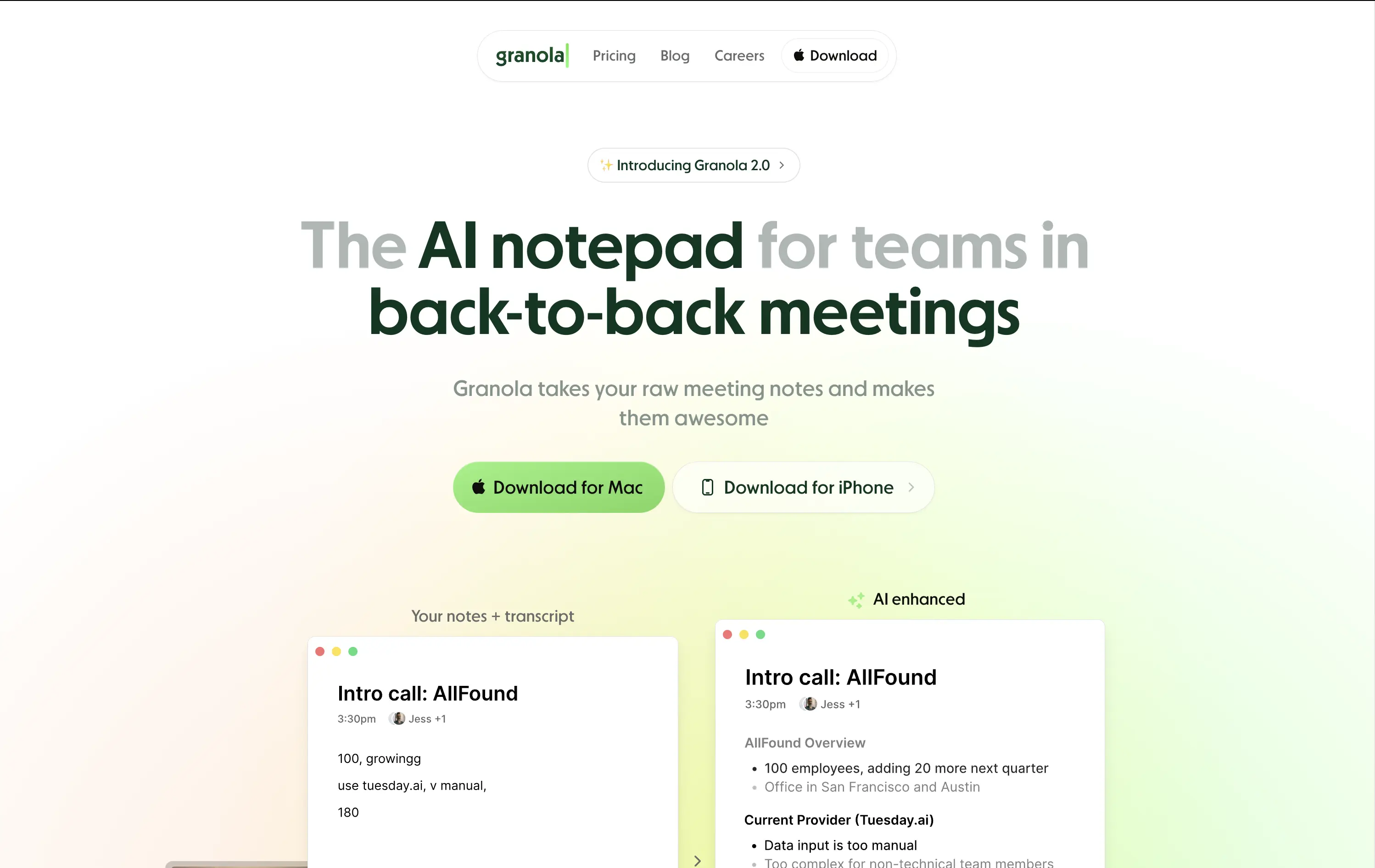
Granola is an AI notepad that turns messy meeting notes into clean, structured transcripts — built for teams with nonstop meetings.
The hero is practical and conversion-focused. It quickly communicates what the tool does and for whom. The side-by-side note demo is immediately legible and shows before/after clarity. Headline focuses on team context rather than just AI, which grounds it. Download CTAs feel native and frictionless. The soft green gradient is calming without feeling sterile. Could benefit from stronger brand differentiation, but it nails clarity and accessibility for a high-frequency use case.
Laser-targeted to productivity-challenged teams. Hero clearly communicates utility and streamlines onboarding. UI preview builds instant understanding, and the download CTAs suggest a tool that fits right into daily workflows.
This layout balances technical utility with human impact, aligning well with Algolia’s positioning as an API-first but UX-aware company. The mobile UI reinforces product value visually, while the logo wall signals scale and trust for enterprise buyers. The tone is clear, benefit-led, and appropriate for high-intent decision-makers evaluating AI tools for customer experience. This is a solid enterprise-facing hero built to perform.
Granola
↗
SaaS
AI Tools
Productivity
Centered
Descriptive
Pain-driven
Download App
Multi-CTA Block
Product UI
Announcement
Gradient
Light Mode
Green
Sans serif
Hybrid
Home Page
Custom Code
AI notepad, transcript comparison, Mac/iOS focus, pastel gradient, clean UX, AI productivity, note app, task-lite SaaS, small team positioning, time-saving tool, App Store-ready, side-by-side visual
Granola is an AI notepad that turns messy meeting notes into clean, structured transcripts — built for teams with nonstop meetings.
The hero is practical and conversion-focused. It quickly communicates what the tool does and for whom. The side-by-side note demo is immediately legible and shows before/after clarity. Headline focuses on team context rather than just AI, which grounds it. Download CTAs feel native and frictionless. The soft green gradient is calming without feeling sterile. Could benefit from stronger brand differentiation, but it nails clarity and accessibility for a high-frequency use case.
Laser-targeted to productivity-challenged teams. Hero clearly communicates utility and streamlines onboarding. UI preview builds instant understanding, and the download CTAs suggest a tool that fits right into daily workflows.
This layout balances technical utility with human impact, aligning well with Algolia’s positioning as an API-first but UX-aware company. The mobile UI reinforces product value visually, while the logo wall signals scale and trust for enterprise buyers. The tone is clear, benefit-led, and appropriate for high-intent decision-makers evaluating AI tools for customer experience. This is a solid enterprise-facing hero built to perform.
The most effective hero sections in your inbox.
Monthly round up of top hero sections.
Don't worry. We hate spam too.
Don't worry. We hate spam too.
Don't worry. We hate spam too.