Duotone
14
14
14
14
Limited to two dominant colors for a stylized or editorial feel.
Filters
Make
↗
No-Code
Productivity
Split Grid
Descriptive
Empowering
Multi-CTA Block
Video
Announcement
Duotone
Pink
Sans serif
Hybrid
Home Page
Custom Code
no-code automation, workflow builder, AI integration, drag-and-drop editor, Zapier alternative, clear onboarding, SaaS demo UX, trust-focused layout, commercial SaaS, AI-enhanced logic
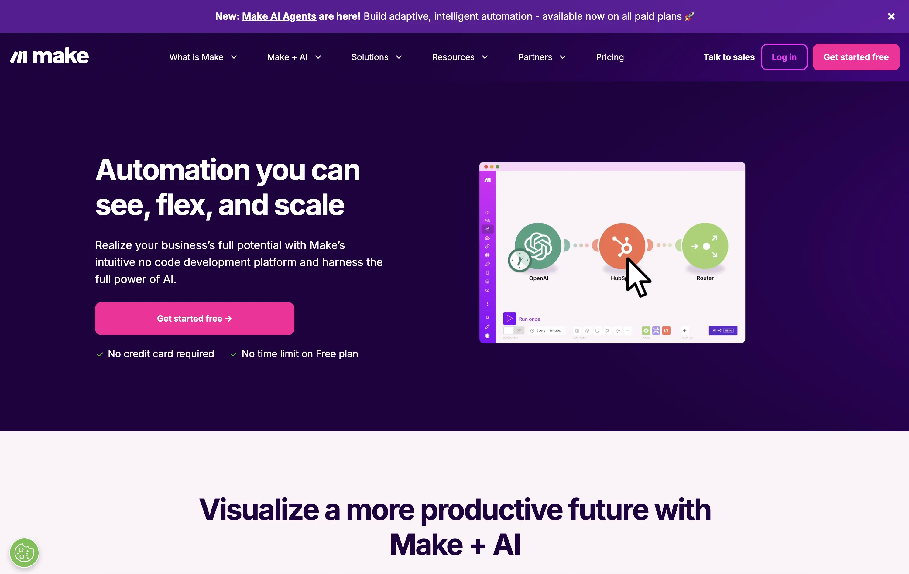
Make is a no-code automation platform that lets businesses visually build and scale workflows powered by AI.
It’s clean, clear, and direct. The animated product video does the heavy lifting. The layout and copy are textbook SaaS—efficient but forgettable. It communicates function well without taking any design risks.
Optimized for clarity and ease of adoption. Great for users shopping for workflow tools, but lacks brand distinctiveness. Plays it safe with a universal SaaS format and gradient palette.
This layout balances technical utility with human impact, aligning well with Algolia’s positioning as an API-first but UX-aware company. The mobile UI reinforces product value visually, while the logo wall signals scale and trust for enterprise buyers. The tone is clear, benefit-led, and appropriate for high-intent decision-makers evaluating AI tools for customer experience. This is a solid enterprise-facing hero built to perform.
Make
↗
No-Code
Productivity
Split Grid
Descriptive
Empowering
Multi-CTA Block
Video
Announcement
Duotone
Pink
Sans serif
Hybrid
Home Page
Custom Code
no-code automation, workflow builder, AI integration, drag-and-drop editor, Zapier alternative, clear onboarding, SaaS demo UX, trust-focused layout, commercial SaaS, AI-enhanced logic
Make is a no-code automation platform that lets businesses visually build and scale workflows powered by AI.
It’s clean, clear, and direct. The animated product video does the heavy lifting. The layout and copy are textbook SaaS—efficient but forgettable. It communicates function well without taking any design risks.
Optimized for clarity and ease of adoption. Great for users shopping for workflow tools, but lacks brand distinctiveness. Plays it safe with a universal SaaS format and gradient palette.
This layout balances technical utility with human impact, aligning well with Algolia’s positioning as an API-first but UX-aware company. The mobile UI reinforces product value visually, while the logo wall signals scale and trust for enterprise buyers. The tone is clear, benefit-led, and appropriate for high-intent decision-makers evaluating AI tools for customer experience. This is a solid enterprise-facing hero built to perform.
Arc
↗
SaaS
Productivity
Centered
Proof-Heavy
Multi-CTA Block
Product UI
Social Proof
Duotone
White
Blue
Display
Sans serif
B2C
Home Page
Custom Code
consumer browser, verge quote, UI-focused, product-led design, browser replacement, macOS-first, desktop software, soft but bold, macOS-style visual language, motion-laced layout, quirky detail, testimonial-driven, vibrant blue, feature-forward
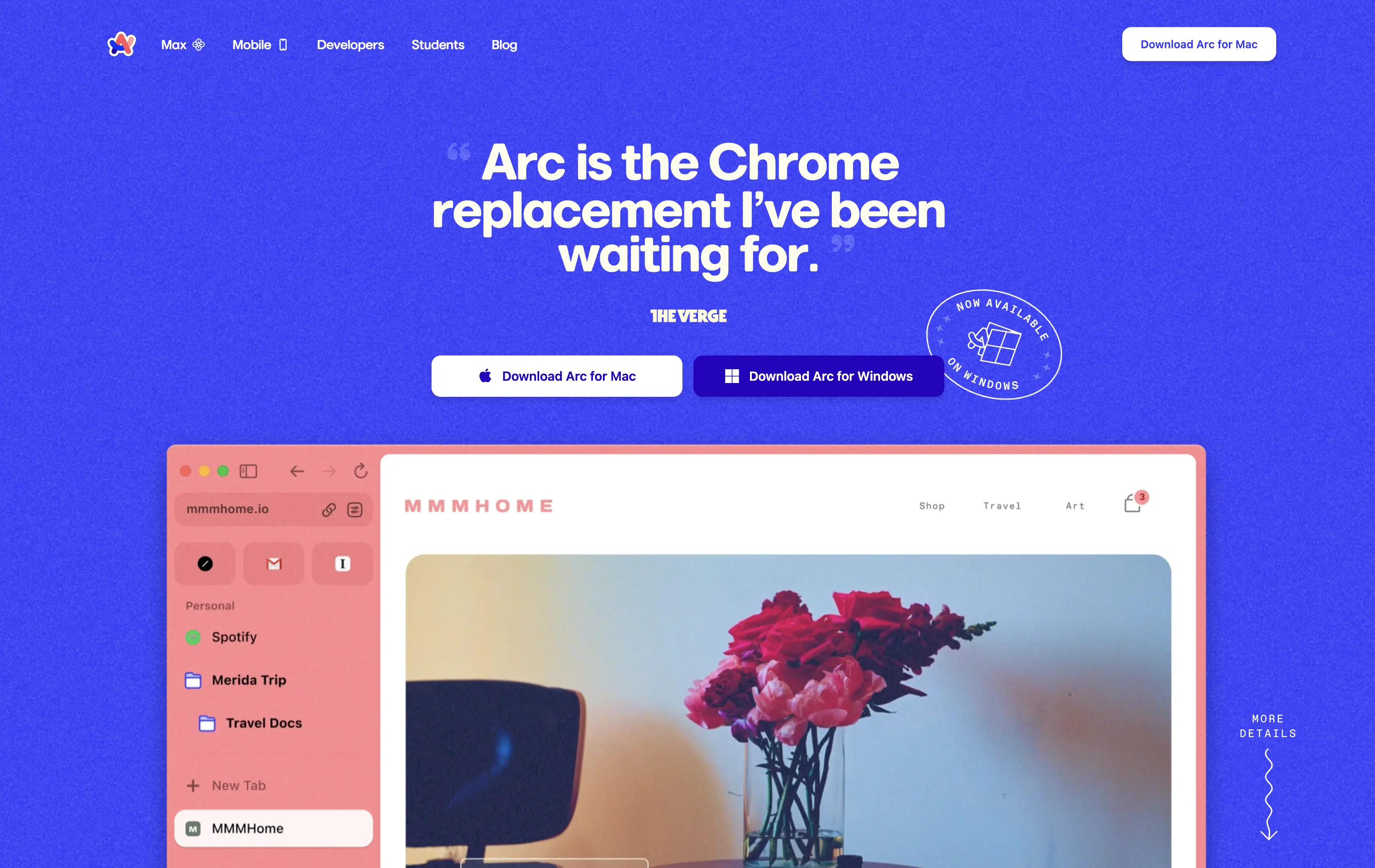
Arc is a modern browser designed to replace legacy browser with a reimagined UI and productivity-first experience.
This hero grabs attention immediately with a high-credibility quote as the headline, bold visual language, and a visible product UI that instantly signals differentiation. The CTA is clear and platform-specific. The color treatment and layout feel energetic and modern, aligning well with consumer expectations for a desktop app.
Strong positioning via social proof rather than abstract messaging. The hero makes the shift-from-Chrome angle explicit, appealing to an informed, tech-forward audience. High trust and strong product framing.
This layout balances technical utility with human impact, aligning well with Algolia’s positioning as an API-first but UX-aware company. The mobile UI reinforces product value visually, while the logo wall signals scale and trust for enterprise buyers. The tone is clear, benefit-led, and appropriate for high-intent decision-makers evaluating AI tools for customer experience. This is a solid enterprise-facing hero built to perform.
Arc
↗
SaaS
Productivity
Centered
Proof-Heavy
Multi-CTA Block
Product UI
Social Proof
Duotone
White
Blue
Display
Sans serif
B2C
Home Page
Custom Code
consumer browser, verge quote, UI-focused, product-led design, browser replacement, macOS-first, desktop software, soft but bold, macOS-style visual language, motion-laced layout, quirky detail, testimonial-driven, vibrant blue, feature-forward
Arc is a modern browser designed to replace legacy browser with a reimagined UI and productivity-first experience.
This hero grabs attention immediately with a high-credibility quote as the headline, bold visual language, and a visible product UI that instantly signals differentiation. The CTA is clear and platform-specific. The color treatment and layout feel energetic and modern, aligning well with consumer expectations for a desktop app.
Strong positioning via social proof rather than abstract messaging. The hero makes the shift-from-Chrome angle explicit, appealing to an informed, tech-forward audience. High trust and strong product framing.
This layout balances technical utility with human impact, aligning well with Algolia’s positioning as an API-first but UX-aware company. The mobile UI reinforces product value visually, while the logo wall signals scale and trust for enterprise buyers. The tone is clear, benefit-led, and appropriate for high-intent decision-makers evaluating AI tools for customer experience. This is a solid enterprise-facing hero built to perform.
Coda
↗
SaaS
Collaboration
Productivity
Left-aligned
Descriptive
Empowering
Multi-CTA Block
Product UI
Duotone
White
Yellow
Display
Sans serif
Hybrid
Home Page
Custom Code
doc-as-app, team workflow, internal tools, collaborative workspace, UI product demo, hybrid teams, sales enablement, project brief, minimal design, low-code logic, enterprise-friendly, live multiplayer,
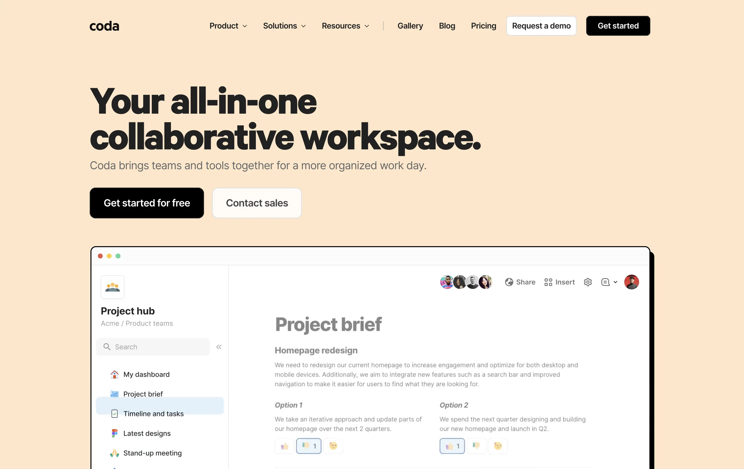
Coda is a collaborative doc platform that combines documents, spreadsheets, and apps into one unified workspace for teams.
The hero communicates clearly with a straightforward headline and strong product shot. Layout is easy to follow, and the dual CTA gives distinct paths for self-serve or sales-led funnels. The visual hierarchy is solid, though not emotionally charged.
Coda leads with clarity over flash. The message and layout prioritize breadth of use and enterprise readiness. Great fit for decision-makers looking to unify scattered tools into a single workspace.
This layout balances technical utility with human impact, aligning well with Algolia’s positioning as an API-first but UX-aware company. The mobile UI reinforces product value visually, while the logo wall signals scale and trust for enterprise buyers. The tone is clear, benefit-led, and appropriate for high-intent decision-makers evaluating AI tools for customer experience. This is a solid enterprise-facing hero built to perform.
Coda
↗
SaaS
Collaboration
Productivity
Left-aligned
Descriptive
Empowering
Multi-CTA Block
Product UI
Duotone
White
Yellow
Display
Sans serif
Hybrid
Home Page
Custom Code
doc-as-app, team workflow, internal tools, collaborative workspace, UI product demo, hybrid teams, sales enablement, project brief, minimal design, low-code logic, enterprise-friendly, live multiplayer,
Coda is a collaborative doc platform that combines documents, spreadsheets, and apps into one unified workspace for teams.
The hero communicates clearly with a straightforward headline and strong product shot. Layout is easy to follow, and the dual CTA gives distinct paths for self-serve or sales-led funnels. The visual hierarchy is solid, though not emotionally charged.
Coda leads with clarity over flash. The message and layout prioritize breadth of use and enterprise readiness. Great fit for decision-makers looking to unify scattered tools into a single workspace.
This layout balances technical utility with human impact, aligning well with Algolia’s positioning as an API-first but UX-aware company. The mobile UI reinforces product value visually, while the logo wall signals scale and trust for enterprise buyers. The tone is clear, benefit-led, and appropriate for high-intent decision-makers evaluating AI tools for customer experience. This is a solid enterprise-facing hero built to perform.
Cabi
↗
CPG
Food & Beverage
Minimal
Editorial
Playful
Descriptive
Single Button
Photography
Duotone
Red
Sans serif
DTC
Home Page
Shopify
neo-retro aesthetic, editorial layout, minimalist packaging, visual-first, high art direction, small-batch vibe, premium grocer, vertical flavor trio, lifestyle CPG, homepage hero, nostalgic modernism, shopable CTA
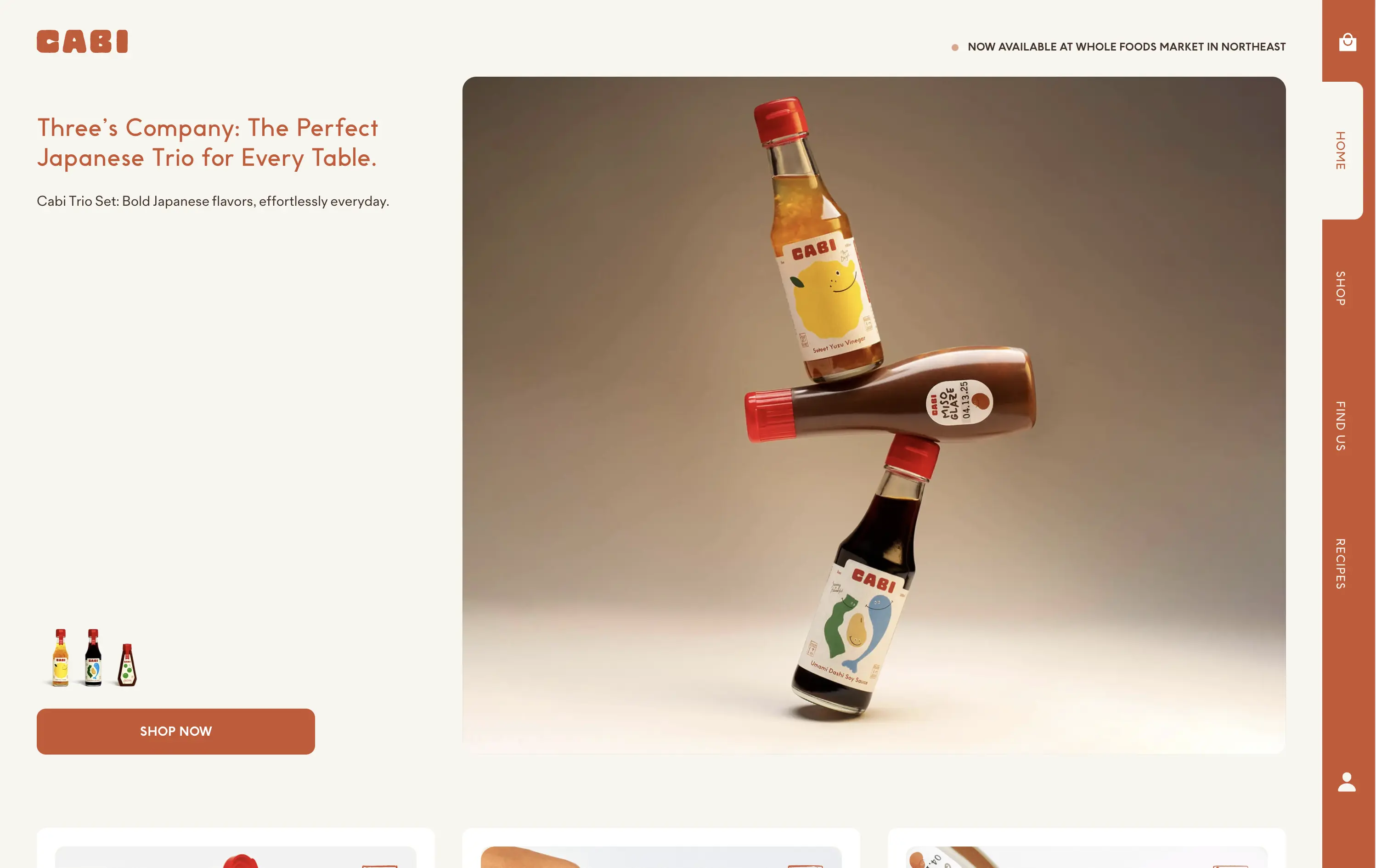
Cabi is a modern Japanese sauce brand offering a trio of bold, everyday condiments sold DTC and through select Whole Foods locations.
Cabi’s hero strikes a balance between product showcase and brand personality. The bottle stack photo is memorable and artful, with warm studio lighting that elevates the product beyond commodity. The copy is clean and narrative-led, paired with an understated “Shop Now” CTA that keeps the focus on visual storytelling. Vertical nav feels custom-built for a modern CPG brand. It holds its own without needing motion or video.
This is a homepage hero made for shelf appeal crossover. Visually premium, minimal in distractions, and confident in letting the packaging carry the emotional and culinary positioning. Feels Whole Foods-ready.
This layout balances technical utility with human impact, aligning well with Algolia’s positioning as an API-first but UX-aware company. The mobile UI reinforces product value visually, while the logo wall signals scale and trust for enterprise buyers. The tone is clear, benefit-led, and appropriate for high-intent decision-makers evaluating AI tools for customer experience. This is a solid enterprise-facing hero built to perform.
Cabi
↗
CPG
Food & Beverage
Minimal
Editorial
Playful
Descriptive
Single Button
Photography
Duotone
Red
Sans serif
DTC
Home Page
Shopify
neo-retro aesthetic, editorial layout, minimalist packaging, visual-first, high art direction, small-batch vibe, premium grocer, vertical flavor trio, lifestyle CPG, homepage hero, nostalgic modernism, shopable CTA
Cabi is a modern Japanese sauce brand offering a trio of bold, everyday condiments sold DTC and through select Whole Foods locations.
Cabi’s hero strikes a balance between product showcase and brand personality. The bottle stack photo is memorable and artful, with warm studio lighting that elevates the product beyond commodity. The copy is clean and narrative-led, paired with an understated “Shop Now” CTA that keeps the focus on visual storytelling. Vertical nav feels custom-built for a modern CPG brand. It holds its own without needing motion or video.
This is a homepage hero made for shelf appeal crossover. Visually premium, minimal in distractions, and confident in letting the packaging carry the emotional and culinary positioning. Feels Whole Foods-ready.
This layout balances technical utility with human impact, aligning well with Algolia’s positioning as an API-first but UX-aware company. The mobile UI reinforces product value visually, while the logo wall signals scale and trust for enterprise buyers. The tone is clear, benefit-led, and appropriate for high-intent decision-makers evaluating AI tools for customer experience. This is a solid enterprise-facing hero built to perform.
Le Bon Garçon
↗
CPG
Food & Beverage
Editorial
Descriptive
Founder-Led Voice
No CTA
Photography
Media Gallery
Announcement
Duotone
Imagery-Based
Orange
Yellow
Serif
DTC
Home Page
Shopify
nostalgic packaging, elevated DTC candy, premium gifting, Asian-American ingredients, still-life styling, art direction-led, cultural storytelling, warm palette, caramel focus, identity-led CPG, curated feel, editorial aesthetic, flavor storytelling, high design, AAPI founder
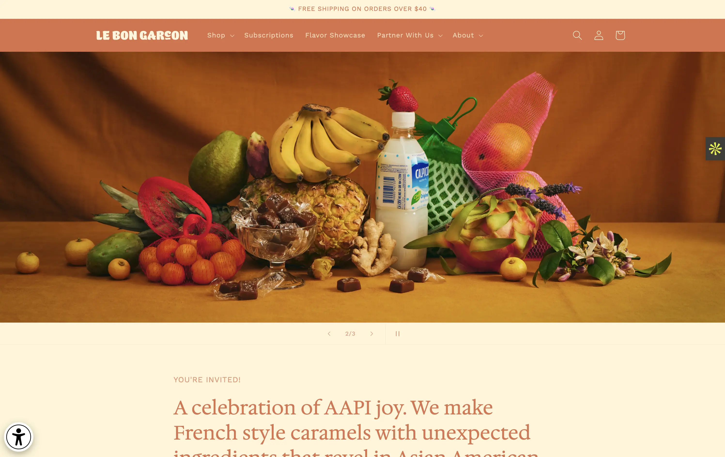
A premium confectionery brand reimagining French-style caramels through the lens of Asian-American flavors and storytelling.
This hero leans fully into art direction, with a cinematic still-life that evokes tradition, indulgence, and multicultural vibrancy. There's no obvious CTA, but the experience feels intentional and immersive. The visual composition draws curiosity and reflects a product crafted with care. The copy introduces cultural relevance and flavor positioning effectively, though some may miss a direct product hook.
Perfect for brand-aware shoppers and gifting segments. A visual-first approach supports premium positioning and cultural storytelling over hard conversion.
This layout balances technical utility with human impact, aligning well with Algolia’s positioning as an API-first but UX-aware company. The mobile UI reinforces product value visually, while the logo wall signals scale and trust for enterprise buyers. The tone is clear, benefit-led, and appropriate for high-intent decision-makers evaluating AI tools for customer experience. This is a solid enterprise-facing hero built to perform.
Le Bon Garçon
↗
CPG
Food & Beverage
Editorial
Descriptive
Founder-Led Voice
No CTA
Photography
Media Gallery
Announcement
Duotone
Imagery-Based
Orange
Yellow
Serif
DTC
Home Page
Shopify
nostalgic packaging, elevated DTC candy, premium gifting, Asian-American ingredients, still-life styling, art direction-led, cultural storytelling, warm palette, caramel focus, identity-led CPG, curated feel, editorial aesthetic, flavor storytelling, high design, AAPI founder
A premium confectionery brand reimagining French-style caramels through the lens of Asian-American flavors and storytelling.
This hero leans fully into art direction, with a cinematic still-life that evokes tradition, indulgence, and multicultural vibrancy. There's no obvious CTA, but the experience feels intentional and immersive. The visual composition draws curiosity and reflects a product crafted with care. The copy introduces cultural relevance and flavor positioning effectively, though some may miss a direct product hook.
Perfect for brand-aware shoppers and gifting segments. A visual-first approach supports premium positioning and cultural storytelling over hard conversion.
This layout balances technical utility with human impact, aligning well with Algolia’s positioning as an API-first but UX-aware company. The mobile UI reinforces product value visually, while the logo wall signals scale and trust for enterprise buyers. The tone is clear, benefit-led, and appropriate for high-intent decision-makers evaluating AI tools for customer experience. This is a solid enterprise-facing hero built to perform.
Gong
↗
SaaS
AI Tools
Productivity
Split Grid
Left-aligned
Benefit-Driven
Confident
Single Button
Photography
Illustration
Logo Wall
Announcement
Duotone
Blue
Purple
Sans serif
B2B
Home Page
Wordpress
sales AI, B2B revenue platform, utility CTA, animated overlays, client logos, enterprise trust signals, AI productivity agents, dark gradient palette, conversational UI, split hero grid, vibrant lighting, modern SaaS, sales enablement, motion interface cues, product-forward layout
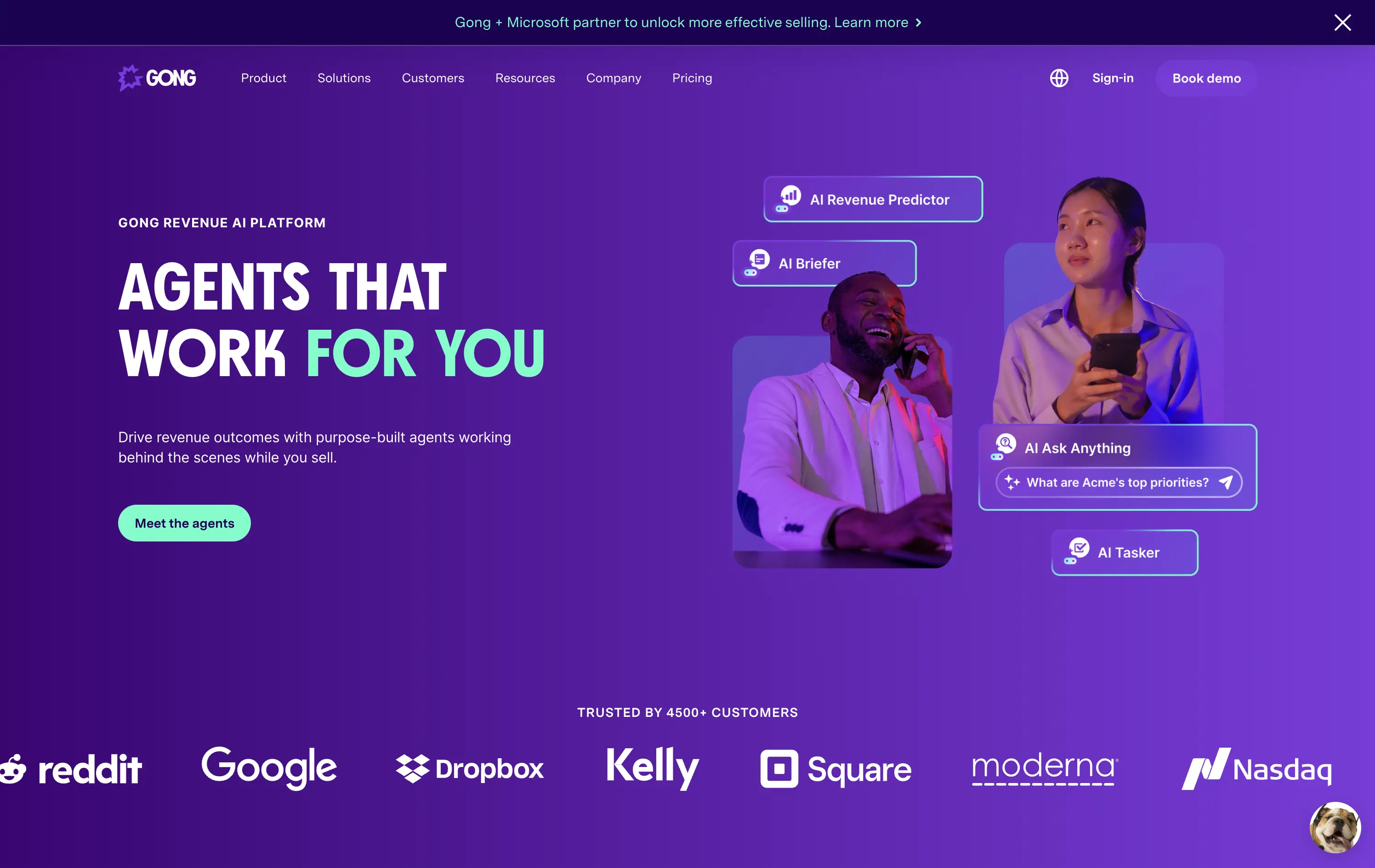
Gong helps sales teams boost revenue by deploying AI-powered agents that automate insights, prep, and task handling across the sales cycle.
The hero is clear and conversion-aware. Headline delivers a confident value prop, supported by animated tooltips that make the product’s AI capabilities tangible. The “Meet the agents” CTA invites deeper engagement. Strong use of customer logos boosts enterprise credibility. Overall, it's tight, modern, and visually active without overwhelming.
Tailored for mid-to-late funnel enterprise leads. High-trust layout and confident tone reflect maturity and market leadership in B2B sales tech.
This layout balances technical utility with human impact, aligning well with Algolia’s positioning as an API-first but UX-aware company. The mobile UI reinforces product value visually, while the logo wall signals scale and trust for enterprise buyers. The tone is clear, benefit-led, and appropriate for high-intent decision-makers evaluating AI tools for customer experience. This is a solid enterprise-facing hero built to perform.
Gong
↗
SaaS
AI Tools
Productivity
Split Grid
Left-aligned
Benefit-Driven
Confident
Single Button
Photography
Illustration
Logo Wall
Announcement
Duotone
Blue
Purple
Sans serif
B2B
Home Page
Wordpress
sales AI, B2B revenue platform, utility CTA, animated overlays, client logos, enterprise trust signals, AI productivity agents, dark gradient palette, conversational UI, split hero grid, vibrant lighting, modern SaaS, sales enablement, motion interface cues, product-forward layout
Gong helps sales teams boost revenue by deploying AI-powered agents that automate insights, prep, and task handling across the sales cycle.
The hero is clear and conversion-aware. Headline delivers a confident value prop, supported by animated tooltips that make the product’s AI capabilities tangible. The “Meet the agents” CTA invites deeper engagement. Strong use of customer logos boosts enterprise credibility. Overall, it's tight, modern, and visually active without overwhelming.
Tailored for mid-to-late funnel enterprise leads. High-trust layout and confident tone reflect maturity and market leadership in B2B sales tech.
This layout balances technical utility with human impact, aligning well with Algolia’s positioning as an API-first but UX-aware company. The mobile UI reinforces product value visually, while the logo wall signals scale and trust for enterprise buyers. The tone is clear, benefit-led, and appropriate for high-intent decision-makers evaluating AI tools for customer experience. This is a solid enterprise-facing hero built to perform.
Ramp
↗
SaaS
Fintech
Split Grid
Left-aligned
Benefit-Driven
Email Capture
Product UI
Social Proof
Duotone
Green
Yellow
Sans serif
B2B
Home Page
Custom Code
expense automation, corporate cards, real-time finance tools, modern B2B fintech, ROI-led copy, dark UI, embedded reviews, verified trust cues, enterprise-ready design, slick dashboard, clear CTA, conversion optimized, mid-funnel targeting, save money pitch, split layout
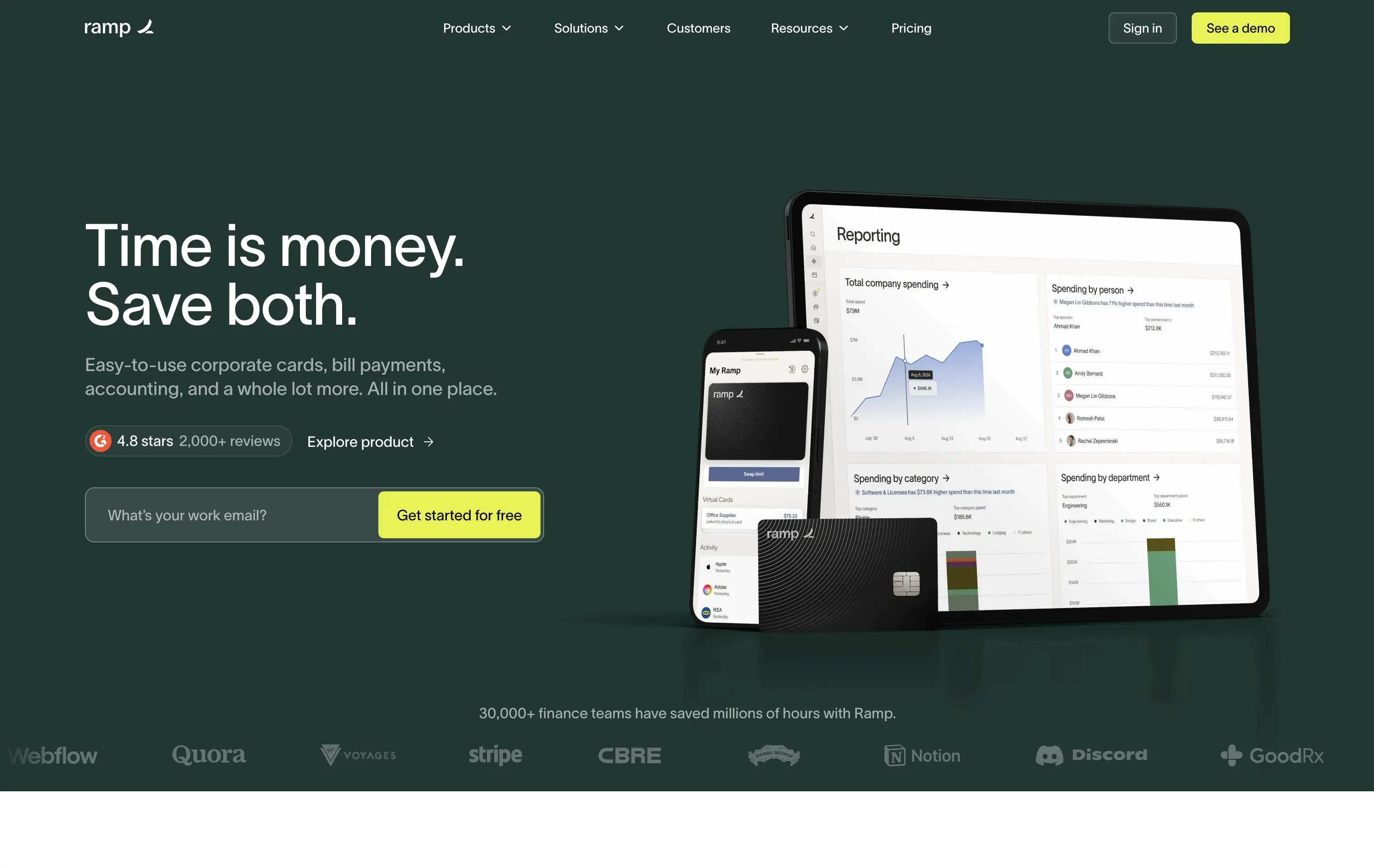
Ramp is a corporate finance platform offering cards, bill pay, and reporting tools designed to save companies time and money.
The hero is clean, trust-building, and conversion-ready. Headline is bold and economic — short enough to stick, direct enough to convert. Subheadline explains the product scope, while the UI visual makes it tangible. Reviews and logos anchor trust. The input field + utility CTA streamlines lead gen.
Perfectly calibrated for CFOs and finance leads. Messaging leads with ROI, not tech — smart for a market that cares about efficiency and outcomes. Strong signal-to-noise ratio.
This layout balances technical utility with human impact, aligning well with Algolia’s positioning as an API-first but UX-aware company. The mobile UI reinforces product value visually, while the logo wall signals scale and trust for enterprise buyers. The tone is clear, benefit-led, and appropriate for high-intent decision-makers evaluating AI tools for customer experience. This is a solid enterprise-facing hero built to perform.
Ramp
↗
SaaS
Fintech
Split Grid
Left-aligned
Benefit-Driven
Email Capture
Product UI
Social Proof
Duotone
Green
Yellow
Sans serif
B2B
Home Page
Custom Code
expense automation, corporate cards, real-time finance tools, modern B2B fintech, ROI-led copy, dark UI, embedded reviews, verified trust cues, enterprise-ready design, slick dashboard, clear CTA, conversion optimized, mid-funnel targeting, save money pitch, split layout
Ramp is a corporate finance platform offering cards, bill pay, and reporting tools designed to save companies time and money.
The hero is clean, trust-building, and conversion-ready. Headline is bold and economic — short enough to stick, direct enough to convert. Subheadline explains the product scope, while the UI visual makes it tangible. Reviews and logos anchor trust. The input field + utility CTA streamlines lead gen.
Perfectly calibrated for CFOs and finance leads. Messaging leads with ROI, not tech — smart for a market that cares about efficiency and outcomes. Strong signal-to-noise ratio.
This layout balances technical utility with human impact, aligning well with Algolia’s positioning as an API-first but UX-aware company. The mobile UI reinforces product value visually, while the logo wall signals scale and trust for enterprise buyers. The tone is clear, benefit-led, and appropriate for high-intent decision-makers evaluating AI tools for customer experience. This is a solid enterprise-facing hero built to perform.
Lettuce
↗
SaaS
Fintech
Split Grid
Left-aligned
Benefit-Driven
Bold & Direct
Single Button
Photography
Logo Wall
Product UI
Duotone
Green
Display
B2C
Home Page
Custom Code
solo business finance, tax automation, self-employed SaaS, conversion-focused layout, AI accounting, ROI-driven copy, playful branding, savings calculator CTA, solo founder tools, dark green palette, clear value prop, direct tone, press trust bar, mobile-first product
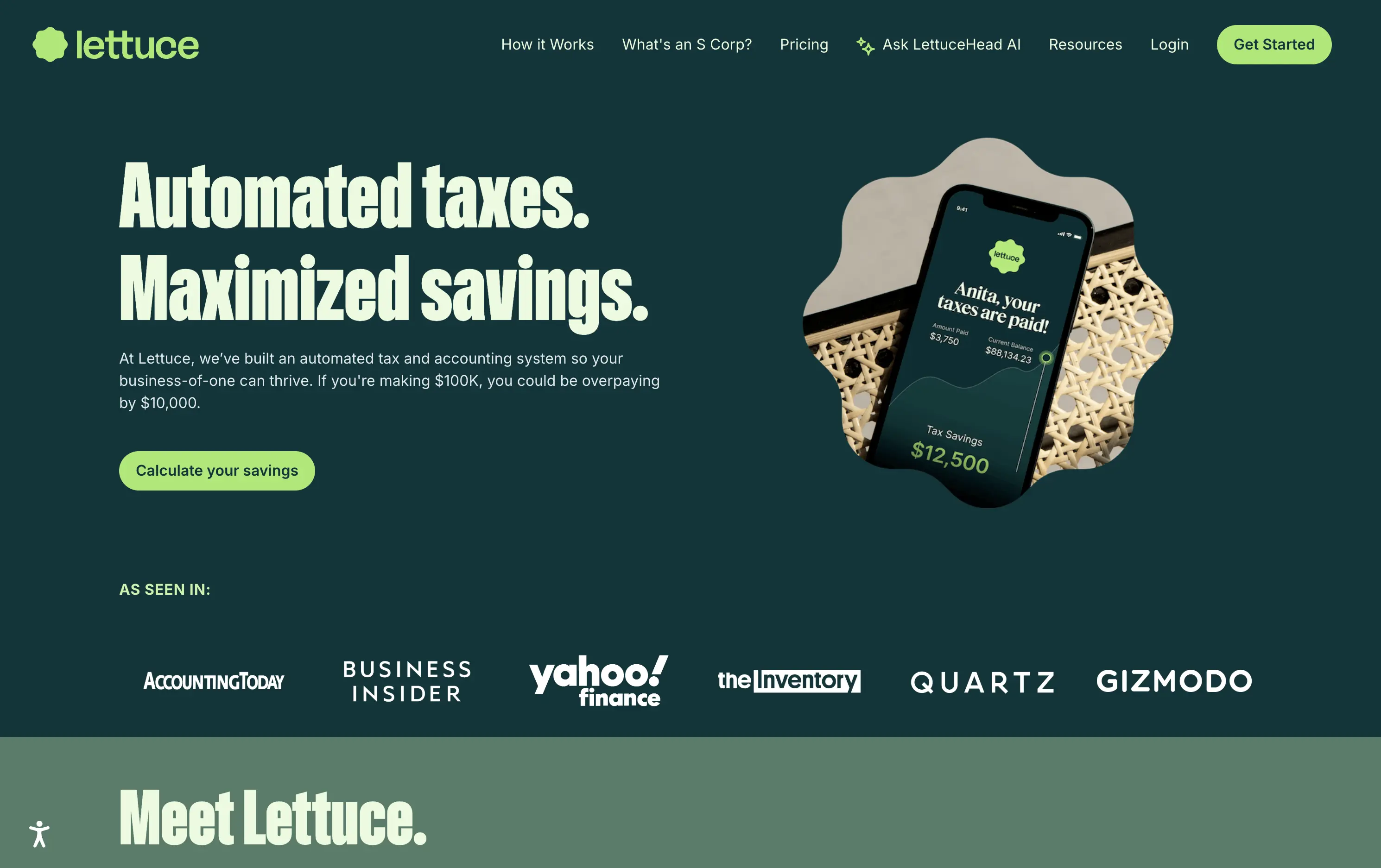
Lettuce is an automated tax and accounting platform built for solo business owners, helping them save thousands by optimizing how they pay taxes.
The hero is assertive, clear, and benefit-led. “Automated taxes. Maximized savings.” lands immediately, and the subhead explains who it's for and what they’re losing without it. The savings figure on the phone mockup reinforces the pitch visually. The “Calculate your savings” CTA is strong and personalized. Overall, the layout moves fast and speaks directly to freelancers and solo operators.
Perfectly tuned for time-poor, outcome-driven solopreneurs. Uses clear math ($10k in savings) and visual cues (mobile UI, dollar figures) to make the benefit feel tangible. Smart alignment of tone, layout, and buyer urgency.
This layout balances technical utility with human impact, aligning well with Algolia’s positioning as an API-first but UX-aware company. The mobile UI reinforces product value visually, while the logo wall signals scale and trust for enterprise buyers. The tone is clear, benefit-led, and appropriate for high-intent decision-makers evaluating AI tools for customer experience. This is a solid enterprise-facing hero built to perform.
Lettuce
↗
SaaS
Fintech
Split Grid
Left-aligned
Benefit-Driven
Bold & Direct
Single Button
Photography
Logo Wall
Product UI
Duotone
Green
Display
B2C
Home Page
Custom Code
solo business finance, tax automation, self-employed SaaS, conversion-focused layout, AI accounting, ROI-driven copy, playful branding, savings calculator CTA, solo founder tools, dark green palette, clear value prop, direct tone, press trust bar, mobile-first product
Lettuce is an automated tax and accounting platform built for solo business owners, helping them save thousands by optimizing how they pay taxes.
The hero is assertive, clear, and benefit-led. “Automated taxes. Maximized savings.” lands immediately, and the subhead explains who it's for and what they’re losing without it. The savings figure on the phone mockup reinforces the pitch visually. The “Calculate your savings” CTA is strong and personalized. Overall, the layout moves fast and speaks directly to freelancers and solo operators.
Perfectly tuned for time-poor, outcome-driven solopreneurs. Uses clear math ($10k in savings) and visual cues (mobile UI, dollar figures) to make the benefit feel tangible. Smart alignment of tone, layout, and buyer urgency.
This layout balances technical utility with human impact, aligning well with Algolia’s positioning as an API-first but UX-aware company. The mobile UI reinforces product value visually, while the logo wall signals scale and trust for enterprise buyers. The tone is clear, benefit-led, and appropriate for high-intent decision-makers evaluating AI tools for customer experience. This is a solid enterprise-facing hero built to perform.
You Can Book Me
↗
SaaS
Productivity
Centered
Descriptive
Empowering
Single Button
Photography
Media Gallery
Duotone
Green
Display
B2B
Home Page
solo-friendly SaaS, scheduling tool, real user proof, small business productivity, personal headline, free trial, soft design system, emotional copy, utility-first, community-led, freemium conversion, authenticity-first visuals, indie SaaS
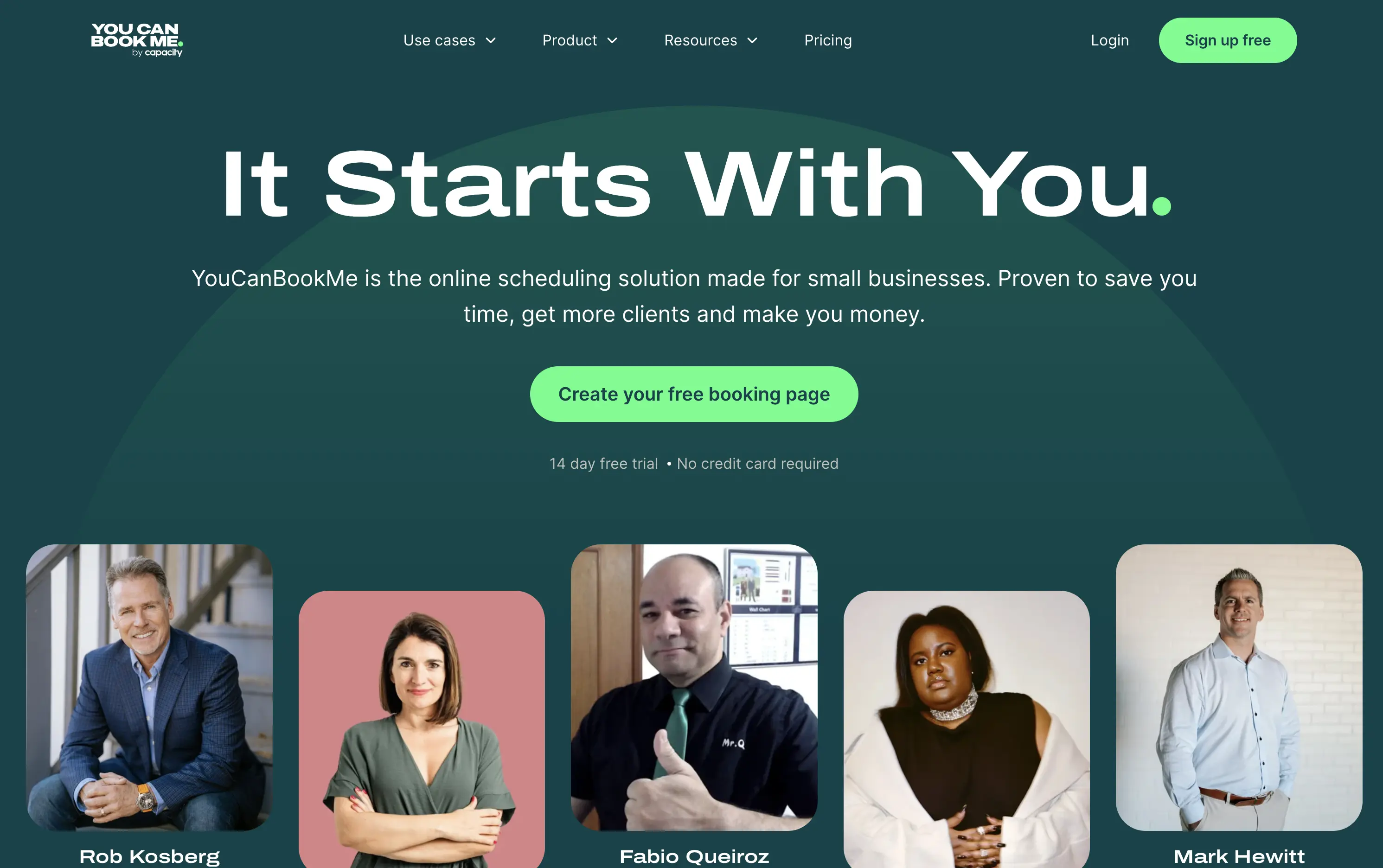
YouCanBook.Me is a scheduling platform designed to help small businesses streamline bookings, save time, and convert more leads through simple, flexible scheduling pages.
The hero centers emotional relatability. “It Starts With You” feels direct and empowering, while the subhead offers a clear, benefit-first pitch. The design isn’t flashy — it leans on authenticity, with non-art-directed portraits adding a raw, real-user touch. The green CTA is visible, though visually softer than competitors. While the layout lacks design sophistication, it feels personal and conversion-minded.
Targeting small business owners and service providers with a tone of support and relatability. It emphasizes utility over polish, aiming to win trust through clarity, familiarity, and proof of real-world use.
This layout balances technical utility with human impact, aligning well with Algolia’s positioning as an API-first but UX-aware company. The mobile UI reinforces product value visually, while the logo wall signals scale and trust for enterprise buyers. The tone is clear, benefit-led, and appropriate for high-intent decision-makers evaluating AI tools for customer experience. This is a solid enterprise-facing hero built to perform.
You Can Book Me
↗
SaaS
Productivity
Centered
Descriptive
Empowering
Single Button
Photography
Media Gallery
Duotone
Green
Display
B2B
Home Page
solo-friendly SaaS, scheduling tool, real user proof, small business productivity, personal headline, free trial, soft design system, emotional copy, utility-first, community-led, freemium conversion, authenticity-first visuals, indie SaaS
YouCanBook.Me is a scheduling platform designed to help small businesses streamline bookings, save time, and convert more leads through simple, flexible scheduling pages.
The hero centers emotional relatability. “It Starts With You” feels direct and empowering, while the subhead offers a clear, benefit-first pitch. The design isn’t flashy — it leans on authenticity, with non-art-directed portraits adding a raw, real-user touch. The green CTA is visible, though visually softer than competitors. While the layout lacks design sophistication, it feels personal and conversion-minded.
Targeting small business owners and service providers with a tone of support and relatability. It emphasizes utility over polish, aiming to win trust through clarity, familiarity, and proof of real-world use.
This layout balances technical utility with human impact, aligning well with Algolia’s positioning as an API-first but UX-aware company. The mobile UI reinforces product value visually, while the logo wall signals scale and trust for enterprise buyers. The tone is clear, benefit-led, and appropriate for high-intent decision-makers evaluating AI tools for customer experience. This is a solid enterprise-facing hero built to perform.
Savvy Cal
↗
SaaS
Productivity
Centered
Playful
Aspirational
Single Button
Illustration
Social Proof
Duotone
Green
Yellow
Display
Serif
B2B
Home Page
Custom Code
calendly alternative, scheduling SaaS, friendly UI, bold typography, customer-first tone, startup productivity tools, anti-friction branding, green-on-green palette, centered layout, calendar control, review-driven, solo founder energy, fresh design, clean booking UX
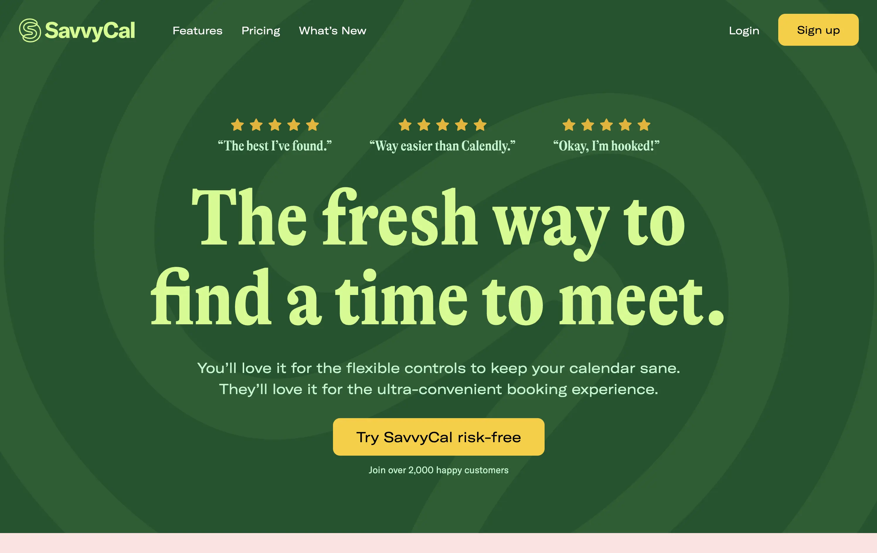
SavvyCal is a scheduling tool designed to simplify meeting coordination with flexible, user-first controls and a clean, friendly interface.
The hero leans hard into charm and confidence. The bold, serif headline feels conversational and clever. The contrast between green tones is controlled, and the centered layout places the CTA in a visually dominant spot. Social proof is integrated at the top with testimonial snippets to validate performance. It’s conversion-ready, especially for users looking for a more human alternative to Calendly.
Tailored to solo operators, indie founders, and small teams seeking simplicity without the enterprise bloat. Balances approachability and professionalism through tone and visual treatment. Micro-proof adds trust without noise.
This layout balances technical utility with human impact, aligning well with Algolia’s positioning as an API-first but UX-aware company. The mobile UI reinforces product value visually, while the logo wall signals scale and trust for enterprise buyers. The tone is clear, benefit-led, and appropriate for high-intent decision-makers evaluating AI tools for customer experience. This is a solid enterprise-facing hero built to perform.
Savvy Cal
↗
SaaS
Productivity
Centered
Playful
Aspirational
Single Button
Illustration
Social Proof
Duotone
Green
Yellow
Display
Serif
B2B
Home Page
Custom Code
calendly alternative, scheduling SaaS, friendly UI, bold typography, customer-first tone, startup productivity tools, anti-friction branding, green-on-green palette, centered layout, calendar control, review-driven, solo founder energy, fresh design, clean booking UX
SavvyCal is a scheduling tool designed to simplify meeting coordination with flexible, user-first controls and a clean, friendly interface.
The hero leans hard into charm and confidence. The bold, serif headline feels conversational and clever. The contrast between green tones is controlled, and the centered layout places the CTA in a visually dominant spot. Social proof is integrated at the top with testimonial snippets to validate performance. It’s conversion-ready, especially for users looking for a more human alternative to Calendly.
Tailored to solo operators, indie founders, and small teams seeking simplicity without the enterprise bloat. Balances approachability and professionalism through tone and visual treatment. Micro-proof adds trust without noise.
This layout balances technical utility with human impact, aligning well with Algolia’s positioning as an API-first but UX-aware company. The mobile UI reinforces product value visually, while the logo wall signals scale and trust for enterprise buyers. The tone is clear, benefit-led, and appropriate for high-intent decision-makers evaluating AI tools for customer experience. This is a solid enterprise-facing hero built to perform.
Asana
↗
SaaS
Collaboration
Productivity
Split Grid
Centered
Aspirational
Multi-CTA Block
Custom Animation
Duotone
Pink
Sans serif
B2B
Home Page
Custom Code
work management, project collaboration, AI assistant, team productivity, multi-cta hero
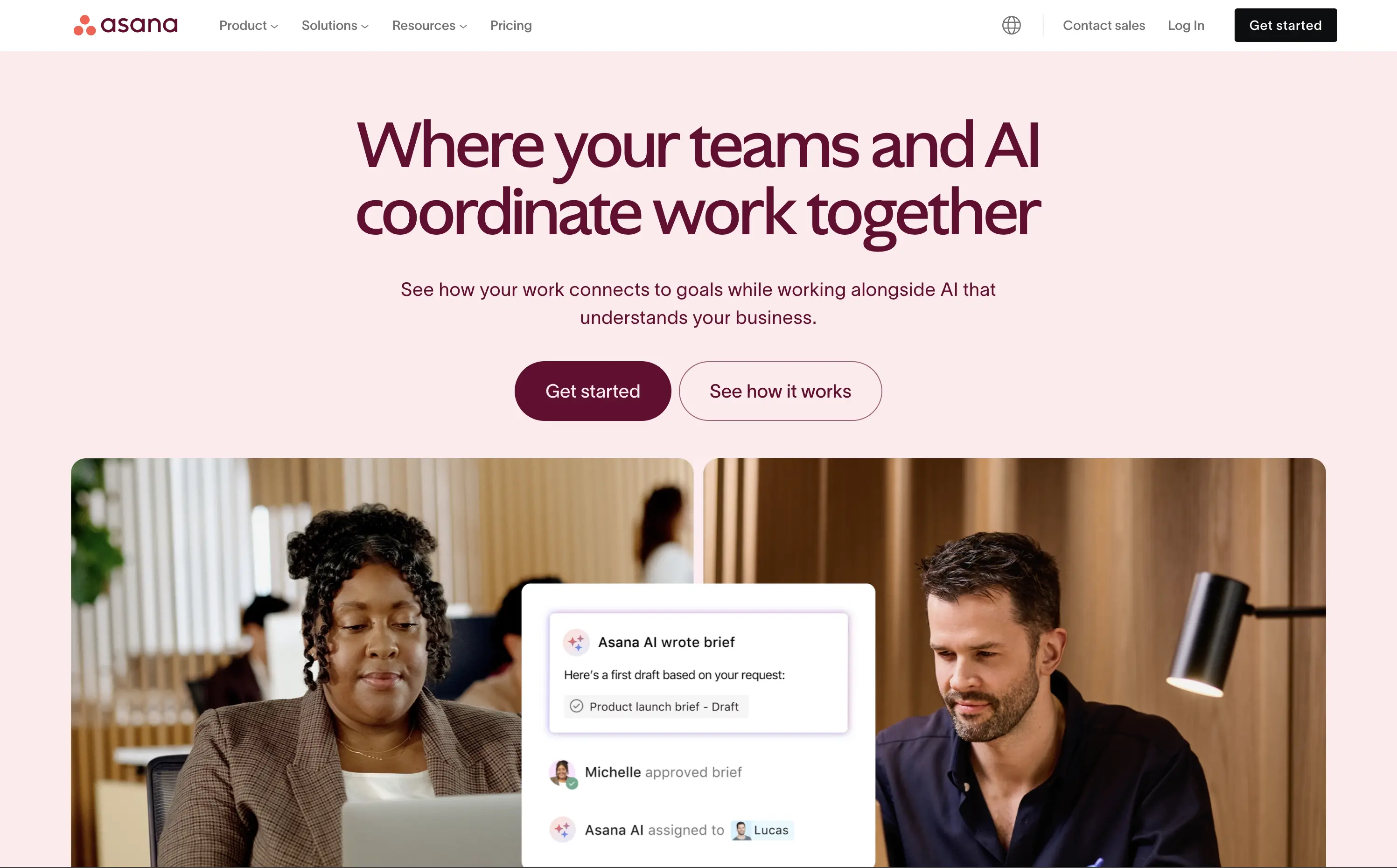
Asana helps organisations plan, track, and automate work—now boosted by an AI assistant that ties tasks to goals.
The hero is serene and strategic. Headline clearly defines the product’s evolution with AI, while visuals combine real people with subtle UI overlays to convey practical usage. Dual CTA is thoughtful and helps segment traffic. Typography and spacing support clarity.
Positions Asana as a next-gen operational tool built for modern teams. The hero shows how AI integrates with workflow, not replaces it. The balance of confidence and calm makes it accessible for mid-market to enterprise users exploring AI productivity.
This layout balances technical utility with human impact, aligning well with Algolia’s positioning as an API-first but UX-aware company. The mobile UI reinforces product value visually, while the logo wall signals scale and trust for enterprise buyers. The tone is clear, benefit-led, and appropriate for high-intent decision-makers evaluating AI tools for customer experience. This is a solid enterprise-facing hero built to perform.
Asana
↗
SaaS
Collaboration
Productivity
Split Grid
Centered
Aspirational
Multi-CTA Block
Custom Animation
Duotone
Pink
Sans serif
B2B
Home Page
Custom Code
work management, project collaboration, AI assistant, team productivity, multi-cta hero
Asana helps organisations plan, track, and automate work—now boosted by an AI assistant that ties tasks to goals.
The hero is serene and strategic. Headline clearly defines the product’s evolution with AI, while visuals combine real people with subtle UI overlays to convey practical usage. Dual CTA is thoughtful and helps segment traffic. Typography and spacing support clarity.
Positions Asana as a next-gen operational tool built for modern teams. The hero shows how AI integrates with workflow, not replaces it. The balance of confidence and calm makes it accessible for mid-market to enterprise users exploring AI productivity.
This layout balances technical utility with human impact, aligning well with Algolia’s positioning as an API-first but UX-aware company. The mobile UI reinforces product value visually, while the logo wall signals scale and trust for enterprise buyers. The tone is clear, benefit-led, and appropriate for high-intent decision-makers evaluating AI tools for customer experience. This is a solid enterprise-facing hero built to perform.
6sense
↗
SaaS
AI Tools
Split Grid
Left-aligned
Professional
No CTA
Logo Wall
Product UI
Duotone
Blue
Green
Sans serif
B2B
Home Page
Wordpress
AI-first, B2B enterprise, workflow automation, data-driven, email UI, proof of concept visual, dark theme, high-trust, demand gen, gradient bottom edge, technical audience, low-fluff, enterprise SaaS, sales enablement, client logos
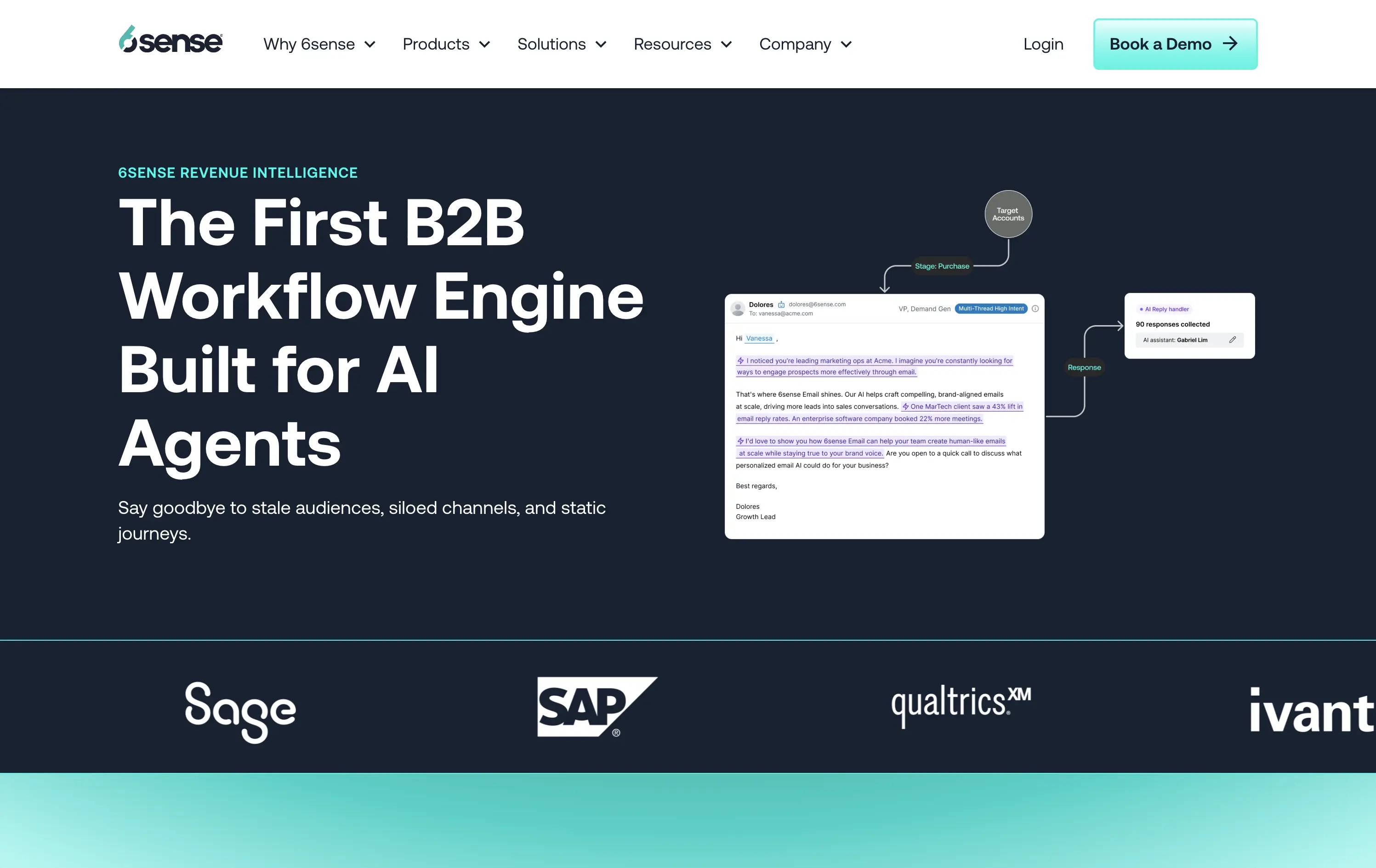
6sense is a B2B platform using AI to automate workflows and personalize marketing outreach at scale.
The hero leads with authority — strong headline, clean copy, and a visual that maps out a real workflow give instant context to a technical audience. The dark theme reads serious and enterprise-ready. Copy is crystal clear, but the visual diagram could use just a little more breathing room. CTA is sharp and obvious: Book a Demo — no distractions.
Hero is tuned for high-intent buyers. The language signals innovation and productivity gains while reinforcing credibility through visual proof and case stats.
This layout balances technical utility with human impact, aligning well with Algolia’s positioning as an API-first but UX-aware company. The mobile UI reinforces product value visually, while the logo wall signals scale and trust for enterprise buyers. The tone is clear, benefit-led, and appropriate for high-intent decision-makers evaluating AI tools for customer experience. This is a solid enterprise-facing hero built to perform.
6sense
↗
SaaS
AI Tools
Split Grid
Left-aligned
Professional
No CTA
Logo Wall
Product UI
Duotone
Blue
Green
Sans serif
B2B
Home Page
Wordpress
AI-first, B2B enterprise, workflow automation, data-driven, email UI, proof of concept visual, dark theme, high-trust, demand gen, gradient bottom edge, technical audience, low-fluff, enterprise SaaS, sales enablement, client logos
6sense is a B2B platform using AI to automate workflows and personalize marketing outreach at scale.
The hero leads with authority — strong headline, clean copy, and a visual that maps out a real workflow give instant context to a technical audience. The dark theme reads serious and enterprise-ready. Copy is crystal clear, but the visual diagram could use just a little more breathing room. CTA is sharp and obvious: Book a Demo — no distractions.
Hero is tuned for high-intent buyers. The language signals innovation and productivity gains while reinforcing credibility through visual proof and case stats.
This layout balances technical utility with human impact, aligning well with Algolia’s positioning as an API-first but UX-aware company. The mobile UI reinforces product value visually, while the logo wall signals scale and trust for enterprise buyers. The tone is clear, benefit-led, and appropriate for high-intent decision-makers evaluating AI tools for customer experience. This is a solid enterprise-facing hero built to perform.
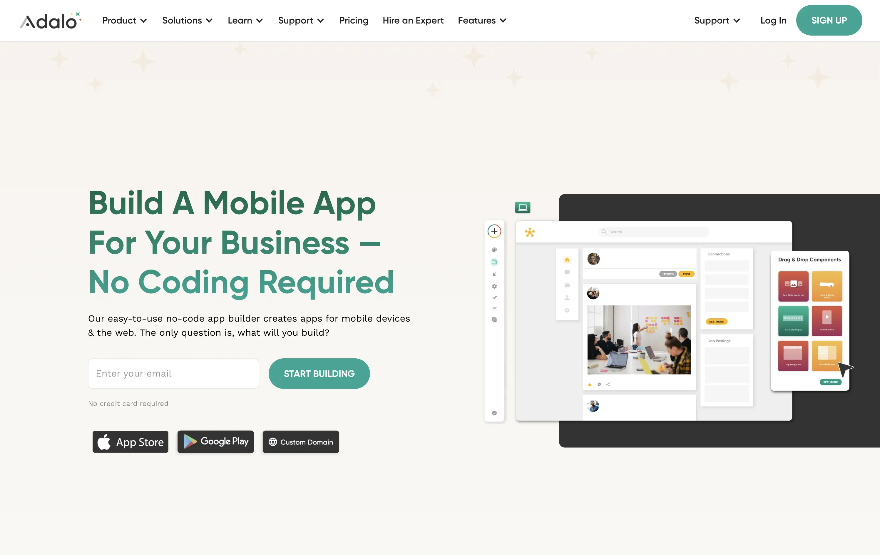
Adalo
↗
SaaS
No-Code
Creative Tools
Split Grid
Left-aligned
Benefit-Driven
Descriptive
Email Capture
Product UI
Duotone
Green
Sans serif
Hybrid
Home Page
Webflow
no-code builder, early-stage vibe, product-led growth, friendly UI, starter-friendly, clear CTA, drag-and-drop visual, email-first CTA, low-barrier signup, mobile-first, DIY tech, warm palette, creator tools, approachable tone, utility-first
Adalo lets anyone build mobile and web apps without coding using an easy drag-and-drop editor and built-in components.
The layout is clean, welcoming, and communicates ease of use. Visual UI gives confidence, and the input field softens conversion friction. It appeals to non-technical founders well but doesn’t carve out much distinctiveness from competitors in the same space.
This hero aligns well with beginner creators. It plays to comfort and simplicity, though it misses an edge in differentiating speed, success stories, or creative freedom.
This layout balances technical utility with human impact, aligning well with Algolia’s positioning as an API-first but UX-aware company. The mobile UI reinforces product value visually, while the logo wall signals scale and trust for enterprise buyers. The tone is clear, benefit-led, and appropriate for high-intent decision-makers evaluating AI tools for customer experience. This is a solid enterprise-facing hero built to perform.
The most effective hero sections in your inbox.
Monthly round up of top hero sections.
Don't worry. We hate spam too.
Don't worry. We hate spam too.
Don't worry. We hate spam too.