Education
2
2
2
2
Learning platforms for individuals, institutions, and lifelong skill-building.
Brightwheel
↗
SaaS
Productivity
Education
Centered
Benefit-Driven
Empowering
Multi-CTA Block
Product UI
Duotone
Blue
Sans serif
B2B
Home Page
Wordpress
childcare SaaS, early education, UI-forward, persona filter, soft onboarding, trust-building, calm palette, family-friendly, product-led storytelling, scroll guidance, interactive selector, teacher tech, value-first headline
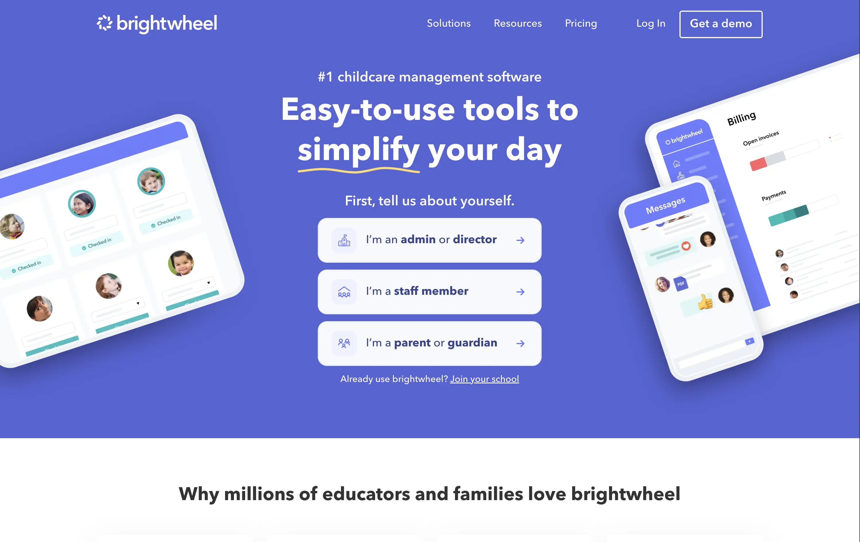
Brightwheel offers all-in-one software for childcare centers, helping staff and parents streamline daily operations, billing, and communication.
The hero blends product visuals with conversion utility. UI mockups feel grounded in real use cases—billing, check-ins, messaging—while the big, benefit-led headline hits directly. Interactive persona buttons sort traffic based on user role, creating clarity and reducing friction. Clean layout, focused copy, and trust cues (like “#1 childcare software”) all work toward fast comprehension.
Targets a trust-dependent category with confident simplicity. The user-type selector streamlines onboarding while signaling the platform’s adaptability. It balances emotional safety with practical function, reflecting Brightwheel’s value as a tool that makes lives easier.
This layout balances technical utility with human impact, aligning well with Algolia’s positioning as an API-first but UX-aware company. The mobile UI reinforces product value visually, while the logo wall signals scale and trust for enterprise buyers. The tone is clear, benefit-led, and appropriate for high-intent decision-makers evaluating AI tools for customer experience. This is a solid enterprise-facing hero built to perform.
Brightwheel
↗
SaaS
Productivity
Education
Centered
Benefit-Driven
Empowering
Multi-CTA Block
Product UI
Duotone
Blue
Sans serif
B2B
Home Page
Wordpress
childcare SaaS, early education, UI-forward, persona filter, soft onboarding, trust-building, calm palette, family-friendly, product-led storytelling, scroll guidance, interactive selector, teacher tech, value-first headline
Brightwheel offers all-in-one software for childcare centers, helping staff and parents streamline daily operations, billing, and communication.
The hero blends product visuals with conversion utility. UI mockups feel grounded in real use cases—billing, check-ins, messaging—while the big, benefit-led headline hits directly. Interactive persona buttons sort traffic based on user role, creating clarity and reducing friction. Clean layout, focused copy, and trust cues (like “#1 childcare software”) all work toward fast comprehension.
Targets a trust-dependent category with confident simplicity. The user-type selector streamlines onboarding while signaling the platform’s adaptability. It balances emotional safety with practical function, reflecting Brightwheel’s value as a tool that makes lives easier.
This layout balances technical utility with human impact, aligning well with Algolia’s positioning as an API-first but UX-aware company. The mobile UI reinforces product value visually, while the logo wall signals scale and trust for enterprise buyers. The tone is clear, benefit-led, and appropriate for high-intent decision-makers evaluating AI tools for customer experience. This is a solid enterprise-facing hero built to perform.
Preply
↗
Education
Left-aligned
Benefit-Driven
Single Button
Photography
Live Metrics
Social Proof
Light Mode
Pink
Black
Home Page
Custom Code
language tutor, online learning, marketplace hero, bold color hero, pink web design, conversational UI, Gen Z UX, bold CTA, tutoring platform, live teaching, zoom call visual, metrics trust banner, marketplace product
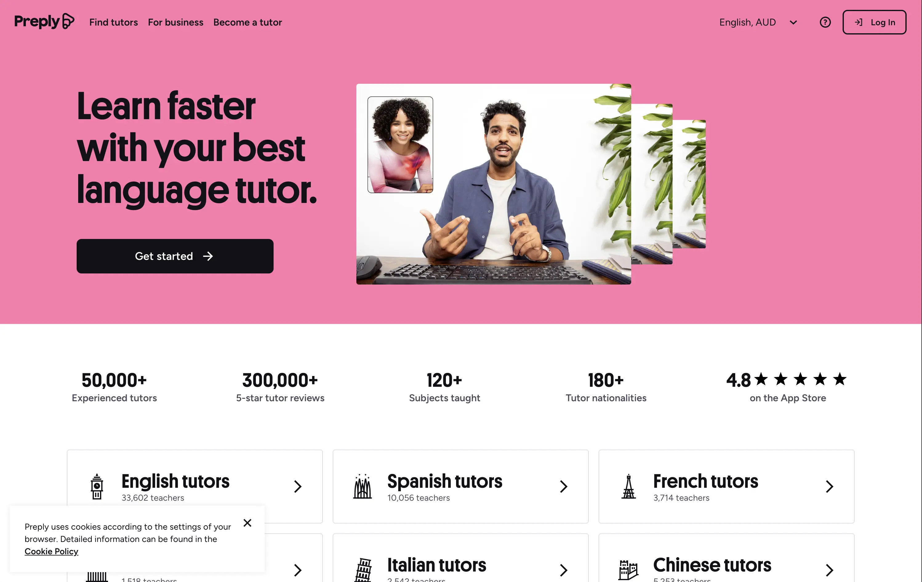
Preply is an online learning platform that connects learners with expert language tutors for personalized one-on-one lessons.
This hero punches through with its candy-pink backdrop — a rare choice for marketplaces but totally intentional. The layout is simple, but the stacked imagery still adds dynamism. Stats like “300,000+ 5-star reviews” and “180+ tutor nationalities” instantly establish credibility. The CTA is minimal and clearly actionable. Overall, the tone is upbeat, modern, and universally accessible — ideal for a cross-border education platform aiming to feel both trustworthy and welcoming.
Hero balances global scale with simplicity. Design and tone cater to international learners of all ages. Trust is built through numbers, while layout minimizes friction for new users.
This layout balances technical utility with human impact, aligning well with Algolia’s positioning as an API-first but UX-aware company. The mobile UI reinforces product value visually, while the logo wall signals scale and trust for enterprise buyers. The tone is clear, benefit-led, and appropriate for high-intent decision-makers evaluating AI tools for customer experience. This is a solid enterprise-facing hero built to perform.
Preply
↗
Education
Left-aligned
Benefit-Driven
Single Button
Photography
Live Metrics
Social Proof
Light Mode
Pink
Black
Home Page
Custom Code
language tutor, online learning, marketplace hero, bold color hero, pink web design, conversational UI, Gen Z UX, bold CTA, tutoring platform, live teaching, zoom call visual, metrics trust banner, marketplace product
Preply is an online learning platform that connects learners with expert language tutors for personalized one-on-one lessons.
This hero punches through with its candy-pink backdrop — a rare choice for marketplaces but totally intentional. The layout is simple, but the stacked imagery still adds dynamism. Stats like “300,000+ 5-star reviews” and “180+ tutor nationalities” instantly establish credibility. The CTA is minimal and clearly actionable. Overall, the tone is upbeat, modern, and universally accessible — ideal for a cross-border education platform aiming to feel both trustworthy and welcoming.
Hero balances global scale with simplicity. Design and tone cater to international learners of all ages. Trust is built through numbers, while layout minimizes friction for new users.
This layout balances technical utility with human impact, aligning well with Algolia’s positioning as an API-first but UX-aware company. The mobile UI reinforces product value visually, while the logo wall signals scale and trust for enterprise buyers. The tone is clear, benefit-led, and appropriate for high-intent decision-makers evaluating AI tools for customer experience. This is a solid enterprise-facing hero built to perform.
The most effective hero sections in your inbox.
Monthly round up of top hero sections.
Don't worry. We hate spam too.
Don't worry. We hate spam too.
Don't worry. We hate spam too.