Email Capture
0
0
0
0
Inline form with email field — great for prelaunch, newsletters, or gated access.
Filters
Later
↗
SaaS
Creator Tools
Productivity
Centered
Descriptive
Empowering
Email Capture
Photography
Media Gallery
Logo Wall
Gradient
Blue
Sans serif
B2B
Home Page
Custom Code
influencer CRM, creator marketing platform, lead gen UI, campaign planning tool, social media SaaS, conversion-first layout, creator showcase, email-first CTA, SaaS for brands, bright
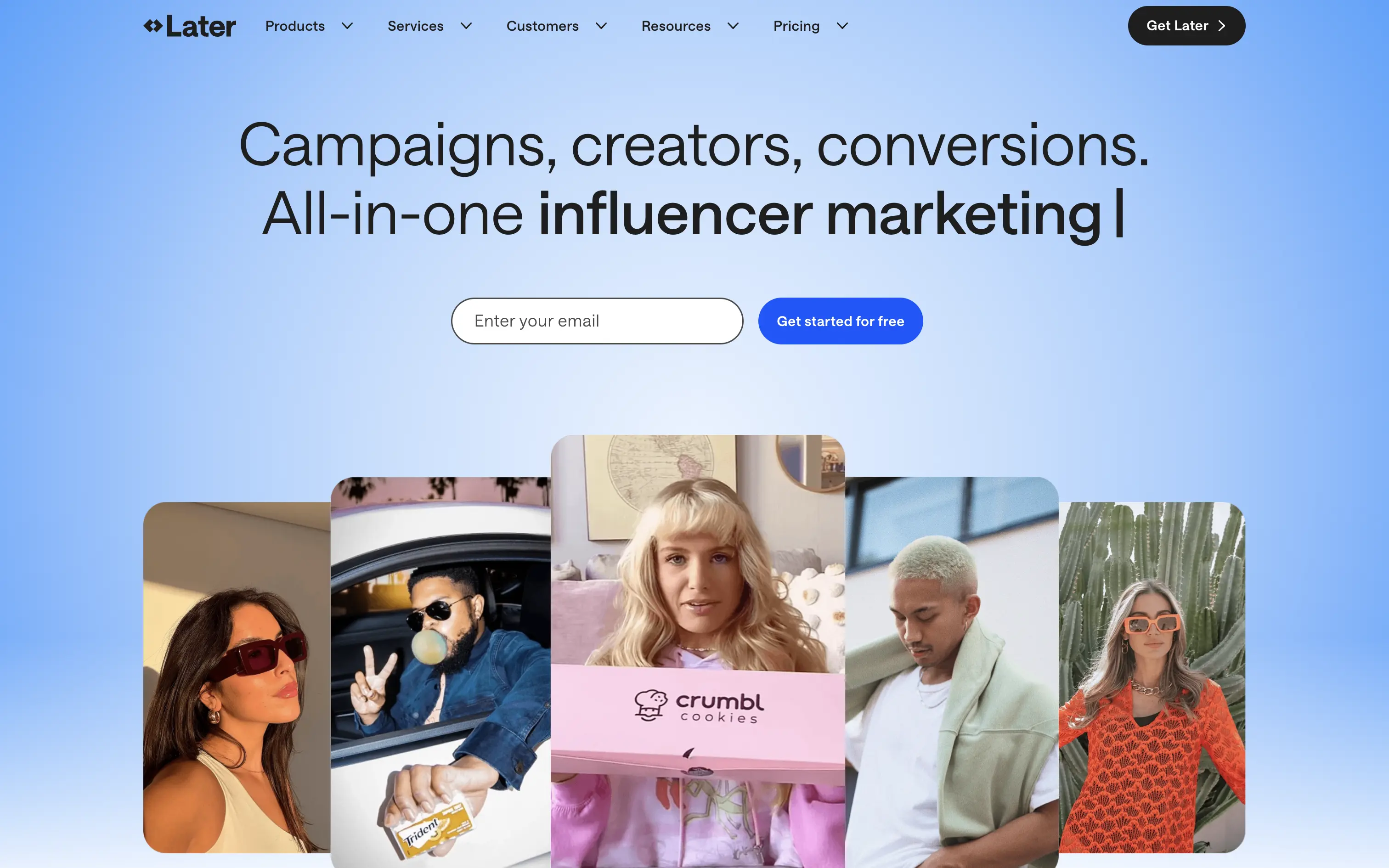
Later is a creator marketing platform helping brands manage influencer campaigns from outreach to ROI.
A functional, no-nonsense SaaS hero. Focused on conversion with a soft blue gradient and creator image bar to build immediate visual relevance. Email-first CTA lowers friction.
Safe and effective for B2B marketing leads. The layout is built for clarity over creativity. Great for scale, but it doesn’t carve out a unique visual or tonal niche.
This layout balances technical utility with human impact, aligning well with Algolia’s positioning as an API-first but UX-aware company. The mobile UI reinforces product value visually, while the logo wall signals scale and trust for enterprise buyers. The tone is clear, benefit-led, and appropriate for high-intent decision-makers evaluating AI tools for customer experience. This is a solid enterprise-facing hero built to perform.
Later
↗
SaaS
Creator Tools
Productivity
Centered
Descriptive
Empowering
Email Capture
Photography
Media Gallery
Logo Wall
Gradient
Blue
Sans serif
B2B
Home Page
Custom Code
influencer CRM, creator marketing platform, lead gen UI, campaign planning tool, social media SaaS, conversion-first layout, creator showcase, email-first CTA, SaaS for brands, bright
Later is a creator marketing platform helping brands manage influencer campaigns from outreach to ROI.
A functional, no-nonsense SaaS hero. Focused on conversion with a soft blue gradient and creator image bar to build immediate visual relevance. Email-first CTA lowers friction.
Safe and effective for B2B marketing leads. The layout is built for clarity over creativity. Great for scale, but it doesn’t carve out a unique visual or tonal niche.
This layout balances technical utility with human impact, aligning well with Algolia’s positioning as an API-first but UX-aware company. The mobile UI reinforces product value visually, while the logo wall signals scale and trust for enterprise buyers. The tone is clear, benefit-led, and appropriate for high-intent decision-makers evaluating AI tools for customer experience. This is a solid enterprise-facing hero built to perform.
Opal
↗
CPG
Hardware
Left-aligned
Editorial
Descriptive
Confident
Single Button
Email Capture
Photography
Imagery-Based
Yellow
Sans serif
DTC
Home Page
Custom Code
premium webcam, lifestyle focus, cozy setup, hardware-first product, DTC electronics, human-centered visual, muted palette, cinematic photography, on-brand lighting, creative tool, soft tech aesthetic
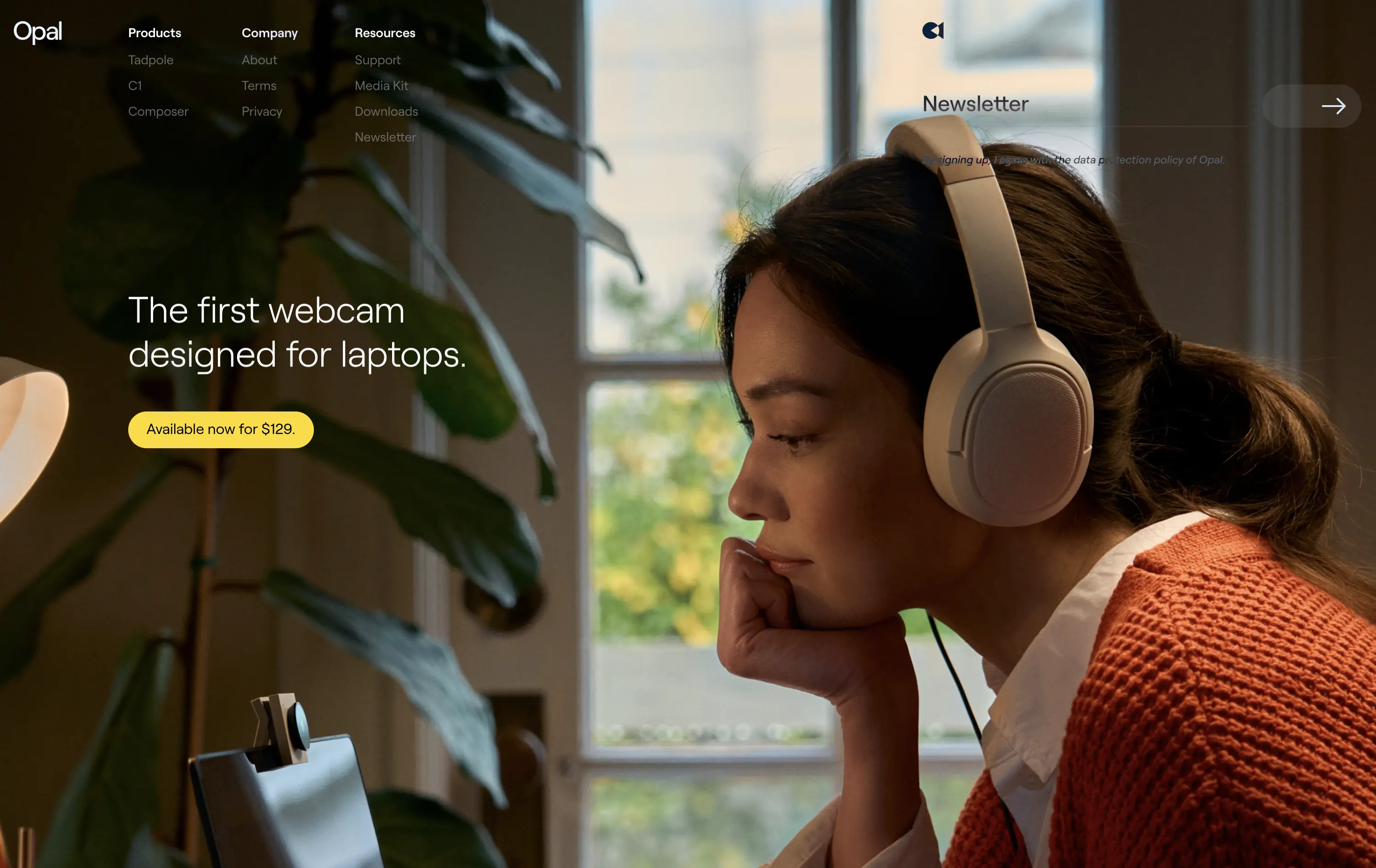
Opal makes premium webcams designed for laptops, with high-end quality and thoughtful design.
The hero is clean and confident. Photo tells the story before the copy does. It’s emotional, product-centric, and conversion-ready—but a bit light on technical proof or feature context.
Opal sells feeling first—comfort, focus, and quality. This is lifestyle-led DTC strategy that builds trust visually. But it risks underselling function unless the user scrolls.
This layout balances technical utility with human impact, aligning well with Algolia’s positioning as an API-first but UX-aware company. The mobile UI reinforces product value visually, while the logo wall signals scale and trust for enterprise buyers. The tone is clear, benefit-led, and appropriate for high-intent decision-makers evaluating AI tools for customer experience. This is a solid enterprise-facing hero built to perform.
Opal
↗
CPG
Hardware
Left-aligned
Editorial
Descriptive
Confident
Single Button
Email Capture
Photography
Imagery-Based
Yellow
Sans serif
DTC
Home Page
Custom Code
premium webcam, lifestyle focus, cozy setup, hardware-first product, DTC electronics, human-centered visual, muted palette, cinematic photography, on-brand lighting, creative tool, soft tech aesthetic
Opal makes premium webcams designed for laptops, with high-end quality and thoughtful design.
The hero is clean and confident. Photo tells the story before the copy does. It’s emotional, product-centric, and conversion-ready—but a bit light on technical proof or feature context.
Opal sells feeling first—comfort, focus, and quality. This is lifestyle-led DTC strategy that builds trust visually. But it risks underselling function unless the user scrolls.
This layout balances technical utility with human impact, aligning well with Algolia’s positioning as an API-first but UX-aware company. The mobile UI reinforces product value visually, while the logo wall signals scale and trust for enterprise buyers. The tone is clear, benefit-led, and appropriate for high-intent decision-makers evaluating AI tools for customer experience. This is a solid enterprise-facing hero built to perform.
Ramp
↗
SaaS
Fintech
Split Grid
Left-aligned
Benefit-Driven
Email Capture
Product UI
Social Proof
Duotone
Green
Yellow
Sans serif
B2B
Home Page
Custom Code
expense automation, corporate cards, real-time finance tools, modern B2B fintech, ROI-led copy, dark UI, embedded reviews, verified trust cues, enterprise-ready design, slick dashboard, clear CTA, conversion optimized, mid-funnel targeting, save money pitch, split layout
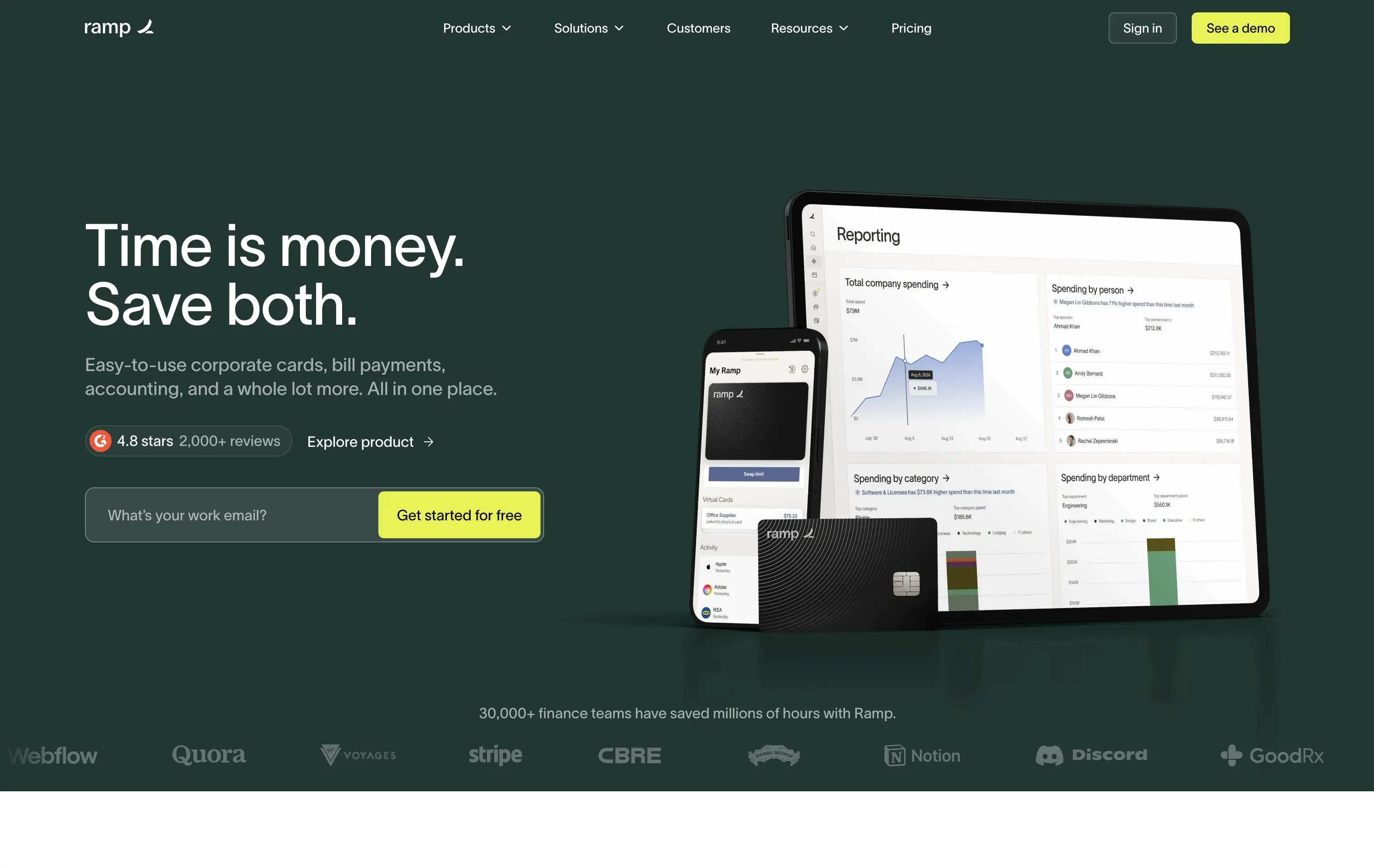
Ramp is a corporate finance platform offering cards, bill pay, and reporting tools designed to save companies time and money.
The hero is clean, trust-building, and conversion-ready. Headline is bold and economic — short enough to stick, direct enough to convert. Subheadline explains the product scope, while the UI visual makes it tangible. Reviews and logos anchor trust. The input field + utility CTA streamlines lead gen.
Perfectly calibrated for CFOs and finance leads. Messaging leads with ROI, not tech — smart for a market that cares about efficiency and outcomes. Strong signal-to-noise ratio.
This layout balances technical utility with human impact, aligning well with Algolia’s positioning as an API-first but UX-aware company. The mobile UI reinforces product value visually, while the logo wall signals scale and trust for enterprise buyers. The tone is clear, benefit-led, and appropriate for high-intent decision-makers evaluating AI tools for customer experience. This is a solid enterprise-facing hero built to perform.
Ramp
↗
SaaS
Fintech
Split Grid
Left-aligned
Benefit-Driven
Email Capture
Product UI
Social Proof
Duotone
Green
Yellow
Sans serif
B2B
Home Page
Custom Code
expense automation, corporate cards, real-time finance tools, modern B2B fintech, ROI-led copy, dark UI, embedded reviews, verified trust cues, enterprise-ready design, slick dashboard, clear CTA, conversion optimized, mid-funnel targeting, save money pitch, split layout
Ramp is a corporate finance platform offering cards, bill pay, and reporting tools designed to save companies time and money.
The hero is clean, trust-building, and conversion-ready. Headline is bold and economic — short enough to stick, direct enough to convert. Subheadline explains the product scope, while the UI visual makes it tangible. Reviews and logos anchor trust. The input field + utility CTA streamlines lead gen.
Perfectly calibrated for CFOs and finance leads. Messaging leads with ROI, not tech — smart for a market that cares about efficiency and outcomes. Strong signal-to-noise ratio.
This layout balances technical utility with human impact, aligning well with Algolia’s positioning as an API-first but UX-aware company. The mobile UI reinforces product value visually, while the logo wall signals scale and trust for enterprise buyers. The tone is clear, benefit-led, and appropriate for high-intent decision-makers evaluating AI tools for customer experience. This is a solid enterprise-facing hero built to perform.
Brex
↗
SaaS
Fintech
Split Grid
Left-aligned
Benefit-Driven
Confident
Email Capture
Product UI
Social Proof
3D visuals
Light Mode
Orange
Sans serif
B2B
Home Page
Custom Code
global finance platform, expense automation, control and speed messaging, embedded email field, startup to enterprise, international SaaS, B2B fintech, conversion-led layout, modern finance stack, clean UI, sharp tone, input-first UX, mobile + card visual, minimalist grid
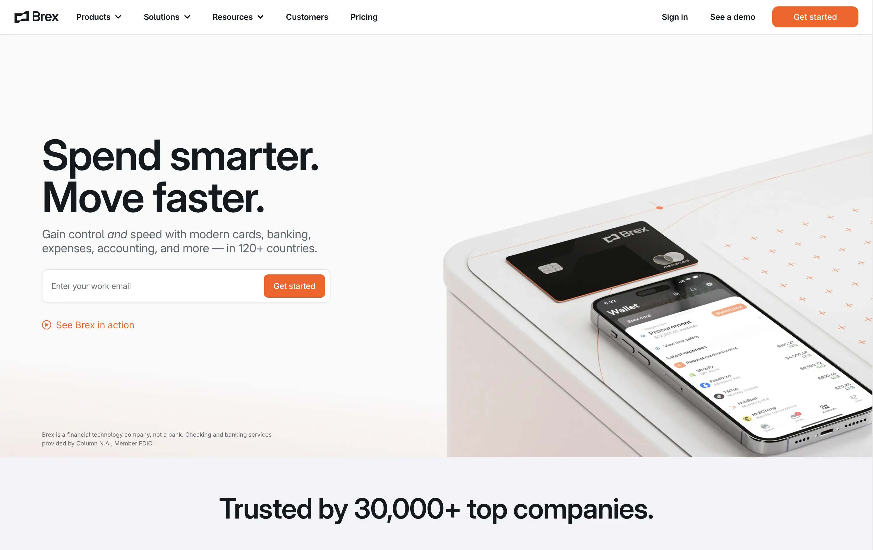
Brex is a global financial platform offering cards, banking, and expense tools for fast-scaling companies in 120+ countries.
This hero nails first-contact clarity. The headline hits fast with rhythmic, benefit-led language, while the subhead contextualizes product depth across spend, banking, and scale. The layout leads with a form-first interaction, pushing immediate action, while the micro-CTA (“See Brex in action”) gives skeptics a softer entry point. The 3D product mockup adds credibility and sharpens the tech-forward appeal. Nothing feels redundant — every element either informs or converts. The result is frictionless, enterprise-friendly, and confident without oversell.
Speaks directly to startup and scale-up operators. Prioritizes control and speed — key brand levers for high-growth companies. Balanced tone and visual logic establish Brex as both trusted and technically future-ready.
This layout balances technical utility with human impact, aligning well with Algolia’s positioning as an API-first but UX-aware company. The mobile UI reinforces product value visually, while the logo wall signals scale and trust for enterprise buyers. The tone is clear, benefit-led, and appropriate for high-intent decision-makers evaluating AI tools for customer experience. This is a solid enterprise-facing hero built to perform.
Brex
↗
SaaS
Fintech
Split Grid
Left-aligned
Benefit-Driven
Confident
Email Capture
Product UI
Social Proof
3D visuals
Light Mode
Orange
Sans serif
B2B
Home Page
Custom Code
global finance platform, expense automation, control and speed messaging, embedded email field, startup to enterprise, international SaaS, B2B fintech, conversion-led layout, modern finance stack, clean UI, sharp tone, input-first UX, mobile + card visual, minimalist grid
Brex is a global financial platform offering cards, banking, and expense tools for fast-scaling companies in 120+ countries.
This hero nails first-contact clarity. The headline hits fast with rhythmic, benefit-led language, while the subhead contextualizes product depth across spend, banking, and scale. The layout leads with a form-first interaction, pushing immediate action, while the micro-CTA (“See Brex in action”) gives skeptics a softer entry point. The 3D product mockup adds credibility and sharpens the tech-forward appeal. Nothing feels redundant — every element either informs or converts. The result is frictionless, enterprise-friendly, and confident without oversell.
Speaks directly to startup and scale-up operators. Prioritizes control and speed — key brand levers for high-growth companies. Balanced tone and visual logic establish Brex as both trusted and technically future-ready.
This layout balances technical utility with human impact, aligning well with Algolia’s positioning as an API-first but UX-aware company. The mobile UI reinforces product value visually, while the logo wall signals scale and trust for enterprise buyers. The tone is clear, benefit-led, and appropriate for high-intent decision-makers evaluating AI tools for customer experience. This is a solid enterprise-facing hero built to perform.
TidyCal
↗
SaaS
Productivity
Centered
Benefit-Driven
Descriptive
Email Capture
Social Proof
Announcement
Badges
Dark Mode
Blue
Sans serif
B2B
Home Page
Custom Code
low-cost alternative, one-time payment SaaS, scheduling tool, Product Hunt-backed, no-frills UI, budget-friendly SaaS, email-first CTA, dark mode hero, indie stack, small team SaaS, lifetime deal, value-first messaging, stripped-down UX, pricing transparency
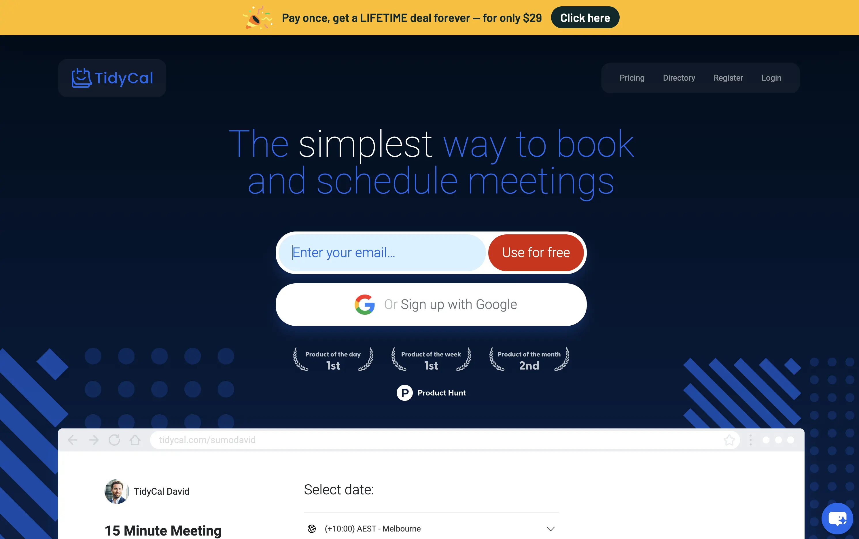
TidyCal is a simple, affordable calendar booking tool offering lifetime access for a one-time fee — ideal for solo professionals and budget-conscious teams.
TidyCal’s hero is clear on purpose but light on finesse. The lifetime deal banner is highly conversion-optimized and immediately grabs attention. However, the headline lacks typographic hierarchy and fails to land with impact — “simplest” stands out visually, but the phrasing overall feels flat. The input-first layout is user-friendly, but inconsistent sizing and visual imbalance reduce perceived trust. This hero converts, but it doesn’t inspire.
The pricing-first message works for a cost-sensitive audience. But the unrefined layout and typographic decisions may limit credibility with enterprise or design-aware users. Prioritizes affordability over perception of quality.
This layout balances technical utility with human impact, aligning well with Algolia’s positioning as an API-first but UX-aware company. The mobile UI reinforces product value visually, while the logo wall signals scale and trust for enterprise buyers. The tone is clear, benefit-led, and appropriate for high-intent decision-makers evaluating AI tools for customer experience. This is a solid enterprise-facing hero built to perform.
TidyCal
↗
SaaS
Productivity
Centered
Benefit-Driven
Descriptive
Email Capture
Social Proof
Announcement
Badges
Dark Mode
Blue
Sans serif
B2B
Home Page
Custom Code
low-cost alternative, one-time payment SaaS, scheduling tool, Product Hunt-backed, no-frills UI, budget-friendly SaaS, email-first CTA, dark mode hero, indie stack, small team SaaS, lifetime deal, value-first messaging, stripped-down UX, pricing transparency
TidyCal is a simple, affordable calendar booking tool offering lifetime access for a one-time fee — ideal for solo professionals and budget-conscious teams.
TidyCal’s hero is clear on purpose but light on finesse. The lifetime deal banner is highly conversion-optimized and immediately grabs attention. However, the headline lacks typographic hierarchy and fails to land with impact — “simplest” stands out visually, but the phrasing overall feels flat. The input-first layout is user-friendly, but inconsistent sizing and visual imbalance reduce perceived trust. This hero converts, but it doesn’t inspire.
The pricing-first message works for a cost-sensitive audience. But the unrefined layout and typographic decisions may limit credibility with enterprise or design-aware users. Prioritizes affordability over perception of quality.
This layout balances technical utility with human impact, aligning well with Algolia’s positioning as an API-first but UX-aware company. The mobile UI reinforces product value visually, while the logo wall signals scale and trust for enterprise buyers. The tone is clear, benefit-led, and appropriate for high-intent decision-makers evaluating AI tools for customer experience. This is a solid enterprise-facing hero built to perform.
MindPalace AI
↗
SaaS
AI Tools
Productivity
Inset
Full Width
Editorial
Founder-Led Voice
Abstract / Conceptual
Email Capture
Photography
Product UI
Imagery-Based
Light Mode
Red
Black
Display
B2C
Home Page
Webflow
cinematic design, founder-led brand, AI memory tool, data integration, futuristic UI, monochrome orange palette, provocative headline, low-context messaging, brand-first hero, retro-futurist aesthetic, predictive tech, narrative design, mood-driven UX
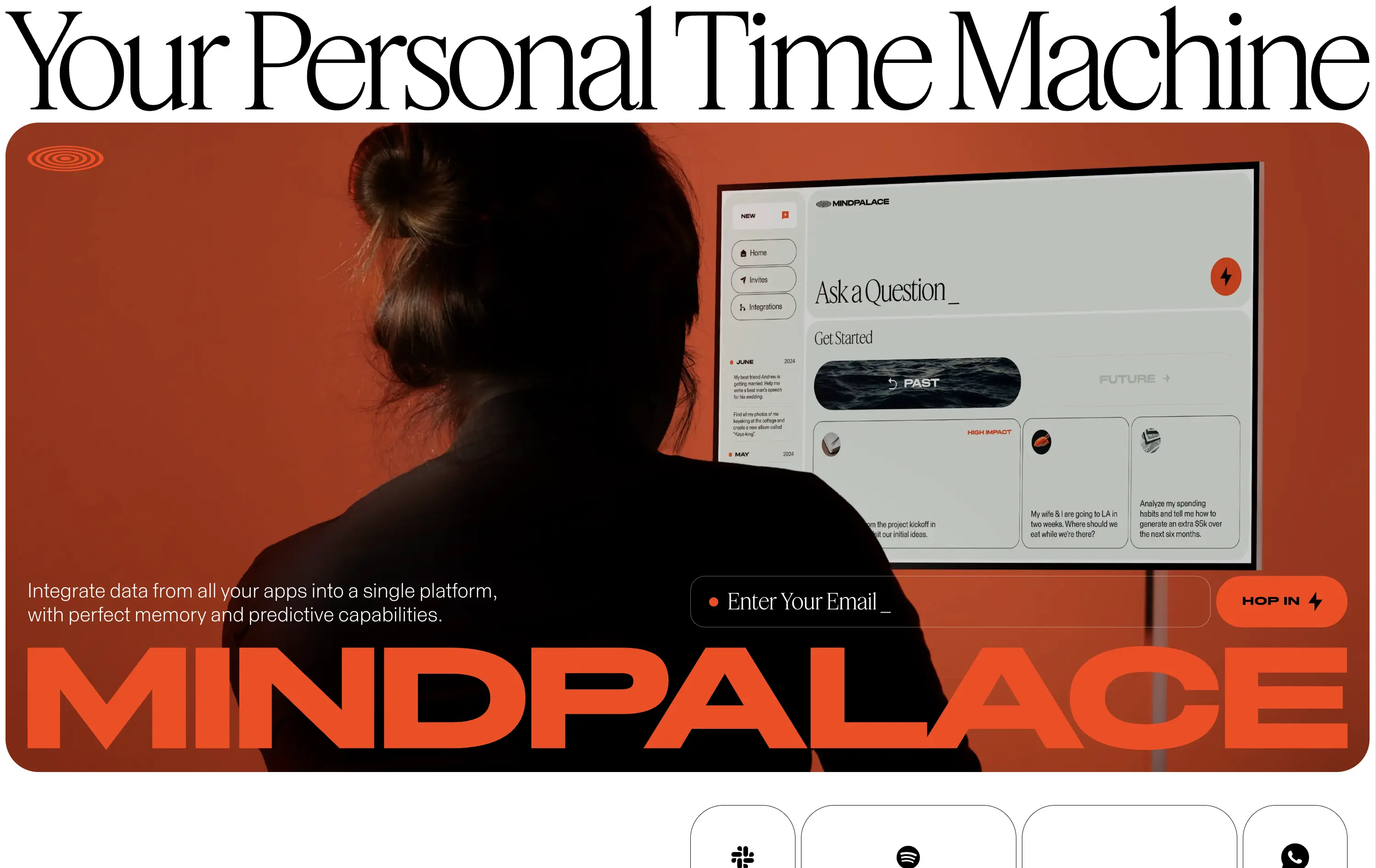
Mindpalace connects and organizes your digital life into a single interface with memory recall and predictive AI tools—part archive, part assistant.
This hero is brand-first, product-second. The editorial headline draws intrigue but offers zero utility without scrolling. Subheadline hints at integration and predictive capabilities but avoids details. The strength lies in the striking art direction: backlit subject, glowing screen, and color-blocked monochrome palette immediately set a cinematic tone. Product UI is visible but not interactive. The email capture field is subtle and stylish, fitting the brand’s creative edge. It’s a bold anti-SaaS approach—prioritizing identity over clarity.
Mindpalace positions itself as a visionary, not a tool. Strategy leans into intrigue, betting on design-savvy early adopters who value storytelling and aesthetics over immediate clarity. Strong brand magnetism, low onboarding intent.
This layout balances technical utility with human impact, aligning well with Algolia’s positioning as an API-first but UX-aware company. The mobile UI reinforces product value visually, while the logo wall signals scale and trust for enterprise buyers. The tone is clear, benefit-led, and appropriate for high-intent decision-makers evaluating AI tools for customer experience. This is a solid enterprise-facing hero built to perform.
MindPalace AI
↗
SaaS
AI Tools
Productivity
Inset
Full Width
Editorial
Founder-Led Voice
Abstract / Conceptual
Email Capture
Photography
Product UI
Imagery-Based
Light Mode
Red
Black
Display
B2C
Home Page
Webflow
cinematic design, founder-led brand, AI memory tool, data integration, futuristic UI, monochrome orange palette, provocative headline, low-context messaging, brand-first hero, retro-futurist aesthetic, predictive tech, narrative design, mood-driven UX
Mindpalace connects and organizes your digital life into a single interface with memory recall and predictive AI tools—part archive, part assistant.
This hero is brand-first, product-second. The editorial headline draws intrigue but offers zero utility without scrolling. Subheadline hints at integration and predictive capabilities but avoids details. The strength lies in the striking art direction: backlit subject, glowing screen, and color-blocked monochrome palette immediately set a cinematic tone. Product UI is visible but not interactive. The email capture field is subtle and stylish, fitting the brand’s creative edge. It’s a bold anti-SaaS approach—prioritizing identity over clarity.
Mindpalace positions itself as a visionary, not a tool. Strategy leans into intrigue, betting on design-savvy early adopters who value storytelling and aesthetics over immediate clarity. Strong brand magnetism, low onboarding intent.
This layout balances technical utility with human impact, aligning well with Algolia’s positioning as an API-first but UX-aware company. The mobile UI reinforces product value visually, while the logo wall signals scale and trust for enterprise buyers. The tone is clear, benefit-led, and appropriate for high-intent decision-makers evaluating AI tools for customer experience. This is a solid enterprise-facing hero built to perform.
Miro
↗
SaaS
Collaboration
Creative Tools
Centered
Aspirational
Abstract / Conceptual
Email Capture
Product UI
Custom Animation
Light Mode
Blue
Sans serif
B2B
Home Page
Framer
collaboration tool, whiteboard software, innovation workspace, product teams, live UI elements, Miro AI, interactive SaaS, idea management, enterprise-ready, low-friction signup, dotted grid design, playful tone, design thinking, real-time tools
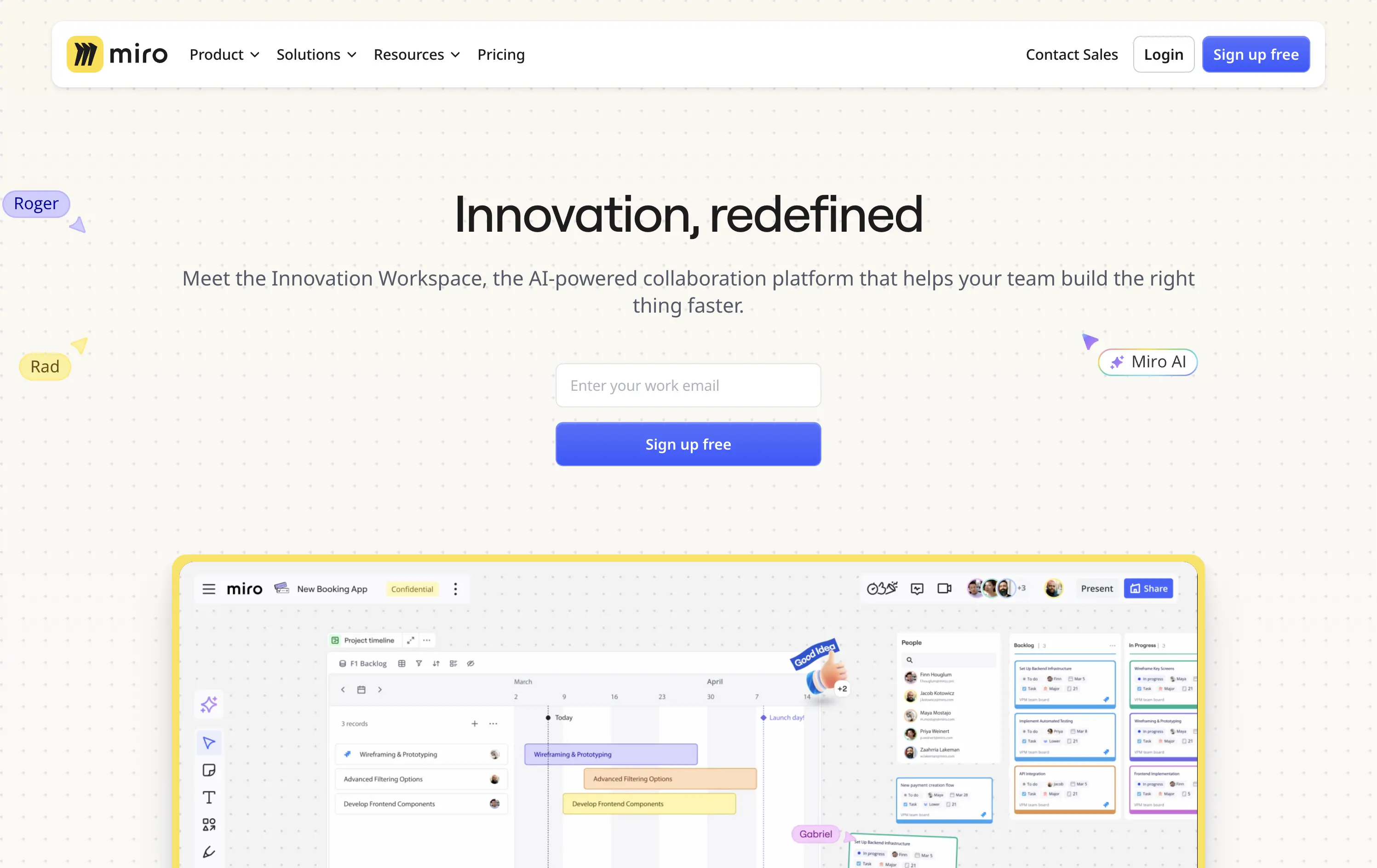
Miro is a collaborative online workspace for teams to brainstorm, plan, and build faster with intuitive tools and real-time visuals.
Hero is clean, modern, and visually grounded. Headline is short and inviting. Product UI is framed to feel expansive but still focused. The email-first CTA supports frictionless onboarding for teams exploring async tools.
Balances approachability with enterprise readiness. Message appeals to team leads, PMs, and designers. AI tag and product visuals align with innovation narrative. The hero positions Miro as both flexible and scalable.
This layout balances technical utility with human impact, aligning well with Algolia’s positioning as an API-first but UX-aware company. The mobile UI reinforces product value visually, while the logo wall signals scale and trust for enterprise buyers. The tone is clear, benefit-led, and appropriate for high-intent decision-makers evaluating AI tools for customer experience. This is a solid enterprise-facing hero built to perform.
Miro
↗
SaaS
Collaboration
Creative Tools
Centered
Aspirational
Abstract / Conceptual
Email Capture
Product UI
Custom Animation
Light Mode
Blue
Sans serif
B2B
Home Page
Framer
collaboration tool, whiteboard software, innovation workspace, product teams, live UI elements, Miro AI, interactive SaaS, idea management, enterprise-ready, low-friction signup, dotted grid design, playful tone, design thinking, real-time tools
Miro is a collaborative online workspace for teams to brainstorm, plan, and build faster with intuitive tools and real-time visuals.
Hero is clean, modern, and visually grounded. Headline is short and inviting. Product UI is framed to feel expansive but still focused. The email-first CTA supports frictionless onboarding for teams exploring async tools.
Balances approachability with enterprise readiness. Message appeals to team leads, PMs, and designers. AI tag and product visuals align with innovation narrative. The hero positions Miro as both flexible and scalable.
This layout balances technical utility with human impact, aligning well with Algolia’s positioning as an API-first but UX-aware company. The mobile UI reinforces product value visually, while the logo wall signals scale and trust for enterprise buyers. The tone is clear, benefit-led, and appropriate for high-intent decision-makers evaluating AI tools for customer experience. This is a solid enterprise-facing hero built to perform.
Zendesk
↗
SaaS
AI Tools
Centered
Professional
Email Capture
Media Gallery
Product UI
Light Mode
Green
Sans serif
B2B
Home Page
Custom Code
AI customer service, chat UI, CRM platform, customer success, clean layout, people-first visuals, trust signal, in-product preview, conversion optimized, large headline, email gate, freemium CTA, enterprise-ready
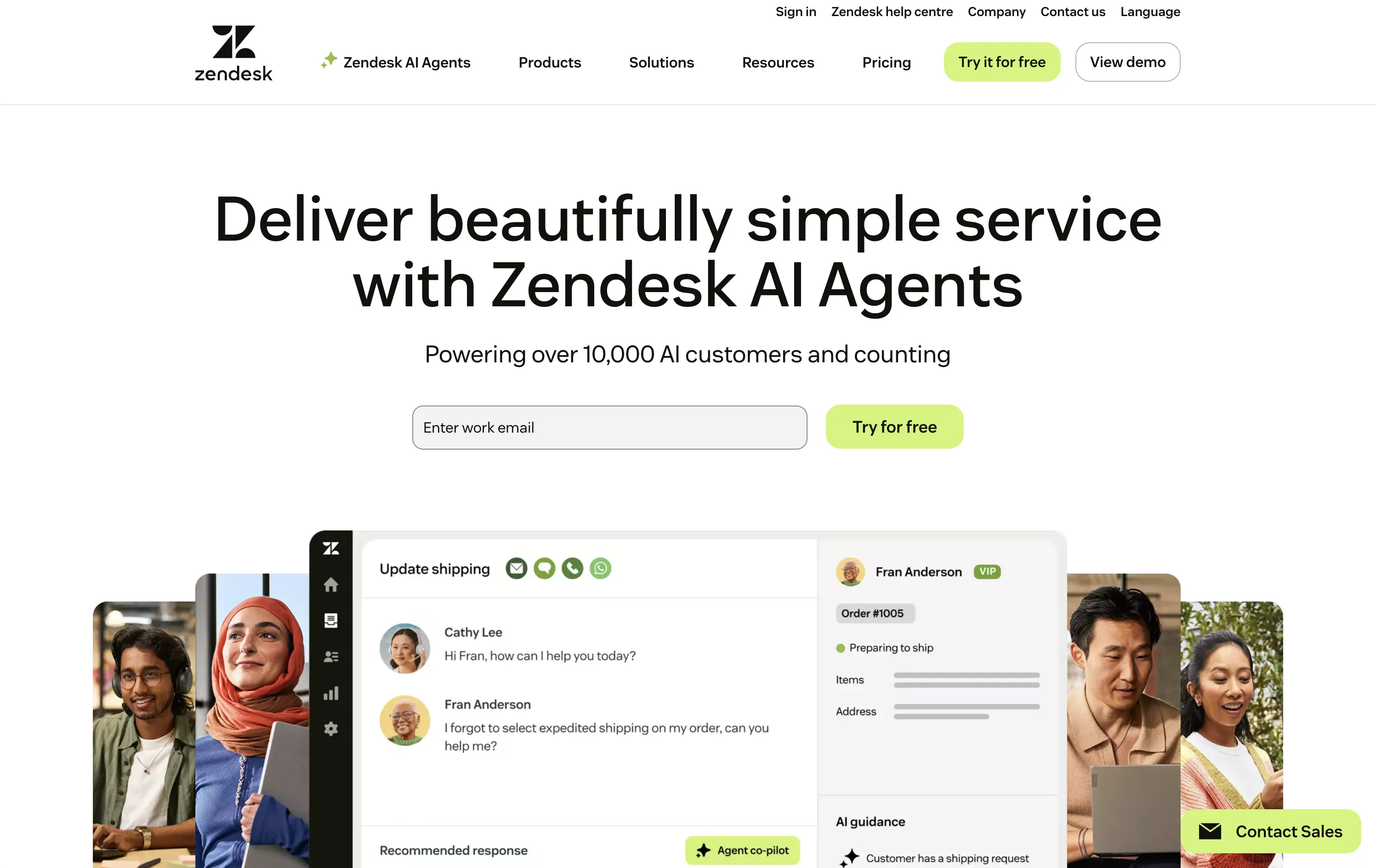
Zendesk provides cloud-based customer-service software and AI agents that let businesses deliver fast, omnichannel support at scale.
Spacious white canvas and oversized headline make the promise (“beautifully simple service”) instantly digestible. Warm staff-and-customer photos humanize the platform, while the embedded UI card proves product clarity. “Powering over 10,000 AI customers” adds quick trust, and the inline email field + lime-green “Try for free” button streamline conversion.
Aimed at scaling teams and enterprise leads. Clear product value, low learning curve, and social proof headline all reinforce maturity and market traction.
This layout balances technical utility with human impact, aligning well with Algolia’s positioning as an API-first but UX-aware company. The mobile UI reinforces product value visually, while the logo wall signals scale and trust for enterprise buyers. The tone is clear, benefit-led, and appropriate for high-intent decision-makers evaluating AI tools for customer experience. This is a solid enterprise-facing hero built to perform.
Zendesk
↗
SaaS
AI Tools
Centered
Professional
Email Capture
Media Gallery
Product UI
Light Mode
Green
Sans serif
B2B
Home Page
Custom Code
AI customer service, chat UI, CRM platform, customer success, clean layout, people-first visuals, trust signal, in-product preview, conversion optimized, large headline, email gate, freemium CTA, enterprise-ready
Zendesk provides cloud-based customer-service software and AI agents that let businesses deliver fast, omnichannel support at scale.
Spacious white canvas and oversized headline make the promise (“beautifully simple service”) instantly digestible. Warm staff-and-customer photos humanize the platform, while the embedded UI card proves product clarity. “Powering over 10,000 AI customers” adds quick trust, and the inline email field + lime-green “Try for free” button streamline conversion.
Aimed at scaling teams and enterprise leads. Clear product value, low learning curve, and social proof headline all reinforce maturity and market traction.
This layout balances technical utility with human impact, aligning well with Algolia’s positioning as an API-first but UX-aware company. The mobile UI reinforces product value visually, while the logo wall signals scale and trust for enterprise buyers. The tone is clear, benefit-led, and appropriate for high-intent decision-makers evaluating AI tools for customer experience. This is a solid enterprise-facing hero built to perform.
Kajabi
↗
SaaS
Creator Tools
Bento
Left-aligned
Aspirational
Empowering
Email Capture
Media Gallery
Live Metrics
Social Proof
Custom Animation
Light Mode
Red
Sans serif
B2C
Home Page
Webflow
creator economy, digital products, personal branding, monetization tools, testimonial-focused, bold headline, gradient cards, visual proof, email capture, energetic layout, high social proof, creator-first SaaS, aspirational branding
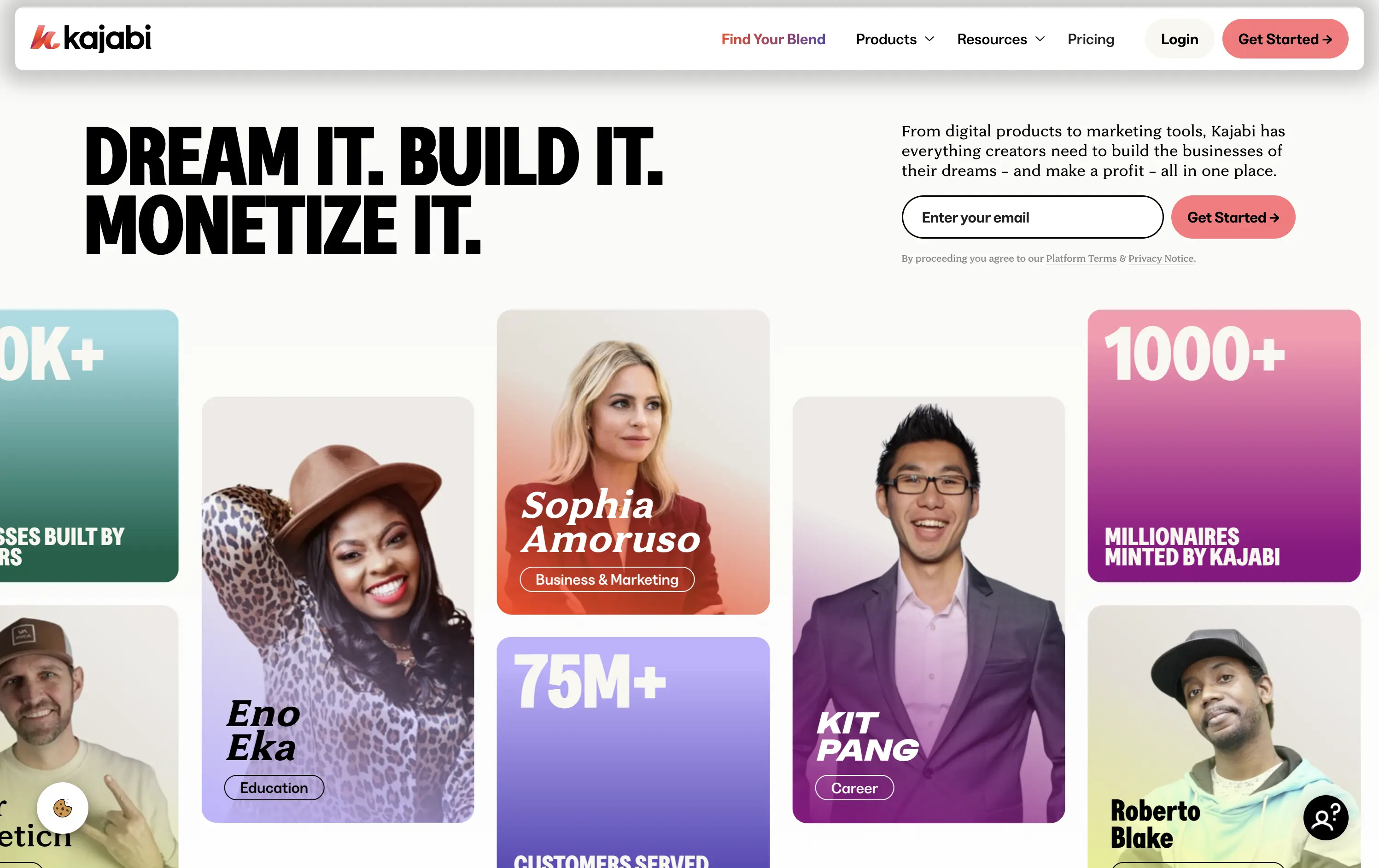
Kajabi is an all-in-one platform for creators to build, market, and monetize their digital products
Hero hits hard with credibility and momentum. Bold headline sets tone, though lacks clarity. Visual grid of creators and stats instantly builds trust. High-density layout may feel overwhelming on first load.
Designed to speak directly to ambitious creators. Social proof, earnings stats, and familiar faces reinforce Kajabi’s category leadership. Loud but tuned to audience mindset — performance-first, legitimacy-led, and conversion-aware.
This layout balances technical utility with human impact, aligning well with Algolia’s positioning as an API-first but UX-aware company. The mobile UI reinforces product value visually, while the logo wall signals scale and trust for enterprise buyers. The tone is clear, benefit-led, and appropriate for high-intent decision-makers evaluating AI tools for customer experience. This is a solid enterprise-facing hero built to perform.
Kajabi
↗
SaaS
Creator Tools
Bento
Left-aligned
Aspirational
Empowering
Email Capture
Media Gallery
Live Metrics
Social Proof
Custom Animation
Light Mode
Red
Sans serif
B2C
Home Page
Webflow
creator economy, digital products, personal branding, monetization tools, testimonial-focused, bold headline, gradient cards, visual proof, email capture, energetic layout, high social proof, creator-first SaaS, aspirational branding
Kajabi is an all-in-one platform for creators to build, market, and monetize their digital products
Hero hits hard with credibility and momentum. Bold headline sets tone, though lacks clarity. Visual grid of creators and stats instantly builds trust. High-density layout may feel overwhelming on first load.
Designed to speak directly to ambitious creators. Social proof, earnings stats, and familiar faces reinforce Kajabi’s category leadership. Loud but tuned to audience mindset — performance-first, legitimacy-led, and conversion-aware.
This layout balances technical utility with human impact, aligning well with Algolia’s positioning as an API-first but UX-aware company. The mobile UI reinforces product value visually, while the logo wall signals scale and trust for enterprise buyers. The tone is clear, benefit-led, and appropriate for high-intent decision-makers evaluating AI tools for customer experience. This is a solid enterprise-facing hero built to perform.
Buffer
↗
SaaS
Creator Tools
Productivity
Inset
Left-aligned
Aspirational
Email Capture
Live Metrics
Social Proof
Custom Animation
Light Mode
Green
Sans serif
Hybrid
Home Page
Custom Code
social media scheduler, content calendar tool, creator marketing SaaS, post automation, analytics, small-business growth
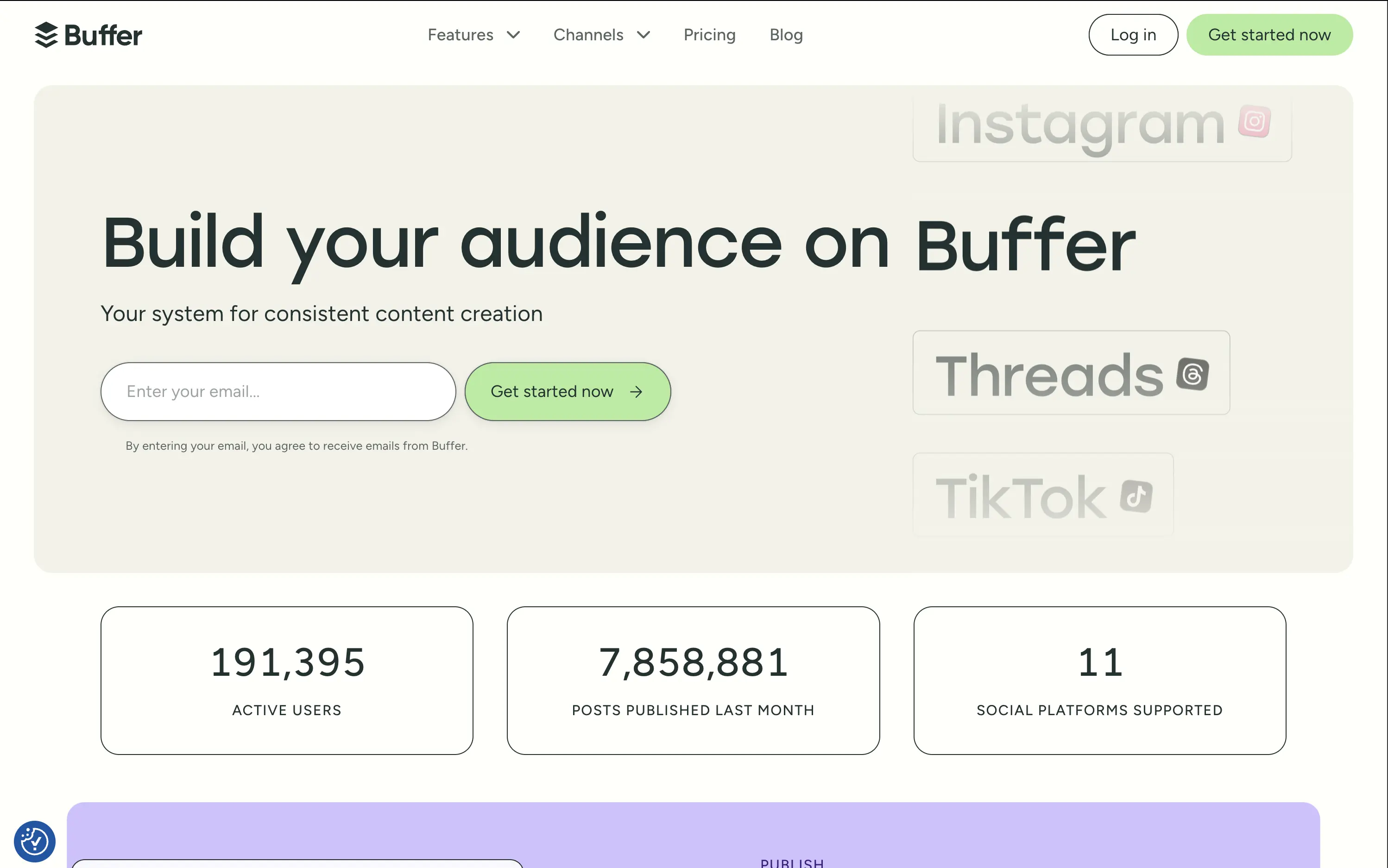
Buffer helps creators and teams grow their audience with simple tools to plan, publish, and track social content across multiple platforms.
The hero is calm and conversion-optimized. The oversized headline commands attention, while the clever marquee animation showcases integrations without visual overload. The inline email field reduces signup resistance and is paired with a soft green CTA for visual hierarchy. The hero balances aspirational tone with grounded proof (usage stats), but slightly muted contrast may reduce clarity on some screens.
Buffer leads with clarity and low effort — a smart choice for time-starved creators and marketers. Stats support credibility while tone avoids hype. The layout matches their no-fluff, practical brand positioning.
This layout balances technical utility with human impact, aligning well with Algolia’s positioning as an API-first but UX-aware company. The mobile UI reinforces product value visually, while the logo wall signals scale and trust for enterprise buyers. The tone is clear, benefit-led, and appropriate for high-intent decision-makers evaluating AI tools for customer experience. This is a solid enterprise-facing hero built to perform.
Buffer
↗
SaaS
Creator Tools
Productivity
Inset
Left-aligned
Aspirational
Email Capture
Live Metrics
Social Proof
Custom Animation
Light Mode
Green
Sans serif
Hybrid
Home Page
Custom Code
social media scheduler, content calendar tool, creator marketing SaaS, post automation, analytics, small-business growth
Buffer helps creators and teams grow their audience with simple tools to plan, publish, and track social content across multiple platforms.
The hero is calm and conversion-optimized. The oversized headline commands attention, while the clever marquee animation showcases integrations without visual overload. The inline email field reduces signup resistance and is paired with a soft green CTA for visual hierarchy. The hero balances aspirational tone with grounded proof (usage stats), but slightly muted contrast may reduce clarity on some screens.
Buffer leads with clarity and low effort — a smart choice for time-starved creators and marketers. Stats support credibility while tone avoids hype. The layout matches their no-fluff, practical brand positioning.
This layout balances technical utility with human impact, aligning well with Algolia’s positioning as an API-first but UX-aware company. The mobile UI reinforces product value visually, while the logo wall signals scale and trust for enterprise buyers. The tone is clear, benefit-led, and appropriate for high-intent decision-makers evaluating AI tools for customer experience. This is a solid enterprise-facing hero built to perform.
ClickFunnels
↗
SaaS
Creator Tools
Centered
Conversational
Aspirational
Email Capture
Interactive
Product UI
Custom Animation
Dark Mode
Yellow
Sans serif
Hybrid
Home Page
ClickFunnels
funnel builder, sales automation, opt-in focused, animated headline, creator economy, scroll-stopper, bold promise, conversion-first, email capture, dark mode, high energy, value-first, info-product, affiliate-heavy, landing page tools
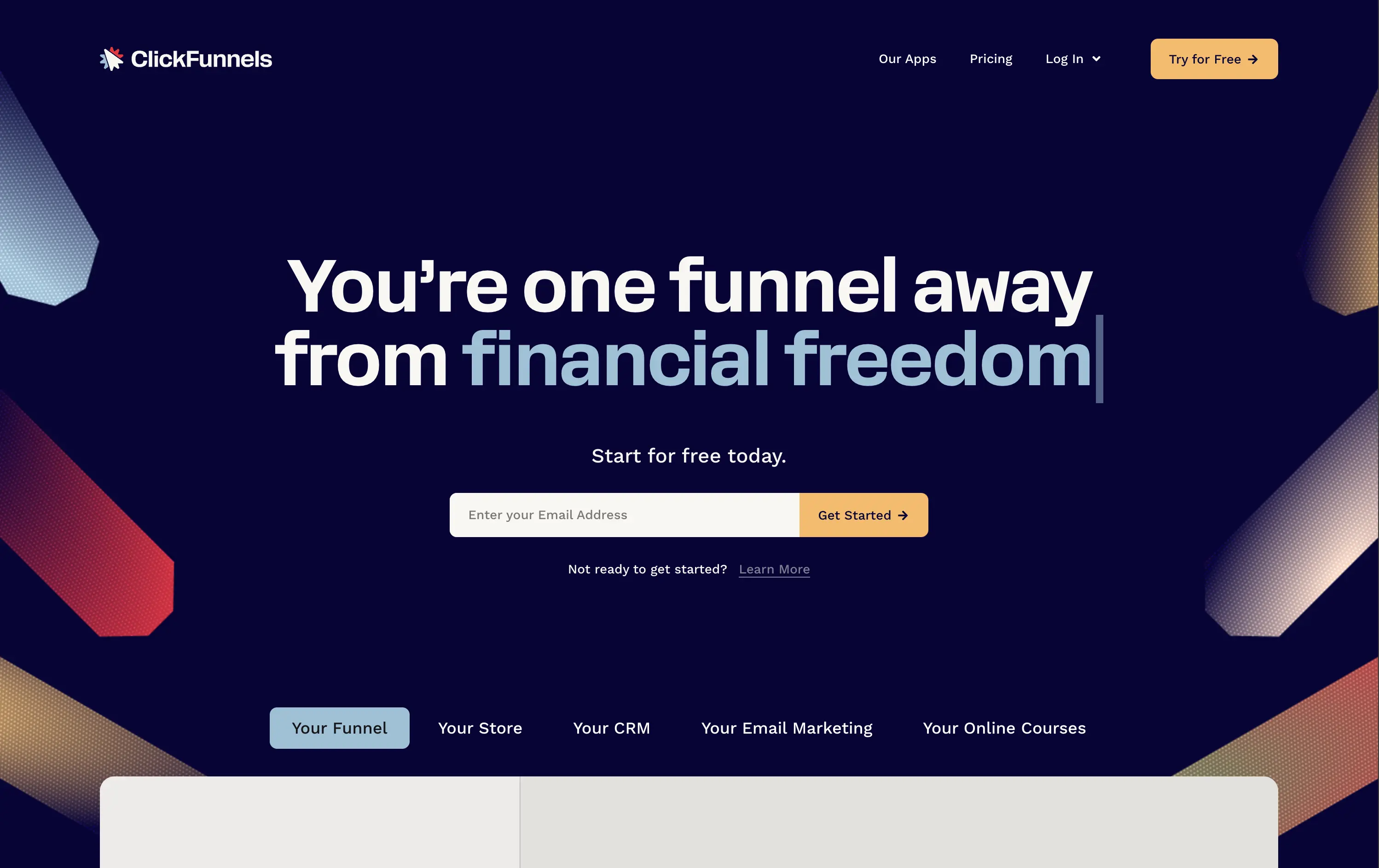
ClickFunnels is an all-in-one platform for building sales funnels, landing pages, and automating digital marketing.
Everything in this hero screams urgency and ambition. The headline animation and phrase “financial freedom” tap directly into aspirational triggers. The surrounding angled graphics guide the eye right to the CTA, and the contrasting orange button and centered layout make signup the only logical next step. Visuals are loud, but coherent. It’s built to convert.
ClickFunnels sells identity as much as software. It targets aspirational creators with a high-conviction offer and message. Clear visual direction, value promise, and frictionless signup make it performance-built.
This layout balances technical utility with human impact, aligning well with Algolia’s positioning as an API-first but UX-aware company. The mobile UI reinforces product value visually, while the logo wall signals scale and trust for enterprise buyers. The tone is clear, benefit-led, and appropriate for high-intent decision-makers evaluating AI tools for customer experience. This is a solid enterprise-facing hero built to perform.
ClickFunnels
↗
SaaS
Creator Tools
Centered
Conversational
Aspirational
Email Capture
Interactive
Product UI
Custom Animation
Dark Mode
Yellow
Sans serif
Hybrid
Home Page
ClickFunnels
funnel builder, sales automation, opt-in focused, animated headline, creator economy, scroll-stopper, bold promise, conversion-first, email capture, dark mode, high energy, value-first, info-product, affiliate-heavy, landing page tools
ClickFunnels is an all-in-one platform for building sales funnels, landing pages, and automating digital marketing.
Everything in this hero screams urgency and ambition. The headline animation and phrase “financial freedom” tap directly into aspirational triggers. The surrounding angled graphics guide the eye right to the CTA, and the contrasting orange button and centered layout make signup the only logical next step. Visuals are loud, but coherent. It’s built to convert.
ClickFunnels sells identity as much as software. It targets aspirational creators with a high-conviction offer and message. Clear visual direction, value promise, and frictionless signup make it performance-built.
This layout balances technical utility with human impact, aligning well with Algolia’s positioning as an API-first but UX-aware company. The mobile UI reinforces product value visually, while the logo wall signals scale and trust for enterprise buyers. The tone is clear, benefit-led, and appropriate for high-intent decision-makers evaluating AI tools for customer experience. This is a solid enterprise-facing hero built to perform.
Airwallex
↗
SaaS
Fintech
Split Grid
Left-aligned
Bold & Direct
Email Capture
Logo Wall
Product UI
Social Proof
Light Mode
Purple
Sans serif
B2B
Home Page
Custom Code
global payments, business finance platform, modern fintech, trust-first messaging, clear value prop, multi-CTA, enterprise growth focus, mobile-first UI, clean grid, bold headline, subtle social proof, form-first hero, platform consolidation
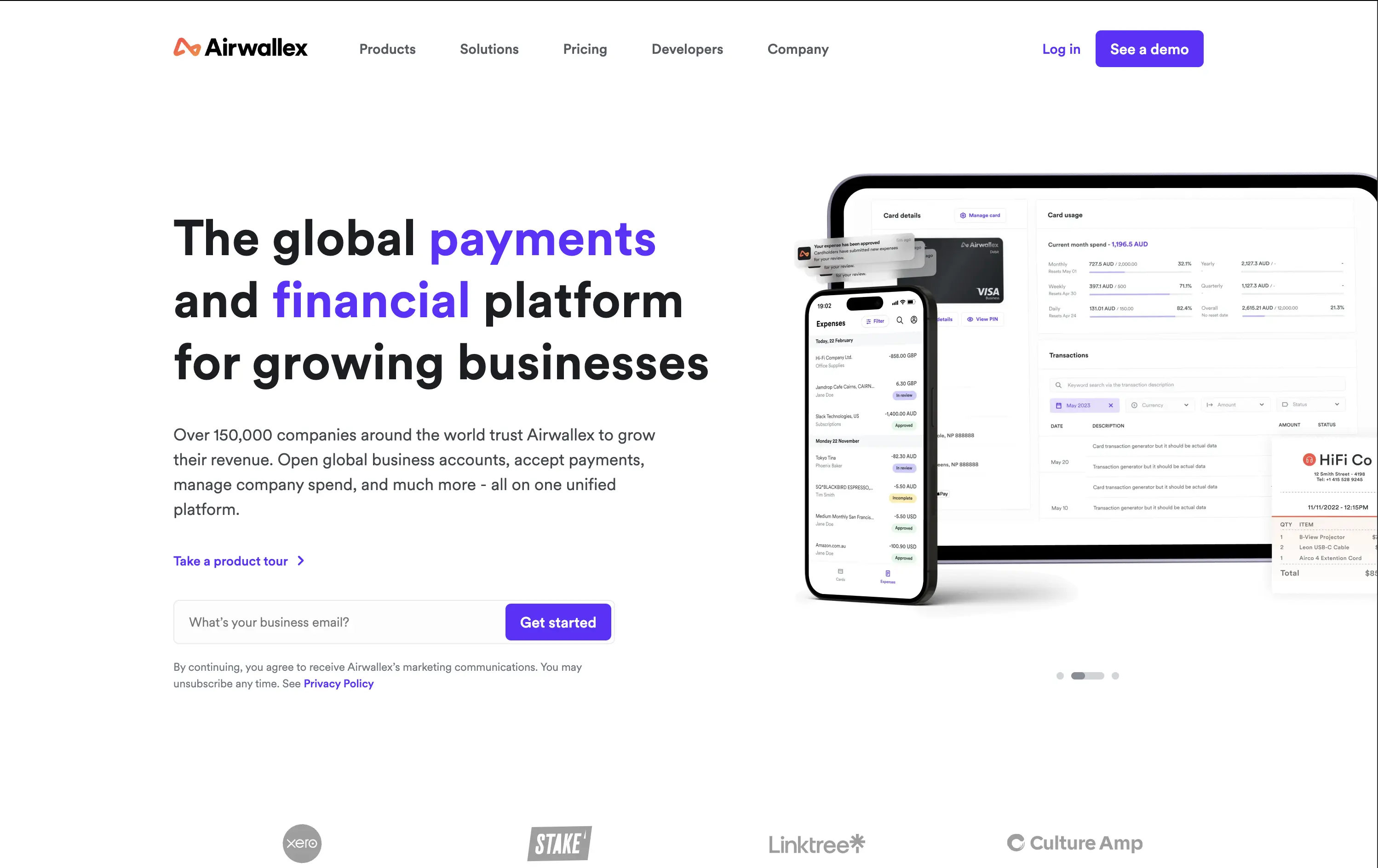
Airwallex helps businesses grow globally by simplifying payments, expenses, and financial operations in one platform.
The hero is clean, confident, and product-led. It showcases both mobile and desktop views, reinforcing versatility. The email CTA is low-friction and conversion-ready. Copy hits major trust levers—global scale, growth, and simplicity—without bloating.
Well-calibrated for a mid-to-enterprise audience seeking global financial control. It’s benefit-led without hyperbole and supports multiple buyer types with a calm, scalable tone. The product visuals back up the value promise.
This layout balances technical utility with human impact, aligning well with Algolia’s positioning as an API-first but UX-aware company. The mobile UI reinforces product value visually, while the logo wall signals scale and trust for enterprise buyers. The tone is clear, benefit-led, and appropriate for high-intent decision-makers evaluating AI tools for customer experience. This is a solid enterprise-facing hero built to perform.
Airwallex
↗
SaaS
Fintech
Split Grid
Left-aligned
Bold & Direct
Email Capture
Logo Wall
Product UI
Social Proof
Light Mode
Purple
Sans serif
B2B
Home Page
Custom Code
global payments, business finance platform, modern fintech, trust-first messaging, clear value prop, multi-CTA, enterprise growth focus, mobile-first UI, clean grid, bold headline, subtle social proof, form-first hero, platform consolidation
Airwallex helps businesses grow globally by simplifying payments, expenses, and financial operations in one platform.
The hero is clean, confident, and product-led. It showcases both mobile and desktop views, reinforcing versatility. The email CTA is low-friction and conversion-ready. Copy hits major trust levers—global scale, growth, and simplicity—without bloating.
Well-calibrated for a mid-to-enterprise audience seeking global financial control. It’s benefit-led without hyperbole and supports multiple buyer types with a calm, scalable tone. The product visuals back up the value promise.
This layout balances technical utility with human impact, aligning well with Algolia’s positioning as an API-first but UX-aware company. The mobile UI reinforces product value visually, while the logo wall signals scale and trust for enterprise buyers. The tone is clear, benefit-led, and appropriate for high-intent decision-makers evaluating AI tools for customer experience. This is a solid enterprise-facing hero built to perform.
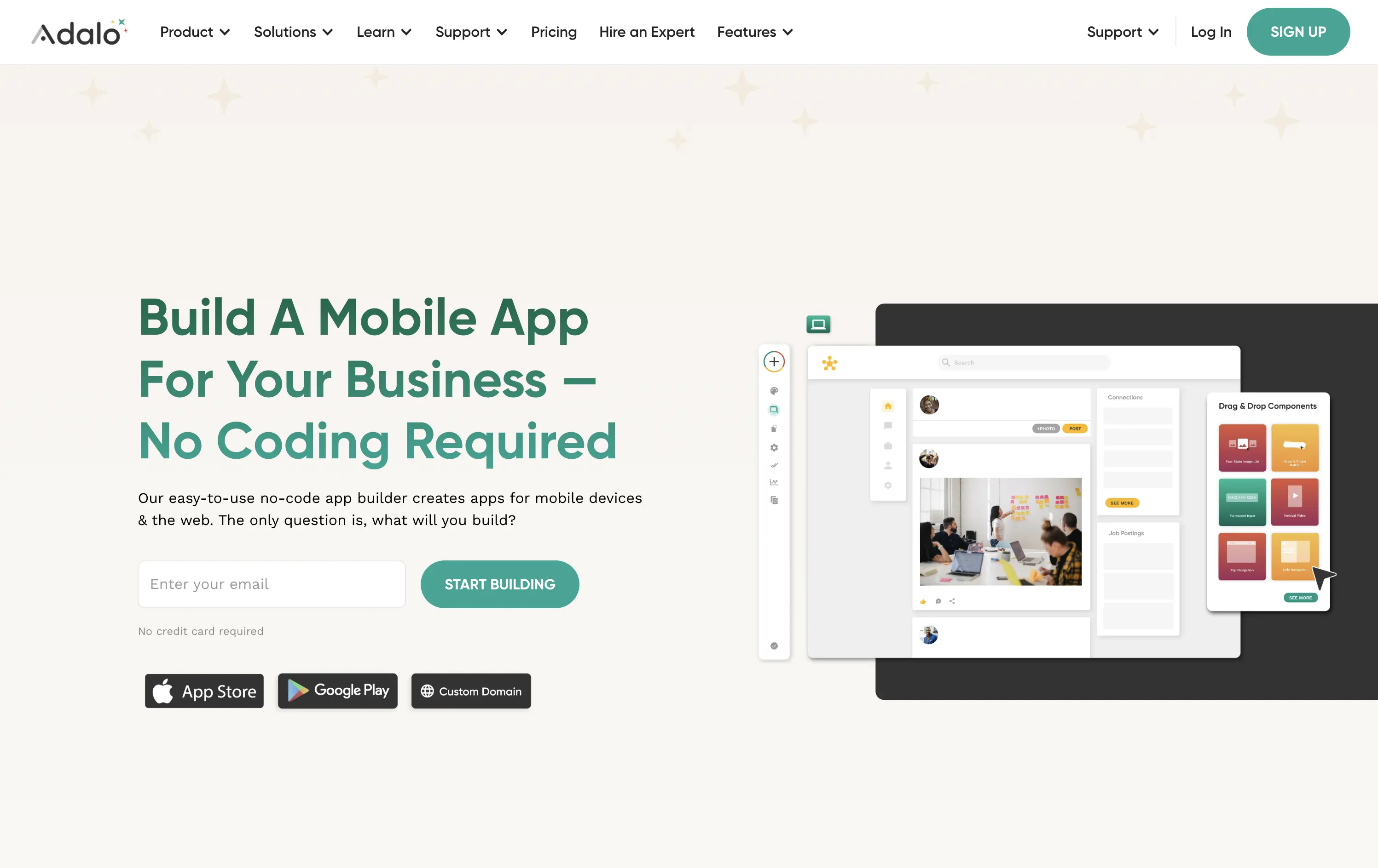
Adalo
↗
SaaS
No-Code
Creative Tools
Split Grid
Left-aligned
Benefit-Driven
Descriptive
Email Capture
Product UI
Duotone
Green
Sans serif
Hybrid
Home Page
Webflow
no-code builder, early-stage vibe, product-led growth, friendly UI, starter-friendly, clear CTA, drag-and-drop visual, email-first CTA, low-barrier signup, mobile-first, DIY tech, warm palette, creator tools, approachable tone, utility-first
Adalo lets anyone build mobile and web apps without coding using an easy drag-and-drop editor and built-in components.
The layout is clean, welcoming, and communicates ease of use. Visual UI gives confidence, and the input field softens conversion friction. It appeals to non-technical founders well but doesn’t carve out much distinctiveness from competitors in the same space.
This hero aligns well with beginner creators. It plays to comfort and simplicity, though it misses an edge in differentiating speed, success stories, or creative freedom.
This layout balances technical utility with human impact, aligning well with Algolia’s positioning as an API-first but UX-aware company. The mobile UI reinforces product value visually, while the logo wall signals scale and trust for enterprise buyers. The tone is clear, benefit-led, and appropriate for high-intent decision-makers evaluating AI tools for customer experience. This is a solid enterprise-facing hero built to perform.
The most effective hero sections in your inbox.
Monthly round up of top hero sections.
Don't worry. We hate spam too.
Don't worry. We hate spam too.
Don't worry. We hate spam too.