Empowering
18
18
18
18
Uplifting tone that positions the user as the hero — often used in wellness, coaching, or tools for change.
Filters
Later
↗
SaaS
Creator Tools
Productivity
Centered
Descriptive
Empowering
Email Capture
Photography
Media Gallery
Logo Wall
Gradient
Blue
Sans serif
B2B
Home Page
Custom Code
influencer CRM, creator marketing platform, lead gen UI, campaign planning tool, social media SaaS, conversion-first layout, creator showcase, email-first CTA, SaaS for brands, bright
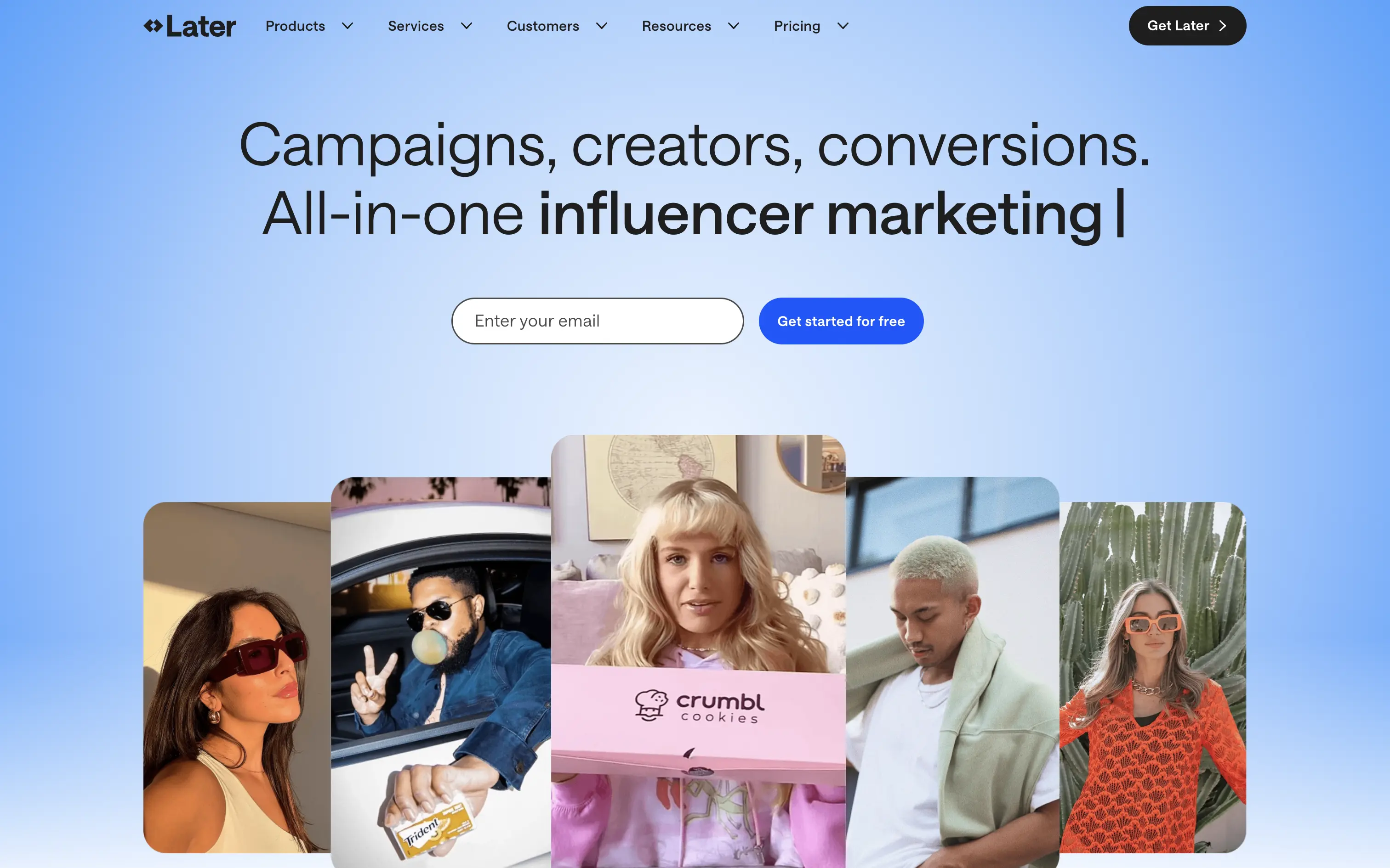
Later is a creator marketing platform helping brands manage influencer campaigns from outreach to ROI.
A functional, no-nonsense SaaS hero. Focused on conversion with a soft blue gradient and creator image bar to build immediate visual relevance. Email-first CTA lowers friction.
Safe and effective for B2B marketing leads. The layout is built for clarity over creativity. Great for scale, but it doesn’t carve out a unique visual or tonal niche.
This layout balances technical utility with human impact, aligning well with Algolia’s positioning as an API-first but UX-aware company. The mobile UI reinforces product value visually, while the logo wall signals scale and trust for enterprise buyers. The tone is clear, benefit-led, and appropriate for high-intent decision-makers evaluating AI tools for customer experience. This is a solid enterprise-facing hero built to perform.
Later
↗
SaaS
Creator Tools
Productivity
Centered
Descriptive
Empowering
Email Capture
Photography
Media Gallery
Logo Wall
Gradient
Blue
Sans serif
B2B
Home Page
Custom Code
influencer CRM, creator marketing platform, lead gen UI, campaign planning tool, social media SaaS, conversion-first layout, creator showcase, email-first CTA, SaaS for brands, bright
Later is a creator marketing platform helping brands manage influencer campaigns from outreach to ROI.
A functional, no-nonsense SaaS hero. Focused on conversion with a soft blue gradient and creator image bar to build immediate visual relevance. Email-first CTA lowers friction.
Safe and effective for B2B marketing leads. The layout is built for clarity over creativity. Great for scale, but it doesn’t carve out a unique visual or tonal niche.
This layout balances technical utility with human impact, aligning well with Algolia’s positioning as an API-first but UX-aware company. The mobile UI reinforces product value visually, while the logo wall signals scale and trust for enterprise buyers. The tone is clear, benefit-led, and appropriate for high-intent decision-makers evaluating AI tools for customer experience. This is a solid enterprise-facing hero built to perform.
Wand
↗
AI Tools
Creative Tools
Centered
Aspirational
Empowering
Download App
Single Button
Video
Product UI
Imagery-Based
Blue
Sans serif
B2C
Home Page
Webflow
sketch-to-render, iOS-first, AI for artists, Apple Pencil UX, generative design, creative tooling, mobile-first AI, aspirational motion, immersive product demo, minimal CTA, emotional tech
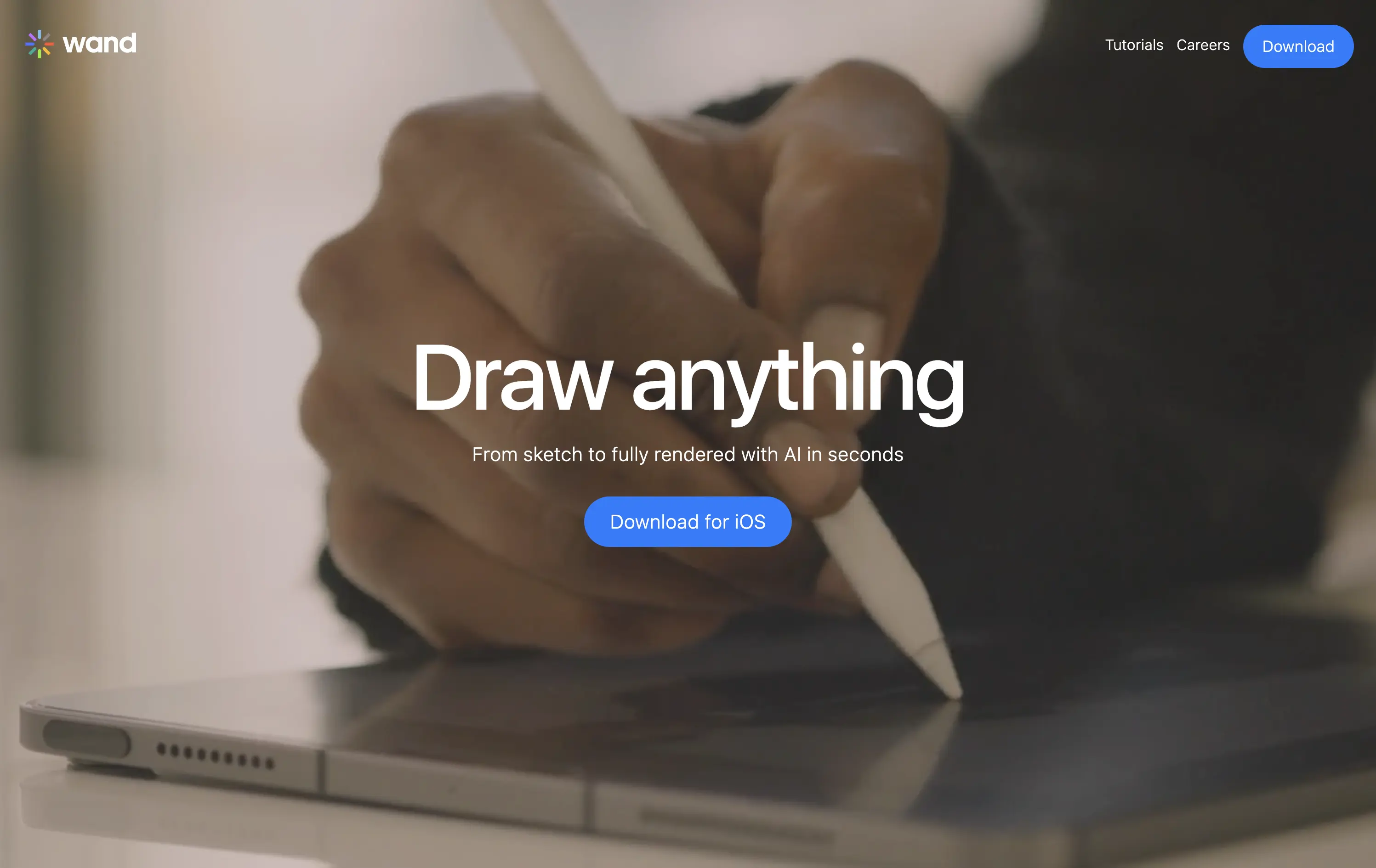
Wand is an iOS app that transforms hand-drawn sketches into fully rendered images using AI—fast, simple, and intuitive.
The full-screen video speaks louder than the copy. You see the product’s value in real time. It’s immersive, emotionally resonant, and gives instant context—but assumes the viewer will wait and watch.
Wand leans into aspiration and emotion to sell its power. The video-first hero positions the tool as magical and tactile. It’s a strong brand move but could benefit from a secondary line for clarity or onboarding.
This layout balances technical utility with human impact, aligning well with Algolia’s positioning as an API-first but UX-aware company. The mobile UI reinforces product value visually, while the logo wall signals scale and trust for enterprise buyers. The tone is clear, benefit-led, and appropriate for high-intent decision-makers evaluating AI tools for customer experience. This is a solid enterprise-facing hero built to perform.
Wand
↗
AI Tools
Creative Tools
Centered
Aspirational
Empowering
Download App
Single Button
Video
Product UI
Imagery-Based
Blue
Sans serif
B2C
Home Page
Webflow
sketch-to-render, iOS-first, AI for artists, Apple Pencil UX, generative design, creative tooling, mobile-first AI, aspirational motion, immersive product demo, minimal CTA, emotional tech
Wand is an iOS app that transforms hand-drawn sketches into fully rendered images using AI—fast, simple, and intuitive.
The full-screen video speaks louder than the copy. You see the product’s value in real time. It’s immersive, emotionally resonant, and gives instant context—but assumes the viewer will wait and watch.
Wand leans into aspiration and emotion to sell its power. The video-first hero positions the tool as magical and tactile. It’s a strong brand move but could benefit from a secondary line for clarity or onboarding.
This layout balances technical utility with human impact, aligning well with Algolia’s positioning as an API-first but UX-aware company. The mobile UI reinforces product value visually, while the logo wall signals scale and trust for enterprise buyers. The tone is clear, benefit-led, and appropriate for high-intent decision-makers evaluating AI tools for customer experience. This is a solid enterprise-facing hero built to perform.
Gamma
↗
AI Tools
Creative Tools
Productivity
Split Grid
Left-aligned
Descriptive
Empowering
Multi-CTA Block
Watch Demo
Illustration
Media Gallery
Interactive
Light Mode
Blue
Sans serif
Hybrid
Home Page
Custom Code
AI presentation tool, whimsical 3D art, surreal imagery, smooth onboarding, soft brand tone, vertical carousel, intuitive UX, layout-focused demo, pastel aesthetic, creative AI tool, friendly product language
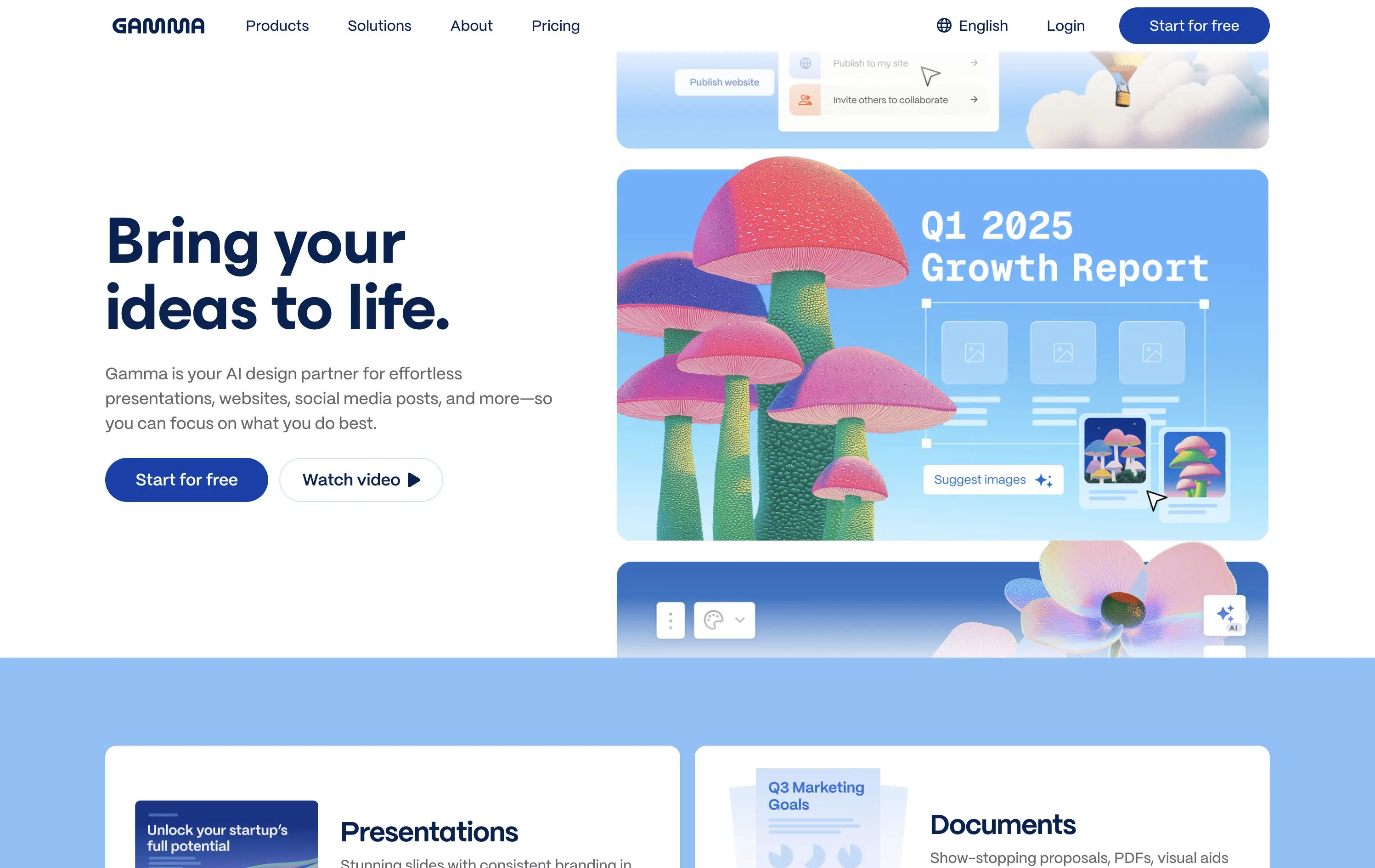
Gamma is an AI-powered design platform that helps users create beautiful presentations, websites, and docs effortlessly.
The carousel introduces Gamma’s features visually without overwhelming the user. The surreal illustration style immediately grabs attention, and the copy reinforces ease-of-use and creativity.
Gamma positions itself as a non-intimidating AI tool for creative productivity. Visuals, layout, and tone all serve to lower the barrier for entry and increase relatability.
This layout balances technical utility with human impact, aligning well with Algolia’s positioning as an API-first but UX-aware company. The mobile UI reinforces product value visually, while the logo wall signals scale and trust for enterprise buyers. The tone is clear, benefit-led, and appropriate for high-intent decision-makers evaluating AI tools for customer experience. This is a solid enterprise-facing hero built to perform.
Gamma
↗
AI Tools
Creative Tools
Productivity
Split Grid
Left-aligned
Descriptive
Empowering
Multi-CTA Block
Watch Demo
Illustration
Media Gallery
Interactive
Light Mode
Blue
Sans serif
Hybrid
Home Page
Custom Code
AI presentation tool, whimsical 3D art, surreal imagery, smooth onboarding, soft brand tone, vertical carousel, intuitive UX, layout-focused demo, pastel aesthetic, creative AI tool, friendly product language
Gamma is an AI-powered design platform that helps users create beautiful presentations, websites, and docs effortlessly.
The carousel introduces Gamma’s features visually without overwhelming the user. The surreal illustration style immediately grabs attention, and the copy reinforces ease-of-use and creativity.
Gamma positions itself as a non-intimidating AI tool for creative productivity. Visuals, layout, and tone all serve to lower the barrier for entry and increase relatability.
This layout balances technical utility with human impact, aligning well with Algolia’s positioning as an API-first but UX-aware company. The mobile UI reinforces product value visually, while the logo wall signals scale and trust for enterprise buyers. The tone is clear, benefit-led, and appropriate for high-intent decision-makers evaluating AI tools for customer experience. This is a solid enterprise-facing hero built to perform.
Make
↗
No-Code
Productivity
Split Grid
Descriptive
Empowering
Multi-CTA Block
Video
Announcement
Duotone
Pink
Sans serif
Hybrid
Home Page
Custom Code
no-code automation, workflow builder, AI integration, drag-and-drop editor, Zapier alternative, clear onboarding, SaaS demo UX, trust-focused layout, commercial SaaS, AI-enhanced logic
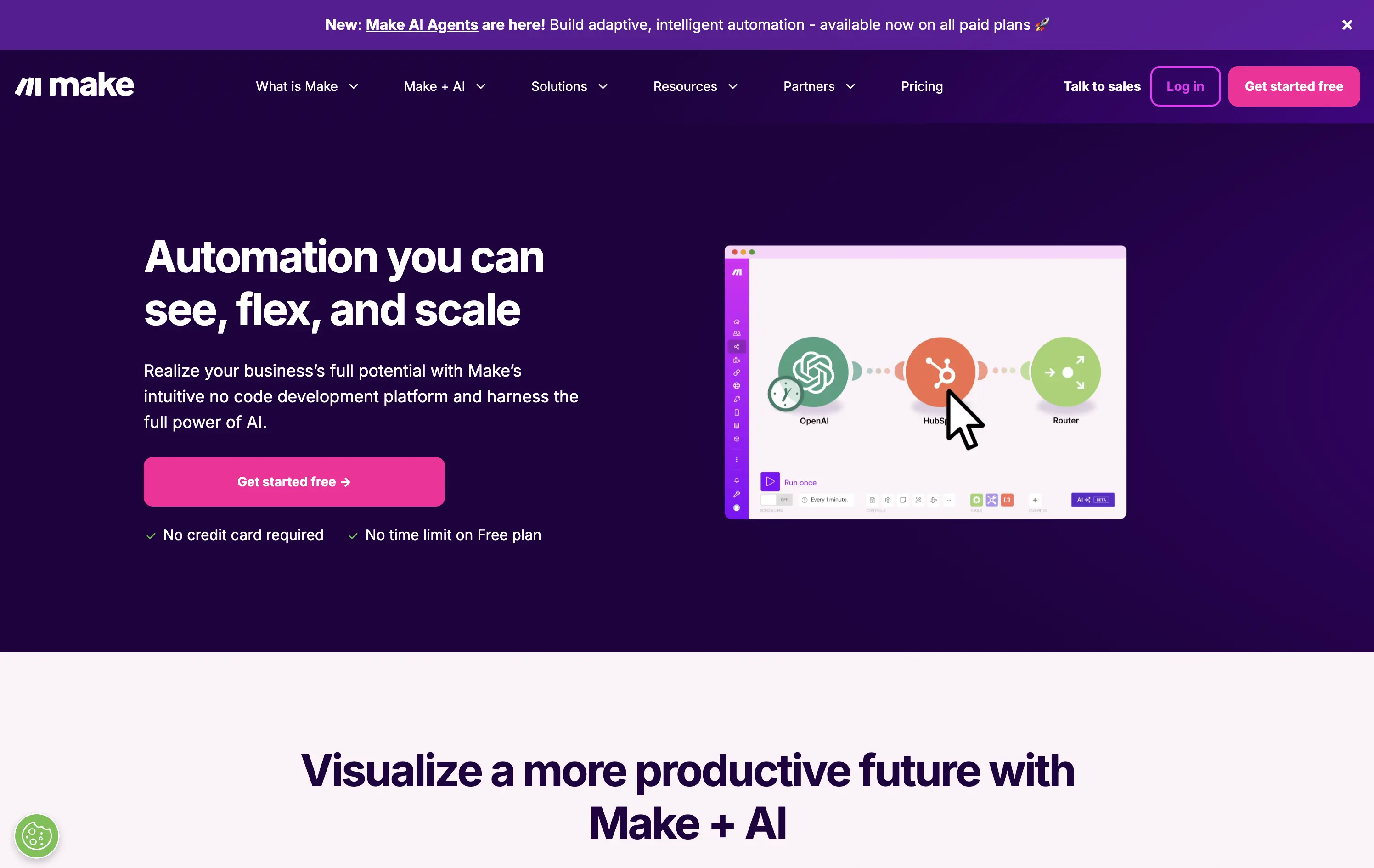
Make is a no-code automation platform that lets businesses visually build and scale workflows powered by AI.
It’s clean, clear, and direct. The animated product video does the heavy lifting. The layout and copy are textbook SaaS—efficient but forgettable. It communicates function well without taking any design risks.
Optimized for clarity and ease of adoption. Great for users shopping for workflow tools, but lacks brand distinctiveness. Plays it safe with a universal SaaS format and gradient palette.
This layout balances technical utility with human impact, aligning well with Algolia’s positioning as an API-first but UX-aware company. The mobile UI reinforces product value visually, while the logo wall signals scale and trust for enterprise buyers. The tone is clear, benefit-led, and appropriate for high-intent decision-makers evaluating AI tools for customer experience. This is a solid enterprise-facing hero built to perform.
Make
↗
No-Code
Productivity
Split Grid
Descriptive
Empowering
Multi-CTA Block
Video
Announcement
Duotone
Pink
Sans serif
Hybrid
Home Page
Custom Code
no-code automation, workflow builder, AI integration, drag-and-drop editor, Zapier alternative, clear onboarding, SaaS demo UX, trust-focused layout, commercial SaaS, AI-enhanced logic
Make is a no-code automation platform that lets businesses visually build and scale workflows powered by AI.
It’s clean, clear, and direct. The animated product video does the heavy lifting. The layout and copy are textbook SaaS—efficient but forgettable. It communicates function well without taking any design risks.
Optimized for clarity and ease of adoption. Great for users shopping for workflow tools, but lacks brand distinctiveness. Plays it safe with a universal SaaS format and gradient palette.
This layout balances technical utility with human impact, aligning well with Algolia’s positioning as an API-first but UX-aware company. The mobile UI reinforces product value visually, while the logo wall signals scale and trust for enterprise buyers. The tone is clear, benefit-led, and appropriate for high-intent decision-makers evaluating AI tools for customer experience. This is a solid enterprise-facing hero built to perform.
Mem
↗
AI Tools
Productivity
Inset
Centered
Benefit-Driven
Empowering
Single Button
Product UI
Announcement
Gradient
Light Mode
Pink
Purple
Sans serif
B2C
Home Page
Framer
ai note app, ambient UI, productivity tool, second brain, writing partner, connected thoughts, knowledge management, pastel color gradient, Gen Z tone, soft product UI, memory system, fast capture, personal knowledge base
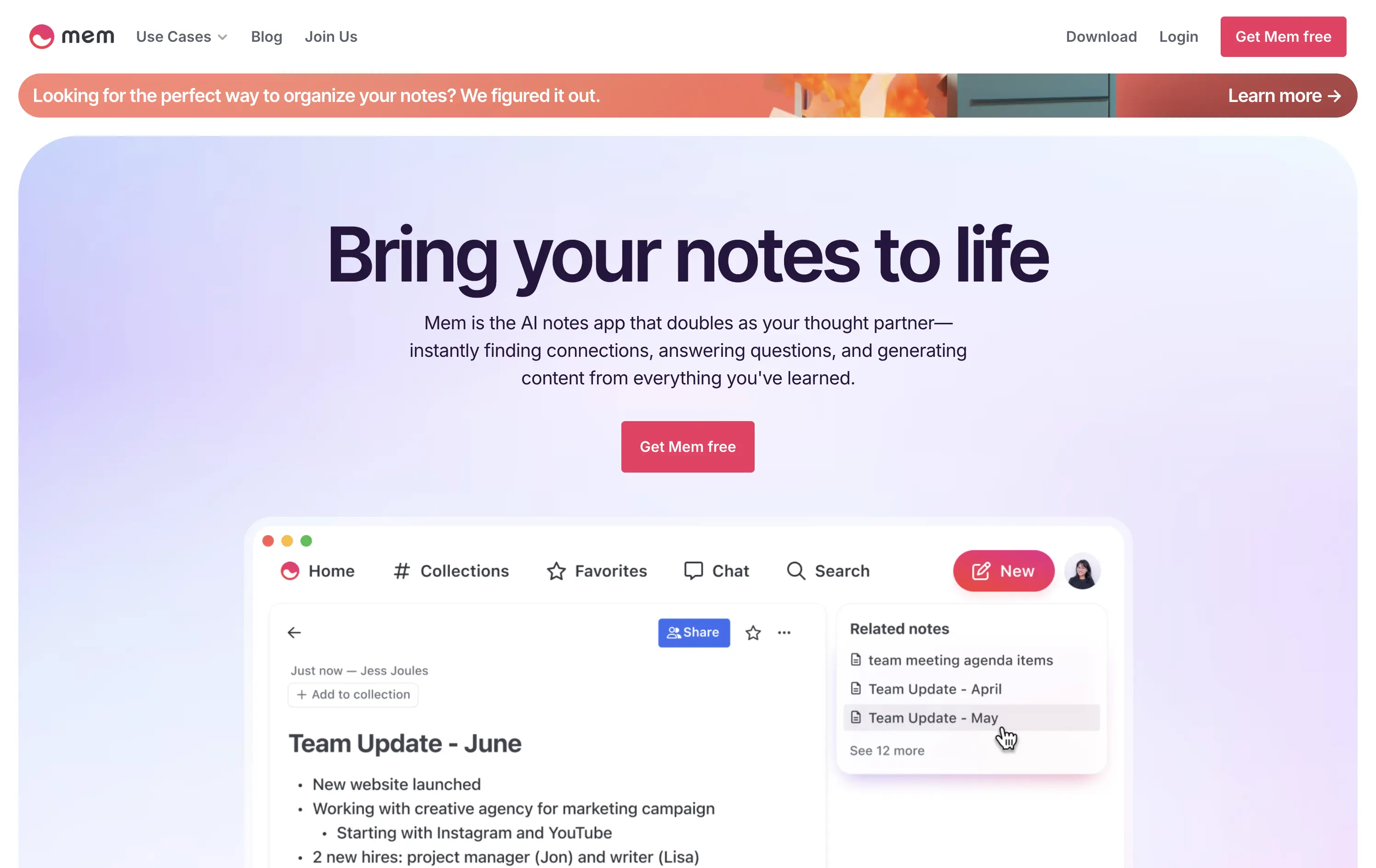
Mem is an AI-powered note-taking app that helps users organize thoughts, generate content, and uncover connections automatically.
Clear and emotional headline matched with a simple product UI. CTA stands out visually. Gradient background and calm visual rhythm support a productivity mindset. Overall, well-structured but slightly generic in messaging.
Positioning as a thought partner sets it apart from basic note apps. Hero leans into AI assistance without overwhelming technicality. Good emotional framing for a consumer productivity tool.
This layout balances technical utility with human impact, aligning well with Algolia’s positioning as an API-first but UX-aware company. The mobile UI reinforces product value visually, while the logo wall signals scale and trust for enterprise buyers. The tone is clear, benefit-led, and appropriate for high-intent decision-makers evaluating AI tools for customer experience. This is a solid enterprise-facing hero built to perform.
Mem
↗
AI Tools
Productivity
Inset
Centered
Benefit-Driven
Empowering
Single Button
Product UI
Announcement
Gradient
Light Mode
Pink
Purple
Sans serif
B2C
Home Page
Framer
ai note app, ambient UI, productivity tool, second brain, writing partner, connected thoughts, knowledge management, pastel color gradient, Gen Z tone, soft product UI, memory system, fast capture, personal knowledge base
Mem is an AI-powered note-taking app that helps users organize thoughts, generate content, and uncover connections automatically.
Clear and emotional headline matched with a simple product UI. CTA stands out visually. Gradient background and calm visual rhythm support a productivity mindset. Overall, well-structured but slightly generic in messaging.
Positioning as a thought partner sets it apart from basic note apps. Hero leans into AI assistance without overwhelming technicality. Good emotional framing for a consumer productivity tool.
This layout balances technical utility with human impact, aligning well with Algolia’s positioning as an API-first but UX-aware company. The mobile UI reinforces product value visually, while the logo wall signals scale and trust for enterprise buyers. The tone is clear, benefit-led, and appropriate for high-intent decision-makers evaluating AI tools for customer experience. This is a solid enterprise-facing hero built to perform.
Coda
↗
SaaS
Collaboration
Productivity
Left-aligned
Descriptive
Empowering
Multi-CTA Block
Product UI
Duotone
White
Yellow
Display
Sans serif
Hybrid
Home Page
Custom Code
doc-as-app, team workflow, internal tools, collaborative workspace, UI product demo, hybrid teams, sales enablement, project brief, minimal design, low-code logic, enterprise-friendly, live multiplayer,
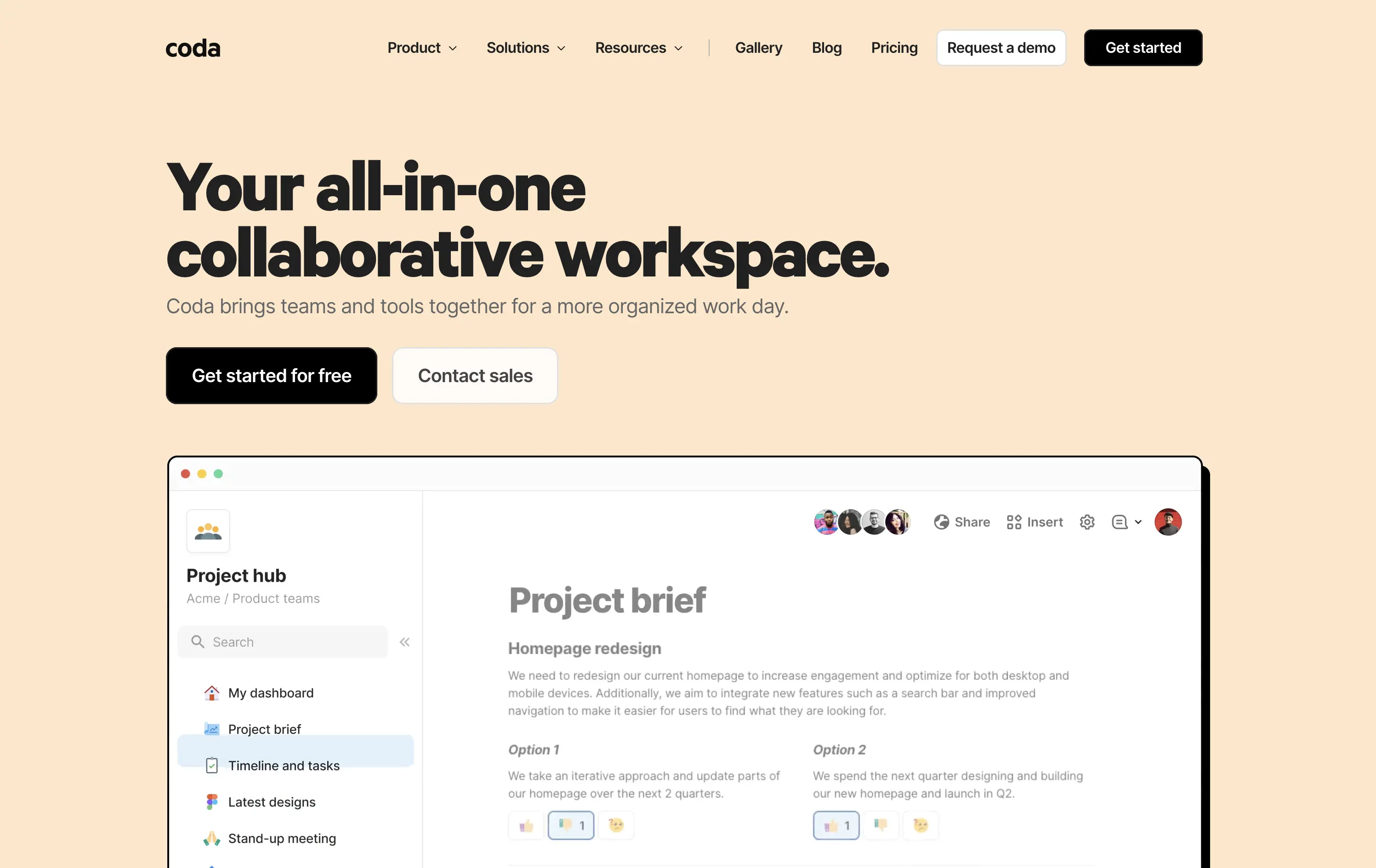
Coda is a collaborative doc platform that combines documents, spreadsheets, and apps into one unified workspace for teams.
The hero communicates clearly with a straightforward headline and strong product shot. Layout is easy to follow, and the dual CTA gives distinct paths for self-serve or sales-led funnels. The visual hierarchy is solid, though not emotionally charged.
Coda leads with clarity over flash. The message and layout prioritize breadth of use and enterprise readiness. Great fit for decision-makers looking to unify scattered tools into a single workspace.
This layout balances technical utility with human impact, aligning well with Algolia’s positioning as an API-first but UX-aware company. The mobile UI reinforces product value visually, while the logo wall signals scale and trust for enterprise buyers. The tone is clear, benefit-led, and appropriate for high-intent decision-makers evaluating AI tools for customer experience. This is a solid enterprise-facing hero built to perform.
Coda
↗
SaaS
Collaboration
Productivity
Left-aligned
Descriptive
Empowering
Multi-CTA Block
Product UI
Duotone
White
Yellow
Display
Sans serif
Hybrid
Home Page
Custom Code
doc-as-app, team workflow, internal tools, collaborative workspace, UI product demo, hybrid teams, sales enablement, project brief, minimal design, low-code logic, enterprise-friendly, live multiplayer,
Coda is a collaborative doc platform that combines documents, spreadsheets, and apps into one unified workspace for teams.
The hero communicates clearly with a straightforward headline and strong product shot. Layout is easy to follow, and the dual CTA gives distinct paths for self-serve or sales-led funnels. The visual hierarchy is solid, though not emotionally charged.
Coda leads with clarity over flash. The message and layout prioritize breadth of use and enterprise readiness. Great fit for decision-makers looking to unify scattered tools into a single workspace.
This layout balances technical utility with human impact, aligning well with Algolia’s positioning as an API-first but UX-aware company. The mobile UI reinforces product value visually, while the logo wall signals scale and trust for enterprise buyers. The tone is clear, benefit-led, and appropriate for high-intent decision-makers evaluating AI tools for customer experience. This is a solid enterprise-facing hero built to perform.
Softr
↗
SaaS
No-Code
Centered
Descriptive
Empowering
Single Button
Product UI
Announcement
Light Mode
Black
Sans serif
B2B
Home Page
Webflow
no-code builder, grid background, empowering language, SaaS homepage, CRM dashboard UI, announcement pill, onboarding-friendly, clean layout, business automation, early-stage SaaS, Coda integration, custom apps, tool for operations, low-friction CTA
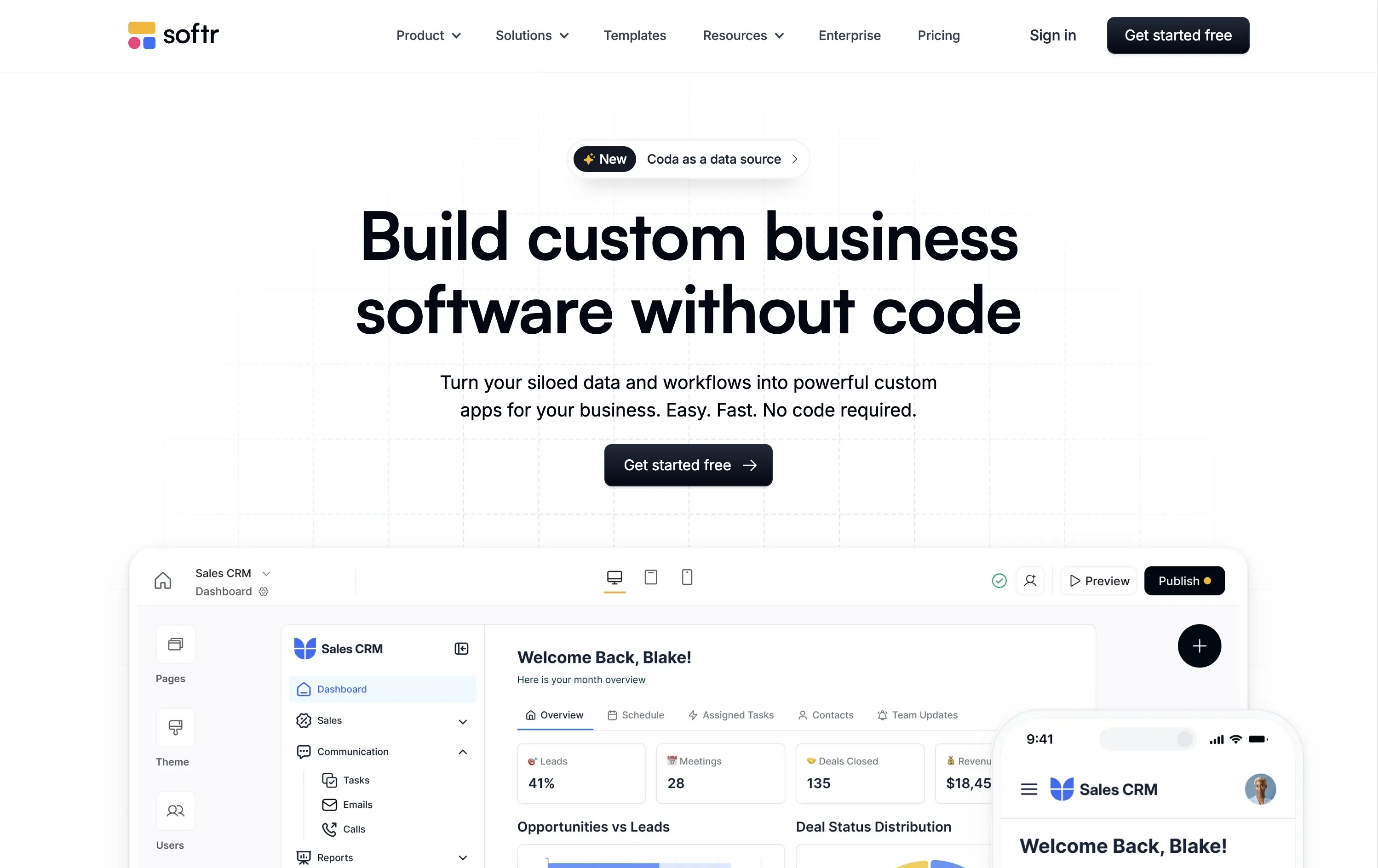
Softr lets you build custom internal tools, portals, and apps from your business data without writing any code.
Clear, product-led hero that instantly communicates value. The main headline is bold and simple, and the visual shows real product UI. New feature callout adds relevance. Overall, conversion-friendly.
Strong fit for practical decision-makers who value clarity and speed. Clean layout and tone match the product’s accessible, productivity-first positioning. Shows rather than tells.
This layout balances technical utility with human impact, aligning well with Algolia’s positioning as an API-first but UX-aware company. The mobile UI reinforces product value visually, while the logo wall signals scale and trust for enterprise buyers. The tone is clear, benefit-led, and appropriate for high-intent decision-makers evaluating AI tools for customer experience. This is a solid enterprise-facing hero built to perform.
Softr
↗
SaaS
No-Code
Centered
Descriptive
Empowering
Single Button
Product UI
Announcement
Light Mode
Black
Sans serif
B2B
Home Page
Webflow
no-code builder, grid background, empowering language, SaaS homepage, CRM dashboard UI, announcement pill, onboarding-friendly, clean layout, business automation, early-stage SaaS, Coda integration, custom apps, tool for operations, low-friction CTA
Softr lets you build custom internal tools, portals, and apps from your business data without writing any code.
Clear, product-led hero that instantly communicates value. The main headline is bold and simple, and the visual shows real product UI. New feature callout adds relevance. Overall, conversion-friendly.
Strong fit for practical decision-makers who value clarity and speed. Clean layout and tone match the product’s accessible, productivity-first positioning. Shows rather than tells.
This layout balances technical utility with human impact, aligning well with Algolia’s positioning as an API-first but UX-aware company. The mobile UI reinforces product value visually, while the logo wall signals scale and trust for enterprise buyers. The tone is clear, benefit-led, and appropriate for high-intent decision-makers evaluating AI tools for customer experience. This is a solid enterprise-facing hero built to perform.
Replit
↗
SaaS
DevTools
AI Tools
Centered
Descriptive
Empowering
Search/Utility Block
Media Gallery
Interactive
Product UI
Dark Mode
White
Sans serif
Hybrid
Home Page
Custom Code
ai developer tools, type-to-build interface, interactive prompt UI, dark interface, real-time suggestion, input-led hero, startup showcase, low-code/no-code, dev productivity, trust logos, community-powered
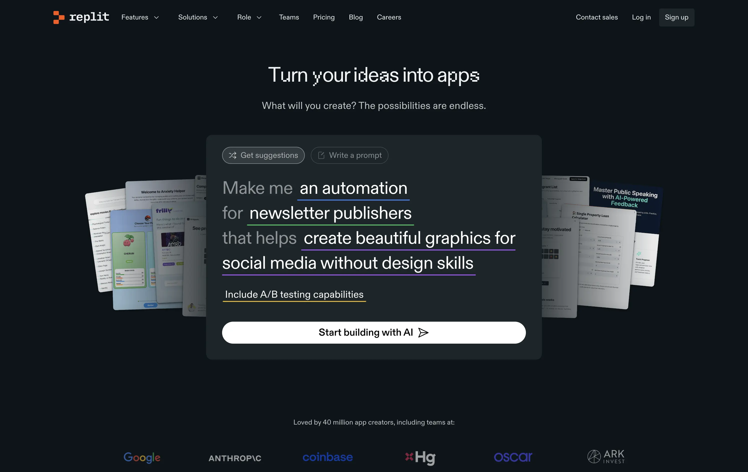
Replit is a collaborative AI-tool platform where anyone can build, deploy, and scale software from a single workspace.
The hero is interaction-first — built around a live prompt box that speaks directly to user intent. Copy fades into function, encouraging you to engage before exploring.
Replit sells ambition to builders. The hero de-emphasizes itself in favor of showing the product experience. It’s aligned to users seeking momentum, not just documentation.
This layout balances technical utility with human impact, aligning well with Algolia’s positioning as an API-first but UX-aware company. The mobile UI reinforces product value visually, while the logo wall signals scale and trust for enterprise buyers. The tone is clear, benefit-led, and appropriate for high-intent decision-makers evaluating AI tools for customer experience. This is a solid enterprise-facing hero built to perform.
Replit
↗
SaaS
DevTools
AI Tools
Centered
Descriptive
Empowering
Search/Utility Block
Media Gallery
Interactive
Product UI
Dark Mode
White
Sans serif
Hybrid
Home Page
Custom Code
ai developer tools, type-to-build interface, interactive prompt UI, dark interface, real-time suggestion, input-led hero, startup showcase, low-code/no-code, dev productivity, trust logos, community-powered
Replit is a collaborative AI-tool platform where anyone can build, deploy, and scale software from a single workspace.
The hero is interaction-first — built around a live prompt box that speaks directly to user intent. Copy fades into function, encouraging you to engage before exploring.
Replit sells ambition to builders. The hero de-emphasizes itself in favor of showing the product experience. It’s aligned to users seeking momentum, not just documentation.
This layout balances technical utility with human impact, aligning well with Algolia’s positioning as an API-first but UX-aware company. The mobile UI reinforces product value visually, while the logo wall signals scale and trust for enterprise buyers. The tone is clear, benefit-led, and appropriate for high-intent decision-makers evaluating AI tools for customer experience. This is a solid enterprise-facing hero built to perform.
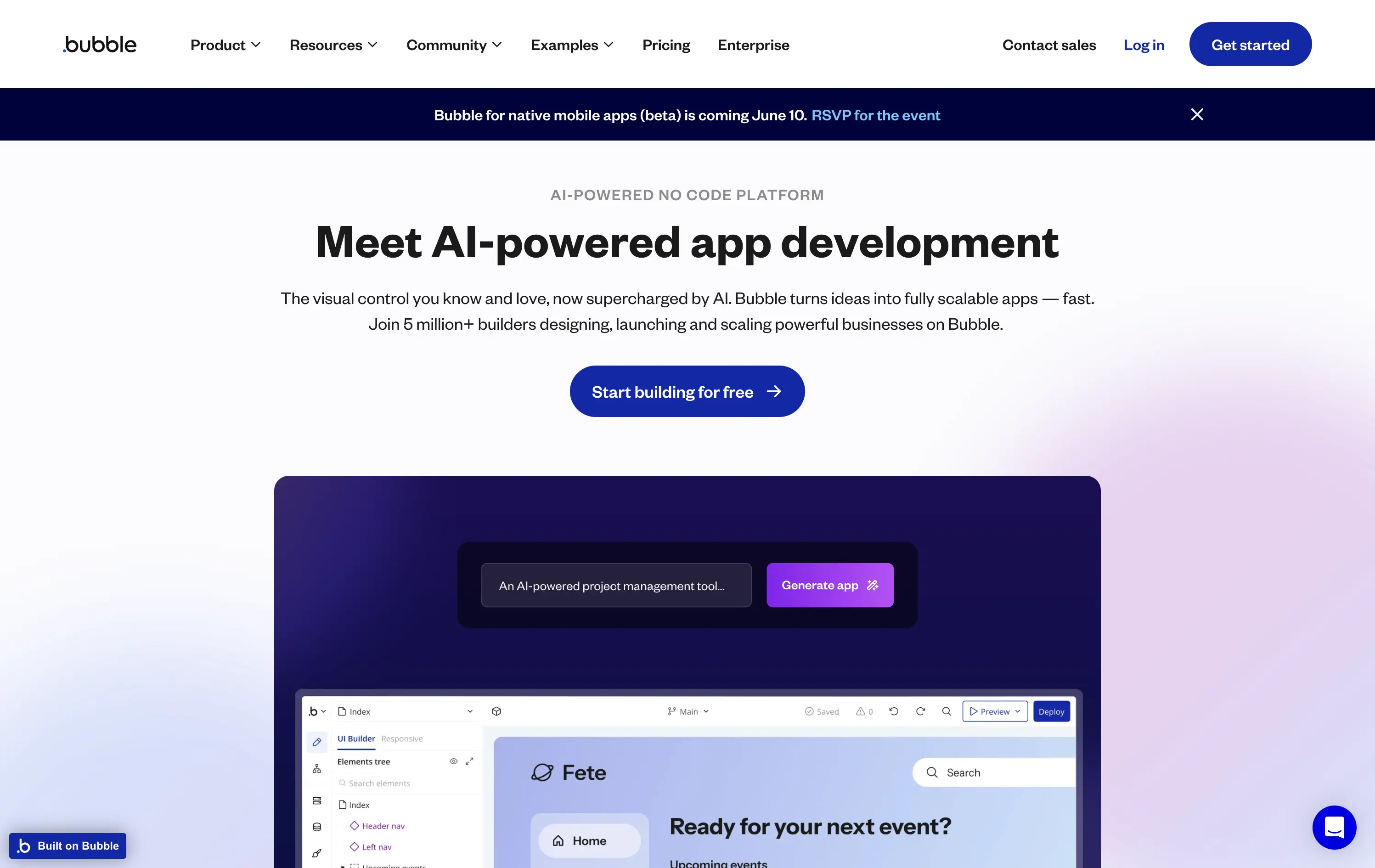
Bubble
↗
DevTools
AI Tools
No-Code
Centered
Bold & Direct
Empowering
Single Button
Product UI
Custom Animation
Gradient
Light Mode
Blue
Purple
Sans serif
B2B
Home Page
Bubble
AI builder, no-code SaaS, non-technical founders, drag-and-drop, scalable apps, visual editor, early-stage startups, animated hero, prompt-to-app, AI UI assistant, builder tools, onboarding ease, trusted platform, app generation, UX demo
Bubble lets anyone build scalable web apps using visual tools, now enhanced with AI that turns plain text into functional components.
The hero is clear and functional, emphasizing AI-enhanced app creation for non-technical users. The animation showcases familiar product patterns with a magic twist — turning text prompts into real UI. The visual reinforces the platform’s promise. The CTA is focused, and social proof is implied through scale messaging (“5 million+ builders”).
Smart repositioning move for a no-code pioneer. The AI angle broadens appeal to early-stage founders, while preserving Bubble’s long-standing brand equity in drag-and-drop development.
This layout balances technical utility with human impact, aligning well with Algolia’s positioning as an API-first but UX-aware company. The mobile UI reinforces product value visually, while the logo wall signals scale and trust for enterprise buyers. The tone is clear, benefit-led, and appropriate for high-intent decision-makers evaluating AI tools for customer experience. This is a solid enterprise-facing hero built to perform.
Bubble
↗
DevTools
AI Tools
No-Code
Centered
Bold & Direct
Empowering
Single Button
Product UI
Custom Animation
Gradient
Light Mode
Blue
Purple
Sans serif
B2B
Home Page
Bubble
AI builder, no-code SaaS, non-technical founders, drag-and-drop, scalable apps, visual editor, early-stage startups, animated hero, prompt-to-app, AI UI assistant, builder tools, onboarding ease, trusted platform, app generation, UX demo
Bubble lets anyone build scalable web apps using visual tools, now enhanced with AI that turns plain text into functional components.
The hero is clear and functional, emphasizing AI-enhanced app creation for non-technical users. The animation showcases familiar product patterns with a magic twist — turning text prompts into real UI. The visual reinforces the platform’s promise. The CTA is focused, and social proof is implied through scale messaging (“5 million+ builders”).
Smart repositioning move for a no-code pioneer. The AI angle broadens appeal to early-stage founders, while preserving Bubble’s long-standing brand equity in drag-and-drop development.
This layout balances technical utility with human impact, aligning well with Algolia’s positioning as an API-first but UX-aware company. The mobile UI reinforces product value visually, while the logo wall signals scale and trust for enterprise buyers. The tone is clear, benefit-led, and appropriate for high-intent decision-makers evaluating AI tools for customer experience. This is a solid enterprise-facing hero built to perform.
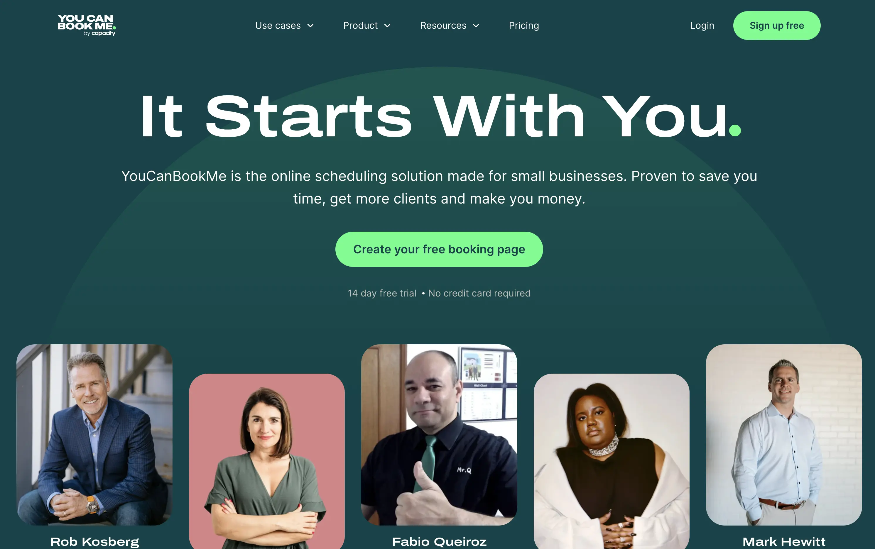
You Can Book Me
↗
SaaS
Productivity
Centered
Descriptive
Empowering
Single Button
Photography
Media Gallery
Duotone
Green
Display
B2B
Home Page
solo-friendly SaaS, scheduling tool, real user proof, small business productivity, personal headline, free trial, soft design system, emotional copy, utility-first, community-led, freemium conversion, authenticity-first visuals, indie SaaS
YouCanBook.Me is a scheduling platform designed to help small businesses streamline bookings, save time, and convert more leads through simple, flexible scheduling pages.
The hero centers emotional relatability. “It Starts With You” feels direct and empowering, while the subhead offers a clear, benefit-first pitch. The design isn’t flashy — it leans on authenticity, with non-art-directed portraits adding a raw, real-user touch. The green CTA is visible, though visually softer than competitors. While the layout lacks design sophistication, it feels personal and conversion-minded.
Targeting small business owners and service providers with a tone of support and relatability. It emphasizes utility over polish, aiming to win trust through clarity, familiarity, and proof of real-world use.
This layout balances technical utility with human impact, aligning well with Algolia’s positioning as an API-first but UX-aware company. The mobile UI reinforces product value visually, while the logo wall signals scale and trust for enterprise buyers. The tone is clear, benefit-led, and appropriate for high-intent decision-makers evaluating AI tools for customer experience. This is a solid enterprise-facing hero built to perform.
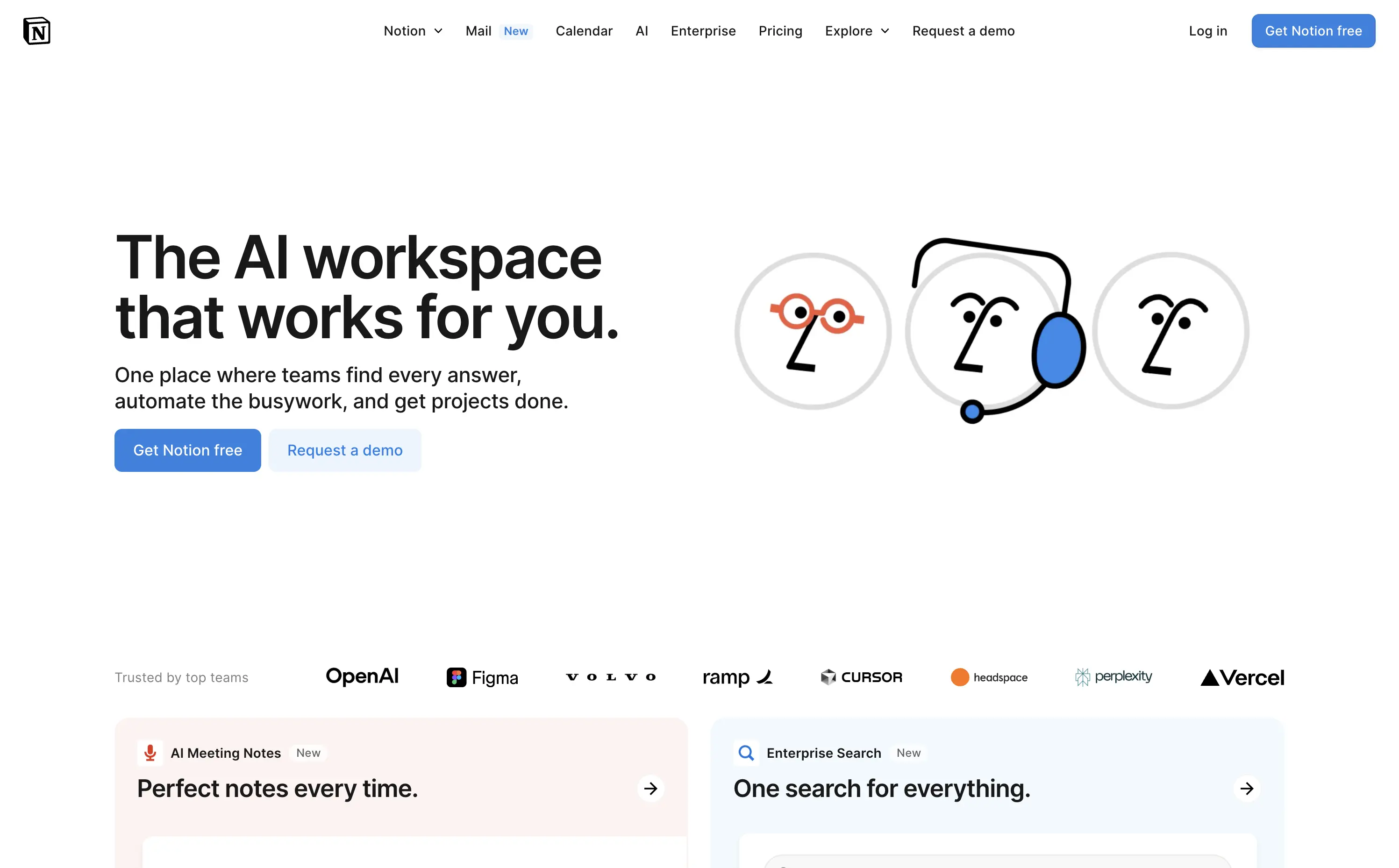
Notion
↗
SaaS
AI Tools
Productivity
Split Grid
Left-aligned
Aspirational
Empowering
Multi-CTA Block
Illustration
Logo Wall
Custom Animation
Light Mode
Blue
Sans serif
Hybrid
Home Page
Custom Code
AI workspace, animated avatars, productivity OS, enterprise-ready, personal + team use, modular interface, brand-first UI, continuation scroll, flexible use cases, playful sophistication, high-trust visual, calm interface, utility meets emotion, scalable collaboration
Notion is an all-in-one AI workspace that helps teams and individuals write, organize, automate, and collaborate — from startups to enterprise scale.
This hero strikes a balance between visual charm and clarity. The animation of AI personas dramatizes the core value prop — “they work for you” — and makes the abstract feel accessible. The headline is direct and benefit-led, while the subhead outlines practical use cases. Dual CTAs target both entry-level and enterprise buyers. Scrolling reveals feature blocks, encouraging deeper exploration. Trusted-by logos create instant credibility.
A masterclass in multi-audience positioning — speaks to freelancers and Fortune 500s simultaneously. Smart blend of human tone and scalable utility, reinforced visually through motion, brand trust cues, and modular follow-up content.
This layout balances technical utility with human impact, aligning well with Algolia’s positioning as an API-first but UX-aware company. The mobile UI reinforces product value visually, while the logo wall signals scale and trust for enterprise buyers. The tone is clear, benefit-led, and appropriate for high-intent decision-makers evaluating AI tools for customer experience. This is a solid enterprise-facing hero built to perform.
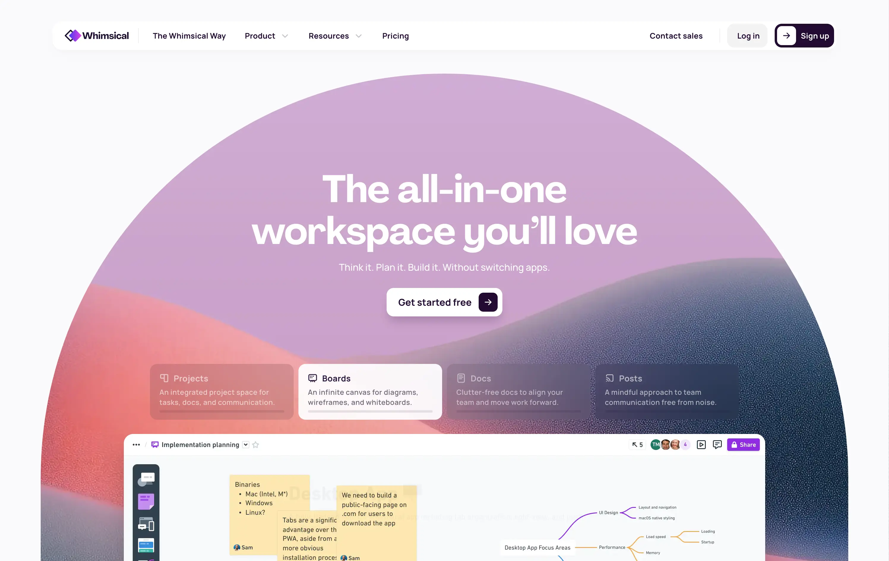
Whimsical
↗
SaaS
Collaboration
Productivity
Inset
Centered
Benefit-Driven
Empowering
Single Button
Illustration
Interactive
Product UI
Gradient
Light Mode
Pink
Purple
Orange
Sans serif
B2B
Home Page
Custom Code
collaborative workspace, pastel gradient, feature carousel, lightweight SaaS, sticky headline, soft UI, premium-yet-friendly, high-trust design, zero-friction onboarding, visual task planning, alternative to Miro, team productivity
Whimsical is an all-in-one visual workspace for teams to plan, wireframe, write, and collaborate—without switching between tools.
The hero immediately differentiates with its warm, gradient-driven palette and curved editorial layout. Headline is sticky and emotional, while the subheadline cues action and ease. Below, animated modules skim through key features—smartly designed to reduce cognitive load while expanding curiosity. The product UI is fully visible and feels friendly. CTA is low friction and well-placed. Compared to competitors, this layout feels more human-centered and less corporate, while still conveying product intelligence.
Strong product-led growth positioning with emotional stickiness. Visuals balance friendliness with focus. Motion helps drive upfront clarity, and layout choice favors quick scanning—well-suited for both individual users and team leads.
This layout balances technical utility with human impact, aligning well with Algolia’s positioning as an API-first but UX-aware company. The mobile UI reinforces product value visually, while the logo wall signals scale and trust for enterprise buyers. The tone is clear, benefit-led, and appropriate for high-intent decision-makers evaluating AI tools for customer experience. This is a solid enterprise-facing hero built to perform.
Shopify
↗
SaaS
No-Code
Full Width
Aspirational
Empowering
Single Button
Video
Custom Animation
Imagery-Based
White
Sans serif
Hybrid
Home Page
Shopify
ecommerce SaaS, cycling headlines, startup mindset, trust-first layout, minimal friction, brand-led SaaS, cinematic video, confident tone, aspirational messaging, high brand equity, editorial feel, unicorn builder
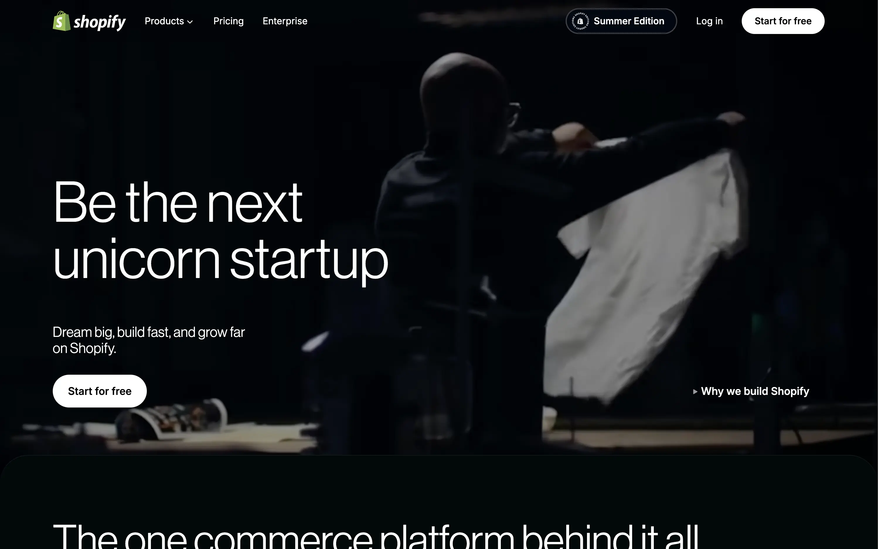
Shopify is the leading e-commerce platform enabling entrepreneurs to build, run, and scale online businesses of any size.
The hero is built on confidence. The looping video paired with aspirational headline cycles invites emotional projection—framing Shopify as the vehicle for bold ambition. The product isn’t shown because it doesn’t need to be; trust is already banked. Typography is clean and large, CTA is ultra-visible, and microcopy ("Dream big, build fast...") seals the brand tone. Minimal elements allow the brand equity to do the heavy lifting, making it a confident and quietly dominant play.
Hero capitalizes on Shopify’s maturity. No need to explain the product—just reaffirm its role as the enabler of big outcomes. Layout fits enterprise confidence while still feeling personal to startup dreamers.
This layout balances technical utility with human impact, aligning well with Algolia’s positioning as an API-first but UX-aware company. The mobile UI reinforces product value visually, while the logo wall signals scale and trust for enterprise buyers. The tone is clear, benefit-led, and appropriate for high-intent decision-makers evaluating AI tools for customer experience. This is a solid enterprise-facing hero built to perform.
Shopify
↗
SaaS
No-Code
Full Width
Aspirational
Empowering
Single Button
Video
Custom Animation
Imagery-Based
White
Sans serif
Hybrid
Home Page
Shopify
ecommerce SaaS, cycling headlines, startup mindset, trust-first layout, minimal friction, brand-led SaaS, cinematic video, confident tone, aspirational messaging, high brand equity, editorial feel, unicorn builder
Shopify is the leading e-commerce platform enabling entrepreneurs to build, run, and scale online businesses of any size.
The hero is built on confidence. The looping video paired with aspirational headline cycles invites emotional projection—framing Shopify as the vehicle for bold ambition. The product isn’t shown because it doesn’t need to be; trust is already banked. Typography is clean and large, CTA is ultra-visible, and microcopy ("Dream big, build fast...") seals the brand tone. Minimal elements allow the brand equity to do the heavy lifting, making it a confident and quietly dominant play.
Hero capitalizes on Shopify’s maturity. No need to explain the product—just reaffirm its role as the enabler of big outcomes. Layout fits enterprise confidence while still feeling personal to startup dreamers.
This layout balances technical utility with human impact, aligning well with Algolia’s positioning as an API-first but UX-aware company. The mobile UI reinforces product value visually, while the logo wall signals scale and trust for enterprise buyers. The tone is clear, benefit-led, and appropriate for high-intent decision-makers evaluating AI tools for customer experience. This is a solid enterprise-facing hero built to perform.
Monday
↗
SaaS
Productivity
Inset
Centered
Empowering
Single Button
Interactive
Product UI
Light Mode
Purple
Sans serif
B2B
Home Page
Custom Code
workflow software, team collaboration, project management, calm UI, interactive tiles, soft gradients, onboarding clarity, task visibility, intuitive UX, AI-enhanced, enterprise-friendly, all-in-one platform, modular SaaS
Monday.com is a flexible work platform that helps teams manage projects, track progress, and automate workflows with AI-powered tools.
The headline is both emotional and functional — “Made for work, designed to love” — signaling a user-first experience. The layout is soft and centered, with an interactive module that invites users to pre-define their use case before even signing up. The single CTA streamlines conversions, and supporting UI previews show off flexibility in a non-intrusive way.
Hero bridges the gap between SMBs and enterprise with an inclusive tone and tailored entry point. Use-case selector adds personalization. Messaging supports wide adoption without diluting brand voice.
This layout balances technical utility with human impact, aligning well with Algolia’s positioning as an API-first but UX-aware company. The mobile UI reinforces product value visually, while the logo wall signals scale and trust for enterprise buyers. The tone is clear, benefit-led, and appropriate for high-intent decision-makers evaluating AI tools for customer experience. This is a solid enterprise-facing hero built to perform.
Squarespace
↗
SaaS
Creative Tools
Left-aligned
Editorial
Aspirational
Empowering
Single Button
Photography
Imagery-Based
White
Sans serif
Hybrid
Home Page
Squarespace
website builder, ecommerce, portfolio, artist websites, small business site, drag and drop, no code
Squarespace empowers creatives and entrepreneurs to bring their brand to life online with striking websites, e-commerce, marketing tools, creator-first, design-led, visual storytelling, warm tones, minimalist CTA, lifestyle imagery, transformation messaging, artistic showcase, premium SaaS, aspirational branding, product in-situ, visually rich, trust-by-design
The hero is visually immersive with minimal copy. Headline captures emotional payoff. UI preview shows real use case. CTA is visible but non-aggressive. The photography and styling do most of the persuasive work.
A brand-first execution that targets creators seeking identity and validation. The emotional angle lands hard, while layout and styling reinforce taste, confidence, and ease. Design aligns perfectly with target user mindset.
This layout balances technical utility with human impact, aligning well with Algolia’s positioning as an API-first but UX-aware company. The mobile UI reinforces product value visually, while the logo wall signals scale and trust for enterprise buyers. The tone is clear, benefit-led, and appropriate for high-intent decision-makers evaluating AI tools for customer experience. This is a solid enterprise-facing hero built to perform.
Givebutter
↗
SaaS
Fintech
Centered
Aspirational
Empowering
Single Button
Illustration
Product UI
Custom Animation
Light Mode
Yellow
Sans serif
B2B
Home Page
Webflow
fundraising SaaS, nonprofit tech, donor platform, feel-good UX, animated mascot, bento interface, purpose-driven, pastel palette, onboarding clarity, interactive benefits, Gen Z friendly, platform utility, warm branding, visual segmentation
Givebutter is a modern fundraising platform for nonprofits to manage donations, donors, events, and campaigns — all in one place.
This hero hits all the right notes for a purpose-led platform. The headline is clear and values-forward, while the playful highlight under “changing the world” draws attention without shouting. The mascot brings joy and motion, and the interactive bentocards smartly preview key benefits. It’s emotionally inviting, but structurally strong.
The hero balances clarity and optimism. Copy is simple and anchored in purpose. Visual hierarchy is clean, with modular tiles surfacing key actions. Mascot animation adds warmth without clutter.
This layout balances technical utility with human impact, aligning well with Algolia’s positioning as an API-first but UX-aware company. The mobile UI reinforces product value visually, while the logo wall signals scale and trust for enterprise buyers. The tone is clear, benefit-led, and appropriate for high-intent decision-makers evaluating AI tools for customer experience. This is a solid enterprise-facing hero built to perform.
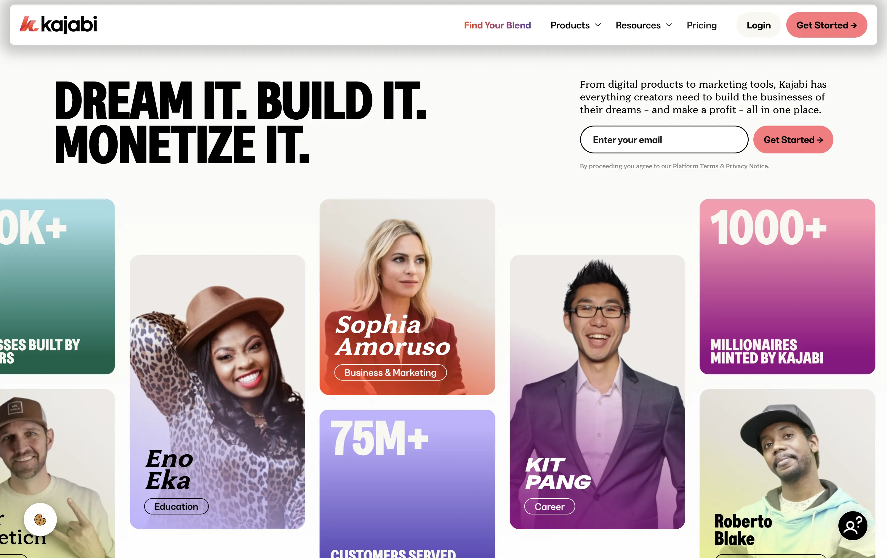
Kajabi
↗
SaaS
Creator Tools
Bento
Left-aligned
Aspirational
Empowering
Email Capture
Media Gallery
Live Metrics
Social Proof
Custom Animation
Light Mode
Red
Sans serif
B2C
Home Page
Webflow
creator economy, digital products, personal branding, monetization tools, testimonial-focused, bold headline, gradient cards, visual proof, email capture, energetic layout, high social proof, creator-first SaaS, aspirational branding
Kajabi is an all-in-one platform for creators to build, market, and monetize their digital products
Hero hits hard with credibility and momentum. Bold headline sets tone, though lacks clarity. Visual grid of creators and stats instantly builds trust. High-density layout may feel overwhelming on first load.
Designed to speak directly to ambitious creators. Social proof, earnings stats, and familiar faces reinforce Kajabi’s category leadership. Loud but tuned to audience mindset — performance-first, legitimacy-led, and conversion-aware.
This layout balances technical utility with human impact, aligning well with Algolia’s positioning as an API-first but UX-aware company. The mobile UI reinforces product value visually, while the logo wall signals scale and trust for enterprise buyers. The tone is clear, benefit-led, and appropriate for high-intent decision-makers evaluating AI tools for customer experience. This is a solid enterprise-facing hero built to perform.
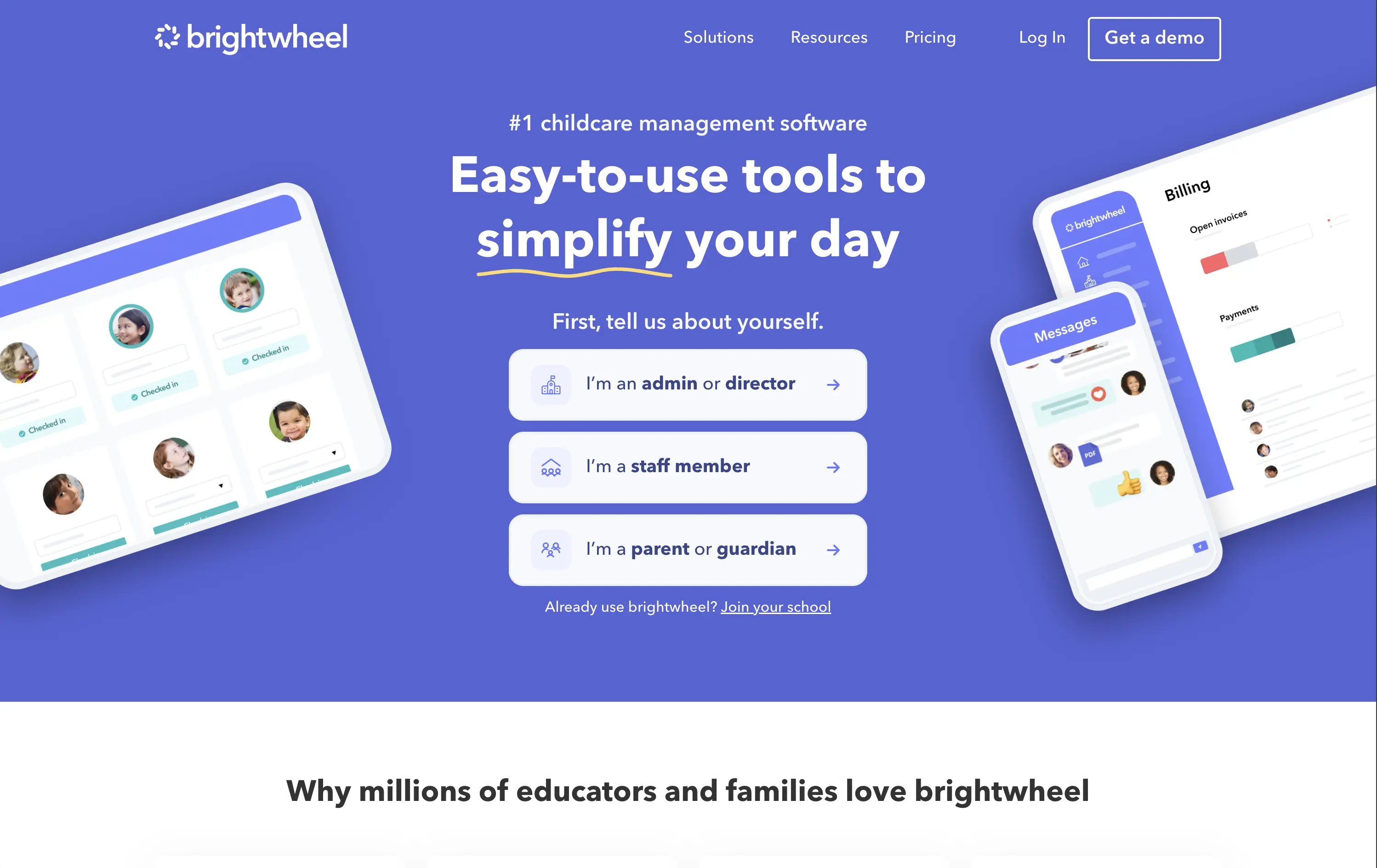
Brightwheel
↗
SaaS
Productivity
Education
Centered
Benefit-Driven
Empowering
Multi-CTA Block
Product UI
Duotone
Blue
Sans serif
B2B
Home Page
Wordpress
childcare SaaS, early education, UI-forward, persona filter, soft onboarding, trust-building, calm palette, family-friendly, product-led storytelling, scroll guidance, interactive selector, teacher tech, value-first headline
Brightwheel offers all-in-one software for childcare centers, helping staff and parents streamline daily operations, billing, and communication.
The hero blends product visuals with conversion utility. UI mockups feel grounded in real use cases—billing, check-ins, messaging—while the big, benefit-led headline hits directly. Interactive persona buttons sort traffic based on user role, creating clarity and reducing friction. Clean layout, focused copy, and trust cues (like “#1 childcare software”) all work toward fast comprehension.
Targets a trust-dependent category with confident simplicity. The user-type selector streamlines onboarding while signaling the platform’s adaptability. It balances emotional safety with practical function, reflecting Brightwheel’s value as a tool that makes lives easier.
This layout balances technical utility with human impact, aligning well with Algolia’s positioning as an API-first but UX-aware company. The mobile UI reinforces product value visually, while the logo wall signals scale and trust for enterprise buyers. The tone is clear, benefit-led, and appropriate for high-intent decision-makers evaluating AI tools for customer experience. This is a solid enterprise-facing hero built to perform.
The most effective hero sections in your inbox.
Monthly round up of top hero sections.
Don't worry. We hate spam too.
Don't worry. We hate spam too.
Don't worry. We hate spam too.