Full Width
7
7
7
7
Expansive layout where content stretches edge to edge — bold and immersive.
Filters
Sanity
↗
SaaS
DevTools
Full Width
Descriptive
Multi-CTA Block
Video
Logo Wall
Announcement
Imagery-Based
White
Orange
Sans serif
B2B
Home Page
Custom Code
programmable content, developer-first CMS, content infrastructure, CLI install, terminal-ready, layered layout, utility CTA, heavy visual load, startup-to-enterprise scale, code-native UX, tech-forward brand, headless CMS, dark visual tone
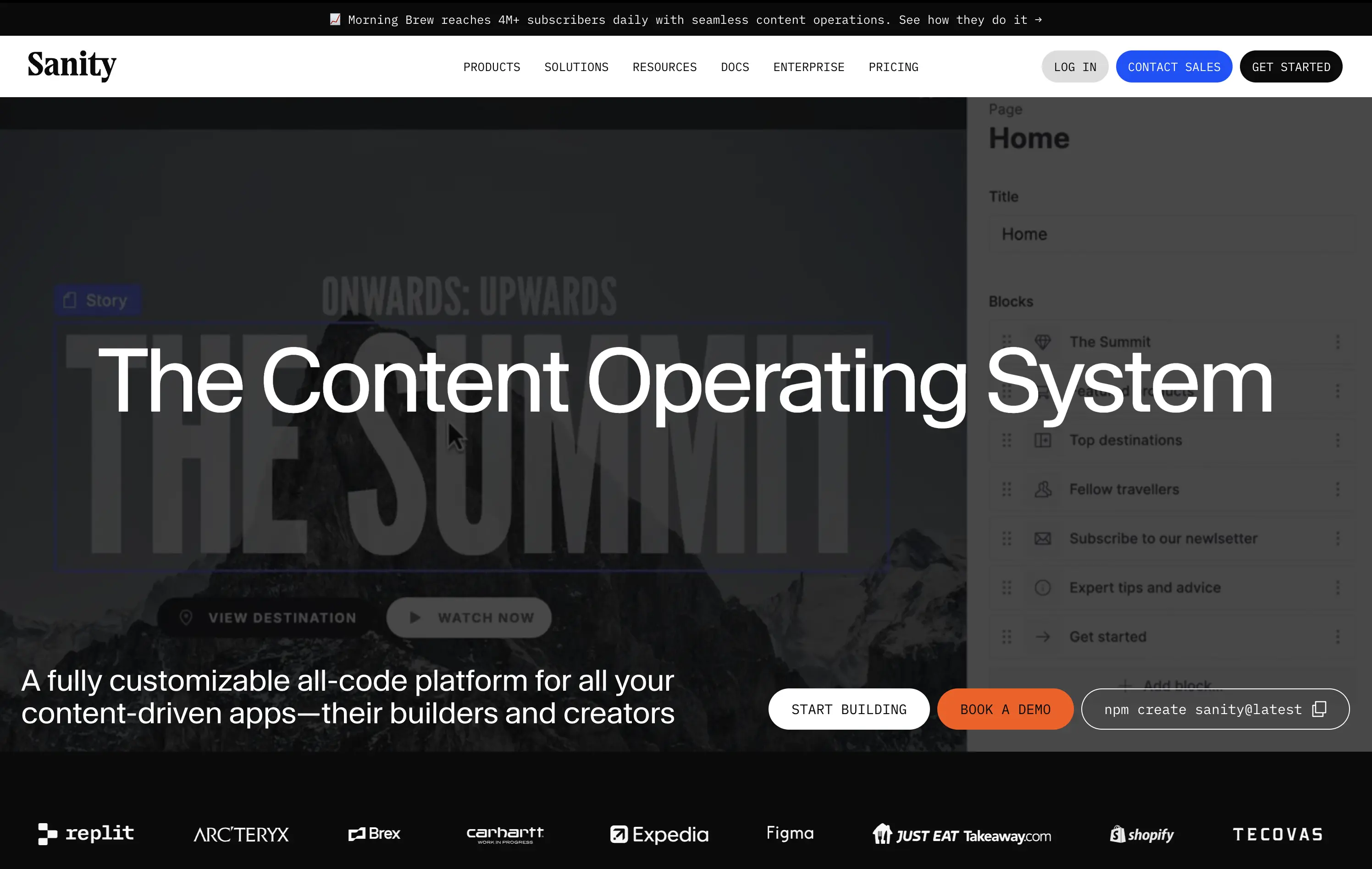
Sanity is a customizable, developer-first CMS platform that gives full programmatic control to build scalable content-driven apps.
Copy-to-clipboard npm CTA is highly functional and aligned with dev habits. But overall hierarchy is cluttered—UI overlay, imagery, and CTAs fight for attention, making the first impression a bit noisy.
Great strategic anchor for a technical audience, but risks cognitive overload on entry. Needs tighter content framing to sharpen focus for first-time visitors.
This layout balances technical utility with human impact, aligning well with Algolia’s positioning as an API-first but UX-aware company. The mobile UI reinforces product value visually, while the logo wall signals scale and trust for enterprise buyers. The tone is clear, benefit-led, and appropriate for high-intent decision-makers evaluating AI tools for customer experience. This is a solid enterprise-facing hero built to perform.
Sanity
↗
SaaS
DevTools
Full Width
Descriptive
Multi-CTA Block
Video
Logo Wall
Announcement
Imagery-Based
White
Orange
Sans serif
B2B
Home Page
Custom Code
programmable content, developer-first CMS, content infrastructure, CLI install, terminal-ready, layered layout, utility CTA, heavy visual load, startup-to-enterprise scale, code-native UX, tech-forward brand, headless CMS, dark visual tone
Sanity is a customizable, developer-first CMS platform that gives full programmatic control to build scalable content-driven apps.
Copy-to-clipboard npm CTA is highly functional and aligned with dev habits. But overall hierarchy is cluttered—UI overlay, imagery, and CTAs fight for attention, making the first impression a bit noisy.
Great strategic anchor for a technical audience, but risks cognitive overload on entry. Needs tighter content framing to sharpen focus for first-time visitors.
This layout balances technical utility with human impact, aligning well with Algolia’s positioning as an API-first but UX-aware company. The mobile UI reinforces product value visually, while the logo wall signals scale and trust for enterprise buyers. The tone is clear, benefit-led, and appropriate for high-intent decision-makers evaluating AI tools for customer experience. This is a solid enterprise-facing hero built to perform.
Outreach
↗
SaaS
AI Tools
Productivity
Full Width
Centered
Benefit-Driven
Confident
Multi-CTA Block
Video
Product UI
Imagery-Based
Blue
Sans serif
B2B
Home Page
Custom Code
sales automation, B2B SaaS, AI forecasting, sales rep enablement, RevOps tools, productivity workflows, confident tone, enterprise platform, full-width layout, animated product demo, AI sales co-pilot, multi-CTA, modern interface, precision messaging, dark UI
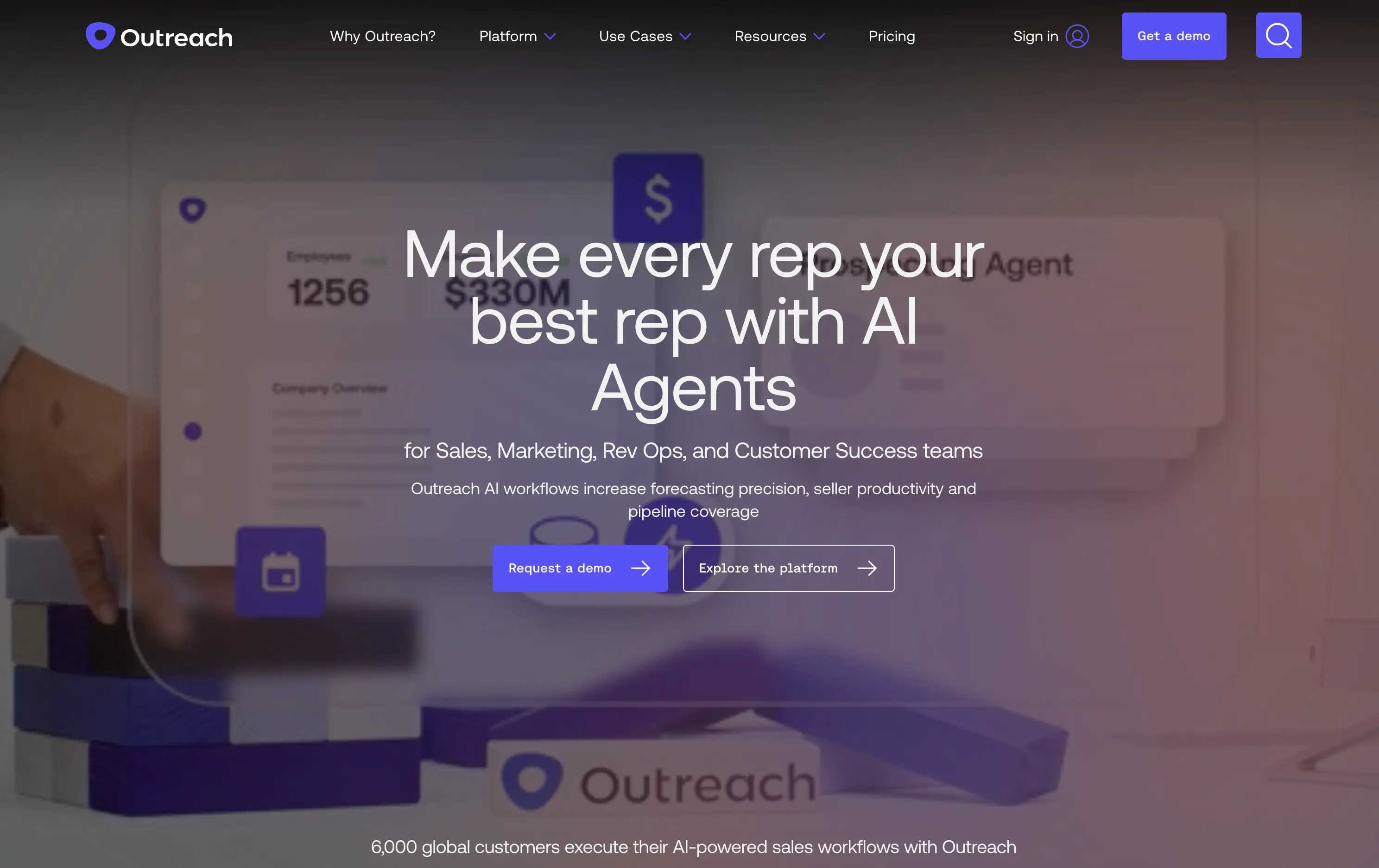
Outreach helps B2B teams improve pipeline precision and sales productivity through AI-powered automation and forecasting tools.
The hero is product-led with a high-trust, enterprise feel. The headline is assertive, speaking directly to the sales persona. Subheadline adds clarity and lists functional benefits. Background motion shows product value without distraction. CTAs are split by intent: demo vs. explore. The full-width layout conveys confidence and scale.
Clearly positioned for decision-makers in SalesOps and RevOps. Copy and layout support mid-funnel engagement with strong product-centric framing and trusting tone.
This layout balances technical utility with human impact, aligning well with Algolia’s positioning as an API-first but UX-aware company. The mobile UI reinforces product value visually, while the logo wall signals scale and trust for enterprise buyers. The tone is clear, benefit-led, and appropriate for high-intent decision-makers evaluating AI tools for customer experience. This is a solid enterprise-facing hero built to perform.
Outreach
↗
SaaS
AI Tools
Productivity
Full Width
Centered
Benefit-Driven
Confident
Multi-CTA Block
Video
Product UI
Imagery-Based
Blue
Sans serif
B2B
Home Page
Custom Code
sales automation, B2B SaaS, AI forecasting, sales rep enablement, RevOps tools, productivity workflows, confident tone, enterprise platform, full-width layout, animated product demo, AI sales co-pilot, multi-CTA, modern interface, precision messaging, dark UI
Outreach helps B2B teams improve pipeline precision and sales productivity through AI-powered automation and forecasting tools.
The hero is product-led with a high-trust, enterprise feel. The headline is assertive, speaking directly to the sales persona. Subheadline adds clarity and lists functional benefits. Background motion shows product value without distraction. CTAs are split by intent: demo vs. explore. The full-width layout conveys confidence and scale.
Clearly positioned for decision-makers in SalesOps and RevOps. Copy and layout support mid-funnel engagement with strong product-centric framing and trusting tone.
This layout balances technical utility with human impact, aligning well with Algolia’s positioning as an API-first but UX-aware company. The mobile UI reinforces product value visually, while the logo wall signals scale and trust for enterprise buyers. The tone is clear, benefit-led, and appropriate for high-intent decision-makers evaluating AI tools for customer experience. This is a solid enterprise-facing hero built to perform.
MindPalace AI
↗
SaaS
AI Tools
Productivity
Inset
Full Width
Editorial
Founder-Led Voice
Abstract / Conceptual
Email Capture
Photography
Product UI
Imagery-Based
Light Mode
Red
Black
Display
B2C
Home Page
Webflow
cinematic design, founder-led brand, AI memory tool, data integration, futuristic UI, monochrome orange palette, provocative headline, low-context messaging, brand-first hero, retro-futurist aesthetic, predictive tech, narrative design, mood-driven UX
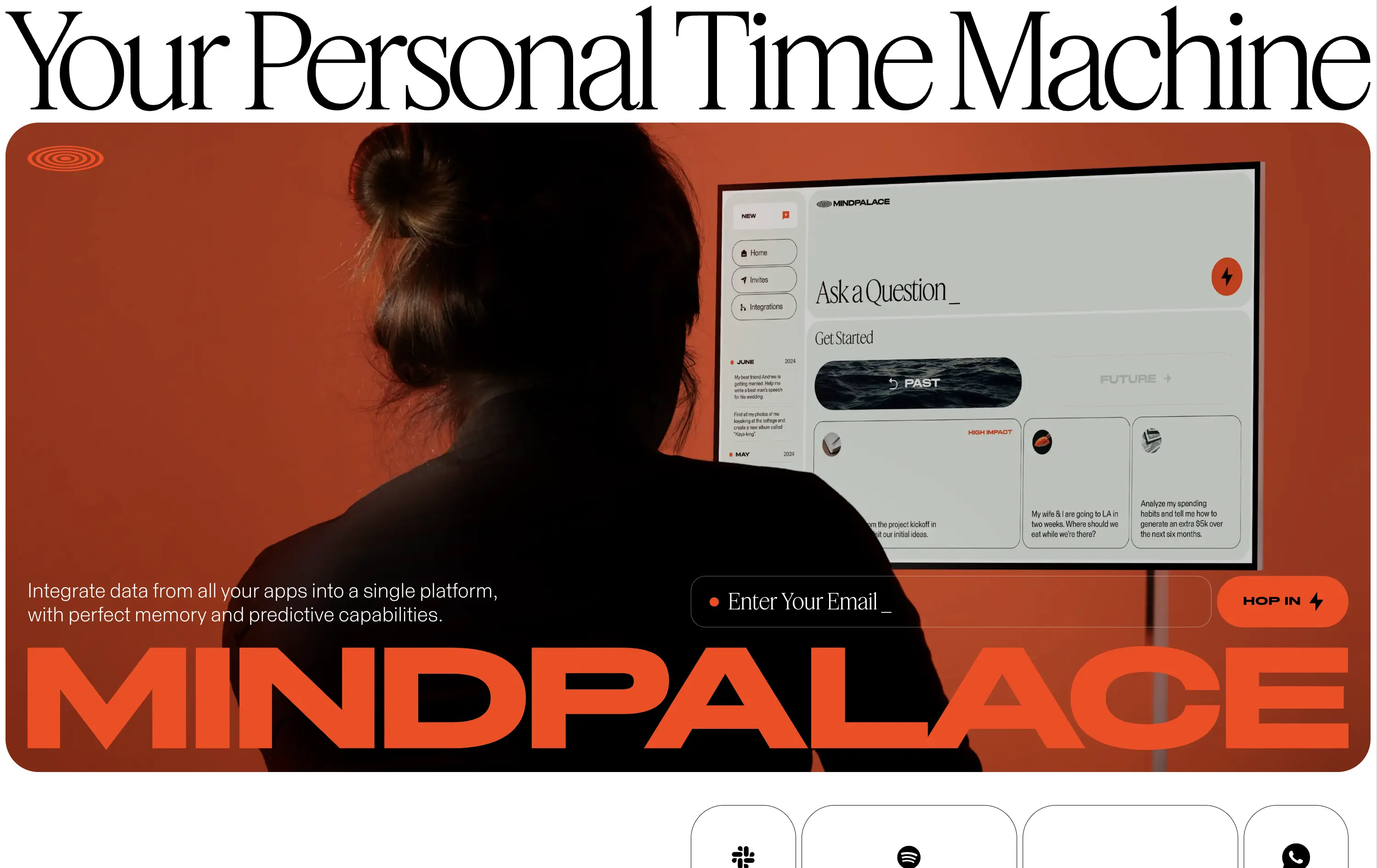
Mindpalace connects and organizes your digital life into a single interface with memory recall and predictive AI tools—part archive, part assistant.
This hero is brand-first, product-second. The editorial headline draws intrigue but offers zero utility without scrolling. Subheadline hints at integration and predictive capabilities but avoids details. The strength lies in the striking art direction: backlit subject, glowing screen, and color-blocked monochrome palette immediately set a cinematic tone. Product UI is visible but not interactive. The email capture field is subtle and stylish, fitting the brand’s creative edge. It’s a bold anti-SaaS approach—prioritizing identity over clarity.
Mindpalace positions itself as a visionary, not a tool. Strategy leans into intrigue, betting on design-savvy early adopters who value storytelling and aesthetics over immediate clarity. Strong brand magnetism, low onboarding intent.
This layout balances technical utility with human impact, aligning well with Algolia’s positioning as an API-first but UX-aware company. The mobile UI reinforces product value visually, while the logo wall signals scale and trust for enterprise buyers. The tone is clear, benefit-led, and appropriate for high-intent decision-makers evaluating AI tools for customer experience. This is a solid enterprise-facing hero built to perform.
MindPalace AI
↗
SaaS
AI Tools
Productivity
Inset
Full Width
Editorial
Founder-Led Voice
Abstract / Conceptual
Email Capture
Photography
Product UI
Imagery-Based
Light Mode
Red
Black
Display
B2C
Home Page
Webflow
cinematic design, founder-led brand, AI memory tool, data integration, futuristic UI, monochrome orange palette, provocative headline, low-context messaging, brand-first hero, retro-futurist aesthetic, predictive tech, narrative design, mood-driven UX
Mindpalace connects and organizes your digital life into a single interface with memory recall and predictive AI tools—part archive, part assistant.
This hero is brand-first, product-second. The editorial headline draws intrigue but offers zero utility without scrolling. Subheadline hints at integration and predictive capabilities but avoids details. The strength lies in the striking art direction: backlit subject, glowing screen, and color-blocked monochrome palette immediately set a cinematic tone. Product UI is visible but not interactive. The email capture field is subtle and stylish, fitting the brand’s creative edge. It’s a bold anti-SaaS approach—prioritizing identity over clarity.
Mindpalace positions itself as a visionary, not a tool. Strategy leans into intrigue, betting on design-savvy early adopters who value storytelling and aesthetics over immediate clarity. Strong brand magnetism, low onboarding intent.
This layout balances technical utility with human impact, aligning well with Algolia’s positioning as an API-first but UX-aware company. The mobile UI reinforces product value visually, while the logo wall signals scale and trust for enterprise buyers. The tone is clear, benefit-led, and appropriate for high-intent decision-makers evaluating AI tools for customer experience. This is a solid enterprise-facing hero built to perform.
Shopify
↗
SaaS
No-Code
Full Width
Aspirational
Empowering
Single Button
Video
Custom Animation
Imagery-Based
White
Sans serif
Hybrid
Home Page
Shopify
ecommerce SaaS, cycling headlines, startup mindset, trust-first layout, minimal friction, brand-led SaaS, cinematic video, confident tone, aspirational messaging, high brand equity, editorial feel, unicorn builder
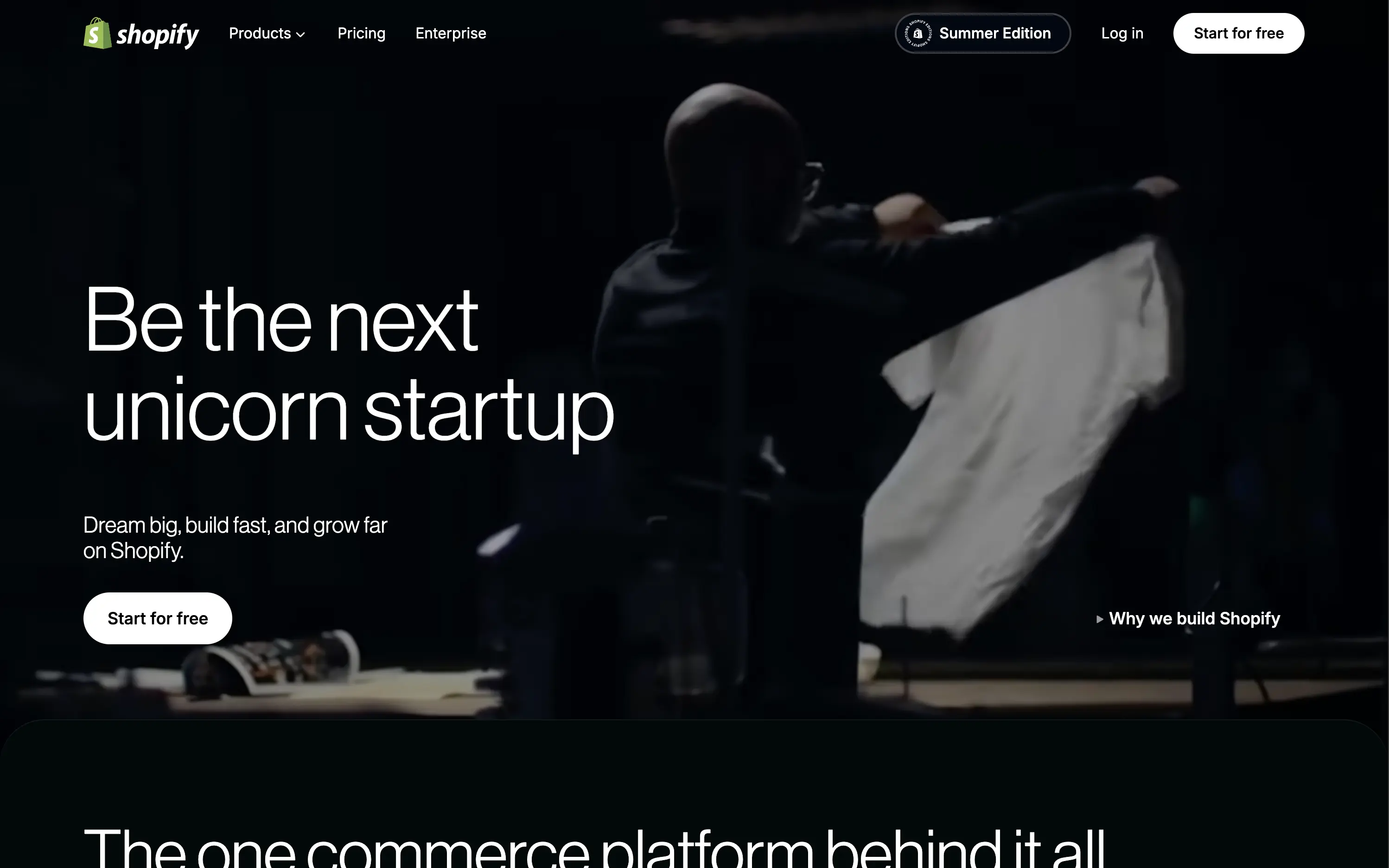
Shopify is the leading e-commerce platform enabling entrepreneurs to build, run, and scale online businesses of any size.
The hero is built on confidence. The looping video paired with aspirational headline cycles invites emotional projection—framing Shopify as the vehicle for bold ambition. The product isn’t shown because it doesn’t need to be; trust is already banked. Typography is clean and large, CTA is ultra-visible, and microcopy ("Dream big, build fast...") seals the brand tone. Minimal elements allow the brand equity to do the heavy lifting, making it a confident and quietly dominant play.
Hero capitalizes on Shopify’s maturity. No need to explain the product—just reaffirm its role as the enabler of big outcomes. Layout fits enterprise confidence while still feeling personal to startup dreamers.
This layout balances technical utility with human impact, aligning well with Algolia’s positioning as an API-first but UX-aware company. The mobile UI reinforces product value visually, while the logo wall signals scale and trust for enterprise buyers. The tone is clear, benefit-led, and appropriate for high-intent decision-makers evaluating AI tools for customer experience. This is a solid enterprise-facing hero built to perform.
Shopify
↗
SaaS
No-Code
Full Width
Aspirational
Empowering
Single Button
Video
Custom Animation
Imagery-Based
White
Sans serif
Hybrid
Home Page
Shopify
ecommerce SaaS, cycling headlines, startup mindset, trust-first layout, minimal friction, brand-led SaaS, cinematic video, confident tone, aspirational messaging, high brand equity, editorial feel, unicorn builder
Shopify is the leading e-commerce platform enabling entrepreneurs to build, run, and scale online businesses of any size.
The hero is built on confidence. The looping video paired with aspirational headline cycles invites emotional projection—framing Shopify as the vehicle for bold ambition. The product isn’t shown because it doesn’t need to be; trust is already banked. Typography is clean and large, CTA is ultra-visible, and microcopy ("Dream big, build fast...") seals the brand tone. Minimal elements allow the brand equity to do the heavy lifting, making it a confident and quietly dominant play.
Hero capitalizes on Shopify’s maturity. No need to explain the product—just reaffirm its role as the enabler of big outcomes. Layout fits enterprise confidence while still feeling personal to startup dreamers.
This layout balances technical utility with human impact, aligning well with Algolia’s positioning as an API-first but UX-aware company. The mobile UI reinforces product value visually, while the logo wall signals scale and trust for enterprise buyers. The tone is clear, benefit-led, and appropriate for high-intent decision-makers evaluating AI tools for customer experience. This is a solid enterprise-facing hero built to perform.
Cometeer
↗
CPG
Food & Beverage
Full Width
Editorial
Benefit-Driven
Aspirational
Multi-CTA Block
Video
Imagery-Based
Yellow
Sans serif
DTC
Home Page
Shopify
DTC coffee, video-led hero, brand storytelling, clear CTA hierarchy, warm tones, minimal text, fast onboarding, gradient background, sensory cue, product-focused, premium feel, lifestyle positioning, high visual polish, science-inspired design
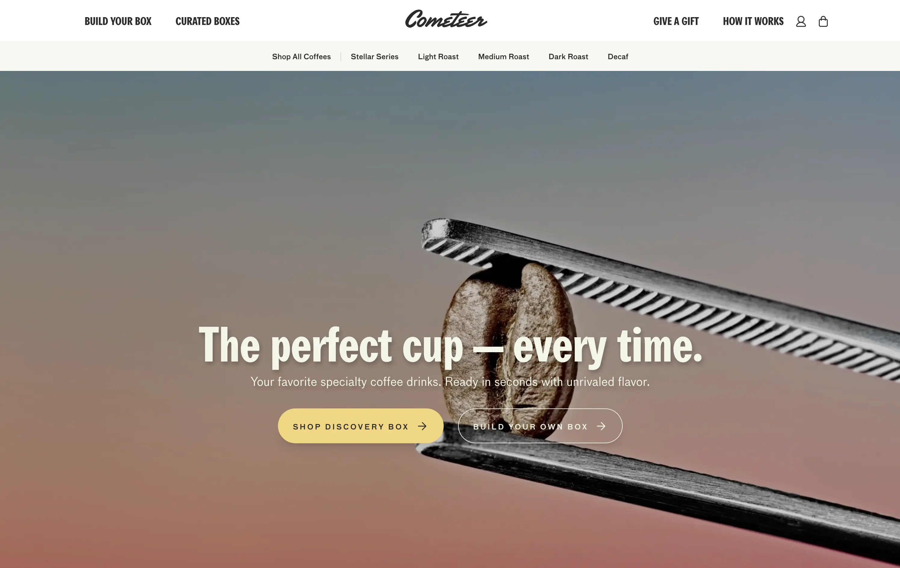
Cometeer delivers barista-grade coffee flash-frozen into capsules for ultra-fast, ultra-consistent brewing at home.
The hero balances brand storytelling and performance design—sharp visual contrast, cinematic motion, and precise art direction anchor the product as premium and scientific. The headline is bold and memorable, while the subheadline clarifies the value prop in under 10 words. Dual CTAs reduce friction. The use of macro imagery paired with a scientific tool elevates the perception of quality and process control.
Clear DTC positioning with a premium, precision-led angle. The visual metaphor of lab-grade quality supports brand trust while the tone stays human. Layout signals high product confidence and fast conversion intent.
This layout balances technical utility with human impact, aligning well with Algolia’s positioning as an API-first but UX-aware company. The mobile UI reinforces product value visually, while the logo wall signals scale and trust for enterprise buyers. The tone is clear, benefit-led, and appropriate for high-intent decision-makers evaluating AI tools for customer experience. This is a solid enterprise-facing hero built to perform.
Cometeer
↗
CPG
Food & Beverage
Full Width
Editorial
Benefit-Driven
Aspirational
Multi-CTA Block
Video
Imagery-Based
Yellow
Sans serif
DTC
Home Page
Shopify
DTC coffee, video-led hero, brand storytelling, clear CTA hierarchy, warm tones, minimal text, fast onboarding, gradient background, sensory cue, product-focused, premium feel, lifestyle positioning, high visual polish, science-inspired design
Cometeer delivers barista-grade coffee flash-frozen into capsules for ultra-fast, ultra-consistent brewing at home.
The hero balances brand storytelling and performance design—sharp visual contrast, cinematic motion, and precise art direction anchor the product as premium and scientific. The headline is bold and memorable, while the subheadline clarifies the value prop in under 10 words. Dual CTAs reduce friction. The use of macro imagery paired with a scientific tool elevates the perception of quality and process control.
Clear DTC positioning with a premium, precision-led angle. The visual metaphor of lab-grade quality supports brand trust while the tone stays human. Layout signals high product confidence and fast conversion intent.
This layout balances technical utility with human impact, aligning well with Algolia’s positioning as an API-first but UX-aware company. The mobile UI reinforces product value visually, while the logo wall signals scale and trust for enterprise buyers. The tone is clear, benefit-led, and appropriate for high-intent decision-makers evaluating AI tools for customer experience. This is a solid enterprise-facing hero built to perform.
Wild
↗
CPG
Beauty & Wellness
Sustainability
Full Width
Left-aligned
Bold & Direct
Multi-CTA Block
Social Proof
Announcement
Imagery-Based
Green
Orange
Serif
DTC
Home Page
Shopify
eco-conscious, refillable packaging, summer aesthetic, photo-based hero, colorful packaging, nature-forward, trustbar visible, multi-CTA, DTC beauty, vibrant product shot, planet-positive, sunlit tone, clean bodycare
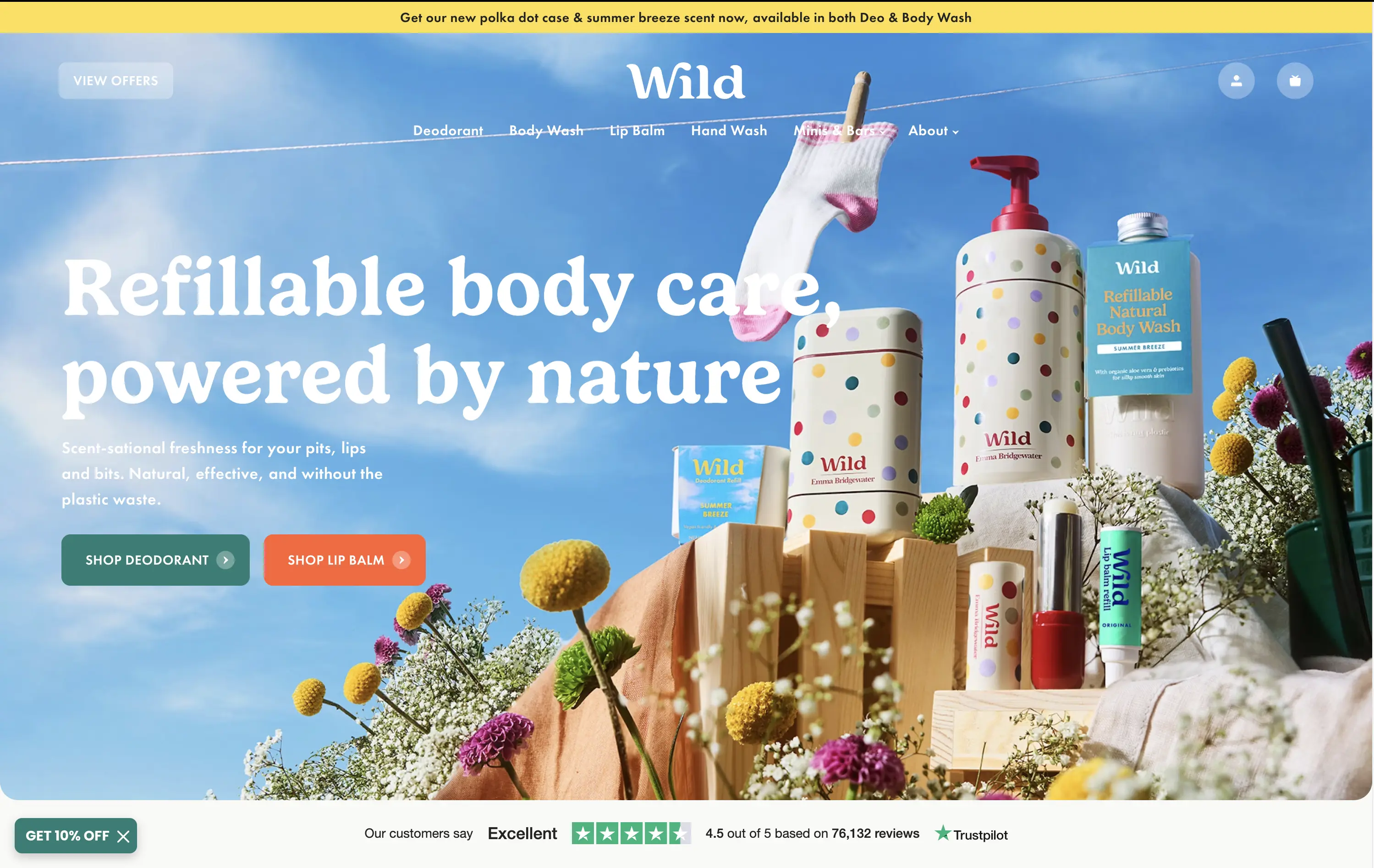
Wild offers refillable personal care products that are plastic-free, eco-friendly, and designed for everyday routines.
Bright, joyful photography captures the brand’s eco-fresh ethos while showcasing the full product range in one glance. Bold headline contrasts nicely with the sky backdrop, and CTAs are well-placed for quick shopper entry. Trustpilot widget reinforces credibility. While it’s vibrant and approachable, background details might slightly interfere with copy clarity on smaller screens.
Clear value prop and visual narrative tailored to eco-conscious DTC buyers. Emotional appeal (freshness, fun, nature) is balanced with proof (Trustpilot) and conversion intent. Could improve copy visibility slightly on mobile.
This layout balances technical utility with human impact, aligning well with Algolia’s positioning as an API-first but UX-aware company. The mobile UI reinforces product value visually, while the logo wall signals scale and trust for enterprise buyers. The tone is clear, benefit-led, and appropriate for high-intent decision-makers evaluating AI tools for customer experience. This is a solid enterprise-facing hero built to perform.
Wild
↗
CPG
Beauty & Wellness
Sustainability
Full Width
Left-aligned
Bold & Direct
Multi-CTA Block
Social Proof
Announcement
Imagery-Based
Green
Orange
Serif
DTC
Home Page
Shopify
eco-conscious, refillable packaging, summer aesthetic, photo-based hero, colorful packaging, nature-forward, trustbar visible, multi-CTA, DTC beauty, vibrant product shot, planet-positive, sunlit tone, clean bodycare
Wild offers refillable personal care products that are plastic-free, eco-friendly, and designed for everyday routines.
Bright, joyful photography captures the brand’s eco-fresh ethos while showcasing the full product range in one glance. Bold headline contrasts nicely with the sky backdrop, and CTAs are well-placed for quick shopper entry. Trustpilot widget reinforces credibility. While it’s vibrant and approachable, background details might slightly interfere with copy clarity on smaller screens.
Clear value prop and visual narrative tailored to eco-conscious DTC buyers. Emotional appeal (freshness, fun, nature) is balanced with proof (Trustpilot) and conversion intent. Could improve copy visibility slightly on mobile.
This layout balances technical utility with human impact, aligning well with Algolia’s positioning as an API-first but UX-aware company. The mobile UI reinforces product value visually, while the logo wall signals scale and trust for enterprise buyers. The tone is clear, benefit-led, and appropriate for high-intent decision-makers evaluating AI tools for customer experience. This is a solid enterprise-facing hero built to perform.
Tuft & Needle
↗
Home & Living
Full Width
Descriptive
Single Button
Video
Imagery-Based
Light Mode
Green
Serif
DTC
Home Page
Shopify
calm aesthetic, DTC home brand, promo-led hero, lifestyle video, seasonal offer, mattress DTC, soothing tones, centered CTA, sales-driven layout, comfort-first, ecommerce UX, banner urgency, restful visuals
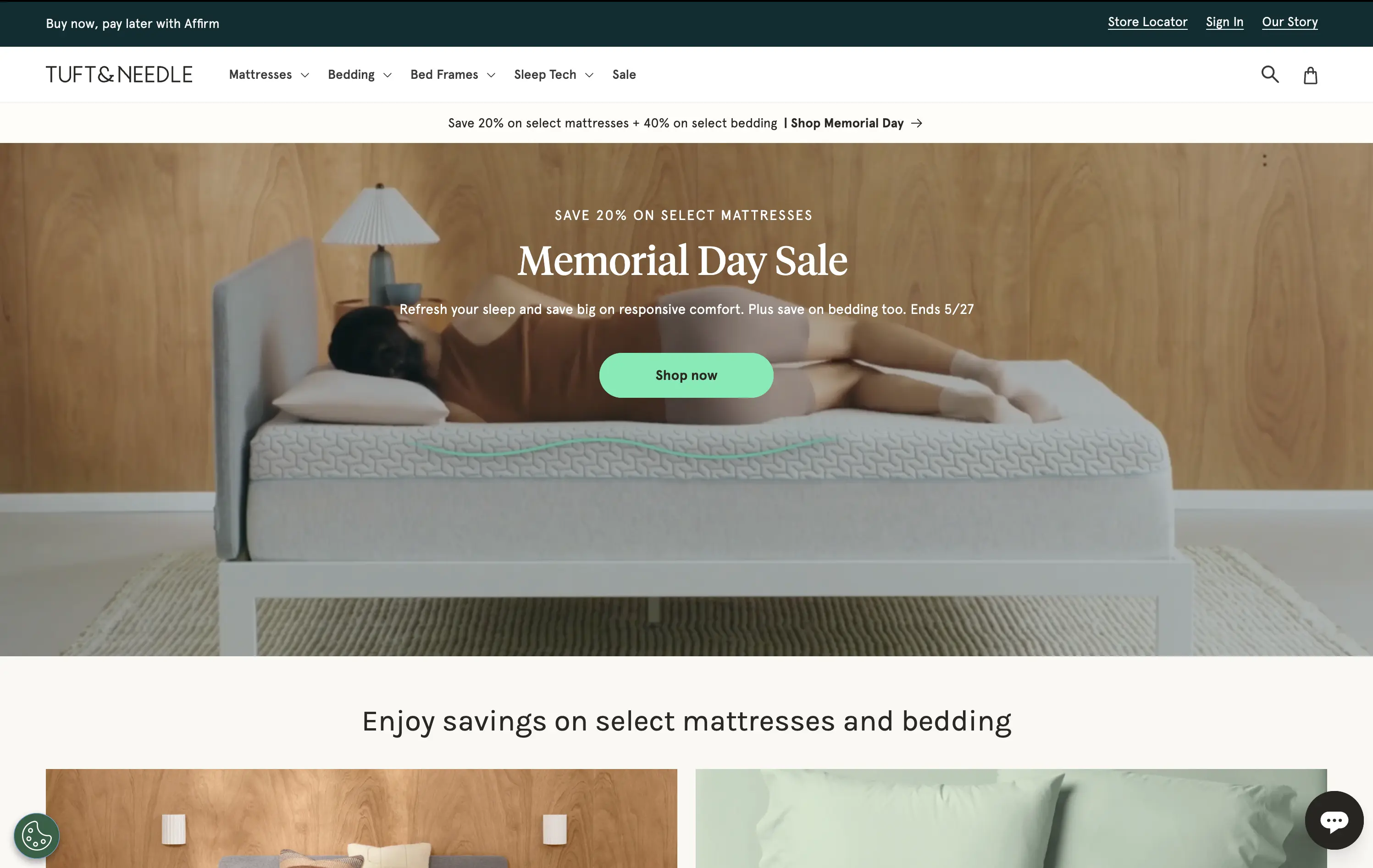
Tuft & Needle sells mattresses and bedding online, promising comfort, value, and fast delivery.
Hero makes the seasonal sale clear and appealing without breaking the brand’s visual softness. Video adds warmth, while the green CTA stands out without feeling intrusive. Messaging is brief and conversion-oriented.
Built to convert value-driven home shoppers during peak sale season. Visual tone maintains trust and ease, while layout pushes urgency in a structured, on-brand way. No distractions, just comfort and clarity.
This layout balances technical utility with human impact, aligning well with Algolia’s positioning as an API-first but UX-aware company. The mobile UI reinforces product value visually, while the logo wall signals scale and trust for enterprise buyers. The tone is clear, benefit-led, and appropriate for high-intent decision-makers evaluating AI tools for customer experience. This is a solid enterprise-facing hero built to perform.
Tuft & Needle
↗
Home & Living
Full Width
Descriptive
Single Button
Video
Imagery-Based
Light Mode
Green
Serif
DTC
Home Page
Shopify
calm aesthetic, DTC home brand, promo-led hero, lifestyle video, seasonal offer, mattress DTC, soothing tones, centered CTA, sales-driven layout, comfort-first, ecommerce UX, banner urgency, restful visuals
Tuft & Needle sells mattresses and bedding online, promising comfort, value, and fast delivery.
Hero makes the seasonal sale clear and appealing without breaking the brand’s visual softness. Video adds warmth, while the green CTA stands out without feeling intrusive. Messaging is brief and conversion-oriented.
Built to convert value-driven home shoppers during peak sale season. Visual tone maintains trust and ease, while layout pushes urgency in a structured, on-brand way. No distractions, just comfort and clarity.
This layout balances technical utility with human impact, aligning well with Algolia’s positioning as an API-first but UX-aware company. The mobile UI reinforces product value visually, while the logo wall signals scale and trust for enterprise buyers. The tone is clear, benefit-led, and appropriate for high-intent decision-makers evaluating AI tools for customer experience. This is a solid enterprise-facing hero built to perform.
The most effective hero sections in your inbox.
Monthly round up of top hero sections.
Don't worry. We hate spam too.
Don't worry. We hate spam too.
Don't worry. We hate spam too.