Illustration
19
19
19
19
Custom artwork used as the focal point or backdrop.
Filters
Family
↗
Fintech
Web3
Centered
Playful
Confident
Download App
Multi-CTA Block
Illustration
Custom Animation
Loading Animation
Light Mode
Blue
Yellow
Black
Sans serif
B2C
Home Page
Custom Code
crypto wallet for iOS, ENS support, playful Web3, mobile-first design, Gen Z crypto, kawaii aesthetic, approachable fintech, token collectibles, web3 onboarding, friendly UX
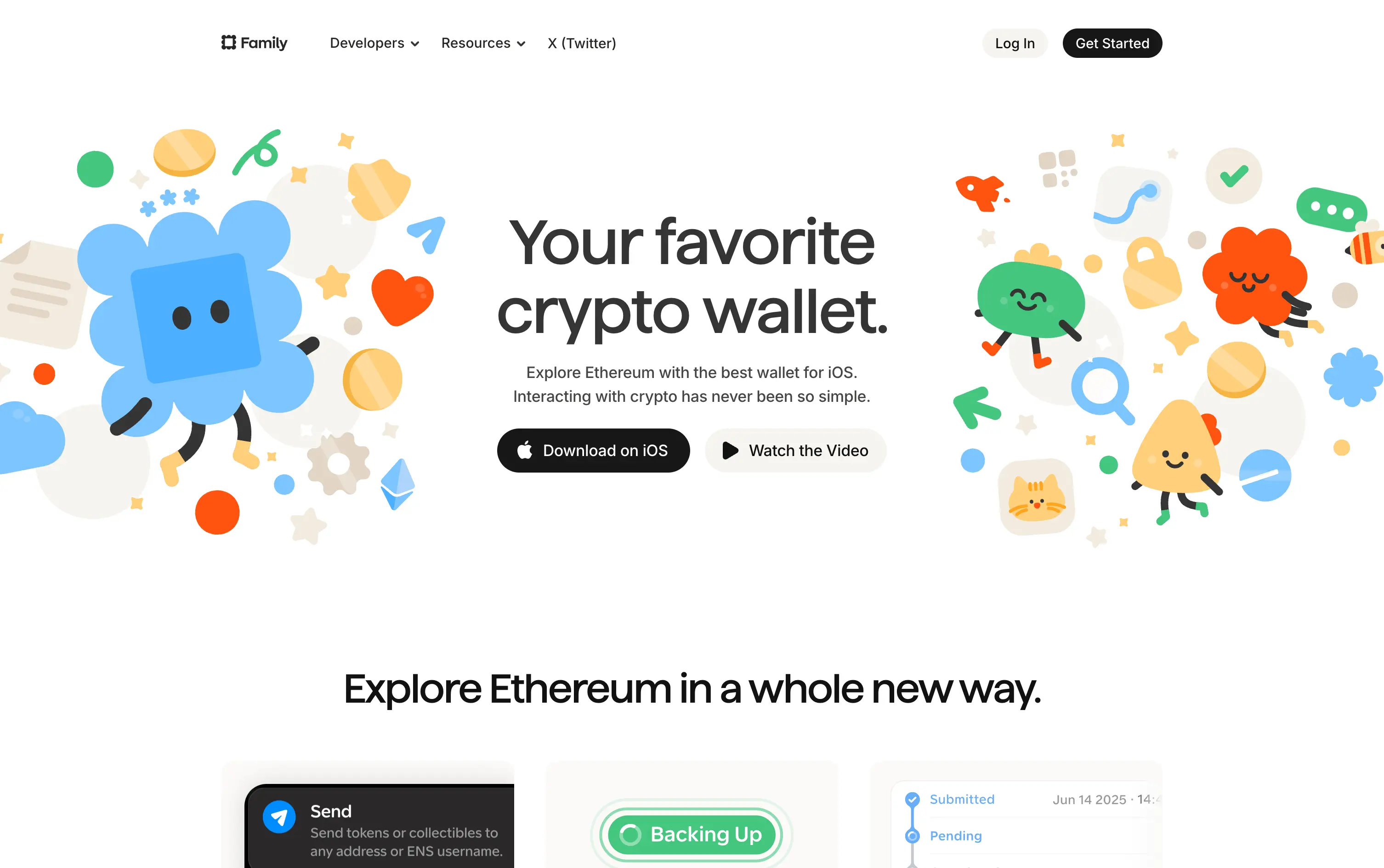
Family is a playful Ethereum wallet designed for iOS, making crypto feel friendly, visual, and simple to use.
Extremely approachable for a space often seen as cold or intimidating. The illustrations soften the category. Clear copy and strong CTA pair well with the product’s target audience and mobile-first approach.
A masterclass in brand positioning. While most Web3 brands chase dark, technical aesthetics, Family goes the opposite direction—bright, warm, and welcoming. It’s intentionally crafted to disarm, invite, and onboard a broader audience.
This layout balances technical utility with human impact, aligning well with Algolia’s positioning as an API-first but UX-aware company. The mobile UI reinforces product value visually, while the logo wall signals scale and trust for enterprise buyers. The tone is clear, benefit-led, and appropriate for high-intent decision-makers evaluating AI tools for customer experience. This is a solid enterprise-facing hero built to perform.
Family
↗
Fintech
Web3
Centered
Playful
Confident
Download App
Multi-CTA Block
Illustration
Custom Animation
Loading Animation
Light Mode
Blue
Yellow
Black
Sans serif
B2C
Home Page
Custom Code
crypto wallet for iOS, ENS support, playful Web3, mobile-first design, Gen Z crypto, kawaii aesthetic, approachable fintech, token collectibles, web3 onboarding, friendly UX
Family is a playful Ethereum wallet designed for iOS, making crypto feel friendly, visual, and simple to use.
Extremely approachable for a space often seen as cold or intimidating. The illustrations soften the category. Clear copy and strong CTA pair well with the product’s target audience and mobile-first approach.
A masterclass in brand positioning. While most Web3 brands chase dark, technical aesthetics, Family goes the opposite direction—bright, warm, and welcoming. It’s intentionally crafted to disarm, invite, and onboard a broader audience.
This layout balances technical utility with human impact, aligning well with Algolia’s positioning as an API-first but UX-aware company. The mobile UI reinforces product value visually, while the logo wall signals scale and trust for enterprise buyers. The tone is clear, benefit-led, and appropriate for high-intent decision-makers evaluating AI tools for customer experience. This is a solid enterprise-facing hero built to perform.
Gamma
↗
AI Tools
Creative Tools
Productivity
Split Grid
Left-aligned
Descriptive
Empowering
Multi-CTA Block
Watch Demo
Illustration
Media Gallery
Interactive
Light Mode
Blue
Sans serif
Hybrid
Home Page
Custom Code
AI presentation tool, whimsical 3D art, surreal imagery, smooth onboarding, soft brand tone, vertical carousel, intuitive UX, layout-focused demo, pastel aesthetic, creative AI tool, friendly product language
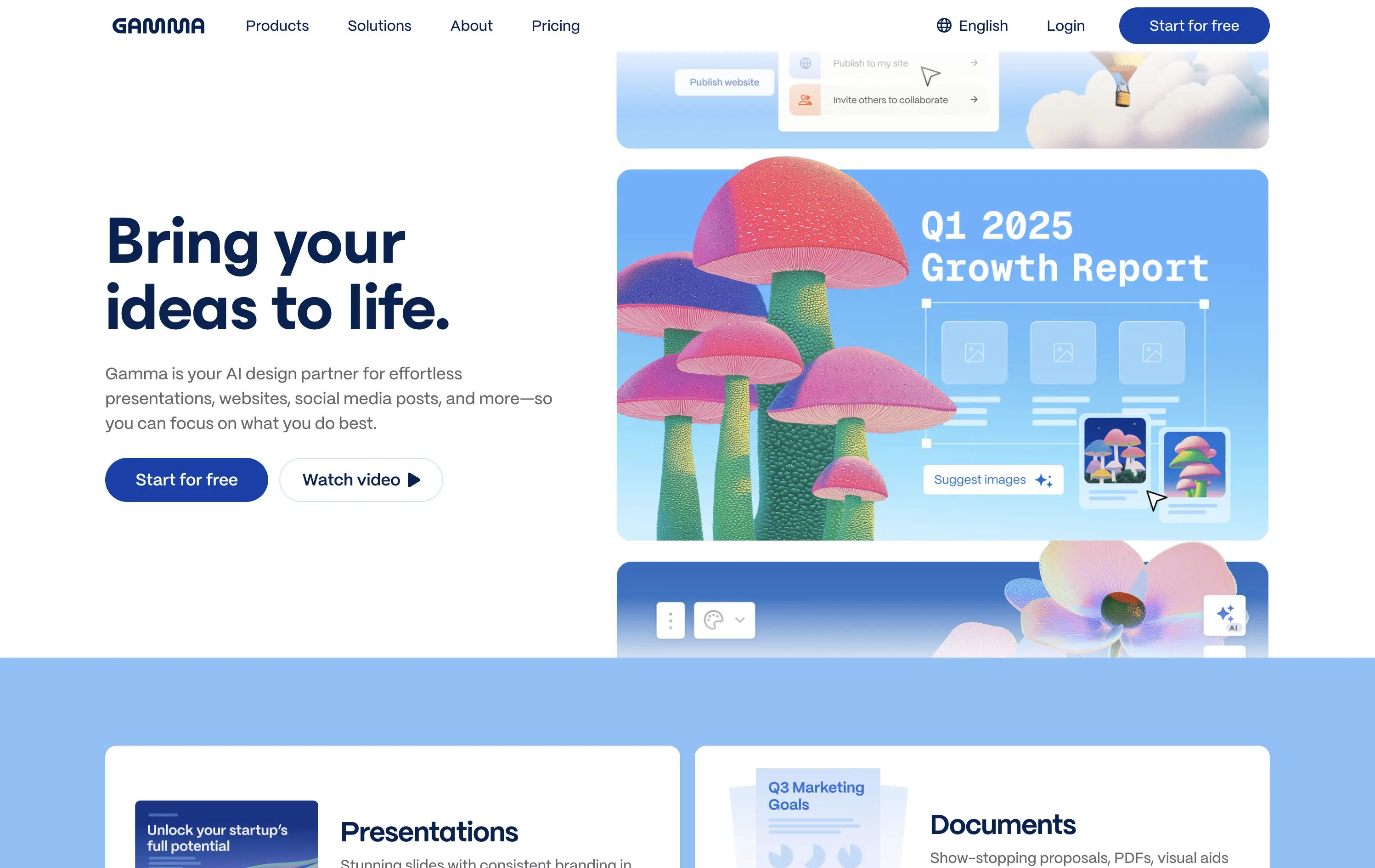
Gamma is an AI-powered design platform that helps users create beautiful presentations, websites, and docs effortlessly.
The carousel introduces Gamma’s features visually without overwhelming the user. The surreal illustration style immediately grabs attention, and the copy reinforces ease-of-use and creativity.
Gamma positions itself as a non-intimidating AI tool for creative productivity. Visuals, layout, and tone all serve to lower the barrier for entry and increase relatability.
This layout balances technical utility with human impact, aligning well with Algolia’s positioning as an API-first but UX-aware company. The mobile UI reinforces product value visually, while the logo wall signals scale and trust for enterprise buyers. The tone is clear, benefit-led, and appropriate for high-intent decision-makers evaluating AI tools for customer experience. This is a solid enterprise-facing hero built to perform.
Gamma
↗
AI Tools
Creative Tools
Productivity
Split Grid
Left-aligned
Descriptive
Empowering
Multi-CTA Block
Watch Demo
Illustration
Media Gallery
Interactive
Light Mode
Blue
Sans serif
Hybrid
Home Page
Custom Code
AI presentation tool, whimsical 3D art, surreal imagery, smooth onboarding, soft brand tone, vertical carousel, intuitive UX, layout-focused demo, pastel aesthetic, creative AI tool, friendly product language
Gamma is an AI-powered design platform that helps users create beautiful presentations, websites, and docs effortlessly.
The carousel introduces Gamma’s features visually without overwhelming the user. The surreal illustration style immediately grabs attention, and the copy reinforces ease-of-use and creativity.
Gamma positions itself as a non-intimidating AI tool for creative productivity. Visuals, layout, and tone all serve to lower the barrier for entry and increase relatability.
This layout balances technical utility with human impact, aligning well with Algolia’s positioning as an API-first but UX-aware company. The mobile UI reinforces product value visually, while the logo wall signals scale and trust for enterprise buyers. The tone is clear, benefit-led, and appropriate for high-intent decision-makers evaluating AI tools for customer experience. This is a solid enterprise-facing hero built to perform.
Arcol
↗
SaaS
Collaboration
Centered
Aspirational
Abstract / Conceptual
No CTA
Illustration
Custom Animation
Light Mode
Blue
Yellow
Sans serif
B2B
Home Page
Webflow
BIM software, real-time collaboration, isometric grid, multiplayer cursor, spatial planning UI, construction tech, 3D data layers, architectural tool, modern CAD, animated interface, light grid background
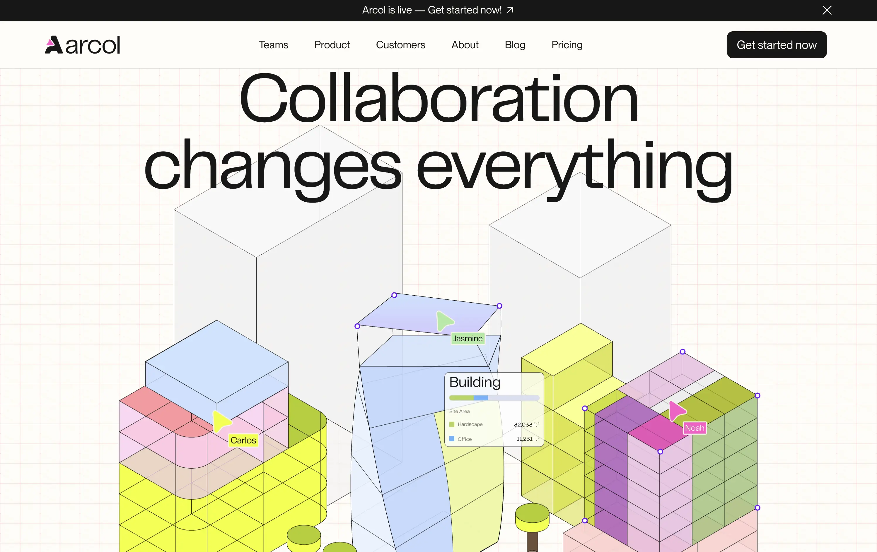
Arcol is a generative design and collaboration platform for architecture and BIM workflows, built for real-time teamwork.
The animated visual does the heavy lifting, illustrating use cases like live edits and data overlays. But without a supporting subline, new users may miss the BIM context. Still, strong visual storytelling creates intrigue.
Visually strong and clearly differentiated, but the messaging lacks grounding. The animation sells collaboration well, but without a sub-headline or product descriptor, it leans too much on visual inference. Clarity is sacrificed for aesthetic.
This layout balances technical utility with human impact, aligning well with Algolia’s positioning as an API-first but UX-aware company. The mobile UI reinforces product value visually, while the logo wall signals scale and trust for enterprise buyers. The tone is clear, benefit-led, and appropriate for high-intent decision-makers evaluating AI tools for customer experience. This is a solid enterprise-facing hero built to perform.
Arcol
↗
SaaS
Collaboration
Centered
Aspirational
Abstract / Conceptual
No CTA
Illustration
Custom Animation
Light Mode
Blue
Yellow
Sans serif
B2B
Home Page
Webflow
BIM software, real-time collaboration, isometric grid, multiplayer cursor, spatial planning UI, construction tech, 3D data layers, architectural tool, modern CAD, animated interface, light grid background
Arcol is a generative design and collaboration platform for architecture and BIM workflows, built for real-time teamwork.
The animated visual does the heavy lifting, illustrating use cases like live edits and data overlays. But without a supporting subline, new users may miss the BIM context. Still, strong visual storytelling creates intrigue.
Visually strong and clearly differentiated, but the messaging lacks grounding. The animation sells collaboration well, but without a sub-headline or product descriptor, it leans too much on visual inference. Clarity is sacrificed for aesthetic.
This layout balances technical utility with human impact, aligning well with Algolia’s positioning as an API-first but UX-aware company. The mobile UI reinforces product value visually, while the logo wall signals scale and trust for enterprise buyers. The tone is clear, benefit-led, and appropriate for high-intent decision-makers evaluating AI tools for customer experience. This is a solid enterprise-facing hero built to perform.
Console
↗
SaaS
IT & Security
AI Tools
Inset
Centered
Descriptive
Single Button
Watch Demo
Illustration
Logo Wall
Announcement
Light Mode
White
Serif
B2B
Home Page
Framer
cinematic backdrop, ai coworker, startup-funded, IT automation, visual metaphor, remote workspace, ambient hero, dystopian warm tone, product-less hero, modern SaaS, minimal chrome, high-trust logos
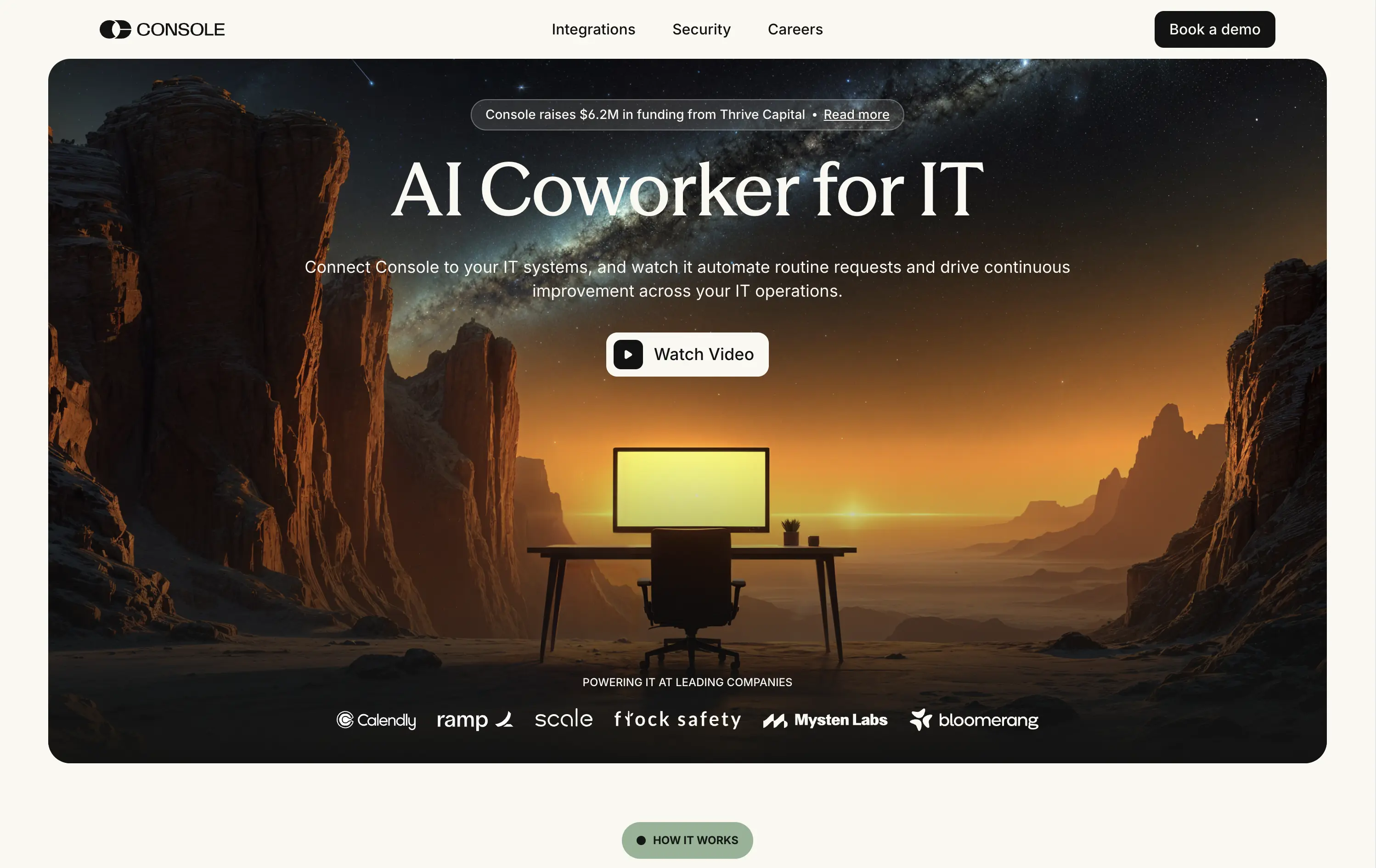
Console is an AI platform that automates routine IT tasks, acting as an autonomous coworker for technical operations teams in scaling companies.
Console’s hero leans heavily on mood. The cinematic desert landscape and glowing screen offer a metaphor for isolation, automation, and 24/7 capability. The “AI Coworker for IT” headline is simple, memorable, and category-redefining. Subtext expands the use case efficiently. The “Watch Video” CTA feels aligned with the storytelling angle. Enterprise logos below provide validation. The absence of product UI is a calculated choice — betting on intrigue over clarity.
This is a bet on brand over clarity; and it works and stands out. Conceptual visual framing elevates the value prop from tool to paradigm. Great fit for early-stage brand building in technical buyer circles.
This layout balances technical utility with human impact, aligning well with Algolia’s positioning as an API-first but UX-aware company. The mobile UI reinforces product value visually, while the logo wall signals scale and trust for enterprise buyers. The tone is clear, benefit-led, and appropriate for high-intent decision-makers evaluating AI tools for customer experience. This is a solid enterprise-facing hero built to perform.
Console
↗
SaaS
IT & Security
AI Tools
Inset
Centered
Descriptive
Single Button
Watch Demo
Illustration
Logo Wall
Announcement
Light Mode
White
Serif
B2B
Home Page
Framer
cinematic backdrop, ai coworker, startup-funded, IT automation, visual metaphor, remote workspace, ambient hero, dystopian warm tone, product-less hero, modern SaaS, minimal chrome, high-trust logos
Console is an AI platform that automates routine IT tasks, acting as an autonomous coworker for technical operations teams in scaling companies.
Console’s hero leans heavily on mood. The cinematic desert landscape and glowing screen offer a metaphor for isolation, automation, and 24/7 capability. The “AI Coworker for IT” headline is simple, memorable, and category-redefining. Subtext expands the use case efficiently. The “Watch Video” CTA feels aligned with the storytelling angle. Enterprise logos below provide validation. The absence of product UI is a calculated choice — betting on intrigue over clarity.
This is a bet on brand over clarity; and it works and stands out. Conceptual visual framing elevates the value prop from tool to paradigm. Great fit for early-stage brand building in technical buyer circles.
This layout balances technical utility with human impact, aligning well with Algolia’s positioning as an API-first but UX-aware company. The mobile UI reinforces product value visually, while the logo wall signals scale and trust for enterprise buyers. The tone is clear, benefit-led, and appropriate for high-intent decision-makers evaluating AI tools for customer experience. This is a solid enterprise-facing hero built to perform.
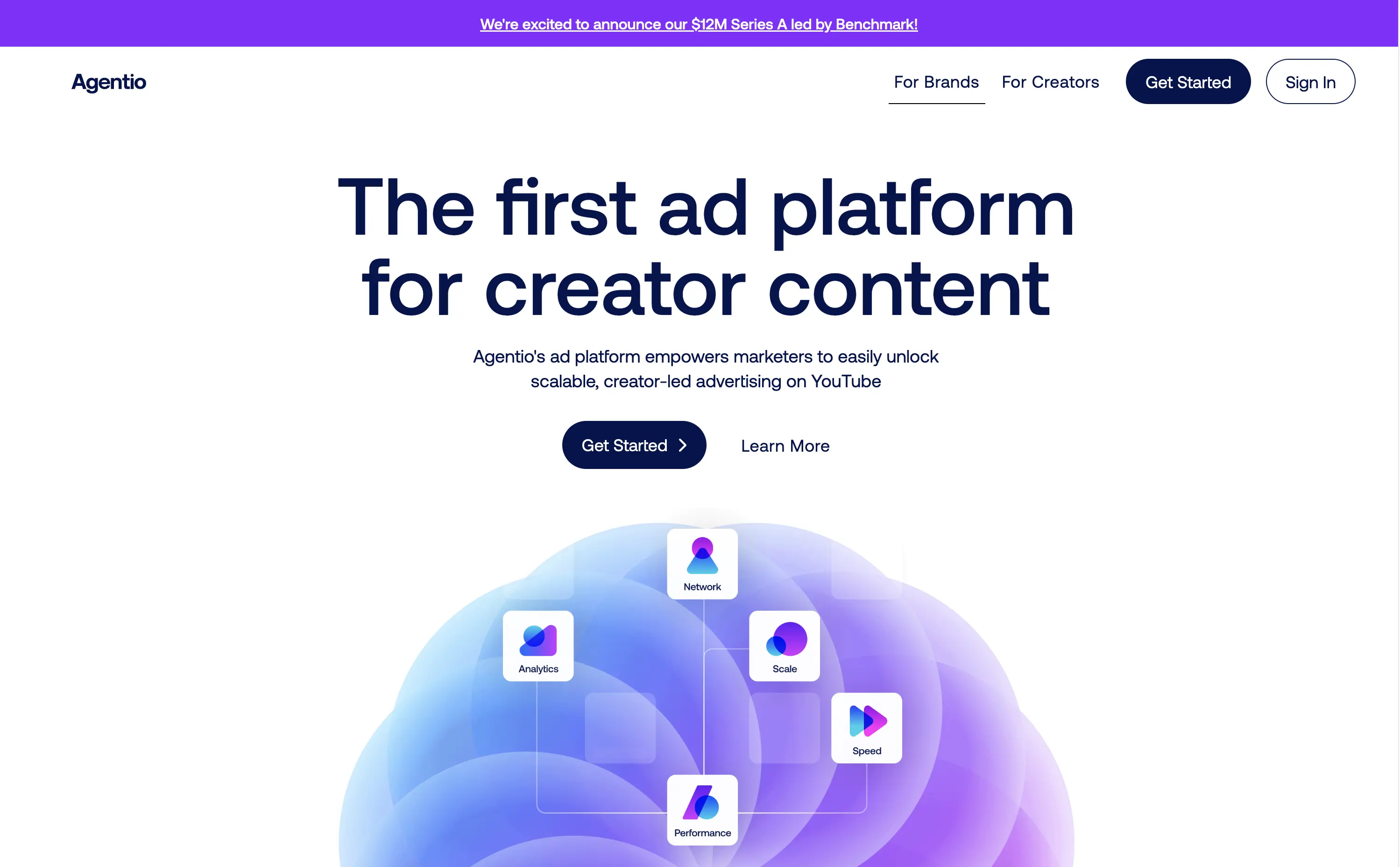
Agentio
↗
SaaS
AI Tools
Creator Tools
Centered
Bold & Direct
Confident
Multi-CTA Block
Illustration
Announcement
Gradient
Light Mode
Blue
Purple
Sans serif
Hybrid
Home Page
Webflow
orb graphic, YouTube ads, creator economy, motion gradient, AI ad platform, minimal layout, startup vibe, polished MVP, Series A, dual audience nav, split funnel intent
Agentio is an adtech platform helping marketers launch scalable, creator-led YouTube campaigns with performance tracking, analytics, and a managed network of creators.
Agentio’s hero is tight and intentional. The headline is clear and confident in its category claim. Subtext adds usability context without overloading. The floating orb graphic with ecosystem icons effectively visualizes the product promise. Dual CTAs cover both high and low-intent traffic. The announcement bar adds momentum without distraction. Layout feels modern and founder-backed — clean, but not generic.
Strong product-market fit vibes. Balances clarity and momentum for both creators and marketers. Visuals align with startup scaleup phase. Messaging is sharply angled to claim an early stake in the creator-led ad space.
This layout balances technical utility with human impact, aligning well with Algolia’s positioning as an API-first but UX-aware company. The mobile UI reinforces product value visually, while the logo wall signals scale and trust for enterprise buyers. The tone is clear, benefit-led, and appropriate for high-intent decision-makers evaluating AI tools for customer experience. This is a solid enterprise-facing hero built to perform.
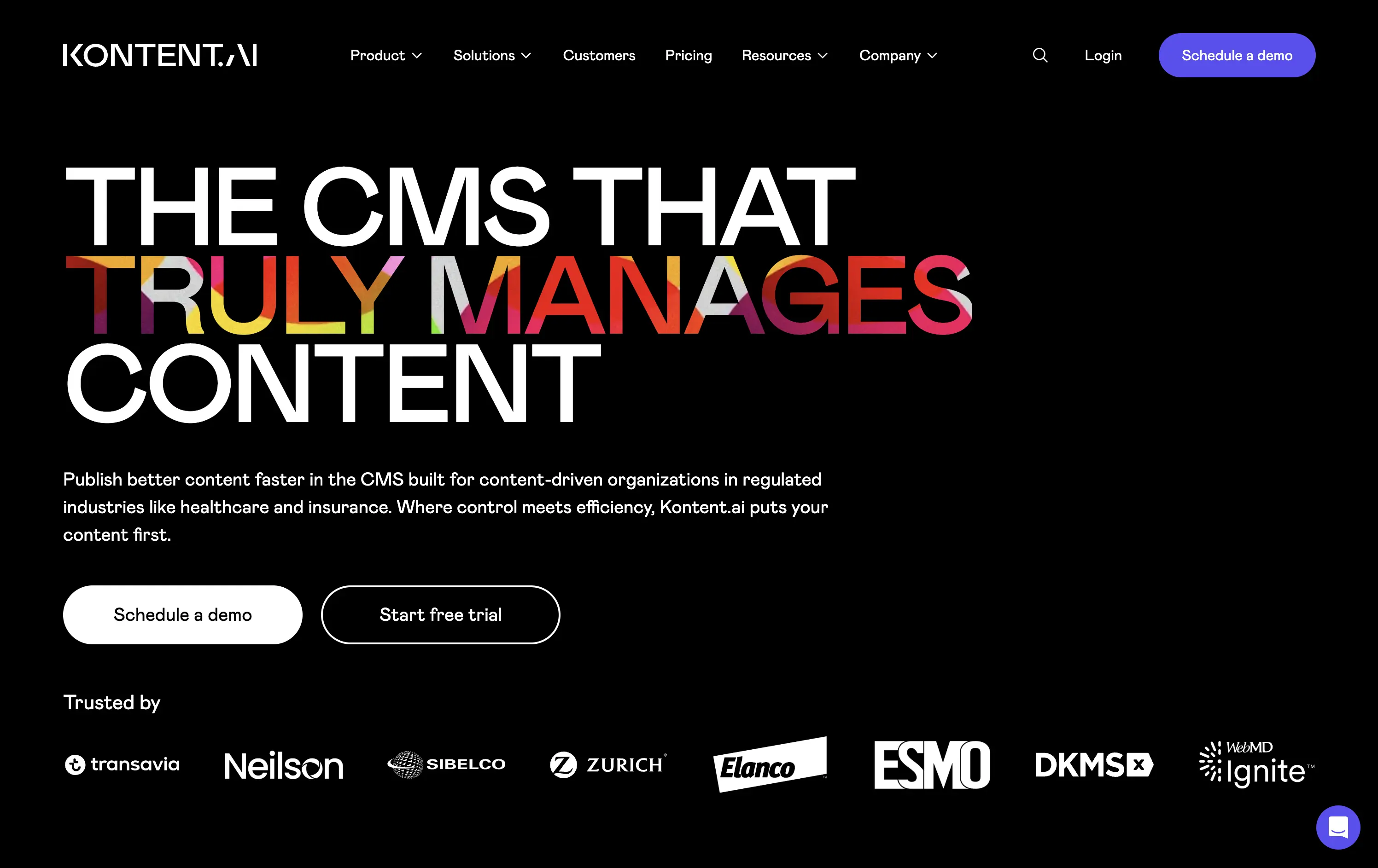
Kontent
↗
SaaS
DevTools
AI Tools
Left-aligned
Aspirational
Professional
Multi-CTA Block
Illustration
Logo Wall
Dark Mode
White
Display
Sans serif
B2B
Home Page
Custom Code
enterprise CMS, headless CMS, AI-powered content, content ops, gradient headline, trust logos, scaling infrastructure, fast deployment, dark aesthetic, enterprise compliance, visual typography, dual CTA, regulation-focused CMS, marketing ops, content velocity
Kontent.ai helps enterprise teams manage and scale content across regulated environments with more speed, control, and automation.
Hero balances clarity with ambition. Headline dramatizes a long-standing pain point in CMS, paired with a clean UI and strong credibility cues. Dual CTA supports varied funnel stages.
Tailored for enterprise teams scaling fast. The aspirational tone reframes content ops as a modern, automated function—not a bottleneck. Visuals and copy are enterprise-calibrated.
This layout balances technical utility with human impact, aligning well with Algolia’s positioning as an API-first but UX-aware company. The mobile UI reinforces product value visually, while the logo wall signals scale and trust for enterprise buyers. The tone is clear, benefit-led, and appropriate for high-intent decision-makers evaluating AI tools for customer experience. This is a solid enterprise-facing hero built to perform.
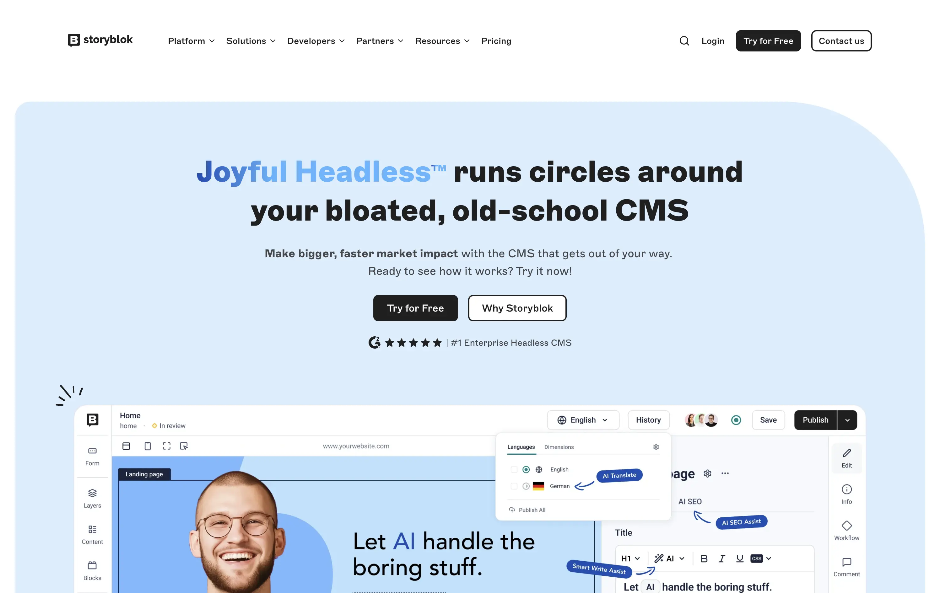
Storyblok
↗
SaaS
DevTools
Inset
Centered
Playful
Pain-driven
Multi-CTA Block
Illustration
Product UI
Social Proof
Badges
Light Mode
Blue
Black
Sans serif
B2B
Home Page
Custom Code
headless CMS, anti-legacy positioning, visual editing, developer tools, AI assist, SaaS marketing, animated UI mockup, software demo, CMS for teams, testimonial badge, conversion-first layout
Storyblok is a headless CMS built for developers and marketers to collaboratively build fast, flexible websites and digital experiences.
The hero is unapologetically punchy. It leads with a clear enemy (bloated CMSs), while pairing credibility badges with live UI proof. Product visuals reinforce benefits instead of distracting from them.
This is high-conversion, pain-aware SaaS positioning. The voice is aggressive but measured, fitting for teams actively seeking a modern CMS alternative.
This layout balances technical utility with human impact, aligning well with Algolia’s positioning as an API-first but UX-aware company. The mobile UI reinforces product value visually, while the logo wall signals scale and trust for enterprise buyers. The tone is clear, benefit-led, and appropriate for high-intent decision-makers evaluating AI tools for customer experience. This is a solid enterprise-facing hero built to perform.
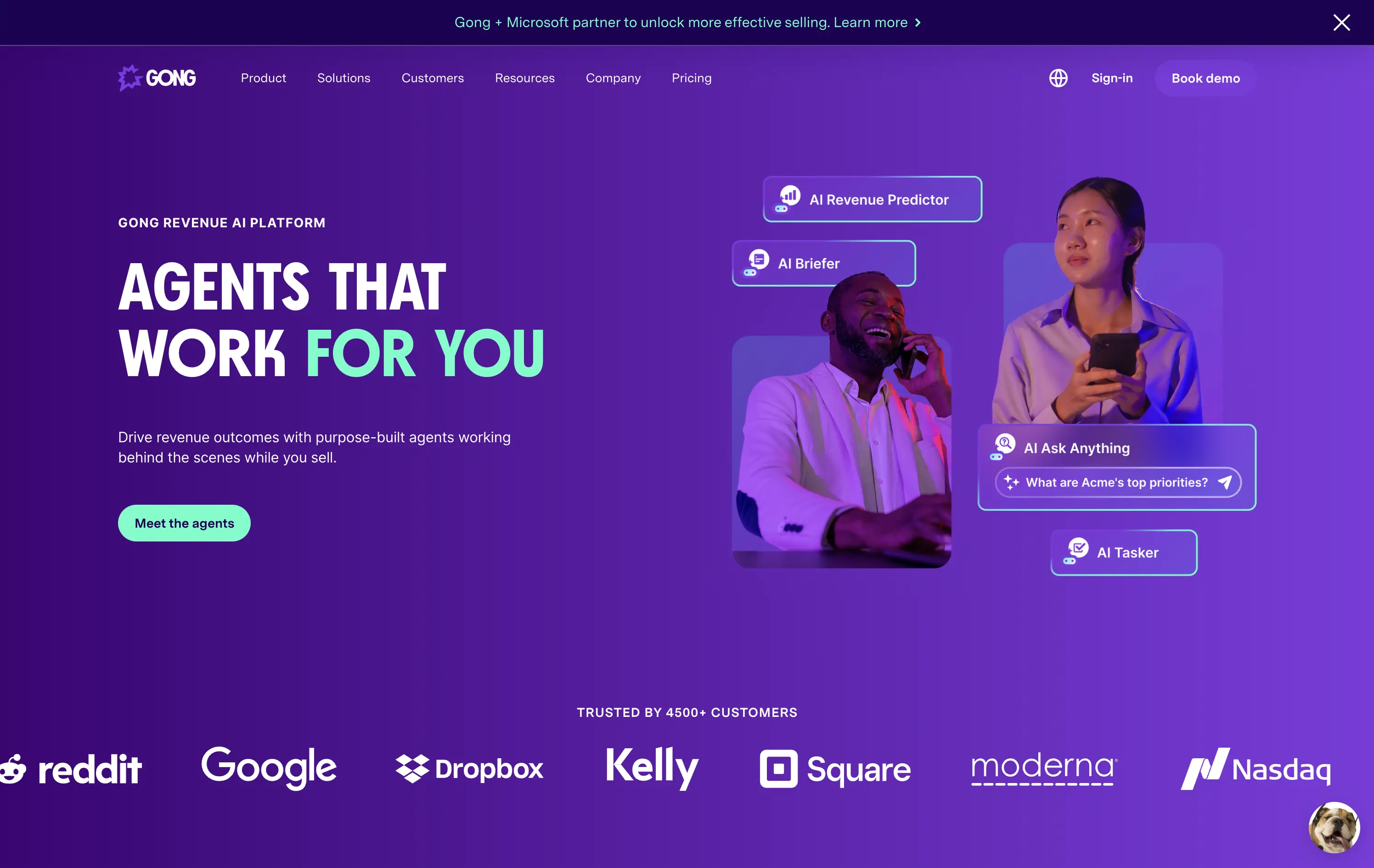
Gong
↗
SaaS
AI Tools
Productivity
Split Grid
Left-aligned
Benefit-Driven
Confident
Single Button
Photography
Illustration
Logo Wall
Announcement
Duotone
Blue
Purple
Sans serif
B2B
Home Page
Wordpress
sales AI, B2B revenue platform, utility CTA, animated overlays, client logos, enterprise trust signals, AI productivity agents, dark gradient palette, conversational UI, split hero grid, vibrant lighting, modern SaaS, sales enablement, motion interface cues, product-forward layout
Gong helps sales teams boost revenue by deploying AI-powered agents that automate insights, prep, and task handling across the sales cycle.
The hero is clear and conversion-aware. Headline delivers a confident value prop, supported by animated tooltips that make the product’s AI capabilities tangible. The “Meet the agents” CTA invites deeper engagement. Strong use of customer logos boosts enterprise credibility. Overall, it's tight, modern, and visually active without overwhelming.
Tailored for mid-to-late funnel enterprise leads. High-trust layout and confident tone reflect maturity and market leadership in B2B sales tech.
This layout balances technical utility with human impact, aligning well with Algolia’s positioning as an API-first but UX-aware company. The mobile UI reinforces product value visually, while the logo wall signals scale and trust for enterprise buyers. The tone is clear, benefit-led, and appropriate for high-intent decision-makers evaluating AI tools for customer experience. This is a solid enterprise-facing hero built to perform.
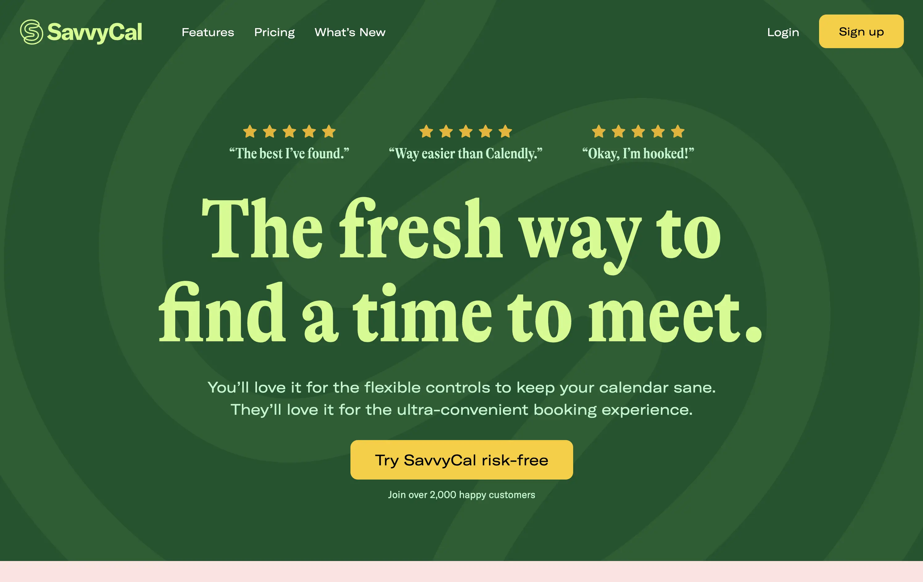
Savvy Cal
↗
SaaS
Productivity
Centered
Playful
Aspirational
Single Button
Illustration
Social Proof
Duotone
Green
Yellow
Display
Serif
B2B
Home Page
Custom Code
calendly alternative, scheduling SaaS, friendly UI, bold typography, customer-first tone, startup productivity tools, anti-friction branding, green-on-green palette, centered layout, calendar control, review-driven, solo founder energy, fresh design, clean booking UX
SavvyCal is a scheduling tool designed to simplify meeting coordination with flexible, user-first controls and a clean, friendly interface.
The hero leans hard into charm and confidence. The bold, serif headline feels conversational and clever. The contrast between green tones is controlled, and the centered layout places the CTA in a visually dominant spot. Social proof is integrated at the top with testimonial snippets to validate performance. It’s conversion-ready, especially for users looking for a more human alternative to Calendly.
Tailored to solo operators, indie founders, and small teams seeking simplicity without the enterprise bloat. Balances approachability and professionalism through tone and visual treatment. Micro-proof adds trust without noise.
This layout balances technical utility with human impact, aligning well with Algolia’s positioning as an API-first but UX-aware company. The mobile UI reinforces product value visually, while the logo wall signals scale and trust for enterprise buyers. The tone is clear, benefit-led, and appropriate for high-intent decision-makers evaluating AI tools for customer experience. This is a solid enterprise-facing hero built to perform.
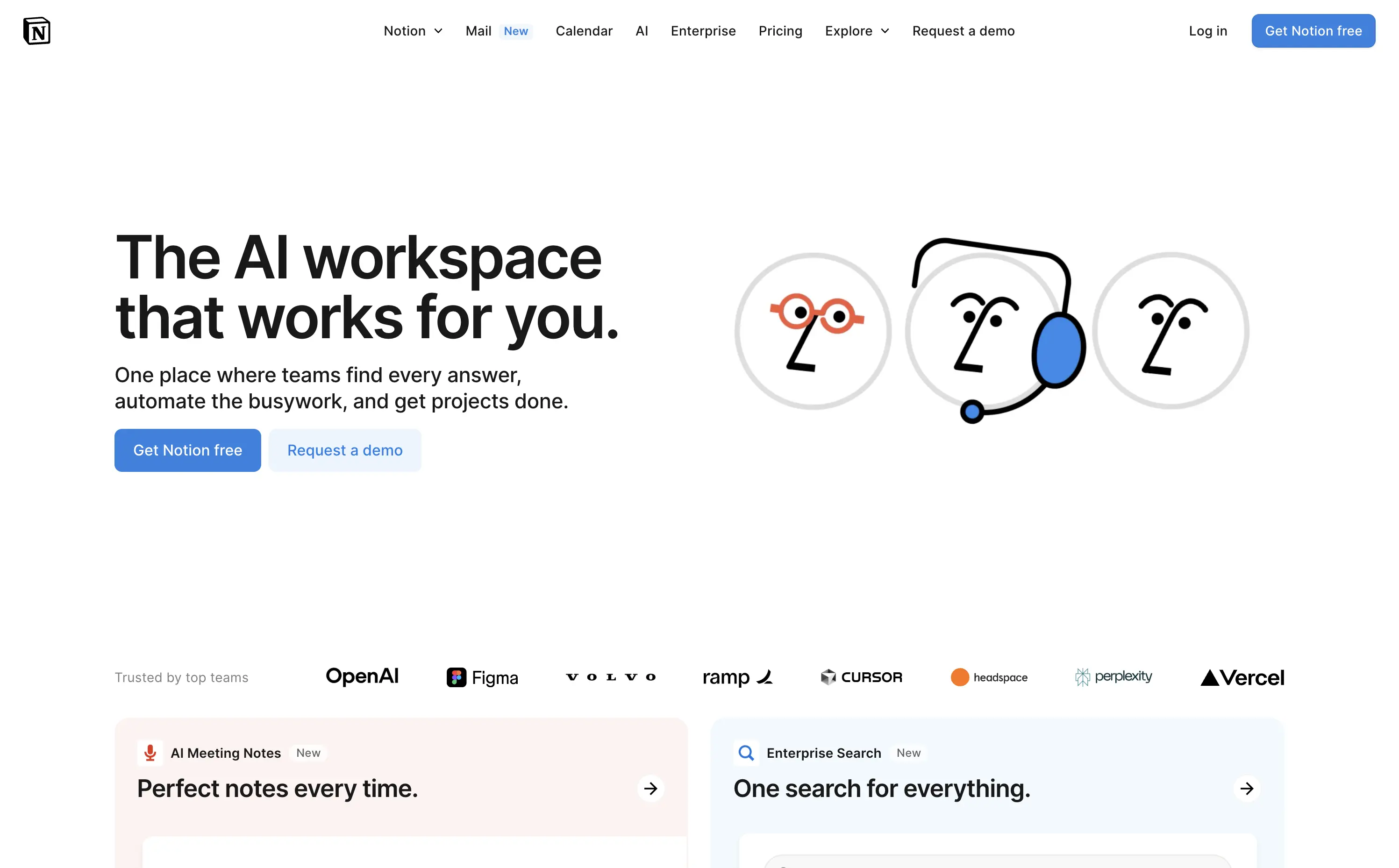
Notion
↗
SaaS
AI Tools
Productivity
Split Grid
Left-aligned
Aspirational
Empowering
Multi-CTA Block
Illustration
Logo Wall
Custom Animation
Light Mode
Blue
Sans serif
Hybrid
Home Page
Custom Code
AI workspace, animated avatars, productivity OS, enterprise-ready, personal + team use, modular interface, brand-first UI, continuation scroll, flexible use cases, playful sophistication, high-trust visual, calm interface, utility meets emotion, scalable collaboration
Notion is an all-in-one AI workspace that helps teams and individuals write, organize, automate, and collaborate — from startups to enterprise scale.
This hero strikes a balance between visual charm and clarity. The animation of AI personas dramatizes the core value prop — “they work for you” — and makes the abstract feel accessible. The headline is direct and benefit-led, while the subhead outlines practical use cases. Dual CTAs target both entry-level and enterprise buyers. Scrolling reveals feature blocks, encouraging deeper exploration. Trusted-by logos create instant credibility.
A masterclass in multi-audience positioning — speaks to freelancers and Fortune 500s simultaneously. Smart blend of human tone and scalable utility, reinforced visually through motion, brand trust cues, and modular follow-up content.
This layout balances technical utility with human impact, aligning well with Algolia’s positioning as an API-first but UX-aware company. The mobile UI reinforces product value visually, while the logo wall signals scale and trust for enterprise buyers. The tone is clear, benefit-led, and appropriate for high-intent decision-makers evaluating AI tools for customer experience. This is a solid enterprise-facing hero built to perform.
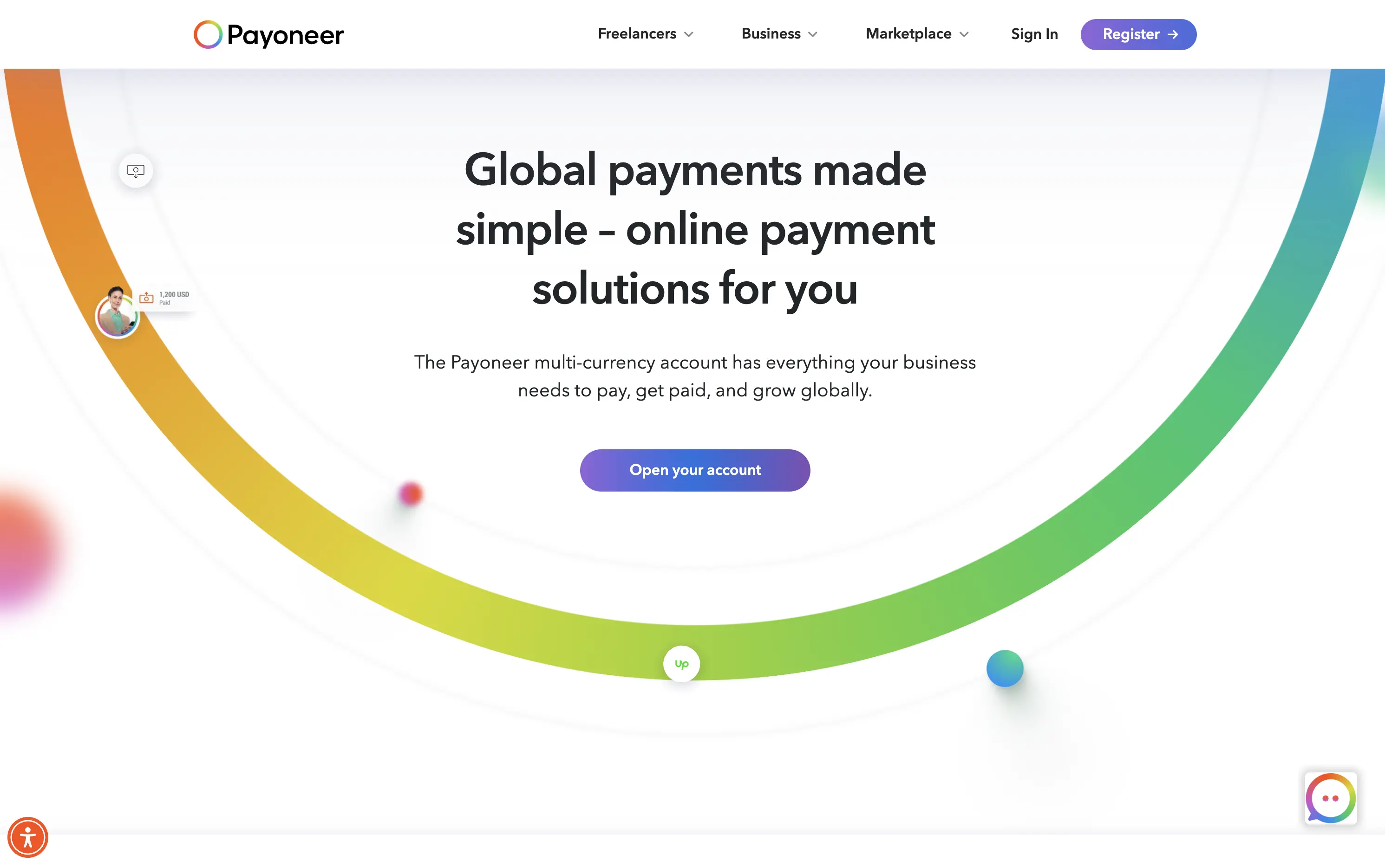
Payoneer
↗
SaaS
Fintech
Centered
Descriptive
Confident
Single Button
Photography
Illustration
Custom Animation
Light Mode
Purple
Sans serif
B2B
Home Page
Wordpress
global payments, borderless finance, transaction animation, multi-currency account, visual storytelling, freelancer payments, cross-border SaaS, simplified UX, modern money movement, motion-led layout, banking alternative, vibrant palette, international scale
Payoneer is a global online payment platform offering multi-currency accounts and seamless cross-border transactions for businesses and freelancers.
The hero blends utility and motion well. The animated arc mimics financial flow, visually conveying the platform’s core promise: fast, borderless payments. Headline is clear and functional, supported by a strong subhead. The animation, showing USD amounts sent and received, makes the experience feel human and practical. The CTA is visible but understated. Overall, it reinforces trust and makes the product feel simple and scalable.
Smart visual metaphor for financial ease and flow — helps Payoneer stand out in a space often dominated by cold, institutional design. This layout is conversion-safe while visually expressive.
This layout balances technical utility with human impact, aligning well with Algolia’s positioning as an API-first but UX-aware company. The mobile UI reinforces product value visually, while the logo wall signals scale and trust for enterprise buyers. The tone is clear, benefit-led, and appropriate for high-intent decision-makers evaluating AI tools for customer experience. This is a solid enterprise-facing hero built to perform.
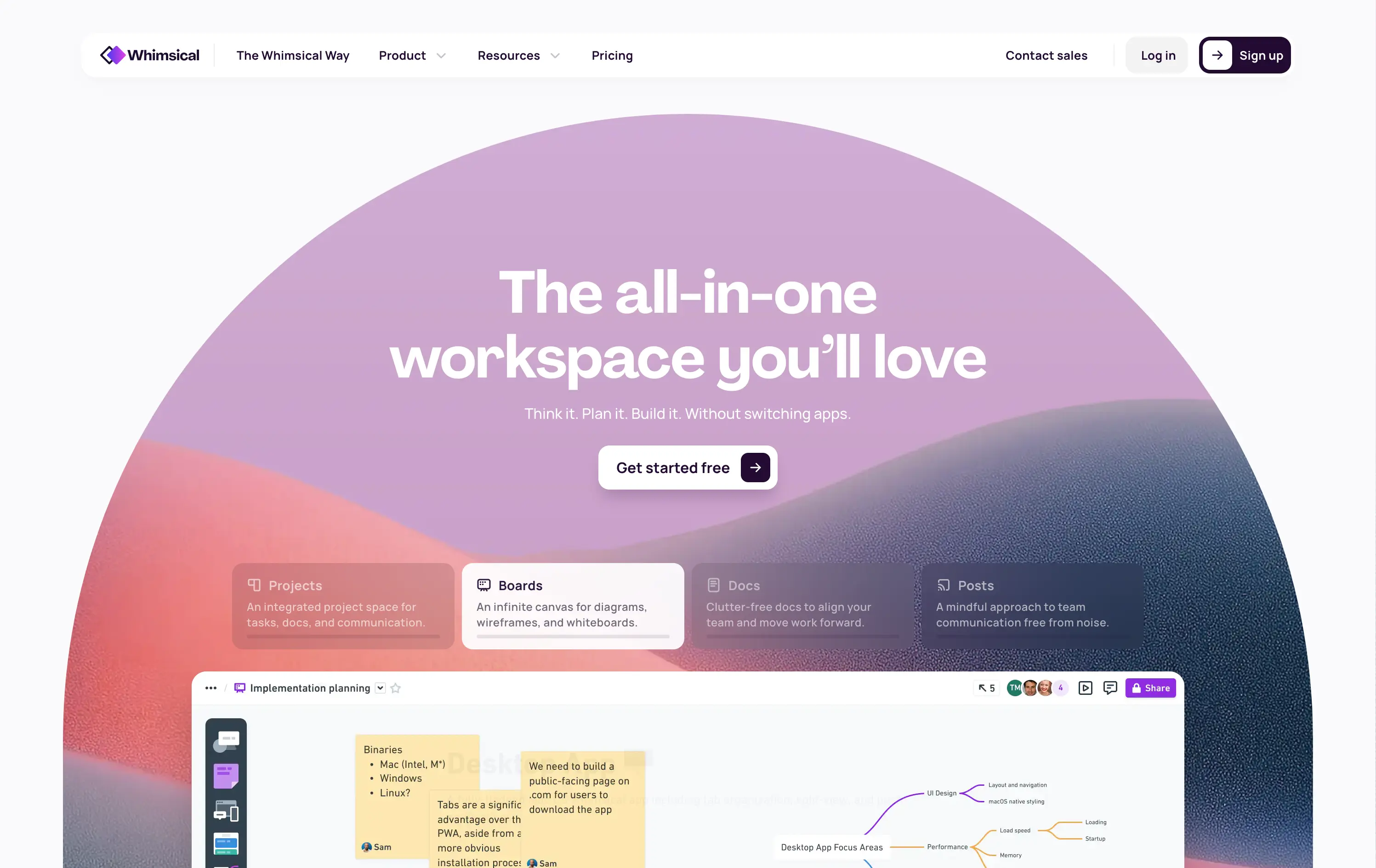
Whimsical
↗
SaaS
Collaboration
Productivity
Inset
Centered
Benefit-Driven
Empowering
Single Button
Illustration
Interactive
Product UI
Gradient
Light Mode
Pink
Purple
Orange
Sans serif
B2B
Home Page
Custom Code
collaborative workspace, pastel gradient, feature carousel, lightweight SaaS, sticky headline, soft UI, premium-yet-friendly, high-trust design, zero-friction onboarding, visual task planning, alternative to Miro, team productivity
Whimsical is an all-in-one visual workspace for teams to plan, wireframe, write, and collaborate—without switching between tools.
The hero immediately differentiates with its warm, gradient-driven palette and curved editorial layout. Headline is sticky and emotional, while the subheadline cues action and ease. Below, animated modules skim through key features—smartly designed to reduce cognitive load while expanding curiosity. The product UI is fully visible and feels friendly. CTA is low friction and well-placed. Compared to competitors, this layout feels more human-centered and less corporate, while still conveying product intelligence.
Strong product-led growth positioning with emotional stickiness. Visuals balance friendliness with focus. Motion helps drive upfront clarity, and layout choice favors quick scanning—well-suited for both individual users and team leads.
This layout balances technical utility with human impact, aligning well with Algolia’s positioning as an API-first but UX-aware company. The mobile UI reinforces product value visually, while the logo wall signals scale and trust for enterprise buyers. The tone is clear, benefit-led, and appropriate for high-intent decision-makers evaluating AI tools for customer experience. This is a solid enterprise-facing hero built to perform.
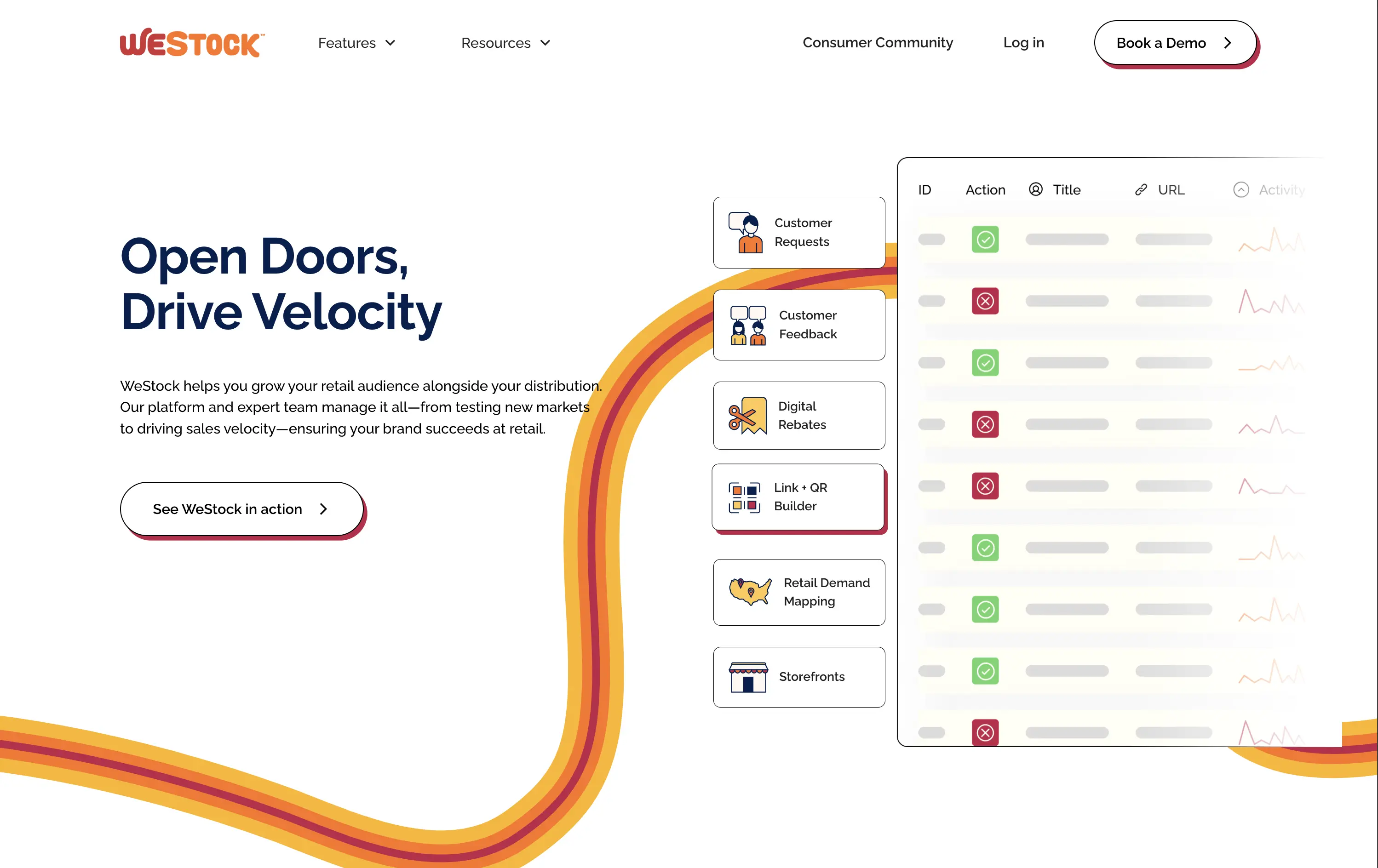
WeStock
↗
SaaS
Split Grid
Left-aligned
Abstract / Conceptual
Single Button
Illustration
Interactive
Product UI
Light Mode
Red
Orange
Yellow
Sans serif
B2B
Home Page
Webflow
retail analytics, B2B SaaS, colorful path motif, feature reveal, scroll effect, clean layout, product-led hero, multicolored interface, CPG enablement, UI preview, startup brand tone, sales-velocity focus, modern B2B
WeStock helps brands grow at retail by using data and consumer demand to drive velocity and streamline distribution.
This hero gets to the point quickly. The headline is bold, the subcopy is informative, and the UI sample makes the product feel real. The color path is a clever directional device. Visual hierarchy works, though the CTA could use stronger visual emphasis to better guide next-step intent.
A clear, professional intro for early-stage and growth CPG brands. Balances explanation with intrigue. Strong brand coherence, great visual metaphor, and effective low-friction education. CTA clarity is good; visibility needs boost.
This layout balances technical utility with human impact, aligning well with Algolia’s positioning as an API-first but UX-aware company. The mobile UI reinforces product value visually, while the logo wall signals scale and trust for enterprise buyers. The tone is clear, benefit-led, and appropriate for high-intent decision-makers evaluating AI tools for customer experience. This is a solid enterprise-facing hero built to perform.
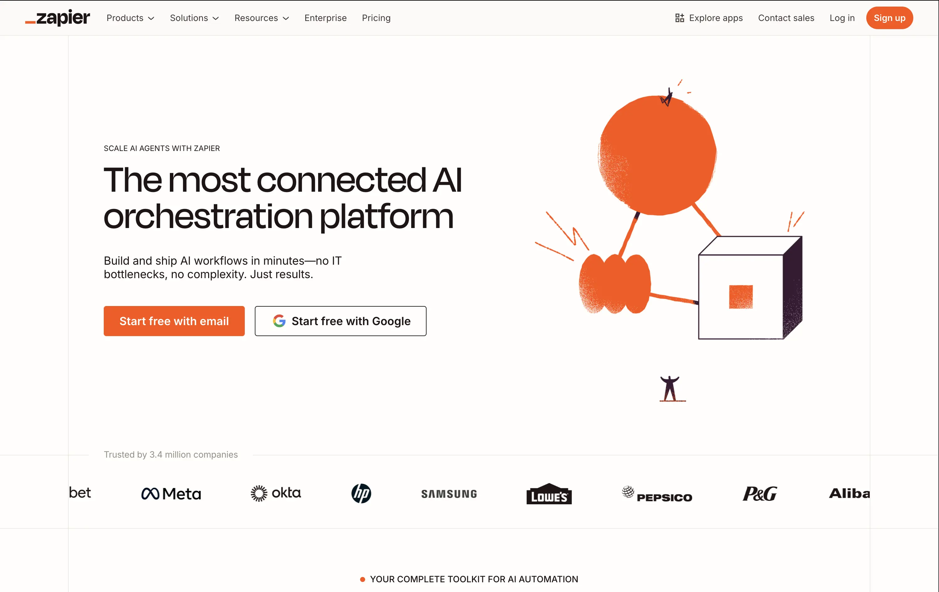
Zapier
↗
SaaS
AI Tools
No-Code
Split Grid
Left-aligned
Confident
Multi-CTA Block
Illustration
Logo Wall
Light Mode
Orange
Sans serif
Hybrid
Home Page
Builder.io
automation platform, brand-led, Zapier orange, illustration-based hero, high-trust layout, whitespace-heavy, freemium SaaS, mature product, enterprise credibility, visual shorthand, no-code workflow, minimal UI, no-code
Zapier is a no-code automation platform that connects 8,000+ apps so anyone can build time-saving workflows without engineering help.
The hero does a clean job of reinforcing brand authority. Copy is tight and direct. The whimsical graphic adds energy while the dual CTAs eliminate friction. It assumes pre-awareness and leans on Zapier’s brand strength.
Ideal for a mature product with wide adoption. Skips granular education to emphasize leadership and ease of use. Visuals and messaging feel like a confident category owner.
This layout balances technical utility with human impact, aligning well with Algolia’s positioning as an API-first but UX-aware company. The mobile UI reinforces product value visually, while the logo wall signals scale and trust for enterprise buyers. The tone is clear, benefit-led, and appropriate for high-intent decision-makers evaluating AI tools for customer experience. This is a solid enterprise-facing hero built to perform.
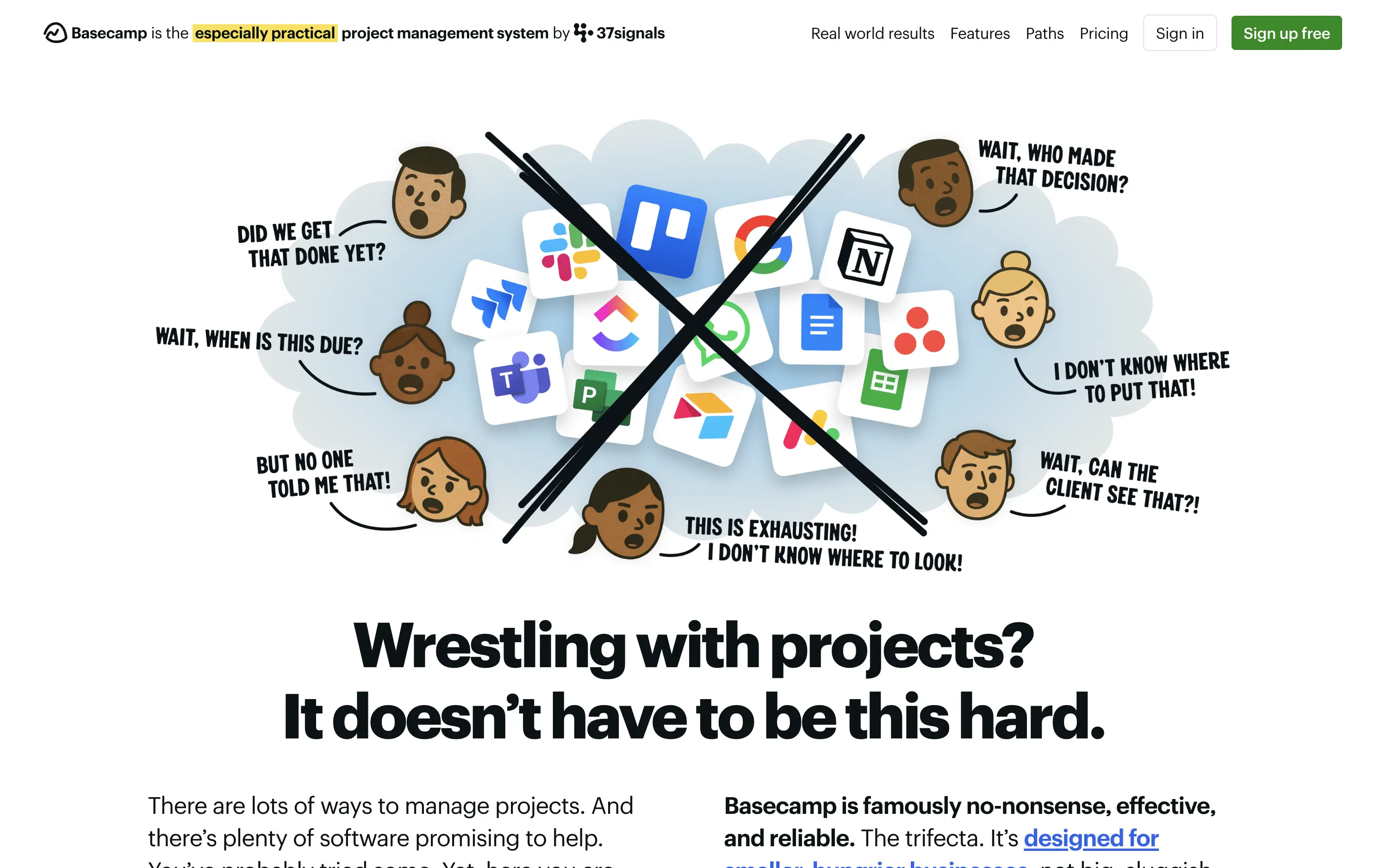
Basecamp
↗
SaaS
Collaboration
Productivity
Centered
Unconventional
Conversational
Pain-driven
No CTA
Illustration
Light Mode
Green
Yellow
Sans serif
B2B
Home Page
Custom Code
project management, SaaS, lo-fi aesthetic, opinionated design, founder-led voice, visual storytelling, problem-first, productivity, cluttered tool fatigue, anti-modern, expressive illustration, early-stage appeal, emotional resonance, no UI demo, brand storytelling, narrative-led
Basecamp cuts through tool overload with one practical workspace, ending project chaos.
The hero skips UI glamour for emotional clarity. It dramatizes the frustration of using too many disjointed tools through expressive cartoon faces and crossed-out logos. The copy is plain, bold, and highly relatable — “Wrestling with projects?” grounds it in a universal pain. No button, no fluff. The simplicity grabs attention and makes the message instantly clear.
Leans hard into anti-trend positioning—practicality over polish. Speaks directly to the frustration of tool overload, appealing to leaders who want sanity, not features. It’s memorable and unmistakably aligned with Basecamp’s legacy of contrarian clarity.
This layout balances technical utility with human impact, aligning well with Algolia’s positioning as an API-first but UX-aware company. The mobile UI reinforces product value visually, while the logo wall signals scale and trust for enterprise buyers. The tone is clear, benefit-led, and appropriate for high-intent decision-makers evaluating AI tools for customer experience. This is a solid enterprise-facing hero built to perform.
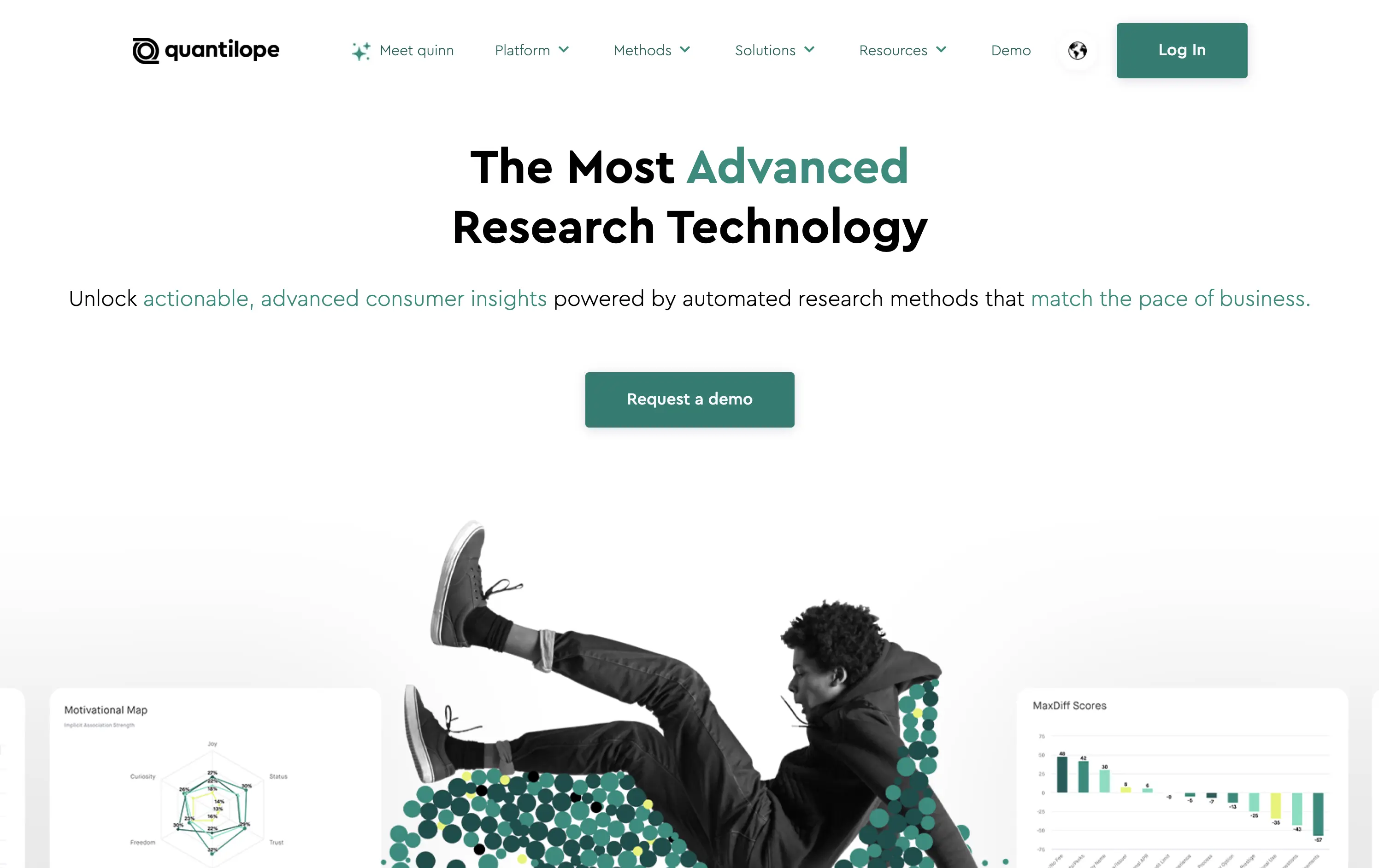
Quantilope
↗
SaaS
AI Tools
Data & Analytics
Centered
Bold & Direct
Confident
Single Button
Photography
Illustration
Product UI
Light Mode
Green
Sans serif
B2B
Home Page
Custom Code
research SaaS, data platform hero, quant marketing, teal hero, minimal SaaS layout, B2B insights platform, insight automation, animated data graphic, data-driven marketing, stat visual hero
Quantilope is an advanced research platform that automates consumer insights at scale.
The headline stakes a bold claim, and the teal accent draws focus to “advanced” and action keywords. Hero visual is a clever juxtaposition of human + data, adding some life to an otherwise data-heavy space. One clear CTA keeps the flow focused.
Aimed at marketing execs and insights leaders, the hero’s tone and layout signal speed, clarity, and data fluency. It balances modernity with professionalism, avoiding overdesign while staying sharp.
This layout balances technical utility with human impact, aligning well with Algolia’s positioning as an API-first but UX-aware company. The mobile UI reinforces product value visually, while the logo wall signals scale and trust for enterprise buyers. The tone is clear, benefit-led, and appropriate for high-intent decision-makers evaluating AI tools for customer experience. This is a solid enterprise-facing hero built to perform.
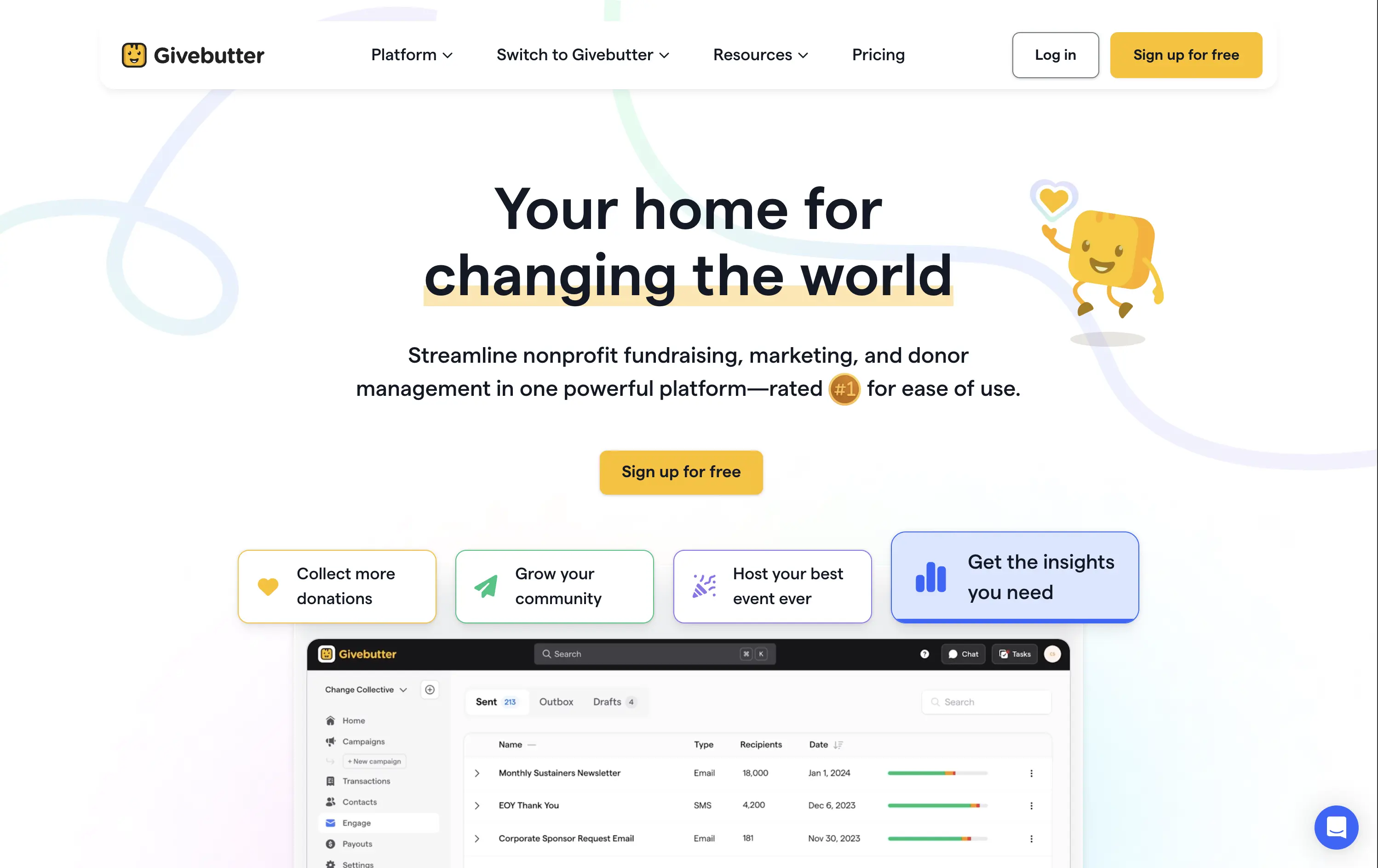
Givebutter
↗
SaaS
Fintech
Centered
Aspirational
Empowering
Single Button
Illustration
Product UI
Custom Animation
Light Mode
Yellow
Sans serif
B2B
Home Page
Webflow
fundraising SaaS, nonprofit tech, donor platform, feel-good UX, animated mascot, bento interface, purpose-driven, pastel palette, onboarding clarity, interactive benefits, Gen Z friendly, platform utility, warm branding, visual segmentation
Givebutter is a modern fundraising platform for nonprofits to manage donations, donors, events, and campaigns — all in one place.
This hero hits all the right notes for a purpose-led platform. The headline is clear and values-forward, while the playful highlight under “changing the world” draws attention without shouting. The mascot brings joy and motion, and the interactive bentocards smartly preview key benefits. It’s emotionally inviting, but structurally strong.
The hero balances clarity and optimism. Copy is simple and anchored in purpose. Visual hierarchy is clean, with modular tiles surfacing key actions. Mascot animation adds warmth without clutter.
This layout balances technical utility with human impact, aligning well with Algolia’s positioning as an API-first but UX-aware company. The mobile UI reinforces product value visually, while the logo wall signals scale and trust for enterprise buyers. The tone is clear, benefit-led, and appropriate for high-intent decision-makers evaluating AI tools for customer experience. This is a solid enterprise-facing hero built to perform.
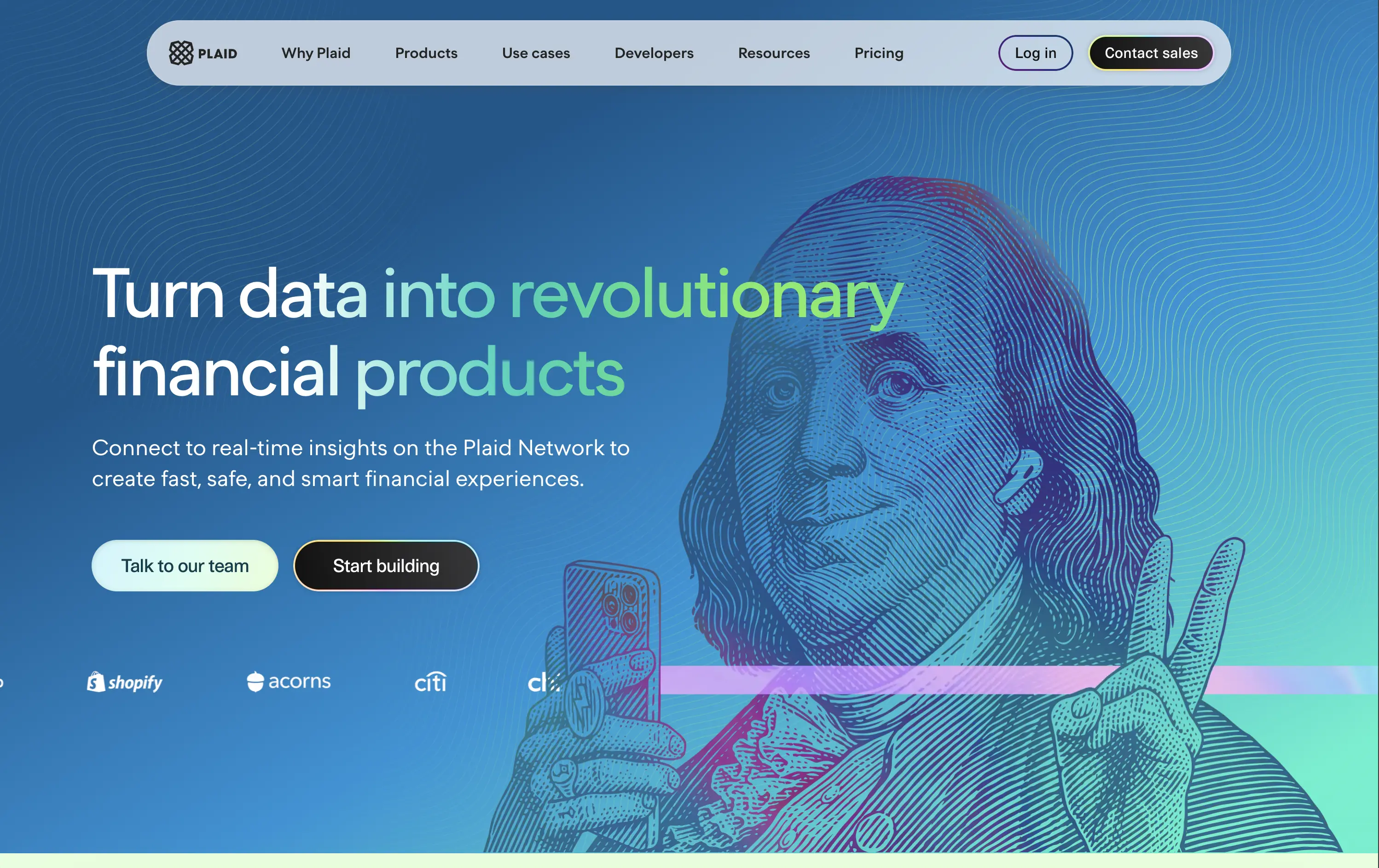
Plaid
↗
DevTools
Fintech
Data & Analytics
Left-aligned
Bold & Direct
Confident
Multi-CTA Block
Illustration
Interactive
Logo Wall
Gradient
Blue
Green
Sans serif
B2B
Home Page
Custom Code
developer fintech, API platform, financial data access, quirky fintech aesthetic, bold hero art, Benjamin Franklin illustration, smart finance tools, B2B API, trust logos, dev-first call to action, animated CTA, playful visual metaphor
Plaid is a data network that connects financial apps to users’ bank accounts securely and efficiently to power modern money experiences.
Plaid’s hero grabs attention with personality — Benjamin Franklin posing with an iPhone and some airpods, wrapped in a swirling gradient background. But it’s not just noise. The headline instantly communicates product value and the CTA contrast (“Talk to our team” vs. “Start building”) serves both enterprise and self-serve tracks. Logo wall underlines legitimacy. It’s high-impact and instantly memorable.
Plaid positions itself as the modern infrastructure backbone of fintech. The visual and messaging mix signals credibility, tech depth, and cultural fluency — ideal for both new gen founders.
This layout balances technical utility with human impact, aligning well with Algolia’s positioning as an API-first but UX-aware company. The mobile UI reinforces product value visually, while the logo wall signals scale and trust for enterprise buyers. The tone is clear, benefit-led, and appropriate for high-intent decision-makers evaluating AI tools for customer experience. This is a solid enterprise-facing hero built to perform.
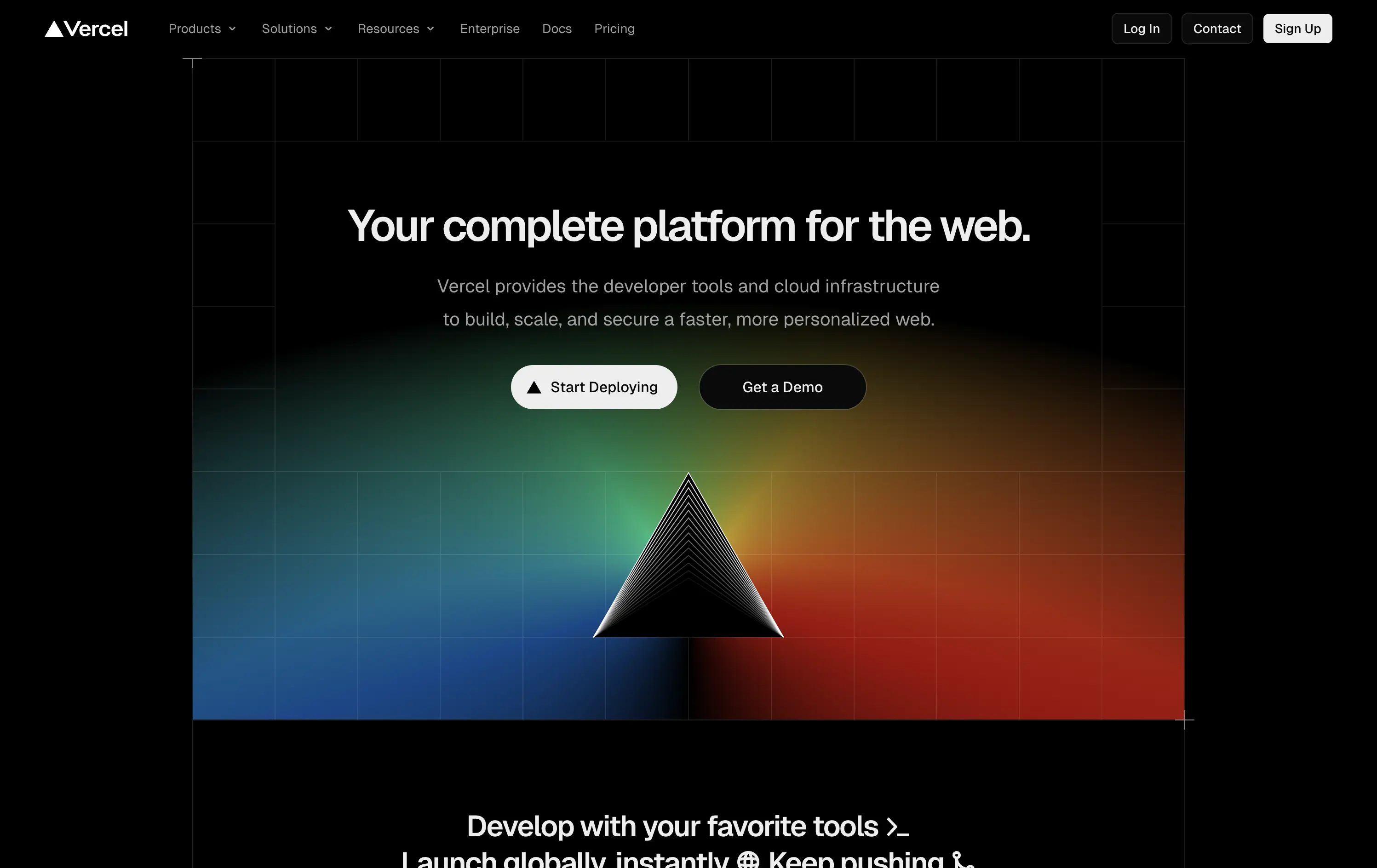
Vercel
↗
SaaS
DevTools
Centered
Bold & Direct
Multi-CTA Block
Illustration
Gradient
Dark Mode
White
Black
Sans serif
B2B
Home Page
Custom Code
developer-first, dark UI, iconic branding, gradient background, clean copy, deploy-focused, modern SaaS, performance tooling, enterprise appeal, visual impact, prism hero, action-oriented
Vercel gives developers the tools to build, deploy, and scale high-performance web apps with ease and speed.
The hero delivers immediate clarity: who it’s for, what it does, and how to get started. The dark UI, glowing visuals, and sharp copy create instant trust. Dual CTAs smartly capture both trial users and enterprise prospects.
A focused, no-fluff entry point optimized for developer decision speed. Brand expression is strong, conversion is easy, and the layout avoids distraction. Built for high-intent audiences evaluating deployment solutions.
This layout balances technical utility with human impact, aligning well with Algolia’s positioning as an API-first but UX-aware company. The mobile UI reinforces product value visually, while the logo wall signals scale and trust for enterprise buyers. The tone is clear, benefit-led, and appropriate for high-intent decision-makers evaluating AI tools for customer experience. This is a solid enterprise-facing hero built to perform.
The most effective hero sections in your inbox.
Monthly round up of top hero sections.
Don't worry. We hate spam too.
Don't worry. We hate spam too.
Don't worry. We hate spam too.