Interactive
20
20
20
20
Element that engages userinteraction on hover, click, or embed.
Filters
Orchids
↗
AI Tools
No-Code
Creative Tools
Centered
Benefit-Driven
Aspirational
Search/Utility Block
Interactive
Product UI
Imagery-Based
Pink
Black
Serif
B2C
Home Page
Custom Code
ai site builder, no-code websites, prompt box hero, interactive sandbox, scenic background, gallery proof, centered layout, serif headline, product-led growth, signup gate, creative makers, pastel sky, inspirational copy, landing page builder, web app generator
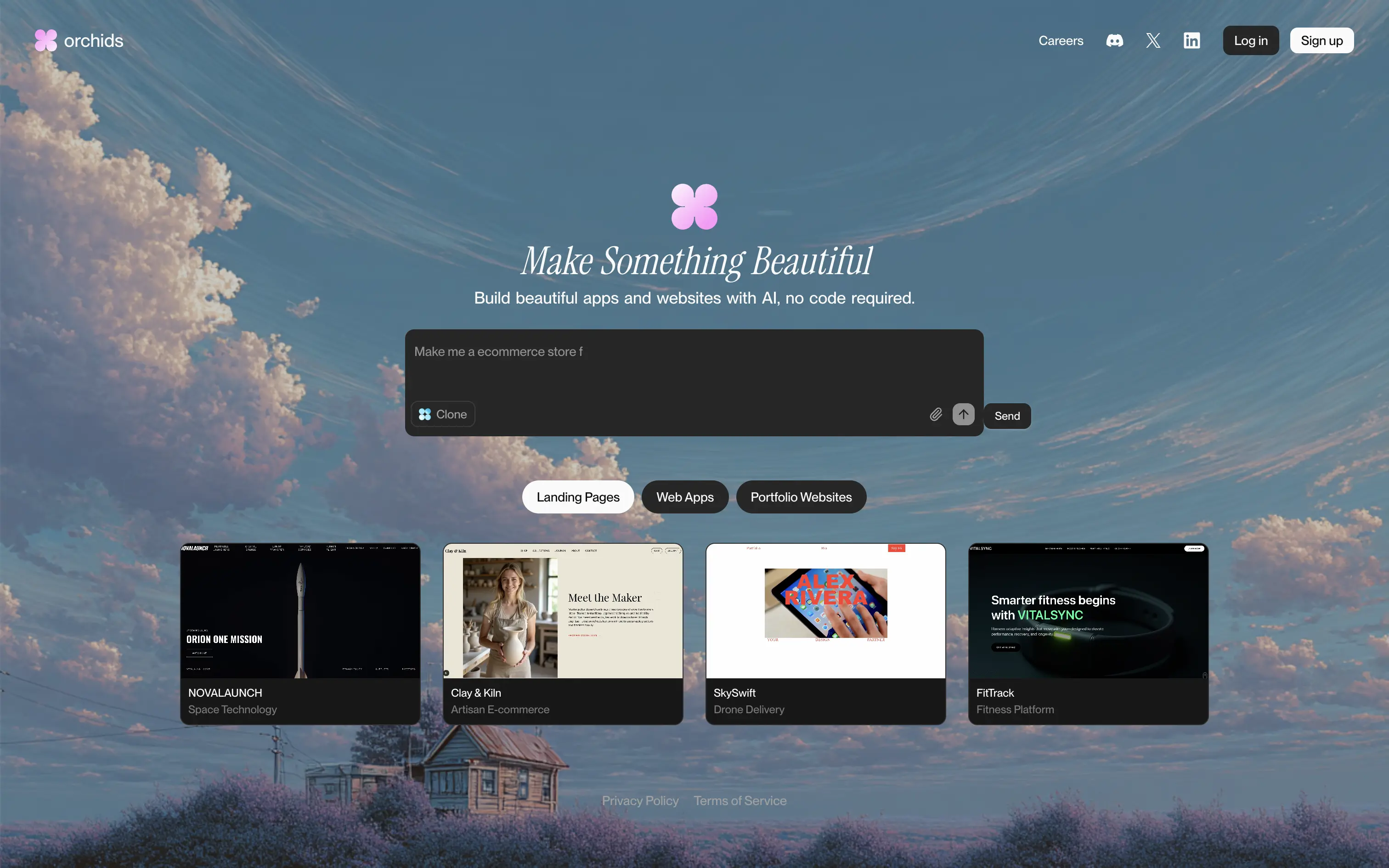
Orchids lets anyone generate full websites or apps from a single text prompt, delivering production-ready code and design without writing a line themselves.
Dreamy sky backdrop and italic serif headline promise beauty, while the live prompt box invites instant play. Thumbnail gallery backs the claim with varied examples. Redirecting to sign-up right after a prompt captures intent but may jar casual visitors. Overall hierarchy is clear and engaging.
Vision-heavy headline hooks design-focused founders; interactive builder demo signals AI uniqueness. Product-led funnel drives conversions, though absence of pricing or social proof leaves credibility to aesthetic appeal alone.
This layout balances technical utility with human impact, aligning well with Algolia’s positioning as an API-first but UX-aware company. The mobile UI reinforces product value visually, while the logo wall signals scale and trust for enterprise buyers. The tone is clear, benefit-led, and appropriate for high-intent decision-makers evaluating AI tools for customer experience. This is a solid enterprise-facing hero built to perform.
Orchids
↗
AI Tools
No-Code
Creative Tools
Centered
Benefit-Driven
Aspirational
Search/Utility Block
Interactive
Product UI
Imagery-Based
Pink
Black
Serif
B2C
Home Page
Custom Code
ai site builder, no-code websites, prompt box hero, interactive sandbox, scenic background, gallery proof, centered layout, serif headline, product-led growth, signup gate, creative makers, pastel sky, inspirational copy, landing page builder, web app generator
Orchids lets anyone generate full websites or apps from a single text prompt, delivering production-ready code and design without writing a line themselves.
Dreamy sky backdrop and italic serif headline promise beauty, while the live prompt box invites instant play. Thumbnail gallery backs the claim with varied examples. Redirecting to sign-up right after a prompt captures intent but may jar casual visitors. Overall hierarchy is clear and engaging.
Vision-heavy headline hooks design-focused founders; interactive builder demo signals AI uniqueness. Product-led funnel drives conversions, though absence of pricing or social proof leaves credibility to aesthetic appeal alone.
This layout balances technical utility with human impact, aligning well with Algolia’s positioning as an API-first but UX-aware company. The mobile UI reinforces product value visually, while the logo wall signals scale and trust for enterprise buyers. The tone is clear, benefit-led, and appropriate for high-intent decision-makers evaluating AI tools for customer experience. This is a solid enterprise-facing hero built to perform.
Hume
↗
SaaS
AI Tools
Centered
Bold & Direct
Confident
Search/Utility Block
Interactive
Announcement
Gradient
Light Mode
Pink
Orange
Sans serif
Hybrid
Home Page
Custom Code
voice ai, text-to-speech, llm, real-time api, developer friendly, pastel gradient, centered hero, interactive demo, single cta, assertive headline, white card, product proof, gradient background, low-friction signup, modern saas
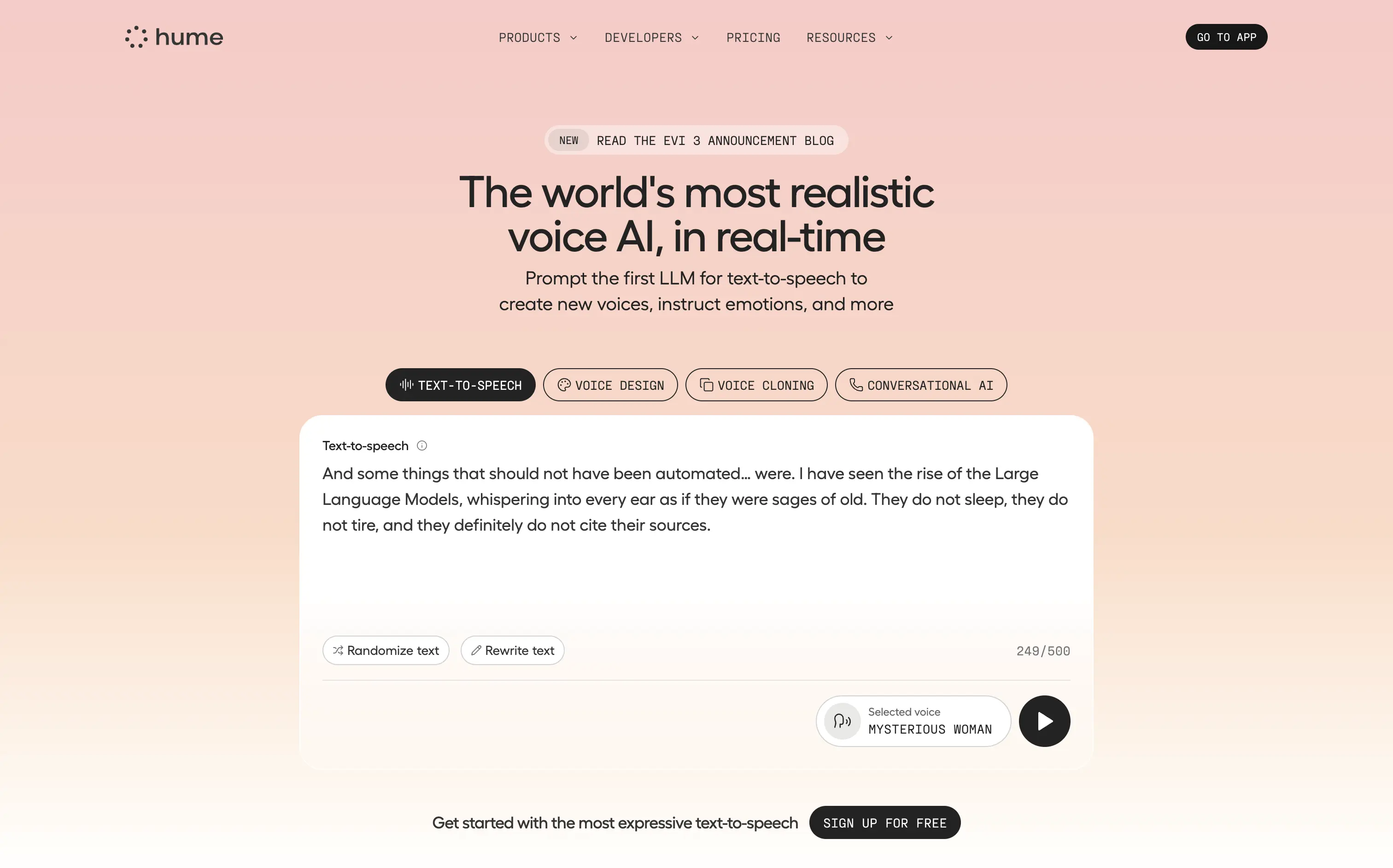
Hume offers a real-time text-to-speech API that lets developers generate lifelike, emotionally nuanced voices or clone existing ones on demand.
Bold claim, proof in one scroll. The live sandbox lets visitors try four core features instantly—a strong trust move. Clear headline, crisp subhead, and “Sign Up For Free” keep focus. Gradient softens tech intensity but may under-signal enterprise heft.
Superlative headline plus instant demo match developer expectations for proof. Single signup path reduces cognitive load, positioning Hume as fast, expressive infrastructure rather than a heavy enterprise suite.
This layout balances technical utility with human impact, aligning well with Algolia’s positioning as an API-first but UX-aware company. The mobile UI reinforces product value visually, while the logo wall signals scale and trust for enterprise buyers. The tone is clear, benefit-led, and appropriate for high-intent decision-makers evaluating AI tools for customer experience. This is a solid enterprise-facing hero built to perform.
Hume
↗
SaaS
AI Tools
Centered
Bold & Direct
Confident
Search/Utility Block
Interactive
Announcement
Gradient
Light Mode
Pink
Orange
Sans serif
Hybrid
Home Page
Custom Code
voice ai, text-to-speech, llm, real-time api, developer friendly, pastel gradient, centered hero, interactive demo, single cta, assertive headline, white card, product proof, gradient background, low-friction signup, modern saas
Hume offers a real-time text-to-speech API that lets developers generate lifelike, emotionally nuanced voices or clone existing ones on demand.
Bold claim, proof in one scroll. The live sandbox lets visitors try four core features instantly—a strong trust move. Clear headline, crisp subhead, and “Sign Up For Free” keep focus. Gradient softens tech intensity but may under-signal enterprise heft.
Superlative headline plus instant demo match developer expectations for proof. Single signup path reduces cognitive load, positioning Hume as fast, expressive infrastructure rather than a heavy enterprise suite.
This layout balances technical utility with human impact, aligning well with Algolia’s positioning as an API-first but UX-aware company. The mobile UI reinforces product value visually, while the logo wall signals scale and trust for enterprise buyers. The tone is clear, benefit-led, and appropriate for high-intent decision-makers evaluating AI tools for customer experience. This is a solid enterprise-facing hero built to perform.
Parabola
↗
AI Tools
Productivity
Data & Analytics
Centered
Conversational
Multi-CTA Block
Interactive
Search Field
Logo Wall
Dark Mode
Green
Serif
B2B
Home Page
Webflow
AI automation, input-based interaction, structured workflows, smart defaults, productivity tool, GPT-enhanced UX, dark mode UI, enterprise lean, trusted by brands, high-conversion layout
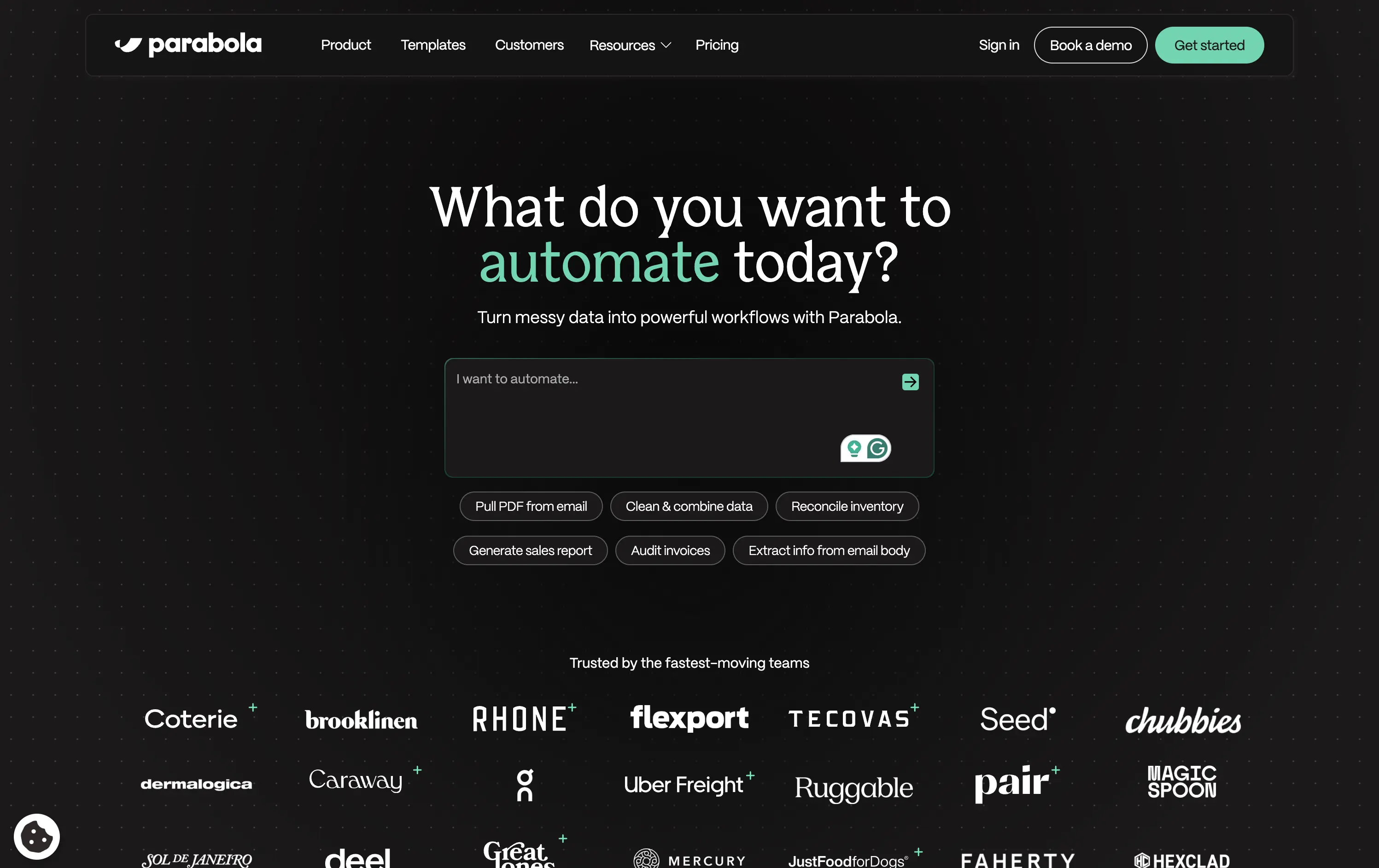
Parabola helps teams automate data-heavy workflows with AI-powered tools that clean, transform, and move business data faster.
Strong interactive moment with the input field immediately puts the user in control. The headline is benefit-led, and supporting actions give examples for inspiration. Clean, conversion-optimized layout that feels modern.
Directly aligned with operational and data-driven teams. The hero positions Parabola as both powerful and easy to start with—supported by an enterprise-trust logo wall and guided input UX.
This layout balances technical utility with human impact, aligning well with Algolia’s positioning as an API-first but UX-aware company. The mobile UI reinforces product value visually, while the logo wall signals scale and trust for enterprise buyers. The tone is clear, benefit-led, and appropriate for high-intent decision-makers evaluating AI tools for customer experience. This is a solid enterprise-facing hero built to perform.
Parabola
↗
AI Tools
Productivity
Data & Analytics
Centered
Conversational
Multi-CTA Block
Interactive
Search Field
Logo Wall
Dark Mode
Green
Serif
B2B
Home Page
Webflow
AI automation, input-based interaction, structured workflows, smart defaults, productivity tool, GPT-enhanced UX, dark mode UI, enterprise lean, trusted by brands, high-conversion layout
Parabola helps teams automate data-heavy workflows with AI-powered tools that clean, transform, and move business data faster.
Strong interactive moment with the input field immediately puts the user in control. The headline is benefit-led, and supporting actions give examples for inspiration. Clean, conversion-optimized layout that feels modern.
Directly aligned with operational and data-driven teams. The hero positions Parabola as both powerful and easy to start with—supported by an enterprise-trust logo wall and guided input UX.
This layout balances technical utility with human impact, aligning well with Algolia’s positioning as an API-first but UX-aware company. The mobile UI reinforces product value visually, while the logo wall signals scale and trust for enterprise buyers. The tone is clear, benefit-led, and appropriate for high-intent decision-makers evaluating AI tools for customer experience. This is a solid enterprise-facing hero built to perform.
Cosmos
↗
SaaS
Creative Tools
Centered
Descriptive
Scroll Prompt
Interactive
Custom Animation
3D visuals
Dark Mode
White
Sans serif
B2C
Home Page
Wordpress
3D animation, immersive experience, visual discovery engine, artist-first, gallery feel, dark mode default, cinematic hero, soft motion, ambient design, identity-led, scroll-to-enter, creative tech
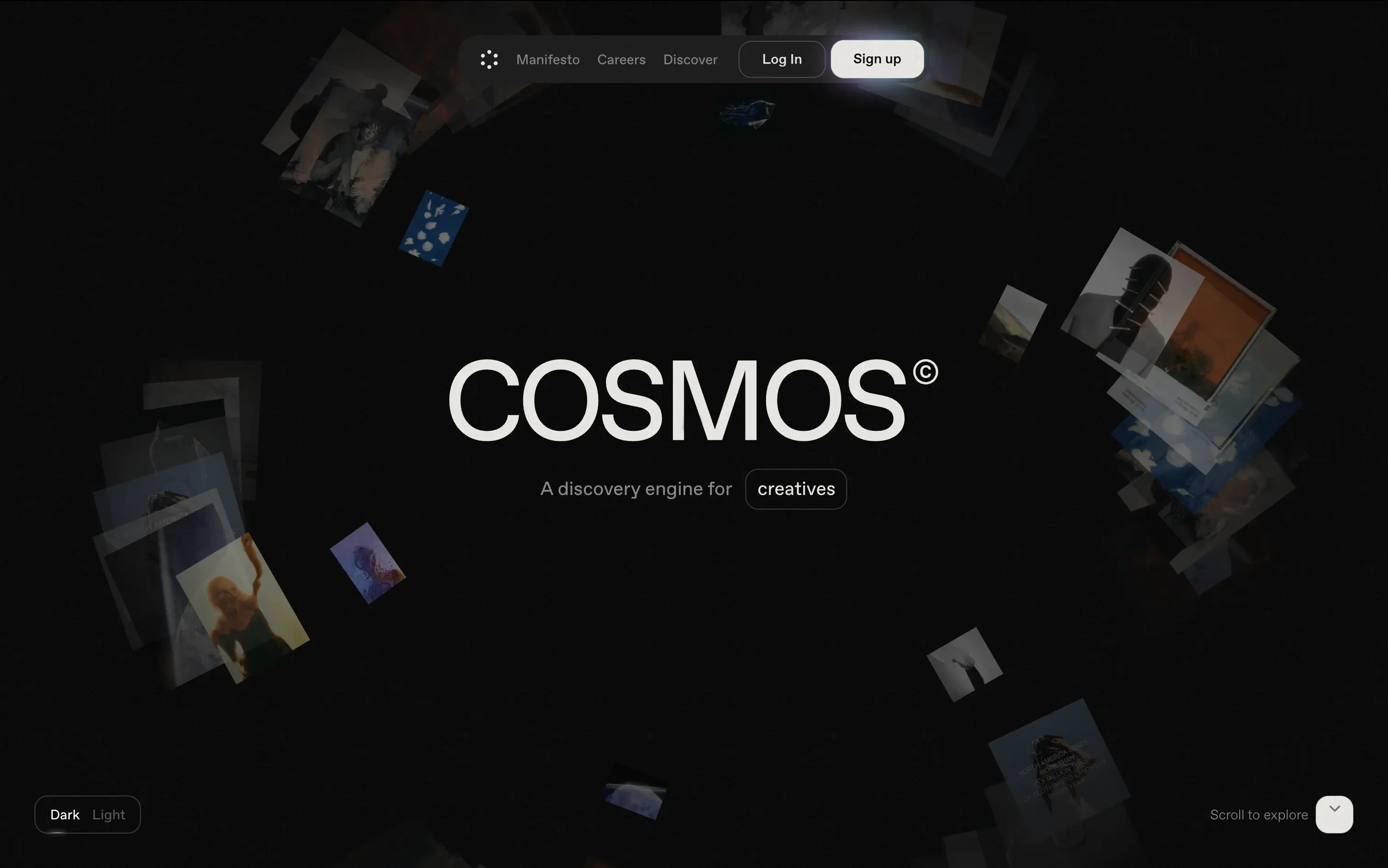
Cosmos is a discovery engine for creatives, helping them explore curated visuals and inspiration in an immersive format.
The hero trades clarity for vibe—but does it with intention. The slow, 3D-style animation invites exploration. There's no CTA push, just immersion. Ideal for creatives looking to feel, not be sold to.
A brand-first, emotion-forward approach that’s clearly designed for visual creatives. The tone and treatment filter out non-ideal users early—this isn’t for the productivity crowd.
This layout balances technical utility with human impact, aligning well with Algolia’s positioning as an API-first but UX-aware company. The mobile UI reinforces product value visually, while the logo wall signals scale and trust for enterprise buyers. The tone is clear, benefit-led, and appropriate for high-intent decision-makers evaluating AI tools for customer experience. This is a solid enterprise-facing hero built to perform.
Cosmos
↗
SaaS
Creative Tools
Centered
Descriptive
Scroll Prompt
Interactive
Custom Animation
3D visuals
Dark Mode
White
Sans serif
B2C
Home Page
Wordpress
3D animation, immersive experience, visual discovery engine, artist-first, gallery feel, dark mode default, cinematic hero, soft motion, ambient design, identity-led, scroll-to-enter, creative tech
Cosmos is a discovery engine for creatives, helping them explore curated visuals and inspiration in an immersive format.
The hero trades clarity for vibe—but does it with intention. The slow, 3D-style animation invites exploration. There's no CTA push, just immersion. Ideal for creatives looking to feel, not be sold to.
A brand-first, emotion-forward approach that’s clearly designed for visual creatives. The tone and treatment filter out non-ideal users early—this isn’t for the productivity crowd.
This layout balances technical utility with human impact, aligning well with Algolia’s positioning as an API-first but UX-aware company. The mobile UI reinforces product value visually, while the logo wall signals scale and trust for enterprise buyers. The tone is clear, benefit-led, and appropriate for high-intent decision-makers evaluating AI tools for customer experience. This is a solid enterprise-facing hero built to perform.
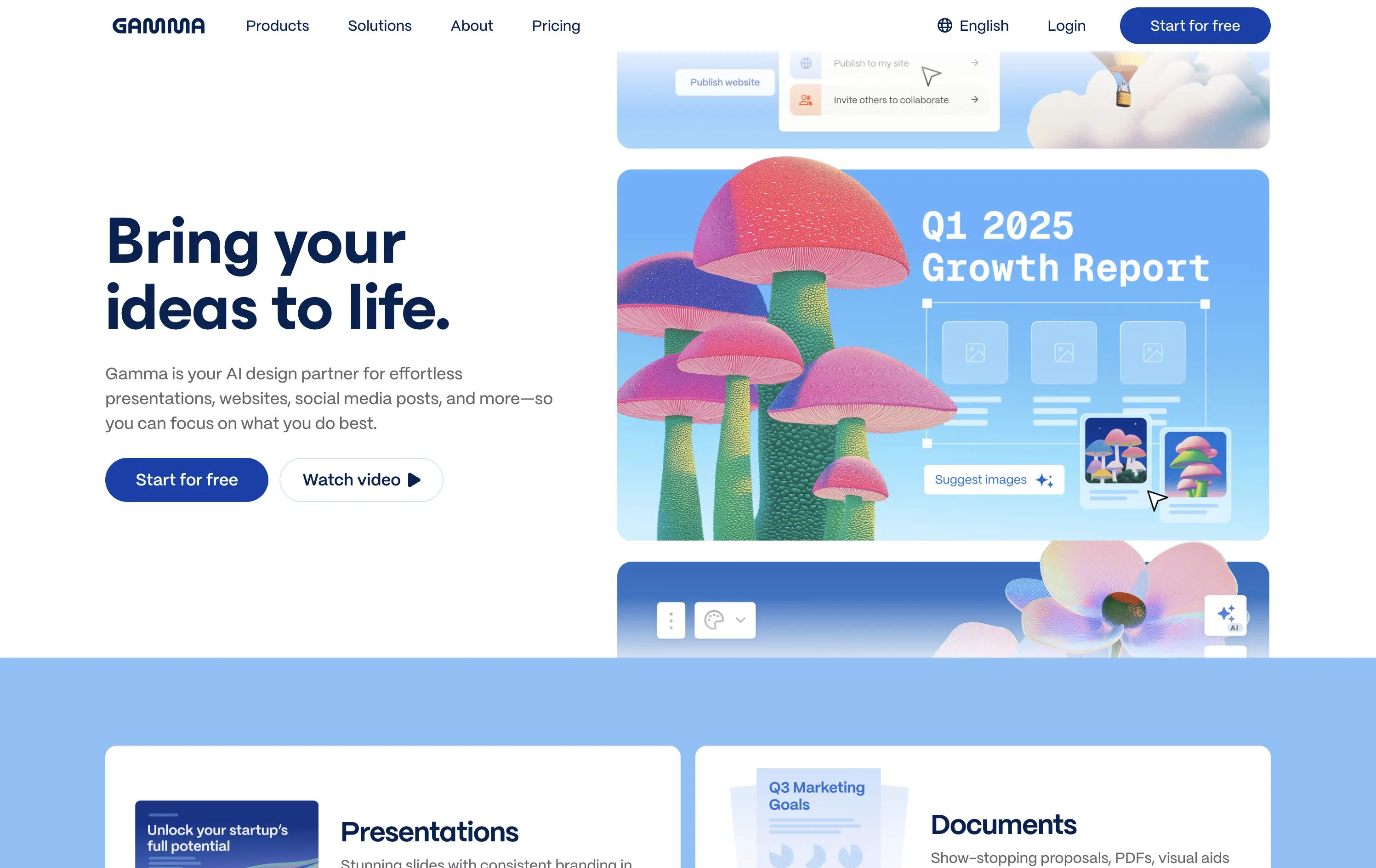
Gamma
↗
AI Tools
Creative Tools
Productivity
Split Grid
Left-aligned
Descriptive
Empowering
Multi-CTA Block
Watch Demo
Illustration
Media Gallery
Interactive
Light Mode
Blue
Sans serif
Hybrid
Home Page
Custom Code
AI presentation tool, whimsical 3D art, surreal imagery, smooth onboarding, soft brand tone, vertical carousel, intuitive UX, layout-focused demo, pastel aesthetic, creative AI tool, friendly product language
Gamma is an AI-powered design platform that helps users create beautiful presentations, websites, and docs effortlessly.
The carousel introduces Gamma’s features visually without overwhelming the user. The surreal illustration style immediately grabs attention, and the copy reinforces ease-of-use and creativity.
Gamma positions itself as a non-intimidating AI tool for creative productivity. Visuals, layout, and tone all serve to lower the barrier for entry and increase relatability.
This layout balances technical utility with human impact, aligning well with Algolia’s positioning as an API-first but UX-aware company. The mobile UI reinforces product value visually, while the logo wall signals scale and trust for enterprise buyers. The tone is clear, benefit-led, and appropriate for high-intent decision-makers evaluating AI tools for customer experience. This is a solid enterprise-facing hero built to perform.
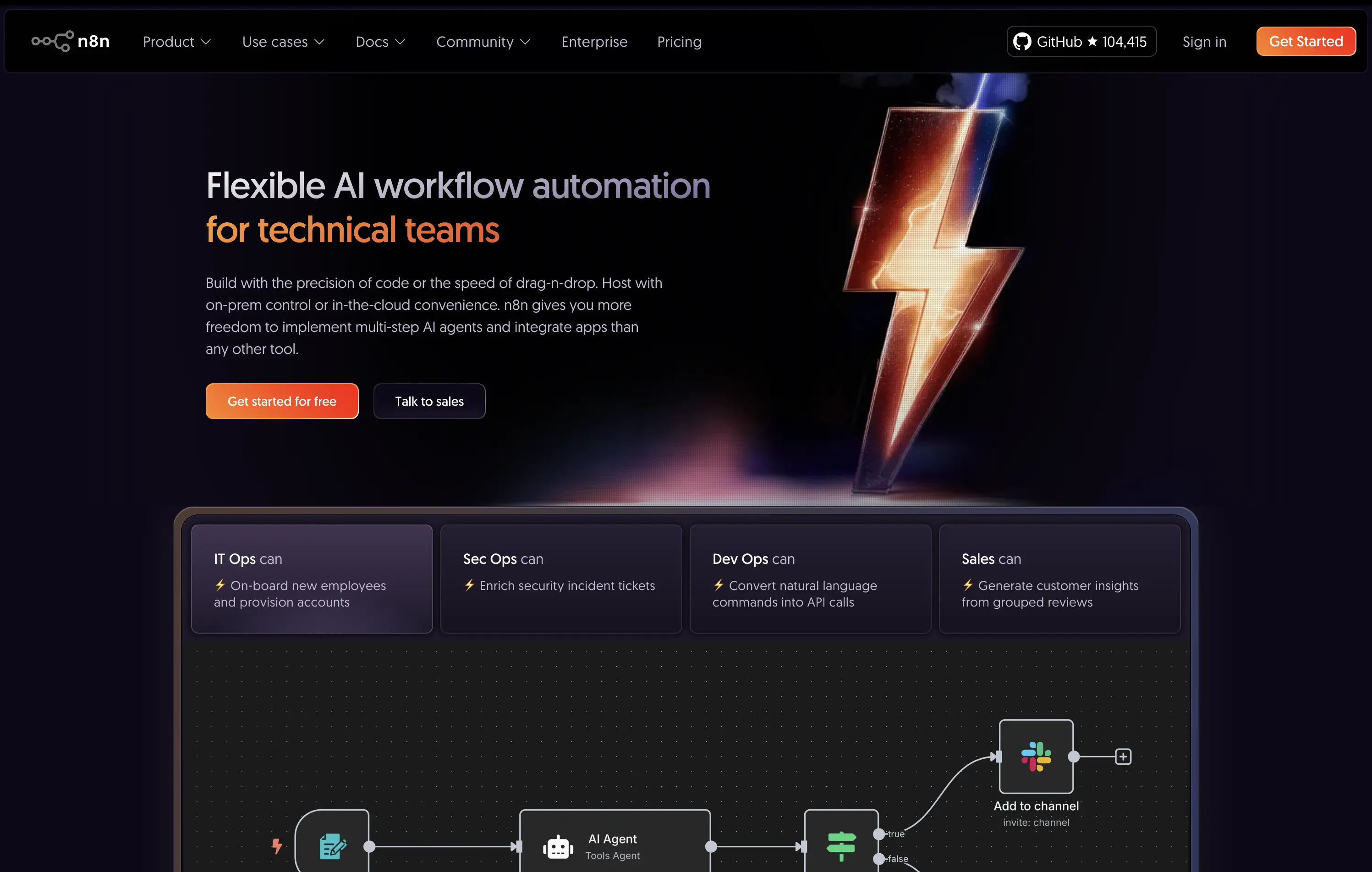
n8n
↗
SaaS
AI Tools
No-Code
Left-aligned
Benefit-Driven
Professional
Multi-CTA Block
Interactive
Product UI
Custom Animation
Dark Mode
Purple
Orange
Sans serif
B2B
Home Page
Custom Code
workflow automation, open source, dev-first, agent-based logic, enterprise-ready, dark UI, custom hosting, role-based use cases, badge grid, high-contrast visual, infra-integrated
An open-source AI workflow automation tool for developers and teams to build, host, and manage agents with full control.
The hero clearly communicates audience and value: “technical teams” is front-loaded, supported by use-case-specific tiles. The lightning bolt graphic adds memorability, while the product UI below supports credibility.
Strongly positioned for a technical, enterprise-leaning audience. The copy and structure match maturity and decision-maker needs. Hosting flexibility is a key differentiator.
This layout balances technical utility with human impact, aligning well with Algolia’s positioning as an API-first but UX-aware company. The mobile UI reinforces product value visually, while the logo wall signals scale and trust for enterprise buyers. The tone is clear, benefit-led, and appropriate for high-intent decision-makers evaluating AI tools for customer experience. This is a solid enterprise-facing hero built to perform.
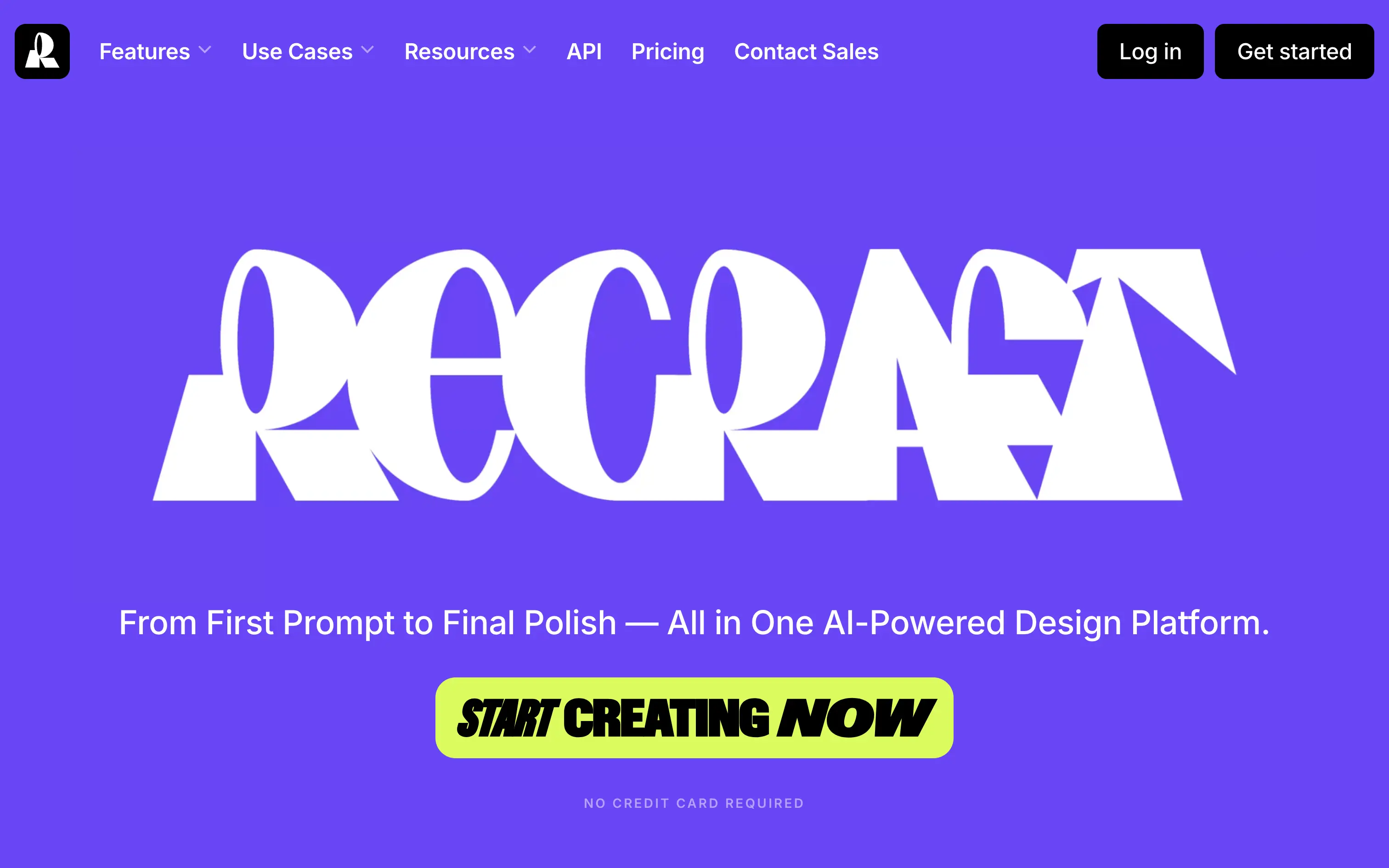
Recraft
↗
SaaS
AI Tools
Creative Tools
Centered
Bold & Direct
Single Button
Interactive
Loading Animation
Multi-color
Green
Purple
Display
Sans serif
B2C
Home Page
Custom Code
experimental typography, AI design suite, generative graphics, all-in-one creative tool, bold visual identity, Gen Z design energy, maximalist type, disruptive layout, prompt-to-polish UX, vector-first platform
Recraft is an AI-powered design platform for generating and editing vector and image assets from text prompts.
A bold, identity-first approach that skips traditional SaaS tropes. The loading animation morphs into the oversized logo, building intrigue and brand memory. Lacks UI context but makes a strong creative impression.
Recraft speaks to non-technical creatives who want AI tools that feel like theirs. This is brand-first positioning at its most intentional—confident, expressive, and highly audience-aligned.
This layout balances technical utility with human impact, aligning well with Algolia’s positioning as an API-first but UX-aware company. The mobile UI reinforces product value visually, while the logo wall signals scale and trust for enterprise buyers. The tone is clear, benefit-led, and appropriate for high-intent decision-makers evaluating AI tools for customer experience. This is a solid enterprise-facing hero built to perform.
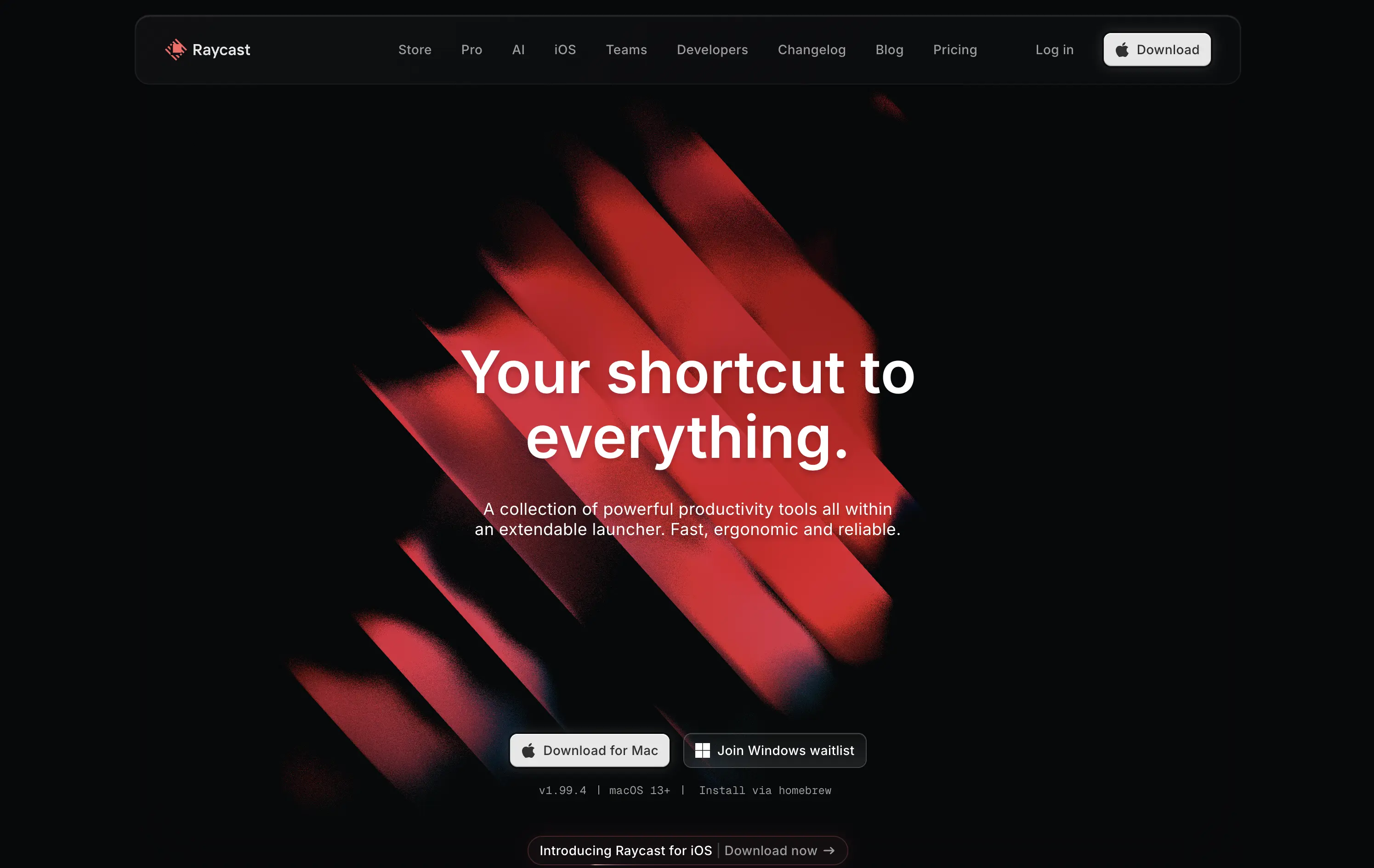
Raycast
↗
SaaS
Productivity
Centered
Bold & Direct
Descriptive
Download App
Multi-CTA Block
Interactive
Custom Animation
Loading Animation
Dark Mode
White
Red
Sans serif
B2C
Home Page
Custom Code
launcher app, power user tool, developer productivity, dark aesthetic, interactive background, custom animation, glowing motion, fast utility, keyboard-first UX, macOS-native, iOS launch, feature-rich
Raycast is a fast, extendable launcher that streamlines tasks and apps into one productivity command center.
Hero opens with striking motion and subtle interactivity, creating immediate emotional pull. Headline is short and memorable. Strong clarity on what it is and what it solves. Layout is focused, high-conversion and visually polished.
Positioning as a utility layer for power users is clear. Dark mode and minimalist tone align with dev-savvy audiences. Strong balance of brand and product without overexplaining.
This layout balances technical utility with human impact, aligning well with Algolia’s positioning as an API-first but UX-aware company. The mobile UI reinforces product value visually, while the logo wall signals scale and trust for enterprise buyers. The tone is clear, benefit-led, and appropriate for high-intent decision-makers evaluating AI tools for customer experience. This is a solid enterprise-facing hero built to perform.
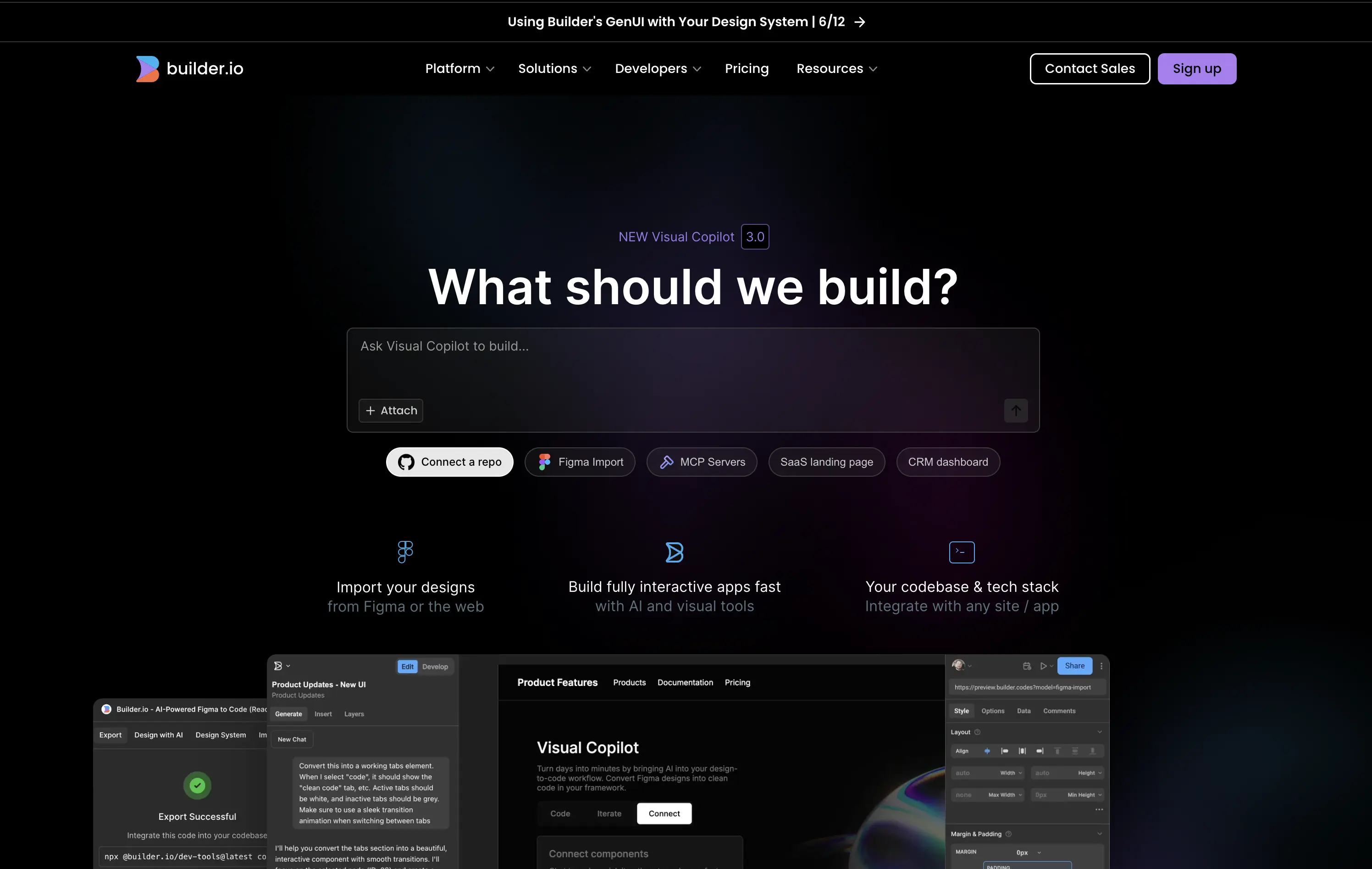
Builder
↗
SaaS
AI Tools
No-Code
Centered
Conversational
Search/Utility Block
Interactive
Product UI
Custom Animation
Dark Mode
White
Purple
Sans serif
B2B
Home Page
Builder.io
prompt-driven UI, dev-focused, figma to code, repo integration, ai builder, dark interface, fast UX, early-stage AI, interactive layout, live input box, utility first, dark-to-light glow, below-the-fold tease
Builder.io is a no-code tool; turning designs and prompts into production-ready code through its AI-powered visual copilot.
The hero instantly orients developers with its input-first layout, suggesting immediate interaction. Integration tags like “Connect a repo” and “Figma Import” provide fast trust. Animation beneath the fold teases depth without cluttering focus.
This hero understands its technical audience. The interactive prompt paired with dev-native language signals power and flexibility without needing to explain too much.
This layout balances technical utility with human impact, aligning well with Algolia’s positioning as an API-first but UX-aware company. The mobile UI reinforces product value visually, while the logo wall signals scale and trust for enterprise buyers. The tone is clear, benefit-led, and appropriate for high-intent decision-makers evaluating AI tools for customer experience. This is a solid enterprise-facing hero built to perform.
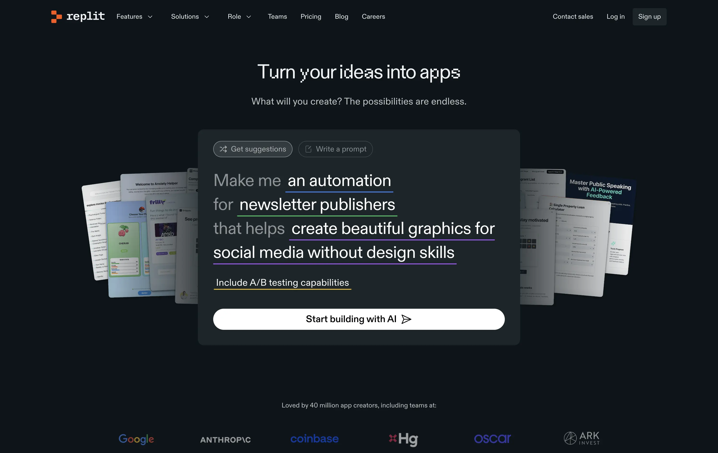
Replit
↗
SaaS
DevTools
AI Tools
Centered
Descriptive
Empowering
Search/Utility Block
Media Gallery
Interactive
Product UI
Dark Mode
White
Sans serif
Hybrid
Home Page
Custom Code
ai developer tools, type-to-build interface, interactive prompt UI, dark interface, real-time suggestion, input-led hero, startup showcase, low-code/no-code, dev productivity, trust logos, community-powered
Replit is a collaborative AI-tool platform where anyone can build, deploy, and scale software from a single workspace.
The hero is interaction-first — built around a live prompt box that speaks directly to user intent. Copy fades into function, encouraging you to engage before exploring.
Replit sells ambition to builders. The hero de-emphasizes itself in favor of showing the product experience. It’s aligned to users seeking momentum, not just documentation.
This layout balances technical utility with human impact, aligning well with Algolia’s positioning as an API-first but UX-aware company. The mobile UI reinforces product value visually, while the logo wall signals scale and trust for enterprise buyers. The tone is clear, benefit-led, and appropriate for high-intent decision-makers evaluating AI tools for customer experience. This is a solid enterprise-facing hero built to perform.
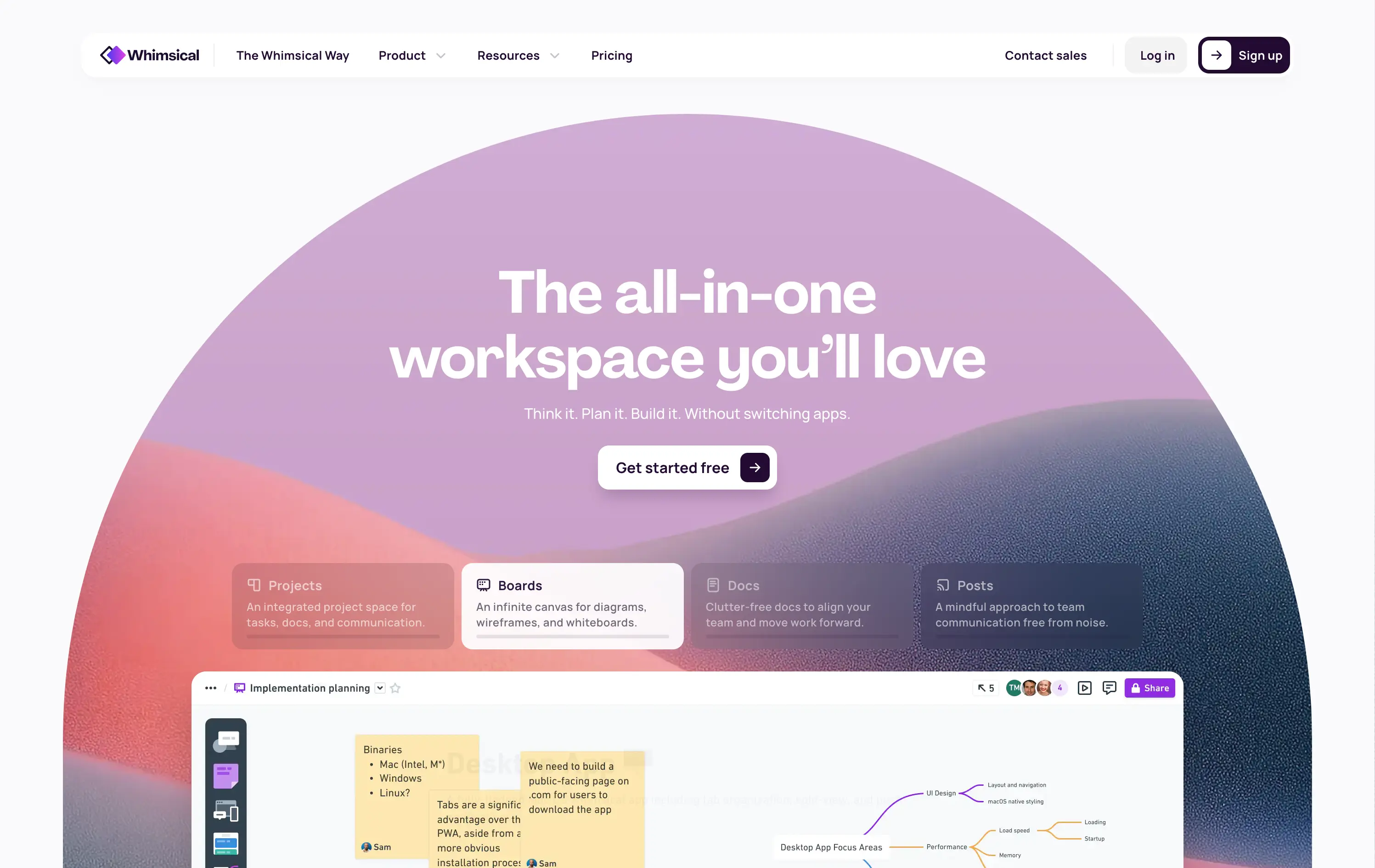
Whimsical
↗
SaaS
Collaboration
Productivity
Inset
Centered
Benefit-Driven
Empowering
Single Button
Illustration
Interactive
Product UI
Gradient
Light Mode
Pink
Purple
Orange
Sans serif
B2B
Home Page
Custom Code
collaborative workspace, pastel gradient, feature carousel, lightweight SaaS, sticky headline, soft UI, premium-yet-friendly, high-trust design, zero-friction onboarding, visual task planning, alternative to Miro, team productivity
Whimsical is an all-in-one visual workspace for teams to plan, wireframe, write, and collaborate—without switching between tools.
The hero immediately differentiates with its warm, gradient-driven palette and curved editorial layout. Headline is sticky and emotional, while the subheadline cues action and ease. Below, animated modules skim through key features—smartly designed to reduce cognitive load while expanding curiosity. The product UI is fully visible and feels friendly. CTA is low friction and well-placed. Compared to competitors, this layout feels more human-centered and less corporate, while still conveying product intelligence.
Strong product-led growth positioning with emotional stickiness. Visuals balance friendliness with focus. Motion helps drive upfront clarity, and layout choice favors quick scanning—well-suited for both individual users and team leads.
This layout balances technical utility with human impact, aligning well with Algolia’s positioning as an API-first but UX-aware company. The mobile UI reinforces product value visually, while the logo wall signals scale and trust for enterprise buyers. The tone is clear, benefit-led, and appropriate for high-intent decision-makers evaluating AI tools for customer experience. This is a solid enterprise-facing hero built to perform.
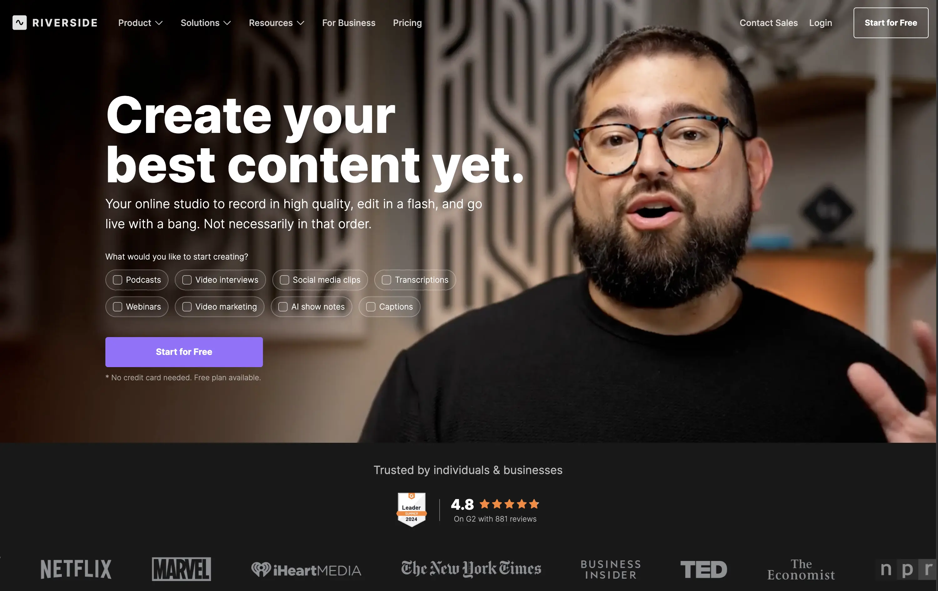
Riverside
↗
SaaS
Creator Tools
Creative Tools
Left-aligned
Aspirational
Single Button
Video
Interactive
Social Proof
Dark Mode
Imagery-Based
Purple
Sans serif
B2C
Home Page
Webflow
creator-first, face-driven, casual tone, real people, live recording, video-first layout, chip selector UI, dark mode, G2 badge, media industry, podcasting tool, modern SaaS, high-trust, content creation
Riverside is a browser-based studio for creators to record, edit, and publish high-quality video and audio content with ease.
Hero combines human warmth with clear purpose. Headline is aspirational, while subcopy clarifies. Visual chips guide self-segmentation. The single CTA is clean, bold, and frictionless. Social proof below adds immediate brand trust.
Tailored to non-technical creators who need a one-stop content tool. Design choices build ease and inspiration. Social logos position Riverside as mainstream-ready while keeping the tone personal and welcoming.
This layout balances technical utility with human impact, aligning well with Algolia’s positioning as an API-first but UX-aware company. The mobile UI reinforces product value visually, while the logo wall signals scale and trust for enterprise buyers. The tone is clear, benefit-led, and appropriate for high-intent decision-makers evaluating AI tools for customer experience. This is a solid enterprise-facing hero built to perform.
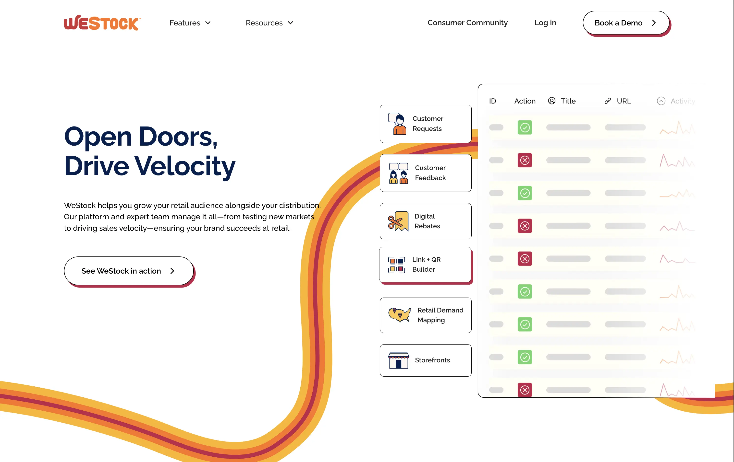
WeStock
↗
SaaS
Split Grid
Left-aligned
Abstract / Conceptual
Single Button
Illustration
Interactive
Product UI
Light Mode
Red
Orange
Yellow
Sans serif
B2B
Home Page
Webflow
retail analytics, B2B SaaS, colorful path motif, feature reveal, scroll effect, clean layout, product-led hero, multicolored interface, CPG enablement, UI preview, startup brand tone, sales-velocity focus, modern B2B
WeStock helps brands grow at retail by using data and consumer demand to drive velocity and streamline distribution.
This hero gets to the point quickly. The headline is bold, the subcopy is informative, and the UI sample makes the product feel real. The color path is a clever directional device. Visual hierarchy works, though the CTA could use stronger visual emphasis to better guide next-step intent.
A clear, professional intro for early-stage and growth CPG brands. Balances explanation with intrigue. Strong brand coherence, great visual metaphor, and effective low-friction education. CTA clarity is good; visibility needs boost.
This layout balances technical utility with human impact, aligning well with Algolia’s positioning as an API-first but UX-aware company. The mobile UI reinforces product value visually, while the logo wall signals scale and trust for enterprise buyers. The tone is clear, benefit-led, and appropriate for high-intent decision-makers evaluating AI tools for customer experience. This is a solid enterprise-facing hero built to perform.
Monday
↗
SaaS
Productivity
Inset
Centered
Empowering
Single Button
Interactive
Product UI
Light Mode
Purple
Sans serif
B2B
Home Page
Custom Code
workflow software, team collaboration, project management, calm UI, interactive tiles, soft gradients, onboarding clarity, task visibility, intuitive UX, AI-enhanced, enterprise-friendly, all-in-one platform, modular SaaS
Monday.com is a flexible work platform that helps teams manage projects, track progress, and automate workflows with AI-powered tools.
The headline is both emotional and functional — “Made for work, designed to love” — signaling a user-first experience. The layout is soft and centered, with an interactive module that invites users to pre-define their use case before even signing up. The single CTA streamlines conversions, and supporting UI previews show off flexibility in a non-intrusive way.
Hero bridges the gap between SMBs and enterprise with an inclusive tone and tailored entry point. Use-case selector adds personalization. Messaging supports wide adoption without diluting brand voice.
This layout balances technical utility with human impact, aligning well with Algolia’s positioning as an API-first but UX-aware company. The mobile UI reinforces product value visually, while the logo wall signals scale and trust for enterprise buyers. The tone is clear, benefit-led, and appropriate for high-intent decision-makers evaluating AI tools for customer experience. This is a solid enterprise-facing hero built to perform.
Wise
↗
SaaS
Fintech
Split Grid
Left-aligned
Benefit-Driven
Search/Utility Block
Interactive
Product UI
Social Proof
Light Mode
Green
Sans serif
Hybrid
Home Page
Custom Code
fintech, currency exchange, cost calculator, social proof upfront, real-time UI, B2C utility, transparent pricing, global payments, lean UX, bold typography, conversion-focused, clean layout, product-first design
Wise lets you send money internationally with real exchange rates and ultra-low fees — no hidden costs, just fast, fair transfers.
The bold headline immediately communicates value — “SEND MONEY GLOBALLY FOR LESS” — while the live calculator UI does the heavy lifting. Trust indicators like app store ratings sit prominently up top. CTAs are practical and clearly tied to user action. It’s all signal; functional and focused.
Perfect for high-intent users seeking fast comparison and action. The calculator UI de-risks the process while keeping attention on price.
This layout balances technical utility with human impact, aligning well with Algolia’s positioning as an API-first but UX-aware company. The mobile UI reinforces product value visually, while the logo wall signals scale and trust for enterprise buyers. The tone is clear, benefit-led, and appropriate for high-intent decision-makers evaluating AI tools for customer experience. This is a solid enterprise-facing hero built to perform.
Plaid
↗
DevTools
Fintech
Data & Analytics
Left-aligned
Bold & Direct
Confident
Multi-CTA Block
Illustration
Interactive
Logo Wall
Gradient
Blue
Green
Sans serif
B2B
Home Page
Custom Code
developer fintech, API platform, financial data access, quirky fintech aesthetic, bold hero art, Benjamin Franklin illustration, smart finance tools, B2B API, trust logos, dev-first call to action, animated CTA, playful visual metaphor
Plaid is a data network that connects financial apps to users’ bank accounts securely and efficiently to power modern money experiences.
Plaid’s hero grabs attention with personality — Benjamin Franklin posing with an iPhone and some airpods, wrapped in a swirling gradient background. But it’s not just noise. The headline instantly communicates product value and the CTA contrast (“Talk to our team” vs. “Start building”) serves both enterprise and self-serve tracks. Logo wall underlines legitimacy. It’s high-impact and instantly memorable.
Plaid positions itself as the modern infrastructure backbone of fintech. The visual and messaging mix signals credibility, tech depth, and cultural fluency — ideal for both new gen founders.
This layout balances technical utility with human impact, aligning well with Algolia’s positioning as an API-first but UX-aware company. The mobile UI reinforces product value visually, while the logo wall signals scale and trust for enterprise buyers. The tone is clear, benefit-led, and appropriate for high-intent decision-makers evaluating AI tools for customer experience. This is a solid enterprise-facing hero built to perform.
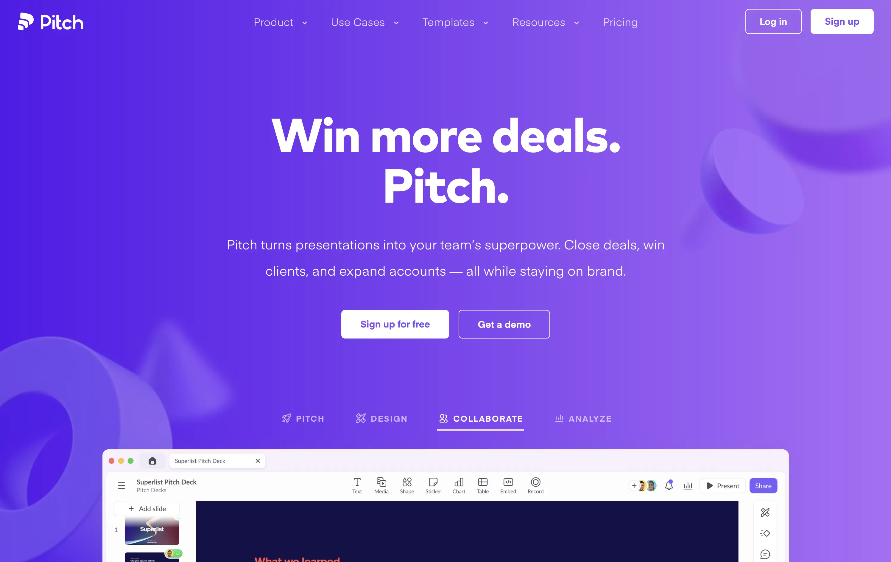
Pitch
↗
SaaS
Creative Tools
Centered
Benefit-Driven
Multi-CTA Block
Interactive
Product UI
Custom Animation
Gradient
White
Blue
Purple
Sans serif
B2B
Home Page
Custom Code
pitch decks, team presentations, sales enablement, bold SaaS design, gradient hero, product-led growth, team collaboration, sales tools, creative presentation, interactive UI, twin CTA, SaaS landing, vibrant visual language
Pitch is a collaborative presentation platform that helps teams design, deliver, and scale winning pitch decks with ease.
The headline “Win more deals. Pitch.” is snappy, benefit-first, and ties directly to the product’s core function. The gradient purple background adds energy and memorability. CTAs are visible, and the bottom UI preview shows real product capability. The modular UI toggles below the hero add perceived versatility without overwhelming. Clean hierarchy, confident voice, and immediate use-case relevance.
Tailored to fast-moving teams and founders. Messaging is tight, layout is focused, and visuals reflect quality and polish. It positions Pitch as both premium and efficient — ideal for growth teams.
This layout balances technical utility with human impact, aligning well with Algolia’s positioning as an API-first but UX-aware company. The mobile UI reinforces product value visually, while the logo wall signals scale and trust for enterprise buyers. The tone is clear, benefit-led, and appropriate for high-intent decision-makers evaluating AI tools for customer experience. This is a solid enterprise-facing hero built to perform.
ClickFunnels
↗
SaaS
Creator Tools
Centered
Conversational
Aspirational
Email Capture
Interactive
Product UI
Custom Animation
Dark Mode
Yellow
Sans serif
Hybrid
Home Page
ClickFunnels
funnel builder, sales automation, opt-in focused, animated headline, creator economy, scroll-stopper, bold promise, conversion-first, email capture, dark mode, high energy, value-first, info-product, affiliate-heavy, landing page tools
ClickFunnels is an all-in-one platform for building sales funnels, landing pages, and automating digital marketing.
Everything in this hero screams urgency and ambition. The headline animation and phrase “financial freedom” tap directly into aspirational triggers. The surrounding angled graphics guide the eye right to the CTA, and the contrasting orange button and centered layout make signup the only logical next step. Visuals are loud, but coherent. It’s built to convert.
ClickFunnels sells identity as much as software. It targets aspirational creators with a high-conviction offer and message. Clear visual direction, value promise, and frictionless signup make it performance-built.
This layout balances technical utility with human impact, aligning well with Algolia’s positioning as an API-first but UX-aware company. The mobile UI reinforces product value visually, while the logo wall signals scale and trust for enterprise buyers. The tone is clear, benefit-led, and appropriate for high-intent decision-makers evaluating AI tools for customer experience. This is a solid enterprise-facing hero built to perform.
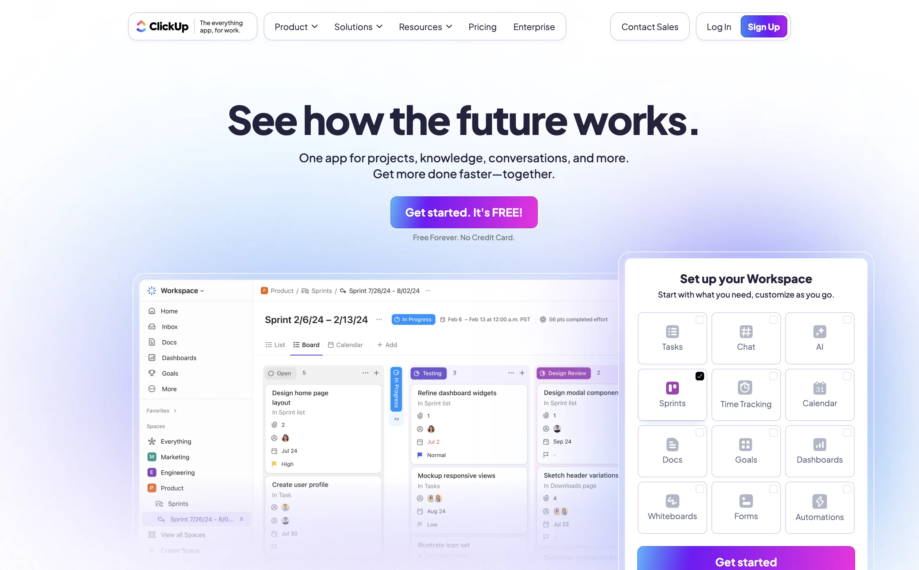
ClickUp
↗
SaaS
Collaboration
Productivity
Centered
Aspirational
Single Button
Interactive
Product UI
Gradient
Light Mode
Blue
Purple
Sans serif
Hybrid
Home Page
Custom Code
project management, all-in-one tool, interactive demo, modular onboarding, live preview, customizable workspace, productivity SaaS, gradient UI, click-to-explore, modern UX, team workflow, no-code vibes, multi-tool stack
ClickUp is a customizable productivity platform where teams manage tasks, docs, goals, and everything else in one place.
The “See how the future works” headline strikes an ambitious yet welcoming tone. The standout element is the interactive module — showing real UI changes based on selected features, creating instant visual proof. Bright gradients and a bold purple CTA drive attention while softening the tech-forward message. It’s engaging, credible, and built for signup momentum.
ClickUp is positioning itself as a full-stack replacement for scattered SaaS tools. This hero backs that claim with both visual clarity and message ambition, supporting its “everything app” value prop.
This layout balances technical utility with human impact, aligning well with Algolia’s positioning as an API-first but UX-aware company. The mobile UI reinforces product value visually, while the logo wall signals scale and trust for enterprise buyers. The tone is clear, benefit-led, and appropriate for high-intent decision-makers evaluating AI tools for customer experience. This is a solid enterprise-facing hero built to perform.
Jasper
↗
SaaS
AI Tools
Centered
Aspirational
Professional
Multi-CTA Block
Interactive
Custom Animation
3D visuals
Gradient
Light Mode
Purple
Yellow
Sans serif
Hybrid
Home Page
Webflow
AI copywriting, AI for marketers, premium SaaS, floating 3D blocks, gradient UI, dual CTA, conversion-focused, brand messaging, purple aesthetic, marketing automation, future-facing, demo-first UX, mid-market SaaS
Jasper is an AI copilot that helps marketing teams craft on-brand content faster across every channel.
Clear message, sharp contrast, and a visually engaging 3D tile animation support both narrative and interaction. Dual CTAs guide intent. Subhead could use slightly more emphasis for hierarchy.
Hero aligns with mid-to-late-stage buyers seeking polished, scalable AI solutions. Visual tone supports category leadership. Good balance of aspiration and product clarity.
This layout balances technical utility with human impact, aligning well with Algolia’s positioning as an API-first but UX-aware company. The mobile UI reinforces product value visually, while the logo wall signals scale and trust for enterprise buyers. The tone is clear, benefit-led, and appropriate for high-intent decision-makers evaluating AI tools for customer experience. This is a solid enterprise-facing hero built to perform.
The most effective hero sections in your inbox.
Monthly round up of top hero sections.
Don't worry. We hate spam too.
Don't worry. We hate spam too.
Don't worry. We hate spam too.