Loading Animation
7
7
7
7
Prominent loader, branded intro, or kinetic reveal defining the hero entrance
Filters
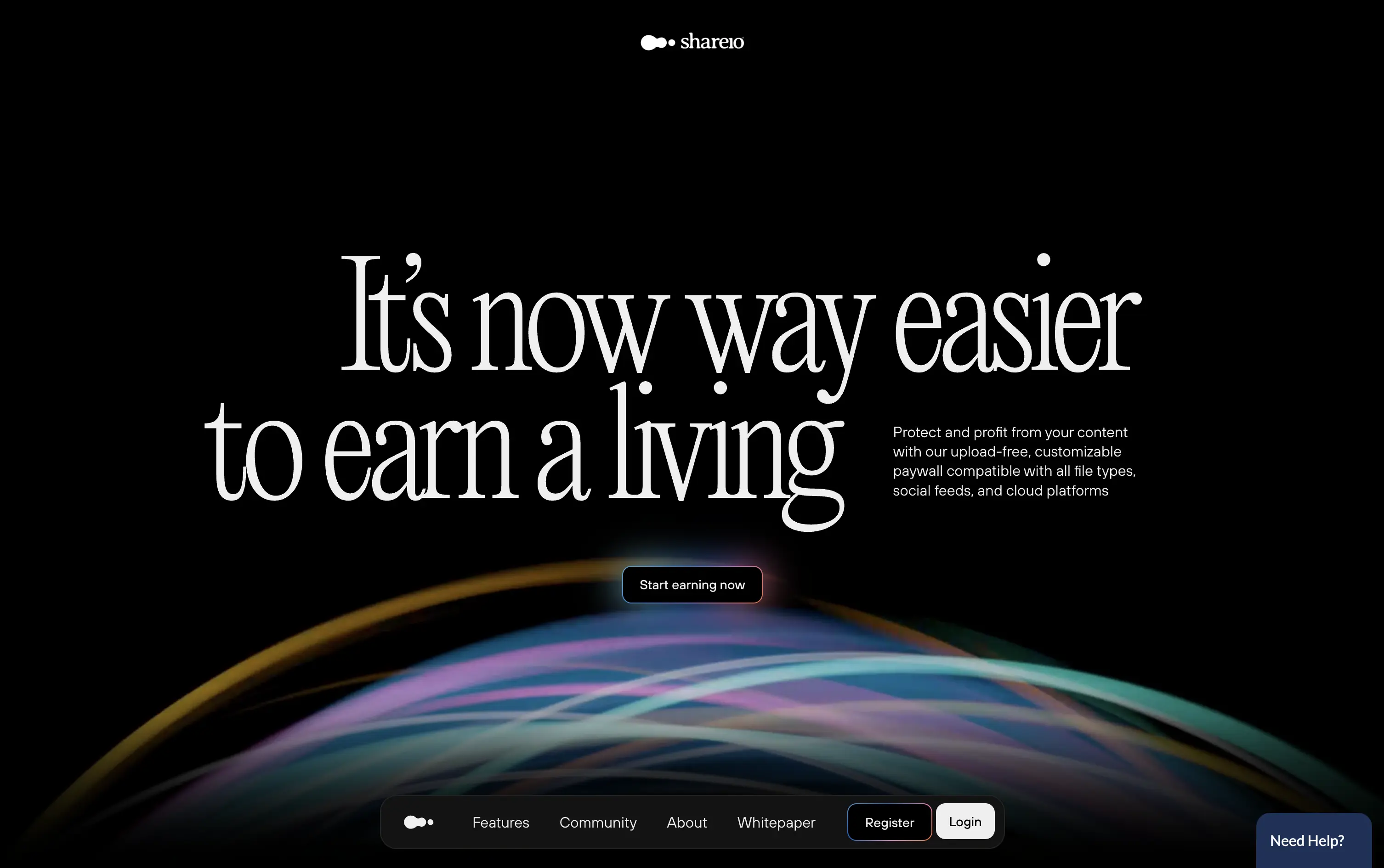
Shareio
↗
Creator Tools
Web3
Editorial
Aspirational
Confident
Single Button
Custom Animation
Loading Animation
3D visuals
Dark Mode
Green
Pink
Serif
B2C
Home Page
Webflow
paywall tech, content monetization, no-upload platform, editorial layout, kinetic typography, web3 creator stack, glowing animation, creator-first, income tools, luxury digital aesthetic
Shareio is a tool for creators to monetize any content via customizable paywalls—no uploads, just link and earn.
The hero is visually magnetic. Oversized serif type and fluid animation deliver a high-end, editorial feel. The core message is emotional, not functional—but the subline recovers clarity.
A bold play for modern creators who value style, independence, and control. The hero builds intrigue through aesthetic gravity but still manages to explain the product’s purpose with restraint.
This layout balances technical utility with human impact, aligning well with Algolia’s positioning as an API-first but UX-aware company. The mobile UI reinforces product value visually, while the logo wall signals scale and trust for enterprise buyers. The tone is clear, benefit-led, and appropriate for high-intent decision-makers evaluating AI tools for customer experience. This is a solid enterprise-facing hero built to perform.
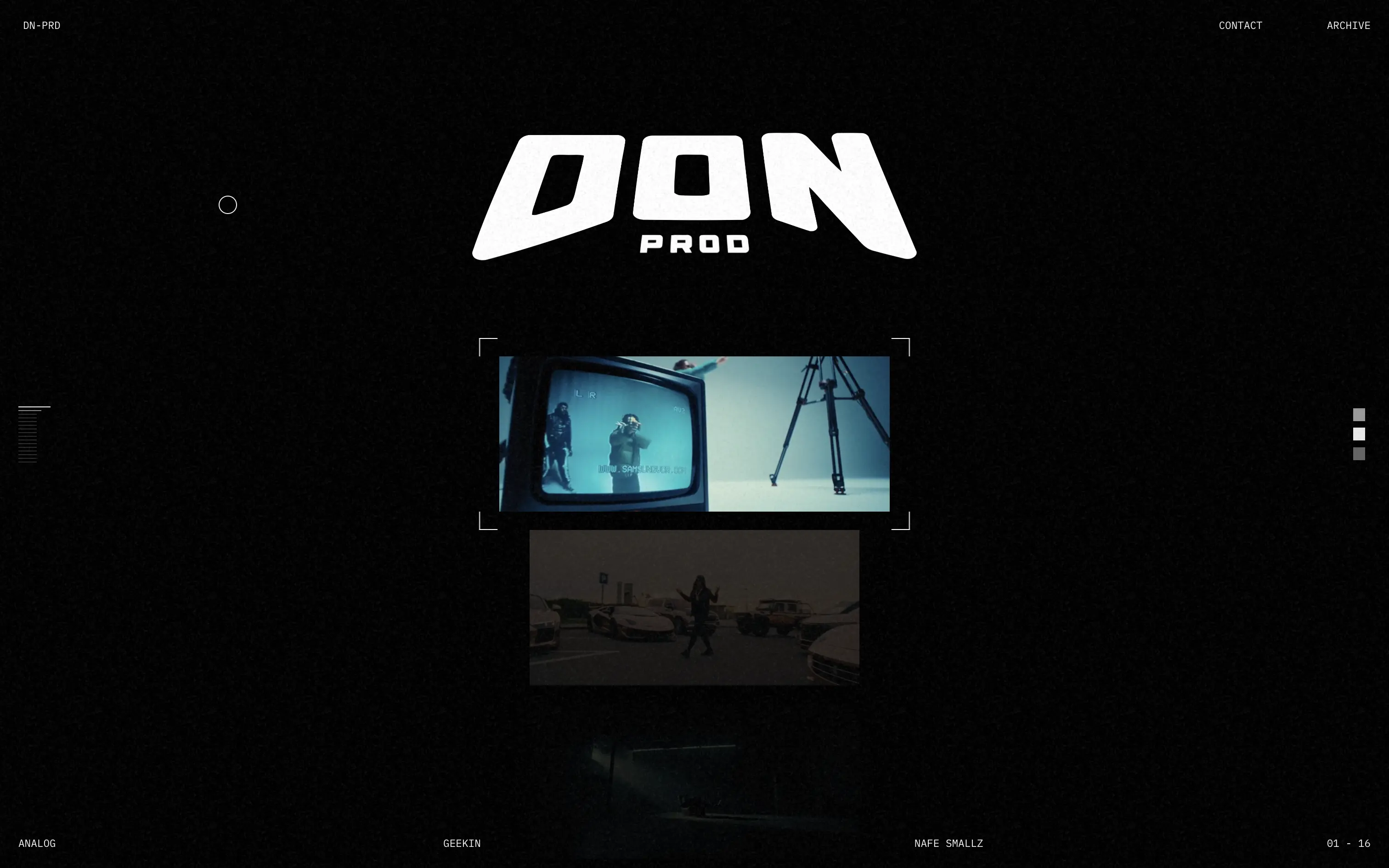
Don Prod
↗
Agencies
Editorial
No headline
No CTA
Media Gallery
Loading Animation
Dark Mode
White
Display
B2B
Home Page
Custom Code
portfolio site, webGL distortion, music video production, VHS aesthetic, visual storytelling, minimalist UX, video-first layout, motion texture, analog feel, creative direction, fullscreen gallery
Don Prod is a visual production studio showcasing high-energy music video work through a minimal, cinematic portfolio.
The hero trades copy for atmosphere. The liquid webGL orb intro and lo-fi video stills establish creative authority fast. There’s no orientation, no CTA—just visual immersion.
This is visual-first positioning for a portfolio that’s all about taste. It’s anti-marketing in the best way—letting the work speak for itself. Not built for mass access, but built with intent.
This layout balances technical utility with human impact, aligning well with Algolia’s positioning as an API-first but UX-aware company. The mobile UI reinforces product value visually, while the logo wall signals scale and trust for enterprise buyers. The tone is clear, benefit-led, and appropriate for high-intent decision-makers evaluating AI tools for customer experience. This is a solid enterprise-facing hero built to perform.
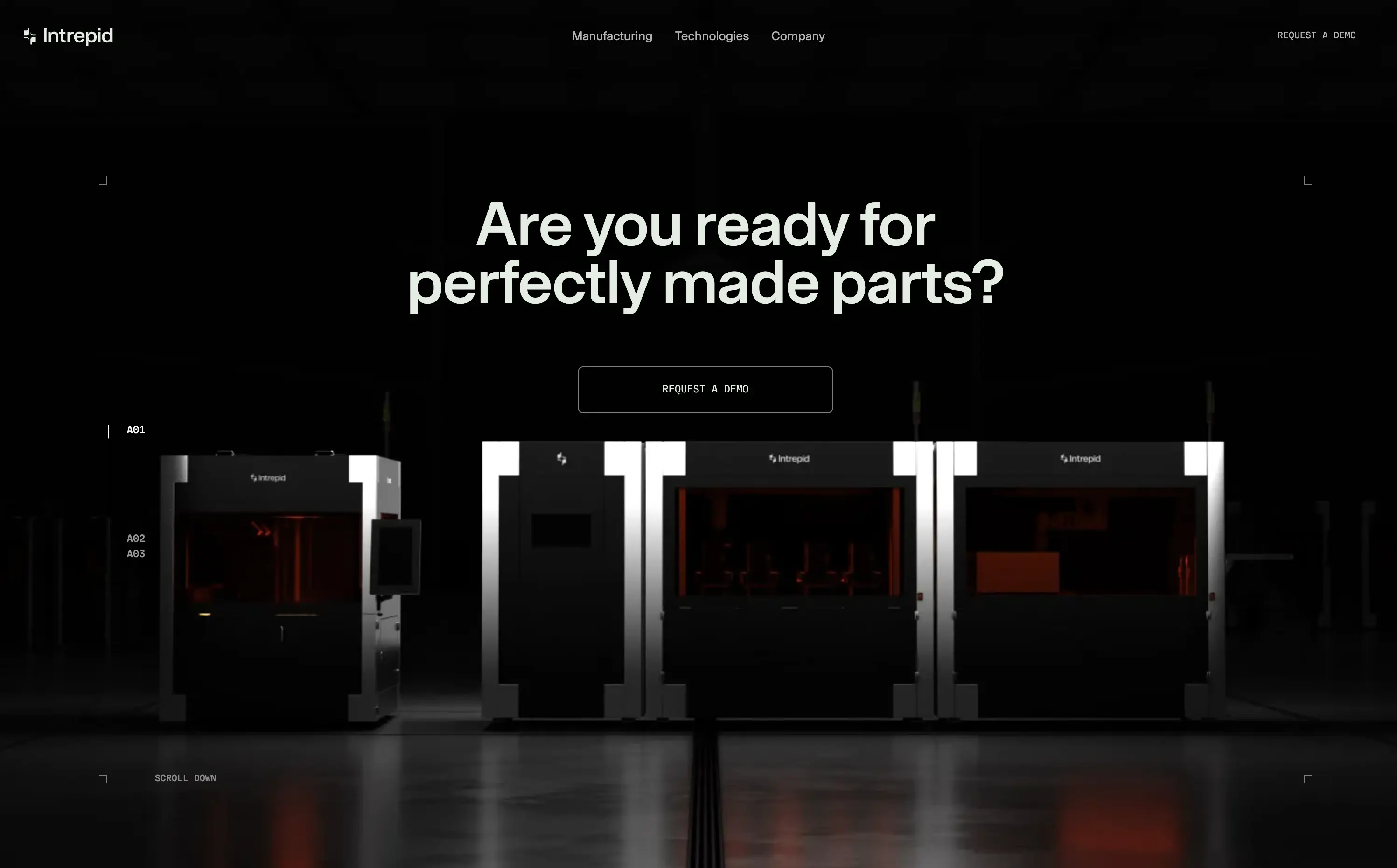
Intrepid
↗
Hardware
Centered
Benefit-Driven
Confident
Single Button
Photography
Loading Animation
3D visuals
Dark Mode
Orange
Sans serif
B2B
Home Page
Custom Code
dark hero, industrial hardware, 3D printing, automation tech, demo‑first CTA, mint headline, orange glow accents, centered layout, B2B manufacturing, sleek machines, full‑width image, high contrast, precise messaging
Industrial 3D‑printing company making automated hardware systems that produce precise parts at production scale for manufacturers.
Industrial 3D‑printing company making automated hardware systems that produce precise parts at production scale for manufacturers.
Visual gravitas matches enterprise buyers seeking reliability. Centered demo CTA suits high‑touch sales funnel. Message aligns with pain of imperfect parts, reinforcing positioning as quality‑first hardware partner.
This layout balances technical utility with human impact, aligning well with Algolia’s positioning as an API-first but UX-aware company. The mobile UI reinforces product value visually, while the logo wall signals scale and trust for enterprise buyers. The tone is clear, benefit-led, and appropriate for high-intent decision-makers evaluating AI tools for customer experience. This is a solid enterprise-facing hero built to perform.
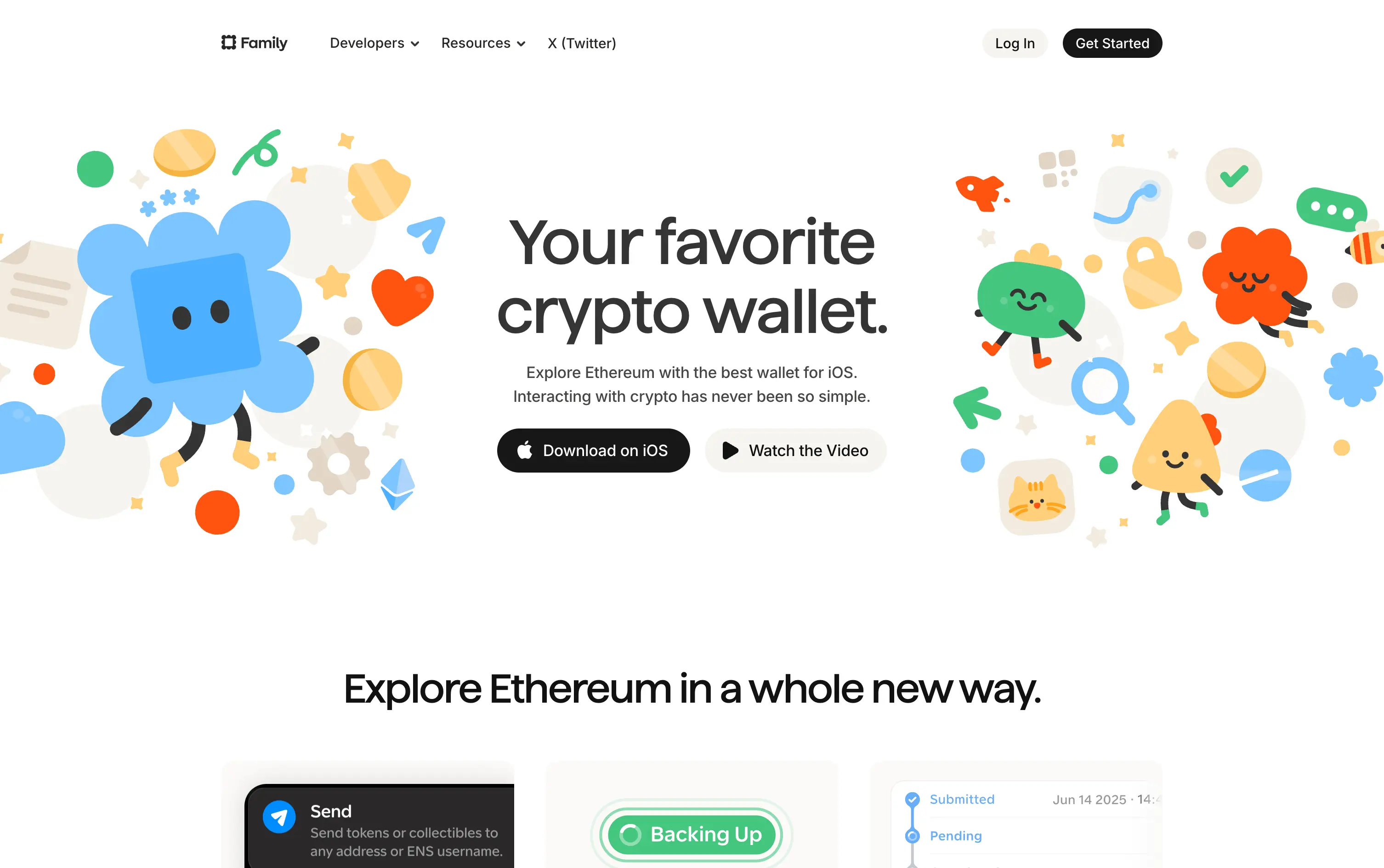
Family
↗
Fintech
Web3
Centered
Playful
Confident
Download App
Multi-CTA Block
Illustration
Custom Animation
Loading Animation
Light Mode
Blue
Yellow
Black
Sans serif
B2C
Home Page
Custom Code
crypto wallet for iOS, ENS support, playful Web3, mobile-first design, Gen Z crypto, kawaii aesthetic, approachable fintech, token collectibles, web3 onboarding, friendly UX
Family is a playful Ethereum wallet designed for iOS, making crypto feel friendly, visual, and simple to use.
Extremely approachable for a space often seen as cold or intimidating. The illustrations soften the category. Clear copy and strong CTA pair well with the product’s target audience and mobile-first approach.
A masterclass in brand positioning. While most Web3 brands chase dark, technical aesthetics, Family goes the opposite direction—bright, warm, and welcoming. It’s intentionally crafted to disarm, invite, and onboard a broader audience.
This layout balances technical utility with human impact, aligning well with Algolia’s positioning as an API-first but UX-aware company. The mobile UI reinforces product value visually, while the logo wall signals scale and trust for enterprise buyers. The tone is clear, benefit-led, and appropriate for high-intent decision-makers evaluating AI tools for customer experience. This is a solid enterprise-facing hero built to perform.
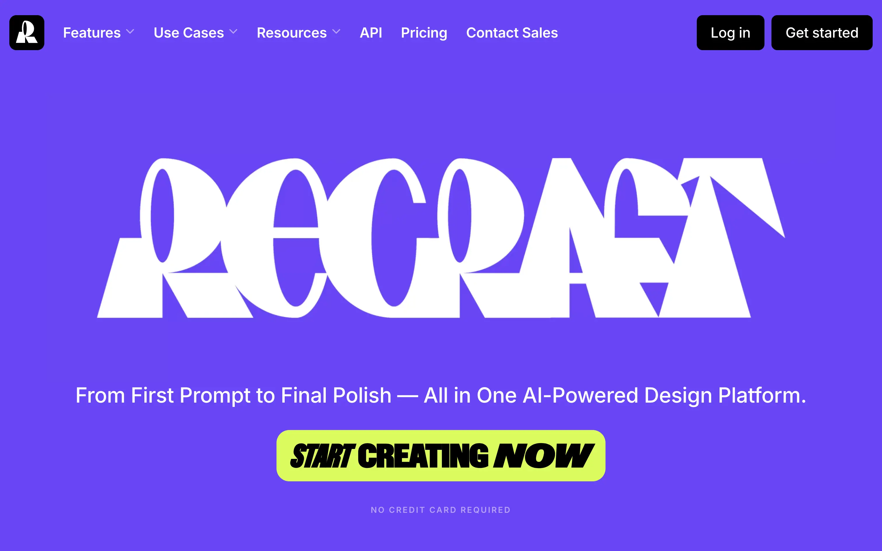
Recraft
↗
SaaS
AI Tools
Creative Tools
Centered
Bold & Direct
Single Button
Interactive
Loading Animation
Multi-color
Green
Purple
Display
Sans serif
B2C
Home Page
Custom Code
experimental typography, AI design suite, generative graphics, all-in-one creative tool, bold visual identity, Gen Z design energy, maximalist type, disruptive layout, prompt-to-polish UX, vector-first platform
Recraft is an AI-powered design platform for generating and editing vector and image assets from text prompts.
A bold, identity-first approach that skips traditional SaaS tropes. The loading animation morphs into the oversized logo, building intrigue and brand memory. Lacks UI context but makes a strong creative impression.
Recraft speaks to non-technical creatives who want AI tools that feel like theirs. This is brand-first positioning at its most intentional—confident, expressive, and highly audience-aligned.
This layout balances technical utility with human impact, aligning well with Algolia’s positioning as an API-first but UX-aware company. The mobile UI reinforces product value visually, while the logo wall signals scale and trust for enterprise buyers. The tone is clear, benefit-led, and appropriate for high-intent decision-makers evaluating AI tools for customer experience. This is a solid enterprise-facing hero built to perform.
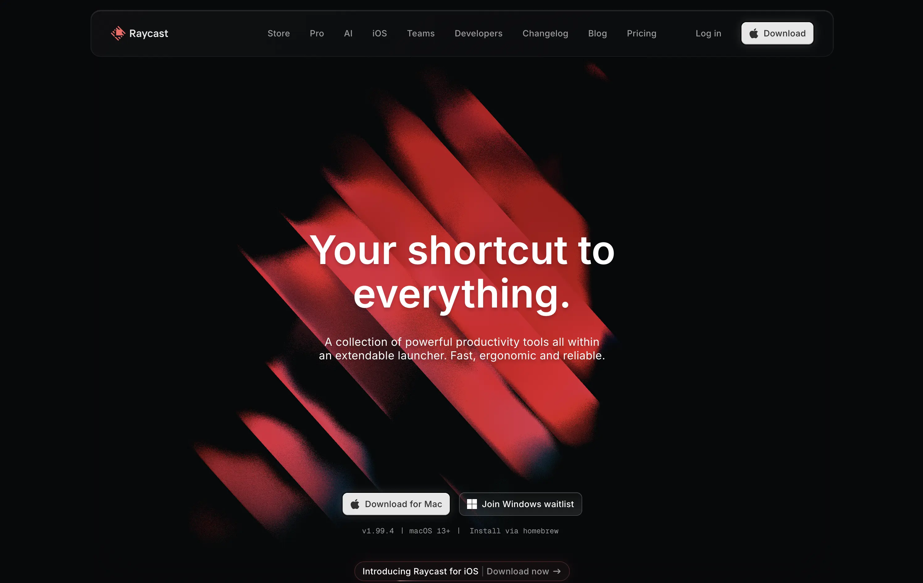
Raycast
↗
SaaS
Productivity
Centered
Bold & Direct
Descriptive
Download App
Multi-CTA Block
Interactive
Custom Animation
Loading Animation
Dark Mode
White
Red
Sans serif
B2C
Home Page
Custom Code
launcher app, power user tool, developer productivity, dark aesthetic, interactive background, custom animation, glowing motion, fast utility, keyboard-first UX, macOS-native, iOS launch, feature-rich
Raycast is a fast, extendable launcher that streamlines tasks and apps into one productivity command center.
Hero opens with striking motion and subtle interactivity, creating immediate emotional pull. Headline is short and memorable. Strong clarity on what it is and what it solves. Layout is focused, high-conversion and visually polished.
Positioning as a utility layer for power users is clear. Dark mode and minimalist tone align with dev-savvy audiences. Strong balance of brand and product without overexplaining.
This layout balances technical utility with human impact, aligning well with Algolia’s positioning as an API-first but UX-aware company. The mobile UI reinforces product value visually, while the logo wall signals scale and trust for enterprise buyers. The tone is clear, benefit-led, and appropriate for high-intent decision-makers evaluating AI tools for customer experience. This is a solid enterprise-facing hero built to perform.
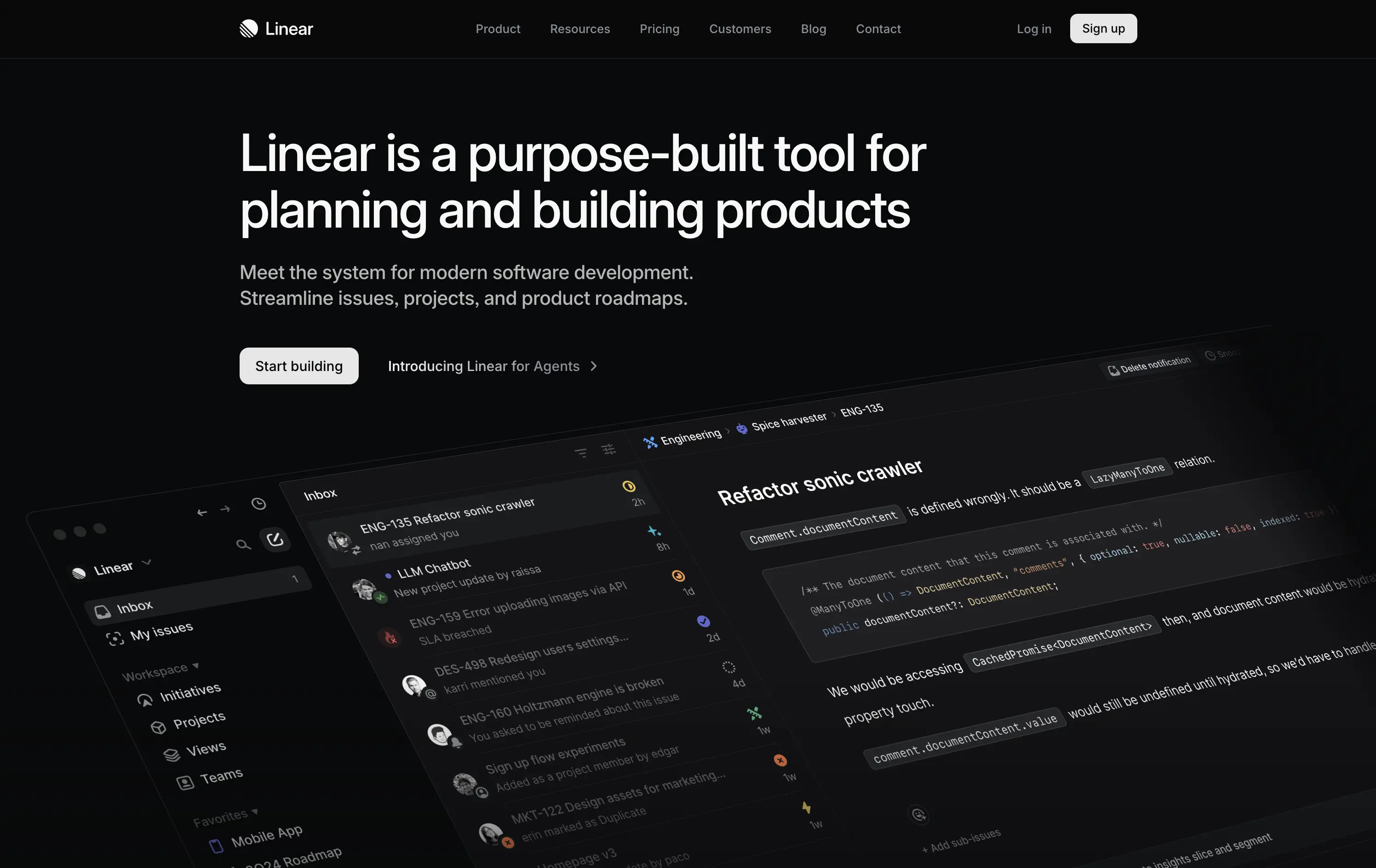
Linear
↗
SaaS
DevTools
Productivity
Left-aligned
Descriptive
Confident
Single Button
Product UI
Loading Animation
Dark Mode
White
Sans serif
B2B
Home Page
Custom Code
dark UI, engineering tools, product planning, no-fluff SaaS, modern developer stack, minimal aesthetic, deep focus, crisp layout, issue tracking, roadmap software, command-style CTA, zero distraction, productivity-first, startup tools
Linear is a streamlined tool for software teams to manage issues, sprints, and product roadmaps in a beautifully fast interface.
The hero is sleek, direct, and visually immersive. It highlights product strength without bloating the screen. Messaging is tight and outcome-focused. “Start building” reinforces dev-oriented immediacy. A strong signal of seriousness.
Perfectly aligned with experienced product and engineering teams. The minimal design supports focus. Hero says: “we’re here to work,” not pitch. Shows deep awareness of audience expectations.
This layout balances technical utility with human impact, aligning well with Algolia’s positioning as an API-first but UX-aware company. The mobile UI reinforces product value visually, while the logo wall signals scale and trust for enterprise buyers. The tone is clear, benefit-led, and appropriate for high-intent decision-makers evaluating AI tools for customer experience. This is a solid enterprise-facing hero built to perform.
The most effective hero sections in your inbox.
Monthly round up of top hero sections.
Don't worry. We hate spam too.
Don't worry. We hate spam too.
Don't worry. We hate spam too.