Minimal
2
2
2
2
Clean and stripped back. Prioritizes whitespace, simplicity, and focus.
Filters
Cabi
↗
CPG
Food & Beverage
Minimal
Editorial
Playful
Descriptive
Single Button
Photography
Duotone
Red
Sans serif
DTC
Home Page
Shopify
neo-retro aesthetic, editorial layout, minimalist packaging, visual-first, high art direction, small-batch vibe, premium grocer, vertical flavor trio, lifestyle CPG, homepage hero, nostalgic modernism, shopable CTA
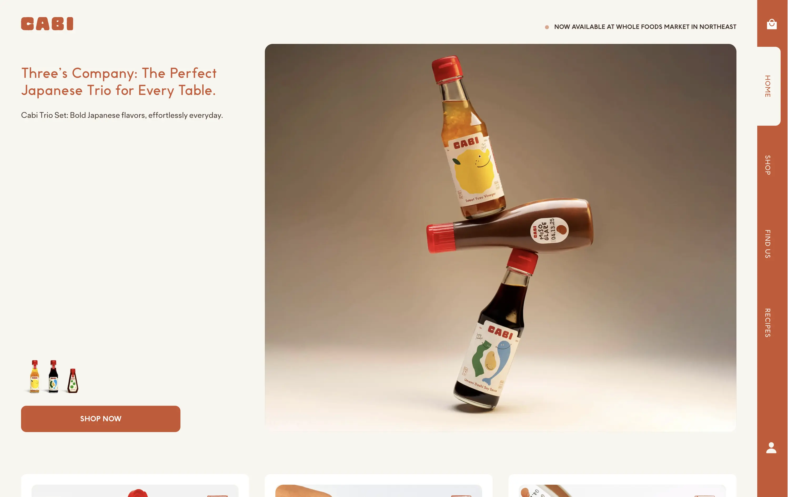
Cabi is a modern Japanese sauce brand offering a trio of bold, everyday condiments sold DTC and through select Whole Foods locations.
Cabi’s hero strikes a balance between product showcase and brand personality. The bottle stack photo is memorable and artful, with warm studio lighting that elevates the product beyond commodity. The copy is clean and narrative-led, paired with an understated “Shop Now” CTA that keeps the focus on visual storytelling. Vertical nav feels custom-built for a modern CPG brand. It holds its own without needing motion or video.
This is a homepage hero made for shelf appeal crossover. Visually premium, minimal in distractions, and confident in letting the packaging carry the emotional and culinary positioning. Feels Whole Foods-ready.
This layout balances technical utility with human impact, aligning well with Algolia’s positioning as an API-first but UX-aware company. The mobile UI reinforces product value visually, while the logo wall signals scale and trust for enterprise buyers. The tone is clear, benefit-led, and appropriate for high-intent decision-makers evaluating AI tools for customer experience. This is a solid enterprise-facing hero built to perform.
Cabi
↗
CPG
Food & Beverage
Minimal
Editorial
Playful
Descriptive
Single Button
Photography
Duotone
Red
Sans serif
DTC
Home Page
Shopify
neo-retro aesthetic, editorial layout, minimalist packaging, visual-first, high art direction, small-batch vibe, premium grocer, vertical flavor trio, lifestyle CPG, homepage hero, nostalgic modernism, shopable CTA
Cabi is a modern Japanese sauce brand offering a trio of bold, everyday condiments sold DTC and through select Whole Foods locations.
Cabi’s hero strikes a balance between product showcase and brand personality. The bottle stack photo is memorable and artful, with warm studio lighting that elevates the product beyond commodity. The copy is clean and narrative-led, paired with an understated “Shop Now” CTA that keeps the focus on visual storytelling. Vertical nav feels custom-built for a modern CPG brand. It holds its own without needing motion or video.
This is a homepage hero made for shelf appeal crossover. Visually premium, minimal in distractions, and confident in letting the packaging carry the emotional and culinary positioning. Feels Whole Foods-ready.
This layout balances technical utility with human impact, aligning well with Algolia’s positioning as an API-first but UX-aware company. The mobile UI reinforces product value visually, while the logo wall signals scale and trust for enterprise buyers. The tone is clear, benefit-led, and appropriate for high-intent decision-makers evaluating AI tools for customer experience. This is a solid enterprise-facing hero built to perform.
Stacker
↗
SaaS
AI Tools
Productivity
Minimal
Centered
Descriptive
Professional
Single Button
Photography
Video
Light Mode
Black
Sans serif
B2B
Home Page
Framer
AI operations platform, light minimal hero, conversational UI, agent automation, process copilots, clean layout, icon-based features, white space emphasis, AI-native workflow, modern SaaS tone, B2B AI, high-trust layout, early-stage beta feel
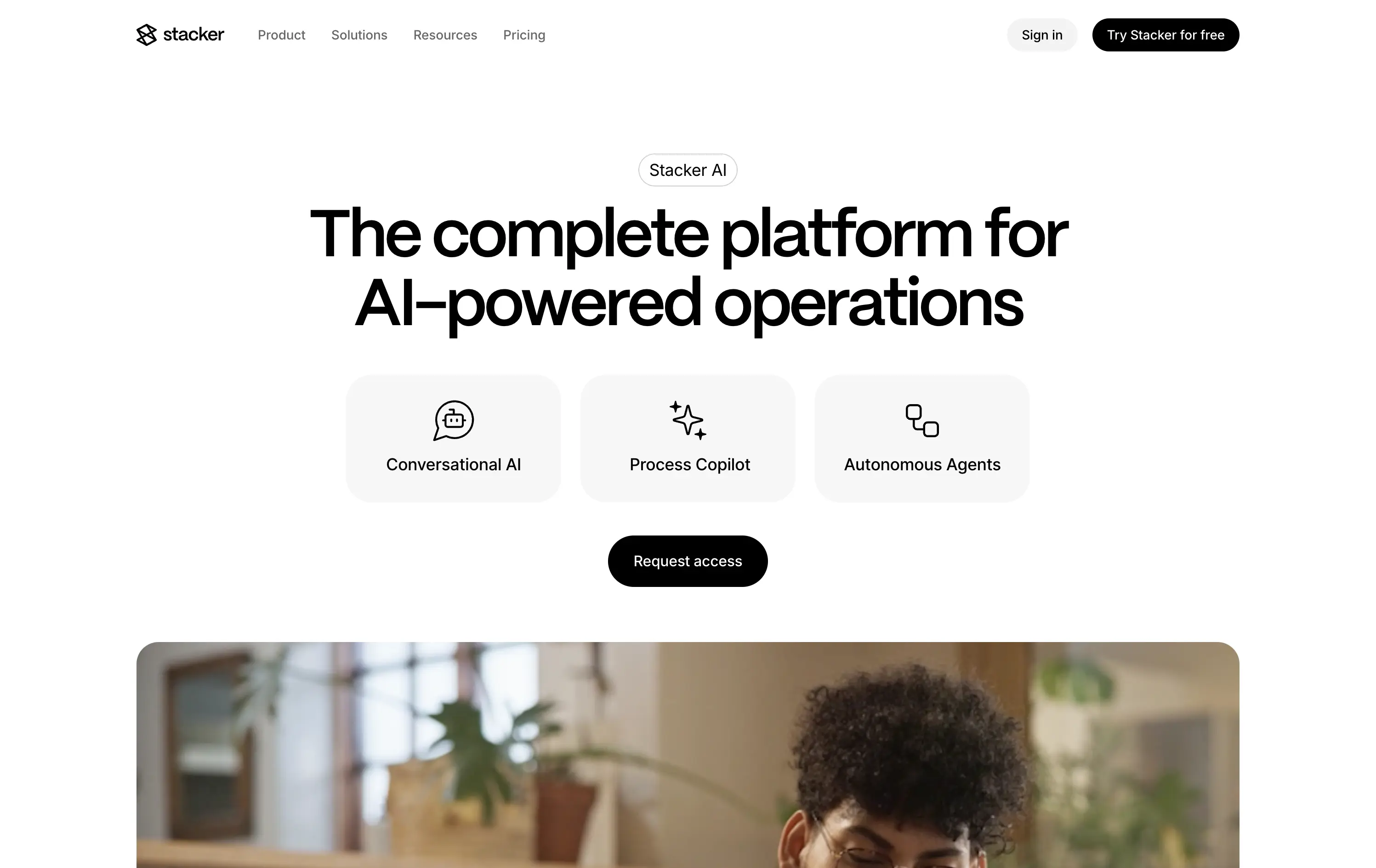
Stacker AI helps companies automate internal operations with conversational interfaces, process copilots, and autonomous agents built into their workflows.
Clarity-forward hero with minimal visual noise. Headline is direct. Icons give quick scannability of offering. “Request access” indicates early-stage invite model, aligning with AI-native positioning.
Strong entry for teams exploring AI-first automation. The restrained layout and soft interaction style suggest maturity and stability—a counterbalance to the experimental nature of AI agents.
This layout balances technical utility with human impact, aligning well with Algolia’s positioning as an API-first but UX-aware company. The mobile UI reinforces product value visually, while the logo wall signals scale and trust for enterprise buyers. The tone is clear, benefit-led, and appropriate for high-intent decision-makers evaluating AI tools for customer experience. This is a solid enterprise-facing hero built to perform.
Stacker
↗
SaaS
AI Tools
Productivity
Minimal
Centered
Descriptive
Professional
Single Button
Photography
Video
Light Mode
Black
Sans serif
B2B
Home Page
Framer
AI operations platform, light minimal hero, conversational UI, agent automation, process copilots, clean layout, icon-based features, white space emphasis, AI-native workflow, modern SaaS tone, B2B AI, high-trust layout, early-stage beta feel
Stacker AI helps companies automate internal operations with conversational interfaces, process copilots, and autonomous agents built into their workflows.
Clarity-forward hero with minimal visual noise. Headline is direct. Icons give quick scannability of offering. “Request access” indicates early-stage invite model, aligning with AI-native positioning.
Strong entry for teams exploring AI-first automation. The restrained layout and soft interaction style suggest maturity and stability—a counterbalance to the experimental nature of AI agents.
This layout balances technical utility with human impact, aligning well with Algolia’s positioning as an API-first but UX-aware company. The mobile UI reinforces product value visually, while the logo wall signals scale and trust for enterprise buyers. The tone is clear, benefit-led, and appropriate for high-intent decision-makers evaluating AI tools for customer experience. This is a solid enterprise-facing hero built to perform.
The most effective hero sections in your inbox.
Monthly round up of top hero sections.
Don't worry. We hate spam too.
Don't worry. We hate spam too.
Don't worry. We hate spam too.