Multi-CTA Block
0
0
0
0
Two or more action options side by side — often combining explore and convert.
Filters
Stacks
↗
SaaS
AI Tools
Fintech
Centered
Aspirational
Abstract / Conceptual
Multi-CTA Block
Logo Wall
Product UI
Announcement
Gradient
Light Mode
Green
Yellow
Serif
B2B
Home Page
Framer
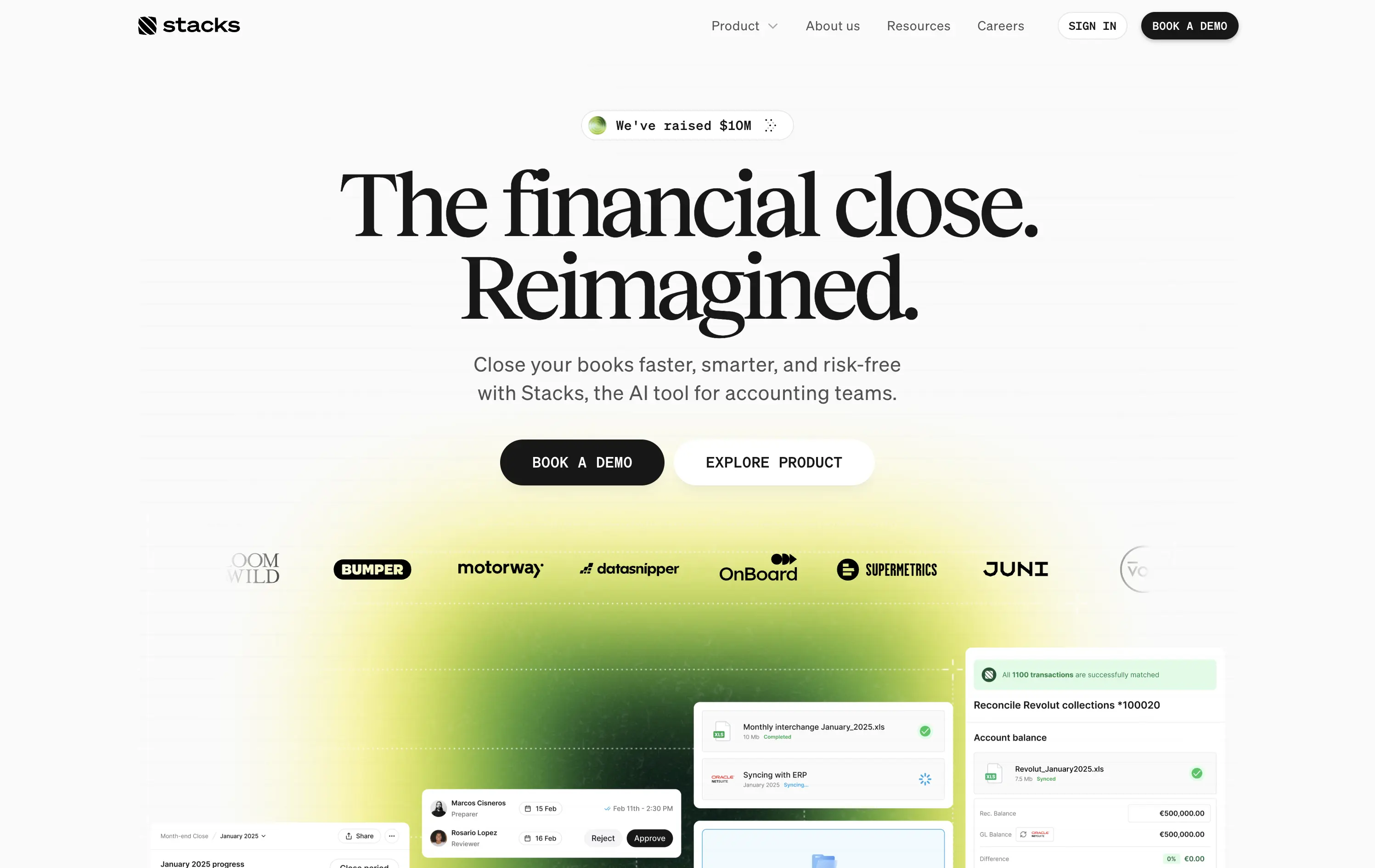
gradient hero, oversized serif headline, AI accounting SaaS, dual CTA, funding badge, logo wall, centered layout, finance automation, green yellow gradient, trusted by logos, product UI peek, crisp white background, modern B2B, high trust, accounting teams
AI‑powered platform that helps accounting teams close books faster and with less risk by automating month‑end workflows.
Oversized serif headline reframes month‑end close as an ambitious reinvention, while the lime gradient draws focus and adds energy. Subheadline grounds the concept with clear benefits, and dual CTAs serve both demo‑ready and exploratory visitors. Funding badge plus client logos build instant trust. UI snippets tease depth without clutter, aided by spacious layout and sticky nav. Cohesive and convincing.
Conceptual headline elevates mundane finance work, appealing to transformation‑minded leaders. Gradient signals progress, while proof elements ease risk concerns. Demo‑centric funnel matches enterprise sales reality.
This layout balances technical utility with human impact, aligning well with Algolia’s positioning as an API-first but UX-aware company. The mobile UI reinforces product value visually, while the logo wall signals scale and trust for enterprise buyers. The tone is clear, benefit-led, and appropriate for high-intent decision-makers evaluating AI tools for customer experience. This is a solid enterprise-facing hero built to perform.
Stacks
↗
SaaS
AI Tools
Fintech
Centered
Aspirational
Abstract / Conceptual
Multi-CTA Block
Logo Wall
Product UI
Announcement
Gradient
Light Mode
Green
Yellow
Serif
B2B
Home Page
Framer
gradient hero, oversized serif headline, AI accounting SaaS, dual CTA, funding badge, logo wall, centered layout, finance automation, green yellow gradient, trusted by logos, product UI peek, crisp white background, modern B2B, high trust, accounting teams
AI‑powered platform that helps accounting teams close books faster and with less risk by automating month‑end workflows.
Oversized serif headline reframes month‑end close as an ambitious reinvention, while the lime gradient draws focus and adds energy. Subheadline grounds the concept with clear benefits, and dual CTAs serve both demo‑ready and exploratory visitors. Funding badge plus client logos build instant trust. UI snippets tease depth without clutter, aided by spacious layout and sticky nav. Cohesive and convincing.
Conceptual headline elevates mundane finance work, appealing to transformation‑minded leaders. Gradient signals progress, while proof elements ease risk concerns. Demo‑centric funnel matches enterprise sales reality.
This layout balances technical utility with human impact, aligning well with Algolia’s positioning as an API-first but UX-aware company. The mobile UI reinforces product value visually, while the logo wall signals scale and trust for enterprise buyers. The tone is clear, benefit-led, and appropriate for high-intent decision-makers evaluating AI tools for customer experience. This is a solid enterprise-facing hero built to perform.
Family
↗
Fintech
Web3
Centered
Playful
Confident
Download App
Multi-CTA Block
Illustration
Custom Animation
Loading Animation
Light Mode
Blue
Yellow
Black
Sans serif
B2C
Home Page
Custom Code
crypto wallet for iOS, ENS support, playful Web3, mobile-first design, Gen Z crypto, kawaii aesthetic, approachable fintech, token collectibles, web3 onboarding, friendly UX
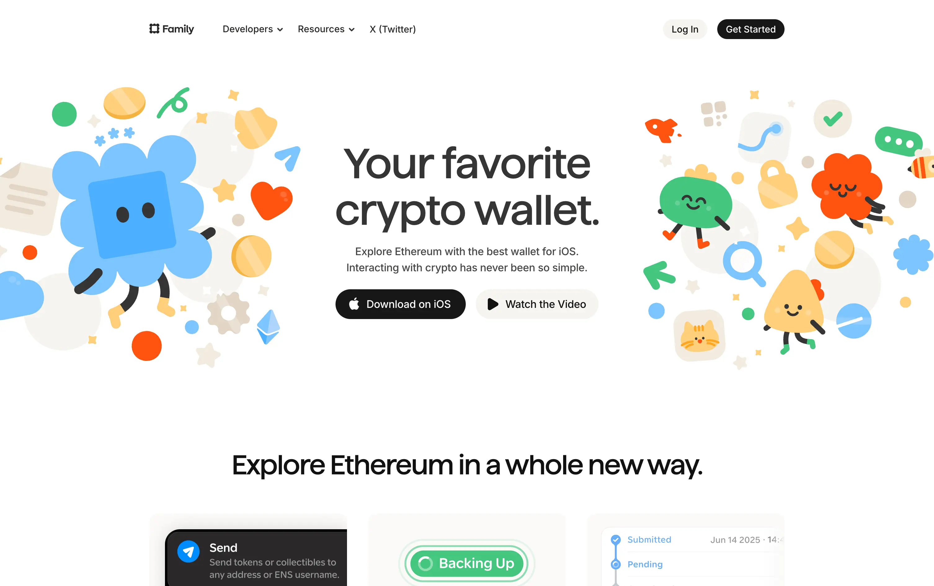
Family is a playful Ethereum wallet designed for iOS, making crypto feel friendly, visual, and simple to use.
Extremely approachable for a space often seen as cold or intimidating. The illustrations soften the category. Clear copy and strong CTA pair well with the product’s target audience and mobile-first approach.
A masterclass in brand positioning. While most Web3 brands chase dark, technical aesthetics, Family goes the opposite direction—bright, warm, and welcoming. It’s intentionally crafted to disarm, invite, and onboard a broader audience.
This layout balances technical utility with human impact, aligning well with Algolia’s positioning as an API-first but UX-aware company. The mobile UI reinforces product value visually, while the logo wall signals scale and trust for enterprise buyers. The tone is clear, benefit-led, and appropriate for high-intent decision-makers evaluating AI tools for customer experience. This is a solid enterprise-facing hero built to perform.
Family
↗
Fintech
Web3
Centered
Playful
Confident
Download App
Multi-CTA Block
Illustration
Custom Animation
Loading Animation
Light Mode
Blue
Yellow
Black
Sans serif
B2C
Home Page
Custom Code
crypto wallet for iOS, ENS support, playful Web3, mobile-first design, Gen Z crypto, kawaii aesthetic, approachable fintech, token collectibles, web3 onboarding, friendly UX
Family is a playful Ethereum wallet designed for iOS, making crypto feel friendly, visual, and simple to use.
Extremely approachable for a space often seen as cold or intimidating. The illustrations soften the category. Clear copy and strong CTA pair well with the product’s target audience and mobile-first approach.
A masterclass in brand positioning. While most Web3 brands chase dark, technical aesthetics, Family goes the opposite direction—bright, warm, and welcoming. It’s intentionally crafted to disarm, invite, and onboard a broader audience.
This layout balances technical utility with human impact, aligning well with Algolia’s positioning as an API-first but UX-aware company. The mobile UI reinforces product value visually, while the logo wall signals scale and trust for enterprise buyers. The tone is clear, benefit-led, and appropriate for high-intent decision-makers evaluating AI tools for customer experience. This is a solid enterprise-facing hero built to perform.
Parabola
↗
AI Tools
Productivity
Data & Analytics
Centered
Conversational
Multi-CTA Block
Interactive
Search Field
Logo Wall
Dark Mode
Green
Serif
B2B
Home Page
Webflow
AI automation, input-based interaction, structured workflows, smart defaults, productivity tool, GPT-enhanced UX, dark mode UI, enterprise lean, trusted by brands, high-conversion layout
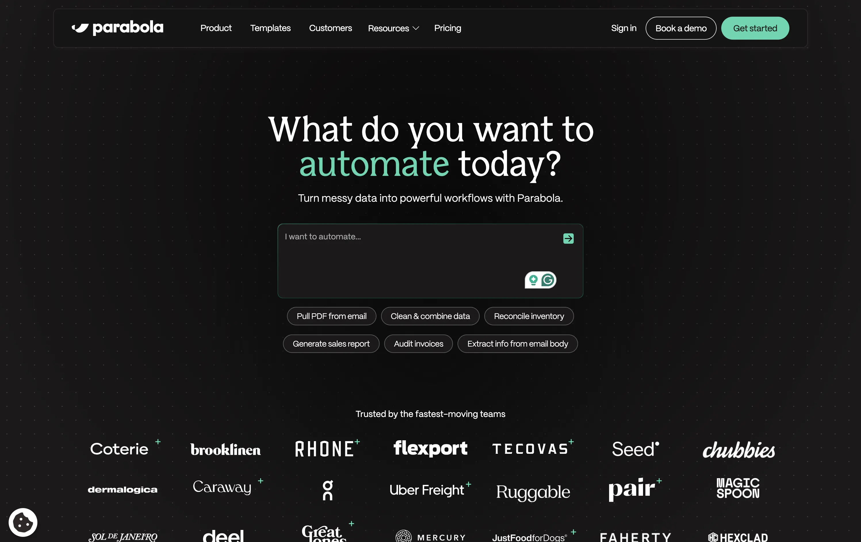
Parabola helps teams automate data-heavy workflows with AI-powered tools that clean, transform, and move business data faster.
Strong interactive moment with the input field immediately puts the user in control. The headline is benefit-led, and supporting actions give examples for inspiration. Clean, conversion-optimized layout that feels modern.
Directly aligned with operational and data-driven teams. The hero positions Parabola as both powerful and easy to start with—supported by an enterprise-trust logo wall and guided input UX.
This layout balances technical utility with human impact, aligning well with Algolia’s positioning as an API-first but UX-aware company. The mobile UI reinforces product value visually, while the logo wall signals scale and trust for enterprise buyers. The tone is clear, benefit-led, and appropriate for high-intent decision-makers evaluating AI tools for customer experience. This is a solid enterprise-facing hero built to perform.
Parabola
↗
AI Tools
Productivity
Data & Analytics
Centered
Conversational
Multi-CTA Block
Interactive
Search Field
Logo Wall
Dark Mode
Green
Serif
B2B
Home Page
Webflow
AI automation, input-based interaction, structured workflows, smart defaults, productivity tool, GPT-enhanced UX, dark mode UI, enterprise lean, trusted by brands, high-conversion layout
Parabola helps teams automate data-heavy workflows with AI-powered tools that clean, transform, and move business data faster.
Strong interactive moment with the input field immediately puts the user in control. The headline is benefit-led, and supporting actions give examples for inspiration. Clean, conversion-optimized layout that feels modern.
Directly aligned with operational and data-driven teams. The hero positions Parabola as both powerful and easy to start with—supported by an enterprise-trust logo wall and guided input UX.
This layout balances technical utility with human impact, aligning well with Algolia’s positioning as an API-first but UX-aware company. The mobile UI reinforces product value visually, while the logo wall signals scale and trust for enterprise buyers. The tone is clear, benefit-led, and appropriate for high-intent decision-makers evaluating AI tools for customer experience. This is a solid enterprise-facing hero built to perform.
Gamma
↗
AI Tools
Creative Tools
Productivity
Split Grid
Left-aligned
Descriptive
Empowering
Multi-CTA Block
Watch Demo
Illustration
Media Gallery
Interactive
Light Mode
Blue
Sans serif
Hybrid
Home Page
Custom Code
AI presentation tool, whimsical 3D art, surreal imagery, smooth onboarding, soft brand tone, vertical carousel, intuitive UX, layout-focused demo, pastel aesthetic, creative AI tool, friendly product language
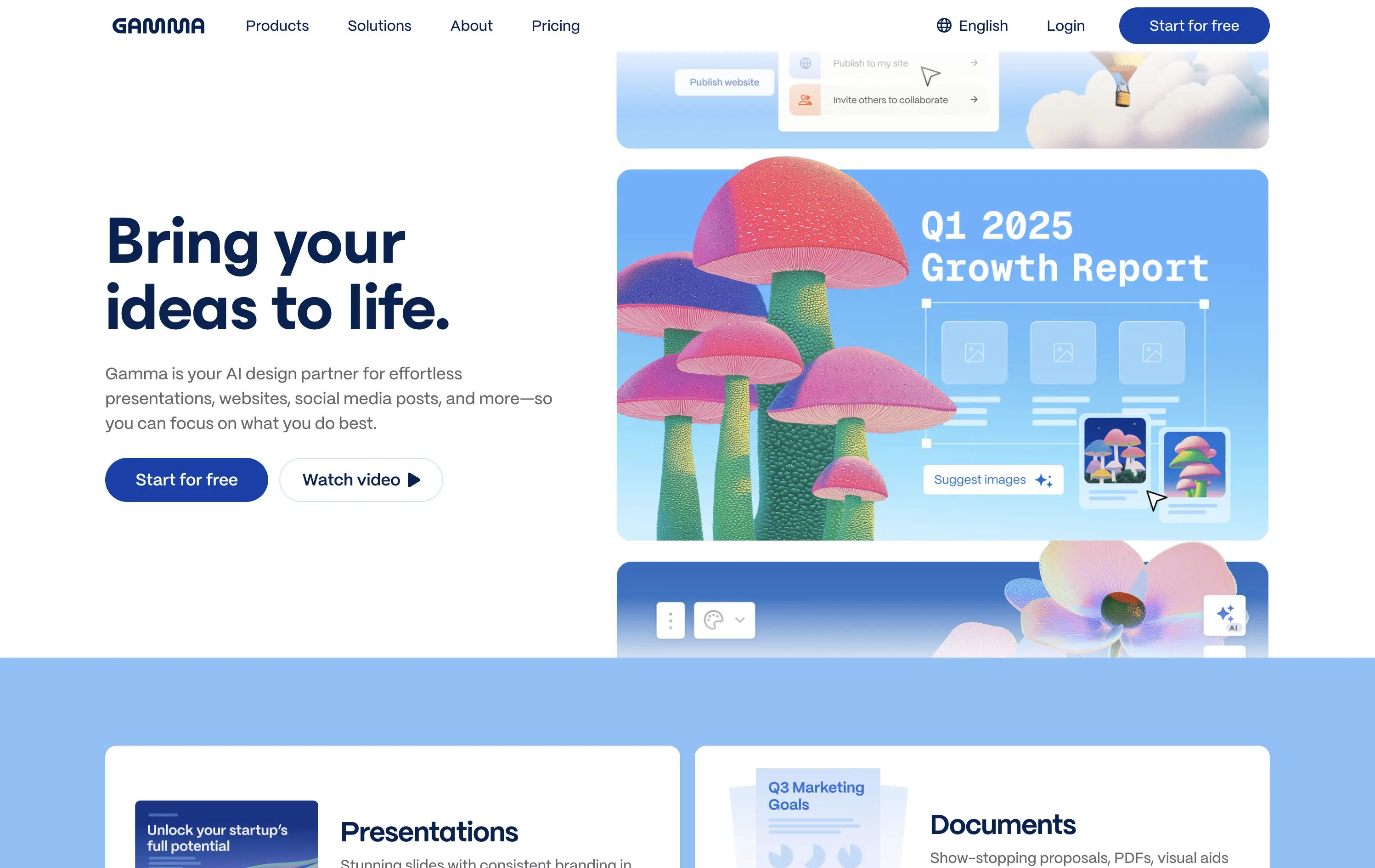
Gamma is an AI-powered design platform that helps users create beautiful presentations, websites, and docs effortlessly.
The carousel introduces Gamma’s features visually without overwhelming the user. The surreal illustration style immediately grabs attention, and the copy reinforces ease-of-use and creativity.
Gamma positions itself as a non-intimidating AI tool for creative productivity. Visuals, layout, and tone all serve to lower the barrier for entry and increase relatability.
This layout balances technical utility with human impact, aligning well with Algolia’s positioning as an API-first but UX-aware company. The mobile UI reinforces product value visually, while the logo wall signals scale and trust for enterprise buyers. The tone is clear, benefit-led, and appropriate for high-intent decision-makers evaluating AI tools for customer experience. This is a solid enterprise-facing hero built to perform.
Gamma
↗
AI Tools
Creative Tools
Productivity
Split Grid
Left-aligned
Descriptive
Empowering
Multi-CTA Block
Watch Demo
Illustration
Media Gallery
Interactive
Light Mode
Blue
Sans serif
Hybrid
Home Page
Custom Code
AI presentation tool, whimsical 3D art, surreal imagery, smooth onboarding, soft brand tone, vertical carousel, intuitive UX, layout-focused demo, pastel aesthetic, creative AI tool, friendly product language
Gamma is an AI-powered design platform that helps users create beautiful presentations, websites, and docs effortlessly.
The carousel introduces Gamma’s features visually without overwhelming the user. The surreal illustration style immediately grabs attention, and the copy reinforces ease-of-use and creativity.
Gamma positions itself as a non-intimidating AI tool for creative productivity. Visuals, layout, and tone all serve to lower the barrier for entry and increase relatability.
This layout balances technical utility with human impact, aligning well with Algolia’s positioning as an API-first but UX-aware company. The mobile UI reinforces product value visually, while the logo wall signals scale and trust for enterprise buyers. The tone is clear, benefit-led, and appropriate for high-intent decision-makers evaluating AI tools for customer experience. This is a solid enterprise-facing hero built to perform.
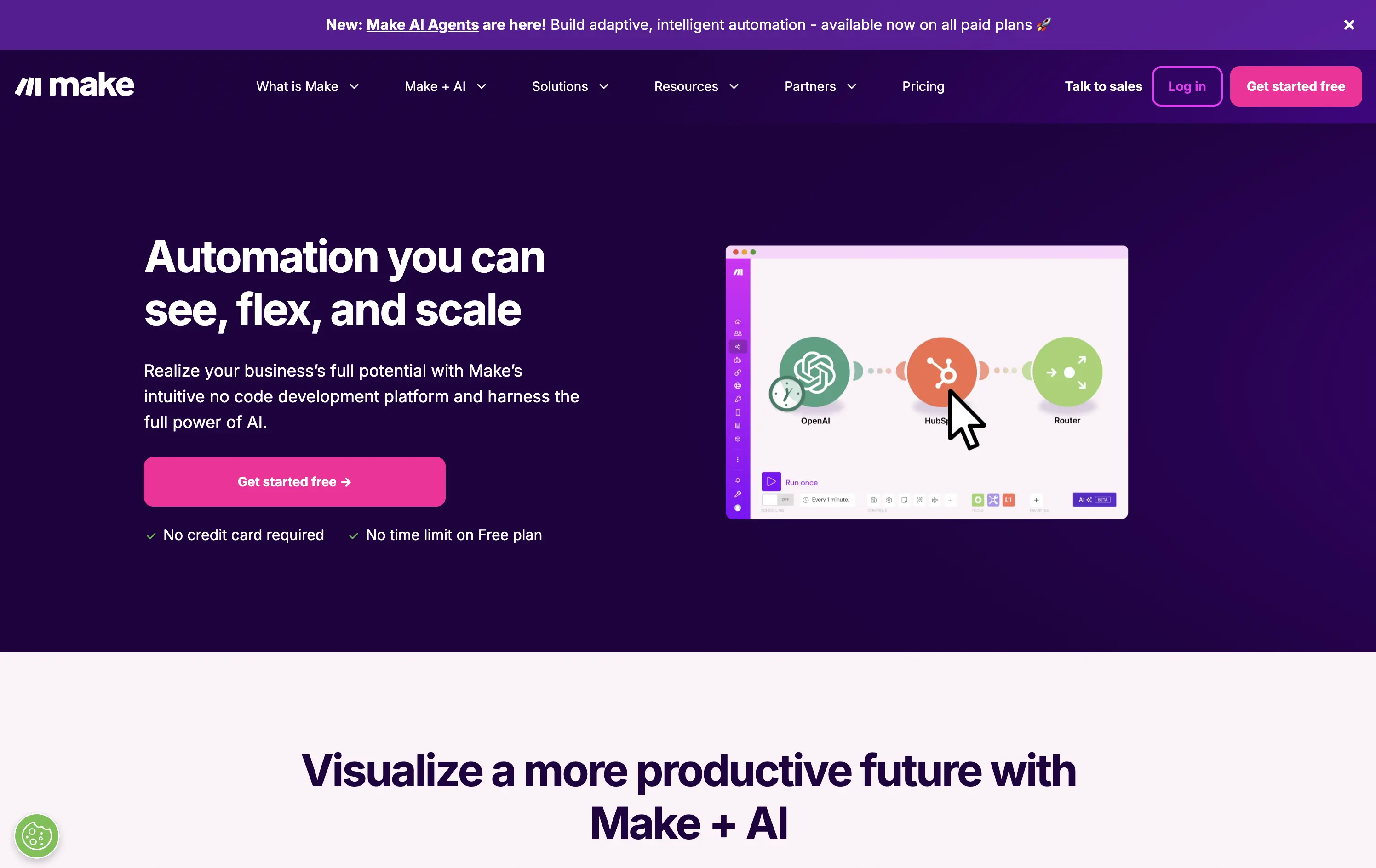
Make
↗
No-Code
Productivity
Split Grid
Descriptive
Empowering
Multi-CTA Block
Video
Announcement
Duotone
Pink
Sans serif
Hybrid
Home Page
Custom Code
no-code automation, workflow builder, AI integration, drag-and-drop editor, Zapier alternative, clear onboarding, SaaS demo UX, trust-focused layout, commercial SaaS, AI-enhanced logic
Make is a no-code automation platform that lets businesses visually build and scale workflows powered by AI.
It’s clean, clear, and direct. The animated product video does the heavy lifting. The layout and copy are textbook SaaS—efficient but forgettable. It communicates function well without taking any design risks.
Optimized for clarity and ease of adoption. Great for users shopping for workflow tools, but lacks brand distinctiveness. Plays it safe with a universal SaaS format and gradient palette.
This layout balances technical utility with human impact, aligning well with Algolia’s positioning as an API-first but UX-aware company. The mobile UI reinforces product value visually, while the logo wall signals scale and trust for enterprise buyers. The tone is clear, benefit-led, and appropriate for high-intent decision-makers evaluating AI tools for customer experience. This is a solid enterprise-facing hero built to perform.
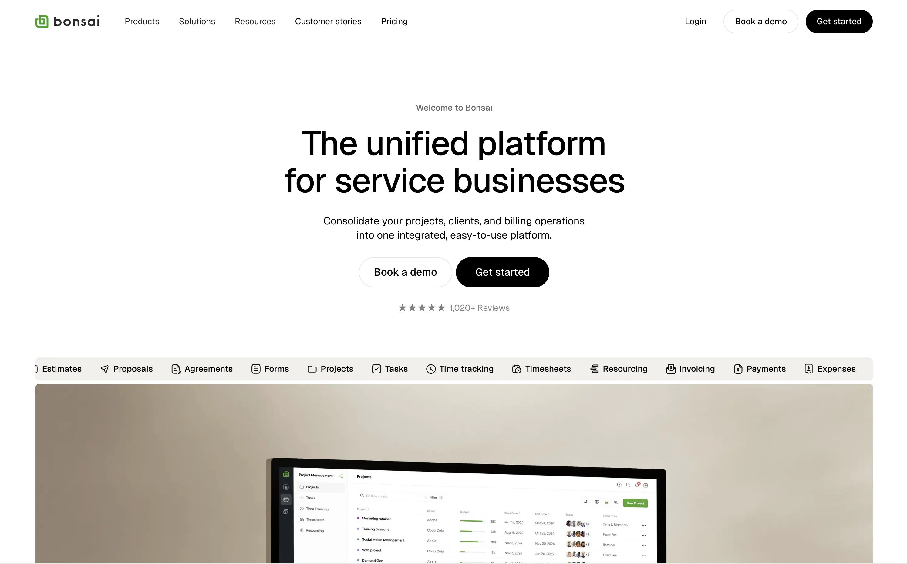
Bonsai
↗
SaaS
Productivity
Centered
Descriptive
Professional
Multi-CTA Block
Product UI
Social Proof
Badges
Light Mode
Black
Sans serif
B2B
Home Page
Webflow
clean UI, use-case ticker, modular product suite, high-trust SaaS, minimal layout, neutral branding, small business ops, service platform, feature-led structure, multi-tool clarity, clear positioning
Bonsai offers an all-in-one platform to manage projects, clients, billing, and admin work for service-based businesses.
Minimal, structured, and very clear. The hero spells out the value in one line and supports it with a rolling feature list. Visuals, CTAs, and copy all pull in the same direction—no friction, no fluff.
Positioned for busy professionals who need clarity fast. Layout and tone reflect a mature product with high utility and little need for persuasion theatrics.
This layout balances technical utility with human impact, aligning well with Algolia’s positioning as an API-first but UX-aware company. The mobile UI reinforces product value visually, while the logo wall signals scale and trust for enterprise buyers. The tone is clear, benefit-led, and appropriate for high-intent decision-makers evaluating AI tools for customer experience. This is a solid enterprise-facing hero built to perform.
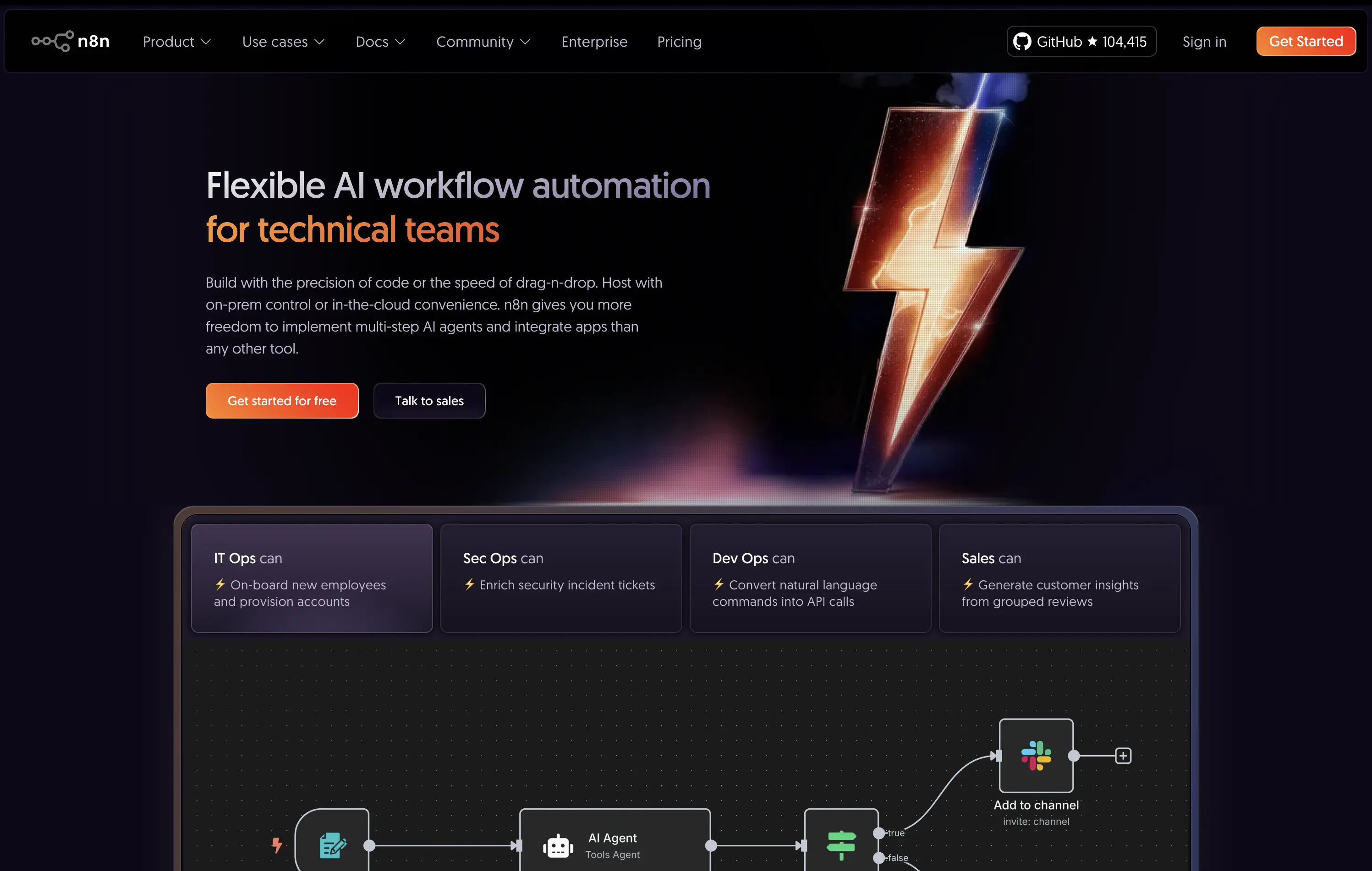
n8n
↗
SaaS
AI Tools
No-Code
Left-aligned
Benefit-Driven
Professional
Multi-CTA Block
Interactive
Product UI
Custom Animation
Dark Mode
Purple
Orange
Sans serif
B2B
Home Page
Custom Code
workflow automation, open source, dev-first, agent-based logic, enterprise-ready, dark UI, custom hosting, role-based use cases, badge grid, high-contrast visual, infra-integrated
An open-source AI workflow automation tool for developers and teams to build, host, and manage agents with full control.
The hero clearly communicates audience and value: “technical teams” is front-loaded, supported by use-case-specific tiles. The lightning bolt graphic adds memorability, while the product UI below supports credibility.
Strongly positioned for a technical, enterprise-leaning audience. The copy and structure match maturity and decision-maker needs. Hosting flexibility is a key differentiator.
This layout balances technical utility with human impact, aligning well with Algolia’s positioning as an API-first but UX-aware company. The mobile UI reinforces product value visually, while the logo wall signals scale and trust for enterprise buyers. The tone is clear, benefit-led, and appropriate for high-intent decision-makers evaluating AI tools for customer experience. This is a solid enterprise-facing hero built to perform.
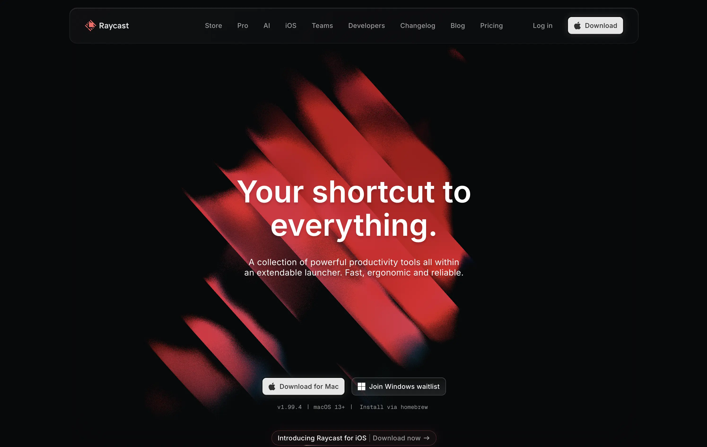
Raycast
↗
SaaS
Productivity
Centered
Bold & Direct
Descriptive
Download App
Multi-CTA Block
Interactive
Custom Animation
Loading Animation
Dark Mode
White
Red
Sans serif
B2C
Home Page
Custom Code
launcher app, power user tool, developer productivity, dark aesthetic, interactive background, custom animation, glowing motion, fast utility, keyboard-first UX, macOS-native, iOS launch, feature-rich
Raycast is a fast, extendable launcher that streamlines tasks and apps into one productivity command center.
Hero opens with striking motion and subtle interactivity, creating immediate emotional pull. Headline is short and memorable. Strong clarity on what it is and what it solves. Layout is focused, high-conversion and visually polished.
Positioning as a utility layer for power users is clear. Dark mode and minimalist tone align with dev-savvy audiences. Strong balance of brand and product without overexplaining.
This layout balances technical utility with human impact, aligning well with Algolia’s positioning as an API-first but UX-aware company. The mobile UI reinforces product value visually, while the logo wall signals scale and trust for enterprise buyers. The tone is clear, benefit-led, and appropriate for high-intent decision-makers evaluating AI tools for customer experience. This is a solid enterprise-facing hero built to perform.
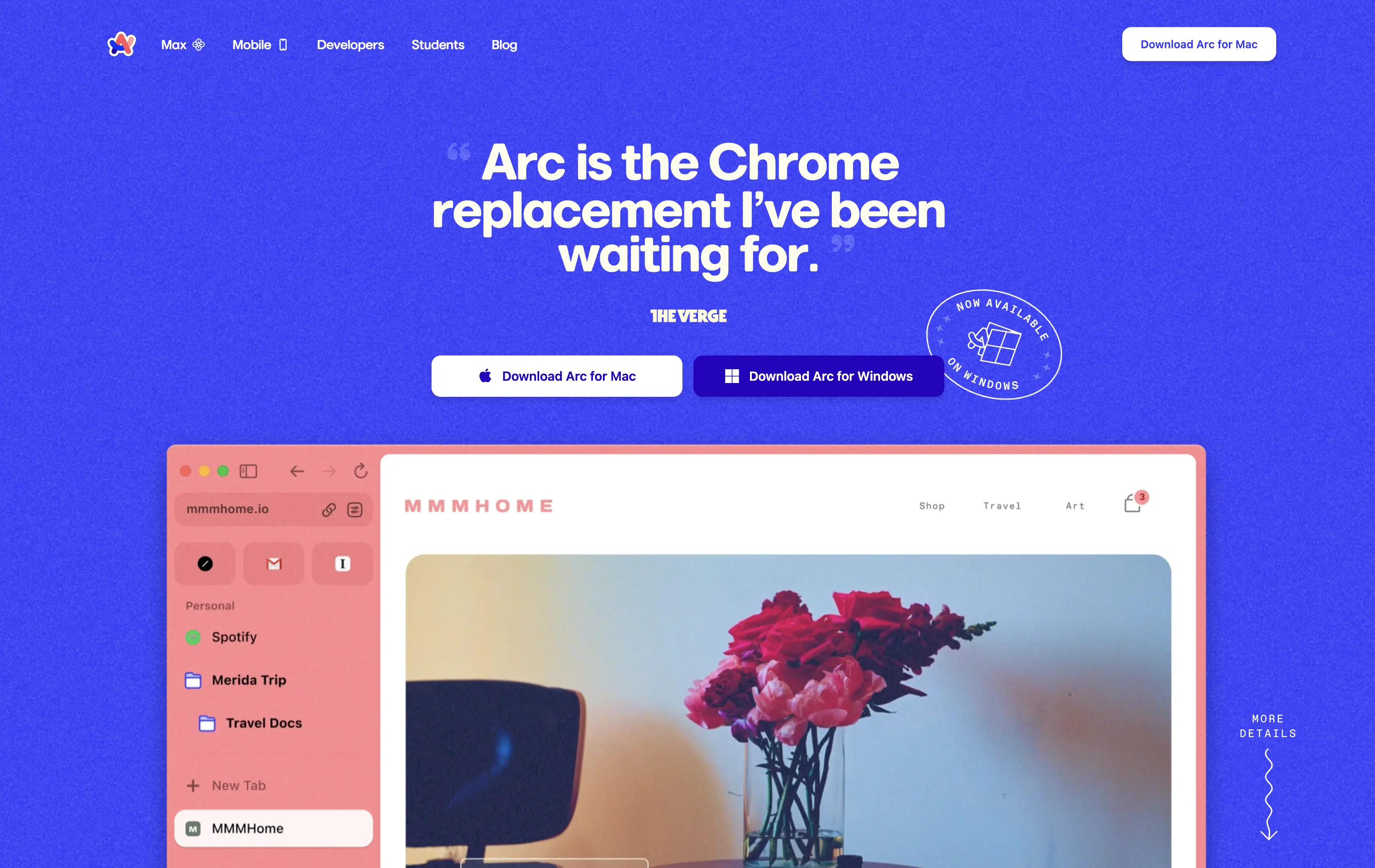
Arc
↗
SaaS
Productivity
Centered
Proof-Heavy
Multi-CTA Block
Product UI
Social Proof
Duotone
White
Blue
Display
Sans serif
B2C
Home Page
Custom Code
consumer browser, verge quote, UI-focused, product-led design, browser replacement, macOS-first, desktop software, soft but bold, macOS-style visual language, motion-laced layout, quirky detail, testimonial-driven, vibrant blue, feature-forward
Arc is a modern browser designed to replace legacy browser with a reimagined UI and productivity-first experience.
This hero grabs attention immediately with a high-credibility quote as the headline, bold visual language, and a visible product UI that instantly signals differentiation. The CTA is clear and platform-specific. The color treatment and layout feel energetic and modern, aligning well with consumer expectations for a desktop app.
Strong positioning via social proof rather than abstract messaging. The hero makes the shift-from-Chrome angle explicit, appealing to an informed, tech-forward audience. High trust and strong product framing.
This layout balances technical utility with human impact, aligning well with Algolia’s positioning as an API-first but UX-aware company. The mobile UI reinforces product value visually, while the logo wall signals scale and trust for enterprise buyers. The tone is clear, benefit-led, and appropriate for high-intent decision-makers evaluating AI tools for customer experience. This is a solid enterprise-facing hero built to perform.
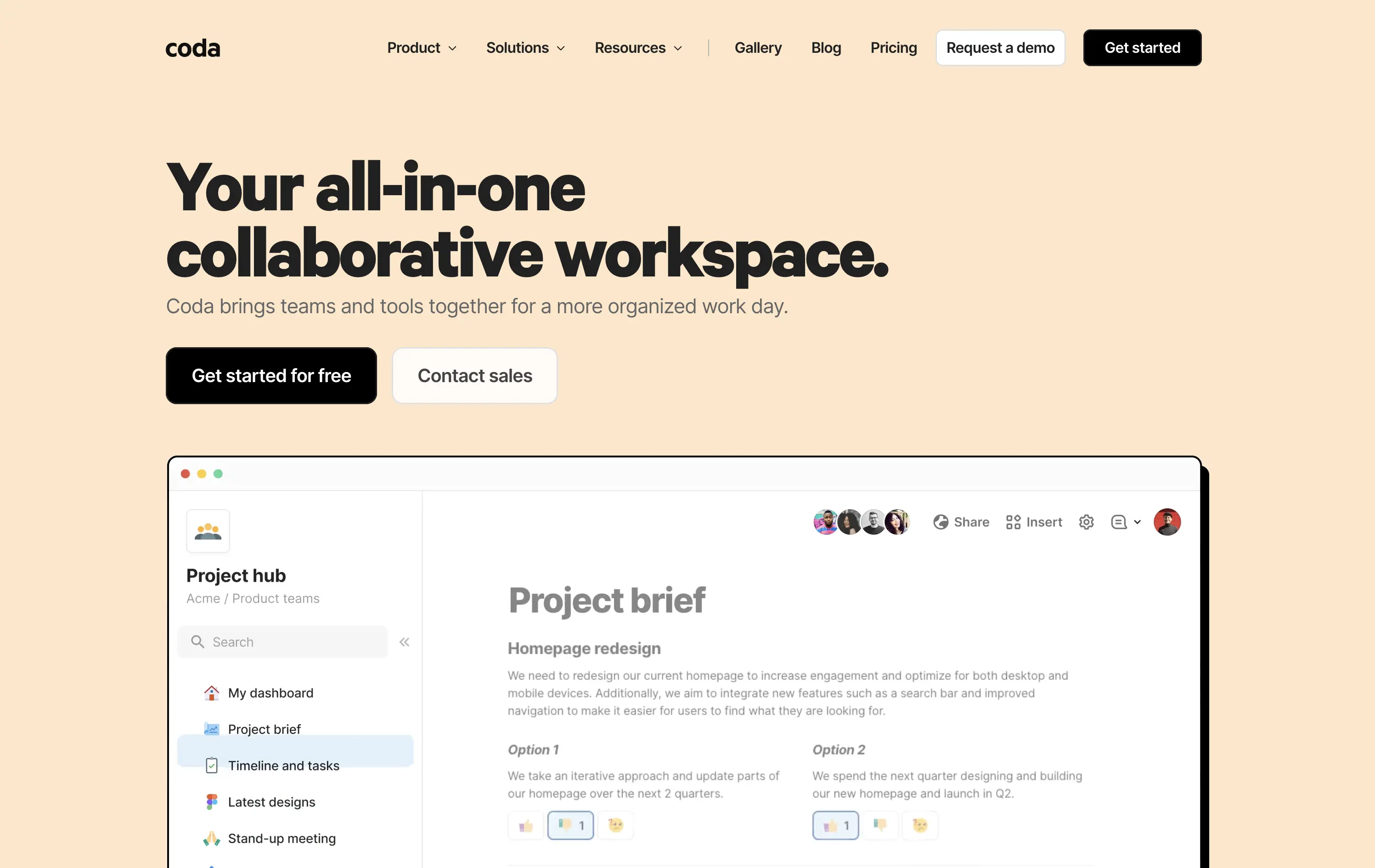
Coda
↗
SaaS
Collaboration
Productivity
Left-aligned
Descriptive
Empowering
Multi-CTA Block
Product UI
Duotone
White
Yellow
Display
Sans serif
Hybrid
Home Page
Custom Code
doc-as-app, team workflow, internal tools, collaborative workspace, UI product demo, hybrid teams, sales enablement, project brief, minimal design, low-code logic, enterprise-friendly, live multiplayer,
Coda is a collaborative doc platform that combines documents, spreadsheets, and apps into one unified workspace for teams.
The hero communicates clearly with a straightforward headline and strong product shot. Layout is easy to follow, and the dual CTA gives distinct paths for self-serve or sales-led funnels. The visual hierarchy is solid, though not emotionally charged.
Coda leads with clarity over flash. The message and layout prioritize breadth of use and enterprise readiness. Great fit for decision-makers looking to unify scattered tools into a single workspace.
This layout balances technical utility with human impact, aligning well with Algolia’s positioning as an API-first but UX-aware company. The mobile UI reinforces product value visually, while the logo wall signals scale and trust for enterprise buyers. The tone is clear, benefit-led, and appropriate for high-intent decision-makers evaluating AI tools for customer experience. This is a solid enterprise-facing hero built to perform.
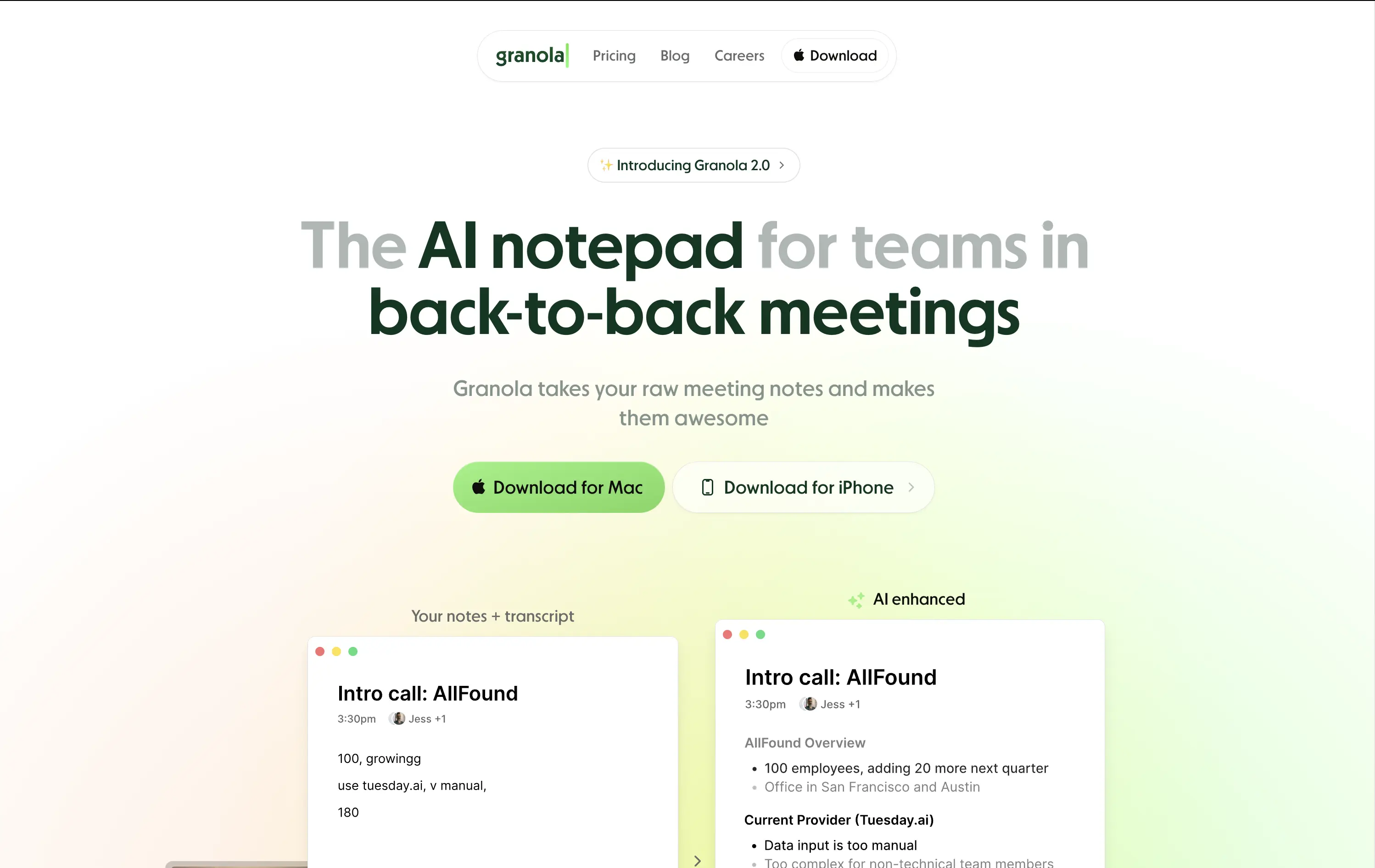
Granola
↗
SaaS
AI Tools
Productivity
Centered
Descriptive
Pain-driven
Download App
Multi-CTA Block
Product UI
Announcement
Gradient
Light Mode
Green
Sans serif
Hybrid
Home Page
Custom Code
AI notepad, transcript comparison, Mac/iOS focus, pastel gradient, clean UX, AI productivity, note app, task-lite SaaS, small team positioning, time-saving tool, App Store-ready, side-by-side visual
Granola is an AI notepad that turns messy meeting notes into clean, structured transcripts — built for teams with nonstop meetings.
The hero is practical and conversion-focused. It quickly communicates what the tool does and for whom. The side-by-side note demo is immediately legible and shows before/after clarity. Headline focuses on team context rather than just AI, which grounds it. Download CTAs feel native and frictionless. The soft green gradient is calming without feeling sterile. Could benefit from stronger brand differentiation, but it nails clarity and accessibility for a high-frequency use case.
Laser-targeted to productivity-challenged teams. Hero clearly communicates utility and streamlines onboarding. UI preview builds instant understanding, and the download CTAs suggest a tool that fits right into daily workflows.
This layout balances technical utility with human impact, aligning well with Algolia’s positioning as an API-first but UX-aware company. The mobile UI reinforces product value visually, while the logo wall signals scale and trust for enterprise buyers. The tone is clear, benefit-led, and appropriate for high-intent decision-makers evaluating AI tools for customer experience. This is a solid enterprise-facing hero built to perform.
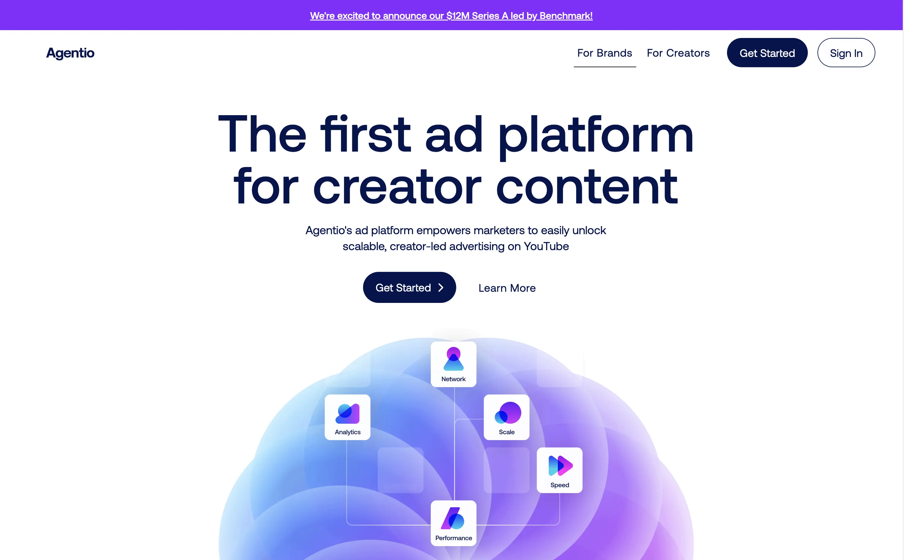
Agentio
↗
SaaS
AI Tools
Creator Tools
Centered
Bold & Direct
Confident
Multi-CTA Block
Illustration
Announcement
Gradient
Light Mode
Blue
Purple
Sans serif
Hybrid
Home Page
Webflow
orb graphic, YouTube ads, creator economy, motion gradient, AI ad platform, minimal layout, startup vibe, polished MVP, Series A, dual audience nav, split funnel intent
Agentio is an adtech platform helping marketers launch scalable, creator-led YouTube campaigns with performance tracking, analytics, and a managed network of creators.
Agentio’s hero is tight and intentional. The headline is clear and confident in its category claim. Subtext adds usability context without overloading. The floating orb graphic with ecosystem icons effectively visualizes the product promise. Dual CTAs cover both high and low-intent traffic. The announcement bar adds momentum without distraction. Layout feels modern and founder-backed — clean, but not generic.
Strong product-market fit vibes. Balances clarity and momentum for both creators and marketers. Visuals align with startup scaleup phase. Messaging is sharply angled to claim an early stake in the creator-led ad space.
This layout balances technical utility with human impact, aligning well with Algolia’s positioning as an API-first but UX-aware company. The mobile UI reinforces product value visually, while the logo wall signals scale and trust for enterprise buyers. The tone is clear, benefit-led, and appropriate for high-intent decision-makers evaluating AI tools for customer experience. This is a solid enterprise-facing hero built to perform.
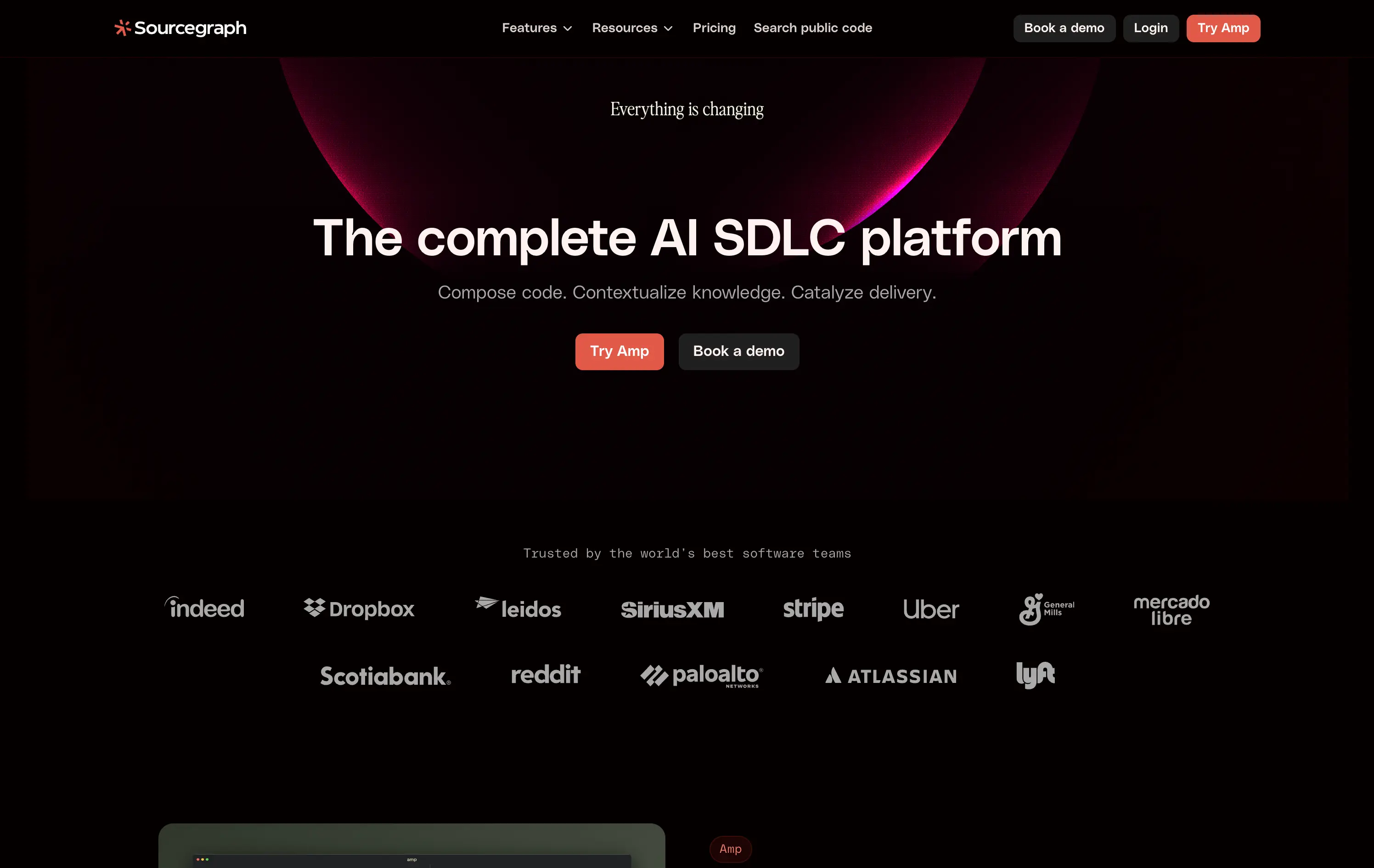
Sourcegraph
↗
DevTools
AI Tools
Collaboration
Centered
Abstract / Conceptual
Professional
Multi-CTA Block
Logo Wall
Custom Animation
Dark Mode
White
Red
Sans serif
B2B
Home Page
Webflow
AI developer tools, software delivery, blinking headline, AI SDLC platform, cognitive CTA friction, high-trust logos, developer enterprise, dual CTA layout, evolving dev workflows, dark futuristic aesthetic, intelligent search, platform abstraction
Sourcegraph offers AI-powered tools to help dev teams search, understand, and deliver code faster across their entire software development lifecycle.
The hero signals scale, change, and technical leadership. Trust logos and layout build authority fast. But “Try Amp” as CTA is vague—first-time users won’t know what it means.
Aims to own a high-level category: “AI SDLC.” The priming animation reinforces urgency, but abstract product naming creates an entry barrier for unfamiliar users.
This layout balances technical utility with human impact, aligning well with Algolia’s positioning as an API-first but UX-aware company. The mobile UI reinforces product value visually, while the logo wall signals scale and trust for enterprise buyers. The tone is clear, benefit-led, and appropriate for high-intent decision-makers evaluating AI tools for customer experience. This is a solid enterprise-facing hero built to perform.
Kontent
↗
SaaS
DevTools
AI Tools
Left-aligned
Aspirational
Professional
Multi-CTA Block
Illustration
Logo Wall
Dark Mode
White
Display
Sans serif
B2B
Home Page
Custom Code
enterprise CMS, headless CMS, AI-powered content, content ops, gradient headline, trust logos, scaling infrastructure, fast deployment, dark aesthetic, enterprise compliance, visual typography, dual CTA, regulation-focused CMS, marketing ops, content velocity
Kontent.ai helps enterprise teams manage and scale content across regulated environments with more speed, control, and automation.
Hero balances clarity with ambition. Headline dramatizes a long-standing pain point in CMS, paired with a clean UI and strong credibility cues. Dual CTA supports varied funnel stages.
Tailored for enterprise teams scaling fast. The aspirational tone reframes content ops as a modern, automated function—not a bottleneck. Visuals and copy are enterprise-calibrated.
This layout balances technical utility with human impact, aligning well with Algolia’s positioning as an API-first but UX-aware company. The mobile UI reinforces product value visually, while the logo wall signals scale and trust for enterprise buyers. The tone is clear, benefit-led, and appropriate for high-intent decision-makers evaluating AI tools for customer experience. This is a solid enterprise-facing hero built to perform.
Sanity
↗
SaaS
DevTools
Full Width
Descriptive
Multi-CTA Block
Video
Logo Wall
Announcement
Imagery-Based
White
Orange
Sans serif
B2B
Home Page
Custom Code
programmable content, developer-first CMS, content infrastructure, CLI install, terminal-ready, layered layout, utility CTA, heavy visual load, startup-to-enterprise scale, code-native UX, tech-forward brand, headless CMS, dark visual tone
Sanity is a customizable, developer-first CMS platform that gives full programmatic control to build scalable content-driven apps.
Copy-to-clipboard npm CTA is highly functional and aligned with dev habits. But overall hierarchy is cluttered—UI overlay, imagery, and CTAs fight for attention, making the first impression a bit noisy.
Great strategic anchor for a technical audience, but risks cognitive overload on entry. Needs tighter content framing to sharpen focus for first-time visitors.
This layout balances technical utility with human impact, aligning well with Algolia’s positioning as an API-first but UX-aware company. The mobile UI reinforces product value visually, while the logo wall signals scale and trust for enterprise buyers. The tone is clear, benefit-led, and appropriate for high-intent decision-makers evaluating AI tools for customer experience. This is a solid enterprise-facing hero built to perform.
Jot
↗
CPG
Food & Beverage
Editorial
Benefit-Driven
Conversational
Multi-CTA Block
Photography
Custom Animation
Announcement
Imagery-Based
Yellow
Black
Display
DTC
Home Page
Shopify
Replo
coffee brand, lifestyle product, home ritual, premium instant coffee, CPG beverage, warm palette, morning routine, modern food DTC, product-centered hero, rotating headline, lifestyle-led photography
Jot sells ultra-concentrated coffee that simplifies your morning brew without compromising on quality or taste.
Visuals immediately convey simplicity and satisfaction. The rotating headline adapts to multiple buyer intents while keeping focus tight. The product-in-action shot clarifies usage without needing extra explanation.
The brand leans hard into lifestyle cues—targeting modern, taste-conscious buyers with clarity and credibility. The light palette and cozy setup reinforce everyday luxury.
This layout balances technical utility with human impact, aligning well with Algolia’s positioning as an API-first but UX-aware company. The mobile UI reinforces product value visually, while the logo wall signals scale and trust for enterprise buyers. The tone is clear, benefit-led, and appropriate for high-intent decision-makers evaluating AI tools for customer experience. This is a solid enterprise-facing hero built to perform.
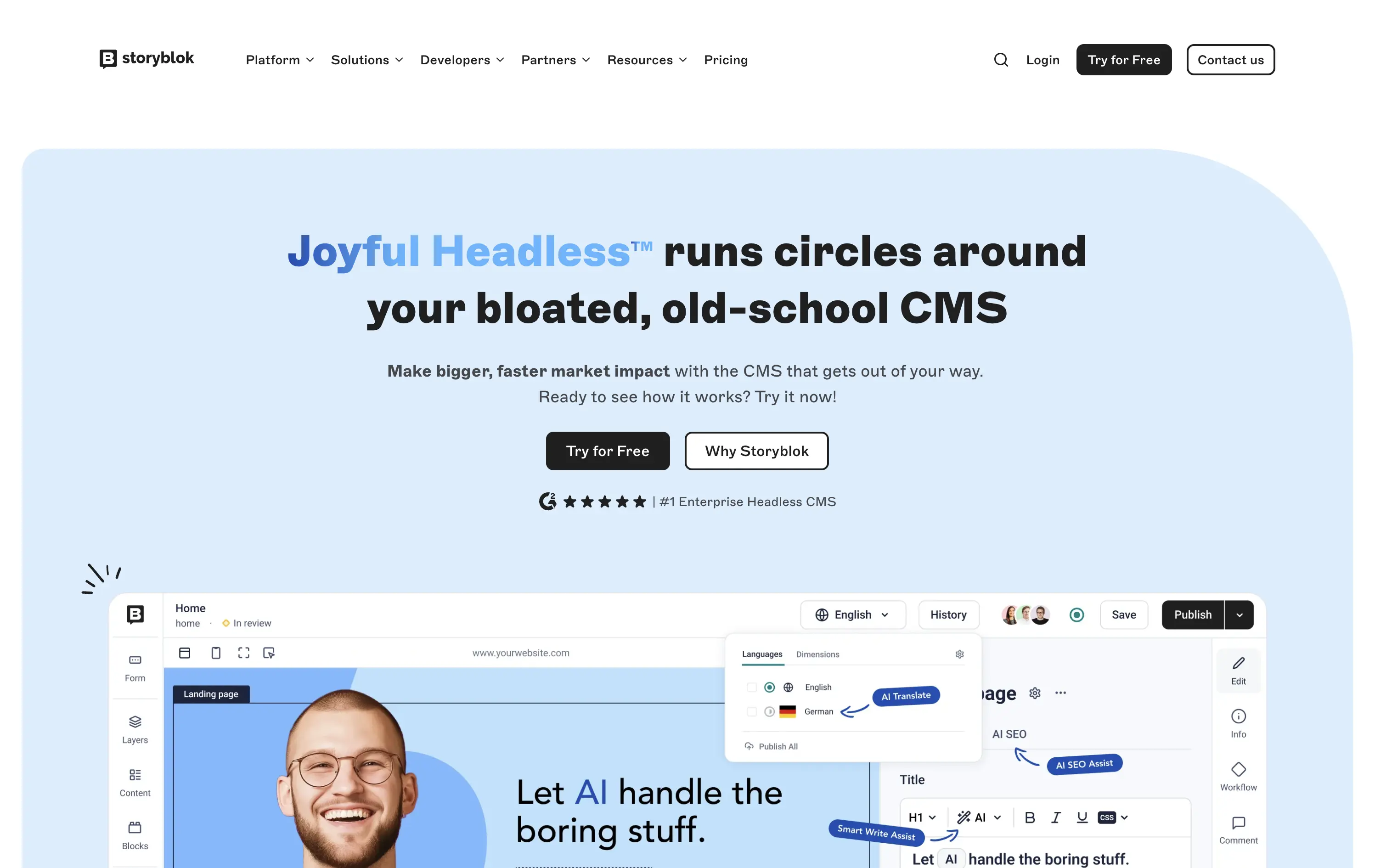
Storyblok
↗
SaaS
DevTools
Inset
Centered
Playful
Pain-driven
Multi-CTA Block
Illustration
Product UI
Social Proof
Badges
Light Mode
Blue
Black
Sans serif
B2B
Home Page
Custom Code
headless CMS, anti-legacy positioning, visual editing, developer tools, AI assist, SaaS marketing, animated UI mockup, software demo, CMS for teams, testimonial badge, conversion-first layout
Storyblok is a headless CMS built for developers and marketers to collaboratively build fast, flexible websites and digital experiences.
The hero is unapologetically punchy. It leads with a clear enemy (bloated CMSs), while pairing credibility badges with live UI proof. Product visuals reinforce benefits instead of distracting from them.
This is high-conversion, pain-aware SaaS positioning. The voice is aggressive but measured, fitting for teams actively seeking a modern CMS alternative.
This layout balances technical utility with human impact, aligning well with Algolia’s positioning as an API-first but UX-aware company. The mobile UI reinforces product value visually, while the logo wall signals scale and trust for enterprise buyers. The tone is clear, benefit-led, and appropriate for high-intent decision-makers evaluating AI tools for customer experience. This is a solid enterprise-facing hero built to perform.
Outreach
↗
SaaS
AI Tools
Productivity
Full Width
Centered
Benefit-Driven
Confident
Multi-CTA Block
Video
Product UI
Imagery-Based
Blue
Sans serif
B2B
Home Page
Custom Code
sales automation, B2B SaaS, AI forecasting, sales rep enablement, RevOps tools, productivity workflows, confident tone, enterprise platform, full-width layout, animated product demo, AI sales co-pilot, multi-CTA, modern interface, precision messaging, dark UI
Outreach helps B2B teams improve pipeline precision and sales productivity through AI-powered automation and forecasting tools.
The hero is product-led with a high-trust, enterprise feel. The headline is assertive, speaking directly to the sales persona. Subheadline adds clarity and lists functional benefits. Background motion shows product value without distraction. CTAs are split by intent: demo vs. explore. The full-width layout conveys confidence and scale.
Clearly positioned for decision-makers in SalesOps and RevOps. Copy and layout support mid-funnel engagement with strong product-centric framing and trusting tone.
This layout balances technical utility with human impact, aligning well with Algolia’s positioning as an API-first but UX-aware company. The mobile UI reinforces product value visually, while the logo wall signals scale and trust for enterprise buyers. The tone is clear, benefit-led, and appropriate for high-intent decision-makers evaluating AI tools for customer experience. This is a solid enterprise-facing hero built to perform.
Magic Spoon
↗
Food & Beverage
Split Grid
Playful
Multi-CTA Block
Photography
Announcement
Gradient
Multi-color
Pink
Purple
Yellow
Sans serif
DTC
Home Page
Shopify
high-protein cereal, nostalgic breakfast, millennial branding, retro palette, build-your-own-bundle, vibrant color gradient, candy-colored visuals, kid-to-adult rebrand, DTC snack, bold typography, healthified junk food, colorful product styling, split grid layout, energetic tone, premium grocery
Magic Spoon sells high-protein cereal and snack bars that recreate childhood favorites with adult nutrition standards.
The hero nails the balance between fun and function. Product visuals feel exaggerated in the best way — styled like sugary cereal ads from the ‘90s but paired with benefit-led messaging. The copy is tight and instantly clarifies the value prop. Gradient background and punchy layout draw attention. CTAs are clear, and “build your own bundle” is an engaging utility-led hook.
Smartly crafted for health-conscious millennials who want nostalgia without the sugar crash. The visual-candy look softens the functional message about protein and better ingredients.
This layout balances technical utility with human impact, aligning well with Algolia’s positioning as an API-first but UX-aware company. The mobile UI reinforces product value visually, while the logo wall signals scale and trust for enterprise buyers. The tone is clear, benefit-led, and appropriate for high-intent decision-makers evaluating AI tools for customer experience. This is a solid enterprise-facing hero built to perform.
Notion
↗
SaaS
AI Tools
Productivity
Split Grid
Left-aligned
Aspirational
Empowering
Multi-CTA Block
Illustration
Logo Wall
Custom Animation
Light Mode
Blue
Sans serif
Hybrid
Home Page
Custom Code
AI workspace, animated avatars, productivity OS, enterprise-ready, personal + team use, modular interface, brand-first UI, continuation scroll, flexible use cases, playful sophistication, high-trust visual, calm interface, utility meets emotion, scalable collaboration
Notion is an all-in-one AI workspace that helps teams and individuals write, organize, automate, and collaborate — from startups to enterprise scale.
This hero strikes a balance between visual charm and clarity. The animation of AI personas dramatizes the core value prop — “they work for you” — and makes the abstract feel accessible. The headline is direct and benefit-led, while the subhead outlines practical use cases. Dual CTAs target both entry-level and enterprise buyers. Scrolling reveals feature blocks, encouraging deeper exploration. Trusted-by logos create instant credibility.
A masterclass in multi-audience positioning — speaks to freelancers and Fortune 500s simultaneously. Smart blend of human tone and scalable utility, reinforced visually through motion, brand trust cues, and modular follow-up content.
This layout balances technical utility with human impact, aligning well with Algolia’s positioning as an API-first but UX-aware company. The mobile UI reinforces product value visually, while the logo wall signals scale and trust for enterprise buyers. The tone is clear, benefit-led, and appropriate for high-intent decision-makers evaluating AI tools for customer experience. This is a solid enterprise-facing hero built to perform.
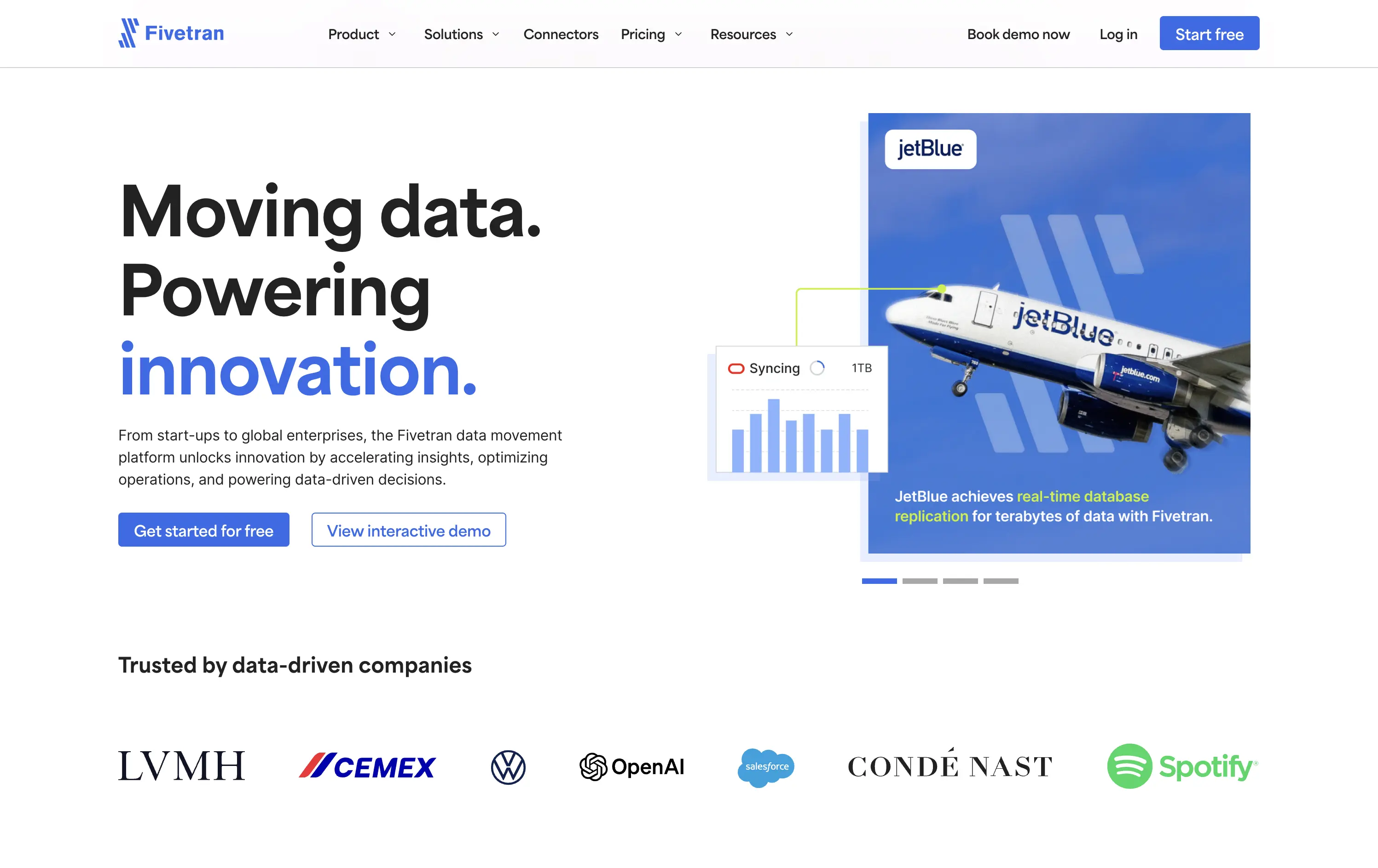
Fivetran
↗
SaaS
Data & Analytics
Split Grid
Left-aligned
Confident
Professional
Multi-CTA Block
Photography
Product UI
Social Proof
Custom Animation
Light Mode
Blue
Sans serif
B2B
Home Page
Webflow
enterprise-grade, real-time sync, testimonial integration, data pipeline, scalable architecture, visual storytelling, motion-light, trust-first, case-driven, product-led, split layout, mature B2B, dual CTA
Fivetran is a data integration platform that helps businesses automate, sync, and centralize their data across systems for analysis and reporting.
Fivetran’s hero delivers immediate clarity through its strong headline and proof-focused subtext. The combination of a recognizable brand (JetBlue) and a visual data-sync overlay reinforces product value without requiring technical deep dives. Dual CTAs are clear and well-placed for different levels of intent. Social proof below adds enterprise credibility. The overall layout is well-balanced and efficient.
Tailored for enterprise buyers, the hero blends technical reassurance with case-based credibility. It communicates trust and scalability, aligning with a mid-to-late funnel B2B audience without overwhelming on first touch.
This layout balances technical utility with human impact, aligning well with Algolia’s positioning as an API-first but UX-aware company. The mobile UI reinforces product value visually, while the logo wall signals scale and trust for enterprise buyers. The tone is clear, benefit-led, and appropriate for high-intent decision-makers evaluating AI tools for customer experience. This is a solid enterprise-facing hero built to perform.
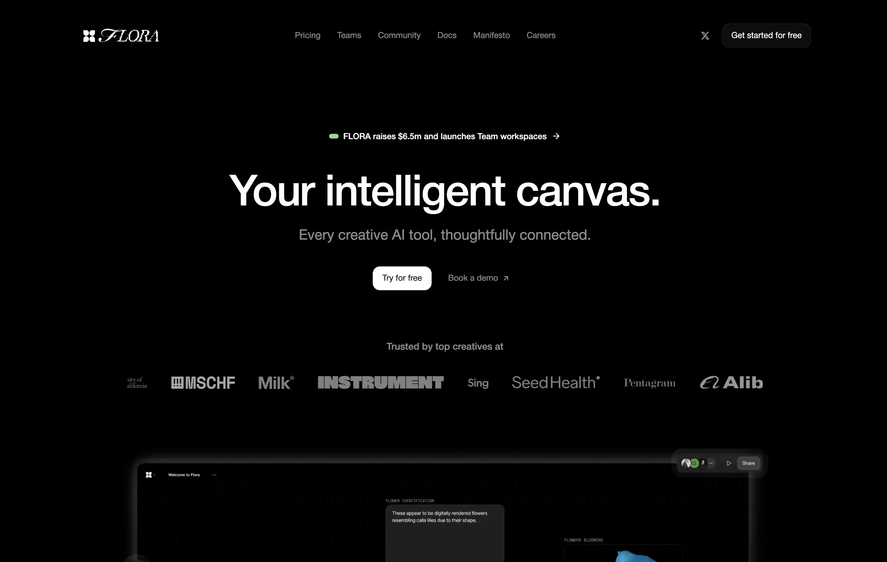
Flora AI
↗
AI Tools
Collaboration
Creative Tools
Centered
Bold & Direct
Aspirational
Multi-CTA Block
Logo Wall
Product UI
Custom Animation
Dark Mode
White
Sans serif
Hybrid
Home Page
Custom Code
AI creative suite, dark mode, studio audience, high-contrast UI, high-trust logos, Figma-adjacent design, minimal copy, serious tone, tool for creators, productivity signal, elegant layout, launch announcement
Flora is an AI-powered workspace designed for creatives to ideate, visualize, and connect ideas on a shared intelligent canvas.
The hero pairs abstract positioning with subtle product proof. The headline is conceptual yet grounded by a clear subheadline and conversion-friendly CTA layout. Surreal AI-generated flower animations subtly showcase new-gen UX thinking—meant to spark imagination, not just drive efficiency. Real-time collaboration visuals offer credibility. Trust logos lend early validation. Layout is calm and deliberate, giving room for the idea of a “thoughtfully connected” tool to breathe.
The layout signals a premium, vision-led AI product for creative teams. Abstract yet functional, it balances aspirational positioning with clear proof. Ideal for early adopters in design-forward or innovation-heavy spaces.
This layout balances technical utility with human impact, aligning well with Algolia’s positioning as an API-first but UX-aware company. The mobile UI reinforces product value visually, while the logo wall signals scale and trust for enterprise buyers. The tone is clear, benefit-led, and appropriate for high-intent decision-makers evaluating AI tools for customer experience. This is a solid enterprise-facing hero built to perform.
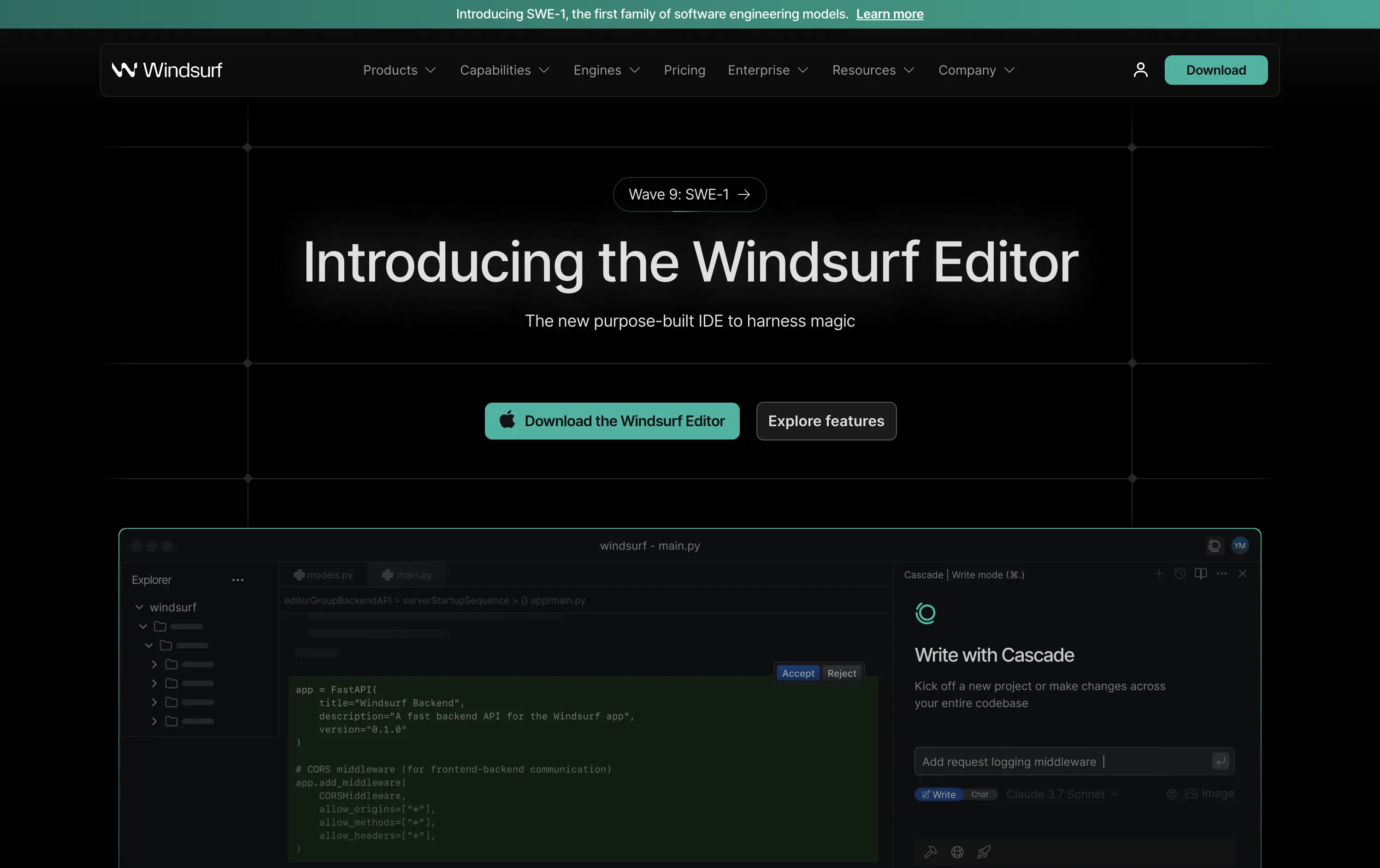
Windsurf
↗
DevTools
AI Tools
Productivity
Centered
Descriptive
Multi-CTA Block
Product UI
Custom Animation
Announcement
Dark Mode
Green
Sans serif
B2B
Home Page
Custom Code
IDE launch, developer-centric UI, dark mode, AI-enhanced coding, precision layout, launch-focused, performance signaling, Claude integration, copy-to-download conversion, dev community tone, structured layout, hero with proof
Windsurf is a new AI-powered IDE purpose-built for modern software engineers—integrating tools, models, and workflows into one seamless editing experience.
This is a pure product launch hero—focused, fast, and confident. The headline introduces the new editor directly, with “harness magic” adding flair. A download CTA and “Explore features” link address both high and medium intent users. Visual hierarchy is crisp: product UI preview beneath gives immediate credibility. The dark grid background and neon teal accents push a high-performance, developer-native aesthetic. Motion on the UI keeps it alive without distracting. Overall: efficient, well-structured, and optimized for launch-phase conversion.
A highly product-led approach targeted at technical users. The CTA hierarchy and layout structure prioritize credibility and momentum. Strong framing for launch, with a clear focus on dev audience mindset and intent.
This layout balances technical utility with human impact, aligning well with Algolia’s positioning as an API-first but UX-aware company. The mobile UI reinforces product value visually, while the logo wall signals scale and trust for enterprise buyers. The tone is clear, benefit-led, and appropriate for high-intent decision-makers evaluating AI tools for customer experience. This is a solid enterprise-facing hero built to perform.
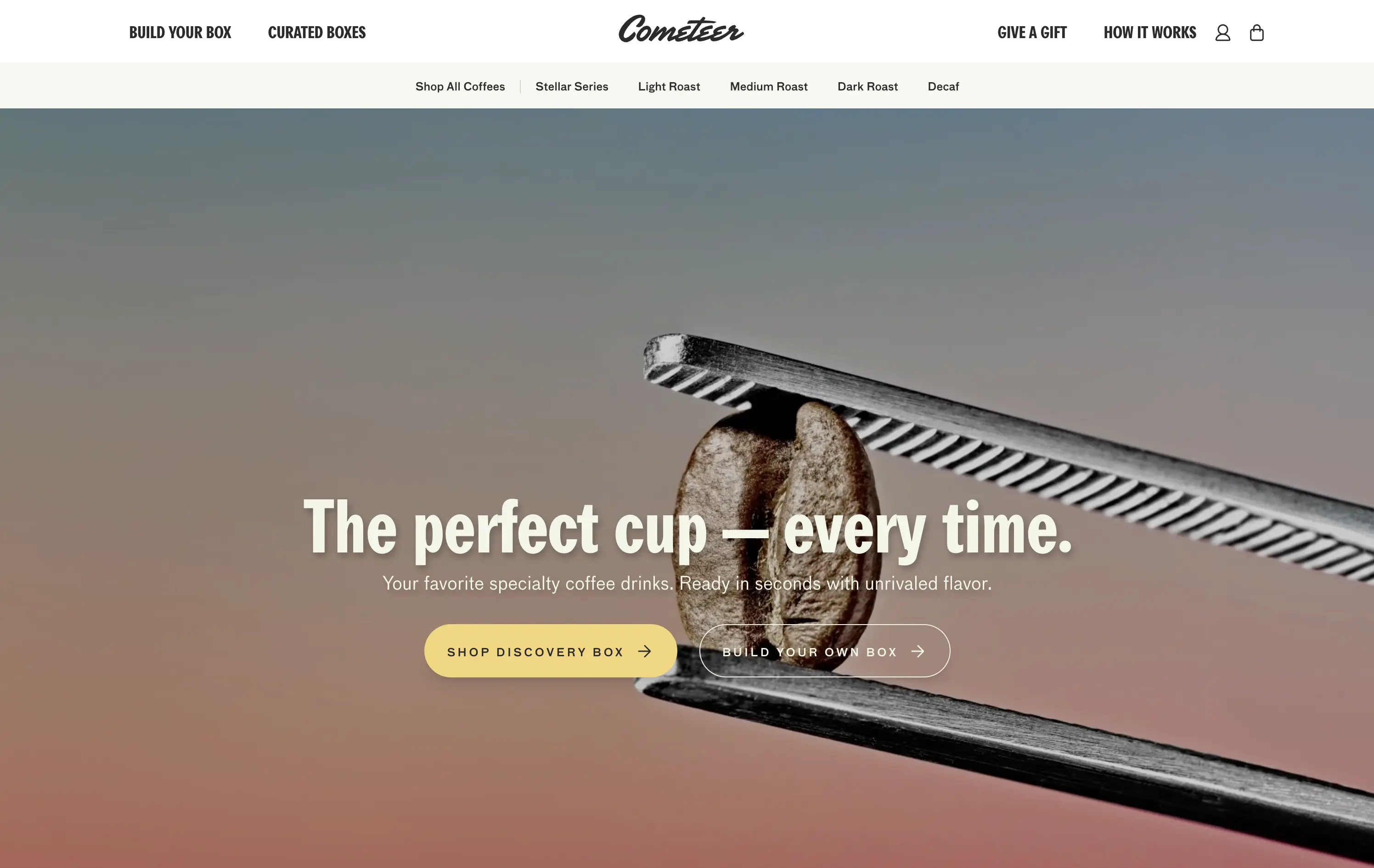
Cometeer
↗
CPG
Food & Beverage
Full Width
Editorial
Benefit-Driven
Aspirational
Multi-CTA Block
Video
Imagery-Based
Yellow
Sans serif
DTC
Home Page
Shopify
DTC coffee, video-led hero, brand storytelling, clear CTA hierarchy, warm tones, minimal text, fast onboarding, gradient background, sensory cue, product-focused, premium feel, lifestyle positioning, high visual polish, science-inspired design
Cometeer delivers barista-grade coffee flash-frozen into capsules for ultra-fast, ultra-consistent brewing at home.
The hero balances brand storytelling and performance design—sharp visual contrast, cinematic motion, and precise art direction anchor the product as premium and scientific. The headline is bold and memorable, while the subheadline clarifies the value prop in under 10 words. Dual CTAs reduce friction. The use of macro imagery paired with a scientific tool elevates the perception of quality and process control.
Clear DTC positioning with a premium, precision-led angle. The visual metaphor of lab-grade quality supports brand trust while the tone stays human. Layout signals high product confidence and fast conversion intent.
This layout balances technical utility with human impact, aligning well with Algolia’s positioning as an API-first but UX-aware company. The mobile UI reinforces product value visually, while the logo wall signals scale and trust for enterprise buyers. The tone is clear, benefit-led, and appropriate for high-intent decision-makers evaluating AI tools for customer experience. This is a solid enterprise-facing hero built to perform.
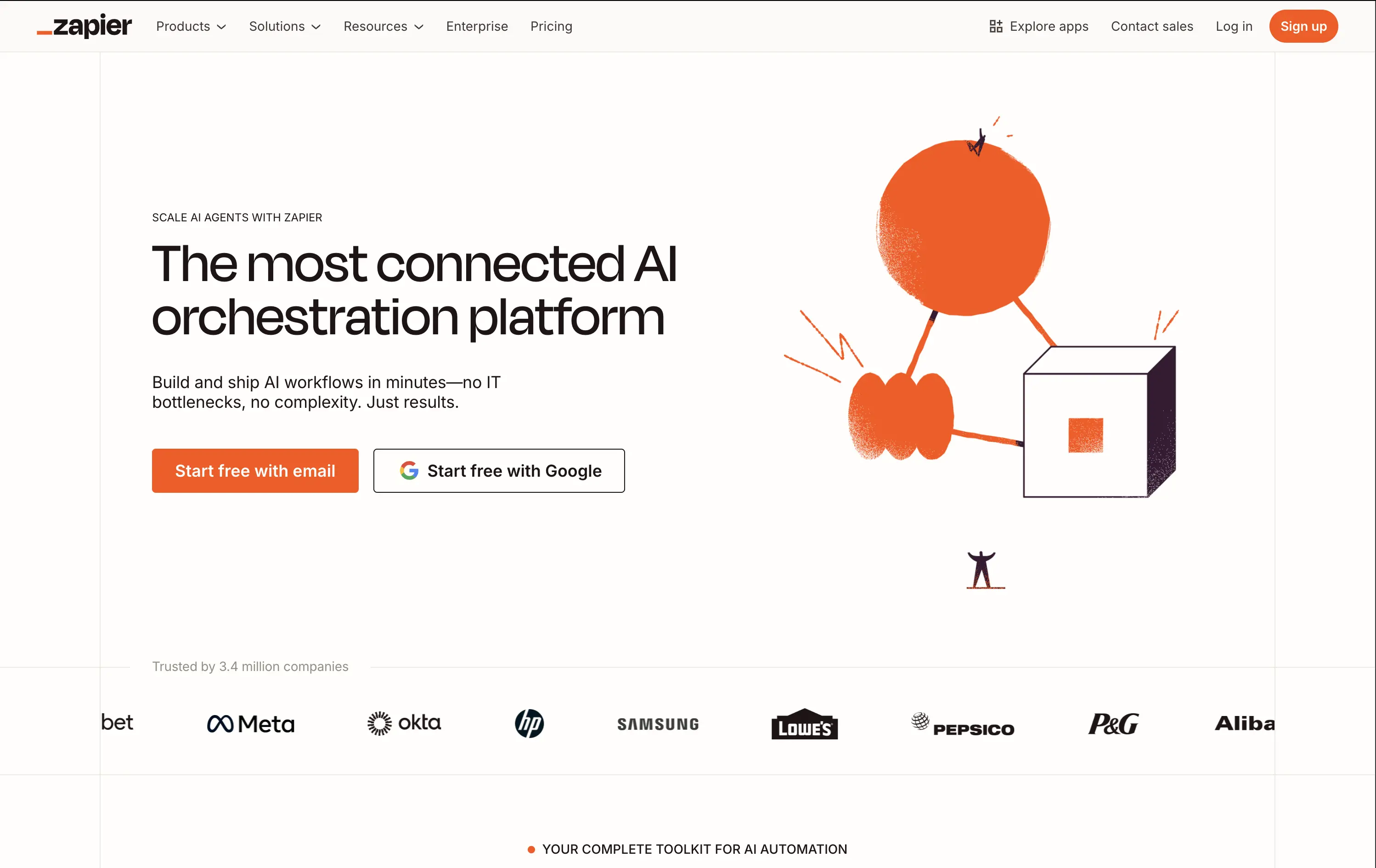
Zapier
↗
SaaS
AI Tools
No-Code
Split Grid
Left-aligned
Confident
Multi-CTA Block
Illustration
Logo Wall
Light Mode
Orange
Sans serif
Hybrid
Home Page
Builder.io
automation platform, brand-led, Zapier orange, illustration-based hero, high-trust layout, whitespace-heavy, freemium SaaS, mature product, enterprise credibility, visual shorthand, no-code workflow, minimal UI, no-code
Zapier is a no-code automation platform that connects 8,000+ apps so anyone can build time-saving workflows without engineering help.
The hero does a clean job of reinforcing brand authority. Copy is tight and direct. The whimsical graphic adds energy while the dual CTAs eliminate friction. It assumes pre-awareness and leans on Zapier’s brand strength.
Ideal for a mature product with wide adoption. Skips granular education to emphasize leadership and ease of use. Visuals and messaging feel like a confident category owner.
This layout balances technical utility with human impact, aligning well with Algolia’s positioning as an API-first but UX-aware company. The mobile UI reinforces product value visually, while the logo wall signals scale and trust for enterprise buyers. The tone is clear, benefit-led, and appropriate for high-intent decision-makers evaluating AI tools for customer experience. This is a solid enterprise-facing hero built to perform.
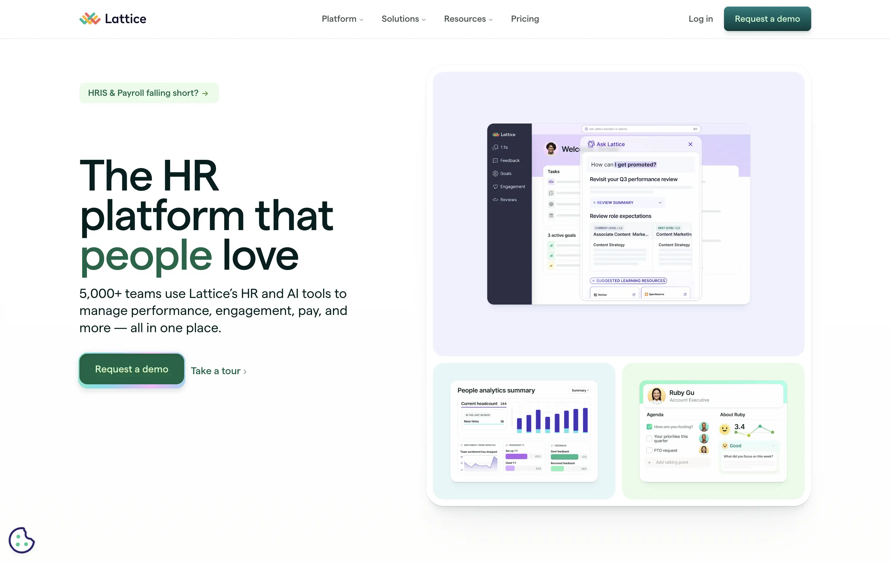
Lattice
↗
SaaS
HR/People Tech
Bento
Left-aligned
Benefit-Driven
Bold & Direct
Multi-CTA Block
Media Gallery
Product UI
Light Mode
Green
Sans serif
B2B
Home Page
Webflow
HR software, performance management, workplace culture, AI-assisted HR, clean layout, emotion-forward, team tools, modern UX, soft color palette, trust-led, subtle AI integration, employee experience, people-first platform
Lattice is an all-in-one people platform helping companies manage performance, engagement, growth, and compensation in one streamlined space.
Headline is short and sticky. The visual weight leans toward clarity and warmth. Product UI is legible and softly styled. Strong CTA placement plus secondary path shows understanding of buyer stages.
Effectively balances performance-driven HR with emotional resonance. Smart for leadership stakeholders seeking culture and efficiency. Visuals support modernity without overwhelming.
This layout balances technical utility with human impact, aligning well with Algolia’s positioning as an API-first but UX-aware company. The mobile UI reinforces product value visually, while the logo wall signals scale and trust for enterprise buyers. The tone is clear, benefit-led, and appropriate for high-intent decision-makers evaluating AI tools for customer experience. This is a solid enterprise-facing hero built to perform.
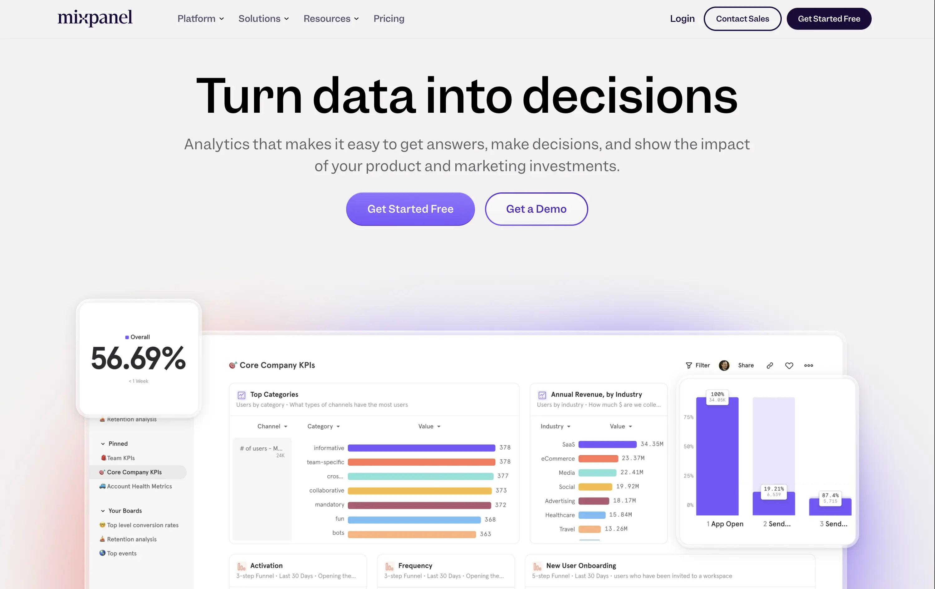
Mixpanel
↗
SaaS
Data & Analytics
Centered
Benefit-Driven
Confident
Multi-CTA Block
Live Metrics
Product UI
Gradient
Purple
Sans serif
B2B
Home Page
Custom Code
product analytics, KPI dashboards, funnel analysis, data insights, gradient background, B2B SaaS, dual CTA, modern enterprise, UI-first layout, decision-making tools, conversion tracking, product-led growth, minimal and bold
Mixpanel is a product analytics platform that helps teams understand user behavior, optimize funnels, and drive business growth.
“Turn data into decisions” is a strong, action-focused hook that immediately communicates value. The subhead explains the core utility without overexplaining. The side-by-side CTAs give both low-friction and high-touch entry points. The supporting UI visuals are clear, colorful, and show the product in action — no fluff, just function
Hero builds trust through clarity. Language and visuals appeal to decision-makers in growth, product, and marketing. Gradient adds polish, while the product UI does most of the selling.
This layout balances technical utility with human impact, aligning well with Algolia’s positioning as an API-first but UX-aware company. The mobile UI reinforces product value visually, while the logo wall signals scale and trust for enterprise buyers. The tone is clear, benefit-led, and appropriate for high-intent decision-makers evaluating AI tools for customer experience. This is a solid enterprise-facing hero built to perform.
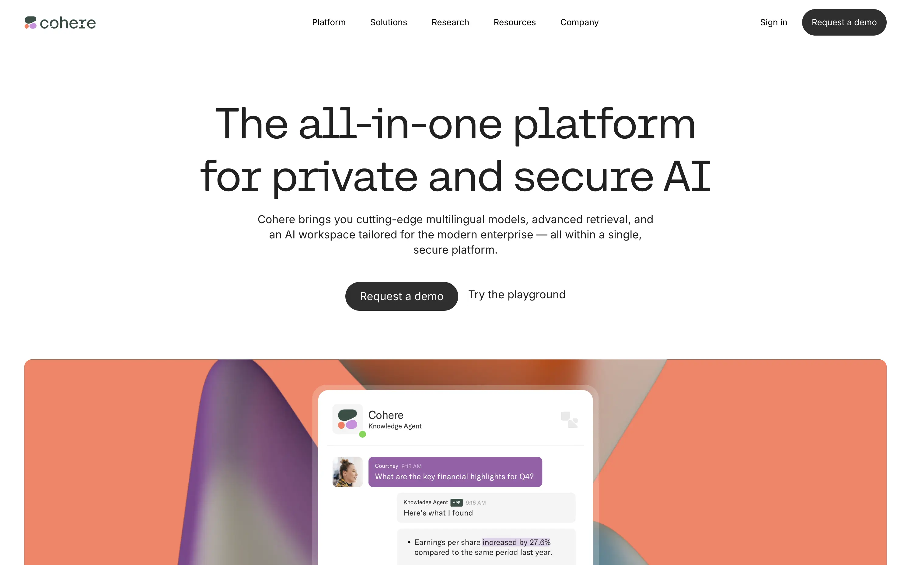
Cohere
↗
AI Tools
Centered
Descriptive
Professional
Multi-CTA Block
Video
Product UI
Light Mode
Black
Monospace
B2B
Home Page
Custom Code
enterprise AI, minimal aesthetic, abstract background, poetic design, security-forward, multilingual AI, understated UI, premium feel, morphing blobs, modern enterprise, monospace typography, visual restraint, AI productivity, custom interface
Cohere delivers private, multilingual AI models for enterprises with a focus on data security, customization, and seamless integration.
The hero is minimalist but intentional. Large, serif-style monospace typography exudes clarity and confidence. The morphing gradient blobs break up the austerity with visual warmth, and the two CTAs — “Request a demo” and “Try the playground” — balance high-commitment and exploratory paths. No gimmicks, no noise — just calm authority.
Cohere leans hard into its point of differentiation: privacy and control. The understated design reinforces brand maturity and trustworthiness — ideal for technical and security-conscious buyers avoiding hype cycles.
This layout balances technical utility with human impact, aligning well with Algolia’s positioning as an API-first but UX-aware company. The mobile UI reinforces product value visually, while the logo wall signals scale and trust for enterprise buyers. The tone is clear, benefit-led, and appropriate for high-intent decision-makers evaluating AI tools for customer experience. This is a solid enterprise-facing hero built to perform.
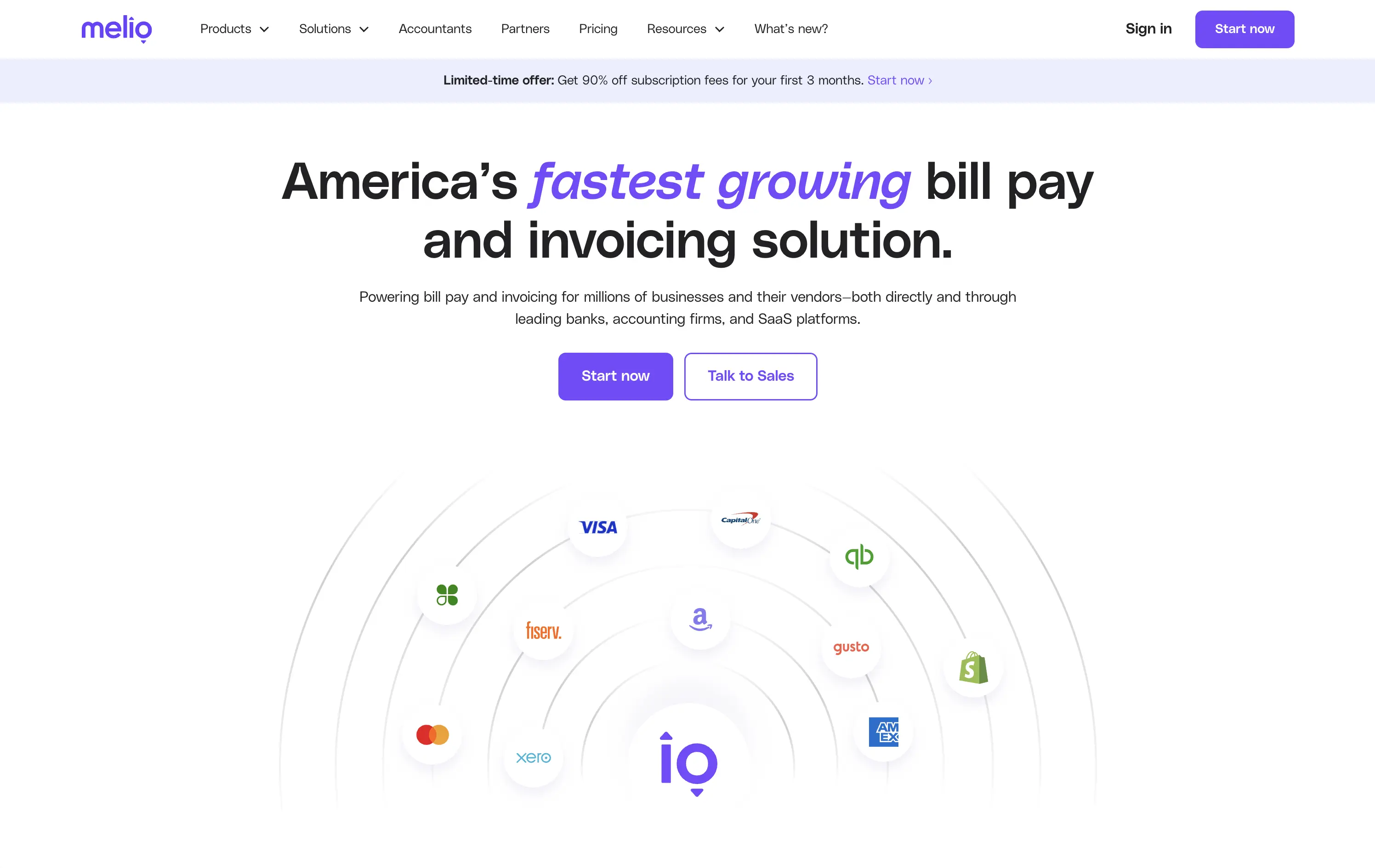
Melio
↗
SaaS
Fintech
Centered
Bold & Direct
Proof-Heavy
Multi-CTA Block
Logo Wall
Announcement
Light Mode
Purple
Sans serif
B2B
Home Page
Wordpress
bill pay, invoicing platform, small business payments, financial automation, AP/AR SaaS, vendor payments, accounting tools, QuickBooks integrations
Melio is a digital payment platform that simplifies bill pay and invoicing for small businesses and accounting teams.
Bold headline, partner logos, and focused CTAs create a strong first impression. The layout supports quick scanning and immediate action. Design choices signal reliability and scale without visual clutter.
Leverages third-party credibility to reduce friction for trust-based workflows. Dual CTA acknowledges buyer types. Layout and tone match the high-urgency, low-risk mindset of SMB finance leads.
This layout balances technical utility with human impact, aligning well with Algolia’s positioning as an API-first but UX-aware company. The mobile UI reinforces product value visually, while the logo wall signals scale and trust for enterprise buyers. The tone is clear, benefit-led, and appropriate for high-intent decision-makers evaluating AI tools for customer experience. This is a solid enterprise-facing hero built to perform.
Retool
↗
SaaS
DevTools
Split Grid
Left-aligned
Bold & Direct
Multi-CTA Block
Product UI
Custom Animation
Dark Mode
White
Sans serif
B2B
Home Page
Custom Code
developer-first, dark UI, code-focused, internal tools, dashboard builder, multi-CTA, enterprise-ready, clear positioning, mature SaaS, custom UI, B2B, functional design, high-trust, productivity-focused, database-driven
Retool is a developer-first platform to quickly build and deploy internal tools using prebuilt components and direct database integration.
Headline is straightforward and credible. Hero splits brand positioning with active launch messaging, creating depth. Product UI preview is dense but legible. CTA structure clearly supports both self-serve and sales-led paths.
Hero speaks directly to high-intent technical users. Design, copy, and structure signal enterprise maturity. It's geared for developers, engineering leads, and CTOs looking for reliability and rapid deployment.
This layout balances technical utility with human impact, aligning well with Algolia’s positioning as an API-first but UX-aware company. The mobile UI reinforces product value visually, while the logo wall signals scale and trust for enterprise buyers. The tone is clear, benefit-led, and appropriate for high-intent decision-makers evaluating AI tools for customer experience. This is a solid enterprise-facing hero built to perform.
Github
↗
DevTools
Collaboration
Centered
Benefit-Driven
Confident
Multi-CTA Block
Product UI
Custom Animation
3D visuals
Gradient
Dark Mode
Green
Purple
Sans serif
Hybrid
Home Page
Custom Code
developer platform, AI coding assistant, GitHub Copilot, dark theme UI, modern dev culture, collaborative tools, open source hub, onboarding input, 3D mascots, dual CTA, cloud-based dev tools, tech-forward, productivity SaaS
GitHub is the world’s leading platform for developers to build, collaborate, and ship code together.
The hero delivers immediate clarity: build and ship software together. The animated floating mascots add visual intrigue without distracting from the copy, and the dual CTAs — email capture and Copilot trial — serve both new users and AI-curious devs. The dark spacey palette and glowing elements feel modern and focused. Solid hierarchy, clean execution.
Blends GitHub’s core dev value with its AI evolution. Highlights collaboration and product trust while gently introducing Copilot. Balanced tone makes it accessible to both enterprise teams and individual devs.
This layout balances technical utility with human impact, aligning well with Algolia’s positioning as an API-first but UX-aware company. The mobile UI reinforces product value visually, while the logo wall signals scale and trust for enterprise buyers. The tone is clear, benefit-led, and appropriate for high-intent decision-makers evaluating AI tools for customer experience. This is a solid enterprise-facing hero built to perform.
Brightwheel
↗
SaaS
Productivity
Education
Centered
Benefit-Driven
Empowering
Multi-CTA Block
Product UI
Duotone
Blue
Sans serif
B2B
Home Page
Wordpress
childcare SaaS, early education, UI-forward, persona filter, soft onboarding, trust-building, calm palette, family-friendly, product-led storytelling, scroll guidance, interactive selector, teacher tech, value-first headline
Brightwheel offers all-in-one software for childcare centers, helping staff and parents streamline daily operations, billing, and communication.
The hero blends product visuals with conversion utility. UI mockups feel grounded in real use cases—billing, check-ins, messaging—while the big, benefit-led headline hits directly. Interactive persona buttons sort traffic based on user role, creating clarity and reducing friction. Clean layout, focused copy, and trust cues (like “#1 childcare software”) all work toward fast comprehension.
Targets a trust-dependent category with confident simplicity. The user-type selector streamlines onboarding while signaling the platform’s adaptability. It balances emotional safety with practical function, reflecting Brightwheel’s value as a tool that makes lives easier.
This layout balances technical utility with human impact, aligning well with Algolia’s positioning as an API-first but UX-aware company. The mobile UI reinforces product value visually, while the logo wall signals scale and trust for enterprise buyers. The tone is clear, benefit-led, and appropriate for high-intent decision-makers evaluating AI tools for customer experience. This is a solid enterprise-facing hero built to perform.
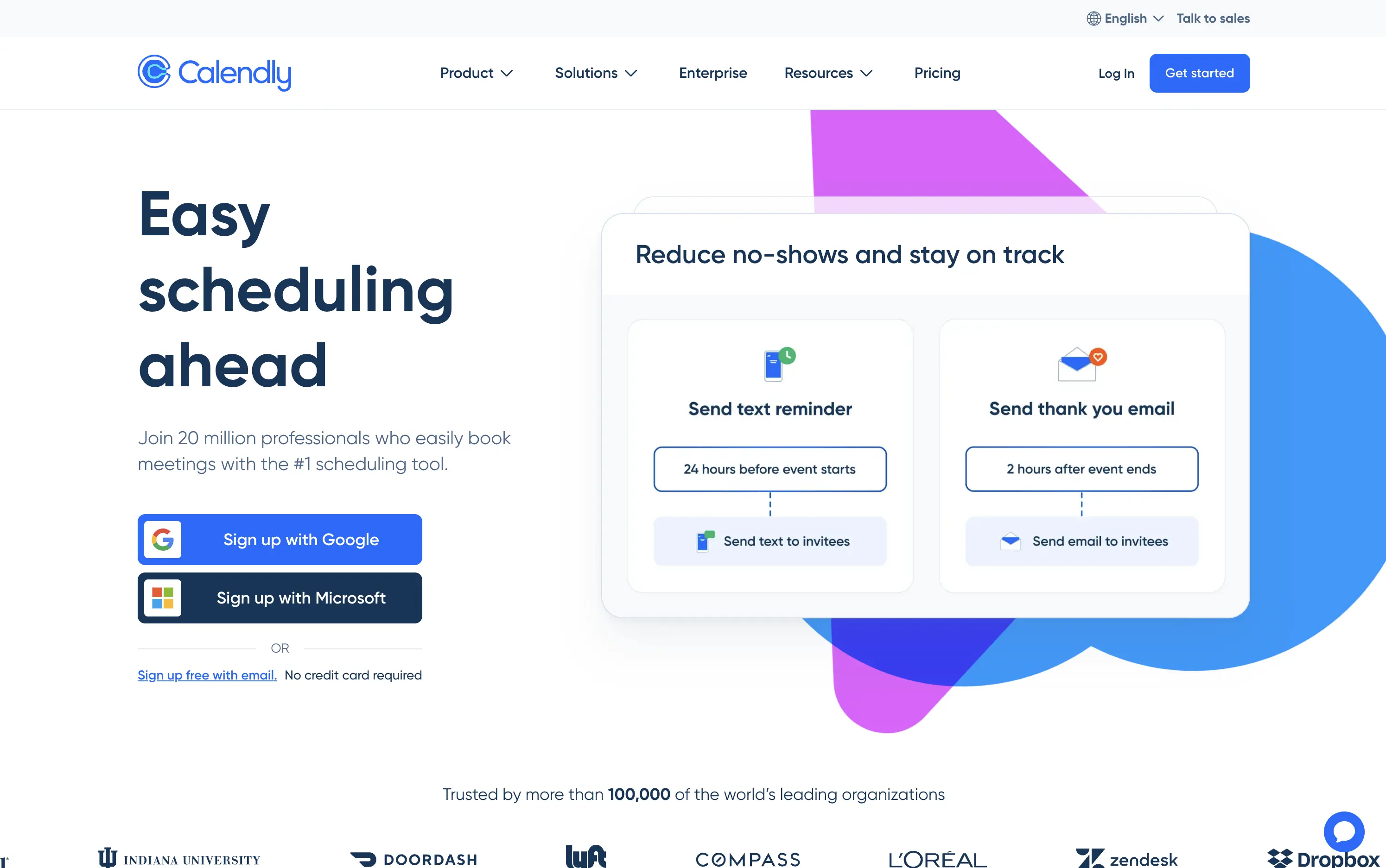
Calendly
↗
SaaS
Productivity
Split Grid
Left-aligned
Benefit-Driven
Aspirational
Multi-CTA Block
Product UI
Social Proof
Custom Animation
Light Mode
Blue
Purple
Sans serif
Hybrid
Home Page
Custom Code
booking automation, enterprise SaaS, high-trust layout, Google sign-in, product-led UX, animated demo cards, client communication, reminder workflows, credibility-focused, mass adoption, enterprise trust, conversion-focused, no-credit-card, dual CTA
Calendly is a scheduling automation platform used by over 20 million professionals to simplify meeting coordination and reduce no-shows.
Large headline clearly communicates the core benefit. Animated UI cards demo concrete features like text reminders and post-meeting emails—useful and direct. Google and Microsoft sign-up flows lower friction and suggest enterprise readiness. Copy leans on credibility (user count, logo wall). Layout is clean and functional, though edges toward safe and generic compared to challenger brands.
Calendly’s hero positions it as the trusted standard for scheduling. Focused on reducing friction for new users while demonstrating value for scale—perfect for self-serve and enterprise alike.
This layout balances technical utility with human impact, aligning well with Algolia’s positioning as an API-first but UX-aware company. The mobile UI reinforces product value visually, while the logo wall signals scale and trust for enterprise buyers. The tone is clear, benefit-led, and appropriate for high-intent decision-makers evaluating AI tools for customer experience. This is a solid enterprise-facing hero built to perform.
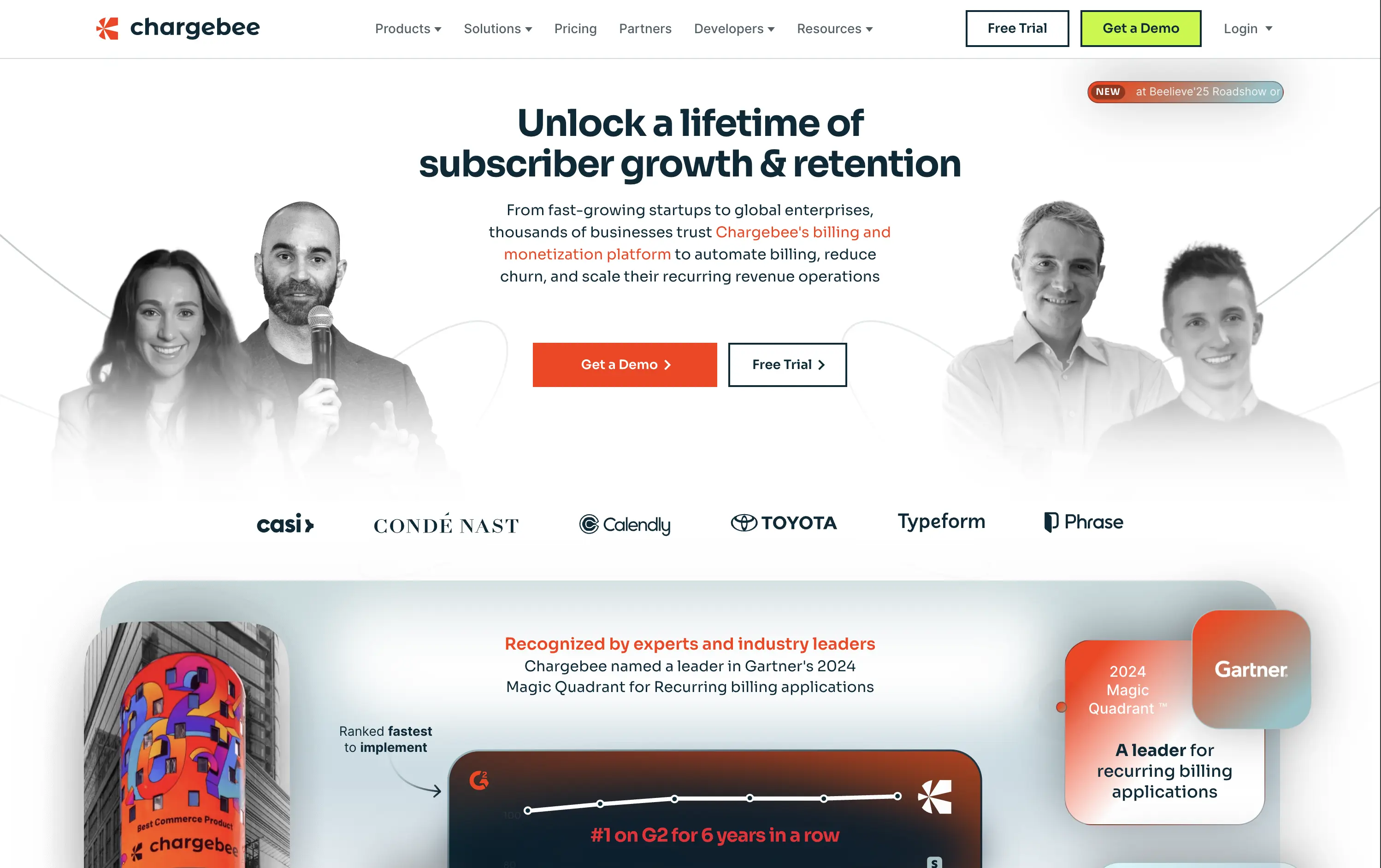
Chargebee
↗
SaaS
Fintech
Centered
Benefit-Driven
Bold & Direct
Multi-CTA Block
Photography
Logo Wall
Social Proof
Light Mode
Green
Orange
Sans serif
B2B
Home Page
Wordpress
B2B SaaS, billing automation, subscription platform, enterprise-ready, credibility-first, leadership positioning, founder imagery, logo wall, dual CTA, Gartner badge, G2 recognition, growth-focused messaging, recurring revenue
Chargebee helps businesses automate recurring billing, reduce churn, and scale subscription revenue through a trusted enterprise-ready platform.
The hero leads with a sharp, benefit-packed headline and backs it up with high-trust signals: real customer faces, name-brand logos, and third-party awards. The “Get a Demo” and “Free Trial” CTAs give users both enterprise and self-serve paths, but visual hierarchy between the two could be better balanced. Copy is outcome-focused and credible.
Smartly targeted at growth-stage and enterprise buyers, but the visual language undersells its category leadership. Strong content mix, but design lacks the presence or edge to reinforce premium positioning.
This layout balances technical utility with human impact, aligning well with Algolia’s positioning as an API-first but UX-aware company. The mobile UI reinforces product value visually, while the logo wall signals scale and trust for enterprise buyers. The tone is clear, benefit-led, and appropriate for high-intent decision-makers evaluating AI tools for customer experience. This is a solid enterprise-facing hero built to perform.
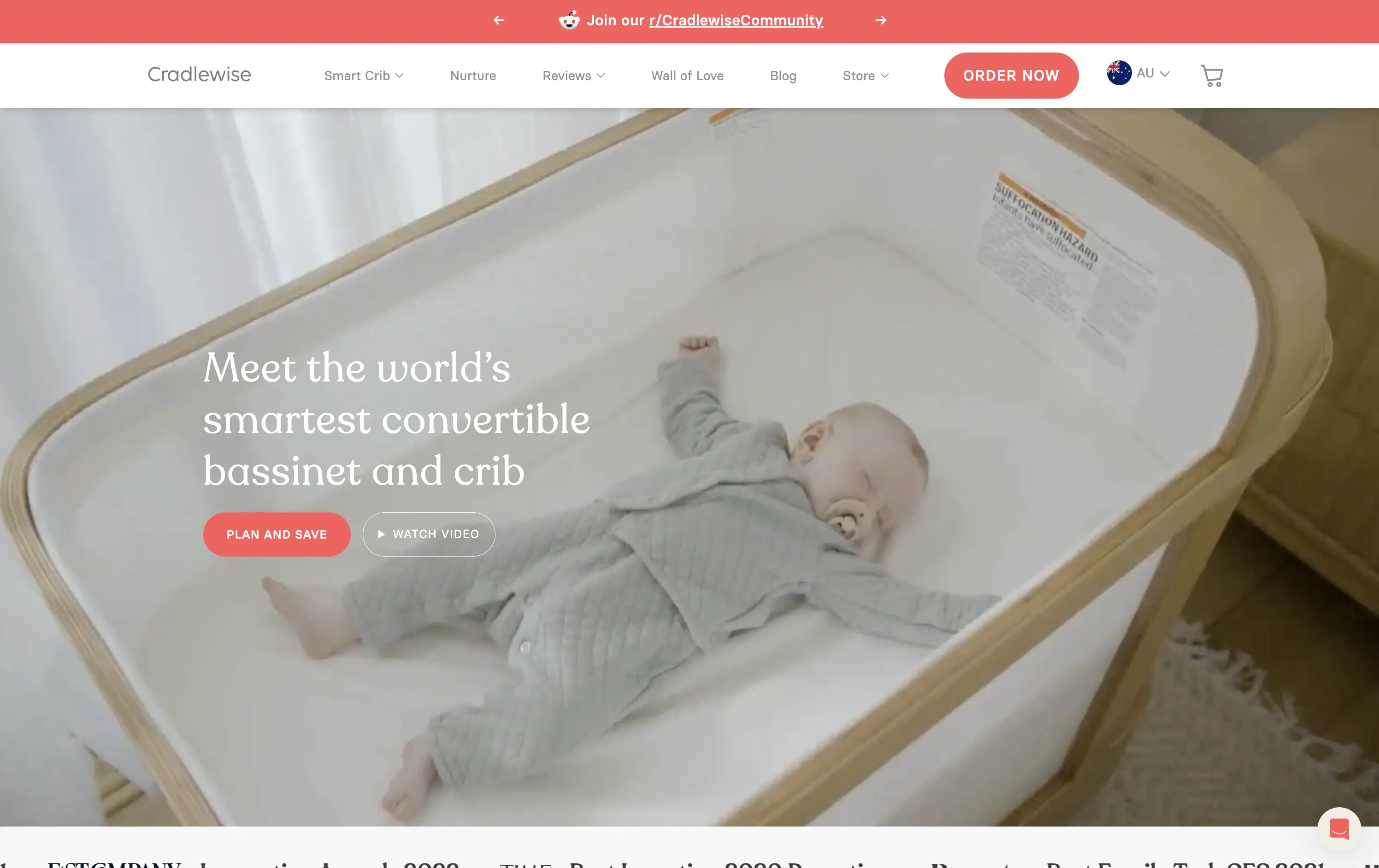
Cradlewise
↗
CPG
Hardware
Editorial
Benefit-Driven
Aspirational
Multi-CTA Block
Video
Announcement
Imagery-Based
Light Mode
Red
Serif
DTC
Home Page
Shopify
baby tech, smart crib, premium parenting, soft lifestyle visual, emotional trust, product-as-solution, sleep tech, high-ticket DTC, calming footage, gentle UX, non-intrusive CTA, safety-forward, babycare innovation, maternal audience
Cradlewise is a smart bassinet and crib that uses AI to soothe babies and help parents sleep better, all in one beautifully designed product.
The hero leans into emotion with soft lifestyle footage of the product in use — instantly communicating trust, peace of mind, and functional value. The headline clearly positions the product as a smart solution, while serif typography adds a premium touch. CTAs are well-placed, letting users choose between action or exploration. It’s elegant and persuasive.
Cradlewise effectively sells peace of mind to new parents. The blend of smart-tech value and lifestyle aesthetics strikes a perfect balance for premium buyers. It reinforces both utility and warmth without overexplaining.
This layout balances technical utility with human impact, aligning well with Algolia’s positioning as an API-first but UX-aware company. The mobile UI reinforces product value visually, while the logo wall signals scale and trust for enterprise buyers. The tone is clear, benefit-led, and appropriate for high-intent decision-makers evaluating AI tools for customer experience. This is a solid enterprise-facing hero built to perform.
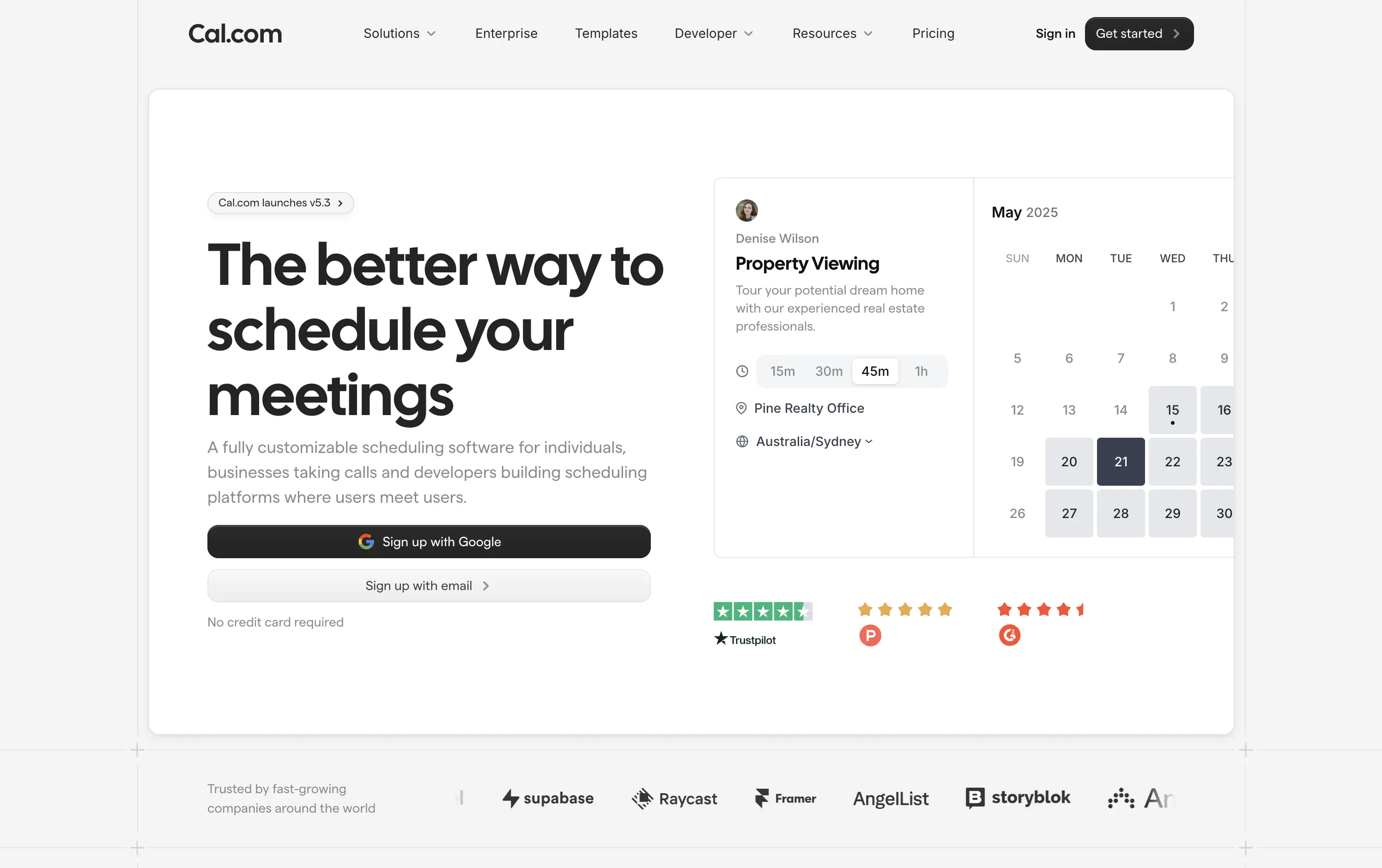
Cal.com
↗
SaaS
Productivity
Split Grid
Left-aligned
Bold & Direct
Multi-CTA Block
Product UI
Social Proof
Custom Animation
Badges
Light Mode
Black
Sans serif
Hybrid
Home Page
Framer
calendar booking, open source scheduler, clean aesthetic, lightweight onboarding, animated UI, trust-led design, Google sign-in, frictionless flow, developer-friendly, minimal layout, self-serve SaaS, cross-industry use cases, credibility-first, proof-based design
Cal.com is a fully customizable scheduling platform for individuals, teams, and developers—built for everything from calls to client bookings.
Clear headline paired with a minimalist aesthetic creates instant comprehension. The animated UI module smartly showcases varied use cases—from legal consults to photoshoots—broadening audience appeal. Trust badges build legitimacy, while “Sign up with Google” signals low-friction entry. Copy is functional and tight, and the centered layout maintains visual clarity without distraction.
The hero is focused and efficient. Clear headline, modular product UI, and direct signup flows drive intent. Trust logos and social proof add validation. UI previews reflect real-world use across industries. Nothing extraneous.
This layout balances technical utility with human impact, aligning well with Algolia’s positioning as an API-first but UX-aware company. The mobile UI reinforces product value visually, while the logo wall signals scale and trust for enterprise buyers. The tone is clear, benefit-led, and appropriate for high-intent decision-makers evaluating AI tools for customer experience. This is a solid enterprise-facing hero built to perform.
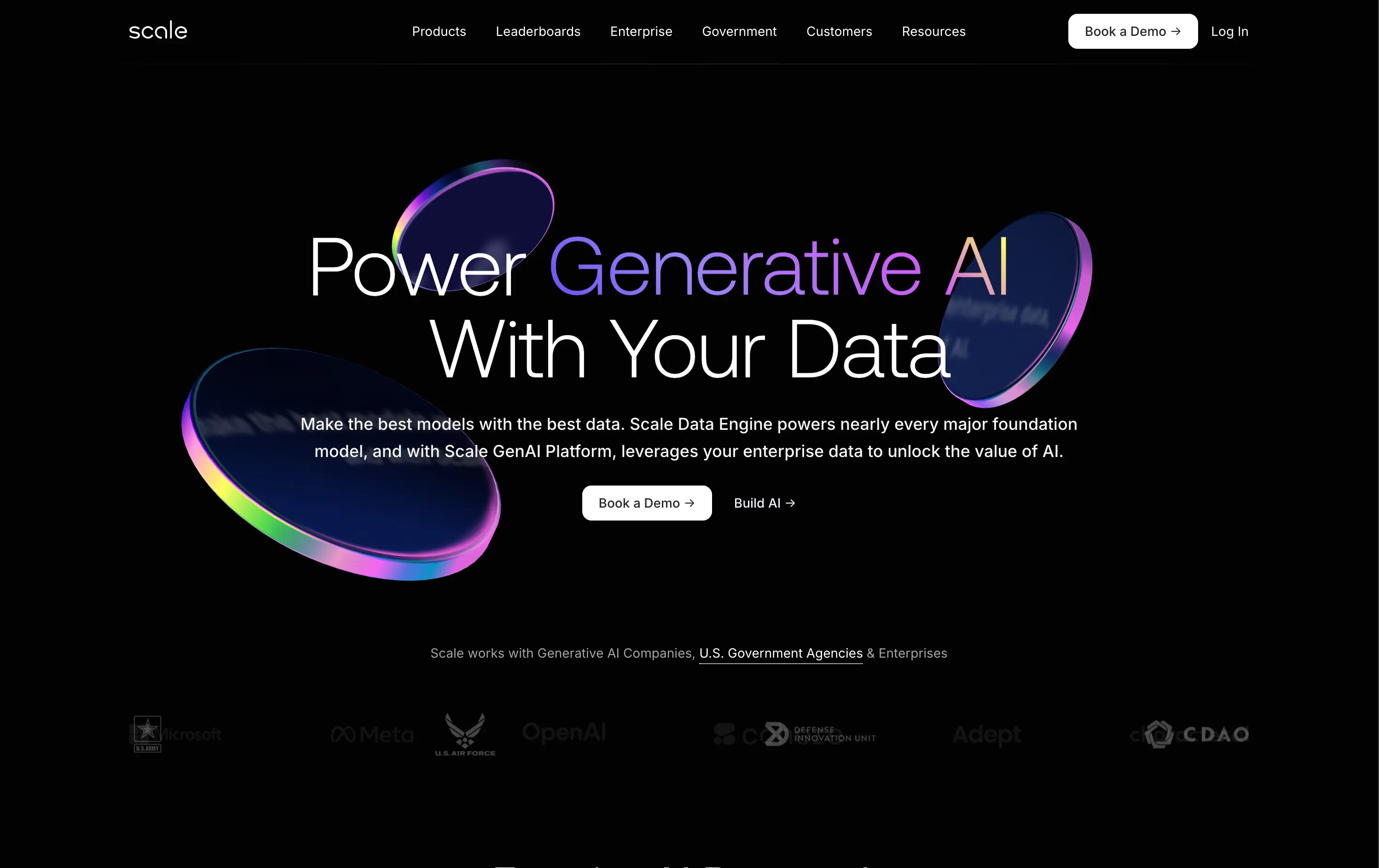
Scale
↗
AI Tools
Data & Analytics
Centered
Confident
Professional
Multi-CTA Block
Logo Wall
Custom Animation
3D visuals
Dark Mode
White
Purple
Sans serif
B2B
Home Page
Custom Code
enterprise AI, gradient glow, high-trust visual, government clients, GenAI platform, data engine, premium tech, futuristic design, centered layout, B2B AI, 3D tokens, logo wall, scale impact, C-suite focused
Scale provides AI infrastructure and data pipelines to help enterprises and governments build, train, and deploy powerful AI models.
The visuals command authority. Messaging is clean and exacting. The black backdrop and glowing UI signal cutting-edge reliability. Dual CTA path supports both buyers and builders. Logo bar validates status instantly.
A top-tier enterprise SaaS hero: built to impress stakeholders with budget and scope. Design choices reflect precision, scale, and mission-critical relevance. It speaks directly to engineering leaders and procurement.
This layout balances technical utility with human impact, aligning well with Algolia’s positioning as an API-first but UX-aware company. The mobile UI reinforces product value visually, while the logo wall signals scale and trust for enterprise buyers. The tone is clear, benefit-led, and appropriate for high-intent decision-makers evaluating AI tools for customer experience. This is a solid enterprise-facing hero built to perform.
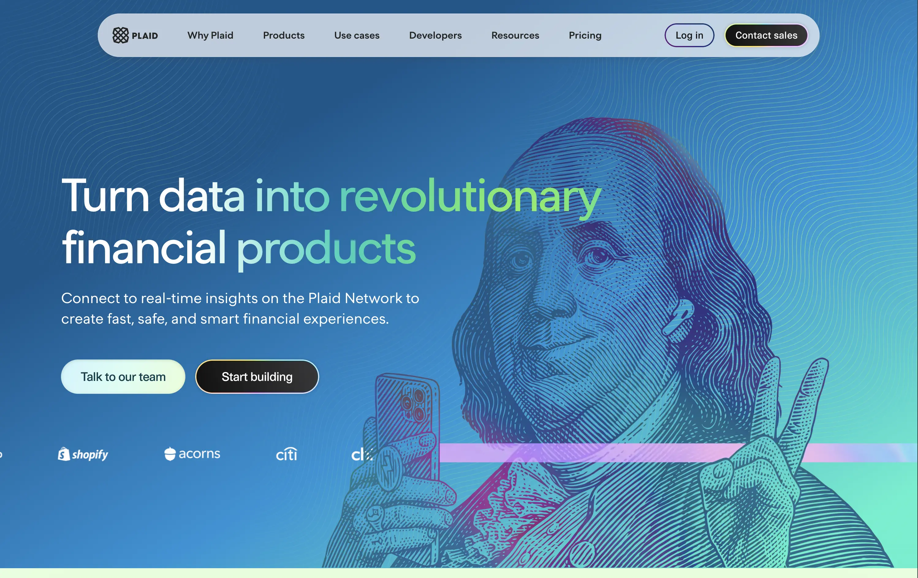
Plaid
↗
DevTools
Fintech
Data & Analytics
Left-aligned
Bold & Direct
Confident
Multi-CTA Block
Illustration
Interactive
Logo Wall
Gradient
Blue
Green
Sans serif
B2B
Home Page
Custom Code
developer fintech, API platform, financial data access, quirky fintech aesthetic, bold hero art, Benjamin Franklin illustration, smart finance tools, B2B API, trust logos, dev-first call to action, animated CTA, playful visual metaphor
Plaid is a data network that connects financial apps to users’ bank accounts securely and efficiently to power modern money experiences.
Plaid’s hero grabs attention with personality — Benjamin Franklin posing with an iPhone and some airpods, wrapped in a swirling gradient background. But it’s not just noise. The headline instantly communicates product value and the CTA contrast (“Talk to our team” vs. “Start building”) serves both enterprise and self-serve tracks. Logo wall underlines legitimacy. It’s high-impact and instantly memorable.
Plaid positions itself as the modern infrastructure backbone of fintech. The visual and messaging mix signals credibility, tech depth, and cultural fluency — ideal for both new gen founders.
This layout balances technical utility with human impact, aligning well with Algolia’s positioning as an API-first but UX-aware company. The mobile UI reinforces product value visually, while the logo wall signals scale and trust for enterprise buyers. The tone is clear, benefit-led, and appropriate for high-intent decision-makers evaluating AI tools for customer experience. This is a solid enterprise-facing hero built to perform.
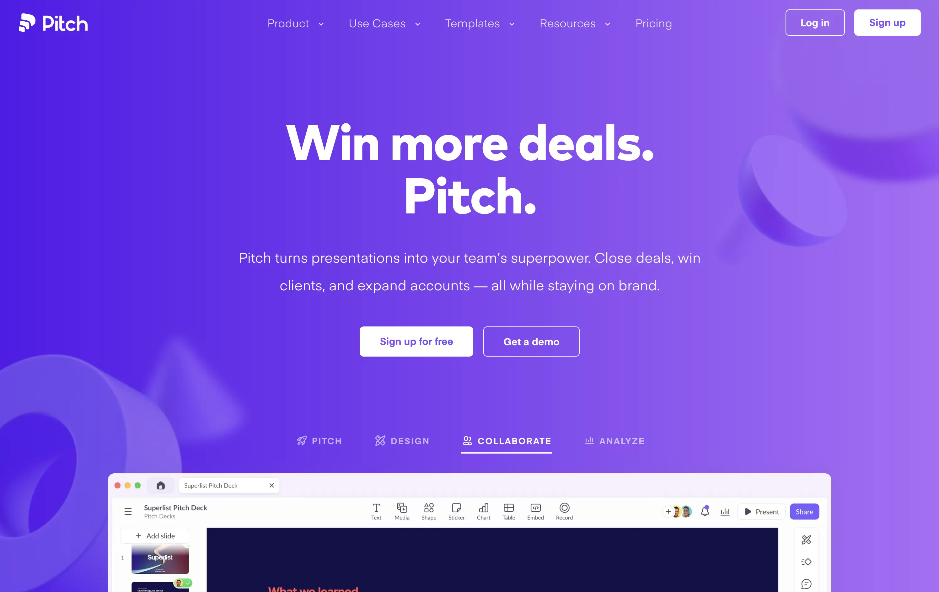
Pitch
↗
SaaS
Creative Tools
Centered
Benefit-Driven
Multi-CTA Block
Interactive
Product UI
Custom Animation
Gradient
White
Blue
Purple
Sans serif
B2B
Home Page
Custom Code
pitch decks, team presentations, sales enablement, bold SaaS design, gradient hero, product-led growth, team collaboration, sales tools, creative presentation, interactive UI, twin CTA, SaaS landing, vibrant visual language
Pitch is a collaborative presentation platform that helps teams design, deliver, and scale winning pitch decks with ease.
The headline “Win more deals. Pitch.” is snappy, benefit-first, and ties directly to the product’s core function. The gradient purple background adds energy and memorability. CTAs are visible, and the bottom UI preview shows real product capability. The modular UI toggles below the hero add perceived versatility without overwhelming. Clean hierarchy, confident voice, and immediate use-case relevance.
Tailored to fast-moving teams and founders. Messaging is tight, layout is focused, and visuals reflect quality and polish. It positions Pitch as both premium and efficient — ideal for growth teams.
This layout balances technical utility with human impact, aligning well with Algolia’s positioning as an API-first but UX-aware company. The mobile UI reinforces product value visually, while the logo wall signals scale and trust for enterprise buyers. The tone is clear, benefit-led, and appropriate for high-intent decision-makers evaluating AI tools for customer experience. This is a solid enterprise-facing hero built to perform.
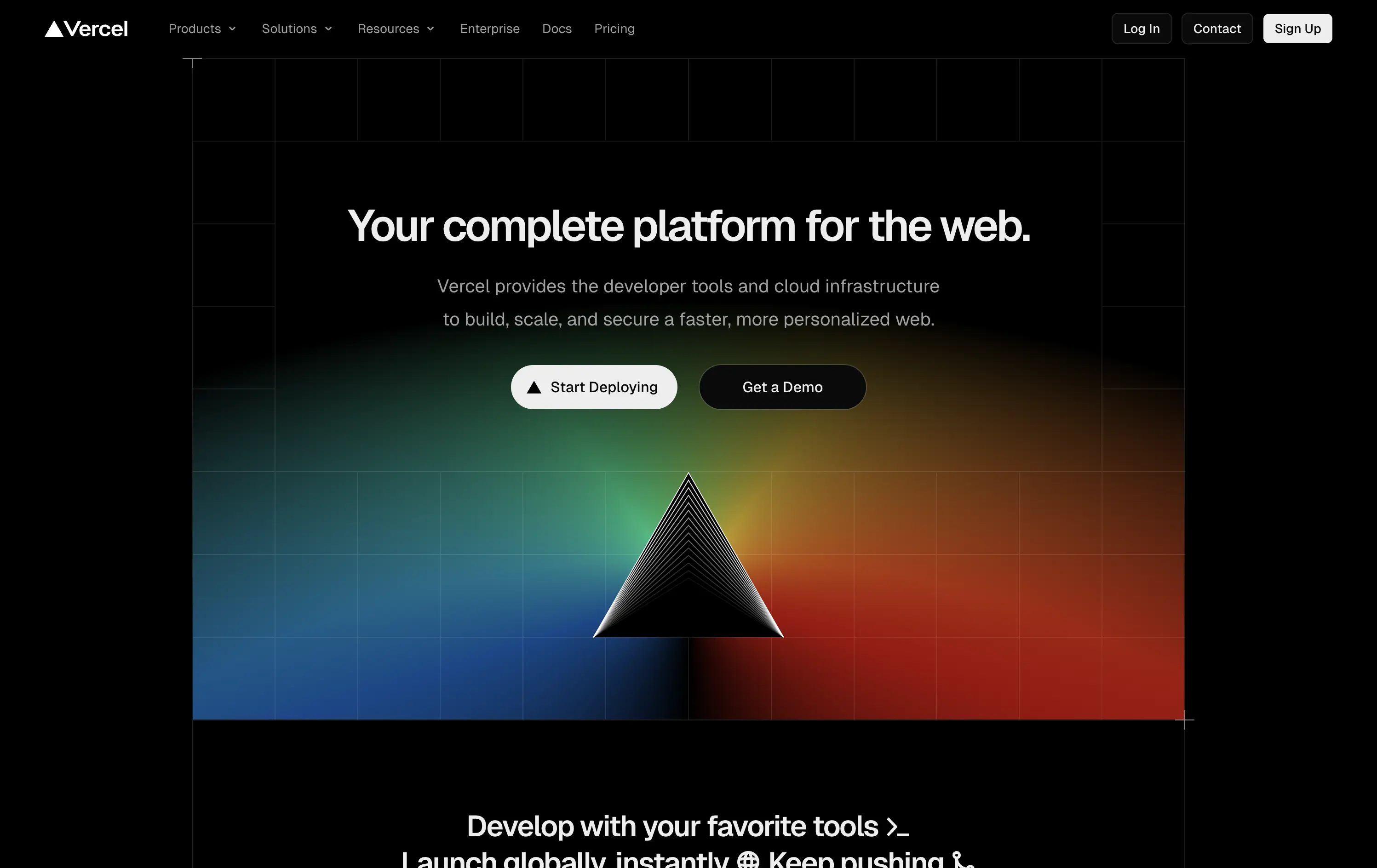
Vercel
↗
SaaS
DevTools
Centered
Bold & Direct
Multi-CTA Block
Illustration
Gradient
Dark Mode
White
Black
Sans serif
B2B
Home Page
Custom Code
developer-first, dark UI, iconic branding, gradient background, clean copy, deploy-focused, modern SaaS, performance tooling, enterprise appeal, visual impact, prism hero, action-oriented
Vercel gives developers the tools to build, deploy, and scale high-performance web apps with ease and speed.
The hero delivers immediate clarity: who it’s for, what it does, and how to get started. The dark UI, glowing visuals, and sharp copy create instant trust. Dual CTAs smartly capture both trial users and enterprise prospects.
A focused, no-fluff entry point optimized for developer decision speed. Brand expression is strong, conversion is easy, and the layout avoids distraction. Built for high-intent audiences evaluating deployment solutions.
This layout balances technical utility with human impact, aligning well with Algolia’s positioning as an API-first but UX-aware company. The mobile UI reinforces product value visually, while the logo wall signals scale and trust for enterprise buyers. The tone is clear, benefit-led, and appropriate for high-intent decision-makers evaluating AI tools for customer experience. This is a solid enterprise-facing hero built to perform.
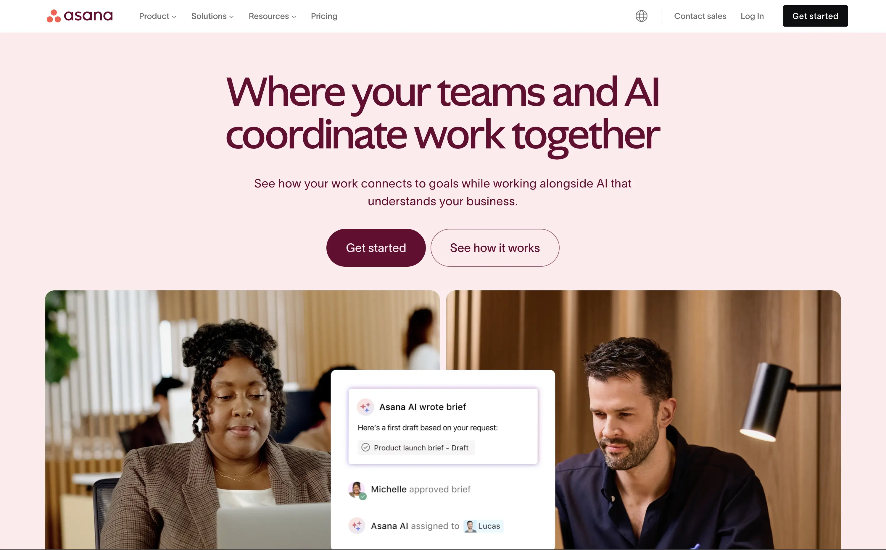
Asana
↗
SaaS
Collaboration
Productivity
Split Grid
Centered
Aspirational
Multi-CTA Block
Custom Animation
Duotone
Pink
Sans serif
B2B
Home Page
Custom Code
work management, project collaboration, AI assistant, team productivity, multi-cta hero
Asana helps organisations plan, track, and automate work—now boosted by an AI assistant that ties tasks to goals.
The hero is serene and strategic. Headline clearly defines the product’s evolution with AI, while visuals combine real people with subtle UI overlays to convey practical usage. Dual CTA is thoughtful and helps segment traffic. Typography and spacing support clarity.
Positions Asana as a next-gen operational tool built for modern teams. The hero shows how AI integrates with workflow, not replaces it. The balance of confidence and calm makes it accessible for mid-market to enterprise users exploring AI productivity.
This layout balances technical utility with human impact, aligning well with Algolia’s positioning as an API-first but UX-aware company. The mobile UI reinforces product value visually, while the logo wall signals scale and trust for enterprise buyers. The tone is clear, benefit-led, and appropriate for high-intent decision-makers evaluating AI tools for customer experience. This is a solid enterprise-facing hero built to perform.
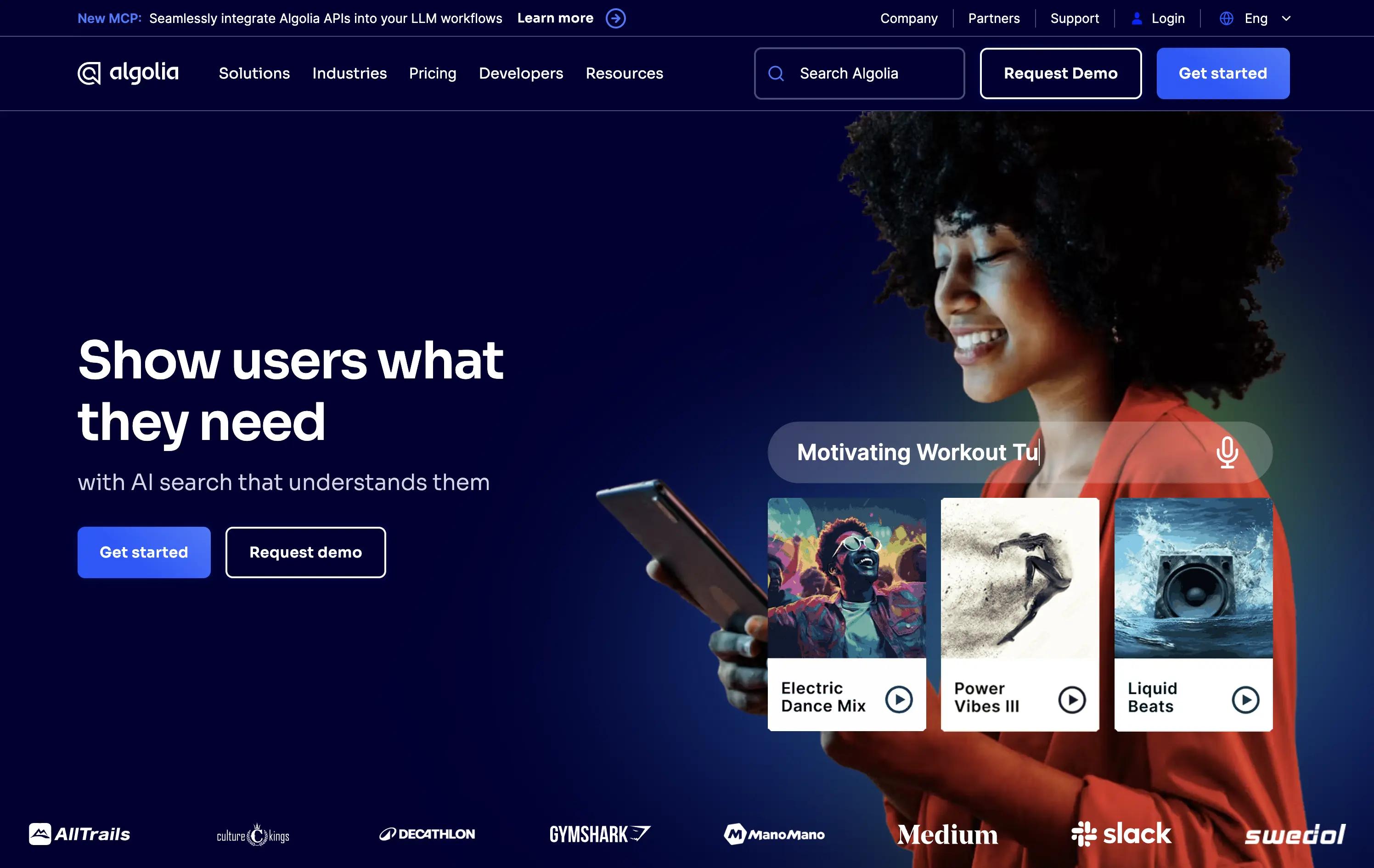
Algolia
↗
DevTools
AI Tools
Split Grid
Left-aligned
Benefit-Driven
Professional
Multi-CTA Block
Logo Wall
Custom Animation
Gradient
Dark Mode
Blue
Sans serif
B2B
Home Page
Custom Code
AI-powered search, developer tools, enterprise-grade SaaS, split layout, multi-CTA, gradient background, product showcase, mobile UI, high-trust layout, logo wall, blue tone, enterprise focus, dual CTA, visual proof, B2B product
Algolia delivers lightning-fast, AI-powered search and discovery APIs so any team can surface the right content or products instantly.
The hero combines a clear value prop with dual CTAs and a lifestyle visual showing product context. The UI animation builds relevance for end-user impact, and the strong contrast between text and background ensures readability. It’s clean, high-trust, and conversion-focused, and the smiling model embodies the end-user promise effectively.
Perfectly straddles developer and business personas. The smiling end-user signals emotional upside while UI animation reinforces performance and specificity. The brand feels modern, AI-aware, and deeply UX-committed.
This layout balances technical utility with human impact, aligning well with Algolia’s positioning as an API-first but UX-aware company. The mobile UI reinforces product value visually, while the logo wall signals scale and trust for enterprise buyers. The tone is clear, benefit-led, and appropriate for high-intent decision-makers evaluating AI tools for customer experience. This is a solid enterprise-facing hero built to perform.
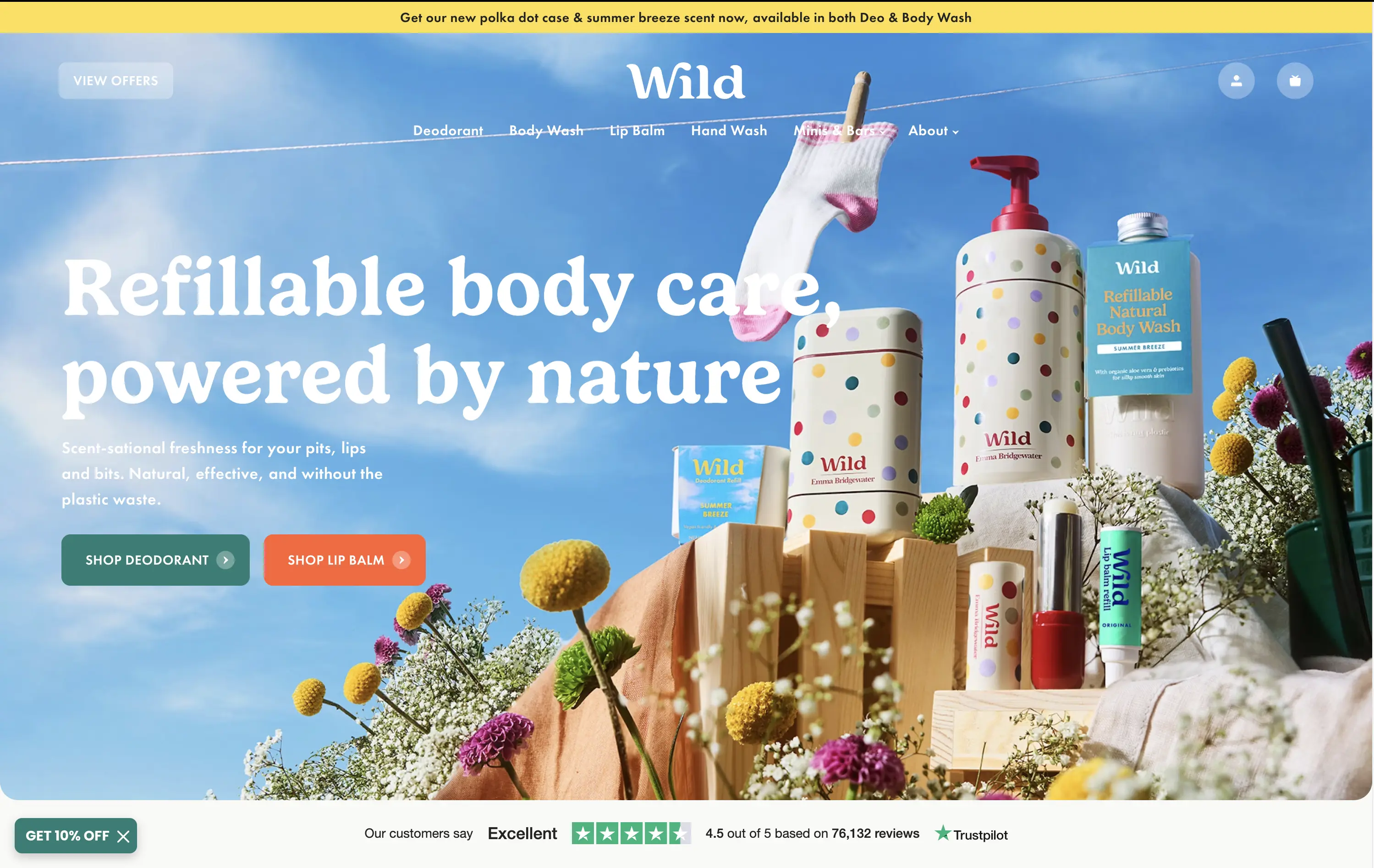
Wild
↗
CPG
Beauty & Wellness
Sustainability
Full Width
Left-aligned
Bold & Direct
Multi-CTA Block
Social Proof
Announcement
Imagery-Based
Green
Orange
Serif
DTC
Home Page
Shopify
eco-conscious, refillable packaging, summer aesthetic, photo-based hero, colorful packaging, nature-forward, trustbar visible, multi-CTA, DTC beauty, vibrant product shot, planet-positive, sunlit tone, clean bodycare
Wild offers refillable personal care products that are plastic-free, eco-friendly, and designed for everyday routines.
Bright, joyful photography captures the brand’s eco-fresh ethos while showcasing the full product range in one glance. Bold headline contrasts nicely with the sky backdrop, and CTAs are well-placed for quick shopper entry. Trustpilot widget reinforces credibility. While it’s vibrant and approachable, background details might slightly interfere with copy clarity on smaller screens.
Clear value prop and visual narrative tailored to eco-conscious DTC buyers. Emotional appeal (freshness, fun, nature) is balanced with proof (Trustpilot) and conversion intent. Could improve copy visibility slightly on mobile.
This layout balances technical utility with human impact, aligning well with Algolia’s positioning as an API-first but UX-aware company. The mobile UI reinforces product value visually, while the logo wall signals scale and trust for enterprise buyers. The tone is clear, benefit-led, and appropriate for high-intent decision-makers evaluating AI tools for customer experience. This is a solid enterprise-facing hero built to perform.
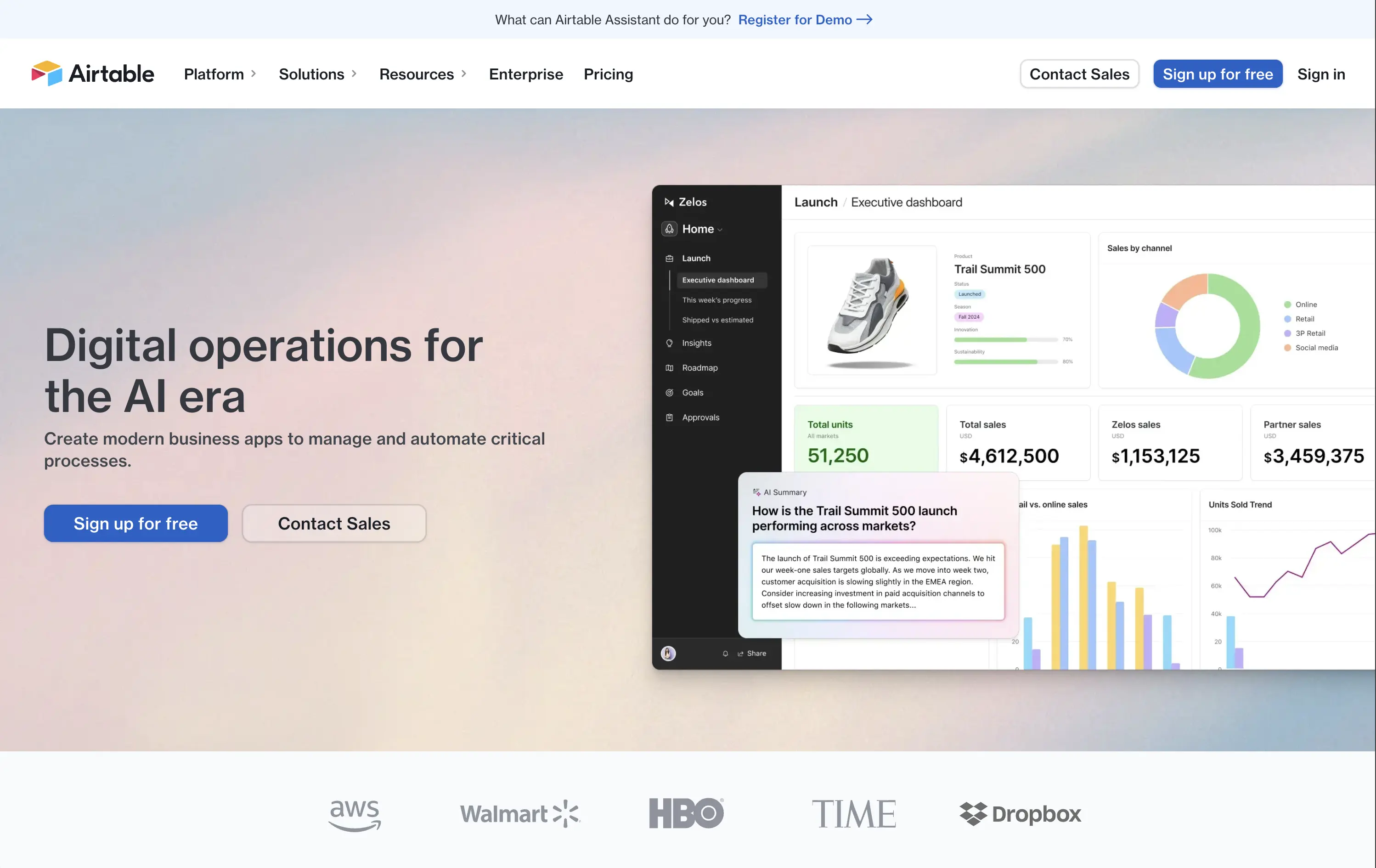
Airtable
↗
SaaS
Productivity
Data & Analytics
Split Grid
Left-aligned
Professional
Multi-CTA Block
Logo Wall
Product UI
Announcement
Light Mode
Blue
Sans serif
Hybrid
Home Page
Custom Code
online database, no-code database, low-code SaaS, workflow automation, AI summaries, enterprise ops
Airtable is a cloud database that lets teams build custom apps, views, and automations with no deep coding needed.
The visual hierarchy is spot-on — calm gradient background, clean product UI, and easy-to-scan copy. “Digital operations for the AI era” is broad but timely, and the supporting line grounds it in practical outcomes. The dashboard example does the heavy lifting to show use case without overloading. Two clear CTAs (free sign-up and contact sales) accommodate both ends of the buyer journey. Quietly confident, but not flashy — very Airtable.
Positions Airtable as an evolving and flexible business OS for enterprise workflows, not just a spreadsheet tool. Speaks to maturing users with operational needs. Copy is safe but solid — it could use a sharper hook, but tone matches market shift toward AI.
This layout balances technical utility with human impact, aligning well with Algolia’s positioning as an API-first but UX-aware company. The mobile UI reinforces product value visually, while the logo wall signals scale and trust for enterprise buyers. The tone is clear, benefit-led, and appropriate for high-intent decision-makers evaluating AI tools for customer experience. This is a solid enterprise-facing hero built to perform.
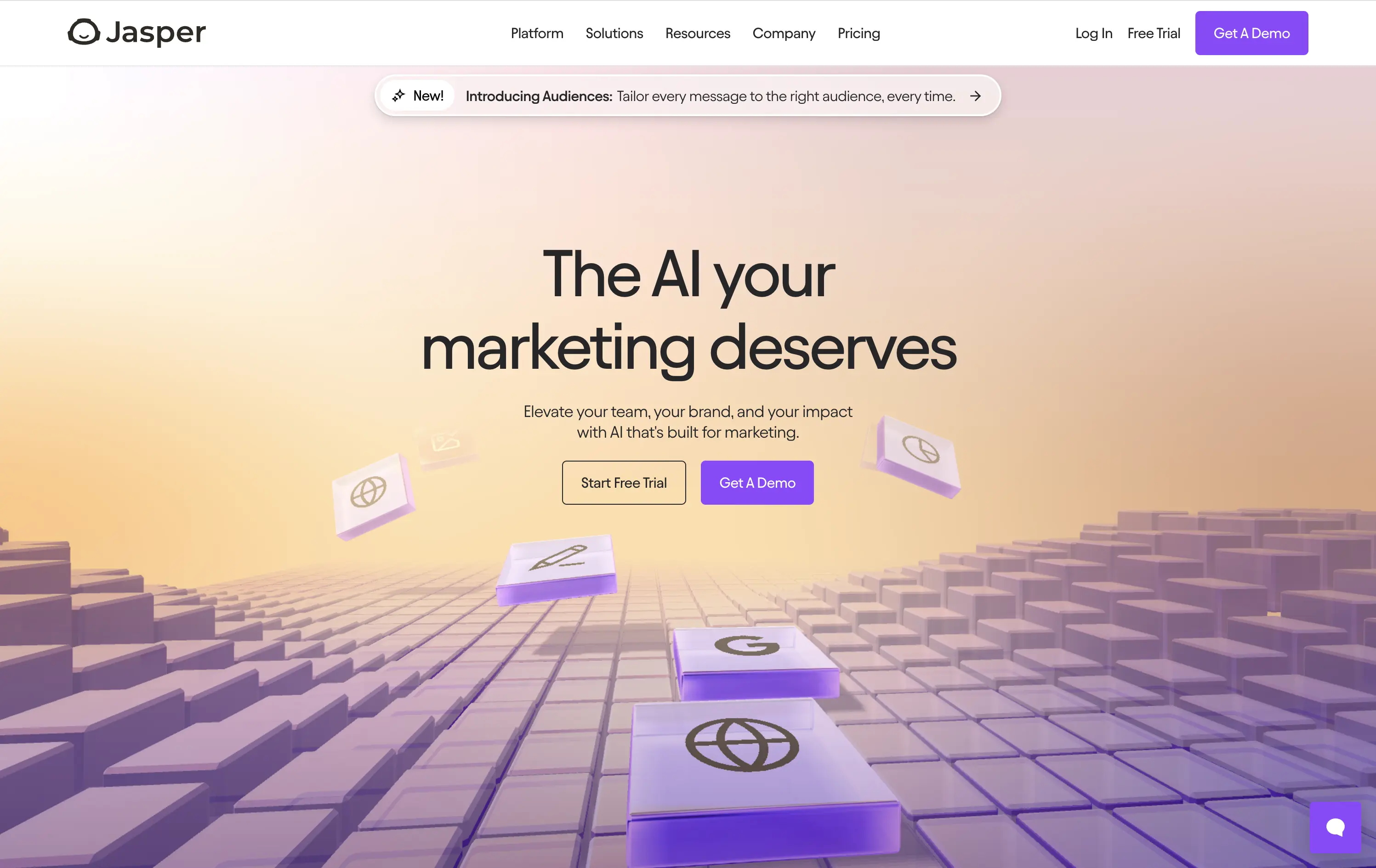
Jasper
↗
SaaS
AI Tools
Centered
Aspirational
Professional
Multi-CTA Block
Interactive
Custom Animation
3D visuals
Gradient
Light Mode
Purple
Yellow
Sans serif
Hybrid
Home Page
Webflow
AI copywriting, AI for marketers, premium SaaS, floating 3D blocks, gradient UI, dual CTA, conversion-focused, brand messaging, purple aesthetic, marketing automation, future-facing, demo-first UX, mid-market SaaS
Jasper is an AI copilot that helps marketing teams craft on-brand content faster across every channel.
Clear message, sharp contrast, and a visually engaging 3D tile animation support both narrative and interaction. Dual CTAs guide intent. Subhead could use slightly more emphasis for hierarchy.
Hero aligns with mid-to-late-stage buyers seeking polished, scalable AI solutions. Visual tone supports category leadership. Good balance of aspiration and product clarity.
This layout balances technical utility with human impact, aligning well with Algolia’s positioning as an API-first but UX-aware company. The mobile UI reinforces product value visually, while the logo wall signals scale and trust for enterprise buyers. The tone is clear, benefit-led, and appropriate for high-intent decision-makers evaluating AI tools for customer experience. This is a solid enterprise-facing hero built to perform.
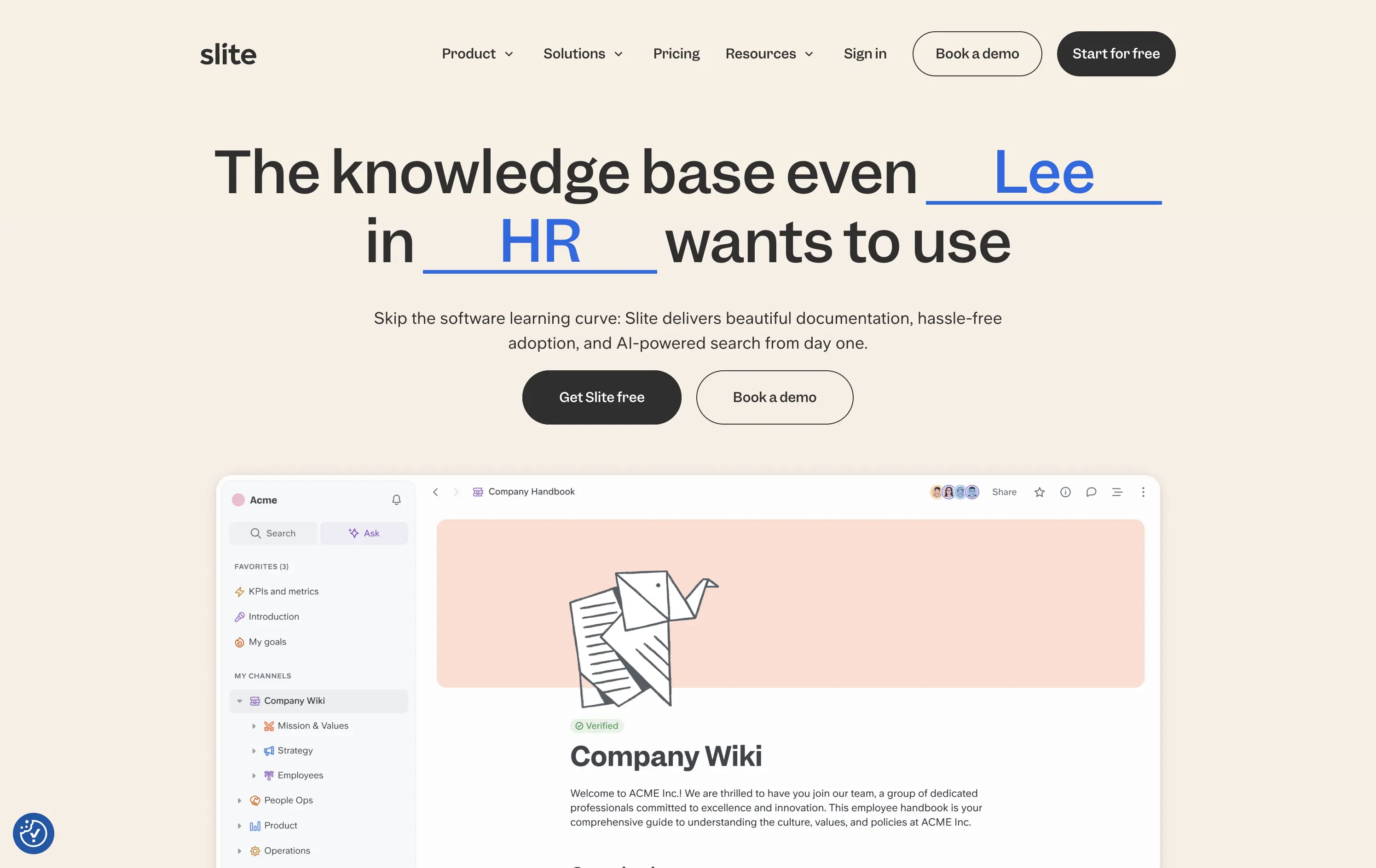
Slite
↗
SaaS
Collaboration
Centered
Benefit-Driven
Conversational
Multi-CTA Block
Product UI
Custom Animation
Light Mode
Blue
Black
Sans serif
B2B
Home Page
Webflow
team-friendly, rotating headline, UI demo, warm neutrals, playful logic, AI-assisted search, startup SaaS, low-friction entry, inclusive language, collaborative tools, documentation-first, dual CTA, trust-building UX
Slite gives teams a simple, AI-powered workspace to capture and find knowledge without the usual learning curve.
Hero is clever and inclusive. Animated blanks highlight versatility without overexplaining. UI preview builds product confidence. Dual CTAs clearly support trial vs. demo. Warm visuals balance modern minimalism with approachability.
Speaks to multiple roles without bloating the message. Tone and visual style position Slite as a low-friction, high-utility tool. Well-suited for horizontal B2B SaaS adoption.
This layout balances technical utility with human impact, aligning well with Algolia’s positioning as an API-first but UX-aware company. The mobile UI reinforces product value visually, while the logo wall signals scale and trust for enterprise buyers. The tone is clear, benefit-led, and appropriate for high-intent decision-makers evaluating AI tools for customer experience. This is a solid enterprise-facing hero built to perform.
The most effective hero sections in your inbox.
Monthly round up of top hero sections.
Don't worry. We hate spam too.
Don't worry. We hate spam too.
Don't worry. We hate spam too.