No CTA
0
0
0
0
No button or interaction — just headline, copy, or visual.
Filters
Don Prod
↗
Agencies
Editorial
No headline
No CTA
Media Gallery
Loading Animation
Dark Mode
White
Display
B2B
Home Page
Custom Code
portfolio site, webGL distortion, music video production, VHS aesthetic, visual storytelling, minimalist UX, video-first layout, motion texture, analog feel, creative direction, fullscreen gallery
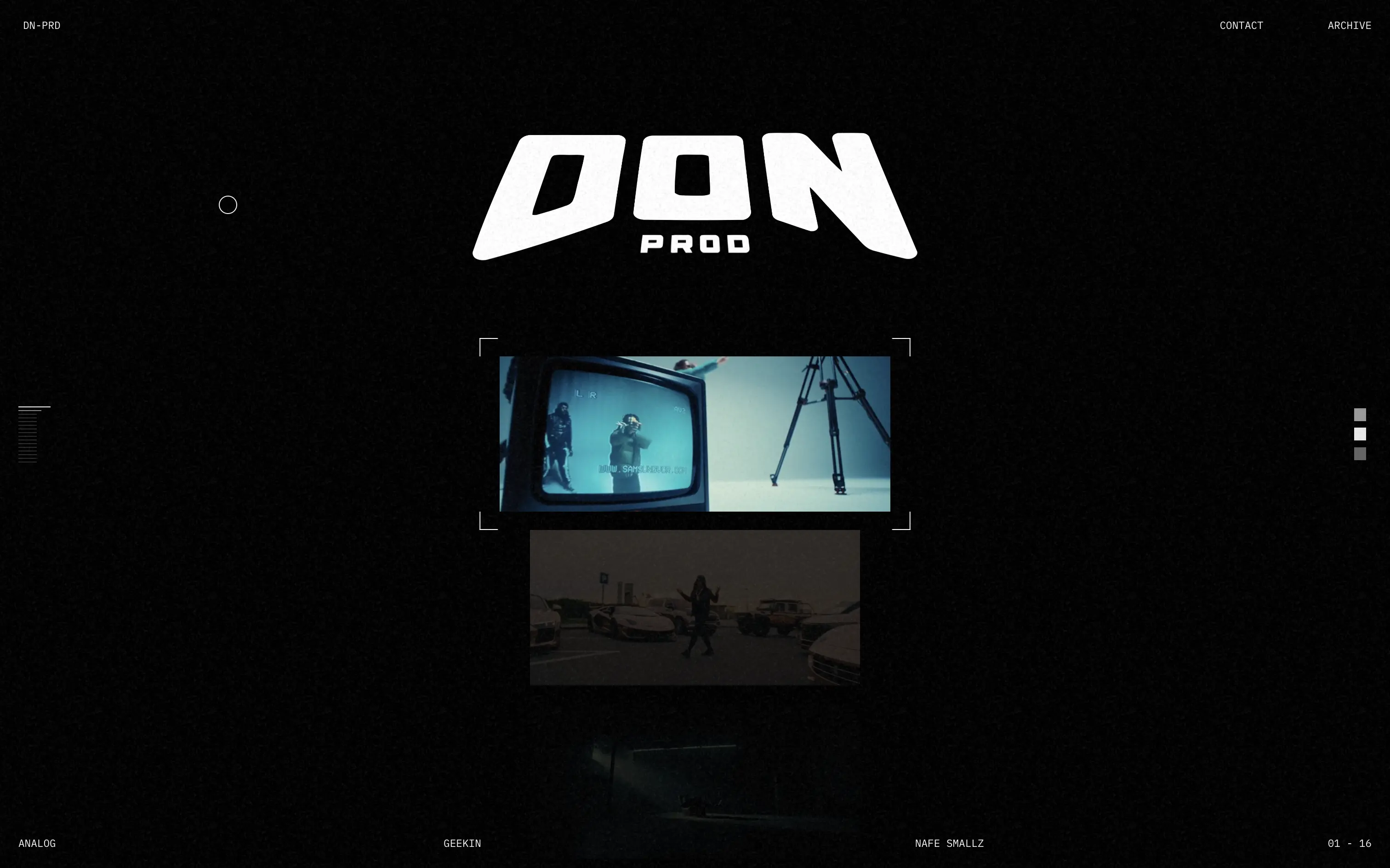
Don Prod is a visual production studio showcasing high-energy music video work through a minimal, cinematic portfolio.
The hero trades copy for atmosphere. The liquid webGL orb intro and lo-fi video stills establish creative authority fast. There’s no orientation, no CTA—just visual immersion.
This is visual-first positioning for a portfolio that’s all about taste. It’s anti-marketing in the best way—letting the work speak for itself. Not built for mass access, but built with intent.
This layout balances technical utility with human impact, aligning well with Algolia’s positioning as an API-first but UX-aware company. The mobile UI reinforces product value visually, while the logo wall signals scale and trust for enterprise buyers. The tone is clear, benefit-led, and appropriate for high-intent decision-makers evaluating AI tools for customer experience. This is a solid enterprise-facing hero built to perform.
Don Prod
↗
Agencies
Editorial
No headline
No CTA
Media Gallery
Loading Animation
Dark Mode
White
Display
B2B
Home Page
Custom Code
portfolio site, webGL distortion, music video production, VHS aesthetic, visual storytelling, minimalist UX, video-first layout, motion texture, analog feel, creative direction, fullscreen gallery
Don Prod is a visual production studio showcasing high-energy music video work through a minimal, cinematic portfolio.
The hero trades copy for atmosphere. The liquid webGL orb intro and lo-fi video stills establish creative authority fast. There’s no orientation, no CTA—just visual immersion.
This is visual-first positioning for a portfolio that’s all about taste. It’s anti-marketing in the best way—letting the work speak for itself. Not built for mass access, but built with intent.
This layout balances technical utility with human impact, aligning well with Algolia’s positioning as an API-first but UX-aware company. The mobile UI reinforces product value visually, while the logo wall signals scale and trust for enterprise buyers. The tone is clear, benefit-led, and appropriate for high-intent decision-makers evaluating AI tools for customer experience. This is a solid enterprise-facing hero built to perform.
Reflect
↗
AI Tools
Creative Tools
Productivity
Centered
Aspirational
No CTA
Video
Product UI
Custom Animation
Gradient
Dark Mode
Purple
Sans serif
B2C
Home Page
Custom Code
second brain tool, backlinking notes, dark ambient UI, AI note-taking, glowing animation, calm productivity, memory-focused tools, Roam alternative, neural metaphor, minimal interface
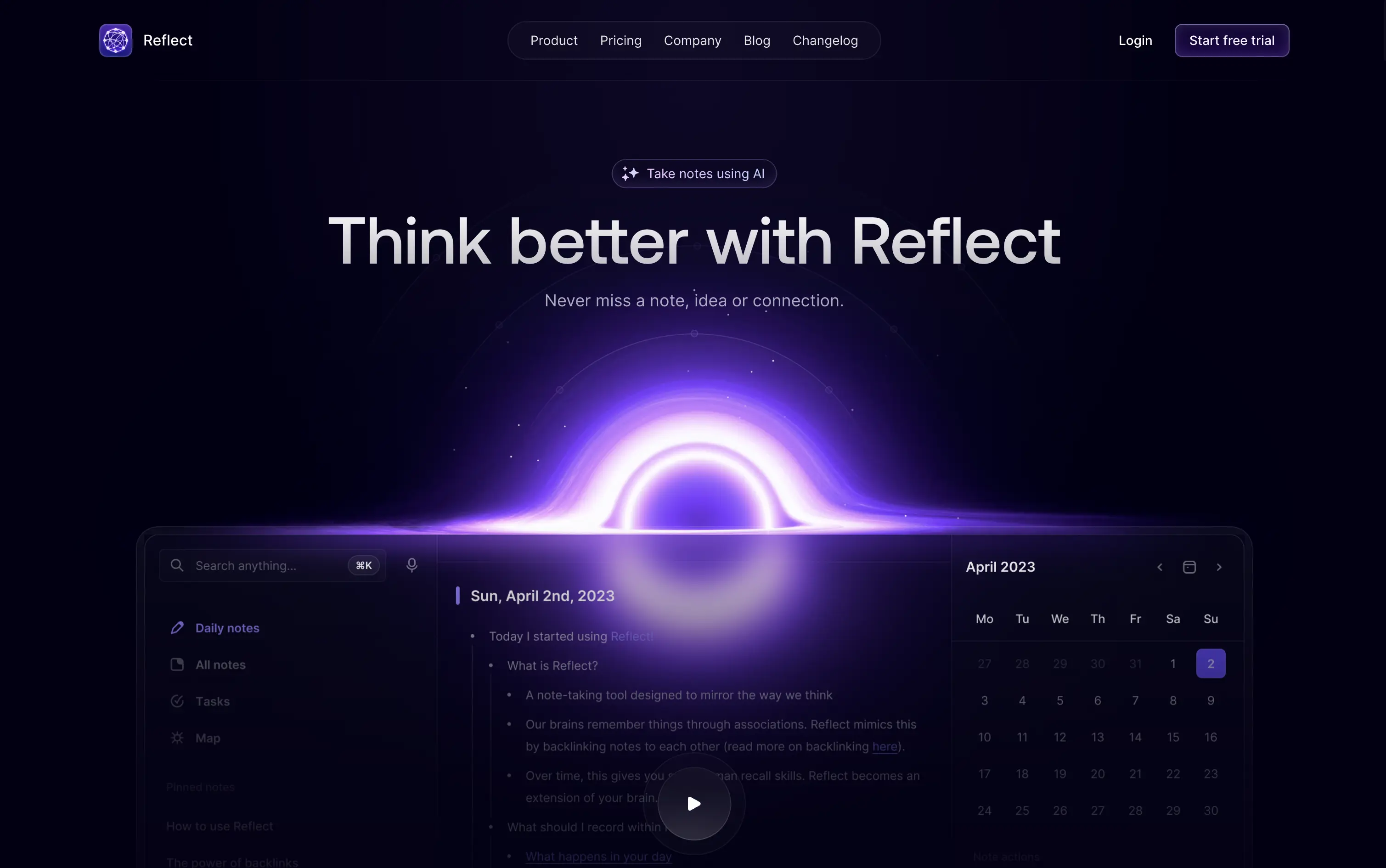
Reflect is an AI-powered note-taking app designed to help users think better, organize ideas, and link concepts seamlessly.
A visually memorable hero that communicates mood more than function. The glowing black-hole motif hints at depth and interconnectedness, but product clarity relies on secondary copy and scroll.
Reflect sells a mindset, not a feature. It uses visual metaphor and ambient energy to frame note-taking as a thinking upgrade. It’s bold, but clarity is delayed—relying on patience and resonance with a knowledge-worker mindset.
This layout balances technical utility with human impact, aligning well with Algolia’s positioning as an API-first but UX-aware company. The mobile UI reinforces product value visually, while the logo wall signals scale and trust for enterprise buyers. The tone is clear, benefit-led, and appropriate for high-intent decision-makers evaluating AI tools for customer experience. This is a solid enterprise-facing hero built to perform.
Reflect
↗
AI Tools
Creative Tools
Productivity
Centered
Aspirational
No CTA
Video
Product UI
Custom Animation
Gradient
Dark Mode
Purple
Sans serif
B2C
Home Page
Custom Code
second brain tool, backlinking notes, dark ambient UI, AI note-taking, glowing animation, calm productivity, memory-focused tools, Roam alternative, neural metaphor, minimal interface
Reflect is an AI-powered note-taking app designed to help users think better, organize ideas, and link concepts seamlessly.
A visually memorable hero that communicates mood more than function. The glowing black-hole motif hints at depth and interconnectedness, but product clarity relies on secondary copy and scroll.
Reflect sells a mindset, not a feature. It uses visual metaphor and ambient energy to frame note-taking as a thinking upgrade. It’s bold, but clarity is delayed—relying on patience and resonance with a knowledge-worker mindset.
This layout balances technical utility with human impact, aligning well with Algolia’s positioning as an API-first but UX-aware company. The mobile UI reinforces product value visually, while the logo wall signals scale and trust for enterprise buyers. The tone is clear, benefit-led, and appropriate for high-intent decision-makers evaluating AI tools for customer experience. This is a solid enterprise-facing hero built to perform.
Arcol
↗
SaaS
Collaboration
Centered
Aspirational
Abstract / Conceptual
No CTA
Illustration
Custom Animation
Light Mode
Blue
Yellow
Sans serif
B2B
Home Page
Webflow
BIM software, real-time collaboration, isometric grid, multiplayer cursor, spatial planning UI, construction tech, 3D data layers, architectural tool, modern CAD, animated interface, light grid background
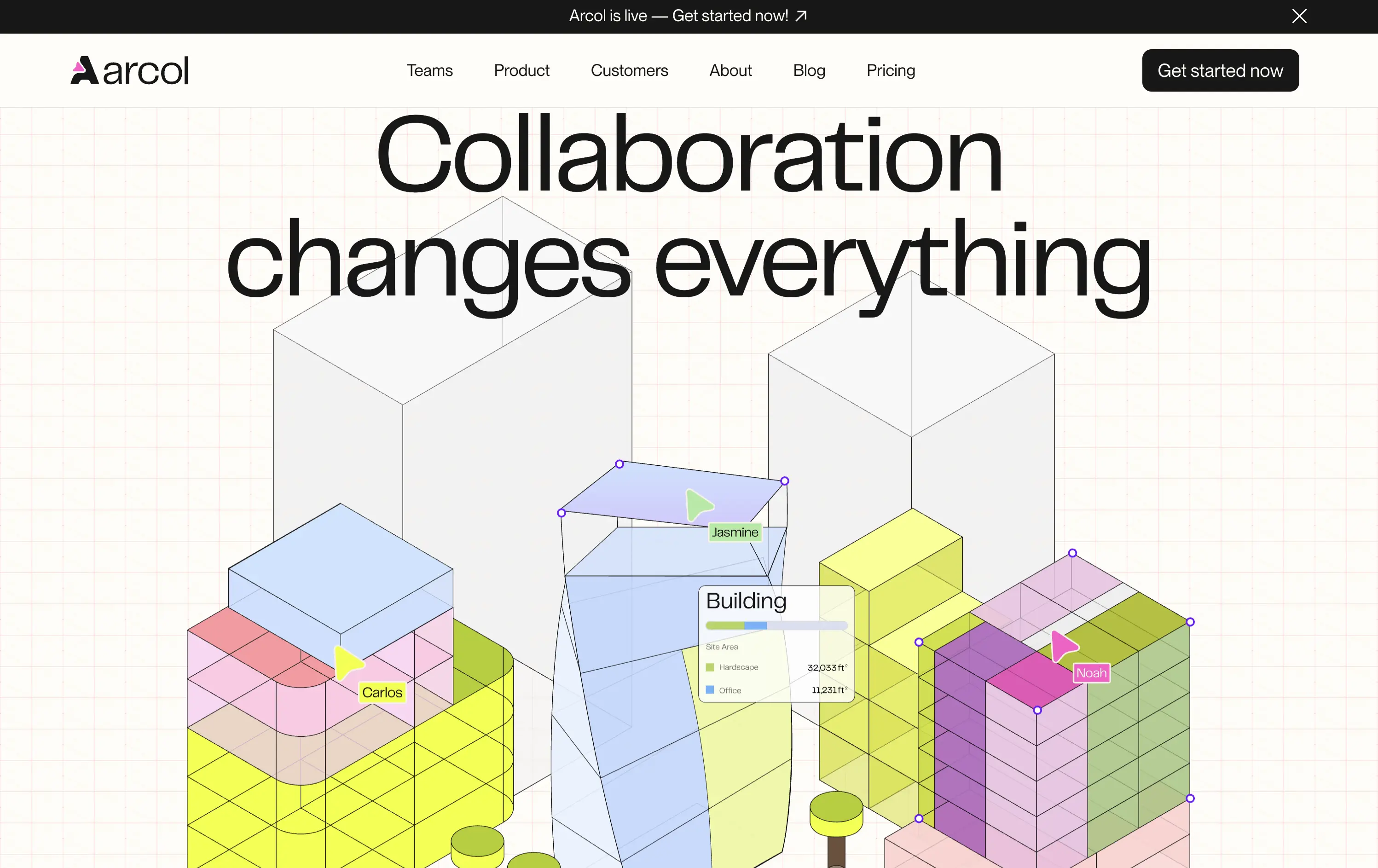
Arcol is a generative design and collaboration platform for architecture and BIM workflows, built for real-time teamwork.
The animated visual does the heavy lifting, illustrating use cases like live edits and data overlays. But without a supporting subline, new users may miss the BIM context. Still, strong visual storytelling creates intrigue.
Visually strong and clearly differentiated, but the messaging lacks grounding. The animation sells collaboration well, but without a sub-headline or product descriptor, it leans too much on visual inference. Clarity is sacrificed for aesthetic.
This layout balances technical utility with human impact, aligning well with Algolia’s positioning as an API-first but UX-aware company. The mobile UI reinforces product value visually, while the logo wall signals scale and trust for enterprise buyers. The tone is clear, benefit-led, and appropriate for high-intent decision-makers evaluating AI tools for customer experience. This is a solid enterprise-facing hero built to perform.
Arcol
↗
SaaS
Collaboration
Centered
Aspirational
Abstract / Conceptual
No CTA
Illustration
Custom Animation
Light Mode
Blue
Yellow
Sans serif
B2B
Home Page
Webflow
BIM software, real-time collaboration, isometric grid, multiplayer cursor, spatial planning UI, construction tech, 3D data layers, architectural tool, modern CAD, animated interface, light grid background
Arcol is a generative design and collaboration platform for architecture and BIM workflows, built for real-time teamwork.
The animated visual does the heavy lifting, illustrating use cases like live edits and data overlays. But without a supporting subline, new users may miss the BIM context. Still, strong visual storytelling creates intrigue.
Visually strong and clearly differentiated, but the messaging lacks grounding. The animation sells collaboration well, but without a sub-headline or product descriptor, it leans too much on visual inference. Clarity is sacrificed for aesthetic.
This layout balances technical utility with human impact, aligning well with Algolia’s positioning as an API-first but UX-aware company. The mobile UI reinforces product value visually, while the logo wall signals scale and trust for enterprise buyers. The tone is clear, benefit-led, and appropriate for high-intent decision-makers evaluating AI tools for customer experience. This is a solid enterprise-facing hero built to perform.
Omsom
↗
CPG
Food & Beverage
Centered
Playful
Bold & Direct
No CTA
Photography
Imagery-Based
Red
Yellow
Display
DTC
Home Page
Shopify
bold packaging, nostalgic film grain, Asian American brand, food culture, Gen Z energy, CPG storytelling, saucy noodles, maximalist vibe, loud typography, high color saturation, visual attitude
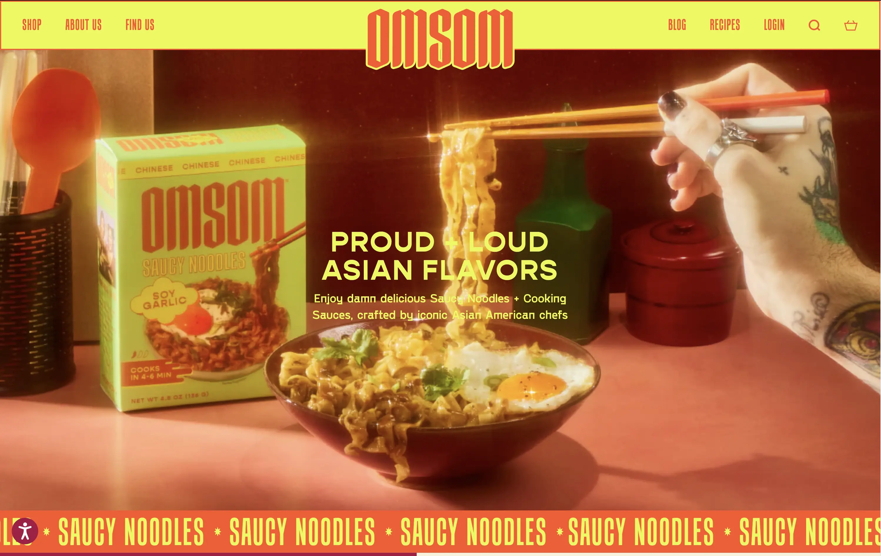
Omsom sells proud and loud Asian sauce kits and noodles without cultural compromise.
The hero hits hard with flavor and personality. High-impact visuals and voice set a strong tone and hints towards the ephereal. It’s clear who it’s for and what they’re selling.
Leans fully into identity and brand world building. Speaks directly to a culturally-aware, proudly niche audience. Messaging and art direction are fully aligned.
This layout balances technical utility with human impact, aligning well with Algolia’s positioning as an API-first but UX-aware company. The mobile UI reinforces product value visually, while the logo wall signals scale and trust for enterprise buyers. The tone is clear, benefit-led, and appropriate for high-intent decision-makers evaluating AI tools for customer experience. This is a solid enterprise-facing hero built to perform.
Omsom
↗
CPG
Food & Beverage
Centered
Playful
Bold & Direct
No CTA
Photography
Imagery-Based
Red
Yellow
Display
DTC
Home Page
Shopify
bold packaging, nostalgic film grain, Asian American brand, food culture, Gen Z energy, CPG storytelling, saucy noodles, maximalist vibe, loud typography, high color saturation, visual attitude
Omsom sells proud and loud Asian sauce kits and noodles without cultural compromise.
The hero hits hard with flavor and personality. High-impact visuals and voice set a strong tone and hints towards the ephereal. It’s clear who it’s for and what they’re selling.
Leans fully into identity and brand world building. Speaks directly to a culturally-aware, proudly niche audience. Messaging and art direction are fully aligned.
This layout balances technical utility with human impact, aligning well with Algolia’s positioning as an API-first but UX-aware company. The mobile UI reinforces product value visually, while the logo wall signals scale and trust for enterprise buyers. The tone is clear, benefit-led, and appropriate for high-intent decision-makers evaluating AI tools for customer experience. This is a solid enterprise-facing hero built to perform.
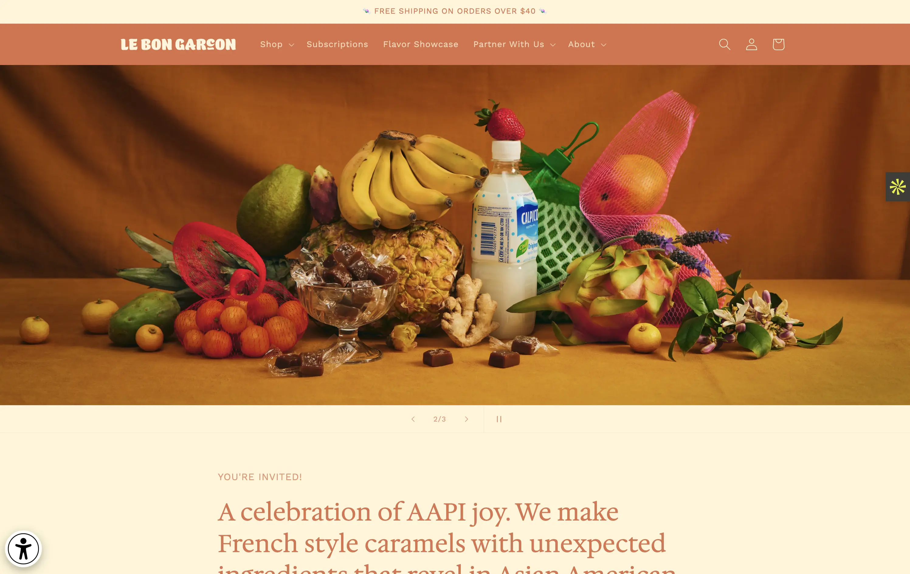
Le Bon Garçon
↗
CPG
Food & Beverage
Editorial
Descriptive
Founder-Led Voice
No CTA
Photography
Media Gallery
Announcement
Duotone
Imagery-Based
Orange
Yellow
Serif
DTC
Home Page
Shopify
nostalgic packaging, elevated DTC candy, premium gifting, Asian-American ingredients, still-life styling, art direction-led, cultural storytelling, warm palette, caramel focus, identity-led CPG, curated feel, editorial aesthetic, flavor storytelling, high design, AAPI founder
A premium confectionery brand reimagining French-style caramels through the lens of Asian-American flavors and storytelling.
This hero leans fully into art direction, with a cinematic still-life that evokes tradition, indulgence, and multicultural vibrancy. There's no obvious CTA, but the experience feels intentional and immersive. The visual composition draws curiosity and reflects a product crafted with care. The copy introduces cultural relevance and flavor positioning effectively, though some may miss a direct product hook.
Perfect for brand-aware shoppers and gifting segments. A visual-first approach supports premium positioning and cultural storytelling over hard conversion.
This layout balances technical utility with human impact, aligning well with Algolia’s positioning as an API-first but UX-aware company. The mobile UI reinforces product value visually, while the logo wall signals scale and trust for enterprise buyers. The tone is clear, benefit-led, and appropriate for high-intent decision-makers evaluating AI tools for customer experience. This is a solid enterprise-facing hero built to perform.
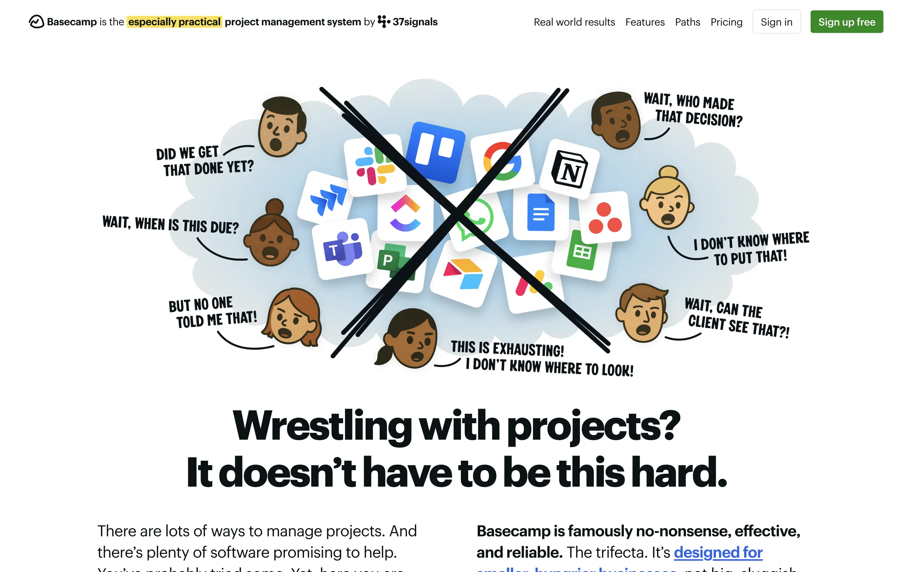
Basecamp
↗
SaaS
Collaboration
Productivity
Centered
Unconventional
Conversational
Pain-driven
No CTA
Illustration
Light Mode
Green
Yellow
Sans serif
B2B
Home Page
Custom Code
project management, SaaS, lo-fi aesthetic, opinionated design, founder-led voice, visual storytelling, problem-first, productivity, cluttered tool fatigue, anti-modern, expressive illustration, early-stage appeal, emotional resonance, no UI demo, brand storytelling, narrative-led
Basecamp cuts through tool overload with one practical workspace, ending project chaos.
The hero skips UI glamour for emotional clarity. It dramatizes the frustration of using too many disjointed tools through expressive cartoon faces and crossed-out logos. The copy is plain, bold, and highly relatable — “Wrestling with projects?” grounds it in a universal pain. No button, no fluff. The simplicity grabs attention and makes the message instantly clear.
Leans hard into anti-trend positioning—practicality over polish. Speaks directly to the frustration of tool overload, appealing to leaders who want sanity, not features. It’s memorable and unmistakably aligned with Basecamp’s legacy of contrarian clarity.
This layout balances technical utility with human impact, aligning well with Algolia’s positioning as an API-first but UX-aware company. The mobile UI reinforces product value visually, while the logo wall signals scale and trust for enterprise buyers. The tone is clear, benefit-led, and appropriate for high-intent decision-makers evaluating AI tools for customer experience. This is a solid enterprise-facing hero built to perform.
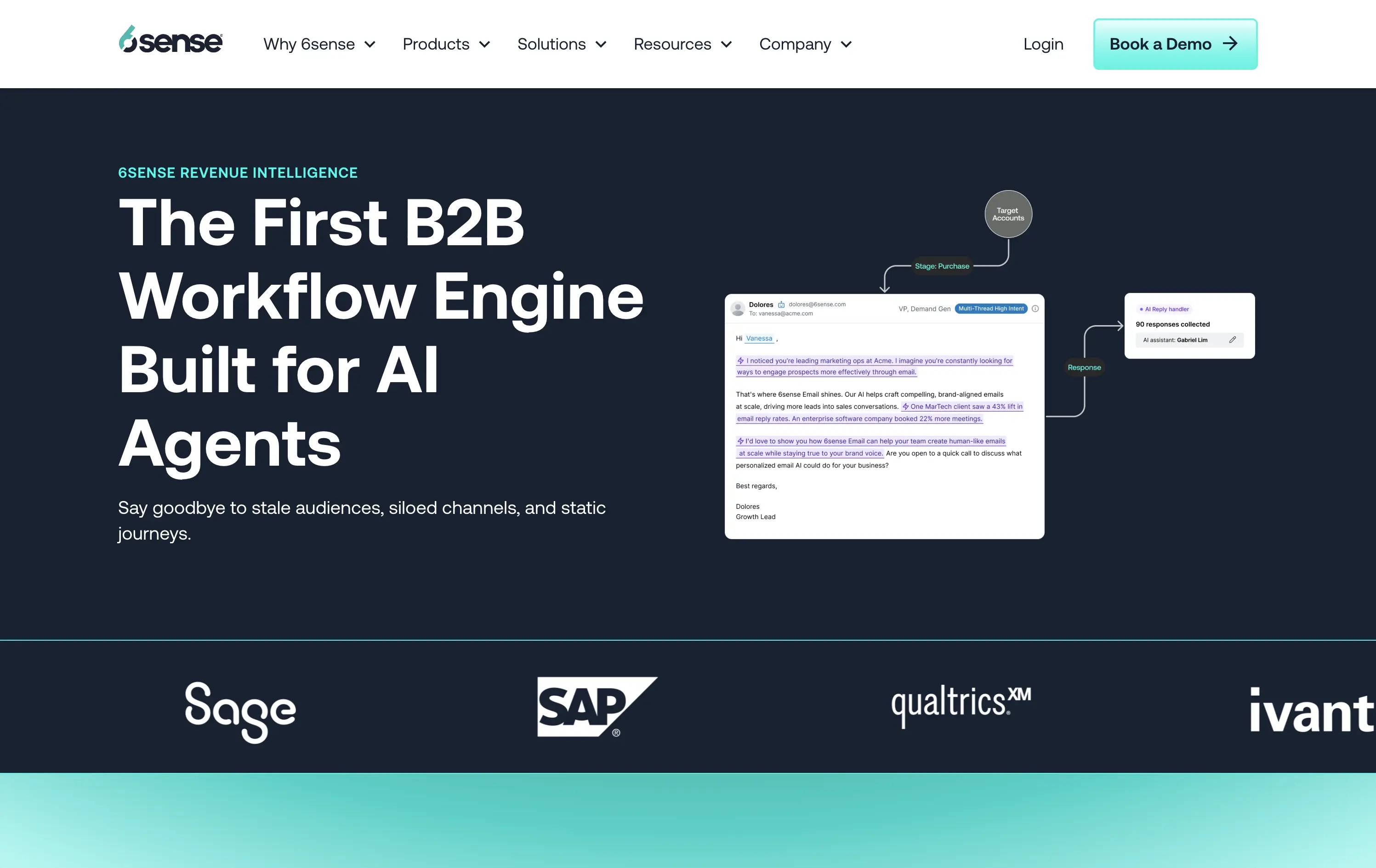
6sense
↗
SaaS
AI Tools
Split Grid
Left-aligned
Professional
No CTA
Logo Wall
Product UI
Duotone
Blue
Green
Sans serif
B2B
Home Page
Wordpress
AI-first, B2B enterprise, workflow automation, data-driven, email UI, proof of concept visual, dark theme, high-trust, demand gen, gradient bottom edge, technical audience, low-fluff, enterprise SaaS, sales enablement, client logos
6sense is a B2B platform using AI to automate workflows and personalize marketing outreach at scale.
The hero leads with authority — strong headline, clean copy, and a visual that maps out a real workflow give instant context to a technical audience. The dark theme reads serious and enterprise-ready. Copy is crystal clear, but the visual diagram could use just a little more breathing room. CTA is sharp and obvious: Book a Demo — no distractions.
Hero is tuned for high-intent buyers. The language signals innovation and productivity gains while reinforcing credibility through visual proof and case stats.
This layout balances technical utility with human impact, aligning well with Algolia’s positioning as an API-first but UX-aware company. The mobile UI reinforces product value visually, while the logo wall signals scale and trust for enterprise buyers. The tone is clear, benefit-led, and appropriate for high-intent decision-makers evaluating AI tools for customer experience. This is a solid enterprise-facing hero built to perform.
The most effective hero sections in your inbox.
Monthly round up of top hero sections.
Don't worry. We hate spam too.
Don't worry. We hate spam too.
Don't worry. We hate spam too.