Orange
11
11
11
11
Filters
Hume
↗
SaaS
AI Tools
Centered
Bold & Direct
Confident
Search/Utility Block
Interactive
Announcement
Gradient
Light Mode
Pink
Orange
Sans serif
Hybrid
Home Page
Custom Code
voice ai, text-to-speech, llm, real-time api, developer friendly, pastel gradient, centered hero, interactive demo, single cta, assertive headline, white card, product proof, gradient background, low-friction signup, modern saas
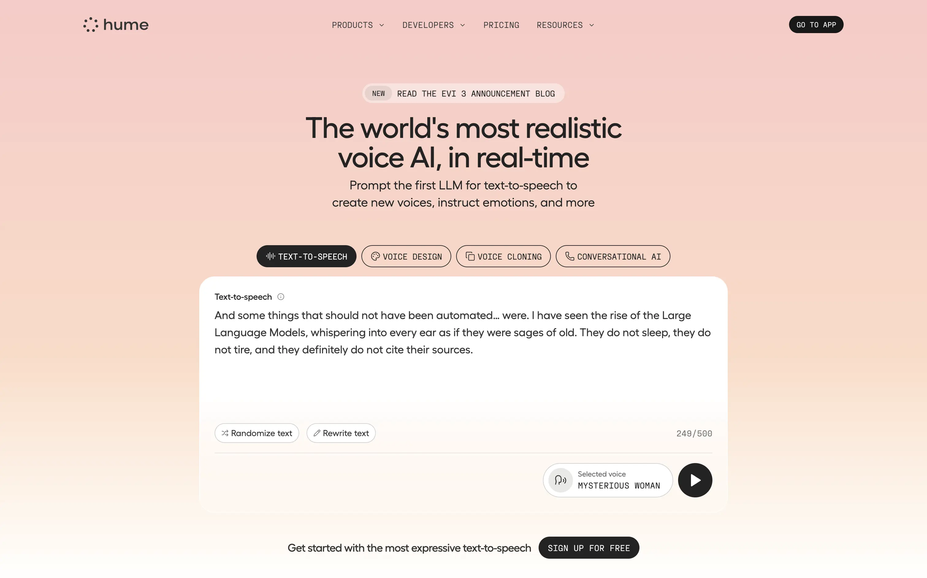
Hume offers a real-time text-to-speech API that lets developers generate lifelike, emotionally nuanced voices or clone existing ones on demand.
Bold claim, proof in one scroll. The live sandbox lets visitors try four core features instantly—a strong trust move. Clear headline, crisp subhead, and “Sign Up For Free” keep focus. Gradient softens tech intensity but may under-signal enterprise heft.
Superlative headline plus instant demo match developer expectations for proof. Single signup path reduces cognitive load, positioning Hume as fast, expressive infrastructure rather than a heavy enterprise suite.
This layout balances technical utility with human impact, aligning well with Algolia’s positioning as an API-first but UX-aware company. The mobile UI reinforces product value visually, while the logo wall signals scale and trust for enterprise buyers. The tone is clear, benefit-led, and appropriate for high-intent decision-makers evaluating AI tools for customer experience. This is a solid enterprise-facing hero built to perform.
Hume
↗
SaaS
AI Tools
Centered
Bold & Direct
Confident
Search/Utility Block
Interactive
Announcement
Gradient
Light Mode
Pink
Orange
Sans serif
Hybrid
Home Page
Custom Code
voice ai, text-to-speech, llm, real-time api, developer friendly, pastel gradient, centered hero, interactive demo, single cta, assertive headline, white card, product proof, gradient background, low-friction signup, modern saas
Hume offers a real-time text-to-speech API that lets developers generate lifelike, emotionally nuanced voices or clone existing ones on demand.
Bold claim, proof in one scroll. The live sandbox lets visitors try four core features instantly—a strong trust move. Clear headline, crisp subhead, and “Sign Up For Free” keep focus. Gradient softens tech intensity but may under-signal enterprise heft.
Superlative headline plus instant demo match developer expectations for proof. Single signup path reduces cognitive load, positioning Hume as fast, expressive infrastructure rather than a heavy enterprise suite.
This layout balances technical utility with human impact, aligning well with Algolia’s positioning as an API-first but UX-aware company. The mobile UI reinforces product value visually, while the logo wall signals scale and trust for enterprise buyers. The tone is clear, benefit-led, and appropriate for high-intent decision-makers evaluating AI tools for customer experience. This is a solid enterprise-facing hero built to perform.
Intrepid
↗
Hardware
Centered
Benefit-Driven
Confident
Single Button
Photography
Loading Animation
3D visuals
Dark Mode
Orange
Sans serif
B2B
Home Page
Custom Code
dark hero, industrial hardware, 3D printing, automation tech, demo‑first CTA, mint headline, orange glow accents, centered layout, B2B manufacturing, sleek machines, full‑width image, high contrast, precise messaging
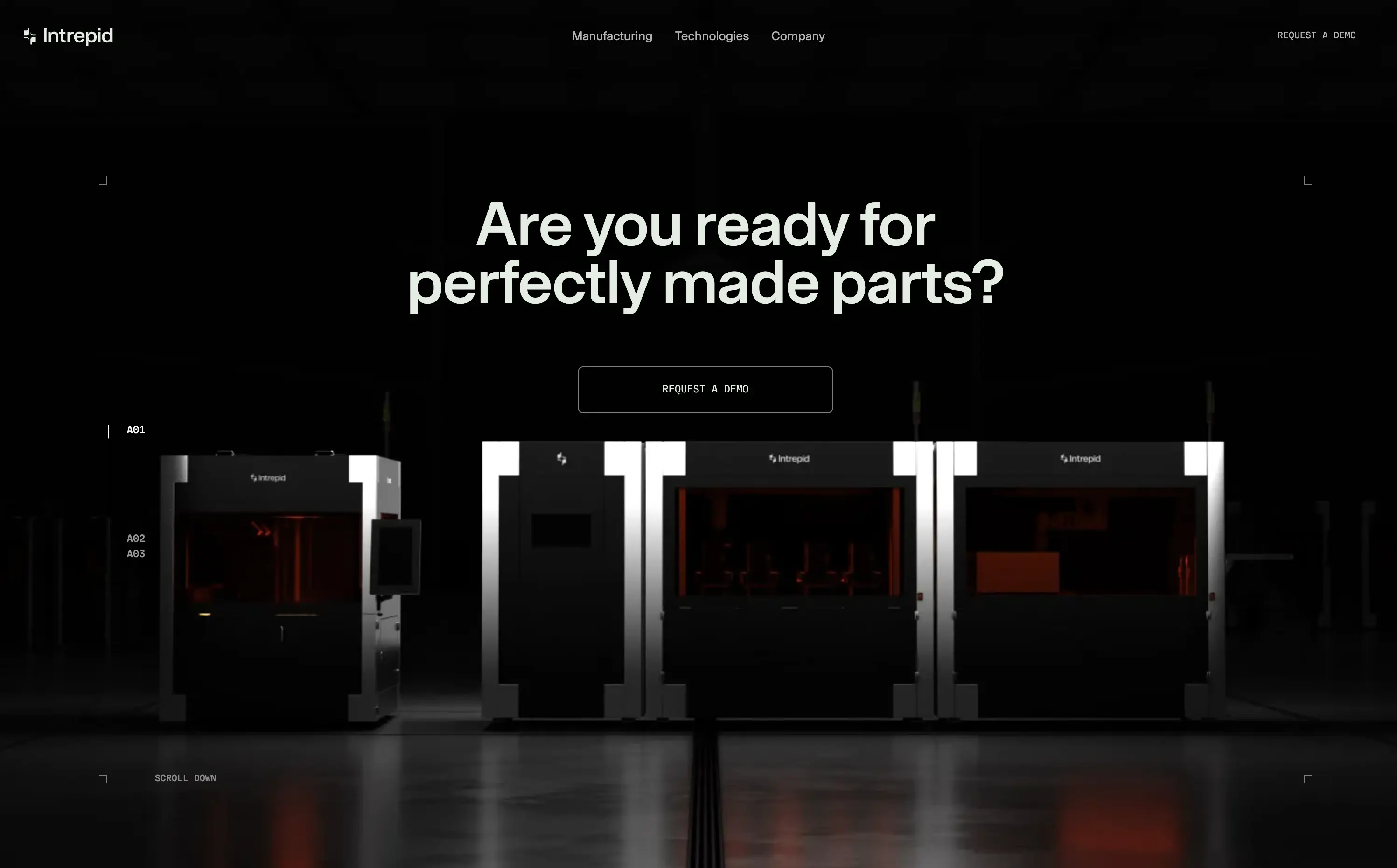
Industrial 3D‑printing company making automated hardware systems that produce precise parts at production scale for manufacturers.
Industrial 3D‑printing company making automated hardware systems that produce precise parts at production scale for manufacturers.
Visual gravitas matches enterprise buyers seeking reliability. Centered demo CTA suits high‑touch sales funnel. Message aligns with pain of imperfect parts, reinforcing positioning as quality‑first hardware partner.
This layout balances technical utility with human impact, aligning well with Algolia’s positioning as an API-first but UX-aware company. The mobile UI reinforces product value visually, while the logo wall signals scale and trust for enterprise buyers. The tone is clear, benefit-led, and appropriate for high-intent decision-makers evaluating AI tools for customer experience. This is a solid enterprise-facing hero built to perform.
Intrepid
↗
Hardware
Centered
Benefit-Driven
Confident
Single Button
Photography
Loading Animation
3D visuals
Dark Mode
Orange
Sans serif
B2B
Home Page
Custom Code
dark hero, industrial hardware, 3D printing, automation tech, demo‑first CTA, mint headline, orange glow accents, centered layout, B2B manufacturing, sleek machines, full‑width image, high contrast, precise messaging
Industrial 3D‑printing company making automated hardware systems that produce precise parts at production scale for manufacturers.
Industrial 3D‑printing company making automated hardware systems that produce precise parts at production scale for manufacturers.
Visual gravitas matches enterprise buyers seeking reliability. Centered demo CTA suits high‑touch sales funnel. Message aligns with pain of imperfect parts, reinforcing positioning as quality‑first hardware partner.
This layout balances technical utility with human impact, aligning well with Algolia’s positioning as an API-first but UX-aware company. The mobile UI reinforces product value visually, while the logo wall signals scale and trust for enterprise buyers. The tone is clear, benefit-led, and appropriate for high-intent decision-makers evaluating AI tools for customer experience. This is a solid enterprise-facing hero built to perform.
n8n
↗
SaaS
AI Tools
No-Code
Left-aligned
Benefit-Driven
Professional
Multi-CTA Block
Interactive
Product UI
Custom Animation
Dark Mode
Purple
Orange
Sans serif
B2B
Home Page
Custom Code
workflow automation, open source, dev-first, agent-based logic, enterprise-ready, dark UI, custom hosting, role-based use cases, badge grid, high-contrast visual, infra-integrated
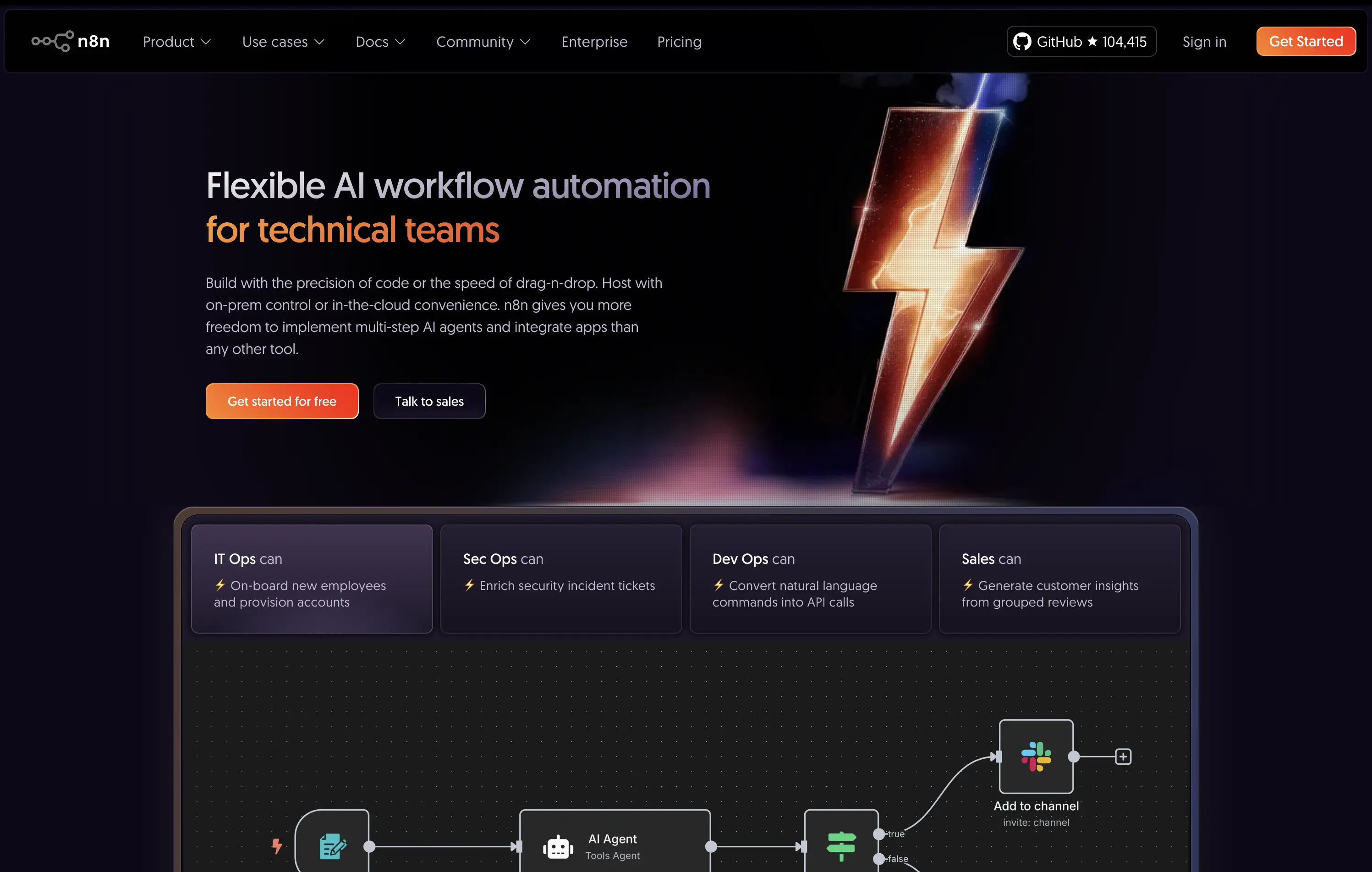
An open-source AI workflow automation tool for developers and teams to build, host, and manage agents with full control.
The hero clearly communicates audience and value: “technical teams” is front-loaded, supported by use-case-specific tiles. The lightning bolt graphic adds memorability, while the product UI below supports credibility.
Strongly positioned for a technical, enterprise-leaning audience. The copy and structure match maturity and decision-maker needs. Hosting flexibility is a key differentiator.
This layout balances technical utility with human impact, aligning well with Algolia’s positioning as an API-first but UX-aware company. The mobile UI reinforces product value visually, while the logo wall signals scale and trust for enterprise buyers. The tone is clear, benefit-led, and appropriate for high-intent decision-makers evaluating AI tools for customer experience. This is a solid enterprise-facing hero built to perform.
n8n
↗
SaaS
AI Tools
No-Code
Left-aligned
Benefit-Driven
Professional
Multi-CTA Block
Interactive
Product UI
Custom Animation
Dark Mode
Purple
Orange
Sans serif
B2B
Home Page
Custom Code
workflow automation, open source, dev-first, agent-based logic, enterprise-ready, dark UI, custom hosting, role-based use cases, badge grid, high-contrast visual, infra-integrated
An open-source AI workflow automation tool for developers and teams to build, host, and manage agents with full control.
The hero clearly communicates audience and value: “technical teams” is front-loaded, supported by use-case-specific tiles. The lightning bolt graphic adds memorability, while the product UI below supports credibility.
Strongly positioned for a technical, enterprise-leaning audience. The copy and structure match maturity and decision-maker needs. Hosting flexibility is a key differentiator.
This layout balances technical utility with human impact, aligning well with Algolia’s positioning as an API-first but UX-aware company. The mobile UI reinforces product value visually, while the logo wall signals scale and trust for enterprise buyers. The tone is clear, benefit-led, and appropriate for high-intent decision-makers evaluating AI tools for customer experience. This is a solid enterprise-facing hero built to perform.
Sanity
↗
SaaS
DevTools
Full Width
Descriptive
Multi-CTA Block
Video
Logo Wall
Announcement
Imagery-Based
White
Orange
Sans serif
B2B
Home Page
Custom Code
programmable content, developer-first CMS, content infrastructure, CLI install, terminal-ready, layered layout, utility CTA, heavy visual load, startup-to-enterprise scale, code-native UX, tech-forward brand, headless CMS, dark visual tone
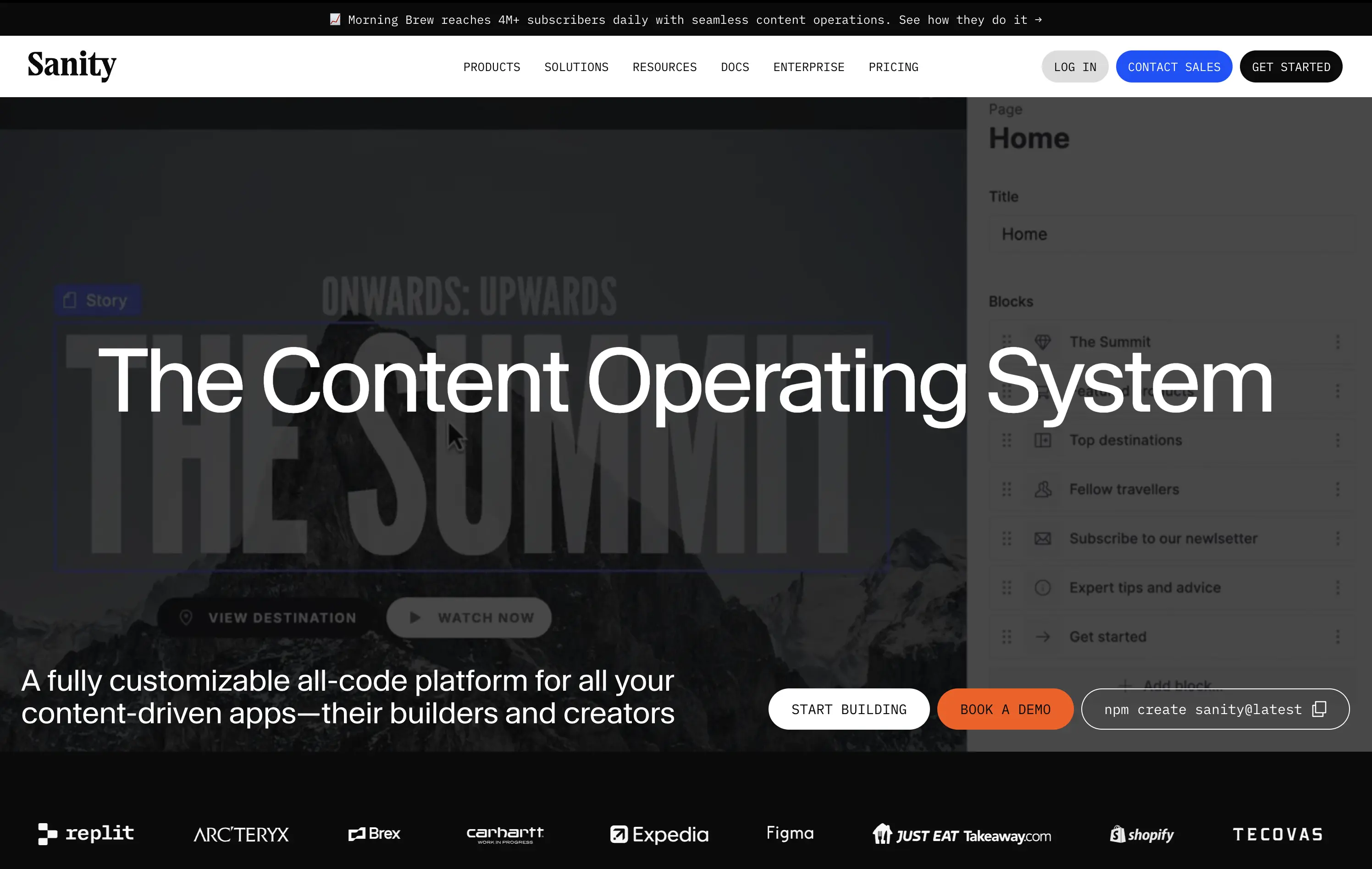
Sanity is a customizable, developer-first CMS platform that gives full programmatic control to build scalable content-driven apps.
Copy-to-clipboard npm CTA is highly functional and aligned with dev habits. But overall hierarchy is cluttered—UI overlay, imagery, and CTAs fight for attention, making the first impression a bit noisy.
Great strategic anchor for a technical audience, but risks cognitive overload on entry. Needs tighter content framing to sharpen focus for first-time visitors.
This layout balances technical utility with human impact, aligning well with Algolia’s positioning as an API-first but UX-aware company. The mobile UI reinforces product value visually, while the logo wall signals scale and trust for enterprise buyers. The tone is clear, benefit-led, and appropriate for high-intent decision-makers evaluating AI tools for customer experience. This is a solid enterprise-facing hero built to perform.
Sanity
↗
SaaS
DevTools
Full Width
Descriptive
Multi-CTA Block
Video
Logo Wall
Announcement
Imagery-Based
White
Orange
Sans serif
B2B
Home Page
Custom Code
programmable content, developer-first CMS, content infrastructure, CLI install, terminal-ready, layered layout, utility CTA, heavy visual load, startup-to-enterprise scale, code-native UX, tech-forward brand, headless CMS, dark visual tone
Sanity is a customizable, developer-first CMS platform that gives full programmatic control to build scalable content-driven apps.
Copy-to-clipboard npm CTA is highly functional and aligned with dev habits. But overall hierarchy is cluttered—UI overlay, imagery, and CTAs fight for attention, making the first impression a bit noisy.
Great strategic anchor for a technical audience, but risks cognitive overload on entry. Needs tighter content framing to sharpen focus for first-time visitors.
This layout balances technical utility with human impact, aligning well with Algolia’s positioning as an API-first but UX-aware company. The mobile UI reinforces product value visually, while the logo wall signals scale and trust for enterprise buyers. The tone is clear, benefit-led, and appropriate for high-intent decision-makers evaluating AI tools for customer experience. This is a solid enterprise-facing hero built to perform.
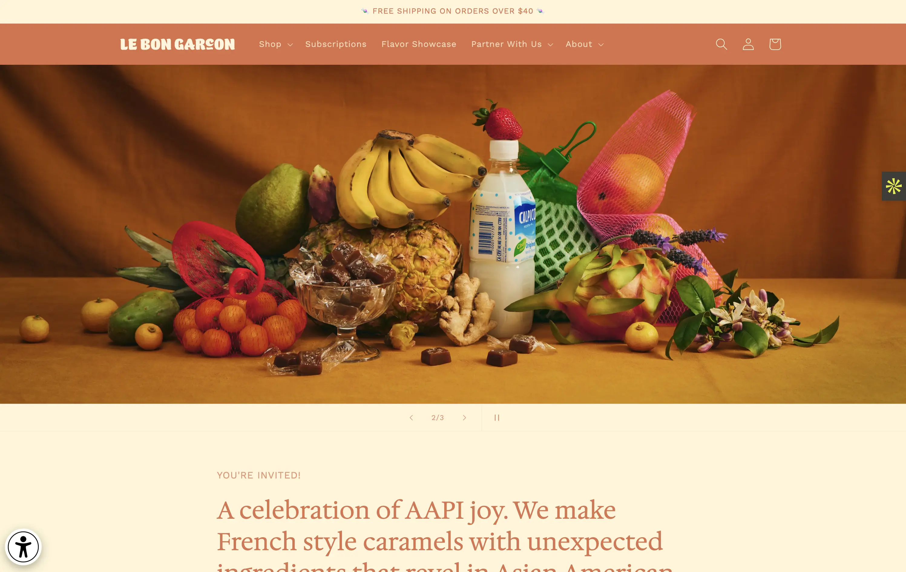
Le Bon Garçon
↗
CPG
Food & Beverage
Editorial
Descriptive
Founder-Led Voice
No CTA
Photography
Media Gallery
Announcement
Duotone
Imagery-Based
Orange
Yellow
Serif
DTC
Home Page
Shopify
nostalgic packaging, elevated DTC candy, premium gifting, Asian-American ingredients, still-life styling, art direction-led, cultural storytelling, warm palette, caramel focus, identity-led CPG, curated feel, editorial aesthetic, flavor storytelling, high design, AAPI founder
A premium confectionery brand reimagining French-style caramels through the lens of Asian-American flavors and storytelling.
This hero leans fully into art direction, with a cinematic still-life that evokes tradition, indulgence, and multicultural vibrancy. There's no obvious CTA, but the experience feels intentional and immersive. The visual composition draws curiosity and reflects a product crafted with care. The copy introduces cultural relevance and flavor positioning effectively, though some may miss a direct product hook.
Perfect for brand-aware shoppers and gifting segments. A visual-first approach supports premium positioning and cultural storytelling over hard conversion.
This layout balances technical utility with human impact, aligning well with Algolia’s positioning as an API-first but UX-aware company. The mobile UI reinforces product value visually, while the logo wall signals scale and trust for enterprise buyers. The tone is clear, benefit-led, and appropriate for high-intent decision-makers evaluating AI tools for customer experience. This is a solid enterprise-facing hero built to perform.
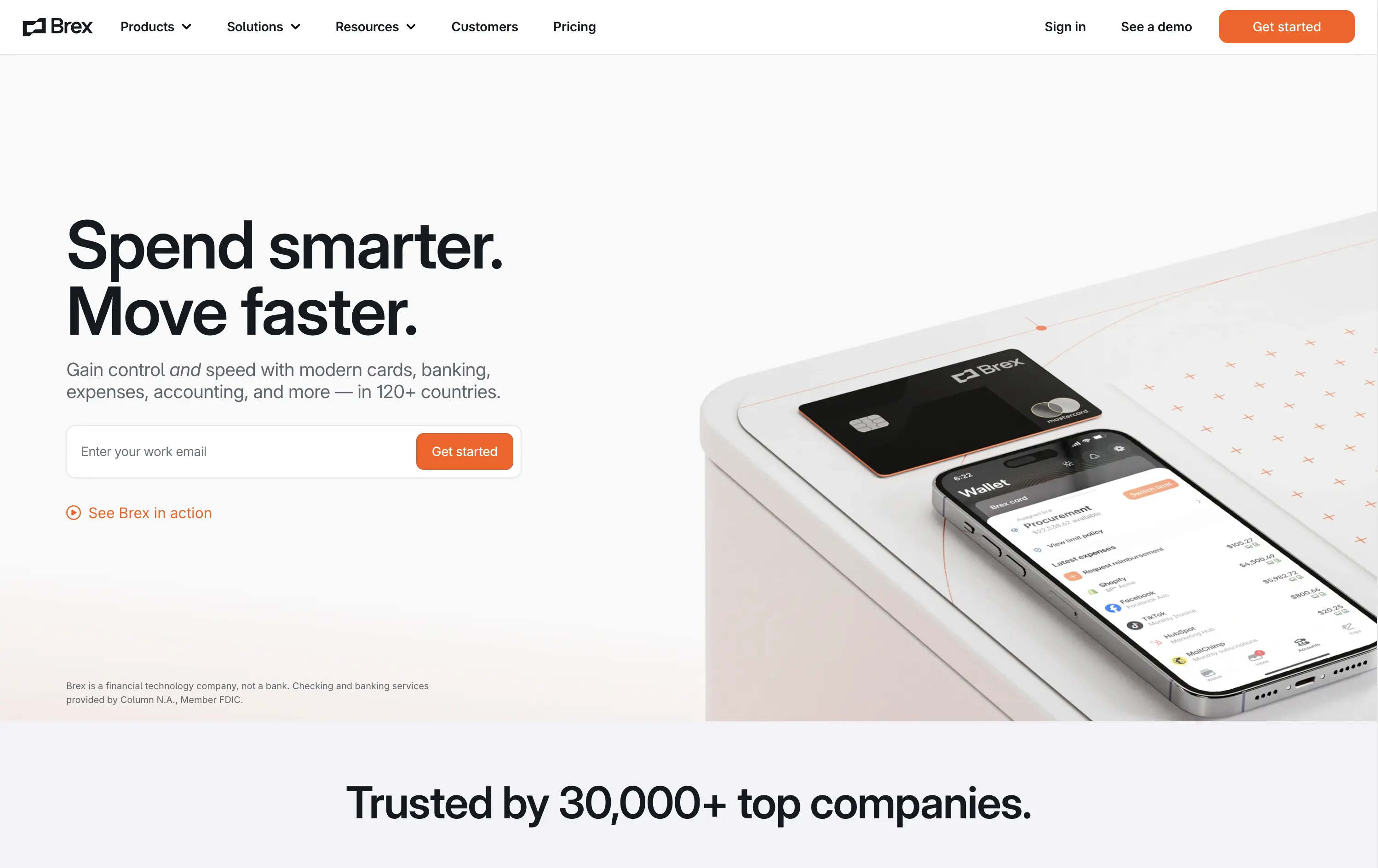
Brex
↗
SaaS
Fintech
Split Grid
Left-aligned
Benefit-Driven
Confident
Email Capture
Product UI
Social Proof
3D visuals
Light Mode
Orange
Sans serif
B2B
Home Page
Custom Code
global finance platform, expense automation, control and speed messaging, embedded email field, startup to enterprise, international SaaS, B2B fintech, conversion-led layout, modern finance stack, clean UI, sharp tone, input-first UX, mobile + card visual, minimalist grid
Brex is a global financial platform offering cards, banking, and expense tools for fast-scaling companies in 120+ countries.
This hero nails first-contact clarity. The headline hits fast with rhythmic, benefit-led language, while the subhead contextualizes product depth across spend, banking, and scale. The layout leads with a form-first interaction, pushing immediate action, while the micro-CTA (“See Brex in action”) gives skeptics a softer entry point. The 3D product mockup adds credibility and sharpens the tech-forward appeal. Nothing feels redundant — every element either informs or converts. The result is frictionless, enterprise-friendly, and confident without oversell.
Speaks directly to startup and scale-up operators. Prioritizes control and speed — key brand levers for high-growth companies. Balanced tone and visual logic establish Brex as both trusted and technically future-ready.
This layout balances technical utility with human impact, aligning well with Algolia’s positioning as an API-first but UX-aware company. The mobile UI reinforces product value visually, while the logo wall signals scale and trust for enterprise buyers. The tone is clear, benefit-led, and appropriate for high-intent decision-makers evaluating AI tools for customer experience. This is a solid enterprise-facing hero built to perform.
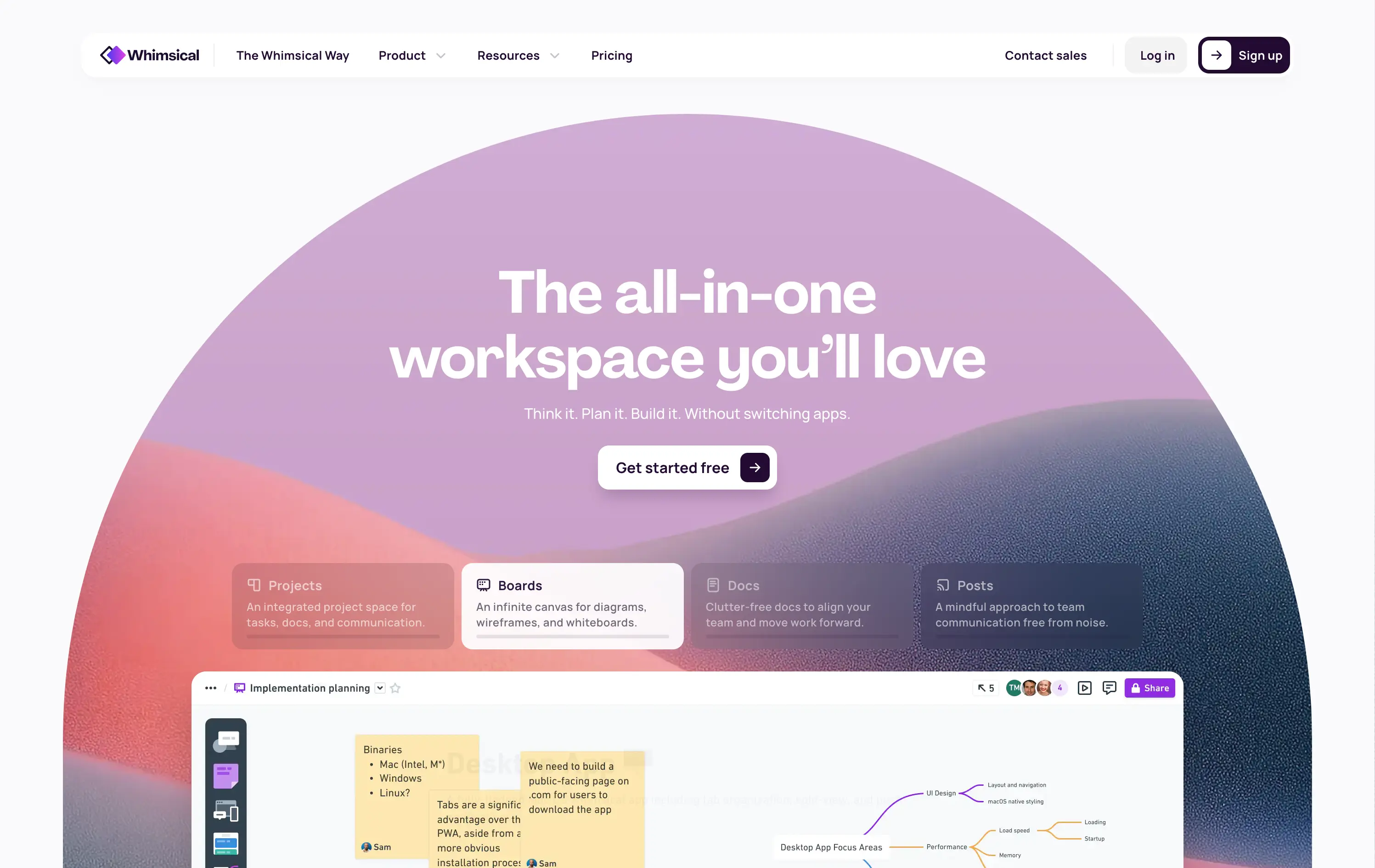
Whimsical
↗
SaaS
Collaboration
Productivity
Inset
Centered
Benefit-Driven
Empowering
Single Button
Illustration
Interactive
Product UI
Gradient
Light Mode
Pink
Purple
Orange
Sans serif
B2B
Home Page
Custom Code
collaborative workspace, pastel gradient, feature carousel, lightweight SaaS, sticky headline, soft UI, premium-yet-friendly, high-trust design, zero-friction onboarding, visual task planning, alternative to Miro, team productivity
Whimsical is an all-in-one visual workspace for teams to plan, wireframe, write, and collaborate—without switching between tools.
The hero immediately differentiates with its warm, gradient-driven palette and curved editorial layout. Headline is sticky and emotional, while the subheadline cues action and ease. Below, animated modules skim through key features—smartly designed to reduce cognitive load while expanding curiosity. The product UI is fully visible and feels friendly. CTA is low friction and well-placed. Compared to competitors, this layout feels more human-centered and less corporate, while still conveying product intelligence.
Strong product-led growth positioning with emotional stickiness. Visuals balance friendliness with focus. Motion helps drive upfront clarity, and layout choice favors quick scanning—well-suited for both individual users and team leads.
This layout balances technical utility with human impact, aligning well with Algolia’s positioning as an API-first but UX-aware company. The mobile UI reinforces product value visually, while the logo wall signals scale and trust for enterprise buyers. The tone is clear, benefit-led, and appropriate for high-intent decision-makers evaluating AI tools for customer experience. This is a solid enterprise-facing hero built to perform.
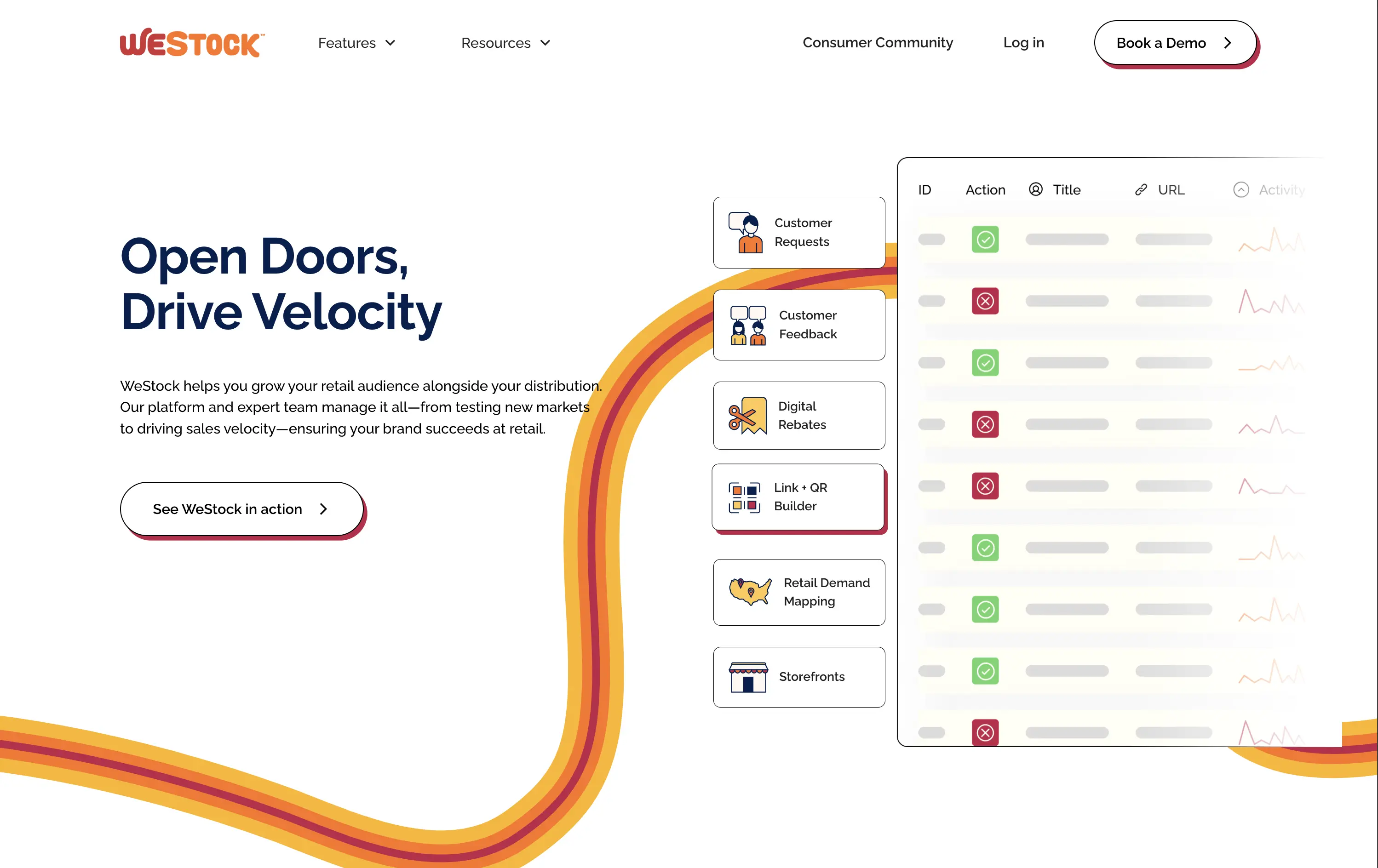
WeStock
↗
SaaS
Split Grid
Left-aligned
Abstract / Conceptual
Single Button
Illustration
Interactive
Product UI
Light Mode
Red
Orange
Yellow
Sans serif
B2B
Home Page
Webflow
retail analytics, B2B SaaS, colorful path motif, feature reveal, scroll effect, clean layout, product-led hero, multicolored interface, CPG enablement, UI preview, startup brand tone, sales-velocity focus, modern B2B
WeStock helps brands grow at retail by using data and consumer demand to drive velocity and streamline distribution.
This hero gets to the point quickly. The headline is bold, the subcopy is informative, and the UI sample makes the product feel real. The color path is a clever directional device. Visual hierarchy works, though the CTA could use stronger visual emphasis to better guide next-step intent.
A clear, professional intro for early-stage and growth CPG brands. Balances explanation with intrigue. Strong brand coherence, great visual metaphor, and effective low-friction education. CTA clarity is good; visibility needs boost.
This layout balances technical utility with human impact, aligning well with Algolia’s positioning as an API-first but UX-aware company. The mobile UI reinforces product value visually, while the logo wall signals scale and trust for enterprise buyers. The tone is clear, benefit-led, and appropriate for high-intent decision-makers evaluating AI tools for customer experience. This is a solid enterprise-facing hero built to perform.
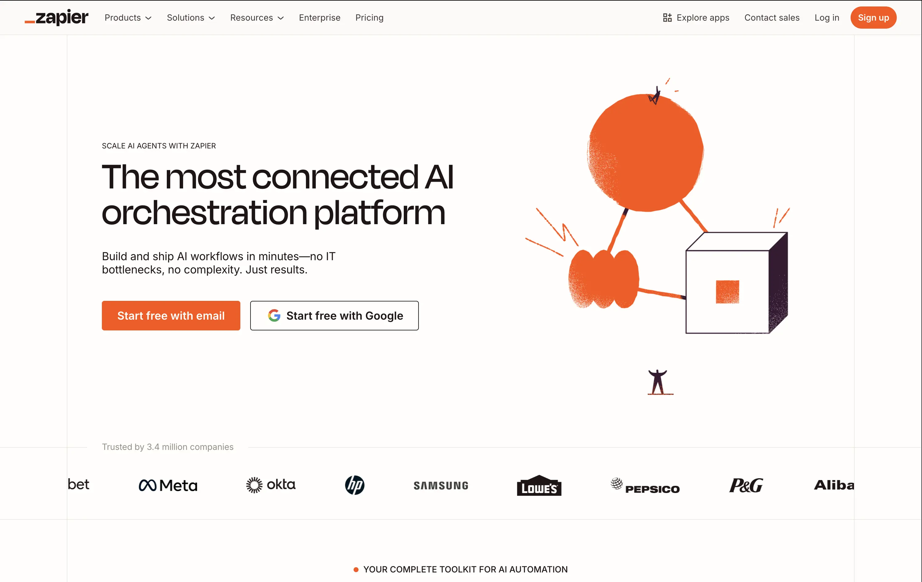
Zapier
↗
SaaS
AI Tools
No-Code
Split Grid
Left-aligned
Confident
Multi-CTA Block
Illustration
Logo Wall
Light Mode
Orange
Sans serif
Hybrid
Home Page
Builder.io
automation platform, brand-led, Zapier orange, illustration-based hero, high-trust layout, whitespace-heavy, freemium SaaS, mature product, enterprise credibility, visual shorthand, no-code workflow, minimal UI, no-code
Zapier is a no-code automation platform that connects 8,000+ apps so anyone can build time-saving workflows without engineering help.
The hero does a clean job of reinforcing brand authority. Copy is tight and direct. The whimsical graphic adds energy while the dual CTAs eliminate friction. It assumes pre-awareness and leans on Zapier’s brand strength.
Ideal for a mature product with wide adoption. Skips granular education to emphasize leadership and ease of use. Visuals and messaging feel like a confident category owner.
This layout balances technical utility with human impact, aligning well with Algolia’s positioning as an API-first but UX-aware company. The mobile UI reinforces product value visually, while the logo wall signals scale and trust for enterprise buyers. The tone is clear, benefit-led, and appropriate for high-intent decision-makers evaluating AI tools for customer experience. This is a solid enterprise-facing hero built to perform.
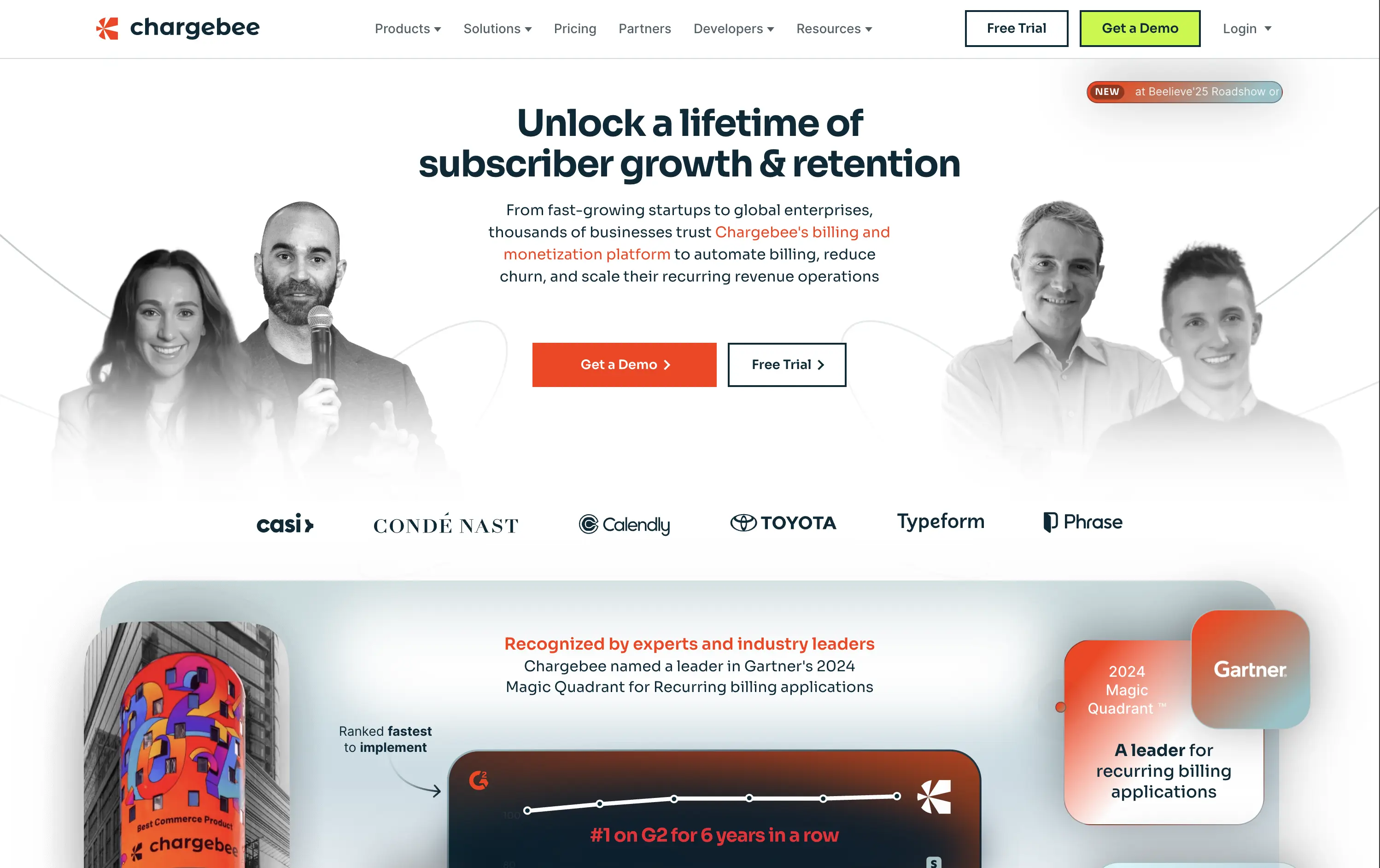
Chargebee
↗
SaaS
Fintech
Centered
Benefit-Driven
Bold & Direct
Multi-CTA Block
Photography
Logo Wall
Social Proof
Light Mode
Green
Orange
Sans serif
B2B
Home Page
Wordpress
B2B SaaS, billing automation, subscription platform, enterprise-ready, credibility-first, leadership positioning, founder imagery, logo wall, dual CTA, Gartner badge, G2 recognition, growth-focused messaging, recurring revenue
Chargebee helps businesses automate recurring billing, reduce churn, and scale subscription revenue through a trusted enterprise-ready platform.
The hero leads with a sharp, benefit-packed headline and backs it up with high-trust signals: real customer faces, name-brand logos, and third-party awards. The “Get a Demo” and “Free Trial” CTAs give users both enterprise and self-serve paths, but visual hierarchy between the two could be better balanced. Copy is outcome-focused and credible.
Smartly targeted at growth-stage and enterprise buyers, but the visual language undersells its category leadership. Strong content mix, but design lacks the presence or edge to reinforce premium positioning.
This layout balances technical utility with human impact, aligning well with Algolia’s positioning as an API-first but UX-aware company. The mobile UI reinforces product value visually, while the logo wall signals scale and trust for enterprise buyers. The tone is clear, benefit-led, and appropriate for high-intent decision-makers evaluating AI tools for customer experience. This is a solid enterprise-facing hero built to perform.
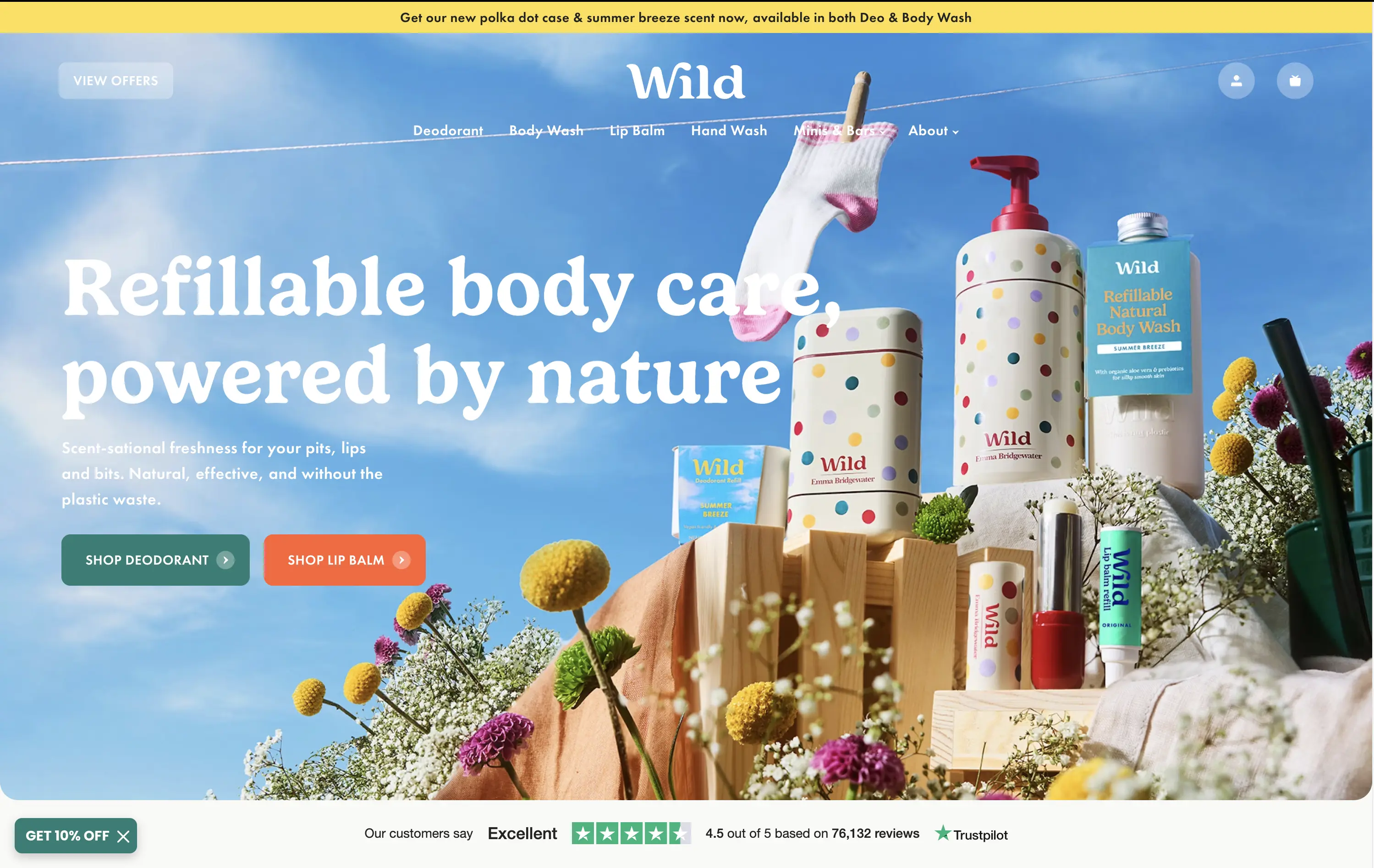
Wild
↗
CPG
Beauty & Wellness
Sustainability
Full Width
Left-aligned
Bold & Direct
Multi-CTA Block
Social Proof
Announcement
Imagery-Based
Green
Orange
Serif
DTC
Home Page
Shopify
eco-conscious, refillable packaging, summer aesthetic, photo-based hero, colorful packaging, nature-forward, trustbar visible, multi-CTA, DTC beauty, vibrant product shot, planet-positive, sunlit tone, clean bodycare
Wild offers refillable personal care products that are plastic-free, eco-friendly, and designed for everyday routines.
Bright, joyful photography captures the brand’s eco-fresh ethos while showcasing the full product range in one glance. Bold headline contrasts nicely with the sky backdrop, and CTAs are well-placed for quick shopper entry. Trustpilot widget reinforces credibility. While it’s vibrant and approachable, background details might slightly interfere with copy clarity on smaller screens.
Clear value prop and visual narrative tailored to eco-conscious DTC buyers. Emotional appeal (freshness, fun, nature) is balanced with proof (Trustpilot) and conversion intent. Could improve copy visibility slightly on mobile.
This layout balances technical utility with human impact, aligning well with Algolia’s positioning as an API-first but UX-aware company. The mobile UI reinforces product value visually, while the logo wall signals scale and trust for enterprise buyers. The tone is clear, benefit-led, and appropriate for high-intent decision-makers evaluating AI tools for customer experience. This is a solid enterprise-facing hero built to perform.
The most effective hero sections in your inbox.
Monthly round up of top hero sections.
Don't worry. We hate spam too.
Don't worry. We hate spam too.
Don't worry. We hate spam too.