Pink
11
11
11
11
Filters
Orchids
↗
AI Tools
No-Code
Creative Tools
Centered
Benefit-Driven
Aspirational
Search/Utility Block
Interactive
Product UI
Imagery-Based
Pink
Black
Serif
B2C
Home Page
Custom Code
ai site builder, no-code websites, prompt box hero, interactive sandbox, scenic background, gallery proof, centered layout, serif headline, product-led growth, signup gate, creative makers, pastel sky, inspirational copy, landing page builder, web app generator
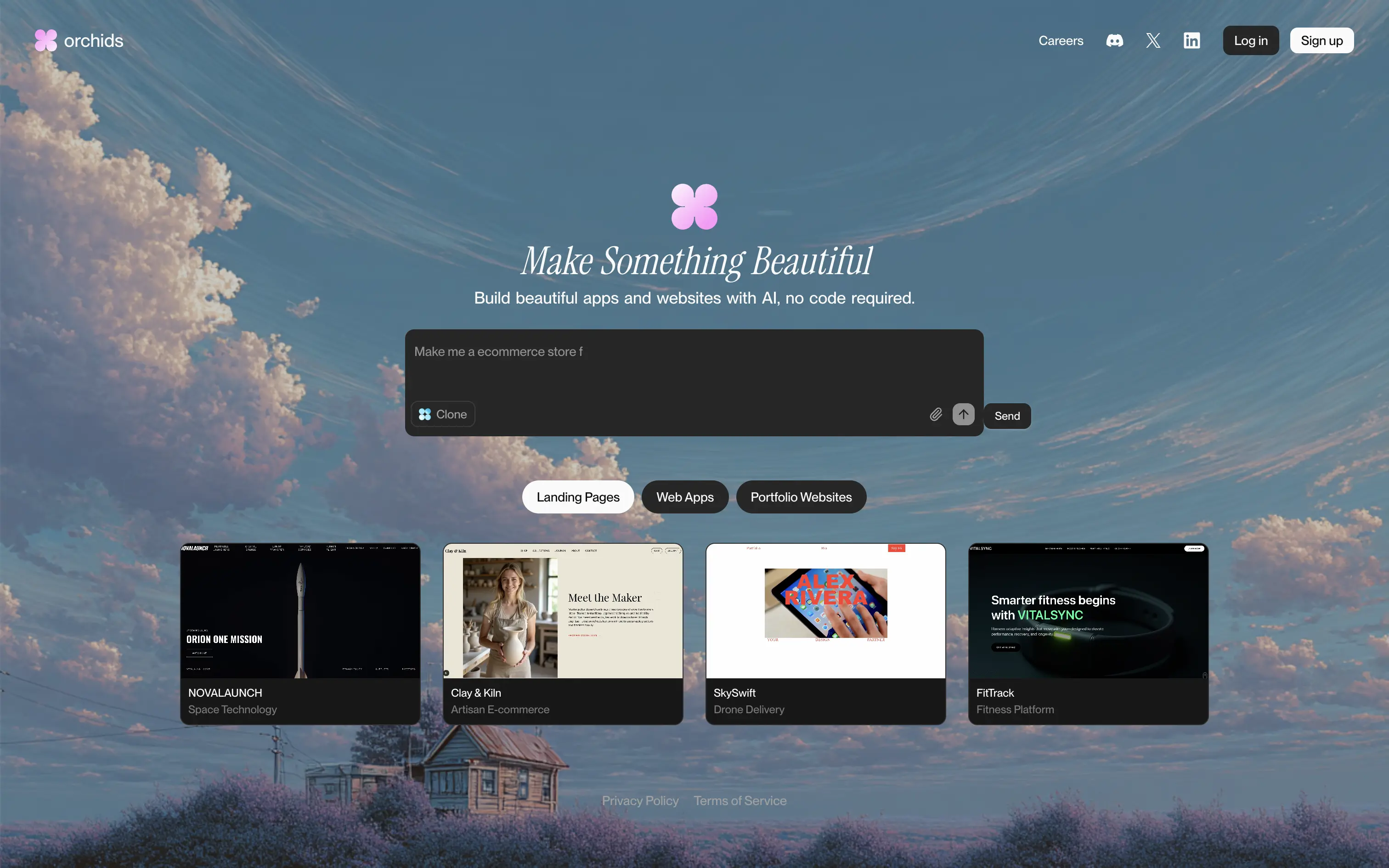
Orchids lets anyone generate full websites or apps from a single text prompt, delivering production-ready code and design without writing a line themselves.
Dreamy sky backdrop and italic serif headline promise beauty, while the live prompt box invites instant play. Thumbnail gallery backs the claim with varied examples. Redirecting to sign-up right after a prompt captures intent but may jar casual visitors. Overall hierarchy is clear and engaging.
Vision-heavy headline hooks design-focused founders; interactive builder demo signals AI uniqueness. Product-led funnel drives conversions, though absence of pricing or social proof leaves credibility to aesthetic appeal alone.
This layout balances technical utility with human impact, aligning well with Algolia’s positioning as an API-first but UX-aware company. The mobile UI reinforces product value visually, while the logo wall signals scale and trust for enterprise buyers. The tone is clear, benefit-led, and appropriate for high-intent decision-makers evaluating AI tools for customer experience. This is a solid enterprise-facing hero built to perform.
Orchids
↗
AI Tools
No-Code
Creative Tools
Centered
Benefit-Driven
Aspirational
Search/Utility Block
Interactive
Product UI
Imagery-Based
Pink
Black
Serif
B2C
Home Page
Custom Code
ai site builder, no-code websites, prompt box hero, interactive sandbox, scenic background, gallery proof, centered layout, serif headline, product-led growth, signup gate, creative makers, pastel sky, inspirational copy, landing page builder, web app generator
Orchids lets anyone generate full websites or apps from a single text prompt, delivering production-ready code and design without writing a line themselves.
Dreamy sky backdrop and italic serif headline promise beauty, while the live prompt box invites instant play. Thumbnail gallery backs the claim with varied examples. Redirecting to sign-up right after a prompt captures intent but may jar casual visitors. Overall hierarchy is clear and engaging.
Vision-heavy headline hooks design-focused founders; interactive builder demo signals AI uniqueness. Product-led funnel drives conversions, though absence of pricing or social proof leaves credibility to aesthetic appeal alone.
This layout balances technical utility with human impact, aligning well with Algolia’s positioning as an API-first but UX-aware company. The mobile UI reinforces product value visually, while the logo wall signals scale and trust for enterprise buyers. The tone is clear, benefit-led, and appropriate for high-intent decision-makers evaluating AI tools for customer experience. This is a solid enterprise-facing hero built to perform.
Hume
↗
SaaS
AI Tools
Centered
Bold & Direct
Confident
Search/Utility Block
Interactive
Announcement
Gradient
Light Mode
Pink
Orange
Sans serif
Hybrid
Home Page
Custom Code
voice ai, text-to-speech, llm, real-time api, developer friendly, pastel gradient, centered hero, interactive demo, single cta, assertive headline, white card, product proof, gradient background, low-friction signup, modern saas
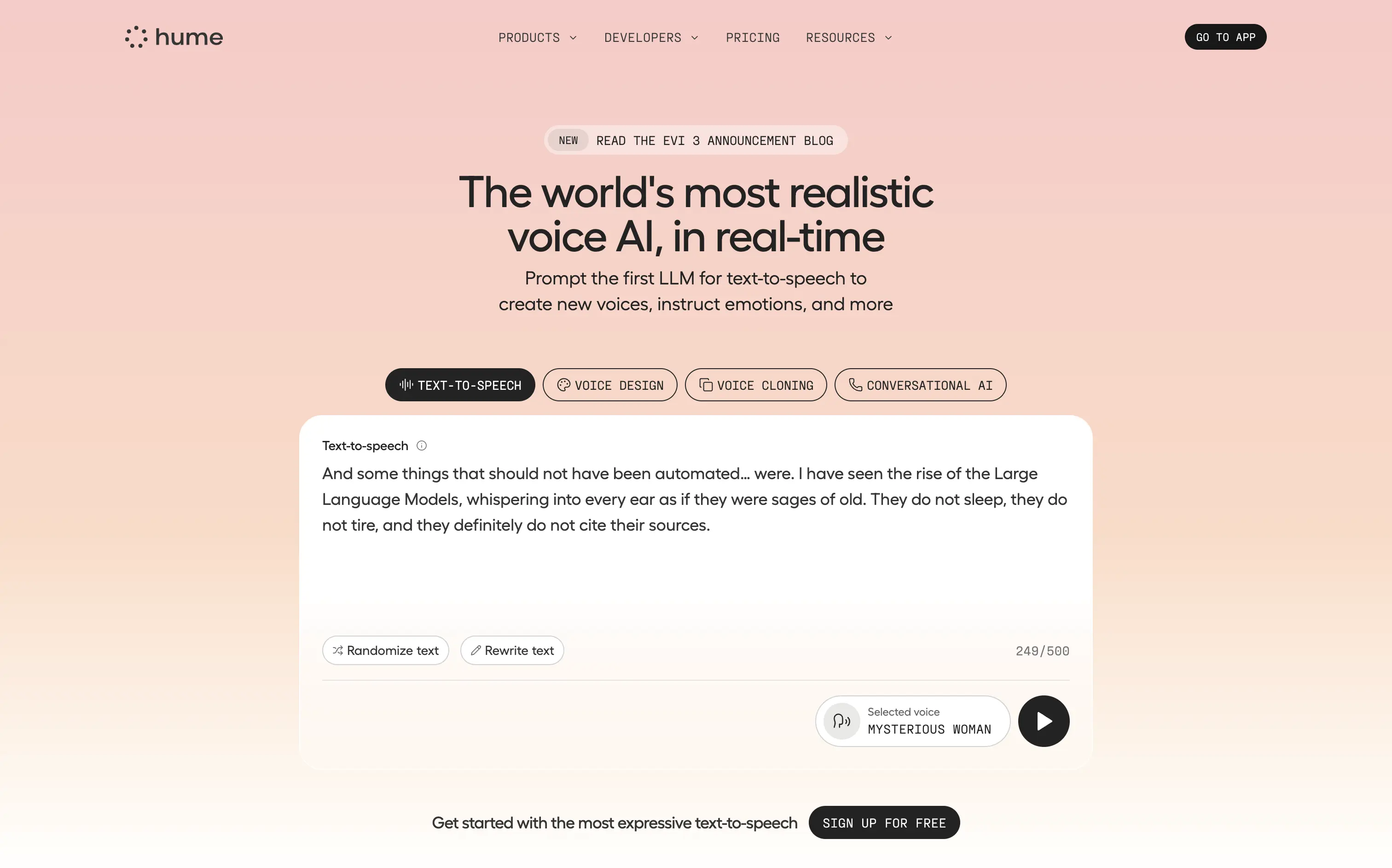
Hume offers a real-time text-to-speech API that lets developers generate lifelike, emotionally nuanced voices or clone existing ones on demand.
Bold claim, proof in one scroll. The live sandbox lets visitors try four core features instantly—a strong trust move. Clear headline, crisp subhead, and “Sign Up For Free” keep focus. Gradient softens tech intensity but may under-signal enterprise heft.
Superlative headline plus instant demo match developer expectations for proof. Single signup path reduces cognitive load, positioning Hume as fast, expressive infrastructure rather than a heavy enterprise suite.
This layout balances technical utility with human impact, aligning well with Algolia’s positioning as an API-first but UX-aware company. The mobile UI reinforces product value visually, while the logo wall signals scale and trust for enterprise buyers. The tone is clear, benefit-led, and appropriate for high-intent decision-makers evaluating AI tools for customer experience. This is a solid enterprise-facing hero built to perform.
Hume
↗
SaaS
AI Tools
Centered
Bold & Direct
Confident
Search/Utility Block
Interactive
Announcement
Gradient
Light Mode
Pink
Orange
Sans serif
Hybrid
Home Page
Custom Code
voice ai, text-to-speech, llm, real-time api, developer friendly, pastel gradient, centered hero, interactive demo, single cta, assertive headline, white card, product proof, gradient background, low-friction signup, modern saas
Hume offers a real-time text-to-speech API that lets developers generate lifelike, emotionally nuanced voices or clone existing ones on demand.
Bold claim, proof in one scroll. The live sandbox lets visitors try four core features instantly—a strong trust move. Clear headline, crisp subhead, and “Sign Up For Free” keep focus. Gradient softens tech intensity but may under-signal enterprise heft.
Superlative headline plus instant demo match developer expectations for proof. Single signup path reduces cognitive load, positioning Hume as fast, expressive infrastructure rather than a heavy enterprise suite.
This layout balances technical utility with human impact, aligning well with Algolia’s positioning as an API-first but UX-aware company. The mobile UI reinforces product value visually, while the logo wall signals scale and trust for enterprise buyers. The tone is clear, benefit-led, and appropriate for high-intent decision-makers evaluating AI tools for customer experience. This is a solid enterprise-facing hero built to perform.
Shareio
↗
Creator Tools
Web3
Editorial
Aspirational
Confident
Single Button
Custom Animation
Loading Animation
3D visuals
Dark Mode
Green
Pink
Serif
B2C
Home Page
Webflow
paywall tech, content monetization, no-upload platform, editorial layout, kinetic typography, web3 creator stack, glowing animation, creator-first, income tools, luxury digital aesthetic
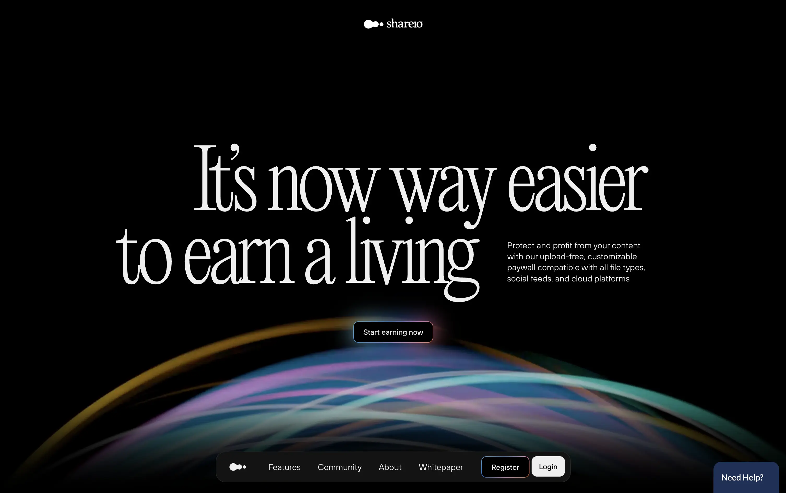
Shareio is a tool for creators to monetize any content via customizable paywalls—no uploads, just link and earn.
The hero is visually magnetic. Oversized serif type and fluid animation deliver a high-end, editorial feel. The core message is emotional, not functional—but the subline recovers clarity.
A bold play for modern creators who value style, independence, and control. The hero builds intrigue through aesthetic gravity but still manages to explain the product’s purpose with restraint.
This layout balances technical utility with human impact, aligning well with Algolia’s positioning as an API-first but UX-aware company. The mobile UI reinforces product value visually, while the logo wall signals scale and trust for enterprise buyers. The tone is clear, benefit-led, and appropriate for high-intent decision-makers evaluating AI tools for customer experience. This is a solid enterprise-facing hero built to perform.
Shareio
↗
Creator Tools
Web3
Editorial
Aspirational
Confident
Single Button
Custom Animation
Loading Animation
3D visuals
Dark Mode
Green
Pink
Serif
B2C
Home Page
Webflow
paywall tech, content monetization, no-upload platform, editorial layout, kinetic typography, web3 creator stack, glowing animation, creator-first, income tools, luxury digital aesthetic
Shareio is a tool for creators to monetize any content via customizable paywalls—no uploads, just link and earn.
The hero is visually magnetic. Oversized serif type and fluid animation deliver a high-end, editorial feel. The core message is emotional, not functional—but the subline recovers clarity.
A bold play for modern creators who value style, independence, and control. The hero builds intrigue through aesthetic gravity but still manages to explain the product’s purpose with restraint.
This layout balances technical utility with human impact, aligning well with Algolia’s positioning as an API-first but UX-aware company. The mobile UI reinforces product value visually, while the logo wall signals scale and trust for enterprise buyers. The tone is clear, benefit-led, and appropriate for high-intent decision-makers evaluating AI tools for customer experience. This is a solid enterprise-facing hero built to perform.
Make
↗
No-Code
Productivity
Split Grid
Descriptive
Empowering
Multi-CTA Block
Video
Announcement
Duotone
Pink
Sans serif
Hybrid
Home Page
Custom Code
no-code automation, workflow builder, AI integration, drag-and-drop editor, Zapier alternative, clear onboarding, SaaS demo UX, trust-focused layout, commercial SaaS, AI-enhanced logic
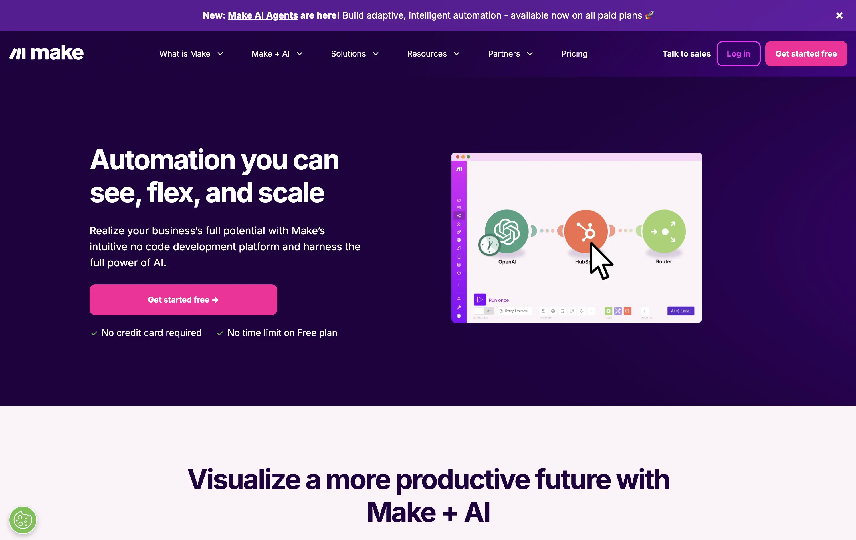
Make is a no-code automation platform that lets businesses visually build and scale workflows powered by AI.
It’s clean, clear, and direct. The animated product video does the heavy lifting. The layout and copy are textbook SaaS—efficient but forgettable. It communicates function well without taking any design risks.
Optimized for clarity and ease of adoption. Great for users shopping for workflow tools, but lacks brand distinctiveness. Plays it safe with a universal SaaS format and gradient palette.
This layout balances technical utility with human impact, aligning well with Algolia’s positioning as an API-first but UX-aware company. The mobile UI reinforces product value visually, while the logo wall signals scale and trust for enterprise buyers. The tone is clear, benefit-led, and appropriate for high-intent decision-makers evaluating AI tools for customer experience. This is a solid enterprise-facing hero built to perform.
Make
↗
No-Code
Productivity
Split Grid
Descriptive
Empowering
Multi-CTA Block
Video
Announcement
Duotone
Pink
Sans serif
Hybrid
Home Page
Custom Code
no-code automation, workflow builder, AI integration, drag-and-drop editor, Zapier alternative, clear onboarding, SaaS demo UX, trust-focused layout, commercial SaaS, AI-enhanced logic
Make is a no-code automation platform that lets businesses visually build and scale workflows powered by AI.
It’s clean, clear, and direct. The animated product video does the heavy lifting. The layout and copy are textbook SaaS—efficient but forgettable. It communicates function well without taking any design risks.
Optimized for clarity and ease of adoption. Great for users shopping for workflow tools, but lacks brand distinctiveness. Plays it safe with a universal SaaS format and gradient palette.
This layout balances technical utility with human impact, aligning well with Algolia’s positioning as an API-first but UX-aware company. The mobile UI reinforces product value visually, while the logo wall signals scale and trust for enterprise buyers. The tone is clear, benefit-led, and appropriate for high-intent decision-makers evaluating AI tools for customer experience. This is a solid enterprise-facing hero built to perform.
Mem
↗
AI Tools
Productivity
Inset
Centered
Benefit-Driven
Empowering
Single Button
Product UI
Announcement
Gradient
Light Mode
Pink
Purple
Sans serif
B2C
Home Page
Framer
ai note app, ambient UI, productivity tool, second brain, writing partner, connected thoughts, knowledge management, pastel color gradient, Gen Z tone, soft product UI, memory system, fast capture, personal knowledge base
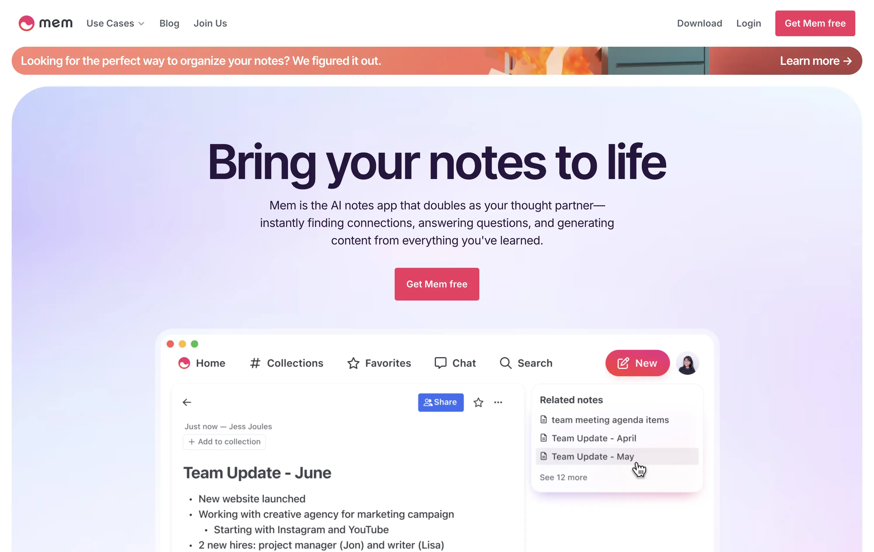
Mem is an AI-powered note-taking app that helps users organize thoughts, generate content, and uncover connections automatically.
Clear and emotional headline matched with a simple product UI. CTA stands out visually. Gradient background and calm visual rhythm support a productivity mindset. Overall, well-structured but slightly generic in messaging.
Positioning as a thought partner sets it apart from basic note apps. Hero leans into AI assistance without overwhelming technicality. Good emotional framing for a consumer productivity tool.
This layout balances technical utility with human impact, aligning well with Algolia’s positioning as an API-first but UX-aware company. The mobile UI reinforces product value visually, while the logo wall signals scale and trust for enterprise buyers. The tone is clear, benefit-led, and appropriate for high-intent decision-makers evaluating AI tools for customer experience. This is a solid enterprise-facing hero built to perform.
Mem
↗
AI Tools
Productivity
Inset
Centered
Benefit-Driven
Empowering
Single Button
Product UI
Announcement
Gradient
Light Mode
Pink
Purple
Sans serif
B2C
Home Page
Framer
ai note app, ambient UI, productivity tool, second brain, writing partner, connected thoughts, knowledge management, pastel color gradient, Gen Z tone, soft product UI, memory system, fast capture, personal knowledge base
Mem is an AI-powered note-taking app that helps users organize thoughts, generate content, and uncover connections automatically.
Clear and emotional headline matched with a simple product UI. CTA stands out visually. Gradient background and calm visual rhythm support a productivity mindset. Overall, well-structured but slightly generic in messaging.
Positioning as a thought partner sets it apart from basic note apps. Hero leans into AI assistance without overwhelming technicality. Good emotional framing for a consumer productivity tool.
This layout balances technical utility with human impact, aligning well with Algolia’s positioning as an API-first but UX-aware company. The mobile UI reinforces product value visually, while the logo wall signals scale and trust for enterprise buyers. The tone is clear, benefit-led, and appropriate for high-intent decision-makers evaluating AI tools for customer experience. This is a solid enterprise-facing hero built to perform.
Plasmic
↗
SaaS
No-Code
Collaboration
Creative Tools
Centered
Benefit-Driven
Descriptive
Single Button
Product UI
Announcement
Gradient
Light Mode
Pink
Purple
Yellow
Sans serif
Hybrid
Home Page
Custom Code
visual builder, code integration, React support, Figma import, developer-friendly, no-code platform, CMS integration, responsive design, real-time collaboration, open-source, component-based, scalable, enterprise-ready, UI/UX design
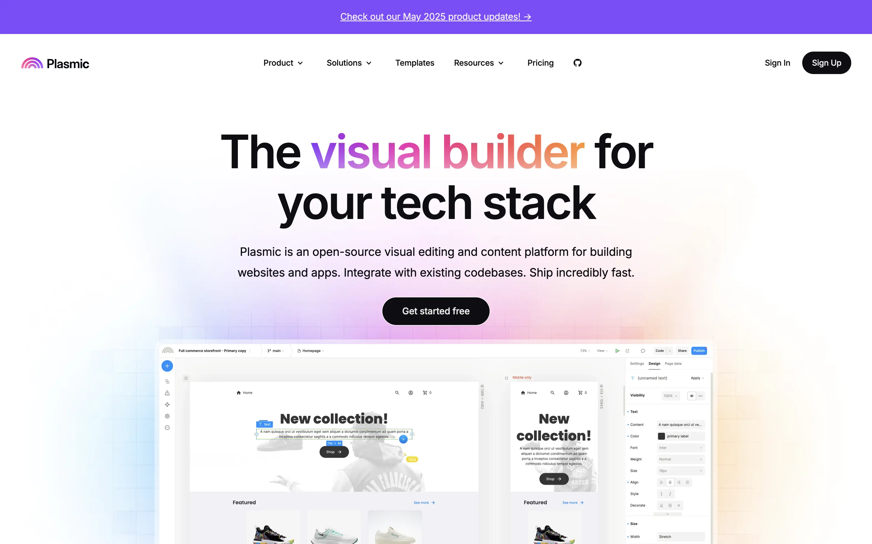
Plasmic is an open-source visual builder that enables teams to design and build web apps and websites rapidly, integrating seamlessly with existing codebases.
The hero section clearly communicates Plasmic's core value proposition as a visual builder for tech stacks. The combination of concise copy and product visuals effectively showcases its capabilities. The inclusion of a logo wall adds credibility, and the CTA is prominently displayed, guiding users toward engagement.
Plasmic positions itself effectively for both developers and non-developers by highlighting seamless code integration and visual editing capabilities. This dual appeal broadens its market reach and addresses common pain points in web development workflows.
This layout balances technical utility with human impact, aligning well with Algolia’s positioning as an API-first but UX-aware company. The mobile UI reinforces product value visually, while the logo wall signals scale and trust for enterprise buyers. The tone is clear, benefit-led, and appropriate for high-intent decision-makers evaluating AI tools for customer experience. This is a solid enterprise-facing hero built to perform.
Plasmic
↗
SaaS
No-Code
Collaboration
Creative Tools
Centered
Benefit-Driven
Descriptive
Single Button
Product UI
Announcement
Gradient
Light Mode
Pink
Purple
Yellow
Sans serif
Hybrid
Home Page
Custom Code
visual builder, code integration, React support, Figma import, developer-friendly, no-code platform, CMS integration, responsive design, real-time collaboration, open-source, component-based, scalable, enterprise-ready, UI/UX design
Plasmic is an open-source visual builder that enables teams to design and build web apps and websites rapidly, integrating seamlessly with existing codebases.
The hero section clearly communicates Plasmic's core value proposition as a visual builder for tech stacks. The combination of concise copy and product visuals effectively showcases its capabilities. The inclusion of a logo wall adds credibility, and the CTA is prominently displayed, guiding users toward engagement.
Plasmic positions itself effectively for both developers and non-developers by highlighting seamless code integration and visual editing capabilities. This dual appeal broadens its market reach and addresses common pain points in web development workflows.
This layout balances technical utility with human impact, aligning well with Algolia’s positioning as an API-first but UX-aware company. The mobile UI reinforces product value visually, while the logo wall signals scale and trust for enterprise buyers. The tone is clear, benefit-led, and appropriate for high-intent decision-makers evaluating AI tools for customer experience. This is a solid enterprise-facing hero built to perform.
Magic Spoon
↗
Food & Beverage
Split Grid
Playful
Multi-CTA Block
Photography
Announcement
Gradient
Multi-color
Pink
Purple
Yellow
Sans serif
DTC
Home Page
Shopify
high-protein cereal, nostalgic breakfast, millennial branding, retro palette, build-your-own-bundle, vibrant color gradient, candy-colored visuals, kid-to-adult rebrand, DTC snack, bold typography, healthified junk food, colorful product styling, split grid layout, energetic tone, premium grocery
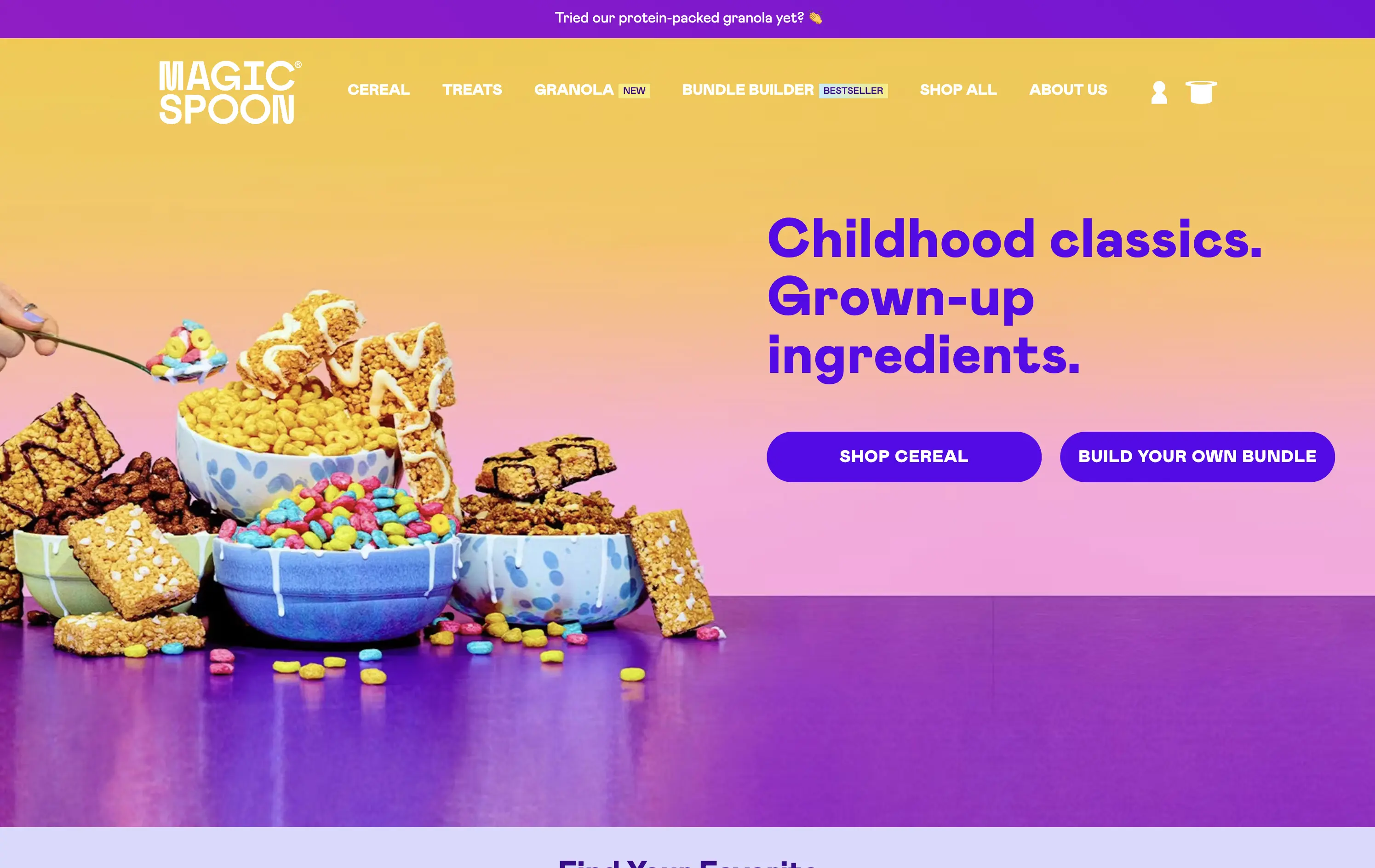
Magic Spoon sells high-protein cereal and snack bars that recreate childhood favorites with adult nutrition standards.
The hero nails the balance between fun and function. Product visuals feel exaggerated in the best way — styled like sugary cereal ads from the ‘90s but paired with benefit-led messaging. The copy is tight and instantly clarifies the value prop. Gradient background and punchy layout draw attention. CTAs are clear, and “build your own bundle” is an engaging utility-led hook.
Smartly crafted for health-conscious millennials who want nostalgia without the sugar crash. The visual-candy look softens the functional message about protein and better ingredients.
This layout balances technical utility with human impact, aligning well with Algolia’s positioning as an API-first but UX-aware company. The mobile UI reinforces product value visually, while the logo wall signals scale and trust for enterprise buyers. The tone is clear, benefit-led, and appropriate for high-intent decision-makers evaluating AI tools for customer experience. This is a solid enterprise-facing hero built to perform.
Magic Spoon
↗
Food & Beverage
Split Grid
Playful
Multi-CTA Block
Photography
Announcement
Gradient
Multi-color
Pink
Purple
Yellow
Sans serif
DTC
Home Page
Shopify
high-protein cereal, nostalgic breakfast, millennial branding, retro palette, build-your-own-bundle, vibrant color gradient, candy-colored visuals, kid-to-adult rebrand, DTC snack, bold typography, healthified junk food, colorful product styling, split grid layout, energetic tone, premium grocery
Magic Spoon sells high-protein cereal and snack bars that recreate childhood favorites with adult nutrition standards.
The hero nails the balance between fun and function. Product visuals feel exaggerated in the best way — styled like sugary cereal ads from the ‘90s but paired with benefit-led messaging. The copy is tight and instantly clarifies the value prop. Gradient background and punchy layout draw attention. CTAs are clear, and “build your own bundle” is an engaging utility-led hook.
Smartly crafted for health-conscious millennials who want nostalgia without the sugar crash. The visual-candy look softens the functional message about protein and better ingredients.
This layout balances technical utility with human impact, aligning well with Algolia’s positioning as an API-first but UX-aware company. The mobile UI reinforces product value visually, while the logo wall signals scale and trust for enterprise buyers. The tone is clear, benefit-led, and appropriate for high-intent decision-makers evaluating AI tools for customer experience. This is a solid enterprise-facing hero built to perform.
Whimsical
↗
SaaS
Collaboration
Productivity
Inset
Centered
Benefit-Driven
Empowering
Single Button
Illustration
Interactive
Product UI
Gradient
Light Mode
Pink
Purple
Orange
Sans serif
B2B
Home Page
Custom Code
collaborative workspace, pastel gradient, feature carousel, lightweight SaaS, sticky headline, soft UI, premium-yet-friendly, high-trust design, zero-friction onboarding, visual task planning, alternative to Miro, team productivity
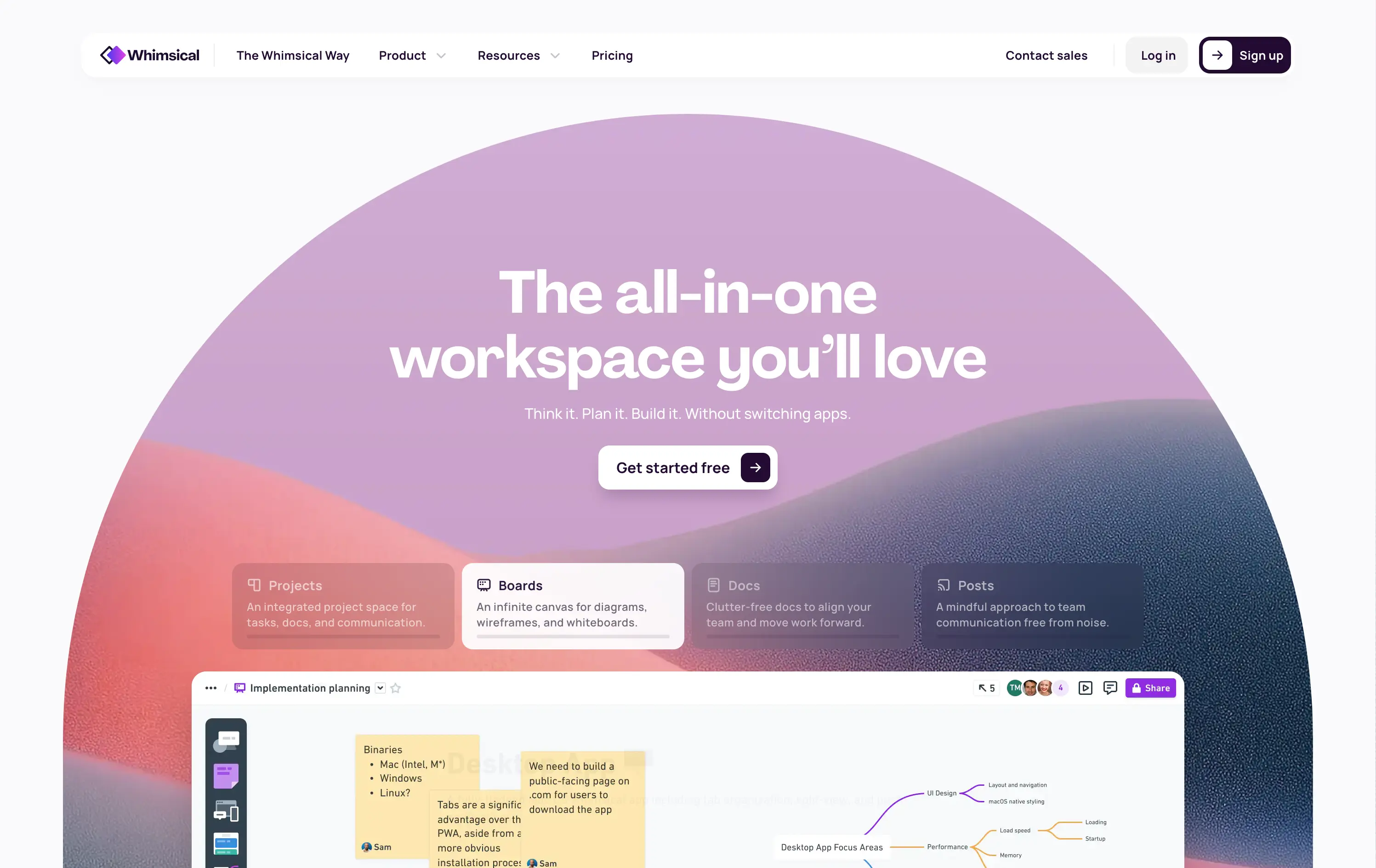
Whimsical is an all-in-one visual workspace for teams to plan, wireframe, write, and collaborate—without switching between tools.
The hero immediately differentiates with its warm, gradient-driven palette and curved editorial layout. Headline is sticky and emotional, while the subheadline cues action and ease. Below, animated modules skim through key features—smartly designed to reduce cognitive load while expanding curiosity. The product UI is fully visible and feels friendly. CTA is low friction and well-placed. Compared to competitors, this layout feels more human-centered and less corporate, while still conveying product intelligence.
Strong product-led growth positioning with emotional stickiness. Visuals balance friendliness with focus. Motion helps drive upfront clarity, and layout choice favors quick scanning—well-suited for both individual users and team leads.
This layout balances technical utility with human impact, aligning well with Algolia’s positioning as an API-first but UX-aware company. The mobile UI reinforces product value visually, while the logo wall signals scale and trust for enterprise buyers. The tone is clear, benefit-led, and appropriate for high-intent decision-makers evaluating AI tools for customer experience. This is a solid enterprise-facing hero built to perform.
Whimsical
↗
SaaS
Collaboration
Productivity
Inset
Centered
Benefit-Driven
Empowering
Single Button
Illustration
Interactive
Product UI
Gradient
Light Mode
Pink
Purple
Orange
Sans serif
B2B
Home Page
Custom Code
collaborative workspace, pastel gradient, feature carousel, lightweight SaaS, sticky headline, soft UI, premium-yet-friendly, high-trust design, zero-friction onboarding, visual task planning, alternative to Miro, team productivity
Whimsical is an all-in-one visual workspace for teams to plan, wireframe, write, and collaborate—without switching between tools.
The hero immediately differentiates with its warm, gradient-driven palette and curved editorial layout. Headline is sticky and emotional, while the subheadline cues action and ease. Below, animated modules skim through key features—smartly designed to reduce cognitive load while expanding curiosity. The product UI is fully visible and feels friendly. CTA is low friction and well-placed. Compared to competitors, this layout feels more human-centered and less corporate, while still conveying product intelligence.
Strong product-led growth positioning with emotional stickiness. Visuals balance friendliness with focus. Motion helps drive upfront clarity, and layout choice favors quick scanning—well-suited for both individual users and team leads.
This layout balances technical utility with human impact, aligning well with Algolia’s positioning as an API-first but UX-aware company. The mobile UI reinforces product value visually, while the logo wall signals scale and trust for enterprise buyers. The tone is clear, benefit-led, and appropriate for high-intent decision-makers evaluating AI tools for customer experience. This is a solid enterprise-facing hero built to perform.
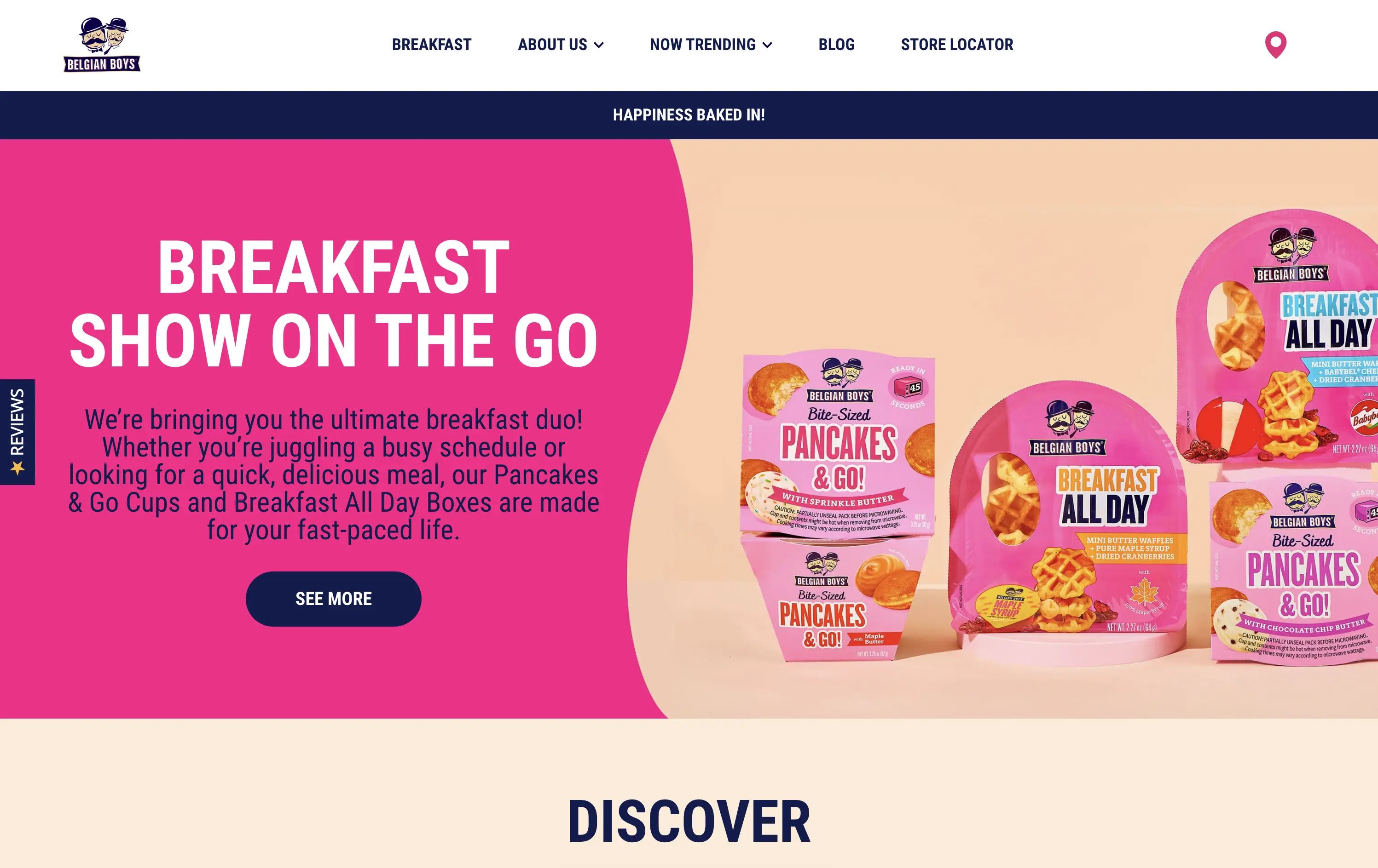
Belgian Boys
↗
CPG
Food & Beverage
Split Grid
Benefit-Driven
Playful
Single Button
Photography
Multi-color
Blue
Pink
Sans serif
DTC
Home Page
Shopify
CPG packaging, breakfast brand, direct-to-consumer, bright pink, snackable meals, product-focused, visual-first, fun tone, food on the go, time-saving meals, supermarket crossover, family-friendly, bold design, colorful grid, accessible copy
Belgian Boys sells fun, ready-to-eat breakfast snacks designed for busy people who want delicious, hassle-free meals.
The hero is loud and unapologetically pink, clearly built for quick scanning. Product packaging is the visual centerpiece, immediately showing what’s on offer. The bold type, simple language, and upbeat color palette make it easy to understand in seconds. The left-right layout balances message and product, while the single CTA is clear and inviting.
Speaks directly to the target buyer: busy, hungry, probably on mobile. The pink and navy color palette feels retail-shelf ready, and the whole layout matches the convenience and joy of the product. A great example of brand alignment through design.
This layout balances technical utility with human impact, aligning well with Algolia’s positioning as an API-first but UX-aware company. The mobile UI reinforces product value visually, while the logo wall signals scale and trust for enterprise buyers. The tone is clear, benefit-led, and appropriate for high-intent decision-makers evaluating AI tools for customer experience. This is a solid enterprise-facing hero built to perform.
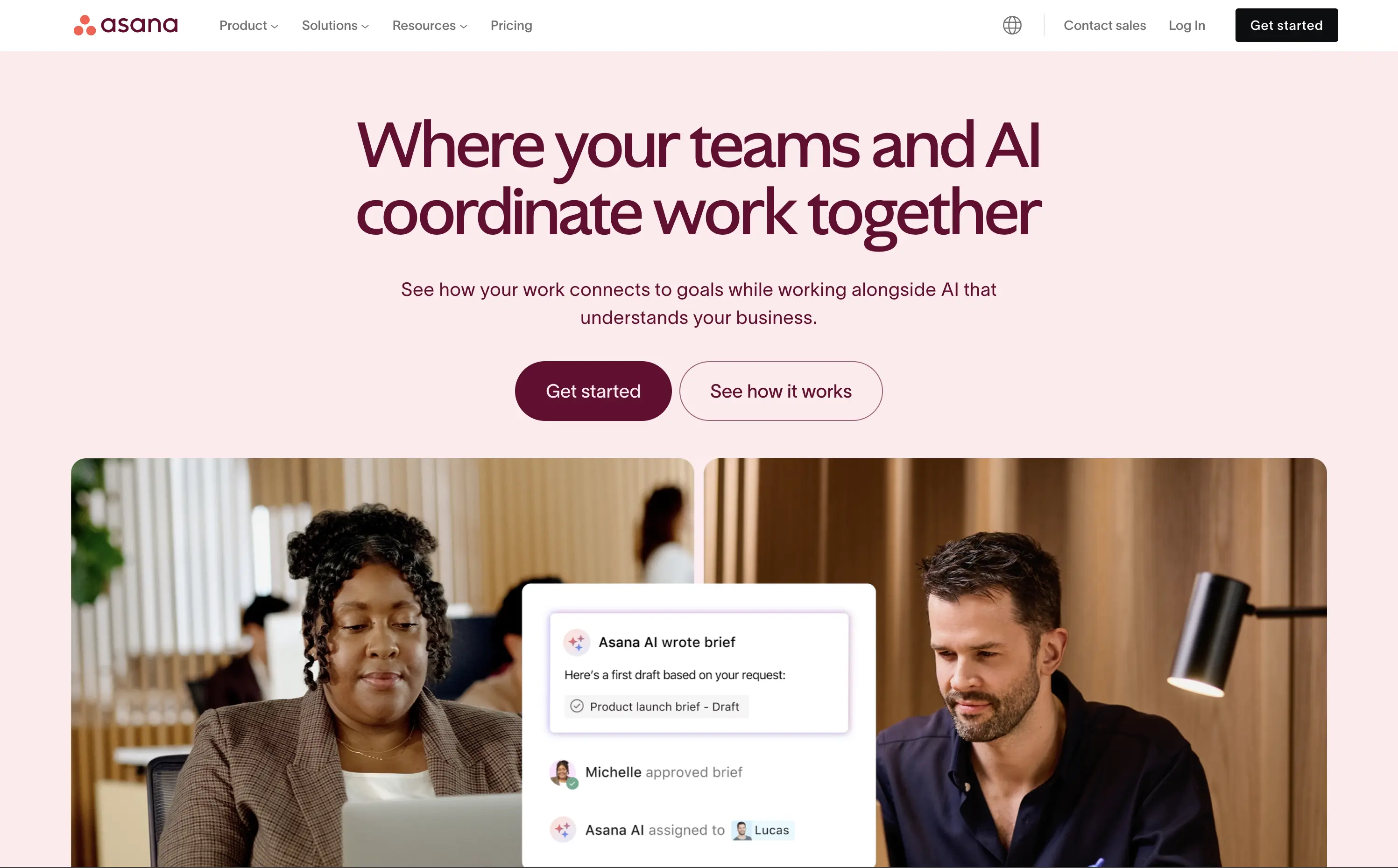
Asana
↗
SaaS
Collaboration
Productivity
Split Grid
Centered
Aspirational
Multi-CTA Block
Custom Animation
Duotone
Pink
Sans serif
B2B
Home Page
Custom Code
work management, project collaboration, AI assistant, team productivity, multi-cta hero
Asana helps organisations plan, track, and automate work—now boosted by an AI assistant that ties tasks to goals.
The hero is serene and strategic. Headline clearly defines the product’s evolution with AI, while visuals combine real people with subtle UI overlays to convey practical usage. Dual CTA is thoughtful and helps segment traffic. Typography and spacing support clarity.
Positions Asana as a next-gen operational tool built for modern teams. The hero shows how AI integrates with workflow, not replaces it. The balance of confidence and calm makes it accessible for mid-market to enterprise users exploring AI productivity.
This layout balances technical utility with human impact, aligning well with Algolia’s positioning as an API-first but UX-aware company. The mobile UI reinforces product value visually, while the logo wall signals scale and trust for enterprise buyers. The tone is clear, benefit-led, and appropriate for high-intent decision-makers evaluating AI tools for customer experience. This is a solid enterprise-facing hero built to perform.
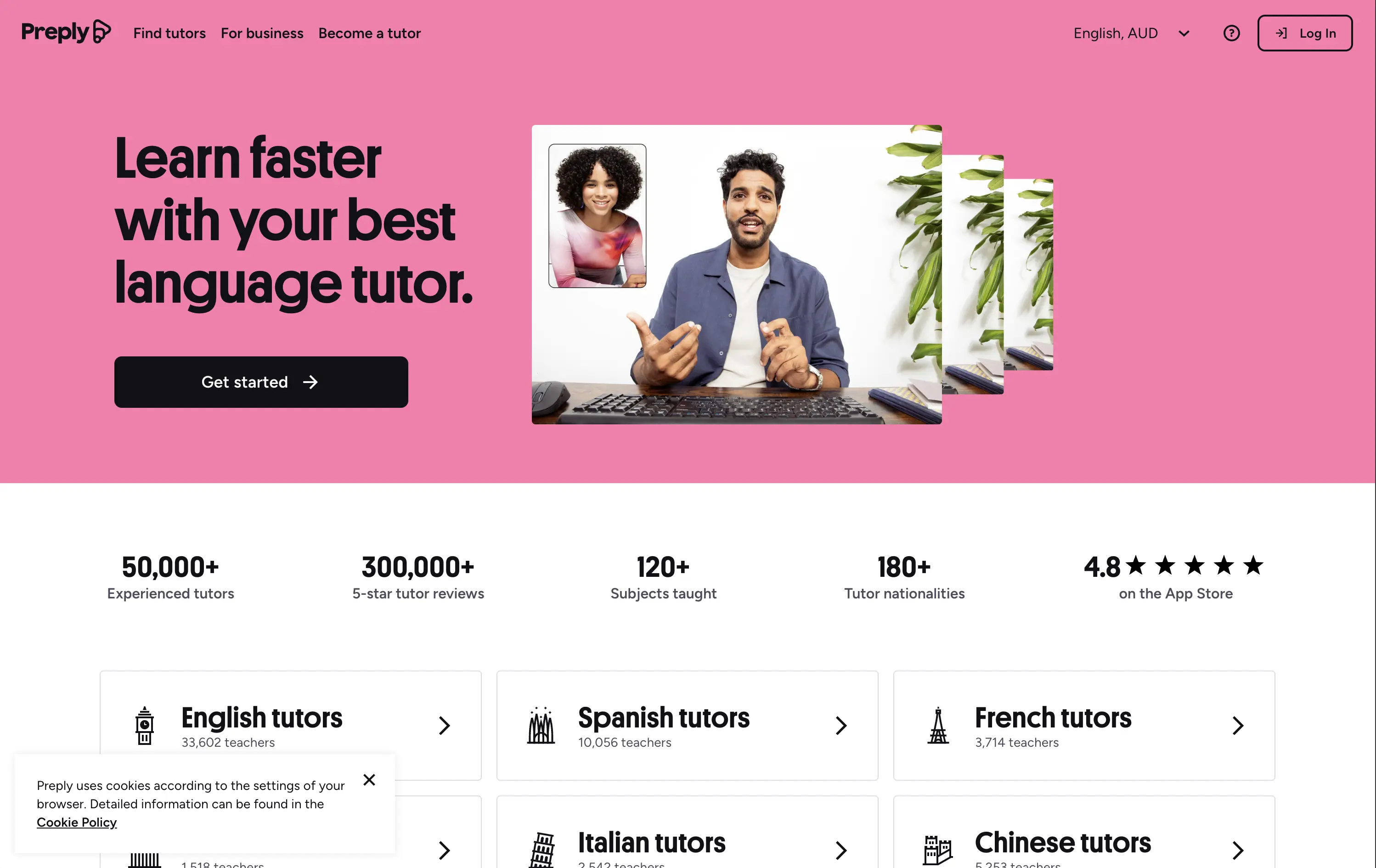
Preply
↗
Education
Left-aligned
Benefit-Driven
Single Button
Photography
Live Metrics
Social Proof
Light Mode
Pink
Black
Home Page
Custom Code
language tutor, online learning, marketplace hero, bold color hero, pink web design, conversational UI, Gen Z UX, bold CTA, tutoring platform, live teaching, zoom call visual, metrics trust banner, marketplace product
Preply is an online learning platform that connects learners with expert language tutors for personalized one-on-one lessons.
This hero punches through with its candy-pink backdrop — a rare choice for marketplaces but totally intentional. The layout is simple, but the stacked imagery still adds dynamism. Stats like “300,000+ 5-star reviews” and “180+ tutor nationalities” instantly establish credibility. The CTA is minimal and clearly actionable. Overall, the tone is upbeat, modern, and universally accessible — ideal for a cross-border education platform aiming to feel both trustworthy and welcoming.
Hero balances global scale with simplicity. Design and tone cater to international learners of all ages. Trust is built through numbers, while layout minimizes friction for new users.
This layout balances technical utility with human impact, aligning well with Algolia’s positioning as an API-first but UX-aware company. The mobile UI reinforces product value visually, while the logo wall signals scale and trust for enterprise buyers. The tone is clear, benefit-led, and appropriate for high-intent decision-makers evaluating AI tools for customer experience. This is a solid enterprise-facing hero built to perform.
The most effective hero sections in your inbox.
Monthly round up of top hero sections.
Don't worry. We hate spam too.
Don't worry. We hate spam too.
Don't worry. We hate spam too.