Social Proof
22
22
22
22
Testimonials, review counts, or user metrics placed prominently.
Filters
Bonsai
↗
SaaS
Productivity
Centered
Descriptive
Professional
Multi-CTA Block
Product UI
Social Proof
Badges
Light Mode
Black
Sans serif
B2B
Home Page
Webflow
clean UI, use-case ticker, modular product suite, high-trust SaaS, minimal layout, neutral branding, small business ops, service platform, feature-led structure, multi-tool clarity, clear positioning
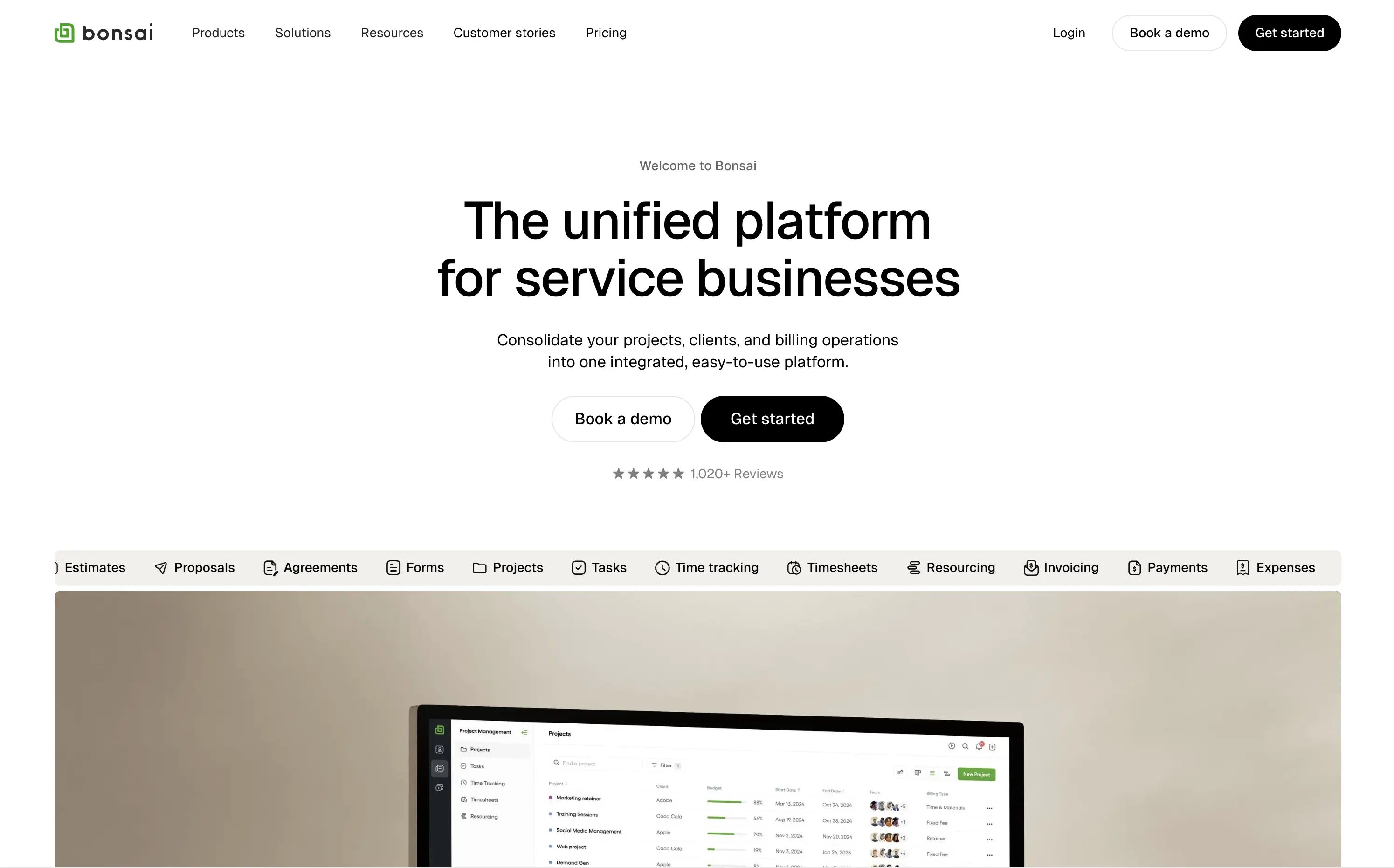
Bonsai offers an all-in-one platform to manage projects, clients, billing, and admin work for service-based businesses.
Minimal, structured, and very clear. The hero spells out the value in one line and supports it with a rolling feature list. Visuals, CTAs, and copy all pull in the same direction—no friction, no fluff.
Positioned for busy professionals who need clarity fast. Layout and tone reflect a mature product with high utility and little need for persuasion theatrics.
This layout balances technical utility with human impact, aligning well with Algolia’s positioning as an API-first but UX-aware company. The mobile UI reinforces product value visually, while the logo wall signals scale and trust for enterprise buyers. The tone is clear, benefit-led, and appropriate for high-intent decision-makers evaluating AI tools for customer experience. This is a solid enterprise-facing hero built to perform.
Bonsai
↗
SaaS
Productivity
Centered
Descriptive
Professional
Multi-CTA Block
Product UI
Social Proof
Badges
Light Mode
Black
Sans serif
B2B
Home Page
Webflow
clean UI, use-case ticker, modular product suite, high-trust SaaS, minimal layout, neutral branding, small business ops, service platform, feature-led structure, multi-tool clarity, clear positioning
Bonsai offers an all-in-one platform to manage projects, clients, billing, and admin work for service-based businesses.
Minimal, structured, and very clear. The hero spells out the value in one line and supports it with a rolling feature list. Visuals, CTAs, and copy all pull in the same direction—no friction, no fluff.
Positioned for busy professionals who need clarity fast. Layout and tone reflect a mature product with high utility and little need for persuasion theatrics.
This layout balances technical utility with human impact, aligning well with Algolia’s positioning as an API-first but UX-aware company. The mobile UI reinforces product value visually, while the logo wall signals scale and trust for enterprise buyers. The tone is clear, benefit-led, and appropriate for high-intent decision-makers evaluating AI tools for customer experience. This is a solid enterprise-facing hero built to perform.
Arc
↗
SaaS
Productivity
Centered
Proof-Heavy
Multi-CTA Block
Product UI
Social Proof
Duotone
White
Blue
Display
Sans serif
B2C
Home Page
Custom Code
consumer browser, verge quote, UI-focused, product-led design, browser replacement, macOS-first, desktop software, soft but bold, macOS-style visual language, motion-laced layout, quirky detail, testimonial-driven, vibrant blue, feature-forward
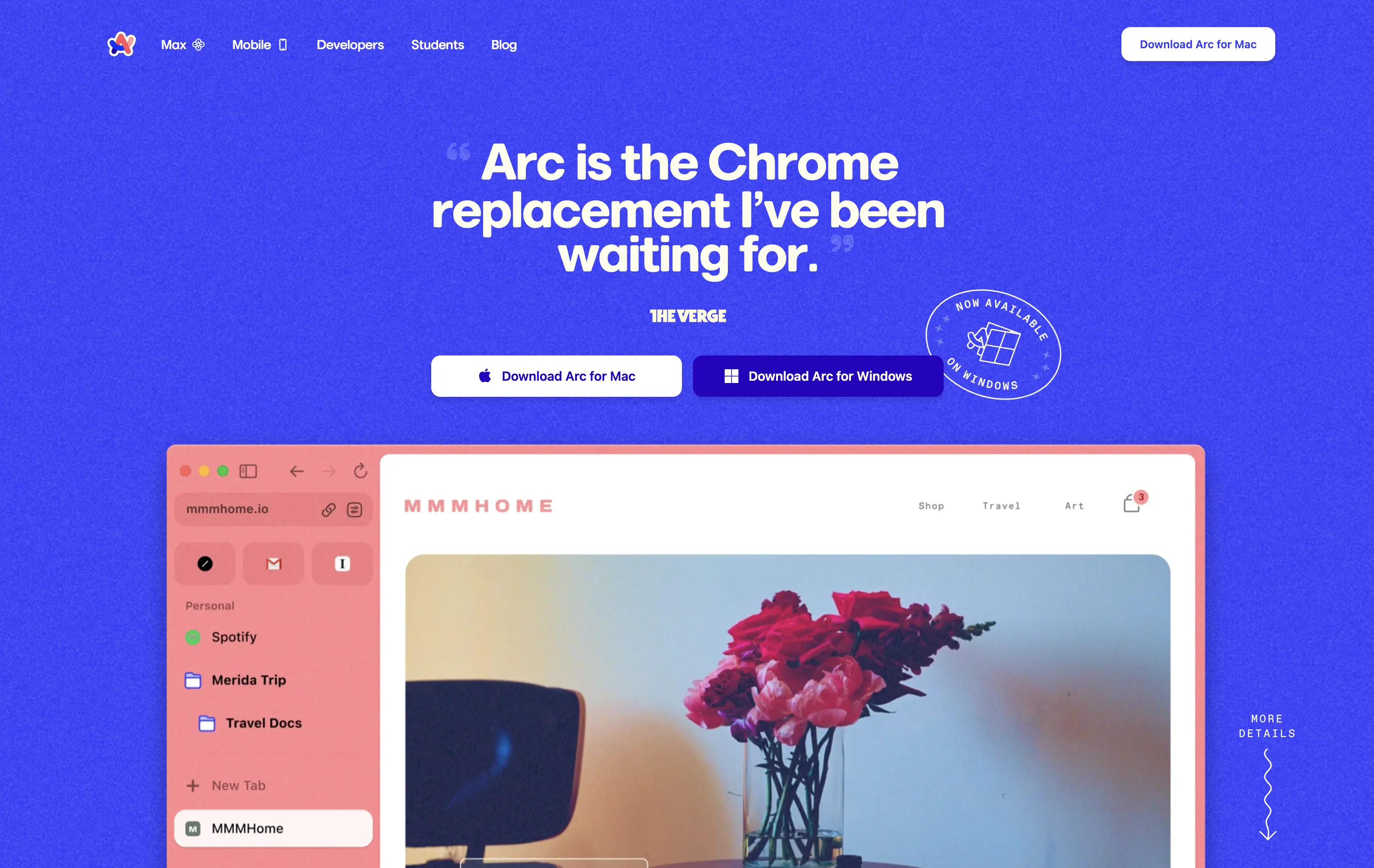
Arc is a modern browser designed to replace legacy browser with a reimagined UI and productivity-first experience.
This hero grabs attention immediately with a high-credibility quote as the headline, bold visual language, and a visible product UI that instantly signals differentiation. The CTA is clear and platform-specific. The color treatment and layout feel energetic and modern, aligning well with consumer expectations for a desktop app.
Strong positioning via social proof rather than abstract messaging. The hero makes the shift-from-Chrome angle explicit, appealing to an informed, tech-forward audience. High trust and strong product framing.
This layout balances technical utility with human impact, aligning well with Algolia’s positioning as an API-first but UX-aware company. The mobile UI reinforces product value visually, while the logo wall signals scale and trust for enterprise buyers. The tone is clear, benefit-led, and appropriate for high-intent decision-makers evaluating AI tools for customer experience. This is a solid enterprise-facing hero built to perform.
Arc
↗
SaaS
Productivity
Centered
Proof-Heavy
Multi-CTA Block
Product UI
Social Proof
Duotone
White
Blue
Display
Sans serif
B2C
Home Page
Custom Code
consumer browser, verge quote, UI-focused, product-led design, browser replacement, macOS-first, desktop software, soft but bold, macOS-style visual language, motion-laced layout, quirky detail, testimonial-driven, vibrant blue, feature-forward
Arc is a modern browser designed to replace legacy browser with a reimagined UI and productivity-first experience.
This hero grabs attention immediately with a high-credibility quote as the headline, bold visual language, and a visible product UI that instantly signals differentiation. The CTA is clear and platform-specific. The color treatment and layout feel energetic and modern, aligning well with consumer expectations for a desktop app.
Strong positioning via social proof rather than abstract messaging. The hero makes the shift-from-Chrome angle explicit, appealing to an informed, tech-forward audience. High trust and strong product framing.
This layout balances technical utility with human impact, aligning well with Algolia’s positioning as an API-first but UX-aware company. The mobile UI reinforces product value visually, while the logo wall signals scale and trust for enterprise buyers. The tone is clear, benefit-led, and appropriate for high-intent decision-makers evaluating AI tools for customer experience. This is a solid enterprise-facing hero built to perform.
Storyblok
↗
SaaS
DevTools
Inset
Centered
Playful
Pain-driven
Multi-CTA Block
Illustration
Product UI
Social Proof
Badges
Light Mode
Blue
Black
Sans serif
B2B
Home Page
Custom Code
headless CMS, anti-legacy positioning, visual editing, developer tools, AI assist, SaaS marketing, animated UI mockup, software demo, CMS for teams, testimonial badge, conversion-first layout
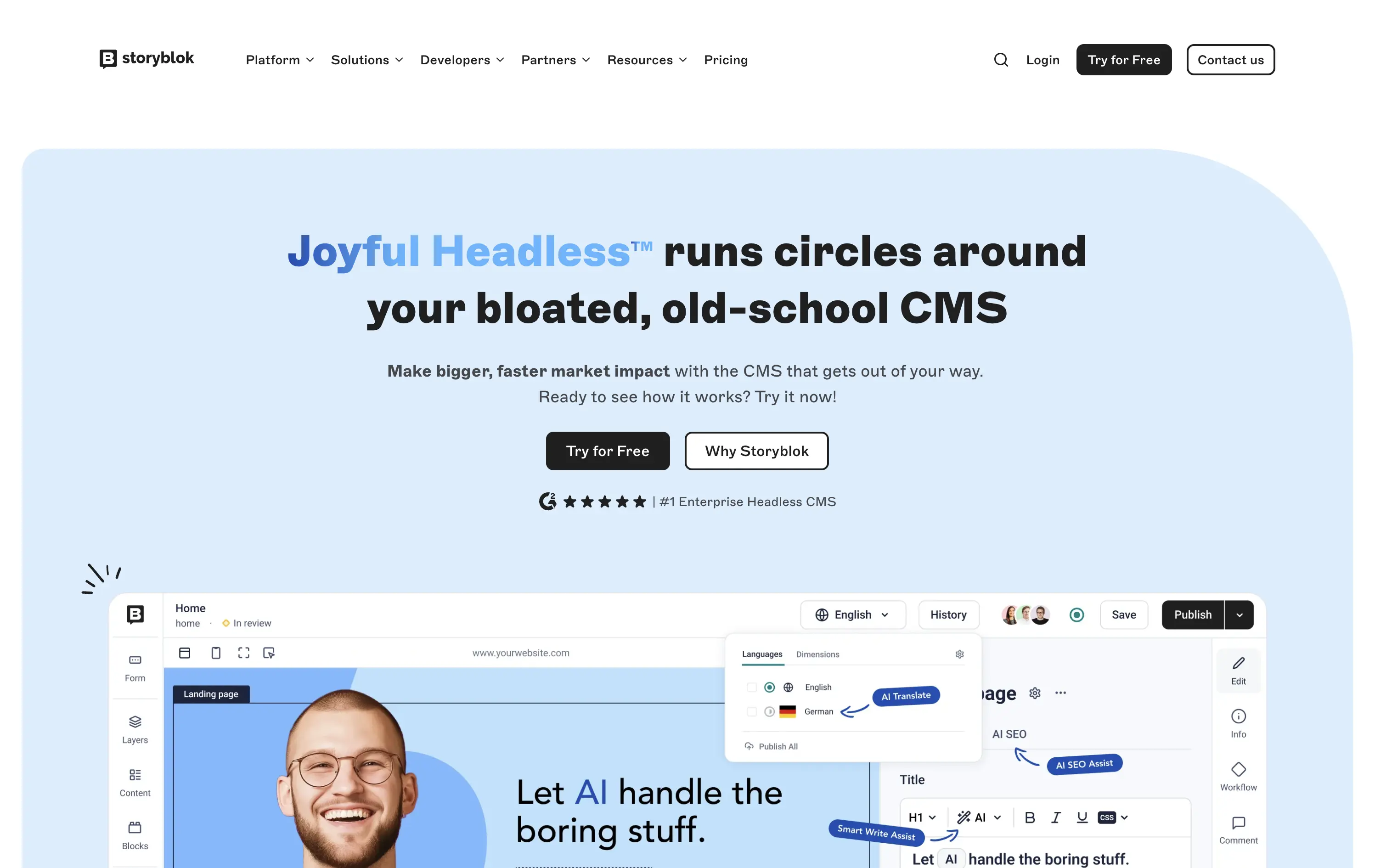
Storyblok is a headless CMS built for developers and marketers to collaboratively build fast, flexible websites and digital experiences.
The hero is unapologetically punchy. It leads with a clear enemy (bloated CMSs), while pairing credibility badges with live UI proof. Product visuals reinforce benefits instead of distracting from them.
This is high-conversion, pain-aware SaaS positioning. The voice is aggressive but measured, fitting for teams actively seeking a modern CMS alternative.
This layout balances technical utility with human impact, aligning well with Algolia’s positioning as an API-first but UX-aware company. The mobile UI reinforces product value visually, while the logo wall signals scale and trust for enterprise buyers. The tone is clear, benefit-led, and appropriate for high-intent decision-makers evaluating AI tools for customer experience. This is a solid enterprise-facing hero built to perform.
Storyblok
↗
SaaS
DevTools
Inset
Centered
Playful
Pain-driven
Multi-CTA Block
Illustration
Product UI
Social Proof
Badges
Light Mode
Blue
Black
Sans serif
B2B
Home Page
Custom Code
headless CMS, anti-legacy positioning, visual editing, developer tools, AI assist, SaaS marketing, animated UI mockup, software demo, CMS for teams, testimonial badge, conversion-first layout
Storyblok is a headless CMS built for developers and marketers to collaboratively build fast, flexible websites and digital experiences.
The hero is unapologetically punchy. It leads with a clear enemy (bloated CMSs), while pairing credibility badges with live UI proof. Product visuals reinforce benefits instead of distracting from them.
This is high-conversion, pain-aware SaaS positioning. The voice is aggressive but measured, fitting for teams actively seeking a modern CMS alternative.
This layout balances technical utility with human impact, aligning well with Algolia’s positioning as an API-first but UX-aware company. The mobile UI reinforces product value visually, while the logo wall signals scale and trust for enterprise buyers. The tone is clear, benefit-led, and appropriate for high-intent decision-makers evaluating AI tools for customer experience. This is a solid enterprise-facing hero built to perform.
Ramp
↗
SaaS
Fintech
Split Grid
Left-aligned
Benefit-Driven
Email Capture
Product UI
Social Proof
Duotone
Green
Yellow
Sans serif
B2B
Home Page
Custom Code
expense automation, corporate cards, real-time finance tools, modern B2B fintech, ROI-led copy, dark UI, embedded reviews, verified trust cues, enterprise-ready design, slick dashboard, clear CTA, conversion optimized, mid-funnel targeting, save money pitch, split layout
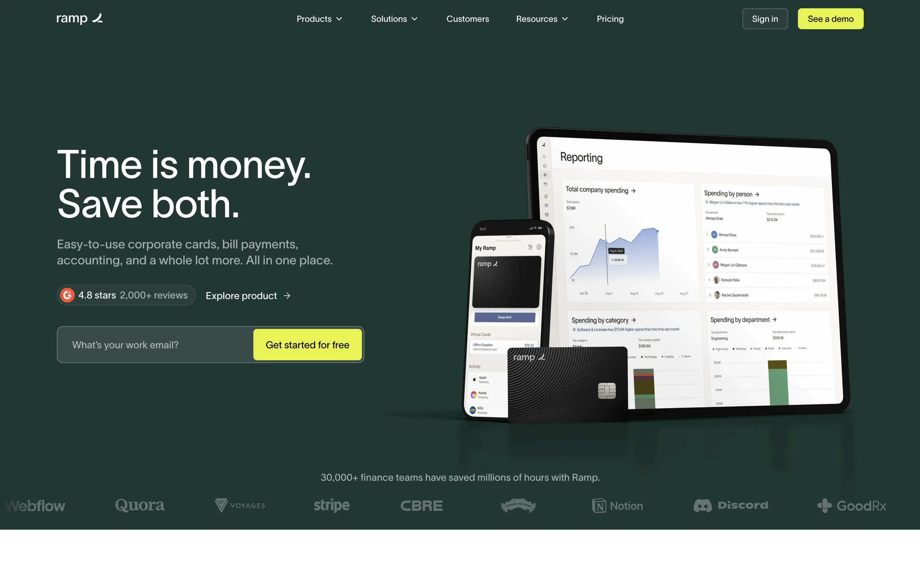
Ramp is a corporate finance platform offering cards, bill pay, and reporting tools designed to save companies time and money.
The hero is clean, trust-building, and conversion-ready. Headline is bold and economic — short enough to stick, direct enough to convert. Subheadline explains the product scope, while the UI visual makes it tangible. Reviews and logos anchor trust. The input field + utility CTA streamlines lead gen.
Perfectly calibrated for CFOs and finance leads. Messaging leads with ROI, not tech — smart for a market that cares about efficiency and outcomes. Strong signal-to-noise ratio.
This layout balances technical utility with human impact, aligning well with Algolia’s positioning as an API-first but UX-aware company. The mobile UI reinforces product value visually, while the logo wall signals scale and trust for enterprise buyers. The tone is clear, benefit-led, and appropriate for high-intent decision-makers evaluating AI tools for customer experience. This is a solid enterprise-facing hero built to perform.
Ramp
↗
SaaS
Fintech
Split Grid
Left-aligned
Benefit-Driven
Email Capture
Product UI
Social Proof
Duotone
Green
Yellow
Sans serif
B2B
Home Page
Custom Code
expense automation, corporate cards, real-time finance tools, modern B2B fintech, ROI-led copy, dark UI, embedded reviews, verified trust cues, enterprise-ready design, slick dashboard, clear CTA, conversion optimized, mid-funnel targeting, save money pitch, split layout
Ramp is a corporate finance platform offering cards, bill pay, and reporting tools designed to save companies time and money.
The hero is clean, trust-building, and conversion-ready. Headline is bold and economic — short enough to stick, direct enough to convert. Subheadline explains the product scope, while the UI visual makes it tangible. Reviews and logos anchor trust. The input field + utility CTA streamlines lead gen.
Perfectly calibrated for CFOs and finance leads. Messaging leads with ROI, not tech — smart for a market that cares about efficiency and outcomes. Strong signal-to-noise ratio.
This layout balances technical utility with human impact, aligning well with Algolia’s positioning as an API-first but UX-aware company. The mobile UI reinforces product value visually, while the logo wall signals scale and trust for enterprise buyers. The tone is clear, benefit-led, and appropriate for high-intent decision-makers evaluating AI tools for customer experience. This is a solid enterprise-facing hero built to perform.
Brex
↗
SaaS
Fintech
Split Grid
Left-aligned
Benefit-Driven
Confident
Email Capture
Product UI
Social Proof
3D visuals
Light Mode
Orange
Sans serif
B2B
Home Page
Custom Code
global finance platform, expense automation, control and speed messaging, embedded email field, startup to enterprise, international SaaS, B2B fintech, conversion-led layout, modern finance stack, clean UI, sharp tone, input-first UX, mobile + card visual, minimalist grid
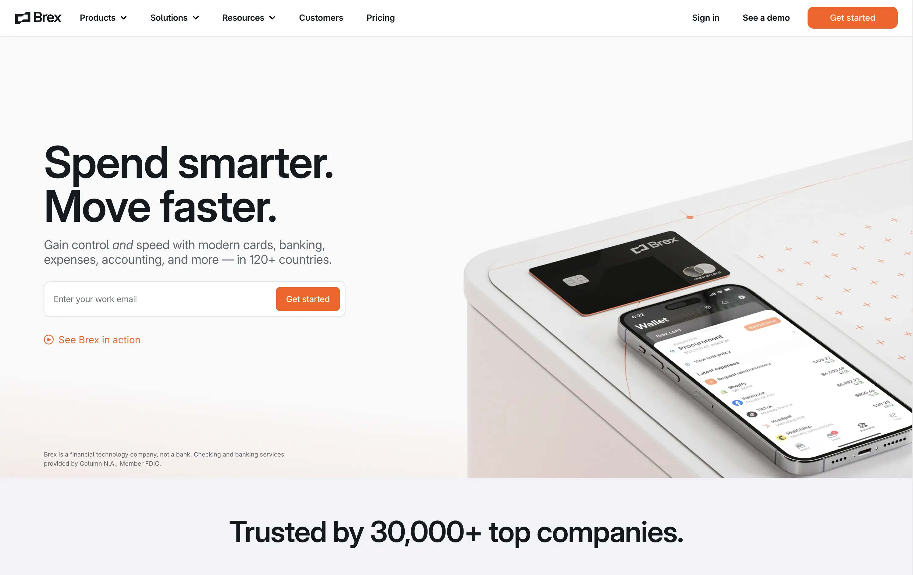
Brex is a global financial platform offering cards, banking, and expense tools for fast-scaling companies in 120+ countries.
This hero nails first-contact clarity. The headline hits fast with rhythmic, benefit-led language, while the subhead contextualizes product depth across spend, banking, and scale. The layout leads with a form-first interaction, pushing immediate action, while the micro-CTA (“See Brex in action”) gives skeptics a softer entry point. The 3D product mockup adds credibility and sharpens the tech-forward appeal. Nothing feels redundant — every element either informs or converts. The result is frictionless, enterprise-friendly, and confident without oversell.
Speaks directly to startup and scale-up operators. Prioritizes control and speed — key brand levers for high-growth companies. Balanced tone and visual logic establish Brex as both trusted and technically future-ready.
This layout balances technical utility with human impact, aligning well with Algolia’s positioning as an API-first but UX-aware company. The mobile UI reinforces product value visually, while the logo wall signals scale and trust for enterprise buyers. The tone is clear, benefit-led, and appropriate for high-intent decision-makers evaluating AI tools for customer experience. This is a solid enterprise-facing hero built to perform.
Brex
↗
SaaS
Fintech
Split Grid
Left-aligned
Benefit-Driven
Confident
Email Capture
Product UI
Social Proof
3D visuals
Light Mode
Orange
Sans serif
B2B
Home Page
Custom Code
global finance platform, expense automation, control and speed messaging, embedded email field, startup to enterprise, international SaaS, B2B fintech, conversion-led layout, modern finance stack, clean UI, sharp tone, input-first UX, mobile + card visual, minimalist grid
Brex is a global financial platform offering cards, banking, and expense tools for fast-scaling companies in 120+ countries.
This hero nails first-contact clarity. The headline hits fast with rhythmic, benefit-led language, while the subhead contextualizes product depth across spend, banking, and scale. The layout leads with a form-first interaction, pushing immediate action, while the micro-CTA (“See Brex in action”) gives skeptics a softer entry point. The 3D product mockup adds credibility and sharpens the tech-forward appeal. Nothing feels redundant — every element either informs or converts. The result is frictionless, enterprise-friendly, and confident without oversell.
Speaks directly to startup and scale-up operators. Prioritizes control and speed — key brand levers for high-growth companies. Balanced tone and visual logic establish Brex as both trusted and technically future-ready.
This layout balances technical utility with human impact, aligning well with Algolia’s positioning as an API-first but UX-aware company. The mobile UI reinforces product value visually, while the logo wall signals scale and trust for enterprise buyers. The tone is clear, benefit-led, and appropriate for high-intent decision-makers evaluating AI tools for customer experience. This is a solid enterprise-facing hero built to perform.
TidyCal
↗
SaaS
Productivity
Centered
Benefit-Driven
Descriptive
Email Capture
Social Proof
Announcement
Badges
Dark Mode
Blue
Sans serif
B2B
Home Page
Custom Code
low-cost alternative, one-time payment SaaS, scheduling tool, Product Hunt-backed, no-frills UI, budget-friendly SaaS, email-first CTA, dark mode hero, indie stack, small team SaaS, lifetime deal, value-first messaging, stripped-down UX, pricing transparency
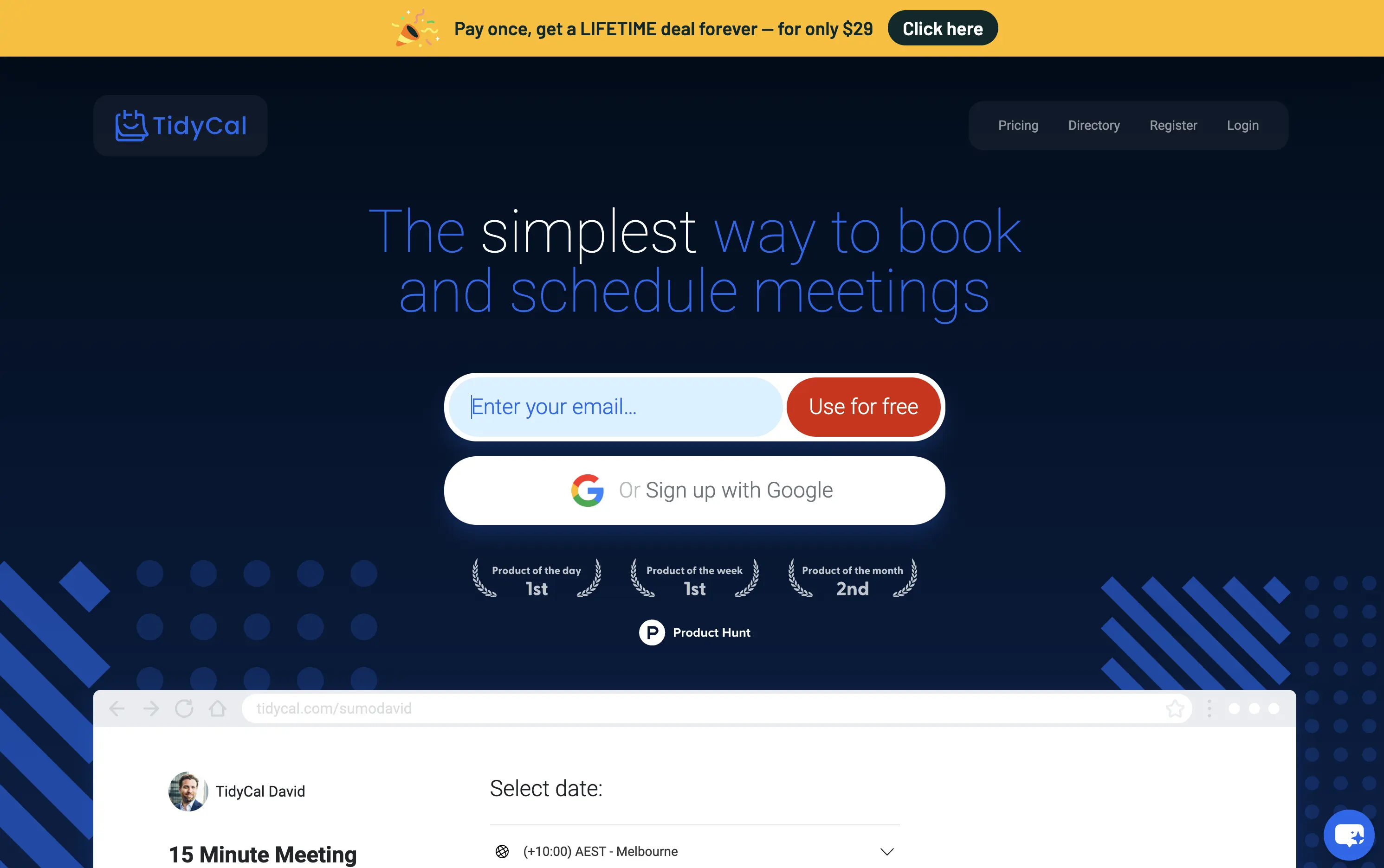
TidyCal is a simple, affordable calendar booking tool offering lifetime access for a one-time fee — ideal for solo professionals and budget-conscious teams.
TidyCal’s hero is clear on purpose but light on finesse. The lifetime deal banner is highly conversion-optimized and immediately grabs attention. However, the headline lacks typographic hierarchy and fails to land with impact — “simplest” stands out visually, but the phrasing overall feels flat. The input-first layout is user-friendly, but inconsistent sizing and visual imbalance reduce perceived trust. This hero converts, but it doesn’t inspire.
The pricing-first message works for a cost-sensitive audience. But the unrefined layout and typographic decisions may limit credibility with enterprise or design-aware users. Prioritizes affordability over perception of quality.
This layout balances technical utility with human impact, aligning well with Algolia’s positioning as an API-first but UX-aware company. The mobile UI reinforces product value visually, while the logo wall signals scale and trust for enterprise buyers. The tone is clear, benefit-led, and appropriate for high-intent decision-makers evaluating AI tools for customer experience. This is a solid enterprise-facing hero built to perform.
TidyCal
↗
SaaS
Productivity
Centered
Benefit-Driven
Descriptive
Email Capture
Social Proof
Announcement
Badges
Dark Mode
Blue
Sans serif
B2B
Home Page
Custom Code
low-cost alternative, one-time payment SaaS, scheduling tool, Product Hunt-backed, no-frills UI, budget-friendly SaaS, email-first CTA, dark mode hero, indie stack, small team SaaS, lifetime deal, value-first messaging, stripped-down UX, pricing transparency
TidyCal is a simple, affordable calendar booking tool offering lifetime access for a one-time fee — ideal for solo professionals and budget-conscious teams.
TidyCal’s hero is clear on purpose but light on finesse. The lifetime deal banner is highly conversion-optimized and immediately grabs attention. However, the headline lacks typographic hierarchy and fails to land with impact — “simplest” stands out visually, but the phrasing overall feels flat. The input-first layout is user-friendly, but inconsistent sizing and visual imbalance reduce perceived trust. This hero converts, but it doesn’t inspire.
The pricing-first message works for a cost-sensitive audience. But the unrefined layout and typographic decisions may limit credibility with enterprise or design-aware users. Prioritizes affordability over perception of quality.
This layout balances technical utility with human impact, aligning well with Algolia’s positioning as an API-first but UX-aware company. The mobile UI reinforces product value visually, while the logo wall signals scale and trust for enterprise buyers. The tone is clear, benefit-led, and appropriate for high-intent decision-makers evaluating AI tools for customer experience. This is a solid enterprise-facing hero built to perform.
Savvy Cal
↗
SaaS
Productivity
Centered
Playful
Aspirational
Single Button
Illustration
Social Proof
Duotone
Green
Yellow
Display
Serif
B2B
Home Page
Custom Code
calendly alternative, scheduling SaaS, friendly UI, bold typography, customer-first tone, startup productivity tools, anti-friction branding, green-on-green palette, centered layout, calendar control, review-driven, solo founder energy, fresh design, clean booking UX
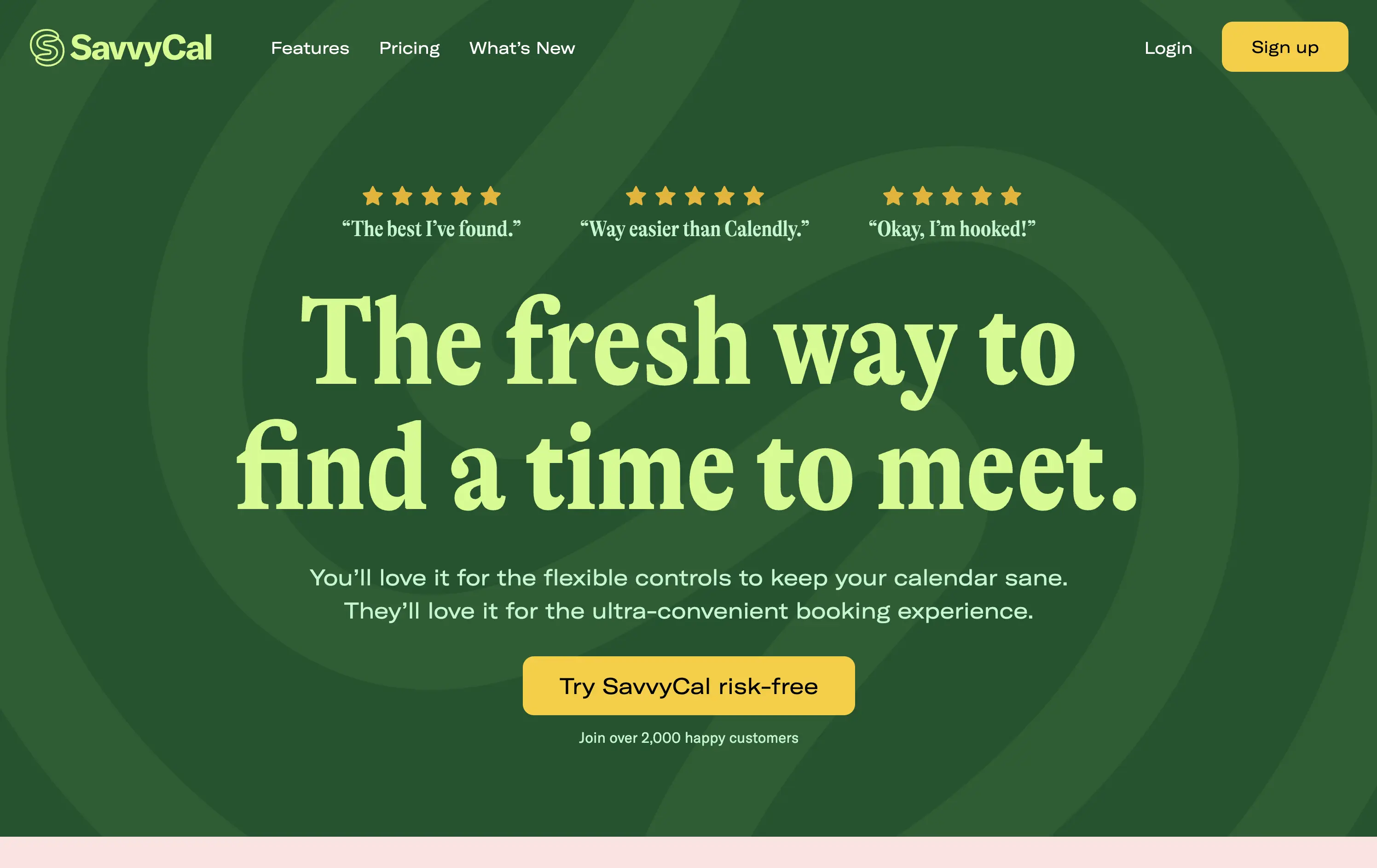
SavvyCal is a scheduling tool designed to simplify meeting coordination with flexible, user-first controls and a clean, friendly interface.
The hero leans hard into charm and confidence. The bold, serif headline feels conversational and clever. The contrast between green tones is controlled, and the centered layout places the CTA in a visually dominant spot. Social proof is integrated at the top with testimonial snippets to validate performance. It’s conversion-ready, especially for users looking for a more human alternative to Calendly.
Tailored to solo operators, indie founders, and small teams seeking simplicity without the enterprise bloat. Balances approachability and professionalism through tone and visual treatment. Micro-proof adds trust without noise.
This layout balances technical utility with human impact, aligning well with Algolia’s positioning as an API-first but UX-aware company. The mobile UI reinforces product value visually, while the logo wall signals scale and trust for enterprise buyers. The tone is clear, benefit-led, and appropriate for high-intent decision-makers evaluating AI tools for customer experience. This is a solid enterprise-facing hero built to perform.
Savvy Cal
↗
SaaS
Productivity
Centered
Playful
Aspirational
Single Button
Illustration
Social Proof
Duotone
Green
Yellow
Display
Serif
B2B
Home Page
Custom Code
calendly alternative, scheduling SaaS, friendly UI, bold typography, customer-first tone, startup productivity tools, anti-friction branding, green-on-green palette, centered layout, calendar control, review-driven, solo founder energy, fresh design, clean booking UX
SavvyCal is a scheduling tool designed to simplify meeting coordination with flexible, user-first controls and a clean, friendly interface.
The hero leans hard into charm and confidence. The bold, serif headline feels conversational and clever. The contrast between green tones is controlled, and the centered layout places the CTA in a visually dominant spot. Social proof is integrated at the top with testimonial snippets to validate performance. It’s conversion-ready, especially for users looking for a more human alternative to Calendly.
Tailored to solo operators, indie founders, and small teams seeking simplicity without the enterprise bloat. Balances approachability and professionalism through tone and visual treatment. Micro-proof adds trust without noise.
This layout balances technical utility with human impact, aligning well with Algolia’s positioning as an API-first but UX-aware company. The mobile UI reinforces product value visually, while the logo wall signals scale and trust for enterprise buyers. The tone is clear, benefit-led, and appropriate for high-intent decision-makers evaluating AI tools for customer experience. This is a solid enterprise-facing hero built to perform.
Fivetran
↗
SaaS
Data & Analytics
Split Grid
Left-aligned
Confident
Professional
Multi-CTA Block
Photography
Product UI
Social Proof
Custom Animation
Light Mode
Blue
Sans serif
B2B
Home Page
Webflow
enterprise-grade, real-time sync, testimonial integration, data pipeline, scalable architecture, visual storytelling, motion-light, trust-first, case-driven, product-led, split layout, mature B2B, dual CTA
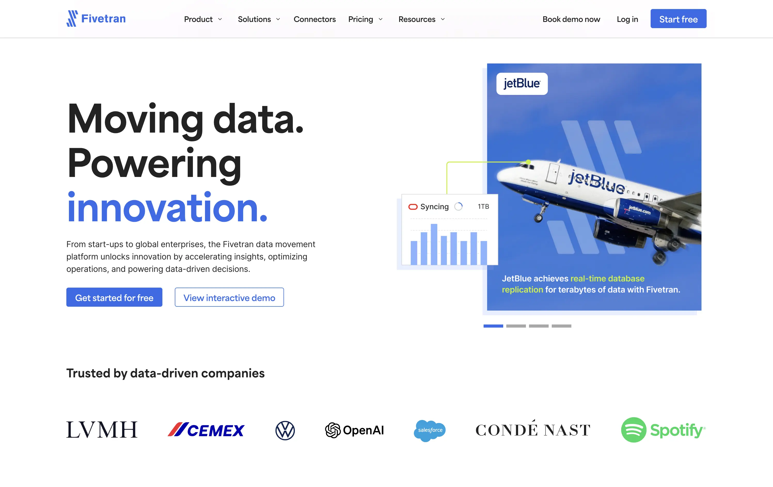
Fivetran is a data integration platform that helps businesses automate, sync, and centralize their data across systems for analysis and reporting.
Fivetran’s hero delivers immediate clarity through its strong headline and proof-focused subtext. The combination of a recognizable brand (JetBlue) and a visual data-sync overlay reinforces product value without requiring technical deep dives. Dual CTAs are clear and well-placed for different levels of intent. Social proof below adds enterprise credibility. The overall layout is well-balanced and efficient.
Tailored for enterprise buyers, the hero blends technical reassurance with case-based credibility. It communicates trust and scalability, aligning with a mid-to-late funnel B2B audience without overwhelming on first touch.
This layout balances technical utility with human impact, aligning well with Algolia’s positioning as an API-first but UX-aware company. The mobile UI reinforces product value visually, while the logo wall signals scale and trust for enterprise buyers. The tone is clear, benefit-led, and appropriate for high-intent decision-makers evaluating AI tools for customer experience. This is a solid enterprise-facing hero built to perform.
Fivetran
↗
SaaS
Data & Analytics
Split Grid
Left-aligned
Confident
Professional
Multi-CTA Block
Photography
Product UI
Social Proof
Custom Animation
Light Mode
Blue
Sans serif
B2B
Home Page
Webflow
enterprise-grade, real-time sync, testimonial integration, data pipeline, scalable architecture, visual storytelling, motion-light, trust-first, case-driven, product-led, split layout, mature B2B, dual CTA
Fivetran is a data integration platform that helps businesses automate, sync, and centralize their data across systems for analysis and reporting.
Fivetran’s hero delivers immediate clarity through its strong headline and proof-focused subtext. The combination of a recognizable brand (JetBlue) and a visual data-sync overlay reinforces product value without requiring technical deep dives. Dual CTAs are clear and well-placed for different levels of intent. Social proof below adds enterprise credibility. The overall layout is well-balanced and efficient.
Tailored for enterprise buyers, the hero blends technical reassurance with case-based credibility. It communicates trust and scalability, aligning with a mid-to-late funnel B2B audience without overwhelming on first touch.
This layout balances technical utility with human impact, aligning well with Algolia’s positioning as an API-first but UX-aware company. The mobile UI reinforces product value visually, while the logo wall signals scale and trust for enterprise buyers. The tone is clear, benefit-led, and appropriate for high-intent decision-makers evaluating AI tools for customer experience. This is a solid enterprise-facing hero built to perform.
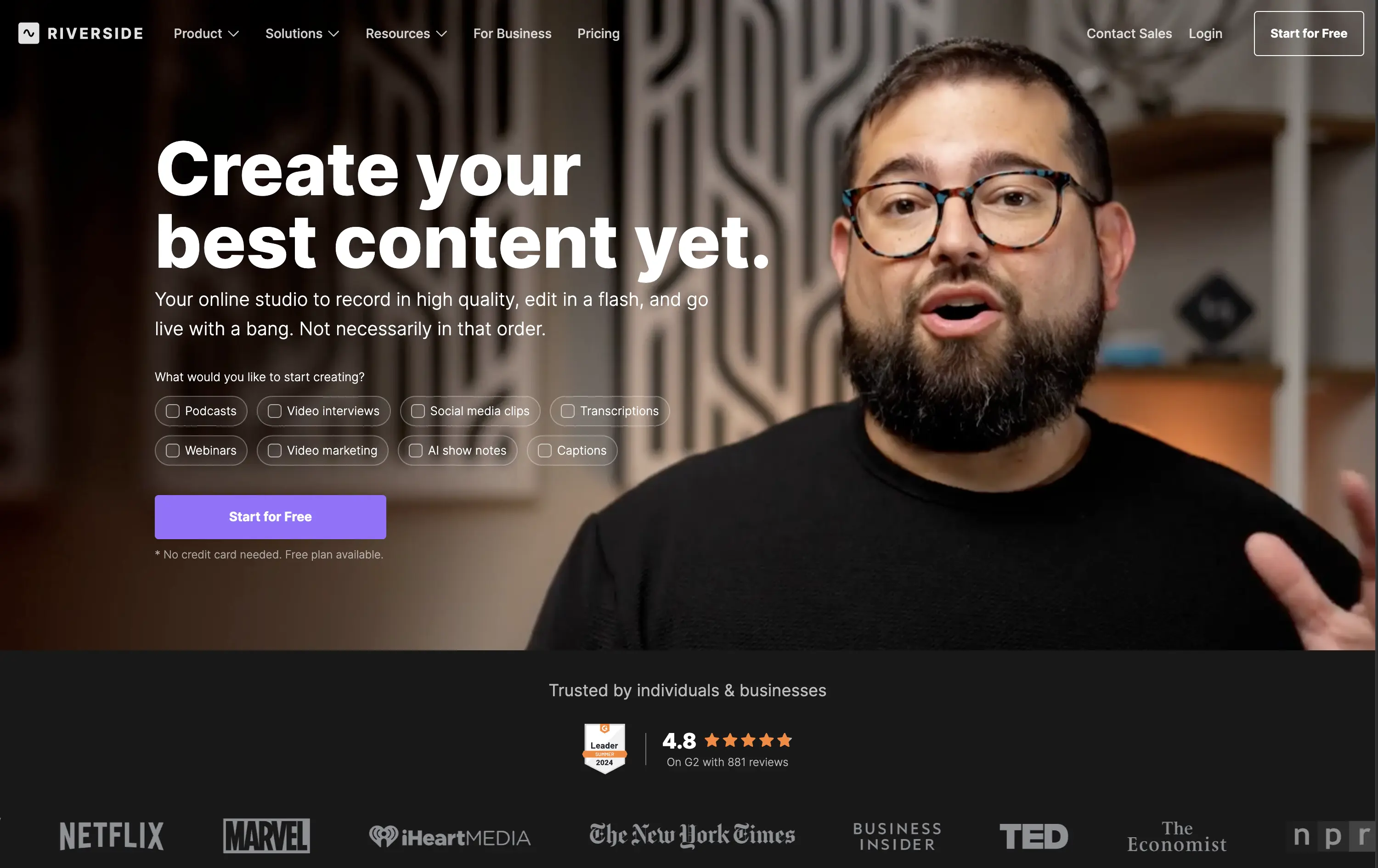
Riverside
↗
SaaS
Creator Tools
Creative Tools
Left-aligned
Aspirational
Single Button
Video
Interactive
Social Proof
Dark Mode
Imagery-Based
Purple
Sans serif
B2C
Home Page
Webflow
creator-first, face-driven, casual tone, real people, live recording, video-first layout, chip selector UI, dark mode, G2 badge, media industry, podcasting tool, modern SaaS, high-trust, content creation
Riverside is a browser-based studio for creators to record, edit, and publish high-quality video and audio content with ease.
Hero combines human warmth with clear purpose. Headline is aspirational, while subcopy clarifies. Visual chips guide self-segmentation. The single CTA is clean, bold, and frictionless. Social proof below adds immediate brand trust.
Tailored to non-technical creators who need a one-stop content tool. Design choices build ease and inspiration. Social logos position Riverside as mainstream-ready while keeping the tone personal and welcoming.
This layout balances technical utility with human impact, aligning well with Algolia’s positioning as an API-first but UX-aware company. The mobile UI reinforces product value visually, while the logo wall signals scale and trust for enterprise buyers. The tone is clear, benefit-led, and appropriate for high-intent decision-makers evaluating AI tools for customer experience. This is a solid enterprise-facing hero built to perform.
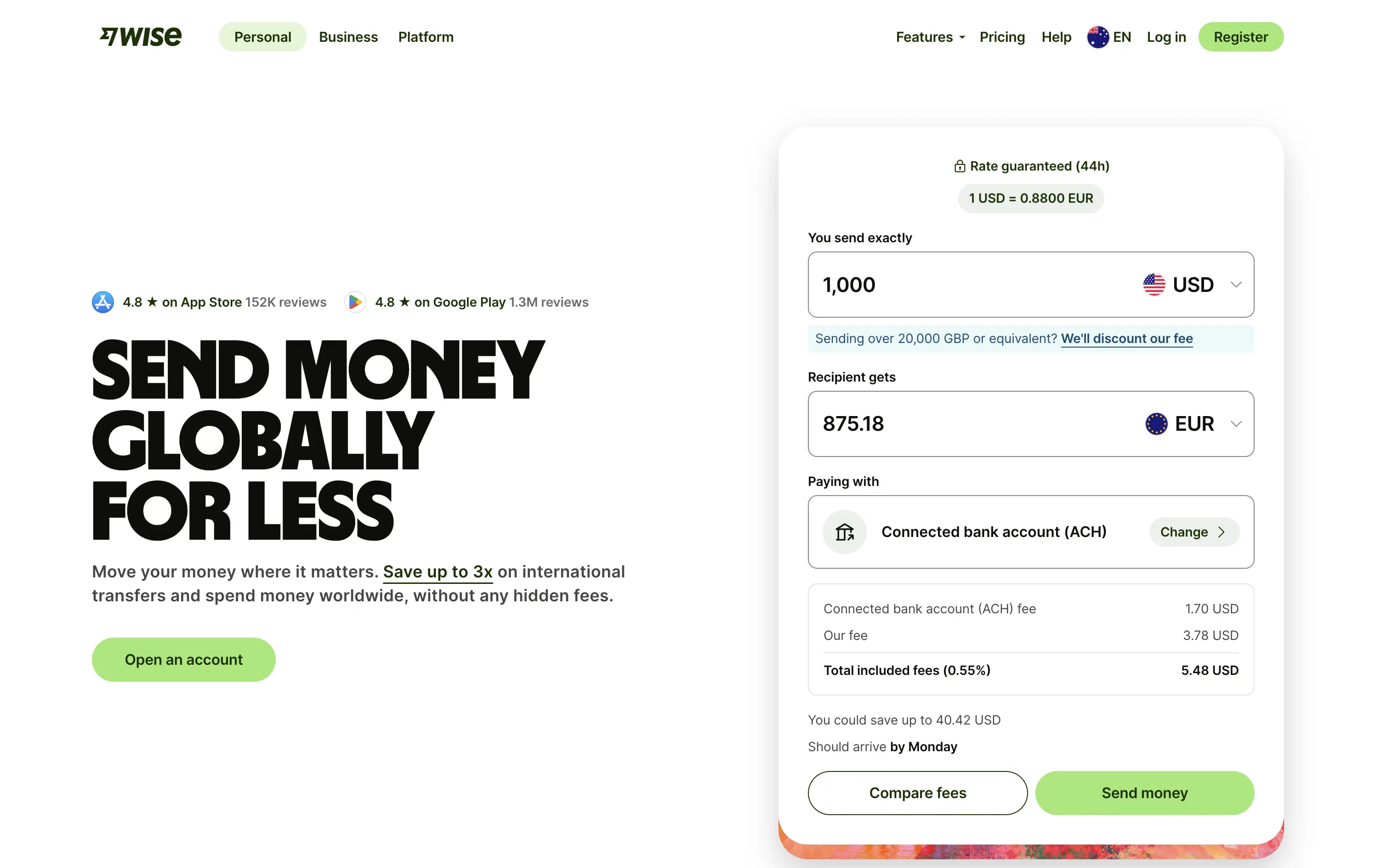
Wise
↗
SaaS
Fintech
Split Grid
Left-aligned
Benefit-Driven
Search/Utility Block
Interactive
Product UI
Social Proof
Light Mode
Green
Sans serif
Hybrid
Home Page
Custom Code
fintech, currency exchange, cost calculator, social proof upfront, real-time UI, B2C utility, transparent pricing, global payments, lean UX, bold typography, conversion-focused, clean layout, product-first design
Wise lets you send money internationally with real exchange rates and ultra-low fees — no hidden costs, just fast, fair transfers.
The bold headline immediately communicates value — “SEND MONEY GLOBALLY FOR LESS” — while the live calculator UI does the heavy lifting. Trust indicators like app store ratings sit prominently up top. CTAs are practical and clearly tied to user action. It’s all signal; functional and focused.
Perfect for high-intent users seeking fast comparison and action. The calculator UI de-risks the process while keeping attention on price.
This layout balances technical utility with human impact, aligning well with Algolia’s positioning as an API-first but UX-aware company. The mobile UI reinforces product value visually, while the logo wall signals scale and trust for enterprise buyers. The tone is clear, benefit-led, and appropriate for high-intent decision-makers evaluating AI tools for customer experience. This is a solid enterprise-facing hero built to perform.
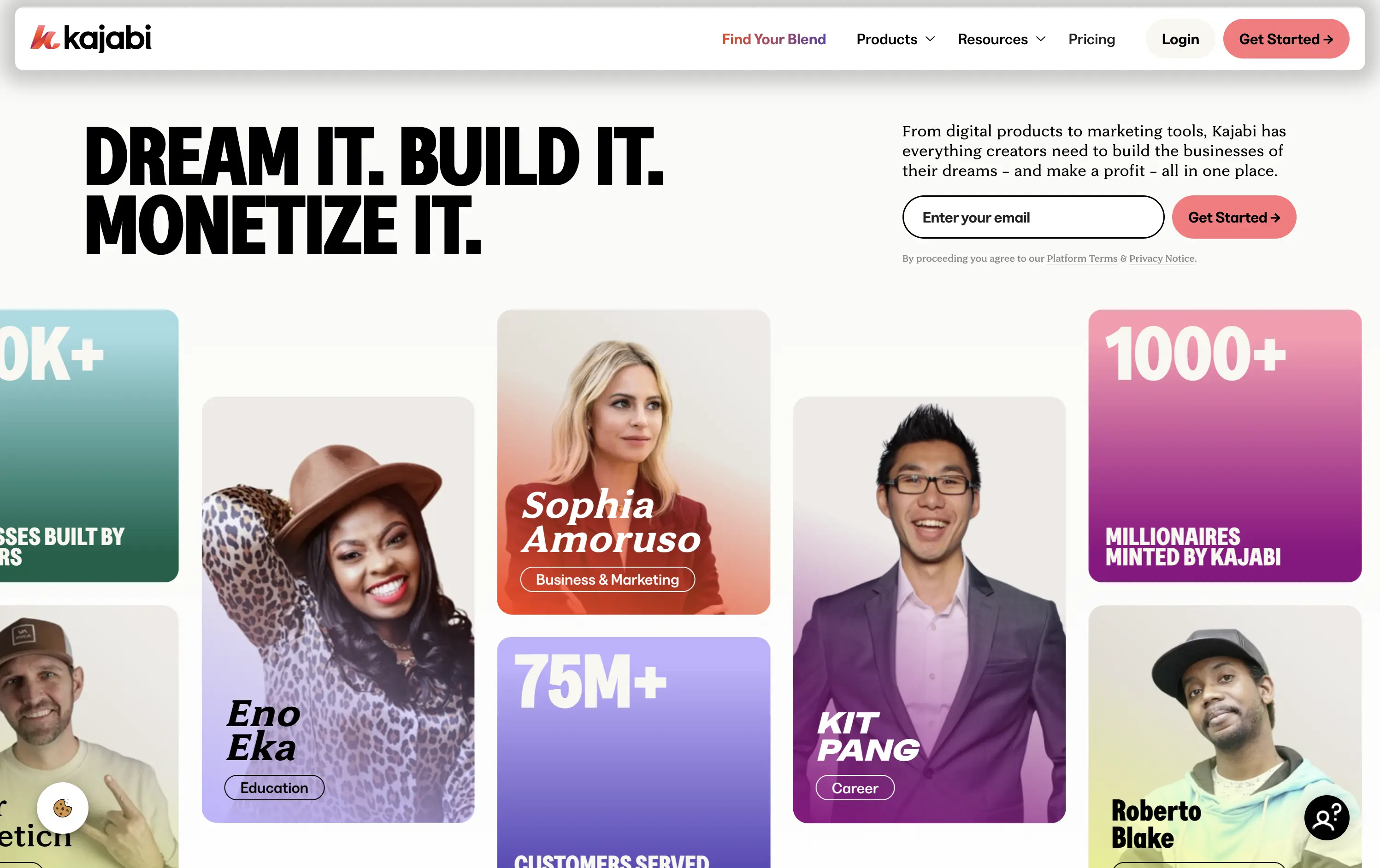
Kajabi
↗
SaaS
Creator Tools
Bento
Left-aligned
Aspirational
Empowering
Email Capture
Media Gallery
Live Metrics
Social Proof
Custom Animation
Light Mode
Red
Sans serif
B2C
Home Page
Webflow
creator economy, digital products, personal branding, monetization tools, testimonial-focused, bold headline, gradient cards, visual proof, email capture, energetic layout, high social proof, creator-first SaaS, aspirational branding
Kajabi is an all-in-one platform for creators to build, market, and monetize their digital products
Hero hits hard with credibility and momentum. Bold headline sets tone, though lacks clarity. Visual grid of creators and stats instantly builds trust. High-density layout may feel overwhelming on first load.
Designed to speak directly to ambitious creators. Social proof, earnings stats, and familiar faces reinforce Kajabi’s category leadership. Loud but tuned to audience mindset — performance-first, legitimacy-led, and conversion-aware.
This layout balances technical utility with human impact, aligning well with Algolia’s positioning as an API-first but UX-aware company. The mobile UI reinforces product value visually, while the logo wall signals scale and trust for enterprise buyers. The tone is clear, benefit-led, and appropriate for high-intent decision-makers evaluating AI tools for customer experience. This is a solid enterprise-facing hero built to perform.
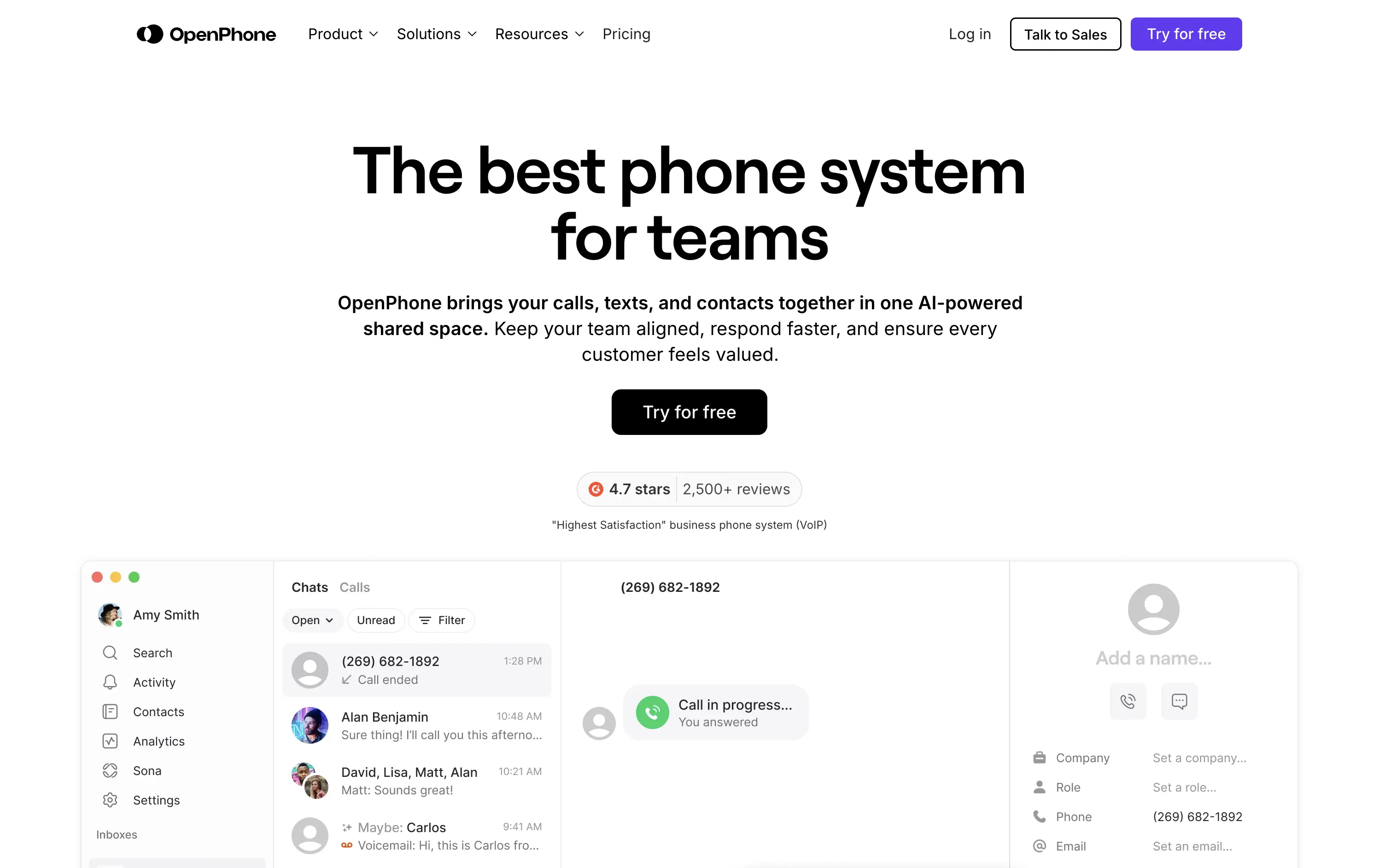
OpenPhone
↗
SaaS
Productivity
Centered
Bold & Direct
Confident
Single Button
Product UI
Social Proof
Light Mode
Purple
Black
Sans serif
B2B
Home Page
Webflow
business phone system, team communication, AI-enhanced calling, VoIP SaaS, minimalist hero, bold headline, trust rating, startup tools, shared inbox, clear CTA, conversion-focused, functional UI preview, modern enterprise utility
OpenPhone is a modern business phone system that unifies calls, texts, and contact management for growing teams.
Hero is bold and crystal clear. Headline makes a confident claim, immediately backed by product visuals and strong review stats. The black CTA button pops against the clean layout, driving clear intent.
Focused and direct for SMB and startup buyers. Hero supports bottom-of-funnel conversion. Minimalist visuals and rating badge project trust. Smart use of space for clarity and speed.
This layout balances technical utility with human impact, aligning well with Algolia’s positioning as an API-first but UX-aware company. The mobile UI reinforces product value visually, while the logo wall signals scale and trust for enterprise buyers. The tone is clear, benefit-led, and appropriate for high-intent decision-makers evaluating AI tools for customer experience. This is a solid enterprise-facing hero built to perform.
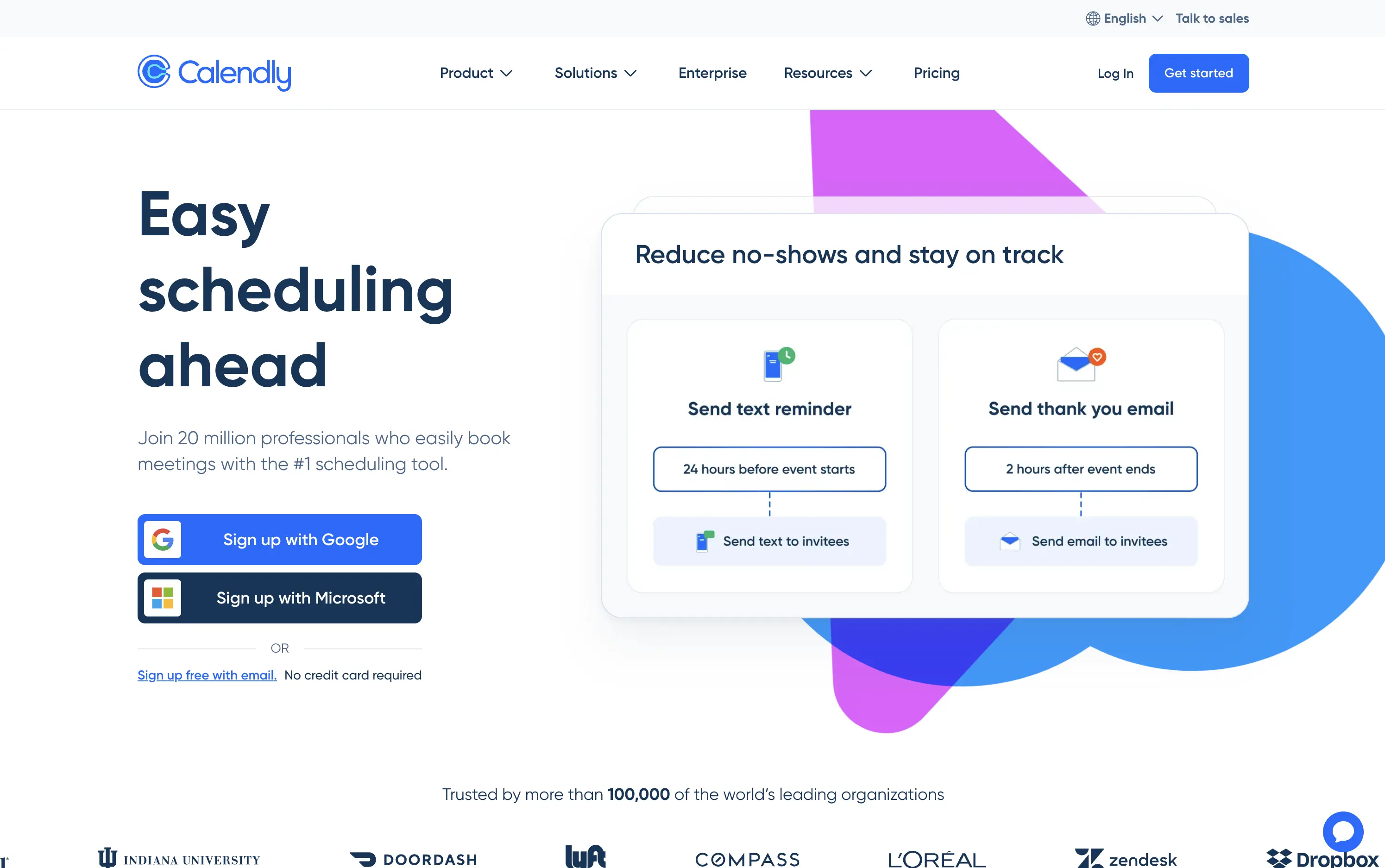
Calendly
↗
SaaS
Productivity
Split Grid
Left-aligned
Benefit-Driven
Aspirational
Multi-CTA Block
Product UI
Social Proof
Custom Animation
Light Mode
Blue
Purple
Sans serif
Hybrid
Home Page
Custom Code
booking automation, enterprise SaaS, high-trust layout, Google sign-in, product-led UX, animated demo cards, client communication, reminder workflows, credibility-focused, mass adoption, enterprise trust, conversion-focused, no-credit-card, dual CTA
Calendly is a scheduling automation platform used by over 20 million professionals to simplify meeting coordination and reduce no-shows.
Large headline clearly communicates the core benefit. Animated UI cards demo concrete features like text reminders and post-meeting emails—useful and direct. Google and Microsoft sign-up flows lower friction and suggest enterprise readiness. Copy leans on credibility (user count, logo wall). Layout is clean and functional, though edges toward safe and generic compared to challenger brands.
Calendly’s hero positions it as the trusted standard for scheduling. Focused on reducing friction for new users while demonstrating value for scale—perfect for self-serve and enterprise alike.
This layout balances technical utility with human impact, aligning well with Algolia’s positioning as an API-first but UX-aware company. The mobile UI reinforces product value visually, while the logo wall signals scale and trust for enterprise buyers. The tone is clear, benefit-led, and appropriate for high-intent decision-makers evaluating AI tools for customer experience. This is a solid enterprise-facing hero built to perform.
Chargebee
↗
SaaS
Fintech
Centered
Benefit-Driven
Bold & Direct
Multi-CTA Block
Photography
Logo Wall
Social Proof
Light Mode
Green
Orange
Sans serif
B2B
Home Page
Wordpress
B2B SaaS, billing automation, subscription platform, enterprise-ready, credibility-first, leadership positioning, founder imagery, logo wall, dual CTA, Gartner badge, G2 recognition, growth-focused messaging, recurring revenue
Chargebee helps businesses automate recurring billing, reduce churn, and scale subscription revenue through a trusted enterprise-ready platform.
The hero leads with a sharp, benefit-packed headline and backs it up with high-trust signals: real customer faces, name-brand logos, and third-party awards. The “Get a Demo” and “Free Trial” CTAs give users both enterprise and self-serve paths, but visual hierarchy between the two could be better balanced. Copy is outcome-focused and credible.
Smartly targeted at growth-stage and enterprise buyers, but the visual language undersells its category leadership. Strong content mix, but design lacks the presence or edge to reinforce premium positioning.
This layout balances technical utility with human impact, aligning well with Algolia’s positioning as an API-first but UX-aware company. The mobile UI reinforces product value visually, while the logo wall signals scale and trust for enterprise buyers. The tone is clear, benefit-led, and appropriate for high-intent decision-makers evaluating AI tools for customer experience. This is a solid enterprise-facing hero built to perform.
Cal.com
↗
SaaS
Productivity
Split Grid
Left-aligned
Bold & Direct
Multi-CTA Block
Product UI
Social Proof
Custom Animation
Badges
Light Mode
Black
Sans serif
Hybrid
Home Page
Framer
calendar booking, open source scheduler, clean aesthetic, lightweight onboarding, animated UI, trust-led design, Google sign-in, frictionless flow, developer-friendly, minimal layout, self-serve SaaS, cross-industry use cases, credibility-first, proof-based design
Cal.com is a fully customizable scheduling platform for individuals, teams, and developers—built for everything from calls to client bookings.
Clear headline paired with a minimalist aesthetic creates instant comprehension. The animated UI module smartly showcases varied use cases—from legal consults to photoshoots—broadening audience appeal. Trust badges build legitimacy, while “Sign up with Google” signals low-friction entry. Copy is functional and tight, and the centered layout maintains visual clarity without distraction.
The hero is focused and efficient. Clear headline, modular product UI, and direct signup flows drive intent. Trust logos and social proof add validation. UI previews reflect real-world use across industries. Nothing extraneous.
This layout balances technical utility with human impact, aligning well with Algolia’s positioning as an API-first but UX-aware company. The mobile UI reinforces product value visually, while the logo wall signals scale and trust for enterprise buyers. The tone is clear, benefit-led, and appropriate for high-intent decision-makers evaluating AI tools for customer experience. This is a solid enterprise-facing hero built to perform.
Preply
↗
Education
Left-aligned
Benefit-Driven
Single Button
Photography
Live Metrics
Social Proof
Light Mode
Pink
Black
Home Page
Custom Code
language tutor, online learning, marketplace hero, bold color hero, pink web design, conversational UI, Gen Z UX, bold CTA, tutoring platform, live teaching, zoom call visual, metrics trust banner, marketplace product
Preply is an online learning platform that connects learners with expert language tutors for personalized one-on-one lessons.
This hero punches through with its candy-pink backdrop — a rare choice for marketplaces but totally intentional. The layout is simple, but the stacked imagery still adds dynamism. Stats like “300,000+ 5-star reviews” and “180+ tutor nationalities” instantly establish credibility. The CTA is minimal and clearly actionable. Overall, the tone is upbeat, modern, and universally accessible — ideal for a cross-border education platform aiming to feel both trustworthy and welcoming.
Hero balances global scale with simplicity. Design and tone cater to international learners of all ages. Trust is built through numbers, while layout minimizes friction for new users.
This layout balances technical utility with human impact, aligning well with Algolia’s positioning as an API-first but UX-aware company. The mobile UI reinforces product value visually, while the logo wall signals scale and trust for enterprise buyers. The tone is clear, benefit-led, and appropriate for high-intent decision-makers evaluating AI tools for customer experience. This is a solid enterprise-facing hero built to perform.
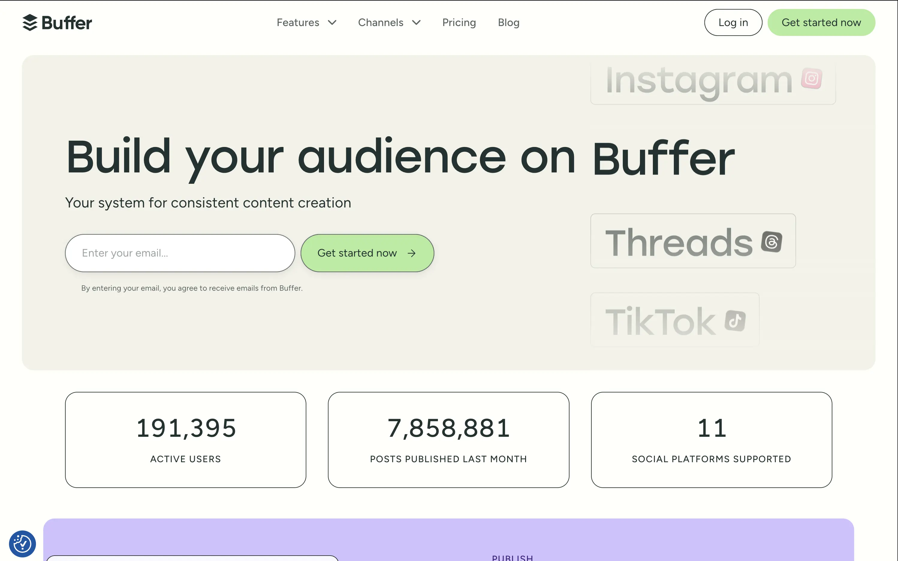
Buffer
↗
SaaS
Creator Tools
Productivity
Inset
Left-aligned
Aspirational
Email Capture
Live Metrics
Social Proof
Custom Animation
Light Mode
Green
Sans serif
Hybrid
Home Page
Custom Code
social media scheduler, content calendar tool, creator marketing SaaS, post automation, analytics, small-business growth
Buffer helps creators and teams grow their audience with simple tools to plan, publish, and track social content across multiple platforms.
The hero is calm and conversion-optimized. The oversized headline commands attention, while the clever marquee animation showcases integrations without visual overload. The inline email field reduces signup resistance and is paired with a soft green CTA for visual hierarchy. The hero balances aspirational tone with grounded proof (usage stats), but slightly muted contrast may reduce clarity on some screens.
Buffer leads with clarity and low effort — a smart choice for time-starved creators and marketers. Stats support credibility while tone avoids hype. The layout matches their no-fluff, practical brand positioning.
This layout balances technical utility with human impact, aligning well with Algolia’s positioning as an API-first but UX-aware company. The mobile UI reinforces product value visually, while the logo wall signals scale and trust for enterprise buyers. The tone is clear, benefit-led, and appropriate for high-intent decision-makers evaluating AI tools for customer experience. This is a solid enterprise-facing hero built to perform.
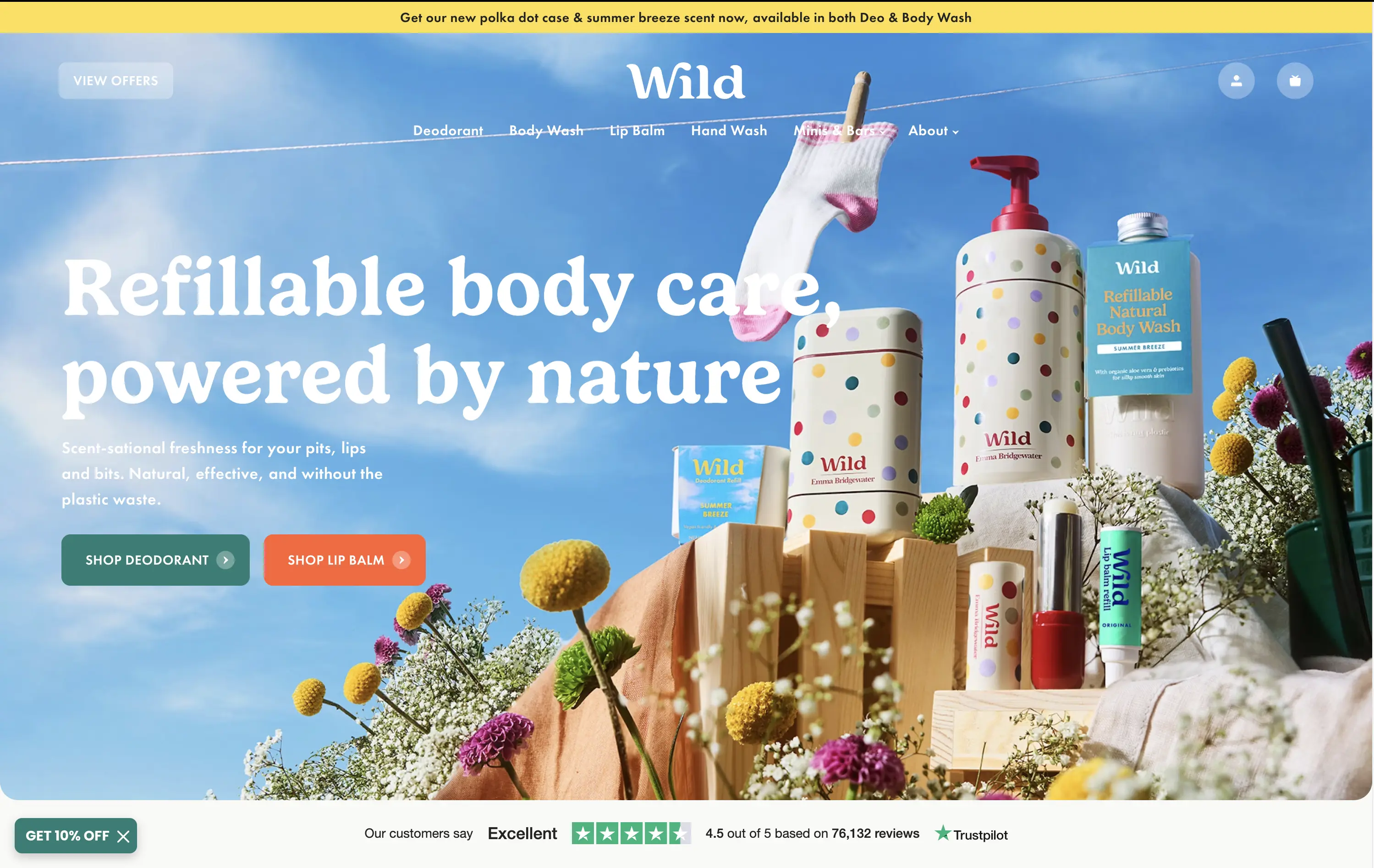
Wild
↗
CPG
Beauty & Wellness
Sustainability
Full Width
Left-aligned
Bold & Direct
Multi-CTA Block
Social Proof
Announcement
Imagery-Based
Green
Orange
Serif
DTC
Home Page
Shopify
eco-conscious, refillable packaging, summer aesthetic, photo-based hero, colorful packaging, nature-forward, trustbar visible, multi-CTA, DTC beauty, vibrant product shot, planet-positive, sunlit tone, clean bodycare
Wild offers refillable personal care products that are plastic-free, eco-friendly, and designed for everyday routines.
Bright, joyful photography captures the brand’s eco-fresh ethos while showcasing the full product range in one glance. Bold headline contrasts nicely with the sky backdrop, and CTAs are well-placed for quick shopper entry. Trustpilot widget reinforces credibility. While it’s vibrant and approachable, background details might slightly interfere with copy clarity on smaller screens.
Clear value prop and visual narrative tailored to eco-conscious DTC buyers. Emotional appeal (freshness, fun, nature) is balanced with proof (Trustpilot) and conversion intent. Could improve copy visibility slightly on mobile.
This layout balances technical utility with human impact, aligning well with Algolia’s positioning as an API-first but UX-aware company. The mobile UI reinforces product value visually, while the logo wall signals scale and trust for enterprise buyers. The tone is clear, benefit-led, and appropriate for high-intent decision-makers evaluating AI tools for customer experience. This is a solid enterprise-facing hero built to perform.
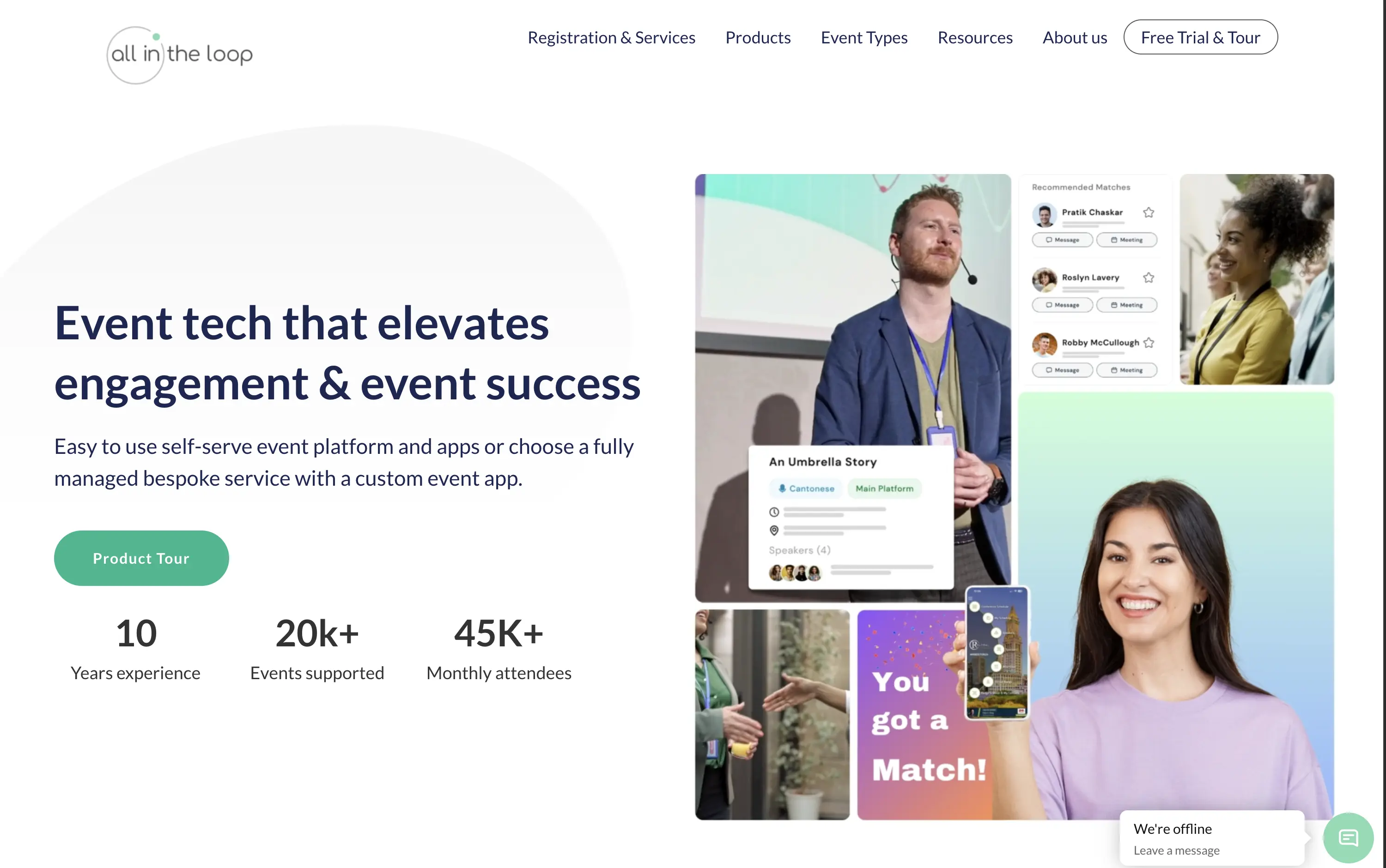
All in the loop
↗
SaaS
Events
Split Grid
Left-aligned
Benefit-Driven
Professional
Single Button
Media Gallery
Live Metrics
Social Proof
Light Mode
Blue
Green
Sans serif
B2B
Home Page
Wordpress
event tech, product tour CTA, pastel gradient, multi-image collage, visual UI overlays, metrics proof, event engagement, B2B SaaS, white background, friendly tone, hybrid event solutions, mobile app showcase, professional layout, soft aesthetic, platform demo
All in the Loop offers a self-serve or fully managed platform to run engaging, app-powered events and conferences.
The hero is clean and covers the basics — a clear headline, brief subtext, supporting visuals, and a CTA. But it plays it too safe. The collage of images feels generic and lacks a focal point. Visual proof of the product exists, but it’s scattered. There’s no standout hook or emotion — it functions, but it doesn’t persuade.
Positioning is sound—highlighting both self-serve and bespoke delivery models shows adaptability. The visuals convey live interaction and networking. Could benefit from a sharper, bolder headline, but trust and clarity are both strong.
This layout balances technical utility with human impact, aligning well with Algolia’s positioning as an API-first but UX-aware company. The mobile UI reinforces product value visually, while the logo wall signals scale and trust for enterprise buyers. The tone is clear, benefit-led, and appropriate for high-intent decision-makers evaluating AI tools for customer experience. This is a solid enterprise-facing hero built to perform.
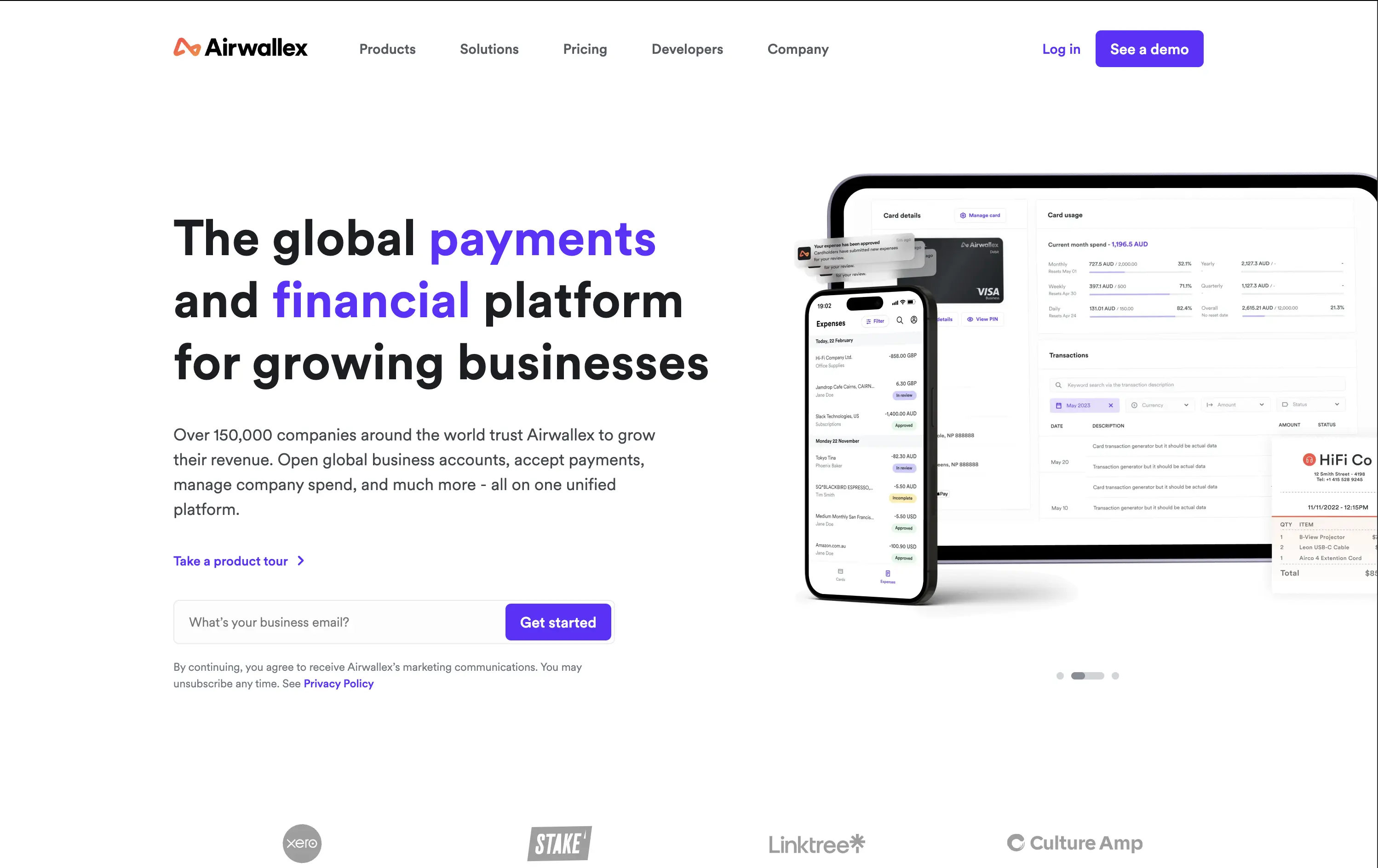
Airwallex
↗
SaaS
Fintech
Split Grid
Left-aligned
Bold & Direct
Email Capture
Logo Wall
Product UI
Social Proof
Light Mode
Purple
Sans serif
B2B
Home Page
Custom Code
global payments, business finance platform, modern fintech, trust-first messaging, clear value prop, multi-CTA, enterprise growth focus, mobile-first UI, clean grid, bold headline, subtle social proof, form-first hero, platform consolidation
Airwallex helps businesses grow globally by simplifying payments, expenses, and financial operations in one platform.
The hero is clean, confident, and product-led. It showcases both mobile and desktop views, reinforcing versatility. The email CTA is low-friction and conversion-ready. Copy hits major trust levers—global scale, growth, and simplicity—without bloating.
Well-calibrated for a mid-to-enterprise audience seeking global financial control. It’s benefit-led without hyperbole and supports multiple buyer types with a calm, scalable tone. The product visuals back up the value promise.
This layout balances technical utility with human impact, aligning well with Algolia’s positioning as an API-first but UX-aware company. The mobile UI reinforces product value visually, while the logo wall signals scale and trust for enterprise buyers. The tone is clear, benefit-led, and appropriate for high-intent decision-makers evaluating AI tools for customer experience. This is a solid enterprise-facing hero built to perform.
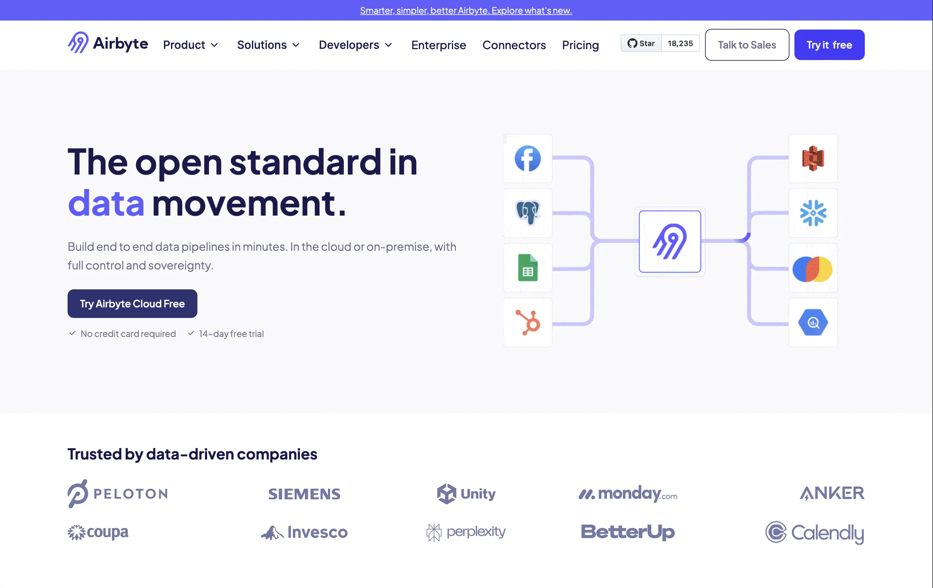
Airbyte
↗
SaaS
DevTools
Data & Analytics
Split Grid
Left-aligned
Confident
Professional
Single Button
Logo Wall
Social Proof
Custom Animation
Announcement
Light Mode
Blue
Purple
Sans serif
B2B
Home Page
Webflow
open source, developer-focused, visual connectors, high-trust, no fluff, fast-start trial, product-led, modern minimalist, enterprise-friendly, soft palette, bold type, efficient UI, scalable tech, clean grid, dual CTA
Airbyte helps companies move data between tools through customizable, open-source pipelines built in minutes.
The hero layout is direct and minimal — a great match for its technical buyer. The headline stakes leadership, and the visual of cross-platform connections lands the core value. CTA options address both bottom-up adoption and top-down sales. It feels mature without overcomplicating.
Positioning is strong: leading with “open standard” signals authority and trust. Visual language and tone reinforce the credibility needed to win enterprise and developer mindshare.
This layout balances technical utility with human impact, aligning well with Algolia’s positioning as an API-first but UX-aware company. The mobile UI reinforces product value visually, while the logo wall signals scale and trust for enterprise buyers. The tone is clear, benefit-led, and appropriate for high-intent decision-makers evaluating AI tools for customer experience. This is a solid enterprise-facing hero built to perform.
Glide
↗
SaaS
AI Tools
No-Code
Centered
Descriptive
Aspirational
Single Button
Media Gallery
Product UI
Social Proof
Light Mode
Blue
Sans serif
Hybrid
Home Page
Custom Code
no-code builder, AI app automation, enterprise productivity, lightweight onboarding, trust rating (G2), operational tooling, clean UI, visual simplicity, mobile-first, responsive design, clear headline, efficient layout, early enterprise fit
Build AI-powered apps from spreadsheets and data in minutes—no code, just drag-and-drop.
Clear headline, fast-loading visuals, and a direct CTA make this hero efficient. The structured layout supports fast scanning. The product screenshots add context, though the wide whitespace risks feeling sparse on large screens.
Hero speaks to operational efficiency with no-code benefits. Fits mid-maturity B2B buyers who want clarity and control. Trust-first approach suits SMBs and teams scaling internal workflows.
This layout balances technical utility with human impact, aligning well with Algolia’s positioning as an API-first but UX-aware company. The mobile UI reinforces product value visually, while the logo wall signals scale and trust for enterprise buyers. The tone is clear, benefit-led, and appropriate for high-intent decision-makers evaluating AI tools for customer experience. This is a solid enterprise-facing hero built to perform.
The most effective hero sections in your inbox.
Monthly round up of top hero sections.
Don't worry. We hate spam too.
Don't worry. We hate spam too.
Don't worry. We hate spam too.