Unconventional
1
1
1
1
Breaks the grid — unexpected structure, surprising rhythm, or playful logic.
Filters
Basecamp
↗
SaaS
Collaboration
Productivity
Centered
Unconventional
Conversational
Pain-driven
No CTA
Illustration
Light Mode
Green
Yellow
Sans serif
B2B
Home Page
Custom Code
project management, SaaS, lo-fi aesthetic, opinionated design, founder-led voice, visual storytelling, problem-first, productivity, cluttered tool fatigue, anti-modern, expressive illustration, early-stage appeal, emotional resonance, no UI demo, brand storytelling, narrative-led
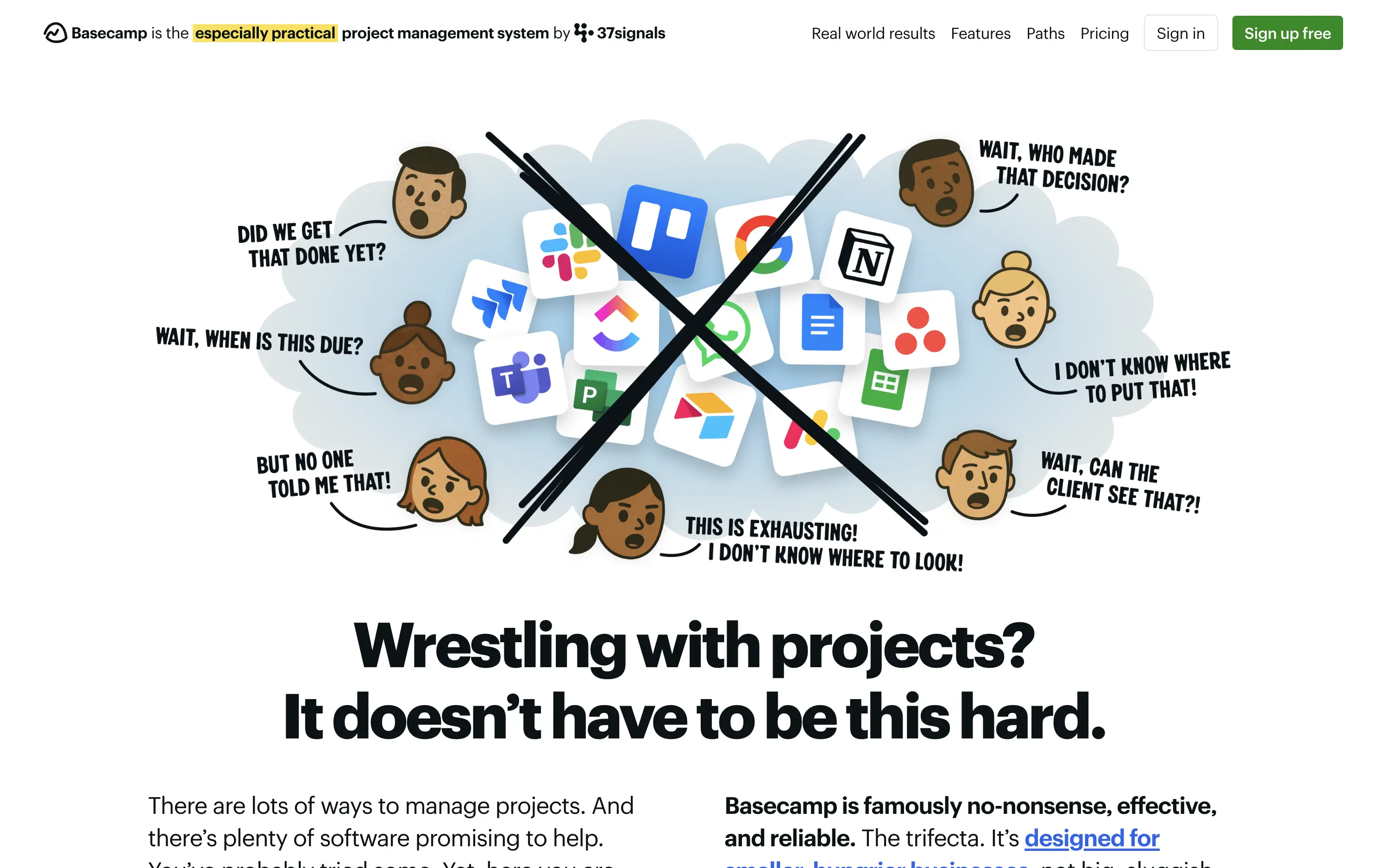
Basecamp cuts through tool overload with one practical workspace, ending project chaos.
The hero skips UI glamour for emotional clarity. It dramatizes the frustration of using too many disjointed tools through expressive cartoon faces and crossed-out logos. The copy is plain, bold, and highly relatable — “Wrestling with projects?” grounds it in a universal pain. No button, no fluff. The simplicity grabs attention and makes the message instantly clear.
Leans hard into anti-trend positioning—practicality over polish. Speaks directly to the frustration of tool overload, appealing to leaders who want sanity, not features. It’s memorable and unmistakably aligned with Basecamp’s legacy of contrarian clarity.
This layout balances technical utility with human impact, aligning well with Algolia’s positioning as an API-first but UX-aware company. The mobile UI reinforces product value visually, while the logo wall signals scale and trust for enterprise buyers. The tone is clear, benefit-led, and appropriate for high-intent decision-makers evaluating AI tools for customer experience. This is a solid enterprise-facing hero built to perform.
Basecamp
↗
SaaS
Collaboration
Productivity
Centered
Unconventional
Conversational
Pain-driven
No CTA
Illustration
Light Mode
Green
Yellow
Sans serif
B2B
Home Page
Custom Code
project management, SaaS, lo-fi aesthetic, opinionated design, founder-led voice, visual storytelling, problem-first, productivity, cluttered tool fatigue, anti-modern, expressive illustration, early-stage appeal, emotional resonance, no UI demo, brand storytelling, narrative-led
Basecamp cuts through tool overload with one practical workspace, ending project chaos.
The hero skips UI glamour for emotional clarity. It dramatizes the frustration of using too many disjointed tools through expressive cartoon faces and crossed-out logos. The copy is plain, bold, and highly relatable — “Wrestling with projects?” grounds it in a universal pain. No button, no fluff. The simplicity grabs attention and makes the message instantly clear.
Leans hard into anti-trend positioning—practicality over polish. Speaks directly to the frustration of tool overload, appealing to leaders who want sanity, not features. It’s memorable and unmistakably aligned with Basecamp’s legacy of contrarian clarity.
This layout balances technical utility with human impact, aligning well with Algolia’s positioning as an API-first but UX-aware company. The mobile UI reinforces product value visually, while the logo wall signals scale and trust for enterprise buyers. The tone is clear, benefit-led, and appropriate for high-intent decision-makers evaluating AI tools for customer experience. This is a solid enterprise-facing hero built to perform.
The most effective hero sections in your inbox.
Monthly round up of top hero sections.
Don't worry. We hate spam too.
Don't worry. We hate spam too.
Don't worry. We hate spam too.