Video
14
14
14
14
Moving visuals that immediately set tone or context — often full-bleed.
Filters
Yellow
↗
AI Tools
Creative Tools
Split Grid
Left-aligned
Benefit-Driven
Single Button
Video
3D visuals
Dark Mode
Yellow
Sans serif
B2B
Home Page
Custom Code
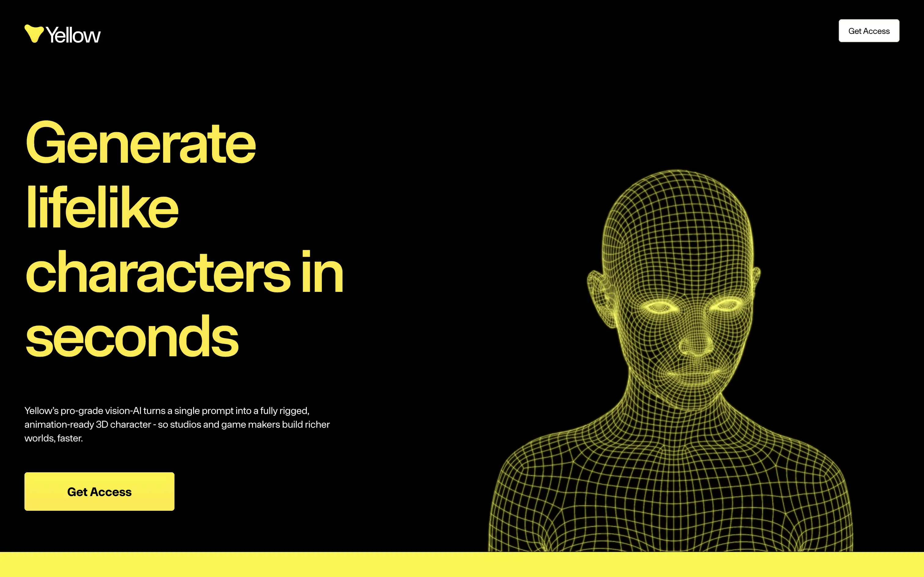
lifelike 3d characters, vision ai, rigged mesh, animation ready, game dev tools, vfx pipeline, split hero, black-yellow palette, bold typography, single cta, video demo, fast generation, pro-grade, product-led, studio workflow
Yellow turns a single prompt into a fully rigged, animation-ready 3D character so game and film studios build richer worlds in minutes.
Oversized yellow headline on black instantly communicates value and speed. Wireframe head animates, proving tech while matching brand color. Short support copy clarifies prompt-to-mesh promise. One bright button repeats “Get Access,” giving a clear next step. Motion pace feels slow, but hierarchy and contrast keep focus locked.
Hero nails pain of slow character workflows, aligning with pro creators who measure in seconds. Stark aesthetic signals premium tooling while early-access gate supports scarcity and user vetting.
This layout balances technical utility with human impact, aligning well with Algolia’s positioning as an API-first but UX-aware company. The mobile UI reinforces product value visually, while the logo wall signals scale and trust for enterprise buyers. The tone is clear, benefit-led, and appropriate for high-intent decision-makers evaluating AI tools for customer experience. This is a solid enterprise-facing hero built to perform.
Yellow
↗
AI Tools
Creative Tools
Split Grid
Left-aligned
Benefit-Driven
Single Button
Video
3D visuals
Dark Mode
Yellow
Sans serif
B2B
Home Page
Custom Code
lifelike 3d characters, vision ai, rigged mesh, animation ready, game dev tools, vfx pipeline, split hero, black-yellow palette, bold typography, single cta, video demo, fast generation, pro-grade, product-led, studio workflow
Yellow turns a single prompt into a fully rigged, animation-ready 3D character so game and film studios build richer worlds in minutes.
Oversized yellow headline on black instantly communicates value and speed. Wireframe head animates, proving tech while matching brand color. Short support copy clarifies prompt-to-mesh promise. One bright button repeats “Get Access,” giving a clear next step. Motion pace feels slow, but hierarchy and contrast keep focus locked.
Hero nails pain of slow character workflows, aligning with pro creators who measure in seconds. Stark aesthetic signals premium tooling while early-access gate supports scarcity and user vetting.
This layout balances technical utility with human impact, aligning well with Algolia’s positioning as an API-first but UX-aware company. The mobile UI reinforces product value visually, while the logo wall signals scale and trust for enterprise buyers. The tone is clear, benefit-led, and appropriate for high-intent decision-makers evaluating AI tools for customer experience. This is a solid enterprise-facing hero built to perform.
Wand
↗
AI Tools
Creative Tools
Centered
Aspirational
Empowering
Download App
Single Button
Video
Product UI
Imagery-Based
Blue
Sans serif
B2C
Home Page
Webflow
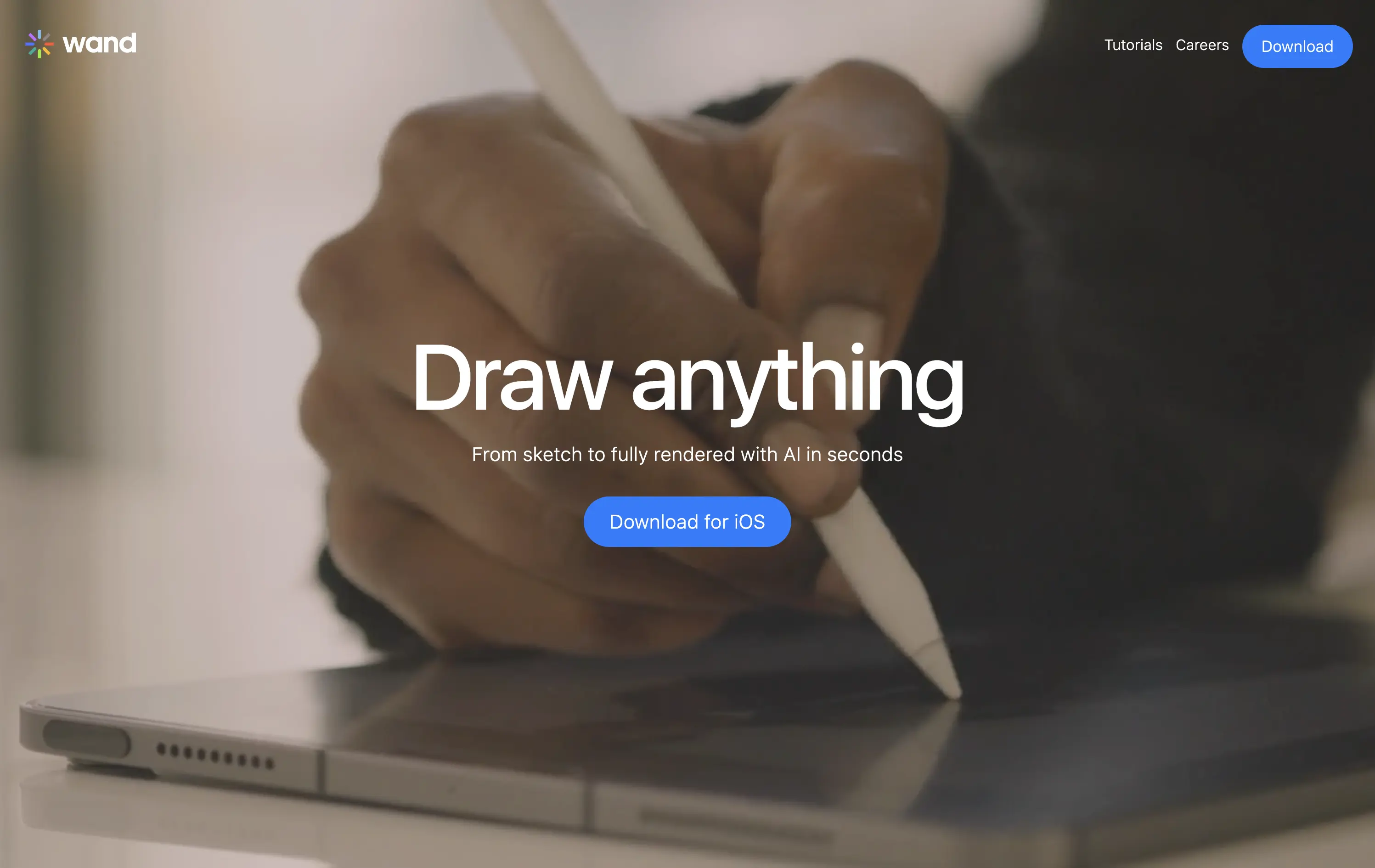
sketch-to-render, iOS-first, AI for artists, Apple Pencil UX, generative design, creative tooling, mobile-first AI, aspirational motion, immersive product demo, minimal CTA, emotional tech
Wand is an iOS app that transforms hand-drawn sketches into fully rendered images using AI—fast, simple, and intuitive.
The full-screen video speaks louder than the copy. You see the product’s value in real time. It’s immersive, emotionally resonant, and gives instant context—but assumes the viewer will wait and watch.
Wand leans into aspiration and emotion to sell its power. The video-first hero positions the tool as magical and tactile. It’s a strong brand move but could benefit from a secondary line for clarity or onboarding.
This layout balances technical utility with human impact, aligning well with Algolia’s positioning as an API-first but UX-aware company. The mobile UI reinforces product value visually, while the logo wall signals scale and trust for enterprise buyers. The tone is clear, benefit-led, and appropriate for high-intent decision-makers evaluating AI tools for customer experience. This is a solid enterprise-facing hero built to perform.
Wand
↗
AI Tools
Creative Tools
Centered
Aspirational
Empowering
Download App
Single Button
Video
Product UI
Imagery-Based
Blue
Sans serif
B2C
Home Page
Webflow
sketch-to-render, iOS-first, AI for artists, Apple Pencil UX, generative design, creative tooling, mobile-first AI, aspirational motion, immersive product demo, minimal CTA, emotional tech
Wand is an iOS app that transforms hand-drawn sketches into fully rendered images using AI—fast, simple, and intuitive.
The full-screen video speaks louder than the copy. You see the product’s value in real time. It’s immersive, emotionally resonant, and gives instant context—but assumes the viewer will wait and watch.
Wand leans into aspiration and emotion to sell its power. The video-first hero positions the tool as magical and tactile. It’s a strong brand move but could benefit from a secondary line for clarity or onboarding.
This layout balances technical utility with human impact, aligning well with Algolia’s positioning as an API-first but UX-aware company. The mobile UI reinforces product value visually, while the logo wall signals scale and trust for enterprise buyers. The tone is clear, benefit-led, and appropriate for high-intent decision-makers evaluating AI tools for customer experience. This is a solid enterprise-facing hero built to perform.
Reflect
↗
AI Tools
Creative Tools
Productivity
Centered
Aspirational
No CTA
Video
Product UI
Custom Animation
Gradient
Dark Mode
Purple
Sans serif
B2C
Home Page
Custom Code
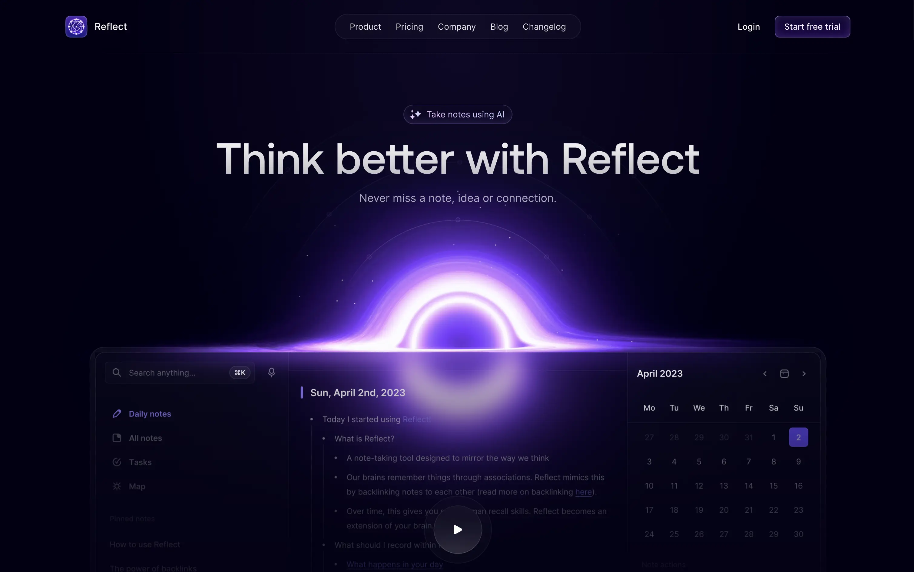
second brain tool, backlinking notes, dark ambient UI, AI note-taking, glowing animation, calm productivity, memory-focused tools, Roam alternative, neural metaphor, minimal interface
Reflect is an AI-powered note-taking app designed to help users think better, organize ideas, and link concepts seamlessly.
A visually memorable hero that communicates mood more than function. The glowing black-hole motif hints at depth and interconnectedness, but product clarity relies on secondary copy and scroll.
Reflect sells a mindset, not a feature. It uses visual metaphor and ambient energy to frame note-taking as a thinking upgrade. It’s bold, but clarity is delayed—relying on patience and resonance with a knowledge-worker mindset.
This layout balances technical utility with human impact, aligning well with Algolia’s positioning as an API-first but UX-aware company. The mobile UI reinforces product value visually, while the logo wall signals scale and trust for enterprise buyers. The tone is clear, benefit-led, and appropriate for high-intent decision-makers evaluating AI tools for customer experience. This is a solid enterprise-facing hero built to perform.
Reflect
↗
AI Tools
Creative Tools
Productivity
Centered
Aspirational
No CTA
Video
Product UI
Custom Animation
Gradient
Dark Mode
Purple
Sans serif
B2C
Home Page
Custom Code
second brain tool, backlinking notes, dark ambient UI, AI note-taking, glowing animation, calm productivity, memory-focused tools, Roam alternative, neural metaphor, minimal interface
Reflect is an AI-powered note-taking app designed to help users think better, organize ideas, and link concepts seamlessly.
A visually memorable hero that communicates mood more than function. The glowing black-hole motif hints at depth and interconnectedness, but product clarity relies on secondary copy and scroll.
Reflect sells a mindset, not a feature. It uses visual metaphor and ambient energy to frame note-taking as a thinking upgrade. It’s bold, but clarity is delayed—relying on patience and resonance with a knowledge-worker mindset.
This layout balances technical utility with human impact, aligning well with Algolia’s positioning as an API-first but UX-aware company. The mobile UI reinforces product value visually, while the logo wall signals scale and trust for enterprise buyers. The tone is clear, benefit-led, and appropriate for high-intent decision-makers evaluating AI tools for customer experience. This is a solid enterprise-facing hero built to perform.
Make
↗
No-Code
Productivity
Split Grid
Descriptive
Empowering
Multi-CTA Block
Video
Announcement
Duotone
Pink
Sans serif
Hybrid
Home Page
Custom Code
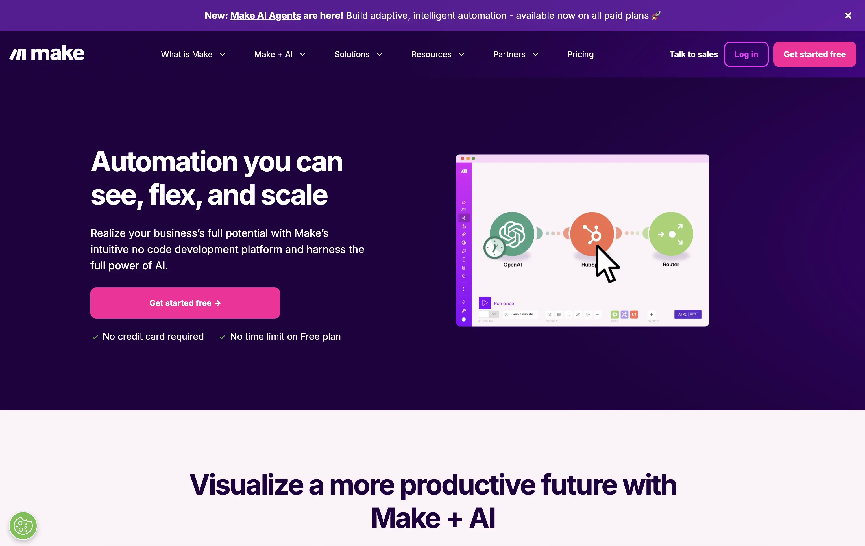
no-code automation, workflow builder, AI integration, drag-and-drop editor, Zapier alternative, clear onboarding, SaaS demo UX, trust-focused layout, commercial SaaS, AI-enhanced logic
Make is a no-code automation platform that lets businesses visually build and scale workflows powered by AI.
It’s clean, clear, and direct. The animated product video does the heavy lifting. The layout and copy are textbook SaaS—efficient but forgettable. It communicates function well without taking any design risks.
Optimized for clarity and ease of adoption. Great for users shopping for workflow tools, but lacks brand distinctiveness. Plays it safe with a universal SaaS format and gradient palette.
This layout balances technical utility with human impact, aligning well with Algolia’s positioning as an API-first but UX-aware company. The mobile UI reinforces product value visually, while the logo wall signals scale and trust for enterprise buyers. The tone is clear, benefit-led, and appropriate for high-intent decision-makers evaluating AI tools for customer experience. This is a solid enterprise-facing hero built to perform.
Make
↗
No-Code
Productivity
Split Grid
Descriptive
Empowering
Multi-CTA Block
Video
Announcement
Duotone
Pink
Sans serif
Hybrid
Home Page
Custom Code
no-code automation, workflow builder, AI integration, drag-and-drop editor, Zapier alternative, clear onboarding, SaaS demo UX, trust-focused layout, commercial SaaS, AI-enhanced logic
Make is a no-code automation platform that lets businesses visually build and scale workflows powered by AI.
It’s clean, clear, and direct. The animated product video does the heavy lifting. The layout and copy are textbook SaaS—efficient but forgettable. It communicates function well without taking any design risks.
Optimized for clarity and ease of adoption. Great for users shopping for workflow tools, but lacks brand distinctiveness. Plays it safe with a universal SaaS format and gradient palette.
This layout balances technical utility with human impact, aligning well with Algolia’s positioning as an API-first but UX-aware company. The mobile UI reinforces product value visually, while the logo wall signals scale and trust for enterprise buyers. The tone is clear, benefit-led, and appropriate for high-intent decision-makers evaluating AI tools for customer experience. This is a solid enterprise-facing hero built to perform.
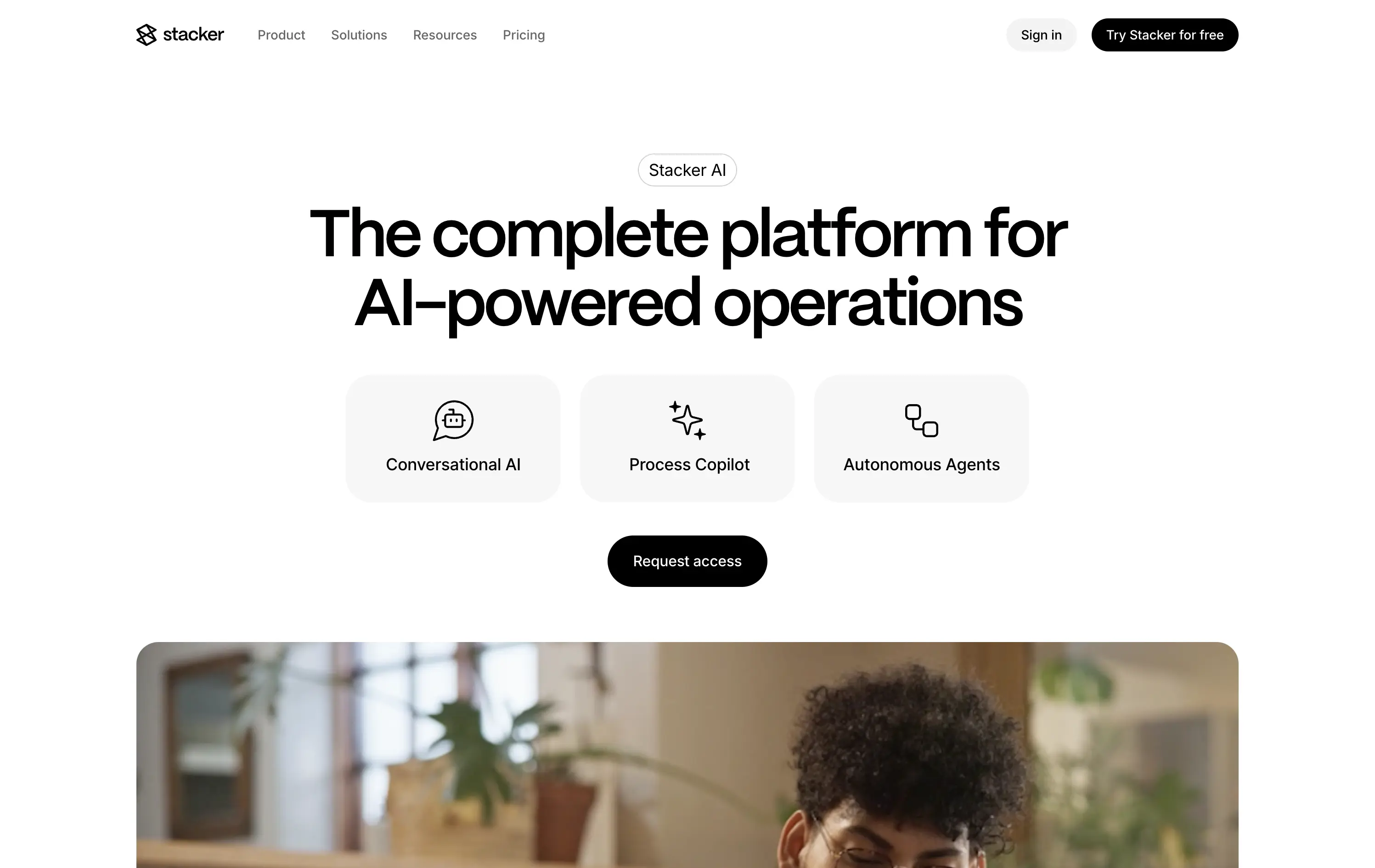
Stacker
↗
SaaS
AI Tools
Productivity
Minimal
Centered
Descriptive
Professional
Single Button
Photography
Video
Light Mode
Black
Sans serif
B2B
Home Page
Framer
AI operations platform, light minimal hero, conversational UI, agent automation, process copilots, clean layout, icon-based features, white space emphasis, AI-native workflow, modern SaaS tone, B2B AI, high-trust layout, early-stage beta feel
Stacker AI helps companies automate internal operations with conversational interfaces, process copilots, and autonomous agents built into their workflows.
Clarity-forward hero with minimal visual noise. Headline is direct. Icons give quick scannability of offering. “Request access” indicates early-stage invite model, aligning with AI-native positioning.
Strong entry for teams exploring AI-first automation. The restrained layout and soft interaction style suggest maturity and stability—a counterbalance to the experimental nature of AI agents.
This layout balances technical utility with human impact, aligning well with Algolia’s positioning as an API-first but UX-aware company. The mobile UI reinforces product value visually, while the logo wall signals scale and trust for enterprise buyers. The tone is clear, benefit-led, and appropriate for high-intent decision-makers evaluating AI tools for customer experience. This is a solid enterprise-facing hero built to perform.
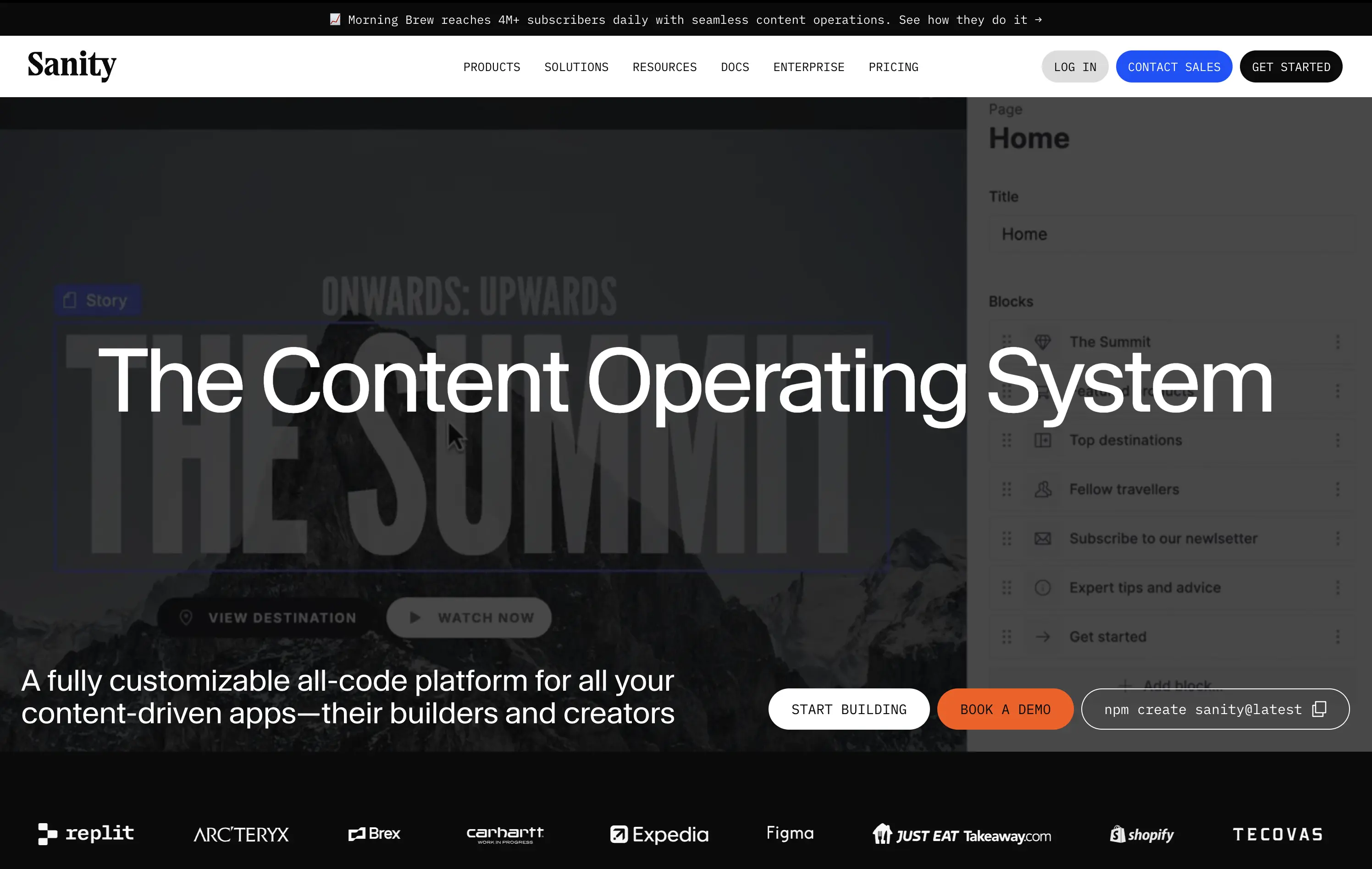
Sanity
↗
SaaS
DevTools
Full Width
Descriptive
Multi-CTA Block
Video
Logo Wall
Announcement
Imagery-Based
White
Orange
Sans serif
B2B
Home Page
Custom Code
programmable content, developer-first CMS, content infrastructure, CLI install, terminal-ready, layered layout, utility CTA, heavy visual load, startup-to-enterprise scale, code-native UX, tech-forward brand, headless CMS, dark visual tone
Sanity is a customizable, developer-first CMS platform that gives full programmatic control to build scalable content-driven apps.
Copy-to-clipboard npm CTA is highly functional and aligned with dev habits. But overall hierarchy is cluttered—UI overlay, imagery, and CTAs fight for attention, making the first impression a bit noisy.
Great strategic anchor for a technical audience, but risks cognitive overload on entry. Needs tighter content framing to sharpen focus for first-time visitors.
This layout balances technical utility with human impact, aligning well with Algolia’s positioning as an API-first but UX-aware company. The mobile UI reinforces product value visually, while the logo wall signals scale and trust for enterprise buyers. The tone is clear, benefit-led, and appropriate for high-intent decision-makers evaluating AI tools for customer experience. This is a solid enterprise-facing hero built to perform.
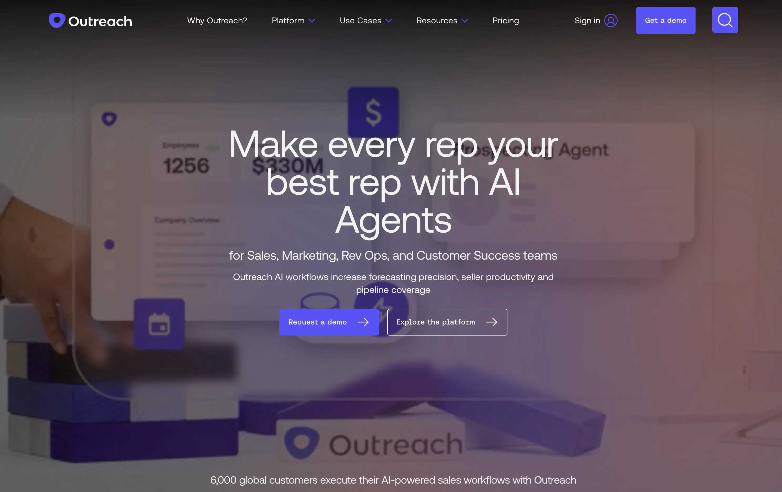
Outreach
↗
SaaS
AI Tools
Productivity
Full Width
Centered
Benefit-Driven
Confident
Multi-CTA Block
Video
Product UI
Imagery-Based
Blue
Sans serif
B2B
Home Page
Custom Code
sales automation, B2B SaaS, AI forecasting, sales rep enablement, RevOps tools, productivity workflows, confident tone, enterprise platform, full-width layout, animated product demo, AI sales co-pilot, multi-CTA, modern interface, precision messaging, dark UI
Outreach helps B2B teams improve pipeline precision and sales productivity through AI-powered automation and forecasting tools.
The hero is product-led with a high-trust, enterprise feel. The headline is assertive, speaking directly to the sales persona. Subheadline adds clarity and lists functional benefits. Background motion shows product value without distraction. CTAs are split by intent: demo vs. explore. The full-width layout conveys confidence and scale.
Clearly positioned for decision-makers in SalesOps and RevOps. Copy and layout support mid-funnel engagement with strong product-centric framing and trusting tone.
This layout balances technical utility with human impact, aligning well with Algolia’s positioning as an API-first but UX-aware company. The mobile UI reinforces product value visually, while the logo wall signals scale and trust for enterprise buyers. The tone is clear, benefit-led, and appropriate for high-intent decision-makers evaluating AI tools for customer experience. This is a solid enterprise-facing hero built to perform.
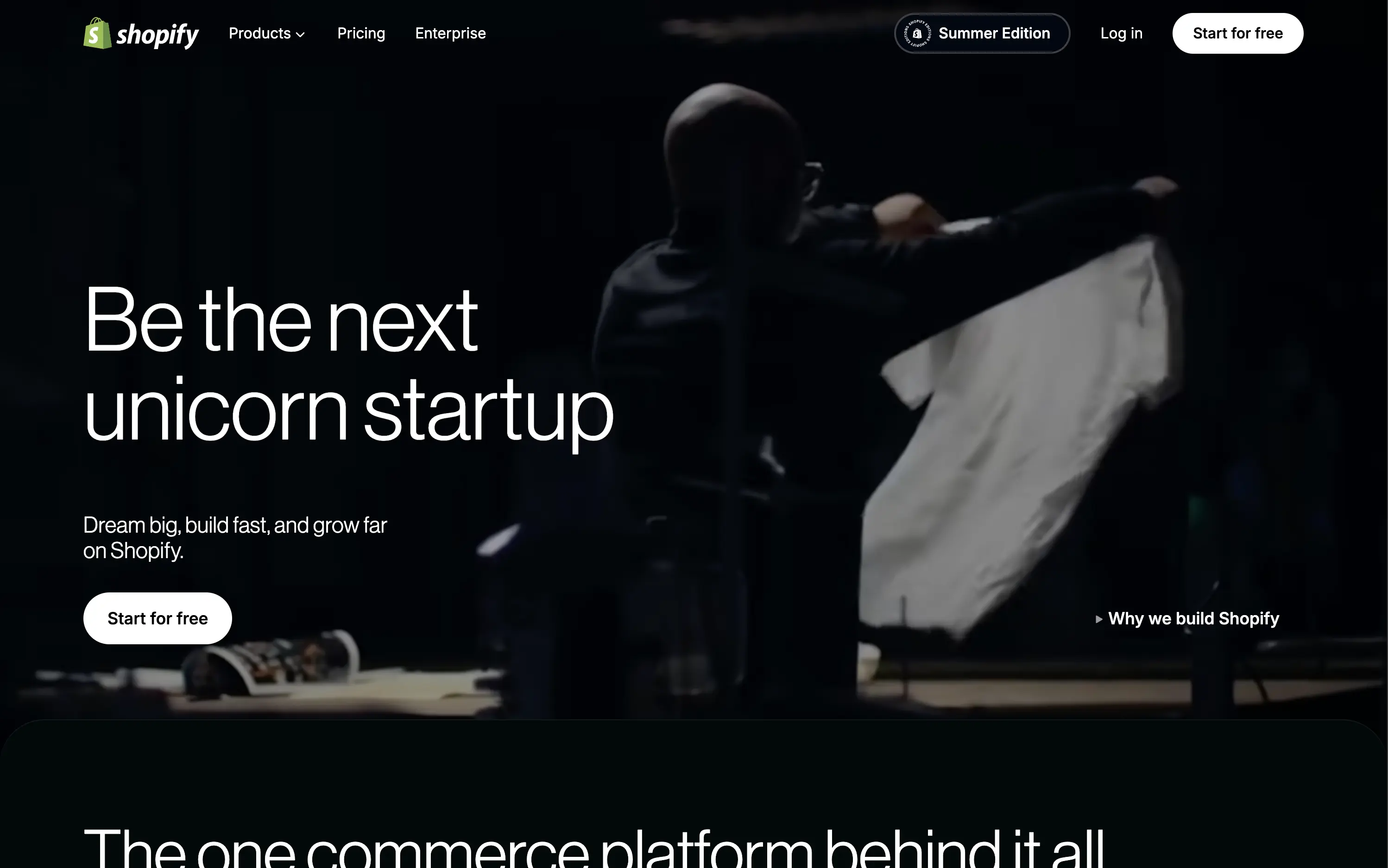
Shopify
↗
SaaS
No-Code
Full Width
Aspirational
Empowering
Single Button
Video
Custom Animation
Imagery-Based
White
Sans serif
Hybrid
Home Page
Shopify
ecommerce SaaS, cycling headlines, startup mindset, trust-first layout, minimal friction, brand-led SaaS, cinematic video, confident tone, aspirational messaging, high brand equity, editorial feel, unicorn builder
Shopify is the leading e-commerce platform enabling entrepreneurs to build, run, and scale online businesses of any size.
The hero is built on confidence. The looping video paired with aspirational headline cycles invites emotional projection—framing Shopify as the vehicle for bold ambition. The product isn’t shown because it doesn’t need to be; trust is already banked. Typography is clean and large, CTA is ultra-visible, and microcopy ("Dream big, build fast...") seals the brand tone. Minimal elements allow the brand equity to do the heavy lifting, making it a confident and quietly dominant play.
Hero capitalizes on Shopify’s maturity. No need to explain the product—just reaffirm its role as the enabler of big outcomes. Layout fits enterprise confidence while still feeling personal to startup dreamers.
This layout balances technical utility with human impact, aligning well with Algolia’s positioning as an API-first but UX-aware company. The mobile UI reinforces product value visually, while the logo wall signals scale and trust for enterprise buyers. The tone is clear, benefit-led, and appropriate for high-intent decision-makers evaluating AI tools for customer experience. This is a solid enterprise-facing hero built to perform.
Shopify
↗
SaaS
No-Code
Full Width
Aspirational
Empowering
Single Button
Video
Custom Animation
Imagery-Based
White
Sans serif
Hybrid
Home Page
Shopify
ecommerce SaaS, cycling headlines, startup mindset, trust-first layout, minimal friction, brand-led SaaS, cinematic video, confident tone, aspirational messaging, high brand equity, editorial feel, unicorn builder
Shopify is the leading e-commerce platform enabling entrepreneurs to build, run, and scale online businesses of any size.
The hero is built on confidence. The looping video paired with aspirational headline cycles invites emotional projection—framing Shopify as the vehicle for bold ambition. The product isn’t shown because it doesn’t need to be; trust is already banked. Typography is clean and large, CTA is ultra-visible, and microcopy ("Dream big, build fast...") seals the brand tone. Minimal elements allow the brand equity to do the heavy lifting, making it a confident and quietly dominant play.
Hero capitalizes on Shopify’s maturity. No need to explain the product—just reaffirm its role as the enabler of big outcomes. Layout fits enterprise confidence while still feeling personal to startup dreamers.
This layout balances technical utility with human impact, aligning well with Algolia’s positioning as an API-first but UX-aware company. The mobile UI reinforces product value visually, while the logo wall signals scale and trust for enterprise buyers. The tone is clear, benefit-led, and appropriate for high-intent decision-makers evaluating AI tools for customer experience. This is a solid enterprise-facing hero built to perform.
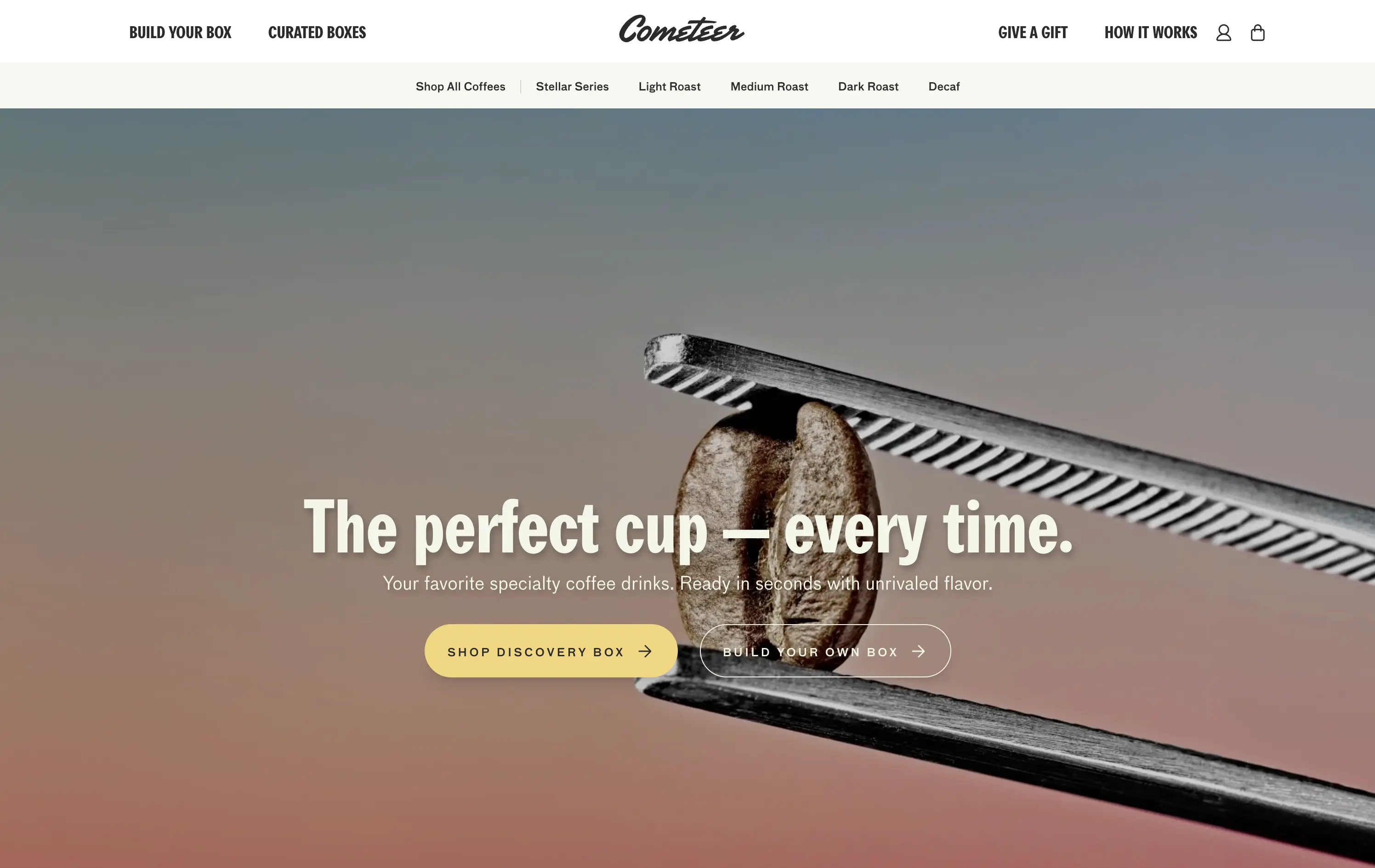
Cometeer
↗
CPG
Food & Beverage
Full Width
Editorial
Benefit-Driven
Aspirational
Multi-CTA Block
Video
Imagery-Based
Yellow
Sans serif
DTC
Home Page
Shopify
DTC coffee, video-led hero, brand storytelling, clear CTA hierarchy, warm tones, minimal text, fast onboarding, gradient background, sensory cue, product-focused, premium feel, lifestyle positioning, high visual polish, science-inspired design
Cometeer delivers barista-grade coffee flash-frozen into capsules for ultra-fast, ultra-consistent brewing at home.
The hero balances brand storytelling and performance design—sharp visual contrast, cinematic motion, and precise art direction anchor the product as premium and scientific. The headline is bold and memorable, while the subheadline clarifies the value prop in under 10 words. Dual CTAs reduce friction. The use of macro imagery paired with a scientific tool elevates the perception of quality and process control.
Clear DTC positioning with a premium, precision-led angle. The visual metaphor of lab-grade quality supports brand trust while the tone stays human. Layout signals high product confidence and fast conversion intent.
This layout balances technical utility with human impact, aligning well with Algolia’s positioning as an API-first but UX-aware company. The mobile UI reinforces product value visually, while the logo wall signals scale and trust for enterprise buyers. The tone is clear, benefit-led, and appropriate for high-intent decision-makers evaluating AI tools for customer experience. This is a solid enterprise-facing hero built to perform.
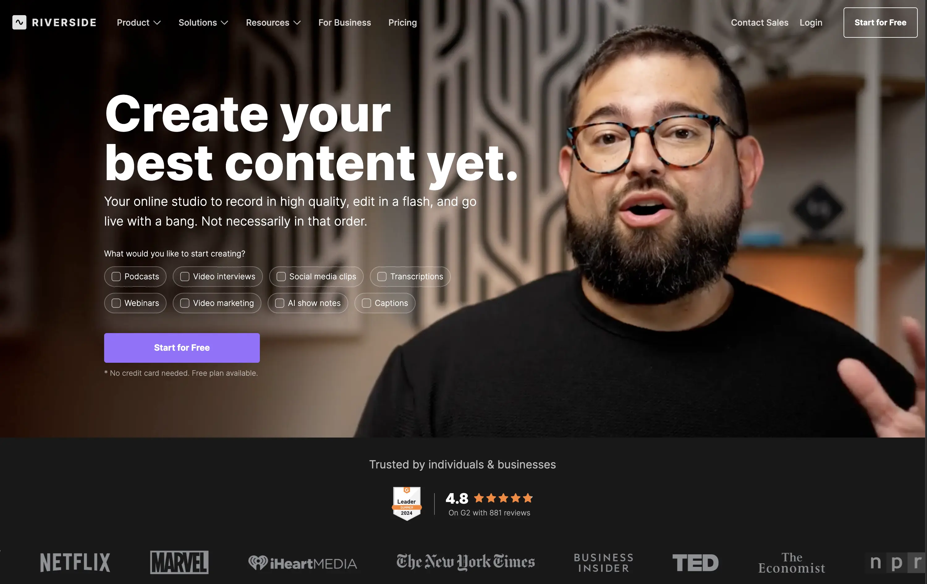
Riverside
↗
SaaS
Creator Tools
Creative Tools
Left-aligned
Aspirational
Single Button
Video
Interactive
Social Proof
Dark Mode
Imagery-Based
Purple
Sans serif
B2C
Home Page
Webflow
creator-first, face-driven, casual tone, real people, live recording, video-first layout, chip selector UI, dark mode, G2 badge, media industry, podcasting tool, modern SaaS, high-trust, content creation
Riverside is a browser-based studio for creators to record, edit, and publish high-quality video and audio content with ease.
Hero combines human warmth with clear purpose. Headline is aspirational, while subcopy clarifies. Visual chips guide self-segmentation. The single CTA is clean, bold, and frictionless. Social proof below adds immediate brand trust.
Tailored to non-technical creators who need a one-stop content tool. Design choices build ease and inspiration. Social logos position Riverside as mainstream-ready while keeping the tone personal and welcoming.
This layout balances technical utility with human impact, aligning well with Algolia’s positioning as an API-first but UX-aware company. The mobile UI reinforces product value visually, while the logo wall signals scale and trust for enterprise buyers. The tone is clear, benefit-led, and appropriate for high-intent decision-makers evaluating AI tools for customer experience. This is a solid enterprise-facing hero built to perform.
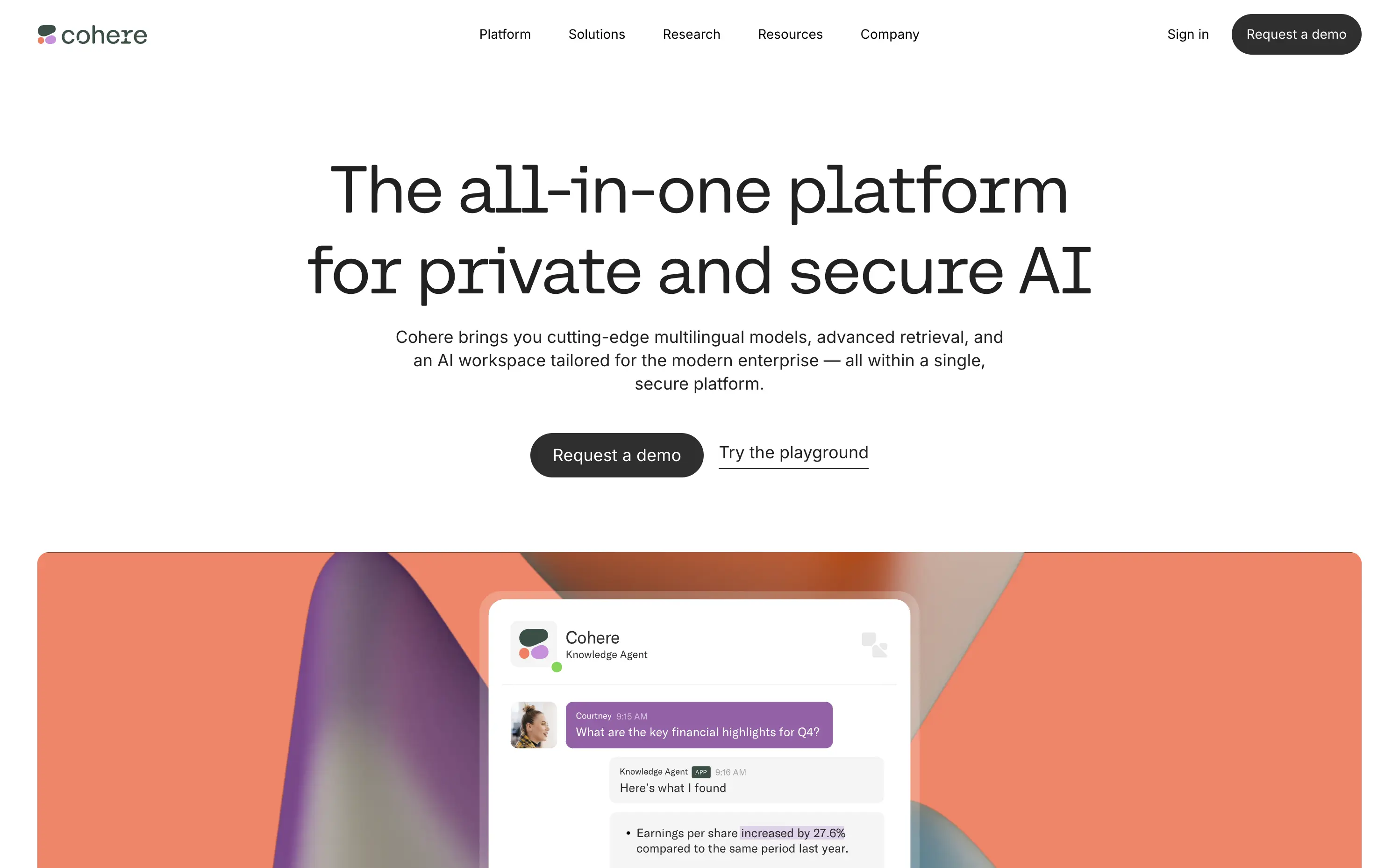
Cohere
↗
AI Tools
Centered
Descriptive
Professional
Multi-CTA Block
Video
Product UI
Light Mode
Black
Monospace
B2B
Home Page
Custom Code
enterprise AI, minimal aesthetic, abstract background, poetic design, security-forward, multilingual AI, understated UI, premium feel, morphing blobs, modern enterprise, monospace typography, visual restraint, AI productivity, custom interface
Cohere delivers private, multilingual AI models for enterprises with a focus on data security, customization, and seamless integration.
The hero is minimalist but intentional. Large, serif-style monospace typography exudes clarity and confidence. The morphing gradient blobs break up the austerity with visual warmth, and the two CTAs — “Request a demo” and “Try the playground” — balance high-commitment and exploratory paths. No gimmicks, no noise — just calm authority.
Cohere leans hard into its point of differentiation: privacy and control. The understated design reinforces brand maturity and trustworthiness — ideal for technical and security-conscious buyers avoiding hype cycles.
This layout balances technical utility with human impact, aligning well with Algolia’s positioning as an API-first but UX-aware company. The mobile UI reinforces product value visually, while the logo wall signals scale and trust for enterprise buyers. The tone is clear, benefit-led, and appropriate for high-intent decision-makers evaluating AI tools for customer experience. This is a solid enterprise-facing hero built to perform.
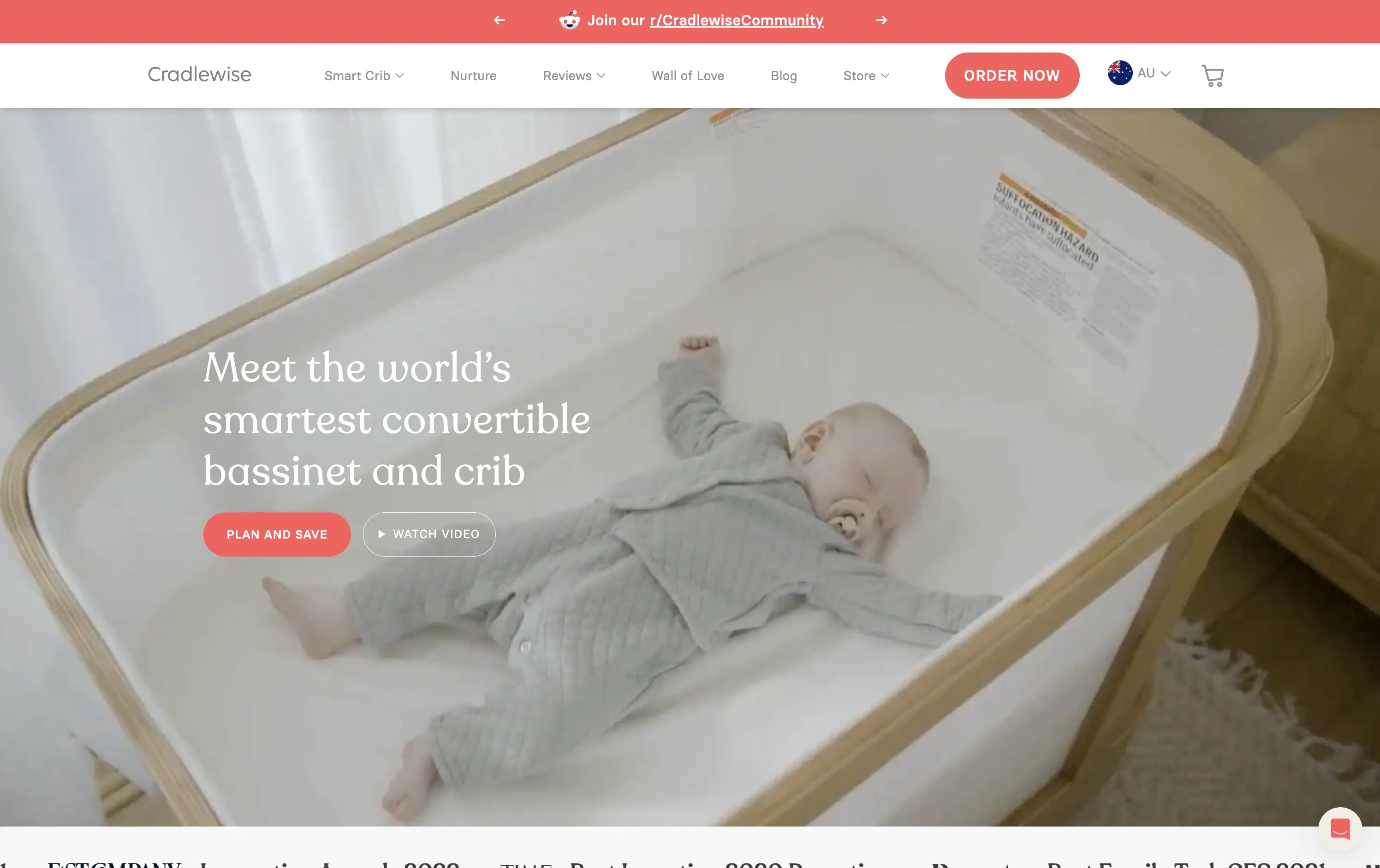
Cradlewise
↗
CPG
Hardware
Editorial
Benefit-Driven
Aspirational
Multi-CTA Block
Video
Announcement
Imagery-Based
Light Mode
Red
Serif
DTC
Home Page
Shopify
baby tech, smart crib, premium parenting, soft lifestyle visual, emotional trust, product-as-solution, sleep tech, high-ticket DTC, calming footage, gentle UX, non-intrusive CTA, safety-forward, babycare innovation, maternal audience
Cradlewise is a smart bassinet and crib that uses AI to soothe babies and help parents sleep better, all in one beautifully designed product.
The hero leans into emotion with soft lifestyle footage of the product in use — instantly communicating trust, peace of mind, and functional value. The headline clearly positions the product as a smart solution, while serif typography adds a premium touch. CTAs are well-placed, letting users choose between action or exploration. It’s elegant and persuasive.
Cradlewise effectively sells peace of mind to new parents. The blend of smart-tech value and lifestyle aesthetics strikes a perfect balance for premium buyers. It reinforces both utility and warmth without overexplaining.
This layout balances technical utility with human impact, aligning well with Algolia’s positioning as an API-first but UX-aware company. The mobile UI reinforces product value visually, while the logo wall signals scale and trust for enterprise buyers. The tone is clear, benefit-led, and appropriate for high-intent decision-makers evaluating AI tools for customer experience. This is a solid enterprise-facing hero built to perform.
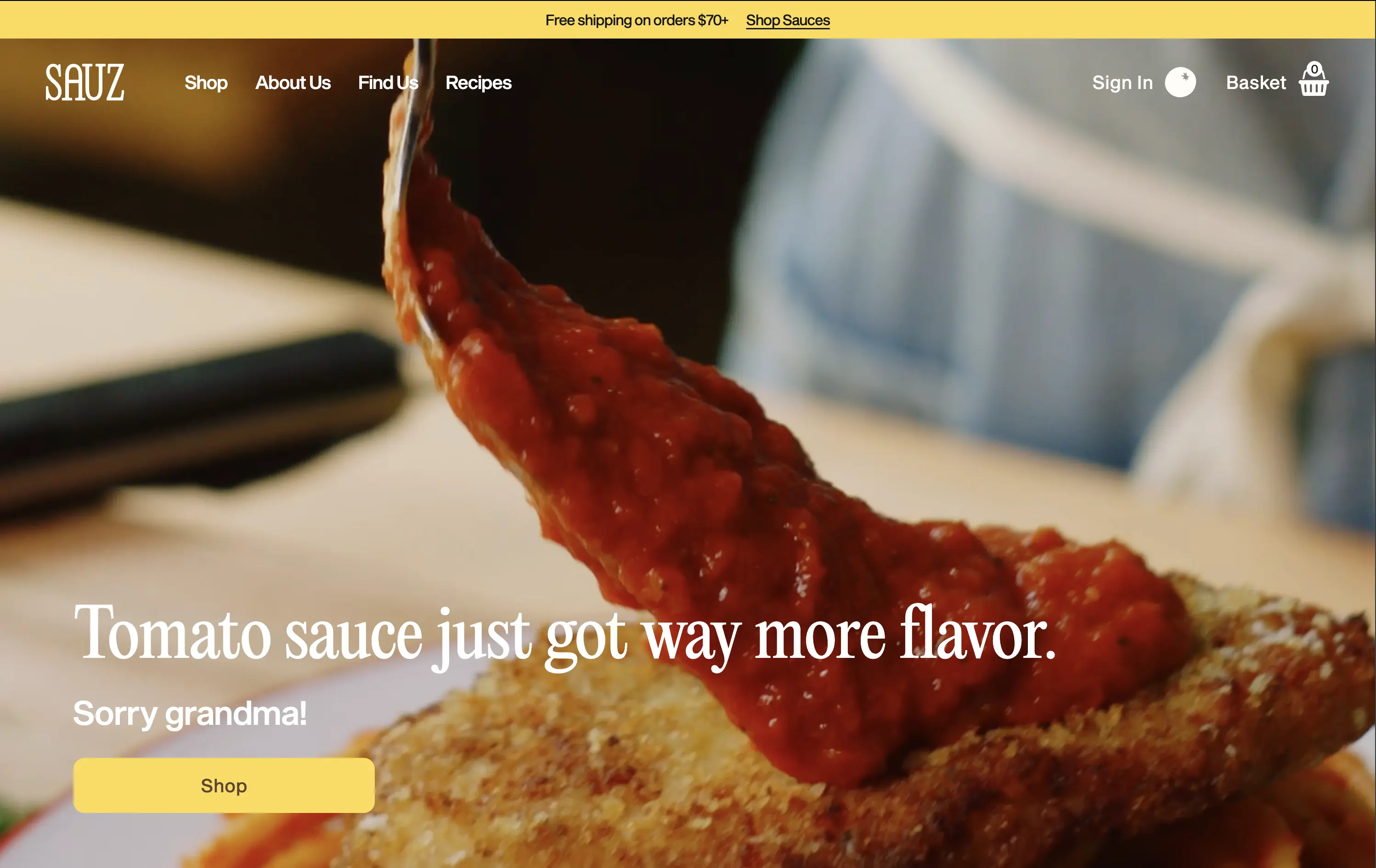
Sauz
↗
CPG
Food & Beverage
Left-aligned
Editorial
Playful
Confident
Single Button
Video
Announcement
Imagery-Based
Yellow
Sans serif
DTC
Home Page
Shopify
food-focused, video hero, flavor-first, cheeky copy, bold serif, zoom-in shot, emotional appeal, clean layout, direct CTA, DTC food, high-conversion, gourmet casual, attention-grabbing, warm tones
Sauz is a modern food brand delivering bold, chef-crafted sauces that reimagine classic flavors with attitude and heat.
The video draws instant attention and evokes craving. Typography and tone hit hard but feel fun. CTA is well-placed and visually distinct. It’s visual-first and high-impact with zero distractions — built for impulse.
A textbook DTC move: punchy, irreverent, visual. The design guides users toward quick conversion. It’s fun without losing clarity — perfect for modern food shoppers who crave personality with purchase.
This layout balances technical utility with human impact, aligning well with Algolia’s positioning as an API-first but UX-aware company. The mobile UI reinforces product value visually, while the logo wall signals scale and trust for enterprise buyers. The tone is clear, benefit-led, and appropriate for high-intent decision-makers evaluating AI tools for customer experience. This is a solid enterprise-facing hero built to perform.
Tuft & Needle
↗
Home & Living
Full Width
Descriptive
Single Button
Video
Imagery-Based
Light Mode
Green
Serif
DTC
Home Page
Shopify
calm aesthetic, DTC home brand, promo-led hero, lifestyle video, seasonal offer, mattress DTC, soothing tones, centered CTA, sales-driven layout, comfort-first, ecommerce UX, banner urgency, restful visuals
Tuft & Needle sells mattresses and bedding online, promising comfort, value, and fast delivery.
Hero makes the seasonal sale clear and appealing without breaking the brand’s visual softness. Video adds warmth, while the green CTA stands out without feeling intrusive. Messaging is brief and conversion-oriented.
Built to convert value-driven home shoppers during peak sale season. Visual tone maintains trust and ease, while layout pushes urgency in a structured, on-brand way. No distractions, just comfort and clarity.
This layout balances technical utility with human impact, aligning well with Algolia’s positioning as an API-first but UX-aware company. The mobile UI reinforces product value visually, while the logo wall signals scale and trust for enterprise buyers. The tone is clear, benefit-led, and appropriate for high-intent decision-makers evaluating AI tools for customer experience. This is a solid enterprise-facing hero built to perform.
The most effective hero sections in your inbox.
Monthly round up of top hero sections.
Don't worry. We hate spam too.
Don't worry. We hate spam too.
Don't worry. We hate spam too.