Yellow
21
21
21
21
Filters
Yellow
↗
AI Tools
Creative Tools
Split Grid
Left-aligned
Benefit-Driven
Single Button
Video
3D visuals
Dark Mode
Yellow
Sans serif
B2B
Home Page
Custom Code
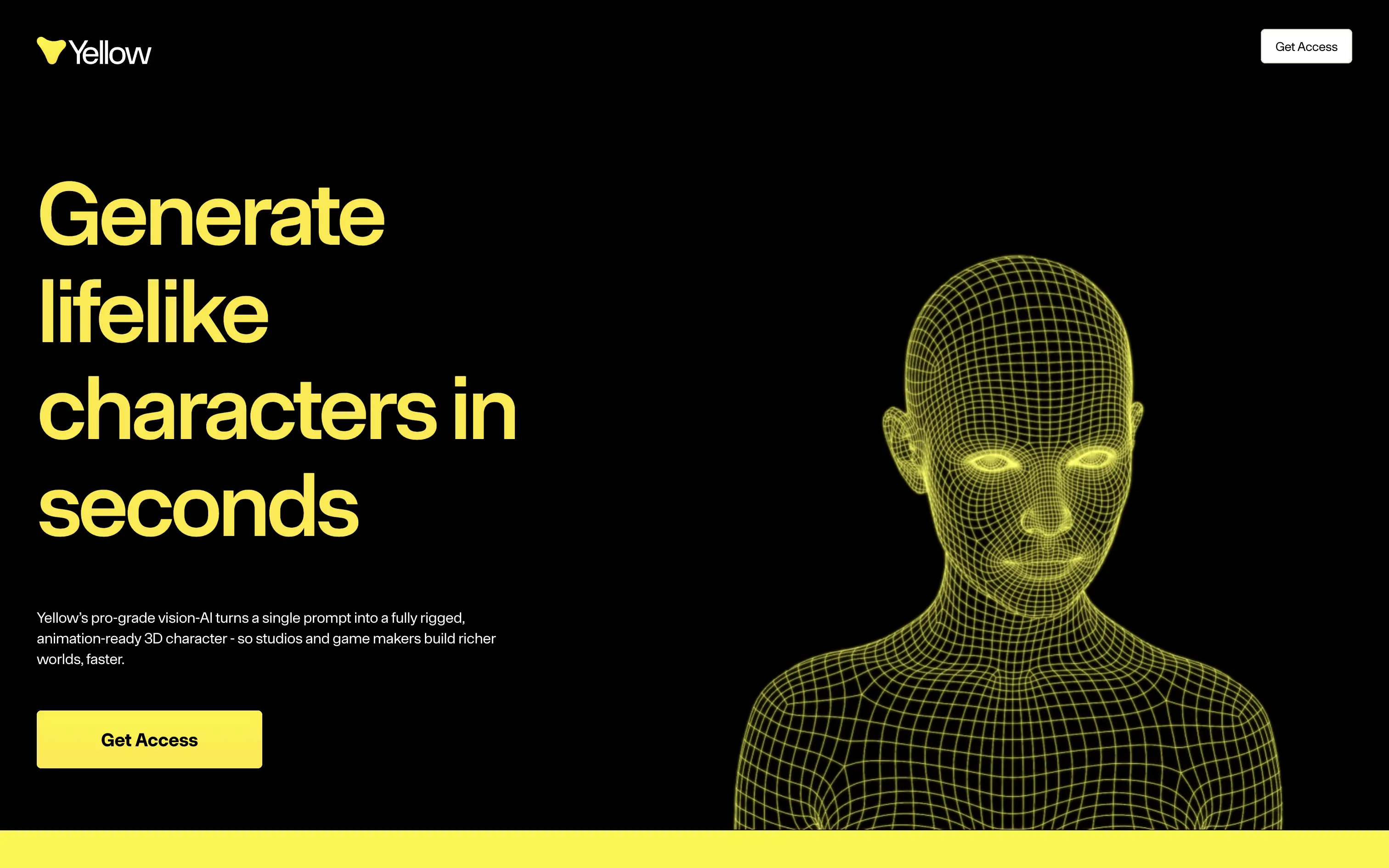
lifelike 3d characters, vision ai, rigged mesh, animation ready, game dev tools, vfx pipeline, split hero, black-yellow palette, bold typography, single cta, video demo, fast generation, pro-grade, product-led, studio workflow
Yellow turns a single prompt into a fully rigged, animation-ready 3D character so game and film studios build richer worlds in minutes.
Oversized yellow headline on black instantly communicates value and speed. Wireframe head animates, proving tech while matching brand color. Short support copy clarifies prompt-to-mesh promise. One bright button repeats “Get Access,” giving a clear next step. Motion pace feels slow, but hierarchy and contrast keep focus locked.
Hero nails pain of slow character workflows, aligning with pro creators who measure in seconds. Stark aesthetic signals premium tooling while early-access gate supports scarcity and user vetting.
This layout balances technical utility with human impact, aligning well with Algolia’s positioning as an API-first but UX-aware company. The mobile UI reinforces product value visually, while the logo wall signals scale and trust for enterprise buyers. The tone is clear, benefit-led, and appropriate for high-intent decision-makers evaluating AI tools for customer experience. This is a solid enterprise-facing hero built to perform.
Yellow
↗
AI Tools
Creative Tools
Split Grid
Left-aligned
Benefit-Driven
Single Button
Video
3D visuals
Dark Mode
Yellow
Sans serif
B2B
Home Page
Custom Code
lifelike 3d characters, vision ai, rigged mesh, animation ready, game dev tools, vfx pipeline, split hero, black-yellow palette, bold typography, single cta, video demo, fast generation, pro-grade, product-led, studio workflow
Yellow turns a single prompt into a fully rigged, animation-ready 3D character so game and film studios build richer worlds in minutes.
Oversized yellow headline on black instantly communicates value and speed. Wireframe head animates, proving tech while matching brand color. Short support copy clarifies prompt-to-mesh promise. One bright button repeats “Get Access,” giving a clear next step. Motion pace feels slow, but hierarchy and contrast keep focus locked.
Hero nails pain of slow character workflows, aligning with pro creators who measure in seconds. Stark aesthetic signals premium tooling while early-access gate supports scarcity and user vetting.
This layout balances technical utility with human impact, aligning well with Algolia’s positioning as an API-first but UX-aware company. The mobile UI reinforces product value visually, while the logo wall signals scale and trust for enterprise buyers. The tone is clear, benefit-led, and appropriate for high-intent decision-makers evaluating AI tools for customer experience. This is a solid enterprise-facing hero built to perform.
Stacks
↗
SaaS
AI Tools
Fintech
Centered
Aspirational
Abstract / Conceptual
Multi-CTA Block
Logo Wall
Product UI
Announcement
Gradient
Light Mode
Green
Yellow
Serif
B2B
Home Page
Framer
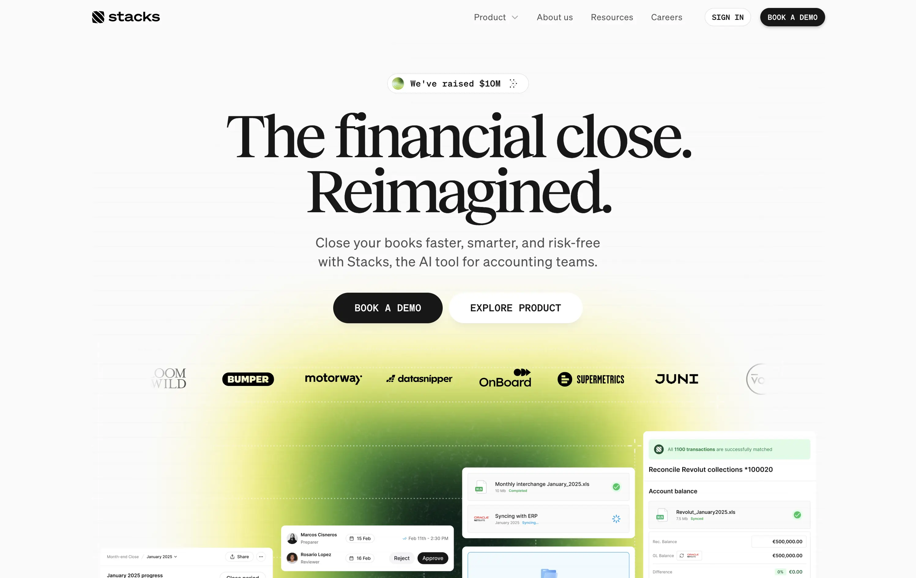
gradient hero, oversized serif headline, AI accounting SaaS, dual CTA, funding badge, logo wall, centered layout, finance automation, green yellow gradient, trusted by logos, product UI peek, crisp white background, modern B2B, high trust, accounting teams
AI‑powered platform that helps accounting teams close books faster and with less risk by automating month‑end workflows.
Oversized serif headline reframes month‑end close as an ambitious reinvention, while the lime gradient draws focus and adds energy. Subheadline grounds the concept with clear benefits, and dual CTAs serve both demo‑ready and exploratory visitors. Funding badge plus client logos build instant trust. UI snippets tease depth without clutter, aided by spacious layout and sticky nav. Cohesive and convincing.
Conceptual headline elevates mundane finance work, appealing to transformation‑minded leaders. Gradient signals progress, while proof elements ease risk concerns. Demo‑centric funnel matches enterprise sales reality.
This layout balances technical utility with human impact, aligning well with Algolia’s positioning as an API-first but UX-aware company. The mobile UI reinforces product value visually, while the logo wall signals scale and trust for enterprise buyers. The tone is clear, benefit-led, and appropriate for high-intent decision-makers evaluating AI tools for customer experience. This is a solid enterprise-facing hero built to perform.
Stacks
↗
SaaS
AI Tools
Fintech
Centered
Aspirational
Abstract / Conceptual
Multi-CTA Block
Logo Wall
Product UI
Announcement
Gradient
Light Mode
Green
Yellow
Serif
B2B
Home Page
Framer
gradient hero, oversized serif headline, AI accounting SaaS, dual CTA, funding badge, logo wall, centered layout, finance automation, green yellow gradient, trusted by logos, product UI peek, crisp white background, modern B2B, high trust, accounting teams
AI‑powered platform that helps accounting teams close books faster and with less risk by automating month‑end workflows.
Oversized serif headline reframes month‑end close as an ambitious reinvention, while the lime gradient draws focus and adds energy. Subheadline grounds the concept with clear benefits, and dual CTAs serve both demo‑ready and exploratory visitors. Funding badge plus client logos build instant trust. UI snippets tease depth without clutter, aided by spacious layout and sticky nav. Cohesive and convincing.
Conceptual headline elevates mundane finance work, appealing to transformation‑minded leaders. Gradient signals progress, while proof elements ease risk concerns. Demo‑centric funnel matches enterprise sales reality.
This layout balances technical utility with human impact, aligning well with Algolia’s positioning as an API-first but UX-aware company. The mobile UI reinforces product value visually, while the logo wall signals scale and trust for enterprise buyers. The tone is clear, benefit-led, and appropriate for high-intent decision-makers evaluating AI tools for customer experience. This is a solid enterprise-facing hero built to perform.
Opal
↗
CPG
Hardware
Left-aligned
Editorial
Descriptive
Confident
Single Button
Email Capture
Photography
Imagery-Based
Yellow
Sans serif
DTC
Home Page
Custom Code
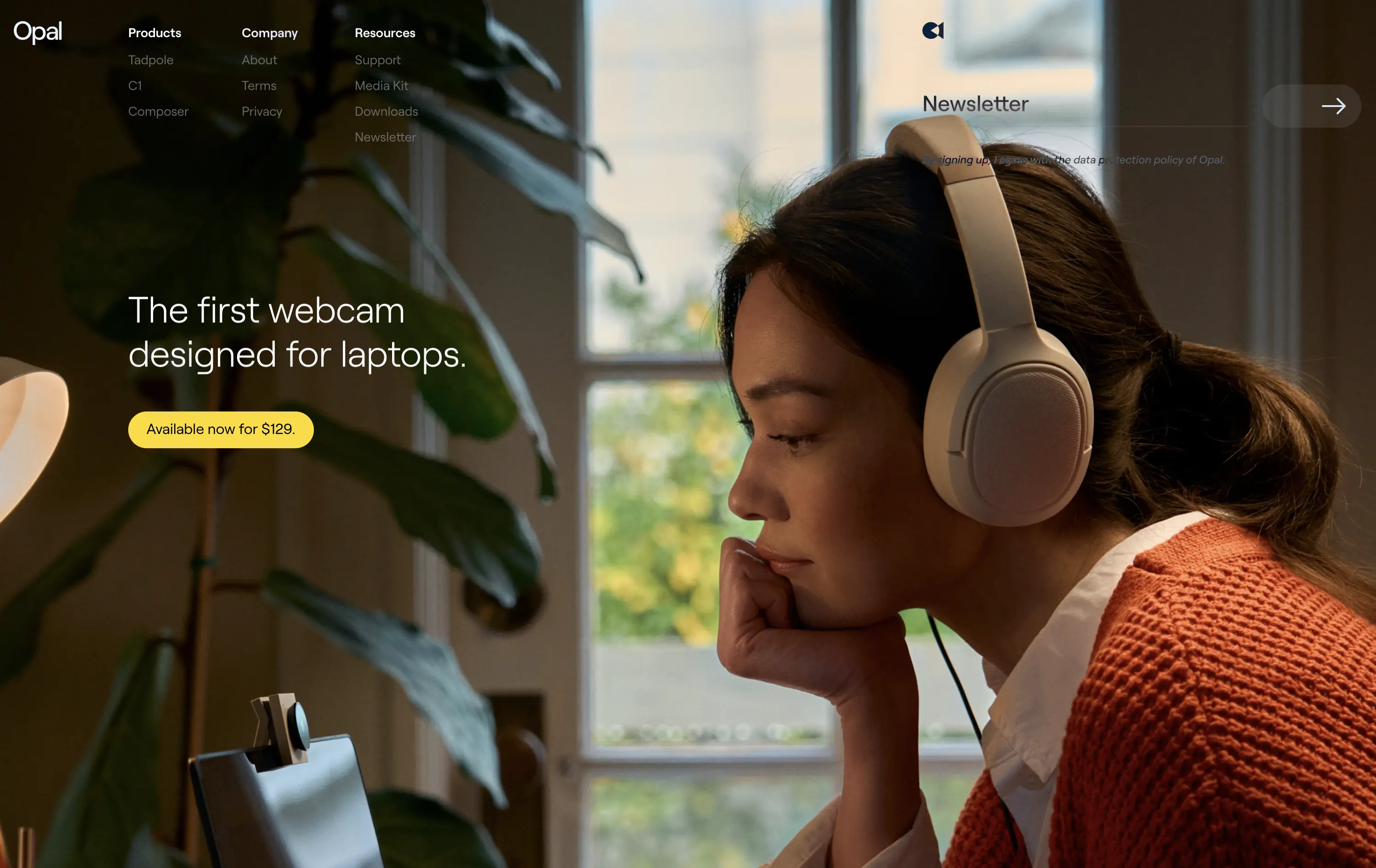
premium webcam, lifestyle focus, cozy setup, hardware-first product, DTC electronics, human-centered visual, muted palette, cinematic photography, on-brand lighting, creative tool, soft tech aesthetic
Opal makes premium webcams designed for laptops, with high-end quality and thoughtful design.
The hero is clean and confident. Photo tells the story before the copy does. It’s emotional, product-centric, and conversion-ready—but a bit light on technical proof or feature context.
Opal sells feeling first—comfort, focus, and quality. This is lifestyle-led DTC strategy that builds trust visually. But it risks underselling function unless the user scrolls.
This layout balances technical utility with human impact, aligning well with Algolia’s positioning as an API-first but UX-aware company. The mobile UI reinforces product value visually, while the logo wall signals scale and trust for enterprise buyers. The tone is clear, benefit-led, and appropriate for high-intent decision-makers evaluating AI tools for customer experience. This is a solid enterprise-facing hero built to perform.
Opal
↗
CPG
Hardware
Left-aligned
Editorial
Descriptive
Confident
Single Button
Email Capture
Photography
Imagery-Based
Yellow
Sans serif
DTC
Home Page
Custom Code
premium webcam, lifestyle focus, cozy setup, hardware-first product, DTC electronics, human-centered visual, muted palette, cinematic photography, on-brand lighting, creative tool, soft tech aesthetic
Opal makes premium webcams designed for laptops, with high-end quality and thoughtful design.
The hero is clean and confident. Photo tells the story before the copy does. It’s emotional, product-centric, and conversion-ready—but a bit light on technical proof or feature context.
Opal sells feeling first—comfort, focus, and quality. This is lifestyle-led DTC strategy that builds trust visually. But it risks underselling function unless the user scrolls.
This layout balances technical utility with human impact, aligning well with Algolia’s positioning as an API-first but UX-aware company. The mobile UI reinforces product value visually, while the logo wall signals scale and trust for enterprise buyers. The tone is clear, benefit-led, and appropriate for high-intent decision-makers evaluating AI tools for customer experience. This is a solid enterprise-facing hero built to perform.
Family
↗
Fintech
Web3
Centered
Playful
Confident
Download App
Multi-CTA Block
Illustration
Custom Animation
Loading Animation
Light Mode
Blue
Yellow
Black
Sans serif
B2C
Home Page
Custom Code
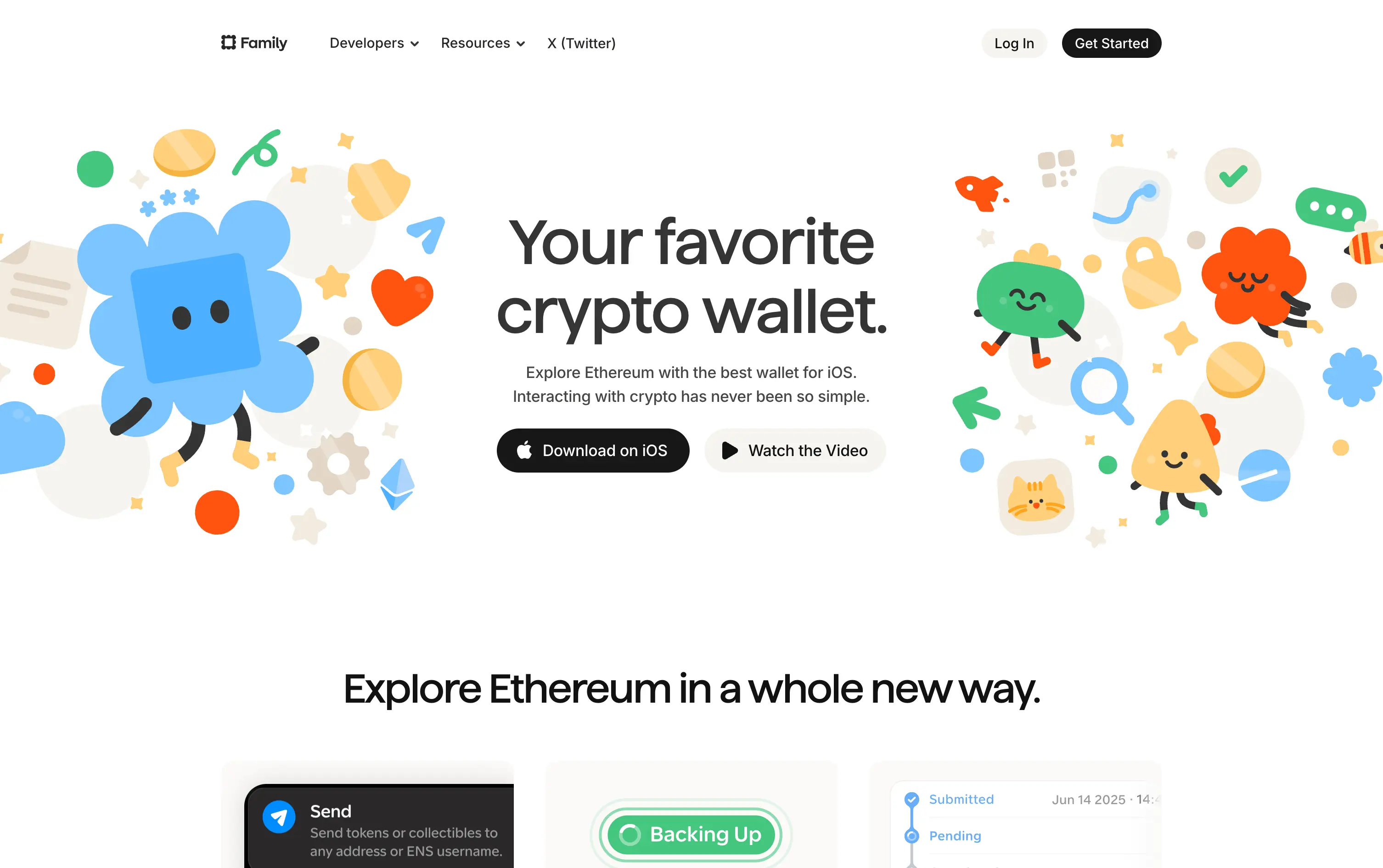
crypto wallet for iOS, ENS support, playful Web3, mobile-first design, Gen Z crypto, kawaii aesthetic, approachable fintech, token collectibles, web3 onboarding, friendly UX
Family is a playful Ethereum wallet designed for iOS, making crypto feel friendly, visual, and simple to use.
Extremely approachable for a space often seen as cold or intimidating. The illustrations soften the category. Clear copy and strong CTA pair well with the product’s target audience and mobile-first approach.
A masterclass in brand positioning. While most Web3 brands chase dark, technical aesthetics, Family goes the opposite direction—bright, warm, and welcoming. It’s intentionally crafted to disarm, invite, and onboard a broader audience.
This layout balances technical utility with human impact, aligning well with Algolia’s positioning as an API-first but UX-aware company. The mobile UI reinforces product value visually, while the logo wall signals scale and trust for enterprise buyers. The tone is clear, benefit-led, and appropriate for high-intent decision-makers evaluating AI tools for customer experience. This is a solid enterprise-facing hero built to perform.
Family
↗
Fintech
Web3
Centered
Playful
Confident
Download App
Multi-CTA Block
Illustration
Custom Animation
Loading Animation
Light Mode
Blue
Yellow
Black
Sans serif
B2C
Home Page
Custom Code
crypto wallet for iOS, ENS support, playful Web3, mobile-first design, Gen Z crypto, kawaii aesthetic, approachable fintech, token collectibles, web3 onboarding, friendly UX
Family is a playful Ethereum wallet designed for iOS, making crypto feel friendly, visual, and simple to use.
Extremely approachable for a space often seen as cold or intimidating. The illustrations soften the category. Clear copy and strong CTA pair well with the product’s target audience and mobile-first approach.
A masterclass in brand positioning. While most Web3 brands chase dark, technical aesthetics, Family goes the opposite direction—bright, warm, and welcoming. It’s intentionally crafted to disarm, invite, and onboard a broader audience.
This layout balances technical utility with human impact, aligning well with Algolia’s positioning as an API-first but UX-aware company. The mobile UI reinforces product value visually, while the logo wall signals scale and trust for enterprise buyers. The tone is clear, benefit-led, and appropriate for high-intent decision-makers evaluating AI tools for customer experience. This is a solid enterprise-facing hero built to perform.
Arcol
↗
SaaS
Collaboration
Centered
Aspirational
Abstract / Conceptual
No CTA
Illustration
Custom Animation
Light Mode
Blue
Yellow
Sans serif
B2B
Home Page
Webflow
BIM software, real-time collaboration, isometric grid, multiplayer cursor, spatial planning UI, construction tech, 3D data layers, architectural tool, modern CAD, animated interface, light grid background
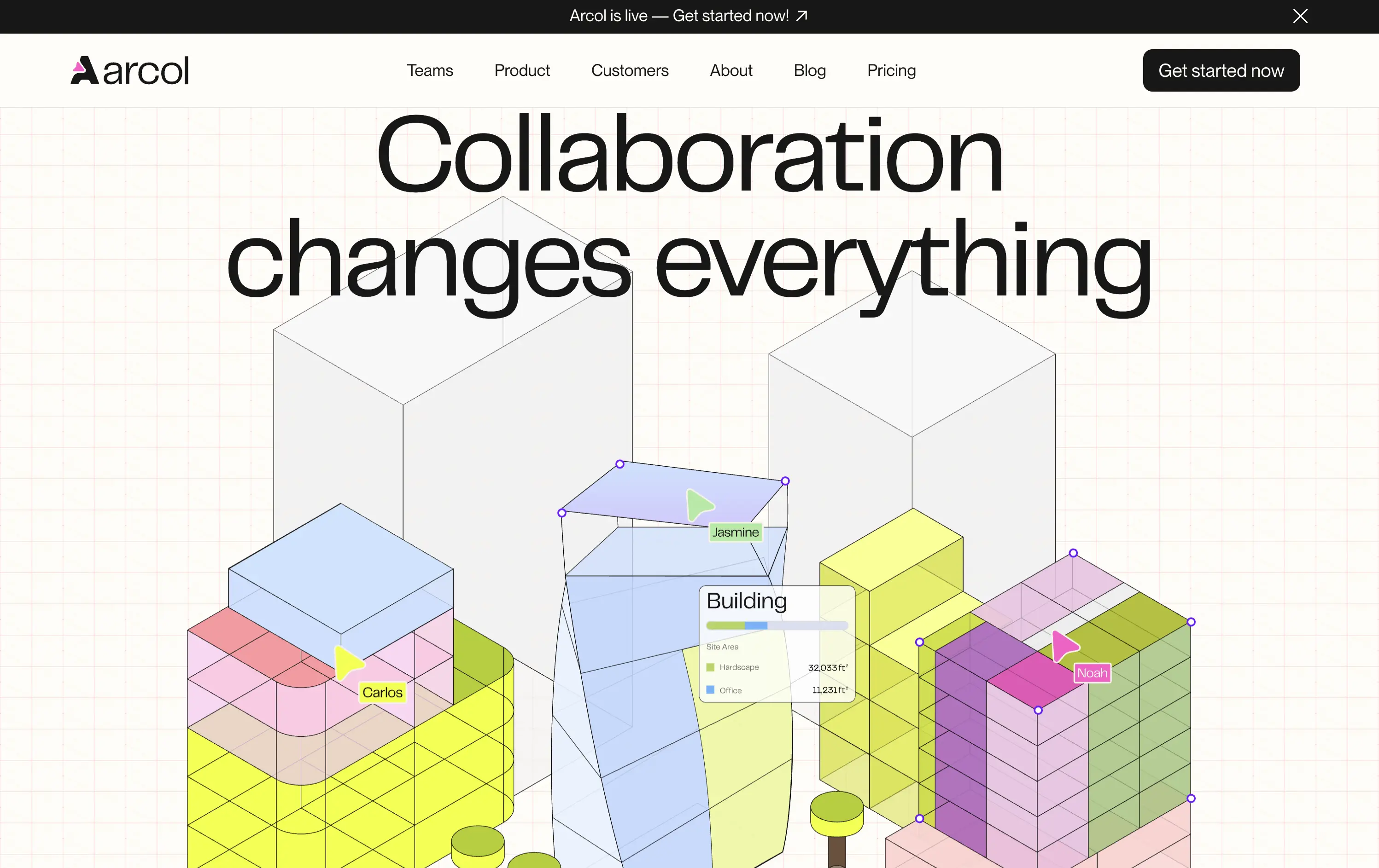
Arcol is a generative design and collaboration platform for architecture and BIM workflows, built for real-time teamwork.
The animated visual does the heavy lifting, illustrating use cases like live edits and data overlays. But without a supporting subline, new users may miss the BIM context. Still, strong visual storytelling creates intrigue.
Visually strong and clearly differentiated, but the messaging lacks grounding. The animation sells collaboration well, but without a sub-headline or product descriptor, it leans too much on visual inference. Clarity is sacrificed for aesthetic.
This layout balances technical utility with human impact, aligning well with Algolia’s positioning as an API-first but UX-aware company. The mobile UI reinforces product value visually, while the logo wall signals scale and trust for enterprise buyers. The tone is clear, benefit-led, and appropriate for high-intent decision-makers evaluating AI tools for customer experience. This is a solid enterprise-facing hero built to perform.
Arcol
↗
SaaS
Collaboration
Centered
Aspirational
Abstract / Conceptual
No CTA
Illustration
Custom Animation
Light Mode
Blue
Yellow
Sans serif
B2B
Home Page
Webflow
BIM software, real-time collaboration, isometric grid, multiplayer cursor, spatial planning UI, construction tech, 3D data layers, architectural tool, modern CAD, animated interface, light grid background
Arcol is a generative design and collaboration platform for architecture and BIM workflows, built for real-time teamwork.
The animated visual does the heavy lifting, illustrating use cases like live edits and data overlays. But without a supporting subline, new users may miss the BIM context. Still, strong visual storytelling creates intrigue.
Visually strong and clearly differentiated, but the messaging lacks grounding. The animation sells collaboration well, but without a sub-headline or product descriptor, it leans too much on visual inference. Clarity is sacrificed for aesthetic.
This layout balances technical utility with human impact, aligning well with Algolia’s positioning as an API-first but UX-aware company. The mobile UI reinforces product value visually, while the logo wall signals scale and trust for enterprise buyers. The tone is clear, benefit-led, and appropriate for high-intent decision-makers evaluating AI tools for customer experience. This is a solid enterprise-facing hero built to perform.
Omsom
↗
CPG
Food & Beverage
Centered
Playful
Bold & Direct
No CTA
Photography
Imagery-Based
Red
Yellow
Display
DTC
Home Page
Shopify
bold packaging, nostalgic film grain, Asian American brand, food culture, Gen Z energy, CPG storytelling, saucy noodles, maximalist vibe, loud typography, high color saturation, visual attitude
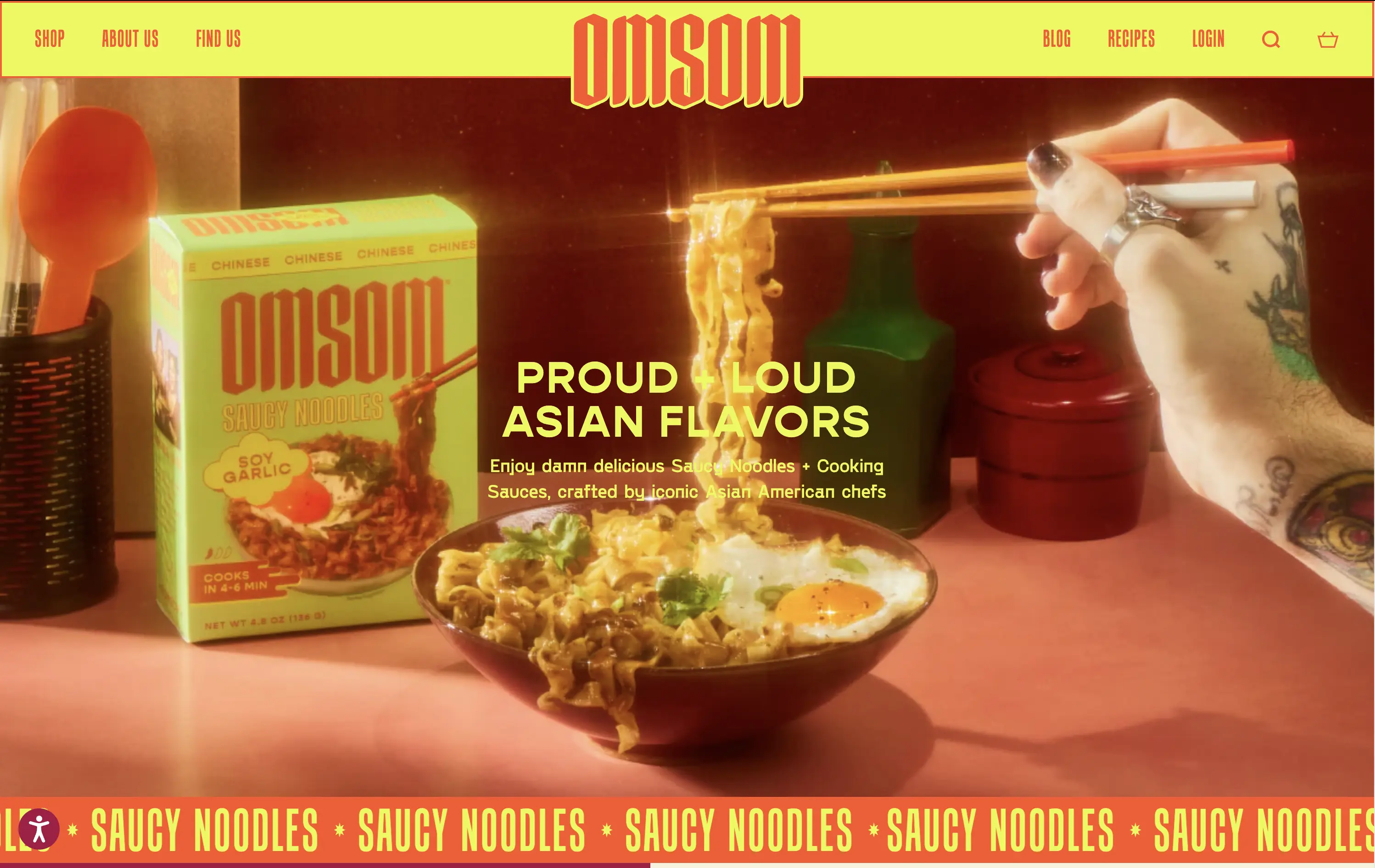
Omsom sells proud and loud Asian sauce kits and noodles without cultural compromise.
The hero hits hard with flavor and personality. High-impact visuals and voice set a strong tone and hints towards the ephereal. It’s clear who it’s for and what they’re selling.
Leans fully into identity and brand world building. Speaks directly to a culturally-aware, proudly niche audience. Messaging and art direction are fully aligned.
This layout balances technical utility with human impact, aligning well with Algolia’s positioning as an API-first but UX-aware company. The mobile UI reinforces product value visually, while the logo wall signals scale and trust for enterprise buyers. The tone is clear, benefit-led, and appropriate for high-intent decision-makers evaluating AI tools for customer experience. This is a solid enterprise-facing hero built to perform.
Omsom
↗
CPG
Food & Beverage
Centered
Playful
Bold & Direct
No CTA
Photography
Imagery-Based
Red
Yellow
Display
DTC
Home Page
Shopify
bold packaging, nostalgic film grain, Asian American brand, food culture, Gen Z energy, CPG storytelling, saucy noodles, maximalist vibe, loud typography, high color saturation, visual attitude
Omsom sells proud and loud Asian sauce kits and noodles without cultural compromise.
The hero hits hard with flavor and personality. High-impact visuals and voice set a strong tone and hints towards the ephereal. It’s clear who it’s for and what they’re selling.
Leans fully into identity and brand world building. Speaks directly to a culturally-aware, proudly niche audience. Messaging and art direction are fully aligned.
This layout balances technical utility with human impact, aligning well with Algolia’s positioning as an API-first but UX-aware company. The mobile UI reinforces product value visually, while the logo wall signals scale and trust for enterprise buyers. The tone is clear, benefit-led, and appropriate for high-intent decision-makers evaluating AI tools for customer experience. This is a solid enterprise-facing hero built to perform.
Plasmic
↗
SaaS
No-Code
Collaboration
Creative Tools
Centered
Benefit-Driven
Descriptive
Single Button
Product UI
Announcement
Gradient
Light Mode
Pink
Purple
Yellow
Sans serif
Hybrid
Home Page
Custom Code
visual builder, code integration, React support, Figma import, developer-friendly, no-code platform, CMS integration, responsive design, real-time collaboration, open-source, component-based, scalable, enterprise-ready, UI/UX design
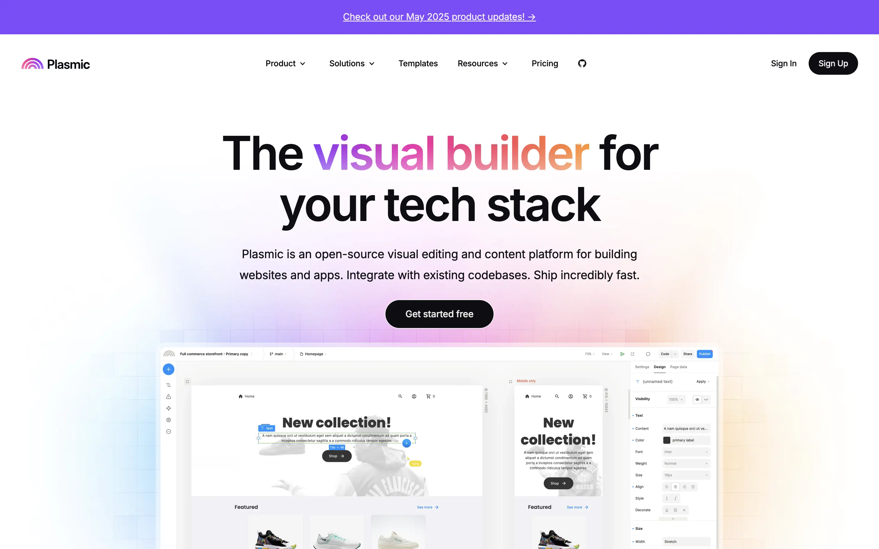
Plasmic is an open-source visual builder that enables teams to design and build web apps and websites rapidly, integrating seamlessly with existing codebases.
The hero section clearly communicates Plasmic's core value proposition as a visual builder for tech stacks. The combination of concise copy and product visuals effectively showcases its capabilities. The inclusion of a logo wall adds credibility, and the CTA is prominently displayed, guiding users toward engagement.
Plasmic positions itself effectively for both developers and non-developers by highlighting seamless code integration and visual editing capabilities. This dual appeal broadens its market reach and addresses common pain points in web development workflows.
This layout balances technical utility with human impact, aligning well with Algolia’s positioning as an API-first but UX-aware company. The mobile UI reinforces product value visually, while the logo wall signals scale and trust for enterprise buyers. The tone is clear, benefit-led, and appropriate for high-intent decision-makers evaluating AI tools for customer experience. This is a solid enterprise-facing hero built to perform.
Plasmic
↗
SaaS
No-Code
Collaboration
Creative Tools
Centered
Benefit-Driven
Descriptive
Single Button
Product UI
Announcement
Gradient
Light Mode
Pink
Purple
Yellow
Sans serif
Hybrid
Home Page
Custom Code
visual builder, code integration, React support, Figma import, developer-friendly, no-code platform, CMS integration, responsive design, real-time collaboration, open-source, component-based, scalable, enterprise-ready, UI/UX design
Plasmic is an open-source visual builder that enables teams to design and build web apps and websites rapidly, integrating seamlessly with existing codebases.
The hero section clearly communicates Plasmic's core value proposition as a visual builder for tech stacks. The combination of concise copy and product visuals effectively showcases its capabilities. The inclusion of a logo wall adds credibility, and the CTA is prominently displayed, guiding users toward engagement.
Plasmic positions itself effectively for both developers and non-developers by highlighting seamless code integration and visual editing capabilities. This dual appeal broadens its market reach and addresses common pain points in web development workflows.
This layout balances technical utility with human impact, aligning well with Algolia’s positioning as an API-first but UX-aware company. The mobile UI reinforces product value visually, while the logo wall signals scale and trust for enterprise buyers. The tone is clear, benefit-led, and appropriate for high-intent decision-makers evaluating AI tools for customer experience. This is a solid enterprise-facing hero built to perform.
Coda
↗
SaaS
Collaboration
Productivity
Left-aligned
Descriptive
Empowering
Multi-CTA Block
Product UI
Duotone
White
Yellow
Display
Sans serif
Hybrid
Home Page
Custom Code
doc-as-app, team workflow, internal tools, collaborative workspace, UI product demo, hybrid teams, sales enablement, project brief, minimal design, low-code logic, enterprise-friendly, live multiplayer,
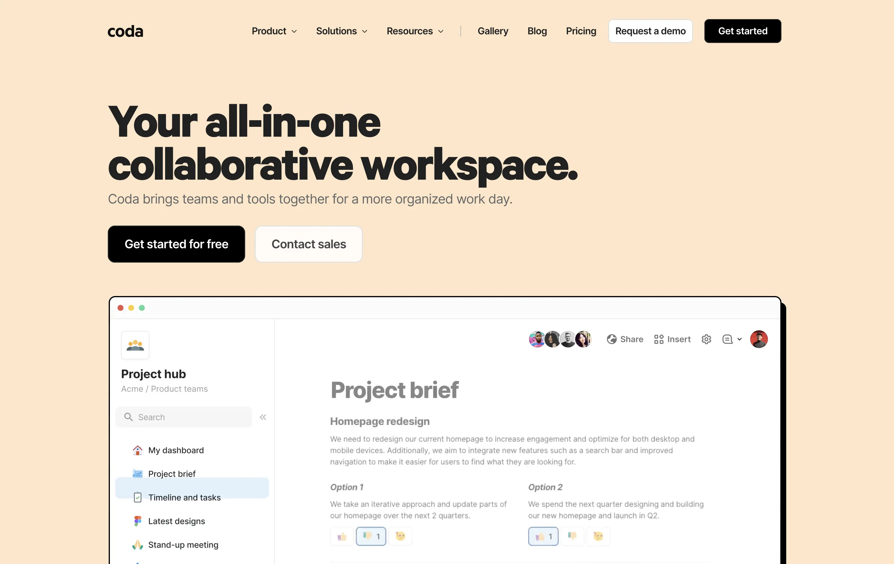
Coda is a collaborative doc platform that combines documents, spreadsheets, and apps into one unified workspace for teams.
The hero communicates clearly with a straightforward headline and strong product shot. Layout is easy to follow, and the dual CTA gives distinct paths for self-serve or sales-led funnels. The visual hierarchy is solid, though not emotionally charged.
Coda leads with clarity over flash. The message and layout prioritize breadth of use and enterprise readiness. Great fit for decision-makers looking to unify scattered tools into a single workspace.
This layout balances technical utility with human impact, aligning well with Algolia’s positioning as an API-first but UX-aware company. The mobile UI reinforces product value visually, while the logo wall signals scale and trust for enterprise buyers. The tone is clear, benefit-led, and appropriate for high-intent decision-makers evaluating AI tools for customer experience. This is a solid enterprise-facing hero built to perform.
Coda
↗
SaaS
Collaboration
Productivity
Left-aligned
Descriptive
Empowering
Multi-CTA Block
Product UI
Duotone
White
Yellow
Display
Sans serif
Hybrid
Home Page
Custom Code
doc-as-app, team workflow, internal tools, collaborative workspace, UI product demo, hybrid teams, sales enablement, project brief, minimal design, low-code logic, enterprise-friendly, live multiplayer,
Coda is a collaborative doc platform that combines documents, spreadsheets, and apps into one unified workspace for teams.
The hero communicates clearly with a straightforward headline and strong product shot. Layout is easy to follow, and the dual CTA gives distinct paths for self-serve or sales-led funnels. The visual hierarchy is solid, though not emotionally charged.
Coda leads with clarity over flash. The message and layout prioritize breadth of use and enterprise readiness. Great fit for decision-makers looking to unify scattered tools into a single workspace.
This layout balances technical utility with human impact, aligning well with Algolia’s positioning as an API-first but UX-aware company. The mobile UI reinforces product value visually, while the logo wall signals scale and trust for enterprise buyers. The tone is clear, benefit-led, and appropriate for high-intent decision-makers evaluating AI tools for customer experience. This is a solid enterprise-facing hero built to perform.
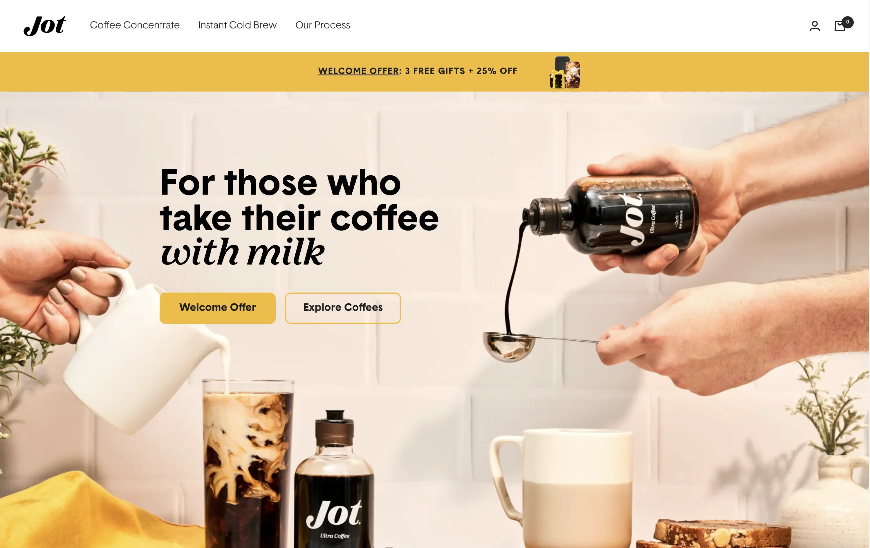
Jot
↗
CPG
Food & Beverage
Editorial
Benefit-Driven
Conversational
Multi-CTA Block
Photography
Custom Animation
Announcement
Imagery-Based
Yellow
Black
Display
DTC
Home Page
Shopify
Replo
coffee brand, lifestyle product, home ritual, premium instant coffee, CPG beverage, warm palette, morning routine, modern food DTC, product-centered hero, rotating headline, lifestyle-led photography
Jot sells ultra-concentrated coffee that simplifies your morning brew without compromising on quality or taste.
Visuals immediately convey simplicity and satisfaction. The rotating headline adapts to multiple buyer intents while keeping focus tight. The product-in-action shot clarifies usage without needing extra explanation.
The brand leans hard into lifestyle cues—targeting modern, taste-conscious buyers with clarity and credibility. The light palette and cozy setup reinforce everyday luxury.
This layout balances technical utility with human impact, aligning well with Algolia’s positioning as an API-first but UX-aware company. The mobile UI reinforces product value visually, while the logo wall signals scale and trust for enterprise buyers. The tone is clear, benefit-led, and appropriate for high-intent decision-makers evaluating AI tools for customer experience. This is a solid enterprise-facing hero built to perform.
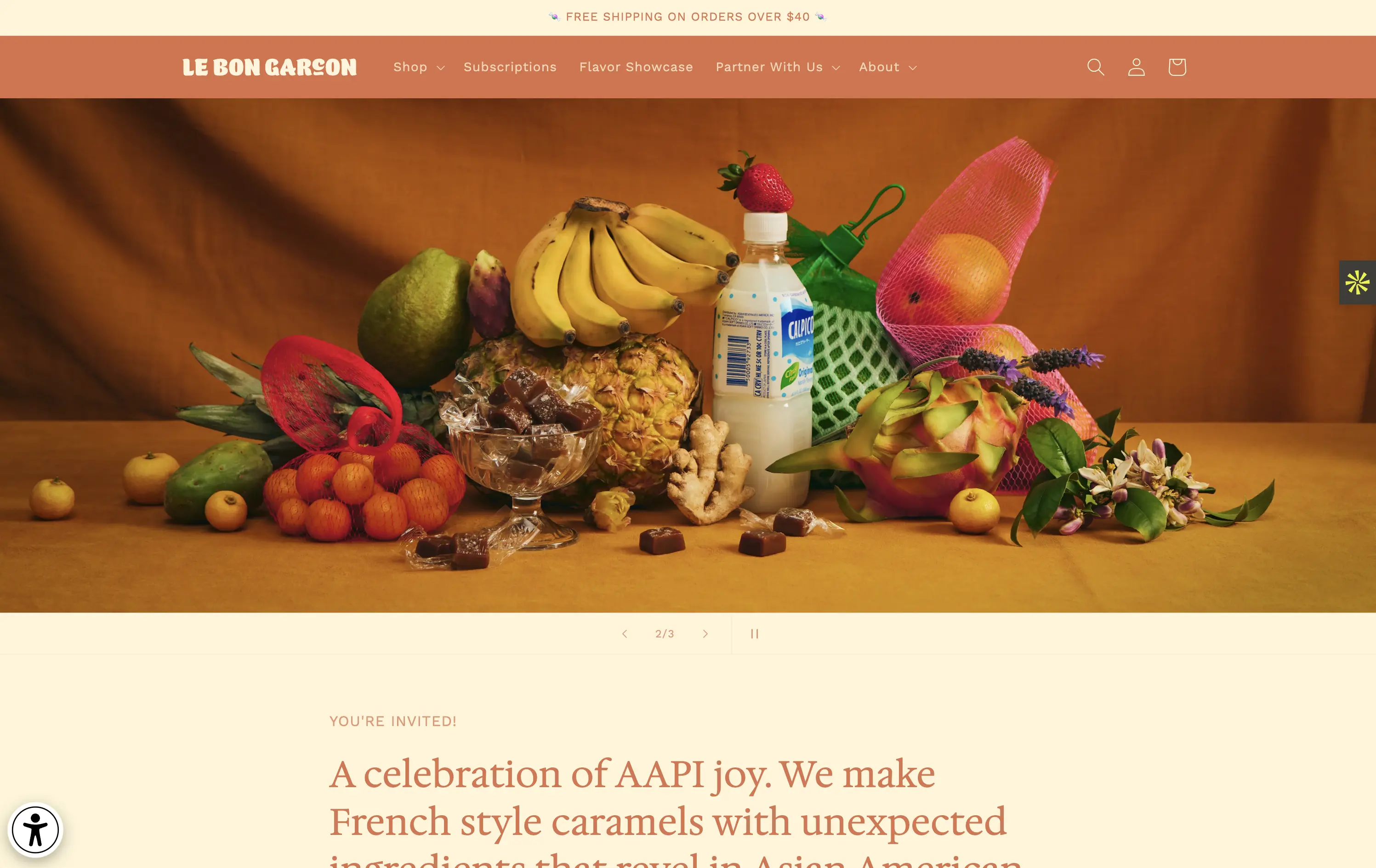
Le Bon Garçon
↗
CPG
Food & Beverage
Editorial
Descriptive
Founder-Led Voice
No CTA
Photography
Media Gallery
Announcement
Duotone
Imagery-Based
Orange
Yellow
Serif
DTC
Home Page
Shopify
nostalgic packaging, elevated DTC candy, premium gifting, Asian-American ingredients, still-life styling, art direction-led, cultural storytelling, warm palette, caramel focus, identity-led CPG, curated feel, editorial aesthetic, flavor storytelling, high design, AAPI founder
A premium confectionery brand reimagining French-style caramels through the lens of Asian-American flavors and storytelling.
This hero leans fully into art direction, with a cinematic still-life that evokes tradition, indulgence, and multicultural vibrancy. There's no obvious CTA, but the experience feels intentional and immersive. The visual composition draws curiosity and reflects a product crafted with care. The copy introduces cultural relevance and flavor positioning effectively, though some may miss a direct product hook.
Perfect for brand-aware shoppers and gifting segments. A visual-first approach supports premium positioning and cultural storytelling over hard conversion.
This layout balances technical utility with human impact, aligning well with Algolia’s positioning as an API-first but UX-aware company. The mobile UI reinforces product value visually, while the logo wall signals scale and trust for enterprise buyers. The tone is clear, benefit-led, and appropriate for high-intent decision-makers evaluating AI tools for customer experience. This is a solid enterprise-facing hero built to perform.
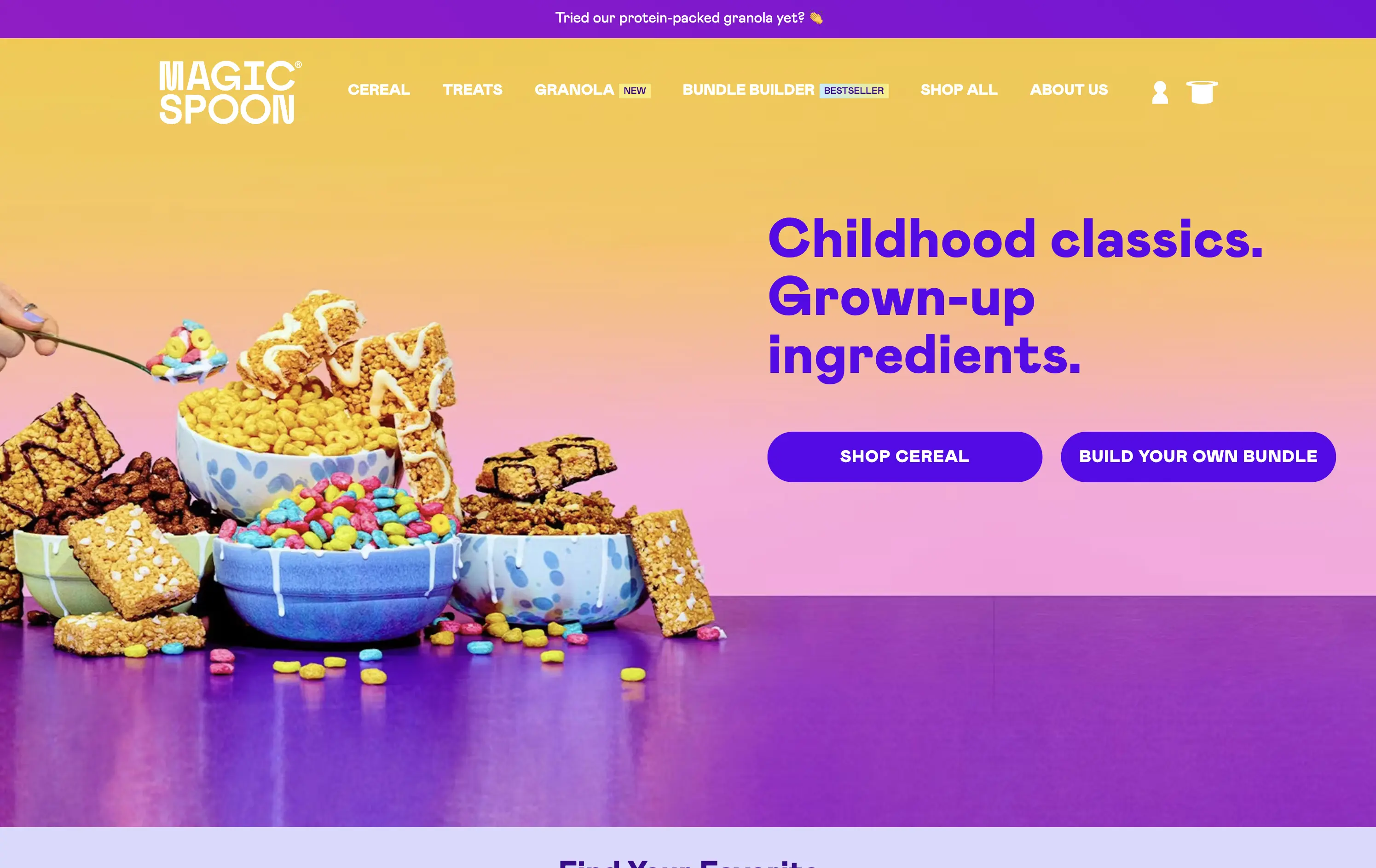
Magic Spoon
↗
Food & Beverage
Split Grid
Playful
Multi-CTA Block
Photography
Announcement
Gradient
Multi-color
Pink
Purple
Yellow
Sans serif
DTC
Home Page
Shopify
high-protein cereal, nostalgic breakfast, millennial branding, retro palette, build-your-own-bundle, vibrant color gradient, candy-colored visuals, kid-to-adult rebrand, DTC snack, bold typography, healthified junk food, colorful product styling, split grid layout, energetic tone, premium grocery
Magic Spoon sells high-protein cereal and snack bars that recreate childhood favorites with adult nutrition standards.
The hero nails the balance between fun and function. Product visuals feel exaggerated in the best way — styled like sugary cereal ads from the ‘90s but paired with benefit-led messaging. The copy is tight and instantly clarifies the value prop. Gradient background and punchy layout draw attention. CTAs are clear, and “build your own bundle” is an engaging utility-led hook.
Smartly crafted for health-conscious millennials who want nostalgia without the sugar crash. The visual-candy look softens the functional message about protein and better ingredients.
This layout balances technical utility with human impact, aligning well with Algolia’s positioning as an API-first but UX-aware company. The mobile UI reinforces product value visually, while the logo wall signals scale and trust for enterprise buyers. The tone is clear, benefit-led, and appropriate for high-intent decision-makers evaluating AI tools for customer experience. This is a solid enterprise-facing hero built to perform.
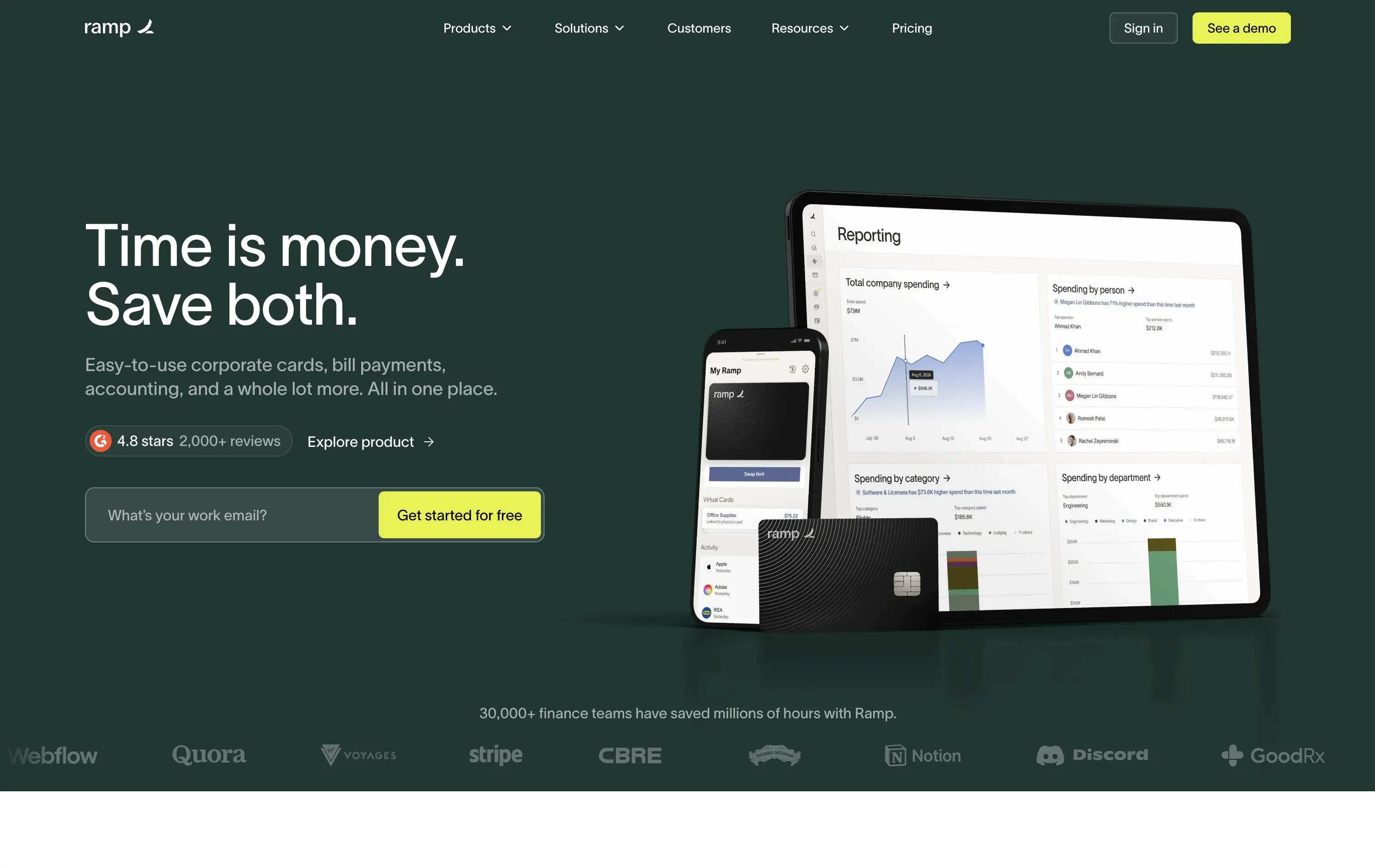
Ramp
↗
SaaS
Fintech
Split Grid
Left-aligned
Benefit-Driven
Email Capture
Product UI
Social Proof
Duotone
Green
Yellow
Sans serif
B2B
Home Page
Custom Code
expense automation, corporate cards, real-time finance tools, modern B2B fintech, ROI-led copy, dark UI, embedded reviews, verified trust cues, enterprise-ready design, slick dashboard, clear CTA, conversion optimized, mid-funnel targeting, save money pitch, split layout
Ramp is a corporate finance platform offering cards, bill pay, and reporting tools designed to save companies time and money.
The hero is clean, trust-building, and conversion-ready. Headline is bold and economic — short enough to stick, direct enough to convert. Subheadline explains the product scope, while the UI visual makes it tangible. Reviews and logos anchor trust. The input field + utility CTA streamlines lead gen.
Perfectly calibrated for CFOs and finance leads. Messaging leads with ROI, not tech — smart for a market that cares about efficiency and outcomes. Strong signal-to-noise ratio.
This layout balances technical utility with human impact, aligning well with Algolia’s positioning as an API-first but UX-aware company. The mobile UI reinforces product value visually, while the logo wall signals scale and trust for enterprise buyers. The tone is clear, benefit-led, and appropriate for high-intent decision-makers evaluating AI tools for customer experience. This is a solid enterprise-facing hero built to perform.
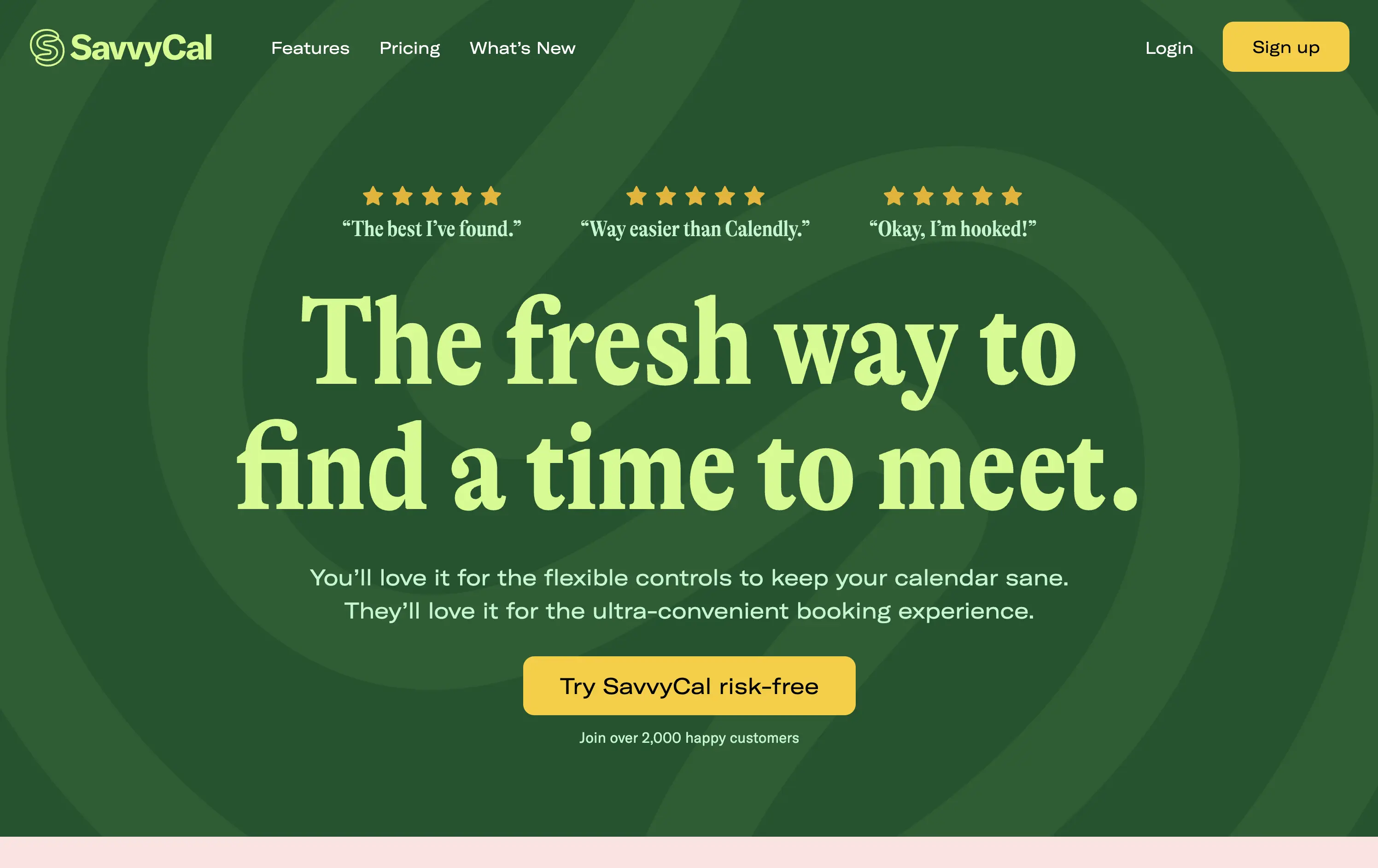
Savvy Cal
↗
SaaS
Productivity
Centered
Playful
Aspirational
Single Button
Illustration
Social Proof
Duotone
Green
Yellow
Display
Serif
B2B
Home Page
Custom Code
calendly alternative, scheduling SaaS, friendly UI, bold typography, customer-first tone, startup productivity tools, anti-friction branding, green-on-green palette, centered layout, calendar control, review-driven, solo founder energy, fresh design, clean booking UX
SavvyCal is a scheduling tool designed to simplify meeting coordination with flexible, user-first controls and a clean, friendly interface.
The hero leans hard into charm and confidence. The bold, serif headline feels conversational and clever. The contrast between green tones is controlled, and the centered layout places the CTA in a visually dominant spot. Social proof is integrated at the top with testimonial snippets to validate performance. It’s conversion-ready, especially for users looking for a more human alternative to Calendly.
Tailored to solo operators, indie founders, and small teams seeking simplicity without the enterprise bloat. Balances approachability and professionalism through tone and visual treatment. Micro-proof adds trust without noise.
This layout balances technical utility with human impact, aligning well with Algolia’s positioning as an API-first but UX-aware company. The mobile UI reinforces product value visually, while the logo wall signals scale and trust for enterprise buyers. The tone is clear, benefit-led, and appropriate for high-intent decision-makers evaluating AI tools for customer experience. This is a solid enterprise-facing hero built to perform.
Mural
↗
SaaS
Collaboration
Productivity
Centered
Benefit-Driven
Aspirational
Single Button
Product UI
Multi-color
Green
Yellow
Serif
B2B
Home Page
Webflow
team productivity tool, familiar UI, friendly tone, AI-supported collaboration, light mode, optimistic copy, future-focused, dotted grid, visual-first, professional teams, clean hierarchy, flat color background
Mural is a visual collaboration platform that helps teams ideate, align, and execute strategy in real time with AI support.
The hero opens with a strong aspirational headline and bright color blocking that draws attention quickly. The serif typeface adds gravitas, while the clean UI below hints at practical use. However, the product preview could be more immediate—only the top edge of the canvas is visible, which may delay user comprehension. CTA is simple and visible. Overall, the section signals clarity and ease but misses some depth in product proof above the fold.
Strategically aimed at enterprise teams navigating transformation. The tone leans inspirational, while the visual style keeps it accessible. Immediate clarity, but lacks an element to tease the scroll action to anchor the pitch.
This layout balances technical utility with human impact, aligning well with Algolia’s positioning as an API-first but UX-aware company. The mobile UI reinforces product value visually, while the logo wall signals scale and trust for enterprise buyers. The tone is clear, benefit-led, and appropriate for high-intent decision-makers evaluating AI tools for customer experience. This is a solid enterprise-facing hero built to perform.
Cometeer
↗
CPG
Food & Beverage
Full Width
Editorial
Benefit-Driven
Aspirational
Multi-CTA Block
Video
Imagery-Based
Yellow
Sans serif
DTC
Home Page
Shopify
DTC coffee, video-led hero, brand storytelling, clear CTA hierarchy, warm tones, minimal text, fast onboarding, gradient background, sensory cue, product-focused, premium feel, lifestyle positioning, high visual polish, science-inspired design
Cometeer delivers barista-grade coffee flash-frozen into capsules for ultra-fast, ultra-consistent brewing at home.
The hero balances brand storytelling and performance design—sharp visual contrast, cinematic motion, and precise art direction anchor the product as premium and scientific. The headline is bold and memorable, while the subheadline clarifies the value prop in under 10 words. Dual CTAs reduce friction. The use of macro imagery paired with a scientific tool elevates the perception of quality and process control.
Clear DTC positioning with a premium, precision-led angle. The visual metaphor of lab-grade quality supports brand trust while the tone stays human. Layout signals high product confidence and fast conversion intent.
This layout balances technical utility with human impact, aligning well with Algolia’s positioning as an API-first but UX-aware company. The mobile UI reinforces product value visually, while the logo wall signals scale and trust for enterprise buyers. The tone is clear, benefit-led, and appropriate for high-intent decision-makers evaluating AI tools for customer experience. This is a solid enterprise-facing hero built to perform.
WeStock
↗
SaaS
Split Grid
Left-aligned
Abstract / Conceptual
Single Button
Illustration
Interactive
Product UI
Light Mode
Red
Orange
Yellow
Sans serif
B2B
Home Page
Webflow
retail analytics, B2B SaaS, colorful path motif, feature reveal, scroll effect, clean layout, product-led hero, multicolored interface, CPG enablement, UI preview, startup brand tone, sales-velocity focus, modern B2B
WeStock helps brands grow at retail by using data and consumer demand to drive velocity and streamline distribution.
This hero gets to the point quickly. The headline is bold, the subcopy is informative, and the UI sample makes the product feel real. The color path is a clever directional device. Visual hierarchy works, though the CTA could use stronger visual emphasis to better guide next-step intent.
A clear, professional intro for early-stage and growth CPG brands. Balances explanation with intrigue. Strong brand coherence, great visual metaphor, and effective low-friction education. CTA clarity is good; visibility needs boost.
This layout balances technical utility with human impact, aligning well with Algolia’s positioning as an API-first but UX-aware company. The mobile UI reinforces product value visually, while the logo wall signals scale and trust for enterprise buyers. The tone is clear, benefit-led, and appropriate for high-intent decision-makers evaluating AI tools for customer experience. This is a solid enterprise-facing hero built to perform.
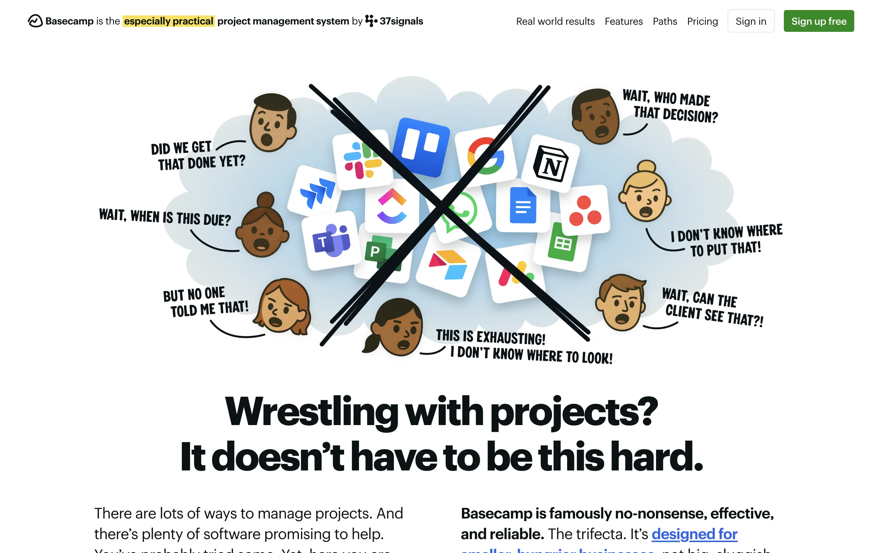
Basecamp
↗
SaaS
Collaboration
Productivity
Centered
Unconventional
Conversational
Pain-driven
No CTA
Illustration
Light Mode
Green
Yellow
Sans serif
B2B
Home Page
Custom Code
project management, SaaS, lo-fi aesthetic, opinionated design, founder-led voice, visual storytelling, problem-first, productivity, cluttered tool fatigue, anti-modern, expressive illustration, early-stage appeal, emotional resonance, no UI demo, brand storytelling, narrative-led
Basecamp cuts through tool overload with one practical workspace, ending project chaos.
The hero skips UI glamour for emotional clarity. It dramatizes the frustration of using too many disjointed tools through expressive cartoon faces and crossed-out logos. The copy is plain, bold, and highly relatable — “Wrestling with projects?” grounds it in a universal pain. No button, no fluff. The simplicity grabs attention and makes the message instantly clear.
Leans hard into anti-trend positioning—practicality over polish. Speaks directly to the frustration of tool overload, appealing to leaders who want sanity, not features. It’s memorable and unmistakably aligned with Basecamp’s legacy of contrarian clarity.
This layout balances technical utility with human impact, aligning well with Algolia’s positioning as an API-first but UX-aware company. The mobile UI reinforces product value visually, while the logo wall signals scale and trust for enterprise buyers. The tone is clear, benefit-led, and appropriate for high-intent decision-makers evaluating AI tools for customer experience. This is a solid enterprise-facing hero built to perform.
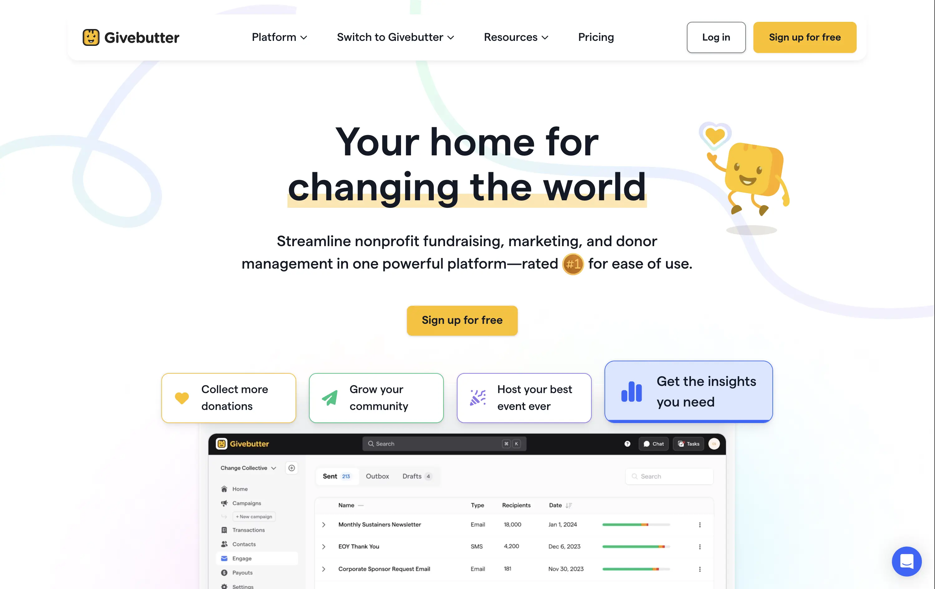
Givebutter
↗
SaaS
Fintech
Centered
Aspirational
Empowering
Single Button
Illustration
Product UI
Custom Animation
Light Mode
Yellow
Sans serif
B2B
Home Page
Webflow
fundraising SaaS, nonprofit tech, donor platform, feel-good UX, animated mascot, bento interface, purpose-driven, pastel palette, onboarding clarity, interactive benefits, Gen Z friendly, platform utility, warm branding, visual segmentation
Givebutter is a modern fundraising platform for nonprofits to manage donations, donors, events, and campaigns — all in one place.
This hero hits all the right notes for a purpose-led platform. The headline is clear and values-forward, while the playful highlight under “changing the world” draws attention without shouting. The mascot brings joy and motion, and the interactive bentocards smartly preview key benefits. It’s emotionally inviting, but structurally strong.
The hero balances clarity and optimism. Copy is simple and anchored in purpose. Visual hierarchy is clean, with modular tiles surfacing key actions. Mascot animation adds warmth without clutter.
This layout balances technical utility with human impact, aligning well with Algolia’s positioning as an API-first but UX-aware company. The mobile UI reinforces product value visually, while the logo wall signals scale and trust for enterprise buyers. The tone is clear, benefit-led, and appropriate for high-intent decision-makers evaluating AI tools for customer experience. This is a solid enterprise-facing hero built to perform.
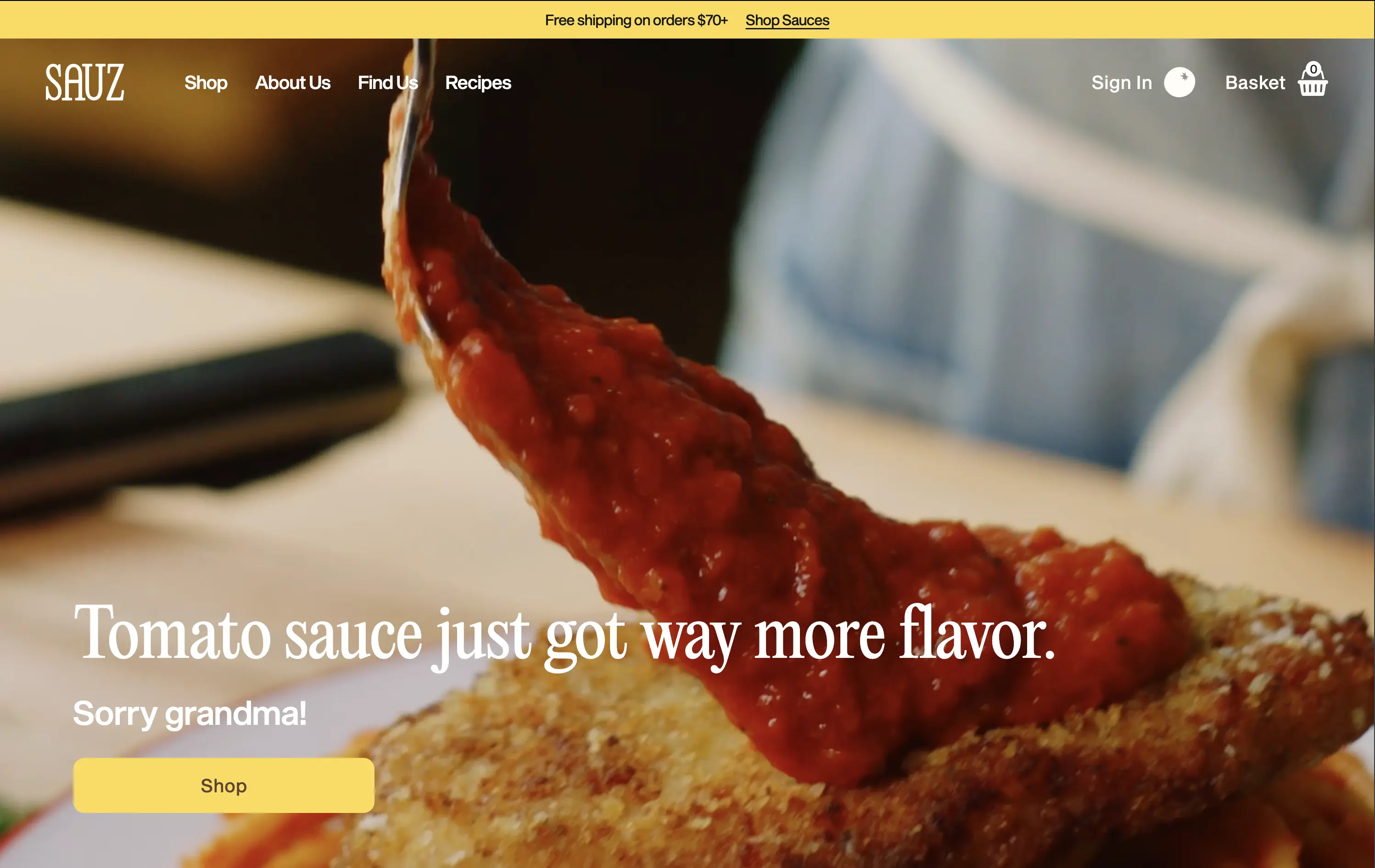
Sauz
↗
CPG
Food & Beverage
Left-aligned
Editorial
Playful
Confident
Single Button
Video
Announcement
Imagery-Based
Yellow
Sans serif
DTC
Home Page
Shopify
food-focused, video hero, flavor-first, cheeky copy, bold serif, zoom-in shot, emotional appeal, clean layout, direct CTA, DTC food, high-conversion, gourmet casual, attention-grabbing, warm tones
Sauz is a modern food brand delivering bold, chef-crafted sauces that reimagine classic flavors with attitude and heat.
The video draws instant attention and evokes craving. Typography and tone hit hard but feel fun. CTA is well-placed and visually distinct. It’s visual-first and high-impact with zero distractions — built for impulse.
A textbook DTC move: punchy, irreverent, visual. The design guides users toward quick conversion. It’s fun without losing clarity — perfect for modern food shoppers who crave personality with purchase.
This layout balances technical utility with human impact, aligning well with Algolia’s positioning as an API-first but UX-aware company. The mobile UI reinforces product value visually, while the logo wall signals scale and trust for enterprise buyers. The tone is clear, benefit-led, and appropriate for high-intent decision-makers evaluating AI tools for customer experience. This is a solid enterprise-facing hero built to perform.
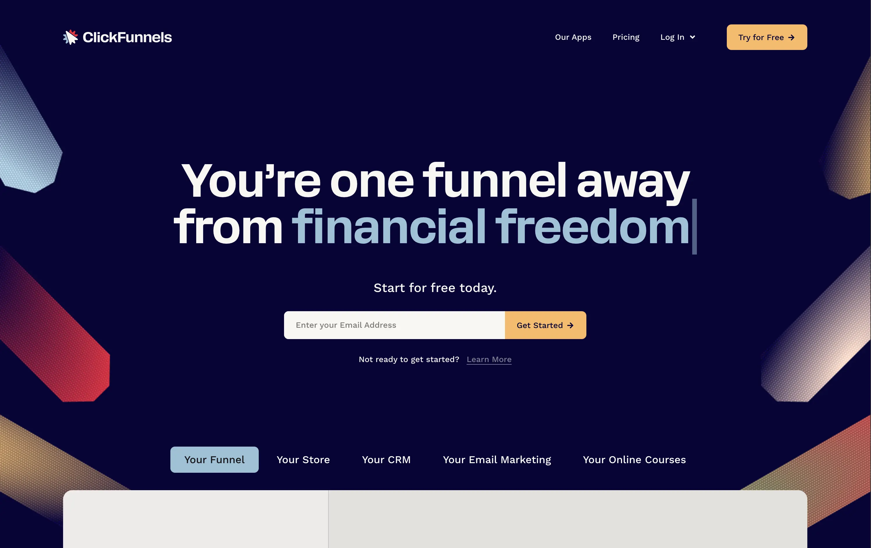
ClickFunnels
↗
SaaS
Creator Tools
Centered
Conversational
Aspirational
Email Capture
Interactive
Product UI
Custom Animation
Dark Mode
Yellow
Sans serif
Hybrid
Home Page
ClickFunnels
funnel builder, sales automation, opt-in focused, animated headline, creator economy, scroll-stopper, bold promise, conversion-first, email capture, dark mode, high energy, value-first, info-product, affiliate-heavy, landing page tools
ClickFunnels is an all-in-one platform for building sales funnels, landing pages, and automating digital marketing.
Everything in this hero screams urgency and ambition. The headline animation and phrase “financial freedom” tap directly into aspirational triggers. The surrounding angled graphics guide the eye right to the CTA, and the contrasting orange button and centered layout make signup the only logical next step. Visuals are loud, but coherent. It’s built to convert.
ClickFunnels sells identity as much as software. It targets aspirational creators with a high-conviction offer and message. Clear visual direction, value promise, and frictionless signup make it performance-built.
This layout balances technical utility with human impact, aligning well with Algolia’s positioning as an API-first but UX-aware company. The mobile UI reinforces product value visually, while the logo wall signals scale and trust for enterprise buyers. The tone is clear, benefit-led, and appropriate for high-intent decision-makers evaluating AI tools for customer experience. This is a solid enterprise-facing hero built to perform.
ClickFunnels
↗
SaaS
Creator Tools
Centered
Conversational
Aspirational
Email Capture
Interactive
Product UI
Custom Animation
Dark Mode
Yellow
Sans serif
Hybrid
Home Page
ClickFunnels
funnel builder, sales automation, opt-in focused, animated headline, creator economy, scroll-stopper, bold promise, conversion-first, email capture, dark mode, high energy, value-first, info-product, affiliate-heavy, landing page tools
ClickFunnels is an all-in-one platform for building sales funnels, landing pages, and automating digital marketing.
Everything in this hero screams urgency and ambition. The headline animation and phrase “financial freedom” tap directly into aspirational triggers. The surrounding angled graphics guide the eye right to the CTA, and the contrasting orange button and centered layout make signup the only logical next step. Visuals are loud, but coherent. It’s built to convert.
ClickFunnels sells identity as much as software. It targets aspirational creators with a high-conviction offer and message. Clear visual direction, value promise, and frictionless signup make it performance-built.
This layout balances technical utility with human impact, aligning well with Algolia’s positioning as an API-first but UX-aware company. The mobile UI reinforces product value visually, while the logo wall signals scale and trust for enterprise buyers. The tone is clear, benefit-led, and appropriate for high-intent decision-makers evaluating AI tools for customer experience. This is a solid enterprise-facing hero built to perform.
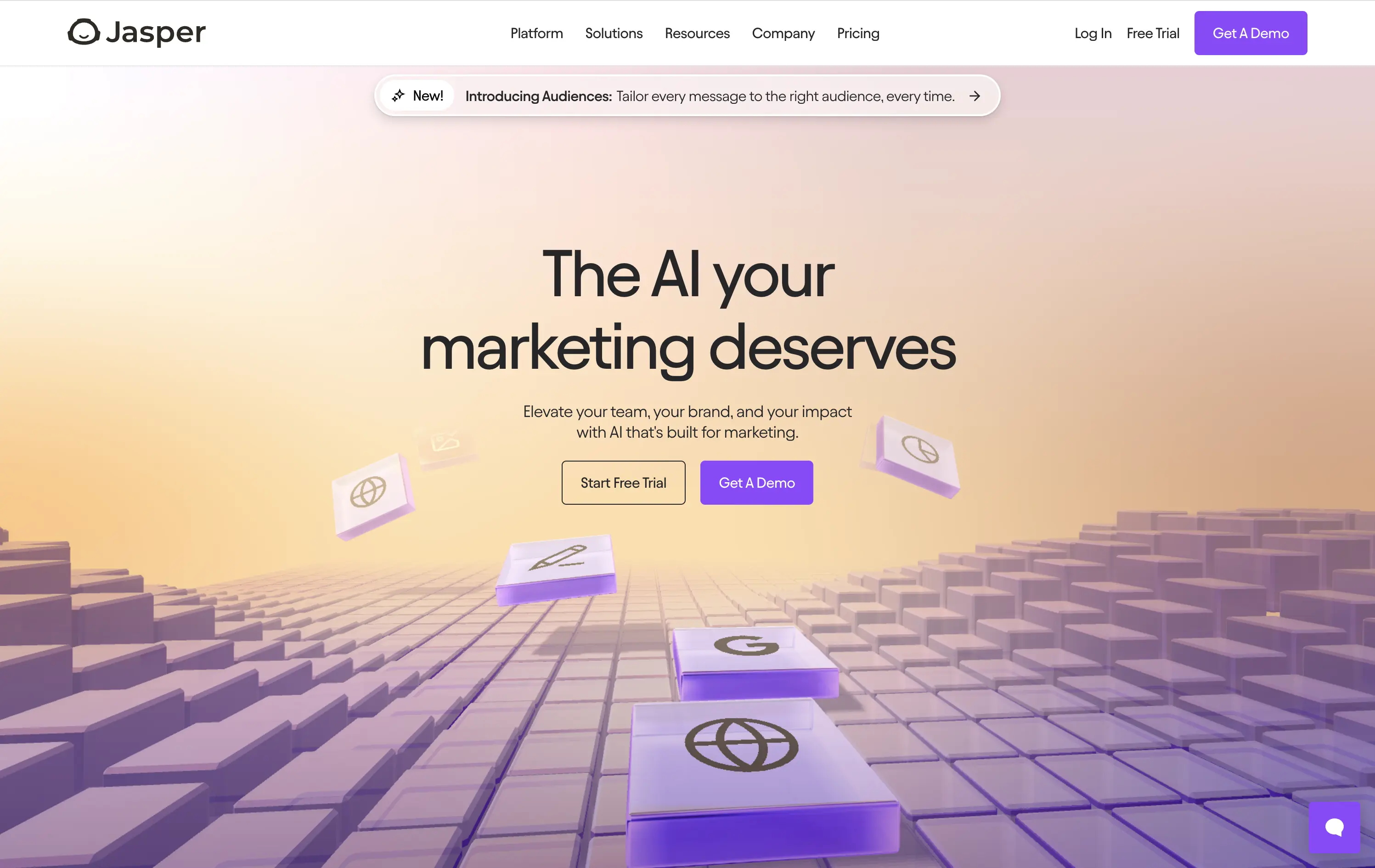
Jasper
↗
SaaS
AI Tools
Centered
Aspirational
Professional
Multi-CTA Block
Interactive
Custom Animation
3D visuals
Gradient
Light Mode
Purple
Yellow
Sans serif
Hybrid
Home Page
Webflow
AI copywriting, AI for marketers, premium SaaS, floating 3D blocks, gradient UI, dual CTA, conversion-focused, brand messaging, purple aesthetic, marketing automation, future-facing, demo-first UX, mid-market SaaS
Jasper is an AI copilot that helps marketing teams craft on-brand content faster across every channel.
Clear message, sharp contrast, and a visually engaging 3D tile animation support both narrative and interaction. Dual CTAs guide intent. Subhead could use slightly more emphasis for hierarchy.
Hero aligns with mid-to-late-stage buyers seeking polished, scalable AI solutions. Visual tone supports category leadership. Good balance of aspiration and product clarity.
This layout balances technical utility with human impact, aligning well with Algolia’s positioning as an API-first but UX-aware company. The mobile UI reinforces product value visually, while the logo wall signals scale and trust for enterprise buyers. The tone is clear, benefit-led, and appropriate for high-intent decision-makers evaluating AI tools for customer experience. This is a solid enterprise-facing hero built to perform.
The most effective hero sections in your inbox.
Monthly round up of top hero sections.
Don't worry. We hate spam too.
Don't worry. We hate spam too.
Don't worry. We hate spam too.