Display
12
12
12
12
Bold, stylized, or decorative — used for distinctiveness and visual identity.
Filters
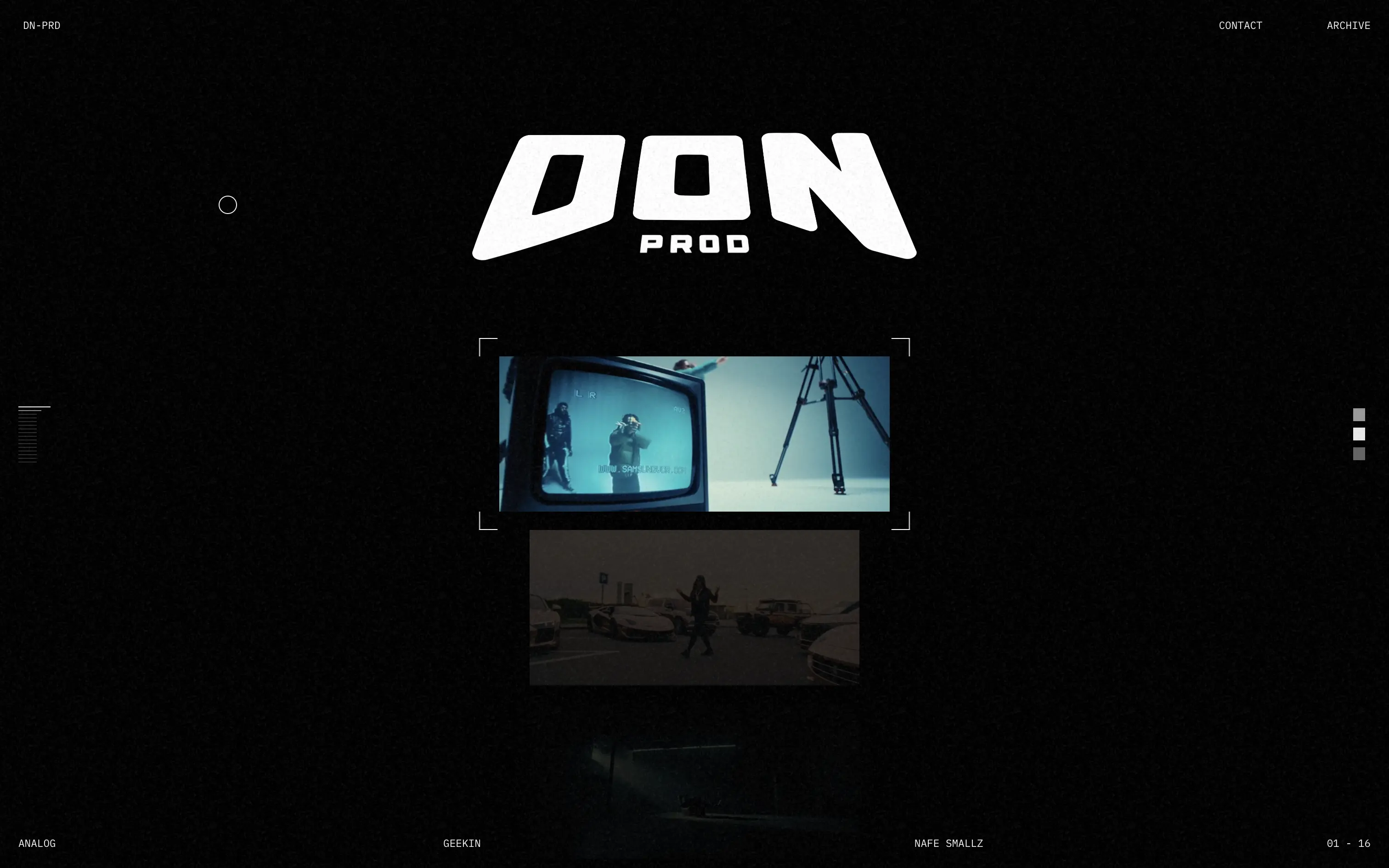
Don Prod
↗
Agencies
Editorial
No headline
No CTA
Media Gallery
Loading Animation
Dark Mode
White
Display
B2B
Home Page
Custom Code
portfolio site, webGL distortion, music video production, VHS aesthetic, visual storytelling, minimalist UX, video-first layout, motion texture, analog feel, creative direction, fullscreen gallery
Don Prod is a visual production studio showcasing high-energy music video work through a minimal, cinematic portfolio.
The hero trades copy for atmosphere. The liquid webGL orb intro and lo-fi video stills establish creative authority fast. There’s no orientation, no CTA—just visual immersion.
This is visual-first positioning for a portfolio that’s all about taste. It’s anti-marketing in the best way—letting the work speak for itself. Not built for mass access, but built with intent.
This layout balances technical utility with human impact, aligning well with Algolia’s positioning as an API-first but UX-aware company. The mobile UI reinforces product value visually, while the logo wall signals scale and trust for enterprise buyers. The tone is clear, benefit-led, and appropriate for high-intent decision-makers evaluating AI tools for customer experience. This is a solid enterprise-facing hero built to perform.
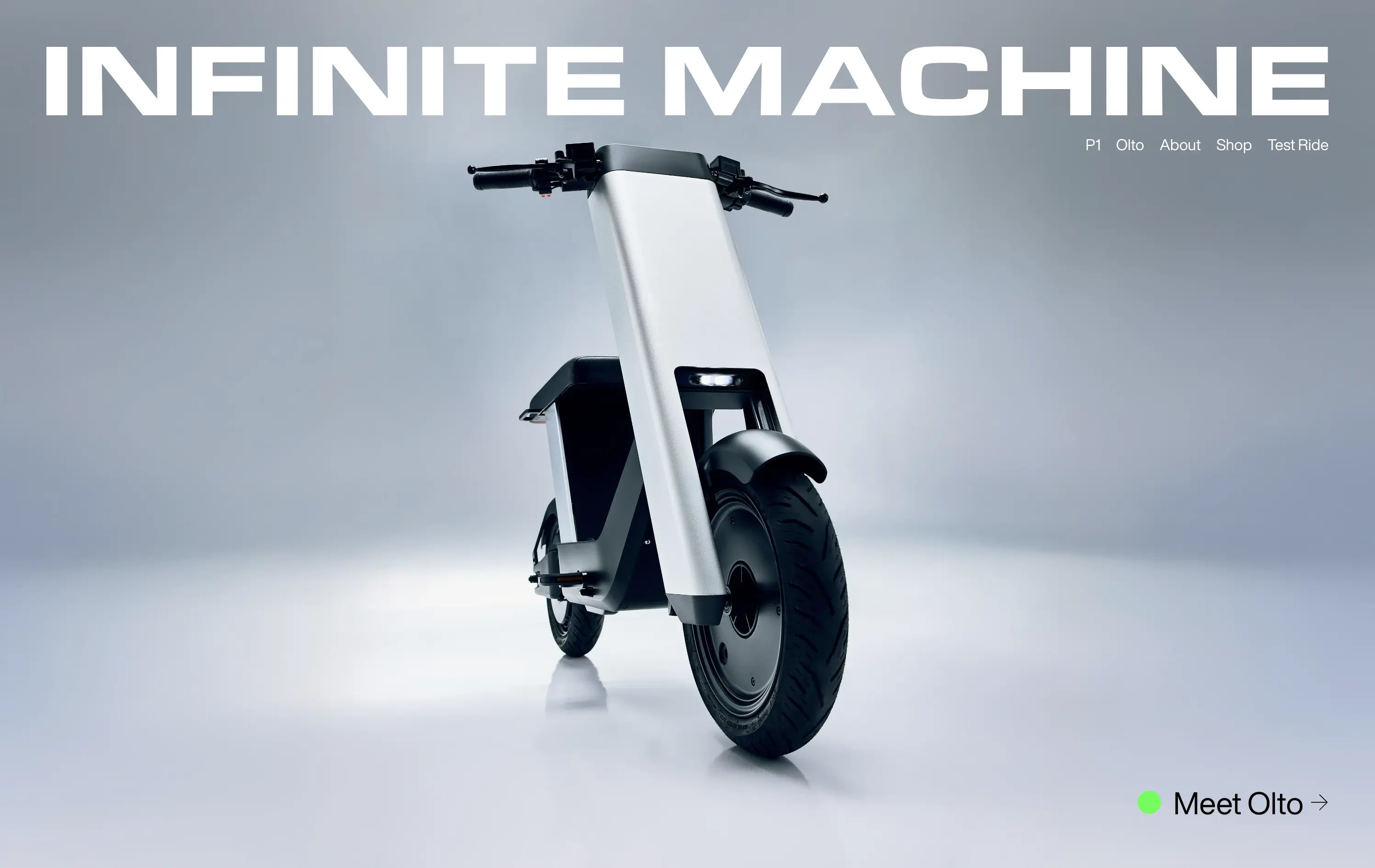
Infinite Machine
↗
Hardware
Editorial
No headline
Single Button
Photography
3D visuals
Imagery-Based
Green
Display
DTC
Home Page
Webflow
electric mobility, hyper-modern design, minimalist layout, luxury product, DTC vehicle brand, monochrome aesthetic, bold branding, soft industrial lighting, lifestyle hardware, premium feel
Infinite Machine builds futuristic electric motorcycles with a minimalist aesthetic and modern tech integrations.
The layout mimics a high-end magazine cover: stark, centered, and brand-dominant. It creates intrigue and immediate visual impact, but offers little onboarding or product context until users click deeper.
Infinite Machine is selling vision, not just a product. The choice to remove all explanatory copy and lead with form aligns with a luxury hardware playbook
This layout balances technical utility with human impact, aligning well with Algolia’s positioning as an API-first but UX-aware company. The mobile UI reinforces product value visually, while the logo wall signals scale and trust for enterprise buyers. The tone is clear, benefit-led, and appropriate for high-intent decision-makers evaluating AI tools for customer experience. This is a solid enterprise-facing hero built to perform.
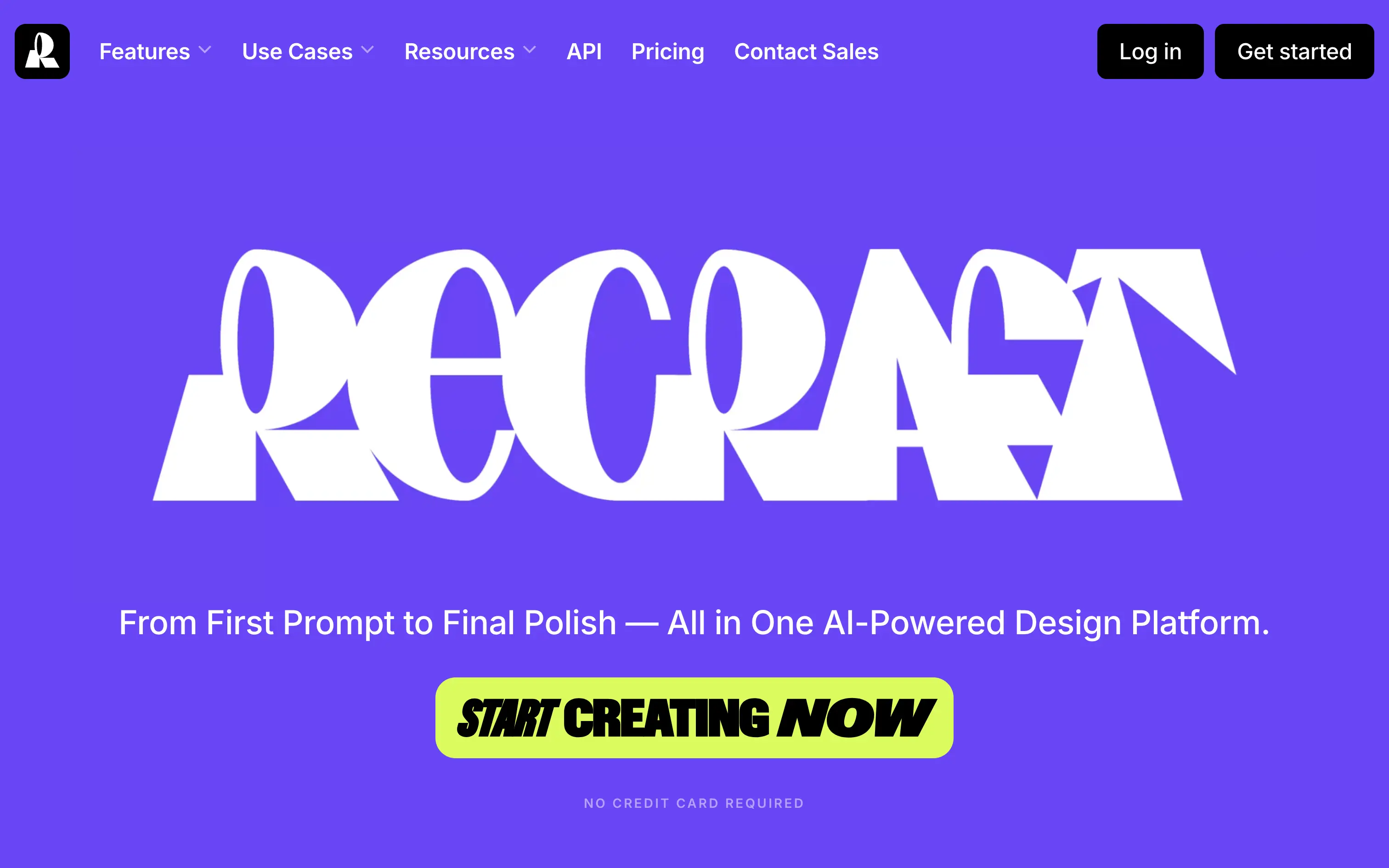
Recraft
↗
SaaS
AI Tools
Creative Tools
Centered
Bold & Direct
Single Button
Interactive
Loading Animation
Multi-color
Green
Purple
Display
Sans serif
B2C
Home Page
Custom Code
experimental typography, AI design suite, generative graphics, all-in-one creative tool, bold visual identity, Gen Z design energy, maximalist type, disruptive layout, prompt-to-polish UX, vector-first platform
Recraft is an AI-powered design platform for generating and editing vector and image assets from text prompts.
A bold, identity-first approach that skips traditional SaaS tropes. The loading animation morphs into the oversized logo, building intrigue and brand memory. Lacks UI context but makes a strong creative impression.
Recraft speaks to non-technical creatives who want AI tools that feel like theirs. This is brand-first positioning at its most intentional—confident, expressive, and highly audience-aligned.
This layout balances technical utility with human impact, aligning well with Algolia’s positioning as an API-first but UX-aware company. The mobile UI reinforces product value visually, while the logo wall signals scale and trust for enterprise buyers. The tone is clear, benefit-led, and appropriate for high-intent decision-makers evaluating AI tools for customer experience. This is a solid enterprise-facing hero built to perform.
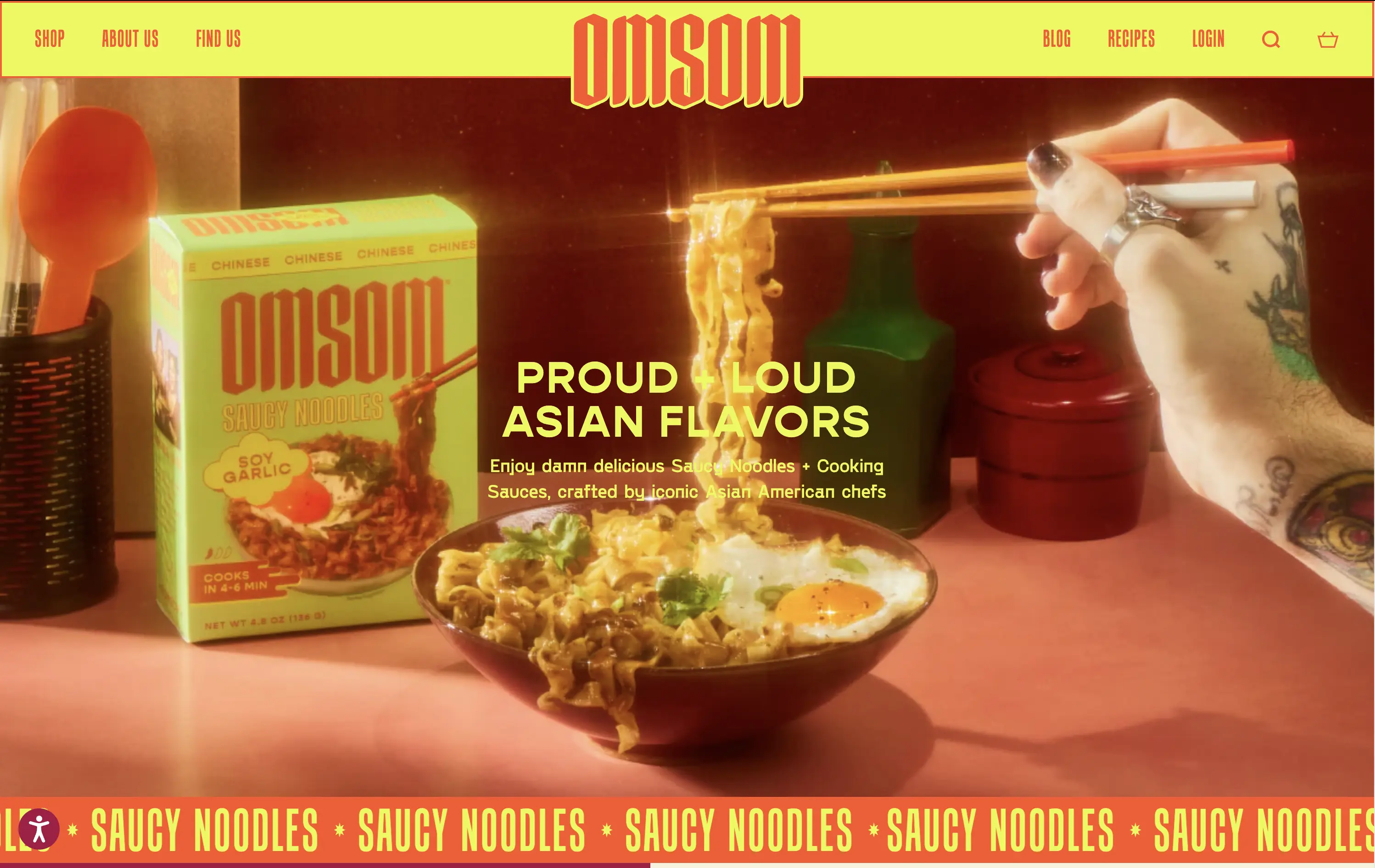
Omsom
↗
CPG
Food & Beverage
Centered
Playful
Bold & Direct
No CTA
Photography
Imagery-Based
Red
Yellow
Display
DTC
Home Page
Shopify
bold packaging, nostalgic film grain, Asian American brand, food culture, Gen Z energy, CPG storytelling, saucy noodles, maximalist vibe, loud typography, high color saturation, visual attitude
Omsom sells proud and loud Asian sauce kits and noodles without cultural compromise.
The hero hits hard with flavor and personality. High-impact visuals and voice set a strong tone and hints towards the ephereal. It’s clear who it’s for and what they’re selling.
Leans fully into identity and brand world building. Speaks directly to a culturally-aware, proudly niche audience. Messaging and art direction are fully aligned.
This layout balances technical utility with human impact, aligning well with Algolia’s positioning as an API-first but UX-aware company. The mobile UI reinforces product value visually, while the logo wall signals scale and trust for enterprise buyers. The tone is clear, benefit-led, and appropriate for high-intent decision-makers evaluating AI tools for customer experience. This is a solid enterprise-facing hero built to perform.
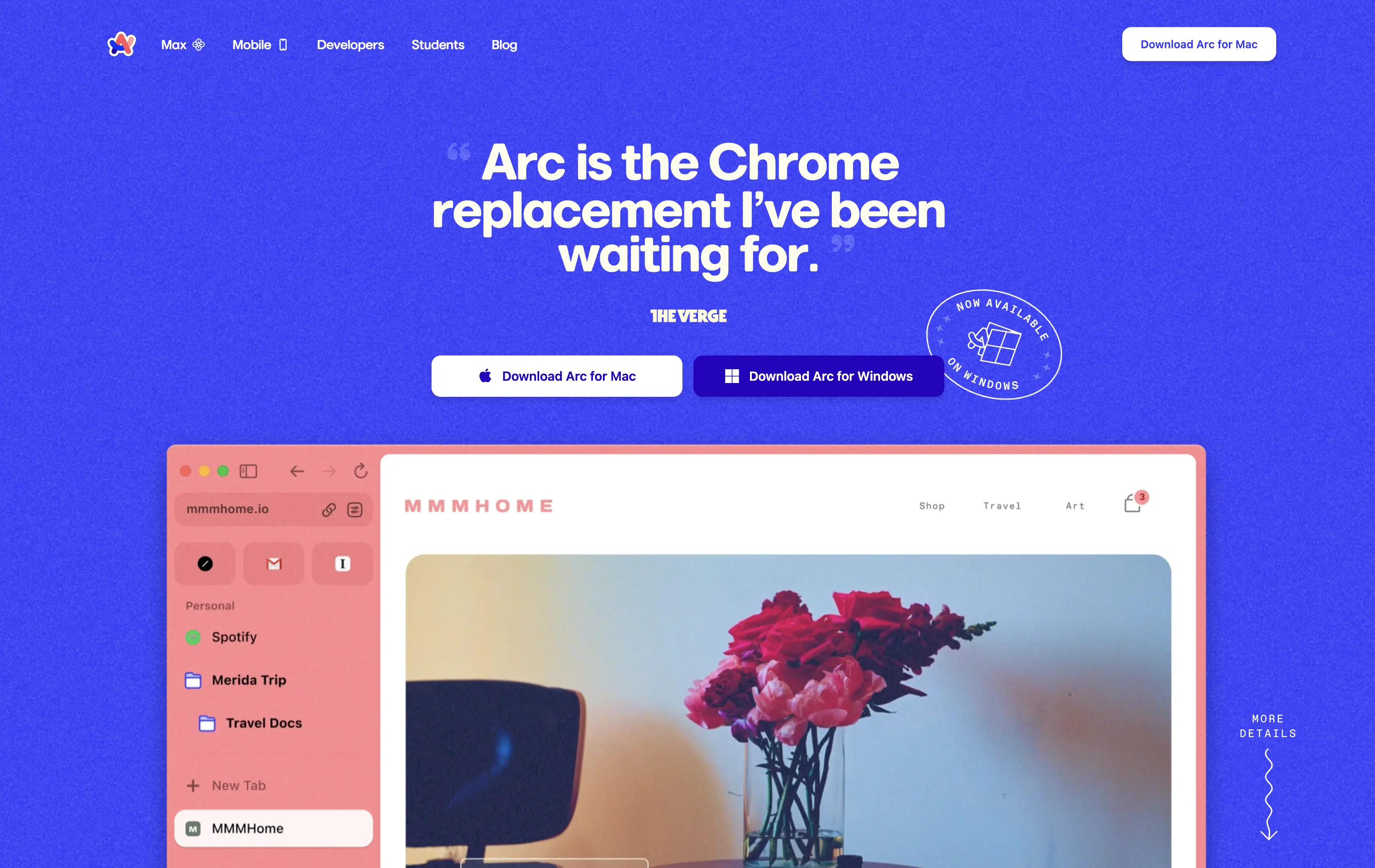
Arc
↗
SaaS
Productivity
Centered
Proof-Heavy
Multi-CTA Block
Product UI
Social Proof
Duotone
White
Blue
Display
Sans serif
B2C
Home Page
Custom Code
consumer browser, verge quote, UI-focused, product-led design, browser replacement, macOS-first, desktop software, soft but bold, macOS-style visual language, motion-laced layout, quirky detail, testimonial-driven, vibrant blue, feature-forward
Arc is a modern browser designed to replace legacy browser with a reimagined UI and productivity-first experience.
This hero grabs attention immediately with a high-credibility quote as the headline, bold visual language, and a visible product UI that instantly signals differentiation. The CTA is clear and platform-specific. The color treatment and layout feel energetic and modern, aligning well with consumer expectations for a desktop app.
Strong positioning via social proof rather than abstract messaging. The hero makes the shift-from-Chrome angle explicit, appealing to an informed, tech-forward audience. High trust and strong product framing.
This layout balances technical utility with human impact, aligning well with Algolia’s positioning as an API-first but UX-aware company. The mobile UI reinforces product value visually, while the logo wall signals scale and trust for enterprise buyers. The tone is clear, benefit-led, and appropriate for high-intent decision-makers evaluating AI tools for customer experience. This is a solid enterprise-facing hero built to perform.
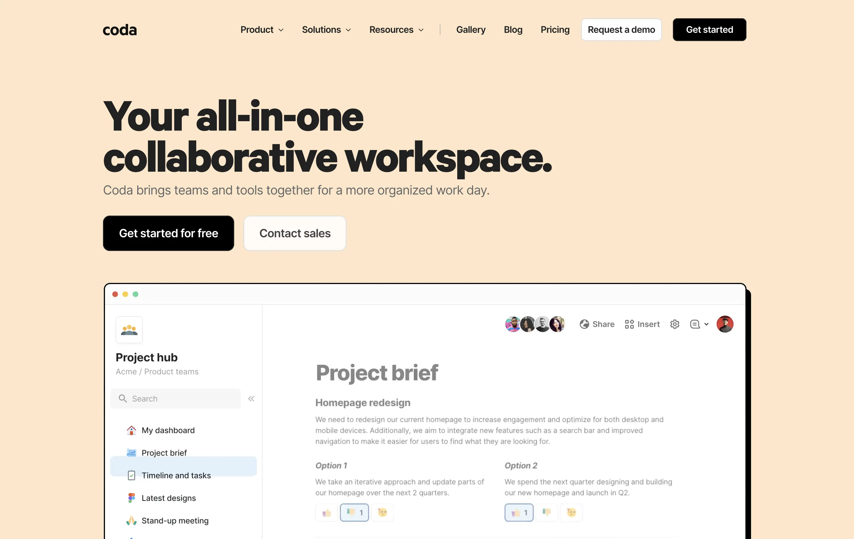
Coda
↗
SaaS
Collaboration
Productivity
Left-aligned
Descriptive
Empowering
Multi-CTA Block
Product UI
Duotone
White
Yellow
Display
Sans serif
Hybrid
Home Page
Custom Code
doc-as-app, team workflow, internal tools, collaborative workspace, UI product demo, hybrid teams, sales enablement, project brief, minimal design, low-code logic, enterprise-friendly, live multiplayer,
Coda is a collaborative doc platform that combines documents, spreadsheets, and apps into one unified workspace for teams.
The hero communicates clearly with a straightforward headline and strong product shot. Layout is easy to follow, and the dual CTA gives distinct paths for self-serve or sales-led funnels. The visual hierarchy is solid, though not emotionally charged.
Coda leads with clarity over flash. The message and layout prioritize breadth of use and enterprise readiness. Great fit for decision-makers looking to unify scattered tools into a single workspace.
This layout balances technical utility with human impact, aligning well with Algolia’s positioning as an API-first but UX-aware company. The mobile UI reinforces product value visually, while the logo wall signals scale and trust for enterprise buyers. The tone is clear, benefit-led, and appropriate for high-intent decision-makers evaluating AI tools for customer experience. This is a solid enterprise-facing hero built to perform.
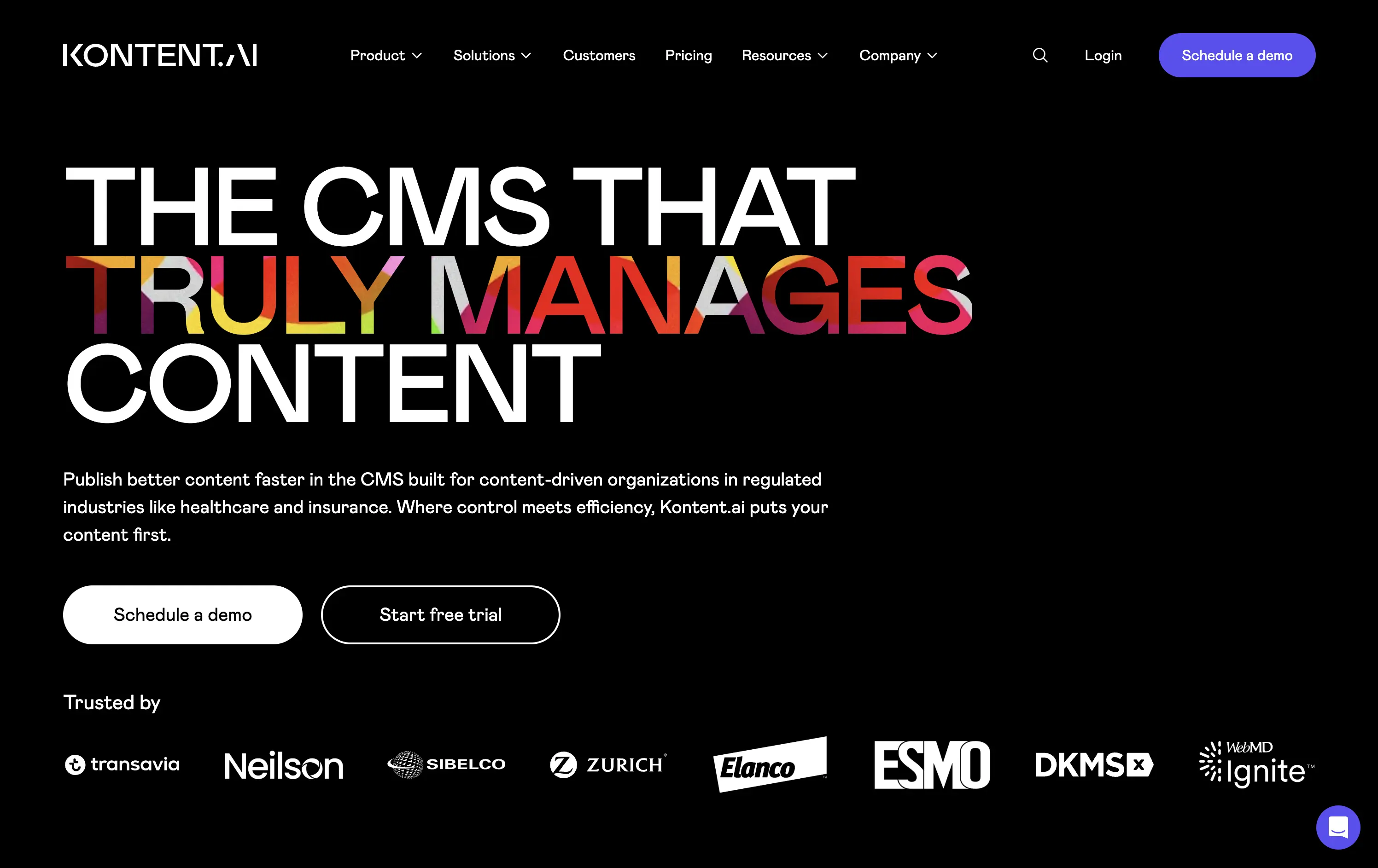
Kontent
↗
SaaS
DevTools
AI Tools
Left-aligned
Aspirational
Professional
Multi-CTA Block
Illustration
Logo Wall
Dark Mode
White
Display
Sans serif
B2B
Home Page
Custom Code
enterprise CMS, headless CMS, AI-powered content, content ops, gradient headline, trust logos, scaling infrastructure, fast deployment, dark aesthetic, enterprise compliance, visual typography, dual CTA, regulation-focused CMS, marketing ops, content velocity
Kontent.ai helps enterprise teams manage and scale content across regulated environments with more speed, control, and automation.
Hero balances clarity with ambition. Headline dramatizes a long-standing pain point in CMS, paired with a clean UI and strong credibility cues. Dual CTA supports varied funnel stages.
Tailored for enterprise teams scaling fast. The aspirational tone reframes content ops as a modern, automated function—not a bottleneck. Visuals and copy are enterprise-calibrated.
This layout balances technical utility with human impact, aligning well with Algolia’s positioning as an API-first but UX-aware company. The mobile UI reinforces product value visually, while the logo wall signals scale and trust for enterprise buyers. The tone is clear, benefit-led, and appropriate for high-intent decision-makers evaluating AI tools for customer experience. This is a solid enterprise-facing hero built to perform.
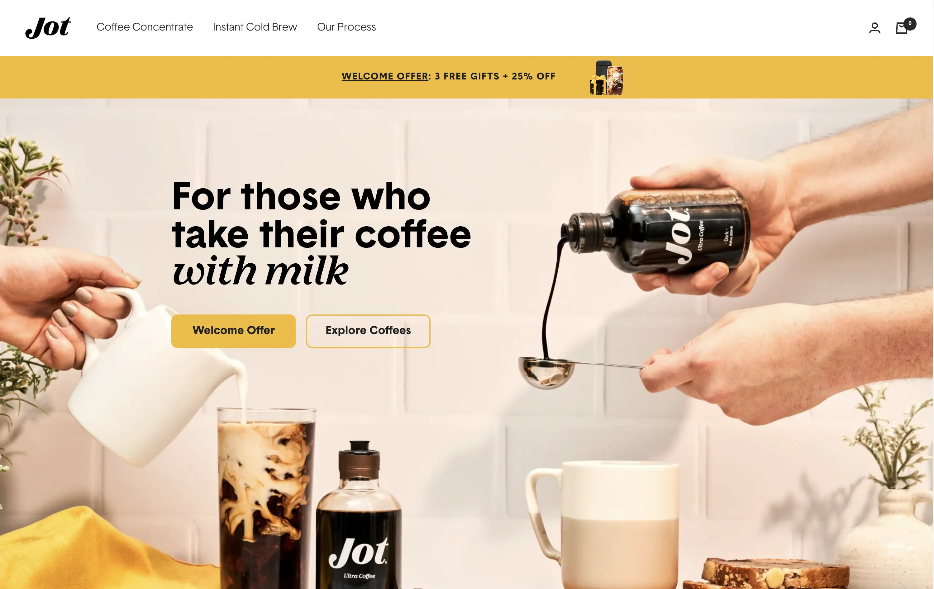
Jot
↗
CPG
Food & Beverage
Editorial
Benefit-Driven
Conversational
Multi-CTA Block
Photography
Custom Animation
Announcement
Imagery-Based
Yellow
Black
Display
DTC
Home Page
Shopify
Replo
coffee brand, lifestyle product, home ritual, premium instant coffee, CPG beverage, warm palette, morning routine, modern food DTC, product-centered hero, rotating headline, lifestyle-led photography
Jot sells ultra-concentrated coffee that simplifies your morning brew without compromising on quality or taste.
Visuals immediately convey simplicity and satisfaction. The rotating headline adapts to multiple buyer intents while keeping focus tight. The product-in-action shot clarifies usage without needing extra explanation.
The brand leans hard into lifestyle cues—targeting modern, taste-conscious buyers with clarity and credibility. The light palette and cozy setup reinforce everyday luxury.
This layout balances technical utility with human impact, aligning well with Algolia’s positioning as an API-first but UX-aware company. The mobile UI reinforces product value visually, while the logo wall signals scale and trust for enterprise buyers. The tone is clear, benefit-led, and appropriate for high-intent decision-makers evaluating AI tools for customer experience. This is a solid enterprise-facing hero built to perform.
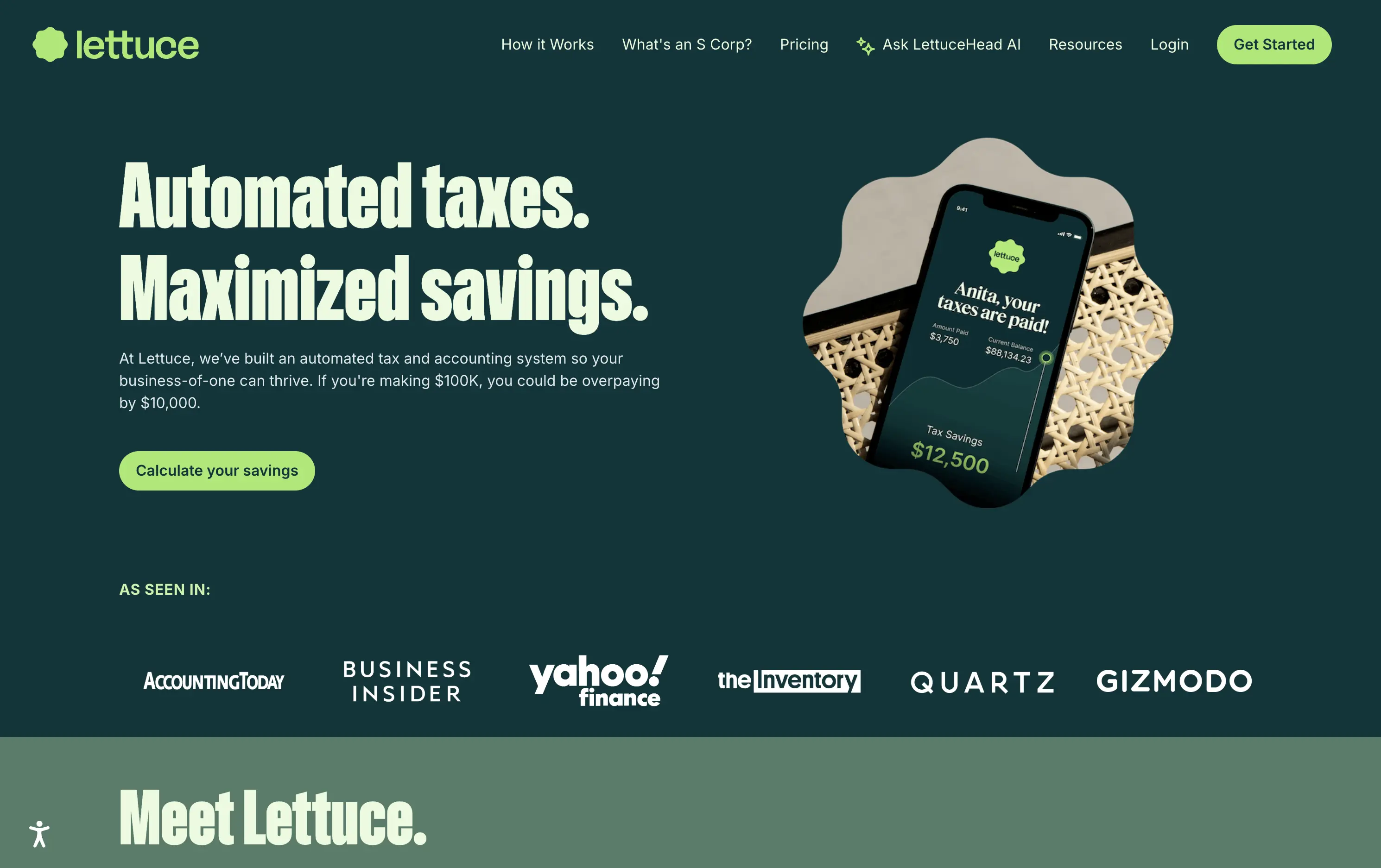
Lettuce
↗
SaaS
Fintech
Split Grid
Left-aligned
Benefit-Driven
Bold & Direct
Single Button
Photography
Logo Wall
Product UI
Duotone
Green
Display
B2C
Home Page
Custom Code
solo business finance, tax automation, self-employed SaaS, conversion-focused layout, AI accounting, ROI-driven copy, playful branding, savings calculator CTA, solo founder tools, dark green palette, clear value prop, direct tone, press trust bar, mobile-first product
Lettuce is an automated tax and accounting platform built for solo business owners, helping them save thousands by optimizing how they pay taxes.
The hero is assertive, clear, and benefit-led. “Automated taxes. Maximized savings.” lands immediately, and the subhead explains who it's for and what they’re losing without it. The savings figure on the phone mockup reinforces the pitch visually. The “Calculate your savings” CTA is strong and personalized. Overall, the layout moves fast and speaks directly to freelancers and solo operators.
Perfectly tuned for time-poor, outcome-driven solopreneurs. Uses clear math ($10k in savings) and visual cues (mobile UI, dollar figures) to make the benefit feel tangible. Smart alignment of tone, layout, and buyer urgency.
This layout balances technical utility with human impact, aligning well with Algolia’s positioning as an API-first but UX-aware company. The mobile UI reinforces product value visually, while the logo wall signals scale and trust for enterprise buyers. The tone is clear, benefit-led, and appropriate for high-intent decision-makers evaluating AI tools for customer experience. This is a solid enterprise-facing hero built to perform.
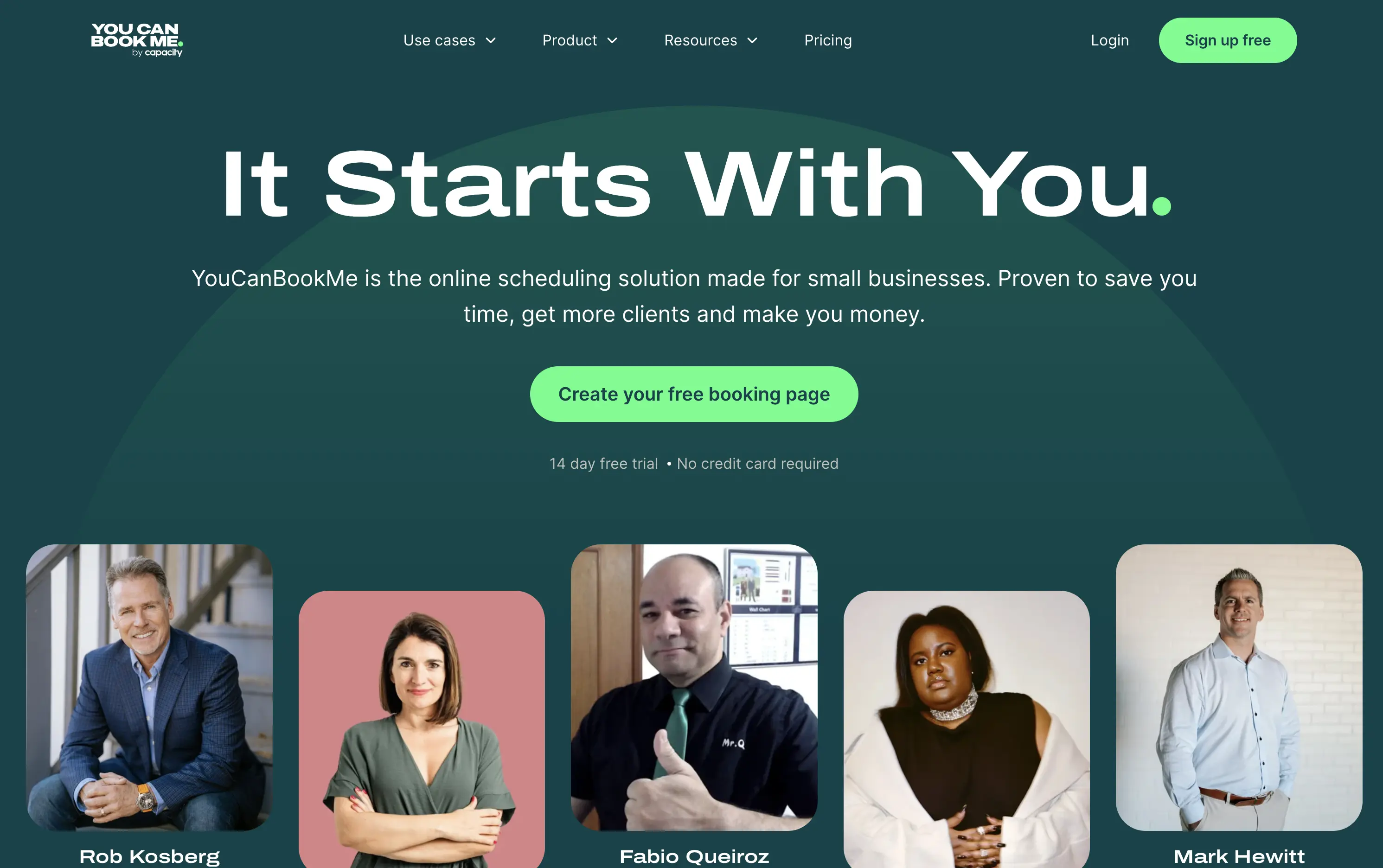
You Can Book Me
↗
SaaS
Productivity
Centered
Descriptive
Empowering
Single Button
Photography
Media Gallery
Duotone
Green
Display
B2B
Home Page
solo-friendly SaaS, scheduling tool, real user proof, small business productivity, personal headline, free trial, soft design system, emotional copy, utility-first, community-led, freemium conversion, authenticity-first visuals, indie SaaS
YouCanBook.Me is a scheduling platform designed to help small businesses streamline bookings, save time, and convert more leads through simple, flexible scheduling pages.
The hero centers emotional relatability. “It Starts With You” feels direct and empowering, while the subhead offers a clear, benefit-first pitch. The design isn’t flashy — it leans on authenticity, with non-art-directed portraits adding a raw, real-user touch. The green CTA is visible, though visually softer than competitors. While the layout lacks design sophistication, it feels personal and conversion-minded.
Targeting small business owners and service providers with a tone of support and relatability. It emphasizes utility over polish, aiming to win trust through clarity, familiarity, and proof of real-world use.
This layout balances technical utility with human impact, aligning well with Algolia’s positioning as an API-first but UX-aware company. The mobile UI reinforces product value visually, while the logo wall signals scale and trust for enterprise buyers. The tone is clear, benefit-led, and appropriate for high-intent decision-makers evaluating AI tools for customer experience. This is a solid enterprise-facing hero built to perform.
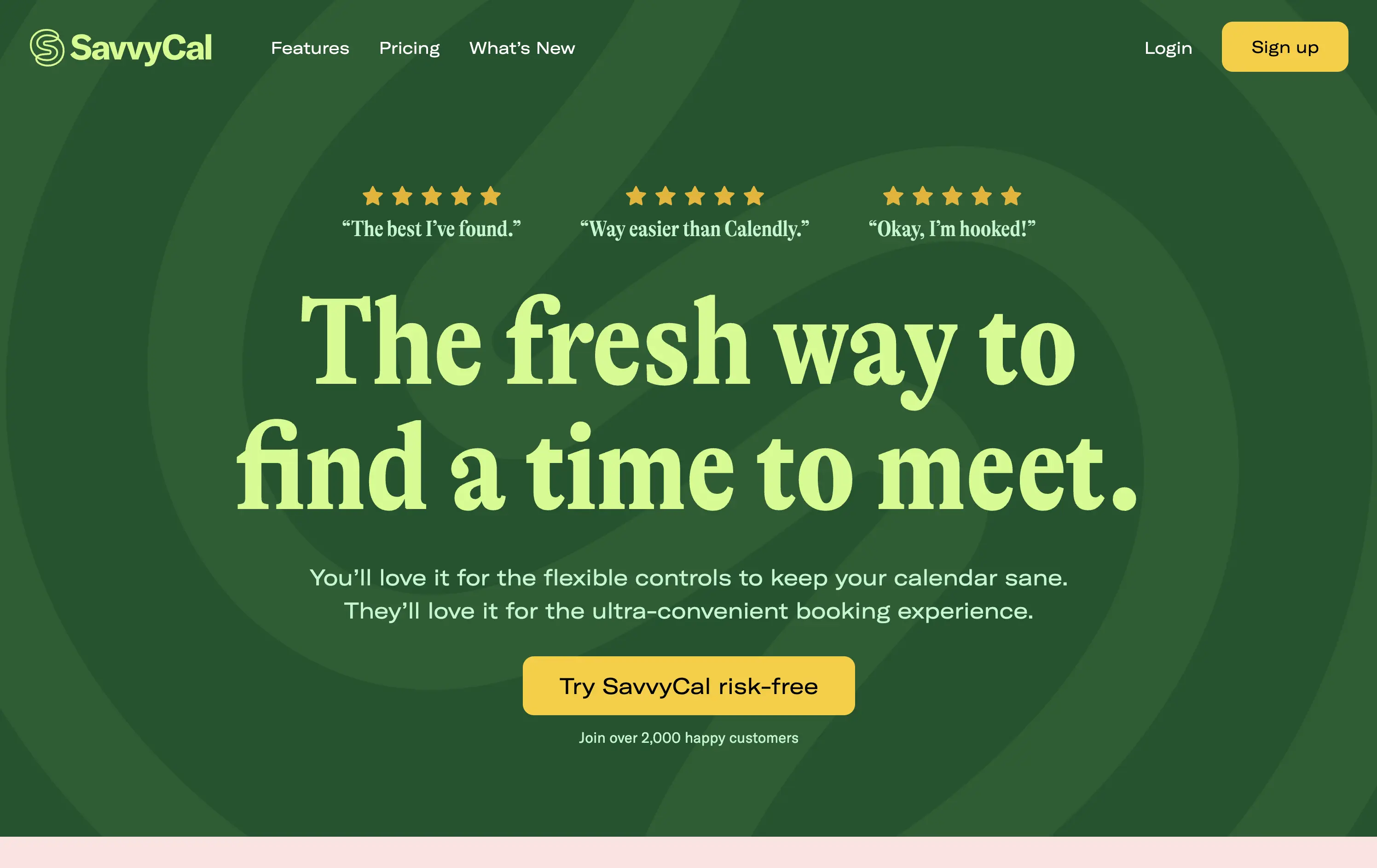
Savvy Cal
↗
SaaS
Productivity
Centered
Playful
Aspirational
Single Button
Illustration
Social Proof
Duotone
Green
Yellow
Display
Serif
B2B
Home Page
Custom Code
calendly alternative, scheduling SaaS, friendly UI, bold typography, customer-first tone, startup productivity tools, anti-friction branding, green-on-green palette, centered layout, calendar control, review-driven, solo founder energy, fresh design, clean booking UX
SavvyCal is a scheduling tool designed to simplify meeting coordination with flexible, user-first controls and a clean, friendly interface.
The hero leans hard into charm and confidence. The bold, serif headline feels conversational and clever. The contrast between green tones is controlled, and the centered layout places the CTA in a visually dominant spot. Social proof is integrated at the top with testimonial snippets to validate performance. It’s conversion-ready, especially for users looking for a more human alternative to Calendly.
Tailored to solo operators, indie founders, and small teams seeking simplicity without the enterprise bloat. Balances approachability and professionalism through tone and visual treatment. Micro-proof adds trust without noise.
This layout balances technical utility with human impact, aligning well with Algolia’s positioning as an API-first but UX-aware company. The mobile UI reinforces product value visually, while the logo wall signals scale and trust for enterprise buyers. The tone is clear, benefit-led, and appropriate for high-intent decision-makers evaluating AI tools for customer experience. This is a solid enterprise-facing hero built to perform.
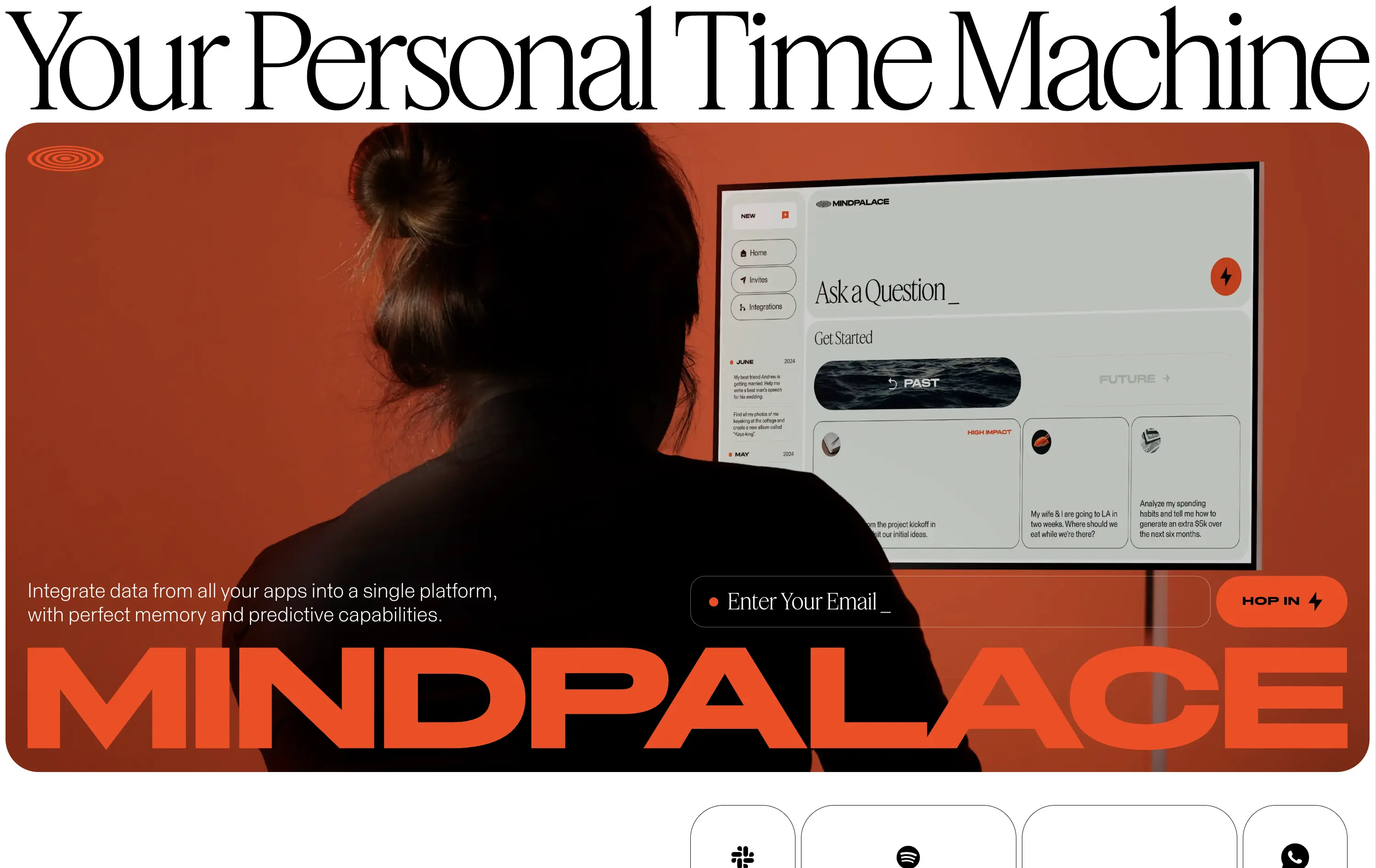
MindPalace AI
↗
SaaS
AI Tools
Productivity
Inset
Full Width
Editorial
Founder-Led Voice
Abstract / Conceptual
Email Capture
Photography
Product UI
Imagery-Based
Light Mode
Red
Black
Display
B2C
Home Page
Webflow
cinematic design, founder-led brand, AI memory tool, data integration, futuristic UI, monochrome orange palette, provocative headline, low-context messaging, brand-first hero, retro-futurist aesthetic, predictive tech, narrative design, mood-driven UX
Mindpalace connects and organizes your digital life into a single interface with memory recall and predictive AI tools—part archive, part assistant.
This hero is brand-first, product-second. The editorial headline draws intrigue but offers zero utility without scrolling. Subheadline hints at integration and predictive capabilities but avoids details. The strength lies in the striking art direction: backlit subject, glowing screen, and color-blocked monochrome palette immediately set a cinematic tone. Product UI is visible but not interactive. The email capture field is subtle and stylish, fitting the brand’s creative edge. It’s a bold anti-SaaS approach—prioritizing identity over clarity.
Mindpalace positions itself as a visionary, not a tool. Strategy leans into intrigue, betting on design-savvy early adopters who value storytelling and aesthetics over immediate clarity. Strong brand magnetism, low onboarding intent.
This layout balances technical utility with human impact, aligning well with Algolia’s positioning as an API-first but UX-aware company. The mobile UI reinforces product value visually, while the logo wall signals scale and trust for enterprise buyers. The tone is clear, benefit-led, and appropriate for high-intent decision-makers evaluating AI tools for customer experience. This is a solid enterprise-facing hero built to perform.
The most effective hero sections in your inbox.
Monthly round up of top hero sections.
Don't worry. We hate spam too.
Don't worry. We hate spam too.
Don't worry. We hate spam too.