Green
26
26
26
26
Filters
Shareio
↗
Creator Tools
Web3
Editorial
Aspirational
Confident
Single Button
Custom Animation
Loading Animation
3D visuals
Dark Mode
Green
Pink
Serif
B2C
Home Page
Webflow
paywall tech, content monetization, no-upload platform, editorial layout, kinetic typography, web3 creator stack, glowing animation, creator-first, income tools, luxury digital aesthetic
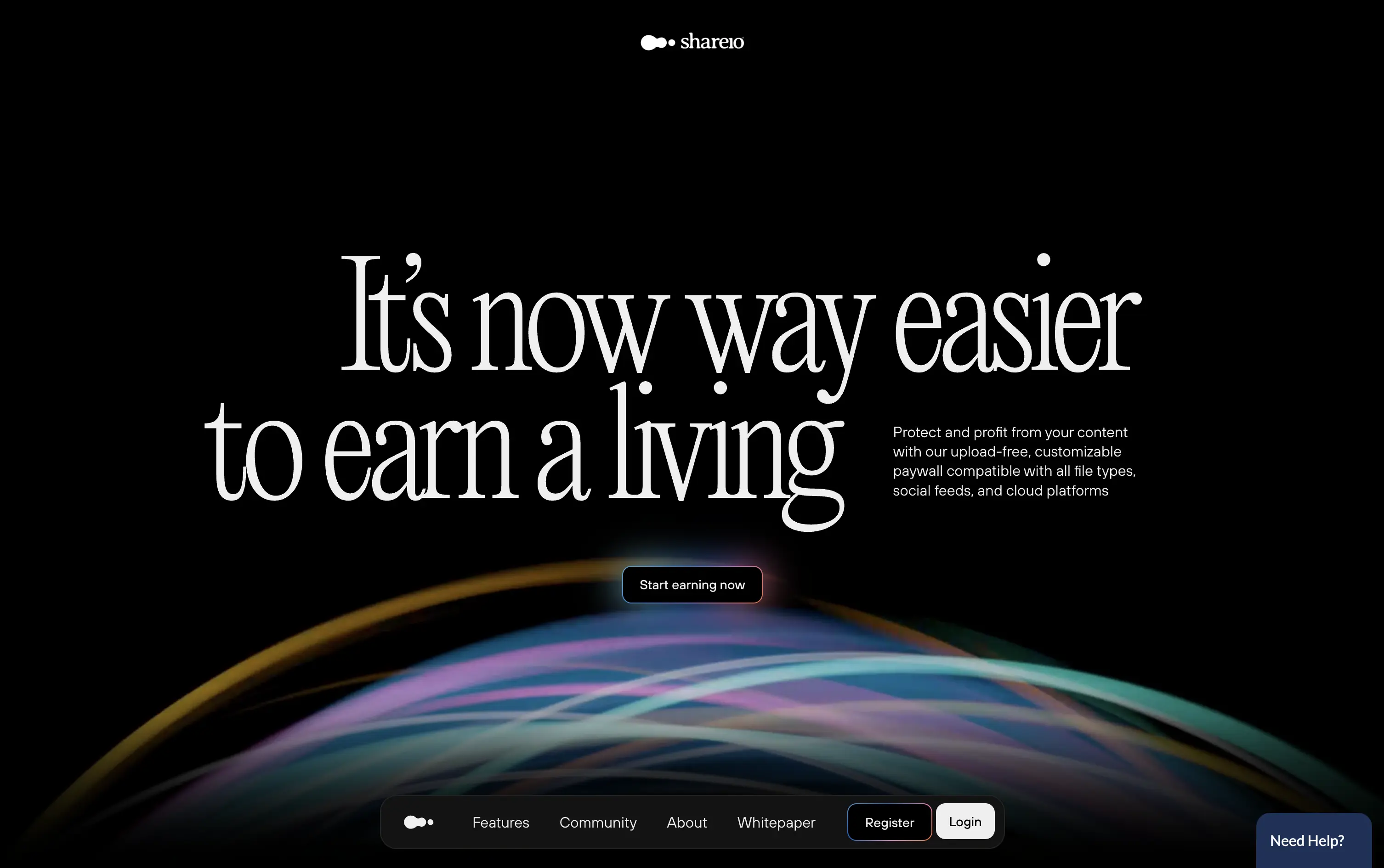
Shareio is a tool for creators to monetize any content via customizable paywalls—no uploads, just link and earn.
The hero is visually magnetic. Oversized serif type and fluid animation deliver a high-end, editorial feel. The core message is emotional, not functional—but the subline recovers clarity.
A bold play for modern creators who value style, independence, and control. The hero builds intrigue through aesthetic gravity but still manages to explain the product’s purpose with restraint.
This layout balances technical utility with human impact, aligning well with Algolia’s positioning as an API-first but UX-aware company. The mobile UI reinforces product value visually, while the logo wall signals scale and trust for enterprise buyers. The tone is clear, benefit-led, and appropriate for high-intent decision-makers evaluating AI tools for customer experience. This is a solid enterprise-facing hero built to perform.
Shareio
↗
Creator Tools
Web3
Editorial
Aspirational
Confident
Single Button
Custom Animation
Loading Animation
3D visuals
Dark Mode
Green
Pink
Serif
B2C
Home Page
Webflow
paywall tech, content monetization, no-upload platform, editorial layout, kinetic typography, web3 creator stack, glowing animation, creator-first, income tools, luxury digital aesthetic
Shareio is a tool for creators to monetize any content via customizable paywalls—no uploads, just link and earn.
The hero is visually magnetic. Oversized serif type and fluid animation deliver a high-end, editorial feel. The core message is emotional, not functional—but the subline recovers clarity.
A bold play for modern creators who value style, independence, and control. The hero builds intrigue through aesthetic gravity but still manages to explain the product’s purpose with restraint.
This layout balances technical utility with human impact, aligning well with Algolia’s positioning as an API-first but UX-aware company. The mobile UI reinforces product value visually, while the logo wall signals scale and trust for enterprise buyers. The tone is clear, benefit-led, and appropriate for high-intent decision-makers evaluating AI tools for customer experience. This is a solid enterprise-facing hero built to perform.
Stacks
↗
SaaS
AI Tools
Fintech
Centered
Aspirational
Abstract / Conceptual
Multi-CTA Block
Logo Wall
Product UI
Announcement
Gradient
Light Mode
Green
Yellow
Serif
B2B
Home Page
Framer
gradient hero, oversized serif headline, AI accounting SaaS, dual CTA, funding badge, logo wall, centered layout, finance automation, green yellow gradient, trusted by logos, product UI peek, crisp white background, modern B2B, high trust, accounting teams
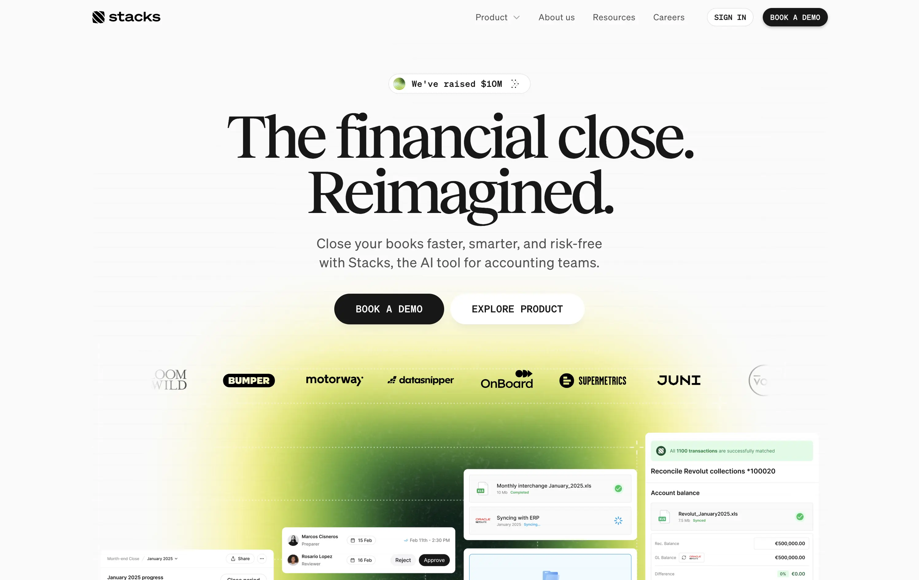
AI‑powered platform that helps accounting teams close books faster and with less risk by automating month‑end workflows.
Oversized serif headline reframes month‑end close as an ambitious reinvention, while the lime gradient draws focus and adds energy. Subheadline grounds the concept with clear benefits, and dual CTAs serve both demo‑ready and exploratory visitors. Funding badge plus client logos build instant trust. UI snippets tease depth without clutter, aided by spacious layout and sticky nav. Cohesive and convincing.
Conceptual headline elevates mundane finance work, appealing to transformation‑minded leaders. Gradient signals progress, while proof elements ease risk concerns. Demo‑centric funnel matches enterprise sales reality.
This layout balances technical utility with human impact, aligning well with Algolia’s positioning as an API-first but UX-aware company. The mobile UI reinforces product value visually, while the logo wall signals scale and trust for enterprise buyers. The tone is clear, benefit-led, and appropriate for high-intent decision-makers evaluating AI tools for customer experience. This is a solid enterprise-facing hero built to perform.
Stacks
↗
SaaS
AI Tools
Fintech
Centered
Aspirational
Abstract / Conceptual
Multi-CTA Block
Logo Wall
Product UI
Announcement
Gradient
Light Mode
Green
Yellow
Serif
B2B
Home Page
Framer
gradient hero, oversized serif headline, AI accounting SaaS, dual CTA, funding badge, logo wall, centered layout, finance automation, green yellow gradient, trusted by logos, product UI peek, crisp white background, modern B2B, high trust, accounting teams
AI‑powered platform that helps accounting teams close books faster and with less risk by automating month‑end workflows.
Oversized serif headline reframes month‑end close as an ambitious reinvention, while the lime gradient draws focus and adds energy. Subheadline grounds the concept with clear benefits, and dual CTAs serve both demo‑ready and exploratory visitors. Funding badge plus client logos build instant trust. UI snippets tease depth without clutter, aided by spacious layout and sticky nav. Cohesive and convincing.
Conceptual headline elevates mundane finance work, appealing to transformation‑minded leaders. Gradient signals progress, while proof elements ease risk concerns. Demo‑centric funnel matches enterprise sales reality.
This layout balances technical utility with human impact, aligning well with Algolia’s positioning as an API-first but UX-aware company. The mobile UI reinforces product value visually, while the logo wall signals scale and trust for enterprise buyers. The tone is clear, benefit-led, and appropriate for high-intent decision-makers evaluating AI tools for customer experience. This is a solid enterprise-facing hero built to perform.
Infinite Machine
↗
Hardware
Editorial
No headline
Single Button
Photography
3D visuals
Imagery-Based
Green
Display
DTC
Home Page
Webflow
electric mobility, hyper-modern design, minimalist layout, luxury product, DTC vehicle brand, monochrome aesthetic, bold branding, soft industrial lighting, lifestyle hardware, premium feel
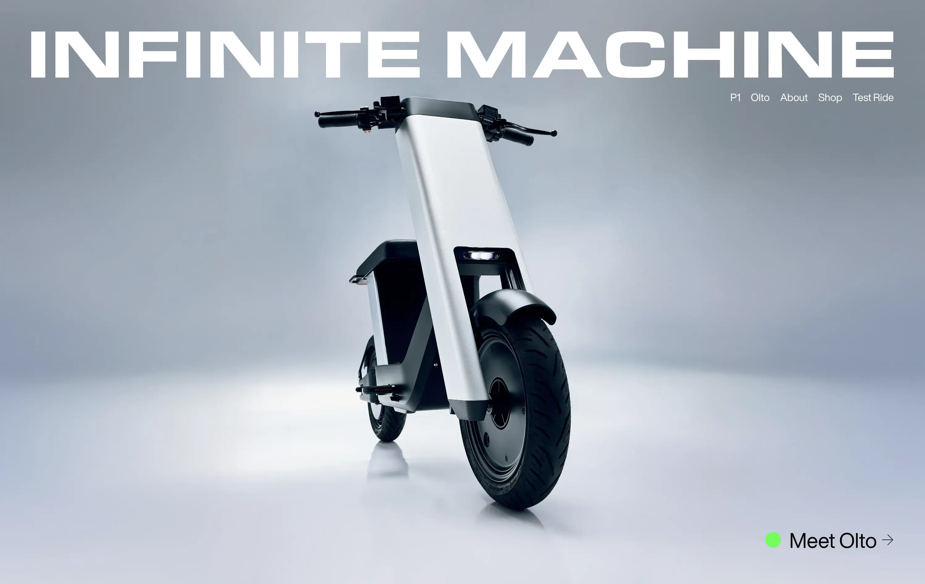
Infinite Machine builds futuristic electric motorcycles with a minimalist aesthetic and modern tech integrations.
The layout mimics a high-end magazine cover: stark, centered, and brand-dominant. It creates intrigue and immediate visual impact, but offers little onboarding or product context until users click deeper.
Infinite Machine is selling vision, not just a product. The choice to remove all explanatory copy and lead with form aligns with a luxury hardware playbook
This layout balances technical utility with human impact, aligning well with Algolia’s positioning as an API-first but UX-aware company. The mobile UI reinforces product value visually, while the logo wall signals scale and trust for enterprise buyers. The tone is clear, benefit-led, and appropriate for high-intent decision-makers evaluating AI tools for customer experience. This is a solid enterprise-facing hero built to perform.
Infinite Machine
↗
Hardware
Editorial
No headline
Single Button
Photography
3D visuals
Imagery-Based
Green
Display
DTC
Home Page
Webflow
electric mobility, hyper-modern design, minimalist layout, luxury product, DTC vehicle brand, monochrome aesthetic, bold branding, soft industrial lighting, lifestyle hardware, premium feel
Infinite Machine builds futuristic electric motorcycles with a minimalist aesthetic and modern tech integrations.
The layout mimics a high-end magazine cover: stark, centered, and brand-dominant. It creates intrigue and immediate visual impact, but offers little onboarding or product context until users click deeper.
Infinite Machine is selling vision, not just a product. The choice to remove all explanatory copy and lead with form aligns with a luxury hardware playbook
This layout balances technical utility with human impact, aligning well with Algolia’s positioning as an API-first but UX-aware company. The mobile UI reinforces product value visually, while the logo wall signals scale and trust for enterprise buyers. The tone is clear, benefit-led, and appropriate for high-intent decision-makers evaluating AI tools for customer experience. This is a solid enterprise-facing hero built to perform.
Parabola
↗
AI Tools
Productivity
Data & Analytics
Centered
Conversational
Multi-CTA Block
Interactive
Search Field
Logo Wall
Dark Mode
Green
Serif
B2B
Home Page
Webflow
AI automation, input-based interaction, structured workflows, smart defaults, productivity tool, GPT-enhanced UX, dark mode UI, enterprise lean, trusted by brands, high-conversion layout
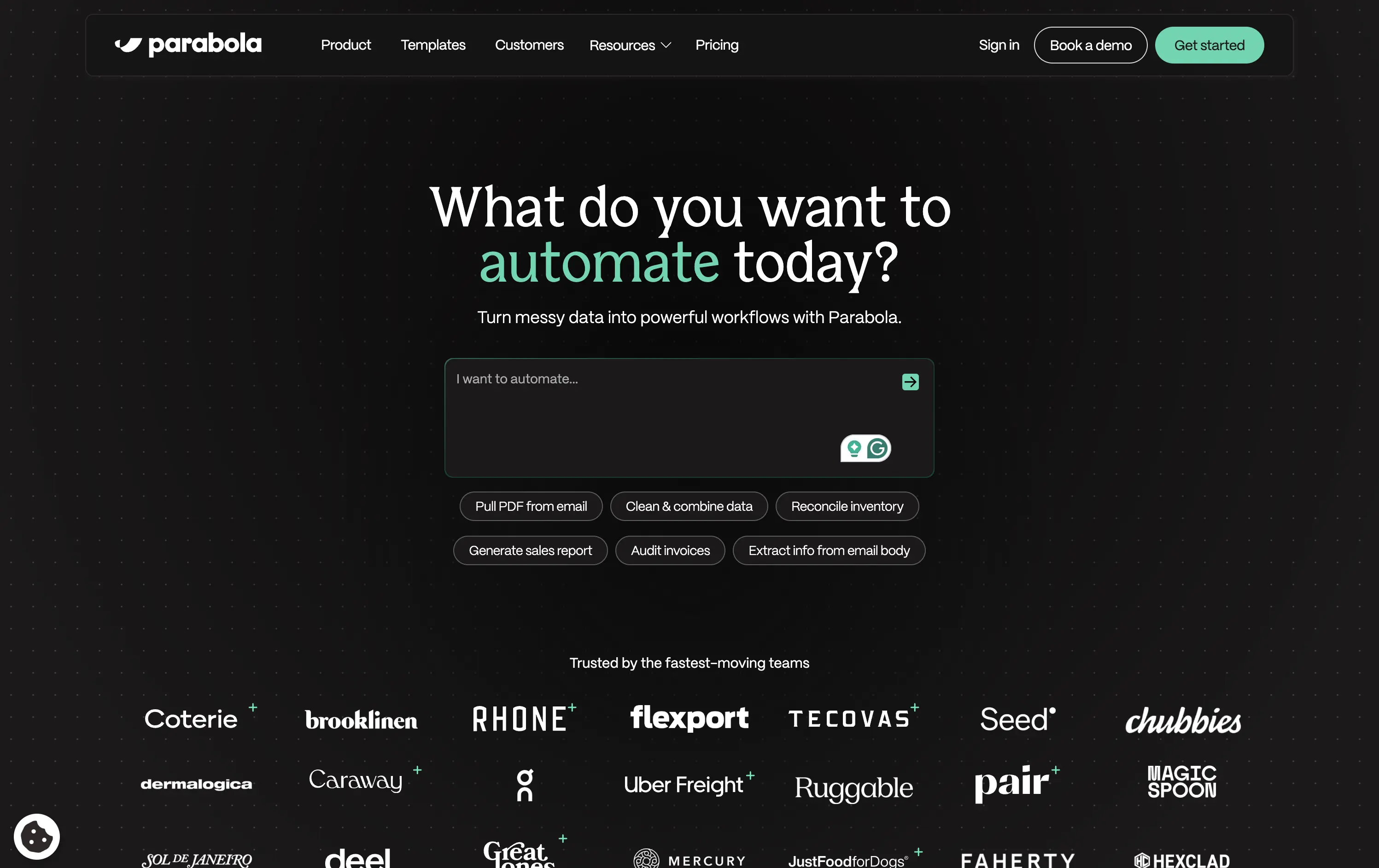
Parabola helps teams automate data-heavy workflows with AI-powered tools that clean, transform, and move business data faster.
Strong interactive moment with the input field immediately puts the user in control. The headline is benefit-led, and supporting actions give examples for inspiration. Clean, conversion-optimized layout that feels modern.
Directly aligned with operational and data-driven teams. The hero positions Parabola as both powerful and easy to start with—supported by an enterprise-trust logo wall and guided input UX.
This layout balances technical utility with human impact, aligning well with Algolia’s positioning as an API-first but UX-aware company. The mobile UI reinforces product value visually, while the logo wall signals scale and trust for enterprise buyers. The tone is clear, benefit-led, and appropriate for high-intent decision-makers evaluating AI tools for customer experience. This is a solid enterprise-facing hero built to perform.
Parabola
↗
AI Tools
Productivity
Data & Analytics
Centered
Conversational
Multi-CTA Block
Interactive
Search Field
Logo Wall
Dark Mode
Green
Serif
B2B
Home Page
Webflow
AI automation, input-based interaction, structured workflows, smart defaults, productivity tool, GPT-enhanced UX, dark mode UI, enterprise lean, trusted by brands, high-conversion layout
Parabola helps teams automate data-heavy workflows with AI-powered tools that clean, transform, and move business data faster.
Strong interactive moment with the input field immediately puts the user in control. The headline is benefit-led, and supporting actions give examples for inspiration. Clean, conversion-optimized layout that feels modern.
Directly aligned with operational and data-driven teams. The hero positions Parabola as both powerful and easy to start with—supported by an enterprise-trust logo wall and guided input UX.
This layout balances technical utility with human impact, aligning well with Algolia’s positioning as an API-first but UX-aware company. The mobile UI reinforces product value visually, while the logo wall signals scale and trust for enterprise buyers. The tone is clear, benefit-led, and appropriate for high-intent decision-makers evaluating AI tools for customer experience. This is a solid enterprise-facing hero built to perform.
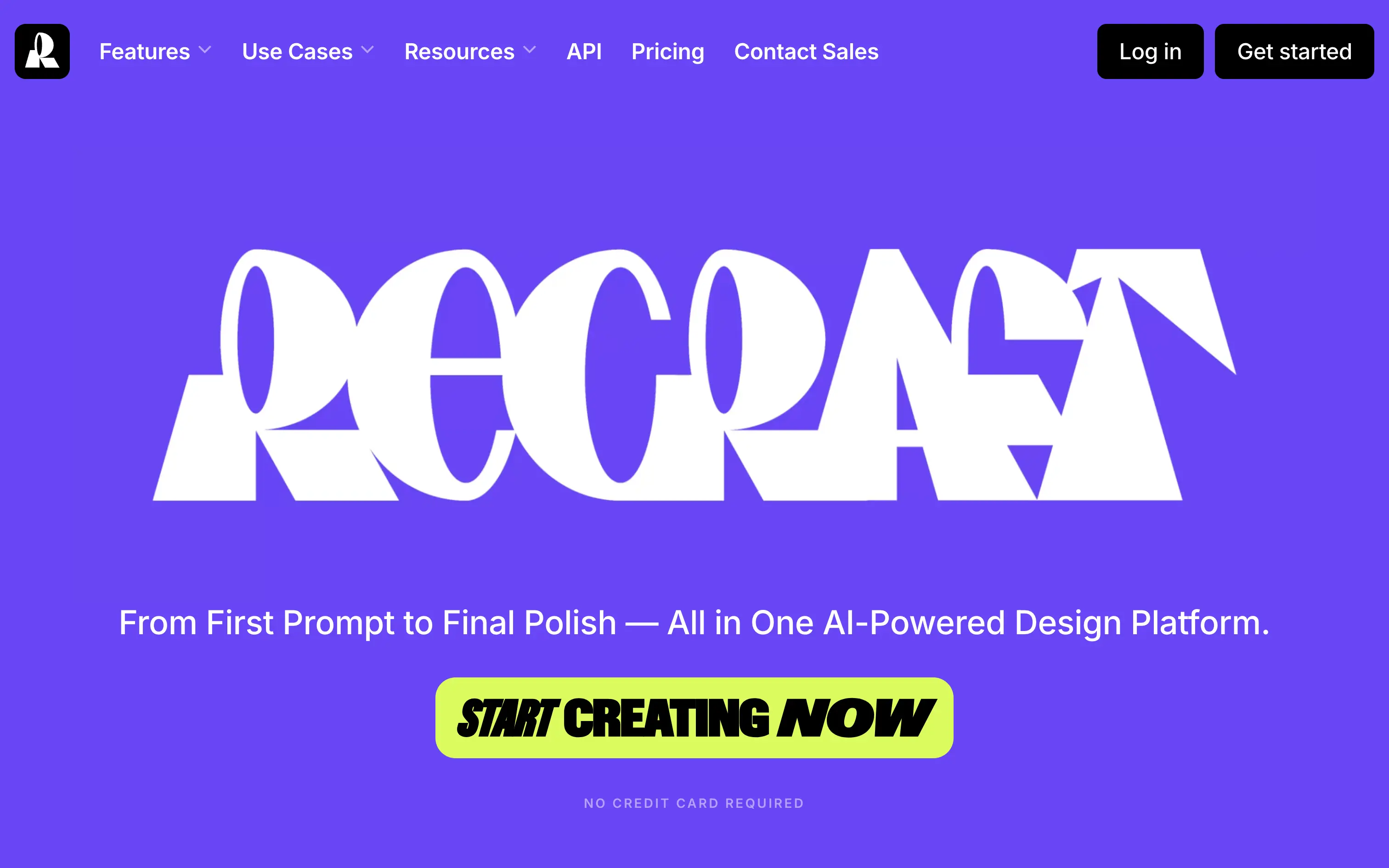
Recraft
↗
SaaS
AI Tools
Creative Tools
Centered
Bold & Direct
Single Button
Interactive
Loading Animation
Multi-color
Green
Purple
Display
Sans serif
B2C
Home Page
Custom Code
experimental typography, AI design suite, generative graphics, all-in-one creative tool, bold visual identity, Gen Z design energy, maximalist type, disruptive layout, prompt-to-polish UX, vector-first platform
Recraft is an AI-powered design platform for generating and editing vector and image assets from text prompts.
A bold, identity-first approach that skips traditional SaaS tropes. The loading animation morphs into the oversized logo, building intrigue and brand memory. Lacks UI context but makes a strong creative impression.
Recraft speaks to non-technical creatives who want AI tools that feel like theirs. This is brand-first positioning at its most intentional—confident, expressive, and highly audience-aligned.
This layout balances technical utility with human impact, aligning well with Algolia’s positioning as an API-first but UX-aware company. The mobile UI reinforces product value visually, while the logo wall signals scale and trust for enterprise buyers. The tone is clear, benefit-led, and appropriate for high-intent decision-makers evaluating AI tools for customer experience. This is a solid enterprise-facing hero built to perform.
Granola
↗
SaaS
AI Tools
Productivity
Centered
Descriptive
Pain-driven
Download App
Multi-CTA Block
Product UI
Announcement
Gradient
Light Mode
Green
Sans serif
Hybrid
Home Page
Custom Code
AI notepad, transcript comparison, Mac/iOS focus, pastel gradient, clean UX, AI productivity, note app, task-lite SaaS, small team positioning, time-saving tool, App Store-ready, side-by-side visual
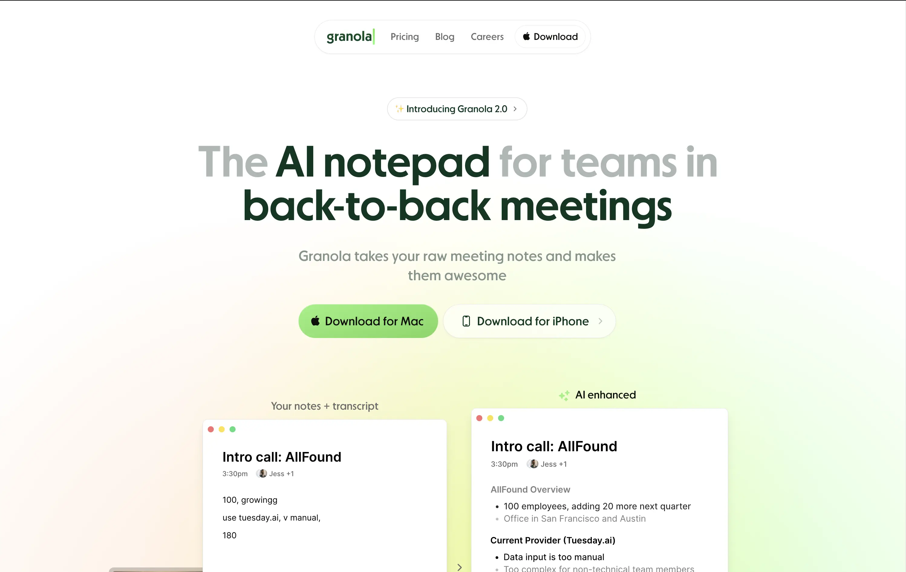
Granola is an AI notepad that turns messy meeting notes into clean, structured transcripts — built for teams with nonstop meetings.
The hero is practical and conversion-focused. It quickly communicates what the tool does and for whom. The side-by-side note demo is immediately legible and shows before/after clarity. Headline focuses on team context rather than just AI, which grounds it. Download CTAs feel native and frictionless. The soft green gradient is calming without feeling sterile. Could benefit from stronger brand differentiation, but it nails clarity and accessibility for a high-frequency use case.
Laser-targeted to productivity-challenged teams. Hero clearly communicates utility and streamlines onboarding. UI preview builds instant understanding, and the download CTAs suggest a tool that fits right into daily workflows.
This layout balances technical utility with human impact, aligning well with Algolia’s positioning as an API-first but UX-aware company. The mobile UI reinforces product value visually, while the logo wall signals scale and trust for enterprise buyers. The tone is clear, benefit-led, and appropriate for high-intent decision-makers evaluating AI tools for customer experience. This is a solid enterprise-facing hero built to perform.
Granola
↗
SaaS
AI Tools
Productivity
Centered
Descriptive
Pain-driven
Download App
Multi-CTA Block
Product UI
Announcement
Gradient
Light Mode
Green
Sans serif
Hybrid
Home Page
Custom Code
AI notepad, transcript comparison, Mac/iOS focus, pastel gradient, clean UX, AI productivity, note app, task-lite SaaS, small team positioning, time-saving tool, App Store-ready, side-by-side visual
Granola is an AI notepad that turns messy meeting notes into clean, structured transcripts — built for teams with nonstop meetings.
The hero is practical and conversion-focused. It quickly communicates what the tool does and for whom. The side-by-side note demo is immediately legible and shows before/after clarity. Headline focuses on team context rather than just AI, which grounds it. Download CTAs feel native and frictionless. The soft green gradient is calming without feeling sterile. Could benefit from stronger brand differentiation, but it nails clarity and accessibility for a high-frequency use case.
Laser-targeted to productivity-challenged teams. Hero clearly communicates utility and streamlines onboarding. UI preview builds instant understanding, and the download CTAs suggest a tool that fits right into daily workflows.
This layout balances technical utility with human impact, aligning well with Algolia’s positioning as an API-first but UX-aware company. The mobile UI reinforces product value visually, while the logo wall signals scale and trust for enterprise buyers. The tone is clear, benefit-led, and appropriate for high-intent decision-makers evaluating AI tools for customer experience. This is a solid enterprise-facing hero built to perform.
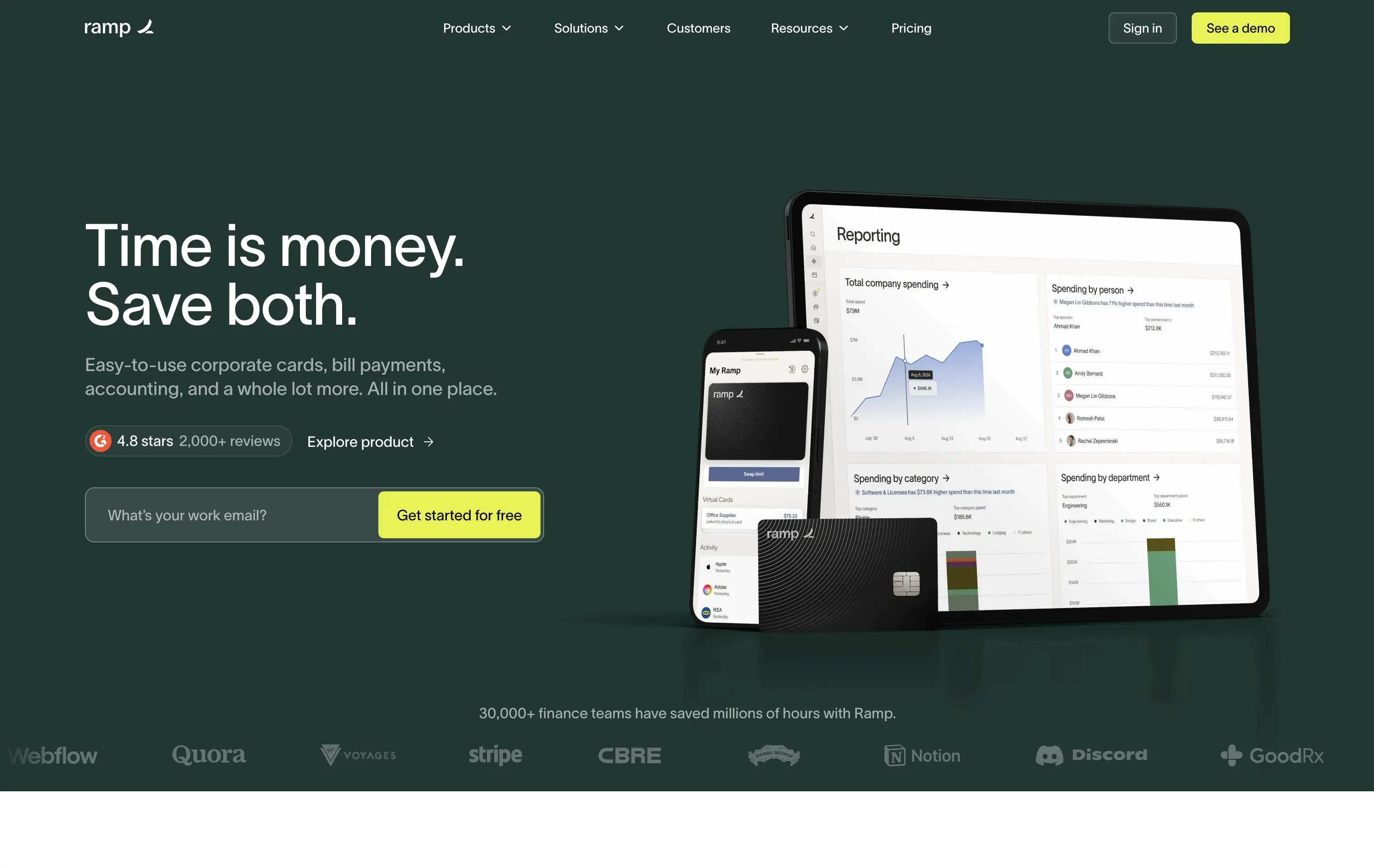
Ramp
↗
SaaS
Fintech
Split Grid
Left-aligned
Benefit-Driven
Email Capture
Product UI
Social Proof
Duotone
Green
Yellow
Sans serif
B2B
Home Page
Custom Code
expense automation, corporate cards, real-time finance tools, modern B2B fintech, ROI-led copy, dark UI, embedded reviews, verified trust cues, enterprise-ready design, slick dashboard, clear CTA, conversion optimized, mid-funnel targeting, save money pitch, split layout
Ramp is a corporate finance platform offering cards, bill pay, and reporting tools designed to save companies time and money.
The hero is clean, trust-building, and conversion-ready. Headline is bold and economic — short enough to stick, direct enough to convert. Subheadline explains the product scope, while the UI visual makes it tangible. Reviews and logos anchor trust. The input field + utility CTA streamlines lead gen.
Perfectly calibrated for CFOs and finance leads. Messaging leads with ROI, not tech — smart for a market that cares about efficiency and outcomes. Strong signal-to-noise ratio.
This layout balances technical utility with human impact, aligning well with Algolia’s positioning as an API-first but UX-aware company. The mobile UI reinforces product value visually, while the logo wall signals scale and trust for enterprise buyers. The tone is clear, benefit-led, and appropriate for high-intent decision-makers evaluating AI tools for customer experience. This is a solid enterprise-facing hero built to perform.
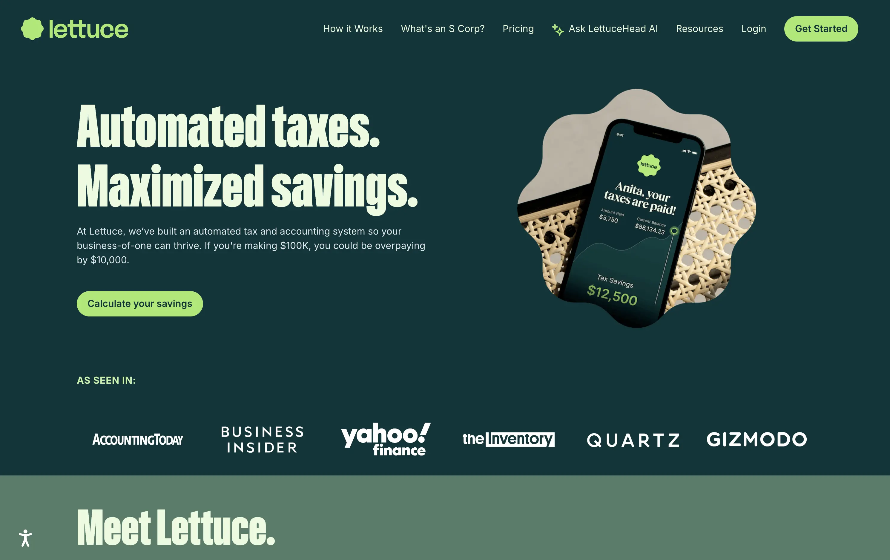
Lettuce
↗
SaaS
Fintech
Split Grid
Left-aligned
Benefit-Driven
Bold & Direct
Single Button
Photography
Logo Wall
Product UI
Duotone
Green
Display
B2C
Home Page
Custom Code
solo business finance, tax automation, self-employed SaaS, conversion-focused layout, AI accounting, ROI-driven copy, playful branding, savings calculator CTA, solo founder tools, dark green palette, clear value prop, direct tone, press trust bar, mobile-first product
Lettuce is an automated tax and accounting platform built for solo business owners, helping them save thousands by optimizing how they pay taxes.
The hero is assertive, clear, and benefit-led. “Automated taxes. Maximized savings.” lands immediately, and the subhead explains who it's for and what they’re losing without it. The savings figure on the phone mockup reinforces the pitch visually. The “Calculate your savings” CTA is strong and personalized. Overall, the layout moves fast and speaks directly to freelancers and solo operators.
Perfectly tuned for time-poor, outcome-driven solopreneurs. Uses clear math ($10k in savings) and visual cues (mobile UI, dollar figures) to make the benefit feel tangible. Smart alignment of tone, layout, and buyer urgency.
This layout balances technical utility with human impact, aligning well with Algolia’s positioning as an API-first but UX-aware company. The mobile UI reinforces product value visually, while the logo wall signals scale and trust for enterprise buyers. The tone is clear, benefit-led, and appropriate for high-intent decision-makers evaluating AI tools for customer experience. This is a solid enterprise-facing hero built to perform.
You Can Book Me
↗
SaaS
Productivity
Centered
Descriptive
Empowering
Single Button
Photography
Media Gallery
Duotone
Green
Display
B2B
Home Page
solo-friendly SaaS, scheduling tool, real user proof, small business productivity, personal headline, free trial, soft design system, emotional copy, utility-first, community-led, freemium conversion, authenticity-first visuals, indie SaaS
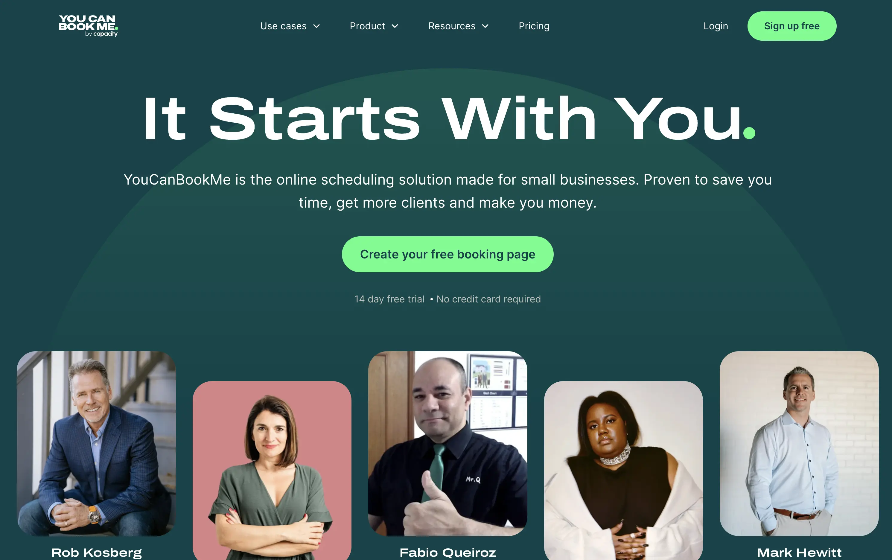
YouCanBook.Me is a scheduling platform designed to help small businesses streamline bookings, save time, and convert more leads through simple, flexible scheduling pages.
The hero centers emotional relatability. “It Starts With You” feels direct and empowering, while the subhead offers a clear, benefit-first pitch. The design isn’t flashy — it leans on authenticity, with non-art-directed portraits adding a raw, real-user touch. The green CTA is visible, though visually softer than competitors. While the layout lacks design sophistication, it feels personal and conversion-minded.
Targeting small business owners and service providers with a tone of support and relatability. It emphasizes utility over polish, aiming to win trust through clarity, familiarity, and proof of real-world use.
This layout balances technical utility with human impact, aligning well with Algolia’s positioning as an API-first but UX-aware company. The mobile UI reinforces product value visually, while the logo wall signals scale and trust for enterprise buyers. The tone is clear, benefit-led, and appropriate for high-intent decision-makers evaluating AI tools for customer experience. This is a solid enterprise-facing hero built to perform.
You Can Book Me
↗
SaaS
Productivity
Centered
Descriptive
Empowering
Single Button
Photography
Media Gallery
Duotone
Green
Display
B2B
Home Page
solo-friendly SaaS, scheduling tool, real user proof, small business productivity, personal headline, free trial, soft design system, emotional copy, utility-first, community-led, freemium conversion, authenticity-first visuals, indie SaaS
YouCanBook.Me is a scheduling platform designed to help small businesses streamline bookings, save time, and convert more leads through simple, flexible scheduling pages.
The hero centers emotional relatability. “It Starts With You” feels direct and empowering, while the subhead offers a clear, benefit-first pitch. The design isn’t flashy — it leans on authenticity, with non-art-directed portraits adding a raw, real-user touch. The green CTA is visible, though visually softer than competitors. While the layout lacks design sophistication, it feels personal and conversion-minded.
Targeting small business owners and service providers with a tone of support and relatability. It emphasizes utility over polish, aiming to win trust through clarity, familiarity, and proof of real-world use.
This layout balances technical utility with human impact, aligning well with Algolia’s positioning as an API-first but UX-aware company. The mobile UI reinforces product value visually, while the logo wall signals scale and trust for enterprise buyers. The tone is clear, benefit-led, and appropriate for high-intent decision-makers evaluating AI tools for customer experience. This is a solid enterprise-facing hero built to perform.
Savvy Cal
↗
SaaS
Productivity
Centered
Playful
Aspirational
Single Button
Illustration
Social Proof
Duotone
Green
Yellow
Display
Serif
B2B
Home Page
Custom Code
calendly alternative, scheduling SaaS, friendly UI, bold typography, customer-first tone, startup productivity tools, anti-friction branding, green-on-green palette, centered layout, calendar control, review-driven, solo founder energy, fresh design, clean booking UX
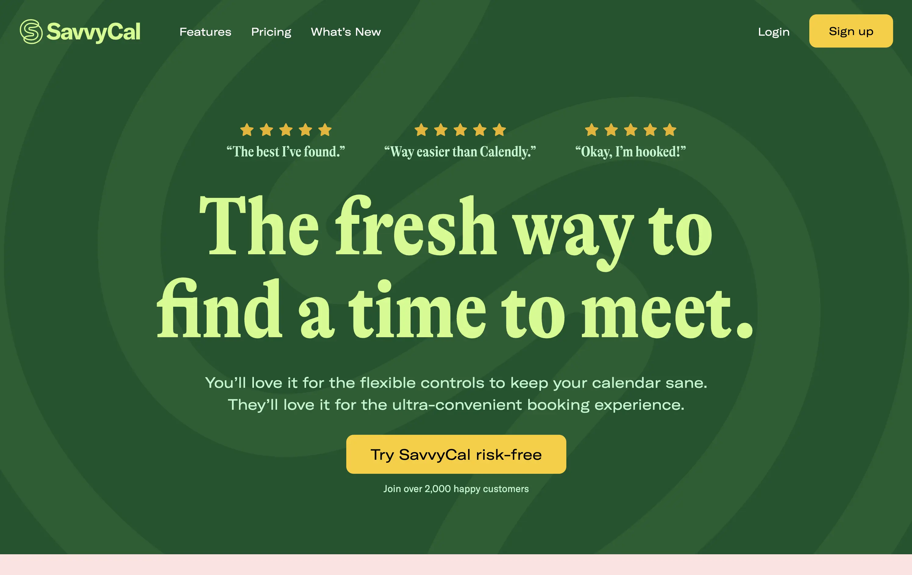
SavvyCal is a scheduling tool designed to simplify meeting coordination with flexible, user-first controls and a clean, friendly interface.
The hero leans hard into charm and confidence. The bold, serif headline feels conversational and clever. The contrast between green tones is controlled, and the centered layout places the CTA in a visually dominant spot. Social proof is integrated at the top with testimonial snippets to validate performance. It’s conversion-ready, especially for users looking for a more human alternative to Calendly.
Tailored to solo operators, indie founders, and small teams seeking simplicity without the enterprise bloat. Balances approachability and professionalism through tone and visual treatment. Micro-proof adds trust without noise.
This layout balances technical utility with human impact, aligning well with Algolia’s positioning as an API-first but UX-aware company. The mobile UI reinforces product value visually, while the logo wall signals scale and trust for enterprise buyers. The tone is clear, benefit-led, and appropriate for high-intent decision-makers evaluating AI tools for customer experience. This is a solid enterprise-facing hero built to perform.
Savvy Cal
↗
SaaS
Productivity
Centered
Playful
Aspirational
Single Button
Illustration
Social Proof
Duotone
Green
Yellow
Display
Serif
B2B
Home Page
Custom Code
calendly alternative, scheduling SaaS, friendly UI, bold typography, customer-first tone, startup productivity tools, anti-friction branding, green-on-green palette, centered layout, calendar control, review-driven, solo founder energy, fresh design, clean booking UX
SavvyCal is a scheduling tool designed to simplify meeting coordination with flexible, user-first controls and a clean, friendly interface.
The hero leans hard into charm and confidence. The bold, serif headline feels conversational and clever. The contrast between green tones is controlled, and the centered layout places the CTA in a visually dominant spot. Social proof is integrated at the top with testimonial snippets to validate performance. It’s conversion-ready, especially for users looking for a more human alternative to Calendly.
Tailored to solo operators, indie founders, and small teams seeking simplicity without the enterprise bloat. Balances approachability and professionalism through tone and visual treatment. Micro-proof adds trust without noise.
This layout balances technical utility with human impact, aligning well with Algolia’s positioning as an API-first but UX-aware company. The mobile UI reinforces product value visually, while the logo wall signals scale and trust for enterprise buyers. The tone is clear, benefit-led, and appropriate for high-intent decision-makers evaluating AI tools for customer experience. This is a solid enterprise-facing hero built to perform.
Mural
↗
SaaS
Collaboration
Productivity
Centered
Benefit-Driven
Aspirational
Single Button
Product UI
Multi-color
Green
Yellow
Serif
B2B
Home Page
Webflow
team productivity tool, familiar UI, friendly tone, AI-supported collaboration, light mode, optimistic copy, future-focused, dotted grid, visual-first, professional teams, clean hierarchy, flat color background
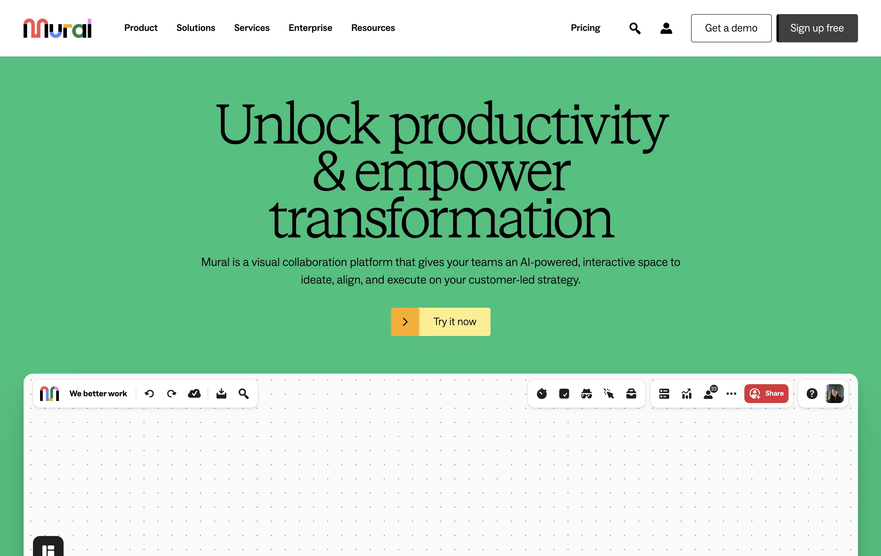
Mural is a visual collaboration platform that helps teams ideate, align, and execute strategy in real time with AI support.
The hero opens with a strong aspirational headline and bright color blocking that draws attention quickly. The serif typeface adds gravitas, while the clean UI below hints at practical use. However, the product preview could be more immediate—only the top edge of the canvas is visible, which may delay user comprehension. CTA is simple and visible. Overall, the section signals clarity and ease but misses some depth in product proof above the fold.
Strategically aimed at enterprise teams navigating transformation. The tone leans inspirational, while the visual style keeps it accessible. Immediate clarity, but lacks an element to tease the scroll action to anchor the pitch.
This layout balances technical utility with human impact, aligning well with Algolia’s positioning as an API-first but UX-aware company. The mobile UI reinforces product value visually, while the logo wall signals scale and trust for enterprise buyers. The tone is clear, benefit-led, and appropriate for high-intent decision-makers evaluating AI tools for customer experience. This is a solid enterprise-facing hero built to perform.
Mural
↗
SaaS
Collaboration
Productivity
Centered
Benefit-Driven
Aspirational
Single Button
Product UI
Multi-color
Green
Yellow
Serif
B2B
Home Page
Webflow
team productivity tool, familiar UI, friendly tone, AI-supported collaboration, light mode, optimistic copy, future-focused, dotted grid, visual-first, professional teams, clean hierarchy, flat color background
Mural is a visual collaboration platform that helps teams ideate, align, and execute strategy in real time with AI support.
The hero opens with a strong aspirational headline and bright color blocking that draws attention quickly. The serif typeface adds gravitas, while the clean UI below hints at practical use. However, the product preview could be more immediate—only the top edge of the canvas is visible, which may delay user comprehension. CTA is simple and visible. Overall, the section signals clarity and ease but misses some depth in product proof above the fold.
Strategically aimed at enterprise teams navigating transformation. The tone leans inspirational, while the visual style keeps it accessible. Immediate clarity, but lacks an element to tease the scroll action to anchor the pitch.
This layout balances technical utility with human impact, aligning well with Algolia’s positioning as an API-first but UX-aware company. The mobile UI reinforces product value visually, while the logo wall signals scale and trust for enterprise buyers. The tone is clear, benefit-led, and appropriate for high-intent decision-makers evaluating AI tools for customer experience. This is a solid enterprise-facing hero built to perform.
Windsurf
↗
DevTools
AI Tools
Productivity
Centered
Descriptive
Multi-CTA Block
Product UI
Custom Animation
Announcement
Dark Mode
Green
Sans serif
B2B
Home Page
Custom Code
IDE launch, developer-centric UI, dark mode, AI-enhanced coding, precision layout, launch-focused, performance signaling, Claude integration, copy-to-download conversion, dev community tone, structured layout, hero with proof
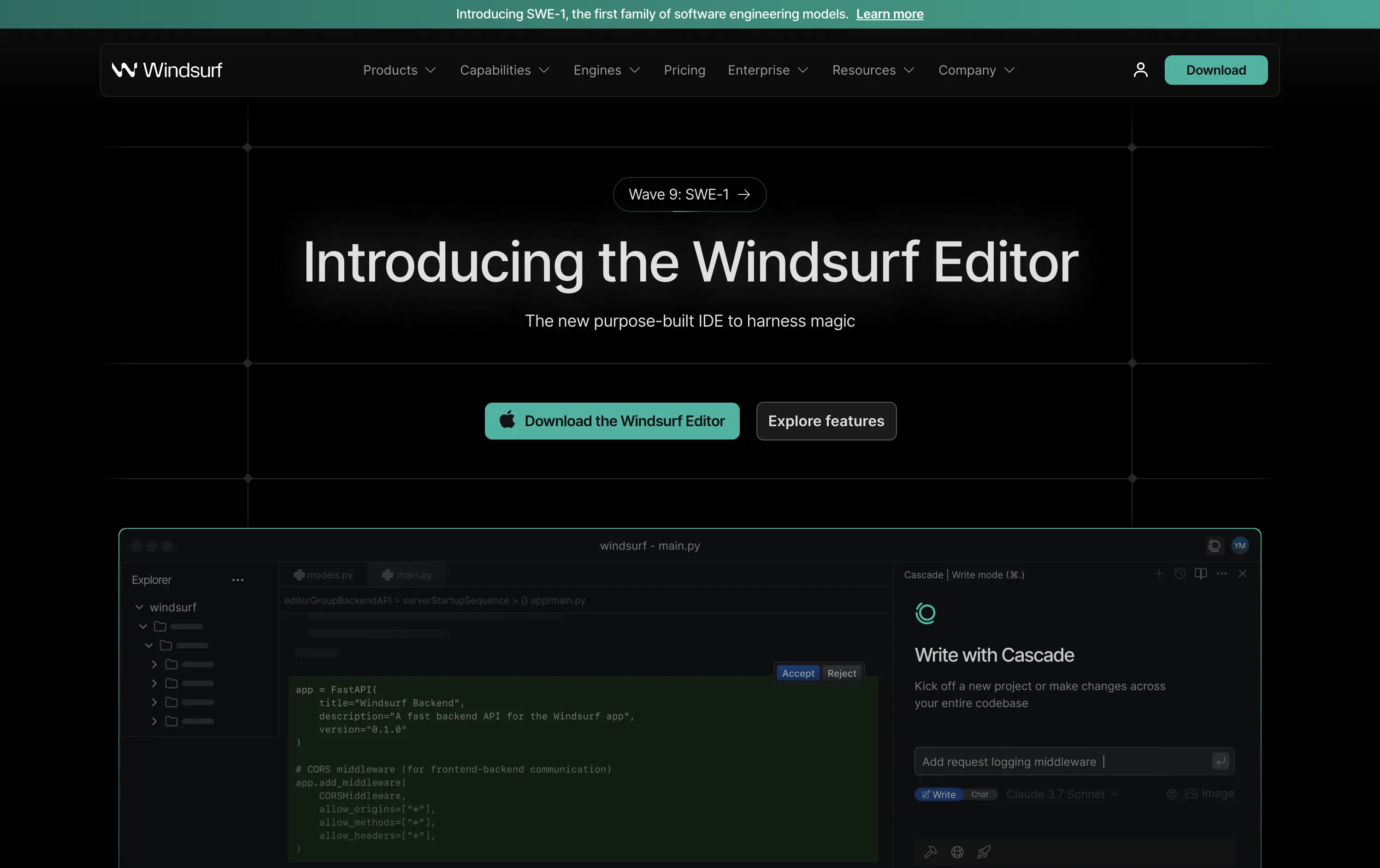
Windsurf is a new AI-powered IDE purpose-built for modern software engineers—integrating tools, models, and workflows into one seamless editing experience.
This is a pure product launch hero—focused, fast, and confident. The headline introduces the new editor directly, with “harness magic” adding flair. A download CTA and “Explore features” link address both high and medium intent users. Visual hierarchy is crisp: product UI preview beneath gives immediate credibility. The dark grid background and neon teal accents push a high-performance, developer-native aesthetic. Motion on the UI keeps it alive without distracting. Overall: efficient, well-structured, and optimized for launch-phase conversion.
A highly product-led approach targeted at technical users. The CTA hierarchy and layout structure prioritize credibility and momentum. Strong framing for launch, with a clear focus on dev audience mindset and intent.
This layout balances technical utility with human impact, aligning well with Algolia’s positioning as an API-first but UX-aware company. The mobile UI reinforces product value visually, while the logo wall signals scale and trust for enterprise buyers. The tone is clear, benefit-led, and appropriate for high-intent decision-makers evaluating AI tools for customer experience. This is a solid enterprise-facing hero built to perform.
Windsurf
↗
DevTools
AI Tools
Productivity
Centered
Descriptive
Multi-CTA Block
Product UI
Custom Animation
Announcement
Dark Mode
Green
Sans serif
B2B
Home Page
Custom Code
IDE launch, developer-centric UI, dark mode, AI-enhanced coding, precision layout, launch-focused, performance signaling, Claude integration, copy-to-download conversion, dev community tone, structured layout, hero with proof
Windsurf is a new AI-powered IDE purpose-built for modern software engineers—integrating tools, models, and workflows into one seamless editing experience.
This is a pure product launch hero—focused, fast, and confident. The headline introduces the new editor directly, with “harness magic” adding flair. A download CTA and “Explore features” link address both high and medium intent users. Visual hierarchy is crisp: product UI preview beneath gives immediate credibility. The dark grid background and neon teal accents push a high-performance, developer-native aesthetic. Motion on the UI keeps it alive without distracting. Overall: efficient, well-structured, and optimized for launch-phase conversion.
A highly product-led approach targeted at technical users. The CTA hierarchy and layout structure prioritize credibility and momentum. Strong framing for launch, with a clear focus on dev audience mindset and intent.
This layout balances technical utility with human impact, aligning well with Algolia’s positioning as an API-first but UX-aware company. The mobile UI reinforces product value visually, while the logo wall signals scale and trust for enterprise buyers. The tone is clear, benefit-led, and appropriate for high-intent decision-makers evaluating AI tools for customer experience. This is a solid enterprise-facing hero built to perform.
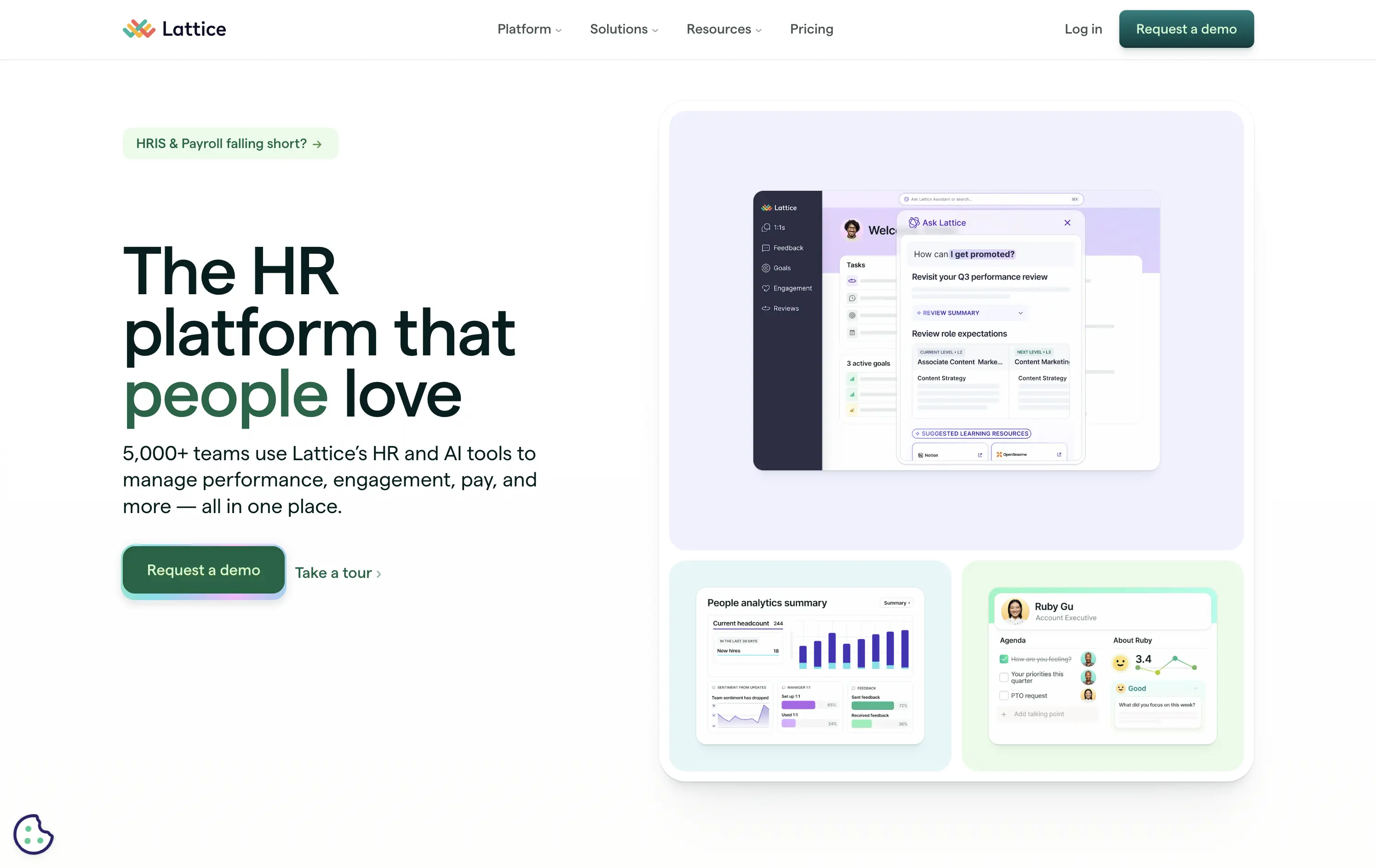
Lattice
↗
SaaS
HR/People Tech
Bento
Left-aligned
Benefit-Driven
Bold & Direct
Multi-CTA Block
Media Gallery
Product UI
Light Mode
Green
Sans serif
B2B
Home Page
Webflow
HR software, performance management, workplace culture, AI-assisted HR, clean layout, emotion-forward, team tools, modern UX, soft color palette, trust-led, subtle AI integration, employee experience, people-first platform
Lattice is an all-in-one people platform helping companies manage performance, engagement, growth, and compensation in one streamlined space.
Headline is short and sticky. The visual weight leans toward clarity and warmth. Product UI is legible and softly styled. Strong CTA placement plus secondary path shows understanding of buyer stages.
Effectively balances performance-driven HR with emotional resonance. Smart for leadership stakeholders seeking culture and efficiency. Visuals support modernity without overwhelming.
This layout balances technical utility with human impact, aligning well with Algolia’s positioning as an API-first but UX-aware company. The mobile UI reinforces product value visually, while the logo wall signals scale and trust for enterprise buyers. The tone is clear, benefit-led, and appropriate for high-intent decision-makers evaluating AI tools for customer experience. This is a solid enterprise-facing hero built to perform.
Basecamp
↗
SaaS
Collaboration
Productivity
Centered
Unconventional
Conversational
Pain-driven
No CTA
Illustration
Light Mode
Green
Yellow
Sans serif
B2B
Home Page
Custom Code
project management, SaaS, lo-fi aesthetic, opinionated design, founder-led voice, visual storytelling, problem-first, productivity, cluttered tool fatigue, anti-modern, expressive illustration, early-stage appeal, emotional resonance, no UI demo, brand storytelling, narrative-led
Basecamp cuts through tool overload with one practical workspace, ending project chaos.
The hero skips UI glamour for emotional clarity. It dramatizes the frustration of using too many disjointed tools through expressive cartoon faces and crossed-out logos. The copy is plain, bold, and highly relatable — “Wrestling with projects?” grounds it in a universal pain. No button, no fluff. The simplicity grabs attention and makes the message instantly clear.
Leans hard into anti-trend positioning—practicality over polish. Speaks directly to the frustration of tool overload, appealing to leaders who want sanity, not features. It’s memorable and unmistakably aligned with Basecamp’s legacy of contrarian clarity.
This layout balances technical utility with human impact, aligning well with Algolia’s positioning as an API-first but UX-aware company. The mobile UI reinforces product value visually, while the logo wall signals scale and trust for enterprise buyers. The tone is clear, benefit-led, and appropriate for high-intent decision-makers evaluating AI tools for customer experience. This is a solid enterprise-facing hero built to perform.
Quantilope
↗
SaaS
AI Tools
Data & Analytics
Centered
Bold & Direct
Confident
Single Button
Photography
Illustration
Product UI
Light Mode
Green
Sans serif
B2B
Home Page
Custom Code
research SaaS, data platform hero, quant marketing, teal hero, minimal SaaS layout, B2B insights platform, insight automation, animated data graphic, data-driven marketing, stat visual hero
Quantilope is an advanced research platform that automates consumer insights at scale.
The headline stakes a bold claim, and the teal accent draws focus to “advanced” and action keywords. Hero visual is a clever juxtaposition of human + data, adding some life to an otherwise data-heavy space. One clear CTA keeps the flow focused.
Aimed at marketing execs and insights leaders, the hero’s tone and layout signal speed, clarity, and data fluency. It balances modernity with professionalism, avoiding overdesign while staying sharp.
This layout balances technical utility with human impact, aligning well with Algolia’s positioning as an API-first but UX-aware company. The mobile UI reinforces product value visually, while the logo wall signals scale and trust for enterprise buyers. The tone is clear, benefit-led, and appropriate for high-intent decision-makers evaluating AI tools for customer experience. This is a solid enterprise-facing hero built to perform.
Wise
↗
SaaS
Fintech
Split Grid
Left-aligned
Benefit-Driven
Search/Utility Block
Interactive
Product UI
Social Proof
Light Mode
Green
Sans serif
Hybrid
Home Page
Custom Code
fintech, currency exchange, cost calculator, social proof upfront, real-time UI, B2C utility, transparent pricing, global payments, lean UX, bold typography, conversion-focused, clean layout, product-first design
Wise lets you send money internationally with real exchange rates and ultra-low fees — no hidden costs, just fast, fair transfers.
The bold headline immediately communicates value — “SEND MONEY GLOBALLY FOR LESS” — while the live calculator UI does the heavy lifting. Trust indicators like app store ratings sit prominently up top. CTAs are practical and clearly tied to user action. It’s all signal; functional and focused.
Perfect for high-intent users seeking fast comparison and action. The calculator UI de-risks the process while keeping attention on price.
This layout balances technical utility with human impact, aligning well with Algolia’s positioning as an API-first but UX-aware company. The mobile UI reinforces product value visually, while the logo wall signals scale and trust for enterprise buyers. The tone is clear, benefit-led, and appropriate for high-intent decision-makers evaluating AI tools for customer experience. This is a solid enterprise-facing hero built to perform.
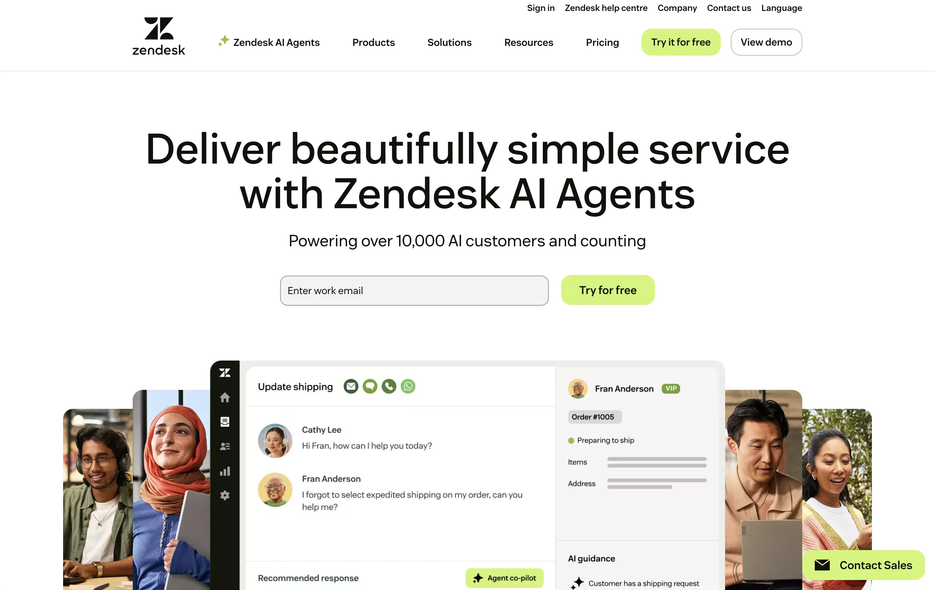
Zendesk
↗
SaaS
AI Tools
Centered
Professional
Email Capture
Media Gallery
Product UI
Light Mode
Green
Sans serif
B2B
Home Page
Custom Code
AI customer service, chat UI, CRM platform, customer success, clean layout, people-first visuals, trust signal, in-product preview, conversion optimized, large headline, email gate, freemium CTA, enterprise-ready
Zendesk provides cloud-based customer-service software and AI agents that let businesses deliver fast, omnichannel support at scale.
Spacious white canvas and oversized headline make the promise (“beautifully simple service”) instantly digestible. Warm staff-and-customer photos humanize the platform, while the embedded UI card proves product clarity. “Powering over 10,000 AI customers” adds quick trust, and the inline email field + lime-green “Try for free” button streamline conversion.
Aimed at scaling teams and enterprise leads. Clear product value, low learning curve, and social proof headline all reinforce maturity and market traction.
This layout balances technical utility with human impact, aligning well with Algolia’s positioning as an API-first but UX-aware company. The mobile UI reinforces product value visually, while the logo wall signals scale and trust for enterprise buyers. The tone is clear, benefit-led, and appropriate for high-intent decision-makers evaluating AI tools for customer experience. This is a solid enterprise-facing hero built to perform.
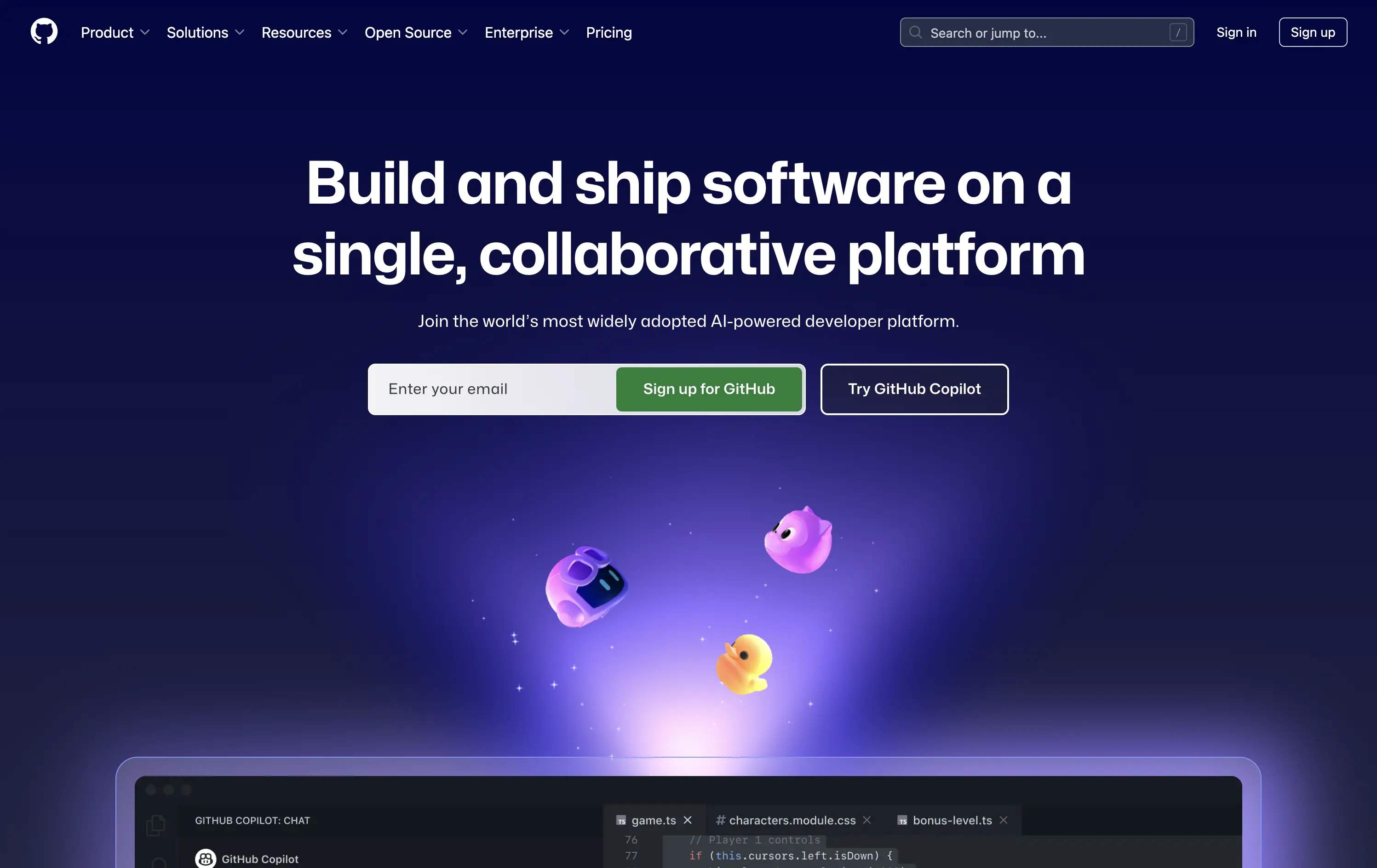
Github
↗
DevTools
Collaboration
Centered
Benefit-Driven
Confident
Multi-CTA Block
Product UI
Custom Animation
3D visuals
Gradient
Dark Mode
Green
Purple
Sans serif
Hybrid
Home Page
Custom Code
developer platform, AI coding assistant, GitHub Copilot, dark theme UI, modern dev culture, collaborative tools, open source hub, onboarding input, 3D mascots, dual CTA, cloud-based dev tools, tech-forward, productivity SaaS
GitHub is the world’s leading platform for developers to build, collaborate, and ship code together.
The hero delivers immediate clarity: build and ship software together. The animated floating mascots add visual intrigue without distracting from the copy, and the dual CTAs — email capture and Copilot trial — serve both new users and AI-curious devs. The dark spacey palette and glowing elements feel modern and focused. Solid hierarchy, clean execution.
Blends GitHub’s core dev value with its AI evolution. Highlights collaboration and product trust while gently introducing Copilot. Balanced tone makes it accessible to both enterprise teams and individual devs.
This layout balances technical utility with human impact, aligning well with Algolia’s positioning as an API-first but UX-aware company. The mobile UI reinforces product value visually, while the logo wall signals scale and trust for enterprise buyers. The tone is clear, benefit-led, and appropriate for high-intent decision-makers evaluating AI tools for customer experience. This is a solid enterprise-facing hero built to perform.
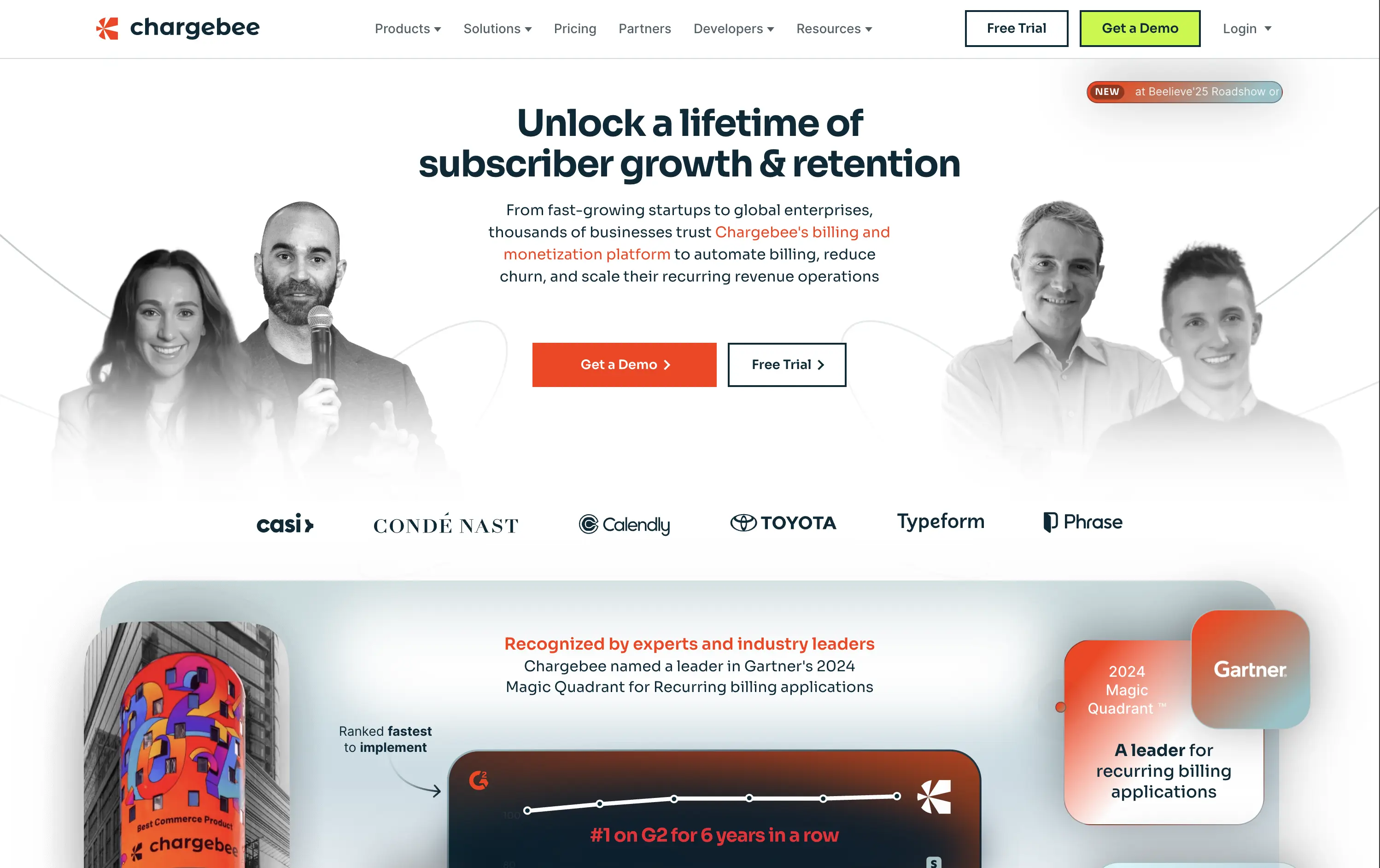
Chargebee
↗
SaaS
Fintech
Centered
Benefit-Driven
Bold & Direct
Multi-CTA Block
Photography
Logo Wall
Social Proof
Light Mode
Green
Orange
Sans serif
B2B
Home Page
Wordpress
B2B SaaS, billing automation, subscription platform, enterprise-ready, credibility-first, leadership positioning, founder imagery, logo wall, dual CTA, Gartner badge, G2 recognition, growth-focused messaging, recurring revenue
Chargebee helps businesses automate recurring billing, reduce churn, and scale subscription revenue through a trusted enterprise-ready platform.
The hero leads with a sharp, benefit-packed headline and backs it up with high-trust signals: real customer faces, name-brand logos, and third-party awards. The “Get a Demo” and “Free Trial” CTAs give users both enterprise and self-serve paths, but visual hierarchy between the two could be better balanced. Copy is outcome-focused and credible.
Smartly targeted at growth-stage and enterprise buyers, but the visual language undersells its category leadership. Strong content mix, but design lacks the presence or edge to reinforce premium positioning.
This layout balances technical utility with human impact, aligning well with Algolia’s positioning as an API-first but UX-aware company. The mobile UI reinforces product value visually, while the logo wall signals scale and trust for enterprise buyers. The tone is clear, benefit-led, and appropriate for high-intent decision-makers evaluating AI tools for customer experience. This is a solid enterprise-facing hero built to perform.
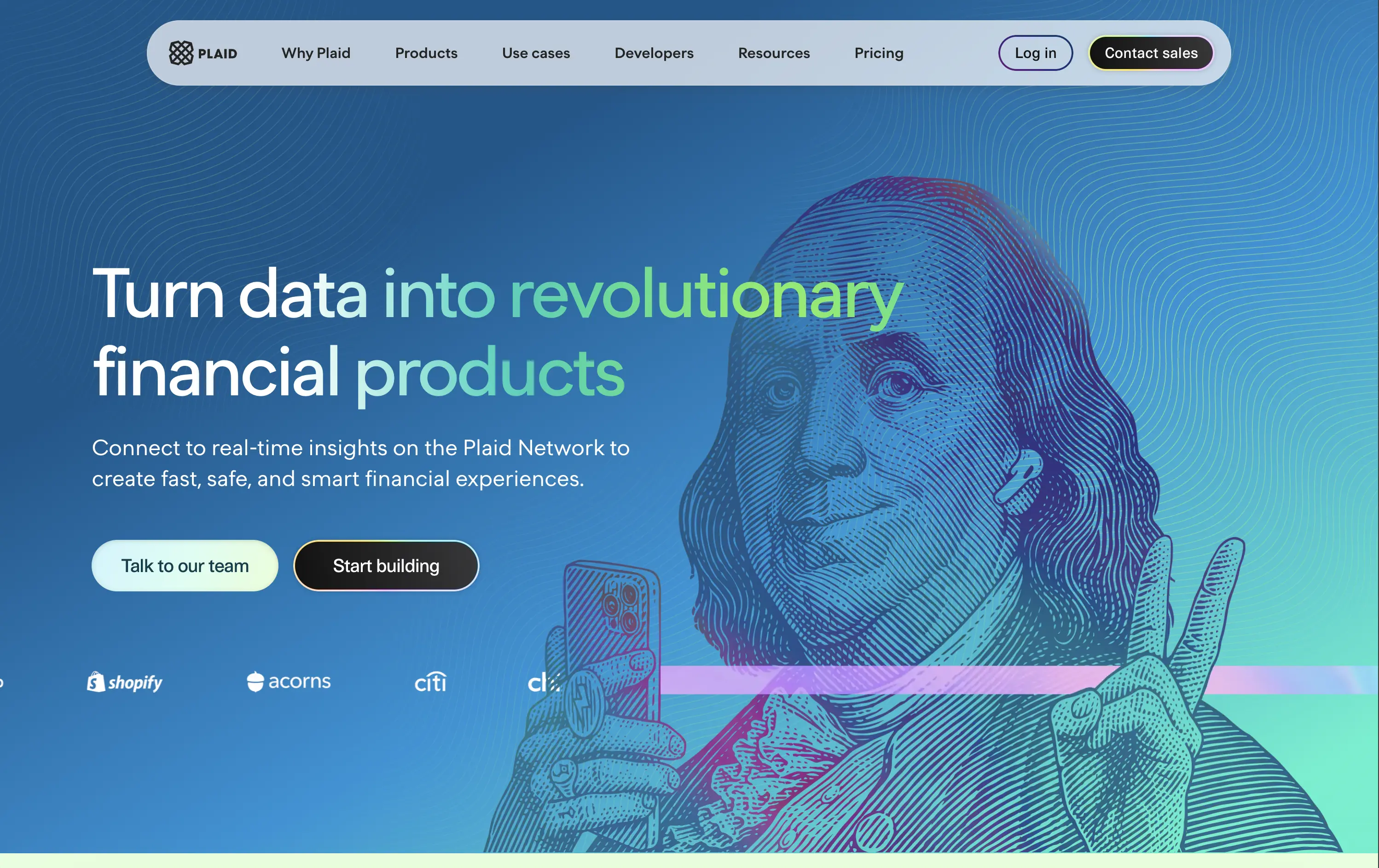
Plaid
↗
DevTools
Fintech
Data & Analytics
Left-aligned
Bold & Direct
Confident
Multi-CTA Block
Illustration
Interactive
Logo Wall
Gradient
Blue
Green
Sans serif
B2B
Home Page
Custom Code
developer fintech, API platform, financial data access, quirky fintech aesthetic, bold hero art, Benjamin Franklin illustration, smart finance tools, B2B API, trust logos, dev-first call to action, animated CTA, playful visual metaphor
Plaid is a data network that connects financial apps to users’ bank accounts securely and efficiently to power modern money experiences.
Plaid’s hero grabs attention with personality — Benjamin Franklin posing with an iPhone and some airpods, wrapped in a swirling gradient background. But it’s not just noise. The headline instantly communicates product value and the CTA contrast (“Talk to our team” vs. “Start building”) serves both enterprise and self-serve tracks. Logo wall underlines legitimacy. It’s high-impact and instantly memorable.
Plaid positions itself as the modern infrastructure backbone of fintech. The visual and messaging mix signals credibility, tech depth, and cultural fluency — ideal for both new gen founders.
This layout balances technical utility with human impact, aligning well with Algolia’s positioning as an API-first but UX-aware company. The mobile UI reinforces product value visually, while the logo wall signals scale and trust for enterprise buyers. The tone is clear, benefit-led, and appropriate for high-intent decision-makers evaluating AI tools for customer experience. This is a solid enterprise-facing hero built to perform.
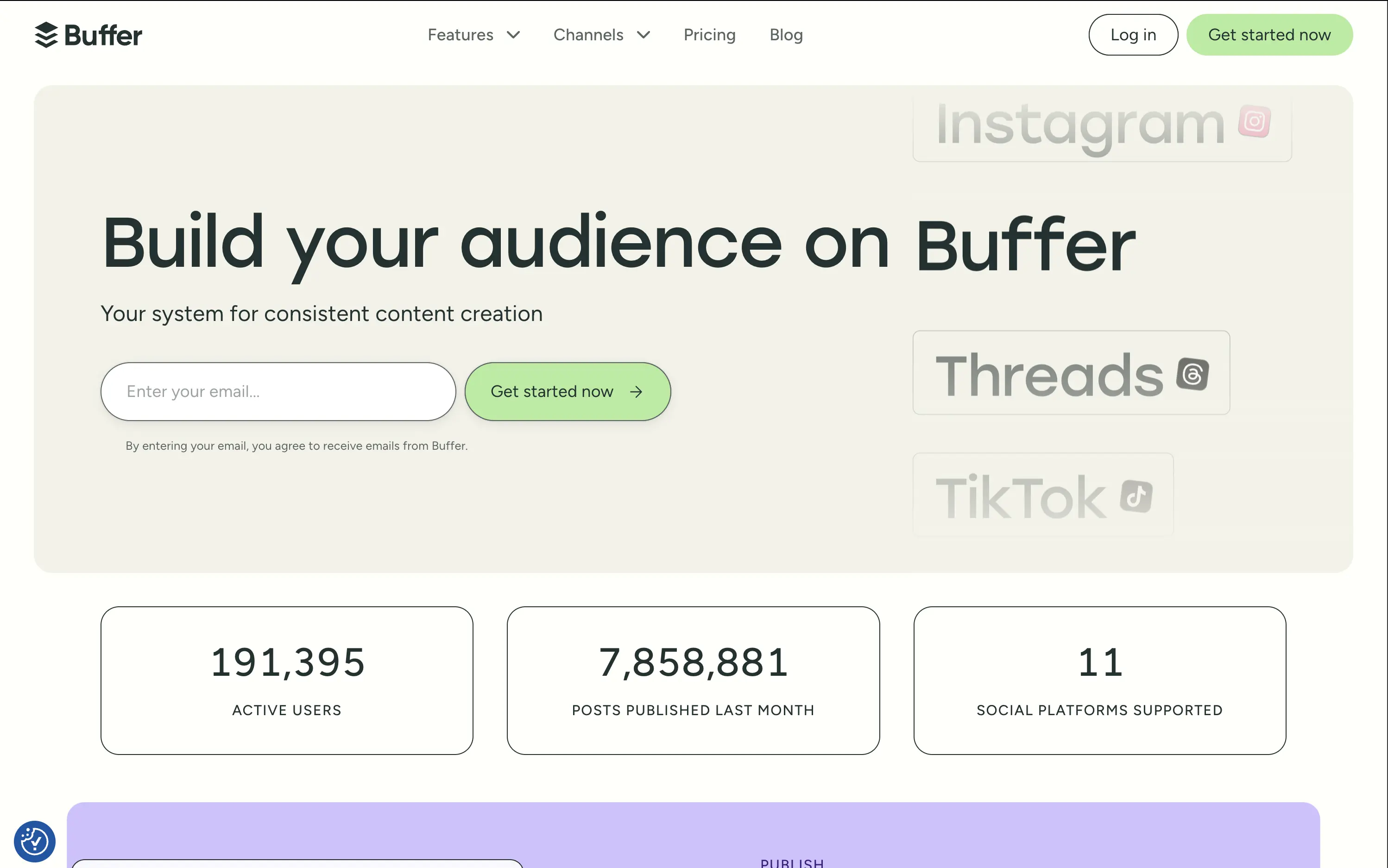
Buffer
↗
SaaS
Creator Tools
Productivity
Inset
Left-aligned
Aspirational
Email Capture
Live Metrics
Social Proof
Custom Animation
Light Mode
Green
Sans serif
Hybrid
Home Page
Custom Code
social media scheduler, content calendar tool, creator marketing SaaS, post automation, analytics, small-business growth
Buffer helps creators and teams grow their audience with simple tools to plan, publish, and track social content across multiple platforms.
The hero is calm and conversion-optimized. The oversized headline commands attention, while the clever marquee animation showcases integrations without visual overload. The inline email field reduces signup resistance and is paired with a soft green CTA for visual hierarchy. The hero balances aspirational tone with grounded proof (usage stats), but slightly muted contrast may reduce clarity on some screens.
Buffer leads with clarity and low effort — a smart choice for time-starved creators and marketers. Stats support credibility while tone avoids hype. The layout matches their no-fluff, practical brand positioning.
This layout balances technical utility with human impact, aligning well with Algolia’s positioning as an API-first but UX-aware company. The mobile UI reinforces product value visually, while the logo wall signals scale and trust for enterprise buyers. The tone is clear, benefit-led, and appropriate for high-intent decision-makers evaluating AI tools for customer experience. This is a solid enterprise-facing hero built to perform.
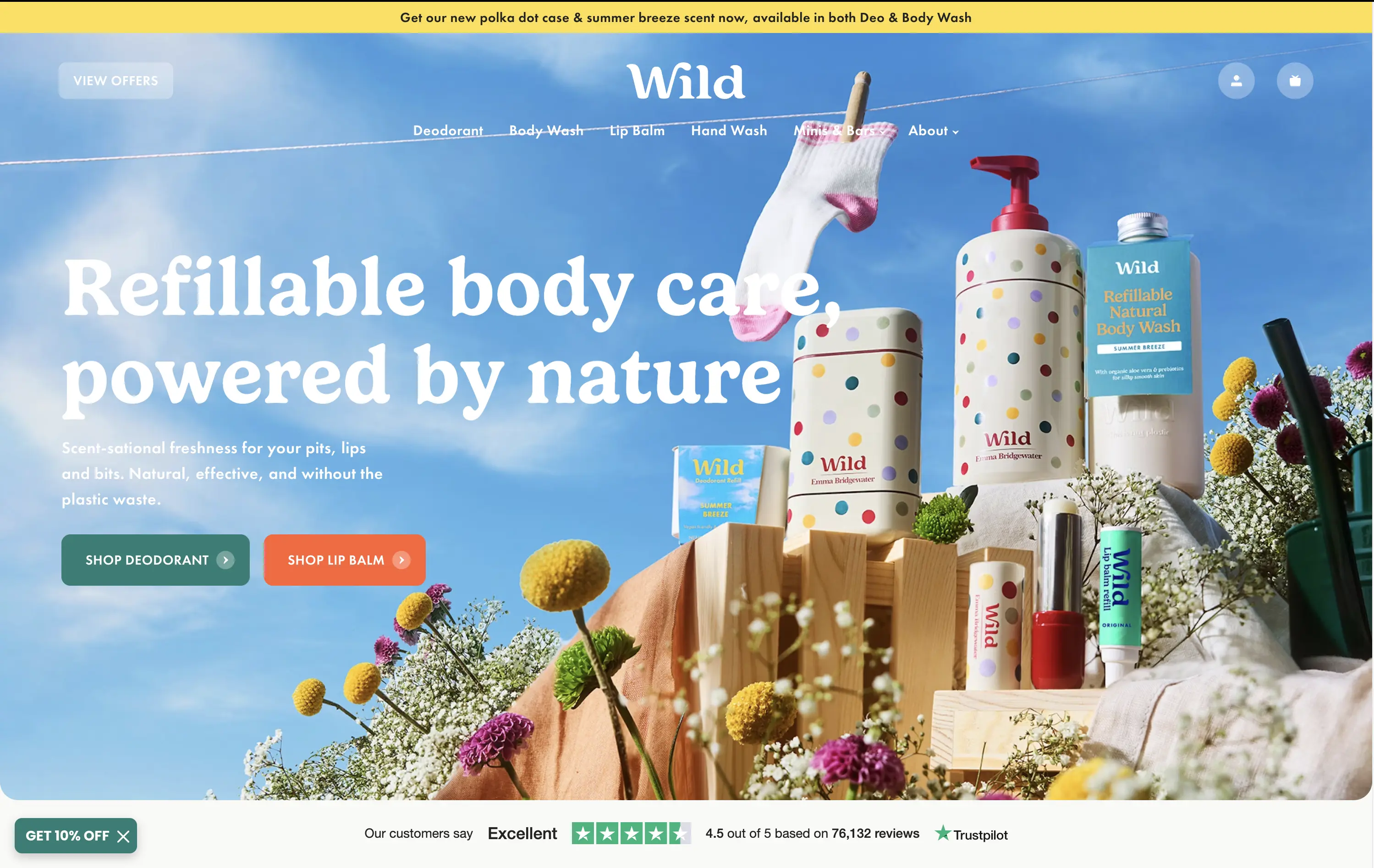
Wild
↗
CPG
Beauty & Wellness
Sustainability
Full Width
Left-aligned
Bold & Direct
Multi-CTA Block
Social Proof
Announcement
Imagery-Based
Green
Orange
Serif
DTC
Home Page
Shopify
eco-conscious, refillable packaging, summer aesthetic, photo-based hero, colorful packaging, nature-forward, trustbar visible, multi-CTA, DTC beauty, vibrant product shot, planet-positive, sunlit tone, clean bodycare
Wild offers refillable personal care products that are plastic-free, eco-friendly, and designed for everyday routines.
Bright, joyful photography captures the brand’s eco-fresh ethos while showcasing the full product range in one glance. Bold headline contrasts nicely with the sky backdrop, and CTAs are well-placed for quick shopper entry. Trustpilot widget reinforces credibility. While it’s vibrant and approachable, background details might slightly interfere with copy clarity on smaller screens.
Clear value prop and visual narrative tailored to eco-conscious DTC buyers. Emotional appeal (freshness, fun, nature) is balanced with proof (Trustpilot) and conversion intent. Could improve copy visibility slightly on mobile.
This layout balances technical utility with human impact, aligning well with Algolia’s positioning as an API-first but UX-aware company. The mobile UI reinforces product value visually, while the logo wall signals scale and trust for enterprise buyers. The tone is clear, benefit-led, and appropriate for high-intent decision-makers evaluating AI tools for customer experience. This is a solid enterprise-facing hero built to perform.
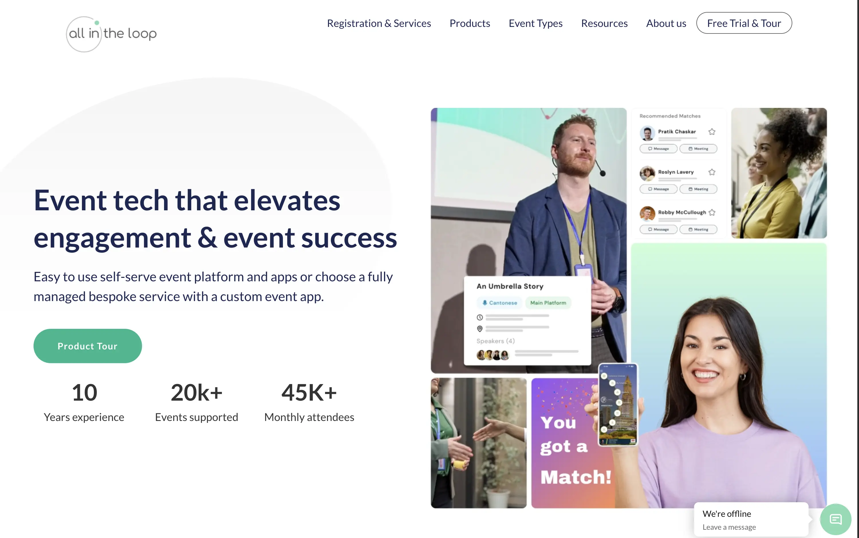
All in the loop
↗
SaaS
Events
Split Grid
Left-aligned
Benefit-Driven
Professional
Single Button
Media Gallery
Live Metrics
Social Proof
Light Mode
Blue
Green
Sans serif
B2B
Home Page
Wordpress
event tech, product tour CTA, pastel gradient, multi-image collage, visual UI overlays, metrics proof, event engagement, B2B SaaS, white background, friendly tone, hybrid event solutions, mobile app showcase, professional layout, soft aesthetic, platform demo
All in the Loop offers a self-serve or fully managed platform to run engaging, app-powered events and conferences.
The hero is clean and covers the basics — a clear headline, brief subtext, supporting visuals, and a CTA. But it plays it too safe. The collage of images feels generic and lacks a focal point. Visual proof of the product exists, but it’s scattered. There’s no standout hook or emotion — it functions, but it doesn’t persuade.
Positioning is sound—highlighting both self-serve and bespoke delivery models shows adaptability. The visuals convey live interaction and networking. Could benefit from a sharper, bolder headline, but trust and clarity are both strong.
This layout balances technical utility with human impact, aligning well with Algolia’s positioning as an API-first but UX-aware company. The mobile UI reinforces product value visually, while the logo wall signals scale and trust for enterprise buyers. The tone is clear, benefit-led, and appropriate for high-intent decision-makers evaluating AI tools for customer experience. This is a solid enterprise-facing hero built to perform.
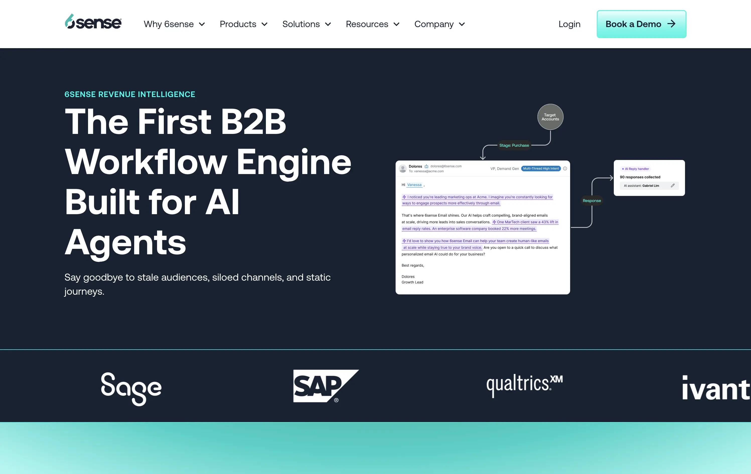
6sense
↗
SaaS
AI Tools
Split Grid
Left-aligned
Professional
No CTA
Logo Wall
Product UI
Duotone
Blue
Green
Sans serif
B2B
Home Page
Wordpress
AI-first, B2B enterprise, workflow automation, data-driven, email UI, proof of concept visual, dark theme, high-trust, demand gen, gradient bottom edge, technical audience, low-fluff, enterprise SaaS, sales enablement, client logos
6sense is a B2B platform using AI to automate workflows and personalize marketing outreach at scale.
The hero leads with authority — strong headline, clean copy, and a visual that maps out a real workflow give instant context to a technical audience. The dark theme reads serious and enterprise-ready. Copy is crystal clear, but the visual diagram could use just a little more breathing room. CTA is sharp and obvious: Book a Demo — no distractions.
Hero is tuned for high-intent buyers. The language signals innovation and productivity gains while reinforcing credibility through visual proof and case stats.
This layout balances technical utility with human impact, aligning well with Algolia’s positioning as an API-first but UX-aware company. The mobile UI reinforces product value visually, while the logo wall signals scale and trust for enterprise buyers. The tone is clear, benefit-led, and appropriate for high-intent decision-makers evaluating AI tools for customer experience. This is a solid enterprise-facing hero built to perform.
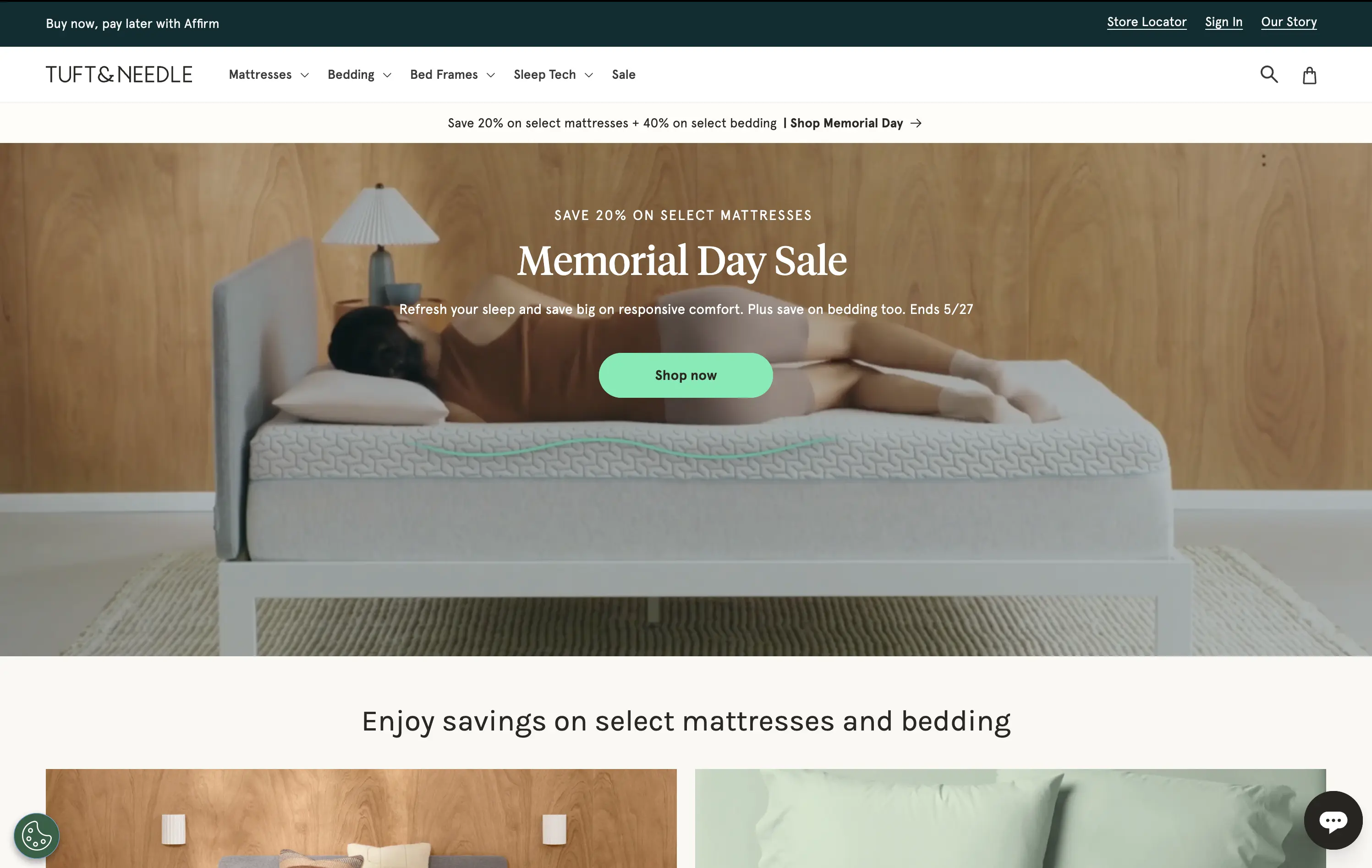
Tuft & Needle
↗
Home & Living
Full Width
Descriptive
Single Button
Video
Imagery-Based
Light Mode
Green
Serif
DTC
Home Page
Shopify
calm aesthetic, DTC home brand, promo-led hero, lifestyle video, seasonal offer, mattress DTC, soothing tones, centered CTA, sales-driven layout, comfort-first, ecommerce UX, banner urgency, restful visuals
Tuft & Needle sells mattresses and bedding online, promising comfort, value, and fast delivery.
Hero makes the seasonal sale clear and appealing without breaking the brand’s visual softness. Video adds warmth, while the green CTA stands out without feeling intrusive. Messaging is brief and conversion-oriented.
Built to convert value-driven home shoppers during peak sale season. Visual tone maintains trust and ease, while layout pushes urgency in a structured, on-brand way. No distractions, just comfort and clarity.
This layout balances technical utility with human impact, aligning well with Algolia’s positioning as an API-first but UX-aware company. The mobile UI reinforces product value visually, while the logo wall signals scale and trust for enterprise buyers. The tone is clear, benefit-led, and appropriate for high-intent decision-makers evaluating AI tools for customer experience. This is a solid enterprise-facing hero built to perform.
Adalo
↗
SaaS
No-Code
Creative Tools
Split Grid
Left-aligned
Benefit-Driven
Descriptive
Email Capture
Product UI
Duotone
Green
Sans serif
Hybrid
Home Page
Webflow
no-code builder, early-stage vibe, product-led growth, friendly UI, starter-friendly, clear CTA, drag-and-drop visual, email-first CTA, low-barrier signup, mobile-first, DIY tech, warm palette, creator tools, approachable tone, utility-first
Adalo lets anyone build mobile and web apps without coding using an easy drag-and-drop editor and built-in components.
The layout is clean, welcoming, and communicates ease of use. Visual UI gives confidence, and the input field softens conversion friction. It appeals to non-technical founders well but doesn’t carve out much distinctiveness from competitors in the same space.
This hero aligns well with beginner creators. It plays to comfort and simplicity, though it misses an edge in differentiating speed, success stories, or creative freedom.
This layout balances technical utility with human impact, aligning well with Algolia’s positioning as an API-first but UX-aware company. The mobile UI reinforces product value visually, while the logo wall signals scale and trust for enterprise buyers. The tone is clear, benefit-led, and appropriate for high-intent decision-makers evaluating AI tools for customer experience. This is a solid enterprise-facing hero built to perform.
The most effective hero sections in your inbox.
Monthly round up of top hero sections.
Don't worry. We hate spam too.
Don't worry. We hate spam too.
Don't worry. We hate spam too.