Photography
23
23
23
23
Editorial-style photos or product shots as the central visual.
Filters
Later
↗
SaaS
Creator Tools
Productivity
Centered
Descriptive
Empowering
Email Capture
Photography
Media Gallery
Logo Wall
Gradient
Blue
Sans serif
B2B
Home Page
Custom Code
influencer CRM, creator marketing platform, lead gen UI, campaign planning tool, social media SaaS, conversion-first layout, creator showcase, email-first CTA, SaaS for brands, bright
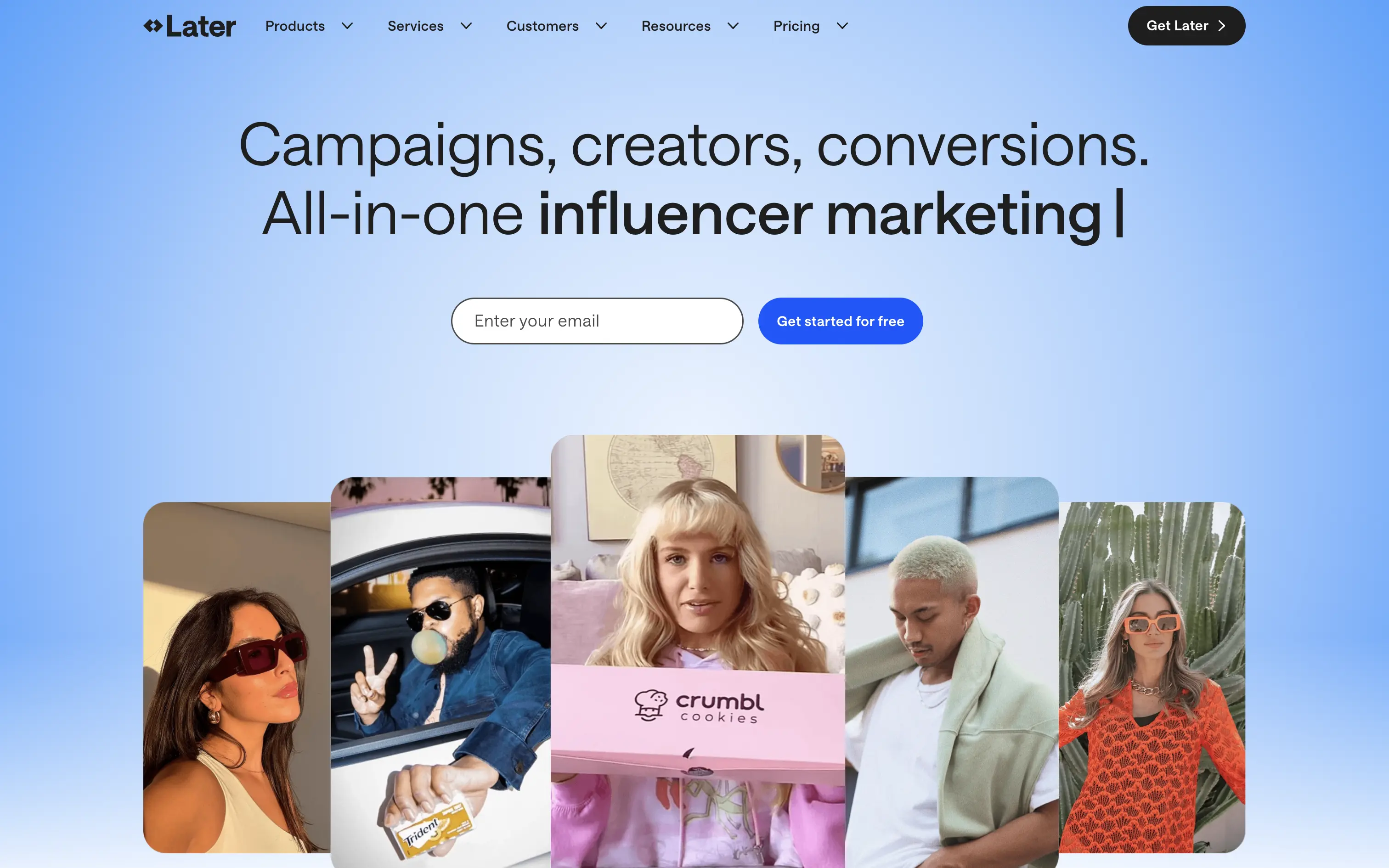
Later is a creator marketing platform helping brands manage influencer campaigns from outreach to ROI.
A functional, no-nonsense SaaS hero. Focused on conversion with a soft blue gradient and creator image bar to build immediate visual relevance. Email-first CTA lowers friction.
Safe and effective for B2B marketing leads. The layout is built for clarity over creativity. Great for scale, but it doesn’t carve out a unique visual or tonal niche.
This layout balances technical utility with human impact, aligning well with Algolia’s positioning as an API-first but UX-aware company. The mobile UI reinforces product value visually, while the logo wall signals scale and trust for enterprise buyers. The tone is clear, benefit-led, and appropriate for high-intent decision-makers evaluating AI tools for customer experience. This is a solid enterprise-facing hero built to perform.
Later
↗
SaaS
Creator Tools
Productivity
Centered
Descriptive
Empowering
Email Capture
Photography
Media Gallery
Logo Wall
Gradient
Blue
Sans serif
B2B
Home Page
Custom Code
influencer CRM, creator marketing platform, lead gen UI, campaign planning tool, social media SaaS, conversion-first layout, creator showcase, email-first CTA, SaaS for brands, bright
Later is a creator marketing platform helping brands manage influencer campaigns from outreach to ROI.
A functional, no-nonsense SaaS hero. Focused on conversion with a soft blue gradient and creator image bar to build immediate visual relevance. Email-first CTA lowers friction.
Safe and effective for B2B marketing leads. The layout is built for clarity over creativity. Great for scale, but it doesn’t carve out a unique visual or tonal niche.
This layout balances technical utility with human impact, aligning well with Algolia’s positioning as an API-first but UX-aware company. The mobile UI reinforces product value visually, while the logo wall signals scale and trust for enterprise buyers. The tone is clear, benefit-led, and appropriate for high-intent decision-makers evaluating AI tools for customer experience. This is a solid enterprise-facing hero built to perform.
Intrepid
↗
Hardware
Centered
Benefit-Driven
Confident
Single Button
Photography
Loading Animation
3D visuals
Dark Mode
Orange
Sans serif
B2B
Home Page
Custom Code
dark hero, industrial hardware, 3D printing, automation tech, demo‑first CTA, mint headline, orange glow accents, centered layout, B2B manufacturing, sleek machines, full‑width image, high contrast, precise messaging
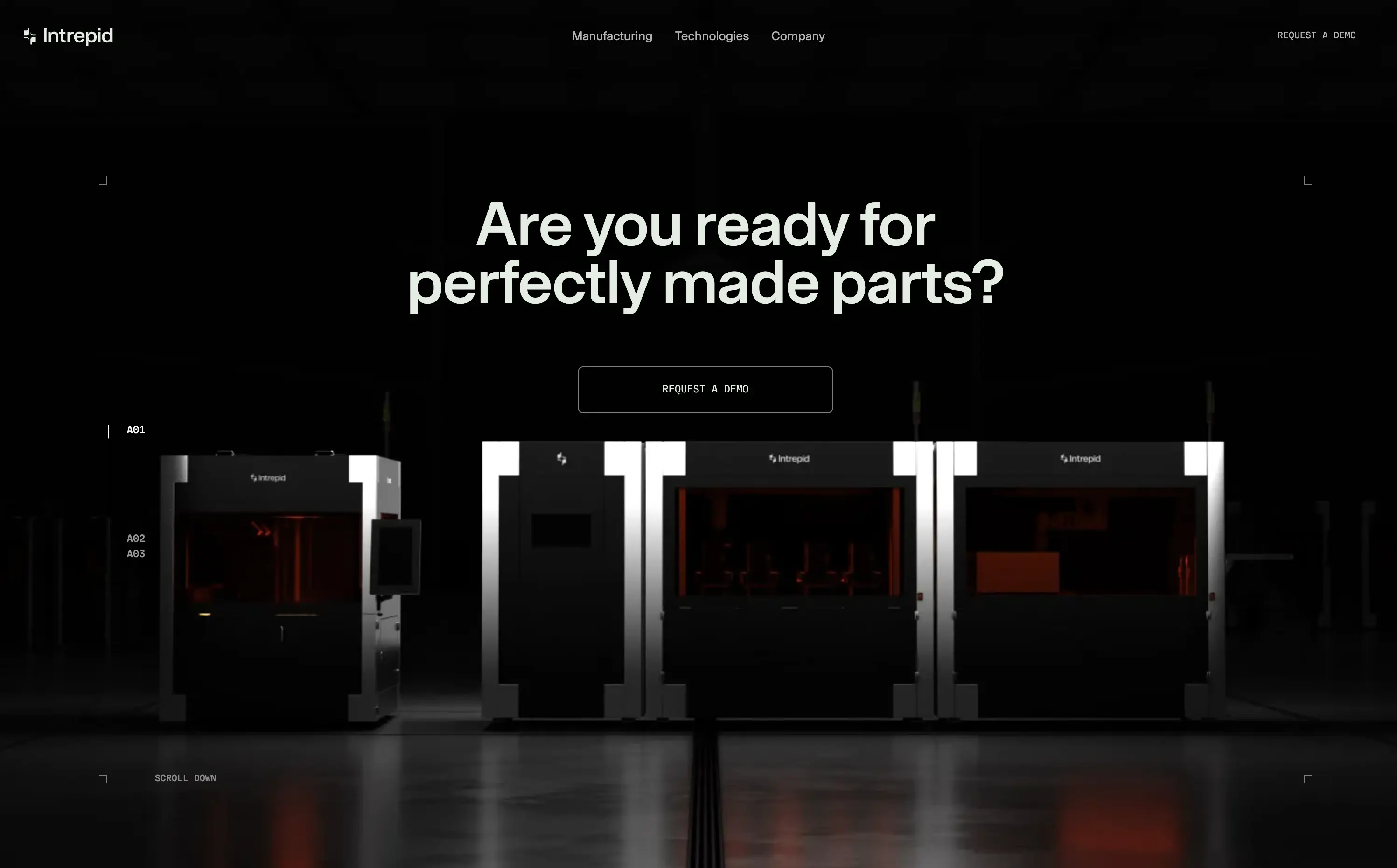
Industrial 3D‑printing company making automated hardware systems that produce precise parts at production scale for manufacturers.
Industrial 3D‑printing company making automated hardware systems that produce precise parts at production scale for manufacturers.
Visual gravitas matches enterprise buyers seeking reliability. Centered demo CTA suits high‑touch sales funnel. Message aligns with pain of imperfect parts, reinforcing positioning as quality‑first hardware partner.
This layout balances technical utility with human impact, aligning well with Algolia’s positioning as an API-first but UX-aware company. The mobile UI reinforces product value visually, while the logo wall signals scale and trust for enterprise buyers. The tone is clear, benefit-led, and appropriate for high-intent decision-makers evaluating AI tools for customer experience. This is a solid enterprise-facing hero built to perform.
Intrepid
↗
Hardware
Centered
Benefit-Driven
Confident
Single Button
Photography
Loading Animation
3D visuals
Dark Mode
Orange
Sans serif
B2B
Home Page
Custom Code
dark hero, industrial hardware, 3D printing, automation tech, demo‑first CTA, mint headline, orange glow accents, centered layout, B2B manufacturing, sleek machines, full‑width image, high contrast, precise messaging
Industrial 3D‑printing company making automated hardware systems that produce precise parts at production scale for manufacturers.
Industrial 3D‑printing company making automated hardware systems that produce precise parts at production scale for manufacturers.
Visual gravitas matches enterprise buyers seeking reliability. Centered demo CTA suits high‑touch sales funnel. Message aligns with pain of imperfect parts, reinforcing positioning as quality‑first hardware partner.
This layout balances technical utility with human impact, aligning well with Algolia’s positioning as an API-first but UX-aware company. The mobile UI reinforces product value visually, while the logo wall signals scale and trust for enterprise buyers. The tone is clear, benefit-led, and appropriate for high-intent decision-makers evaluating AI tools for customer experience. This is a solid enterprise-facing hero built to perform.
Infinite Machine
↗
Hardware
Editorial
No headline
Single Button
Photography
3D visuals
Imagery-Based
Green
Display
DTC
Home Page
Webflow
electric mobility, hyper-modern design, minimalist layout, luxury product, DTC vehicle brand, monochrome aesthetic, bold branding, soft industrial lighting, lifestyle hardware, premium feel
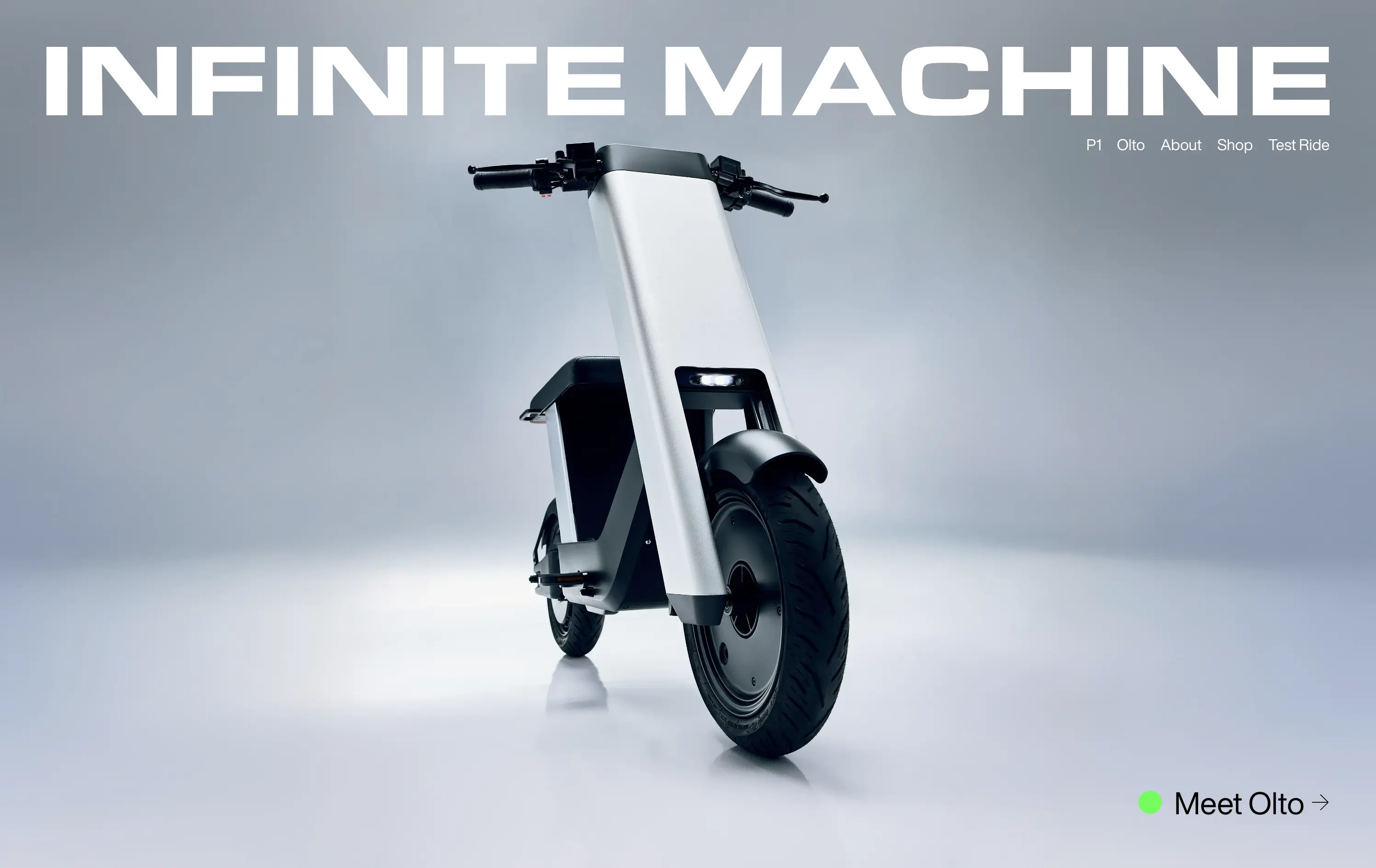
Infinite Machine builds futuristic electric motorcycles with a minimalist aesthetic and modern tech integrations.
The layout mimics a high-end magazine cover: stark, centered, and brand-dominant. It creates intrigue and immediate visual impact, but offers little onboarding or product context until users click deeper.
Infinite Machine is selling vision, not just a product. The choice to remove all explanatory copy and lead with form aligns with a luxury hardware playbook
This layout balances technical utility with human impact, aligning well with Algolia’s positioning as an API-first but UX-aware company. The mobile UI reinforces product value visually, while the logo wall signals scale and trust for enterprise buyers. The tone is clear, benefit-led, and appropriate for high-intent decision-makers evaluating AI tools for customer experience. This is a solid enterprise-facing hero built to perform.
Infinite Machine
↗
Hardware
Editorial
No headline
Single Button
Photography
3D visuals
Imagery-Based
Green
Display
DTC
Home Page
Webflow
electric mobility, hyper-modern design, minimalist layout, luxury product, DTC vehicle brand, monochrome aesthetic, bold branding, soft industrial lighting, lifestyle hardware, premium feel
Infinite Machine builds futuristic electric motorcycles with a minimalist aesthetic and modern tech integrations.
The layout mimics a high-end magazine cover: stark, centered, and brand-dominant. It creates intrigue and immediate visual impact, but offers little onboarding or product context until users click deeper.
Infinite Machine is selling vision, not just a product. The choice to remove all explanatory copy and lead with form aligns with a luxury hardware playbook
This layout balances technical utility with human impact, aligning well with Algolia’s positioning as an API-first but UX-aware company. The mobile UI reinforces product value visually, while the logo wall signals scale and trust for enterprise buyers. The tone is clear, benefit-led, and appropriate for high-intent decision-makers evaluating AI tools for customer experience. This is a solid enterprise-facing hero built to perform.
Opal
↗
CPG
Hardware
Left-aligned
Editorial
Descriptive
Confident
Single Button
Email Capture
Photography
Imagery-Based
Yellow
Sans serif
DTC
Home Page
Custom Code
premium webcam, lifestyle focus, cozy setup, hardware-first product, DTC electronics, human-centered visual, muted palette, cinematic photography, on-brand lighting, creative tool, soft tech aesthetic
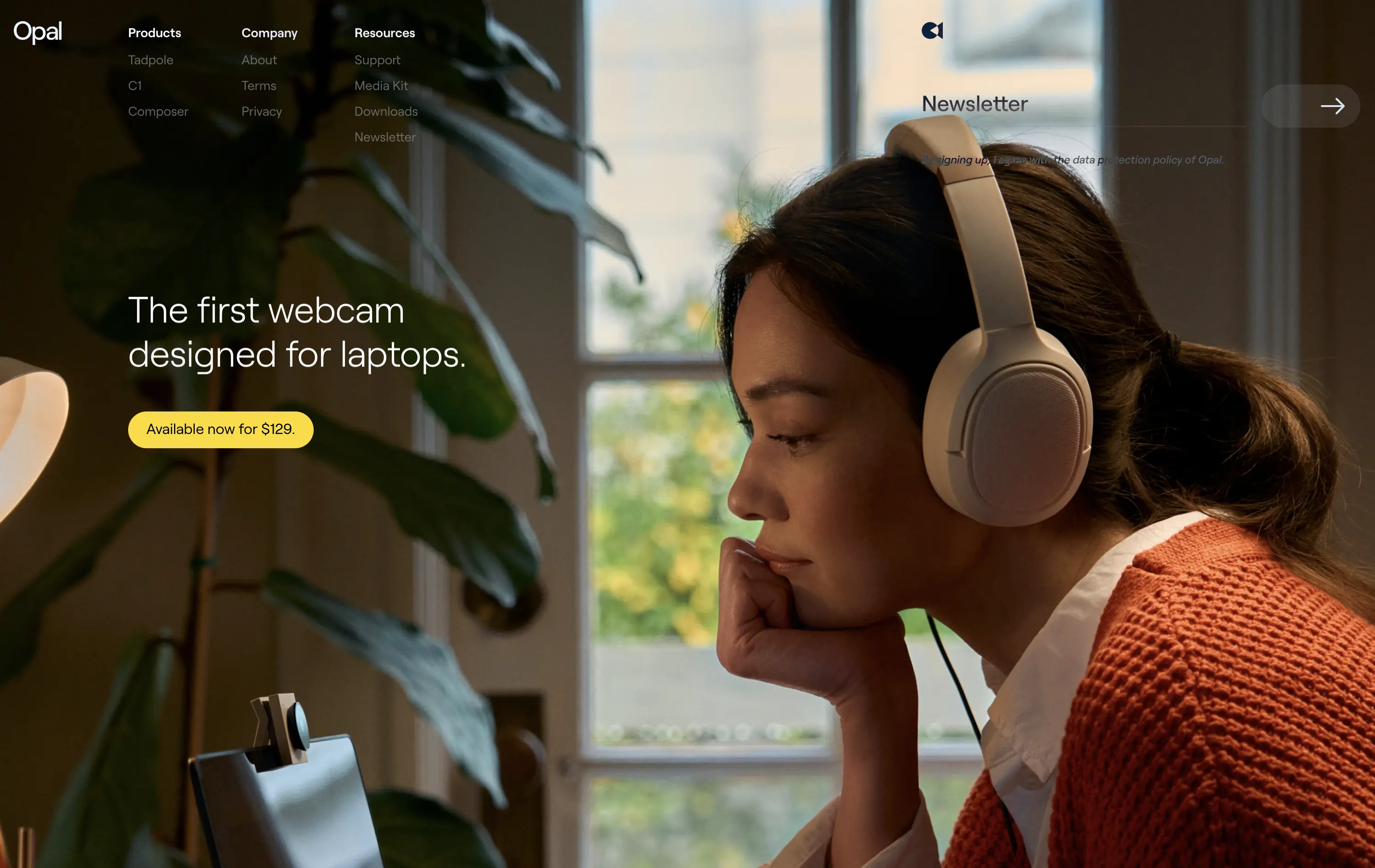
Opal makes premium webcams designed for laptops, with high-end quality and thoughtful design.
The hero is clean and confident. Photo tells the story before the copy does. It’s emotional, product-centric, and conversion-ready—but a bit light on technical proof or feature context.
Opal sells feeling first—comfort, focus, and quality. This is lifestyle-led DTC strategy that builds trust visually. But it risks underselling function unless the user scrolls.
This layout balances technical utility with human impact, aligning well with Algolia’s positioning as an API-first but UX-aware company. The mobile UI reinforces product value visually, while the logo wall signals scale and trust for enterprise buyers. The tone is clear, benefit-led, and appropriate for high-intent decision-makers evaluating AI tools for customer experience. This is a solid enterprise-facing hero built to perform.
Opal
↗
CPG
Hardware
Left-aligned
Editorial
Descriptive
Confident
Single Button
Email Capture
Photography
Imagery-Based
Yellow
Sans serif
DTC
Home Page
Custom Code
premium webcam, lifestyle focus, cozy setup, hardware-first product, DTC electronics, human-centered visual, muted palette, cinematic photography, on-brand lighting, creative tool, soft tech aesthetic
Opal makes premium webcams designed for laptops, with high-end quality and thoughtful design.
The hero is clean and confident. Photo tells the story before the copy does. It’s emotional, product-centric, and conversion-ready—but a bit light on technical proof or feature context.
Opal sells feeling first—comfort, focus, and quality. This is lifestyle-led DTC strategy that builds trust visually. But it risks underselling function unless the user scrolls.
This layout balances technical utility with human impact, aligning well with Algolia’s positioning as an API-first but UX-aware company. The mobile UI reinforces product value visually, while the logo wall signals scale and trust for enterprise buyers. The tone is clear, benefit-led, and appropriate for high-intent decision-makers evaluating AI tools for customer experience. This is a solid enterprise-facing hero built to perform.
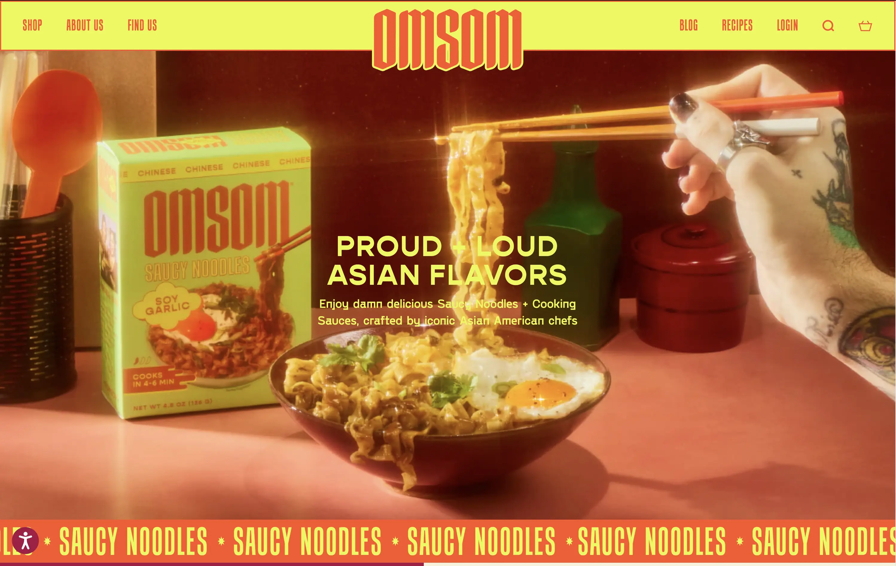
Omsom
↗
CPG
Food & Beverage
Centered
Playful
Bold & Direct
No CTA
Photography
Imagery-Based
Red
Yellow
Display
DTC
Home Page
Shopify
bold packaging, nostalgic film grain, Asian American brand, food culture, Gen Z energy, CPG storytelling, saucy noodles, maximalist vibe, loud typography, high color saturation, visual attitude
Omsom sells proud and loud Asian sauce kits and noodles without cultural compromise.
The hero hits hard with flavor and personality. High-impact visuals and voice set a strong tone and hints towards the ephereal. It’s clear who it’s for and what they’re selling.
Leans fully into identity and brand world building. Speaks directly to a culturally-aware, proudly niche audience. Messaging and art direction are fully aligned.
This layout balances technical utility with human impact, aligning well with Algolia’s positioning as an API-first but UX-aware company. The mobile UI reinforces product value visually, while the logo wall signals scale and trust for enterprise buyers. The tone is clear, benefit-led, and appropriate for high-intent decision-makers evaluating AI tools for customer experience. This is a solid enterprise-facing hero built to perform.
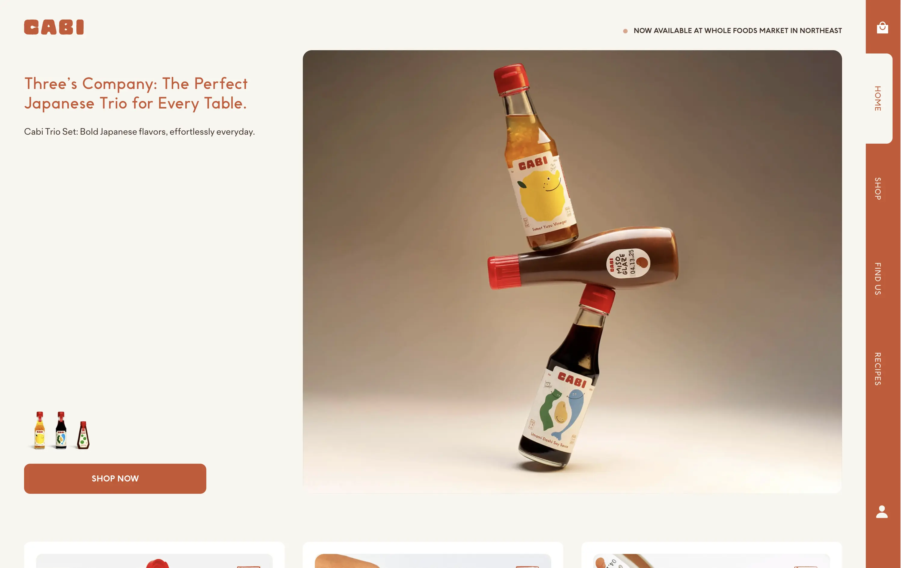
Cabi
↗
CPG
Food & Beverage
Minimal
Editorial
Playful
Descriptive
Single Button
Photography
Duotone
Red
Sans serif
DTC
Home Page
Shopify
neo-retro aesthetic, editorial layout, minimalist packaging, visual-first, high art direction, small-batch vibe, premium grocer, vertical flavor trio, lifestyle CPG, homepage hero, nostalgic modernism, shopable CTA
Cabi is a modern Japanese sauce brand offering a trio of bold, everyday condiments sold DTC and through select Whole Foods locations.
Cabi’s hero strikes a balance between product showcase and brand personality. The bottle stack photo is memorable and artful, with warm studio lighting that elevates the product beyond commodity. The copy is clean and narrative-led, paired with an understated “Shop Now” CTA that keeps the focus on visual storytelling. Vertical nav feels custom-built for a modern CPG brand. It holds its own without needing motion or video.
This is a homepage hero made for shelf appeal crossover. Visually premium, minimal in distractions, and confident in letting the packaging carry the emotional and culinary positioning. Feels Whole Foods-ready.
This layout balances technical utility with human impact, aligning well with Algolia’s positioning as an API-first but UX-aware company. The mobile UI reinforces product value visually, while the logo wall signals scale and trust for enterprise buyers. The tone is clear, benefit-led, and appropriate for high-intent decision-makers evaluating AI tools for customer experience. This is a solid enterprise-facing hero built to perform.
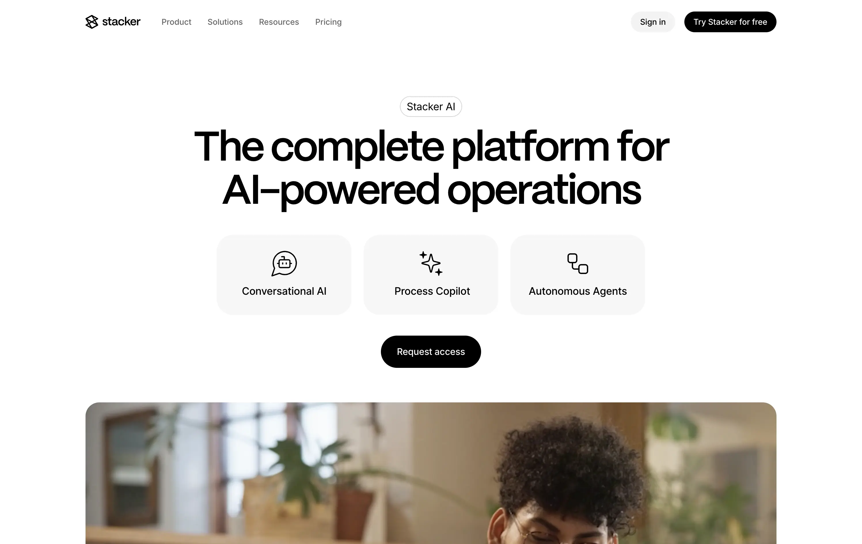
Stacker
↗
SaaS
AI Tools
Productivity
Minimal
Centered
Descriptive
Professional
Single Button
Photography
Video
Light Mode
Black
Sans serif
B2B
Home Page
Framer
AI operations platform, light minimal hero, conversational UI, agent automation, process copilots, clean layout, icon-based features, white space emphasis, AI-native workflow, modern SaaS tone, B2B AI, high-trust layout, early-stage beta feel
Stacker AI helps companies automate internal operations with conversational interfaces, process copilots, and autonomous agents built into their workflows.
Clarity-forward hero with minimal visual noise. Headline is direct. Icons give quick scannability of offering. “Request access” indicates early-stage invite model, aligning with AI-native positioning.
Strong entry for teams exploring AI-first automation. The restrained layout and soft interaction style suggest maturity and stability—a counterbalance to the experimental nature of AI agents.
This layout balances technical utility with human impact, aligning well with Algolia’s positioning as an API-first but UX-aware company. The mobile UI reinforces product value visually, while the logo wall signals scale and trust for enterprise buyers. The tone is clear, benefit-led, and appropriate for high-intent decision-makers evaluating AI tools for customer experience. This is a solid enterprise-facing hero built to perform.
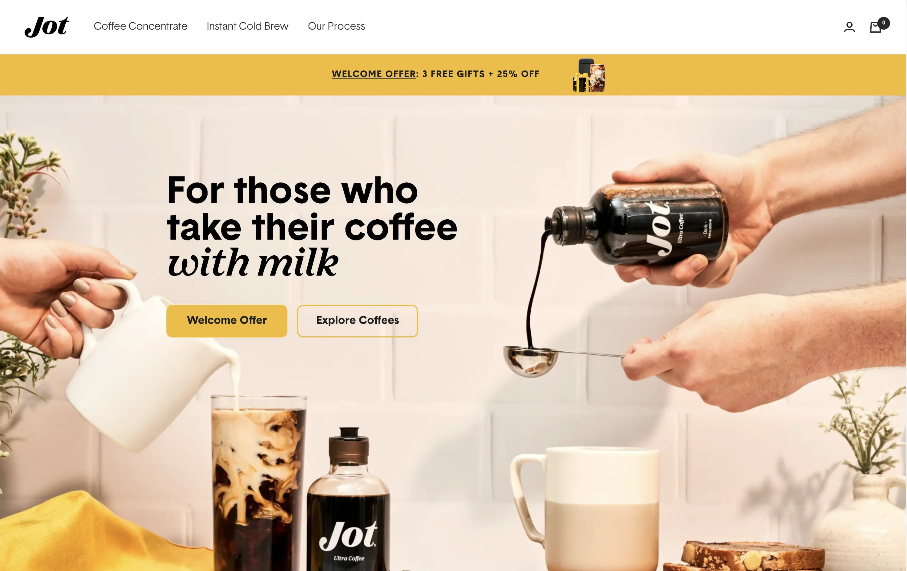
Jot
↗
CPG
Food & Beverage
Editorial
Benefit-Driven
Conversational
Multi-CTA Block
Photography
Custom Animation
Announcement
Imagery-Based
Yellow
Black
Display
DTC
Home Page
Shopify
Replo
coffee brand, lifestyle product, home ritual, premium instant coffee, CPG beverage, warm palette, morning routine, modern food DTC, product-centered hero, rotating headline, lifestyle-led photography
Jot sells ultra-concentrated coffee that simplifies your morning brew without compromising on quality or taste.
Visuals immediately convey simplicity and satisfaction. The rotating headline adapts to multiple buyer intents while keeping focus tight. The product-in-action shot clarifies usage without needing extra explanation.
The brand leans hard into lifestyle cues—targeting modern, taste-conscious buyers with clarity and credibility. The light palette and cozy setup reinforce everyday luxury.
This layout balances technical utility with human impact, aligning well with Algolia’s positioning as an API-first but UX-aware company. The mobile UI reinforces product value visually, while the logo wall signals scale and trust for enterprise buyers. The tone is clear, benefit-led, and appropriate for high-intent decision-makers evaluating AI tools for customer experience. This is a solid enterprise-facing hero built to perform.
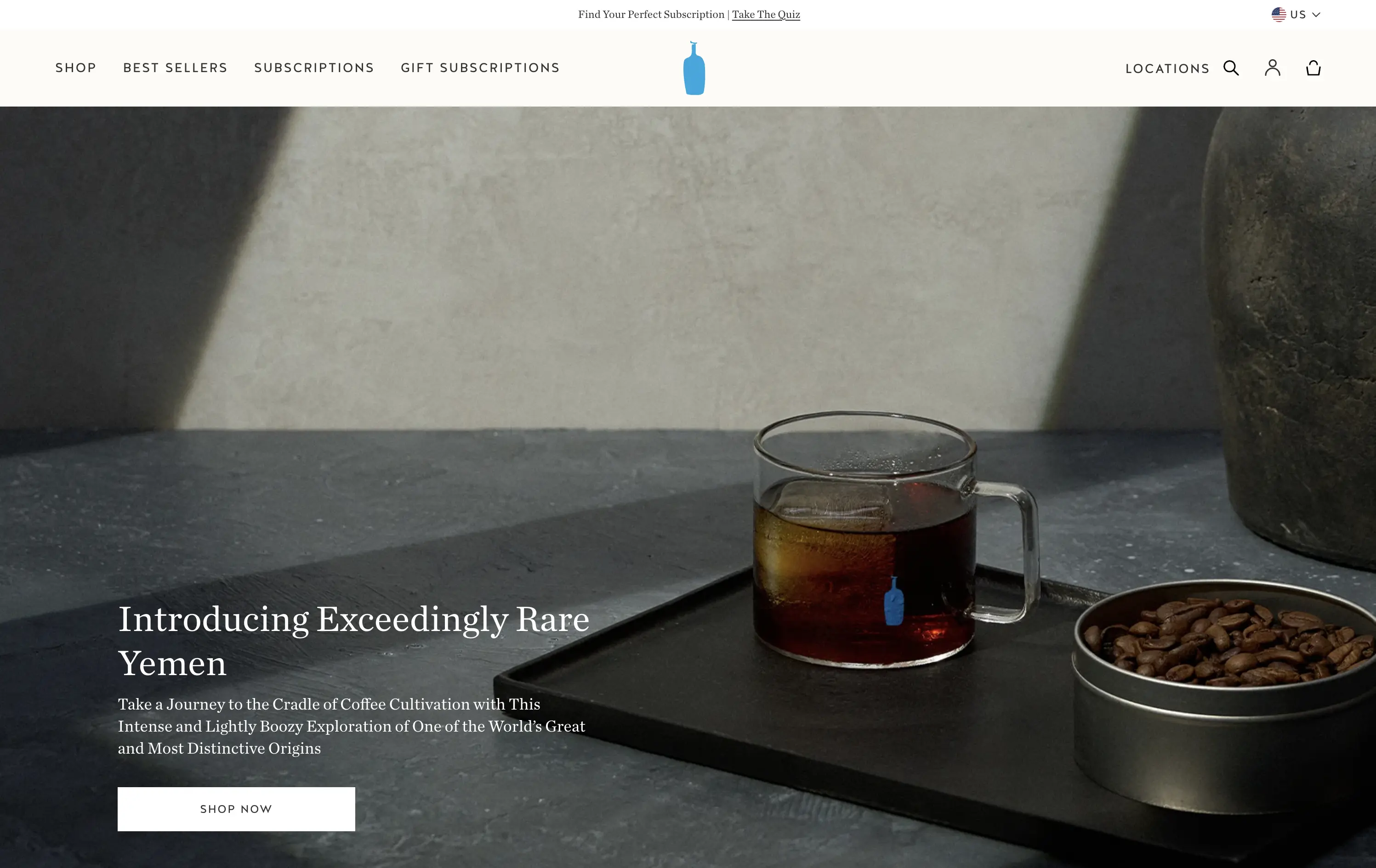
Blue Bottle Coffee
↗
CPG
Food & Beverage
Left-aligned
Editorial
Aspirational
Abstract / Conceptual
Single Button
Photography
Announcement
Imagery-Based
White
Serif
DTC
Home Page
Launch/Promo
Custom Code
premium coffee, quiet luxury, single origin, Yemen release, cultural storytelling, flavor-forward, design restraint, editorial style, homepage feature, slow ritual, product launch, lifestyle minimalism
Blue Bottle Coffee is a premium coffee roaster and retailer known for its meticulously sourced beans, minimalist aesthetic, and elevated brewing experience.
Everything here signals premium: restrained layout, subdued tone, and subtle animation. The hero is purposefully quiet — elevating the coffee without overselling it.
Perfectly aligned with a luxury buyer's mindset. It invites exploration through trust, taste, and tempo — not urgency. Signals quality through understatement.
This layout balances technical utility with human impact, aligning well with Algolia’s positioning as an API-first but UX-aware company. The mobile UI reinforces product value visually, while the logo wall signals scale and trust for enterprise buyers. The tone is clear, benefit-led, and appropriate for high-intent decision-makers evaluating AI tools for customer experience. This is a solid enterprise-facing hero built to perform.
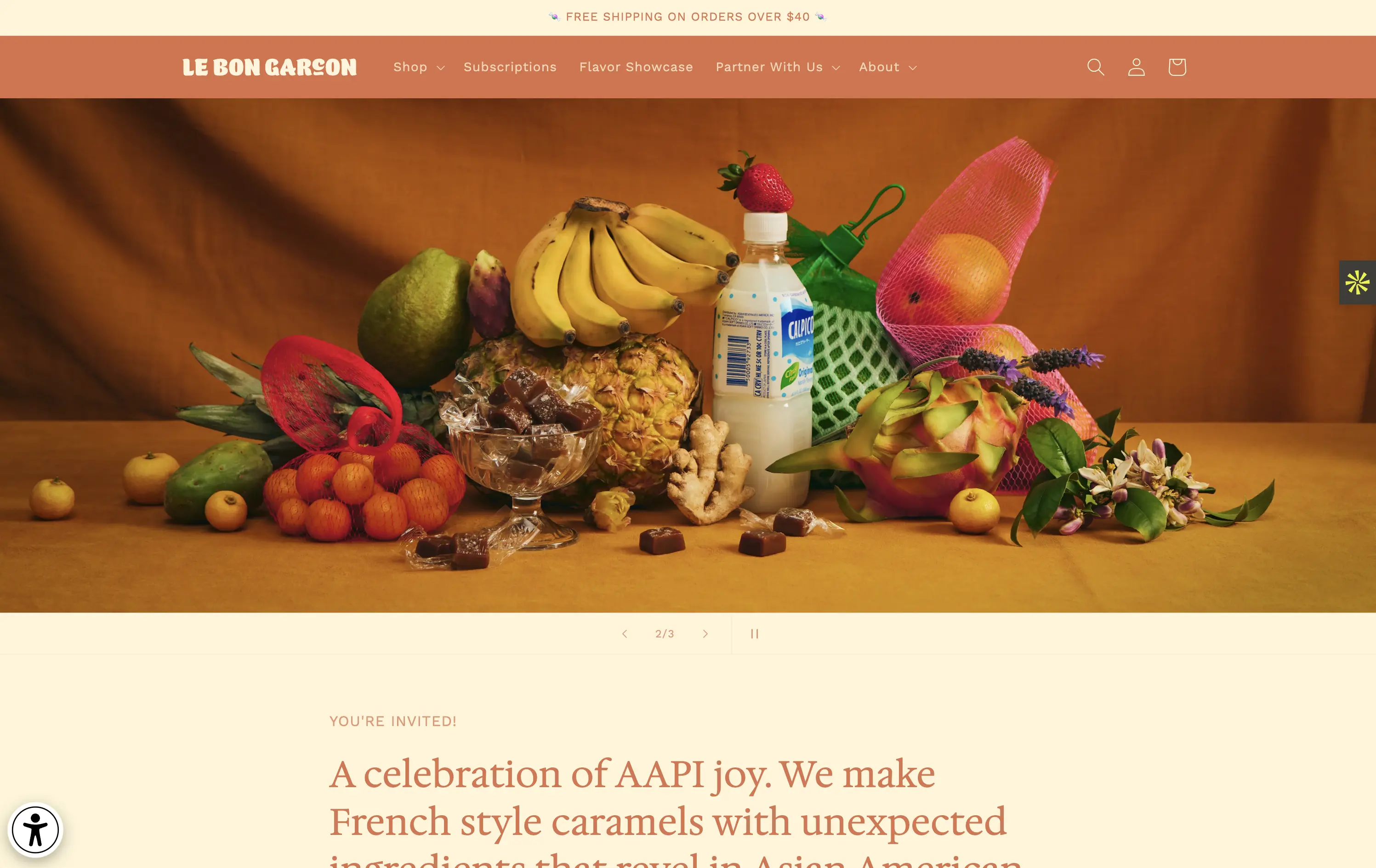
Le Bon Garçon
↗
CPG
Food & Beverage
Editorial
Descriptive
Founder-Led Voice
No CTA
Photography
Media Gallery
Announcement
Duotone
Imagery-Based
Orange
Yellow
Serif
DTC
Home Page
Shopify
nostalgic packaging, elevated DTC candy, premium gifting, Asian-American ingredients, still-life styling, art direction-led, cultural storytelling, warm palette, caramel focus, identity-led CPG, curated feel, editorial aesthetic, flavor storytelling, high design, AAPI founder
A premium confectionery brand reimagining French-style caramels through the lens of Asian-American flavors and storytelling.
This hero leans fully into art direction, with a cinematic still-life that evokes tradition, indulgence, and multicultural vibrancy. There's no obvious CTA, but the experience feels intentional and immersive. The visual composition draws curiosity and reflects a product crafted with care. The copy introduces cultural relevance and flavor positioning effectively, though some may miss a direct product hook.
Perfect for brand-aware shoppers and gifting segments. A visual-first approach supports premium positioning and cultural storytelling over hard conversion.
This layout balances technical utility with human impact, aligning well with Algolia’s positioning as an API-first but UX-aware company. The mobile UI reinforces product value visually, while the logo wall signals scale and trust for enterprise buyers. The tone is clear, benefit-led, and appropriate for high-intent decision-makers evaluating AI tools for customer experience. This is a solid enterprise-facing hero built to perform.
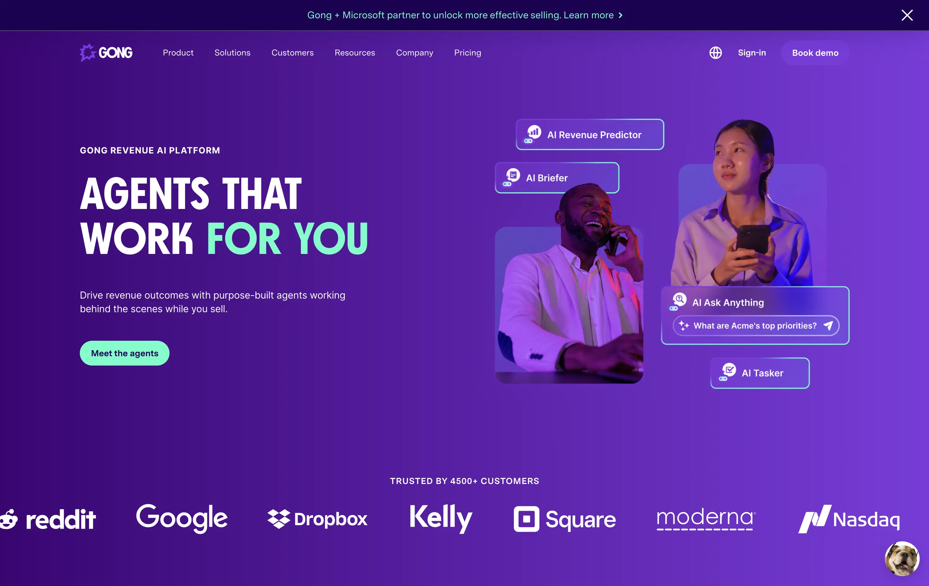
Gong
↗
SaaS
AI Tools
Productivity
Split Grid
Left-aligned
Benefit-Driven
Confident
Single Button
Photography
Illustration
Logo Wall
Announcement
Duotone
Blue
Purple
Sans serif
B2B
Home Page
Wordpress
sales AI, B2B revenue platform, utility CTA, animated overlays, client logos, enterprise trust signals, AI productivity agents, dark gradient palette, conversational UI, split hero grid, vibrant lighting, modern SaaS, sales enablement, motion interface cues, product-forward layout
Gong helps sales teams boost revenue by deploying AI-powered agents that automate insights, prep, and task handling across the sales cycle.
The hero is clear and conversion-aware. Headline delivers a confident value prop, supported by animated tooltips that make the product’s AI capabilities tangible. The “Meet the agents” CTA invites deeper engagement. Strong use of customer logos boosts enterprise credibility. Overall, it's tight, modern, and visually active without overwhelming.
Tailored for mid-to-late funnel enterprise leads. High-trust layout and confident tone reflect maturity and market leadership in B2B sales tech.
This layout balances technical utility with human impact, aligning well with Algolia’s positioning as an API-first but UX-aware company. The mobile UI reinforces product value visually, while the logo wall signals scale and trust for enterprise buyers. The tone is clear, benefit-led, and appropriate for high-intent decision-makers evaluating AI tools for customer experience. This is a solid enterprise-facing hero built to perform.
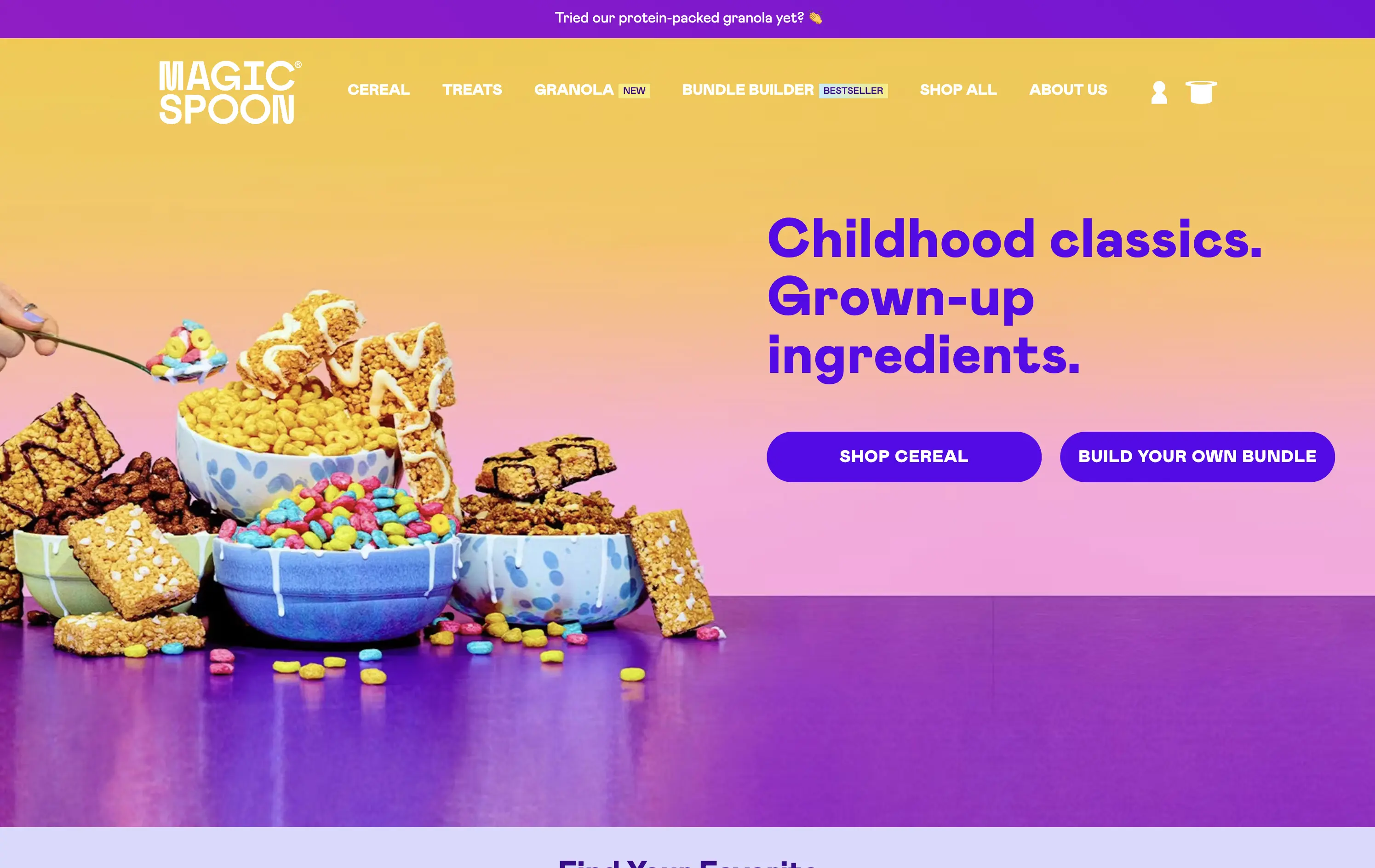
Magic Spoon
↗
Food & Beverage
Split Grid
Playful
Multi-CTA Block
Photography
Announcement
Gradient
Multi-color
Pink
Purple
Yellow
Sans serif
DTC
Home Page
Shopify
high-protein cereal, nostalgic breakfast, millennial branding, retro palette, build-your-own-bundle, vibrant color gradient, candy-colored visuals, kid-to-adult rebrand, DTC snack, bold typography, healthified junk food, colorful product styling, split grid layout, energetic tone, premium grocery
Magic Spoon sells high-protein cereal and snack bars that recreate childhood favorites with adult nutrition standards.
The hero nails the balance between fun and function. Product visuals feel exaggerated in the best way — styled like sugary cereal ads from the ‘90s but paired with benefit-led messaging. The copy is tight and instantly clarifies the value prop. Gradient background and punchy layout draw attention. CTAs are clear, and “build your own bundle” is an engaging utility-led hook.
Smartly crafted for health-conscious millennials who want nostalgia without the sugar crash. The visual-candy look softens the functional message about protein and better ingredients.
This layout balances technical utility with human impact, aligning well with Algolia’s positioning as an API-first but UX-aware company. The mobile UI reinforces product value visually, while the logo wall signals scale and trust for enterprise buyers. The tone is clear, benefit-led, and appropriate for high-intent decision-makers evaluating AI tools for customer experience. This is a solid enterprise-facing hero built to perform.
Lettuce
↗
SaaS
Fintech
Split Grid
Left-aligned
Benefit-Driven
Bold & Direct
Single Button
Photography
Logo Wall
Product UI
Duotone
Green
Display
B2C
Home Page
Custom Code
solo business finance, tax automation, self-employed SaaS, conversion-focused layout, AI accounting, ROI-driven copy, playful branding, savings calculator CTA, solo founder tools, dark green palette, clear value prop, direct tone, press trust bar, mobile-first product
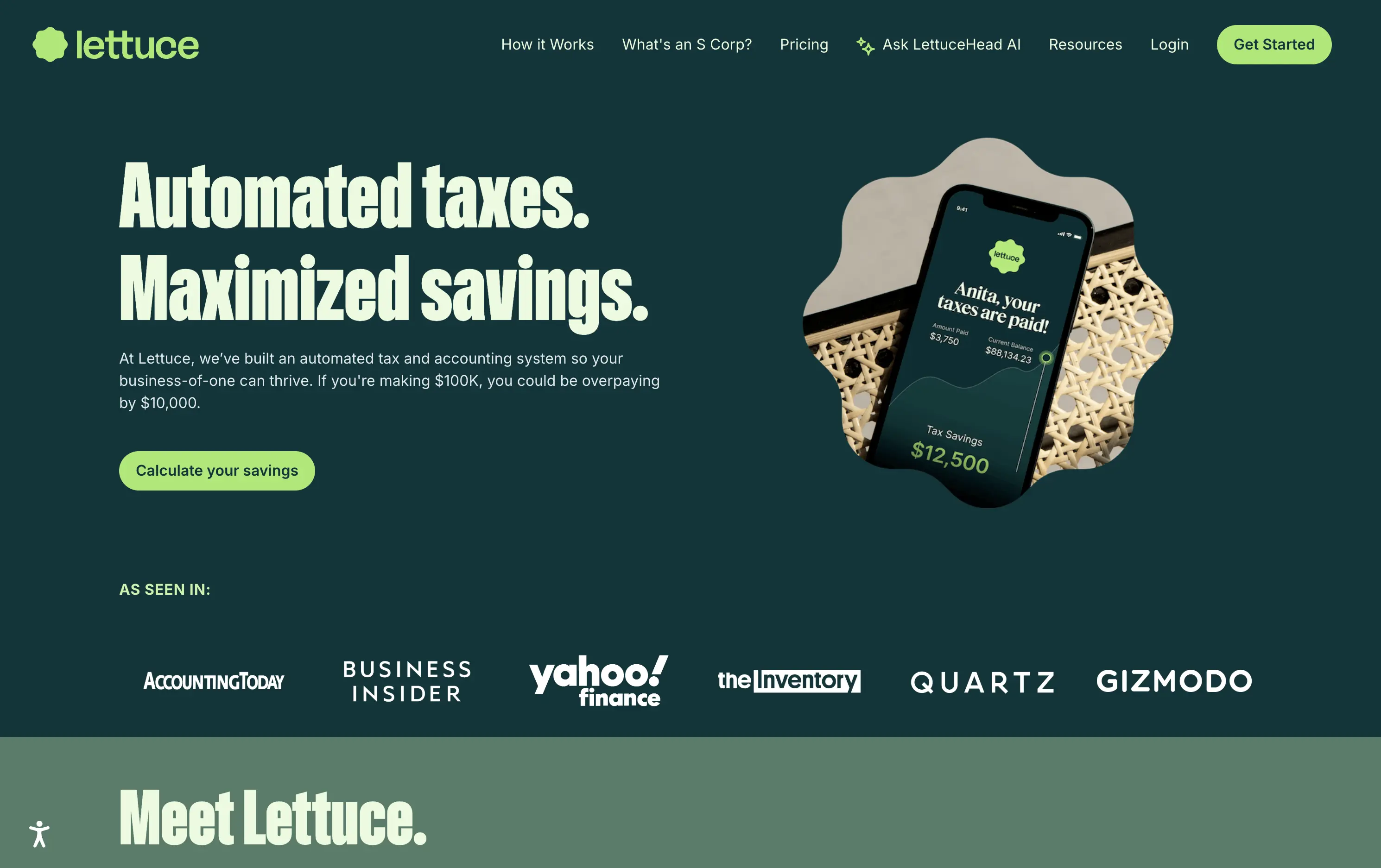
Lettuce is an automated tax and accounting platform built for solo business owners, helping them save thousands by optimizing how they pay taxes.
The hero is assertive, clear, and benefit-led. “Automated taxes. Maximized savings.” lands immediately, and the subhead explains who it's for and what they’re losing without it. The savings figure on the phone mockup reinforces the pitch visually. The “Calculate your savings” CTA is strong and personalized. Overall, the layout moves fast and speaks directly to freelancers and solo operators.
Perfectly tuned for time-poor, outcome-driven solopreneurs. Uses clear math ($10k in savings) and visual cues (mobile UI, dollar figures) to make the benefit feel tangible. Smart alignment of tone, layout, and buyer urgency.
This layout balances technical utility with human impact, aligning well with Algolia’s positioning as an API-first but UX-aware company. The mobile UI reinforces product value visually, while the logo wall signals scale and trust for enterprise buyers. The tone is clear, benefit-led, and appropriate for high-intent decision-makers evaluating AI tools for customer experience. This is a solid enterprise-facing hero built to perform.
Lettuce
↗
SaaS
Fintech
Split Grid
Left-aligned
Benefit-Driven
Bold & Direct
Single Button
Photography
Logo Wall
Product UI
Duotone
Green
Display
B2C
Home Page
Custom Code
solo business finance, tax automation, self-employed SaaS, conversion-focused layout, AI accounting, ROI-driven copy, playful branding, savings calculator CTA, solo founder tools, dark green palette, clear value prop, direct tone, press trust bar, mobile-first product
Lettuce is an automated tax and accounting platform built for solo business owners, helping them save thousands by optimizing how they pay taxes.
The hero is assertive, clear, and benefit-led. “Automated taxes. Maximized savings.” lands immediately, and the subhead explains who it's for and what they’re losing without it. The savings figure on the phone mockup reinforces the pitch visually. The “Calculate your savings” CTA is strong and personalized. Overall, the layout moves fast and speaks directly to freelancers and solo operators.
Perfectly tuned for time-poor, outcome-driven solopreneurs. Uses clear math ($10k in savings) and visual cues (mobile UI, dollar figures) to make the benefit feel tangible. Smart alignment of tone, layout, and buyer urgency.
This layout balances technical utility with human impact, aligning well with Algolia’s positioning as an API-first but UX-aware company. The mobile UI reinforces product value visually, while the logo wall signals scale and trust for enterprise buyers. The tone is clear, benefit-led, and appropriate for high-intent decision-makers evaluating AI tools for customer experience. This is a solid enterprise-facing hero built to perform.
You Can Book Me
↗
SaaS
Productivity
Centered
Descriptive
Empowering
Single Button
Photography
Media Gallery
Duotone
Green
Display
B2B
Home Page
solo-friendly SaaS, scheduling tool, real user proof, small business productivity, personal headline, free trial, soft design system, emotional copy, utility-first, community-led, freemium conversion, authenticity-first visuals, indie SaaS
YouCanBook.Me is a scheduling platform designed to help small businesses streamline bookings, save time, and convert more leads through simple, flexible scheduling pages.
The hero centers emotional relatability. “It Starts With You” feels direct and empowering, while the subhead offers a clear, benefit-first pitch. The design isn’t flashy — it leans on authenticity, with non-art-directed portraits adding a raw, real-user touch. The green CTA is visible, though visually softer than competitors. While the layout lacks design sophistication, it feels personal and conversion-minded.
Targeting small business owners and service providers with a tone of support and relatability. It emphasizes utility over polish, aiming to win trust through clarity, familiarity, and proof of real-world use.
This layout balances technical utility with human impact, aligning well with Algolia’s positioning as an API-first but UX-aware company. The mobile UI reinforces product value visually, while the logo wall signals scale and trust for enterprise buyers. The tone is clear, benefit-led, and appropriate for high-intent decision-makers evaluating AI tools for customer experience. This is a solid enterprise-facing hero built to perform.
Payoneer
↗
SaaS
Fintech
Centered
Descriptive
Confident
Single Button
Photography
Illustration
Custom Animation
Light Mode
Purple
Sans serif
B2B
Home Page
Wordpress
global payments, borderless finance, transaction animation, multi-currency account, visual storytelling, freelancer payments, cross-border SaaS, simplified UX, modern money movement, motion-led layout, banking alternative, vibrant palette, international scale
Payoneer is a global online payment platform offering multi-currency accounts and seamless cross-border transactions for businesses and freelancers.
The hero blends utility and motion well. The animated arc mimics financial flow, visually conveying the platform’s core promise: fast, borderless payments. Headline is clear and functional, supported by a strong subhead. The animation, showing USD amounts sent and received, makes the experience feel human and practical. The CTA is visible but understated. Overall, it reinforces trust and makes the product feel simple and scalable.
Smart visual metaphor for financial ease and flow — helps Payoneer stand out in a space often dominated by cold, institutional design. This layout is conversion-safe while visually expressive.
This layout balances technical utility with human impact, aligning well with Algolia’s positioning as an API-first but UX-aware company. The mobile UI reinforces product value visually, while the logo wall signals scale and trust for enterprise buyers. The tone is clear, benefit-led, and appropriate for high-intent decision-makers evaluating AI tools for customer experience. This is a solid enterprise-facing hero built to perform.
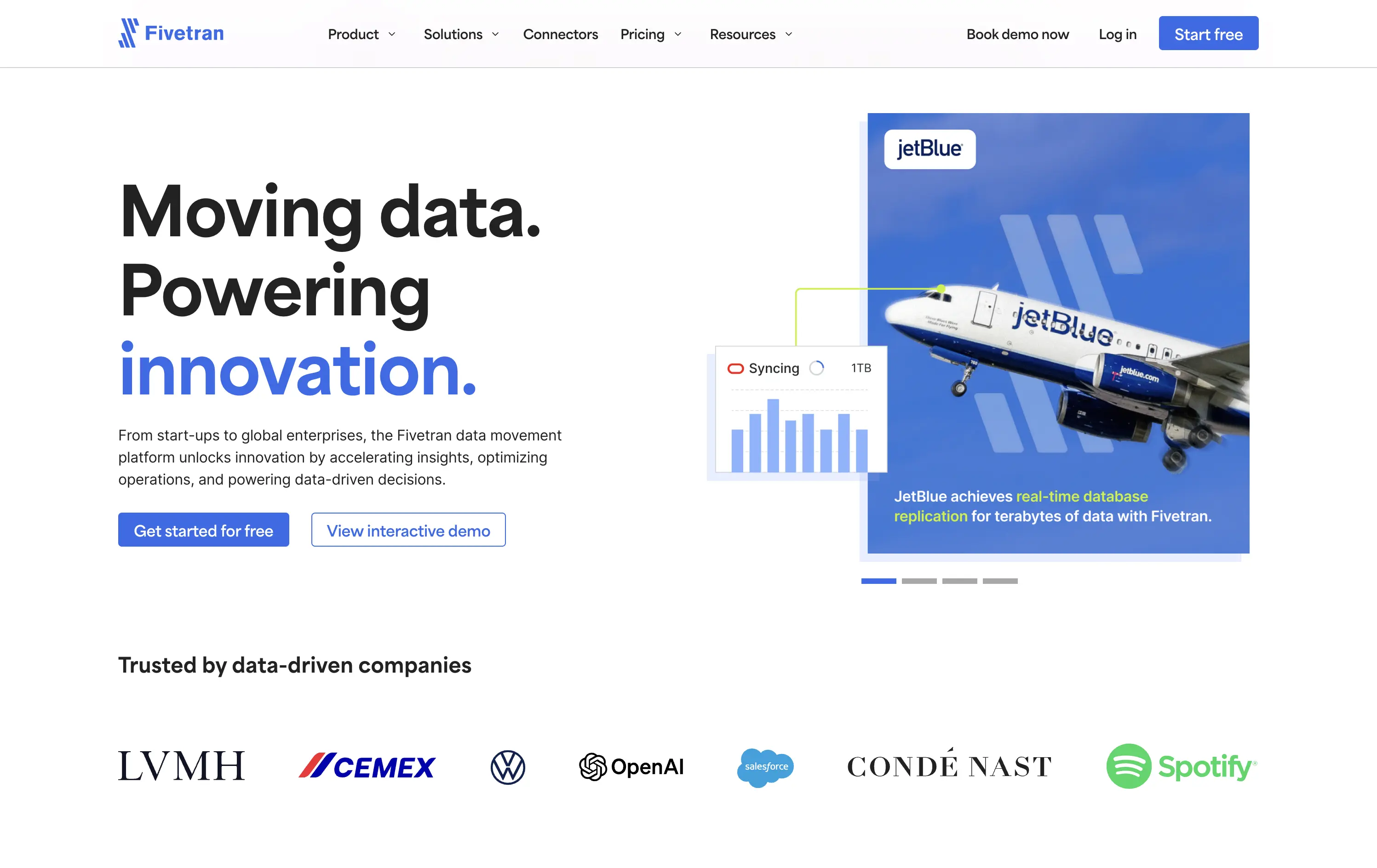
Fivetran
↗
SaaS
Data & Analytics
Split Grid
Left-aligned
Confident
Professional
Multi-CTA Block
Photography
Product UI
Social Proof
Custom Animation
Light Mode
Blue
Sans serif
B2B
Home Page
Webflow
enterprise-grade, real-time sync, testimonial integration, data pipeline, scalable architecture, visual storytelling, motion-light, trust-first, case-driven, product-led, split layout, mature B2B, dual CTA
Fivetran is a data integration platform that helps businesses automate, sync, and centralize their data across systems for analysis and reporting.
Fivetran’s hero delivers immediate clarity through its strong headline and proof-focused subtext. The combination of a recognizable brand (JetBlue) and a visual data-sync overlay reinforces product value without requiring technical deep dives. Dual CTAs are clear and well-placed for different levels of intent. Social proof below adds enterprise credibility. The overall layout is well-balanced and efficient.
Tailored for enterprise buyers, the hero blends technical reassurance with case-based credibility. It communicates trust and scalability, aligning with a mid-to-late funnel B2B audience without overwhelming on first touch.
This layout balances technical utility with human impact, aligning well with Algolia’s positioning as an API-first but UX-aware company. The mobile UI reinforces product value visually, while the logo wall signals scale and trust for enterprise buyers. The tone is clear, benefit-led, and appropriate for high-intent decision-makers evaluating AI tools for customer experience. This is a solid enterprise-facing hero built to perform.
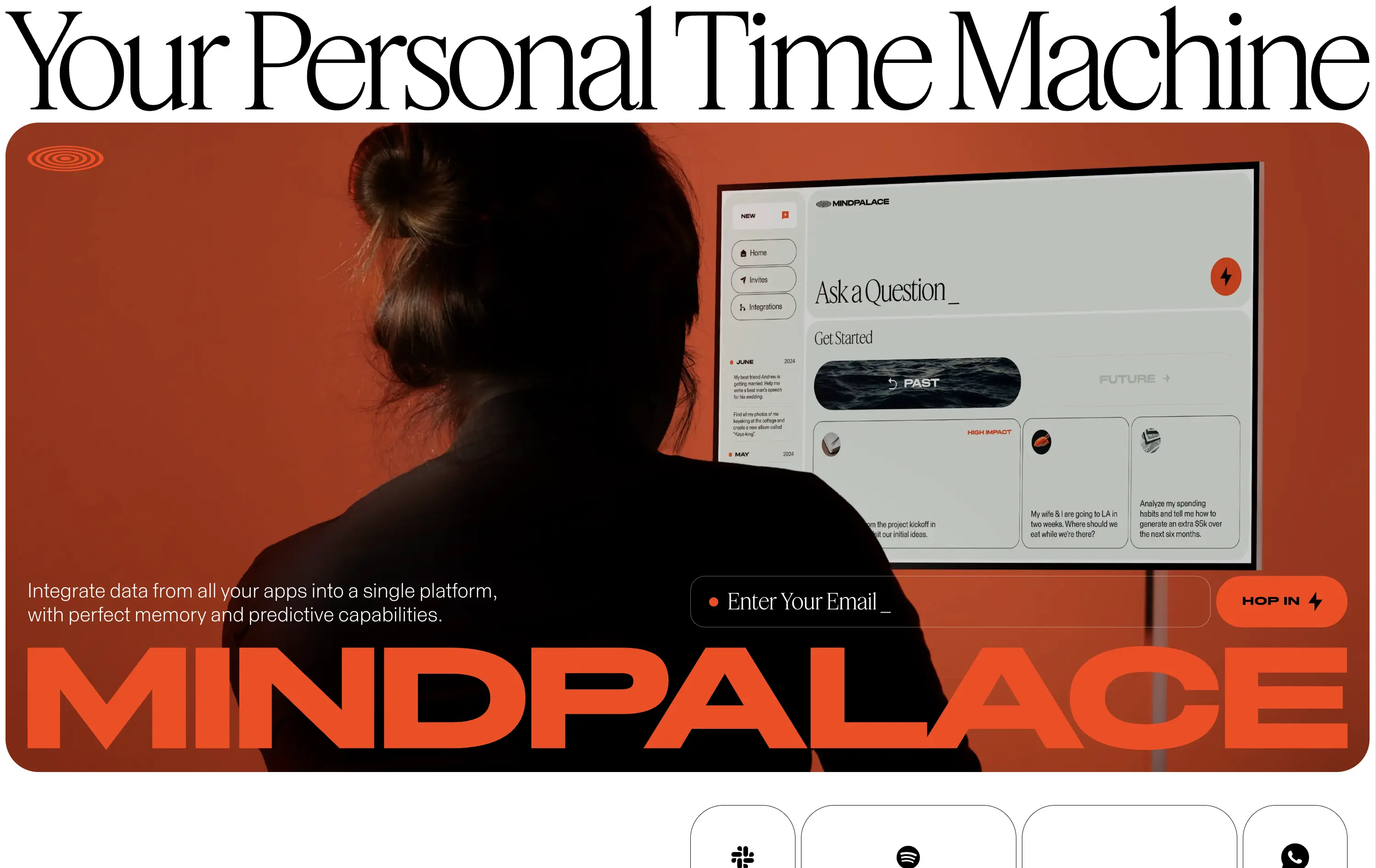
MindPalace AI
↗
SaaS
AI Tools
Productivity
Inset
Full Width
Editorial
Founder-Led Voice
Abstract / Conceptual
Email Capture
Photography
Product UI
Imagery-Based
Light Mode
Red
Black
Display
B2C
Home Page
Webflow
cinematic design, founder-led brand, AI memory tool, data integration, futuristic UI, monochrome orange palette, provocative headline, low-context messaging, brand-first hero, retro-futurist aesthetic, predictive tech, narrative design, mood-driven UX
Mindpalace connects and organizes your digital life into a single interface with memory recall and predictive AI tools—part archive, part assistant.
This hero is brand-first, product-second. The editorial headline draws intrigue but offers zero utility without scrolling. Subheadline hints at integration and predictive capabilities but avoids details. The strength lies in the striking art direction: backlit subject, glowing screen, and color-blocked monochrome palette immediately set a cinematic tone. Product UI is visible but not interactive. The email capture field is subtle and stylish, fitting the brand’s creative edge. It’s a bold anti-SaaS approach—prioritizing identity over clarity.
Mindpalace positions itself as a visionary, not a tool. Strategy leans into intrigue, betting on design-savvy early adopters who value storytelling and aesthetics over immediate clarity. Strong brand magnetism, low onboarding intent.
This layout balances technical utility with human impact, aligning well with Algolia’s positioning as an API-first but UX-aware company. The mobile UI reinforces product value visually, while the logo wall signals scale and trust for enterprise buyers. The tone is clear, benefit-led, and appropriate for high-intent decision-makers evaluating AI tools for customer experience. This is a solid enterprise-facing hero built to perform.
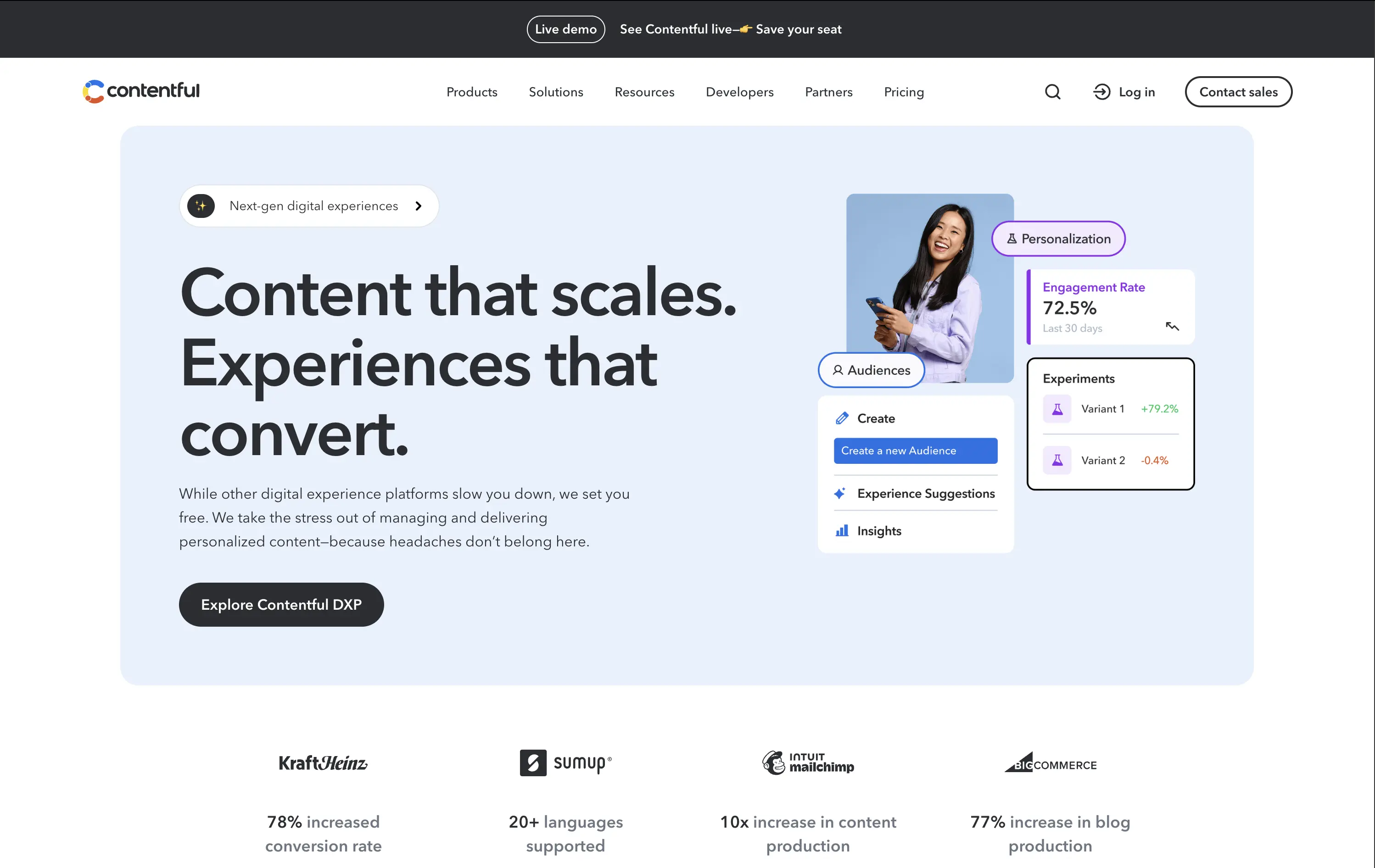
Contentful
↗
SaaS
DevTools
Inset
Left-aligned
Benefit-Driven
Single Button
Photography
Logo Wall
Product UI
Announcement
Light Mode
Blue
Black
Sans serif
B2B
Home Page
Custom Code
headless CMS, digital experience platform, DXP, content ops, personalization tools, conversion-optimized hero, enterprise SaaS
Contentful is a composable content platform for digital teams to build, manage, and scale personalized content experiences.
This hero delivers clarity and control. The headline is simple but strong, while the UI cards bring in real metrics — 72.5% engagement, +79.2% test lift — that immediately signal impact. The modular, bento-inspired visual design frames product capabilities without overwhelming the user. A single, confident CTA caps it off. It’s subtle, strategic, and conversion-aware.
Balances conversion focus with credibility. Perfectly aligned with performance-driven teams who want visual polish without noise. Content strategy and product capability are both clearly expressed without overpromising.
This layout balances technical utility with human impact, aligning well with Algolia’s positioning as an API-first but UX-aware company. The mobile UI reinforces product value visually, while the logo wall signals scale and trust for enterprise buyers. The tone is clear, benefit-led, and appropriate for high-intent decision-makers evaluating AI tools for customer experience. This is a solid enterprise-facing hero built to perform.
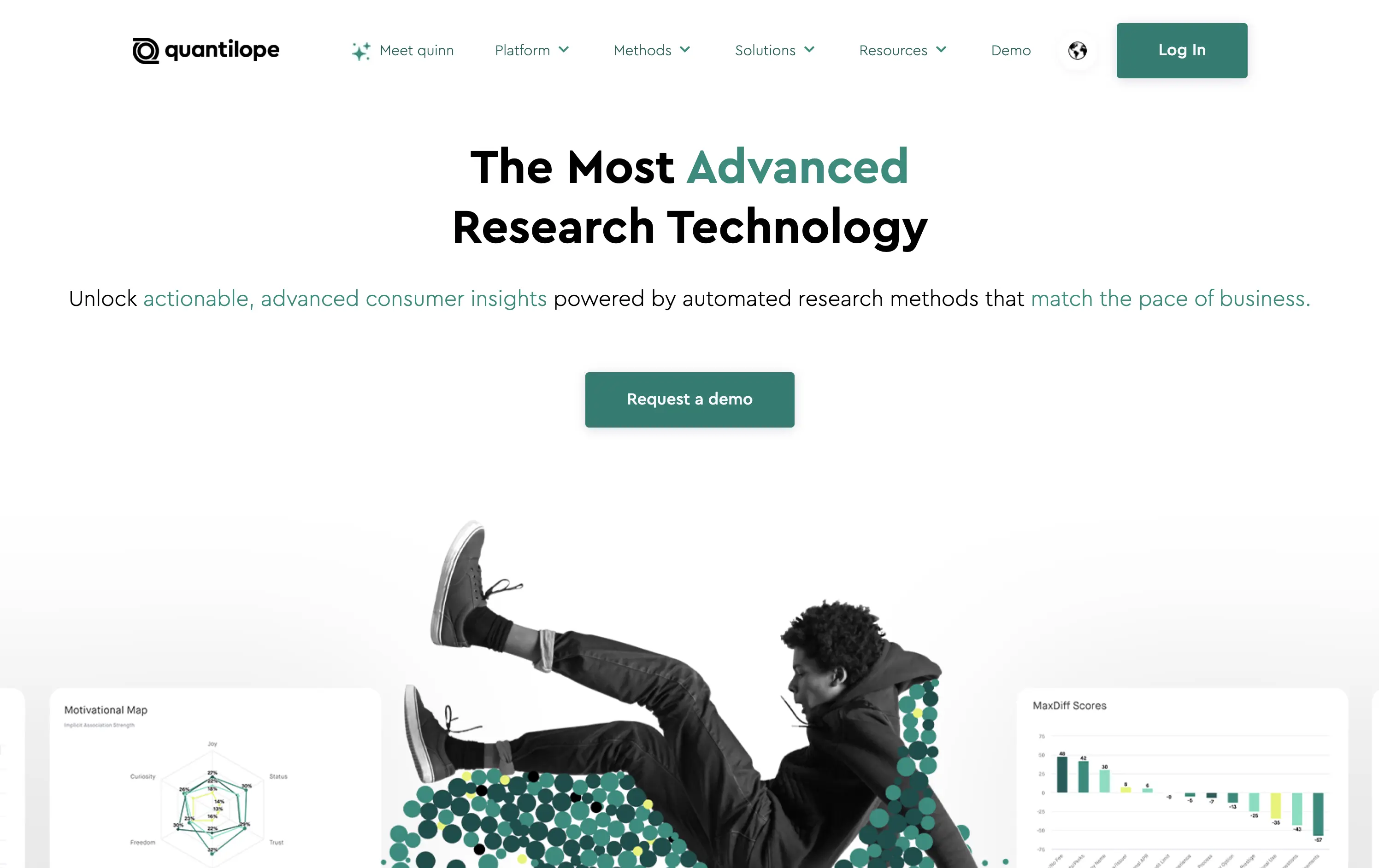
Quantilope
↗
SaaS
AI Tools
Data & Analytics
Centered
Bold & Direct
Confident
Single Button
Photography
Illustration
Product UI
Light Mode
Green
Sans serif
B2B
Home Page
Custom Code
research SaaS, data platform hero, quant marketing, teal hero, minimal SaaS layout, B2B insights platform, insight automation, animated data graphic, data-driven marketing, stat visual hero
Quantilope is an advanced research platform that automates consumer insights at scale.
The headline stakes a bold claim, and the teal accent draws focus to “advanced” and action keywords. Hero visual is a clever juxtaposition of human + data, adding some life to an otherwise data-heavy space. One clear CTA keeps the flow focused.
Aimed at marketing execs and insights leaders, the hero’s tone and layout signal speed, clarity, and data fluency. It balances modernity with professionalism, avoiding overdesign while staying sharp.
This layout balances technical utility with human impact, aligning well with Algolia’s positioning as an API-first but UX-aware company. The mobile UI reinforces product value visually, while the logo wall signals scale and trust for enterprise buyers. The tone is clear, benefit-led, and appropriate for high-intent decision-makers evaluating AI tools for customer experience. This is a solid enterprise-facing hero built to perform.
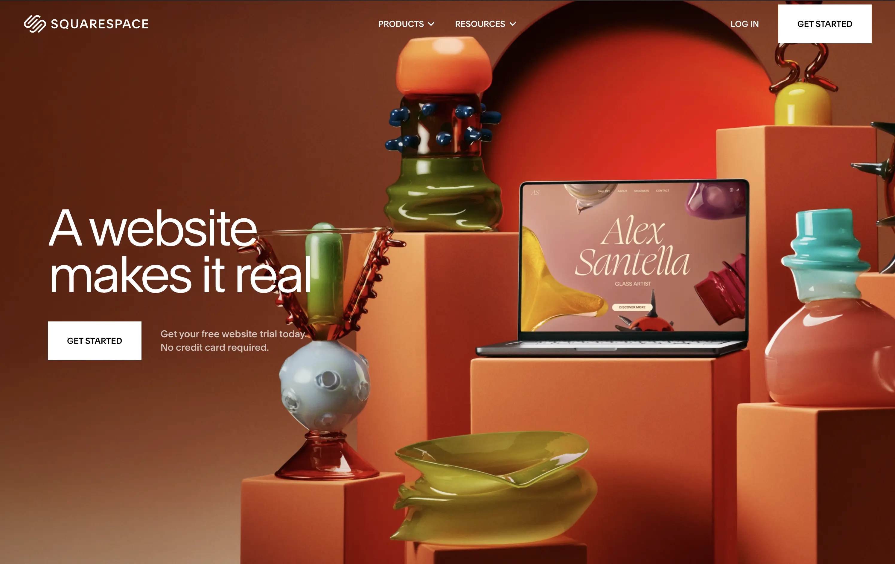
Squarespace
↗
SaaS
Creative Tools
Left-aligned
Editorial
Aspirational
Empowering
Single Button
Photography
Imagery-Based
White
Sans serif
Hybrid
Home Page
Squarespace
website builder, ecommerce, portfolio, artist websites, small business site, drag and drop, no code
Squarespace empowers creatives and entrepreneurs to bring their brand to life online with striking websites, e-commerce, marketing tools, creator-first, design-led, visual storytelling, warm tones, minimalist CTA, lifestyle imagery, transformation messaging, artistic showcase, premium SaaS, aspirational branding, product in-situ, visually rich, trust-by-design
The hero is visually immersive with minimal copy. Headline captures emotional payoff. UI preview shows real use case. CTA is visible but non-aggressive. The photography and styling do most of the persuasive work.
A brand-first execution that targets creators seeking identity and validation. The emotional angle lands hard, while layout and styling reinforce taste, confidence, and ease. Design aligns perfectly with target user mindset.
This layout balances technical utility with human impact, aligning well with Algolia’s positioning as an API-first but UX-aware company. The mobile UI reinforces product value visually, while the logo wall signals scale and trust for enterprise buyers. The tone is clear, benefit-led, and appropriate for high-intent decision-makers evaluating AI tools for customer experience. This is a solid enterprise-facing hero built to perform.
Squarespace
↗
SaaS
Creative Tools
Left-aligned
Editorial
Aspirational
Empowering
Single Button
Photography
Imagery-Based
White
Sans serif
Hybrid
Home Page
Squarespace
website builder, ecommerce, portfolio, artist websites, small business site, drag and drop, no code
Squarespace empowers creatives and entrepreneurs to bring their brand to life online with striking websites, e-commerce, marketing tools, creator-first, design-led, visual storytelling, warm tones, minimalist CTA, lifestyle imagery, transformation messaging, artistic showcase, premium SaaS, aspirational branding, product in-situ, visually rich, trust-by-design
The hero is visually immersive with minimal copy. Headline captures emotional payoff. UI preview shows real use case. CTA is visible but non-aggressive. The photography and styling do most of the persuasive work.
A brand-first execution that targets creators seeking identity and validation. The emotional angle lands hard, while layout and styling reinforce taste, confidence, and ease. Design aligns perfectly with target user mindset.
This layout balances technical utility with human impact, aligning well with Algolia’s positioning as an API-first but UX-aware company. The mobile UI reinforces product value visually, while the logo wall signals scale and trust for enterprise buyers. The tone is clear, benefit-led, and appropriate for high-intent decision-makers evaluating AI tools for customer experience. This is a solid enterprise-facing hero built to perform.
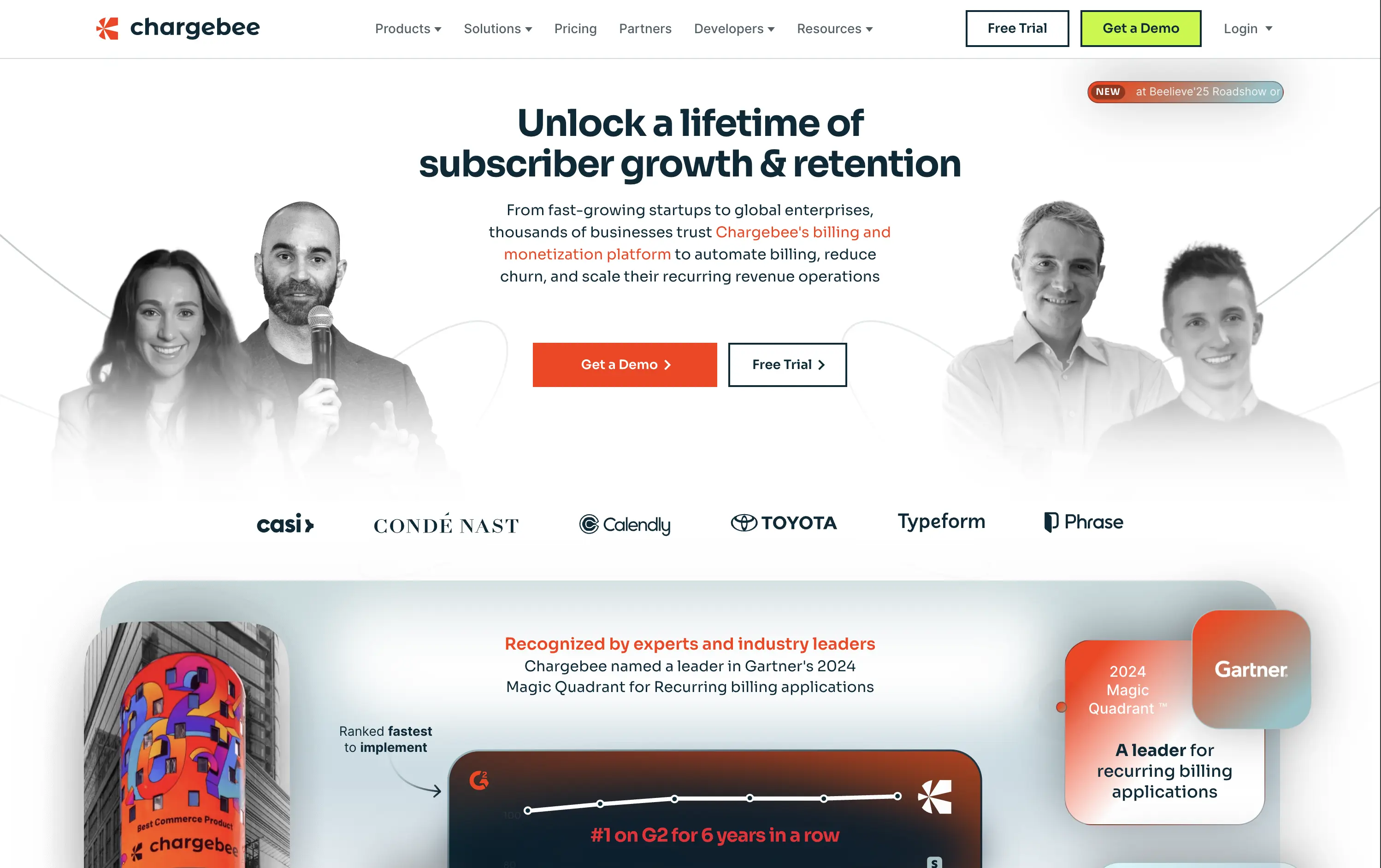
Chargebee
↗
SaaS
Fintech
Centered
Benefit-Driven
Bold & Direct
Multi-CTA Block
Photography
Logo Wall
Social Proof
Light Mode
Green
Orange
Sans serif
B2B
Home Page
Wordpress
B2B SaaS, billing automation, subscription platform, enterprise-ready, credibility-first, leadership positioning, founder imagery, logo wall, dual CTA, Gartner badge, G2 recognition, growth-focused messaging, recurring revenue
Chargebee helps businesses automate recurring billing, reduce churn, and scale subscription revenue through a trusted enterprise-ready platform.
The hero leads with a sharp, benefit-packed headline and backs it up with high-trust signals: real customer faces, name-brand logos, and third-party awards. The “Get a Demo” and “Free Trial” CTAs give users both enterprise and self-serve paths, but visual hierarchy between the two could be better balanced. Copy is outcome-focused and credible.
Smartly targeted at growth-stage and enterprise buyers, but the visual language undersells its category leadership. Strong content mix, but design lacks the presence or edge to reinforce premium positioning.
This layout balances technical utility with human impact, aligning well with Algolia’s positioning as an API-first but UX-aware company. The mobile UI reinforces product value visually, while the logo wall signals scale and trust for enterprise buyers. The tone is clear, benefit-led, and appropriate for high-intent decision-makers evaluating AI tools for customer experience. This is a solid enterprise-facing hero built to perform.
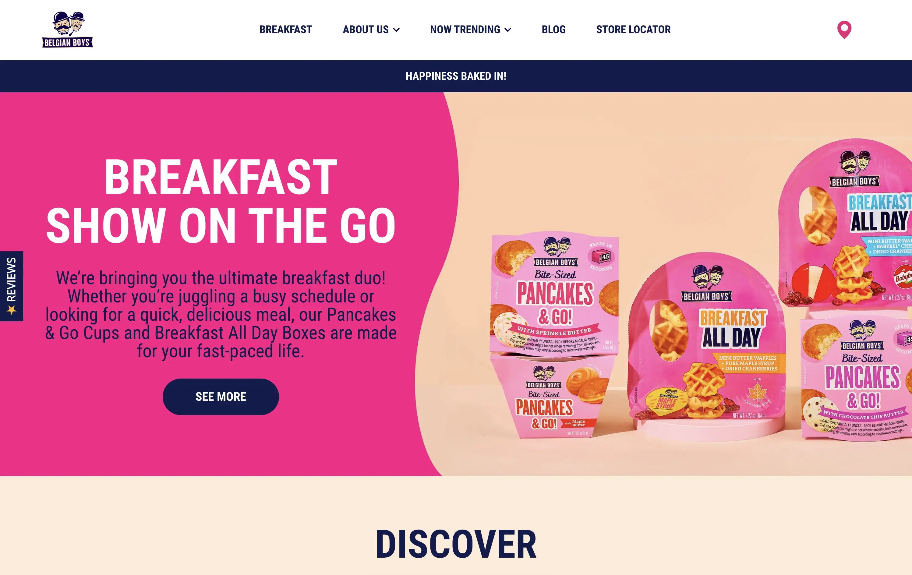
Belgian Boys
↗
CPG
Food & Beverage
Split Grid
Benefit-Driven
Playful
Single Button
Photography
Multi-color
Blue
Pink
Sans serif
DTC
Home Page
Shopify
CPG packaging, breakfast brand, direct-to-consumer, bright pink, snackable meals, product-focused, visual-first, fun tone, food on the go, time-saving meals, supermarket crossover, family-friendly, bold design, colorful grid, accessible copy
Belgian Boys sells fun, ready-to-eat breakfast snacks designed for busy people who want delicious, hassle-free meals.
The hero is loud and unapologetically pink, clearly built for quick scanning. Product packaging is the visual centerpiece, immediately showing what’s on offer. The bold type, simple language, and upbeat color palette make it easy to understand in seconds. The left-right layout balances message and product, while the single CTA is clear and inviting.
Speaks directly to the target buyer: busy, hungry, probably on mobile. The pink and navy color palette feels retail-shelf ready, and the whole layout matches the convenience and joy of the product. A great example of brand alignment through design.
This layout balances technical utility with human impact, aligning well with Algolia’s positioning as an API-first but UX-aware company. The mobile UI reinforces product value visually, while the logo wall signals scale and trust for enterprise buyers. The tone is clear, benefit-led, and appropriate for high-intent decision-makers evaluating AI tools for customer experience. This is a solid enterprise-facing hero built to perform.
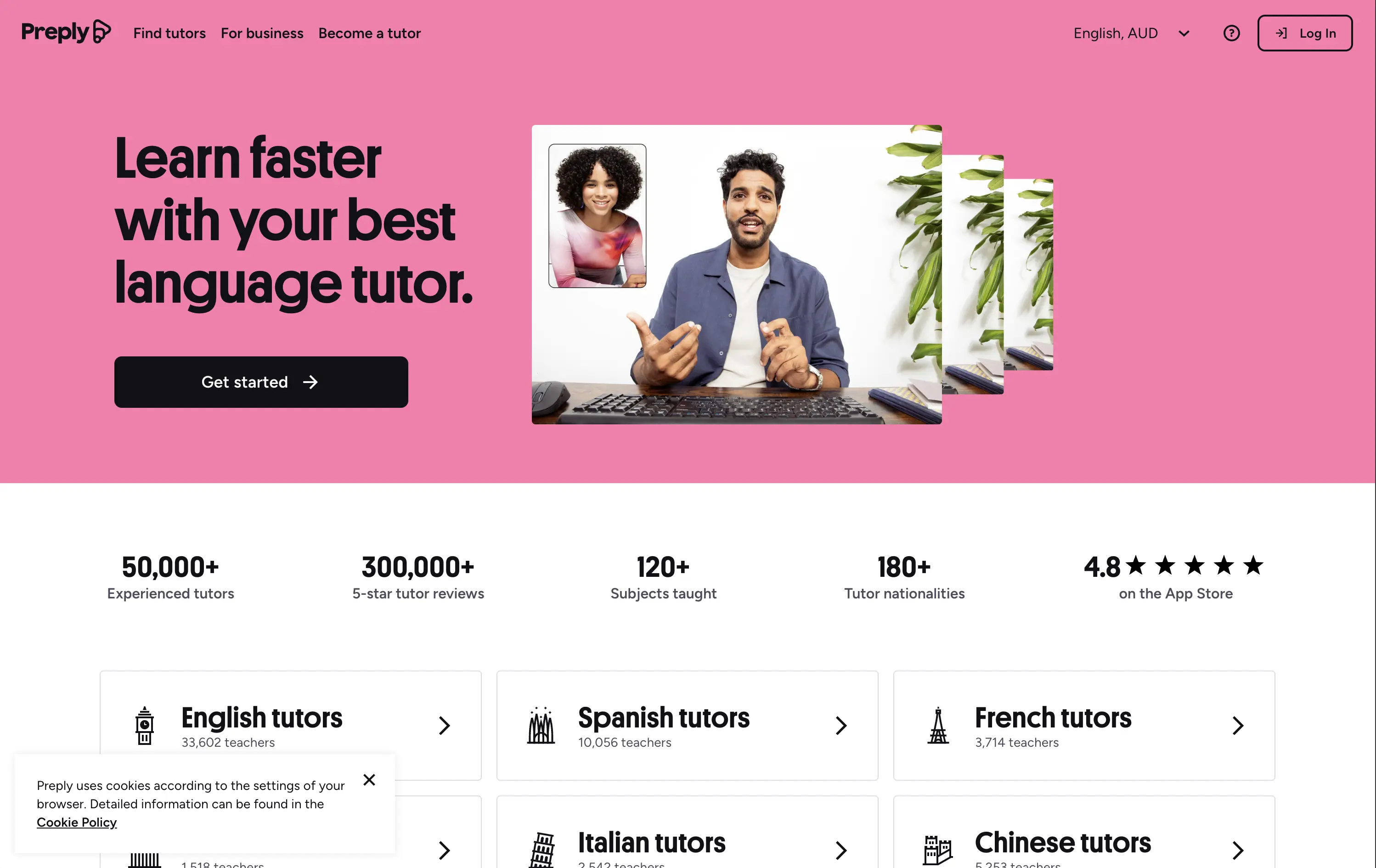
Preply
↗
Education
Left-aligned
Benefit-Driven
Single Button
Photography
Live Metrics
Social Proof
Light Mode
Pink
Black
Home Page
Custom Code
language tutor, online learning, marketplace hero, bold color hero, pink web design, conversational UI, Gen Z UX, bold CTA, tutoring platform, live teaching, zoom call visual, metrics trust banner, marketplace product
Preply is an online learning platform that connects learners with expert language tutors for personalized one-on-one lessons.
This hero punches through with its candy-pink backdrop — a rare choice for marketplaces but totally intentional. The layout is simple, but the stacked imagery still adds dynamism. Stats like “300,000+ 5-star reviews” and “180+ tutor nationalities” instantly establish credibility. The CTA is minimal and clearly actionable. Overall, the tone is upbeat, modern, and universally accessible — ideal for a cross-border education platform aiming to feel both trustworthy and welcoming.
Hero balances global scale with simplicity. Design and tone cater to international learners of all ages. Trust is built through numbers, while layout minimizes friction for new users.
This layout balances technical utility with human impact, aligning well with Algolia’s positioning as an API-first but UX-aware company. The mobile UI reinforces product value visually, while the logo wall signals scale and trust for enterprise buyers. The tone is clear, benefit-led, and appropriate for high-intent decision-makers evaluating AI tools for customer experience. This is a solid enterprise-facing hero built to perform.
The most effective hero sections in your inbox.
Monthly round up of top hero sections.
Don't worry. We hate spam too.
Don't worry. We hate spam too.
Don't worry. We hate spam too.